Download to read offline

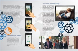
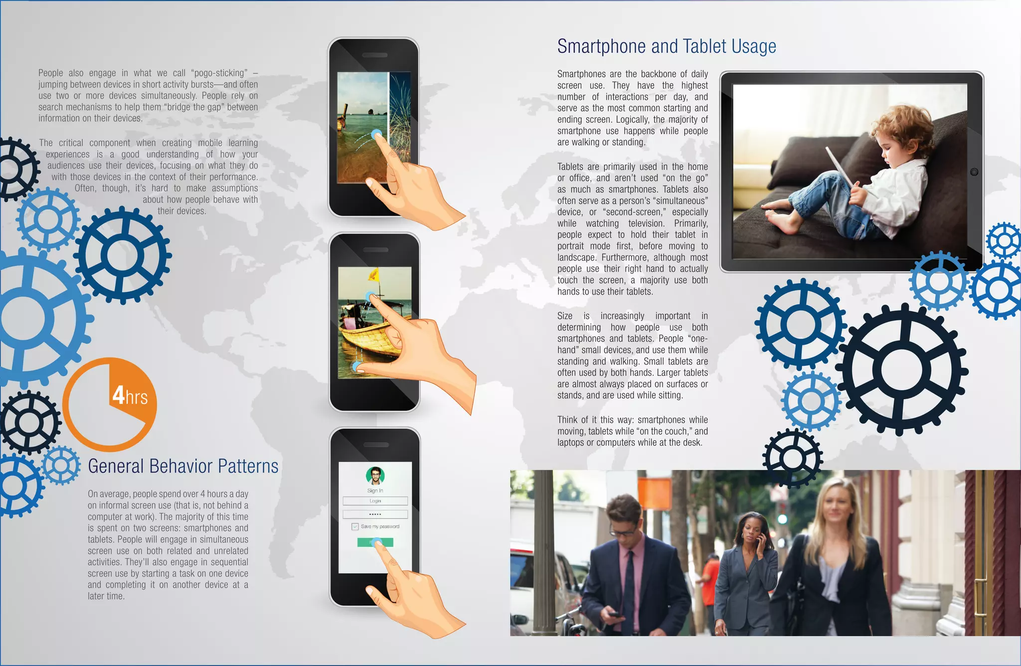

Smartphones and tablets have different usage patterns based on context. Smartphones are used primarily when mobile, often with one hand, while tablets are generally used when stationary but may be held in the hand. Both devices involve touchscreen interaction like scrolling. Effective mobile learning considers these usage contexts by designing for short content and navigation optimized for specific devices.


