Download as PDF, PPTX


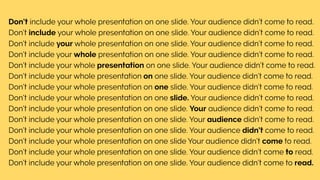
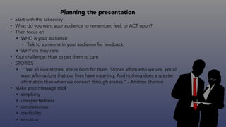


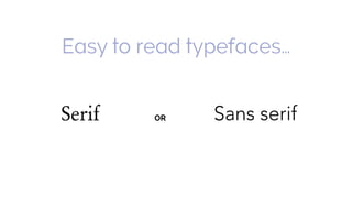


The document provides tips for designing effective slide decks. It recommends using widescreen slides, limiting content to one main idea per slide, including stories and examples to engage audiences, using consistent typography and font sizes that are easy to read, incorporating high-quality images while keeping text legible, and implementing simple designs without overcrowding slides with text or fancy elements. The key is focusing on the audience experience and message through clarity, visual hierarchy and white space.


