Download as PDF, PPTX


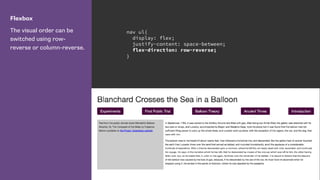
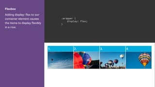
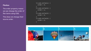
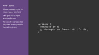
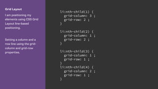
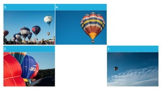
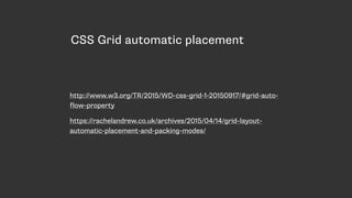

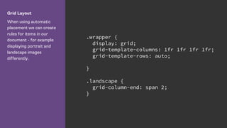

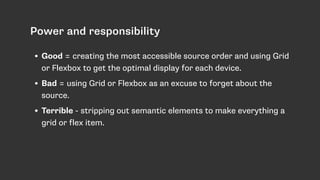


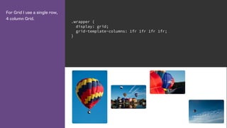
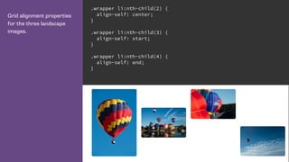

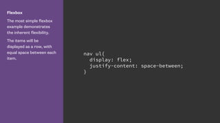

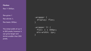

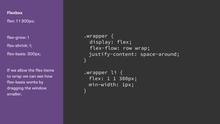
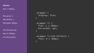

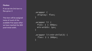

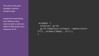


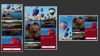
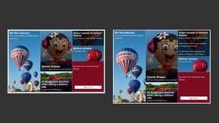
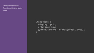
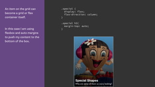
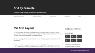
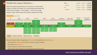
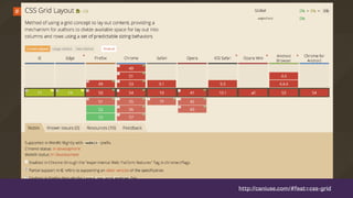

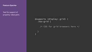
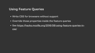
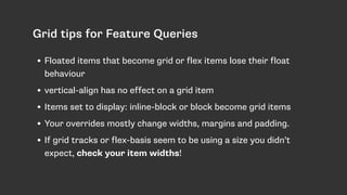


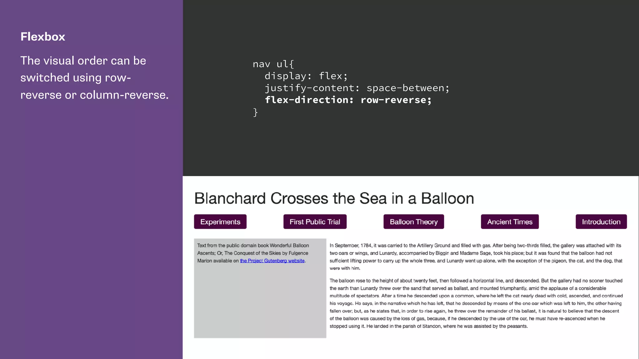
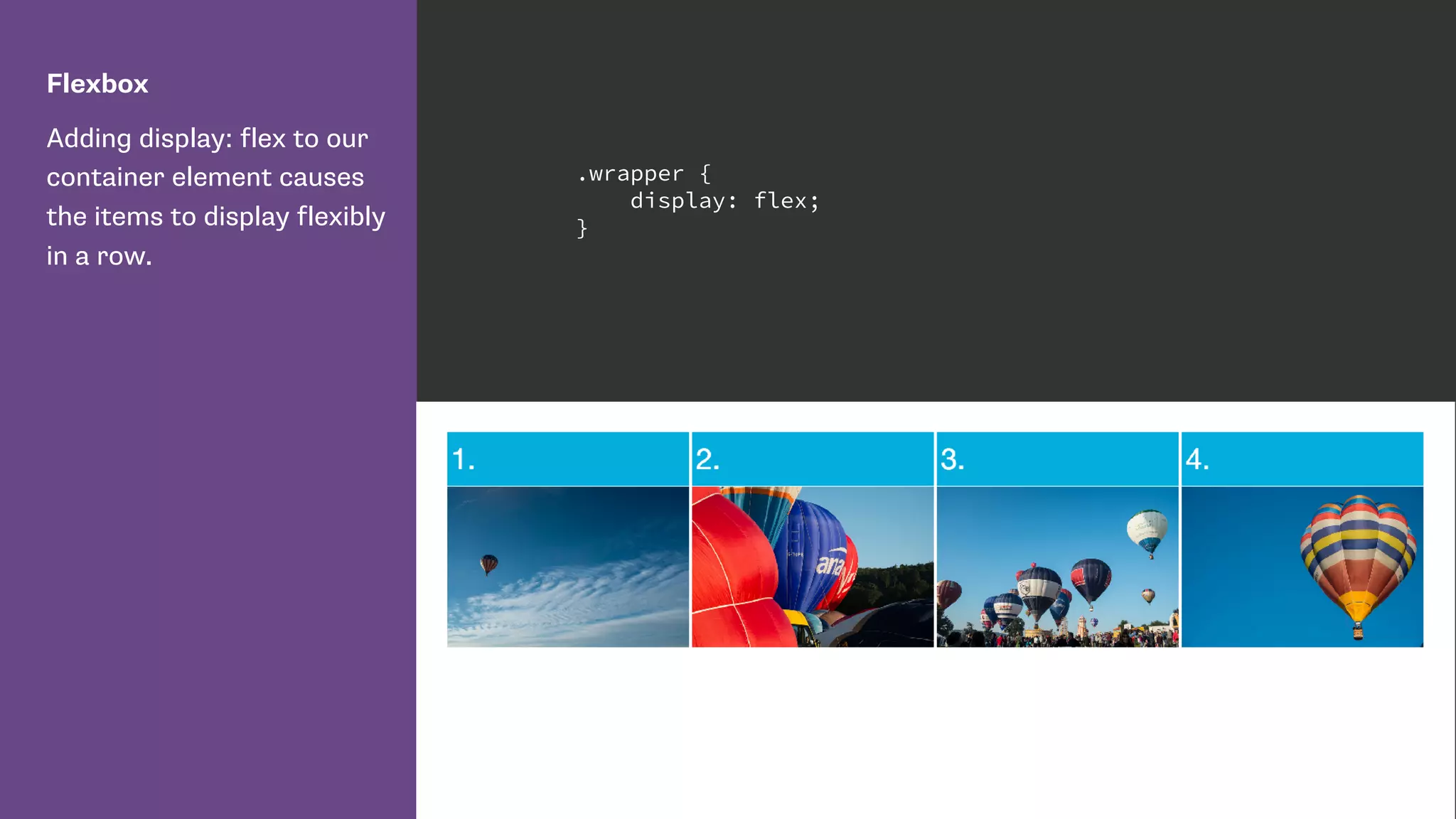
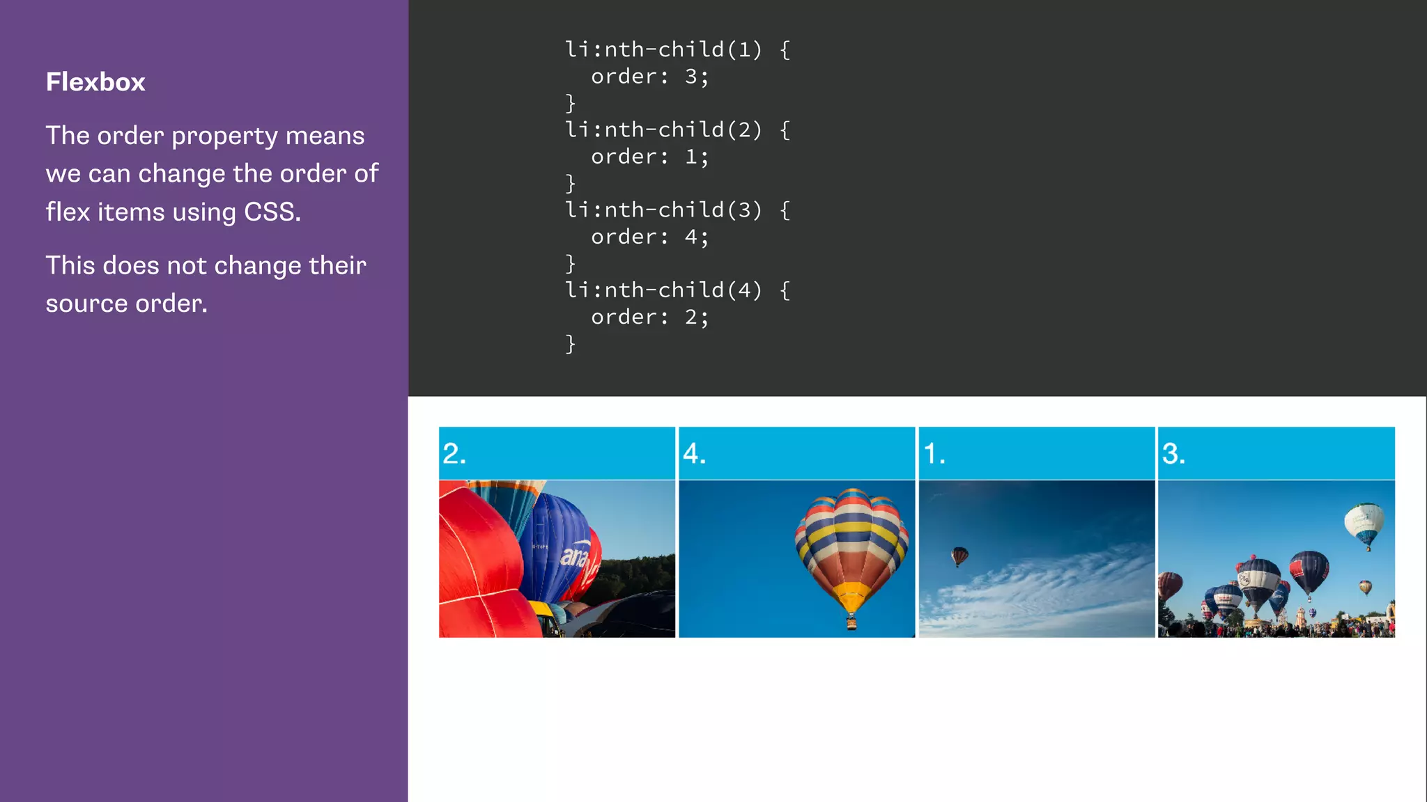
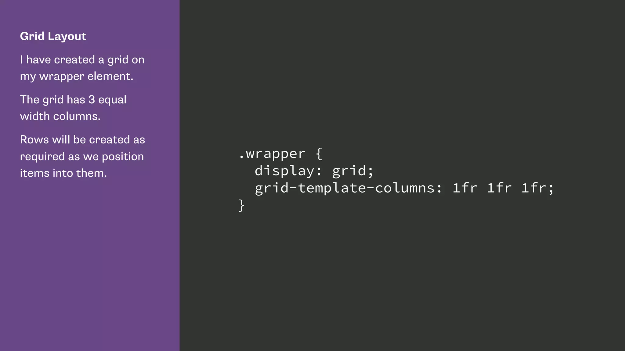
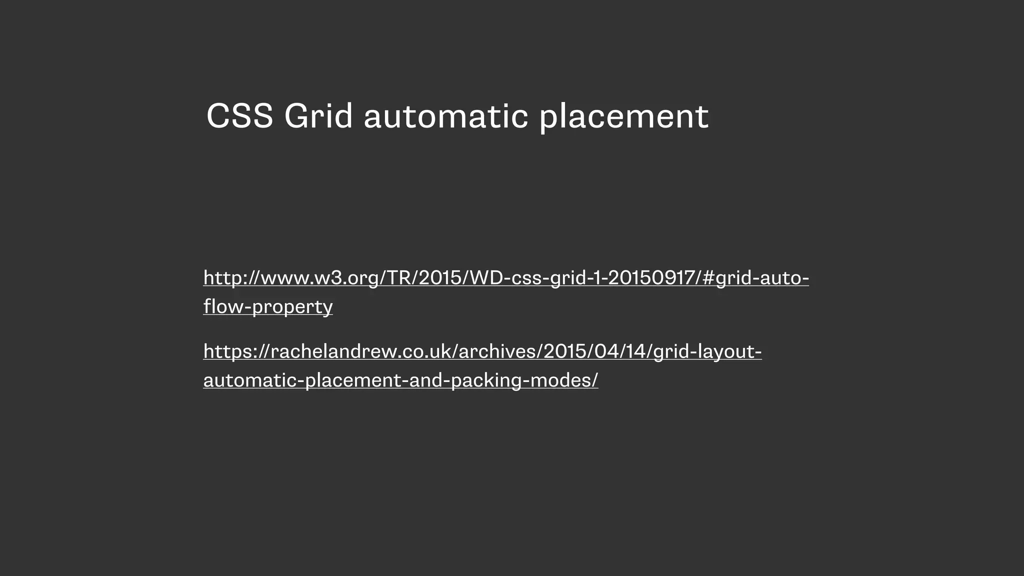
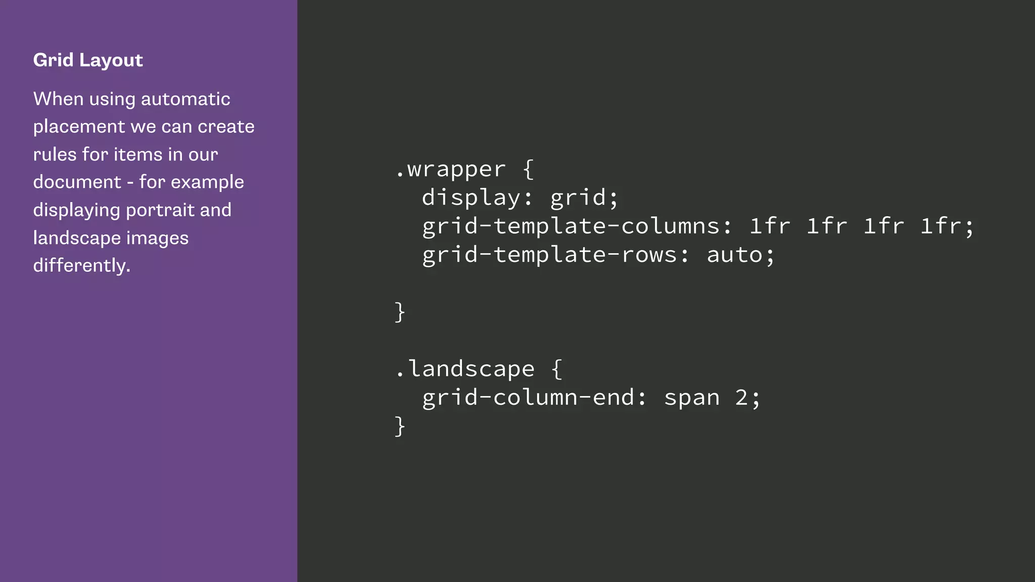

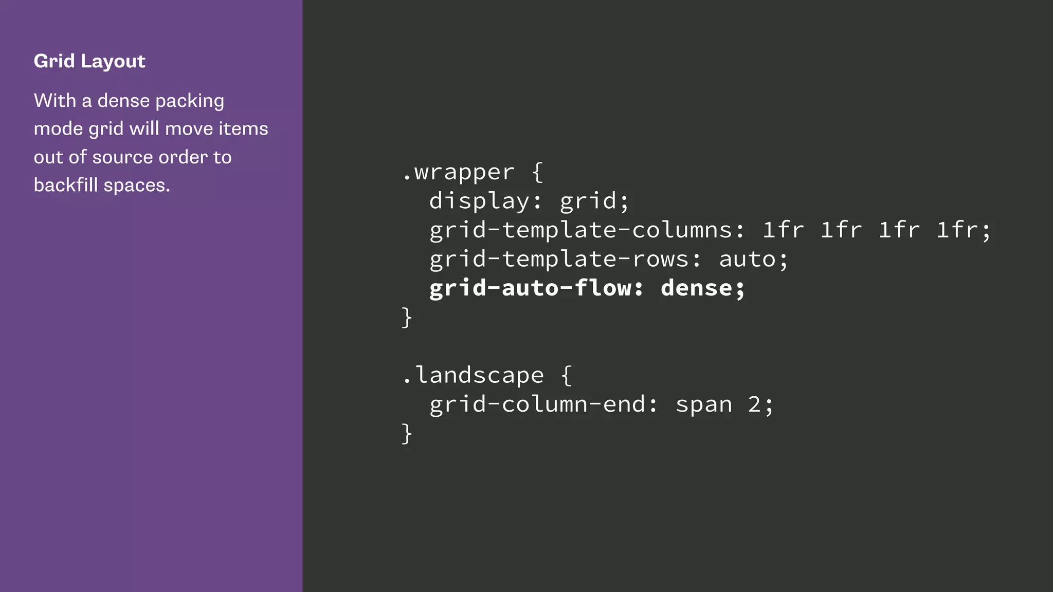
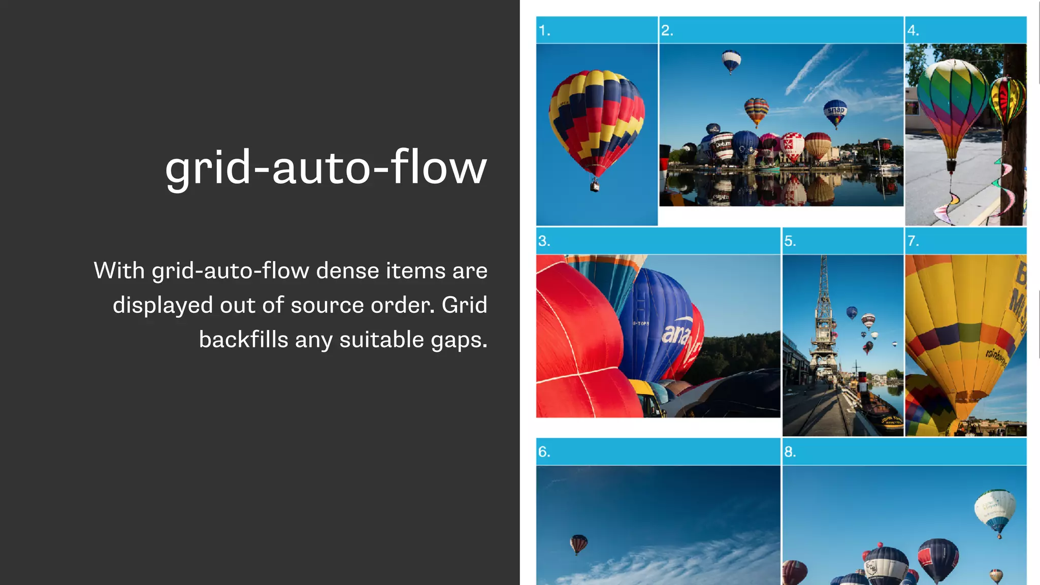


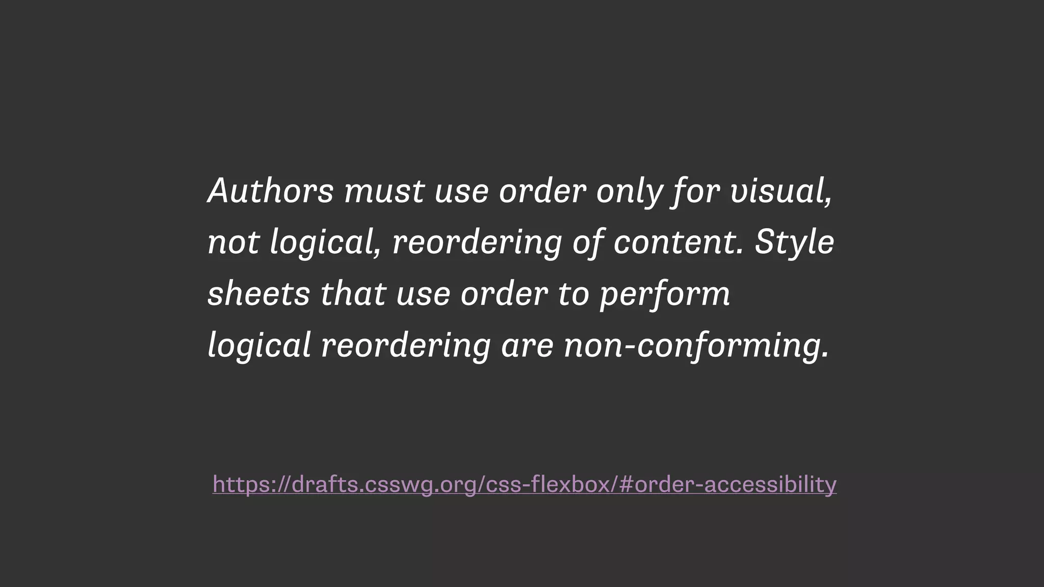
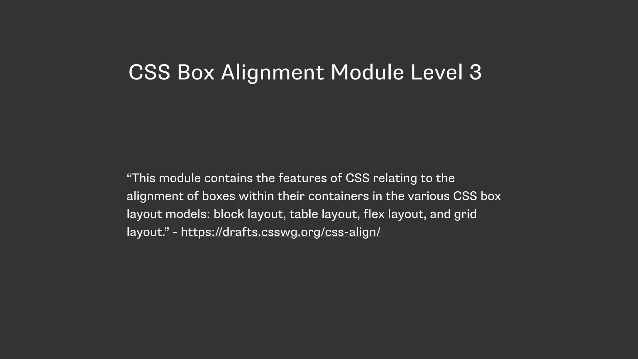


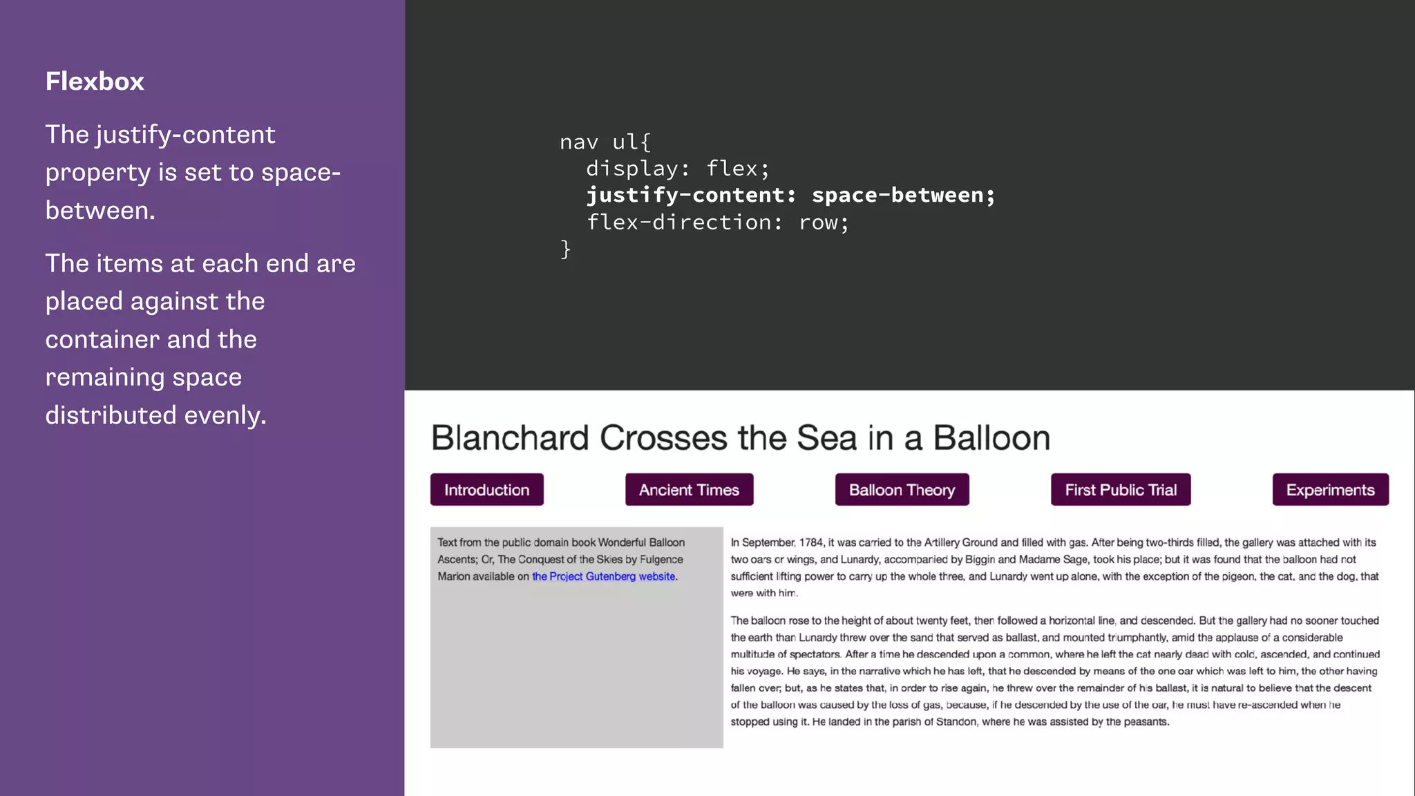


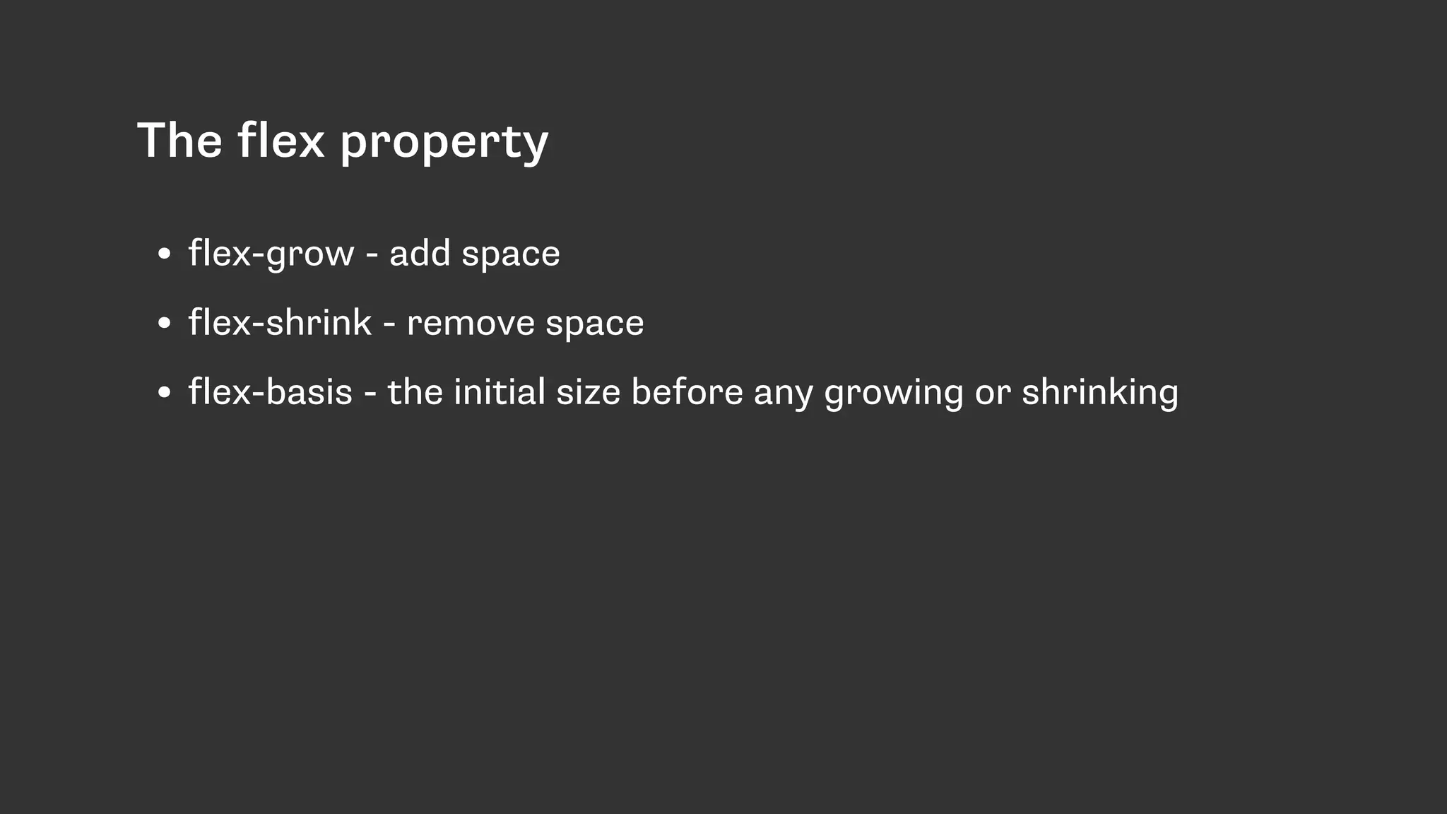
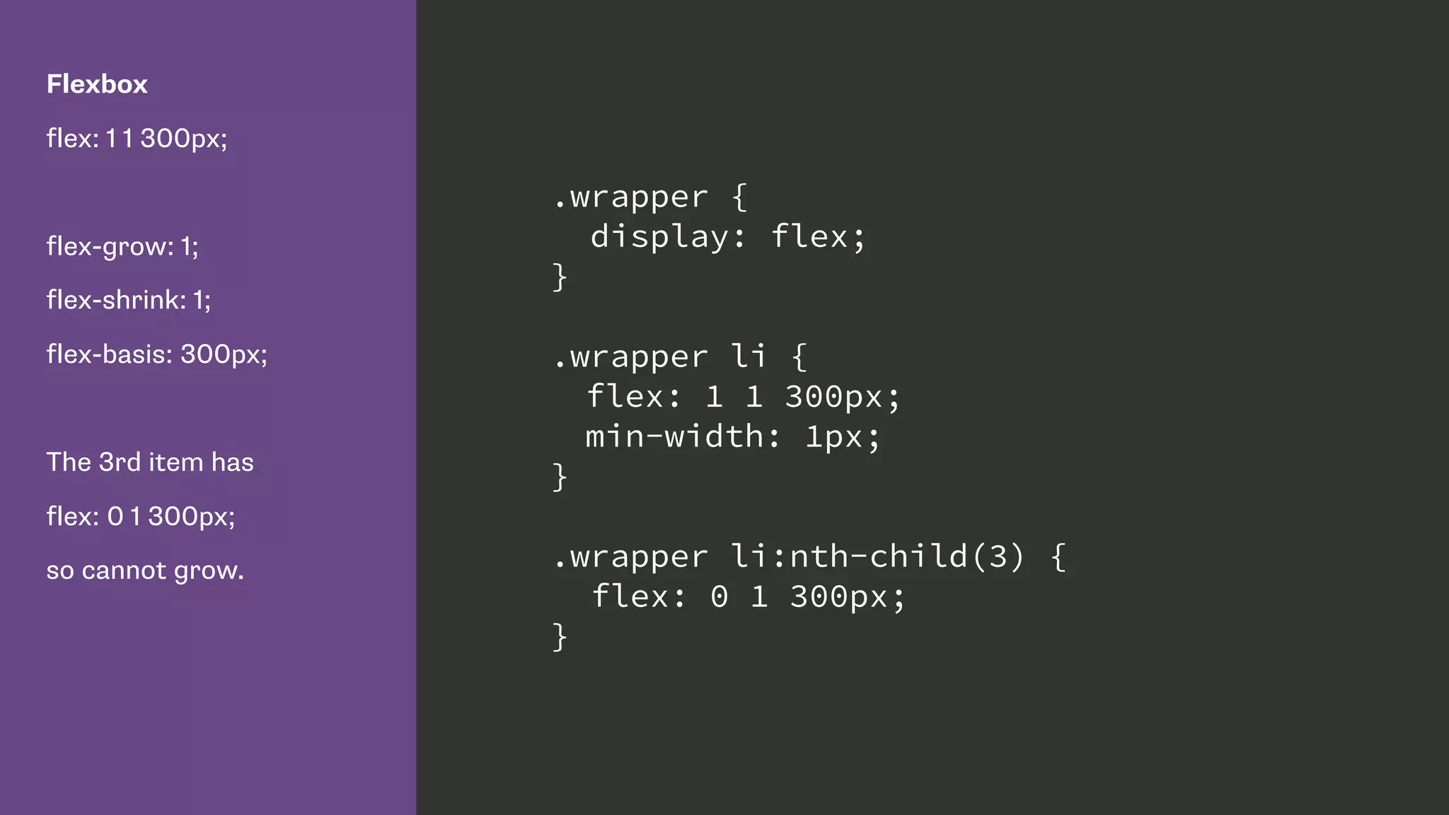
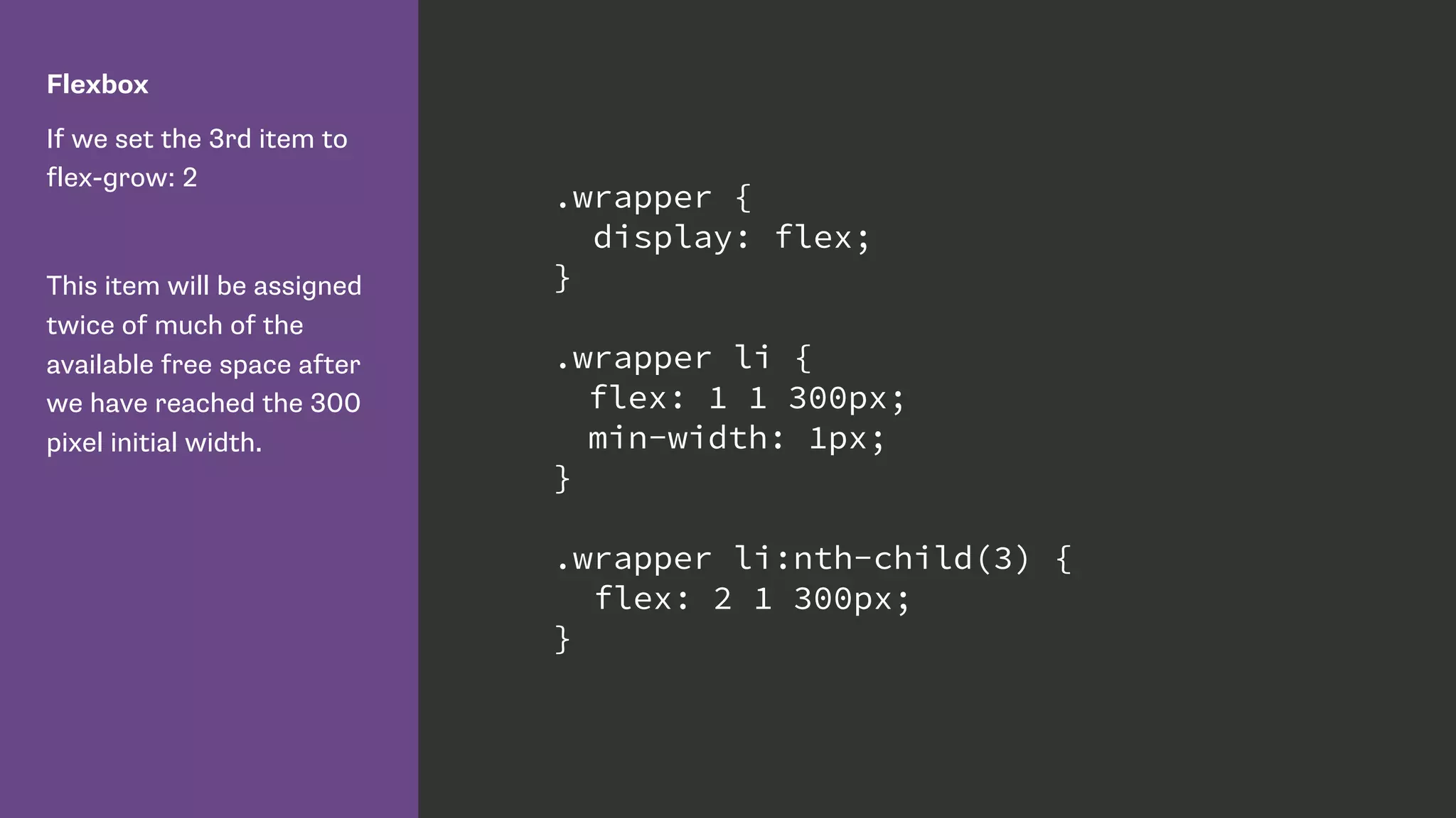


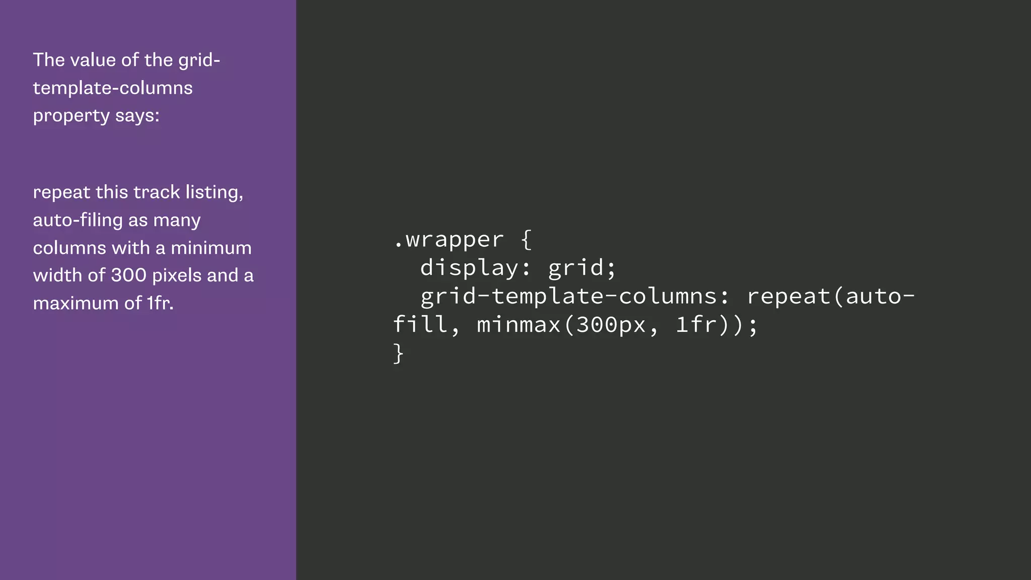


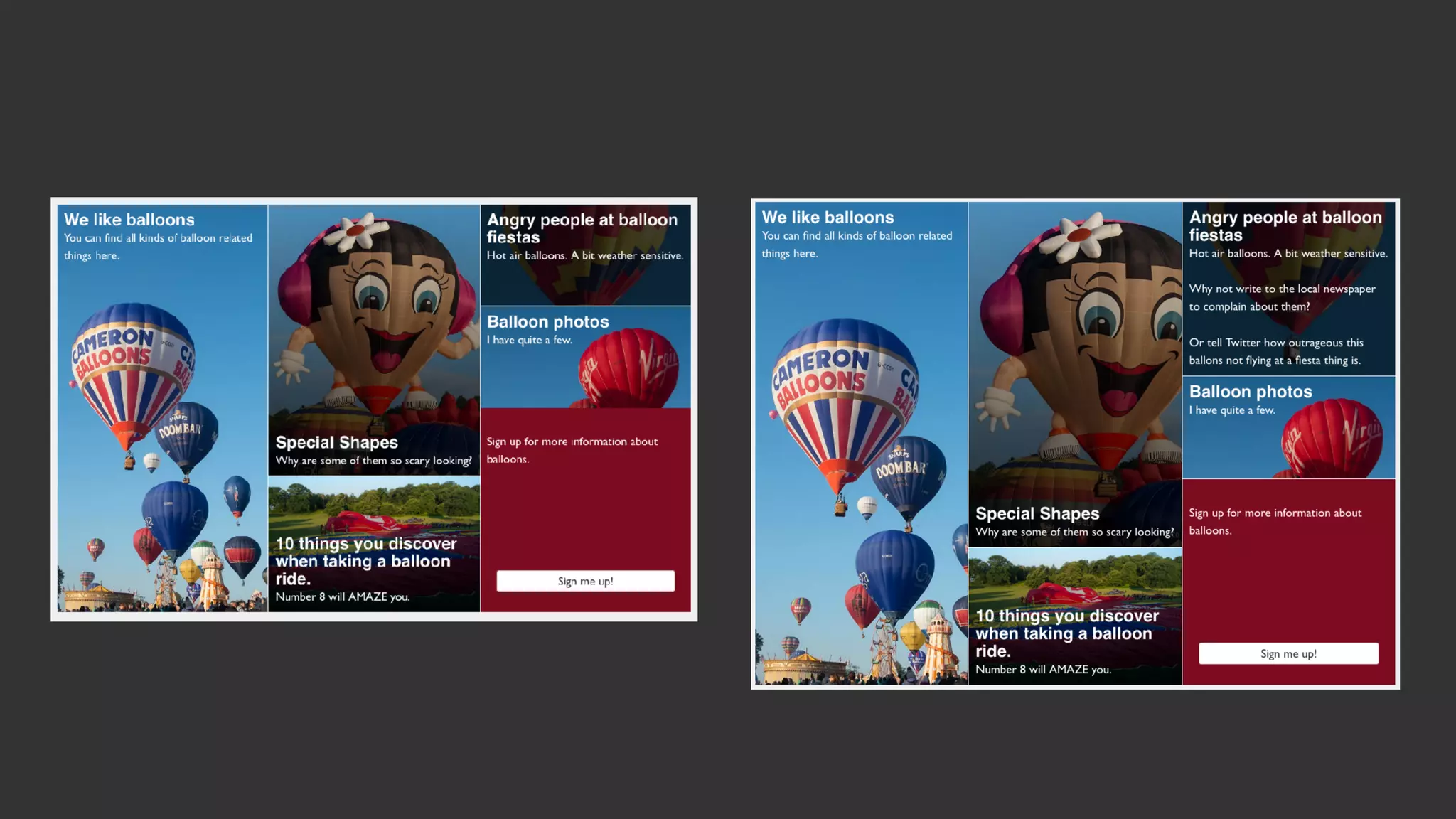

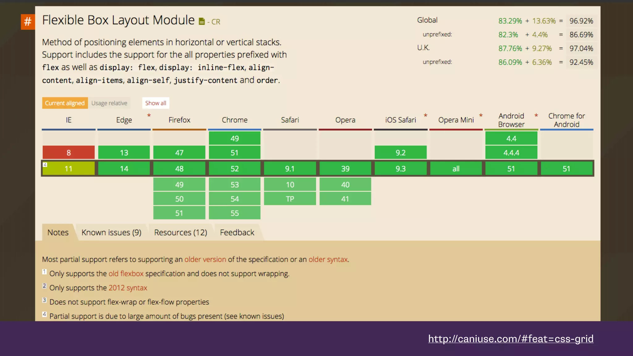
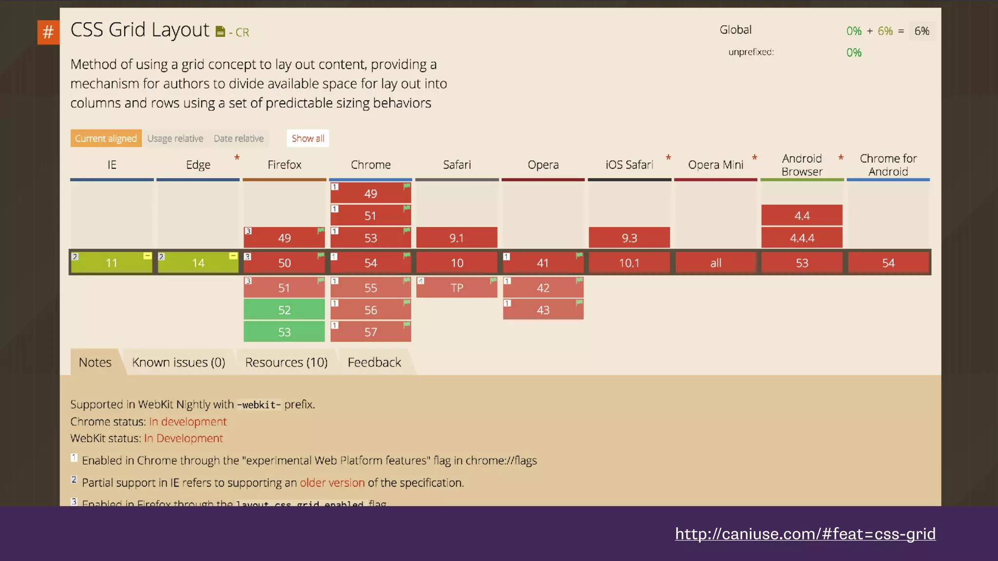

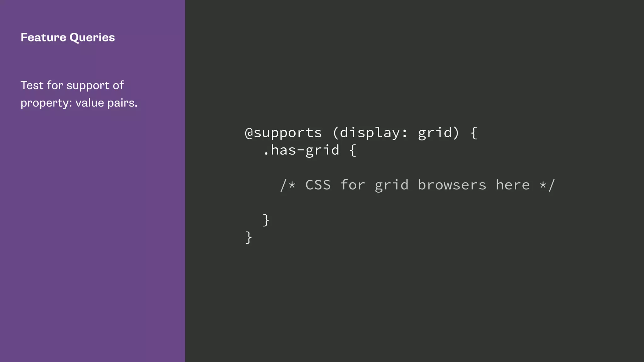


The document summarizes Rachel Andrew's presentation on modern CSS layout techniques including Flexbox and CSS Grid Layout. Some key points include: - Flexbox and CSS Grid Layout provide improved tools for page layout compared to older methods like floats. - These techniques separate logical structure from visual presentation, allow responsive design, and give more control over alignment. - Features like grid-auto-flow can automatically position items but authors must be careful not to compromise accessibility or semantics. - Flexbox is well-suited for one-dimensional layouts while Grid excels at two-dimensional layouts like pages with columns.


