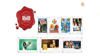
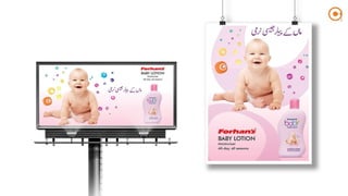
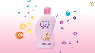
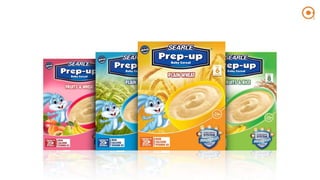
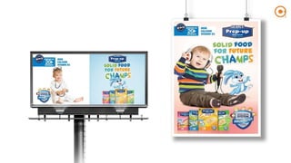
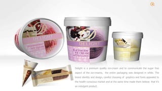
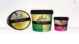
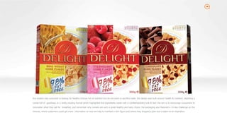
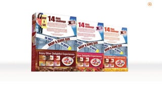
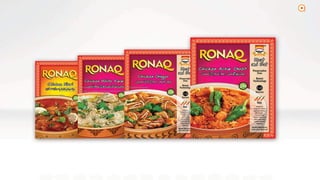
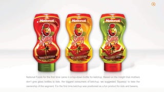
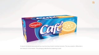
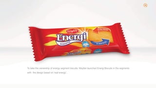
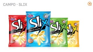
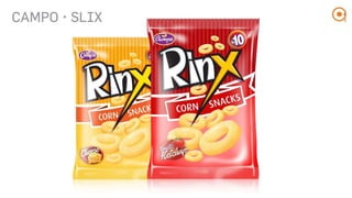
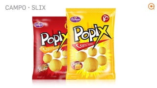
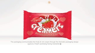
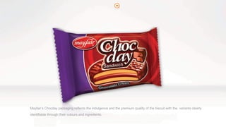
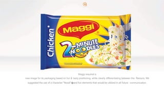
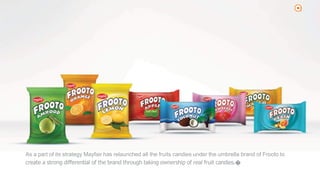
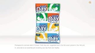
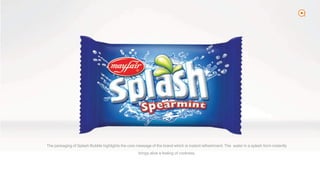
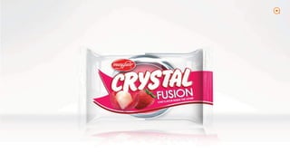
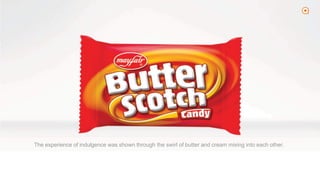
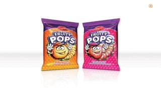
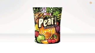
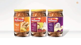
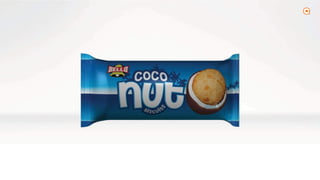
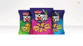
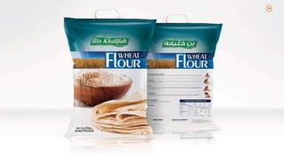
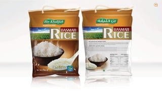
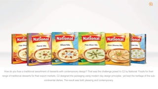
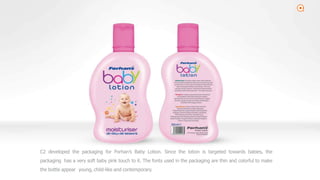
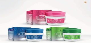
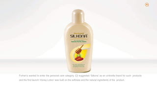
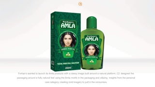
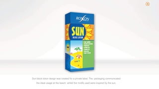
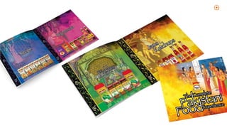
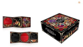
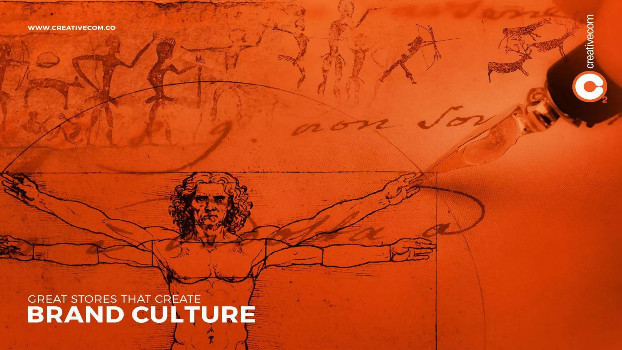
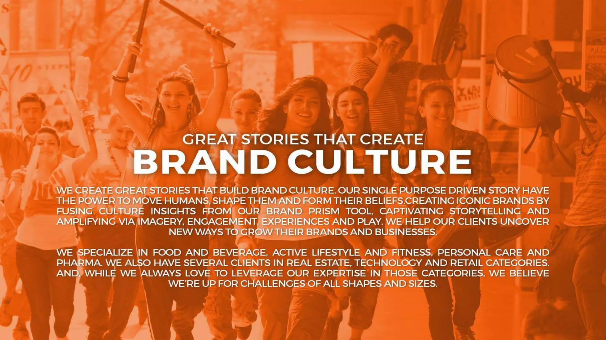
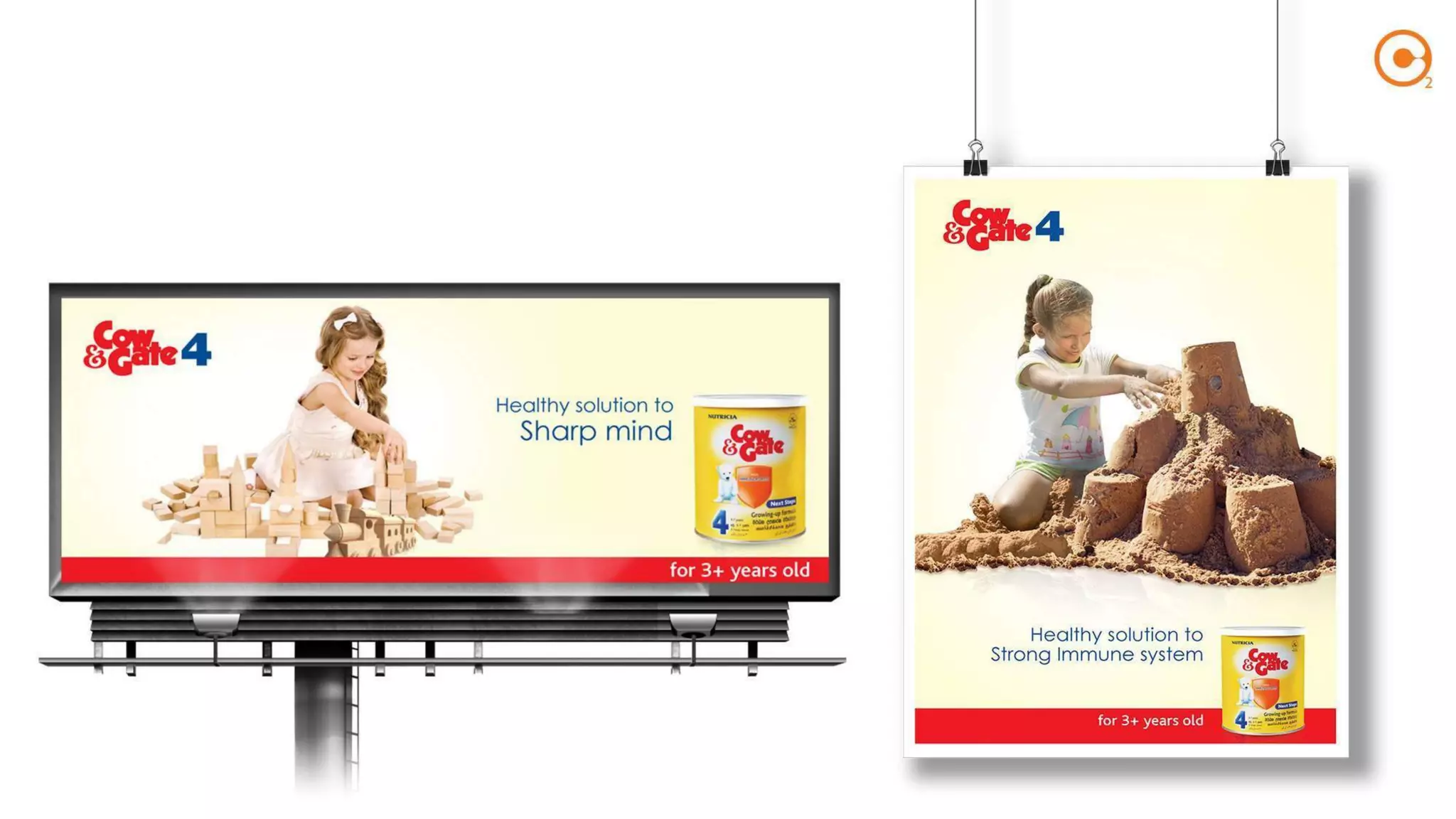
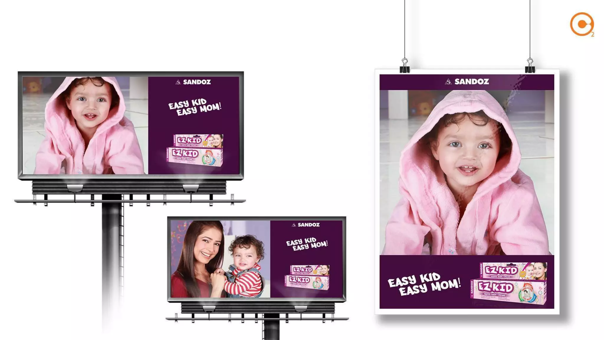
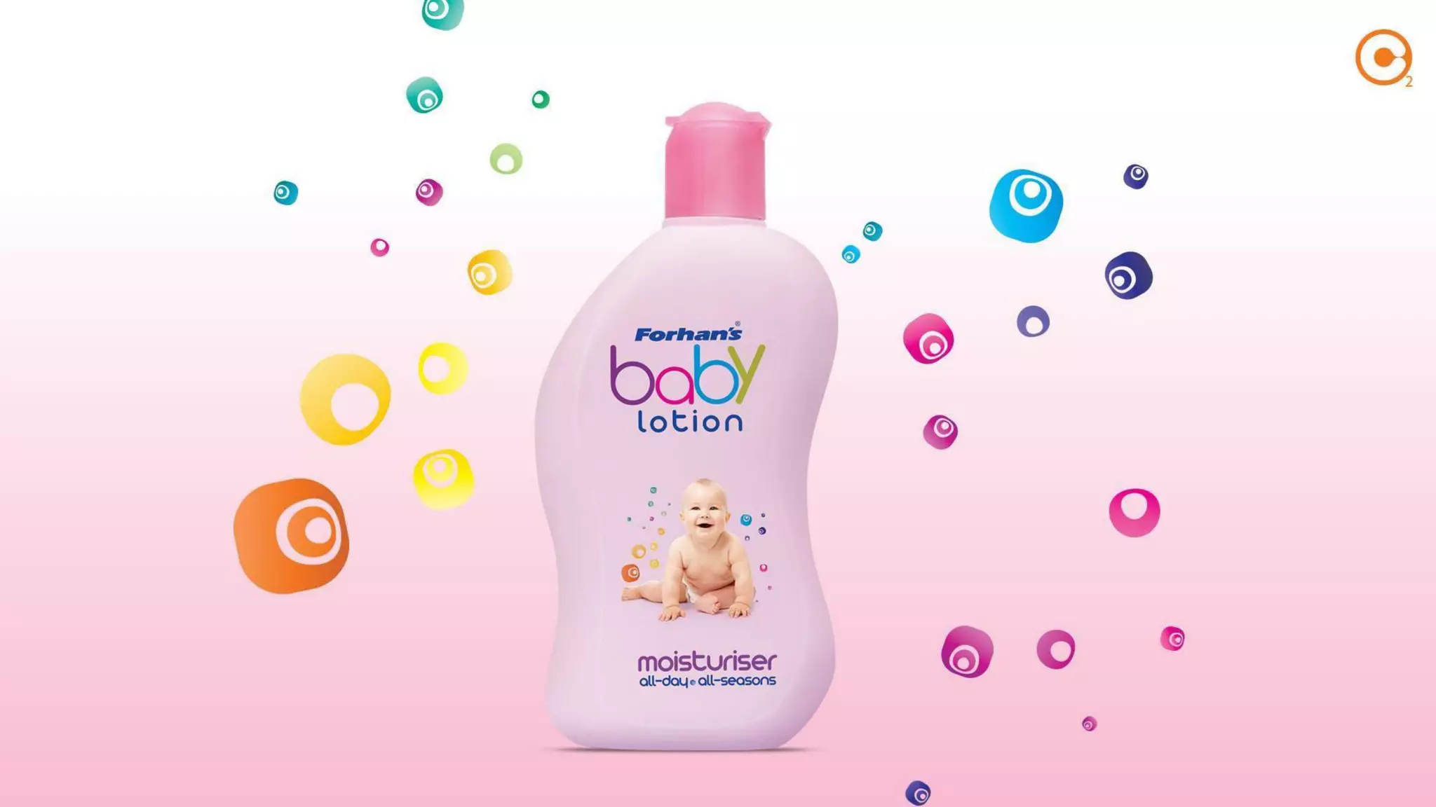
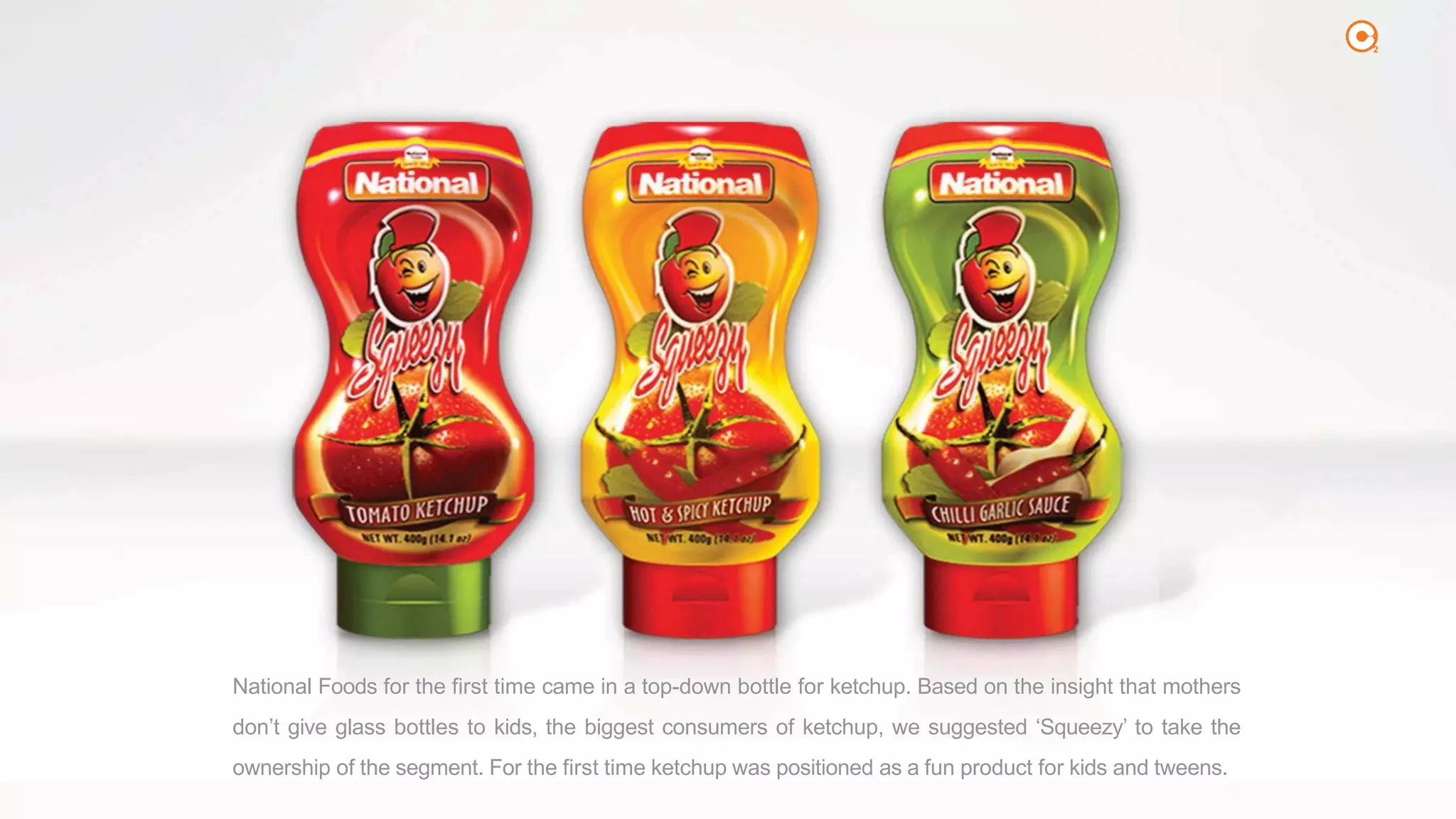
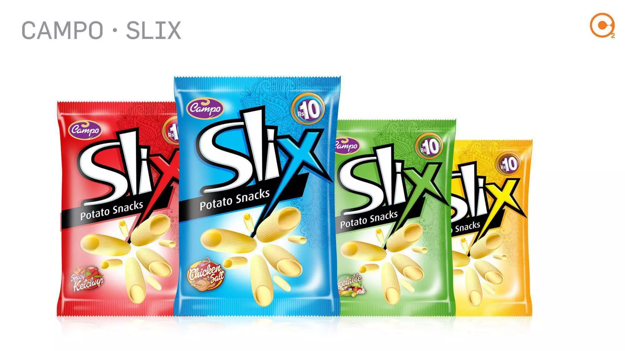
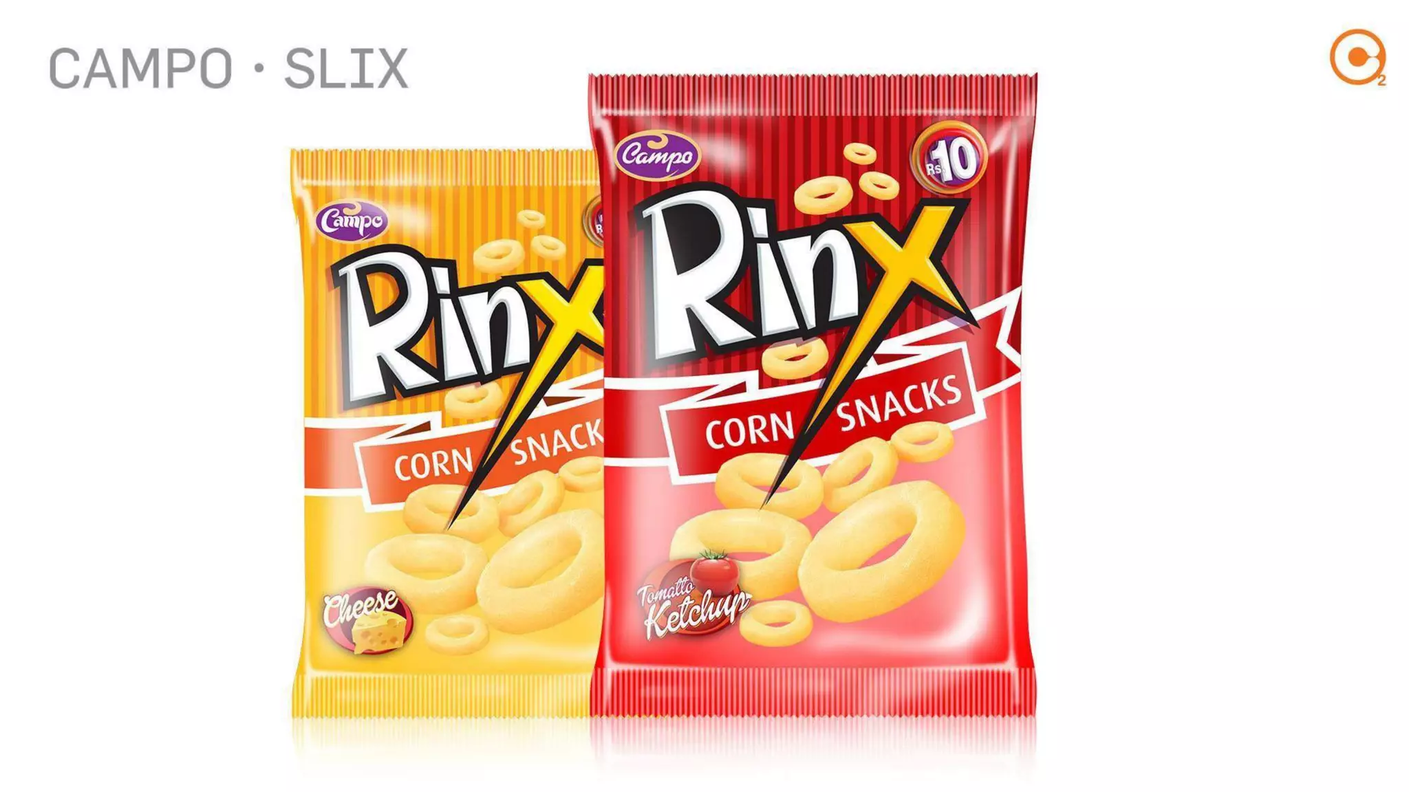
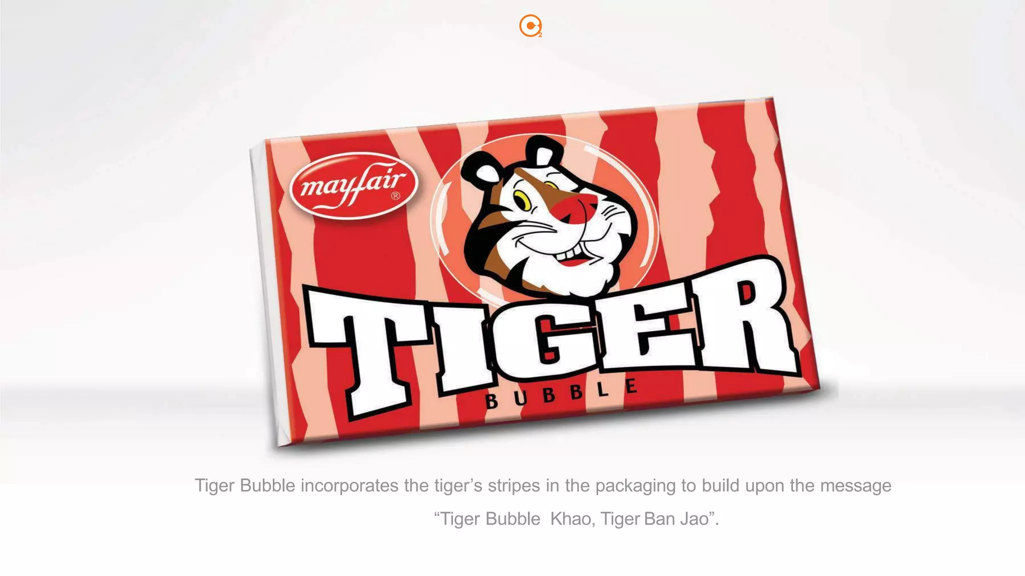
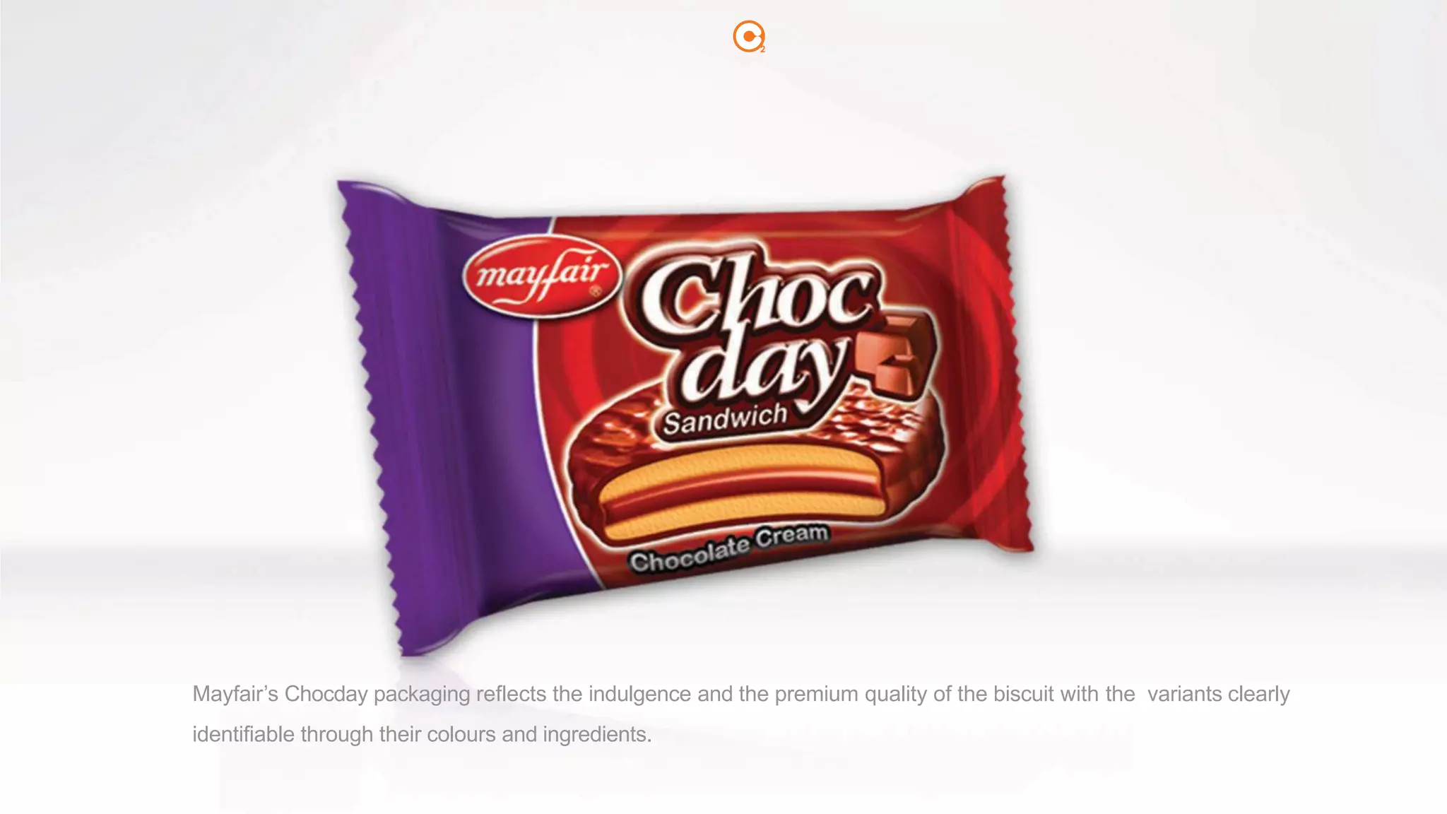
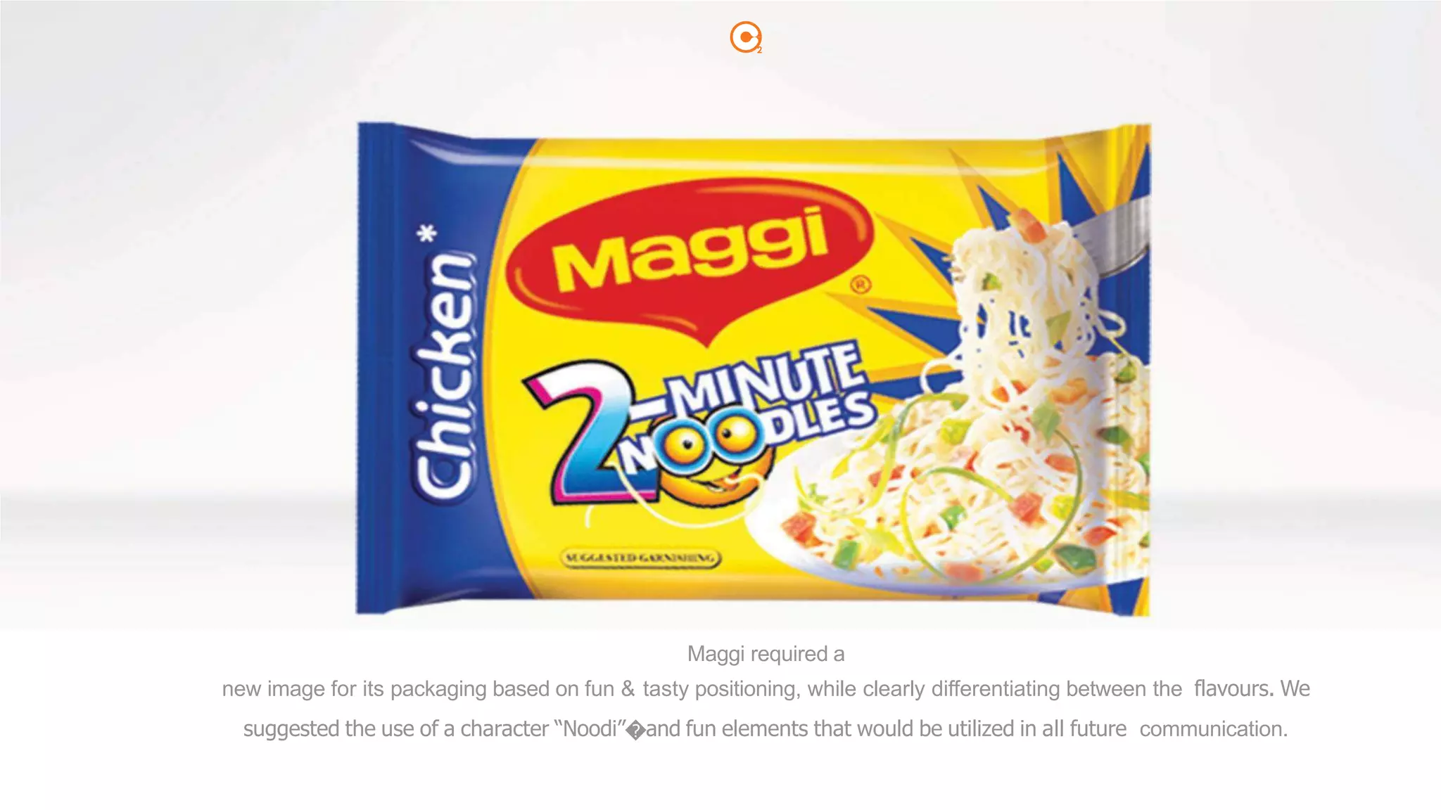
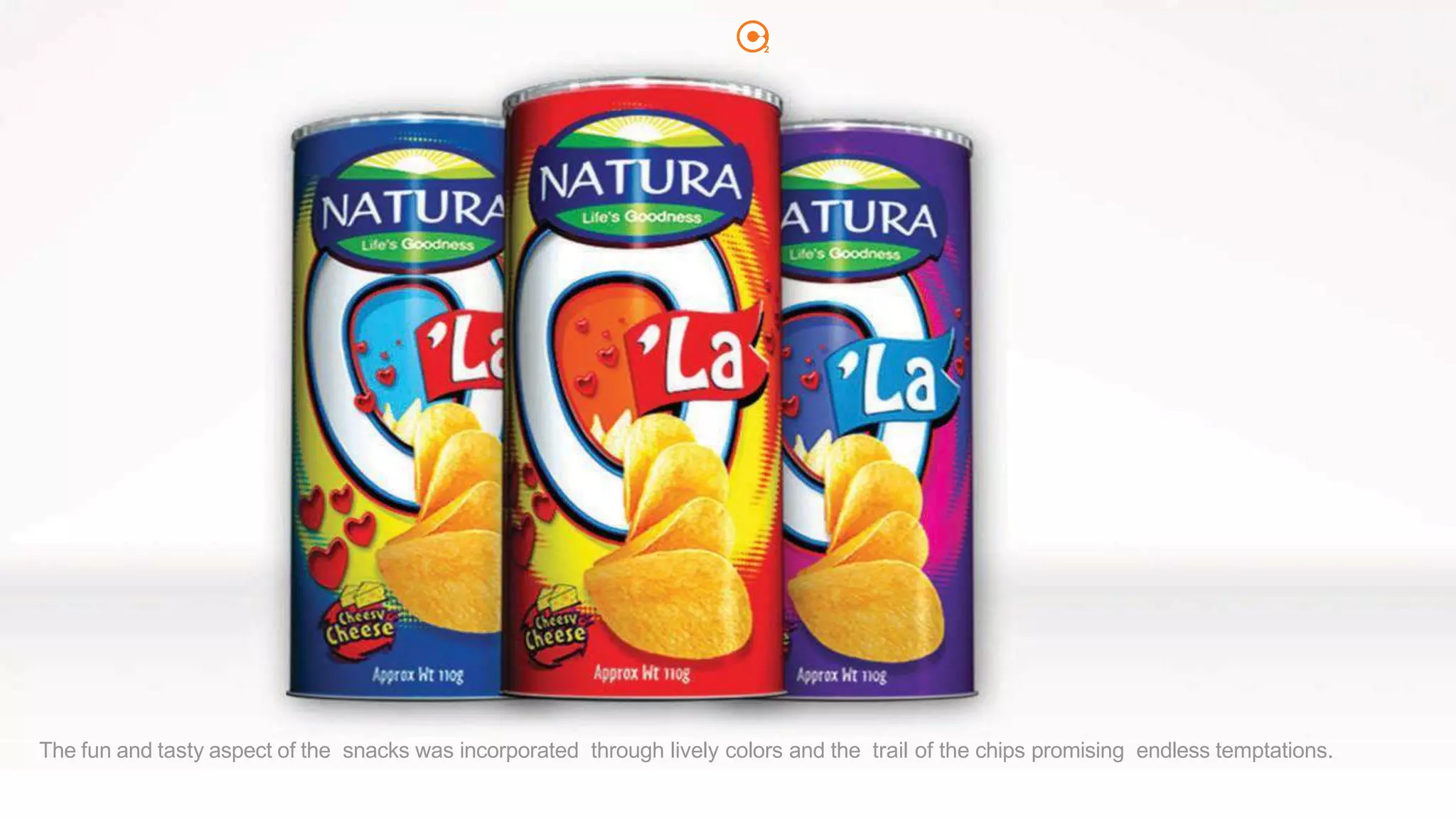
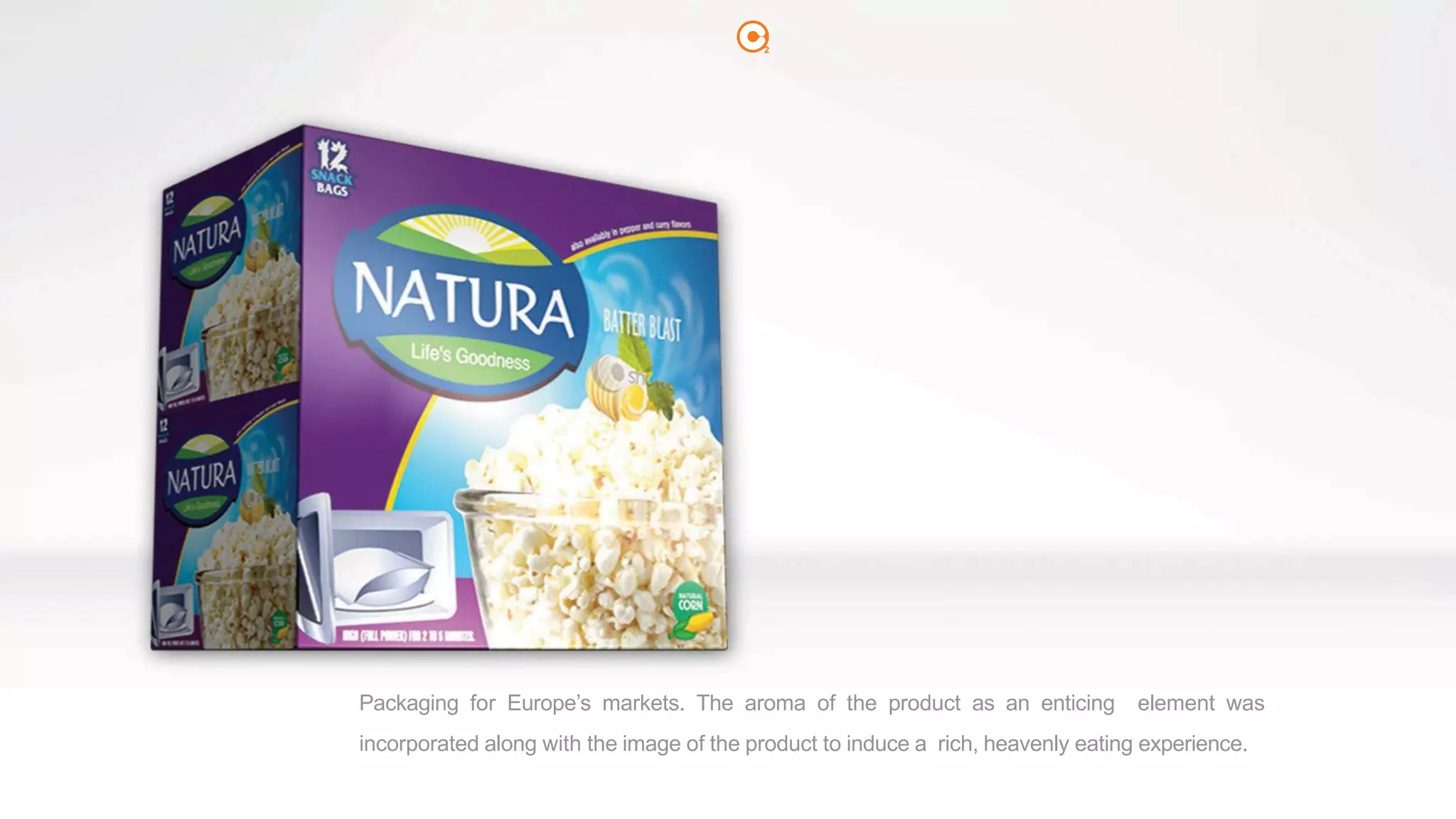
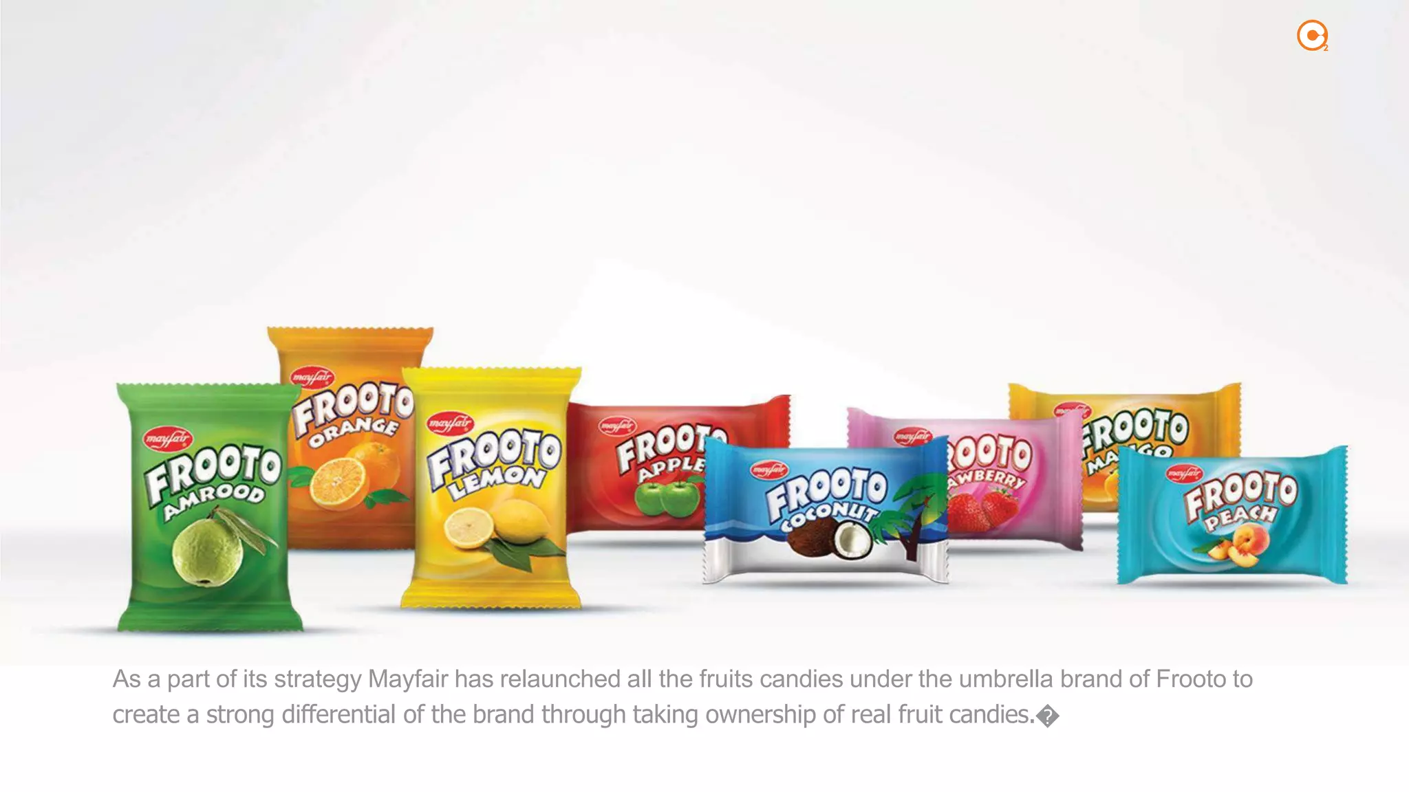
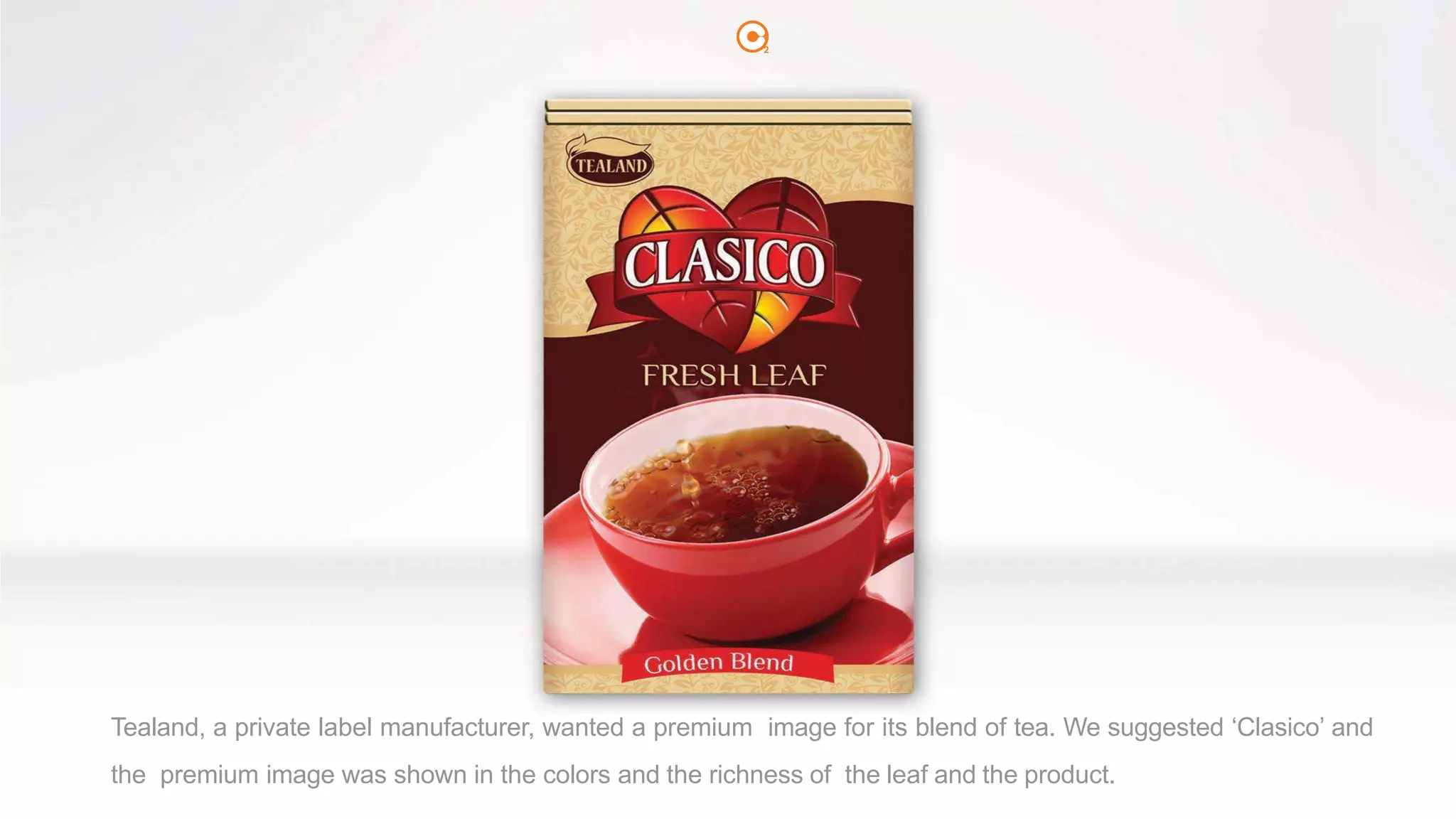
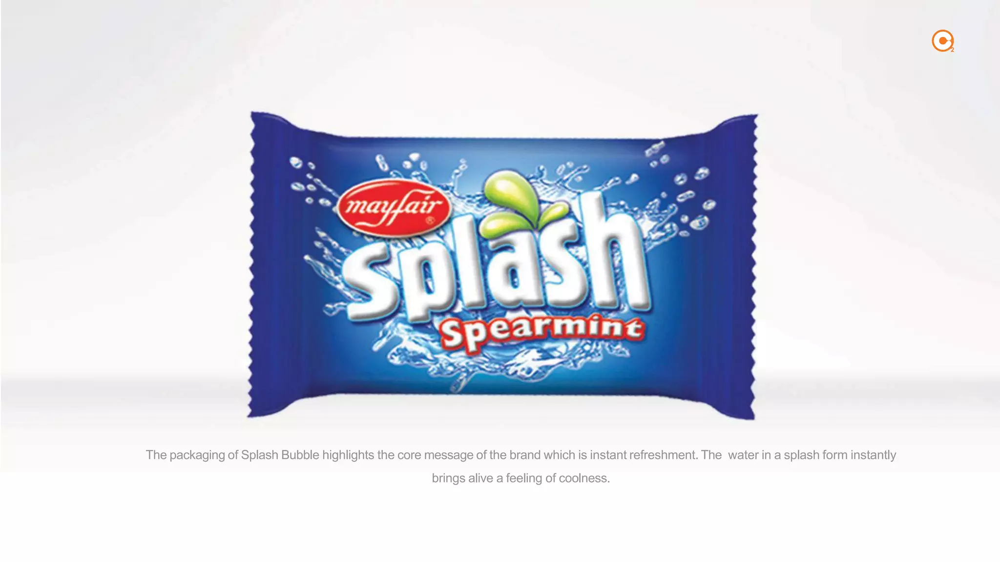
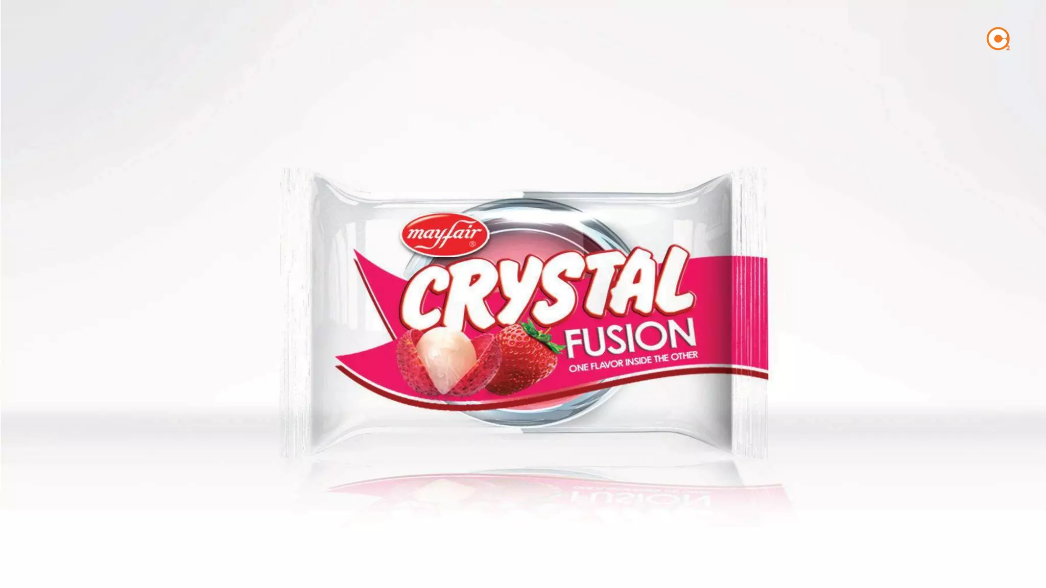
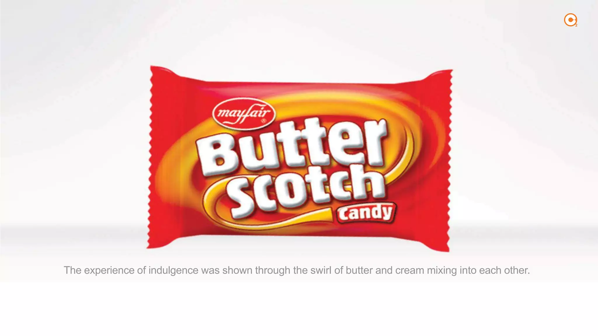
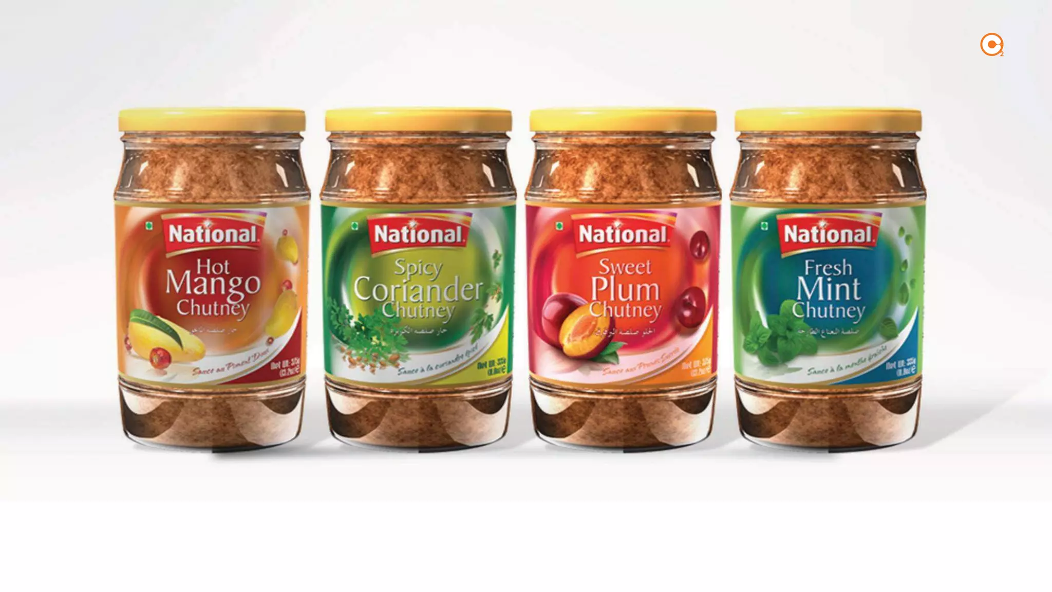
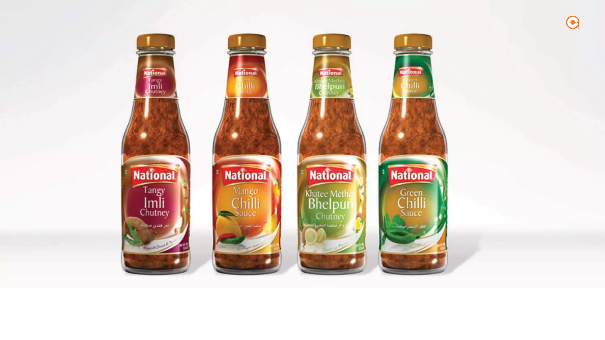
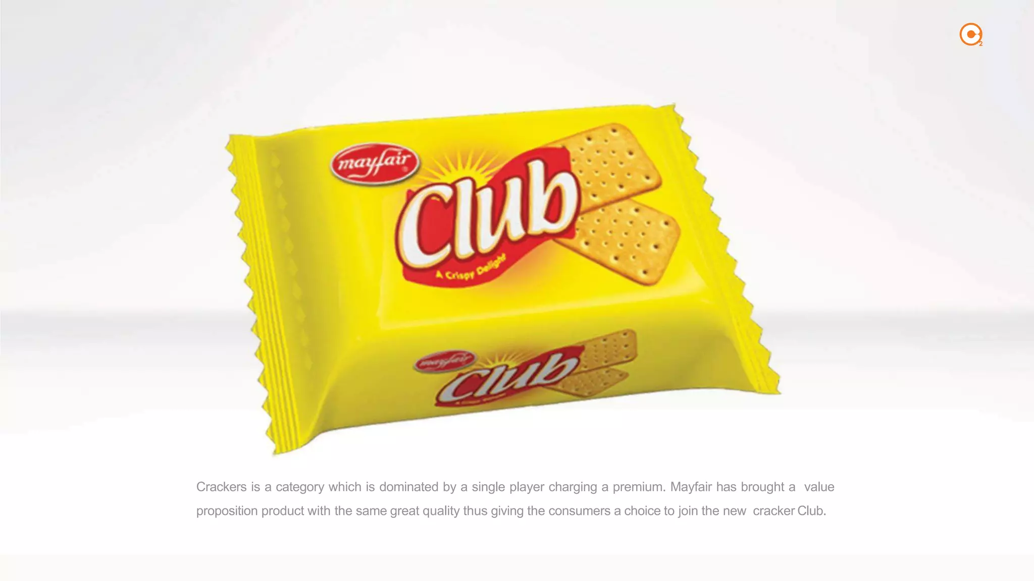
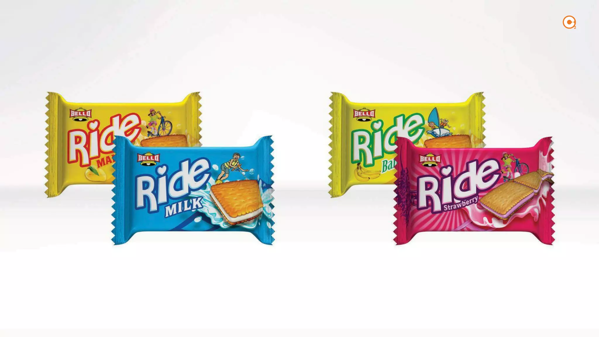
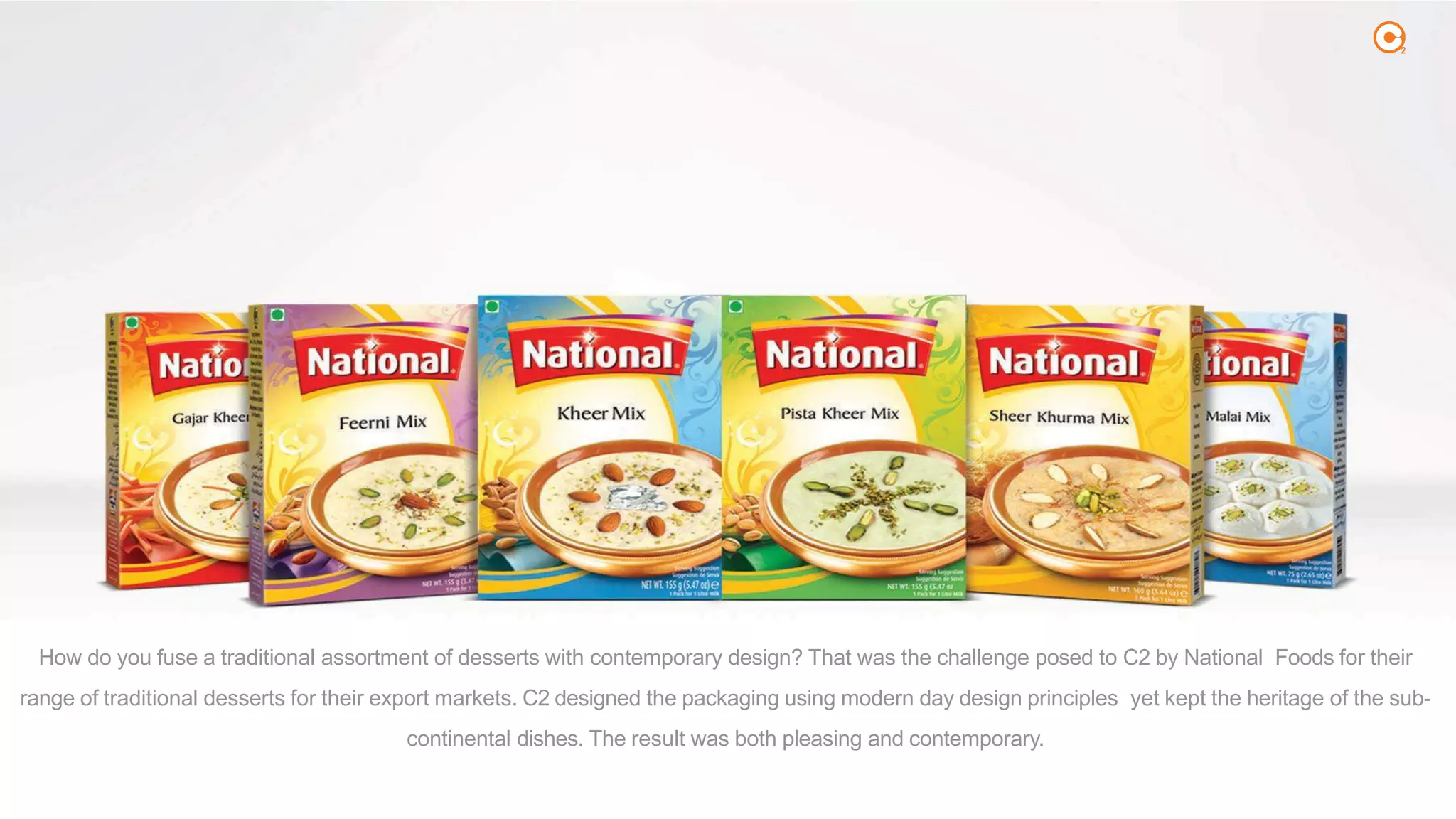
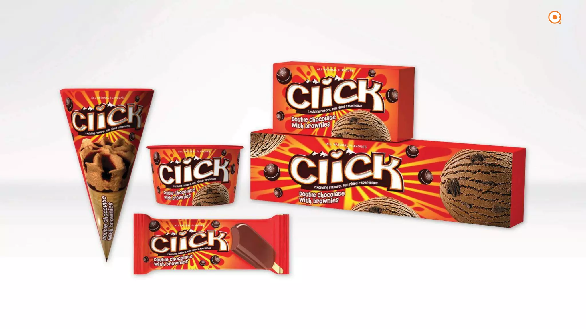
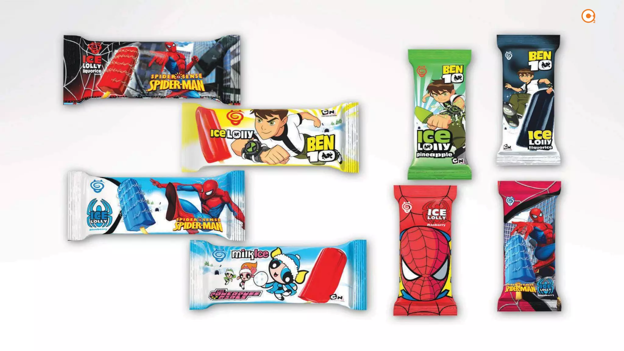
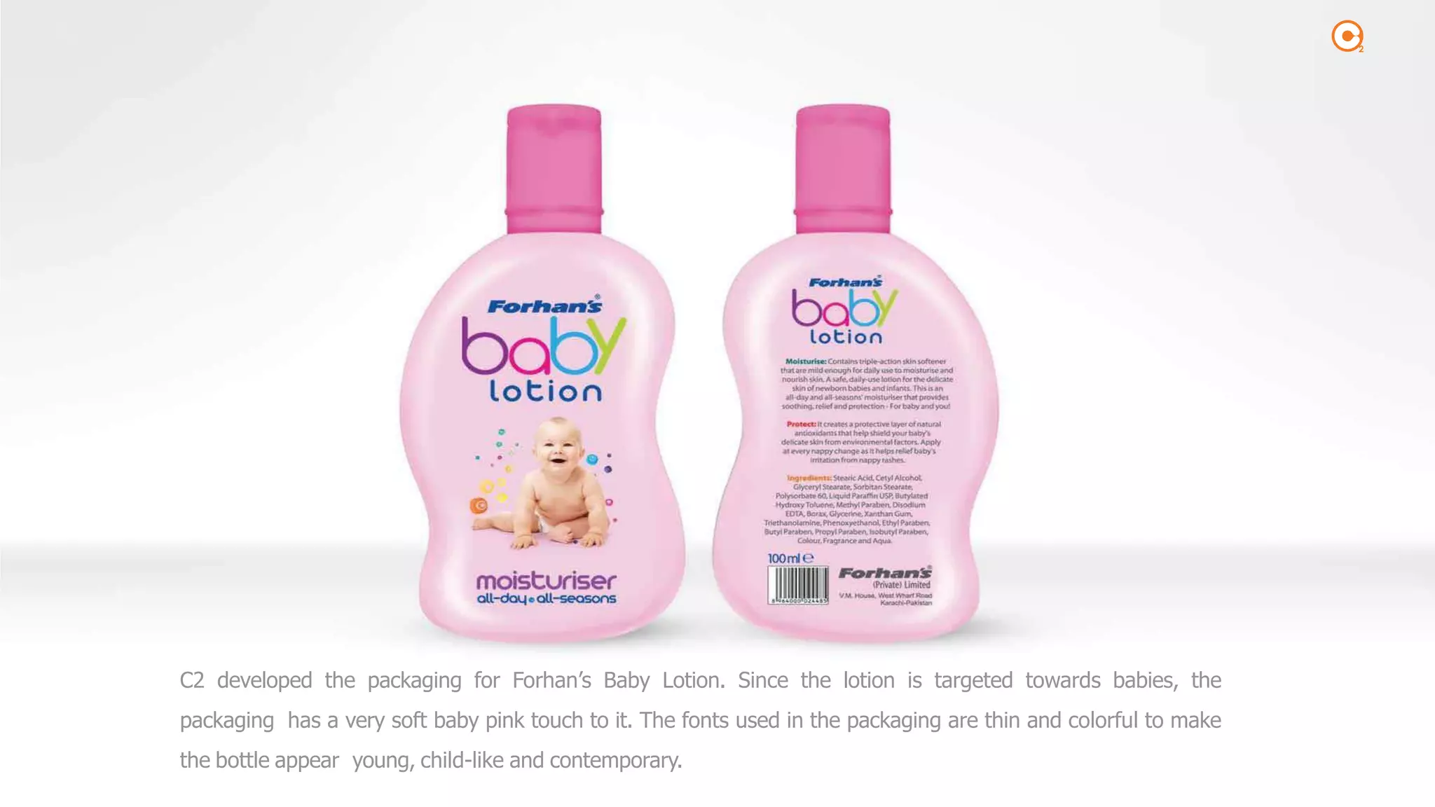
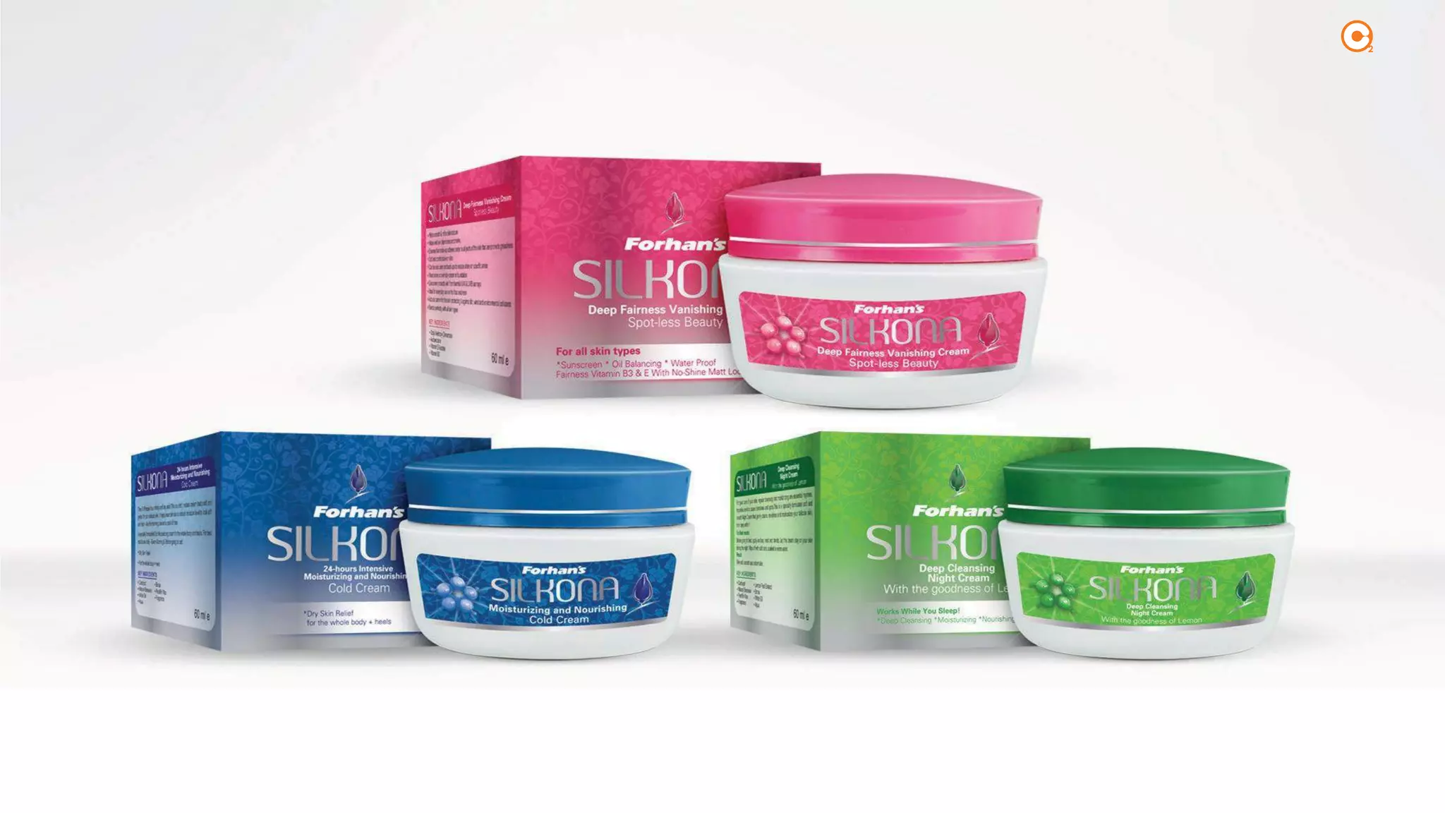
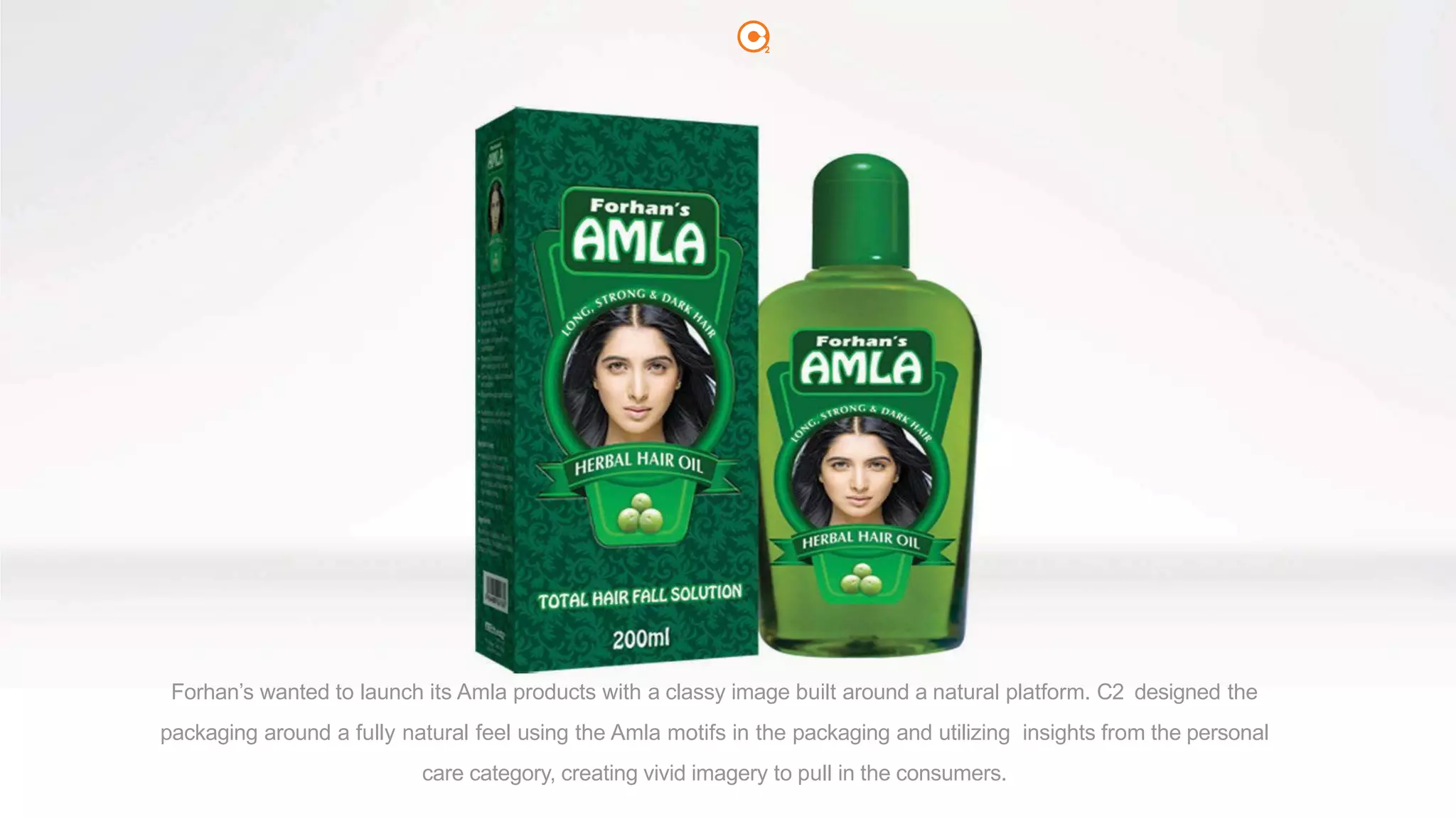
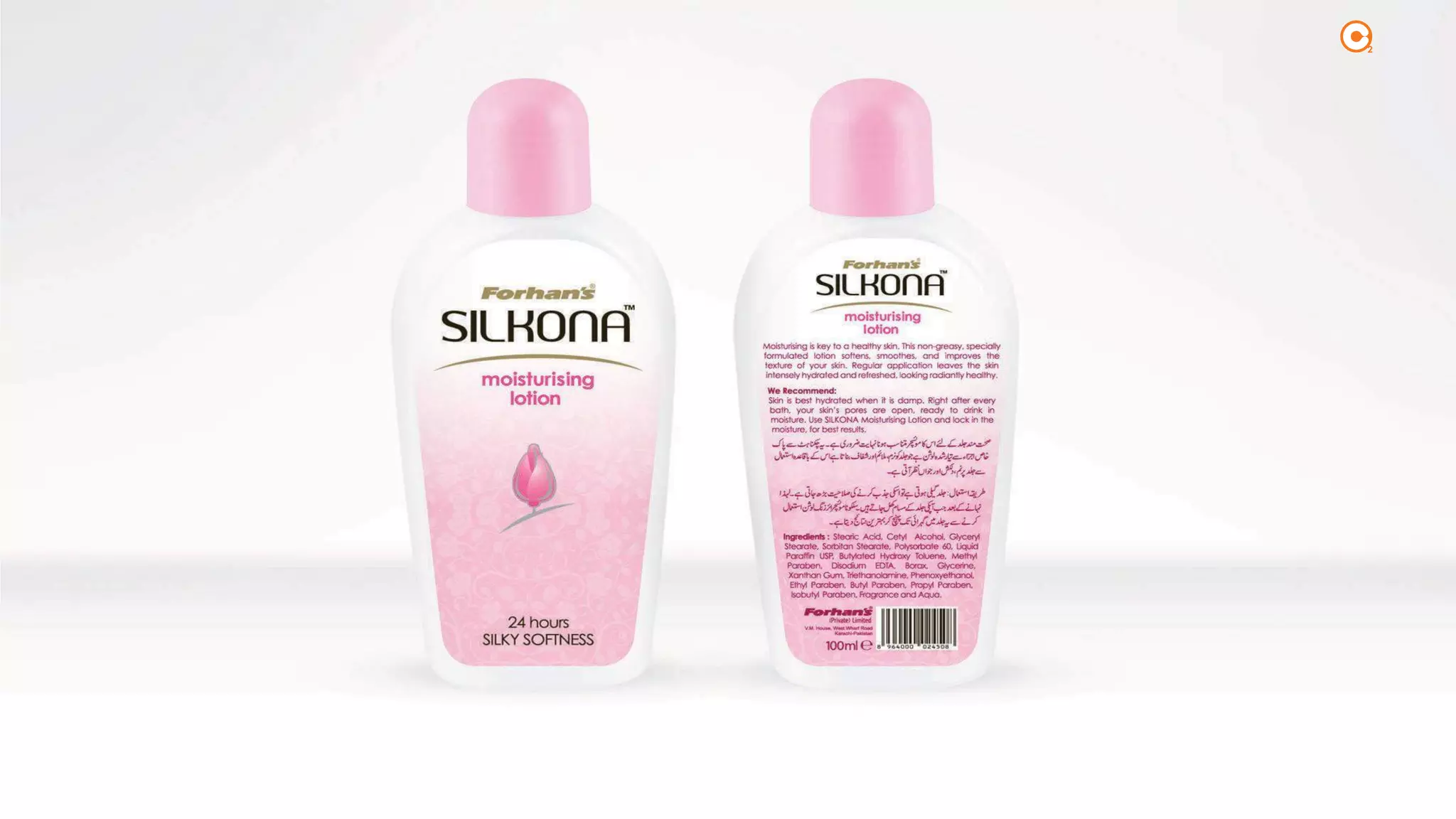
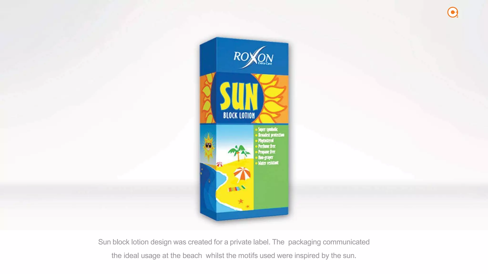
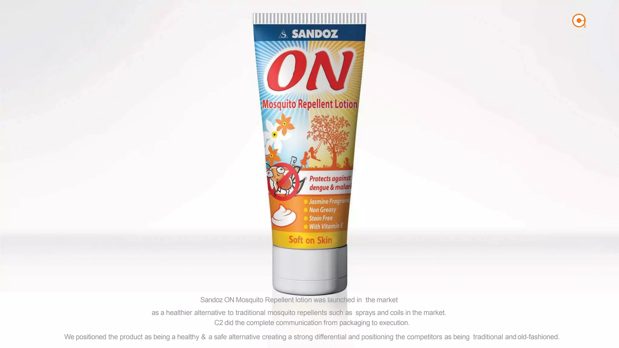
KEMBAR78
CREATIVE COM | PDF
FRUIT BASKET
2
2
ICI DULUX
PENTALITE CLASSIC
Best Creative Campaign – A ICI UK award for best
campaign of the year was given to our campaign.
TVC -OUTDOOR - PRINT -POS
creative
campaign was aired as is in India, Indonesia, Singa-
pore andMalaysia.
ACCUCHEK
PERFORMA
Best Integrated Campaign APAC. The
TVC -OUTDOOR -PRINT -POS TVC -OUTDOOR -PRINT -POS
SANDOZON
MOSQUITO REPELLENTLOTION
Sandoz On – Best Global Product Launch Award. The
product was launched in Bangladesh with same pack-
aging and campaign and is being used for all new
launches as well in other countries.
2
AWARD WINNINGCAMPAIGNS
2
2
packaging
food
2
Delight is a premium quality ice-cream and to communicate the sugar free
aspect of the ice-creams, the entire packaging was designed in white. The
brand identity and design, careful choosing of graphics and fonts appealed to
the health conscious market and at the same time made them believe that it’s
an indulgent product.
2
2
the modern day consumer is looking for healthy choices full of nutrition but do not want to sacrifice taste. the design was built around ā€˜health & nutrition’, depicting a
cereal full of goodness, in a really exciting format which highlighted the ingredients inside with a contemporary look & feel. the aim is to encourage consumers to
reconsider what they eat for breakfast, and remember why cereals are such a great healthy and tasty choice. the packaging also featured a 14-day challenge on the
reverse, where customers could get more information on how we help to maintain a slim figure and where they dropped a jean size is taken as an inspiration.
2
2
Ronaq needed an international image for its new Ronaq Readyto Eat meals. By meshing traditional touches
with contemporary design layouts, we managed to bring out both authenticity & modernity in the communi-
cation.
2
National Foods for the first time came in a top-down bottle for ketchup. Based on the insight that mothers
don’t give glass bottles to kids, the biggest consumers of ketchup, we suggested ā€˜Squeezy’ to take the
ownership of the segment. For the first time ketchup was positioned as a fun product for kids and tweens.
2
At launch the biscuit was positioned as a tea-time biscuit which enriches moments. This has created a differential in
the market & on the shelves. The packaging reflected this positioning as well.
2
To take the ownership of energy segment biscuits, Mayfair launched Energi Biscuits in the segments
with the design based on ā€˜real energy’.
2
2
Tiger Bubble incorporates the tiger’s stripes in the packaging to build upon the message
ā€œTiger Bubble Khao, Tiger Ban Jaoā€.
2
The packaging communicates the fruits & rich cream through the thematic packaging design
against a ā€˜heart’ promising ā€˜loving moments’.ļæ½
2
Mayfair’s Chocday packaging reflects the indulgence and the premium quality of the biscuit with the variants clearly
identifiable through their colours and ingredients.
2
Maggi required a
new image for its packaging based on fun & tasty positioning, while clearly differentiating between the flavours. We
suggested the use of a character ā€œNoodiā€ļæ½and fun elements that would be utilized in all future communication.
2
The fun and tasty aspect of the snacks was incorporated through lively colors and the trail of the chips promising endless temptations.
2
Packaging for Europe’s markets. The aroma of the product as an enticing element was
incorporated along with the image of the product to induce a rich, heavenly eating experience.
2
As a part of its strategy Mayfair has relaunched all the fruits candies under the umbrella brand of Frooto to
create a strong differential of the brand through taking ownership of real fruit candies.ļæ½
2
Tealand, a private label manufacturer, wanted a premium image for its blend of tea. We suggested ā€˜Clasico’ and
the premium image was shown in the colors and the richness of the leaf and the product.
2
Packaging for a private label in Europe. Fresh day was suggested due to the full-cream present in the milk and
to associate as an essential part of starting your day fresh and healthy.
2
The packaging of Splash Bubble highlights the core message of the brand which is instant refreshment. The water in a splash form instantly
brings alive a feeling of coolness.
2
2
2
The experience of indulgence was shown through the swirl of butter and cream mixing into each other.
2
2
2
2
2
2
2
2
2
2
2
Mayfair recently launched Zeera Royale Biscuits at a premium price to the market. The brand communi- cates the royale offering of Unique
Zeera Biscuits through its shape, texture, thickness, bigness, roasted zeera and taste successfully differentiating it from the competitors.
2
Crackers is a category which is dominated by a single player charging a premium. Mayfair has brought a value
proposition product with the same great quality thus giving the consumers a choice to join the new cracker Club.
2
2
We wanted to take ownership of corn based snacks thus suggested ā€˜Poppy corn,
which not only suggested ā€˜Fun’ but also gave us an advantage
over the category. Using a character, we brought out adventure
& excitement of the product.
Loopy was suggested due to the product’s nature of ā€˜Ring Corn Snacks’. Loopy was about
ā€˜Fun’ and using a charac- ter, we brought out adventure & excitement of the product.
2
2
2
2
2
2
How do you fuse a traditional assortment of desserts with contemporary design? That was the challenge posed to C2 by National Foods for their
range of traditional desserts for their export markets. C2 designed the packaging using modern day design principles yet kept the heritage of the sub-
continental dishes. The result was both pleasing and contemporary.
2
2
2
packaging
personal care
2
C2 developed the packaging for Forhan’s Baby Lotion. Since the lotion is targeted towards babies, the
packaging has a very soft baby pink touch to it. The fonts used in the packaging are thin and colorful to make
the bottle appear young, child-like and contemporary.
2
2
the client wanted to enter the skin care market and was looking for a way to depict their product as an advanced whitening cream. c2
suggested the name silkona and used rose petals in the design to communicate the silky, smooth and soft feeling the cream gives after
usage. we also communicated the fragrance aspect in the communication which leaves an everlasting impact on the consumer.
2
Forhan’s wanted to enter the personal care category. C2 suggested ā€˜Silkona’ as an umbrella brand for such products
and the first launch ā€˜Honey Lotion’ was built on the softness and the natural ingredients of the product.
2
Forhan’s wanted to launch its Amla products with a classy image built around a natural platform. C2 designed the
packaging around a fully natural feel using the Amla motifs in the packaging and utilizing insights from the personal
care category, creating vivid imagery to pull in the consumers.
2
2
2
Sun block lotion design was created for a private label. The packaging communicated
the ideal usage at the beach whilst the motifs used were inspired by the sun.
2
2
2
packaging
health & csr
2
Sandoz ON Mosquito Repellent lotion was launched in the market
as a healthier alternative to traditional mosquito repellents such as sprays and coils in the market.
C2 did the complete communication from packaging to execution.
We positioned the product as being a healthy & a safe alternative creating a strong differential and positioning the competitors as being traditional andold-fashioned.
2
2
brochures
2
2
2
2
2
2
2
2
2
2
2
calendars
2
2
2
2
2
2
CREATIVE COM

CREATIVE COM

  • 6.
  • 7.
    2 ICI DULUX PENTALITE CLASSIC BestCreative Campaign – A ICI UK award for best campaign of the year was given to our campaign. TVC -OUTDOOR - PRINT -POS creative campaign was aired as is in India, Indonesia, Singa- pore andMalaysia. ACCUCHEK PERFORMA Best Integrated Campaign APAC. The TVC -OUTDOOR -PRINT -POS TVC -OUTDOOR -PRINT -POS SANDOZON MOSQUITO REPELLENTLOTION Sandoz On – Best Global Product Launch Award. The product was launched in Bangladesh with same pack- aging and campaign and is being used for all new launches as well in other countries. 2 AWARD WINNINGCAMPAIGNS
  • 8.
  • 16.
  • 17.
    2 Delight is apremium quality ice-cream and to communicate the sugar free aspect of the ice-creams, the entire packaging was designed in white. The brand identity and design, careful choosing of graphics and fonts appealed to the health conscious market and at the same time made them believe that it’s an indulgent product.
  • 18.
  • 19.
    2 the modern dayconsumer is looking for healthy choices full of nutrition but do not want to sacrifice taste. the design was built around ā€˜health & nutrition’, depicting a cereal full of goodness, in a really exciting format which highlighted the ingredients inside with a contemporary look & feel. the aim is to encourage consumers to reconsider what they eat for breakfast, and remember why cereals are such a great healthy and tasty choice. the packaging also featured a 14-day challenge on the reverse, where customers could get more information on how we help to maintain a slim figure and where they dropped a jean size is taken as an inspiration.
  • 20.
  • 21.
    2 Ronaq needed aninternational image for its new Ronaq Readyto Eat meals. By meshing traditional touches with contemporary design layouts, we managed to bring out both authenticity & modernity in the communi- cation.
  • 22.
    2 National Foods forthe first time came in a top-down bottle for ketchup. Based on the insight that mothers don’t give glass bottles to kids, the biggest consumers of ketchup, we suggested ā€˜Squeezy’ to take the ownership of the segment. For the first time ketchup was positioned as a fun product for kids and tweens.
  • 23.
    2 At launch thebiscuit was positioned as a tea-time biscuit which enriches moments. This has created a differential in the market & on the shelves. The packaging reflected this positioning as well.
  • 24.
    2 To take theownership of energy segment biscuits, Mayfair launched Energi Biscuits in the segments with the design based on ā€˜real energy’.
  • 25.
  • 29.
    2 Tiger Bubble incorporatesthe tiger’s stripes in the packaging to build upon the message ā€œTiger Bubble Khao, Tiger Ban Jaoā€.
  • 30.
    2 The packaging communicatesthe fruits & rich cream through the thematic packaging design against a ā€˜heart’ promising ā€˜loving moments’.ļæ½
  • 31.
    2 Mayfair’s Chocday packagingreflects the indulgence and the premium quality of the biscuit with the variants clearly identifiable through their colours and ingredients.
  • 32.
    2 Maggi required a newimage for its packaging based on fun & tasty positioning, while clearly differentiating between the flavours. We suggested the use of a character ā€œNoodiā€ļæ½and fun elements that would be utilized in all future communication.
  • 33.
    2 The fun andtasty aspect of the snacks was incorporated through lively colors and the trail of the chips promising endless temptations.
  • 34.
    2 Packaging for Europe’smarkets. The aroma of the product as an enticing element was incorporated along with the image of the product to induce a rich, heavenly eating experience.
  • 35.
    2 As a partof its strategy Mayfair has relaunched all the fruits candies under the umbrella brand of Frooto to create a strong differential of the brand through taking ownership of real fruit candies.ļæ½
  • 36.
    2 Tealand, a privatelabel manufacturer, wanted a premium image for its blend of tea. We suggested ā€˜Clasico’ and the premium image was shown in the colors and the richness of the leaf and the product.
  • 37.
    2 Packaging for aprivate label in Europe. Fresh day was suggested due to the full-cream present in the milk and to associate as an essential part of starting your day fresh and healthy.
  • 38.
    2 The packaging ofSplash Bubble highlights the core message of the brand which is instant refreshment. The water in a splash form instantly brings alive a feeling of coolness.
  • 39.
  • 40.
  • 41.
    2 The experience ofindulgence was shown through the swirl of butter and cream mixing into each other.
  • 42.
  • 43.
  • 44.
  • 45.
  • 46.
  • 47.
  • 48.
  • 49.
  • 50.
  • 51.
  • 52.
    2 Mayfair recently launchedZeera Royale Biscuits at a premium price to the market. The brand communi- cates the royale offering of Unique Zeera Biscuits through its shape, texture, thickness, bigness, roasted zeera and taste successfully differentiating it from the competitors.
  • 53.
    2 Crackers is acategory which is dominated by a single player charging a premium. Mayfair has brought a value proposition product with the same great quality thus giving the consumers a choice to join the new cracker Club.
  • 54.
  • 55.
    2 We wanted totake ownership of corn based snacks thus suggested ā€˜Poppy corn, which not only suggested ā€˜Fun’ but also gave us an advantage over the category. Using a character, we brought out adventure & excitement of the product. Loopy was suggested due to the product’s nature of ā€˜Ring Corn Snacks’. Loopy was about ā€˜Fun’ and using a charac- ter, we brought out adventure & excitement of the product.
  • 56.
  • 57.
  • 58.
  • 59.
  • 60.
  • 61.
    2 How do youfuse a traditional assortment of desserts with contemporary design? That was the challenge posed to C2 by National Foods for their range of traditional desserts for their export markets. C2 designed the packaging using modern day design principles yet kept the heritage of the sub- continental dishes. The result was both pleasing and contemporary.
  • 62.
  • 63.
  • 64.
  • 65.
    2 C2 developed thepackaging for Forhan’s Baby Lotion. Since the lotion is targeted towards babies, the packaging has a very soft baby pink touch to it. The fonts used in the packaging are thin and colorful to make the bottle appear young, child-like and contemporary.
  • 66.
  • 67.
    2 the client wantedto enter the skin care market and was looking for a way to depict their product as an advanced whitening cream. c2 suggested the name silkona and used rose petals in the design to communicate the silky, smooth and soft feeling the cream gives after usage. we also communicated the fragrance aspect in the communication which leaves an everlasting impact on the consumer.
  • 68.
    2 Forhan’s wanted toenter the personal care category. C2 suggested ā€˜Silkona’ as an umbrella brand for such products and the first launch ā€˜Honey Lotion’ was built on the softness and the natural ingredients of the product.
  • 69.
    2 Forhan’s wanted tolaunch its Amla products with a classy image built around a natural platform. C2 designed the packaging around a fully natural feel using the Amla motifs in the packaging and utilizing insights from the personal care category, creating vivid imagery to pull in the consumers.
  • 70.
  • 71.
  • 72.
    2 Sun block lotiondesign was created for a private label. The packaging communicated the ideal usage at the beach whilst the motifs used were inspired by the sun.
  • 73.
  • 74.
  • 75.
  • 76.
    2 Sandoz ON MosquitoRepellent lotion was launched in the market as a healthier alternative to traditional mosquito repellents such as sprays and coils in the market. C2 did the complete communication from packaging to execution. We positioned the product as being a healthy & a safe alternative creating a strong differential and positioning the competitors as being traditional andold-fashioned.
  • 77.
  • 78.
  • 79.
  • 80.
  • 81.
  • 82.
  • 83.
  • 84.
  • 85.
  • 86.
  • 87.
  • 88.
  • 89.
  • 90.
  • 91.
  • 92.
  • 93.
  • 94.
  • 95.