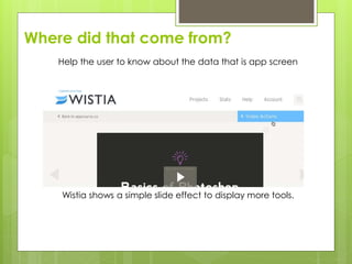
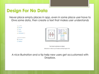
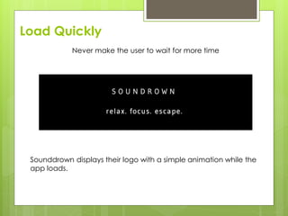
Downloaded 148 times


This document discusses principles for designing applications with web access capabilities. It provides examples of applications that access data from the internet like ebook readers. The document outlines common problems in web application design like choosing colors and content placement. It emphasizes that applications must satisfy user needs or they will switch to competitors. The rest of the document lists rules for good web application design, such as not reinventing patterns, grouping related elements, keeping the design simple, planning before developing, providing feedback, and testing the application.
Overview of web applications, their characteristics, and challenges in design.
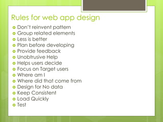
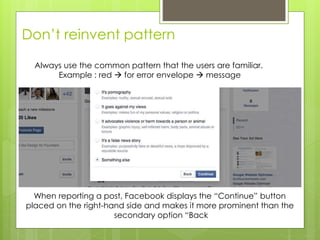
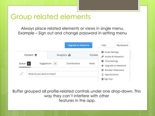
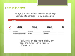
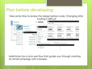
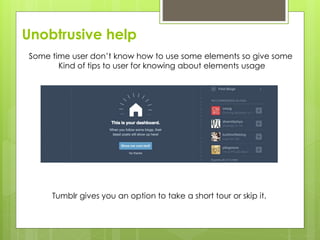
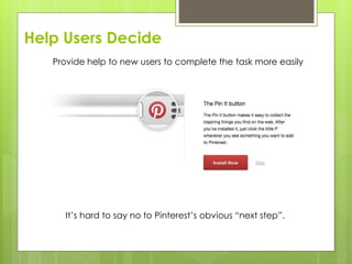
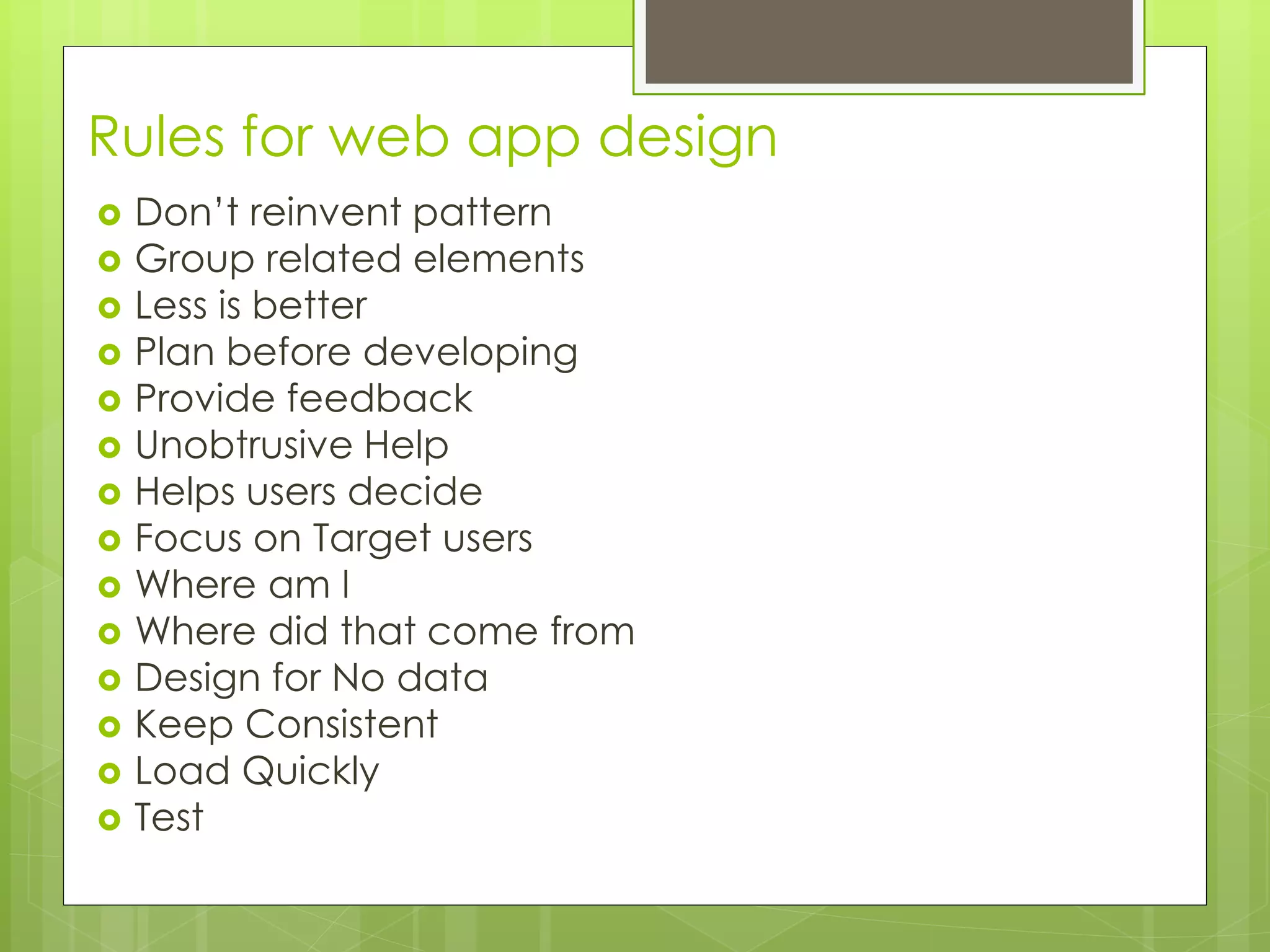
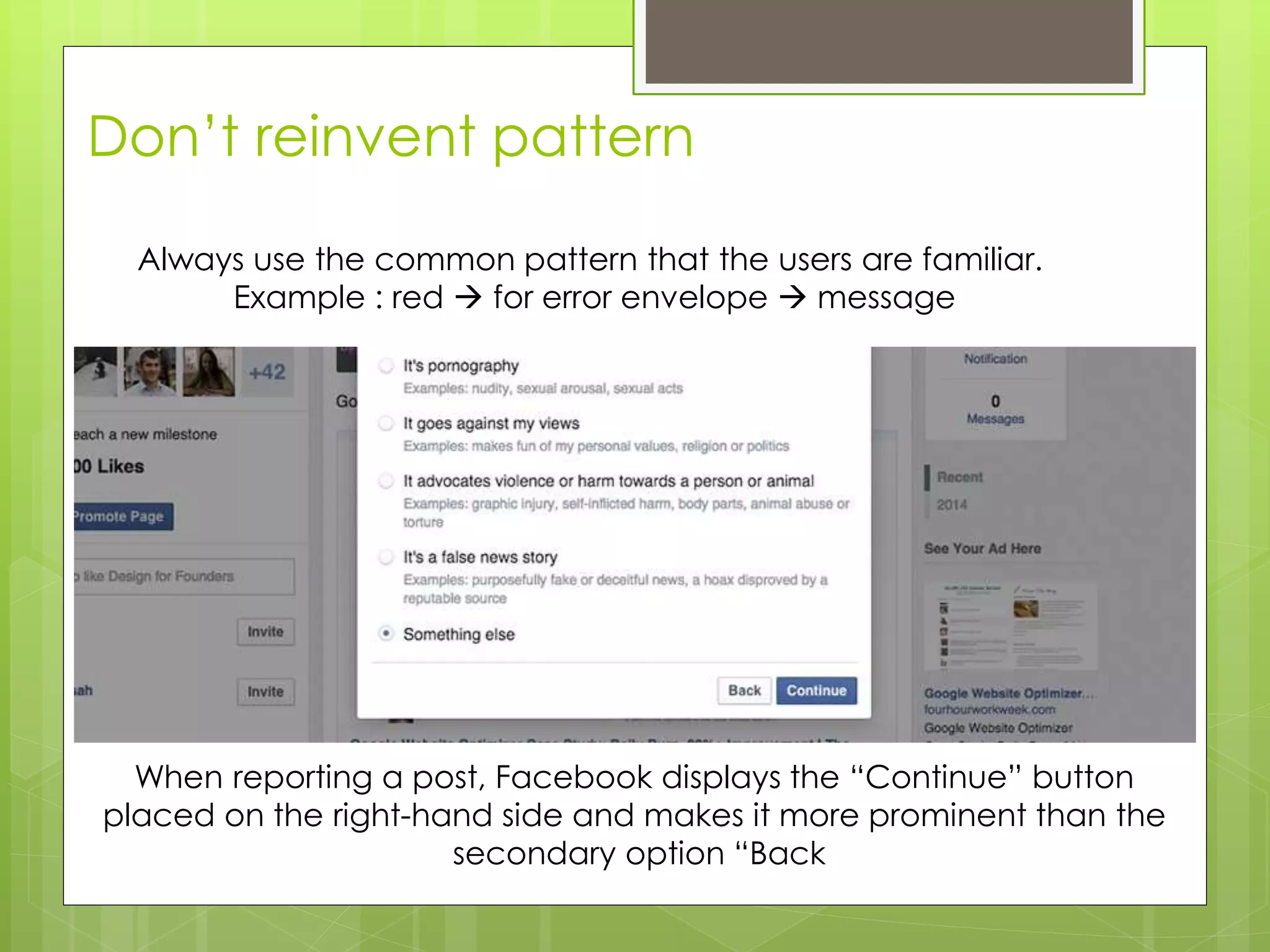
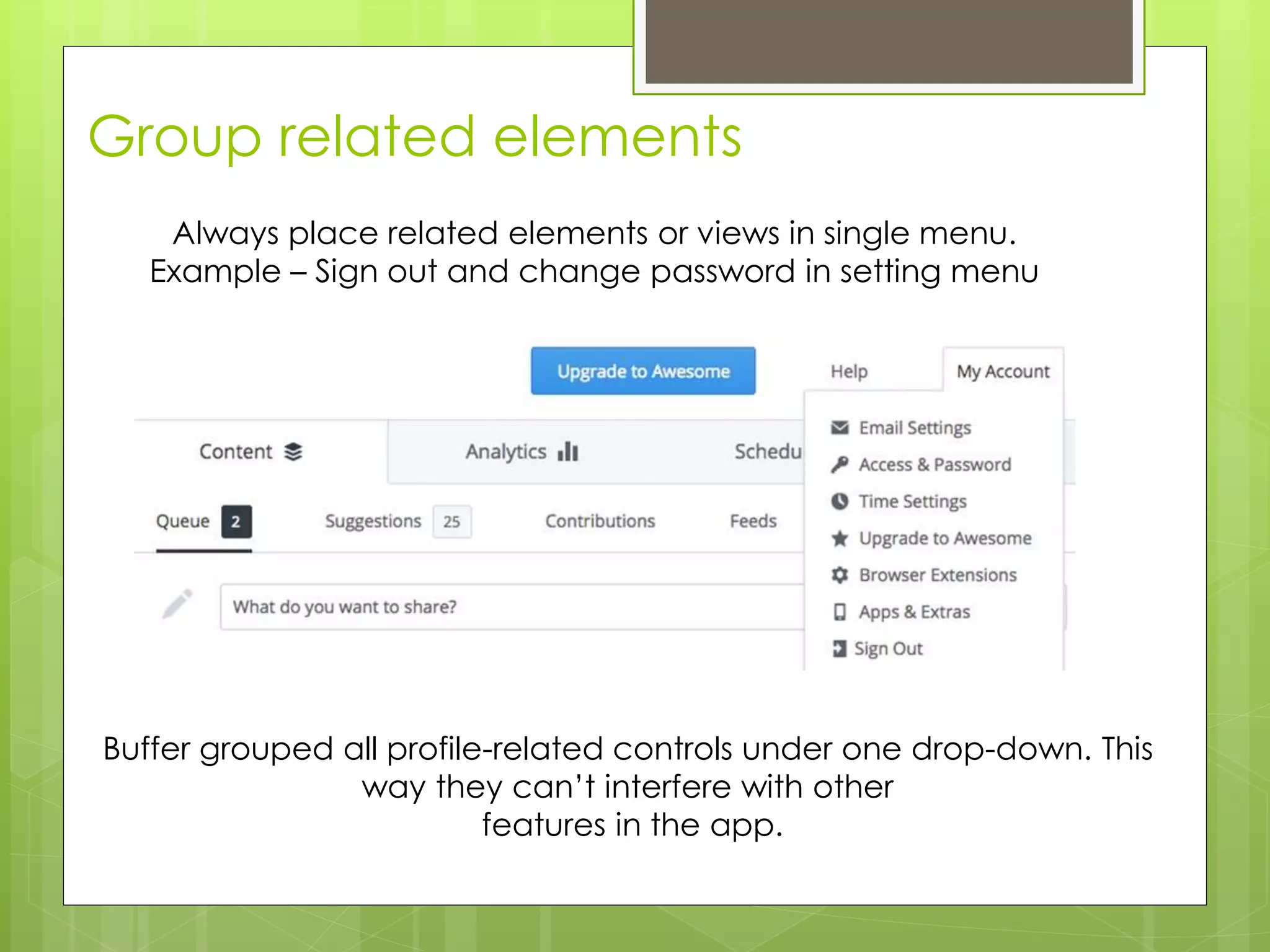
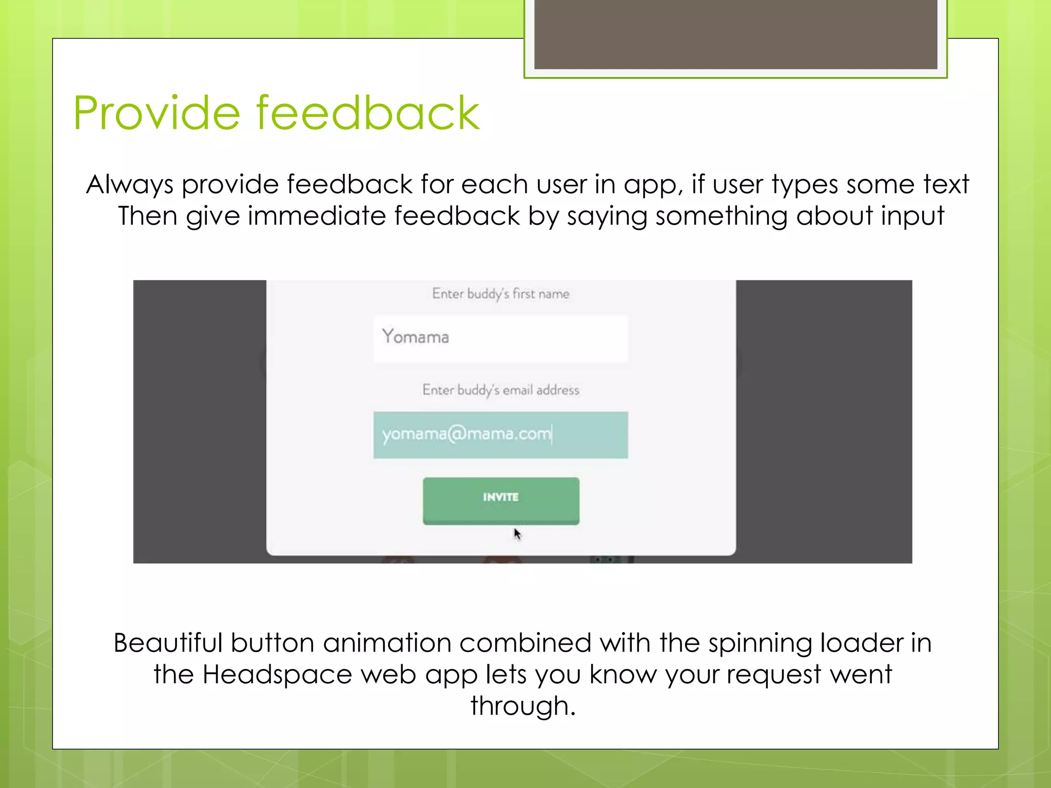
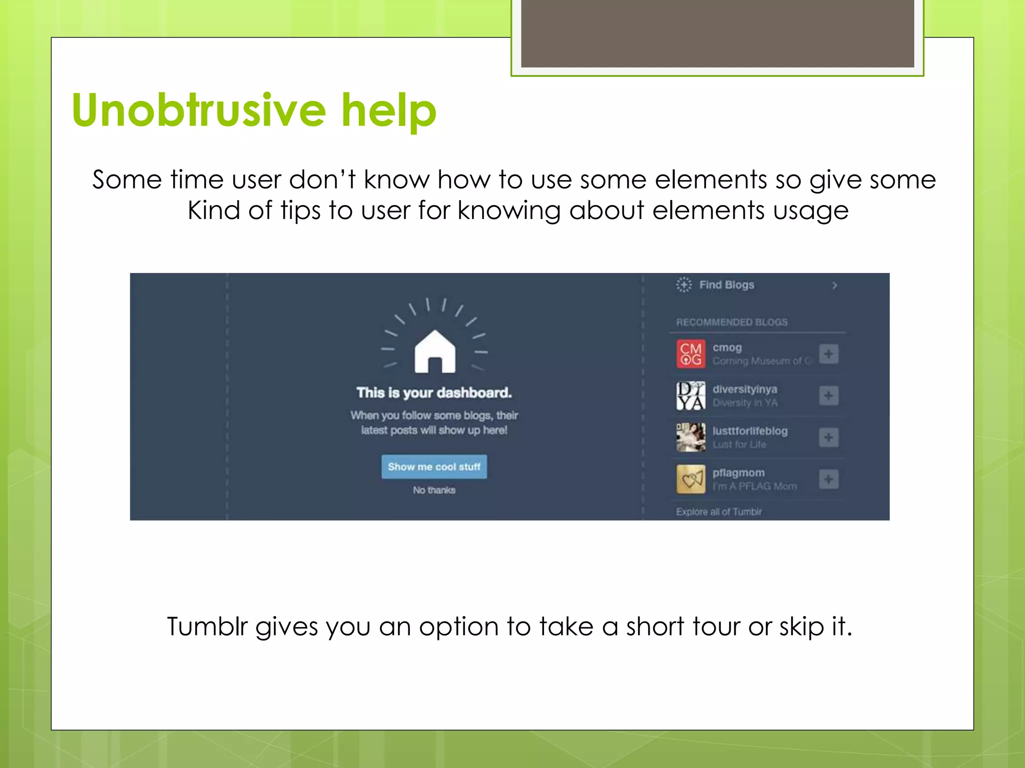
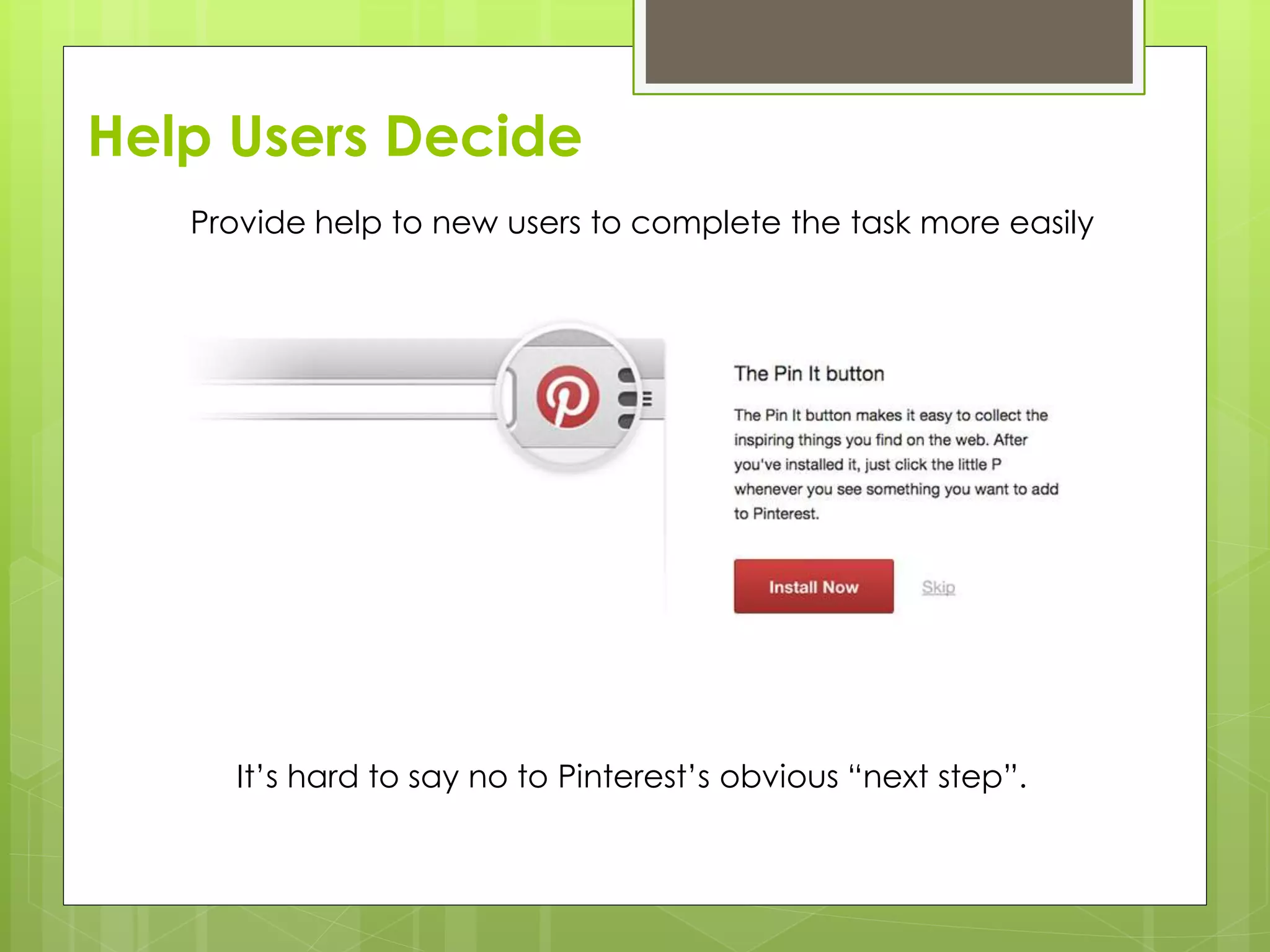
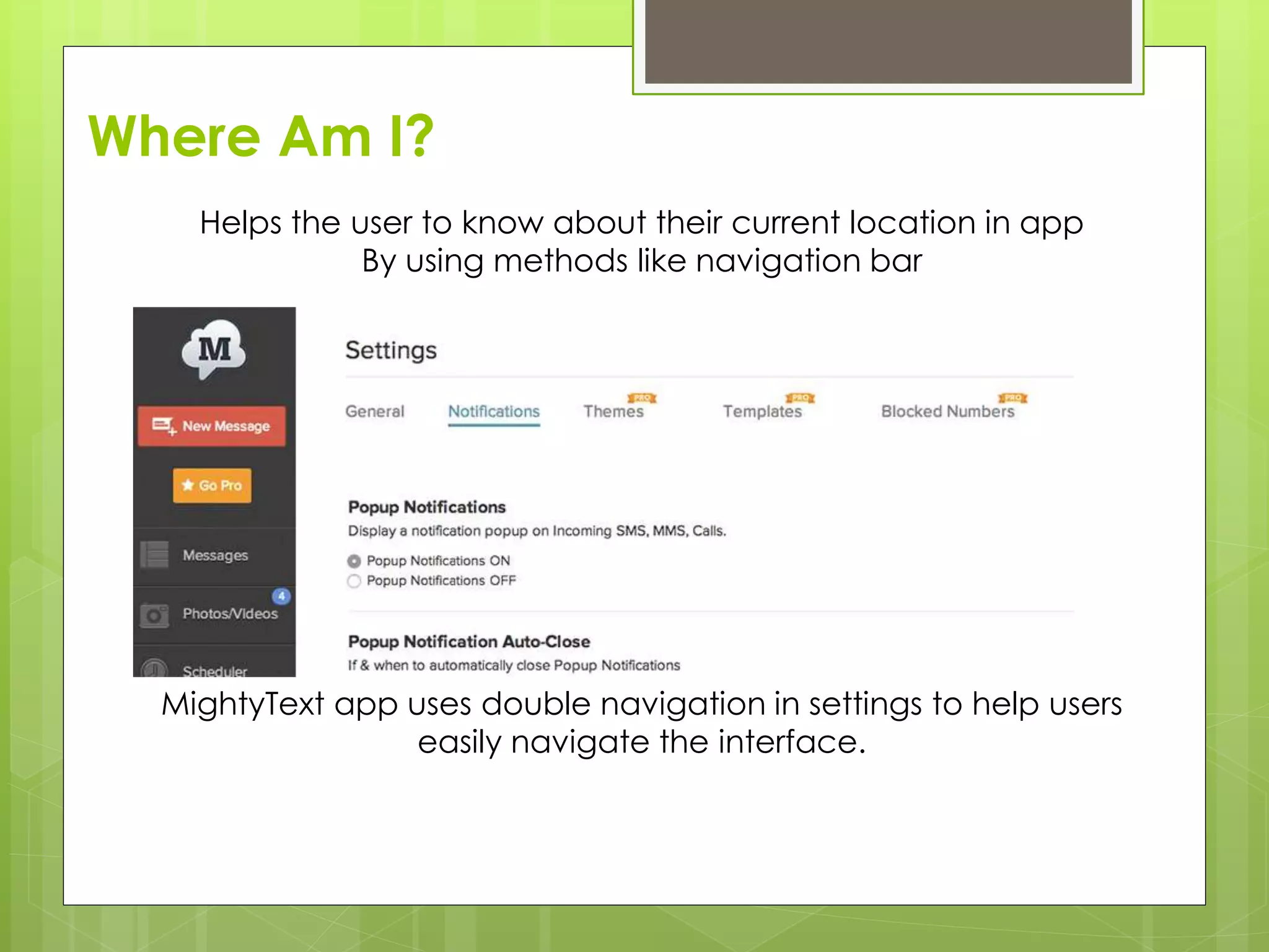
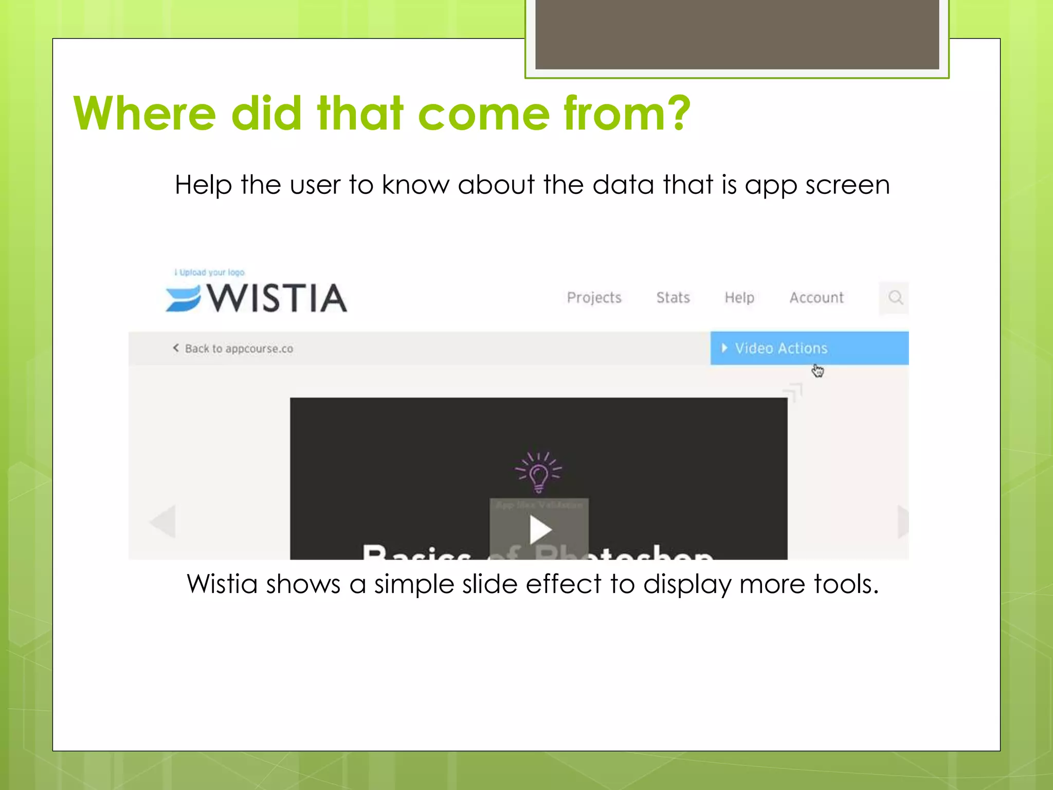
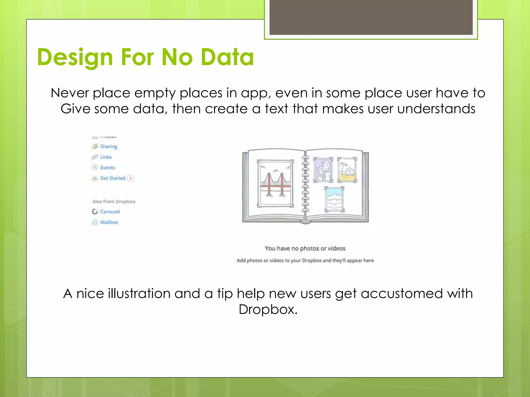
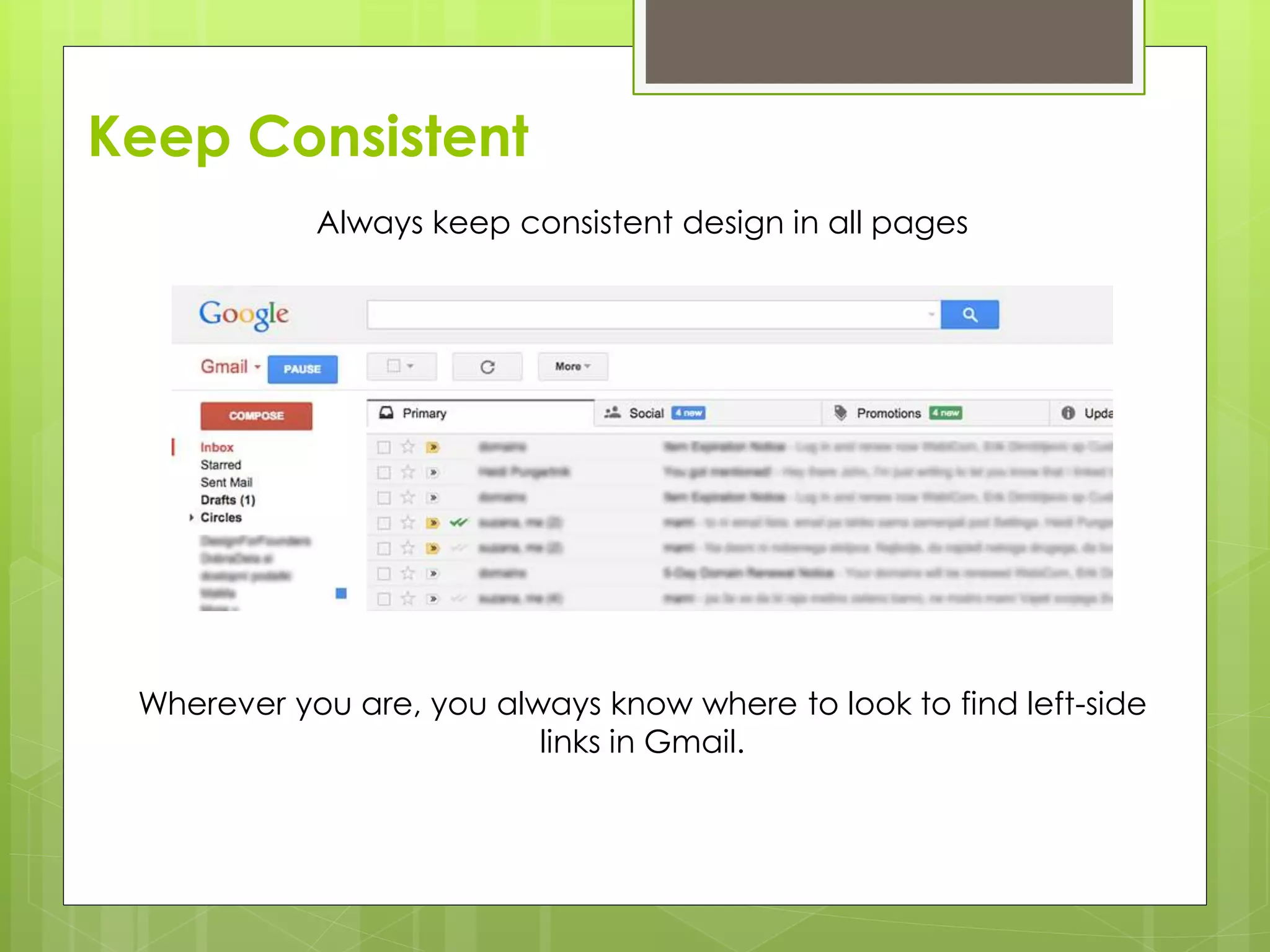
Essential rules for designing web applications including user patterns, grouping elements, simplicity, user feedback, and navigation.


![[2015/2016] User experience design of mobil apps](https://cdn.slidesharecdn.com/ss_thumbnails/02userexperience-160304170558-thumbnail.jpg?width=600ounds&width=560&fit=bounds)


![Installing application in ubuntu [autosaved]](https://cdn.slidesharecdn.com/ss_thumbnails/installingapplicationinubuntuautosaved-150904044920-lva1-app6892-thumbnail.jpg?width=600ounds&width=560&fit=bounds)


