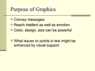
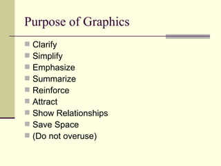
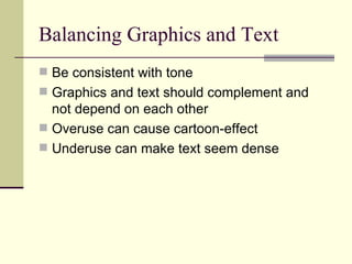
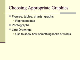
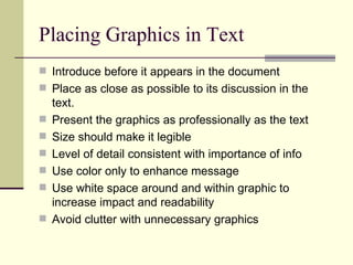
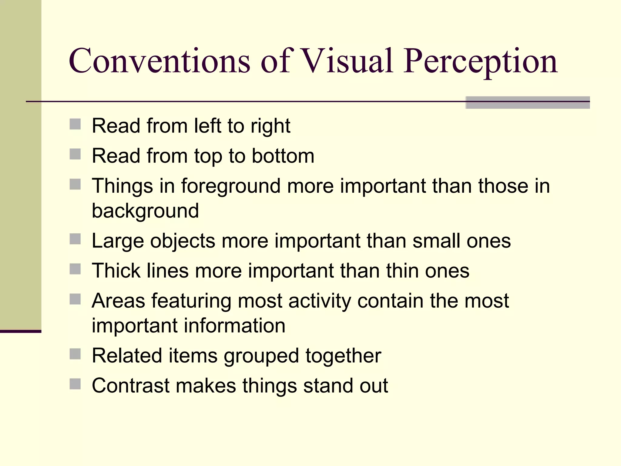
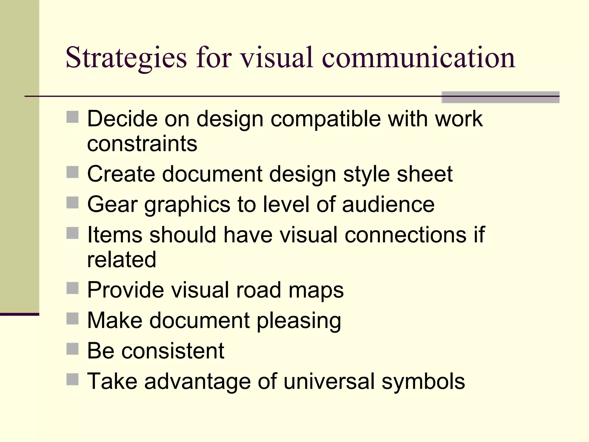
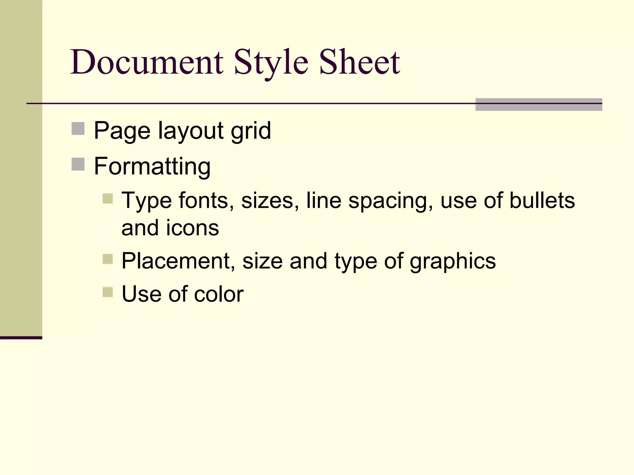
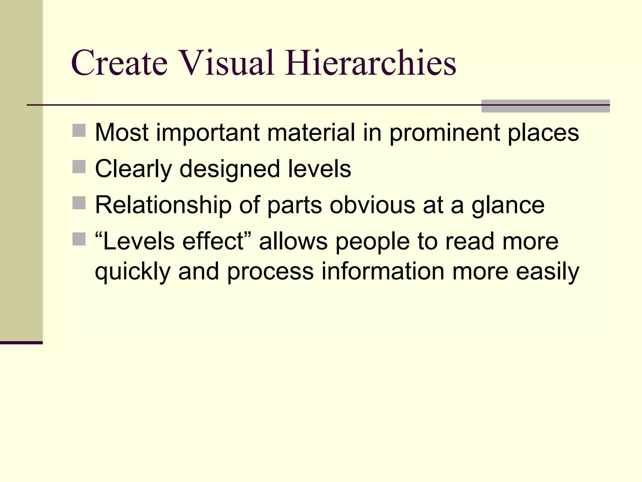
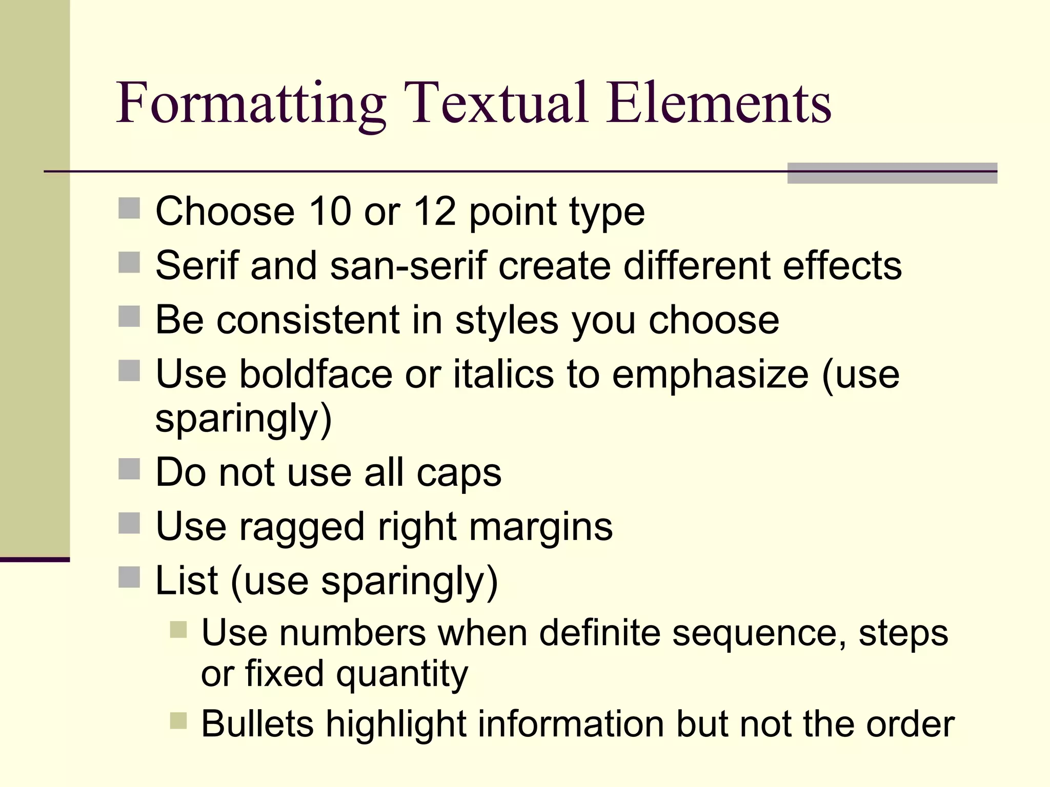
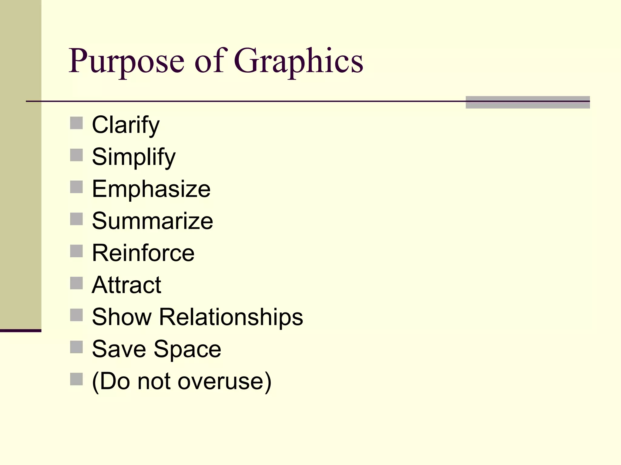
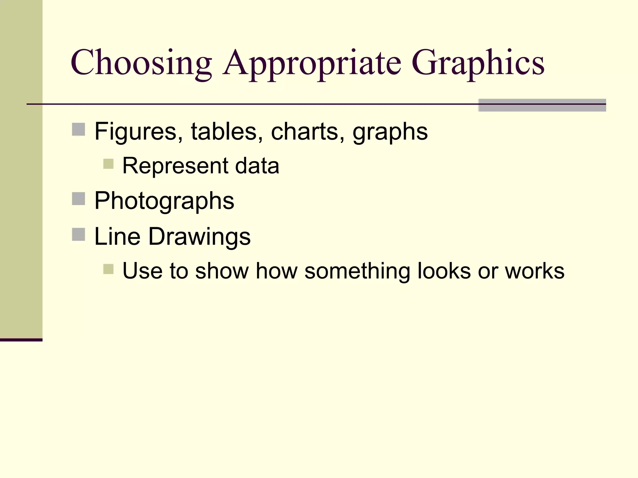
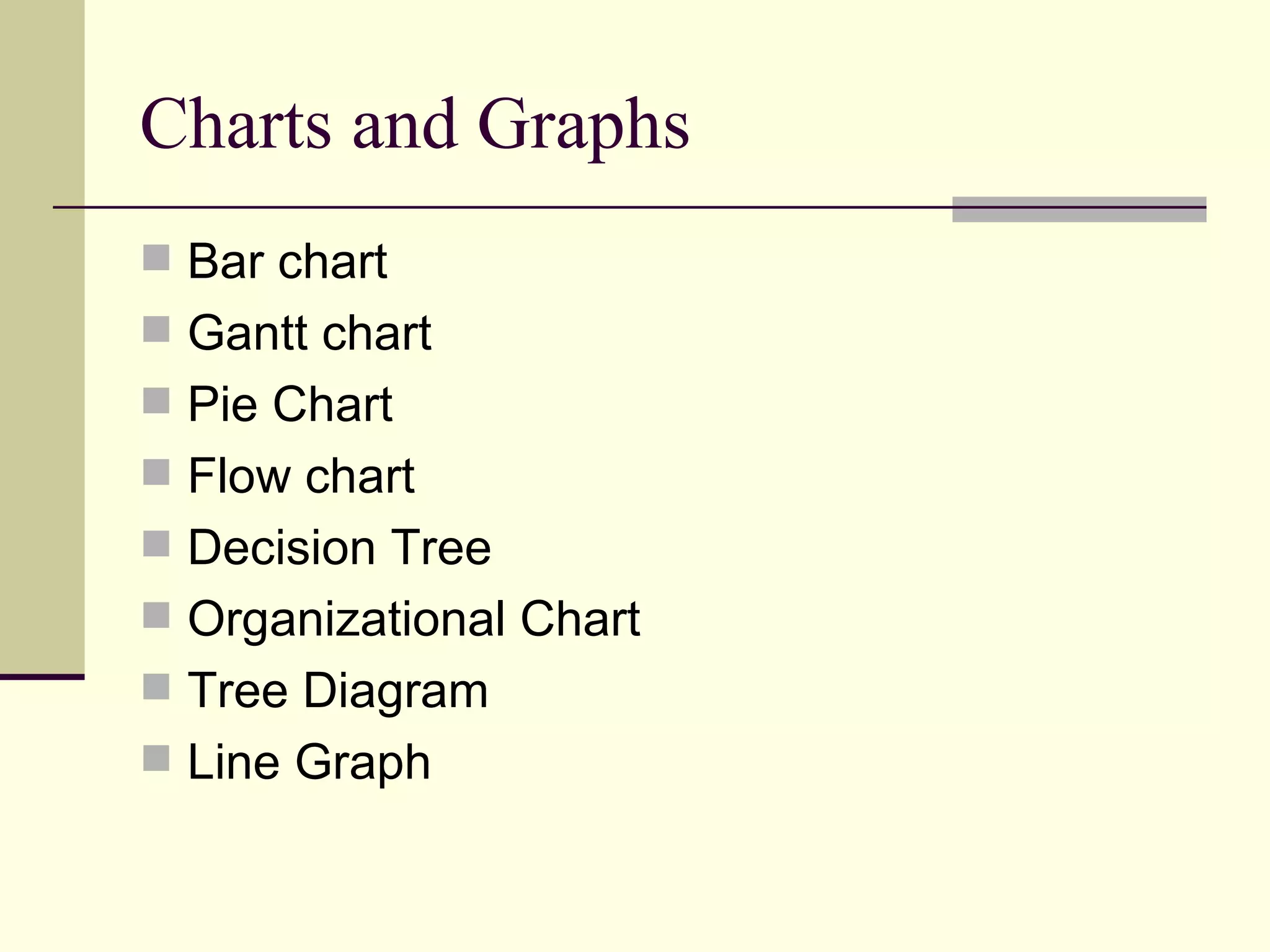
KEMBAR78
Designing The Document | PPT
Designing the Document Format and Graphics
Graphics Integral part of the text Augment and balance the text
Challenges of Technical Writing Documents contain highly complex information Single document intended for multiple audiences and for different purposes Must facilitate quick transfer of information
Visual Design Page design and illustrations Page design The way words appear on the page As much graphic design as illustrations Effective page design Guides reader’s eye to what is most important Cues as to the various paths through material
Graphic Illustrations Transmit information all at once Show relationship of all parts simultaneously
Conventions of Visual Perception Read from left to right Read from top to bottom Things in foreground more important than those in background Large objects more important than small ones Thick lines more important than thin ones Areas featuring most activity contain the most important information Related items grouped together Contrast makes things stand out
Strategies for visual communication Decide on design compatible with work constraints Create document design style sheet Gear graphics to level of audience Items should have visual connections if related Provide visual road maps Make document pleasing Be consistent Take advantage of universal symbols
Document Style Sheet Page layout grid Formatting Type fonts, sizes, line spacing, use of bullets and icons Placement, size and type of graphics Use of color
Create Visual Hierarchies Most important material in prominent places Clearly designed levels Relationship of parts obvious at a glance “Levels effect” allows people to read more quickly and process information more easily
Formatting Textual Elements Choose 10 or 12 point type Serif and san-serif create different effects Be consistent in styles you choose Use boldface or italics to emphasize (use sparingly) Do not use all caps Use ragged right margins List (use sparingly) Use numbers when definite sequence, steps or fixed quantity Bullets highlight information but not the order
Purpose of Graphics Convey messages Reach intellect as well as emotion Color, design, size can be powerful What issues or points in text might be enhanced by visual support
Purpose of Graphics Clarify Simplify Emphasize Summarize Reinforce Attract Show Relationships Save Space (Do not overuse)
Balancing Graphics and Text Be consistent with tone Graphics and text should complement and not depend on each other Overuse can cause cartoon-effect Underuse can make text seem dense
Choosing Appropriate Graphics Figures, tables, charts, graphs Represent data Photographs Line Drawings Use to show how something looks or works
Charts and Graphs Bar chart Gantt chart Pie Chart Flow chart Decision Tree Organizational Chart Tree Diagram Line Graph
Tables Information table Decision table Ethics
Placing Graphics in Text Introduce before it appears in the document Place as close as possible to its discussion in the text. Present the graphics as professionally as the text Size should make it legible Level of detail consistent with importance of info Use color only to enhance message Use white space around and within graphic to increase impact and readability Avoid clutter with unnecessary graphics

Designing The Document

  • 1.
    Designing the DocumentFormat and Graphics
  • 2.
    Graphics Integral partof the text Augment and balance the text
  • 3.
    Challenges of TechnicalWriting Documents contain highly complex information Single document intended for multiple audiences and for different purposes Must facilitate quick transfer of information
  • 4.
    Visual Design Pagedesign and illustrations Page design The way words appear on the page As much graphic design as illustrations Effective page design Guides reader’s eye to what is most important Cues as to the various paths through material
  • 5.
    Graphic Illustrations Transmitinformation all at once Show relationship of all parts simultaneously
  • 6.
    Conventions of VisualPerception Read from left to right Read from top to bottom Things in foreground more important than those in background Large objects more important than small ones Thick lines more important than thin ones Areas featuring most activity contain the most important information Related items grouped together Contrast makes things stand out
  • 7.
    Strategies for visualcommunication Decide on design compatible with work constraints Create document design style sheet Gear graphics to level of audience Items should have visual connections if related Provide visual road maps Make document pleasing Be consistent Take advantage of universal symbols
  • 8.
    Document Style SheetPage layout grid Formatting Type fonts, sizes, line spacing, use of bullets and icons Placement, size and type of graphics Use of color
  • 9.
    Create Visual HierarchiesMost important material in prominent places Clearly designed levels Relationship of parts obvious at a glance “Levels effect” allows people to read more quickly and process information more easily
  • 10.
    Formatting Textual ElementsChoose 10 or 12 point type Serif and san-serif create different effects Be consistent in styles you choose Use boldface or italics to emphasize (use sparingly) Do not use all caps Use ragged right margins List (use sparingly) Use numbers when definite sequence, steps or fixed quantity Bullets highlight information but not the order
  • 11.
    Purpose of GraphicsConvey messages Reach intellect as well as emotion Color, design, size can be powerful What issues or points in text might be enhanced by visual support
  • 12.
    Purpose of GraphicsClarify Simplify Emphasize Summarize Reinforce Attract Show Relationships Save Space (Do not overuse)
  • 13.
    Balancing Graphics andText Be consistent with tone Graphics and text should complement and not depend on each other Overuse can cause cartoon-effect Underuse can make text seem dense
  • 14.
    Choosing Appropriate GraphicsFigures, tables, charts, graphs Represent data Photographs Line Drawings Use to show how something looks or works
  • 15.
    Charts and GraphsBar chart Gantt chart Pie Chart Flow chart Decision Tree Organizational Chart Tree Diagram Line Graph
  • 16.
    Tables Information tableDecision table Ethics
  • 17.
    Placing Graphics inText Introduce before it appears in the document Place as close as possible to its discussion in the text. Present the graphics as professionally as the text Size should make it legible Level of detail consistent with importance of info Use color only to enhance message Use white space around and within graphic to increase impact and readability Avoid clutter with unnecessary graphics