Download to read offline


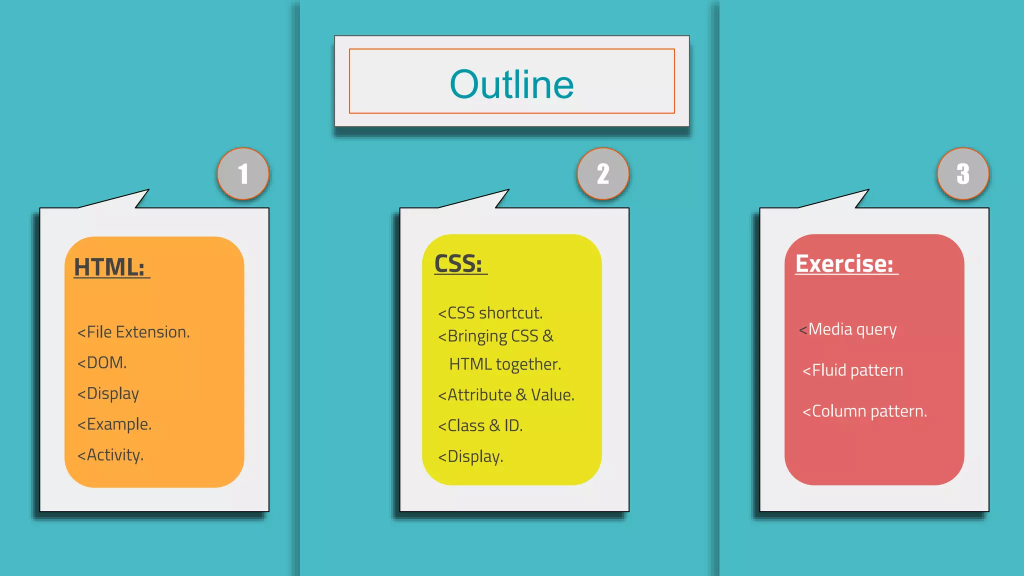


This document provides an outline and overview of HTML, CSS, and responsive web design topics. It includes sections on HTML tags and attributes, CSS properties like display and box model, and responsive design techniques like viewport, media queries, and common patterns like fluid layouts. The document contains examples and exercises for readers to practice these concepts.
Introduction of speaker Abdulrahman Abdullah including contact information.
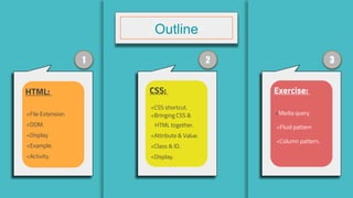
Overview topics covered such as HTML, CSS, and exercises on media queries and patterns.
Introduction to HTML, defined as Hypertext Markup Language.
Brief background on Sir Tim Berners-Lee, creator of the World Wide Web.
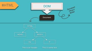
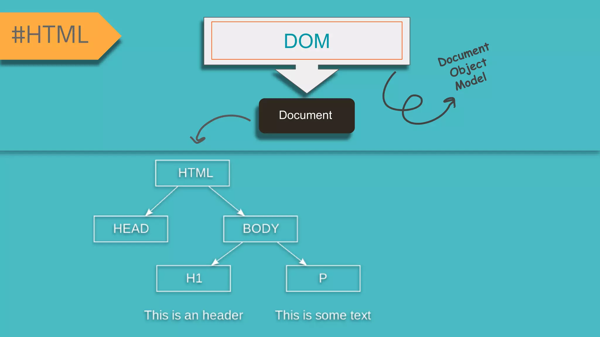
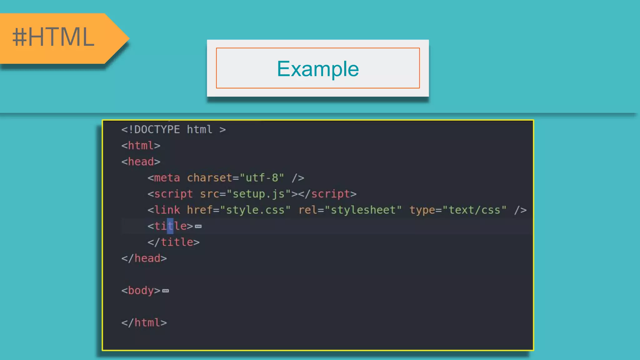
Explanation about the Document Object Model (DOM) in HTML.
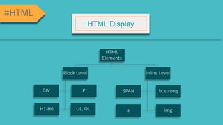
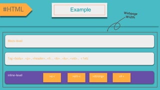
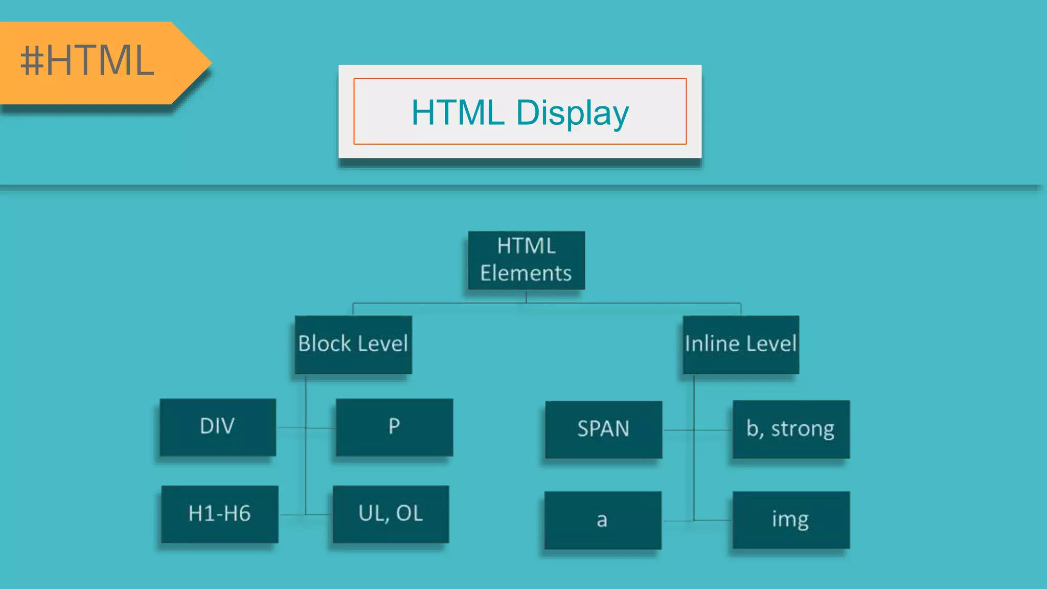
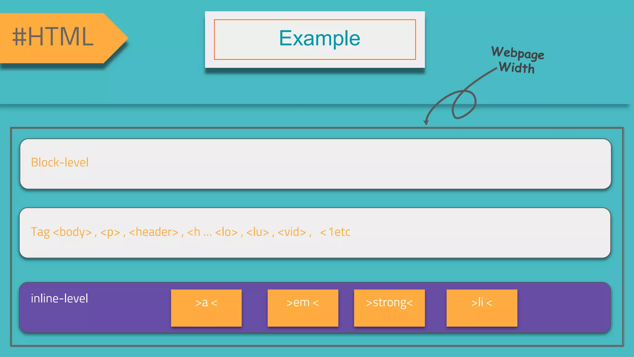
Overview of how HTML elements display on web pages.
Examples of HTML elements including block and inline elements.
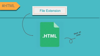
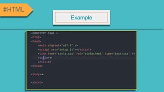
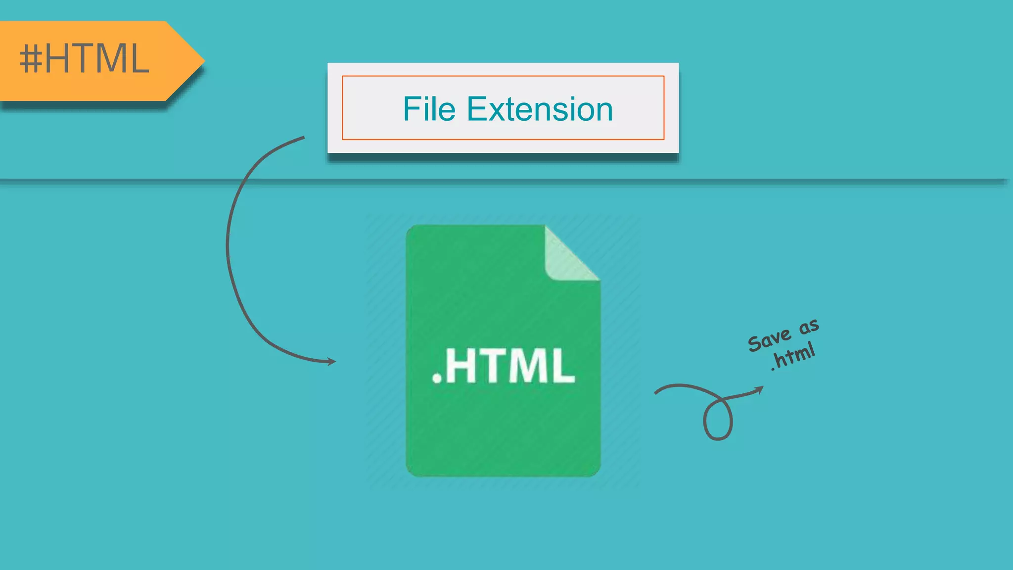
Discussion on common file extensions used for HTML documents.
More examples of HTML elements and their usage.
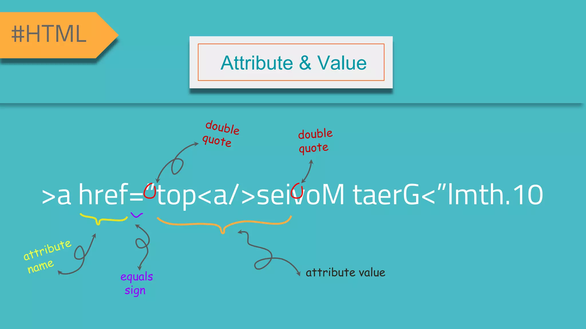
Understanding attributes and values in HTML tags.
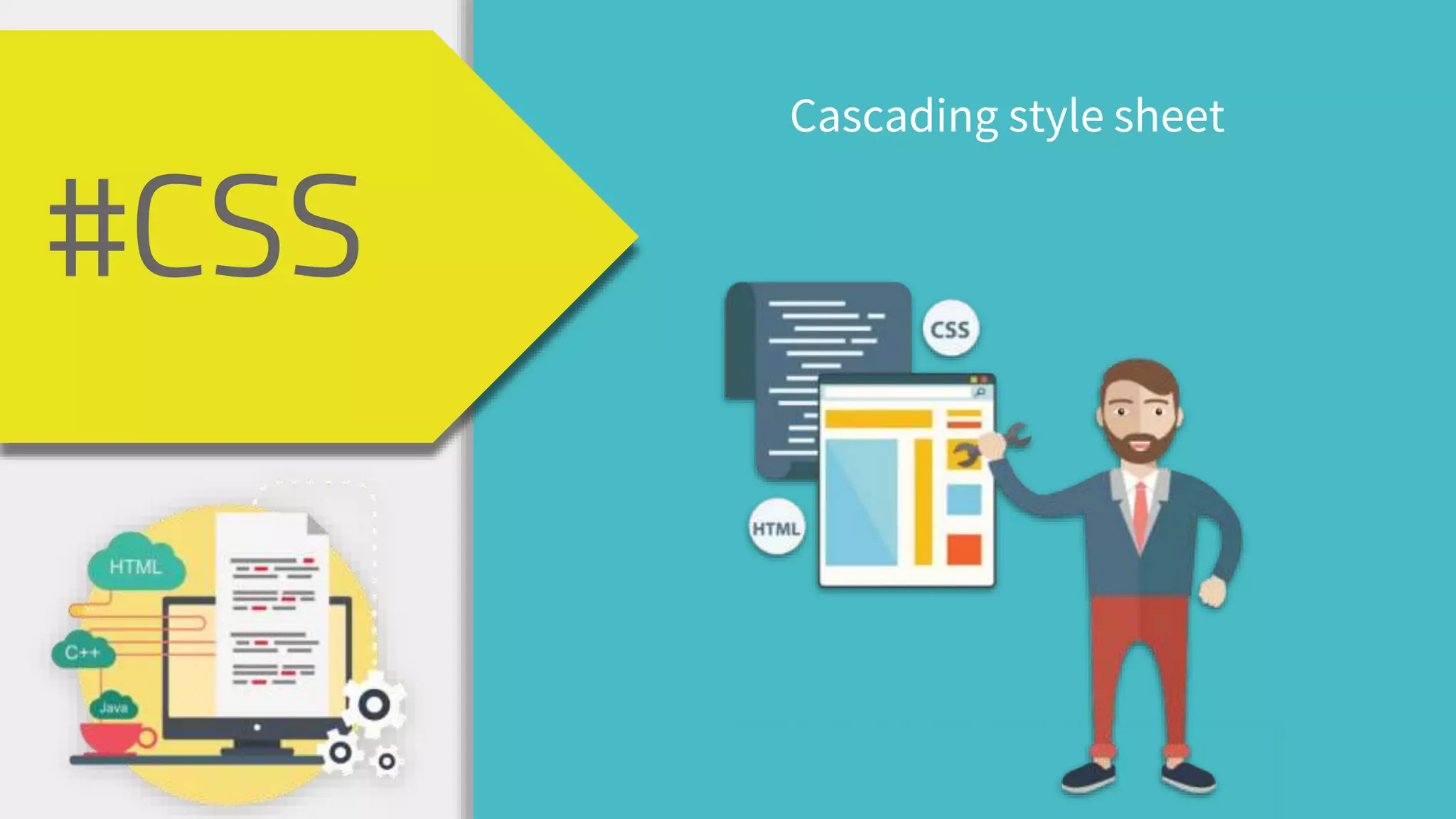
Introduction to CSS, defined as Cascading Style Sheets.
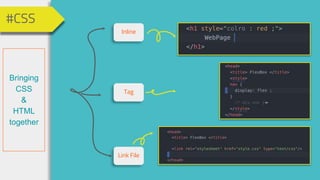
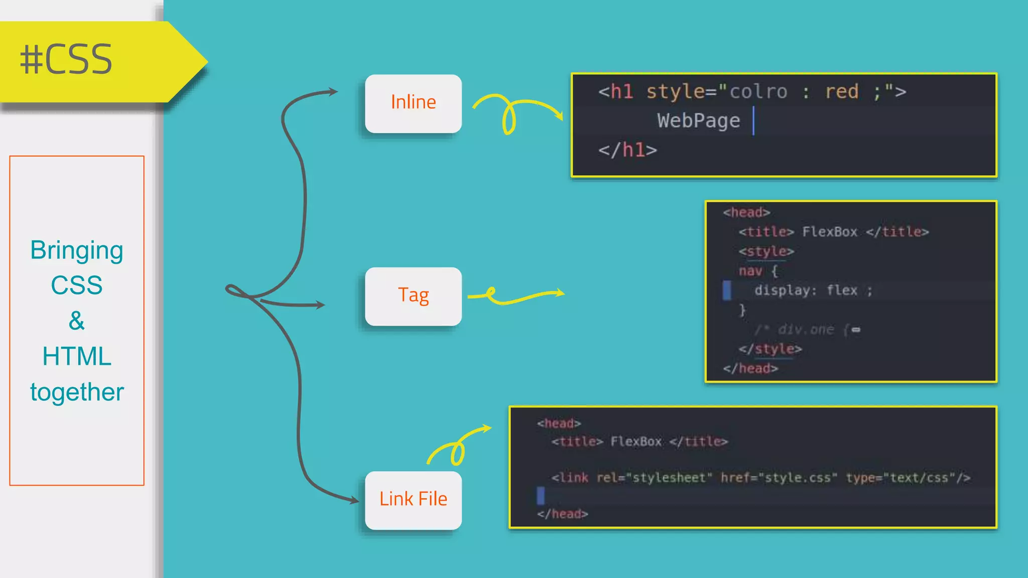
Methods to combine CSS with HTML, including inline styles and linked files.
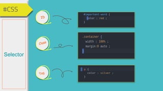
Overview of different CSS selectors used to select HTML elements.
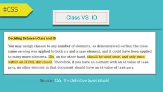
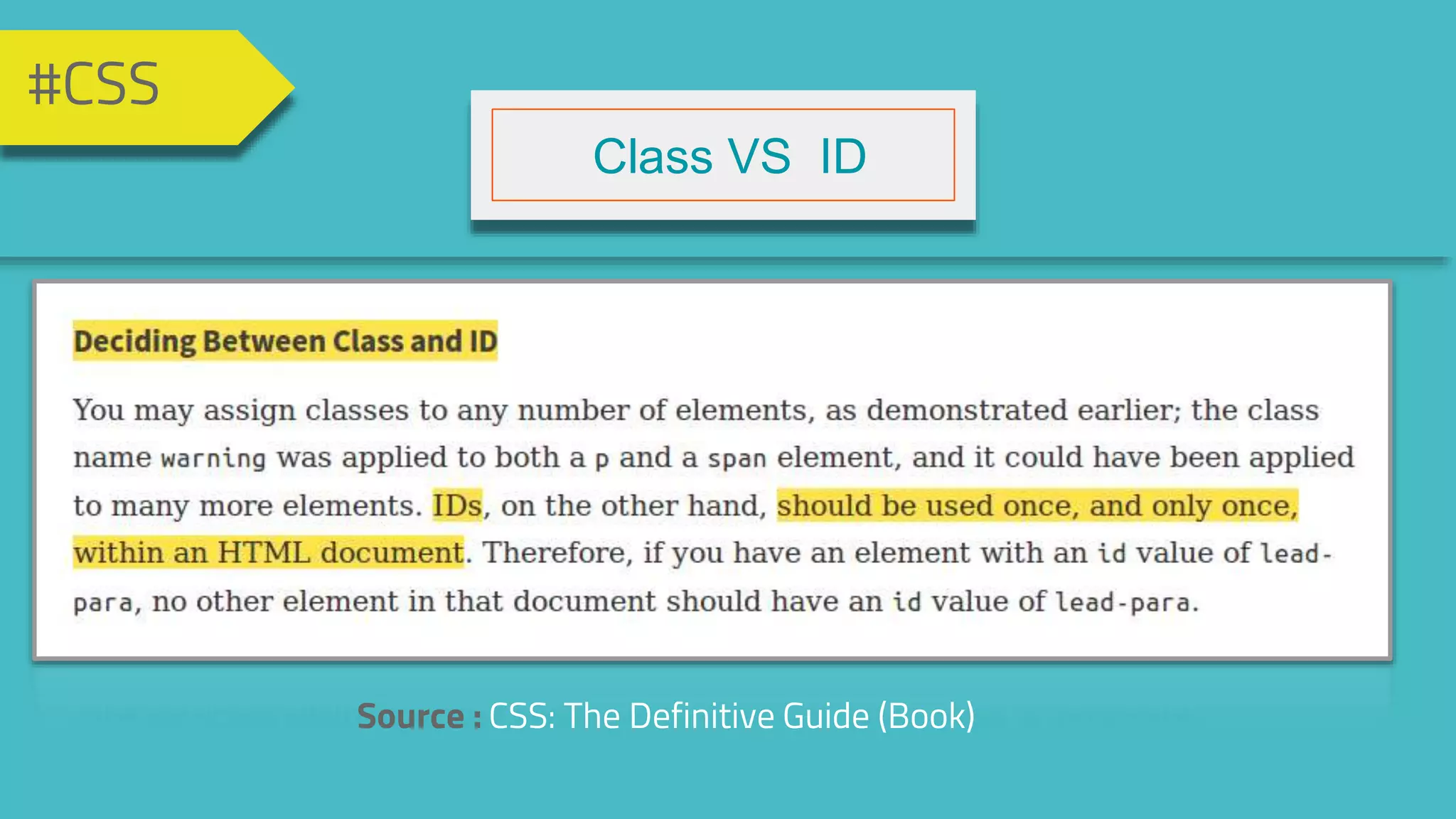
Comparative insight into Class vs ID selectors based on CSS guidelines.
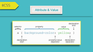
Understanding attributes and their values specifically in the context of CSS.
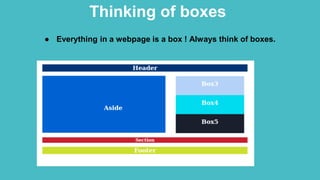
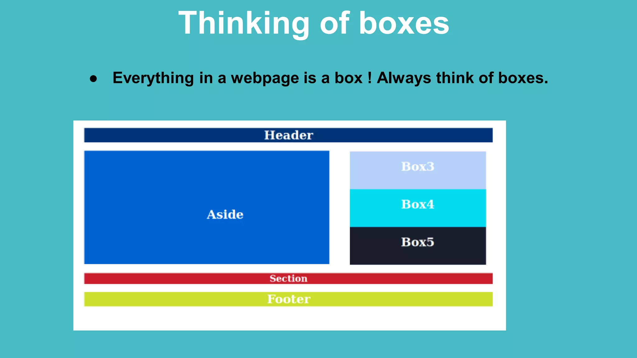
Illustration of how everything in a webpage can be conceptualized as a box.
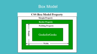
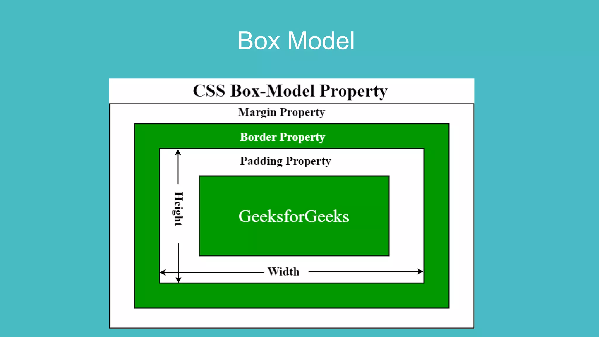
Detailed explanation of the box model in CSS.
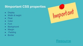
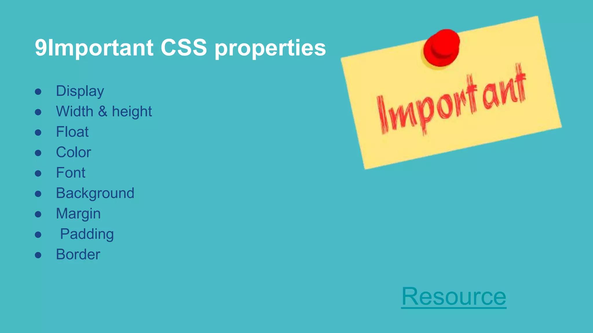
Key CSS properties including display, sizing, float, and aesthetics.
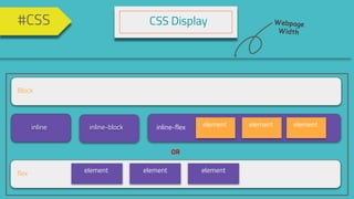
Descriptions of display types like block, inline, flex, and others.
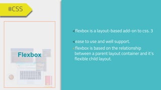
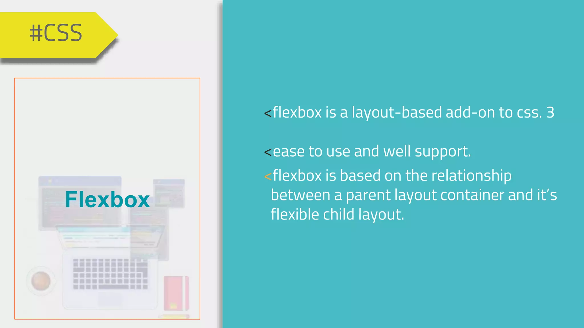
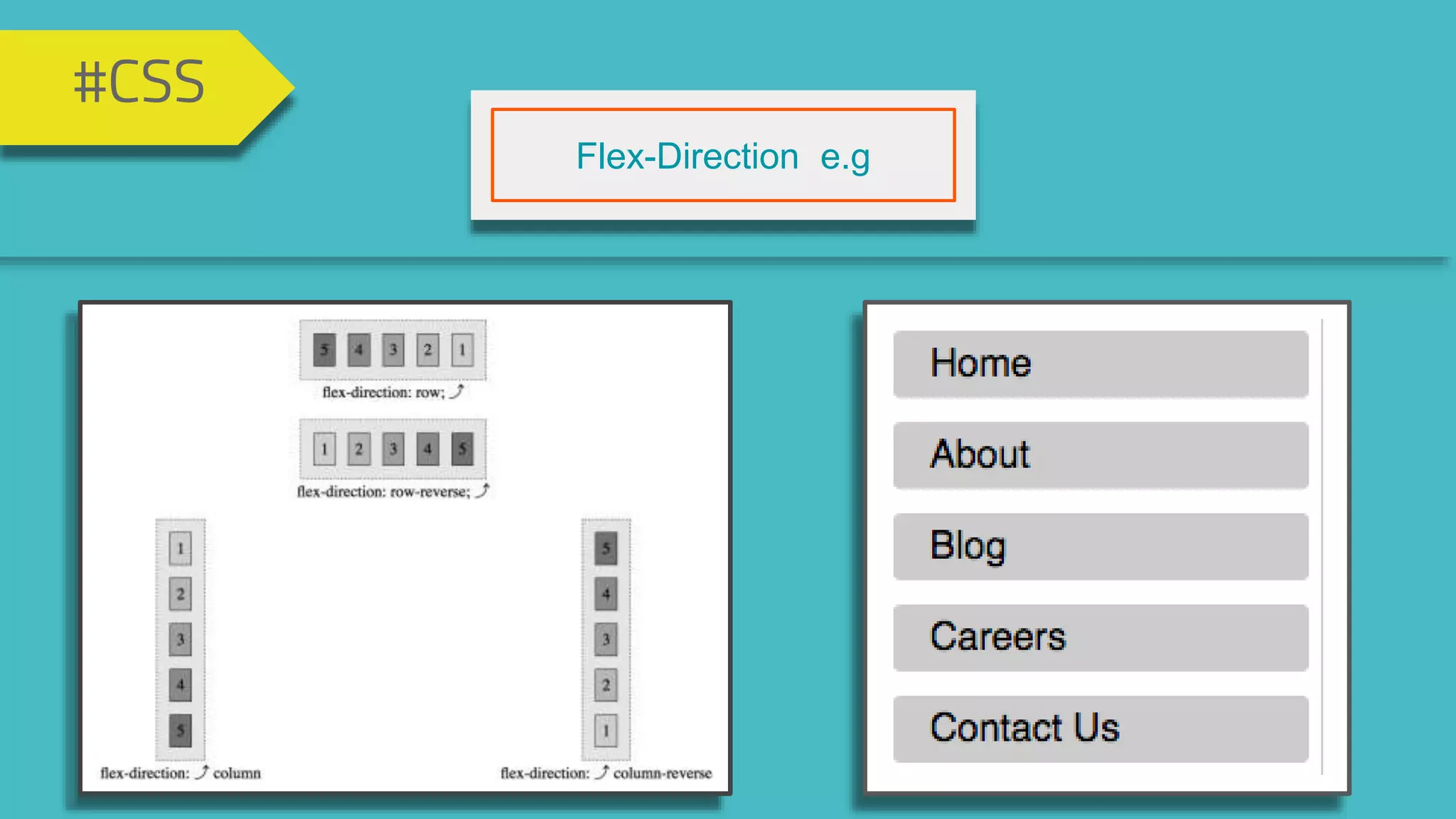
Introduction to flexbox as a layout model for CSS.
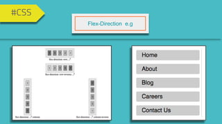
Explanation of flex-direction in the flexbox model.
Significance of responsive web design catering to various screen sizes.
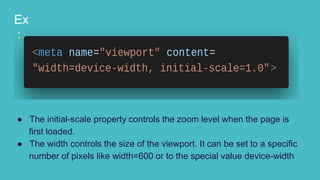
Explanation of initial-scale and viewport width settings.
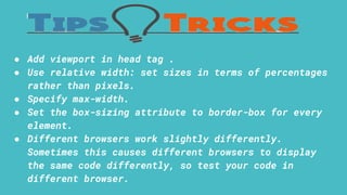
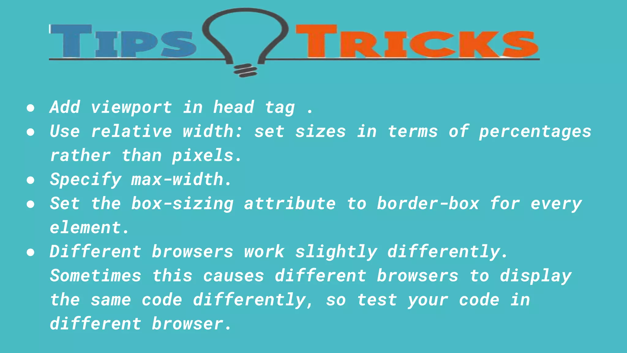
Guidelines for implementing responsive design including viewport usage and testing.
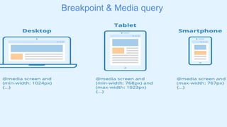
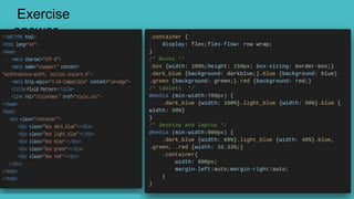
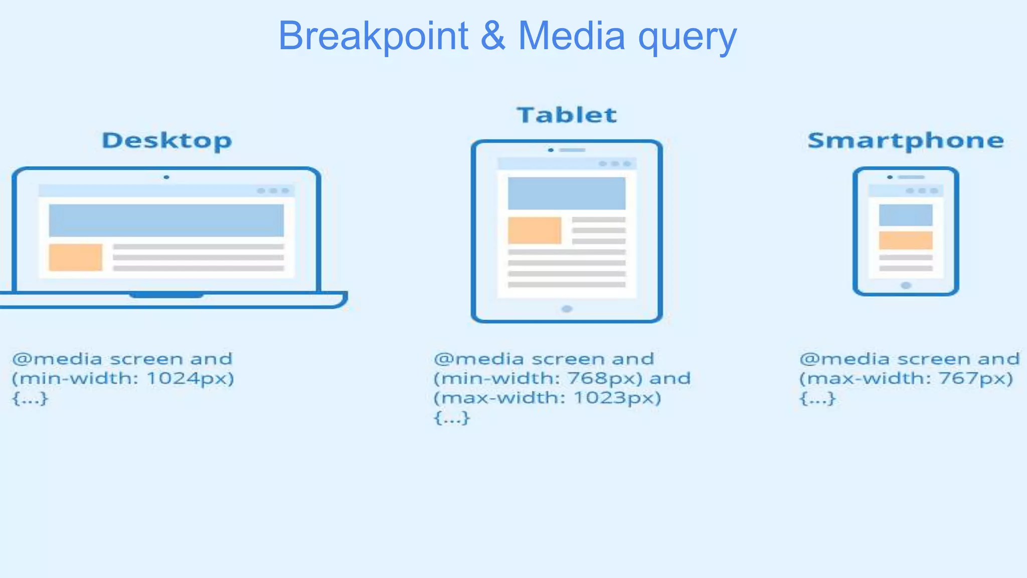
Introduction to breakpoints and media queries in responsive design.
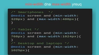
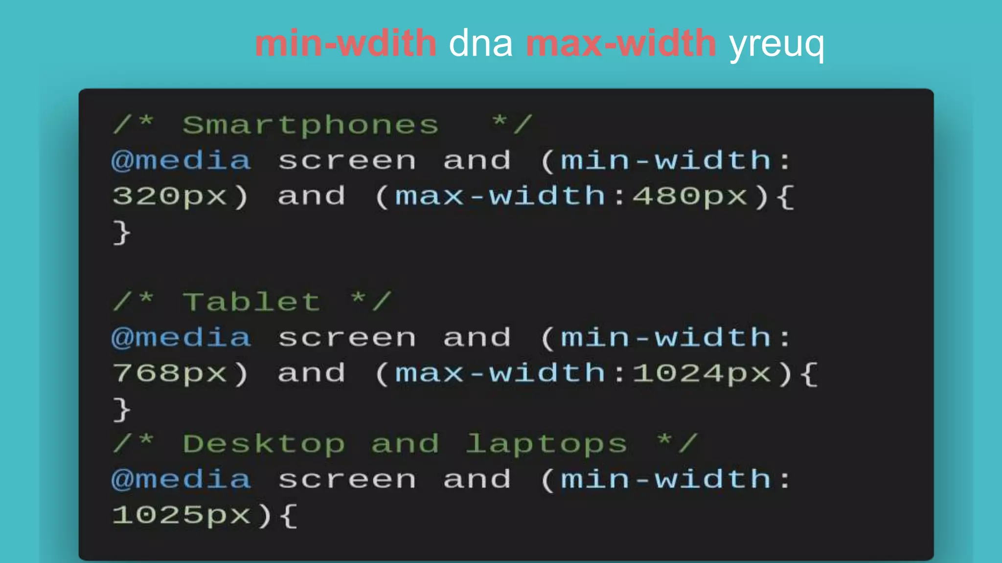
Overview of min-width and max-width media queries.
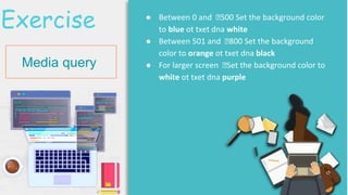
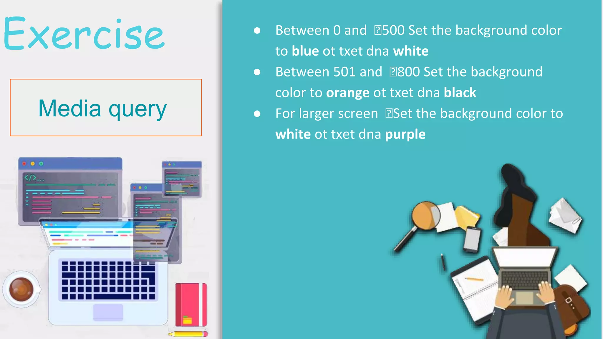
Activities to set different background colors based on screen sizes.
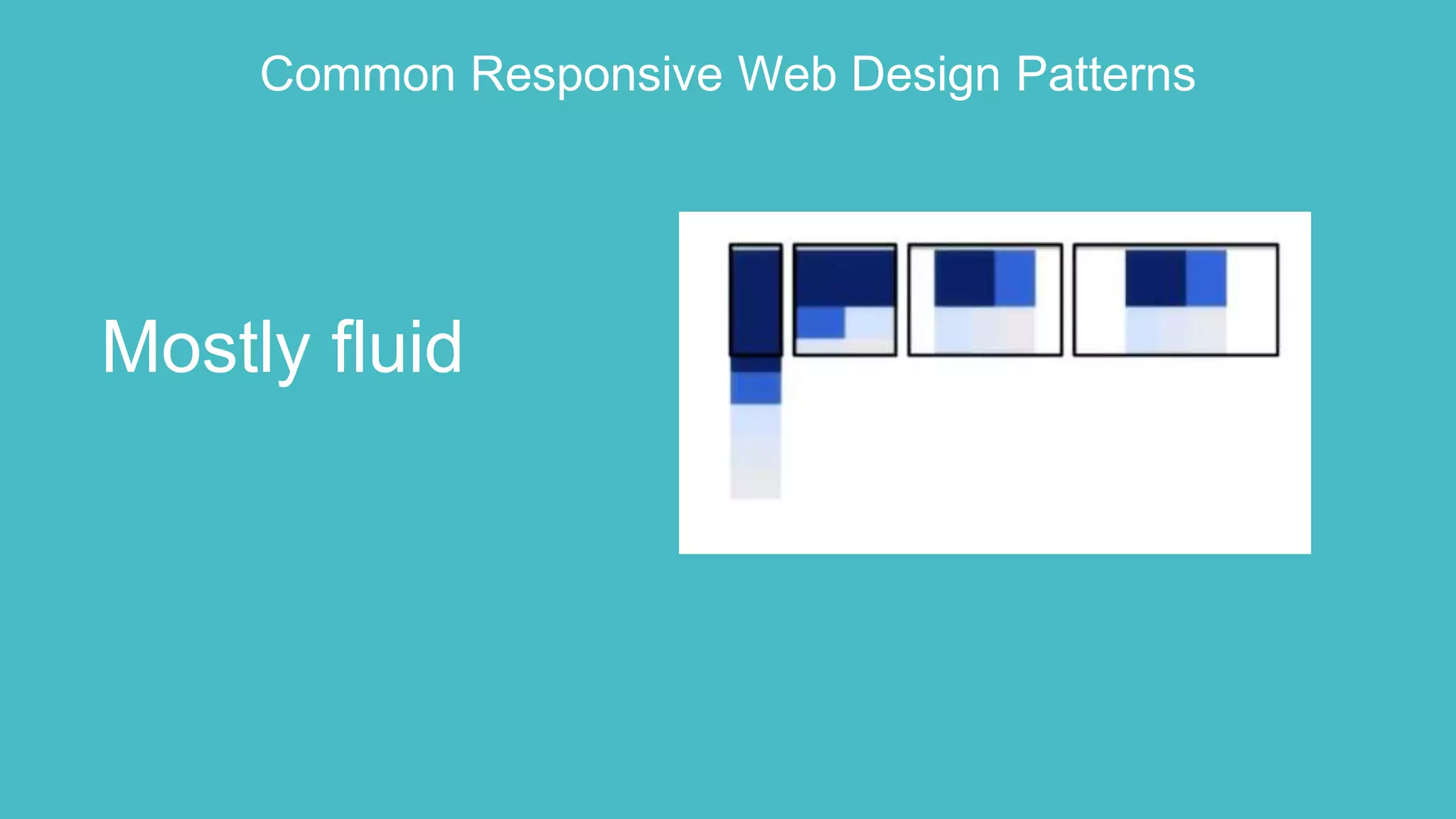
Description of common responsive web design patterns focusing on fluid patterns.
Exercise to build a webpage containing 5 boxes with fluid patterns.
Review and answer session related to the preceding exercises.


