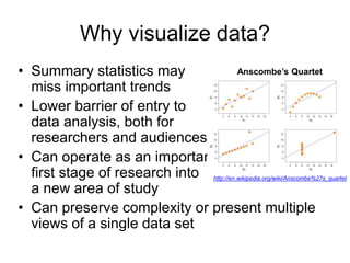
KEMBAR78
Introduction to Data Visualization Slides | PPTX
Introduction to Data Visualization
Angela Zoss
Data Visualization Coordinator
Data & GIS Services, Research Computing
September 4, 2012
LibGuide at:
http://guides.library.duke.edu/content.php?pid=35
5157
Introduction
• Angela Zoss (angela.zoss@duke.edu)
• Started as Data Visualization Coordinator in
June
• Previous study in Information Science, Human-
Computer Interaction, Communication, Cognitive
Science, and Computer Science
• Primary expertise in information visualization,
network analysis
What is visualization?
• Data visualization
– Information visualization
– Scientific visualization
– Static vs. interactive vs. dynamic
• Data
– Categorical (Nominal, Ordinal)
– Quantitative (Interval, Ratio)
Why visualize data?
• Summary statistics may
miss important trends
• Lower barrier of entry to
data analysis, both for
researchers and audiences
• Can operate as an important
first stage of research into
a new area of study
• Can preserve complexity or present multiple
views of a single data set
http://en.wikipedia.org/wiki/Anscombe%27s_quartet
Anscombe’s Quartet
Two primary goals for
visualization:
• Visualization for analysis (a.k.a. “visual
analytics”)
– Exploit visual perception strengths to
explore/analyze data relationships
– Try many views/combinations to find meaningful
stories
• Visualization for communication
– Select a particular view of the data to share
– Construct the visualization with a goal in mind
and in a way that takes into account the skills and
needs of the expected audience
Seven Stages of Visualizing
Data
From Fry (2008), p. 5:
• Acquire: Obtain the data...
• Parse: Provide some structure for the data’s meaning, and order it into
categories.
• Filter: Remove all but the data of interest.
• Mine: Apply methods from statistics or data mining as a way to discern
patterns or place the data in mathematical context.
• Represent: Choose a basic visual model, such as a bar graph, list, or
tree.
• Refine: Improve the basic representation to make it clearer and more
visually engaging.
• Interact: Add methods for manipulating the data or
controlling what features are visible.
Note: stages are often iterative and may have a flexible order or
even be omitted in some projects.
Fry, B. (2008). Visualizing data. Sebastopol, CA: O’Reilly Media, Inc.
From Data to Graphic
• What data types are present in the data
source?
• How are the variables likely to relate?
• What visualization type seems to be the
best fit for the goal?
Matching Data Types to
Visual Elements
Mackinlay, J. (1986). Automating the design of graphical
presentations of relational information. ACM Transactions on
Graphics, 5(2), 110-141.
Chart Choosers
• Interested in showing composition?
Relationship? Distribution?
(What do the charts do well?)
http://extremepresentation.typepad.com/blog/2006/09/choosing_a_g
ood.html
• Chart typically determines position of
elements, with some built-in visual
encodings.
• Additional visual encodings can often be
added to incorporate more variables into
charts, but beware of overwhelming the
audience.
Common Visualization Types
• 1D/Linear (omitted)
• 2D/Planar (incl. Geospatial)
• 3D/Volumetric (omitted)
• Temporal
• nD/Multidimensional
• Tree/Hierarchical
• Network
Shneiderman, B. (1996). The eyes have it: A task by data type taxonomy
for information visualizations. Proceedings of IEEE Symposium on Visual
Languages - Boulder, CO (pp. 336-343).
See LibGuide for most up-to-date examples.
Style and Format
• Color:
– Grade the saturation (lightness), not the hue
(color)
– Cultural considerations
– Print considerations (check in grayscale)
– High saturation for small areas
– Not too many! (6 - 12 at most)
• Clarity vs. Aesthetics
http://dataremixed.com/2012/05/data-visualization-clarity-or-
aesthetics/
QUESTIONS?
Angela Zoss
angela.zoss@duke.edu

Introduction to Data Visualization Slides

  • 1.
    Introduction to DataVisualization Angela Zoss Data Visualization Coordinator Data & GIS Services, Research Computing September 4, 2012 LibGuide at: http://guides.library.duke.edu/content.php?pid=35 5157
  • 2.
    Introduction • Angela Zoss(angela.zoss@duke.edu) • Started as Data Visualization Coordinator in June • Previous study in Information Science, Human- Computer Interaction, Communication, Cognitive Science, and Computer Science • Primary expertise in information visualization, network analysis
  • 3.
    What is visualization? •Data visualization – Information visualization – Scientific visualization – Static vs. interactive vs. dynamic • Data – Categorical (Nominal, Ordinal) – Quantitative (Interval, Ratio)
  • 4.
    Why visualize data? •Summary statistics may miss important trends • Lower barrier of entry to data analysis, both for researchers and audiences • Can operate as an important first stage of research into a new area of study • Can preserve complexity or present multiple views of a single data set http://en.wikipedia.org/wiki/Anscombe%27s_quartet Anscombe’s Quartet
  • 5.
    Two primary goalsfor visualization: • Visualization for analysis (a.k.a. “visual analytics”) – Exploit visual perception strengths to explore/analyze data relationships – Try many views/combinations to find meaningful stories • Visualization for communication – Select a particular view of the data to share – Construct the visualization with a goal in mind and in a way that takes into account the skills and needs of the expected audience
  • 6.
    Seven Stages ofVisualizing Data From Fry (2008), p. 5: • Acquire: Obtain the data... • Parse: Provide some structure for the data’s meaning, and order it into categories. • Filter: Remove all but the data of interest. • Mine: Apply methods from statistics or data mining as a way to discern patterns or place the data in mathematical context. • Represent: Choose a basic visual model, such as a bar graph, list, or tree. • Refine: Improve the basic representation to make it clearer and more visually engaging. • Interact: Add methods for manipulating the data or controlling what features are visible. Note: stages are often iterative and may have a flexible order or even be omitted in some projects. Fry, B. (2008). Visualizing data. Sebastopol, CA: O’Reilly Media, Inc.
  • 7.
    From Data toGraphic • What data types are present in the data source? • How are the variables likely to relate? • What visualization type seems to be the best fit for the goal?
  • 8.
    Matching Data Typesto Visual Elements Mackinlay, J. (1986). Automating the design of graphical presentations of relational information. ACM Transactions on Graphics, 5(2), 110-141.
  • 9.
    Chart Choosers • Interestedin showing composition? Relationship? Distribution? (What do the charts do well?) http://extremepresentation.typepad.com/blog/2006/09/choosing_a_g ood.html • Chart typically determines position of elements, with some built-in visual encodings. • Additional visual encodings can often be added to incorporate more variables into charts, but beware of overwhelming the audience.
  • 10.
    Common Visualization Types •1D/Linear (omitted) • 2D/Planar (incl. Geospatial) • 3D/Volumetric (omitted) • Temporal • nD/Multidimensional • Tree/Hierarchical • Network Shneiderman, B. (1996). The eyes have it: A task by data type taxonomy for information visualizations. Proceedings of IEEE Symposium on Visual Languages - Boulder, CO (pp. 336-343). See LibGuide for most up-to-date examples.
  • 11.
    Style and Format •Color: – Grade the saturation (lightness), not the hue (color) – Cultural considerations – Print considerations (check in grayscale) – High saturation for small areas – Not too many! (6 - 12 at most) • Clarity vs. Aesthetics http://dataremixed.com/2012/05/data-visualization-clarity-or- aesthetics/
  • 12.

Editor's Notes

  • #5 Anscombe’s Quartet shows that four data sets with identical summary statistics (mean, variance, correlation, linear regression) can still have large and meaningful differences that are identifiable when graphed.
  • #7 Ben Fry lists 7 stages of visualizing data. These stages are similar to those included in other representations of the process of visualization, as well as to those of other design processes like software development or user interface design. In most discussions of visualization design, however, the explanations many of these stages are taken for granted, leaving the visualizer to fend for him- or herself when it comes to selecting and applying appropriate techniques for each stage. I have highlighted words here that can be seen as “charged”; that is, each of the highlighted words needs additional judgment from the visualizer to ensure the trustworthiness and utility of the visualization. For example, selection, delineation, and processing of data are all activities that require active choices by the visualizer. It is never simply a matter of “acquiring” or “obtaining” the data, and the data themselves are simply some of the possible data that could be used for a particular project. Operationalization, a foundational phase of the design of any research study, should also be undertaken with a view toward the eventual visualization of the data.
  • #11 1D/Linear visualizations are essentially lists of data items, organized by a single feature (e.g., alphabetical order). To leave time for more complex visualization types, this category will not be covered in the webinar. On the other end of the spectrum, 3D/Volumetric visualizations (including 3D models of real-world objects) will also be omitted. These visualizations are highly technical and field specific and are, thus, less appropriate for an introductory workshop.