Table Of Contents
1.Why Use CSS anyway?
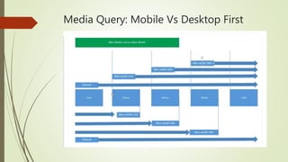
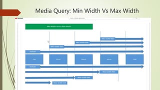
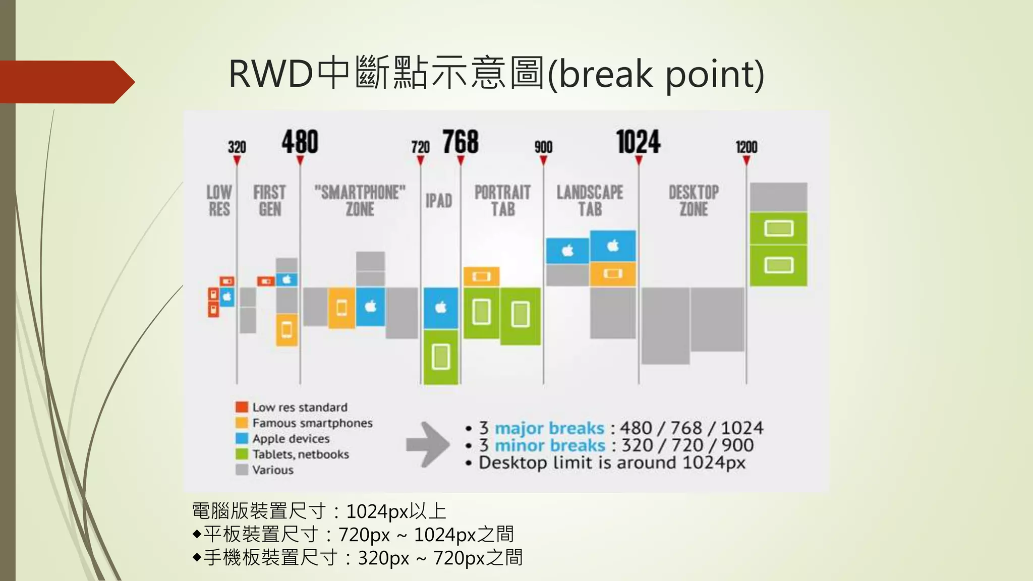
2. Introduction of Responsive Web Design(RWD)
3. RWD Frameworks and Hand-made RWD Comparison
4. Introduction to CSS Grid
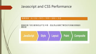
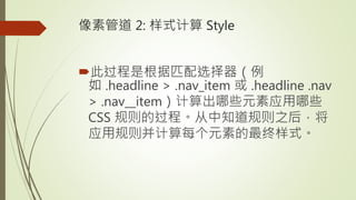
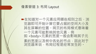
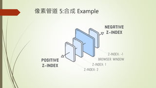
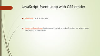
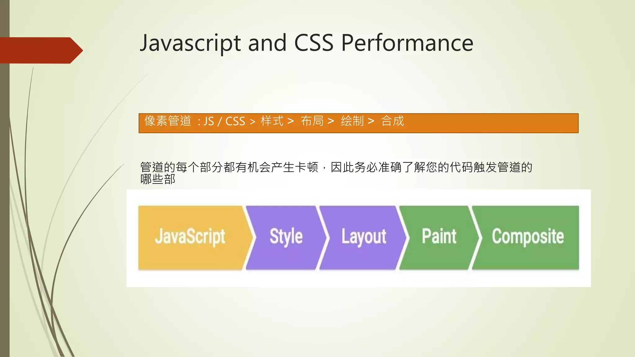
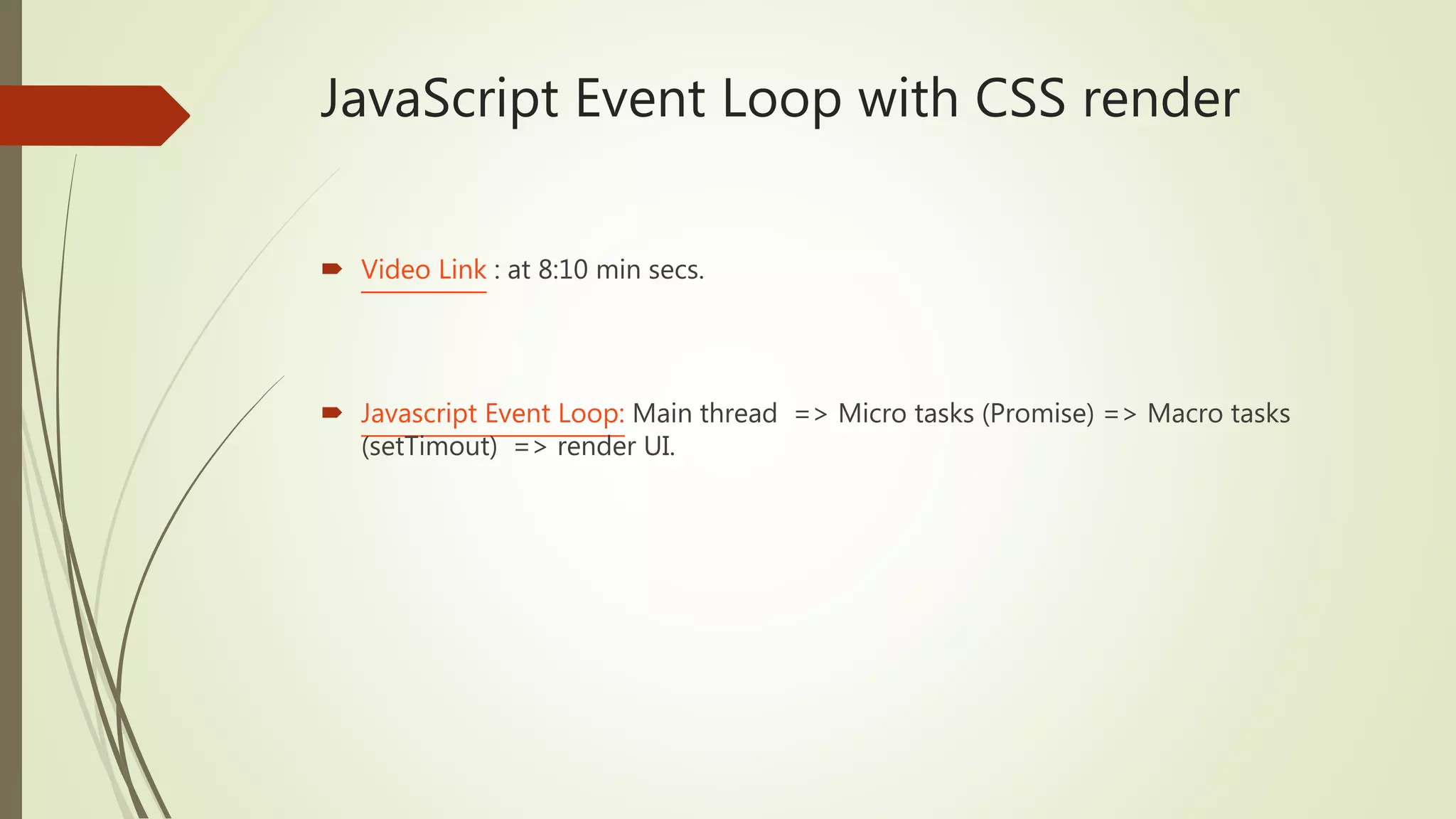
5. Javascript and CSS Performance Tuning
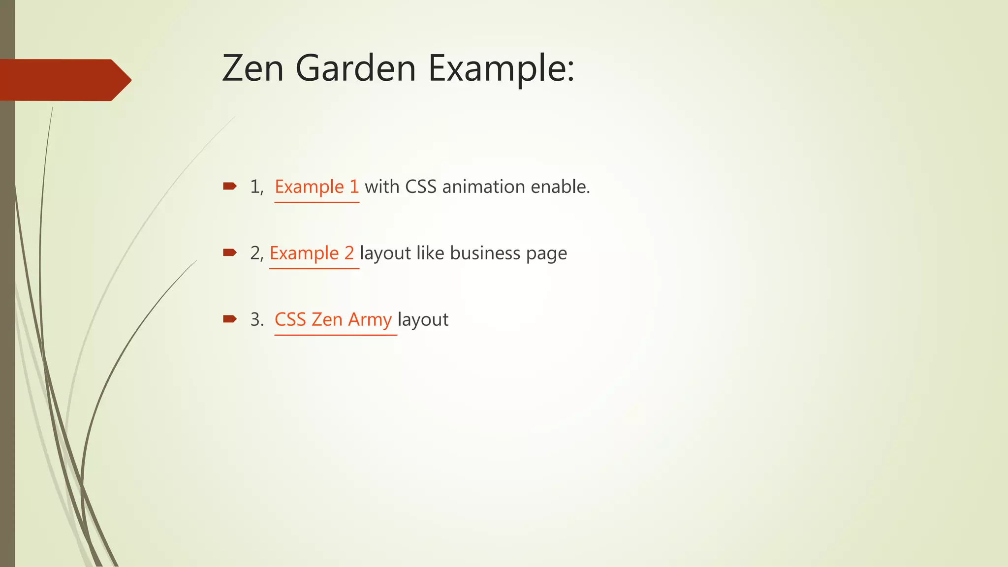
Zen Garden Example:
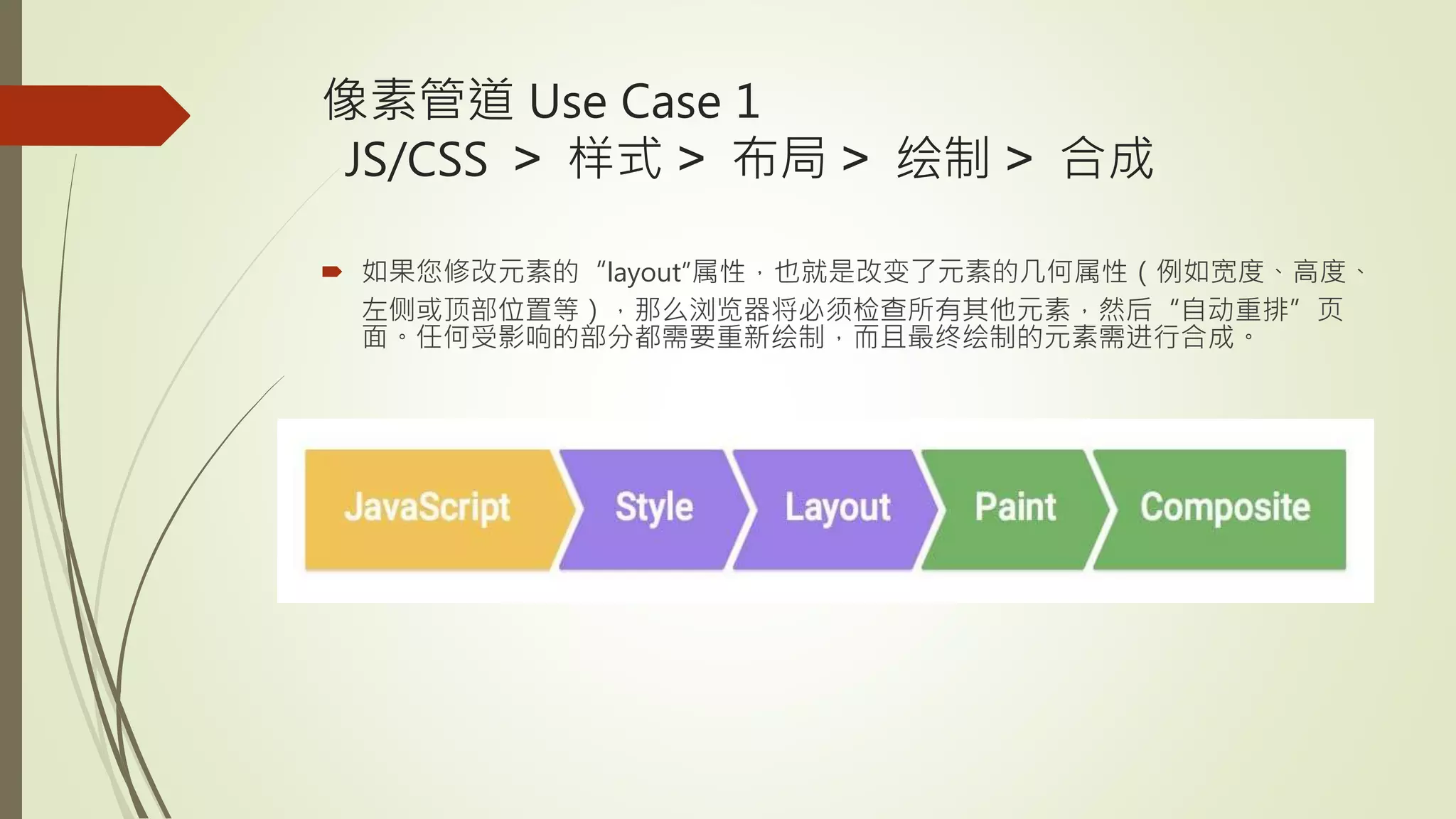
1, Example 1 with CSS animation enable.
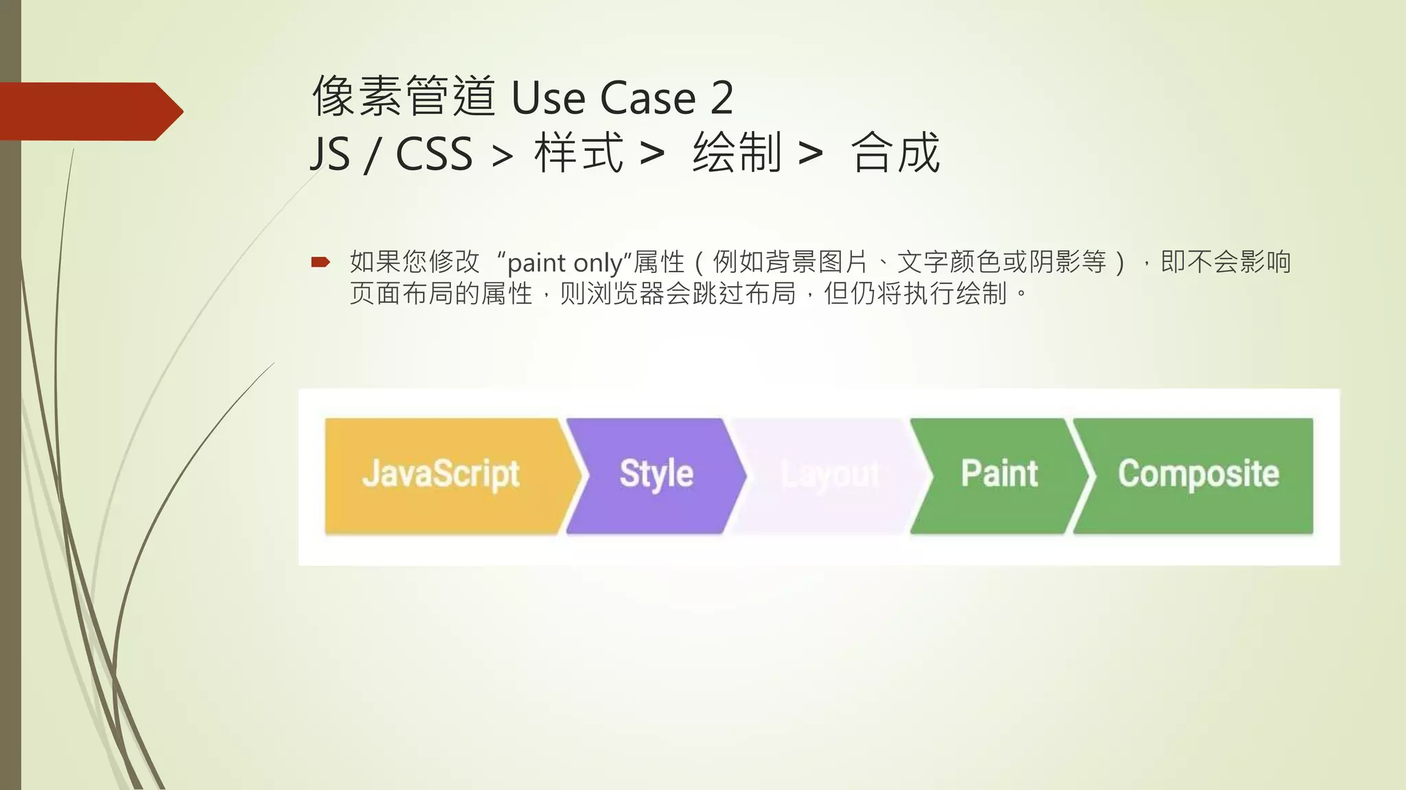
2, Example 2 layout like business page
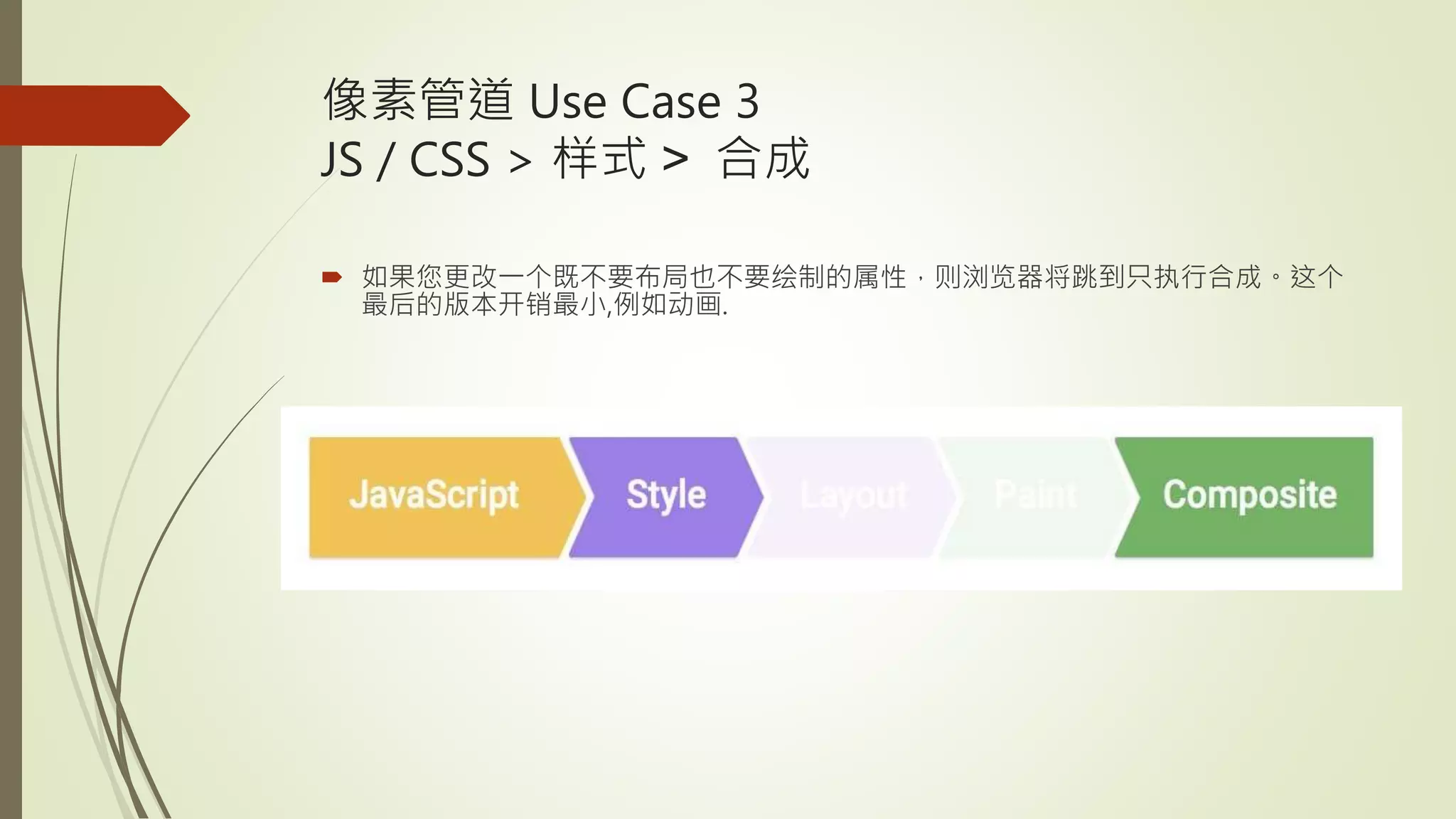
3. CSS Zen Army layout
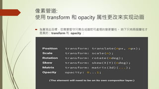
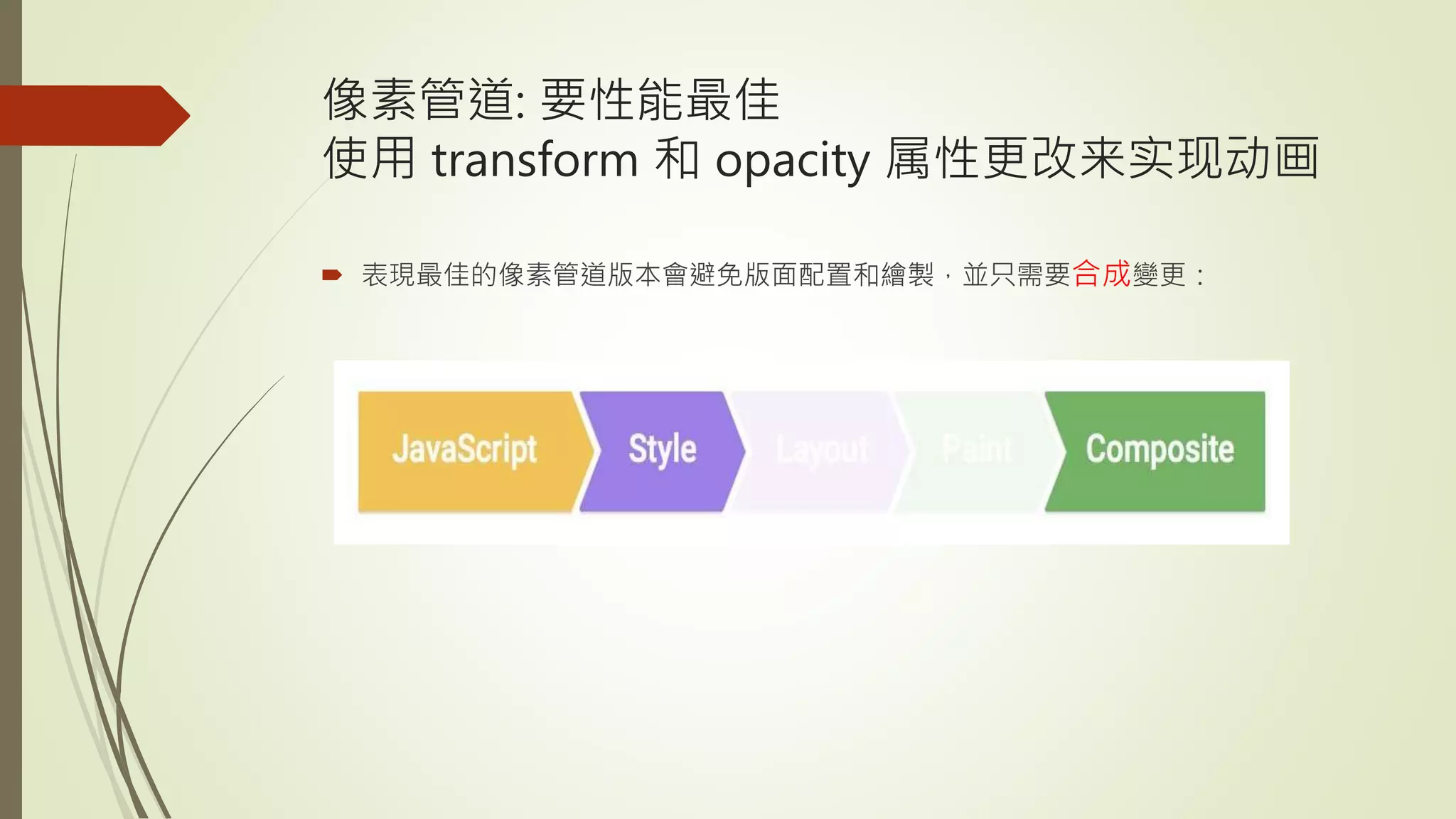
5.
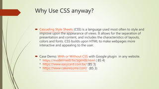
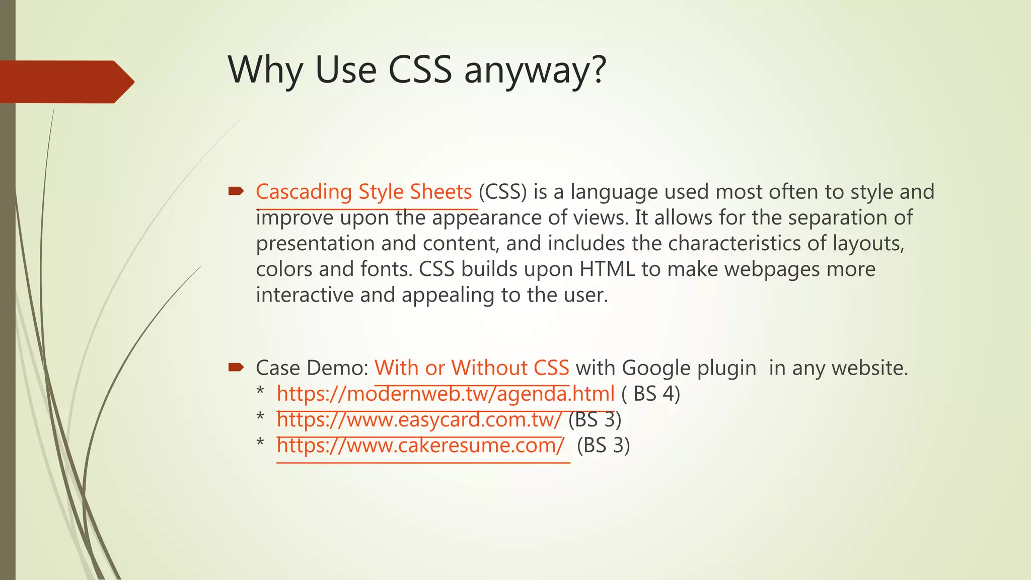
Why Use CSSanyway?
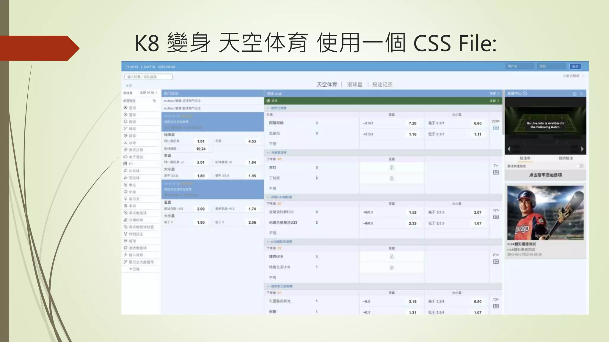
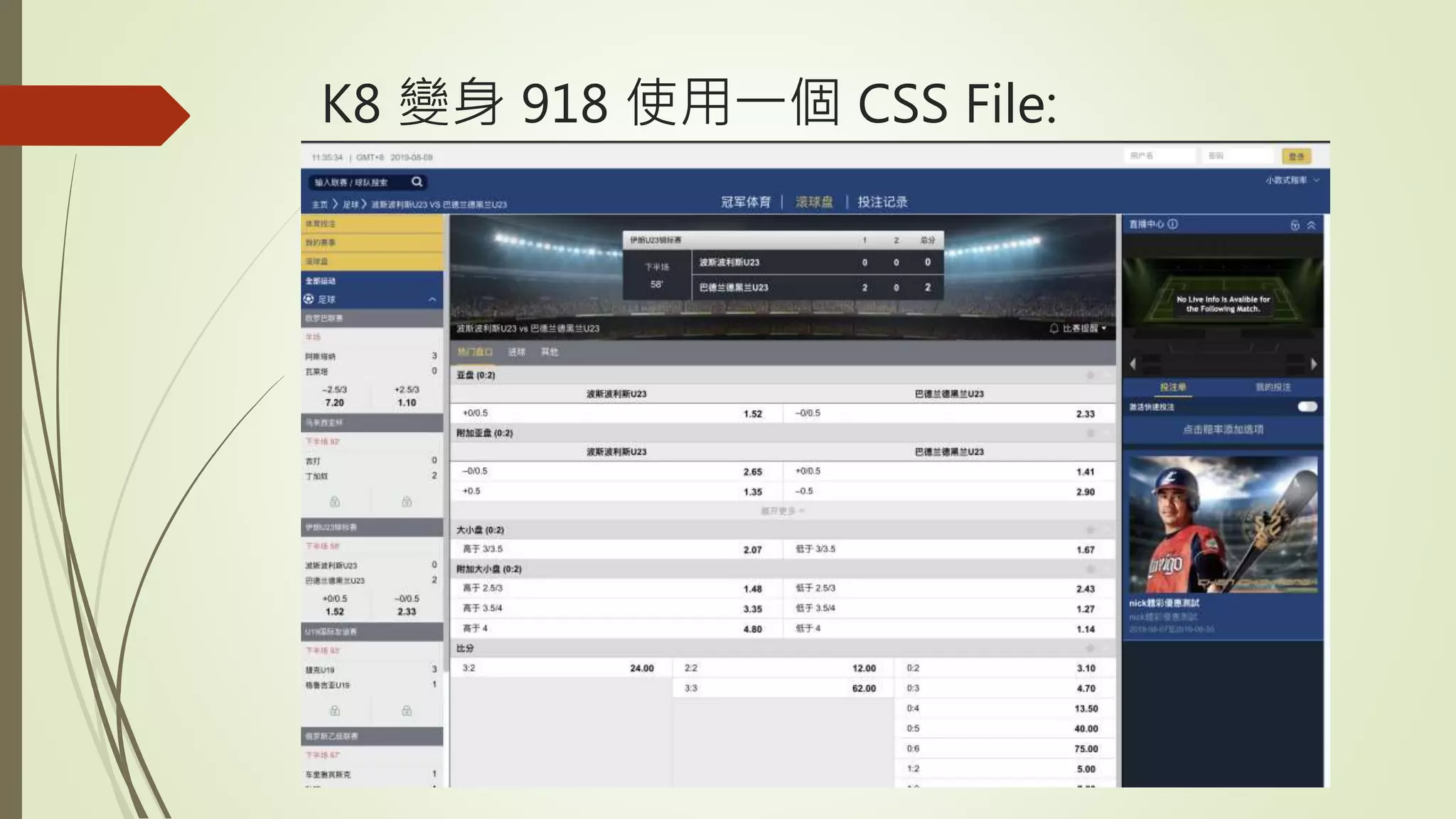
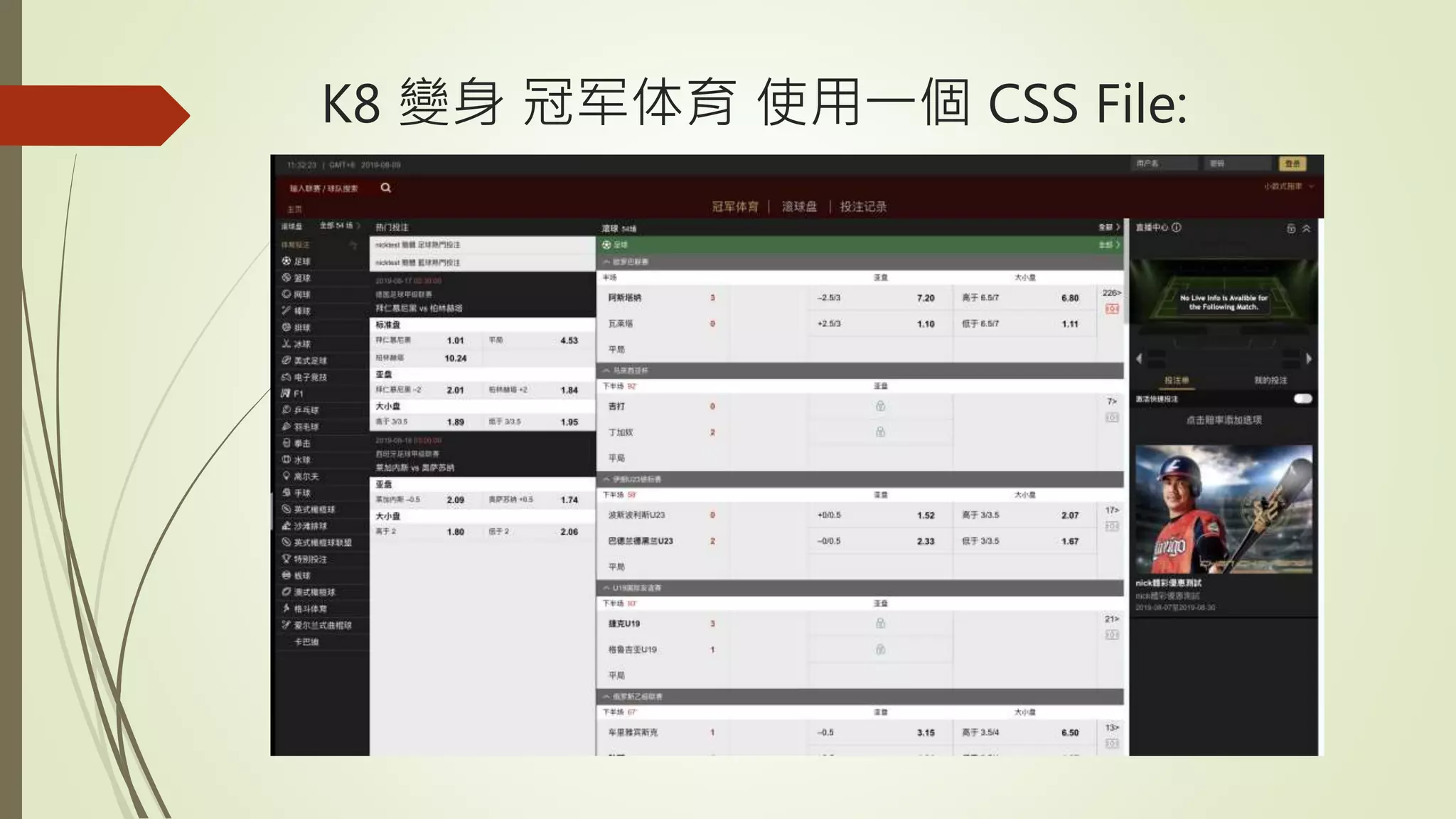
Cascading Style Sheets (CSS) is a language used most often to style and
improve upon the appearance of views. It allows for the separation of
presentation and content, and includes the characteristics of layouts,
colors and fonts. CSS builds upon HTML to make webpages more
interactive and appealing to the user.
Case Demo: With or Without CSS with Google plugin in any website.
* https://modernweb.tw/agenda.html ( BS 4)
* https://www.easycard.com.tw/ (BS 3)
* https://www.cakeresume.com/ (BS 3)
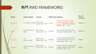
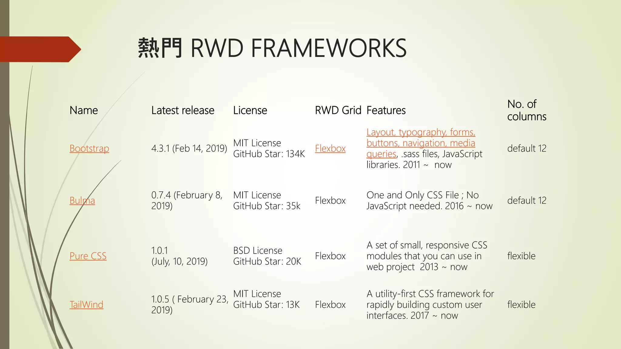
熱門 RWD FRAMEWORKS
NameLatest release License RWD Grid Features
No. of
columns
Bootstrap 4.3.1 (Feb 14, 2019)
MIT License
GitHub Star: 134K
Flexbox
Layout, typography, forms,
buttons, navigation, media
queries, .sass files, JavaScript
libraries. 2011 ~ now
default 12
Bulma
0.7.4 (February 8,
2019)
MIT License
GitHub Star: 35k
Flexbox
One and Only CSS File ; No
JavaScript needed. 2016 ~ now
default 12
Pure CSS
1.0.1
(July, 10, 2019)
BSD License
GitHub Star: 20K
Flexbox
A set of small, responsive CSS
modules that you can use in
web project 2013 ~ now
flexible
TailWind
1.0.5 ( February 23,
2019)
MIT License
GitHub Star: 13K Flexbox
A utility-first CSS framework for
rapidly building custom user
interfaces. 2017 ~ now
flexible
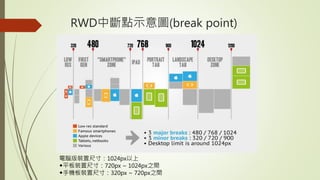
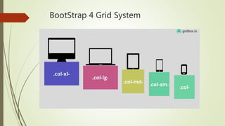
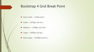
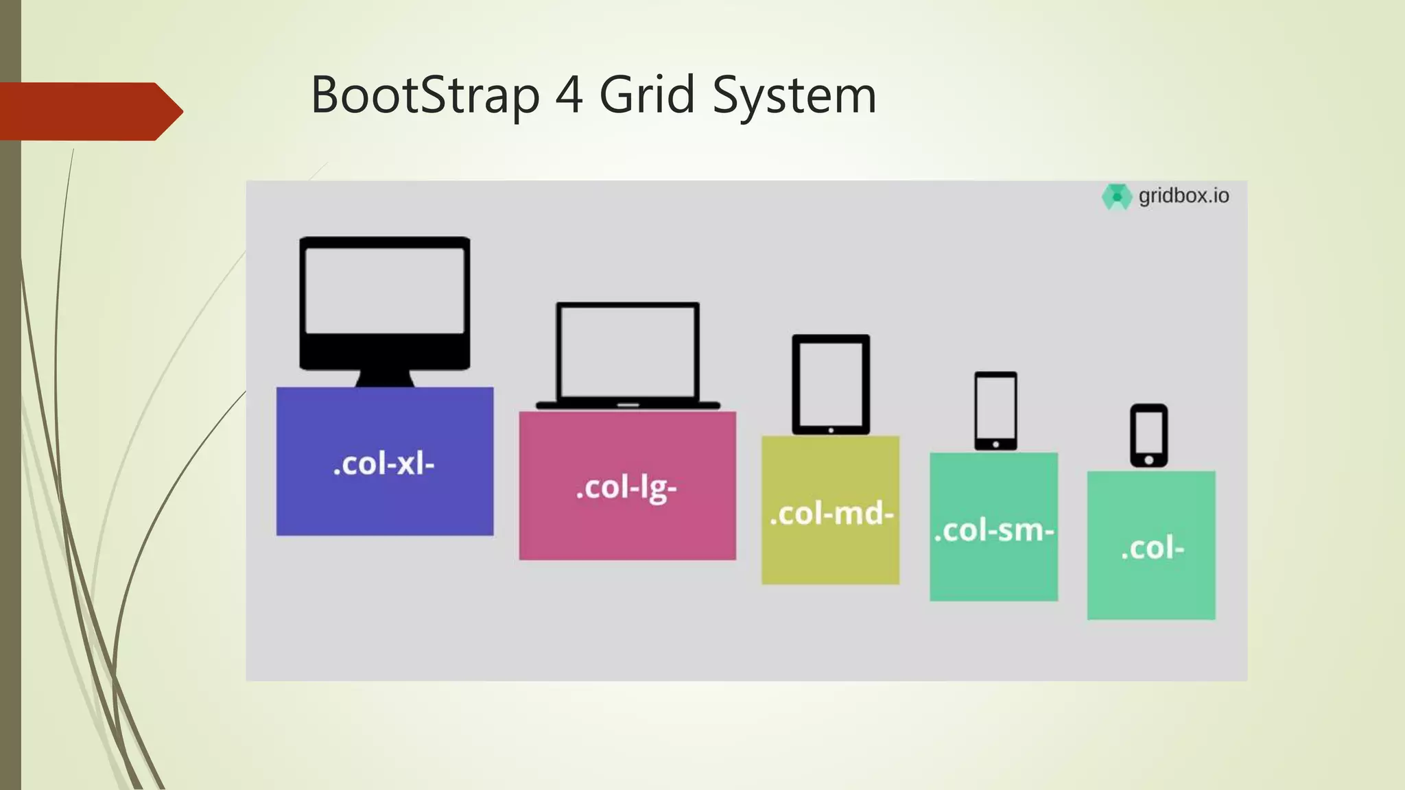
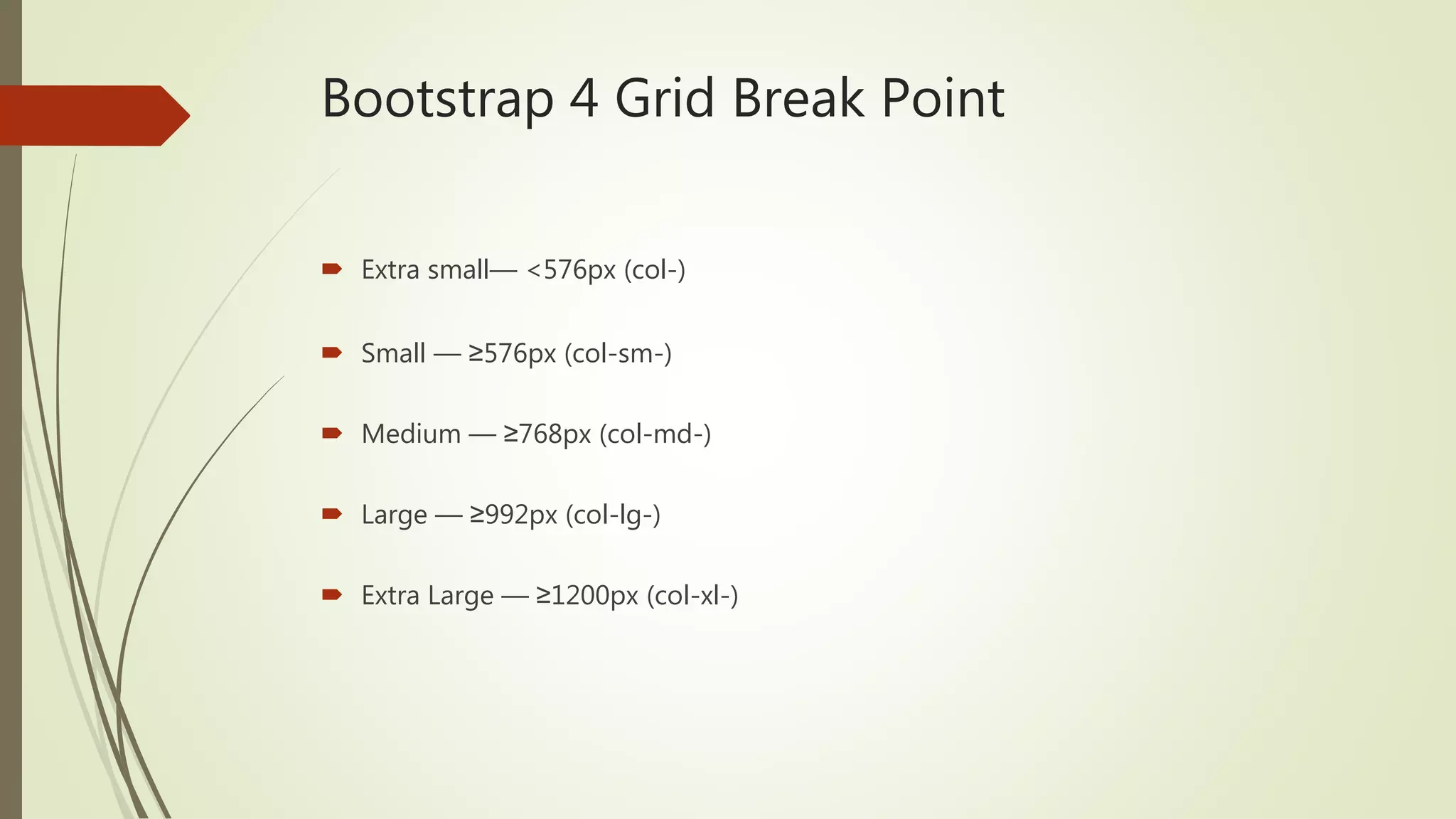
Bootstrap 4 GridBreak Point
Extra small— <576px (col-)
Small — ≥576px (col-sm-)
Medium — ≥768px (col-md-)
Large — ≥992px (col-lg-)
Extra Large — ≥1200px (col-xl-)
18.
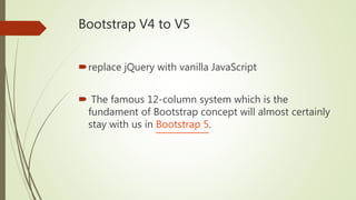
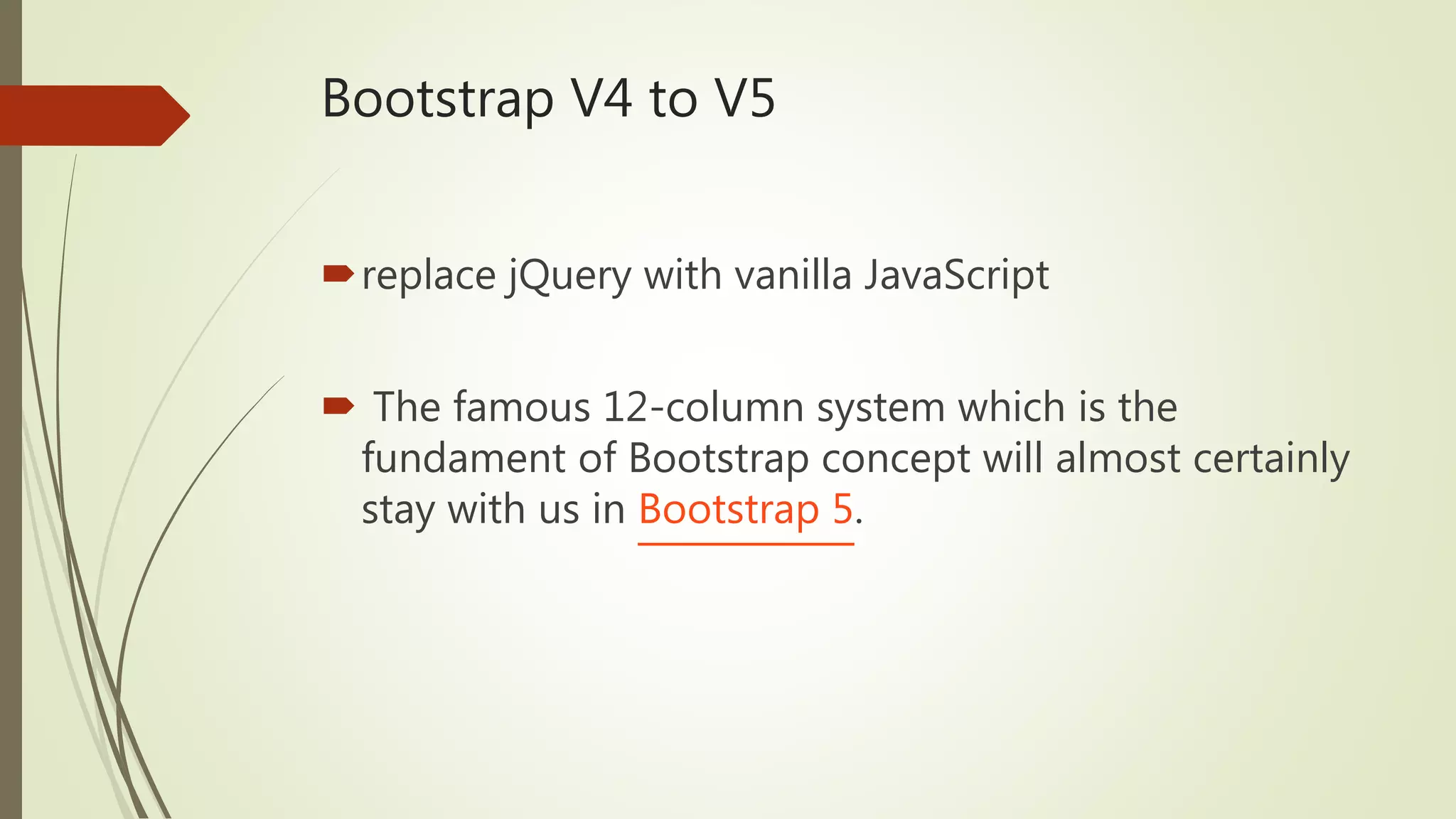
Bootstrap V4 toV5
replace jQuery with vanilla JavaScript
The famous 12-column system which is the
fundament of Bootstrap concept will almost certainly
stay with us in Bootstrap 5.
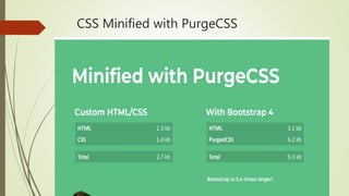
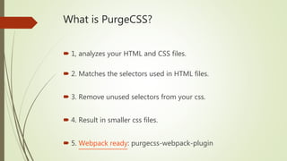
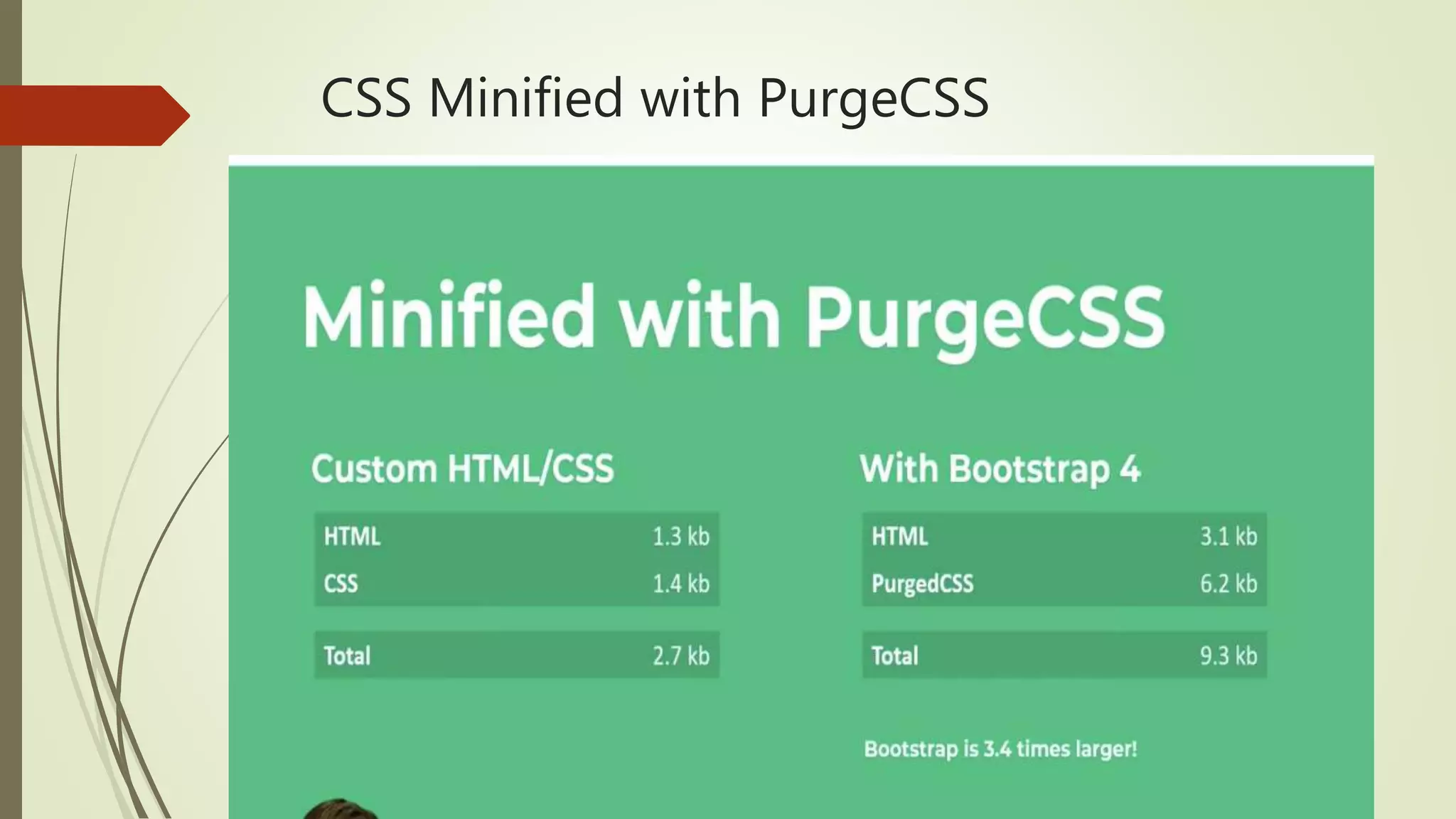
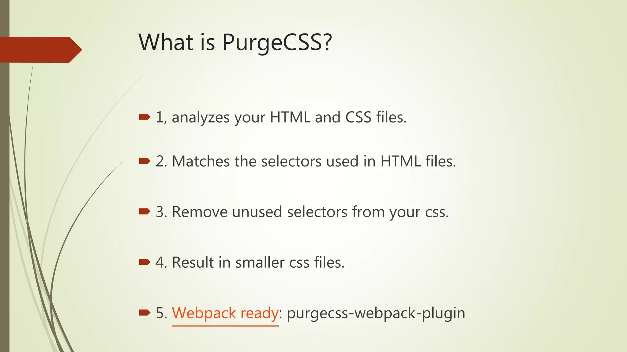
What is PurgeCSS?
1, analyzes your HTML and CSS files.
2. Matches the selectors used in HTML files.
3. Remove unused selectors from your css.
4. Result in smaller css files.
5. Webpack ready: purgecss-webpack-plugin
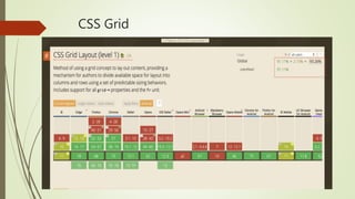
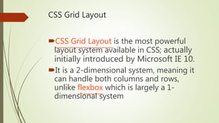
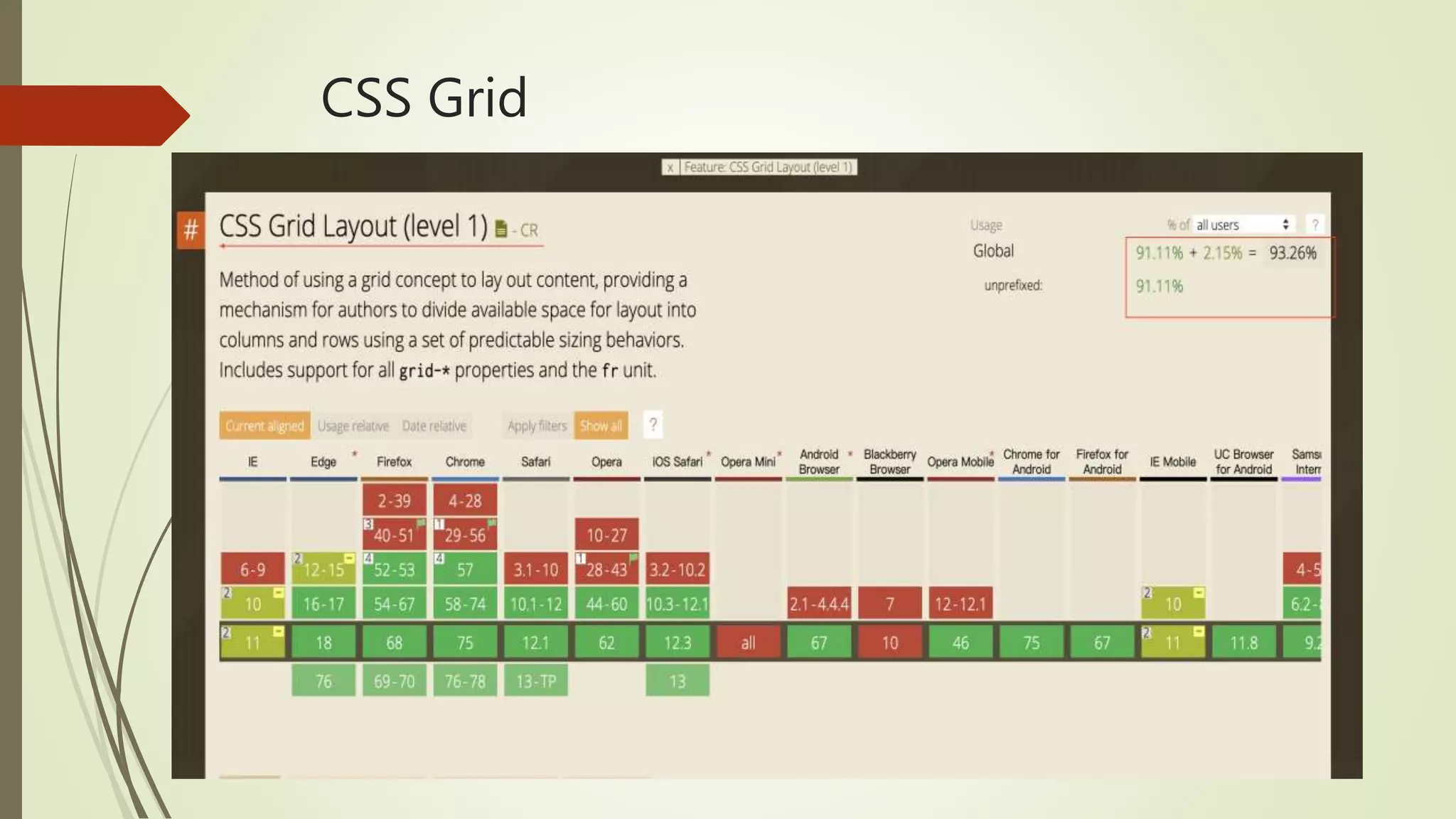
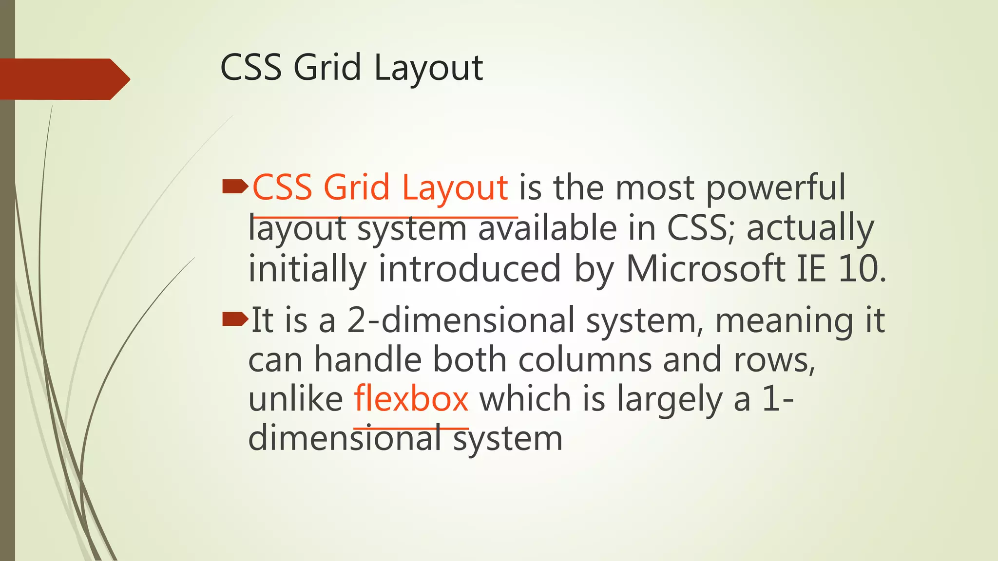
CSS Grid Layout
CSSGrid Layout is the most powerful
layout system available in CSS; actually
initially introduced by Microsoft IE 10.
It is a 2-dimensional system, meaning it
can handle both columns and rows,
unlike flexbox which is largely a 1-
dimensional system
24.
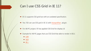
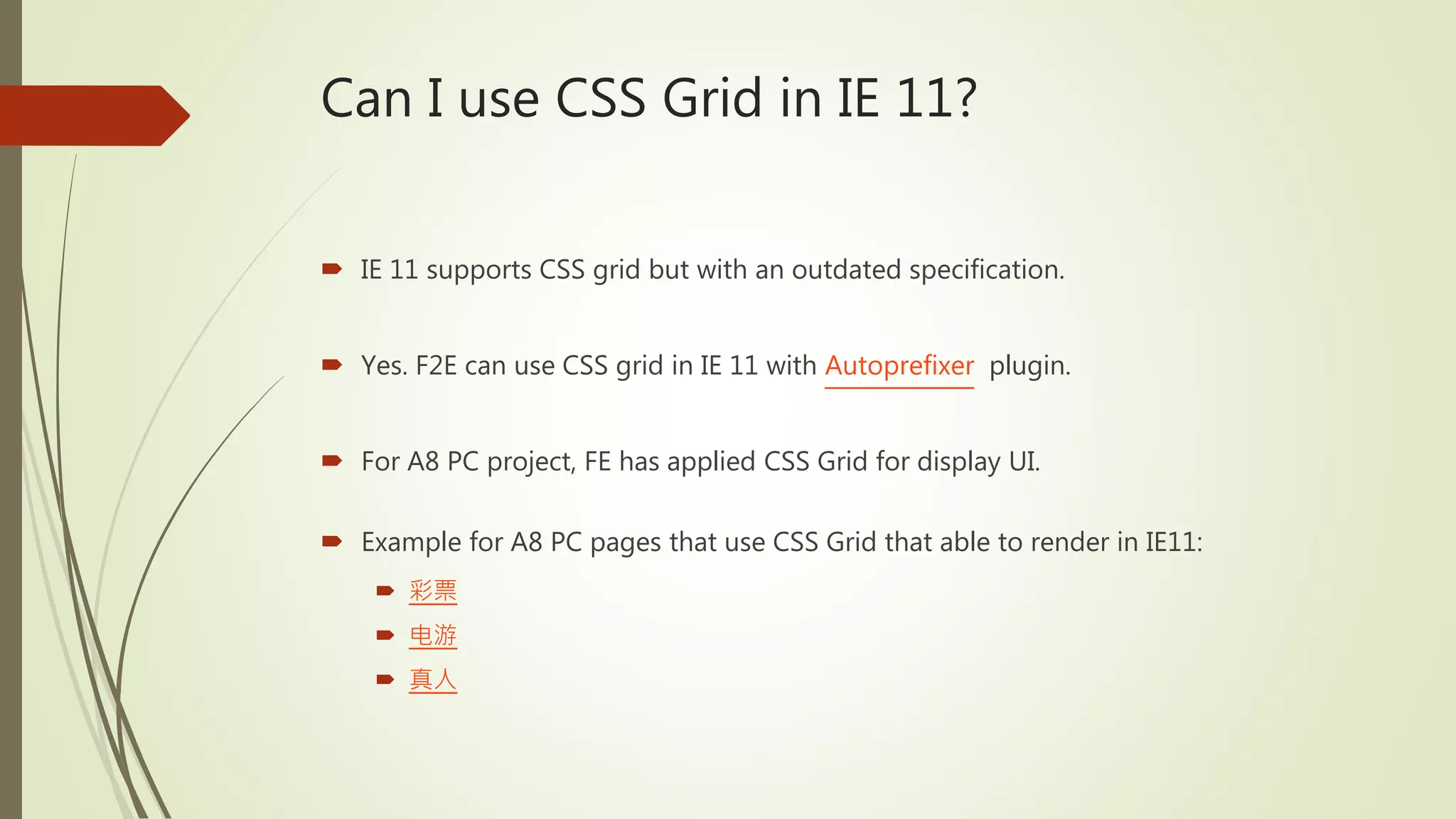
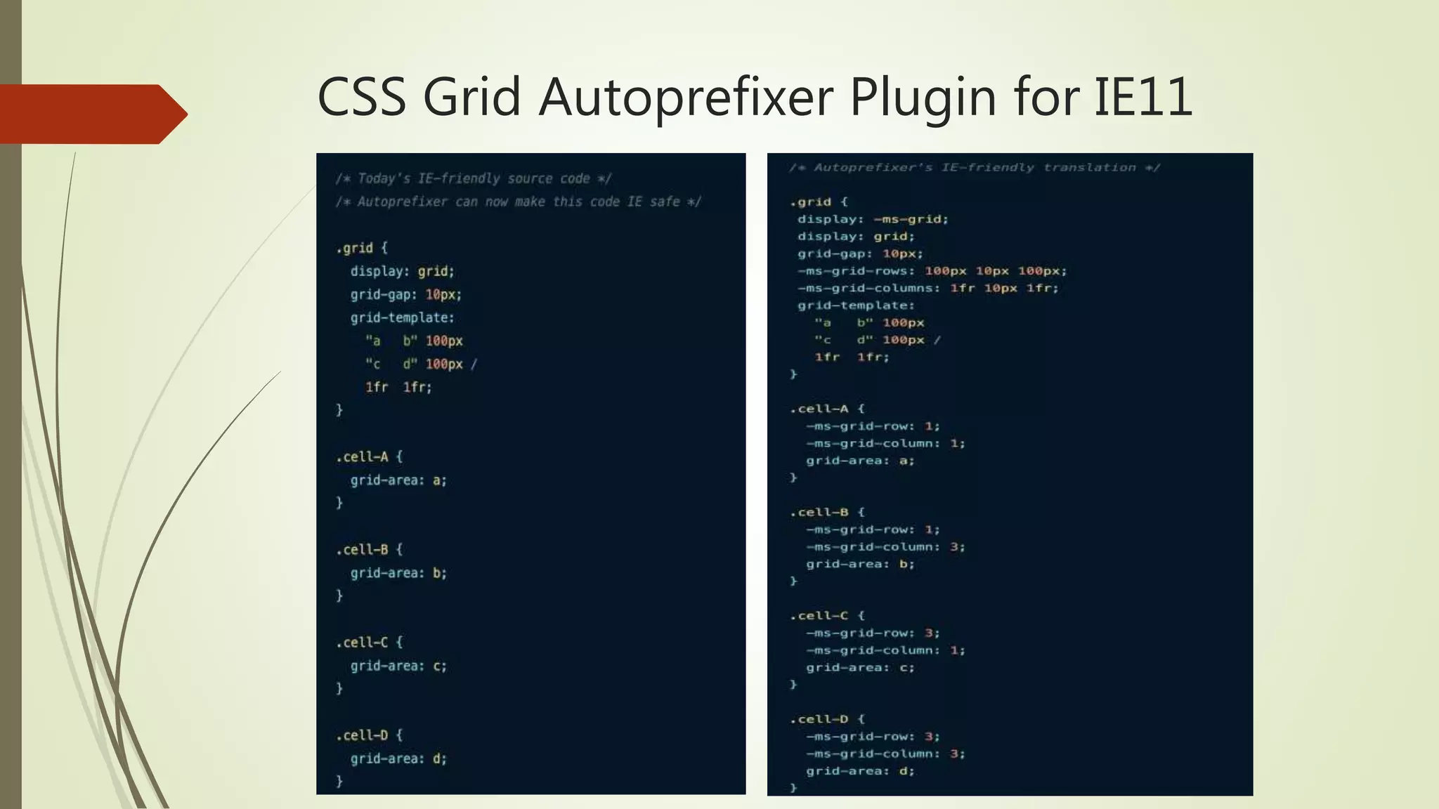
Can I useCSS Grid in IE 11?
IE 11 supports CSS grid but with an outdated specification.
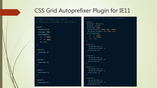
Yes. F2E can use CSS grid in IE 11 with Autoprefixer plugin.
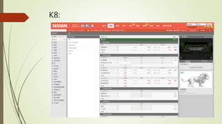
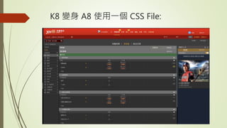
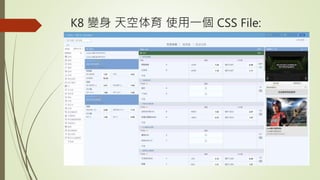
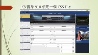
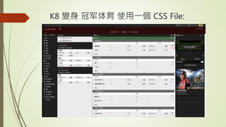
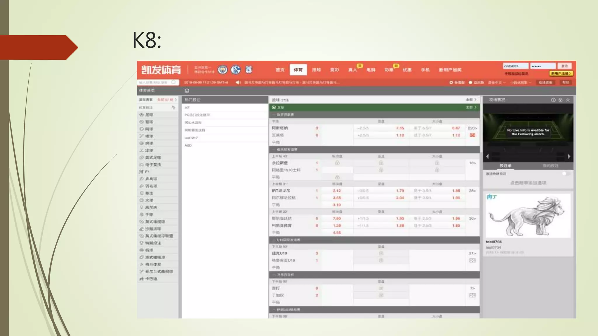
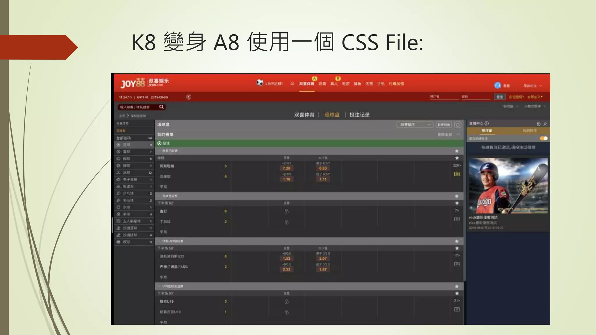
For A8 PC project, FE has applied CSS Grid for display UI.
Example for A8 PC pages that use CSS Grid that able to render in IE11:
彩票
电游
真人
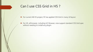
Can I useCSS Grid in H5 ?
For current A8 H5 project, FE has applied CSS Grid in many UI layout.
For H5, all browser, including UC Browser, now support standard CSS Grid spec
without needing to install any plugin.


![[2008]网站重构 -who am i](https://cdn.slidesharecdn.com/ss_thumbnails/2008-whoami-100913035744-phpapp01-thumbnail.jpg?width=600ounds&width=560&fit=bounds)


