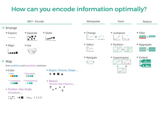
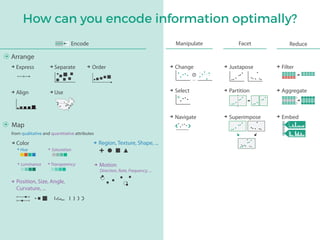
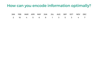
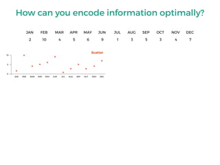
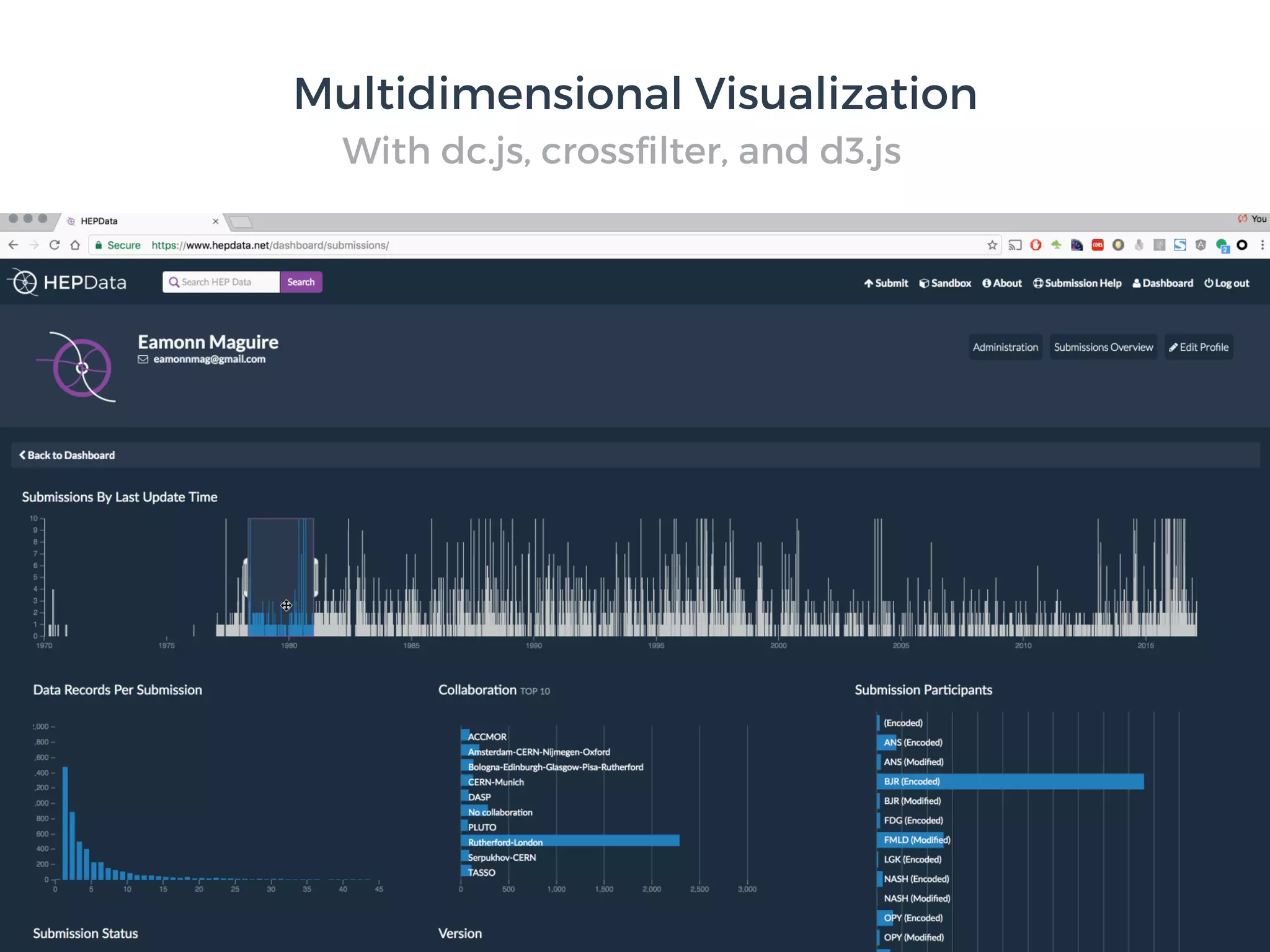
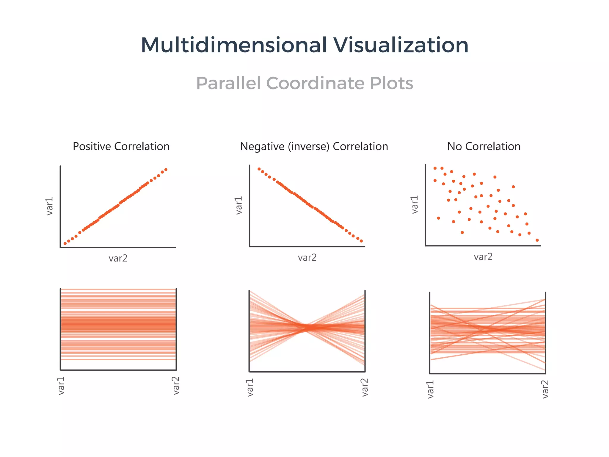
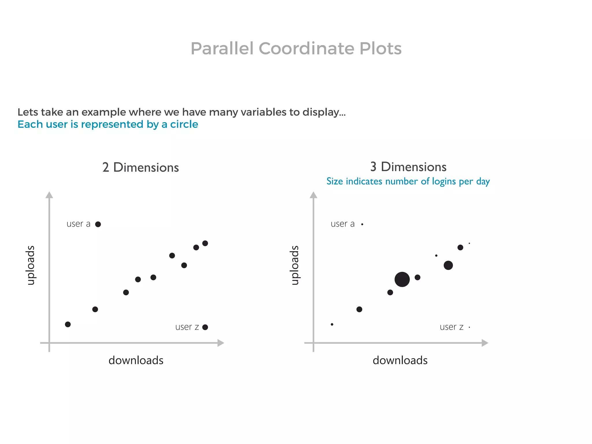
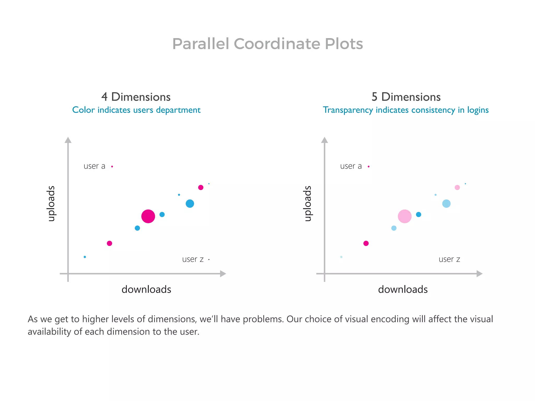
Download as PDF, PPTX

![Cerebral:Visualizing Multiple Experimental Conditions on a
Graph with Biological Context. Barsky, Munzner, Gardy, and
Kincaid. IEEETVCG (Proc. InfoVis) 14(6):1253-1260,
2008.]
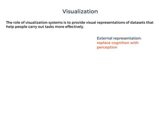
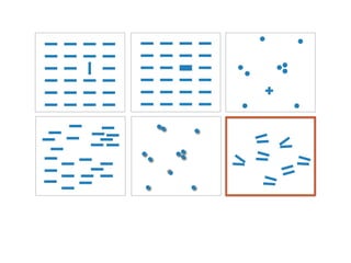
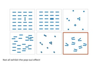
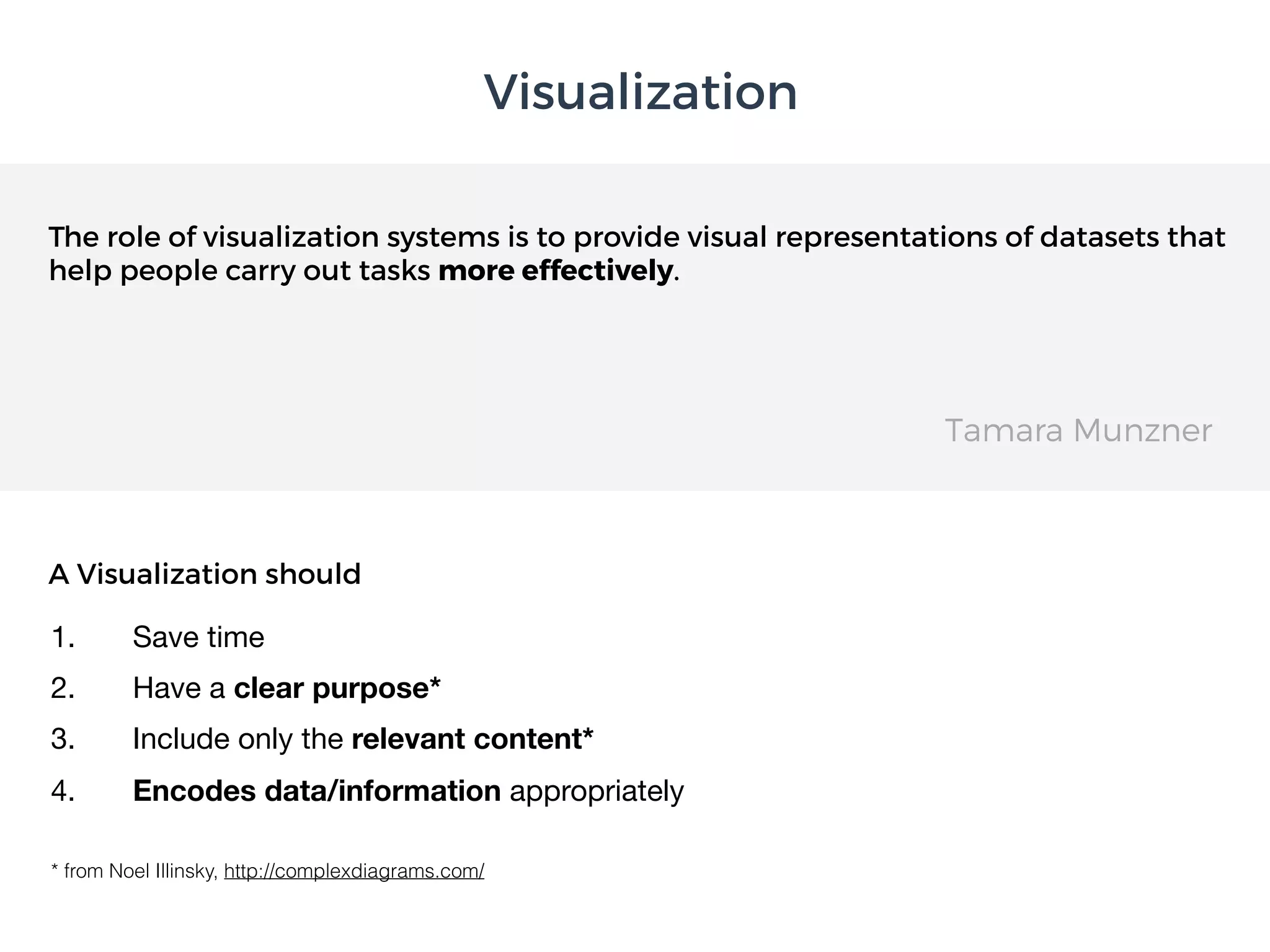
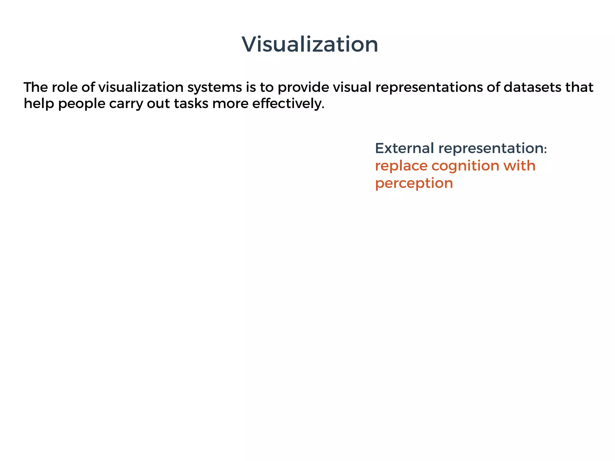
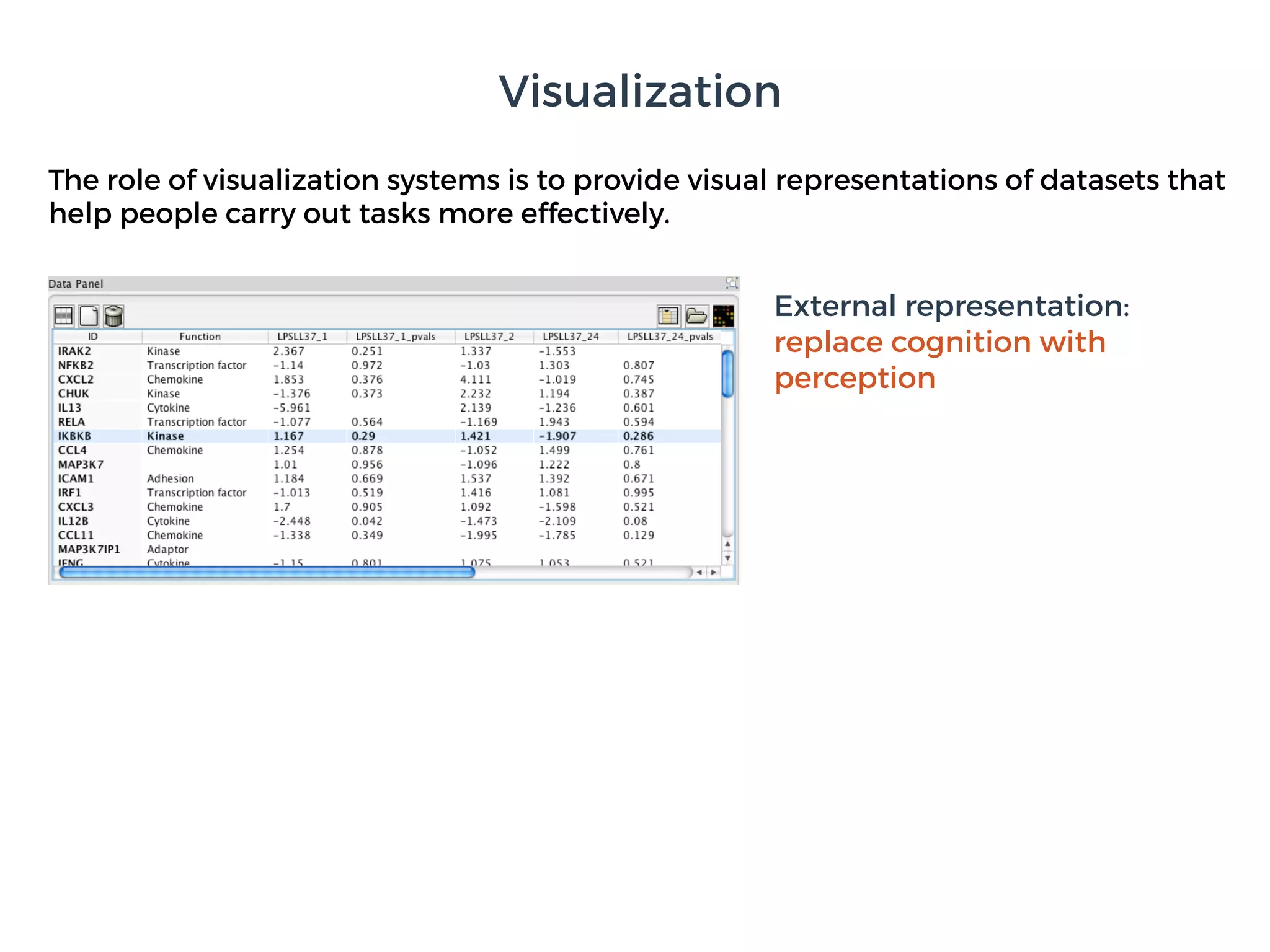
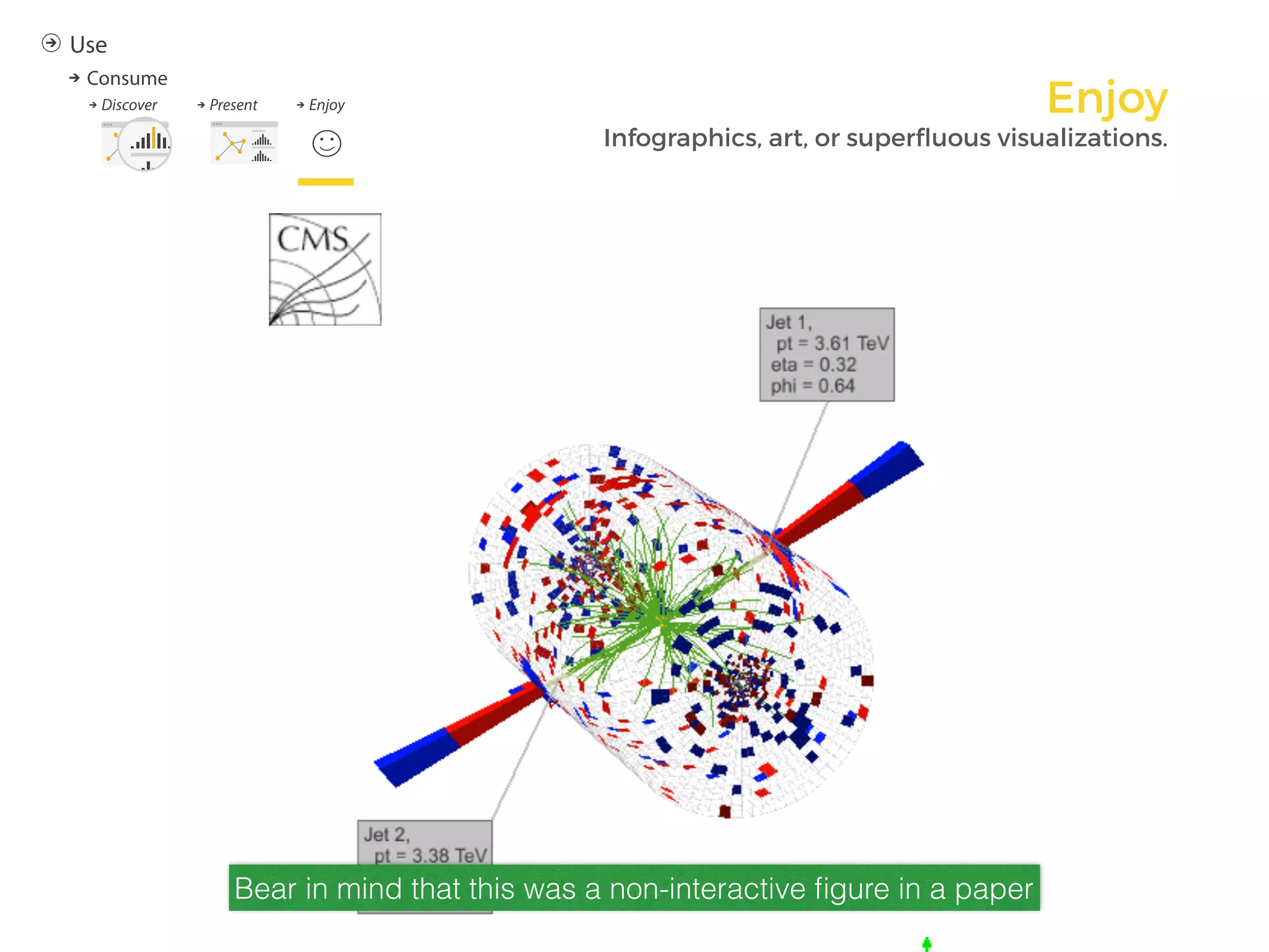
The role of visualization systems is to provide visual representations of datasets that
help people carry out tasks more effectively.
External representation:
replace cognition with
perception
Visualization](https://image.slidesharecdn.com/cern-icsc-eamonn-maguire-v2-170206220540/85/Principles-of-Data-Visualization-8-320.jpg)


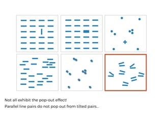


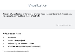
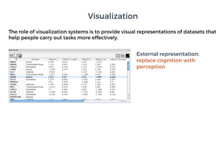
![A. Law of Closure B. Law of Similarity D. Law of Connectedness E. Law of Symmetry
[ ] { } ( )
C. Law of Proximity
F. Law of Good
Continuation
G. Contour Saliency
a c
b
a
c
b
d
H. Law of Common Fate I. Law of Past
Experience
J. Law of
Pragnanz
K. Figure/Ground
Gestalt Laws](https://image.slidesharecdn.com/cern-icsc-eamonn-maguire-v2-170206220540/85/Principles-of-Data-Visualization-82-320.jpg)


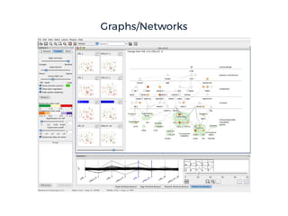
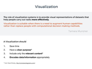
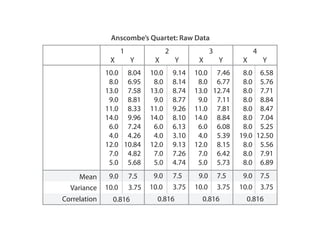
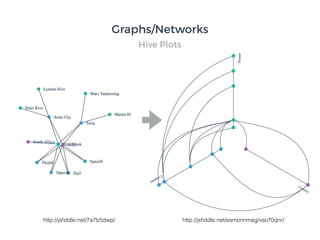
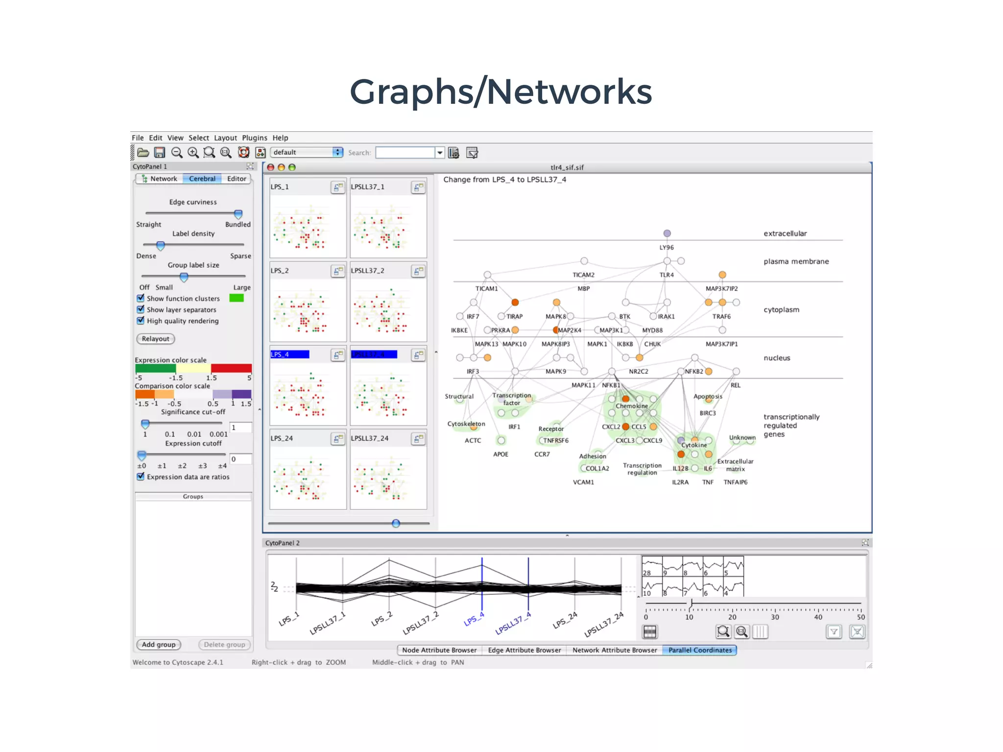
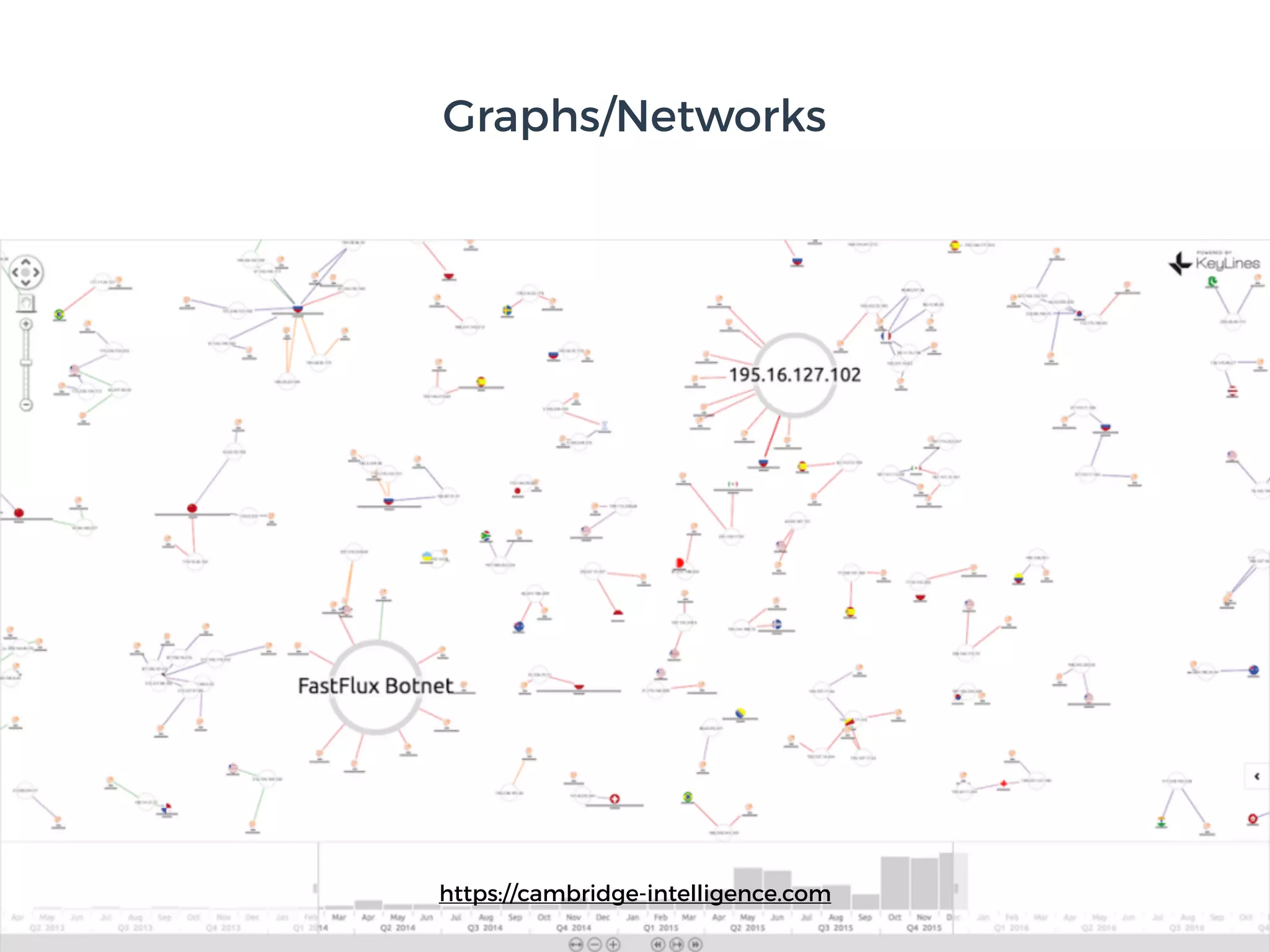
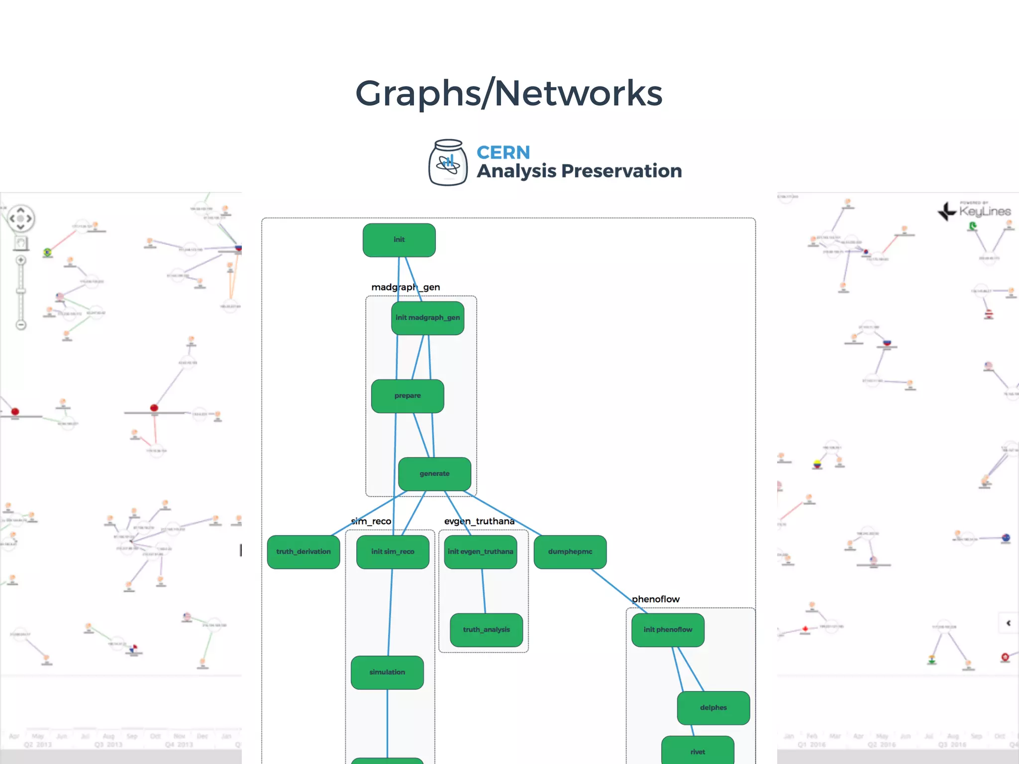
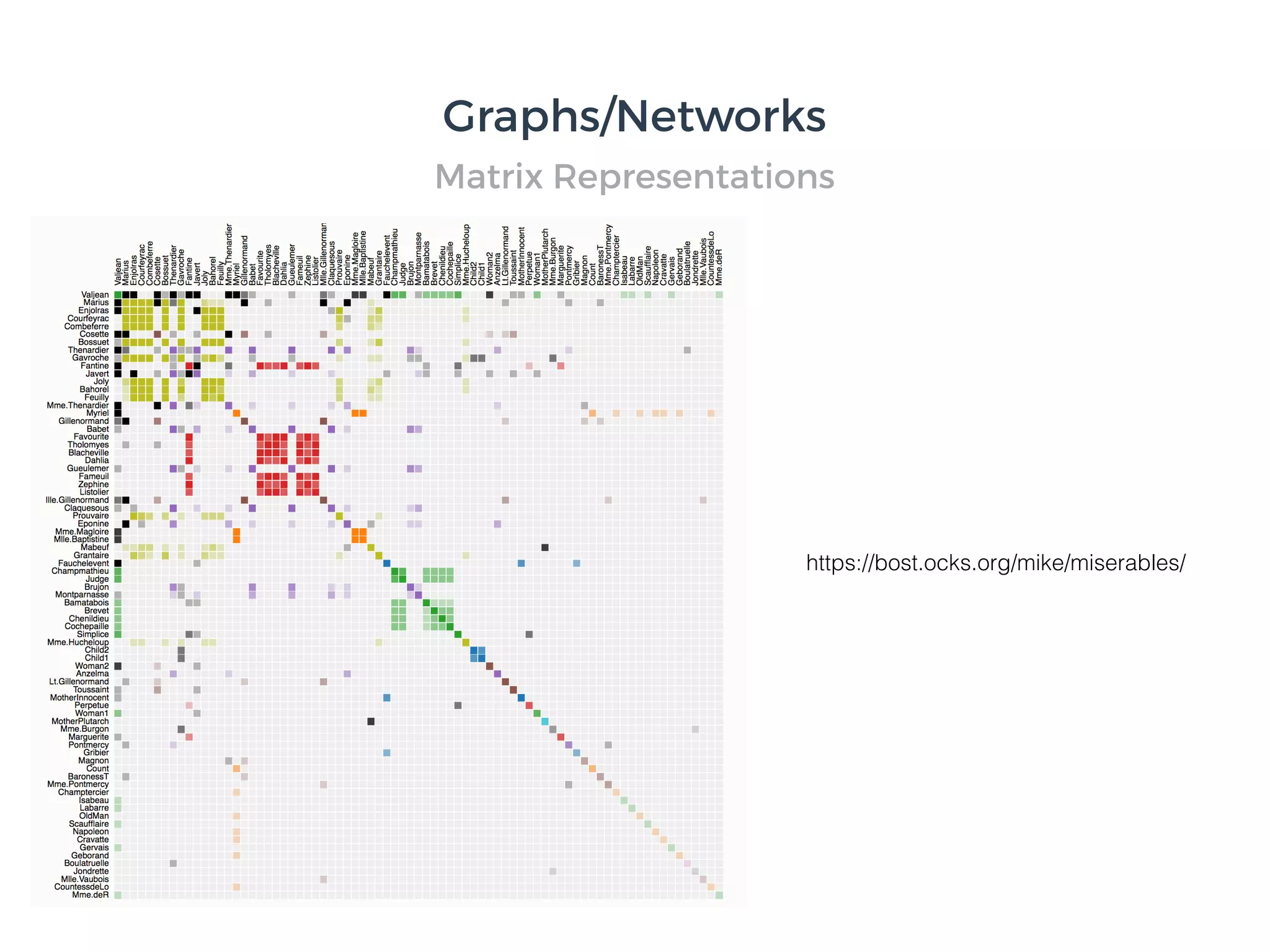
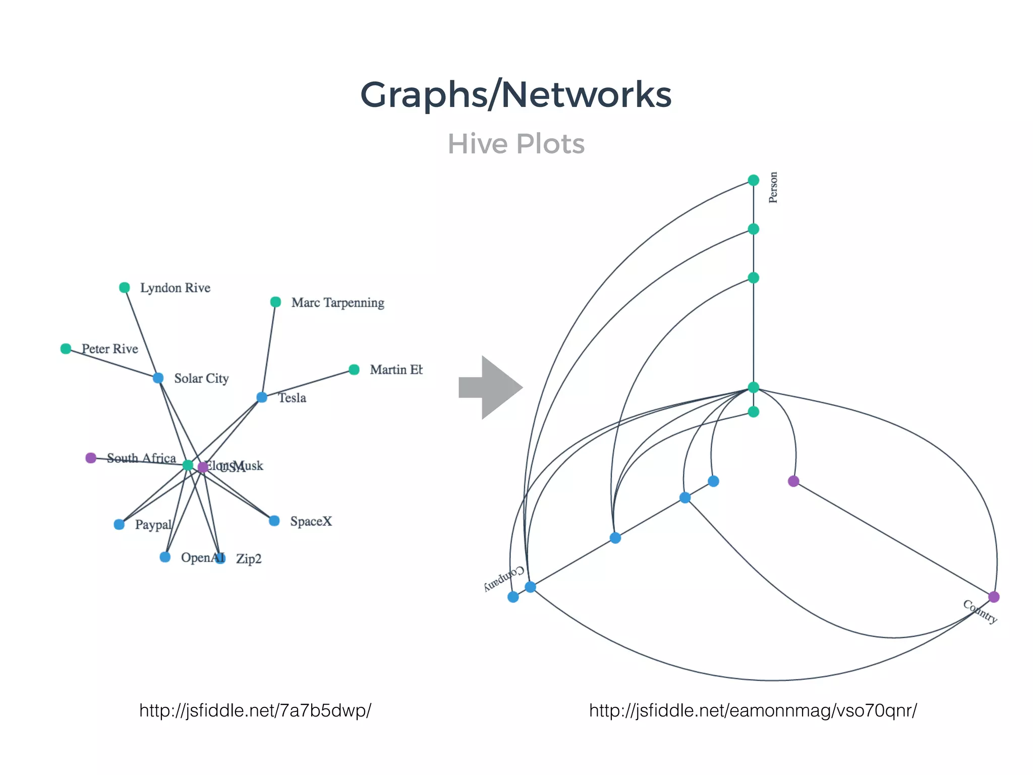
![Graphs/Networks
Cerebral:Visualizing Multiple Experimental Conditions on a Graph with Biological Context. Barsky, Munzner,
Gardy, and Kincaid. IEEETVCG (Proc. InfoVis) 14(6):1253-1260, 2008.]](https://image.slidesharecdn.com/cern-icsc-eamonn-maguire-v2-170206220540/85/Principles-of-Data-Visualization-152-320.jpg)
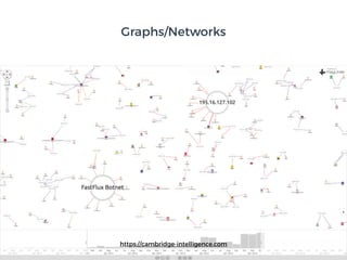


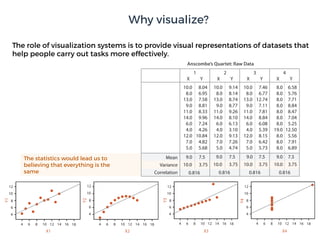
![Cerebral:Visualizing Multiple Experimental Conditions on a
Graph with Biological Context. Barsky, Munzner, Gardy, and
Kincaid. IEEETVCG (Proc. InfoVis) 14(6):1253-1260,
2008.]
The role of visualization systems is to provide visual representations of datasets that
help people carry out tasks more effectively.
External representation:
replace cognition with
perception
Visualization](https://image.slidesharecdn.com/cern-icsc-eamonn-maguire-v2-170206220540/75/Principles-of-Data-Visualization-8-2048.jpg)


![A. Law of Closure B. Law of Similarity D. Law of Connectedness E. Law of Symmetry
[ ] { } ( )
C. Law of Proximity
F. Law of Good
Continuation
G. Contour Saliency
a c
b
a
c
b
d
H. Law of Common Fate I. Law of Past
Experience
J. Law of
Pragnanz
K. Figure/Ground
Gestalt Laws](https://image.slidesharecdn.com/cern-icsc-eamonn-maguire-v2-170206220540/75/Principles-of-Data-Visualization-82-2048.jpg)


![Graphs/Networks
Cerebral:Visualizing Multiple Experimental Conditions on a Graph with Biological Context. Barsky, Munzner,
Gardy, and Kincaid. IEEETVCG (Proc. InfoVis) 14(6):1253-1260, 2008.]](https://image.slidesharecdn.com/cern-icsc-eamonn-maguire-v2-170206220540/75/Principles-of-Data-Visualization-152-2048.jpg)


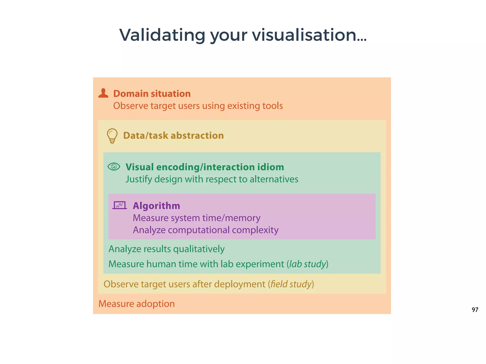


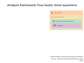
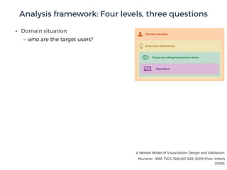
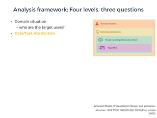
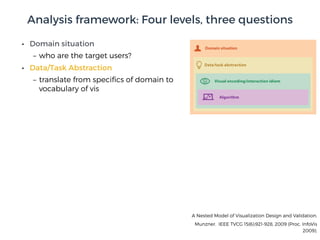
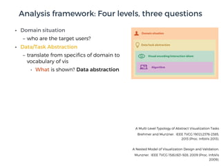
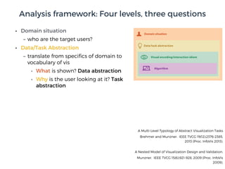
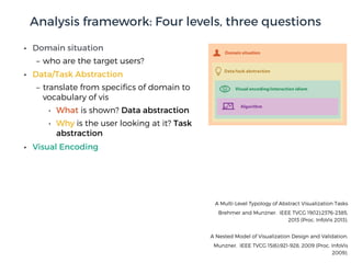
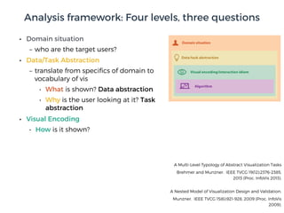
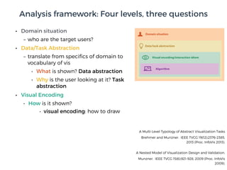
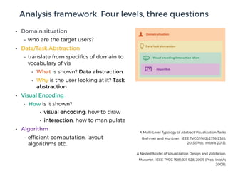
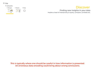
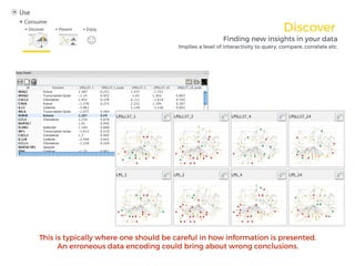
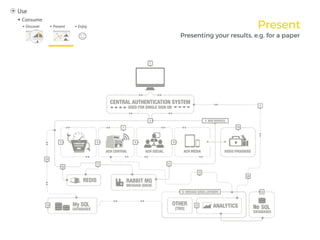
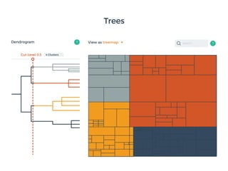
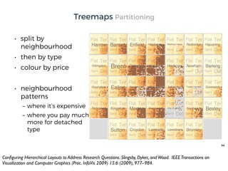
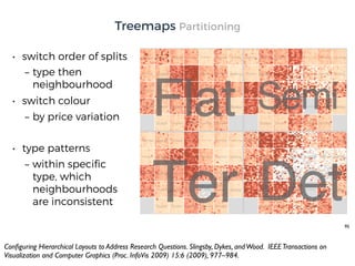
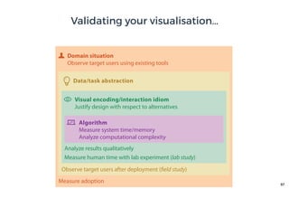
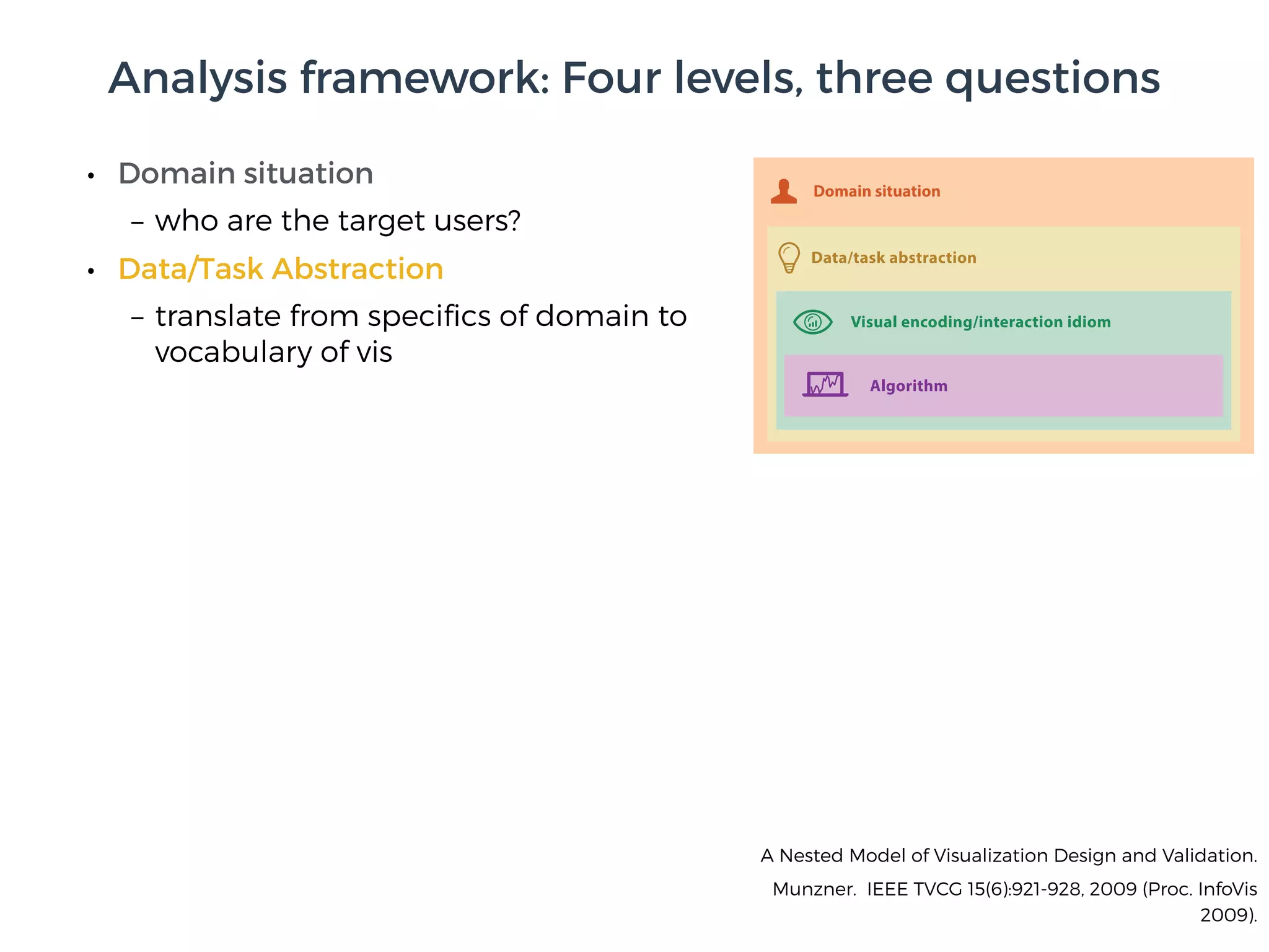
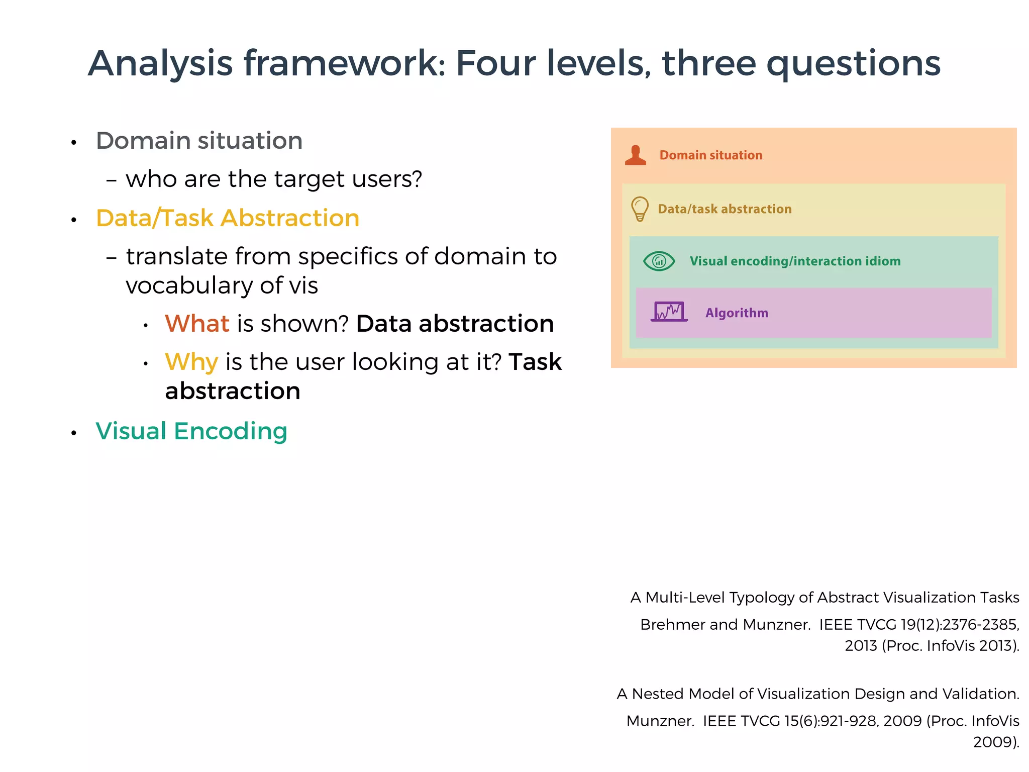
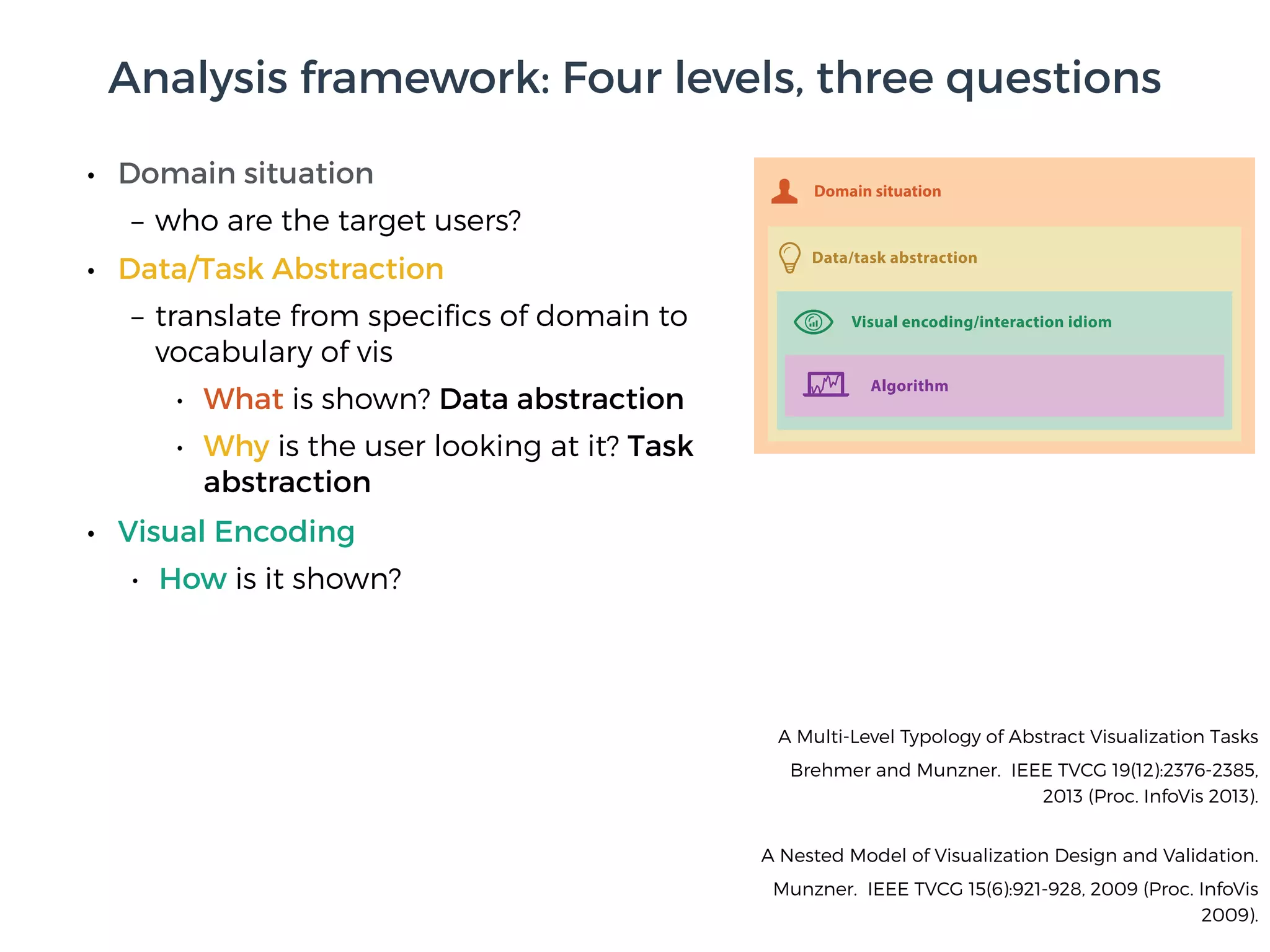
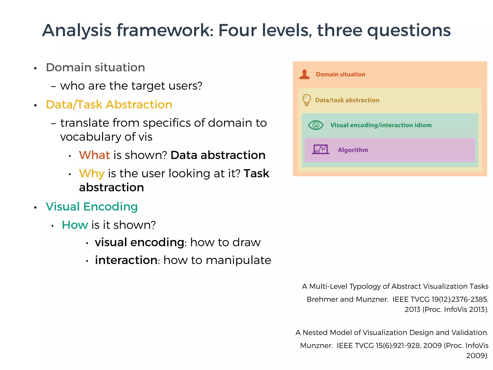
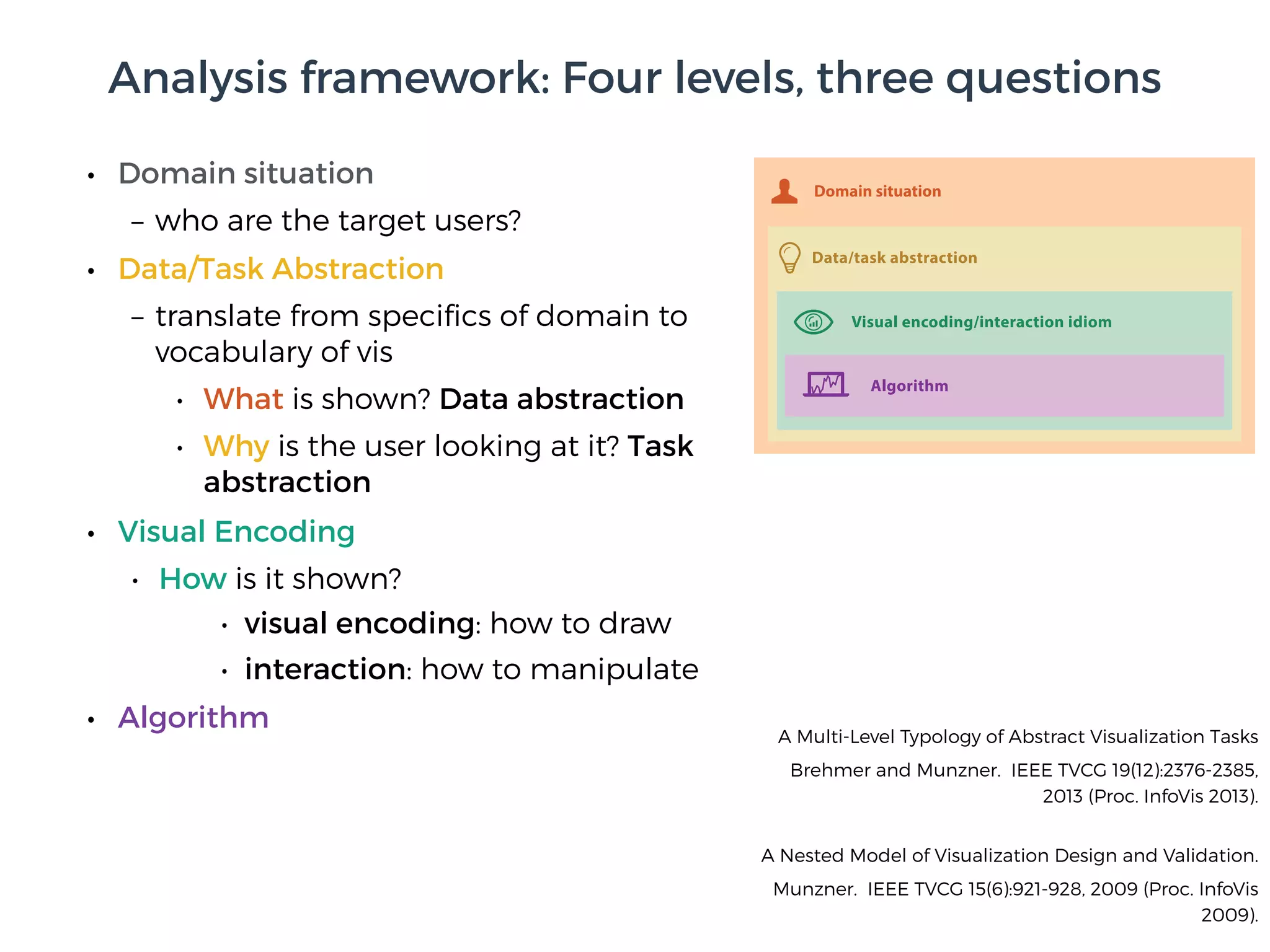
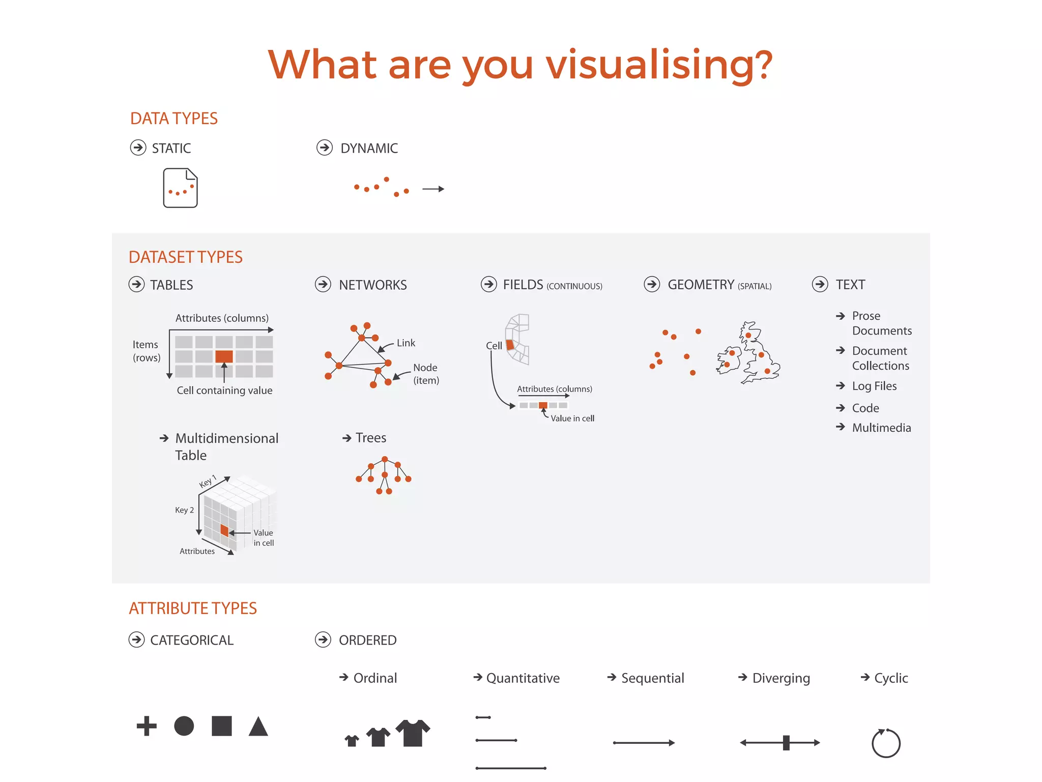
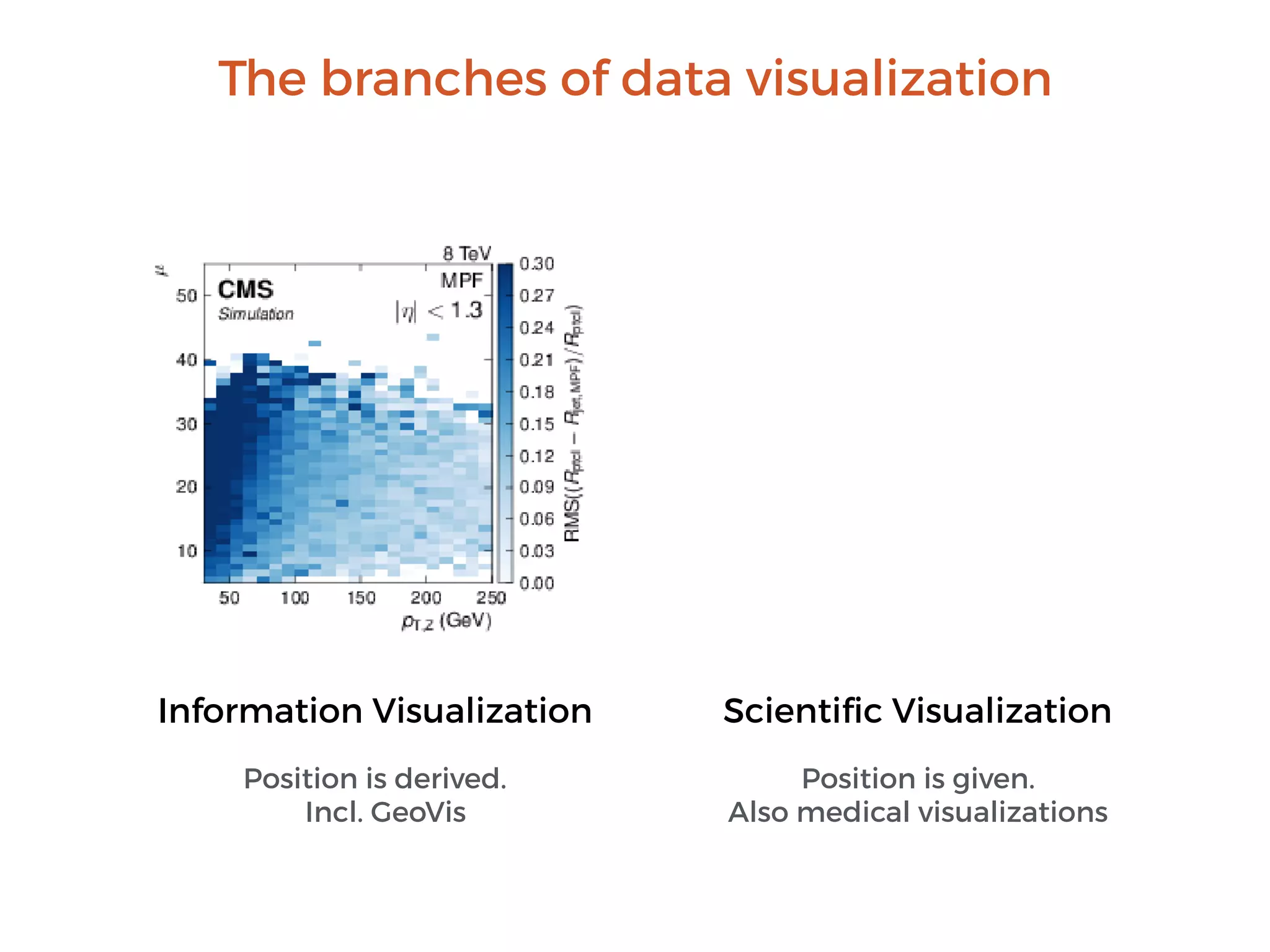
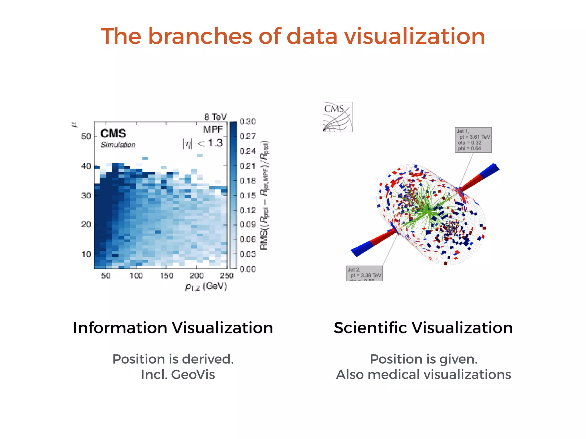
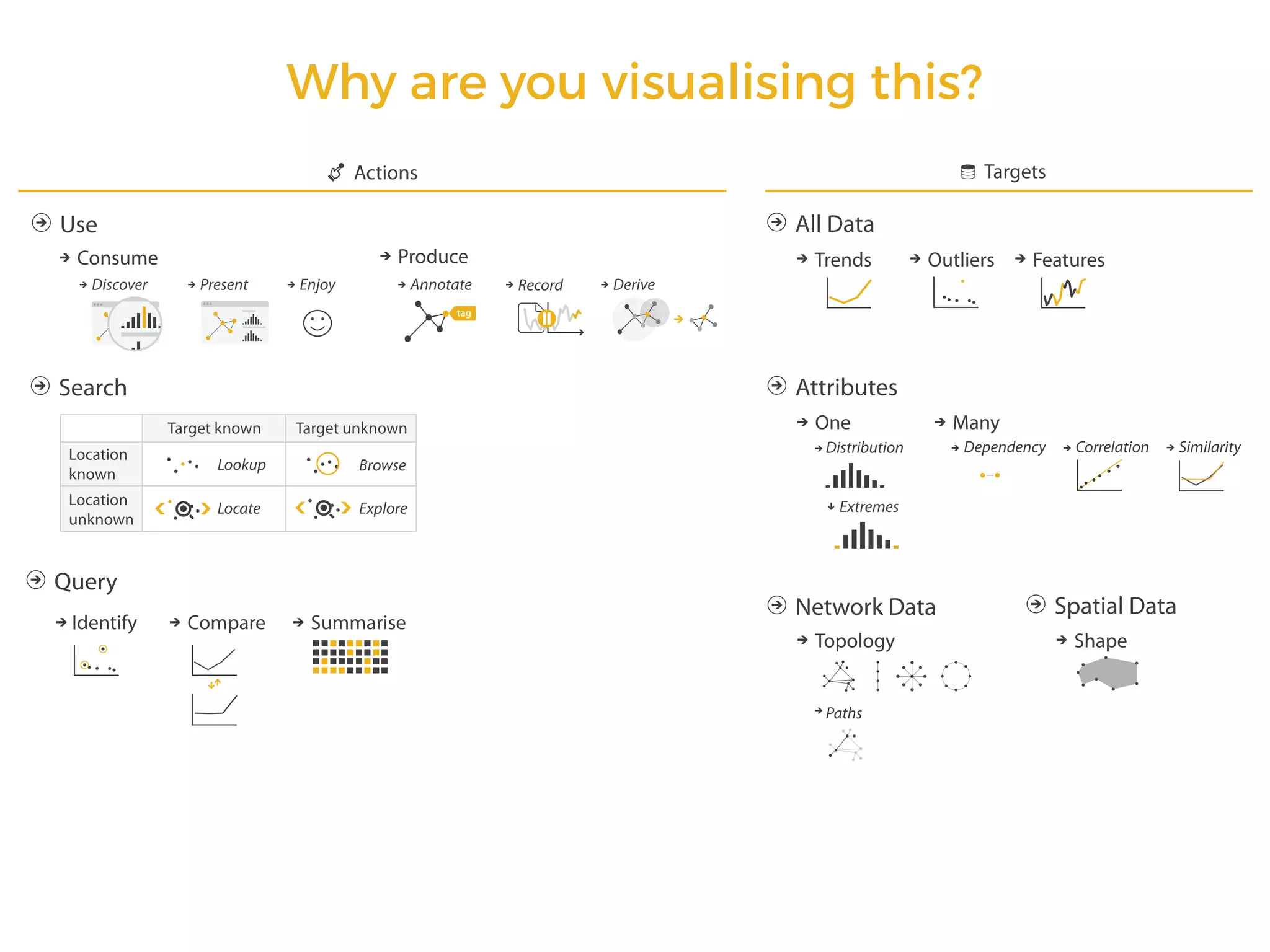
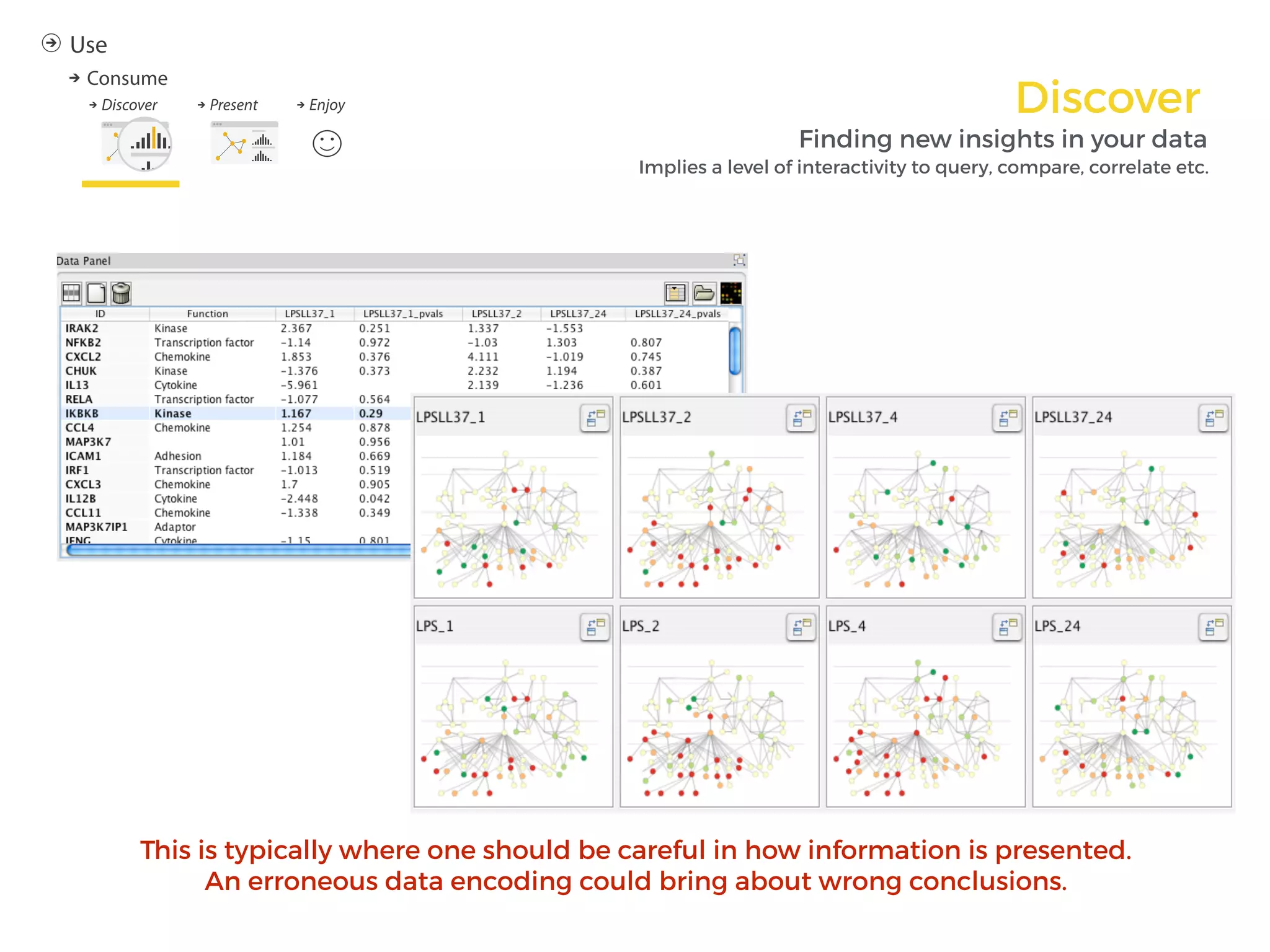
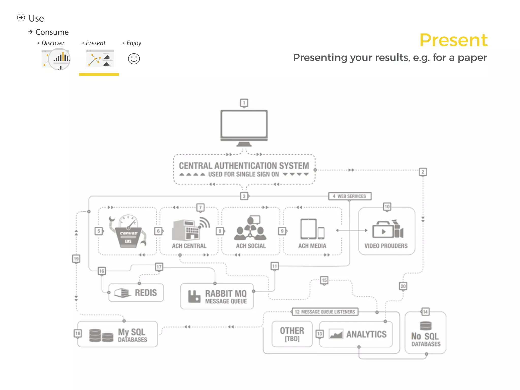
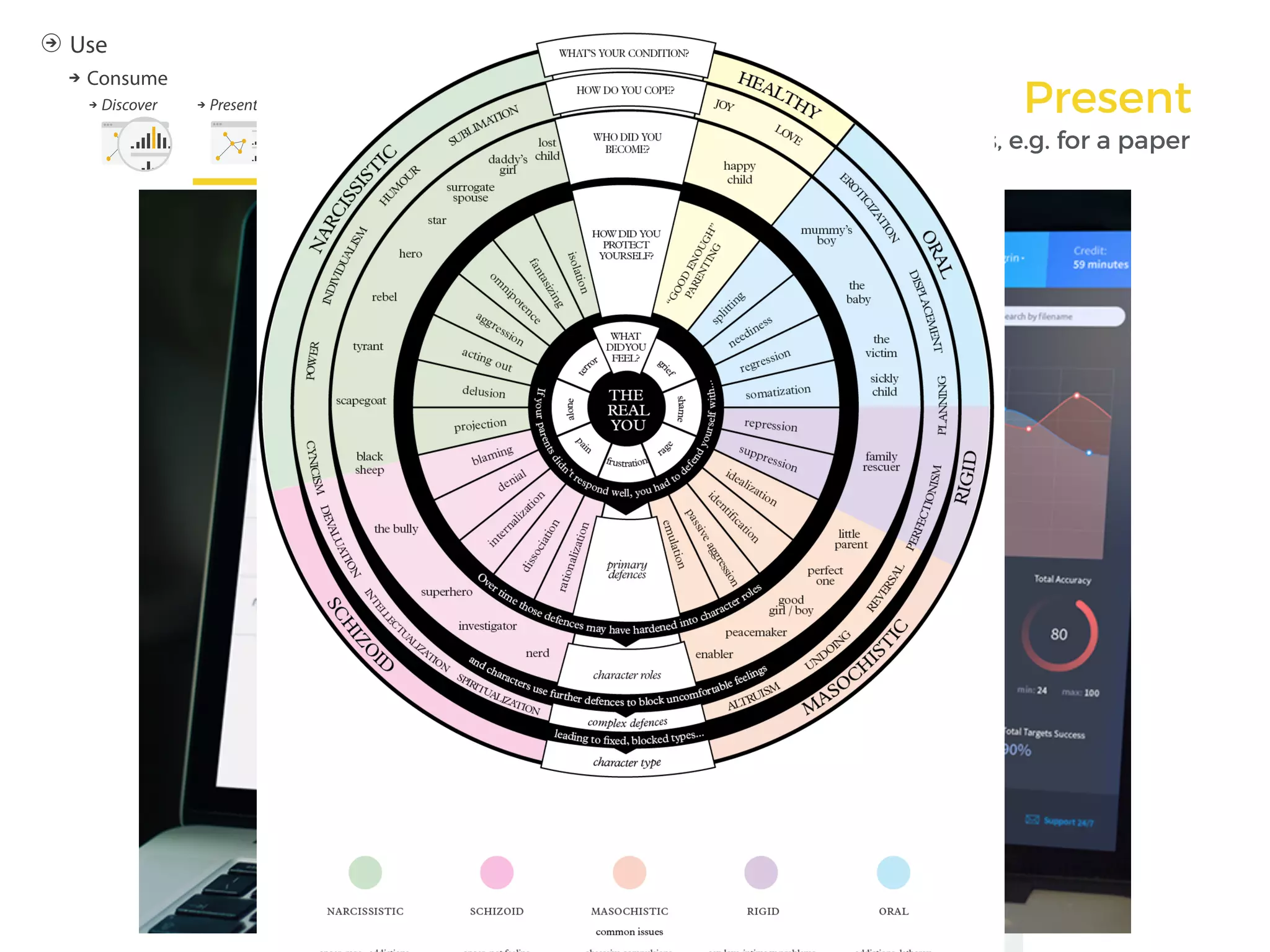
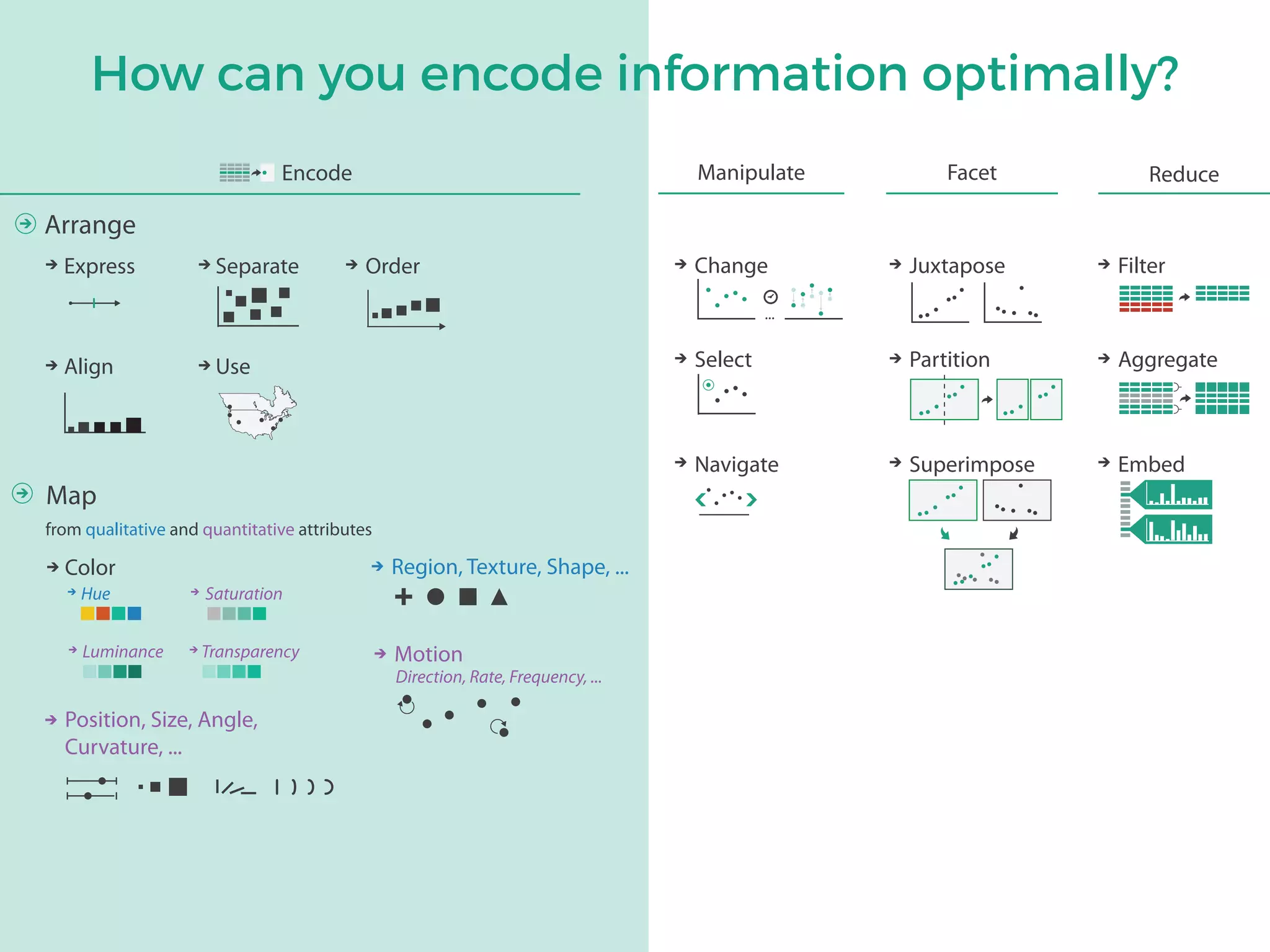
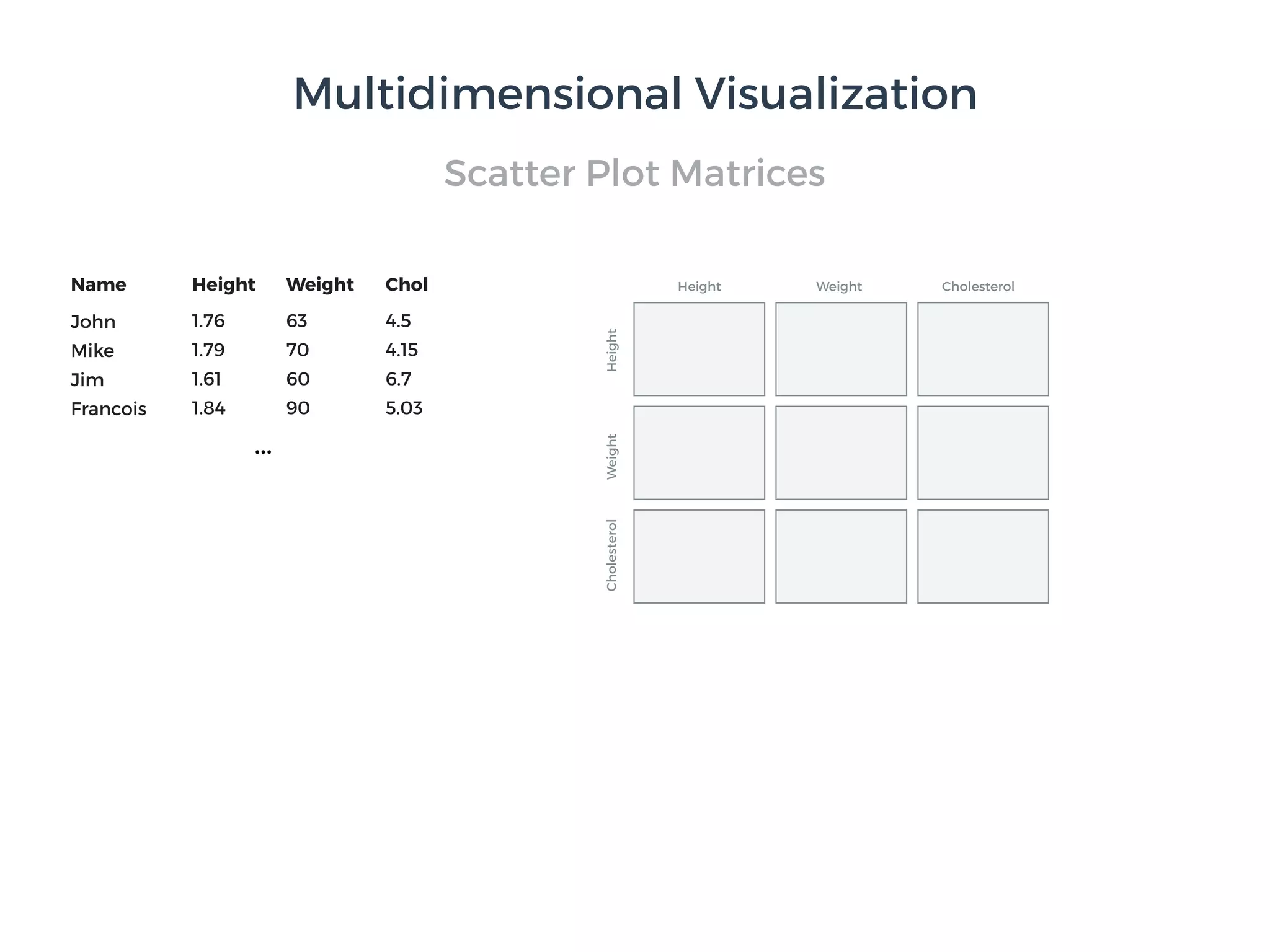
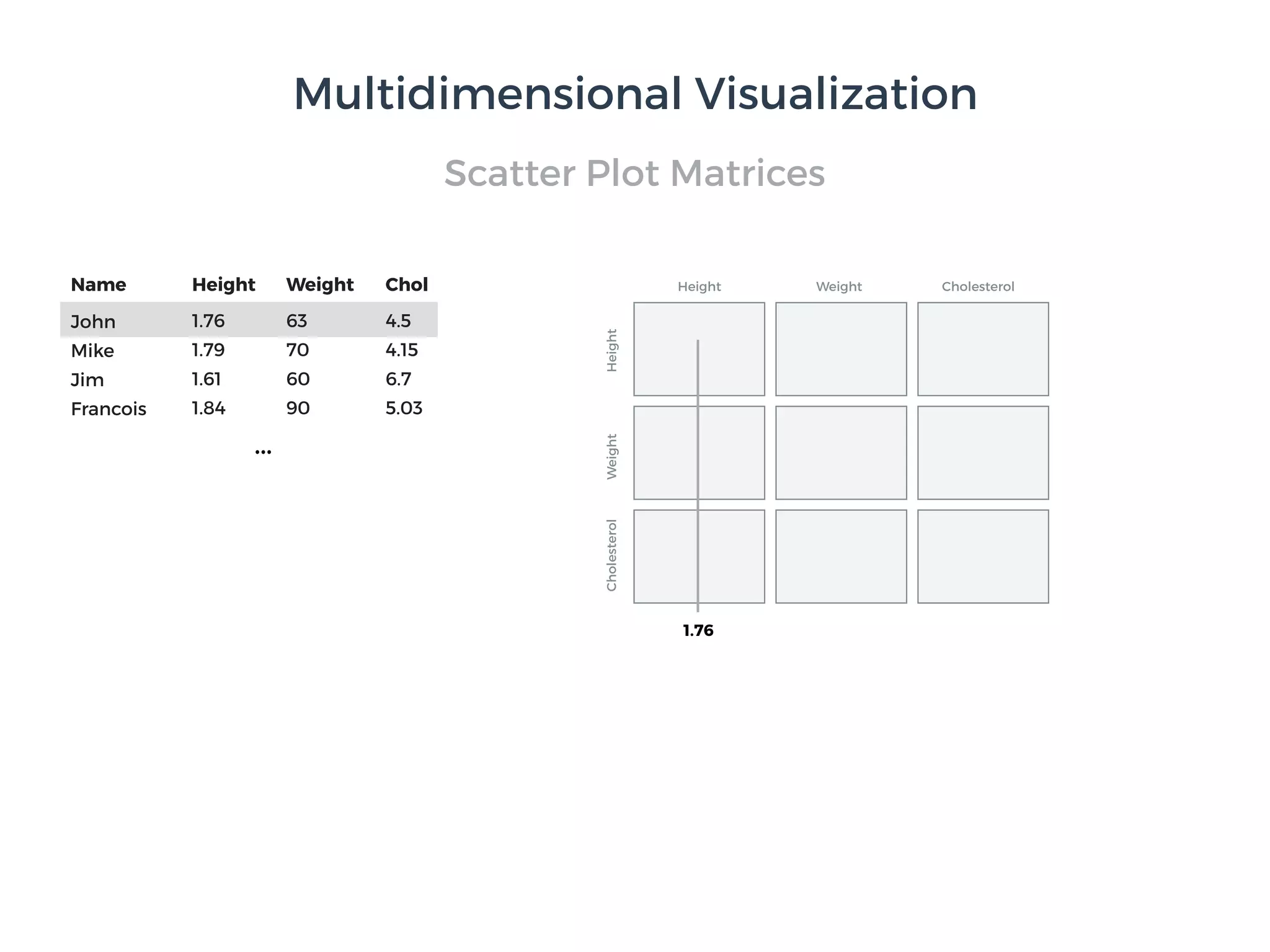
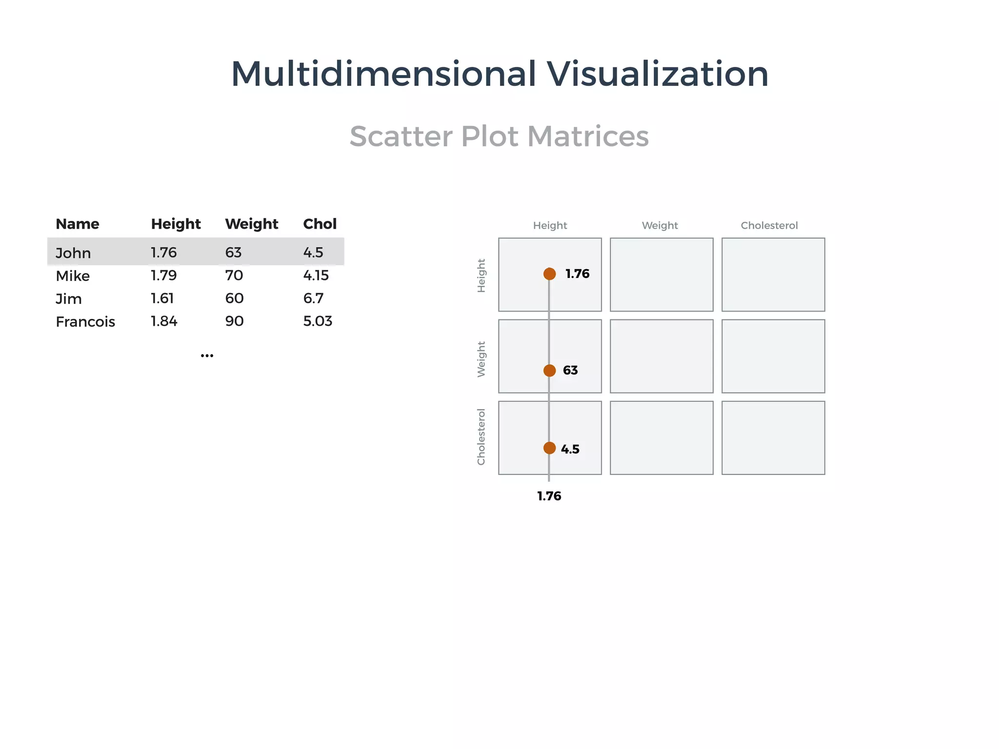
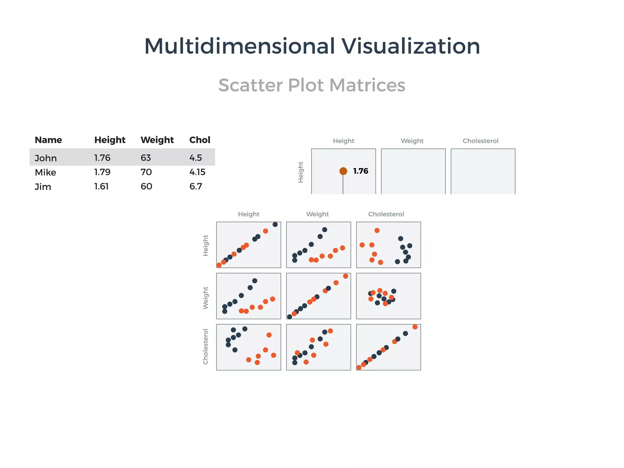
The document discusses principles of data visualization. It provides an overview of Tamara Munzner's framework for visualization design, which involves four levels of analysis: the domain situation, data/task abstraction, visual encoding and interaction idioms, and algorithms. The framework aims to translate real-world problems into visual representations that help users accomplish tasks. The document also outlines different types of data visualization like scientific and information visualization. Finally, it notes discoverability as a key purpose of visualization, to gain new insights from data in an interactive manner.


![Matrix and determinant URT [Autosaved].pptx](https://cdn.slidesharecdn.com/ss_thumbnails/matrixanddeterminanturtautosaved-251018190340-9e6a6deb-thumbnail.jpg?width=600ounds&width=560&fit=bounds)


![RTP_AR_Basic_Learners' Workbook_KS2 [FOR REPRODUCTION] (1).pdf](https://cdn.slidesharecdn.com/ss_thumbnails/rtparbasiclearnersworkbookks2forreproduction1-251016024943-e51a16ac-thumbnail.jpg?width=600ounds&width=560&fit=bounds)