Download as PDF, PPTX

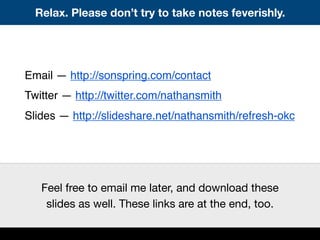


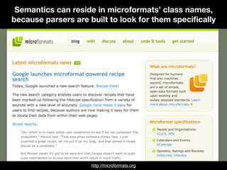


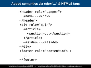


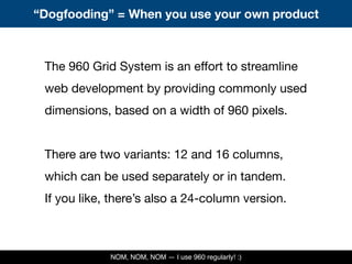
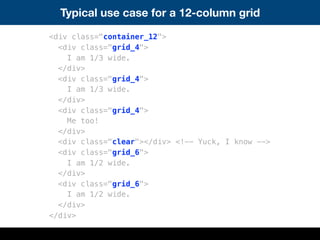


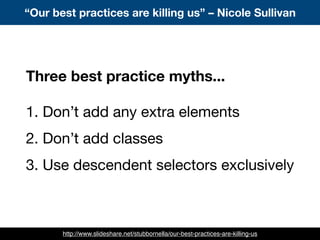
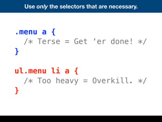
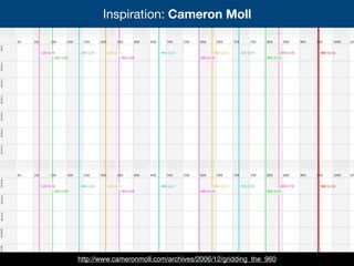


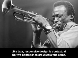


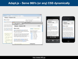
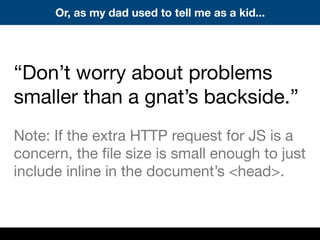
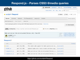
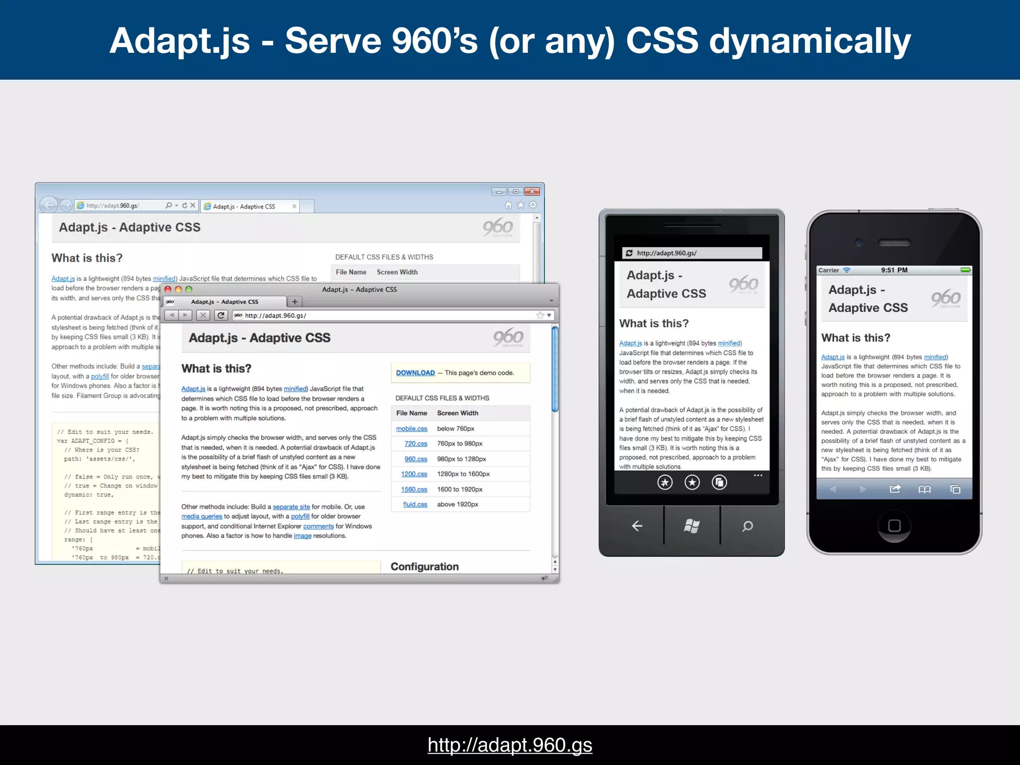
![How to use Adapt.js = A human-readable config
<script>
// Edit to suit your needs.
var ADAPT_CONFIG = {
// Where is your CSS?
path: 'assets/css/',
// false = Only run once, when page first loads.
// true = Change on window resize and page tilt.
dynamic: true,
// Optional callback... myCallback(i, width)
callback: myCallback,
// First range entry is the minimum.
// Last range entry is the maximum.
// Separate ranges by "to" keyword.
range: [
'0px to 760px = mobile.css',
'760px to 980px = 720.css',
'980px to 1280px = 960.css',
'1280px to 1600px = 1200.css',
'1600px to 1920px = 1560.css',
'1920px = fluid.css'
]
};
</script>](https://image.slidesharecdn.com/refresh-okc-110419035057-phpapp02/85/Refresh-OKC-78-320.jpg)
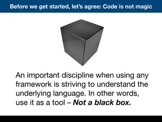
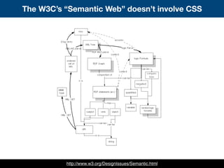
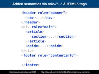
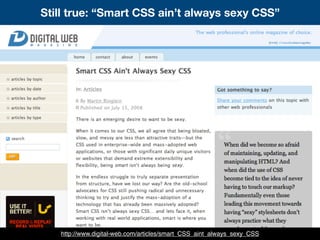
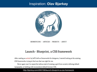
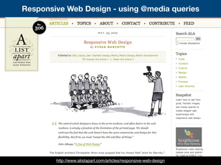
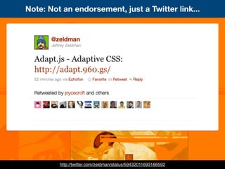
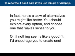
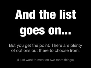
![How to use Adapt.js = A human-readable config
<script>
// Edit to suit your needs.
var ADAPT_CONFIG = {
// Where is your CSS?
path: 'assets/css/',
// false = Only run once, when page first loads.
// true = Change on window resize and page tilt.
dynamic: true,
// Optional callback... myCallback(i, width)
callback: myCallback,
// First range entry is the minimum.
// Last range entry is the maximum.
// Separate ranges by "to" keyword.
range: [
'0px to 760px = mobile.css',
'760px to 980px = 720.css',
'980px to 1280px = 960.css',
'1280px to 1600px = 1200.css',
'1600px to 1920px = 1560.css',
'1920px = fluid.css'
]
};
</script>](https://image.slidesharecdn.com/refresh-okc-110419035057-phpapp02/85/Refresh-OKC-79-320.jpg)

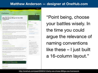
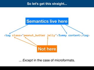
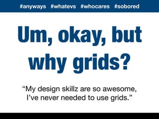
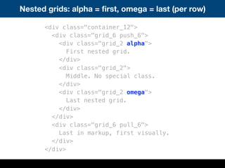
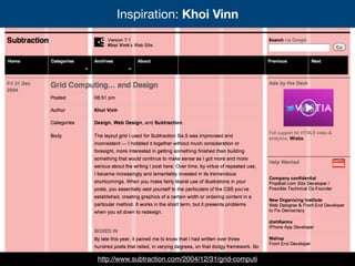
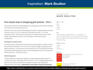
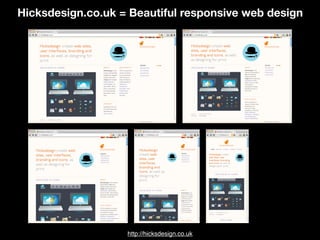
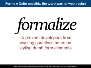
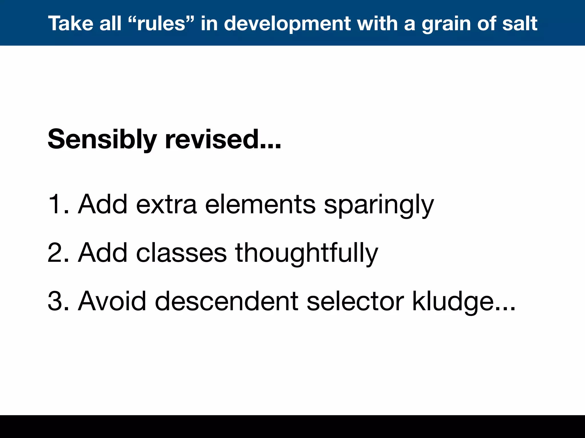
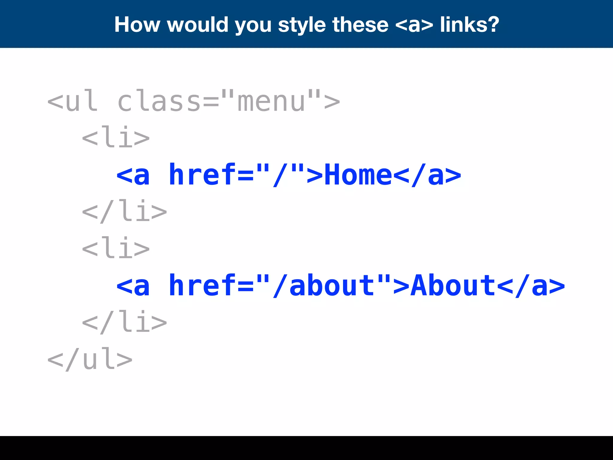
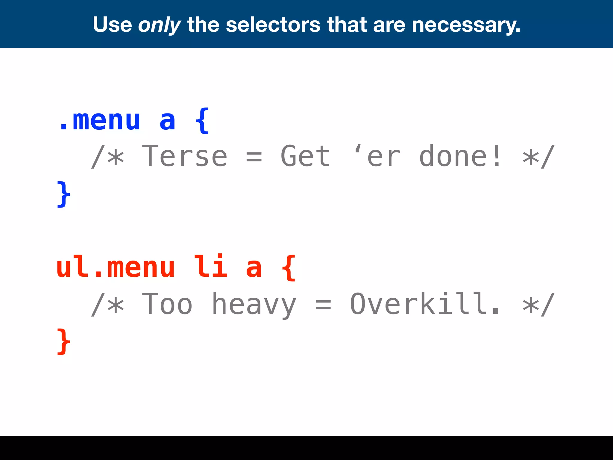
![Not to go all “Ron Burgundy” on you, but...
“Kind of a [small] deal”
I didn’t set out to write a
terse snippet of JavaScript.
That’s just how easy the
problem was to solve.
Seriously though, consider
what will be best for your
project. Nothing is a magic
bullet. Code is just code.
http://en.wikipedia.org/wiki/Anchorman:_The_Legend_of_Ron_Burgundy](https://image.slidesharecdn.com/refresh-okc-110419035057-phpapp02/85/Refresh-OKC-83-320.jpg)


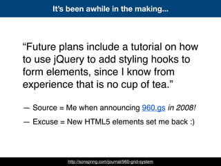


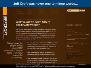
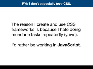
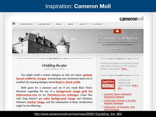
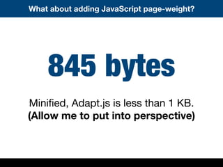
![How to use Adapt.js = A human-readable config
<script>
// Edit to suit your needs.
var ADAPT_CONFIG = {
// Where is your CSS?
path: 'assets/css/',
// false = Only run once, when page first loads.
// true = Change on window resize and page tilt.
dynamic: true,
// Optional callback... myCallback(i, width)
callback: myCallback,
// First range entry is the minimum.
// Last range entry is the maximum.
// Separate ranges by "to" keyword.
range: [
'0px to 760px = mobile.css',
'760px to 980px = 720.css',
'980px to 1280px = 960.css',
'1280px to 1600px = 1200.css',
'1600px to 1920px = 1560.css',
'1920px = fluid.css'
]
};
</script>](https://image.slidesharecdn.com/refresh-okc-110419035057-phpapp02/75/Refresh-OKC-78-2048.jpg)
![How to use Adapt.js = A human-readable config
<script>
// Edit to suit your needs.
var ADAPT_CONFIG = {
// Where is your CSS?
path: 'assets/css/',
// false = Only run once, when page first loads.
// true = Change on window resize and page tilt.
dynamic: true,
// Optional callback... myCallback(i, width)
callback: myCallback,
// First range entry is the minimum.
// Last range entry is the maximum.
// Separate ranges by "to" keyword.
range: [
'0px to 760px = mobile.css',
'760px to 980px = 720.css',
'980px to 1280px = 960.css',
'1280px to 1600px = 1200.css',
'1600px to 1920px = 1560.css',
'1920px = fluid.css'
]
};
</script>](https://image.slidesharecdn.com/refresh-okc-110419035057-phpapp02/75/Refresh-OKC-79-2048.jpg)

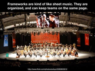
![Not to go all “Ron Burgundy” on you, but...
“Kind of a [small] deal”
I didn’t set out to write a
terse snippet of JavaScript.
That’s just how easy the
problem was to solve.
Seriously though, consider
what will be best for your
project. Nothing is a magic
bullet. Code is just code.
http://en.wikipedia.org/wiki/Anchorman:_The_Legend_of_Ron_Burgundy](https://image.slidesharecdn.com/refresh-okc-110419035057-phpapp02/75/Refresh-OKC-83-2048.jpg)


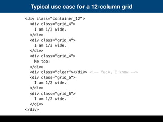
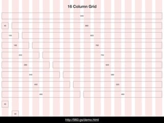
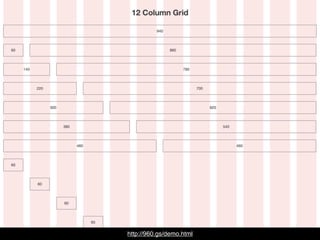
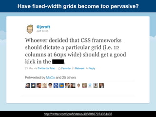
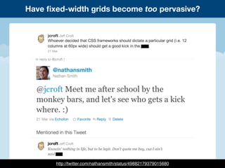
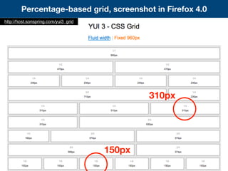
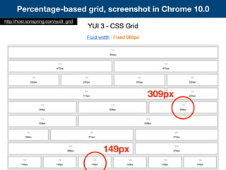
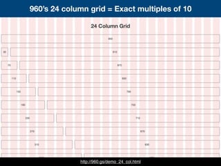
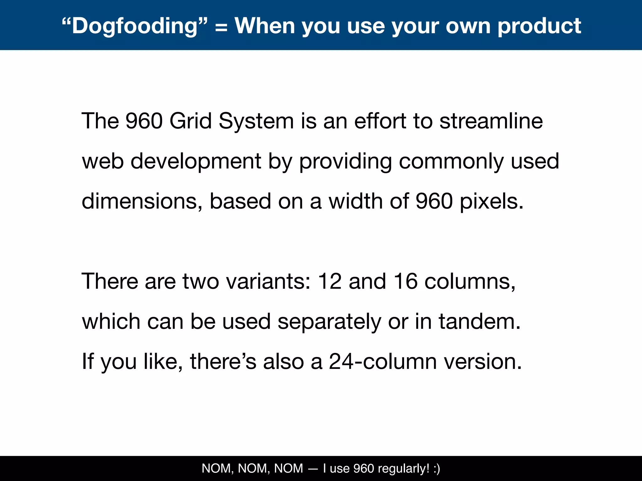
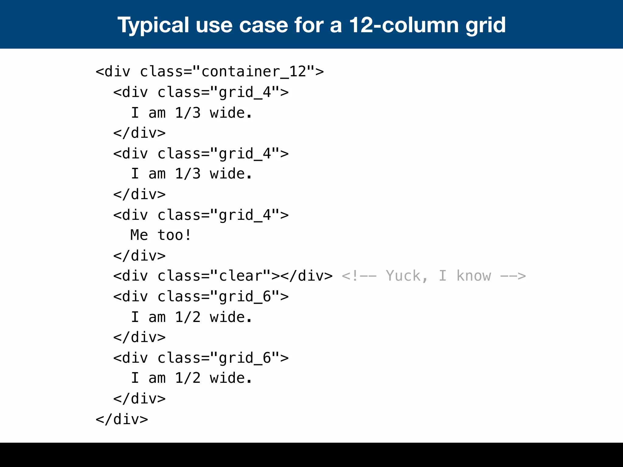
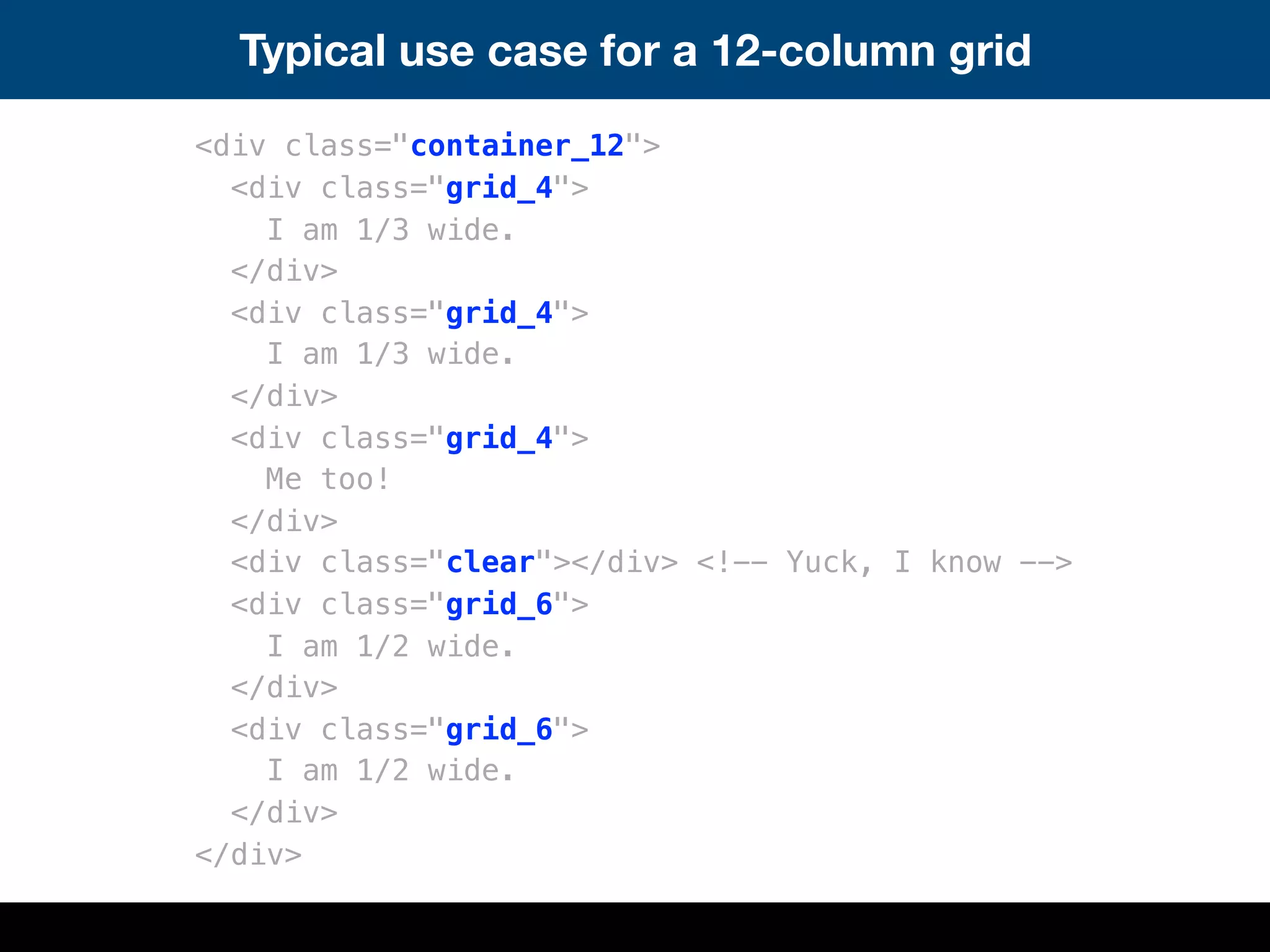
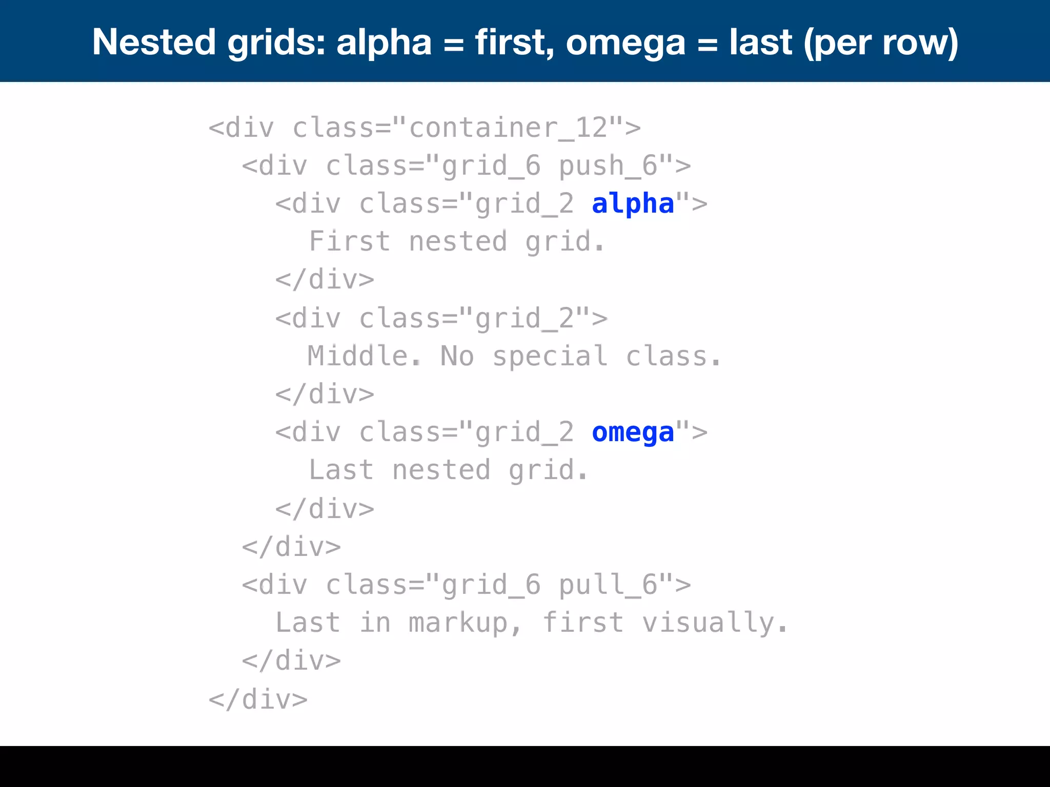
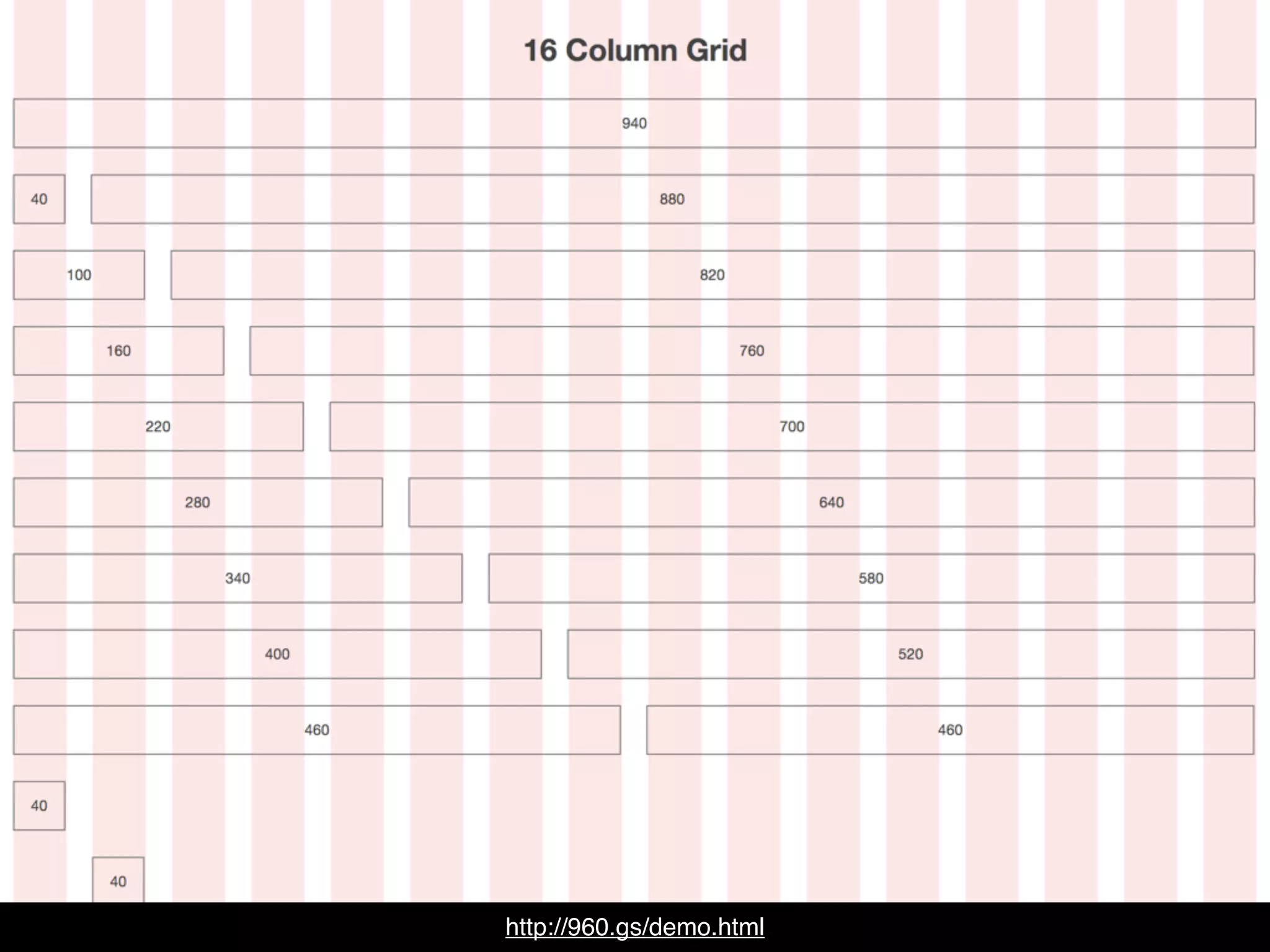
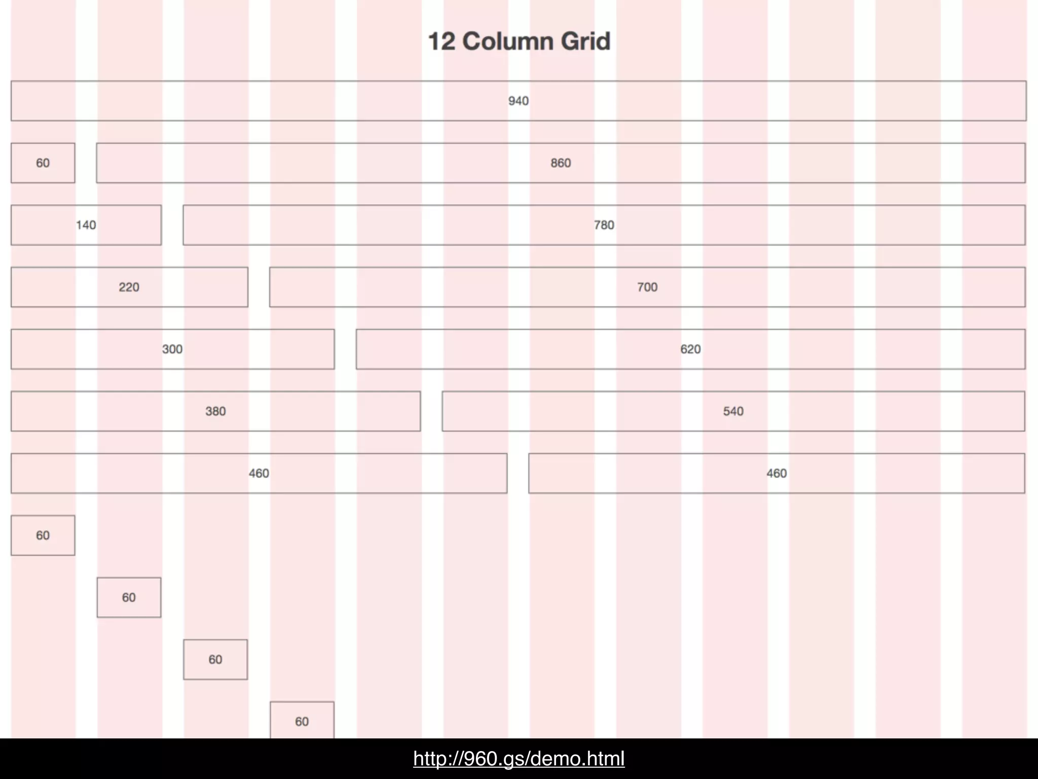
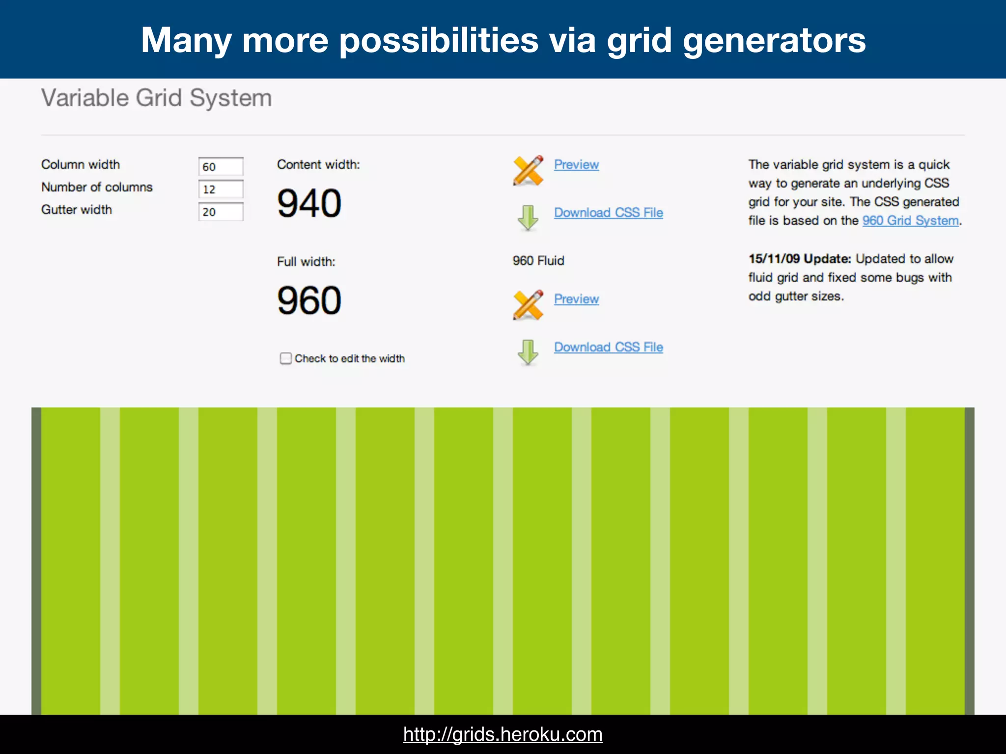
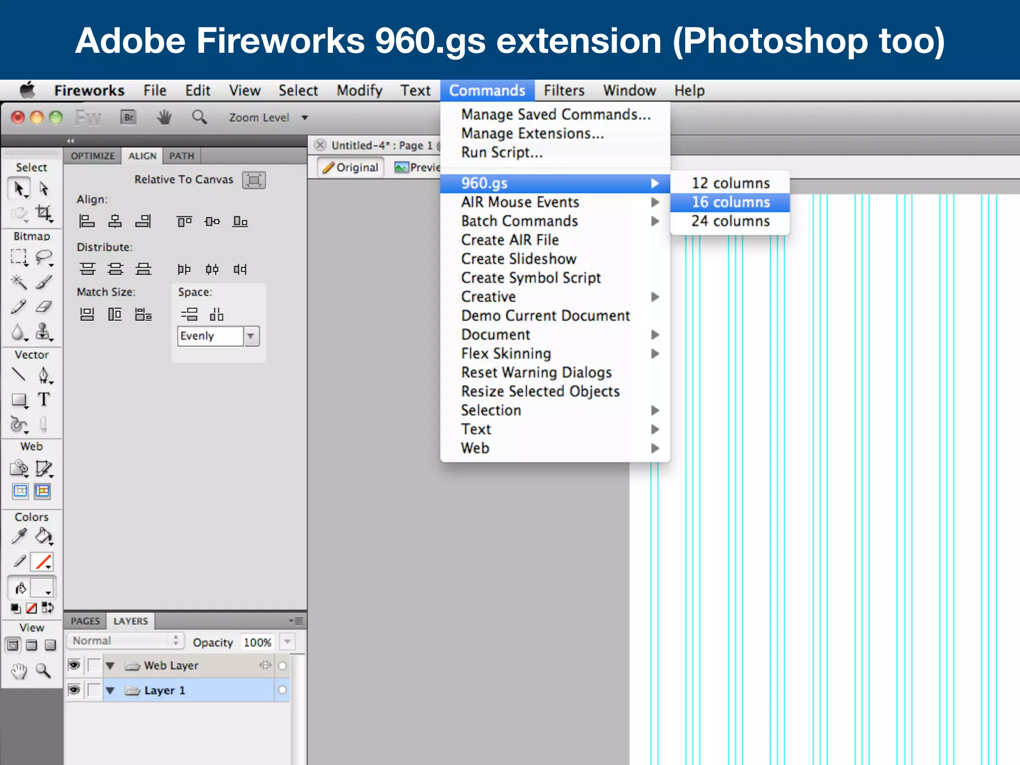
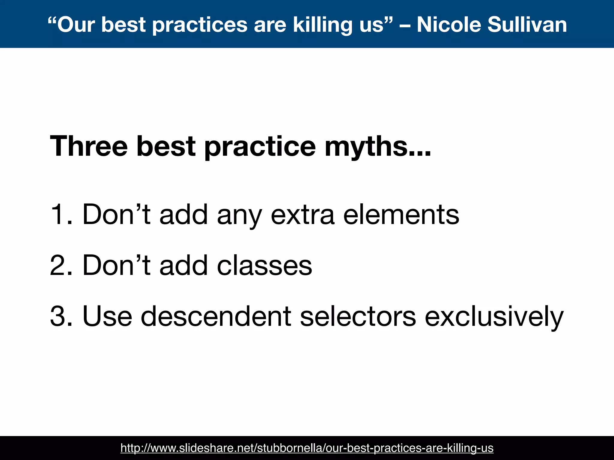
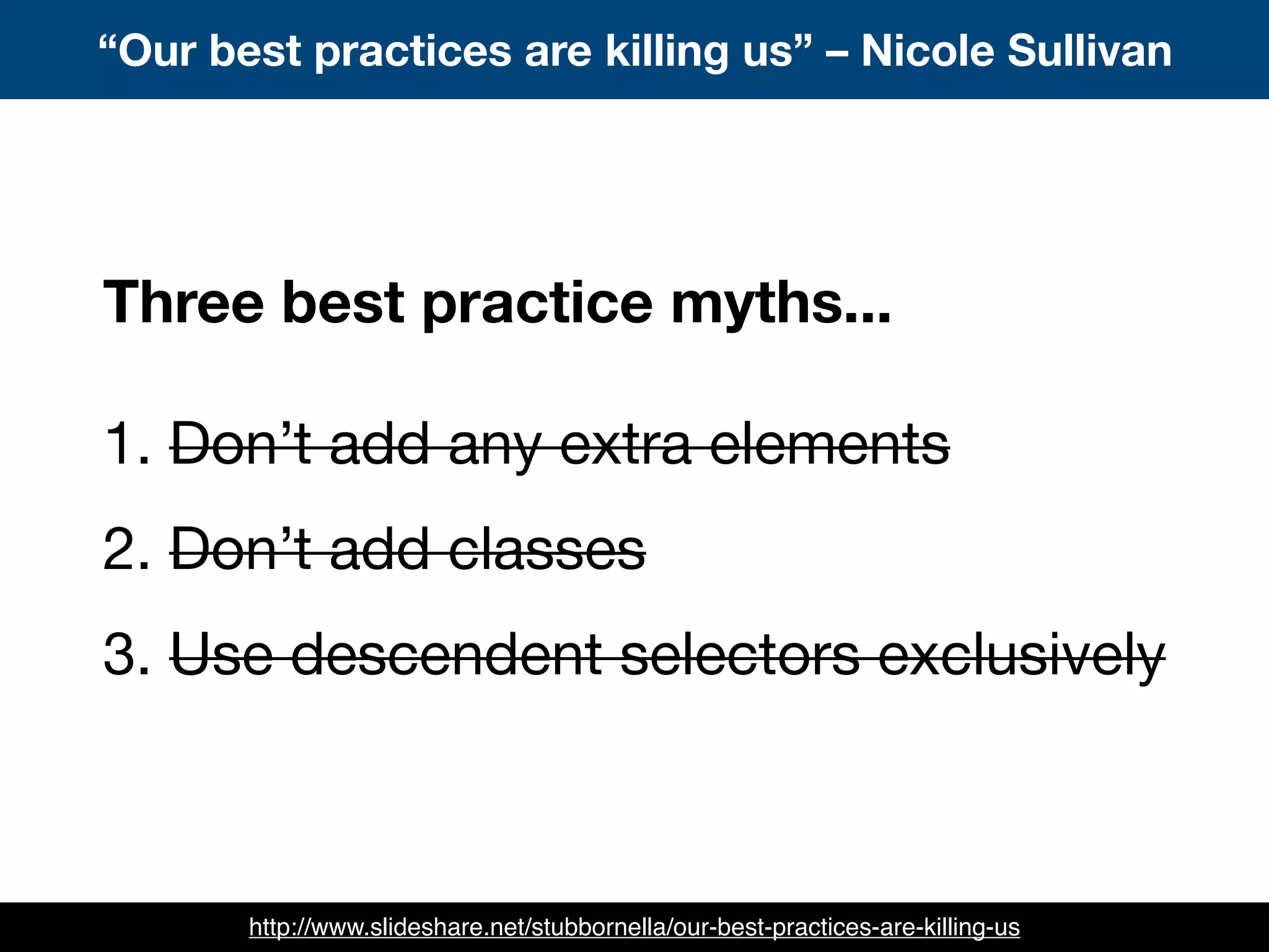
This document discusses the 960 Grid System, a CSS framework that utilizes a 12-column grid layout with widths of 60px each and gutters of 20px. It can be used for rapid prototyping and integrated into production environments. The document provides code examples of typical grid layouts and nested grids. It also discusses related topics like fixed-width grids, grid generators, and myths around CSS best practices.


