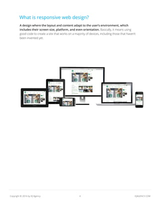
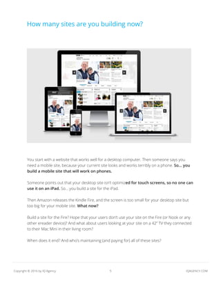
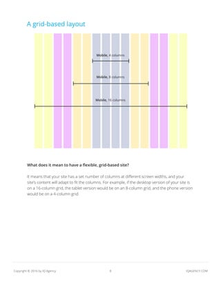
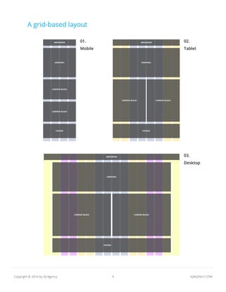
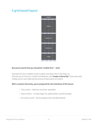
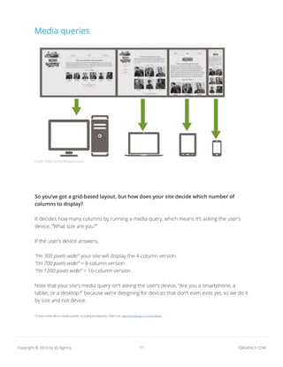
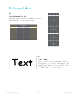
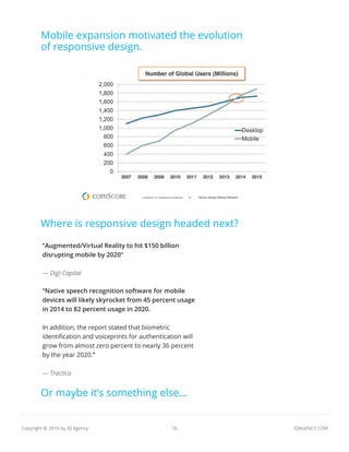
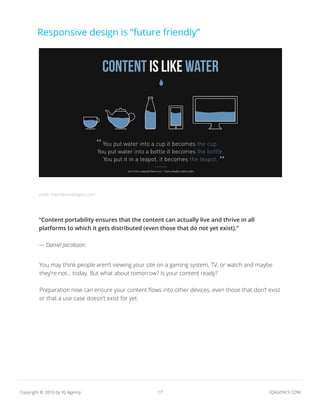
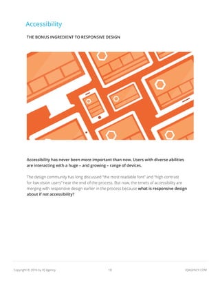
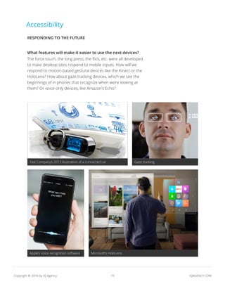
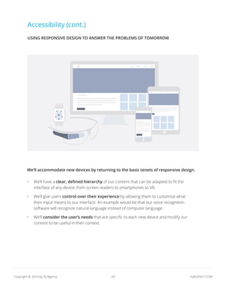
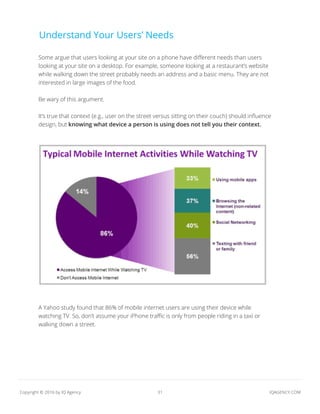
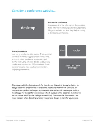
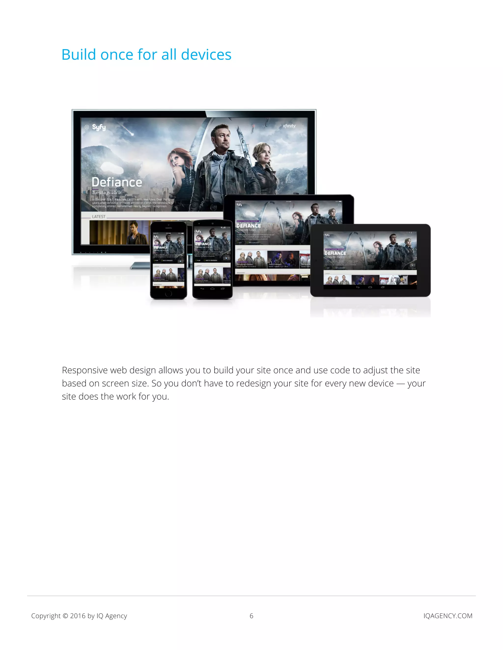
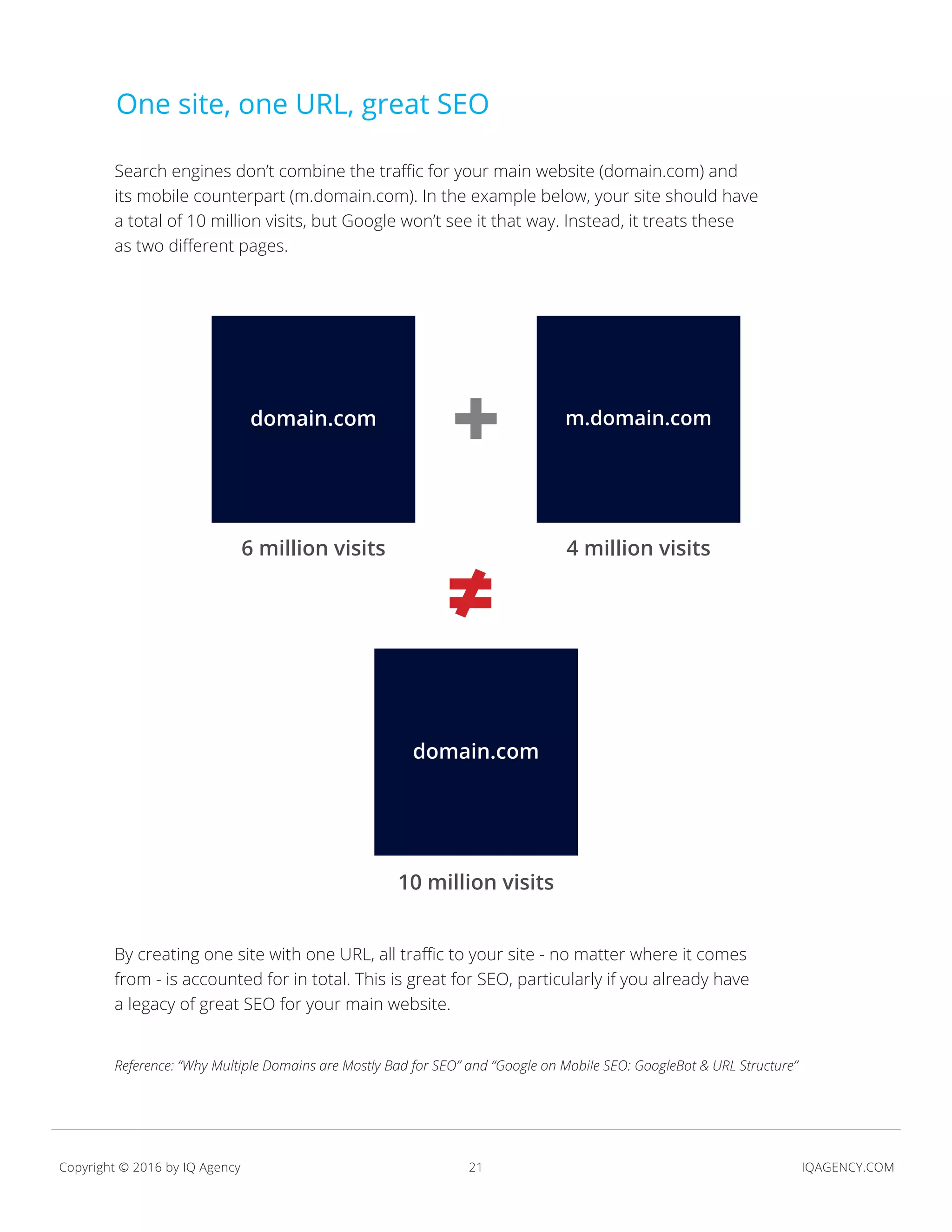
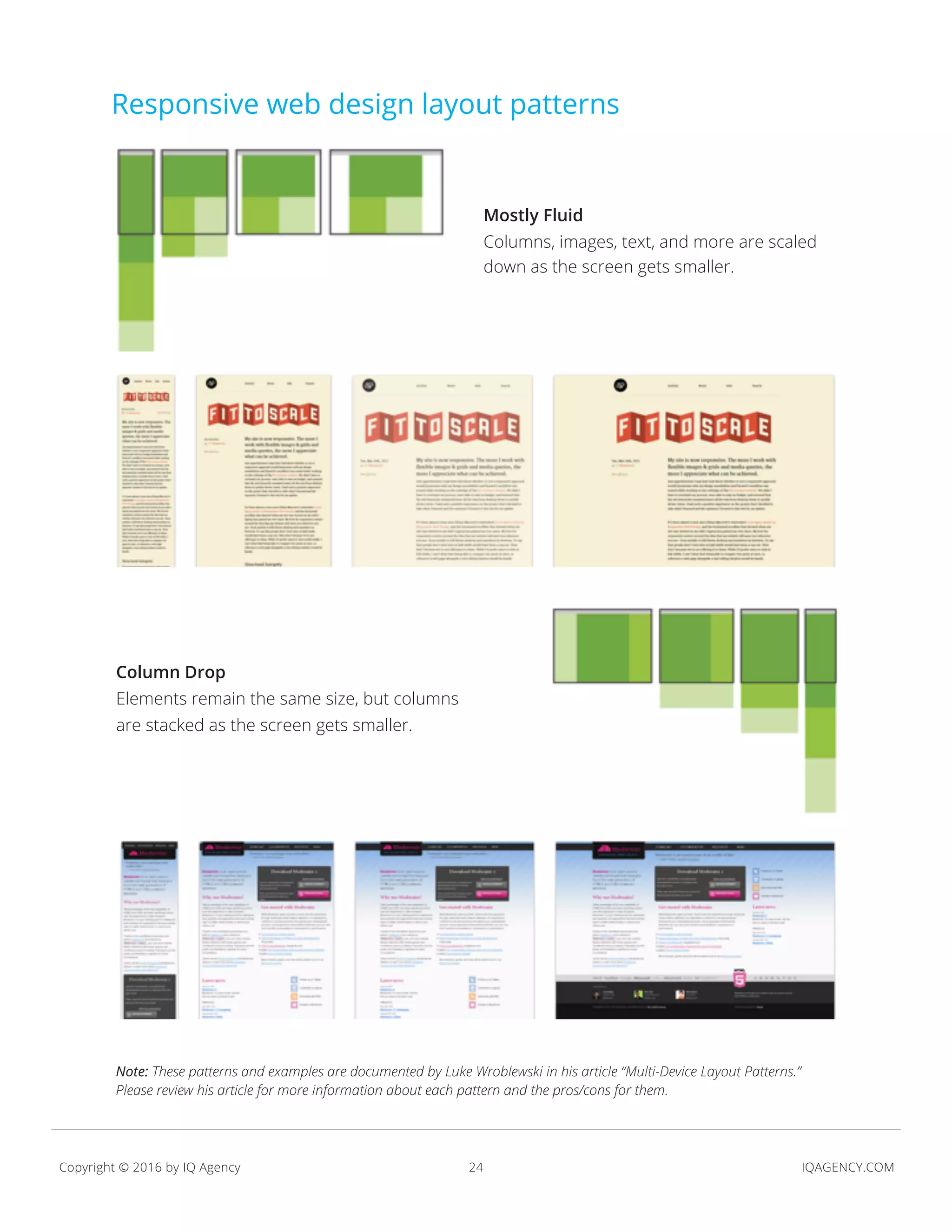
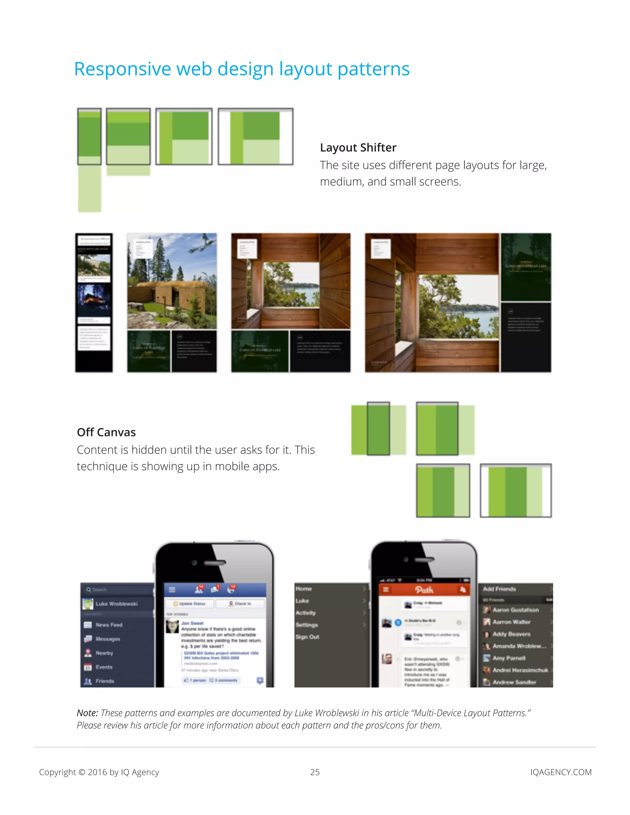
KEMBAR78
Responsive Design in 2016 | PDF
IQAGENCY.COM
RESPONSIVE
WEB DESIGN
Contents
01. What is responsive web design?
02. How will responsive design evolve with the
newest tech?
03. What is the design process?
04. Is responsive design right for your site?
05. A final thought
WHAT IS
RESPONSIVE
WEB DESIGN?
4 IQAGENCY.COMCopyright © 2016 by IQ Agency
A design where the layout and content adapt to the user’s environment, which
includes their screen size, platform, and even orientation. Basically, it means using
good code to create a site that works on a majority of devices, including those that haven’t
been invented yet.
What is responsive web design?
5 IQAGENCY.COMCopyright © 2016 by IQ Agency
credit:
You start with a website that works well for a desktop computer. Then someone says you
need a mobile site, because your current site looks and works terribly on a phone. So... you
build a mobile site that will work on phones.
Someone points out that your desktop site isn’t optimized for touch screens, so no one can
use it on an iPad. So... you build a site for the iPad.
Then Amazon releases the Kindle Fire, and the screen is too small for your desktop site but
too big for your mobile site. What now?
Build a site for the Fire? Hope that your users don’t use your site on the Fire (or Nook or any
other ereader device)? And what about users looking at your site on a 42” TV they connected
to their Mac Mini in their living room?
When does it end? And who’s maintaining (and paying for) all of these sites?
How many sites are you building now?
6 IQAGENCY.COMCopyright © 2016 by IQ Agency
credit:
Responsive web design allows you to build your site once and use code to adjust the site
based on screen size. So you don’t have to redesign your site for every new device — your
site does the work for you.
Build once for all devices
7 IQAGENCY.COMCopyright © 2016 by IQ Agency
A responsive design contains 3 core ingredients:
Not sure how to implement each of these? We’ll explore them more in the following slides, but
the main idea: Flexibility is the key. Create your content (and code, and images, too) once, and
responsive design makes your site flexible enough to fit various screen sizes.
•	 A layout based on a grid and percentages
•	 Media queries
•	 Fluid images and media
•	 And a bonus ingredient… Accessibility
How does it work?
credit: http://medianovak.com/
8 IQAGENCY.COMCopyright © 2016 by IQ Agency
What does it mean to have a flexible, grid-based site?
It means that your site has a set number of columns at different screen widths, and your
site’s content will adapt to fit the columns. For example, if the desktop version of your site is
on a 16-column grid, the tablet version would be on an 8-column grid, and the phone version
would be on a 4-column grid.
A grid-based layout
Mobile, 4 columns
Mobile, 8 columns
Mobile, 16 columns
9 IQAGENCY.COMCopyright © 2016 by IQ Agency
A grid-based layout
01.
Mobile
02.
Tablet
03.
Desktop
10 IQAGENCY.COMCopyright © 2016 by IQ Agency
A grid-based layout
But you’ve heard that you should be “mobile-first” – why?
Starting from your smallest screen is easier and saves time in the long run.
It forces you to rank your content and features, aka “create a hierarchy.” If you start with
mobile, you’re rank-ordering the priority of every piece of content.
With a content hierarchy, you’re prepared for the interfaces of the future:
•	 Tiny screens – Watches and other wearables
•	 Giant screens – Curved mega TVs, wall monitors, and VR overlays
•	 No screens at all – Voice and gestured-controlled devices
11 IQAGENCY.COMCopyright © 2016 by IQ Agency
credit:
So you’ve got a grid-based layout, but how does your site decide which number of
columns to display?
It decides how many columns by running a media query, which means it’s asking the user’s
device, “What size are you?”
If the user’s device answers,
“I’m 300 pixels wide!” your site will display the 4-column version.
“I’m 700 pixels wide!” = 8-column version
“I’m 1200 pixels wide!” = 16-column version
Note that your site’s media query isn’t asking the user’s device, “Are you a smartphone, a
tablet, or a desktop?” because we’re designing for devices that don’t even exist yet, so we do it
by size and not device.
To learn more about media queries, including breakpoints, check out responsivedesign.is’s breakdown.
Media queries
credit: http://amondragon.com/
12 IQAGENCY.COMCopyright © 2016 by IQ Agency
Fluid Images & Media
01.
Responding to device size
Image size should scale down as its parent container
scales down, like from desktop to mobile.
02.
Text in Images
Images shouldn’t contain text because the users’
perception of the font size will change as the image
scales. This photo’s text was originally 12 pt and it’s
now displaying at 74 pt, which distorts it.
13 IQAGENCY.COMCopyright © 2016 by IQ Agency
Fluid Images & Media (cont.)
03.
Skewing
Image height should scale down at the same proportion
as its width scales down so that images don’t become
stretched or skewed.
04.
Original Dimensions
Images should never display larger than their original
dimensions because they will become pixelated.
HOW WILL
RESPONSIVE
DESIGN
EVOLVE WITH
THE NEWEST
TECH?
Mobile use
is BIG.
But the growing list of new
devices is BIGGER.
16 IQAGENCY.COMCopyright © 2016 by IQ Agency
Mobile expansion motivated the evolution
of responsive design.
Where is responsive design headed next?
“Augmented/Virtual Reality to hit $150 billion
disrupting mobile by 2020”
— Digi-Capital
“Native speech recognition software for mobile
devices will likely skyrocket from 45 percent usage
in 2014 to 82 percent usage in 2020.
In addition, the report stated that biometric
identification and voiceprints for authentication will
grow from almost zero percent to nearly 36 percent
by the year 2020.”
— Tractica
Or maybe it’s something else...
17 IQAGENCY.COMCopyright © 2016 by IQ Agency
Responsive design is “future friendly”
“Content portability ensures that the content can actually live and thrive in all
platforms to which it gets distributed (even those that do not yet exist).”
— Daniel Jacobson
You may think people aren’t viewing your site on a gaming system, TV, or watch and maybe
they’re not... today. But what about tomorrow? Is your content ready?
Preparation now can ensure your content flows into other devices, even those that don’t exist
or that a use case doesn’t exist for yet.
credit: http://amondragon.com/
18 IQAGENCY.COMCopyright © 2016 by IQ Agency
Accessibility
Accessibility has never been more important than now. Users with diverse abilities
are interacting with a huge – and growing – range of devices.
The design community has long discussed “the most readable font” and “high contrast
for low-vision users” near the end of the process. But now, the tenets of accessibility are
merging with responsive design earlier in the process because what is responsive design
about if not accessibility?
THE BONUS INGREDIENT TO RESPONSIVE DESIGN
19 IQAGENCY.COMCopyright © 2016 by IQ Agency
Accessibility
What features will make it easier to use the next devices?
The force touch, the long press, the flick, etc. were all developed
to make desktop sites respond to mobile inputs. How will we
respond to motion-based gestural devices like the Kinect or the
HoloLens? How about gaze tracking devices, which we see the
beginnings of in phones that recognize when we’re looking at
them? Or voice-only devices, like Amazon’s Echo?
Fast Company’s 2013 illustration of a connected car Gaze tracking
Apple’s voice recognition software Microsoft’s HoloLens
RESPONDING TO THE FUTURE
20 IQAGENCY.COMCopyright © 2016 by IQ Agency
Accessibility (cont.)
We’ll accommodate new devices by returning to the basic tenets of responsive design.
•	 We’ll have a clear, defined hierarchy of our content that can be adapted to fit the
interface of any device, from screen readers to smartphones to VR.
•	 We’ll give users control over their experience by allowing them to customize what
their input means to our interface. An example would be that our voice recognition
software will recognize natural language instead of computer language.
•	 We’ll consider the user’s needs that are specific to each new device and modify our
content to be useful in their context.
USING RESPONSIVE DESIGN TO ANSWER THE PROBLEMS OF TOMORROW
21 IQAGENCY.COMCopyright © 2016 by IQ Agency
One site, one URL, great SEO
Search engines don’t combine the traffic for your main website (domain.com) and
its mobile counterpart (m.domain.com). In the example below, your site should have
a total of 10 million visits, but Google won’t see it that way. Instead, it treats these
as two different pages.
By creating one site with one URL, all traffic to your site - no matter where it comes
from - is accounted for in total. This is great for SEO, particularly if you already have
a legacy of great SEO for your main website.
domain.com
6 million visits 4 million visits
10 million visits
domain.com
m.domain.com
+
≠
Reference: “Why Multiple Domains are Mostly Bad for SEO” and “Google on Mobile SEO: GoogleBot & URL Structure”
WHAT IS
THE DESIGN
PROCESS?
Responsive web design
requires innovation, but
patterns have emerged...
24 IQAGENCY.COMCopyright © 2016 by IQ Agency
Responsive web design layout patterns
Mostly Fluid
Columns, images, text, and more are scaled
down as the screen gets smaller.
Column Drop
Elements remain the same size, but columns
are stacked as the screen gets smaller.
Note: These patterns and examples are documented by Luke Wroblewski in his article “Multi-Device Layout Patterns.”
Please review his article for more information about each pattern and the pros/cons for them.
25 IQAGENCY.COMCopyright © 2016 by IQ Agency
Responsive web design layout patterns
Layout Shifter
The site uses different page layouts for large,
medium, and small screens.
Off Canvas
Content is hidden until the user asks for it. This
technique is showing up in mobile apps.
Note: These patterns and examples are documented by Luke Wroblewski in his article “Multi-Device Layout Patterns.”
Please review his article for more information about each pattern and the pros/cons for them.
26 IQAGENCY.COMCopyright © 2016 by IQ Agency
Which pattern is right for your site?
Each site is unique, so yours may not fit neatly into a pattern. An agency like IQ can help:
•	 Content strategists review your current content and help you think about future content.
Then they inventory what you have and what you’ll have eventually, so you know what to
design for.
•	 Experience architects help you figure out what features and functions you want the site
to have and then prioritize those with your content. They can also help you (along with the
rest of the team) determine what size points to use (i.e., the screen sizes you already know
you must design for).
•	 Designers create a visual language for your site and determine the best way to scale the
content, features, and functions for each screen size.
•	 Developers build the site. They follow coding standards to ensure your site works across
as many devices as possible and scales nicely from one screen size to the next.
IS RESPONSIVE
WEB DESIGN
RIGHT FOR
YOUR SITE?
First, there are two
considerations from a
business perspective.
29 IQAGENCY.COMCopyright © 2016 by IQ Agency
Business Considerations
Cost is higher up front, but maintenance is likely lower.
•	 As with any design, cost is a factor. Responsive design requires more work, because
you are essentially designing several versions of one site. However, the cost should
be compared with the costs for creating and maintaining separate sites for mobile,
desktop, and tablet.
•	 It’s unlikely you’d have to create a new version of the site every time a new device
comes out.
Second, you must consider
your users. Do they need a
responsive design?
31 IQAGENCY.COMCopyright © 2016 by IQ Agency
Understand Your Users’ Needs
Some argue that users looking at your site on a phone have different needs than users
looking at your site on a desktop. For example, someone looking at a restaurant’s website
while walking down the street probably needs an address and a basic menu. They are not
interested in large images of the food.
Be wary of this argument.
It’s true that context (e.g., user on the street versus sitting on their couch) should influence
design, but knowing what device a person is using does not tell you their context.
A Yahoo study found that 86% of mobile internet users are using their device while
watching TV. So, don’t assume your iPhone traffic is only from people riding in a taxi or
walking down a street.
However, sometimes a
separate mobile site with
different content and
features is appropriate.
33 IQAGENCY.COMCopyright © 2016 by IQ Agency
Consider a conference website...
Before the conference
Users want all of the information. Times, dates,
hotel info, travel details, speaker bios, sponsors,
blog and updates, etc. And they likely are using
a desktop to get that info.
At the conference
Users only need some information. Their personal
schedule of events, suggestions on restaurants,
access to rate a speaker or session, etc. And
they’re likely using a mobile device, so could you
use location services (via GPS) somehow? Some
conferences also have touchscreen monitors
displaying the website.
There are multiple, distinct needs for this site. At this point, it may be better to
design separate experiences so the users’ needs are met in both contexts. Or
maybe the experience changes as the event approaches. Or maybe you build a
mobile app for the conference instead (check out our white paper on mobile web
versus native app if you’re facing that decision). These are the discussions that
must happen when deciding whether responsive design is right for your users.
desktop
phone
tablet
touchscreen
monitor
34 IQAGENCY.COMCopyright © 2016 by IQ Agency
A Final Thought
“Regardless of the medium, choosing a canvas is a powerful, creative act: before the first
brush stroke, before striking the chisel, the canvas gives the art a dimension and shape,
a width and a height, establishing a boundary for the work yet to come.
On the web, we try to mimic this process. We even call it the same thing: we create a
‘canvas’ in our favorite image editor, a blank document with a width and height,
with dimension and shape. The problem with this approach is that we’re one step
removed from our actual canvas: the browser window, and all of its inconsistencies
and imperfections. Because let’s face it: once they’re published online, our designs
are immediately at the mercy of the people who view them — to their font settings,
to the color of their display, to the shape and size of their browser window.”
— Ethan Marcotte
Responsive Web Design
available from A Book Apart
(emphasis added)
35 IQAGENCY.COMCopyright © 2016 by IQ Agency
Additional Resources
Responsive design examples in the wild
To see how they respond to changing screen size, click and drag to resize your browser
window.
ARTICLES
For a Future-Friendly Web
Brad Frost | A List Apart
Discusses the importance of making things “future-friendly” or ready for those things that
don’t exist yet.
Responsive Web Design
Ethan Marcotte | A List Apart
Explains how responsive web design is possible from a coding standpoint and why it is
necessary for creating an optimal user experience.
REFERENCES
1 Cox, S. & Pousman, Z. (2011). You want to go mobile, but which way? Native vs. mobile web. Retrieved from
http://www.slideshare.net/IQ_Agency/mobile-web-vs-native-apps
2 Frost, J. (2012). For a Future-Friendly Web. A List Apart: For people who make websites, 346. Retrieved from
http://www.alistapart.com/articles/for-a-future-friendly-web/
3 Gaudiosi, J. (2015). How Augmented Reality and Virtual Reality Will Generate $150 Billion in Revenue by 2020. Retrieved
from http://fortune.com/2015/04/25/augmented-reality-virtual-reality/.
4 Gustafson, A. (2015). What’s the Future of Responsive Web Design? Retrieved from http://webdesign.tutsplus.com/articles/
whats-the-future-of-responsive-web-design--cms-24692.
5 Leske, N. & Melvin, J. (2012). More mobile devices than people by 2016: Cisco. Reuters. Retrieved from http://www.reuters.
com/article/2012/02/14/us-cisco-mobiledata-idUSTRE81D0VH20120214
6 Ludwig, S. (2012). Facebook’s monster mobile numbers: Over 425M users across Android, iOS, other platforms. Venture-
Beat. Retrieved from http://venturebeat.com/2012/02/01/facebooks-monster-mobile-numbers-over-425m-users-across-an-
droid-ios-other-platforms/
7 Marcotte, E. (2011). Responsive Web Design. A Book Apart. Available from http://www.abookapart.com/products/respon-
sive-web-design
•	 Boston Globe
•	 Smashing Magazine
•	 Media Queries - a gallery of responsive web design examples
36 IQAGENCY.COMCopyright © 2016 by IQ Agency
Additional Resources (cont.)
REFERENCES
8 Melanson, M. (2011). Yahoo: 86% Use Mobile Devices While Watching TV. ReadWriteWeb. Retrieved from
http://www.readwriteweb.com/archives/yahoo_86_use_mobile_devices_while_watching_tv.php
9 Miles, G. (2015). 8 Mobile Marketing Stats to Help You Plan for 2016. Retrieved from https://www.usertesting.com/
blog/2015/06/04/eye-tracking/
10 Moore, P. (2015). Eye tracking: Where it’s Been and Where it’s Going. Retrieved from https://www.usertesting.com/
blog/2015/06/04/eye-tracking/
11 Moss, B. (2015). The Future of Responsive Web Design. Retrieved from http://www.webdesignerdepot.com/2015/03/
the-future-of-responsive-web-design/
12 O’Dell, J. (2010). New Study Shows the Mobile Web Will Rule by 2015. Mashable Tech. Retrieved from http://mashable.
com/2010/04/13/mobile-web-stats/
13 O’Dell, J. (2011). LinkedIn’s new mobile app is so gorgeous, you’ll actually want to use it. VentureBeat. Retrieved from
http://venturebeat.com/2011/08/16/linkedin-mobile-app/
14 Schwartz, B. (2011). Google On Mobile SEO: GoogleBot & URL Structure. Search Engine Roundtable. Retrieved from
http://www.seroundtable.com/google-mobile-seo-12995.html
15 Smoot, S. (2011). Why multiple domains are mostly bad for SEO. SEO.com: #1 in Search Engine Optimization.
Retrieved from http://www.seo.com/blog/multiple-domains-seo/
16 Sze. (2007). Rollable displays by Polymer Vision. iTech News Net. Retrieved from http://www.itechnews.net/2006/03/21/
rollable-displays-by-polymer-vision/
17 Ungerfleider, N. (2013). What’s Next for Car Dashboards. Retrieved from http://www.fastcompany.com/3018608/
whats-next-for-car-dashboards
18 Van Geel, J. (2012). Google Designs Augmented Reality Goggles. Johnny Holland: It’s all about interaction. Retrieved
from http://johnnyholland.org/2012/04/google-designs-augmented-reality-goggles/
19 Williams, E. (2010). The Evolving Ecosystem. Twitter Blog. Retrieved from http://blog.twitter.com/2010/09/evolving-eco-
system.html
20 Williams, R. (2015). Future iPhones could contain eye-tracking software. Retrieved from http://www.telegraph.co.uk/
technology/apple/12001524/Future-iPhones-could-contain-gaze-tracking-software.html
21 Wimberly, C. (2015). The Future of Responsive Design Standards. http://blog.invisionapp.com/future-responsive-de-
sign-standards/
22 Wroblewski, L. (2012). Multi-Device Layout Patterns. Luke W: Ideation and Design. Retrieved from
http://www.lukew.com/ff/entry.asp?1514
IQAGENCY.COM
THANK YOU
To get in touch with IQ:
call us at
404.255.3550
or visit
iqagency.com

Responsive Design in 2016

  • 1.
  • 2.
    Contents 01. What isresponsive web design? 02. How will responsive design evolve with the newest tech? 03. What is the design process? 04. Is responsive design right for your site? 05. A final thought
  • 3.
  • 4.
    4 IQAGENCY.COMCopyright ©2016 by IQ Agency A design where the layout and content adapt to the user’s environment, which includes their screen size, platform, and even orientation. Basically, it means using good code to create a site that works on a majority of devices, including those that haven’t been invented yet. What is responsive web design?
  • 5.
    5 IQAGENCY.COMCopyright ©2016 by IQ Agency credit: You start with a website that works well for a desktop computer. Then someone says you need a mobile site, because your current site looks and works terribly on a phone. So... you build a mobile site that will work on phones. Someone points out that your desktop site isn’t optimized for touch screens, so no one can use it on an iPad. So... you build a site for the iPad. Then Amazon releases the Kindle Fire, and the screen is too small for your desktop site but too big for your mobile site. What now? Build a site for the Fire? Hope that your users don’t use your site on the Fire (or Nook or any other ereader device)? And what about users looking at your site on a 42” TV they connected to their Mac Mini in their living room? When does it end? And who’s maintaining (and paying for) all of these sites? How many sites are you building now?
  • 6.
    6 IQAGENCY.COMCopyright ©2016 by IQ Agency credit: Responsive web design allows you to build your site once and use code to adjust the site based on screen size. So you don’t have to redesign your site for every new device — your site does the work for you. Build once for all devices
  • 7.
    7 IQAGENCY.COMCopyright ©2016 by IQ Agency A responsive design contains 3 core ingredients: Not sure how to implement each of these? We’ll explore them more in the following slides, but the main idea: Flexibility is the key. Create your content (and code, and images, too) once, and responsive design makes your site flexible enough to fit various screen sizes. • A layout based on a grid and percentages • Media queries • Fluid images and media • And a bonus ingredient… Accessibility How does it work? credit: http://medianovak.com/
  • 8.
    8 IQAGENCY.COMCopyright ©2016 by IQ Agency What does it mean to have a flexible, grid-based site? It means that your site has a set number of columns at different screen widths, and your site’s content will adapt to fit the columns. For example, if the desktop version of your site is on a 16-column grid, the tablet version would be on an 8-column grid, and the phone version would be on a 4-column grid. A grid-based layout Mobile, 4 columns Mobile, 8 columns Mobile, 16 columns
  • 9.
    9 IQAGENCY.COMCopyright ©2016 by IQ Agency A grid-based layout 01. Mobile 02. Tablet 03. Desktop
  • 10.
    10 IQAGENCY.COMCopyright ©2016 by IQ Agency A grid-based layout But you’ve heard that you should be “mobile-first” – why? Starting from your smallest screen is easier and saves time in the long run. It forces you to rank your content and features, aka “create a hierarchy.” If you start with mobile, you’re rank-ordering the priority of every piece of content. With a content hierarchy, you’re prepared for the interfaces of the future: • Tiny screens – Watches and other wearables • Giant screens – Curved mega TVs, wall monitors, and VR overlays • No screens at all – Voice and gestured-controlled devices
  • 11.
    11 IQAGENCY.COMCopyright ©2016 by IQ Agency credit: So you’ve got a grid-based layout, but how does your site decide which number of columns to display? It decides how many columns by running a media query, which means it’s asking the user’s device, “What size are you?” If the user’s device answers, “I’m 300 pixels wide!” your site will display the 4-column version. “I’m 700 pixels wide!” = 8-column version “I’m 1200 pixels wide!” = 16-column version Note that your site’s media query isn’t asking the user’s device, “Are you a smartphone, a tablet, or a desktop?” because we’re designing for devices that don’t even exist yet, so we do it by size and not device. To learn more about media queries, including breakpoints, check out responsivedesign.is’s breakdown. Media queries credit: http://amondragon.com/
  • 12.
    12 IQAGENCY.COMCopyright ©2016 by IQ Agency Fluid Images & Media 01. Responding to device size Image size should scale down as its parent container scales down, like from desktop to mobile. 02. Text in Images Images shouldn’t contain text because the users’ perception of the font size will change as the image scales. This photo’s text was originally 12 pt and it’s now displaying at 74 pt, which distorts it.
  • 13.
    13 IQAGENCY.COMCopyright ©2016 by IQ Agency Fluid Images & Media (cont.) 03. Skewing Image height should scale down at the same proportion as its width scales down so that images don’t become stretched or skewed. 04. Original Dimensions Images should never display larger than their original dimensions because they will become pixelated.
  • 14.
  • 15.
    Mobile use is BIG. Butthe growing list of new devices is BIGGER.
  • 16.
    16 IQAGENCY.COMCopyright ©2016 by IQ Agency Mobile expansion motivated the evolution of responsive design. Where is responsive design headed next? “Augmented/Virtual Reality to hit $150 billion disrupting mobile by 2020” — Digi-Capital “Native speech recognition software for mobile devices will likely skyrocket from 45 percent usage in 2014 to 82 percent usage in 2020. In addition, the report stated that biometric identification and voiceprints for authentication will grow from almost zero percent to nearly 36 percent by the year 2020.” — Tractica Or maybe it’s something else...
  • 17.
    17 IQAGENCY.COMCopyright ©2016 by IQ Agency Responsive design is “future friendly” “Content portability ensures that the content can actually live and thrive in all platforms to which it gets distributed (even those that do not yet exist).” — Daniel Jacobson You may think people aren’t viewing your site on a gaming system, TV, or watch and maybe they’re not... today. But what about tomorrow? Is your content ready? Preparation now can ensure your content flows into other devices, even those that don’t exist or that a use case doesn’t exist for yet. credit: http://amondragon.com/
  • 18.
    18 IQAGENCY.COMCopyright ©2016 by IQ Agency Accessibility Accessibility has never been more important than now. Users with diverse abilities are interacting with a huge – and growing – range of devices. The design community has long discussed “the most readable font” and “high contrast for low-vision users” near the end of the process. But now, the tenets of accessibility are merging with responsive design earlier in the process because what is responsive design about if not accessibility? THE BONUS INGREDIENT TO RESPONSIVE DESIGN
  • 19.
    19 IQAGENCY.COMCopyright ©2016 by IQ Agency Accessibility What features will make it easier to use the next devices? The force touch, the long press, the flick, etc. were all developed to make desktop sites respond to mobile inputs. How will we respond to motion-based gestural devices like the Kinect or the HoloLens? How about gaze tracking devices, which we see the beginnings of in phones that recognize when we’re looking at them? Or voice-only devices, like Amazon’s Echo? Fast Company’s 2013 illustration of a connected car Gaze tracking Apple’s voice recognition software Microsoft’s HoloLens RESPONDING TO THE FUTURE
  • 20.
    20 IQAGENCY.COMCopyright ©2016 by IQ Agency Accessibility (cont.) We’ll accommodate new devices by returning to the basic tenets of responsive design. • We’ll have a clear, defined hierarchy of our content that can be adapted to fit the interface of any device, from screen readers to smartphones to VR. • We’ll give users control over their experience by allowing them to customize what their input means to our interface. An example would be that our voice recognition software will recognize natural language instead of computer language. • We’ll consider the user’s needs that are specific to each new device and modify our content to be useful in their context. USING RESPONSIVE DESIGN TO ANSWER THE PROBLEMS OF TOMORROW
  • 21.
    21 IQAGENCY.COMCopyright ©2016 by IQ Agency One site, one URL, great SEO Search engines don’t combine the traffic for your main website (domain.com) and its mobile counterpart (m.domain.com). In the example below, your site should have a total of 10 million visits, but Google won’t see it that way. Instead, it treats these as two different pages. By creating one site with one URL, all traffic to your site - no matter where it comes from - is accounted for in total. This is great for SEO, particularly if you already have a legacy of great SEO for your main website. domain.com 6 million visits 4 million visits 10 million visits domain.com m.domain.com + ≠ Reference: “Why Multiple Domains are Mostly Bad for SEO” and “Google on Mobile SEO: GoogleBot & URL Structure”
  • 22.
  • 23.
    Responsive web design requiresinnovation, but patterns have emerged...
  • 24.
    24 IQAGENCY.COMCopyright ©2016 by IQ Agency Responsive web design layout patterns Mostly Fluid Columns, images, text, and more are scaled down as the screen gets smaller. Column Drop Elements remain the same size, but columns are stacked as the screen gets smaller. Note: These patterns and examples are documented by Luke Wroblewski in his article “Multi-Device Layout Patterns.” Please review his article for more information about each pattern and the pros/cons for them.
  • 25.
    25 IQAGENCY.COMCopyright ©2016 by IQ Agency Responsive web design layout patterns Layout Shifter The site uses different page layouts for large, medium, and small screens. Off Canvas Content is hidden until the user asks for it. This technique is showing up in mobile apps. Note: These patterns and examples are documented by Luke Wroblewski in his article “Multi-Device Layout Patterns.” Please review his article for more information about each pattern and the pros/cons for them.
  • 26.
    26 IQAGENCY.COMCopyright ©2016 by IQ Agency Which pattern is right for your site? Each site is unique, so yours may not fit neatly into a pattern. An agency like IQ can help: • Content strategists review your current content and help you think about future content. Then they inventory what you have and what you’ll have eventually, so you know what to design for. • Experience architects help you figure out what features and functions you want the site to have and then prioritize those with your content. They can also help you (along with the rest of the team) determine what size points to use (i.e., the screen sizes you already know you must design for). • Designers create a visual language for your site and determine the best way to scale the content, features, and functions for each screen size. • Developers build the site. They follow coding standards to ensure your site works across as many devices as possible and scales nicely from one screen size to the next.
  • 27.
  • 28.
    First, there aretwo considerations from a business perspective.
  • 29.
    29 IQAGENCY.COMCopyright ©2016 by IQ Agency Business Considerations Cost is higher up front, but maintenance is likely lower. • As with any design, cost is a factor. Responsive design requires more work, because you are essentially designing several versions of one site. However, the cost should be compared with the costs for creating and maintaining separate sites for mobile, desktop, and tablet. • It’s unlikely you’d have to create a new version of the site every time a new device comes out.
  • 30.
    Second, you mustconsider your users. Do they need a responsive design?
  • 31.
    31 IQAGENCY.COMCopyright ©2016 by IQ Agency Understand Your Users’ Needs Some argue that users looking at your site on a phone have different needs than users looking at your site on a desktop. For example, someone looking at a restaurant’s website while walking down the street probably needs an address and a basic menu. They are not interested in large images of the food. Be wary of this argument. It’s true that context (e.g., user on the street versus sitting on their couch) should influence design, but knowing what device a person is using does not tell you their context. A Yahoo study found that 86% of mobile internet users are using their device while watching TV. So, don’t assume your iPhone traffic is only from people riding in a taxi or walking down a street.
  • 32.
    However, sometimes a separatemobile site with different content and features is appropriate.
  • 33.
    33 IQAGENCY.COMCopyright ©2016 by IQ Agency Consider a conference website... Before the conference Users want all of the information. Times, dates, hotel info, travel details, speaker bios, sponsors, blog and updates, etc. And they likely are using a desktop to get that info. At the conference Users only need some information. Their personal schedule of events, suggestions on restaurants, access to rate a speaker or session, etc. And they’re likely using a mobile device, so could you use location services (via GPS) somehow? Some conferences also have touchscreen monitors displaying the website. There are multiple, distinct needs for this site. At this point, it may be better to design separate experiences so the users’ needs are met in both contexts. Or maybe the experience changes as the event approaches. Or maybe you build a mobile app for the conference instead (check out our white paper on mobile web versus native app if you’re facing that decision). These are the discussions that must happen when deciding whether responsive design is right for your users. desktop phone tablet touchscreen monitor
  • 34.
    34 IQAGENCY.COMCopyright ©2016 by IQ Agency A Final Thought “Regardless of the medium, choosing a canvas is a powerful, creative act: before the first brush stroke, before striking the chisel, the canvas gives the art a dimension and shape, a width and a height, establishing a boundary for the work yet to come. On the web, we try to mimic this process. We even call it the same thing: we create a ‘canvas’ in our favorite image editor, a blank document with a width and height, with dimension and shape. The problem with this approach is that we’re one step removed from our actual canvas: the browser window, and all of its inconsistencies and imperfections. Because let’s face it: once they’re published online, our designs are immediately at the mercy of the people who view them — to their font settings, to the color of their display, to the shape and size of their browser window.” — Ethan Marcotte Responsive Web Design available from A Book Apart (emphasis added)
  • 35.
    35 IQAGENCY.COMCopyright ©2016 by IQ Agency Additional Resources Responsive design examples in the wild To see how they respond to changing screen size, click and drag to resize your browser window. ARTICLES For a Future-Friendly Web Brad Frost | A List Apart Discusses the importance of making things “future-friendly” or ready for those things that don’t exist yet. Responsive Web Design Ethan Marcotte | A List Apart Explains how responsive web design is possible from a coding standpoint and why it is necessary for creating an optimal user experience. REFERENCES 1 Cox, S. & Pousman, Z. (2011). You want to go mobile, but which way? Native vs. mobile web. Retrieved from http://www.slideshare.net/IQ_Agency/mobile-web-vs-native-apps 2 Frost, J. (2012). For a Future-Friendly Web. A List Apart: For people who make websites, 346. Retrieved from http://www.alistapart.com/articles/for-a-future-friendly-web/ 3 Gaudiosi, J. (2015). How Augmented Reality and Virtual Reality Will Generate $150 Billion in Revenue by 2020. Retrieved from http://fortune.com/2015/04/25/augmented-reality-virtual-reality/. 4 Gustafson, A. (2015). What’s the Future of Responsive Web Design? Retrieved from http://webdesign.tutsplus.com/articles/ whats-the-future-of-responsive-web-design--cms-24692. 5 Leske, N. & Melvin, J. (2012). More mobile devices than people by 2016: Cisco. Reuters. Retrieved from http://www.reuters. com/article/2012/02/14/us-cisco-mobiledata-idUSTRE81D0VH20120214 6 Ludwig, S. (2012). Facebook’s monster mobile numbers: Over 425M users across Android, iOS, other platforms. Venture- Beat. Retrieved from http://venturebeat.com/2012/02/01/facebooks-monster-mobile-numbers-over-425m-users-across-an- droid-ios-other-platforms/ 7 Marcotte, E. (2011). Responsive Web Design. A Book Apart. Available from http://www.abookapart.com/products/respon- sive-web-design • Boston Globe • Smashing Magazine • Media Queries - a gallery of responsive web design examples
  • 36.
    36 IQAGENCY.COMCopyright ©2016 by IQ Agency Additional Resources (cont.) REFERENCES 8 Melanson, M. (2011). Yahoo: 86% Use Mobile Devices While Watching TV. ReadWriteWeb. Retrieved from http://www.readwriteweb.com/archives/yahoo_86_use_mobile_devices_while_watching_tv.php 9 Miles, G. (2015). 8 Mobile Marketing Stats to Help You Plan for 2016. Retrieved from https://www.usertesting.com/ blog/2015/06/04/eye-tracking/ 10 Moore, P. (2015). Eye tracking: Where it’s Been and Where it’s Going. Retrieved from https://www.usertesting.com/ blog/2015/06/04/eye-tracking/ 11 Moss, B. (2015). The Future of Responsive Web Design. Retrieved from http://www.webdesignerdepot.com/2015/03/ the-future-of-responsive-web-design/ 12 O’Dell, J. (2010). New Study Shows the Mobile Web Will Rule by 2015. Mashable Tech. Retrieved from http://mashable. com/2010/04/13/mobile-web-stats/ 13 O’Dell, J. (2011). LinkedIn’s new mobile app is so gorgeous, you’ll actually want to use it. VentureBeat. Retrieved from http://venturebeat.com/2011/08/16/linkedin-mobile-app/ 14 Schwartz, B. (2011). Google On Mobile SEO: GoogleBot & URL Structure. Search Engine Roundtable. Retrieved from http://www.seroundtable.com/google-mobile-seo-12995.html 15 Smoot, S. (2011). Why multiple domains are mostly bad for SEO. SEO.com: #1 in Search Engine Optimization. Retrieved from http://www.seo.com/blog/multiple-domains-seo/ 16 Sze. (2007). Rollable displays by Polymer Vision. iTech News Net. Retrieved from http://www.itechnews.net/2006/03/21/ rollable-displays-by-polymer-vision/ 17 Ungerfleider, N. (2013). What’s Next for Car Dashboards. Retrieved from http://www.fastcompany.com/3018608/ whats-next-for-car-dashboards 18 Van Geel, J. (2012). Google Designs Augmented Reality Goggles. Johnny Holland: It’s all about interaction. Retrieved from http://johnnyholland.org/2012/04/google-designs-augmented-reality-goggles/ 19 Williams, E. (2010). The Evolving Ecosystem. Twitter Blog. Retrieved from http://blog.twitter.com/2010/09/evolving-eco- system.html 20 Williams, R. (2015). Future iPhones could contain eye-tracking software. Retrieved from http://www.telegraph.co.uk/ technology/apple/12001524/Future-iPhones-could-contain-gaze-tracking-software.html 21 Wimberly, C. (2015). The Future of Responsive Design Standards. http://blog.invisionapp.com/future-responsive-de- sign-standards/ 22 Wroblewski, L. (2012). Multi-Device Layout Patterns. Luke W: Ideation and Design. Retrieved from http://www.lukew.com/ff/entry.asp?1514
  • 37.
    IQAGENCY.COM THANK YOU To getin touch with IQ: call us at 404.255.3550 or visit iqagency.com