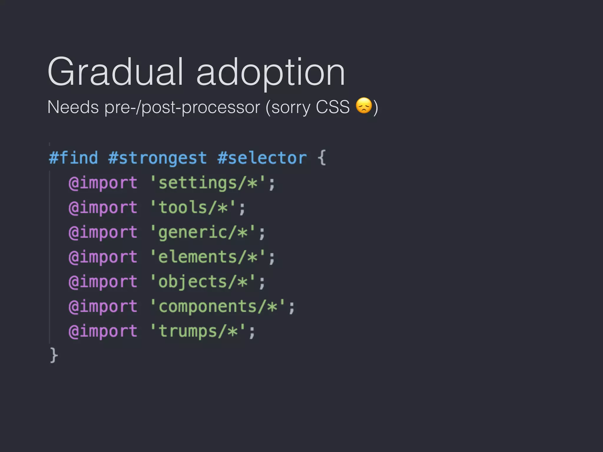
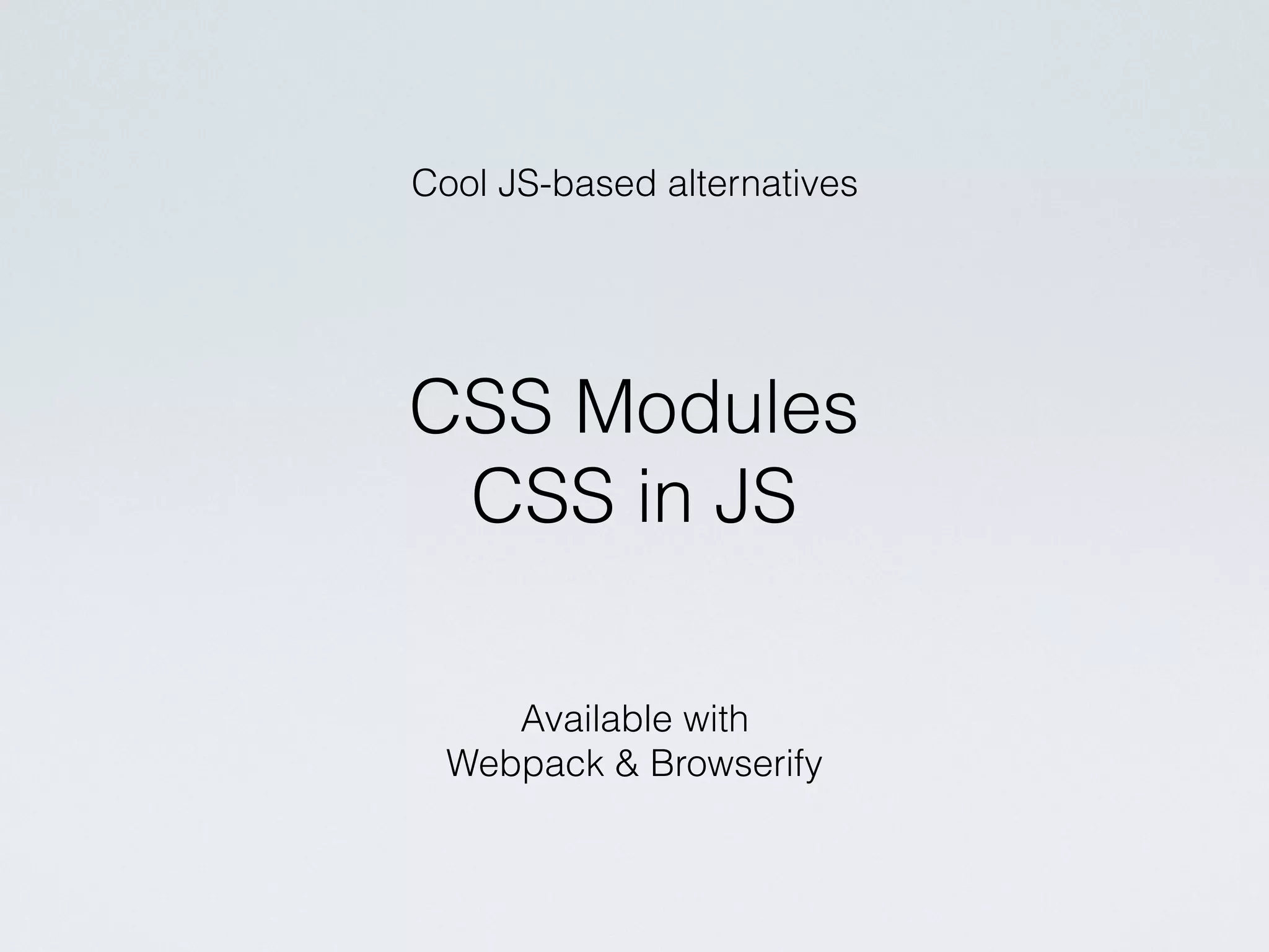
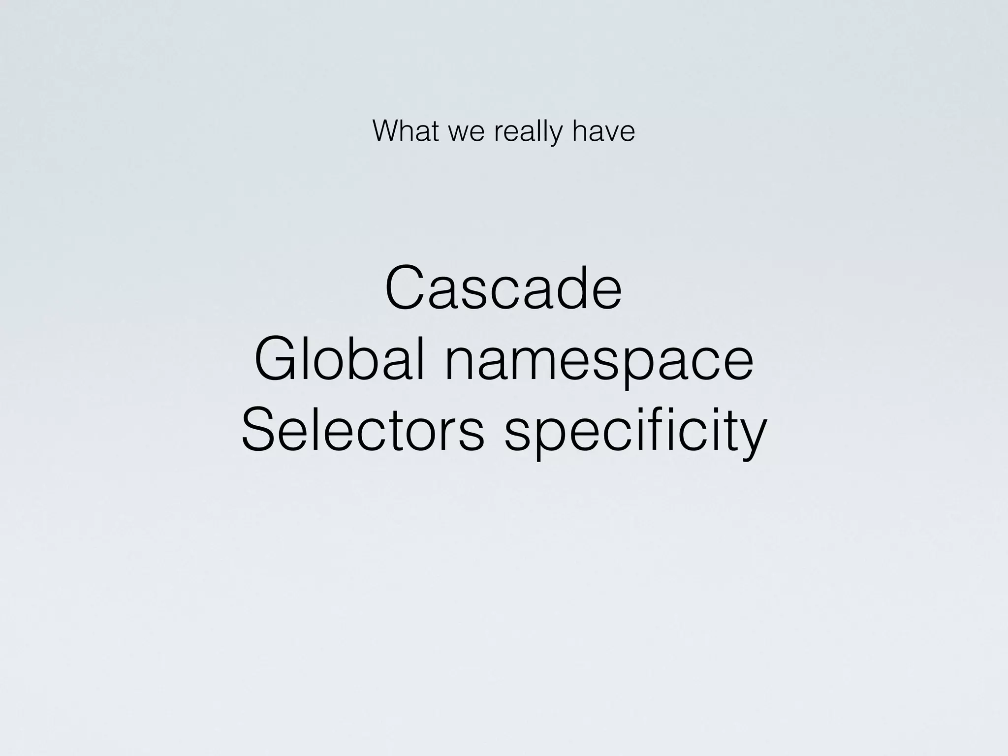
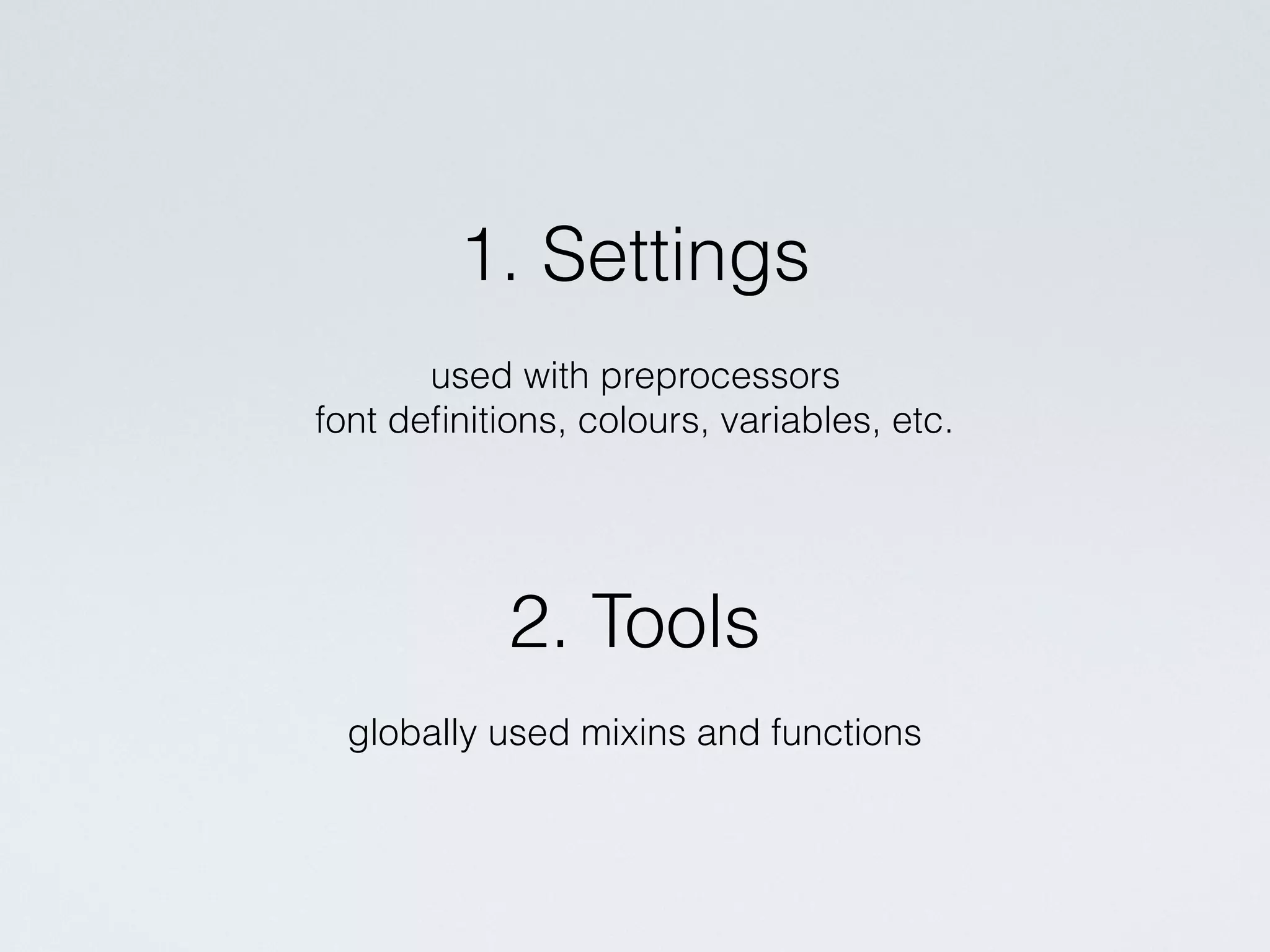
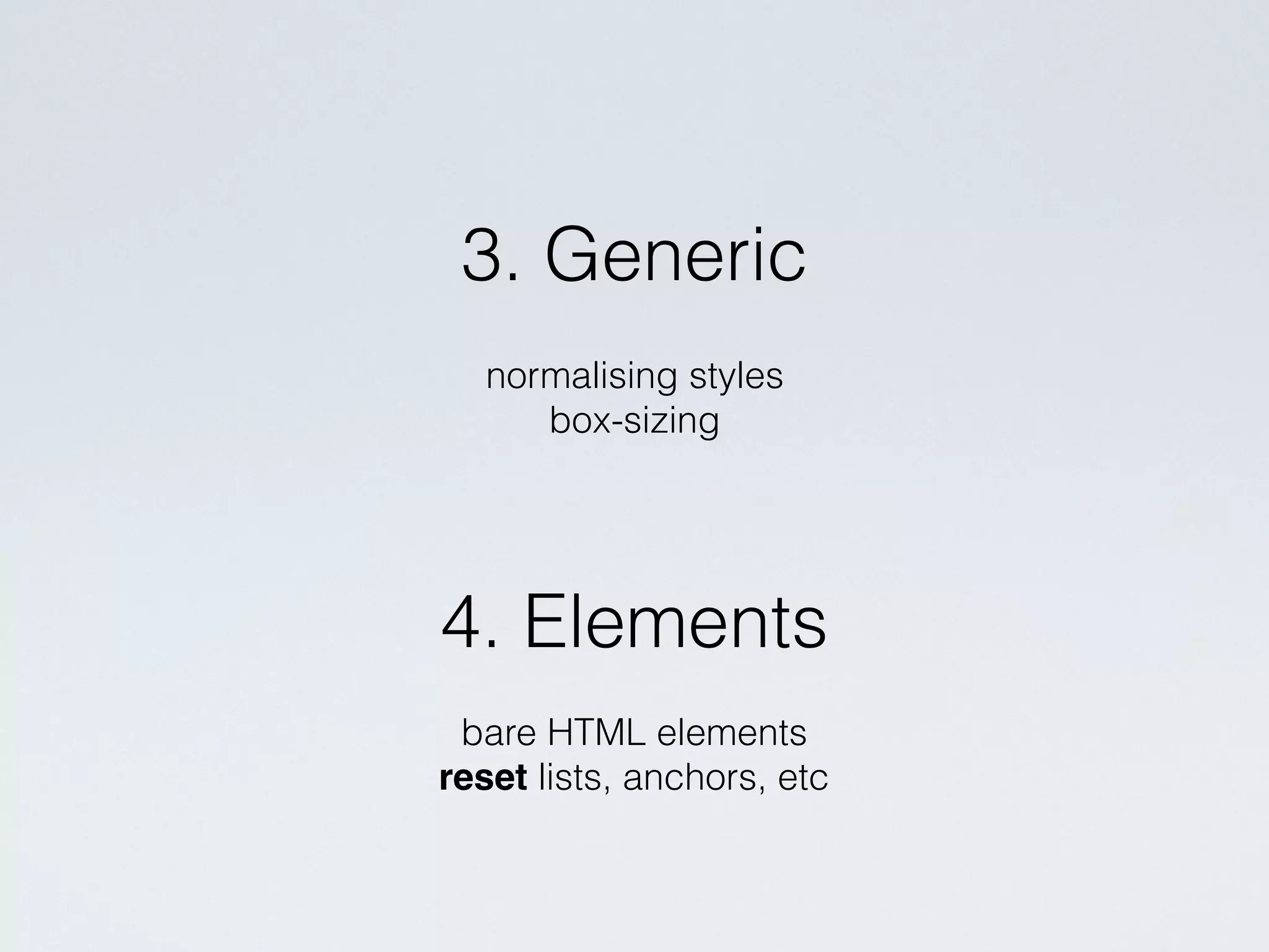
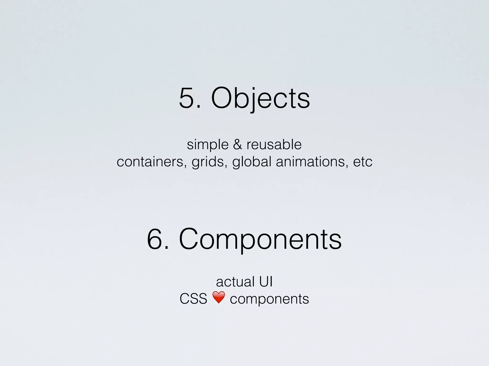
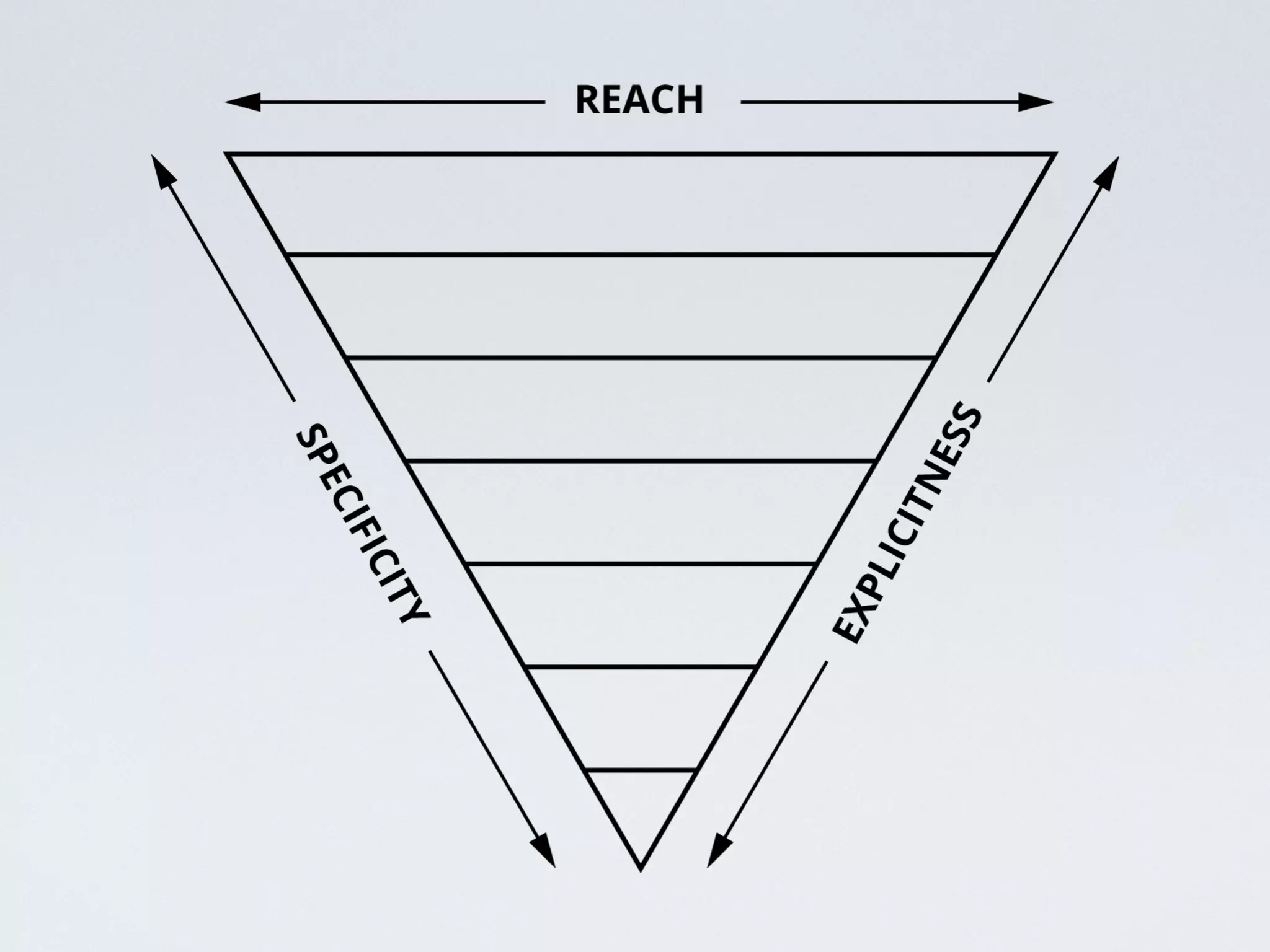
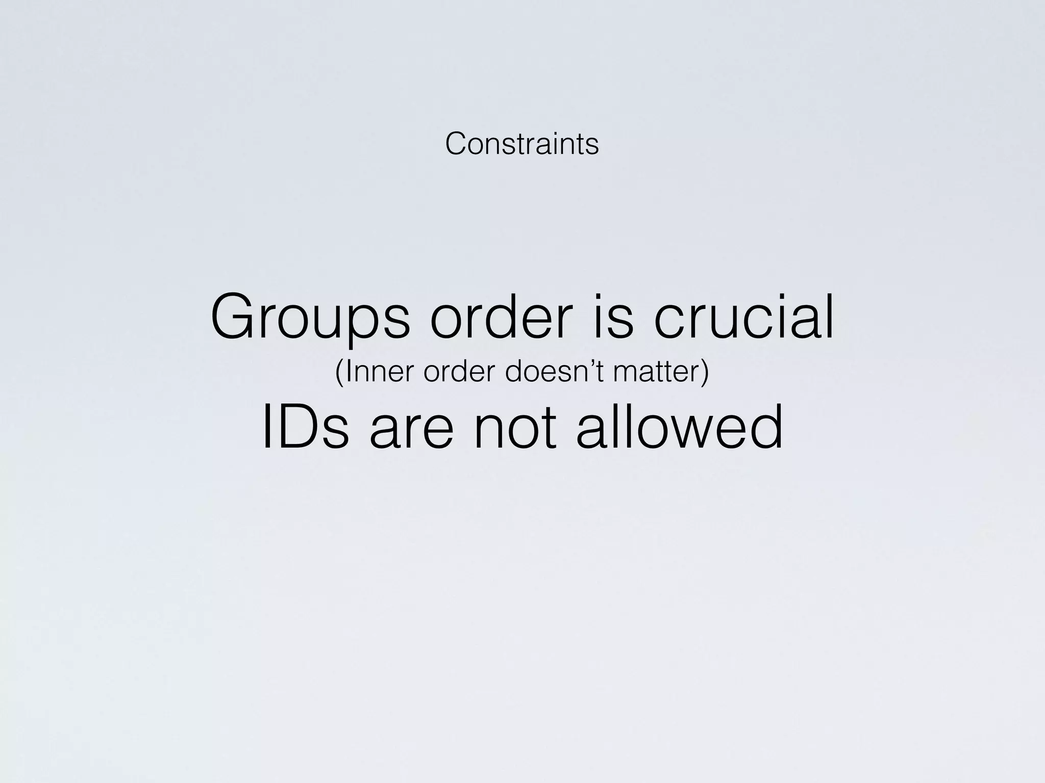
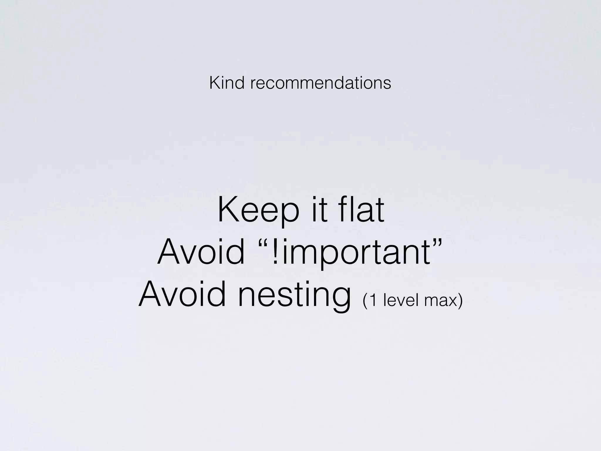
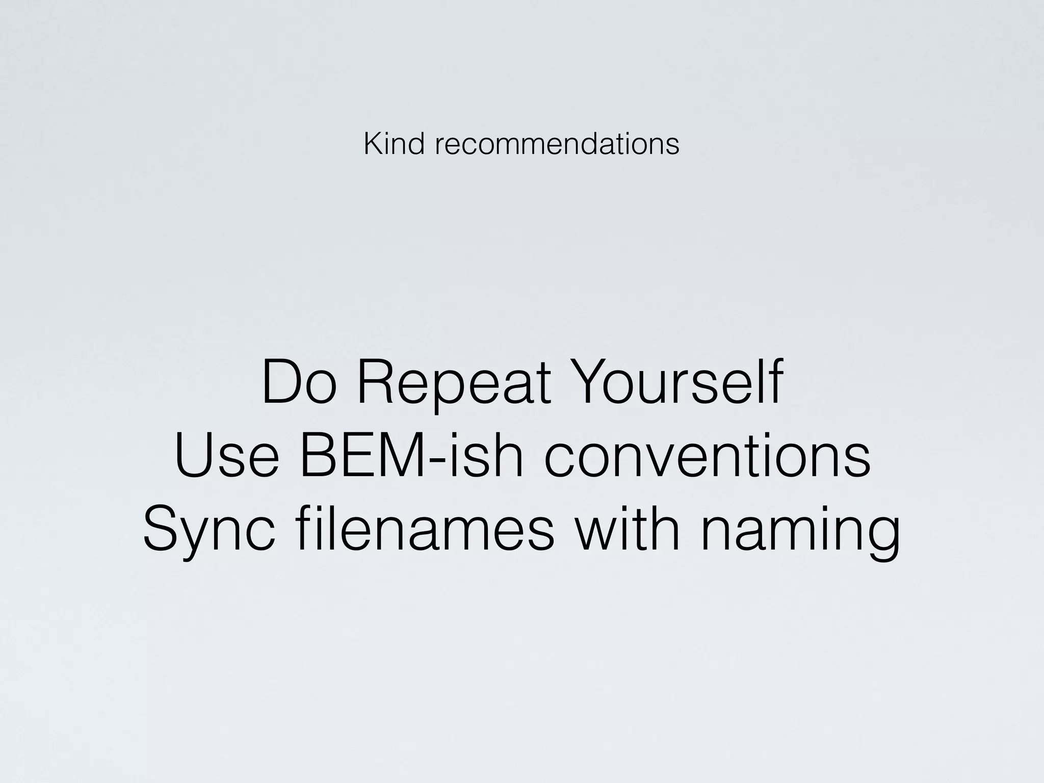
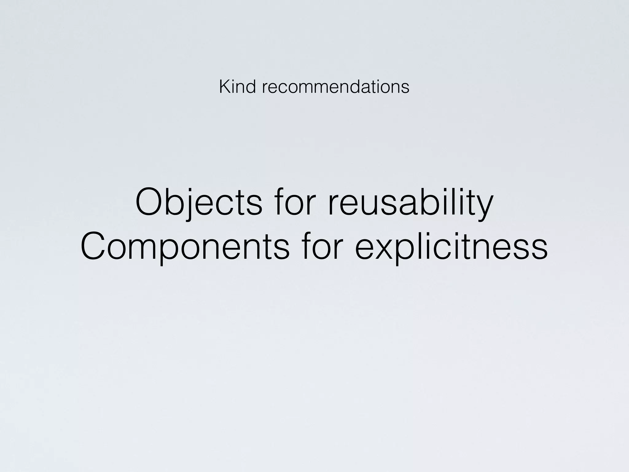
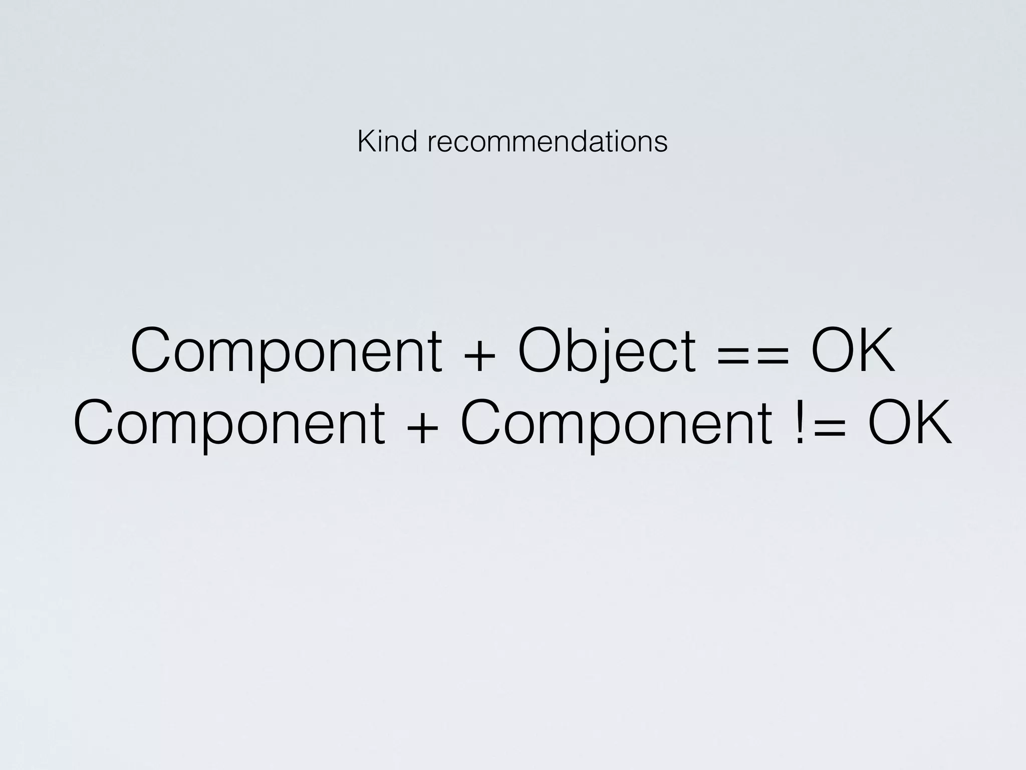
The document discusses scalable and maintainable CSS architecture, focusing on ITCSS (Inverted Triangle CSS) as a solution for organizing stylesheets. It emphasizes modularity, encapsulation, and predictability through structured imports and naming conventions like BEM (Block Element Modifier) to avoid specificity issues. The authors provide guidelines for avoiding excessive nesting and recommend practices for creating reusable and explicit UI components.


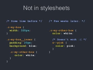
![• .[component-name]__[child]—[modifier]
• Remember that it’s on only a convention!
• Use 🍌 instead of __ or 🍓instead —
if you like
• Important: separation of the parent
element and its children.
• Be consistent.](https://image.slidesharecdn.com/scalable-css-architecture-160929071754/85/Scalable-CSS-Architecture-23-320.jpg)
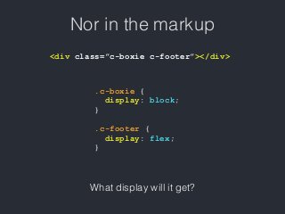
![JS hooks
• .js-[name]
• readonly to identify DOM elements for JS
• can’t be styled!](https://image.slidesharecdn.com/scalable-css-architecture-160929071754/85/Scalable-CSS-Architecture-24-320.jpg)
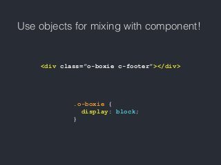
![State classes
• .is-[name]
• .has-[name]
• should be used in favour of —modifiers
in case a component changes its state
after the page is loaded
• handy to use with JS](https://image.slidesharecdn.com/scalable-css-architecture-160929071754/85/Scalable-CSS-Architecture-25-320.jpg)
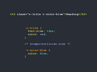
![Temptation to target tags
.c-my-list li {
[item styles]
}
<ul>
<li>
<div class=”c-some-component-with-a-list”>
<ul>
<li>another list!</li>
<li>
and now you need to override
.c-my-list li with stronger selector...</li>
</ul>
</div>
</li>
</ul>](https://image.slidesharecdn.com/scalable-css-architecture-160929071754/85/Scalable-CSS-Architecture-27-320.jpg)


![• .[component-name]__[child]—[modifier]
• Remember that it’s on only a convention!
• Use 🍌 instead of __ or 🍓instead —
if you like
• Important: separation of the parent
element and its children.
• Be consistent.](https://image.slidesharecdn.com/scalable-css-architecture-160929071754/75/Scalable-CSS-Architecture-23-2048.jpg)
![JS hooks
• .js-[name]
• readonly to identify DOM elements for JS
• can’t be styled!](https://image.slidesharecdn.com/scalable-css-architecture-160929071754/75/Scalable-CSS-Architecture-24-2048.jpg)
![State classes
• .is-[name]
• .has-[name]
• should be used in favour of —modifiers
in case a component changes its state
after the page is loaded
• handy to use with JS](https://image.slidesharecdn.com/scalable-css-architecture-160929071754/75/Scalable-CSS-Architecture-25-2048.jpg)
![Temptation to target tags
.c-my-list li {
[item styles]
}
<ul>
<li>
<div class=”c-some-component-with-a-list”>
<ul>
<li>another list!</li>
<li>
and now you need to override
.c-my-list li with stronger selector...</li>
</ul>
</div>
</li>
</ul>](https://image.slidesharecdn.com/scalable-css-architecture-160929071754/75/Scalable-CSS-Architecture-27-2048.jpg)