Downloaded 127 times


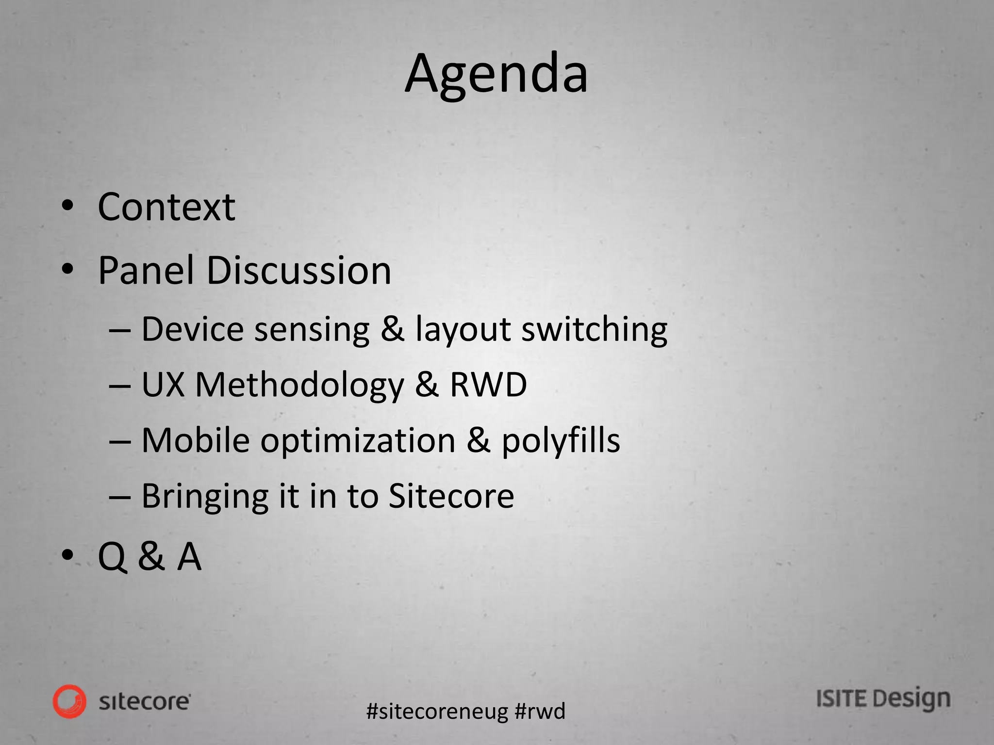


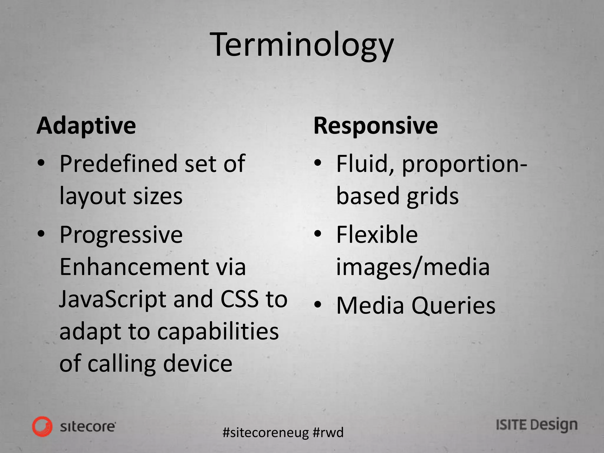
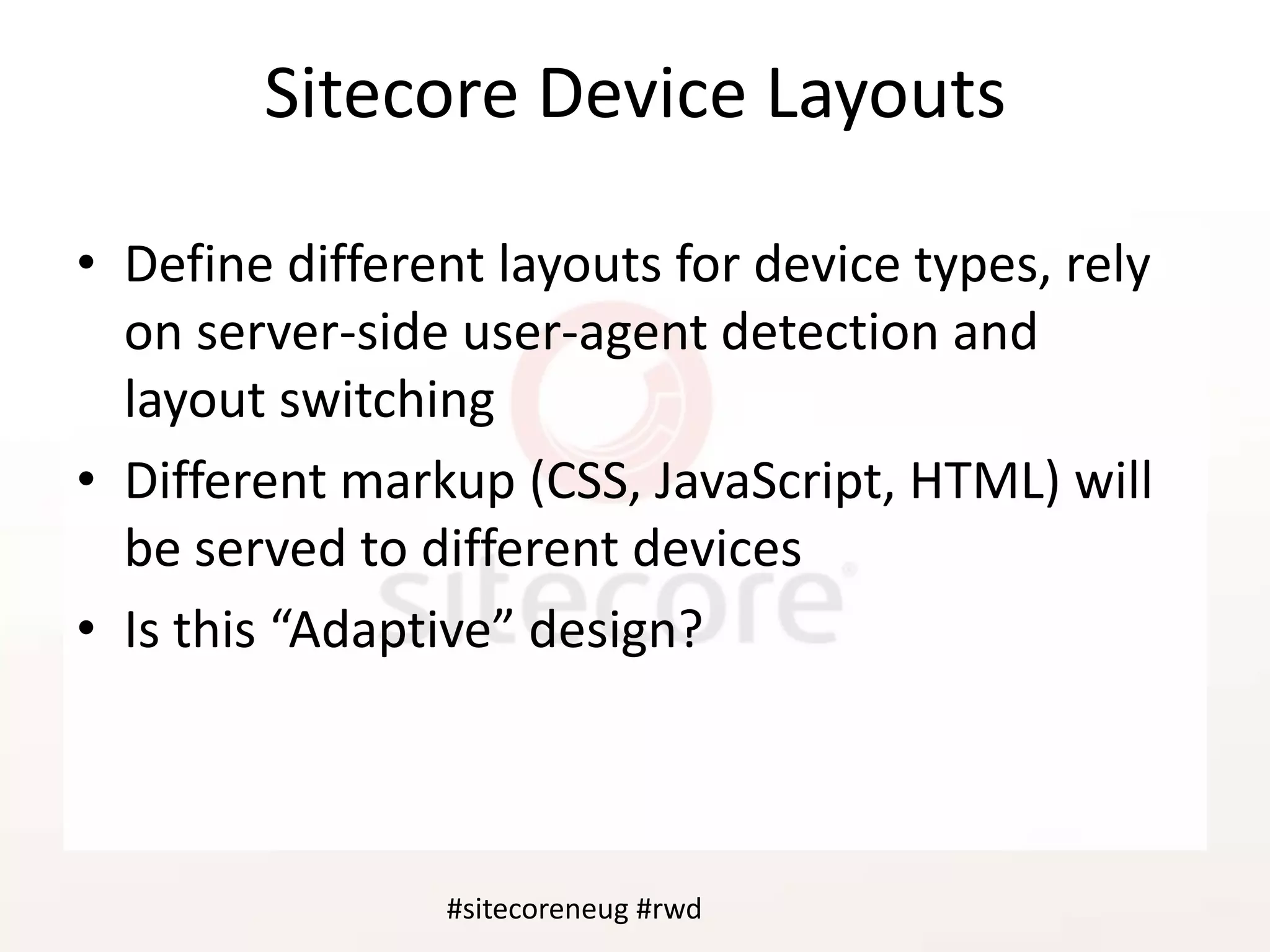
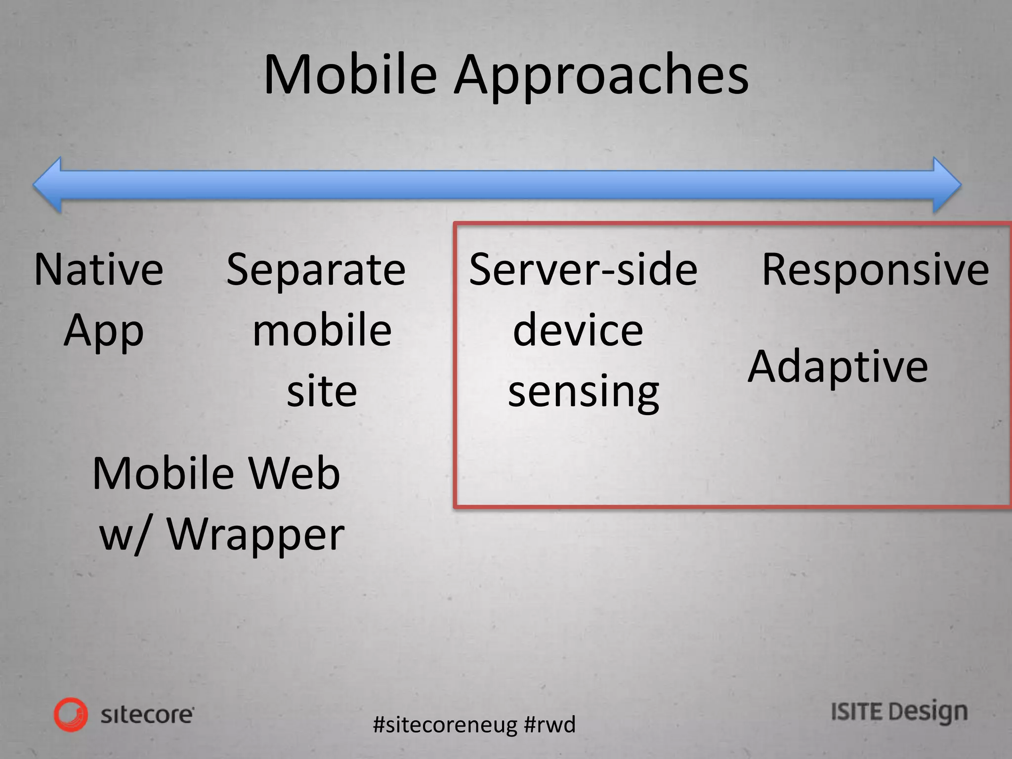


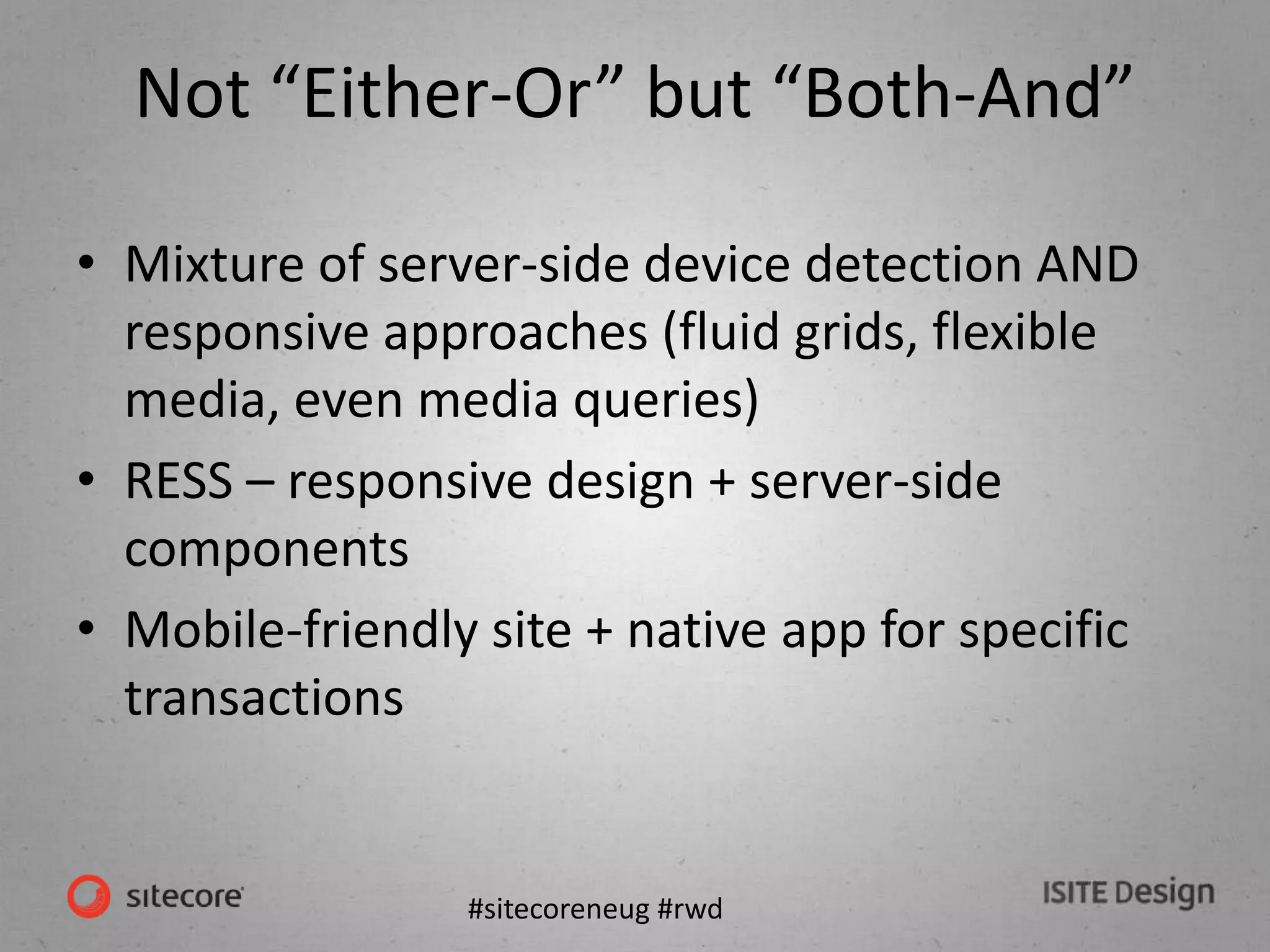
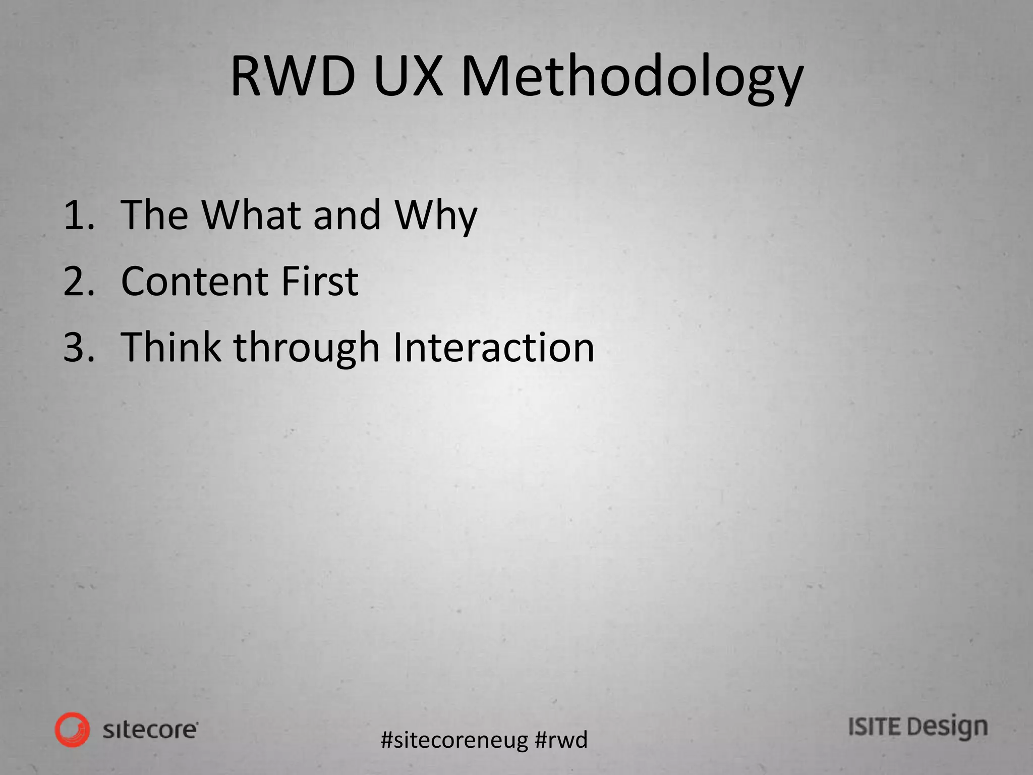

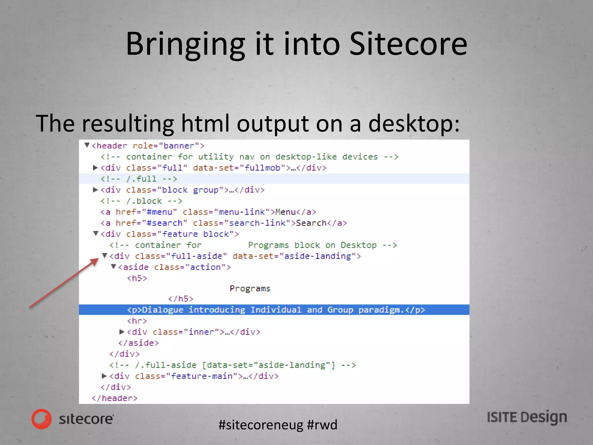
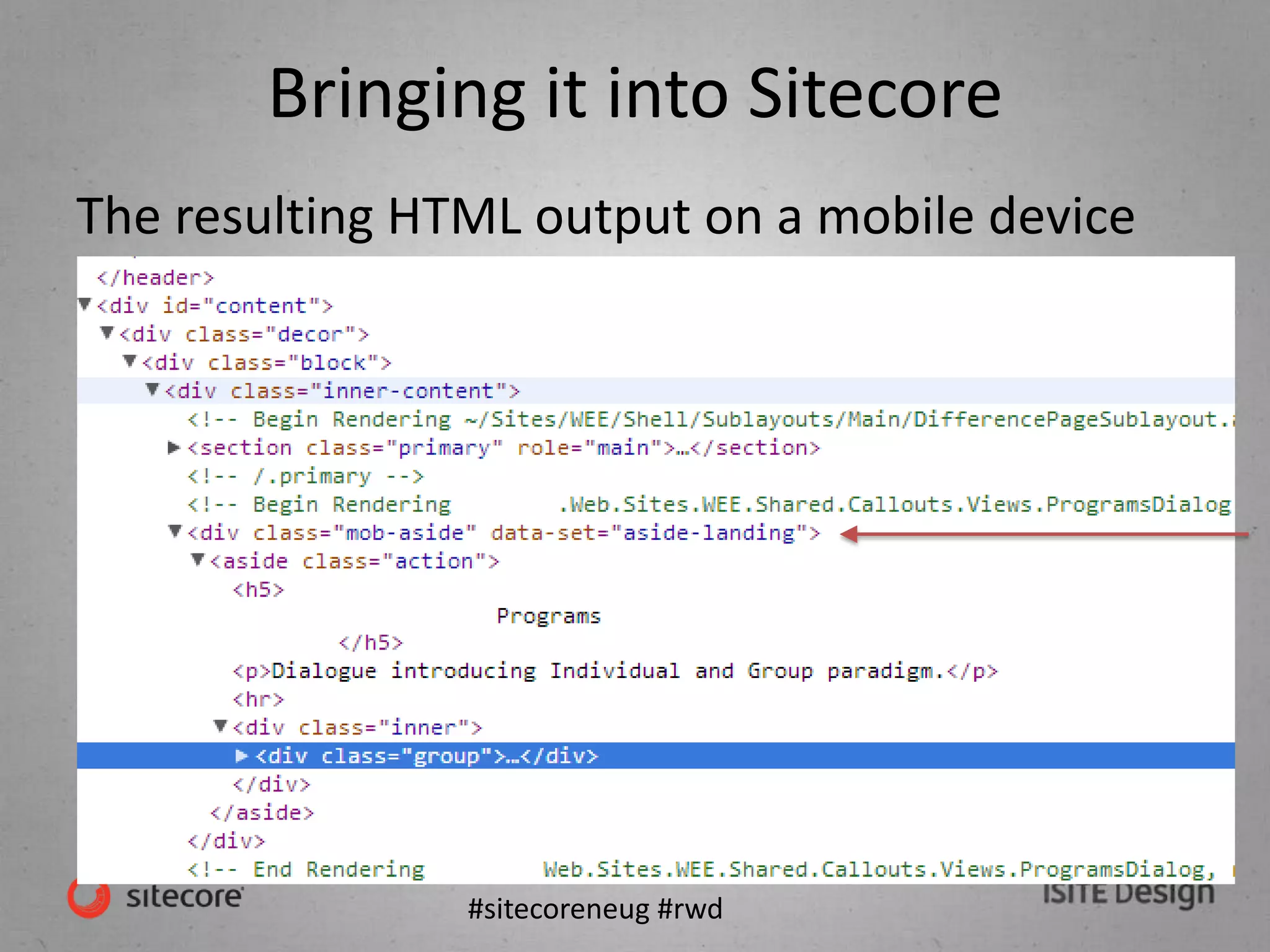
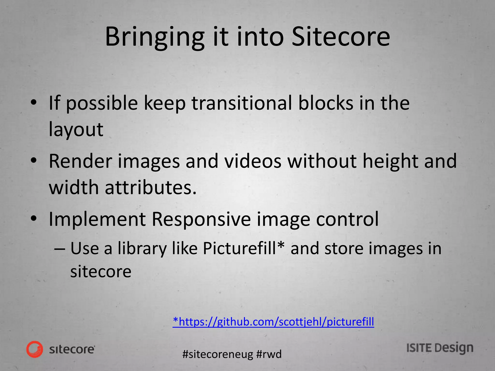


The document summarizes a presentation on responsive web design and Sitecore. It discusses terminology like adaptive and responsive design. It covers approaches to mobile like separate mobile sites versus responsive design. It also discusses bringing responsive design into Sitecore including using device layouts and detection, and considerations for images, videos, and third party content. The panel then took questions on lessons learned and challenges of integrating responsive design into Sitecore projects.


![Responsive Design & Beyond [Code & Creativity Workshop]](https://cdn.slidesharecdn.com/ss_thumbnails/codecreativityworkshop1-140506164731-phpapp01-thumbnail.jpg?width=600ounds&width=560&fit=bounds)


