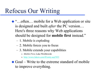
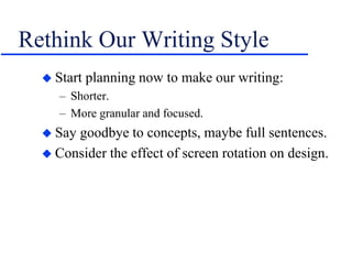
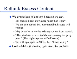
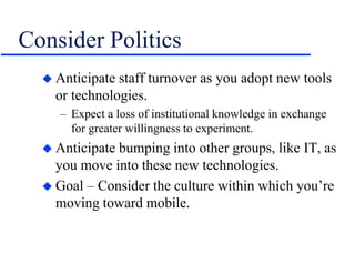
Download to read offline


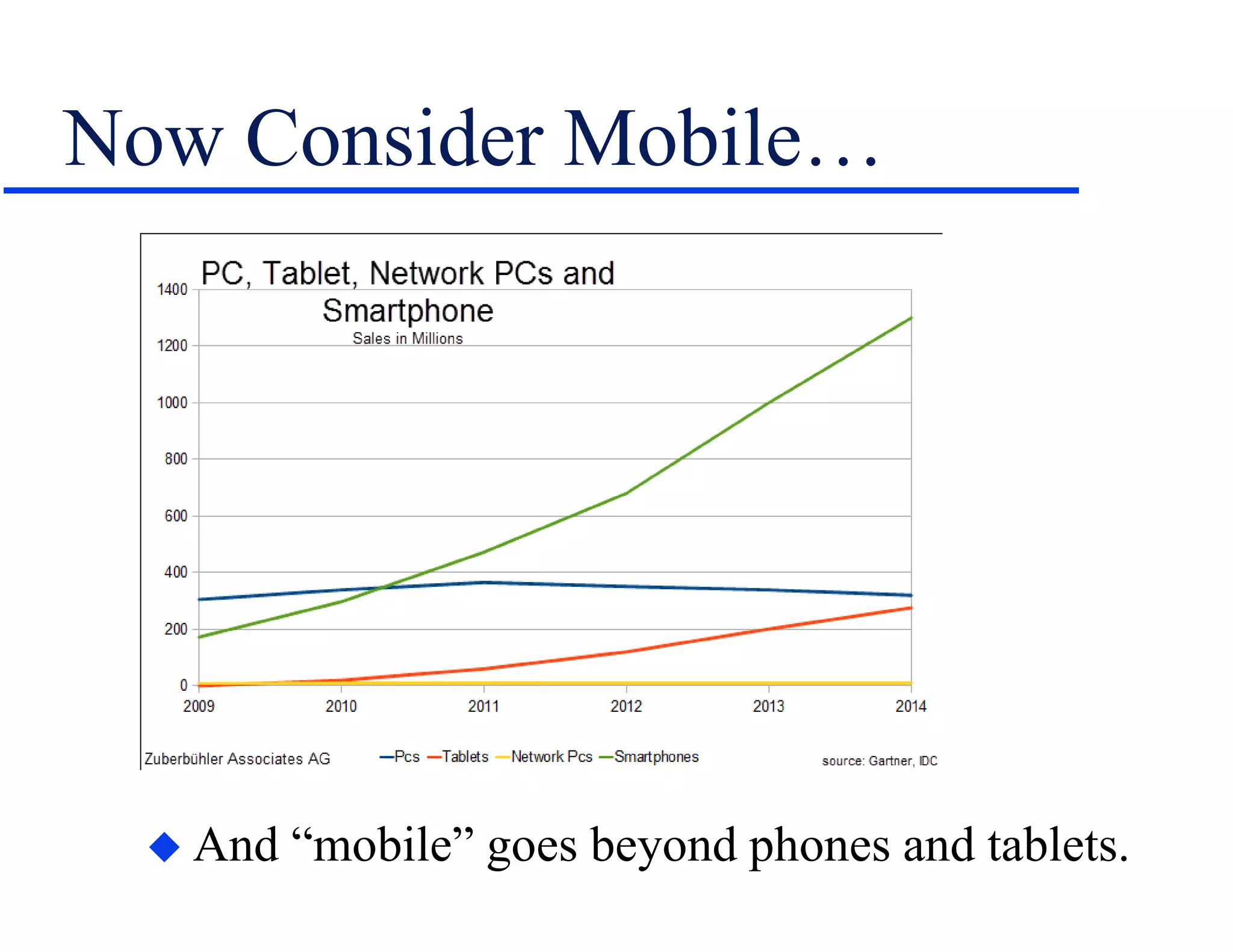


Mobile technology is spreading beyond just phones and tablets and will significantly impact technical communication. To prepare, technical communicators should define the value they provide, consider new business models, focus on search-based navigation over indexes, write more concisely for mobile, and learn new skills like CSS. In the future, they may need to create true mobile apps, explore new interfaces like voice control, and personalize content based on user analytics. Mobile will change how technical communication is delivered and require adaptation.


