Download as PDF, PPTX


The document provides an overview of Tableau, a powerful tool for data visualization, emphasizing its features such as drag-and-drop capabilities and its ability to connect to various data sources. It discusses data preparation techniques including relationships, joins, and blending, as well as different types of filters used in Tableau for data analysis. Additionally, the document outlines the significance of various chart types for visualizing data relationships and patterns.
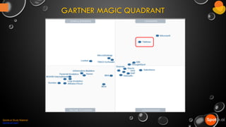
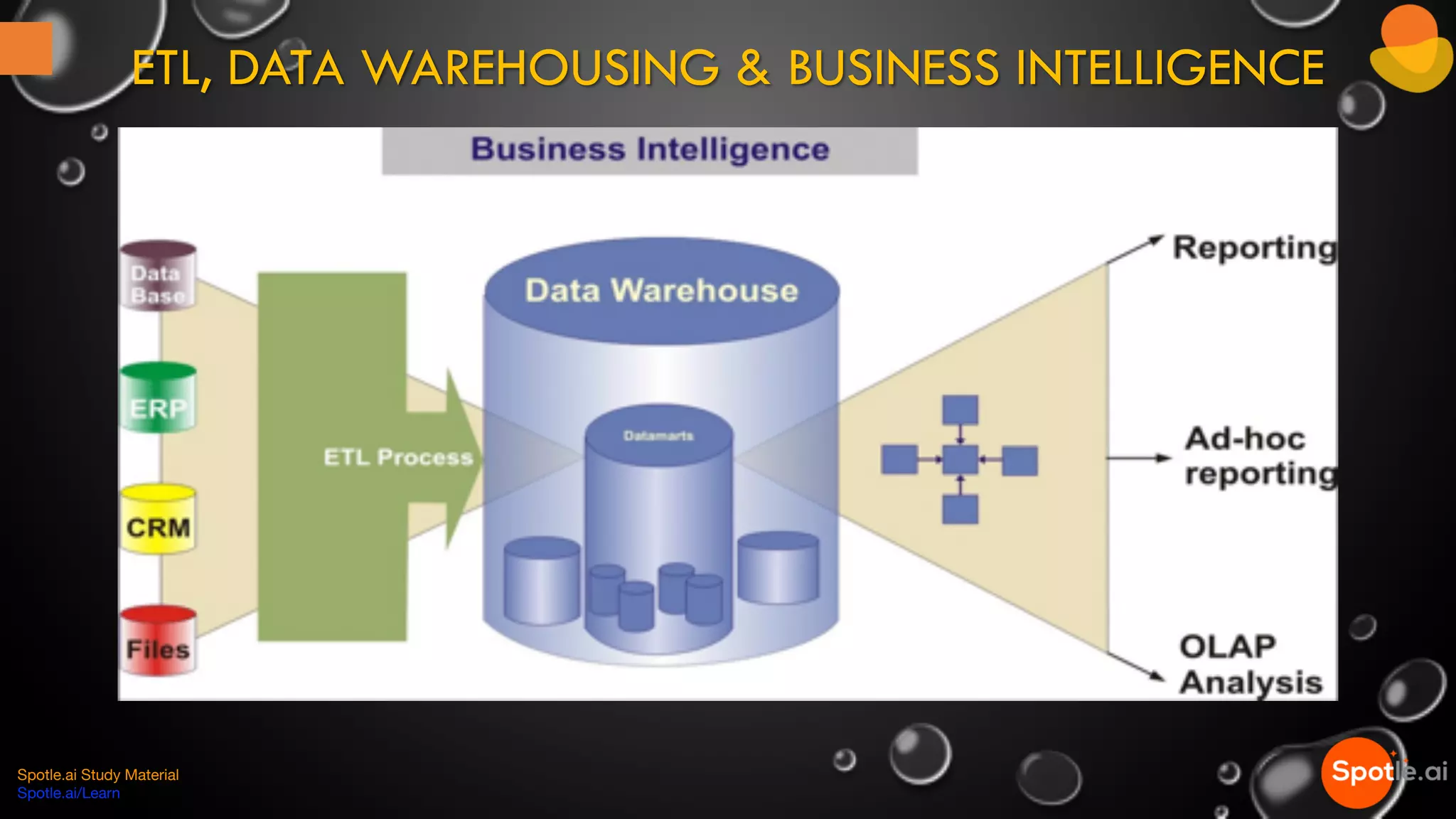
Introduction to Tableau's role in data visualization and overview of ETL, data warehousing, and business intelligence.
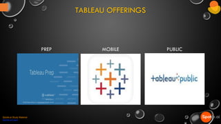
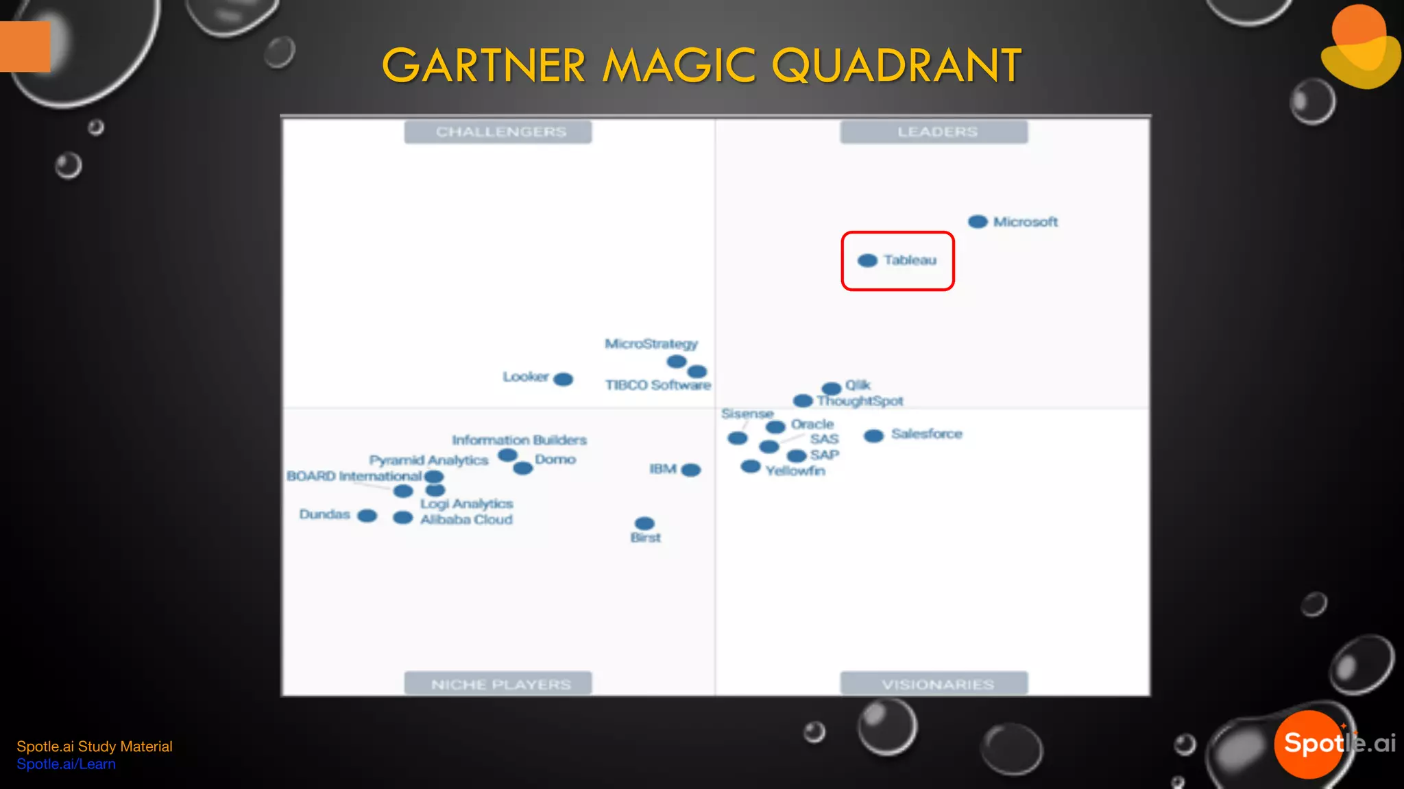
Overview of Tableau as a data visualization tool and its various offerings including Desktop, Server, and Online.
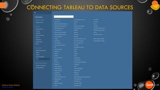
Details on connecting Tableau to different data sources for analysis.
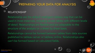
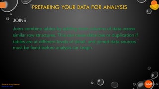
Preparing data through Relationships, Joins, and Blends to optimize tableau analysis.
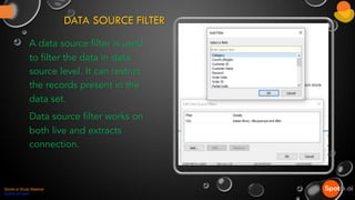
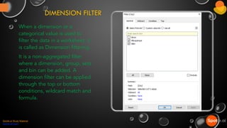
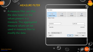
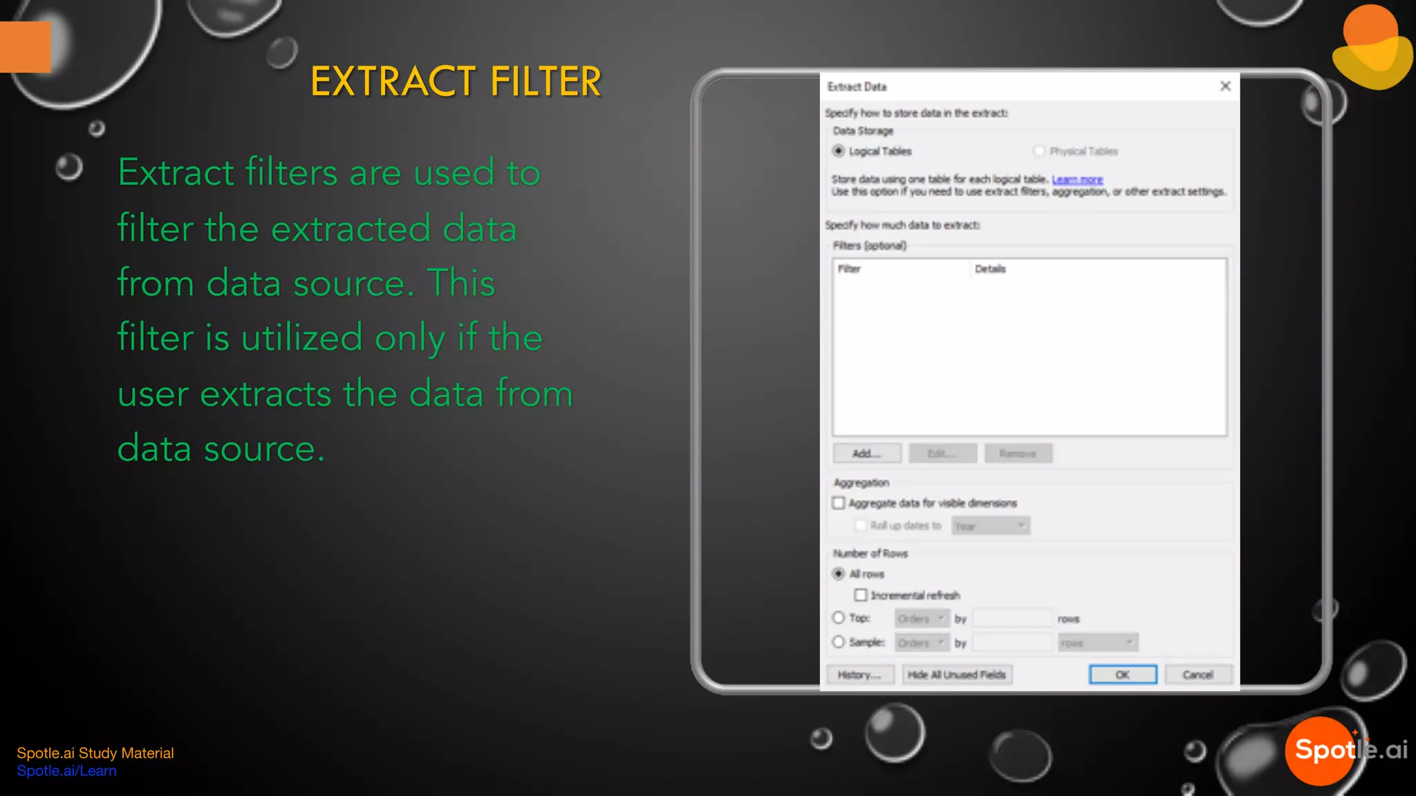
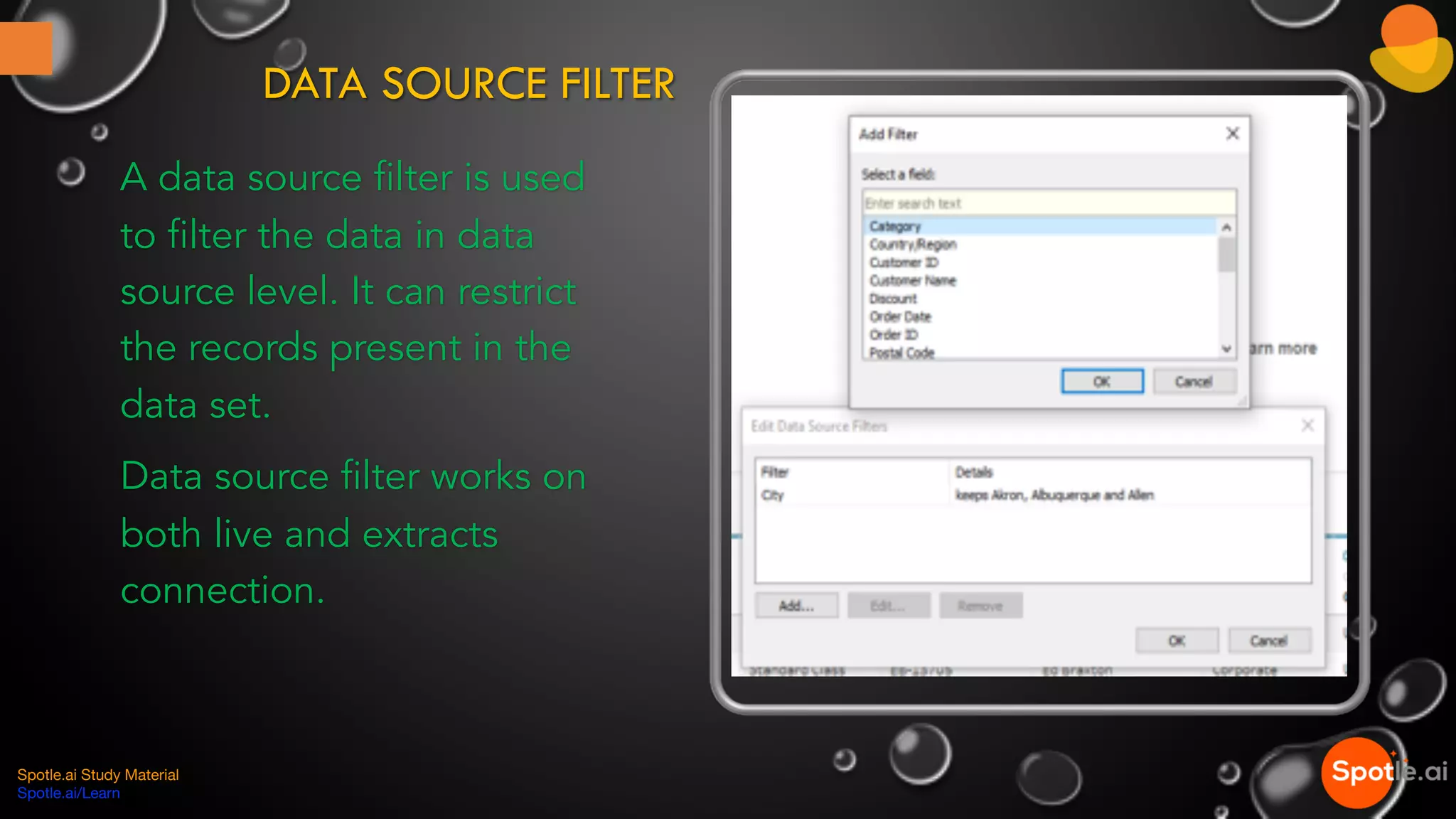
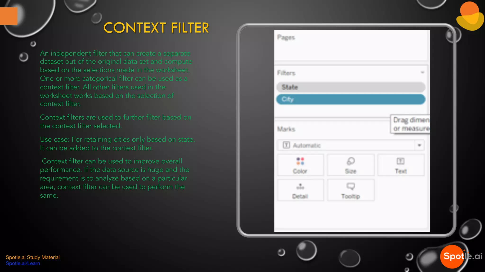
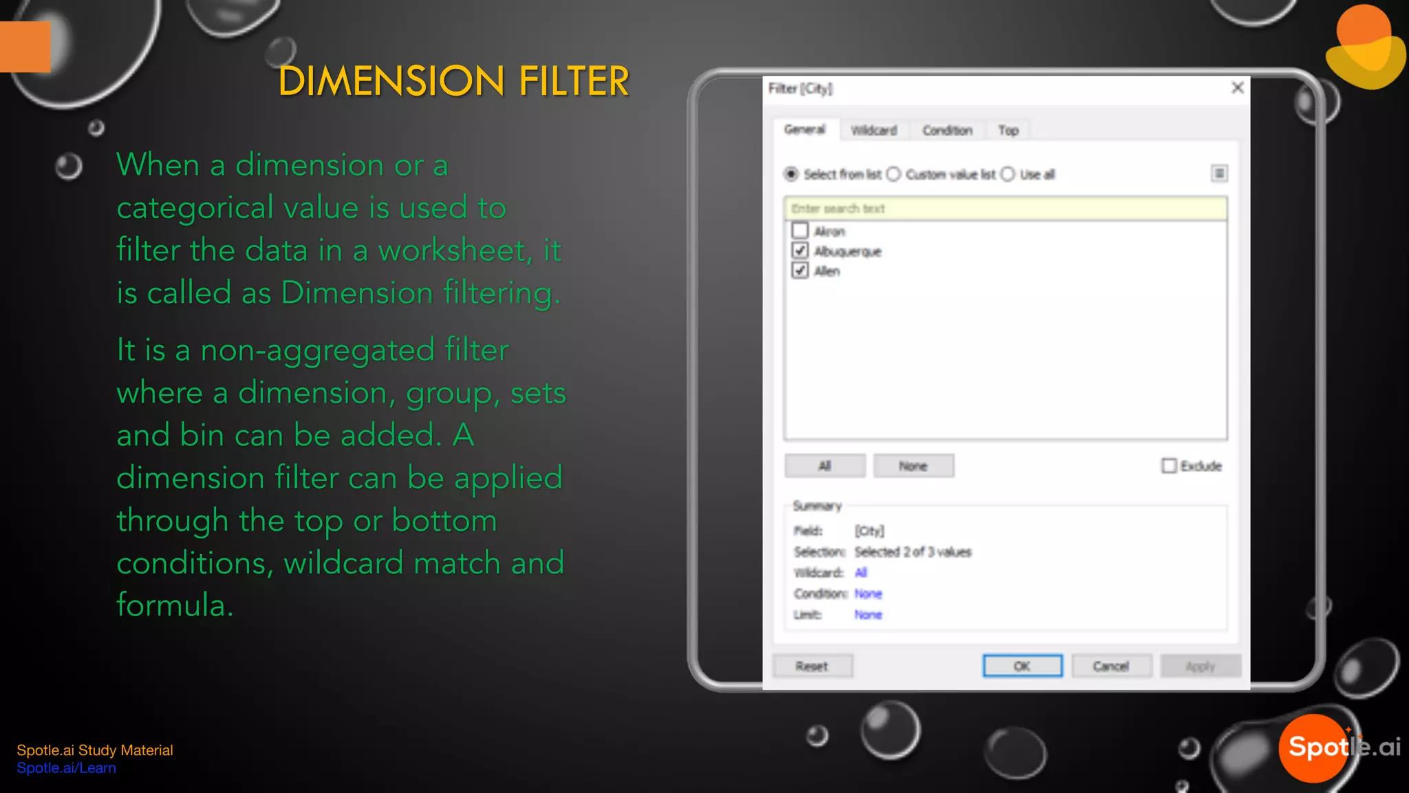
Various filtering techniques in Tableau, including Extract, Data Source, Context, Dimension, and Measure filters.
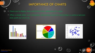
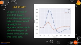
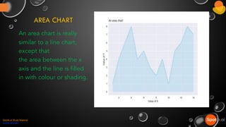
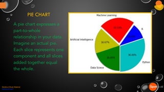
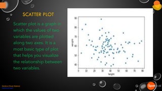
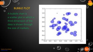
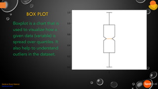
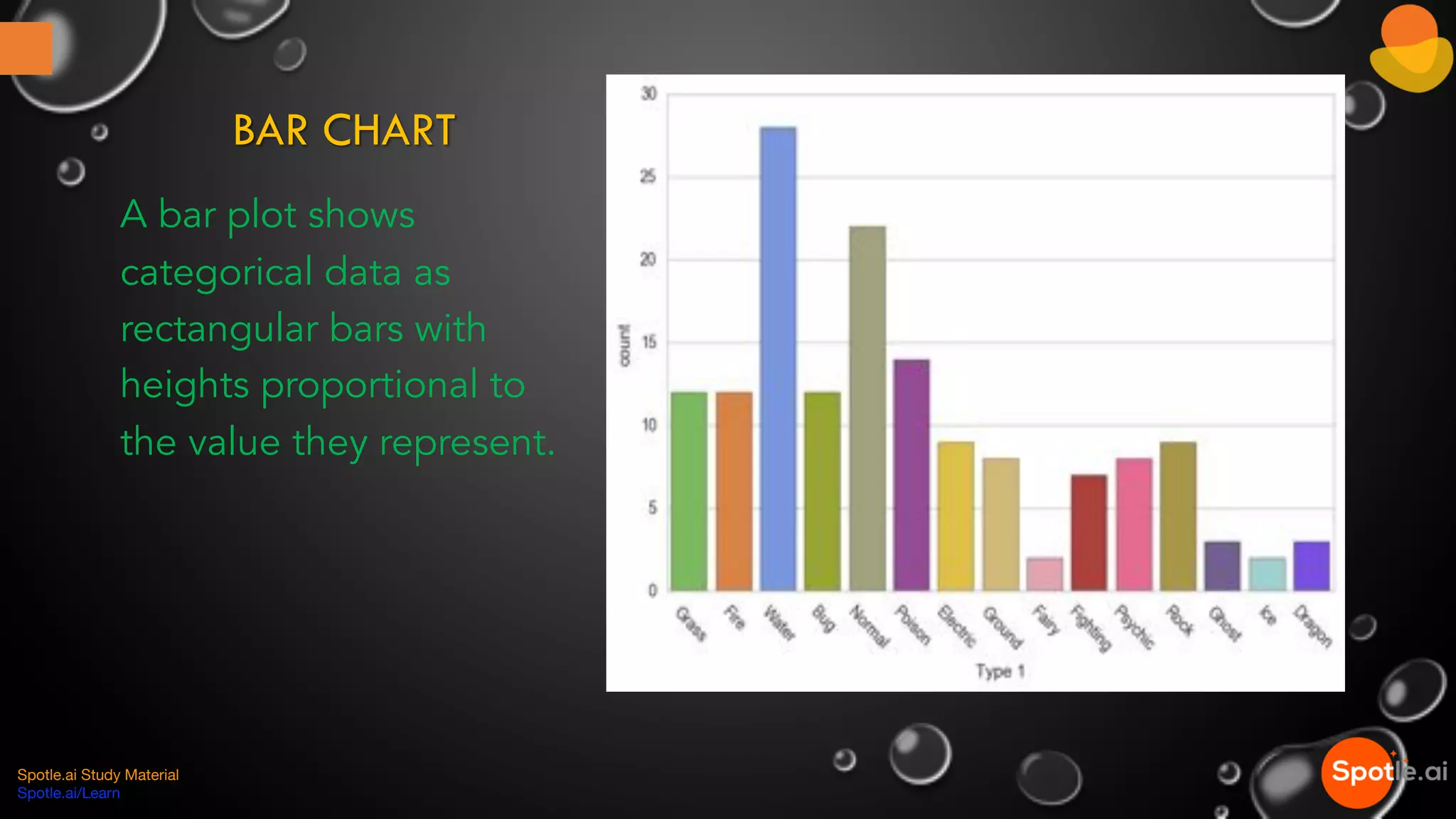
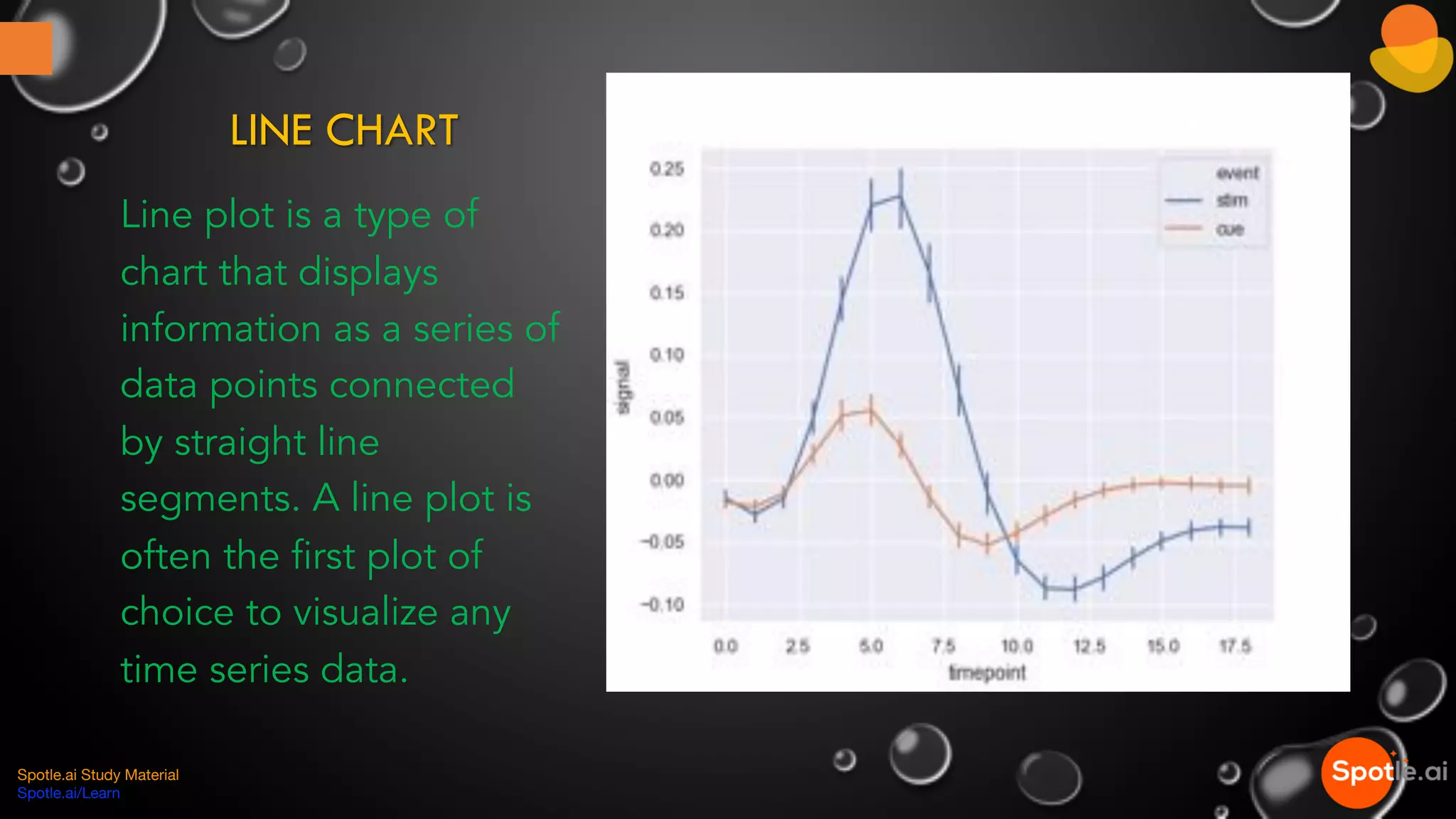
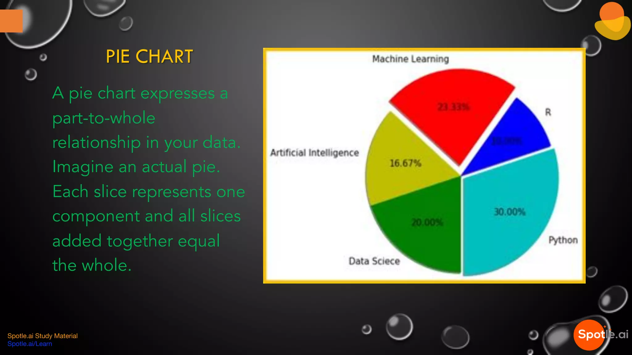
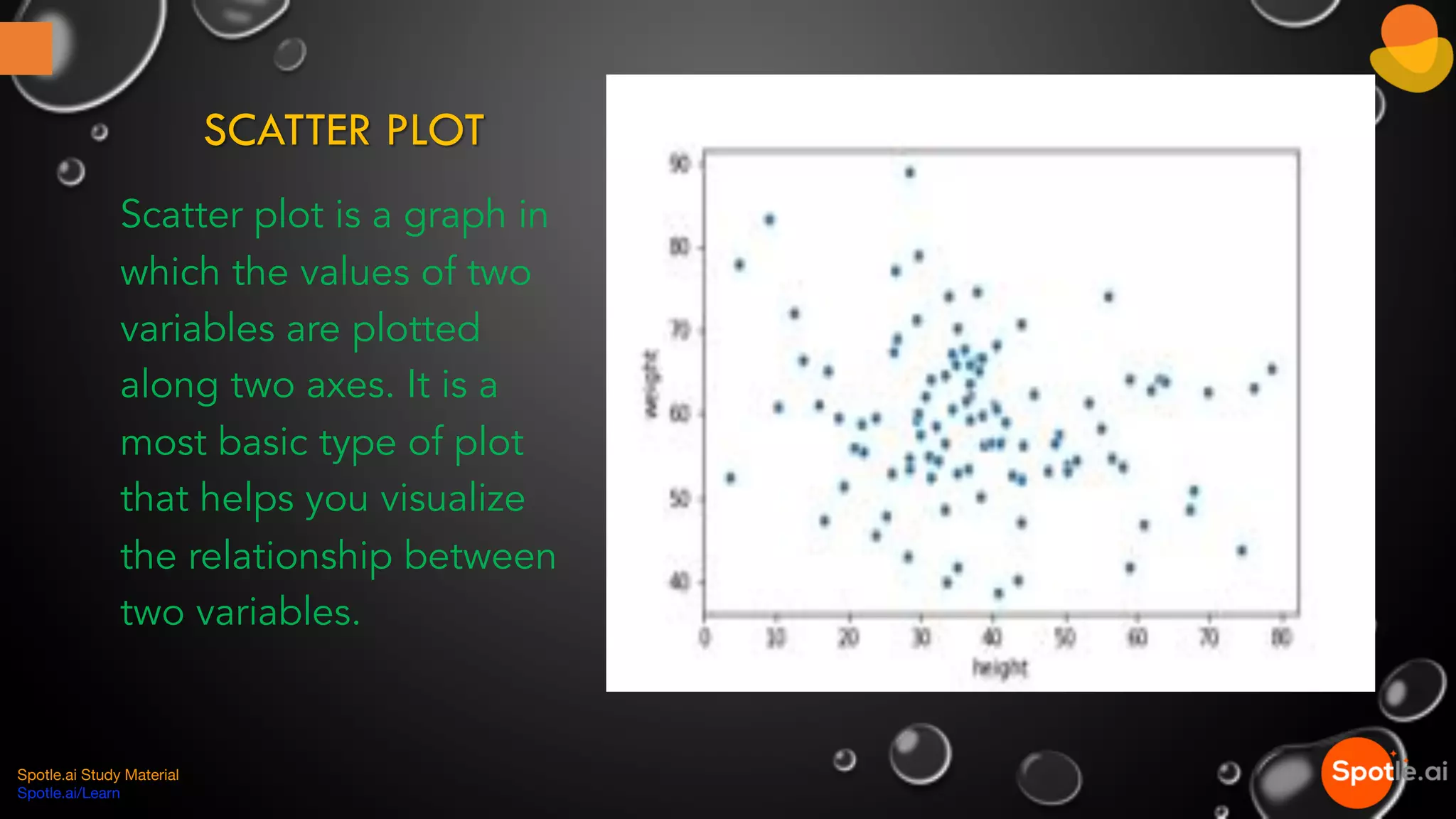
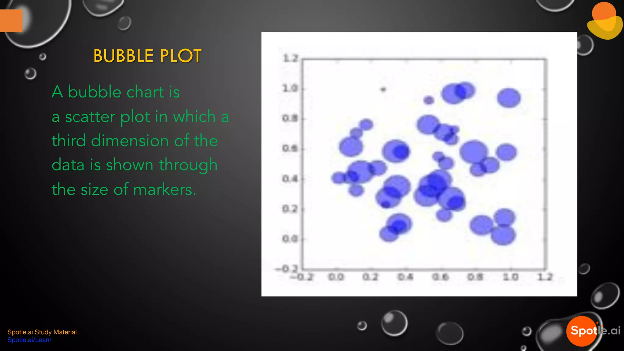
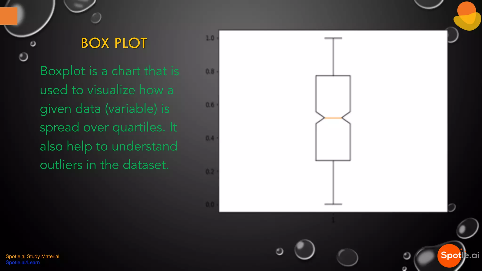
Charts are essential for visualizing data relationships; includes various chart types like Bar, Line, Area, Pie, Scatter, Bubble, and Box plots.
Ending note with a hashtag for learning and career readiness.


