Trusted by the world’s leading companies

Overview
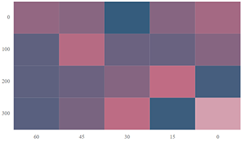
The Angular HeatMap Chart is a graphical representation of two-dimensional data where values are represented with gradient or solid color variations. The data points are rendered as HeatMap cells using Scalable Vector Graphics (SVG) or canvas UI rendering.
Angular HeatMap Chart Code Example
Easily get started with the Angular HeatMap Chart using a few simple lines of HTML and TS code, as demonstrated below. Also explore our Angular HeatMap Chart example that shows you how to render and configure the HeatMap Chart in Angular.
<ejs-heatmap
    id="container"
    [titleSettings]="titleSettings"
    [xAxis]="xAxis"
    [yAxis]="yAxis"
    style="display:block;"
    [dataSource]="dataSource"
  >
  </ejs-heatmap>
import { Component } from '@angular/core';
@Component({
selector: 'app-root',
// Specifies the template string for the heatmap chart component.
templateUrl: './app.component.html',
})
export class AppComponent {
titleSettings: Object = {
text: 'Sales Revenue per Employee (in 1000 US$)',
};
dataSource: Object[] = [
[73, 39, 26, 39, 94, 0],
[93, 58, 53, 38, 26, 68],
[99, 28, 22, 4, 66, 90],
[14, 26, 97, 69, 69, 3],
[7, 46, 47, 47, 88, 6],
[41, 55, 73, 23, 3, 79],
[56, 69, 21, 86, 3, 33],
[45, 7, 53, 81, 95, 79],
[60, 77, 74, 68, 88, 51],
[25, 25, 10, 12, 78, 14],
[25, 56, 55, 58, 12, 82],
[74, 33, 88, 23, 86, 59],
];
xAxis: Object = {
labels: [
'Nancy',
'Andrew',
'Janet',
'Margaret',
'Steven',
'Michael',
'Robert',
'Laura',
'Anne',
'Paul',
'Karin',
'Mario',
],
};
yAxis: Object = {
labels: ['Mon', 'Tues', 'Wed', 'Thurs', 'Fri', 'Sat'],
};
}Dealing with large data
Though the Angular HeatMap Chart can render data points using both SVG and canvas modes, it uses canvas rendering mode while displaying large volumes of data for the best initial load performance and optimized memory usage.
Data binding
The HeatMap Chart can be bound to data using JSON or an array of objects. JSON data can be local or remote, and it can be retrieved using different adaptors. The JSON data can be nested as well.

Bubble HeatMap Chart
The Angular Bubble HeatMap Chart or the matrix bubble chart, visualizes data using variations in bubble attributes such as size, color, and sector.

Calendar HeatMap
The Angular Calendar HeatMap visualizes time series data, with each data point representing a value bound to a specific time.
Axis
Populate data in the Angular HeatMap Chart using different axis types: numeric, category, and date-time.
Numeric axis
Use a numeric axis to represent numeric data in a HeatMap.
Date-time axis
Use a date-time axis to represent time series data in a HeatMap. Similarly, display dates and times as axis labels with different formats.
Category axis
Use a category axis to represent non-numerical data in a HeatMap and display text labels instead of numbers.
Customizable axis
The Angular HeatMap Chart allows you to customize axis elements to make an axis more readable.
Inversed axis
Achieve RTL layout by reversing the axis labels. This swaps the higher and lower ranges of an axis.

Opposed position
Arrange the axes smartly by moving them to positions opposite to their default positions.

Axis intervals
Set axis labels with regular intervals, hiding adjacent labels across all types of axes.

Axis label rotation
Rotate axis labels clockwise or counterclockwise to any desired angle.

Axis label formatting
Customize the axis label text using the available formatting options.
HeatMap cell customization
Customize the default appearance of a cell or data point using the available formatting options.

Data label
Toggle visibility or format the data labels to display custom text along with the cell values.

Border
Change the borders and cell spacing by customizing the border settings.

Data label template
Render any HTML element as a label for the cells in the HeatMap.
Palette
Customize the default color settings of the HeatMap cells with gradient or solid custom colors.


Cell color range customization
Color ranges allow a color to be applied to specific ranges in HeatMap cells.

Legend
Display additional information about data points in the Angular HeatMap Chart using a legend.

Types
Choose between a gradient pointer and a list-type legend for improving data points readability.

Positioning
Place the legend anywhere in the chart area to make it fit best on a page.

Paging
The control enables paging when legend items exceed the bounds. Then, each legend item can be viewed by navigating between the pages.

Legend title
A legend title provides information about the heatmap legend.
Empty points
Handle missed or undefined data values with empty data points.


Selection
Select single or multiple cells the cells using keyboard, mouse, and touch interactions.
Tooltip
Display additional information for the data points with tooltips on mouse hover.

Angular version compatibility
With continuous improvement in Angular versions, the Angular HeatMap is kept up to date to make it compatible with the latest version.

Other supported frameworks
The HeatMap Chart is available for the Blazor, React, JavaScript, and Vue frameworks. Explore its platform-specific options through the following links:


Supported browsers
The Angular HeatMap Chart works well with all modern web browsers, including Chrome, Firefox, Edge, Safari, and Opera.

Not sure how to create your first Angular HeatMap Chart? Our documentation can help.
I’d love to read it now145+ ANGULAR UI COMPONENTS
ALL COMPONENTS
SMART COMPONENTS
GRIDS
DATA VISUALIZATION
DROPDOWNS
FILE VIEWERS & EDITORS
BUTTONS
INTERACTIVE CHAT
INPUTS
NAVIGATION
FORMS
NOTIFICATION
Frequently Asked Questions
Why should you choose Syncfusion® Angular HeatMap Chart?
The Syncfusion® HeatMap Chart for Angular provides the following features:
- Display simple or large matrix data graphically.
Supports automatic switching between SVG and canvas rendering modes.
Legend provides value information for the colors that represent each value.
- Analyze data patterns of the subject quickly with multiple views such as rectangle, bubble, calendar, and sector heatmaps.
- One of the best Angular HeatMap Chart components on the market, offering a feature-rich UI to interact with the software.
- Simple configuration and API.
- Supports all modern browsers.
- Touch-friendly and responsive.
Expansive learning resources such as demos and documentation help you get started quickly with Angular HeatMap Chart.
Where can I find the Syncfusion® Angular HeatMap Chart demo?
You can find our Angular HeatMap Chart demo, which demonstrates how to render and configure the HeatMap Chart.
Can I download and utilize the Syncfusion® Angular HeatMap Chart for free?
No, this is a commercial product and requires a paid license. However, a free Community License is also available for companies and individuals whose organizations have less than $1 million USD in annual gross revenue, 5 or fewer developers, and 10 or fewer total employees.
How do I get started with Syncfusion® Angular HeatMap Chart?
A good place to start would be our comprehensive getting started documentation.
Our Customers Love Us
Having an excellent set of tools and a great support team, Syncfusion® reduces customers’ development time.Here are some of their experiences.

An amazing toolset to accelerate UI development
The number of components available is the best thing about this library. We think of a UI component, and the Angular JS library already offers it. We use the Angular JS library to accelerate development. The experience using and implementing has been great. The support is also excellent.

Shrikant P,

Customer Success Manager, Small-Business
A giant framework with great pricing options
I have loved the components and options that Syncfusion has, besides, its documentation, demos, and Support are excellent.

Alejandro Javier V,
CEO, Small-Business
Rated by users across the globe
Syncfusion® Angular HeatMap Chart Resources


UI Kits
 Figma Download
Figma Download
Awards
Greatness—it’s one thing to say you have it, but it means more when others recognize it. Syncfusion® is proud to hold the following industry awards.