Angular Tree View - Highly Customizable Tree List Component
- Display hierarchical data in a tree-view structure.
- Load a wide range of nodes with optimal performance.
- Drag and drop multiple selected tree nodes anywhere.
- Select multiple nodes using built-in check boxes.
- Edit node text in-line with editable nodes support.
- Easily customize nodes, and expand or collapse icons.
Quick Overview Video

Trusted by the world’s leading companies

Overview
The Angular Tree View is a graphical user interface component that represents hierarchical data in a tree structure. It provides great performance with its advanced features like load on demand, check boxes, multiple selection, tree navigation, drag and drop, tree node editing, and template support.
Why choose Syncfusion Essential Studio® Angular Tree View?
High performance
Load on demand (lazy load) is enabled by default to reduce bandwidth usage when consuming large amounts of data. Only first-level nodes are loaded initially, and then child nodes are loaded when their parent node is expanded.
Seamless data binding
Bind data to the Tree View component from any valid data source in JSON format. The tree data can be local or remote and retrieved via various adapters, such as OData, OData V4, URL, JSON, and web API.
Adapts to any resolution
Tree View has a highly responsive layout and an optimized design for desktops, touchscreens, and phones. It works well on all mobile phones that use iOS, Android, or Windows OS.
Admirable feature set
The Angular Tree View supports load on demand, bound and unbound modes, drag and drop, multiselection, and editing.
Create your own template designs
It can be customized via node template support, which allows you to design a custom structure for tree nodes. Node templates can be used for parent nodes, child nodes, or both, and can include images and any custom element structure.
Visualize hierarchical data
The Angular Tree View is a graphic user interface element that displays hierarchical data as a tree structure. It can be populated with nested arrays of JSON objects from a hierarchical data source.
Attractive, customizable themes
Cutting-edge design with several built-in themes, such as Fluent, Tailwind CSS, Bootstrap, Material, and Fabric. Utilize the online Theme Studio tool to customize themes of treeview easily.
Globalization and localization
Enable users from different locales to use the component by formatting dates, currency, and numbering to suit preferences.
Angular Tree View code example
Easily get started with the Angular Tree View using a few simple lines of HTML and TSX code as demonstrated below. Also explore our Angular Tree View example that shows you how to render and configure the Tree View in Angular.
<ejs-treeview id="default" [fields]='field'></ejs-treeview>public hierarchicalData: Object[] = [
{ id: '01', name: 'Local Disk (C:)', expanded: true,
subChild: [
{
id: '01-01', name: 'Program Files',
subChild: [
{ id: '01-01-01', name: 'Windows NT' },
{ id: '01-01-02', name: 'Windows Mail' },
{ id: '01-01-03', name: 'Windows Photo Viewer' },
]
},
{
id: '01-02', name: 'Users', expanded: true,
subChild: [
{ id: '01-02-01', name: 'Smith' },
{ id: '01-02-02', name: 'Public' },
{ id: '01-02-03', name: 'Admin' },
]
},
{
id: '01-03', name: 'Windows',
subChild: [
{ id: '01-03-01', name: 'Boot' },
{ id: '01-03-02', name: 'FileManager' },
{ id: '01-03-03', name: 'System32' },
]
},
]
},
{
id: '02', name: 'Local Disk (D:)',
subChild: [
{
id: '02-01', name: 'Personals',
subChild: [
{ id: '02-01-01', name: 'My photo.png' },
{ id: '02-01-02', name: 'Rental document.docx' },
{ id: '02-01-03', name: 'Pay slip.pdf' },
]
},
{
id: '02-02', name: 'Projects',
subChild: [
{ id: '02-02-01', name: 'ASP Application' },
{ id: '02-02-02', name: 'TypeScript Application' },
{ id: '02-02-03', name: 'React Application' },
]
},
{
id: '02-03', name: 'Office',
subChild: [
{ id: '02-03-01', name: 'Work details.docx' },
{ id: '02-03-02', name: 'Weekly report.docx' },
{ id: '02-03-03', name: 'Wish list.csv' },
]
},
]
},
{
id: '03', name: 'Local Disk (E:)', icon: 'folder',
subChild: [
{
id: '03-01', name: 'Pictures',
subChild: [
{ id: '03-01-01', name: 'Wind.jpg' },
{ id: '03-01-02', name: 'Stone.jpg' },
{ id: '03-01-03', name: 'Home.jpg' },
]
},
{
id: '03-02', name: 'Documents',
subChild: [
{ id: '03-02-01', name: 'Environment Pollution.docx' },
{ id: '03-02-02', name: 'Global Warming.ppt' },
{ id: '03-02-03', name: 'Social Network.pdf' },
]
},
{
id: '03-03', name: 'Study Materials',
subChild: [
{ id: '03-03-01', name: 'UI-Guide.pdf' },
{ id: '03-03-02', name: 'Tutorials.zip' },
{ id: '03-03-03', name: 'TypeScript.7z' },
]
},
]
}
];
public field:Object ={ dataSource: this.hierarchicalData, id: 'id', text: 'name', child: 'subChild' };
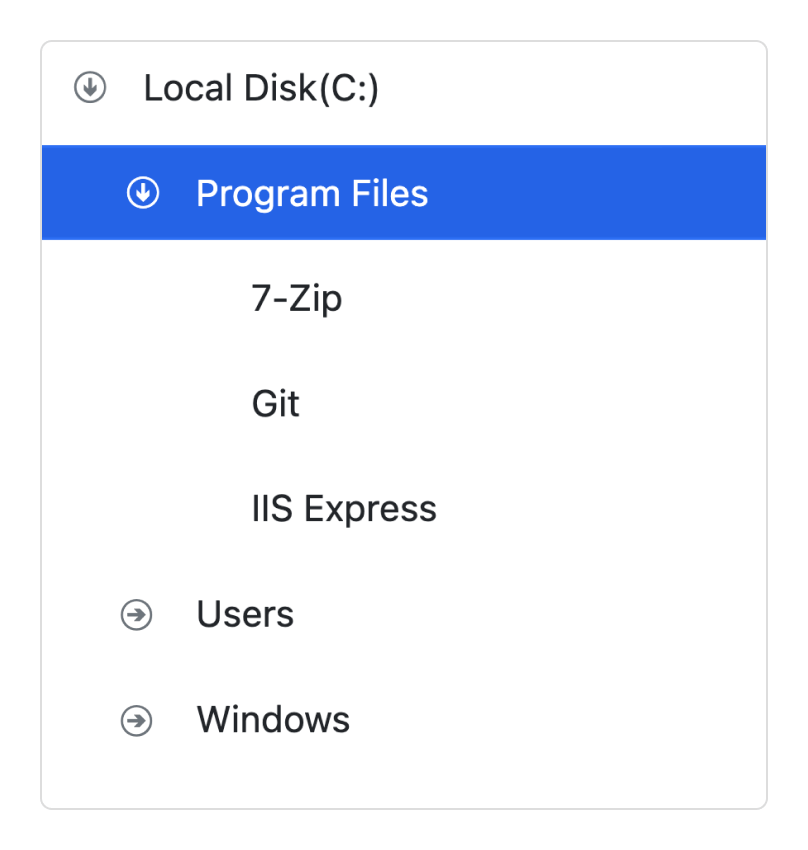
Tree node with icons
Display nodes with labels and icons to present the content in a more readable format. This is helpful in making a typical directory tree and file system.
Check box
The Angular Tree View component provides built-in support for check boxes, allowing users to select more than one item.
The Tree View check boxes also have a tri-state mode, which is applicable only for parent nodes. In this mode, the parent node will go into the indeterminate state when the child nodes are partially checked.

Drag and drop
In Angular Tree View, Nodes can be dragged and dropped at all levels of the same Tree View.
Inside the tree
Tree nodes can be dragged and dropped from one parent node to another within the same level or at different levels.
Outside the tree
Extending the drop behavior allows users to drop tree nodes from one tree view to another.
External container
Drop tree nodes to any external container or component by extending the Angular Tree View node drop action.
Multiple node selection
The Angular Tree View component allows users to select multiple nodes. When the drag-and-drop feature is enabled, all the selected nodes can be dragged at the same time.


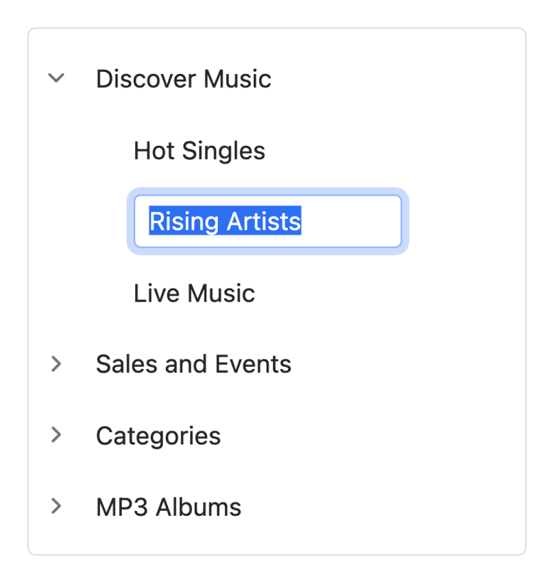
Editable nodes
Edit the tree nodes’ label text on the client side by double-clicking it. When editing treeview nodes, the treeview data source will also be updated with the modified data.
Sorting tree nodes
Render the Tree View nodes in the ascending or descending order based on the label text for improved readability.


Node template
The Angular Tree View component can be customized through its node template support, which allows you to define a custom structure for tree nodes. You can use node templates specifically for parent nodes, child nodes, or both, and include images and any custom element structure.
Expand collapse icons
Easily customize the expand and collapse icons based on the requirement of your application.
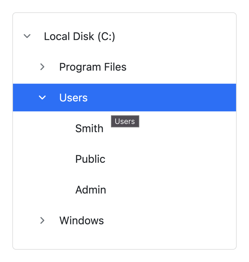
Tooltips for tree nodes
It supports tooltips for tree nodes that display information about the nodes while hovering over them. You can bind a tooltip from a data source along with node fields.
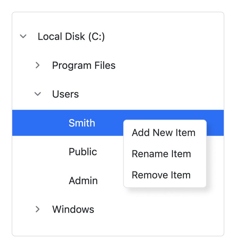
Context menu
A context menu can be integrated with the Tree View component to open when a node is right-clicked. The menu helps users perform node manipulations such as adding, removing, and renaming nodes.
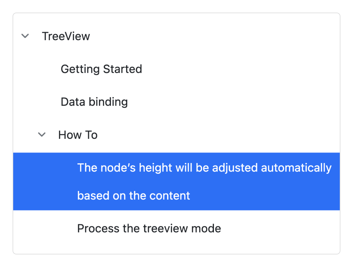
Text wrap
A node’s text wraps when it reaches edge of the Tree View. The node’s height will be adjusted automatically based on the content.
Tree Node Customization
It allows you to customize the tree nodes by level. For example, apply specific styles to leaf nodes, first child nodes, and second level nodes, etc.


Tree Node Validation
You can add validation to the tree node’s text on editing like required, a minimum or maximum length, etc.
Accessibility

Keyboard navigation
The Angular Tree View component ensures that every cell is accessible using the keyboard. Major features like sort, select, and edit can be performed using keyboard commands alone; no mouse interaction is required. This helps in creating highly accessible applications using this component.

Screen reader
The Angular Tree View has complete WAI-ARIA accessibility support. The Data Grid UI includes high-contrast visual elements that help visually impaired people to have the best viewing experience. Also, valid UI descriptions are easily accessible through assistive technologies such as screen readers.

Right to left (RTL)
Right-to-left rendering allows displaying the text and layout of the Tree View from right to left. This improves the user experience and accessibility for RTL languages.
Angular version compatibility
With continuous improvement in Angular versions, the Angular Tree View is kept up to date to make it compatible with versions starting from 4 to the latest version.

Other supported frameworks
The Tree View is available for the Blazor, React, JavaScript, and Vue frameworks. Explore its platform-specific options through the following links:


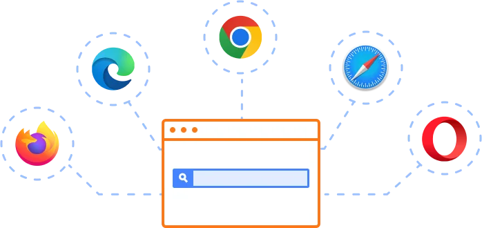
Supported browsers
The Angular Tree View works well with all modern web browsers, including Chrome, Firefox, Edge, Safari, and Opera.
Not sure how to create your first Angular Tree View? Our tutorial videos and documentation can help.
I’d love to watch it now I’d love to read it now145+ ANGULAR UI COMPONENTS
ALL COMPONENTS
SMART COMPONENTS
GRIDS
DATA VISUALIZATION
DROPDOWNS
FILE VIEWERS & EDITORS
BUTTONS
INTERACTIVE CHAT
INPUTS
NAVIGATION
FORMS
NOTIFICATION
Frequently Asked Questions
Why should you choose Syncfusion Essential Studio® Angular Tree View?
- Display hierarchical data in a tree-view structure.
- Load a wide range of nodes with optimal performance.
Flexible data binding with support to use local and remote data sources such as JSON, RESTful services, OData services, and WCF services.
Drag and drop multiple selected tree nodes anywhere.
Select multiple nodes using built-in check boxes.
Edit node text inline with editable nodes support.
Easily customize nodes, expand icons, and collapse icons.
- One of the best Angular Tree View in the market that offers feature-rich UI to interact with the software.
- Simple configuration and API.
- Supports all modern browsers.
- Touch-friendly and responsive.
Expansive learning resources such as demos and documentation to learn quickly and get started with Angular Tree View.
Where can I find the Syncfusion Angular Tree View demo?
You can find our Angular Tree View demo which demonstrates how to render and configure the Tree View.
Can I download and utilize the Syncfusion Angular Tree View for free?
No, this is a commercial product and requires a paid license. However, a free community license is also available for companies and individuals whose organizations have less than $1 million USD in annual gross revenue, 5 or fewer developers, and 10 or fewer total employees.
How do I get started with Syncfusion Angular Tree View?
A good place to start would be our comprehensive getting started documentation.
Our Customers Love Us
Having an excellent set of tools and a great support team, Syncfusion® reduces customers’ development time.Here are some of their experiences.

An amazing toolset to accelerate UI development
The number of components available is the best thing about this library. We think of a UI component, and the Angular JS library already offers it. We use the Angular JS library to accelerate development. The experience using and implementing has been great. The support is also excellent.

Shrikant P,

Customer Success Manager, Small-Business
A giant framework with great pricing options
I have loved the components and options that Syncfusion has, besides, its documentation, demos, and Support are excellent.

Alejandro Javier V,
CEO, Small-Business
Rated by users across the globe
Syncfusion Angular Tree View Resources


UI Kits
 Figma Download
Figma Download
Awards
Greatness—it’s one thing to say you have it, but it means more when others recognize it. Syncfusion® is proud to hold the following industry awards.

