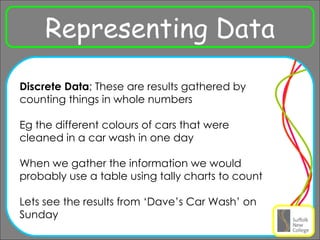
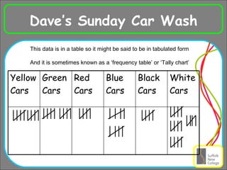
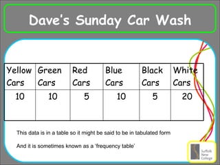
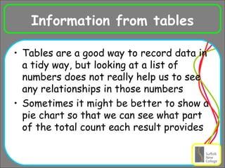
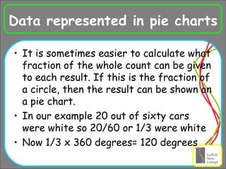
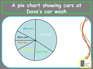
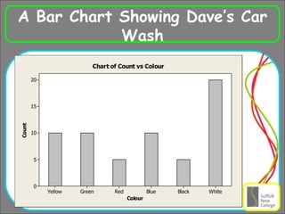
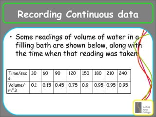
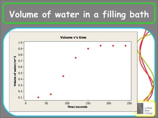
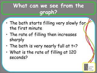
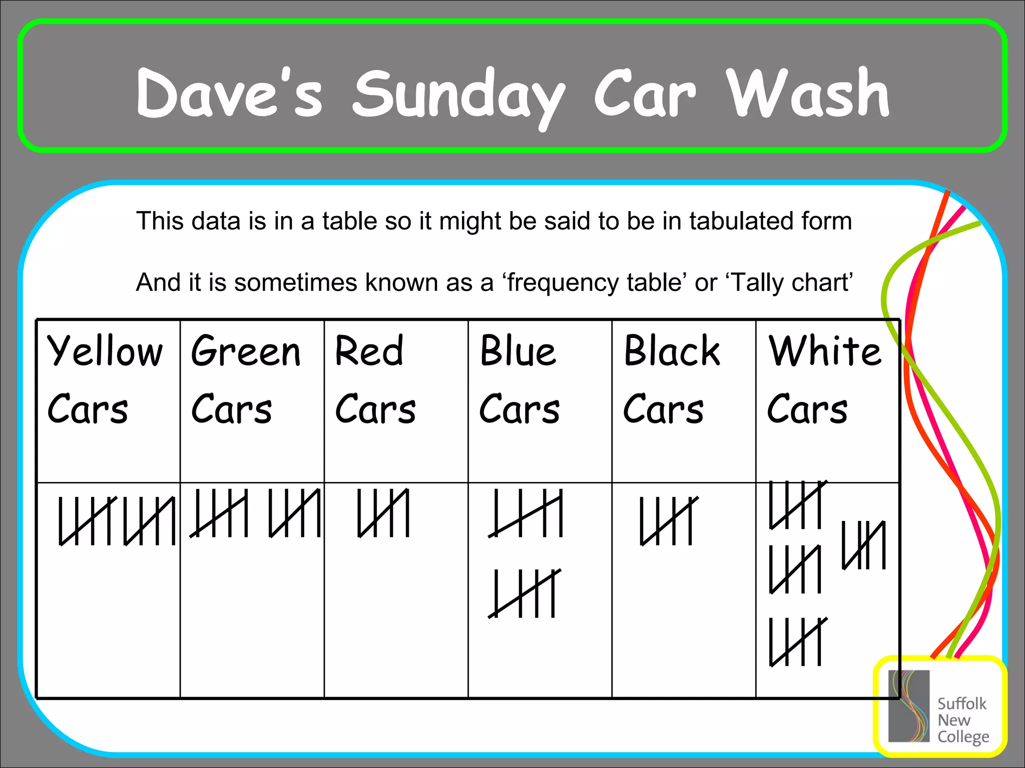
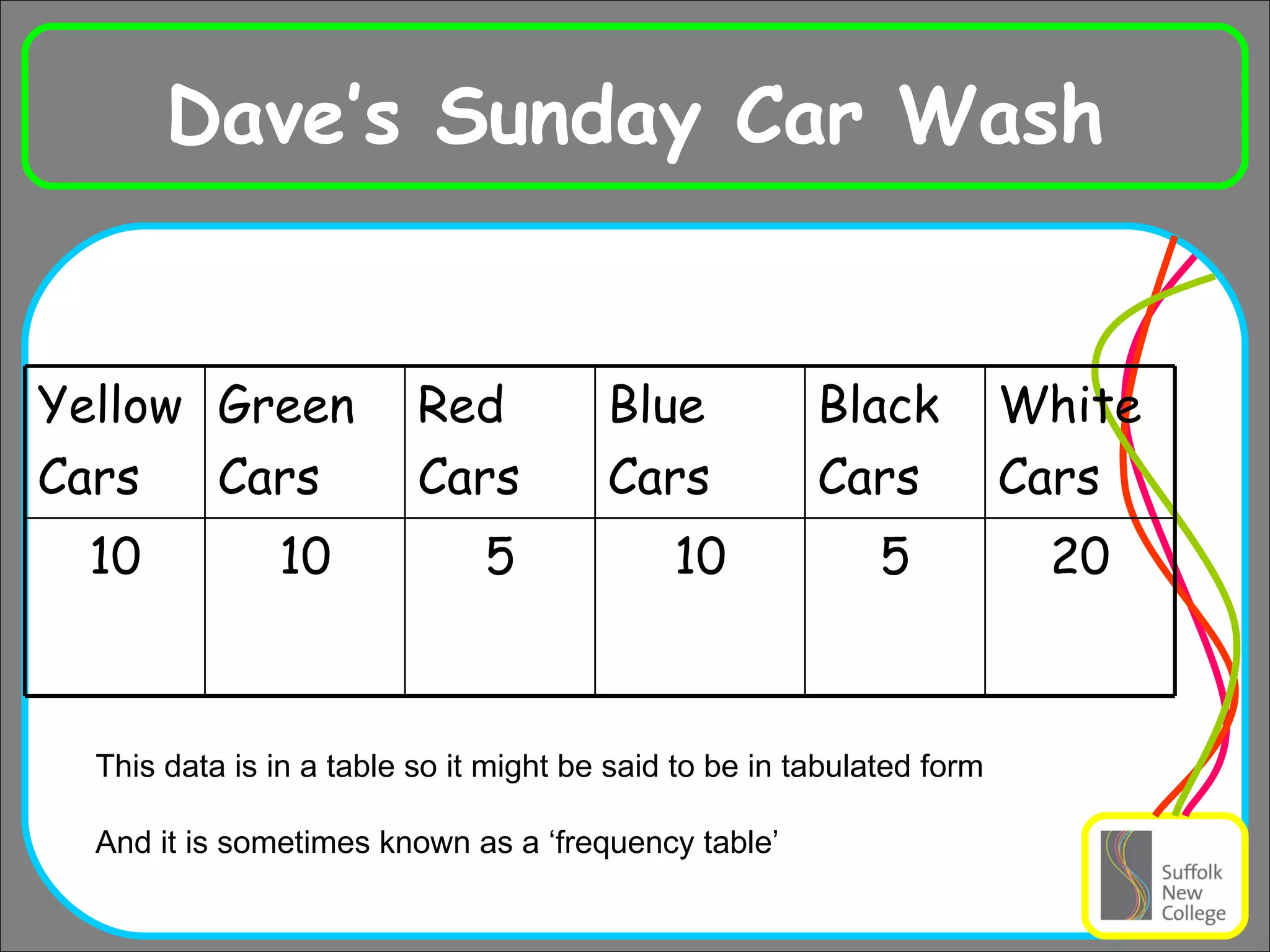
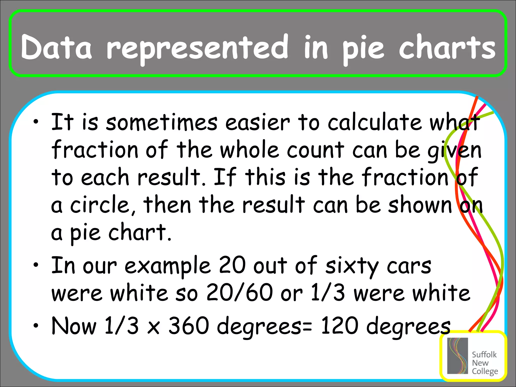
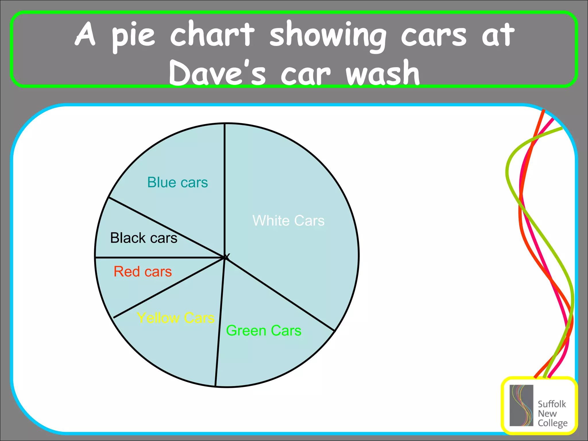
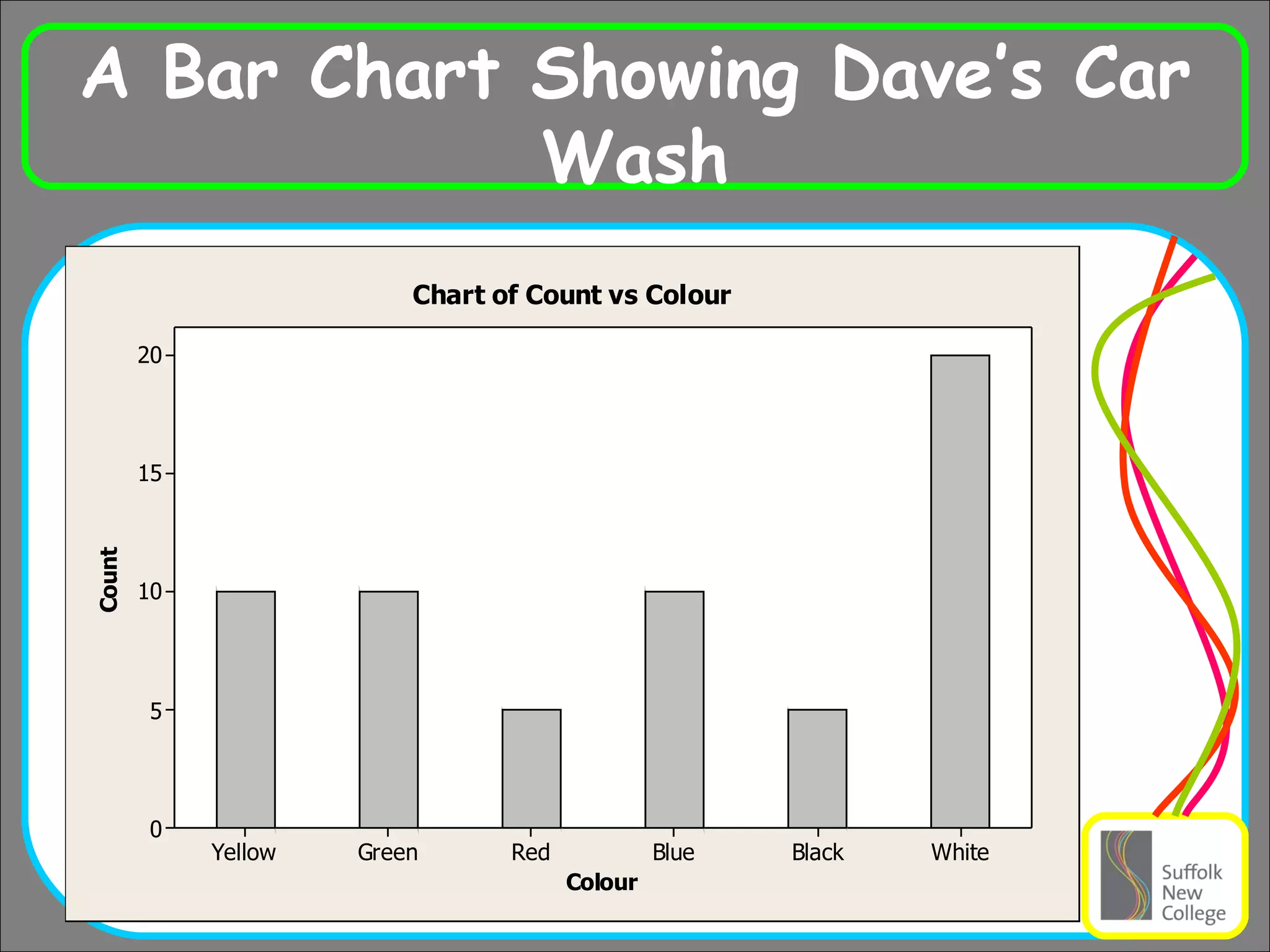
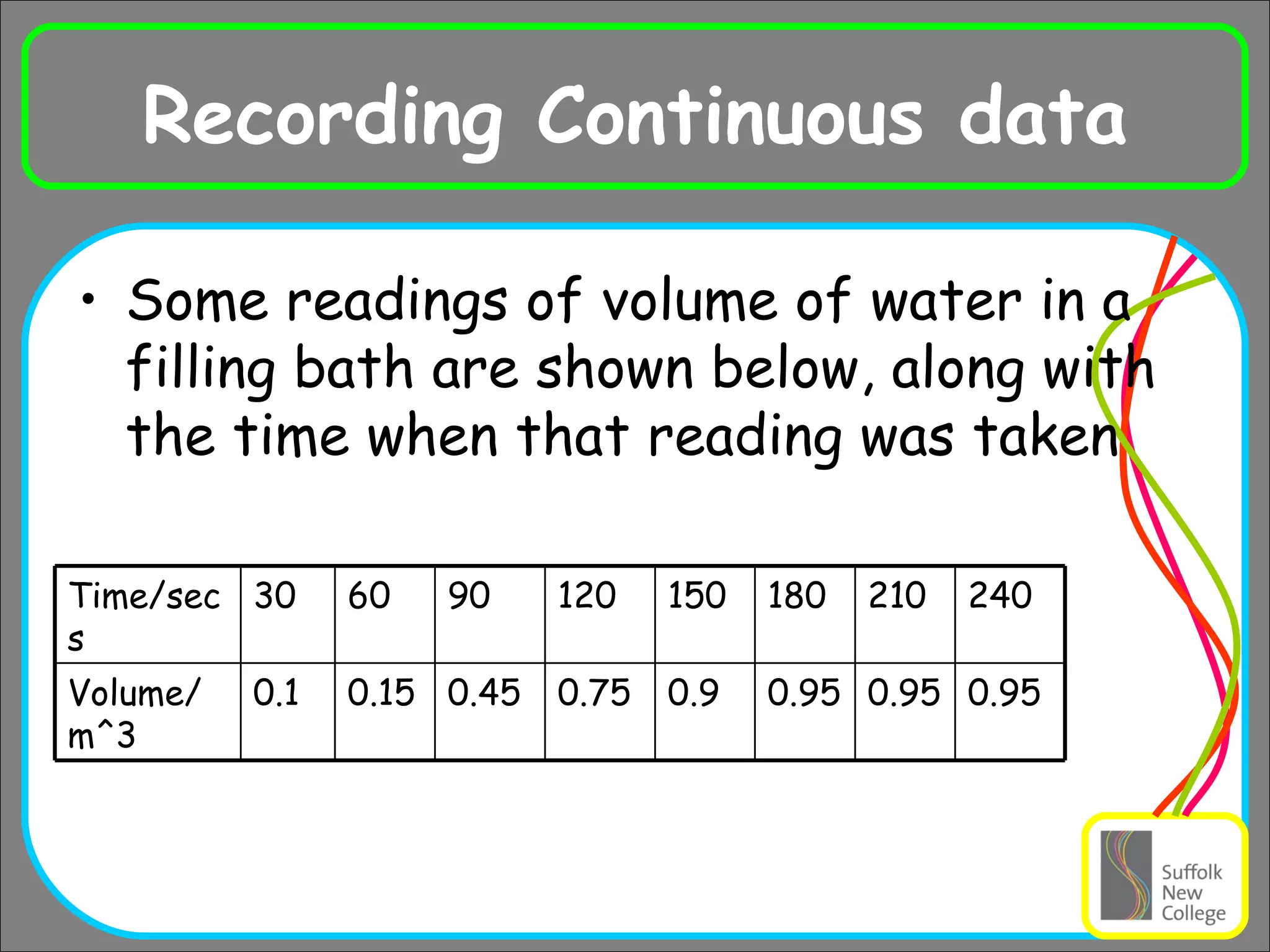
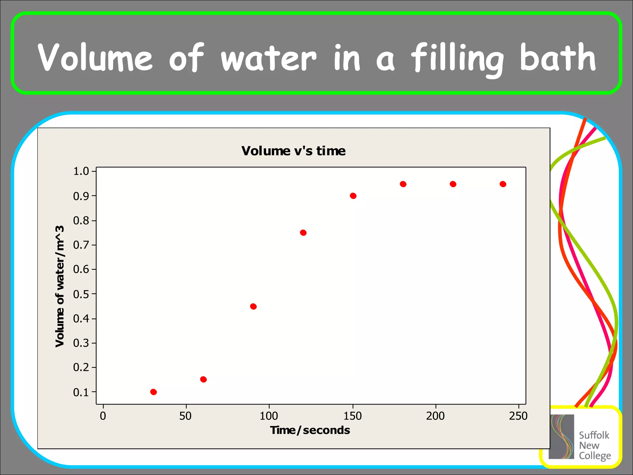
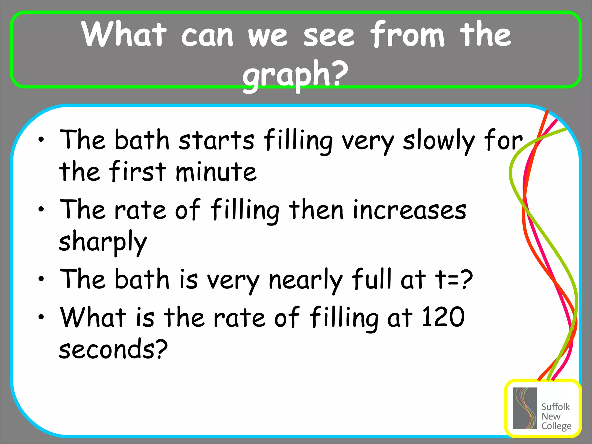
KEMBAR78
discrete and continuous data | PPT
Ra Representing Data Discrete Data ; These are results gathered by counting things in whole numbers Eg the different colours of cars that were cleaned in a car wash in one day When we gather the information we would probably use a table using tally charts to count Lets see the results from ‘Dave’s Car Wash’ on Sunday
Dave’s Sunday Car Wash This data is in a table so it might be said to be in tabulated form And it is sometimes known as a ‘frequency table’ or ‘Tally chart’ White Cars Black Cars Blue Cars Red Cars Green Cars Yellow Cars
Dave’s Sunday Car Wash This data is in a table so it might be said to be in tabulated form And it is sometimes known as a ‘frequency table’ 20 5 10 5 10 10 White Cars Black Cars Blue Cars Red Cars Green Cars Yellow Cars
Information from tables Tables are a good way to record data in a tidy way, but looking at a list of numbers does not really help us to see any relationships in those numbers Sometimes it might be better to show a pie chart so that we can see what part of the total count each result provides
Data represented in pie charts It is sometimes easier to calculate what fraction of the whole count can be given to each result. If this is the fraction of a circle, then the result can be shown on a pie chart. In our example 20 out of sixty cars were white so 20/60 or 1/3 were white Now 1/3 x 360 degrees= 120 degrees
A pie chart showing cars at Dave’s car wash x White Cars Blue cars Yellow Cars Green Cars Black cars Red cars
A Bar Chart Showing Dave’s Car Wash
Using the information From Dave’s car wash we cannot see anything very special about the data Perhaps only that white seems to be twice as popular than any other colour (this is shown by the largest slice in the pie chart and the highest bar in the bar graph) Could we say the modal colour is white?
Continuous Data We have so far talked about counting things and displaying this  discrete data  on Pie charts or Bar charts. If the data can take any value, say when measuring temperature or time, this is called  Continuous Data
Recording Continuous data Some readings of volume of water in a filling bath are shown below, along with the time when that reading was taken 0.95 180 0.95 0.95 0.9 0.75 0.45 0.15 0.1 Volume/m^3 240 210 150 120 90 60 30 Time/secs
Volume of water in a filling bath
What can we see from the graph? The bath starts filling very slowly for the first minute The rate of filling then increases sharply The bath is very nearly full at t=? What is the rate of filling at 120 seconds?

discrete and continuous data

  • 1.
    Ra Representing DataDiscrete Data ; These are results gathered by counting things in whole numbers Eg the different colours of cars that were cleaned in a car wash in one day When we gather the information we would probably use a table using tally charts to count Lets see the results from ‘Dave’s Car Wash’ on Sunday
  • 2.
    Dave’s Sunday CarWash This data is in a table so it might be said to be in tabulated form And it is sometimes known as a ‘frequency table’ or ‘Tally chart’ White Cars Black Cars Blue Cars Red Cars Green Cars Yellow Cars
  • 3.
    Dave’s Sunday CarWash This data is in a table so it might be said to be in tabulated form And it is sometimes known as a ‘frequency table’ 20 5 10 5 10 10 White Cars Black Cars Blue Cars Red Cars Green Cars Yellow Cars
  • 4.
    Information from tablesTables are a good way to record data in a tidy way, but looking at a list of numbers does not really help us to see any relationships in those numbers Sometimes it might be better to show a pie chart so that we can see what part of the total count each result provides
  • 5.
    Data represented inpie charts It is sometimes easier to calculate what fraction of the whole count can be given to each result. If this is the fraction of a circle, then the result can be shown on a pie chart. In our example 20 out of sixty cars were white so 20/60 or 1/3 were white Now 1/3 x 360 degrees= 120 degrees
  • 6.
    A pie chartshowing cars at Dave’s car wash x White Cars Blue cars Yellow Cars Green Cars Black cars Red cars
  • 7.
    A Bar ChartShowing Dave’s Car Wash
  • 8.
    Using the informationFrom Dave’s car wash we cannot see anything very special about the data Perhaps only that white seems to be twice as popular than any other colour (this is shown by the largest slice in the pie chart and the highest bar in the bar graph) Could we say the modal colour is white?
  • 9.
    Continuous Data Wehave so far talked about counting things and displaying this discrete data on Pie charts or Bar charts. If the data can take any value, say when measuring temperature or time, this is called Continuous Data
  • 10.
    Recording Continuous dataSome readings of volume of water in a filling bath are shown below, along with the time when that reading was taken 0.95 180 0.95 0.95 0.9 0.75 0.45 0.15 0.1 Volume/m^3 240 210 150 120 90 60 30 Time/secs
  • 11.
    Volume of waterin a filling bath
  • 12.
    What can wesee from the graph? The bath starts filling very slowly for the first minute The rate of filling then increases sharply The bath is very nearly full at t=? What is the rate of filling at 120 seconds?