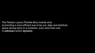
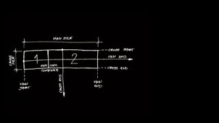
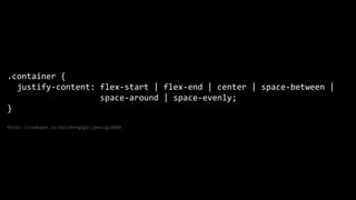
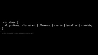
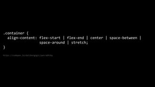
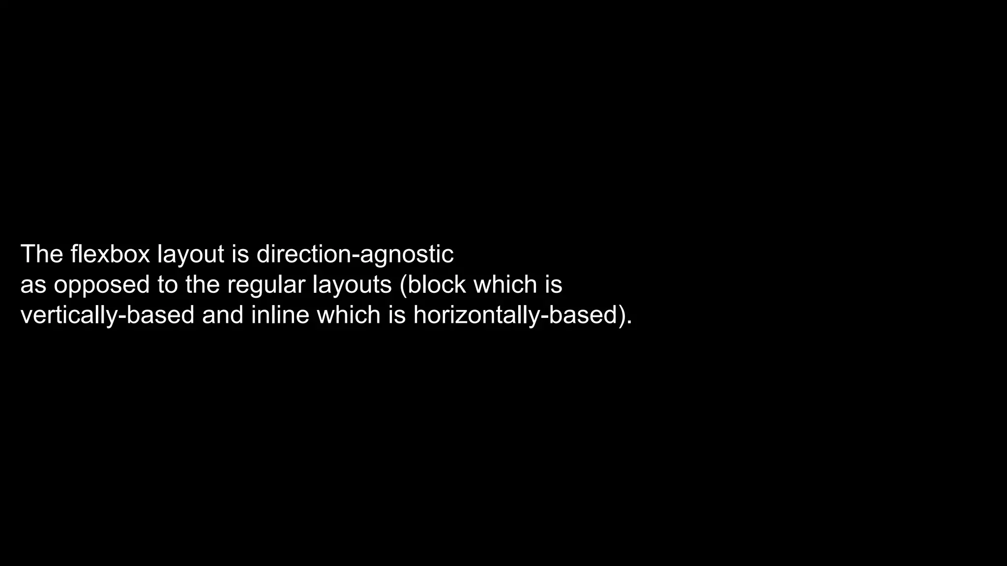
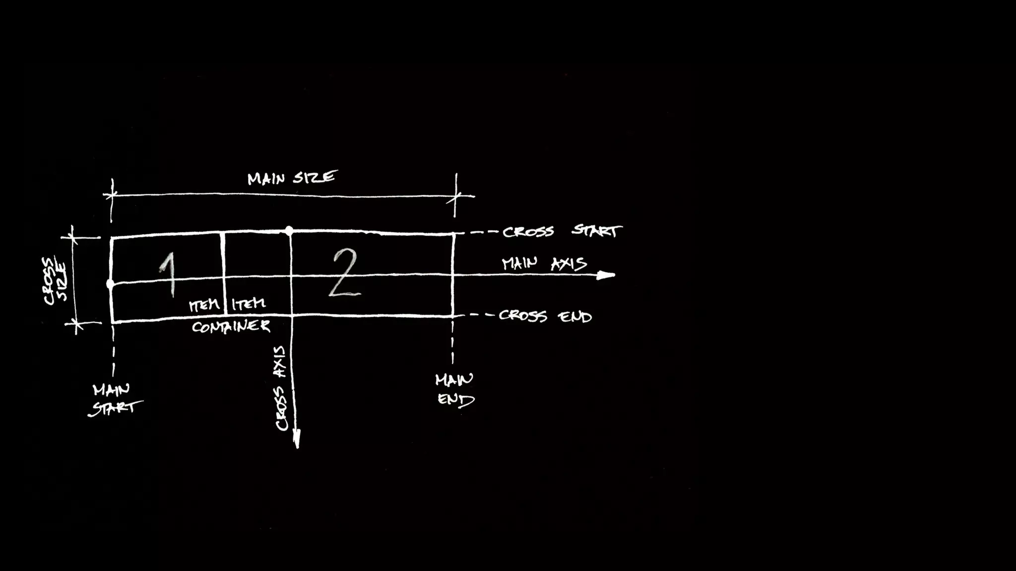
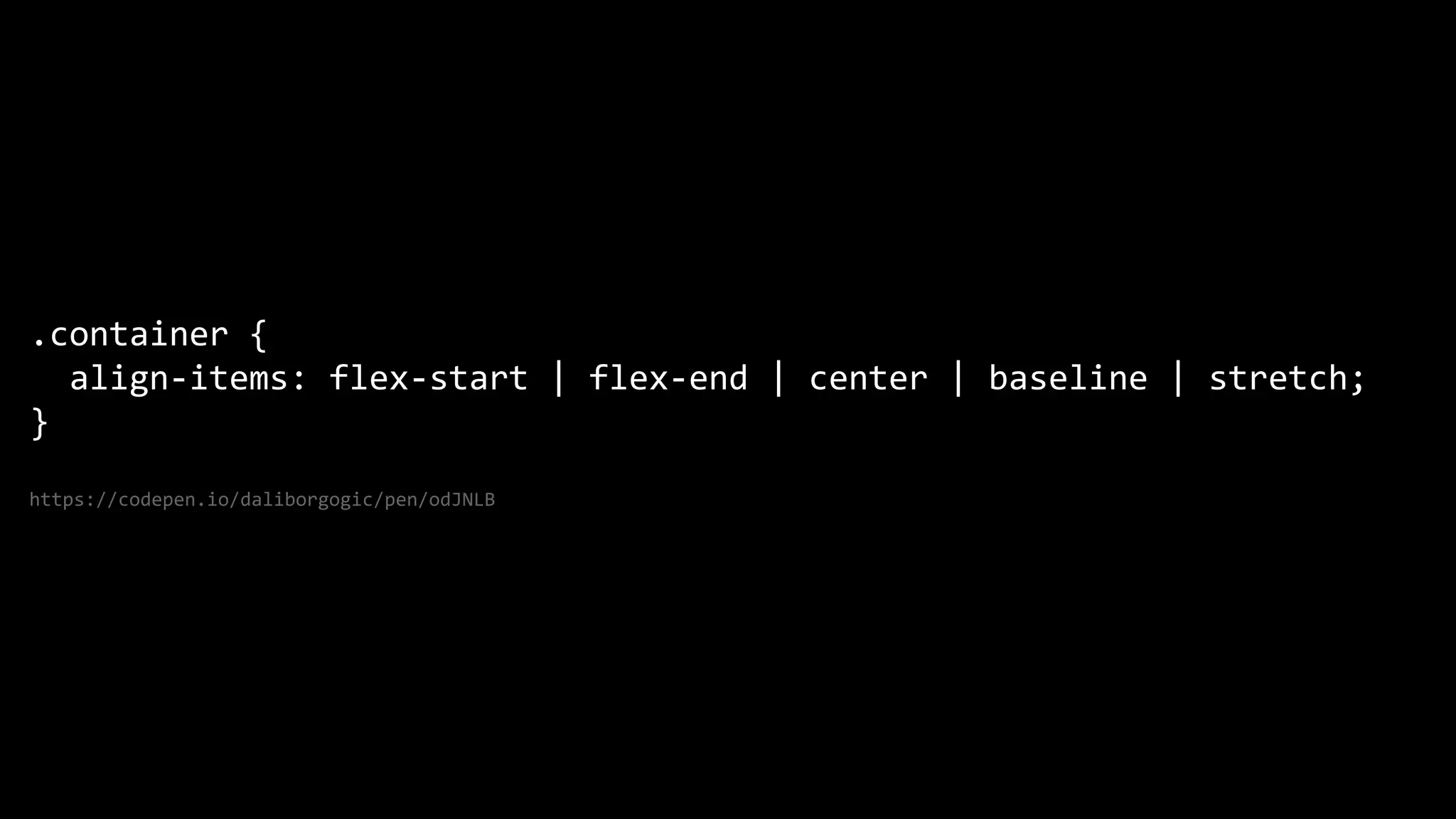
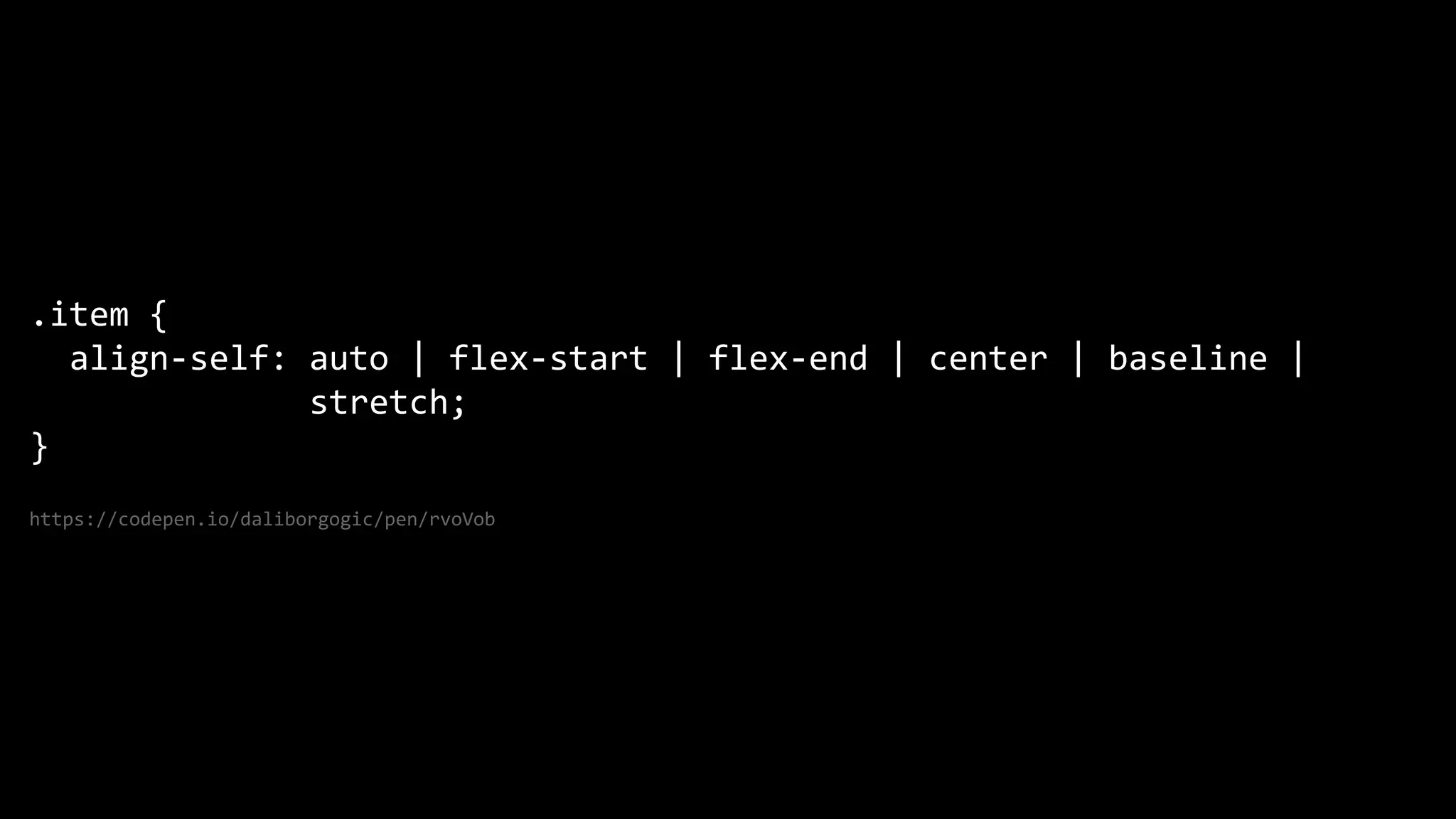
The document discusses the Flexbox Layout module which aims to provide a more efficient way to lay out items in a container. It defines the flex container as direction-agnostic unlike regular layouts. It then covers the various flex properties like flex-direction, flex-wrap, justify-content, align-items, order, flex-grow, flex-shrink and flex-basis which control how flex items are laid out both along the main and cross axes within the flex container.

![@dalibor_gogic
[object Object]](https://image.slidesharecdn.com/html-know-how4-180518171336/85/4-HTML-CSS-know-how-2-320.jpg)


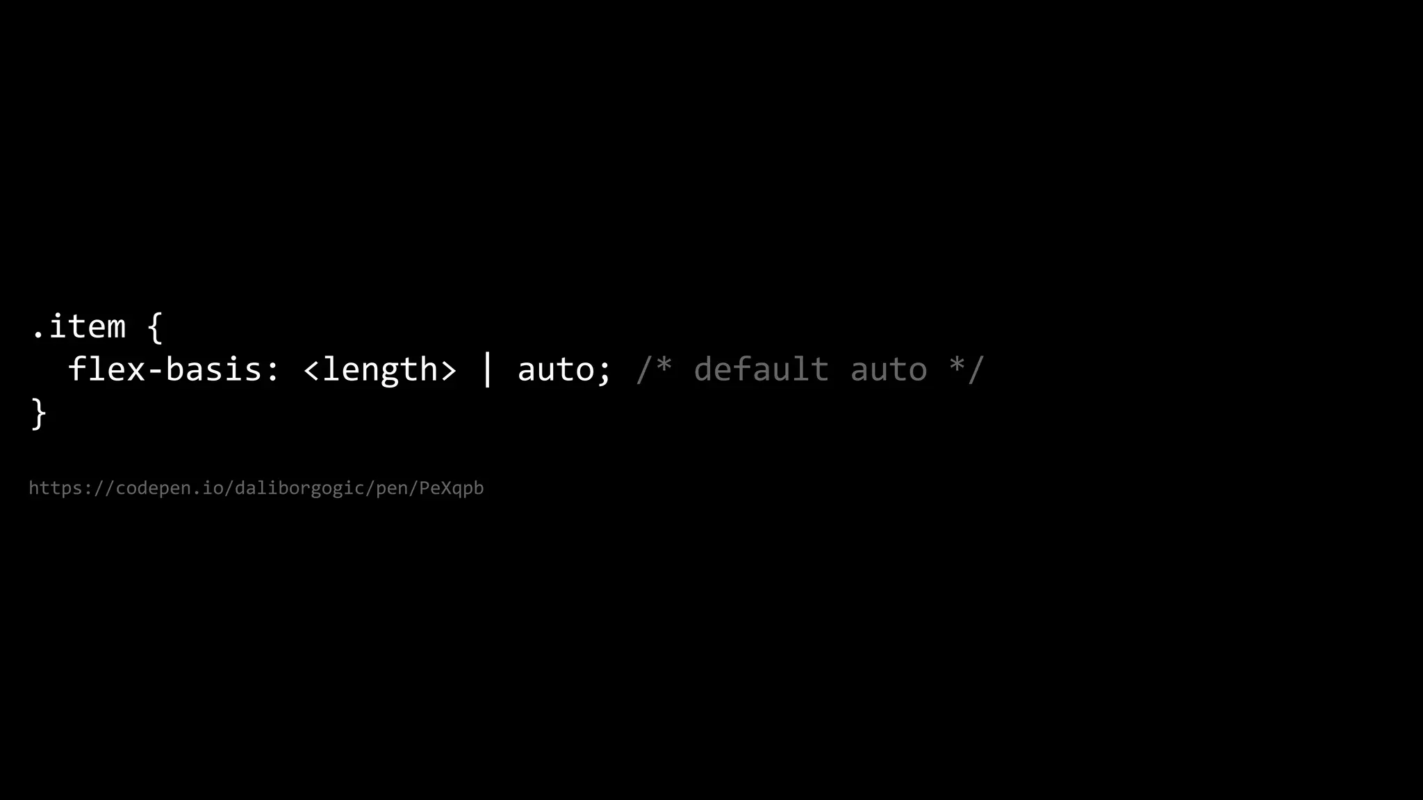
![This is the shorthand for flex-grow, flex-shrink and flex-basis combined.
The second and third parameters (flex-shrink and flex-basis) are optional.
Default is 0 1 auto.
.item {
flex: none | [ <'flex-grow'> <'flex-shrink'>? || <'flex-basis'> ]
}
https://codepen.io/daliborgogic/pen/PeXqpb](https://image.slidesharecdn.com/html-know-how4-180518171336/85/4-HTML-CSS-know-how-18-320.jpg)

![This slide [is] intentionally left blank.](https://image.slidesharecdn.com/html-know-how4-180518171336/85/4-HTML-CSS-know-how-20-320.jpg)

![@dalibor_gogic
[object Object]](https://image.slidesharecdn.com/html-know-how4-180518171336/75/4-HTML-CSS-know-how-2-2048.jpg)


![This is the shorthand for flex-grow, flex-shrink and flex-basis combined.
The second and third parameters (flex-shrink and flex-basis) are optional.
Default is 0 1 auto.
.item {
flex: none | [ <'flex-grow'> <'flex-shrink'>? || <'flex-basis'> ]
}
https://codepen.io/daliborgogic/pen/PeXqpb](https://image.slidesharecdn.com/html-know-how4-180518171336/75/4-HTML-CSS-know-how-18-2048.jpg)
![This slide [is] intentionally left blank.](https://image.slidesharecdn.com/html-know-how4-180518171336/75/4-HTML-CSS-know-how-20-2048.jpg)


![#3 HTML & CSS [know-how]](https://cdn.slidesharecdn.com/ss_thumbnails/html-know-how3-180511205559-thumbnail.jpg?width=600ounds&width=560&fit=bounds)
![#2 Html [know-how]](https://cdn.slidesharecdn.com/ss_thumbnails/html-know-how2-180510191505-thumbnail.jpg?width=600ounds&width=560&fit=bounds)
![#1 HTML [know-how]](https://cdn.slidesharecdn.com/ss_thumbnails/html-know-how-180508193902-thumbnail.jpg?width=600ounds&width=560&fit=bounds)


