Download as PDF, PPTX


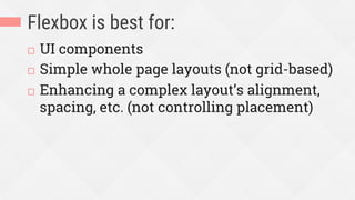

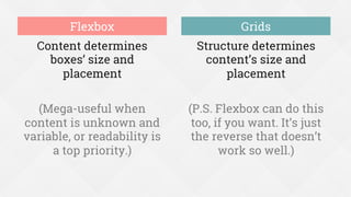


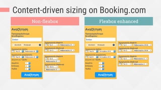
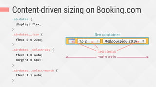
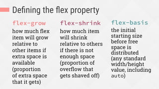
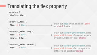
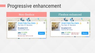
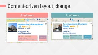

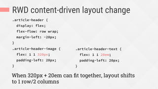
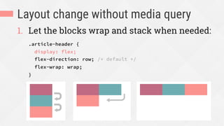
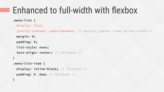
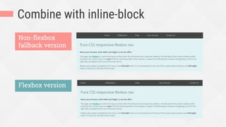
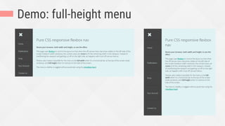

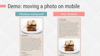
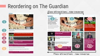

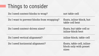
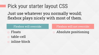

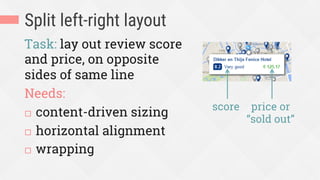
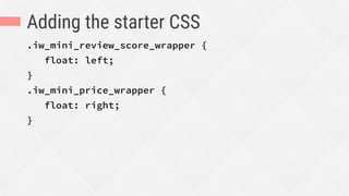


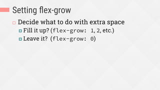
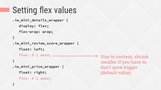


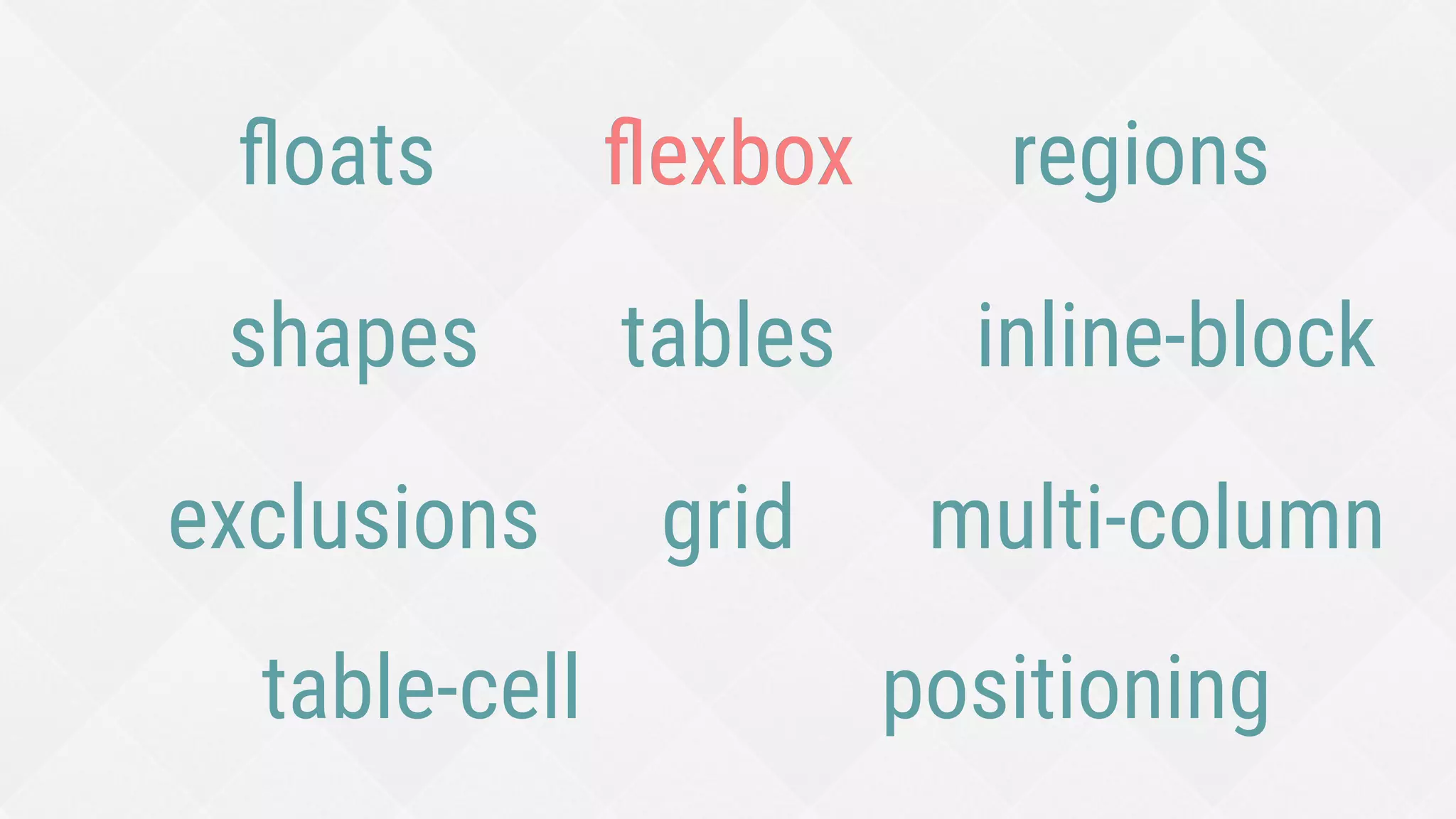
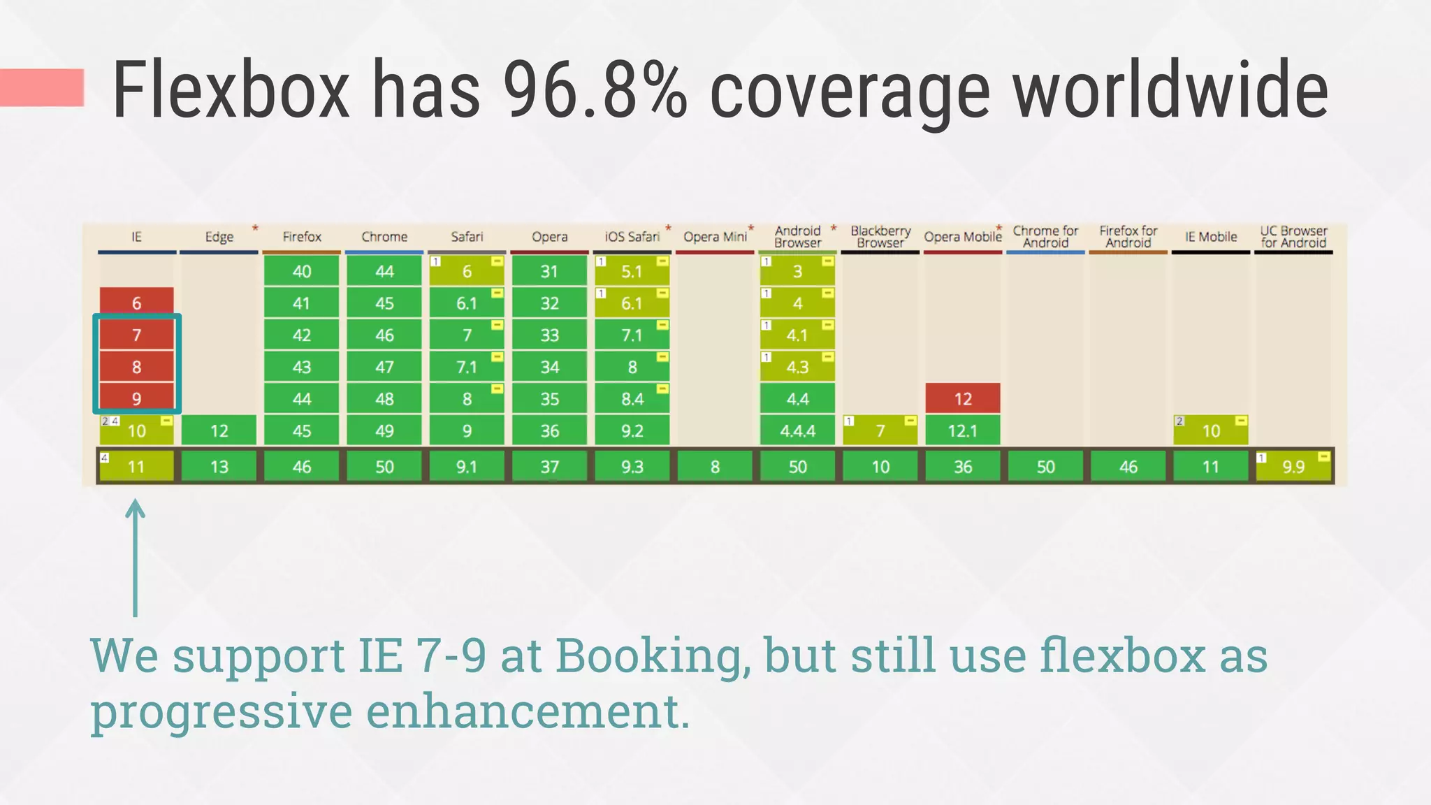
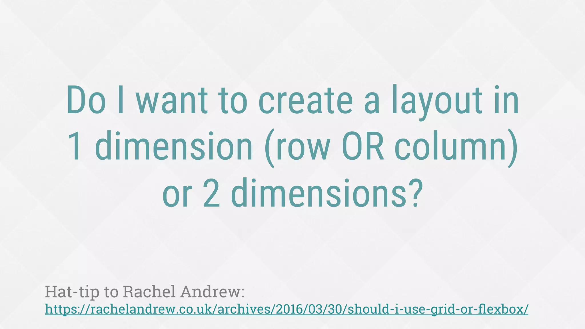


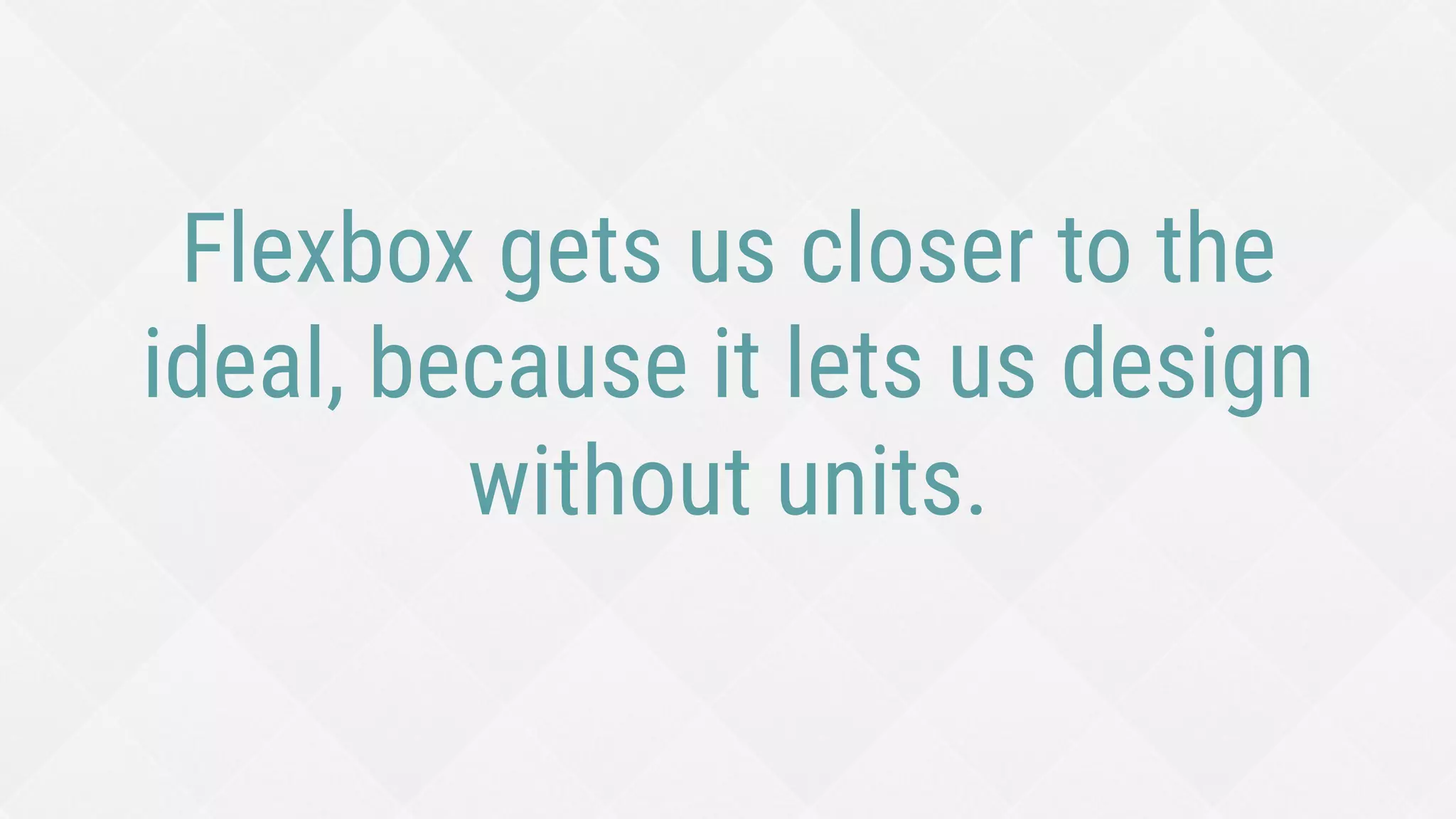
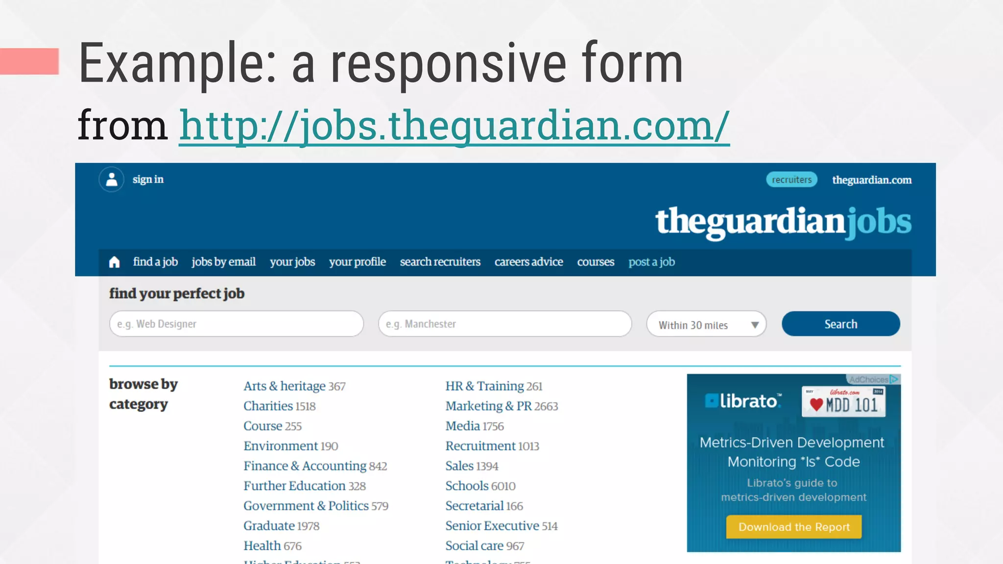

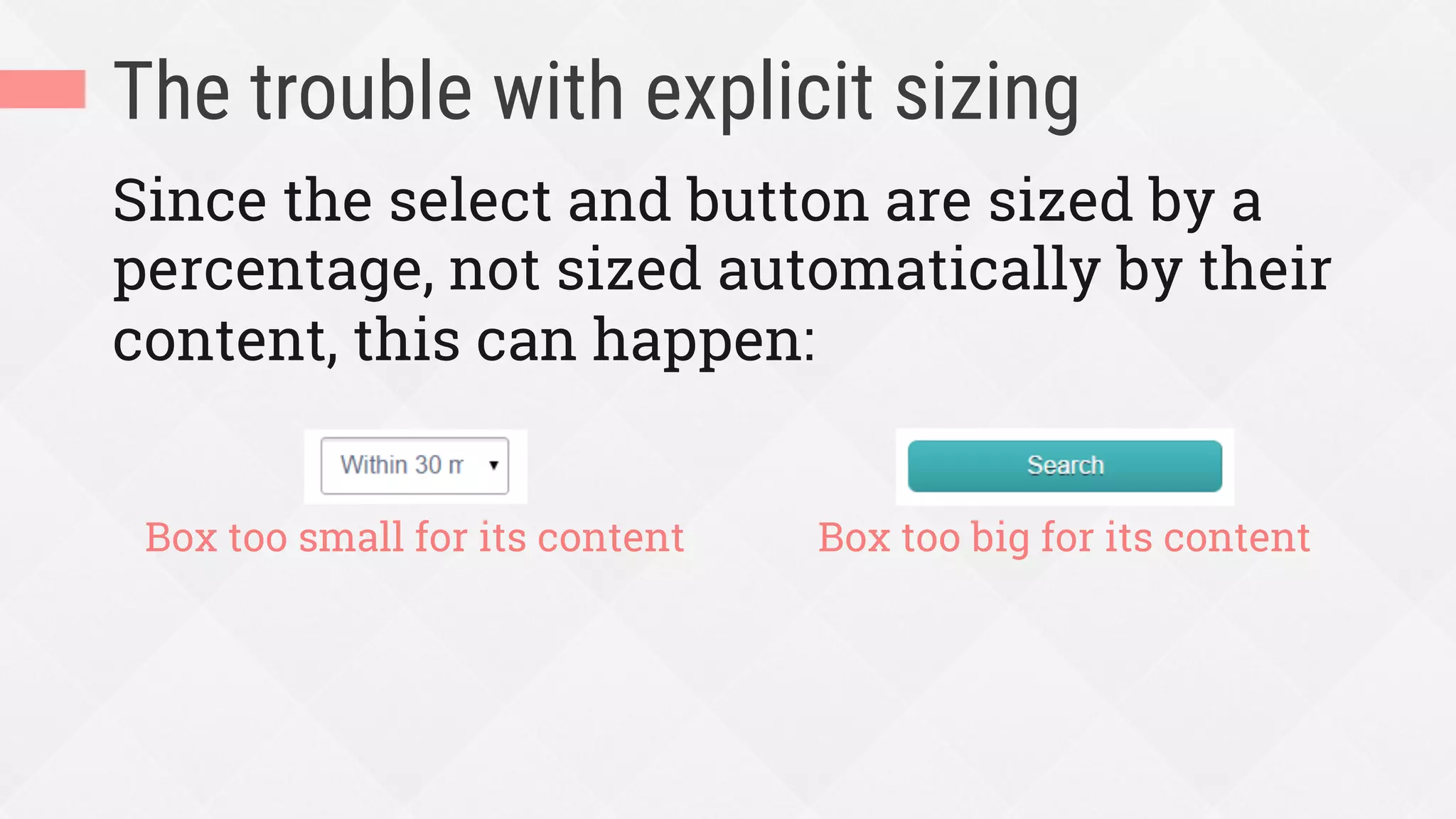
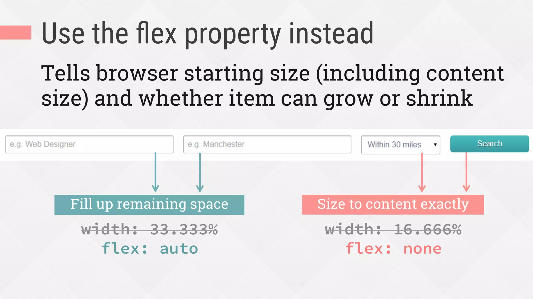
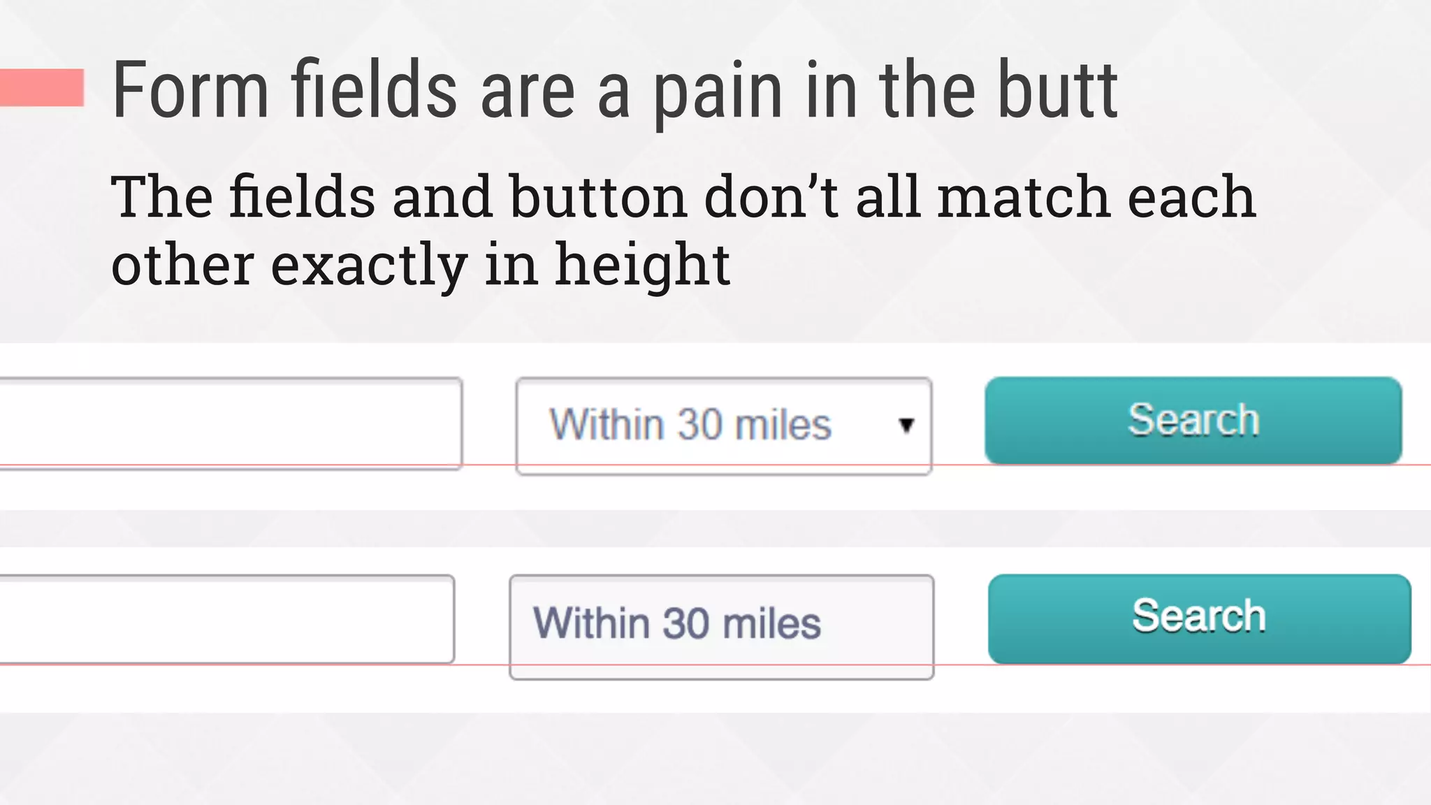
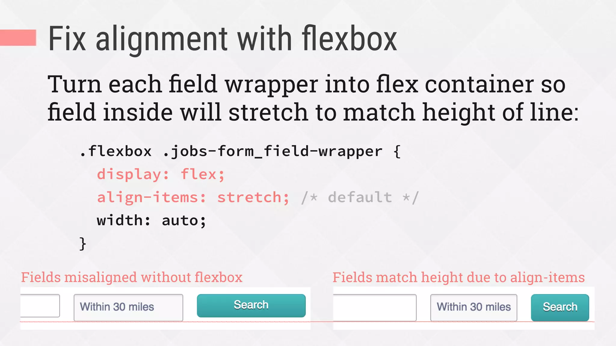
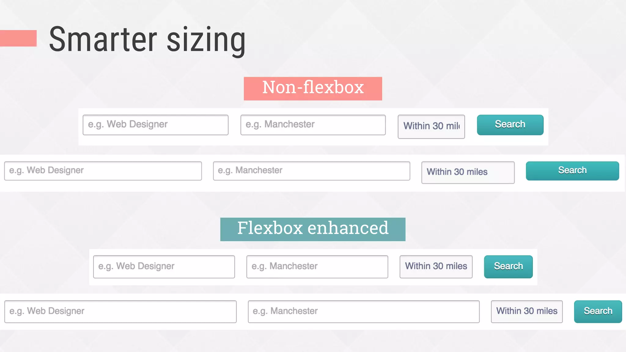

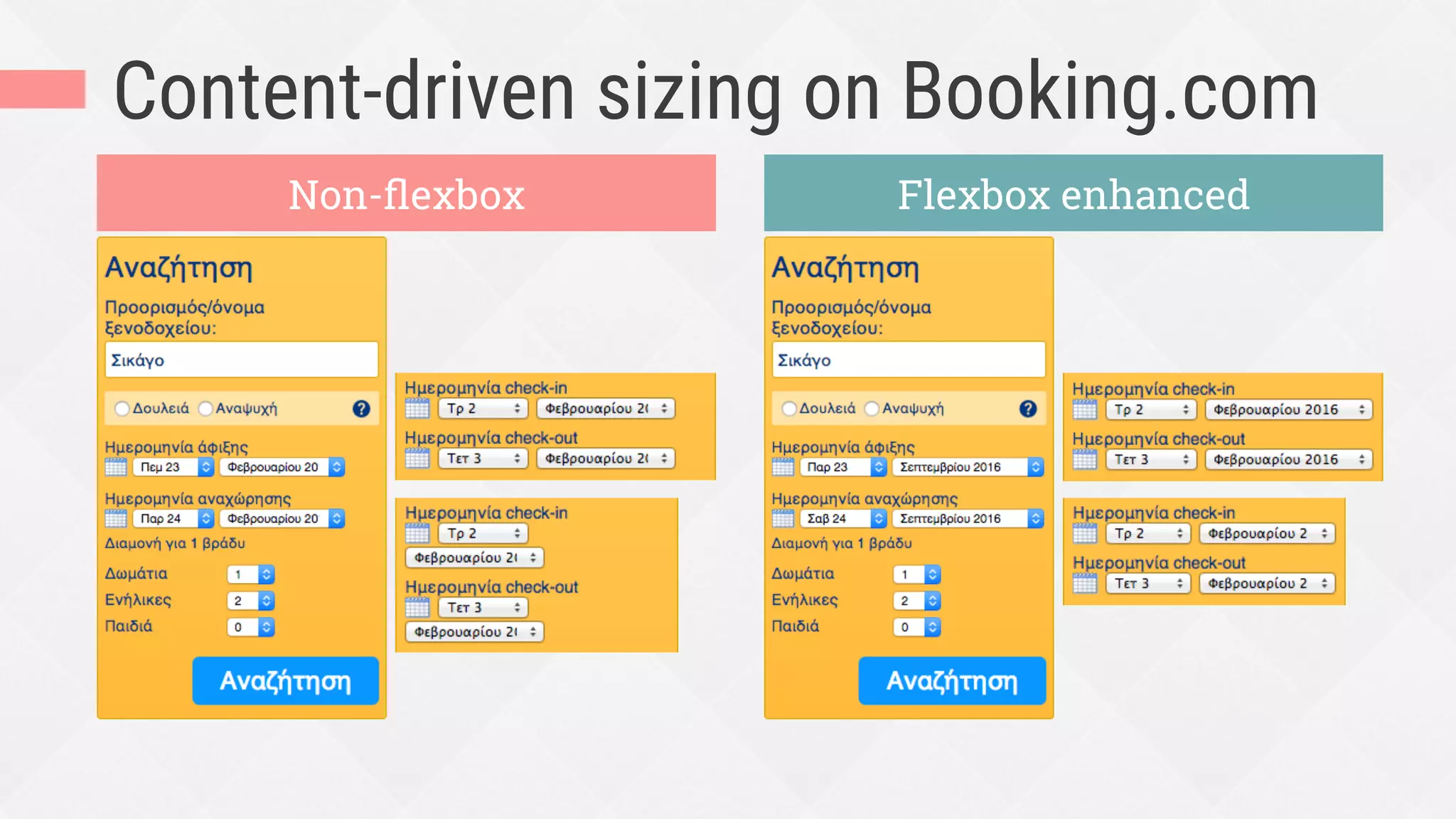
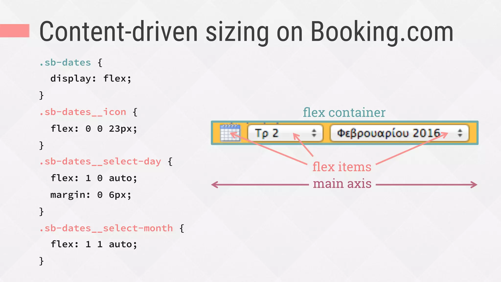
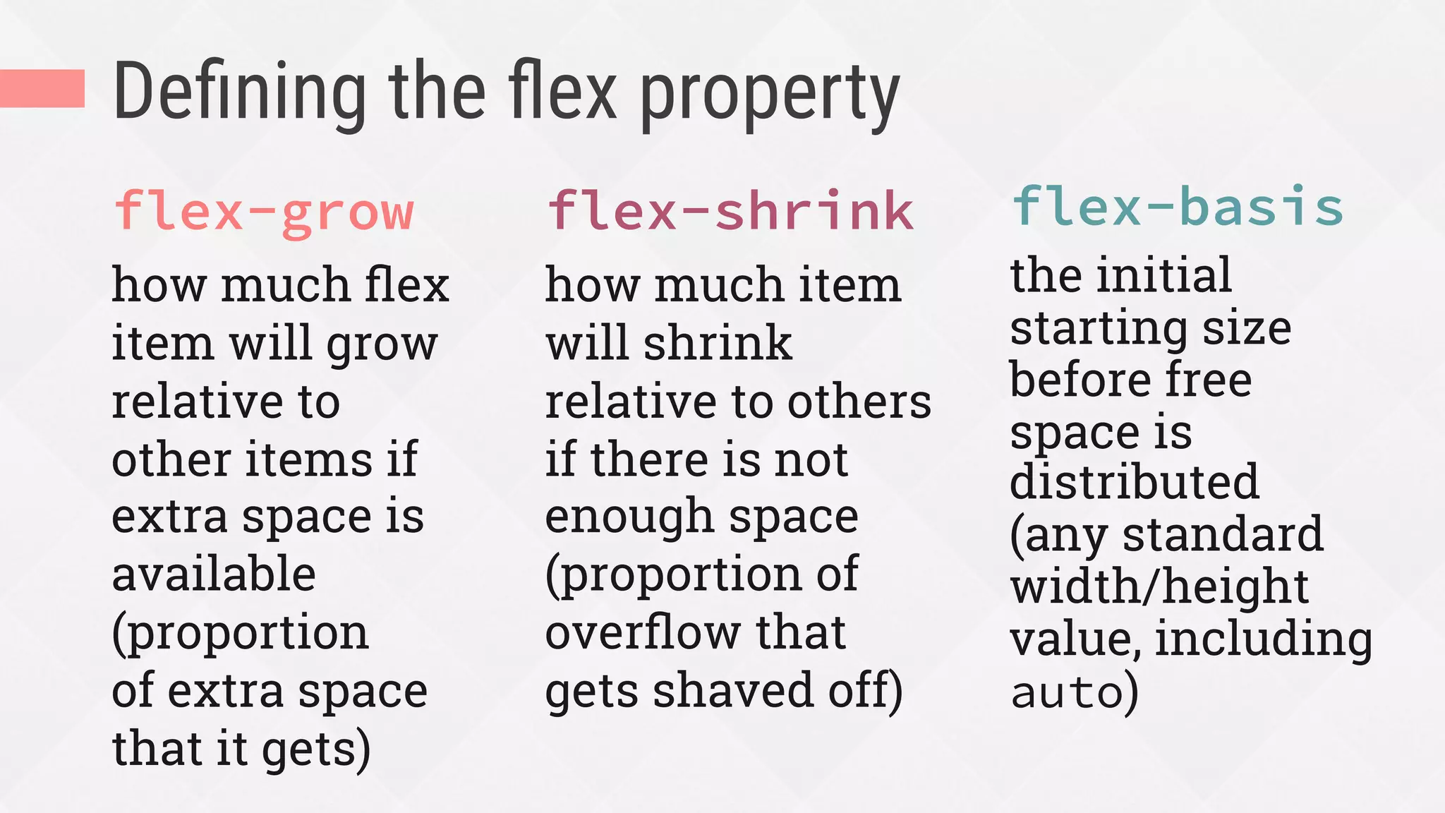
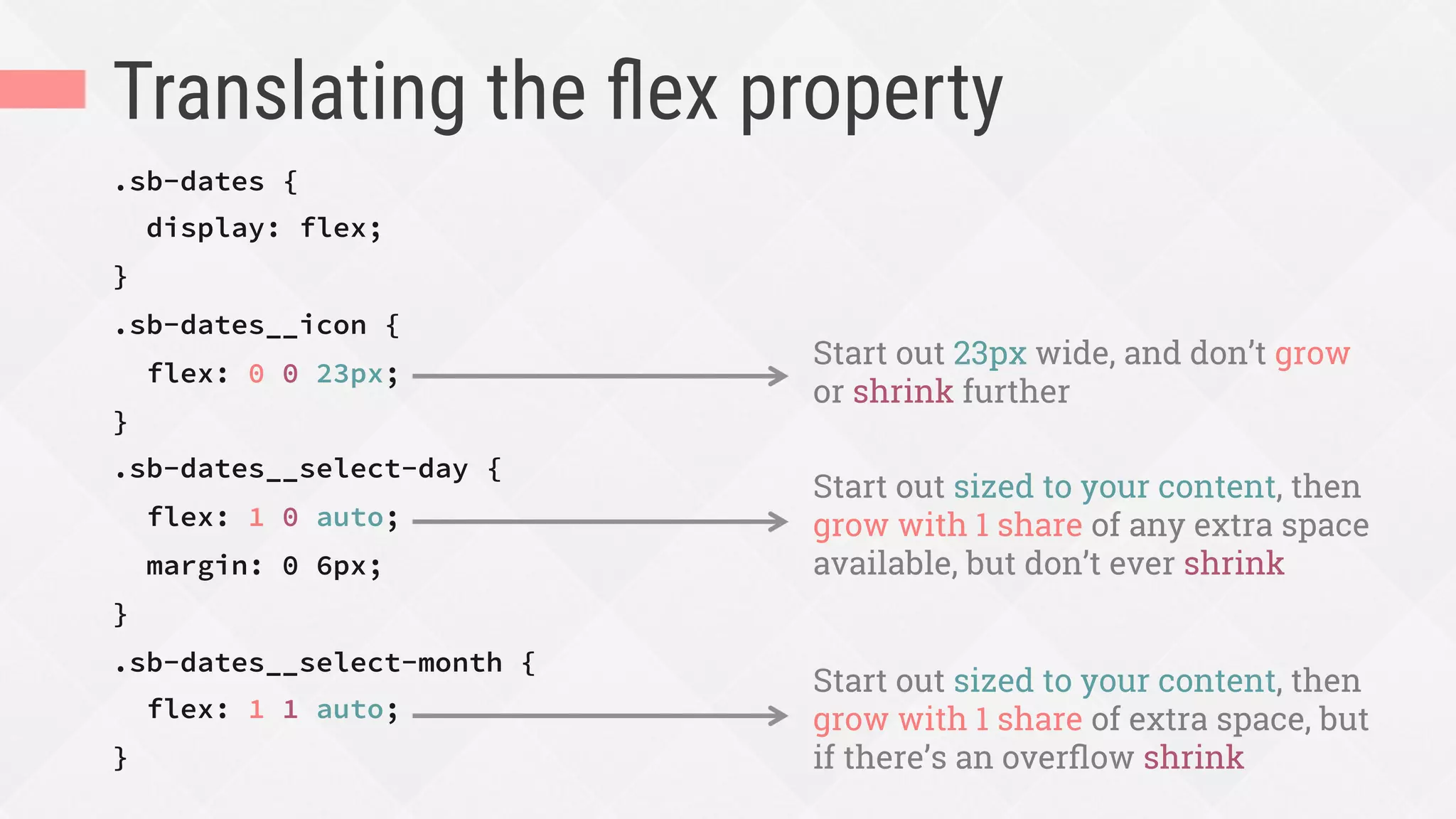
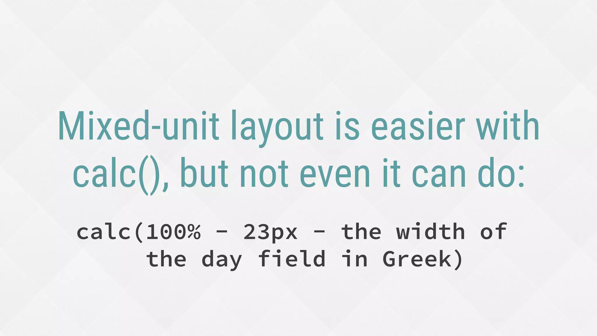
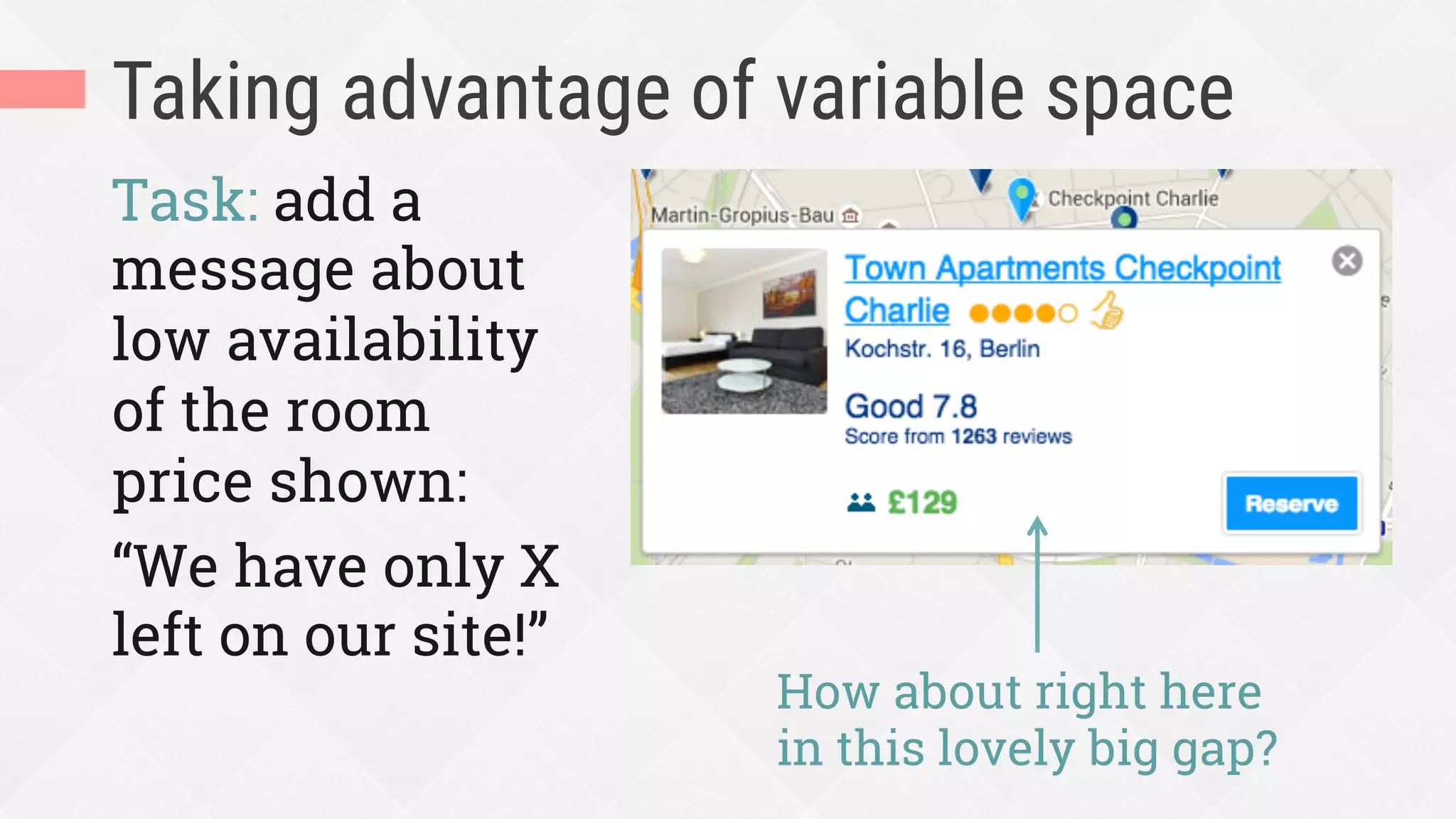
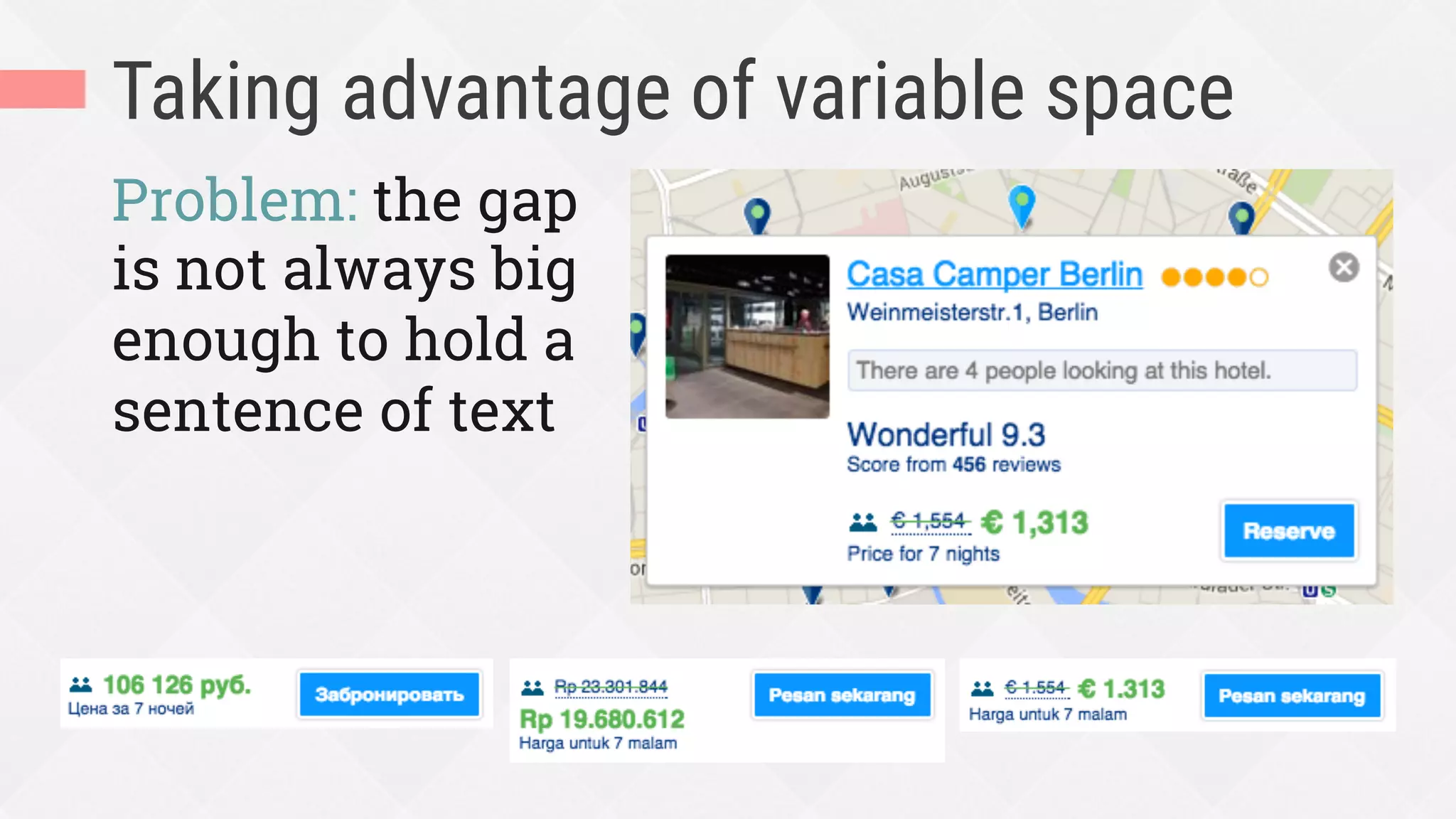
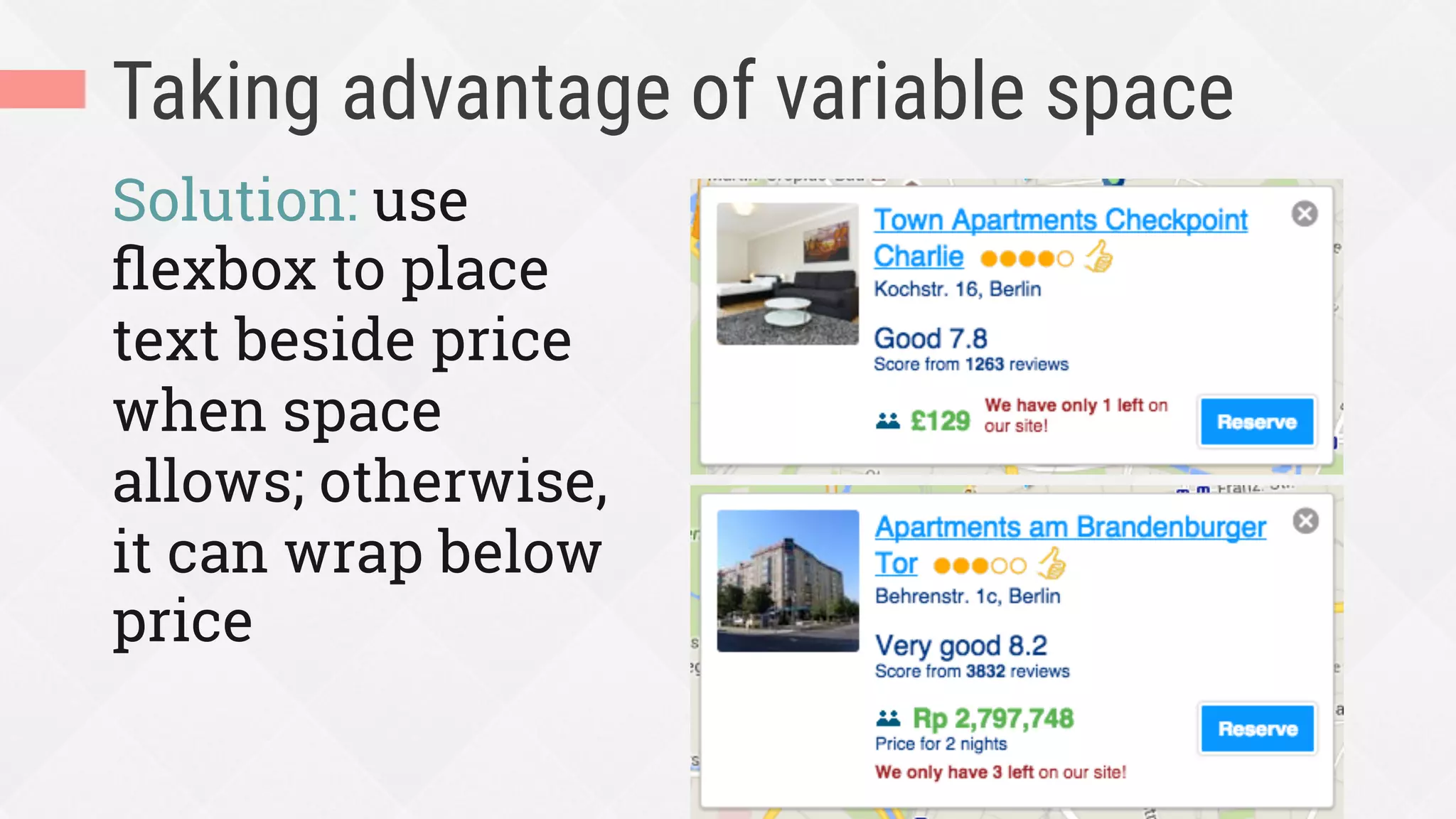
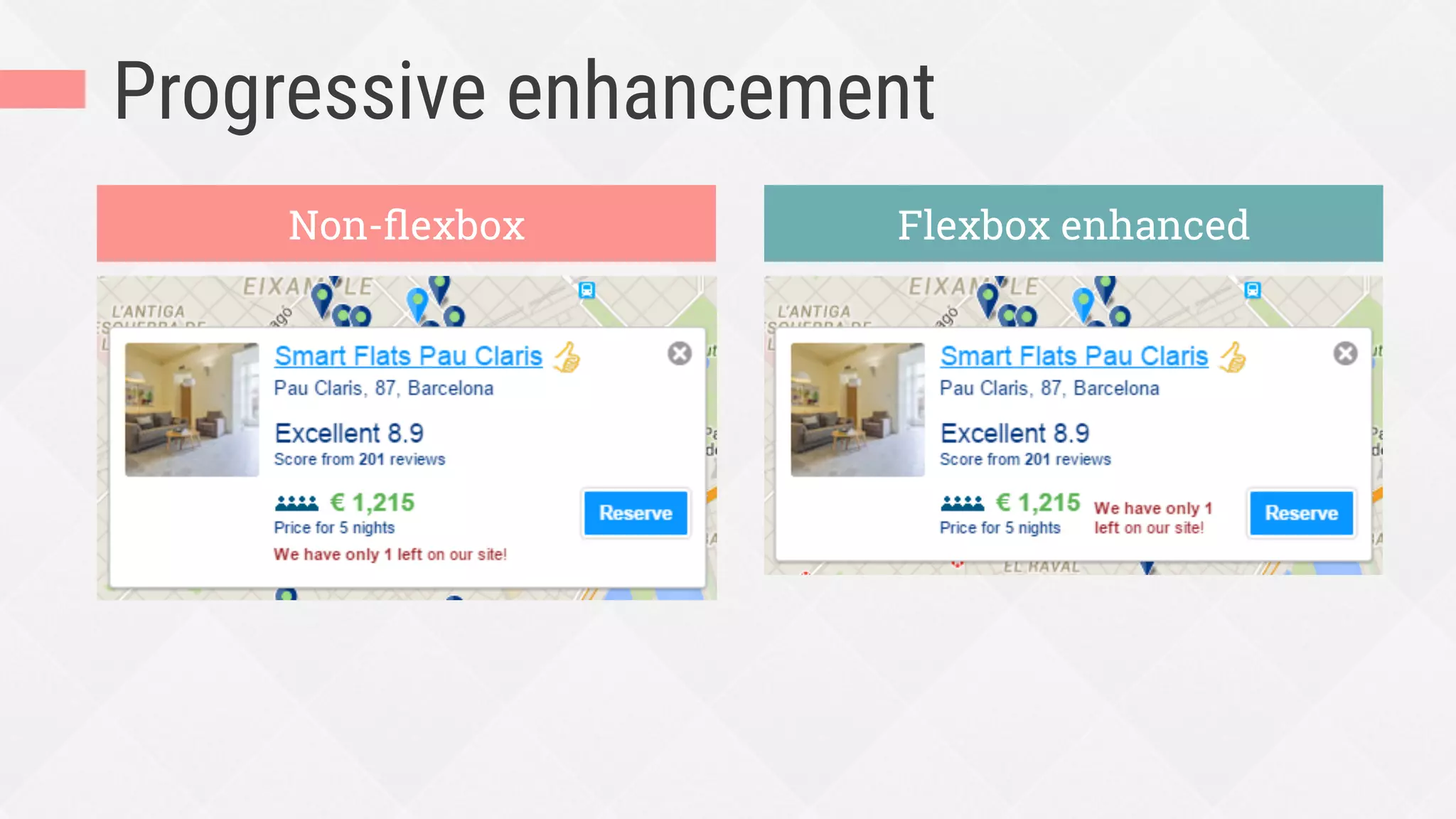
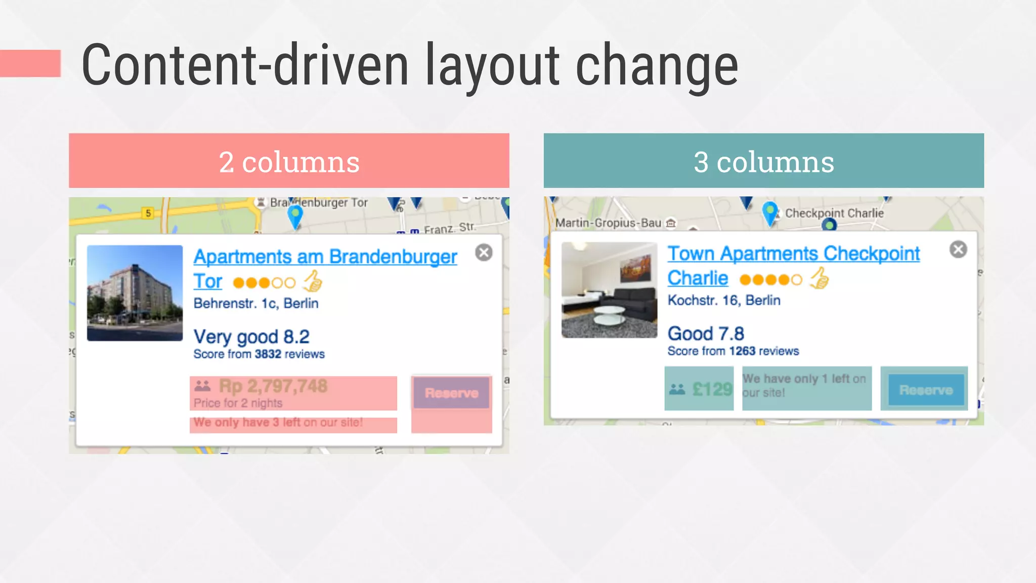
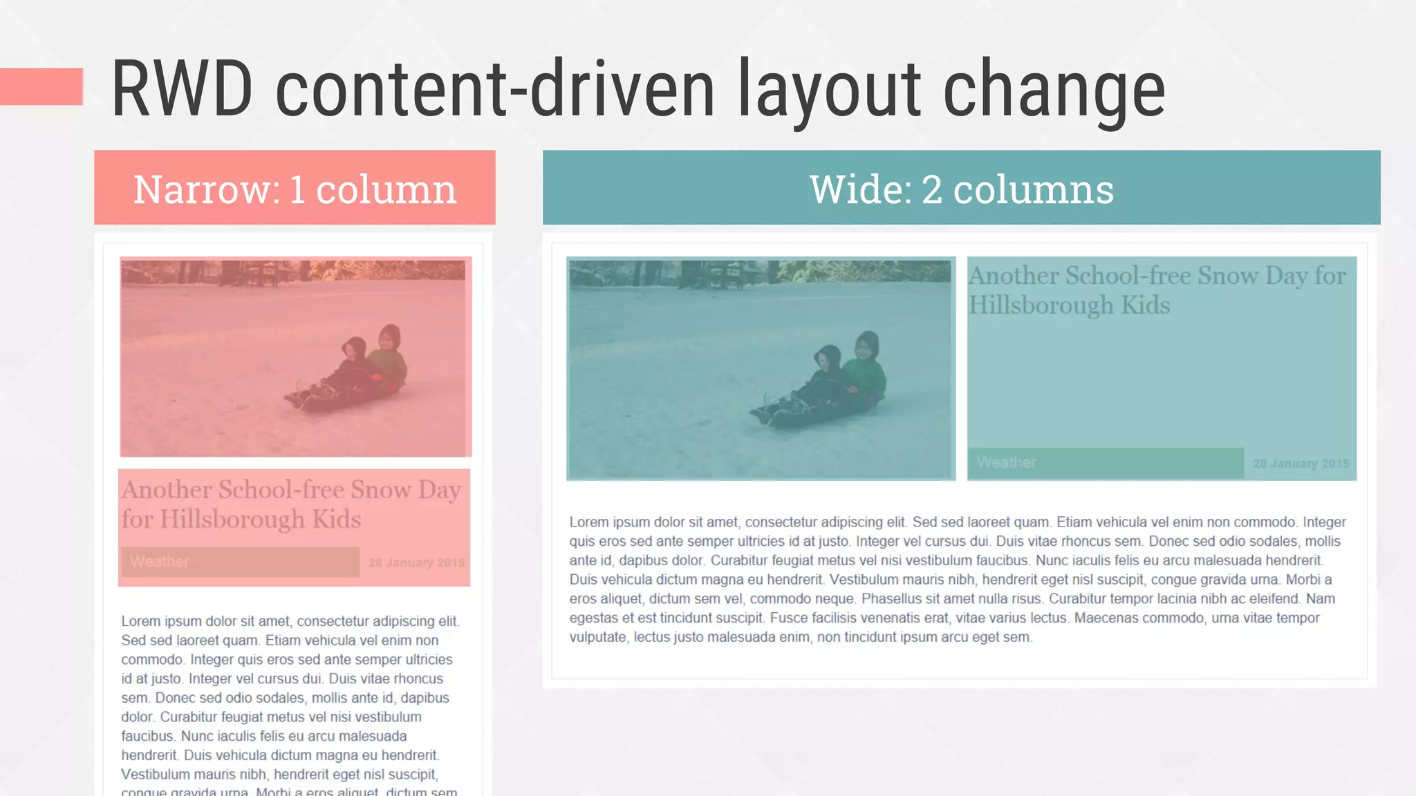
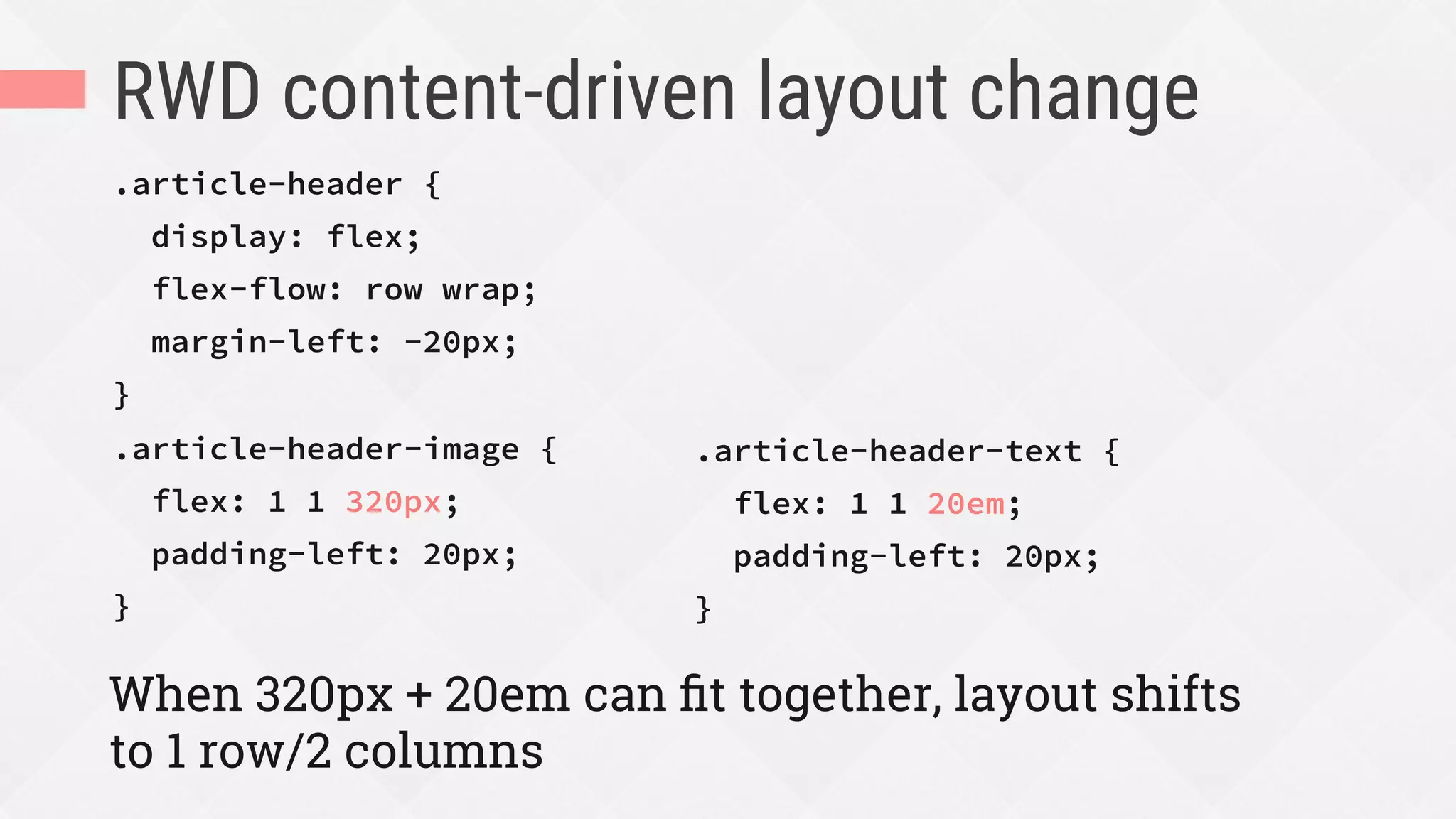
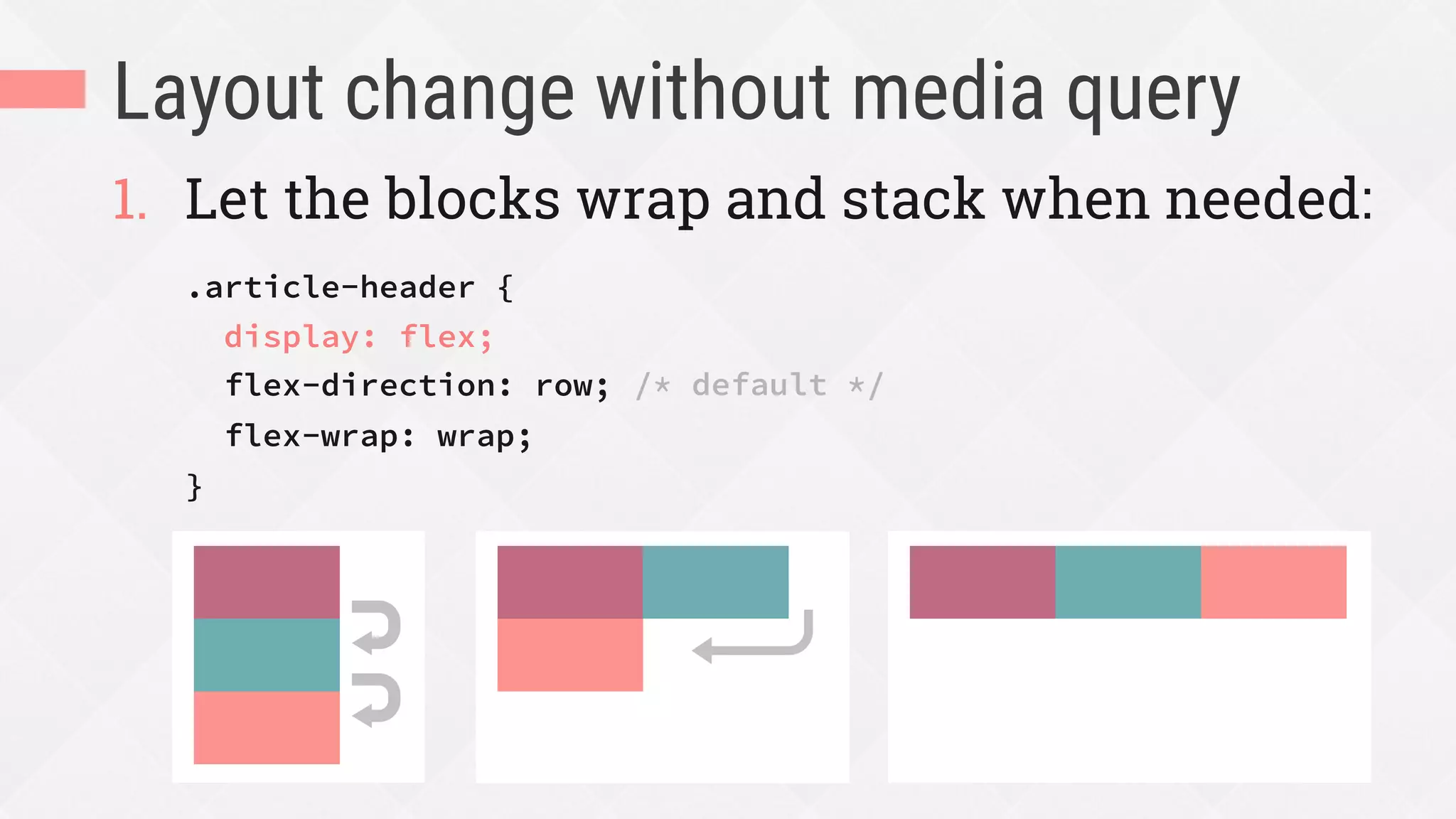
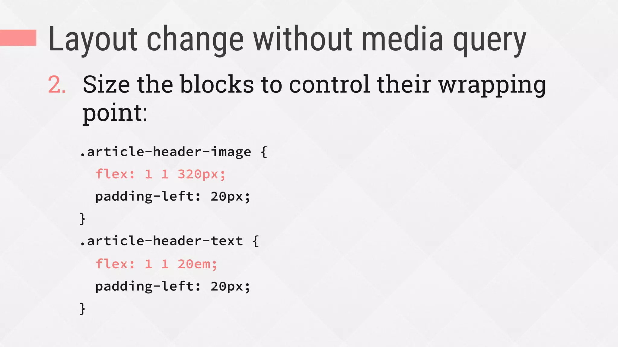
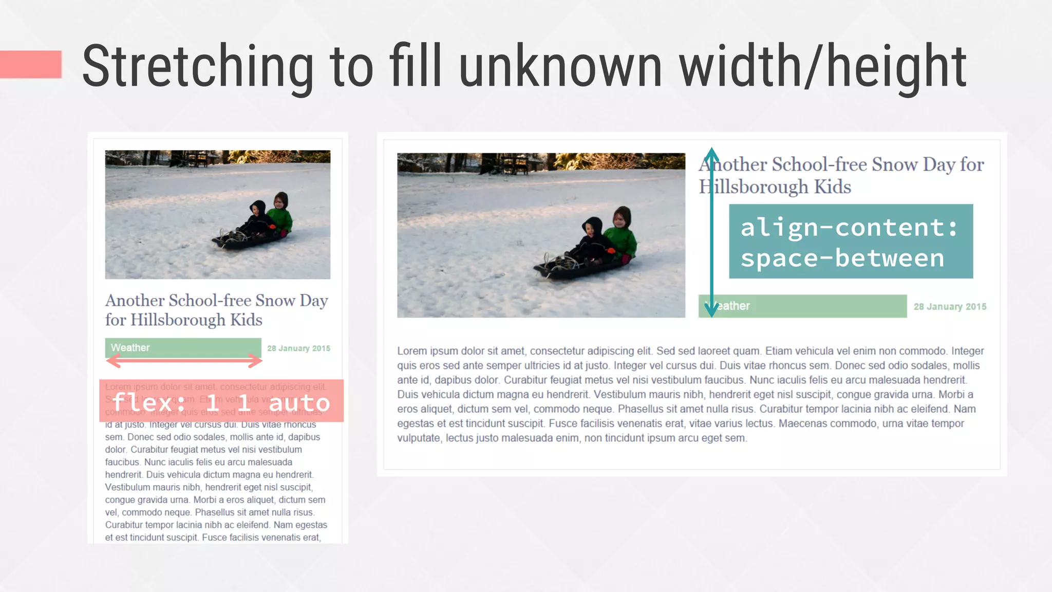

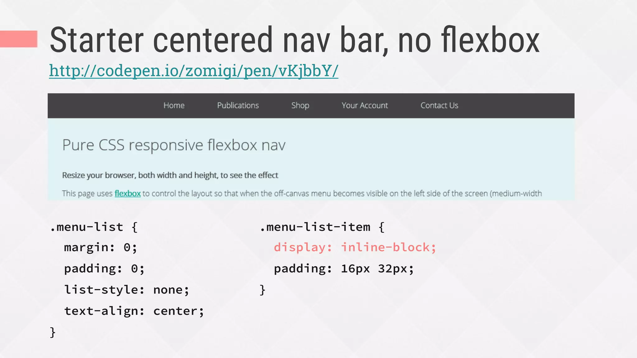
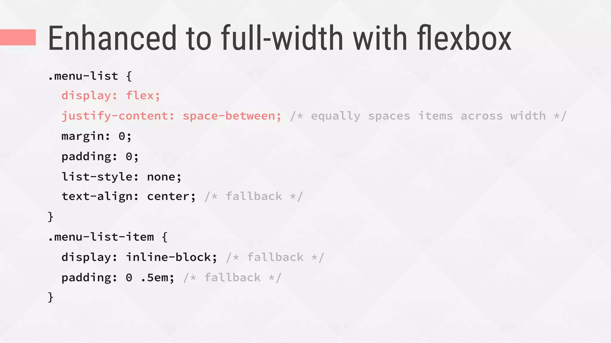

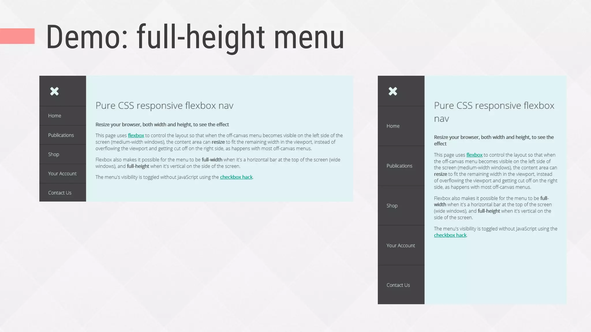
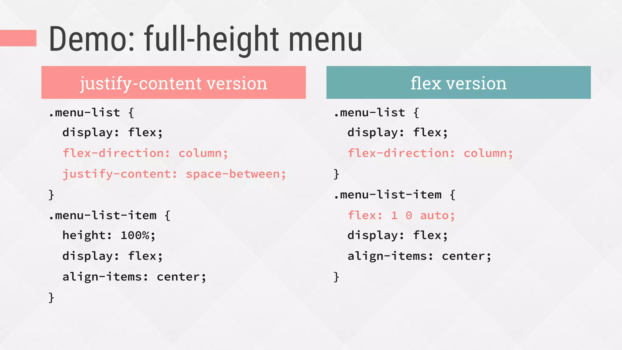
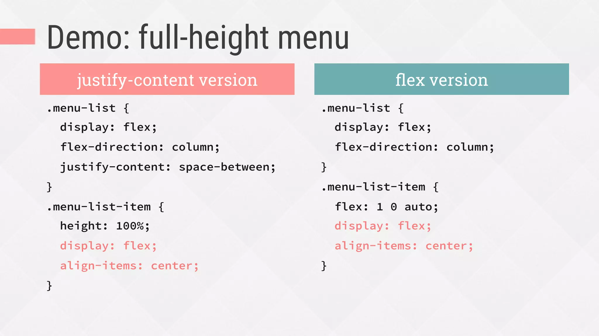

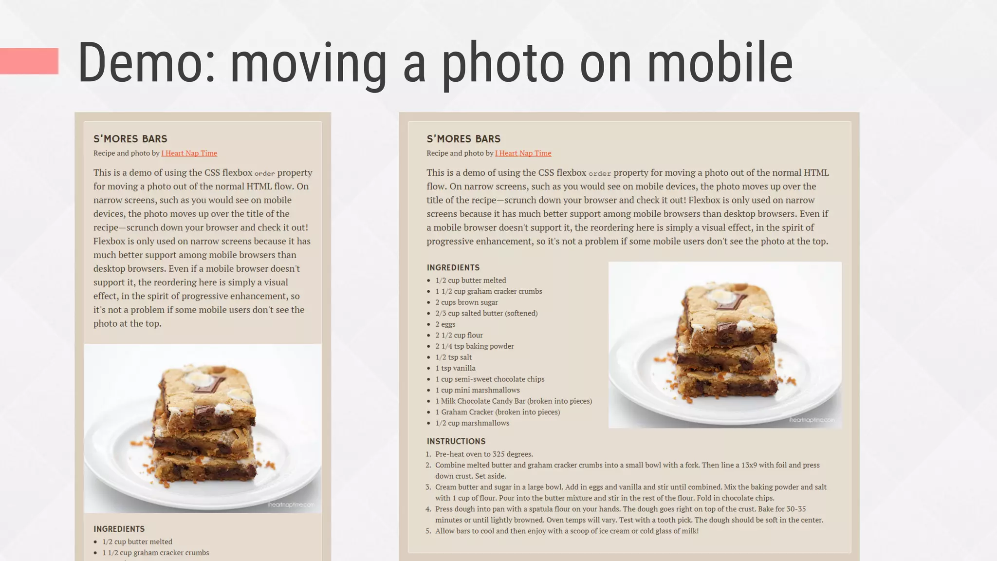
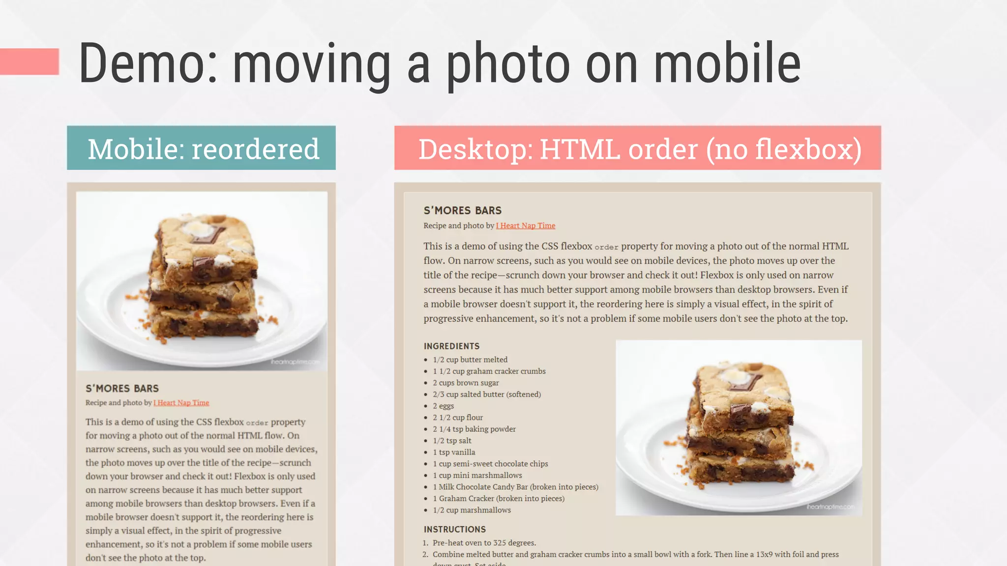
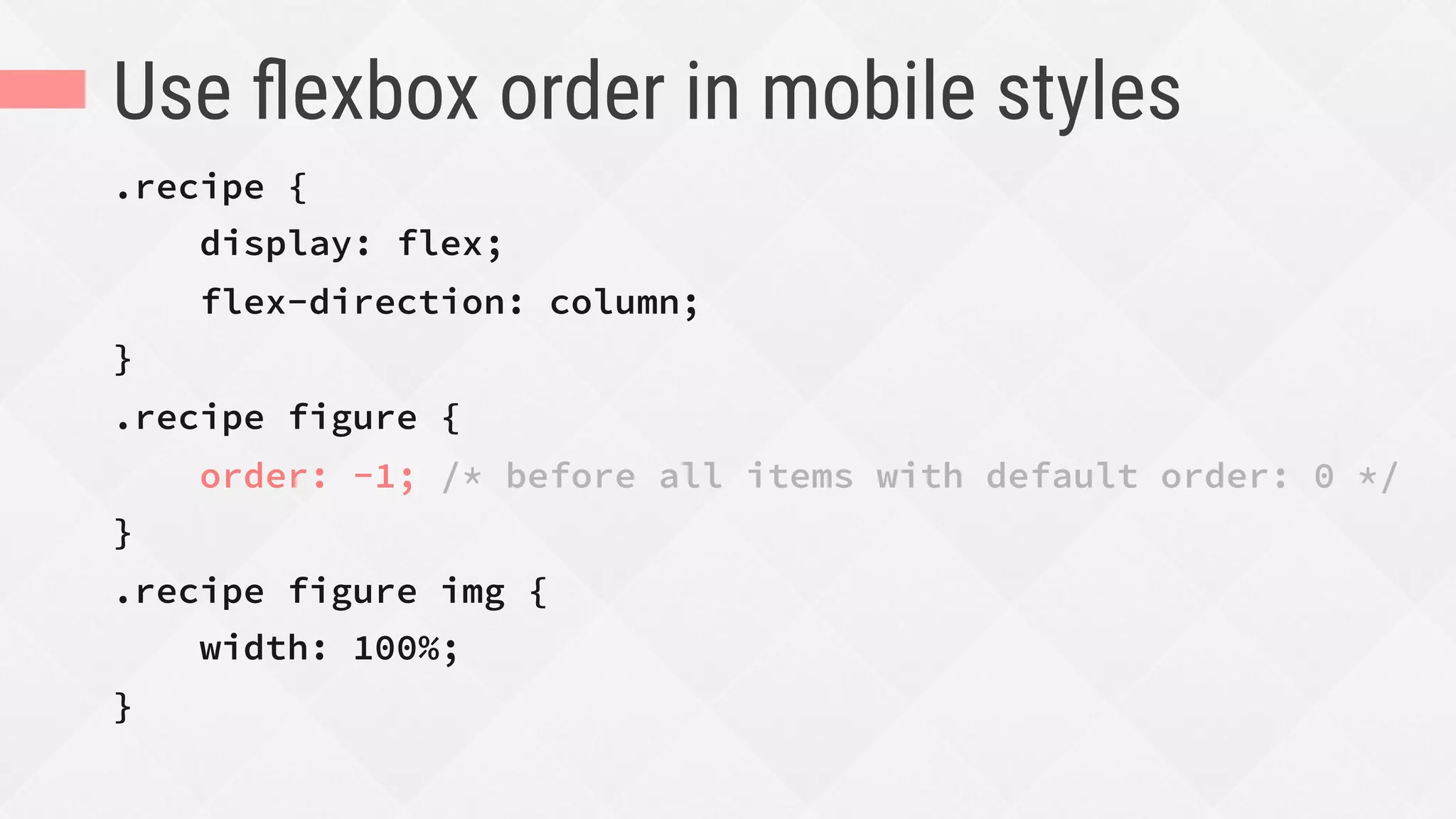
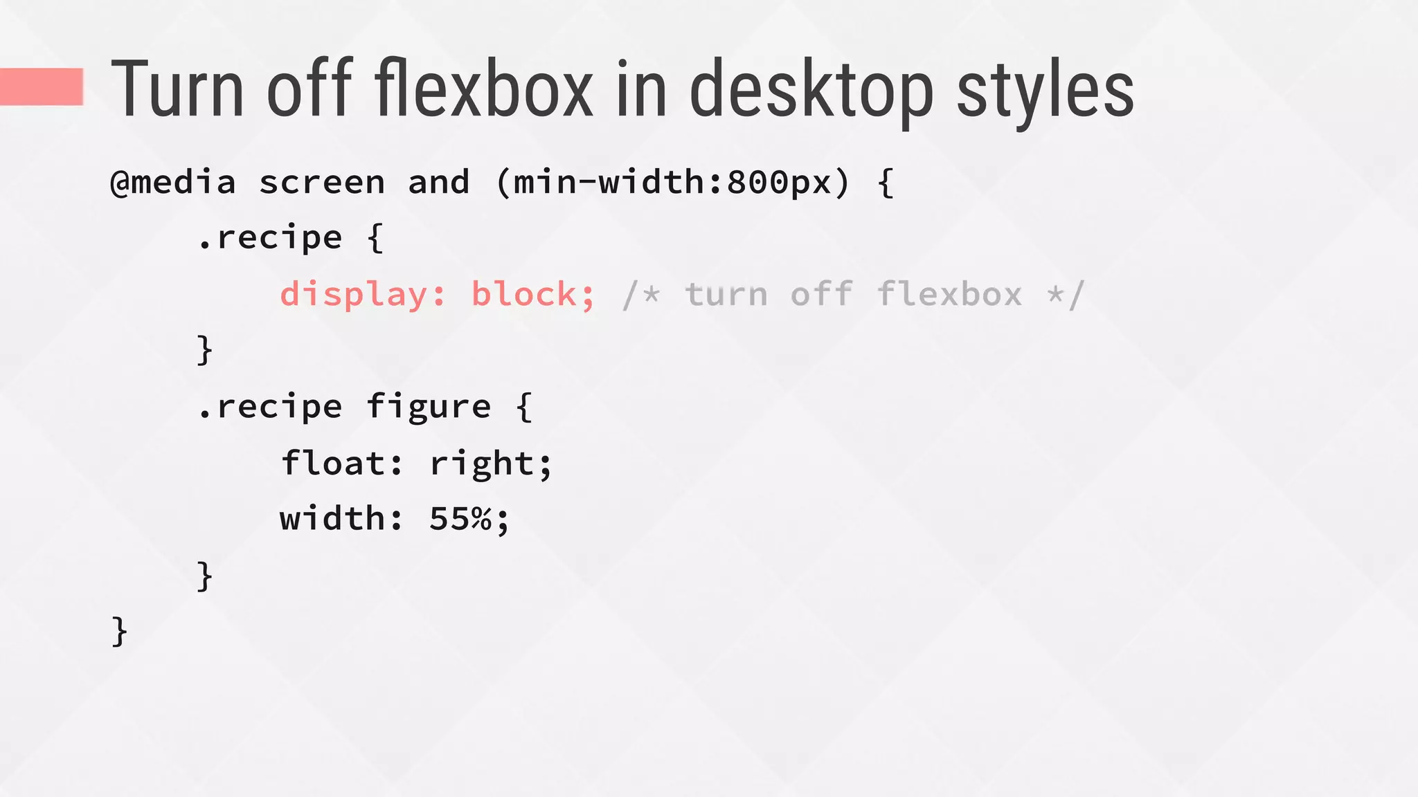
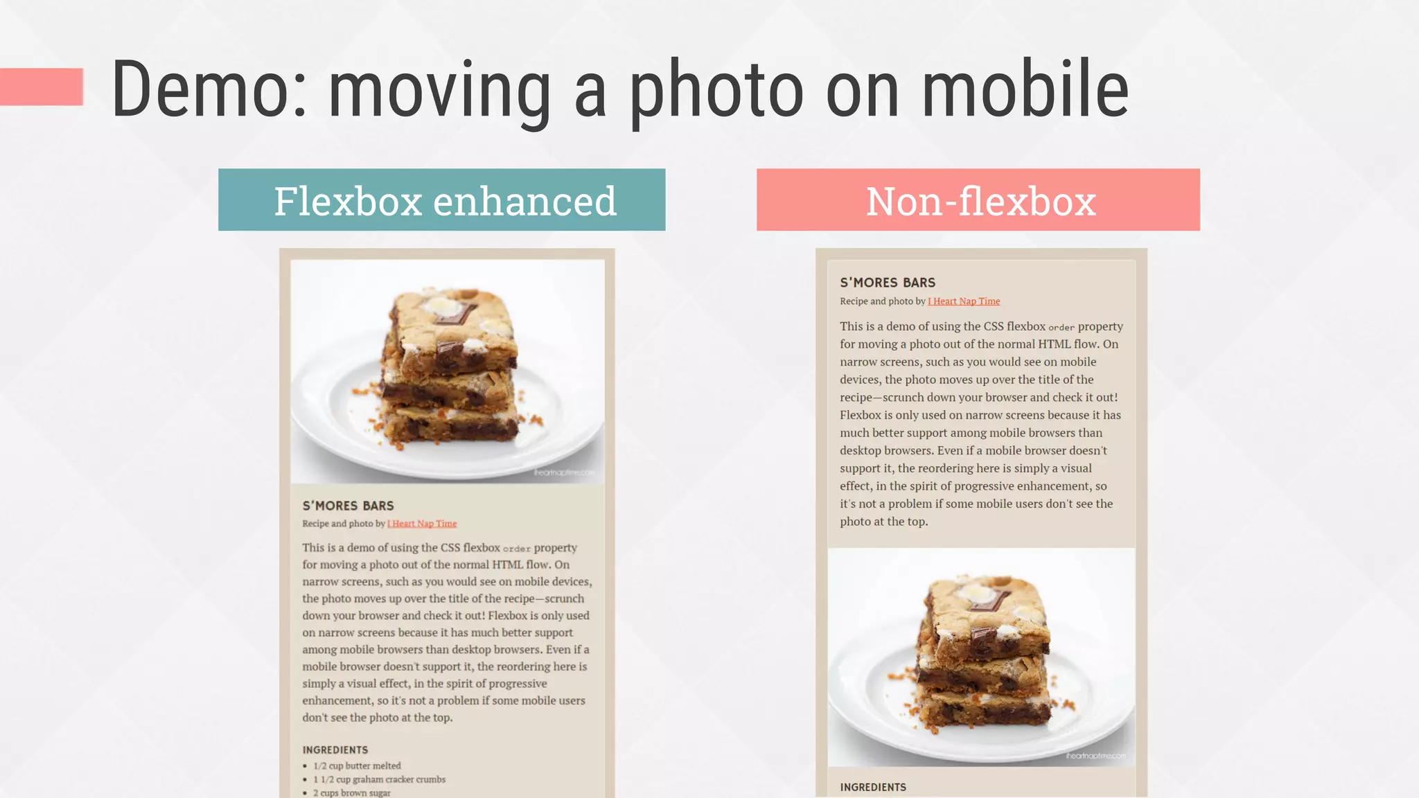
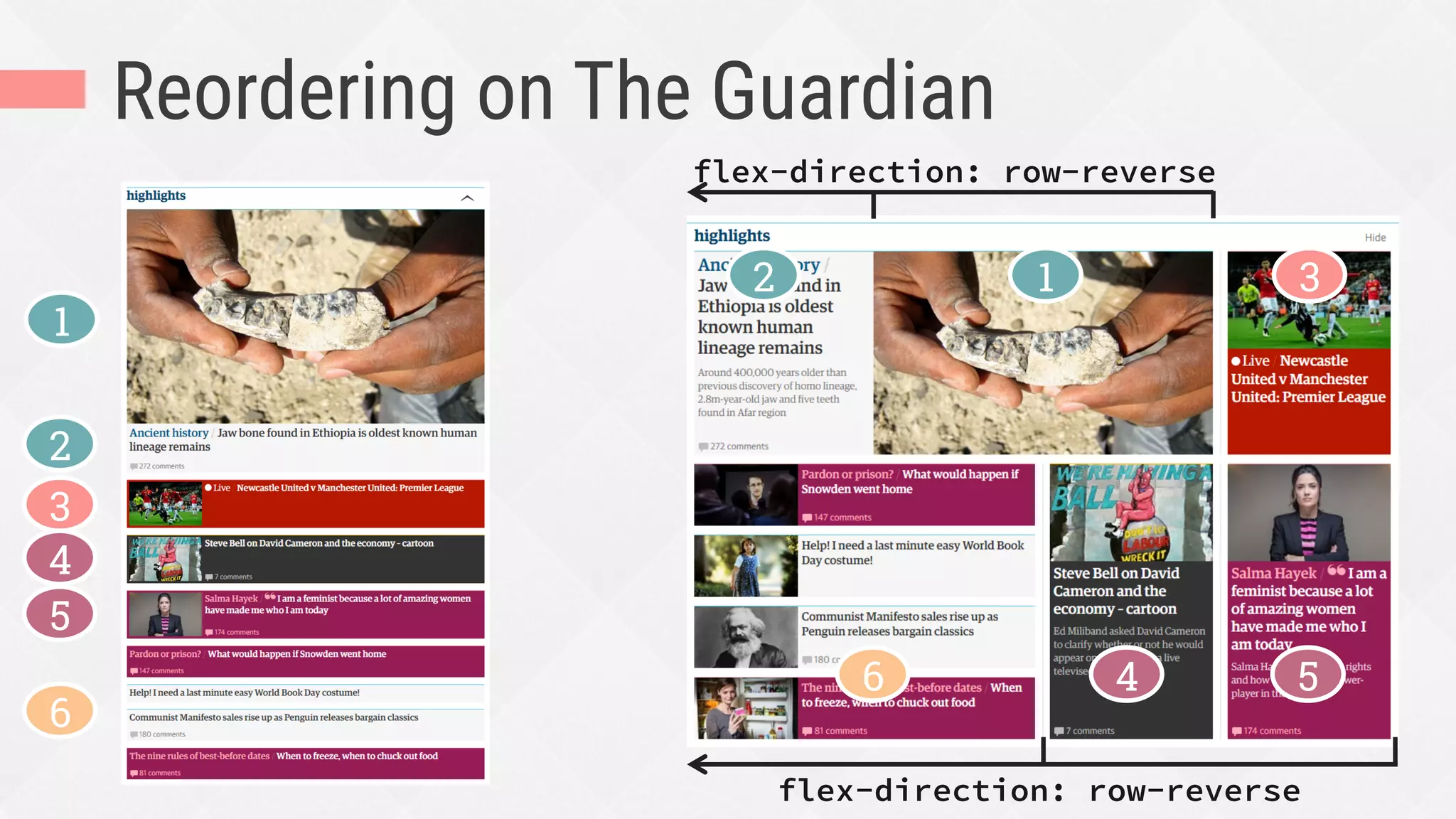
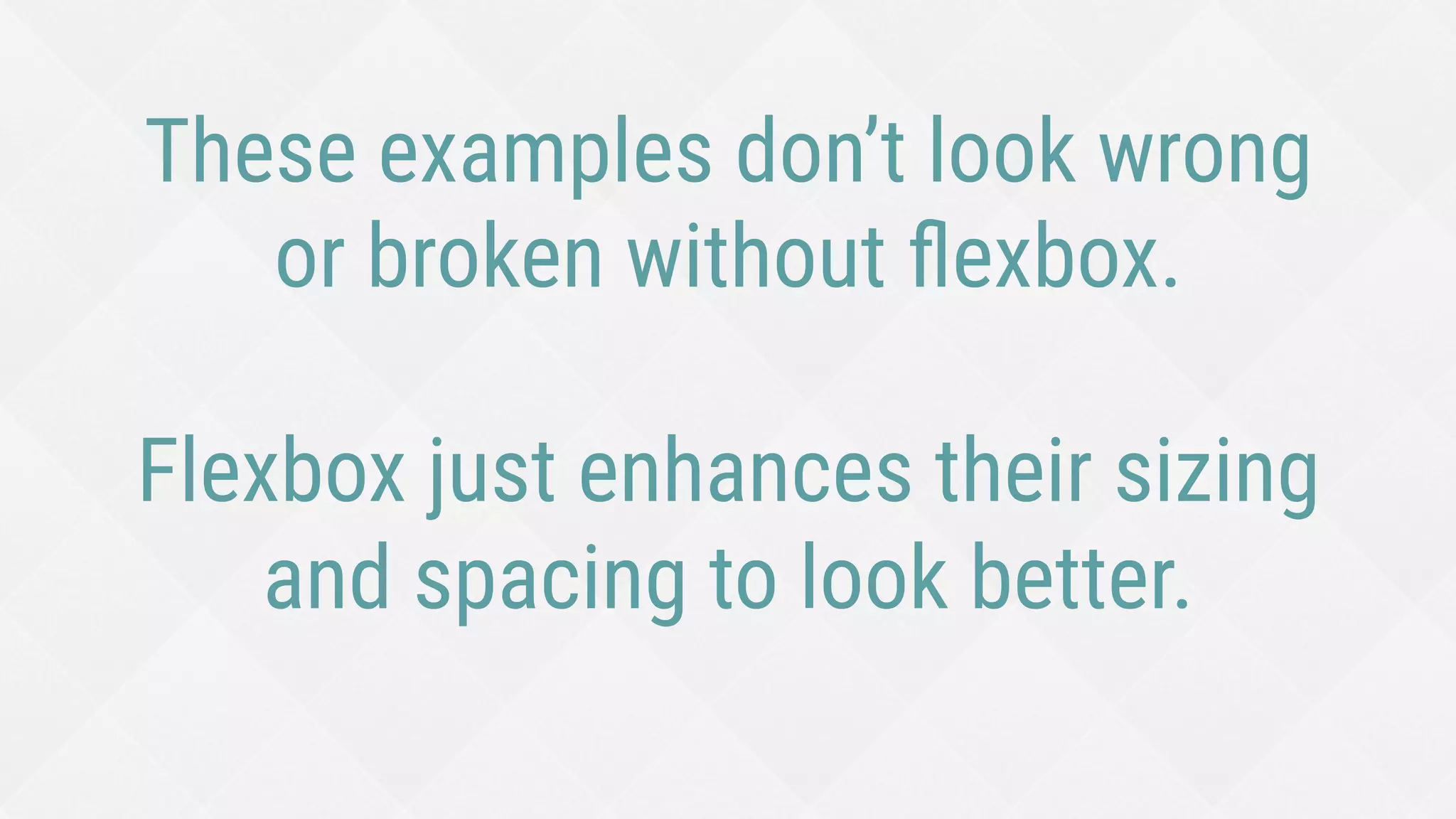

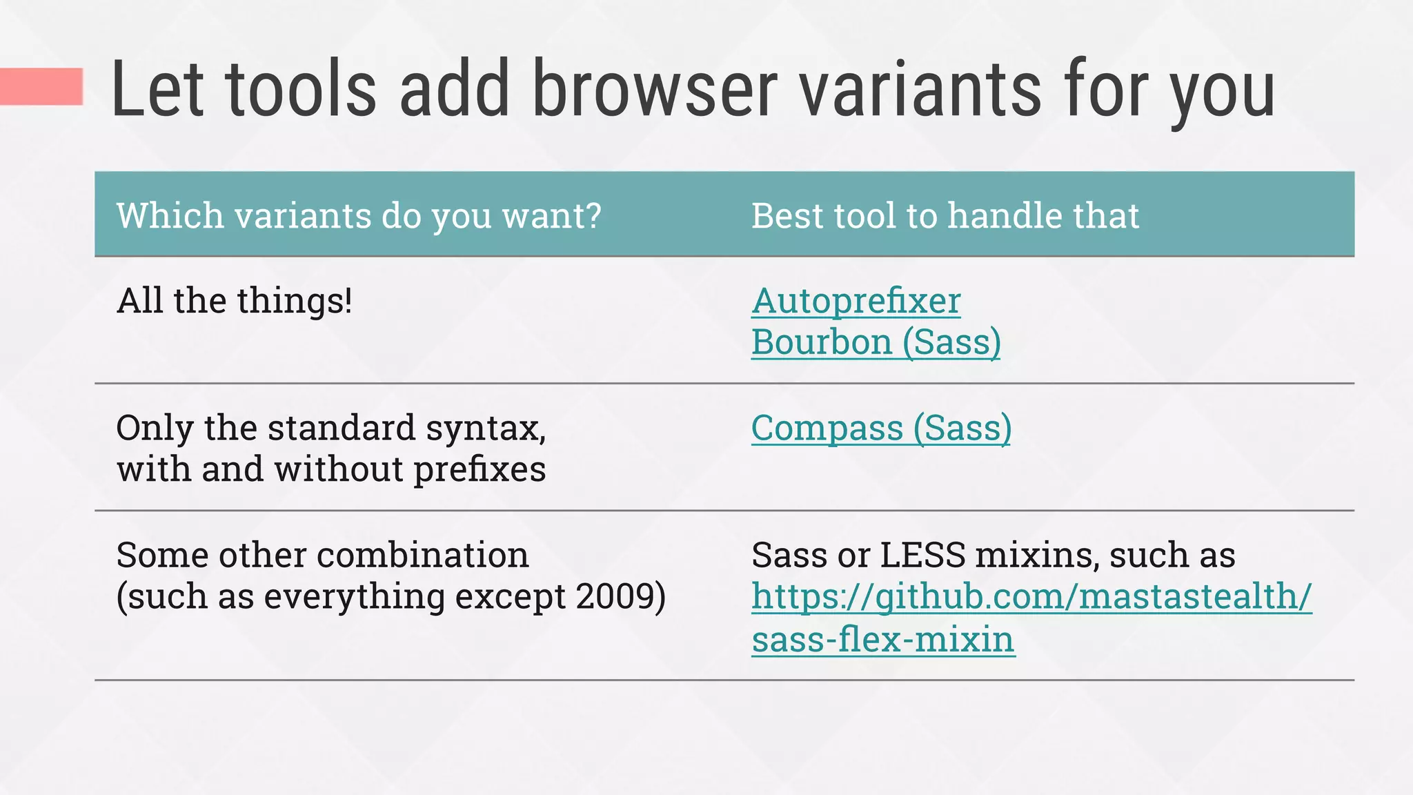
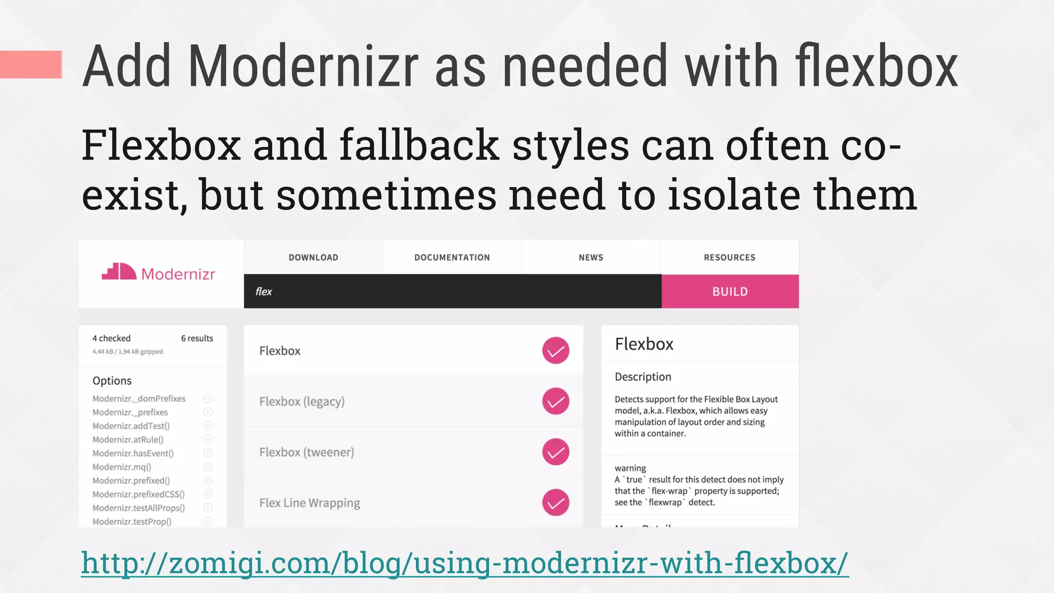
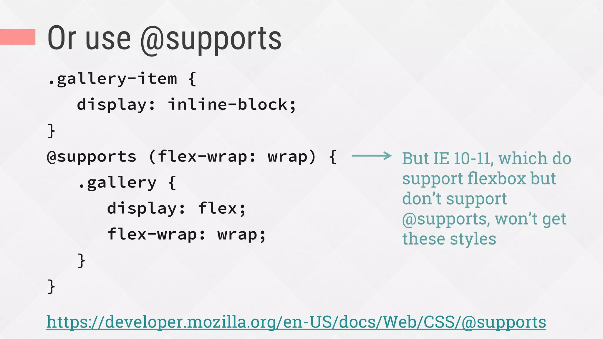
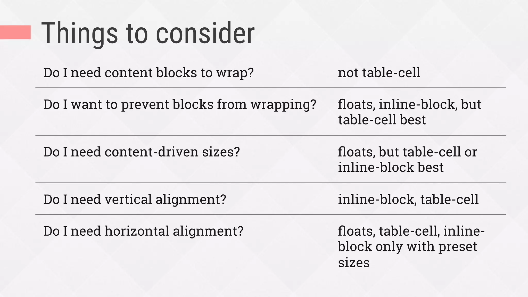
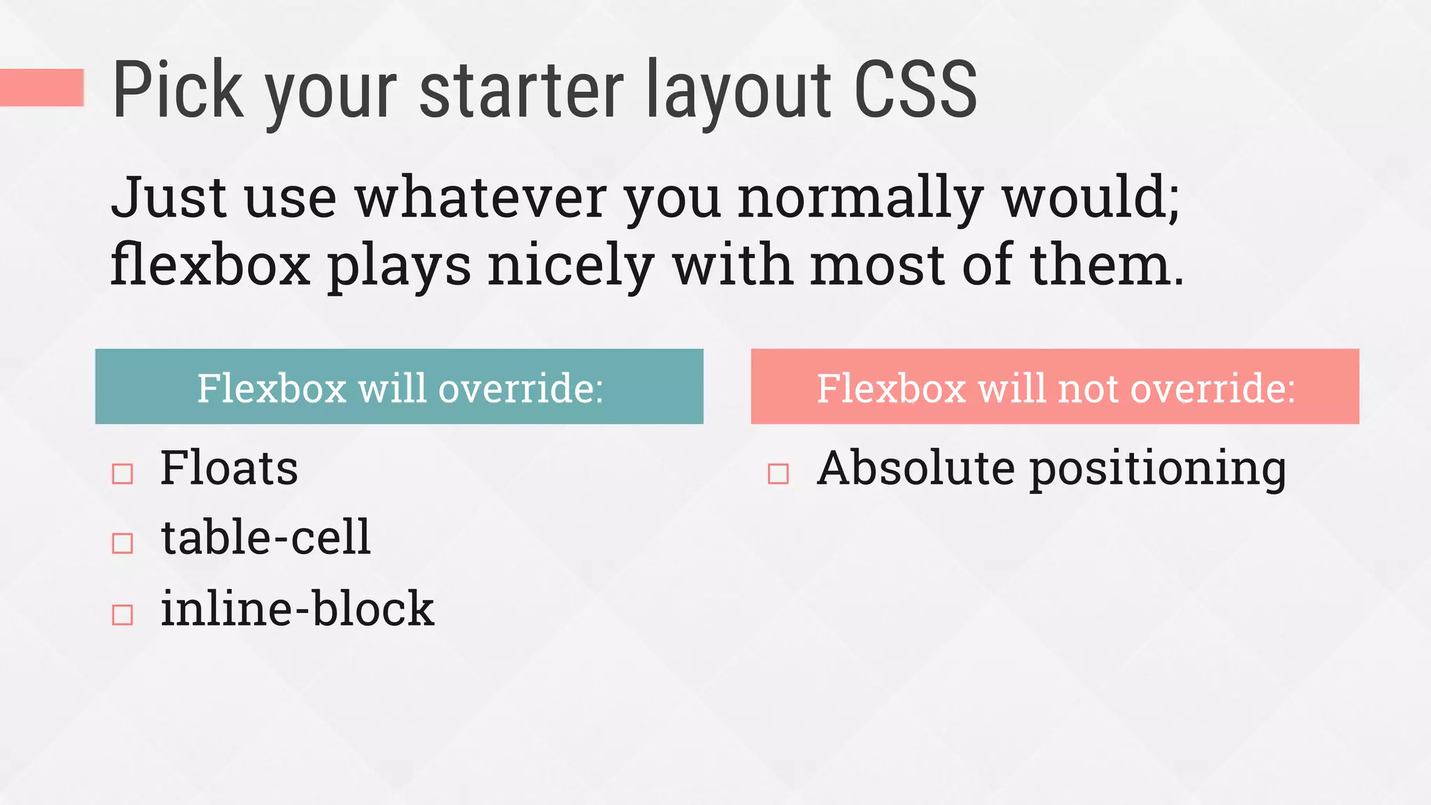

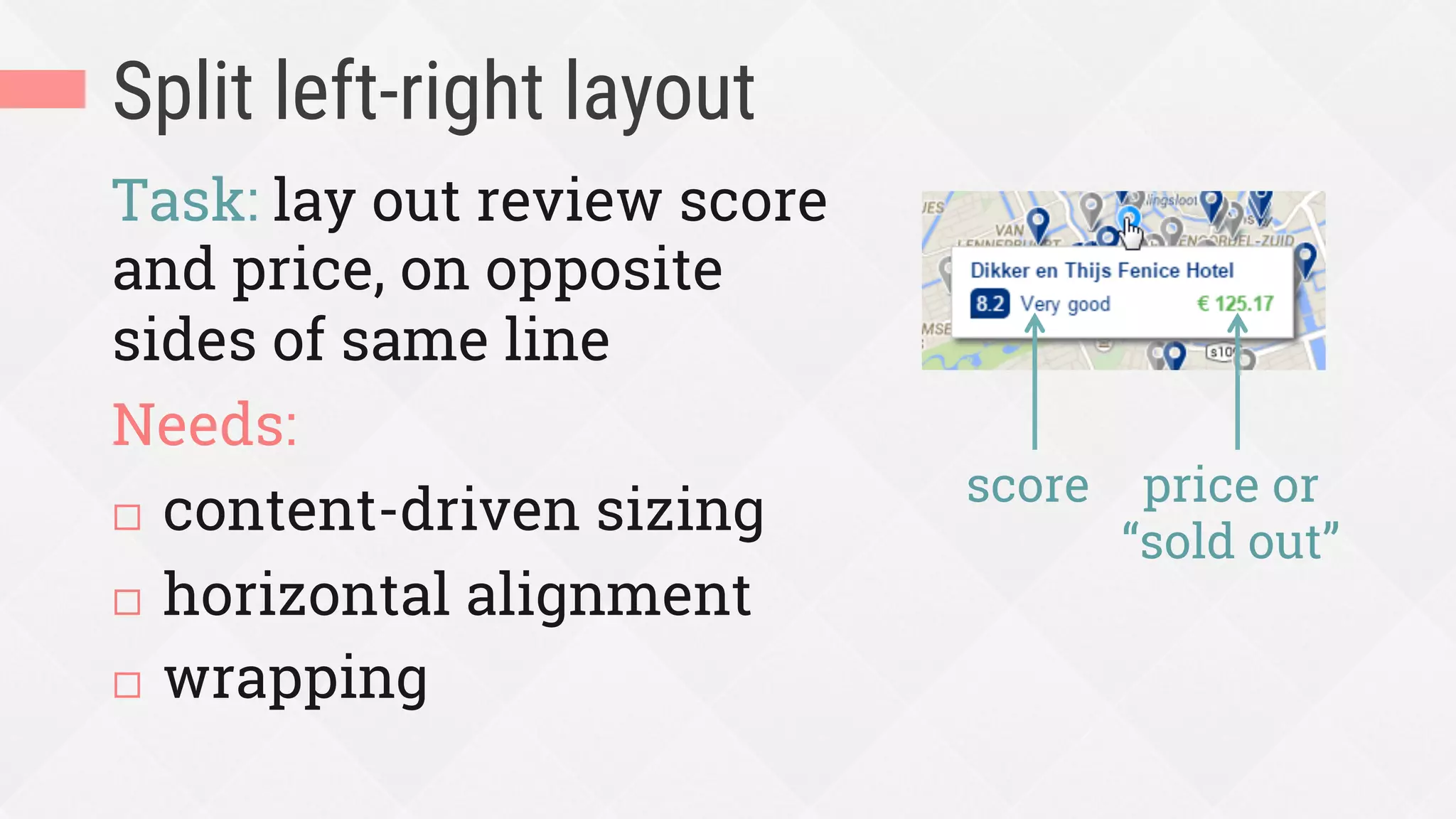
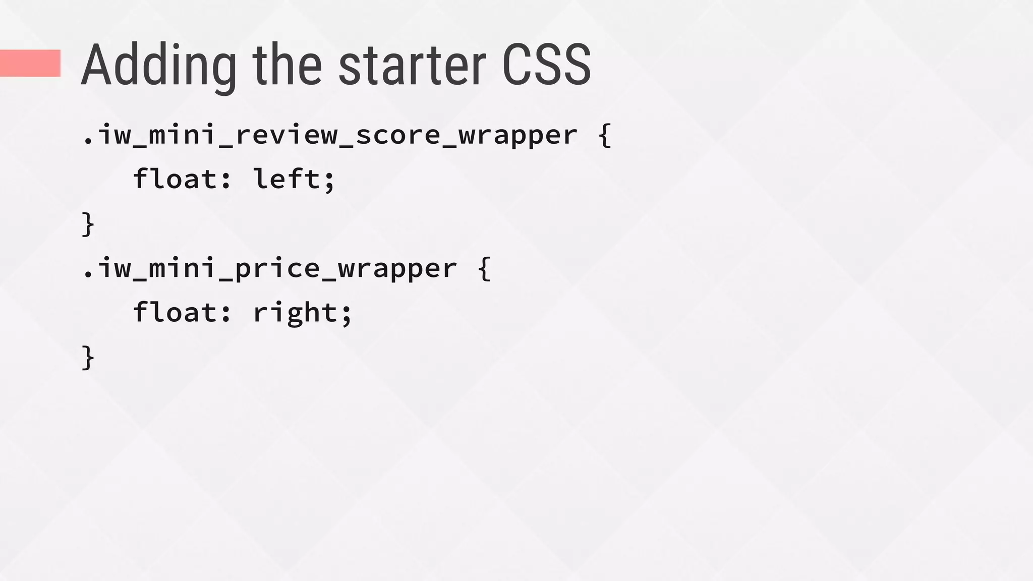


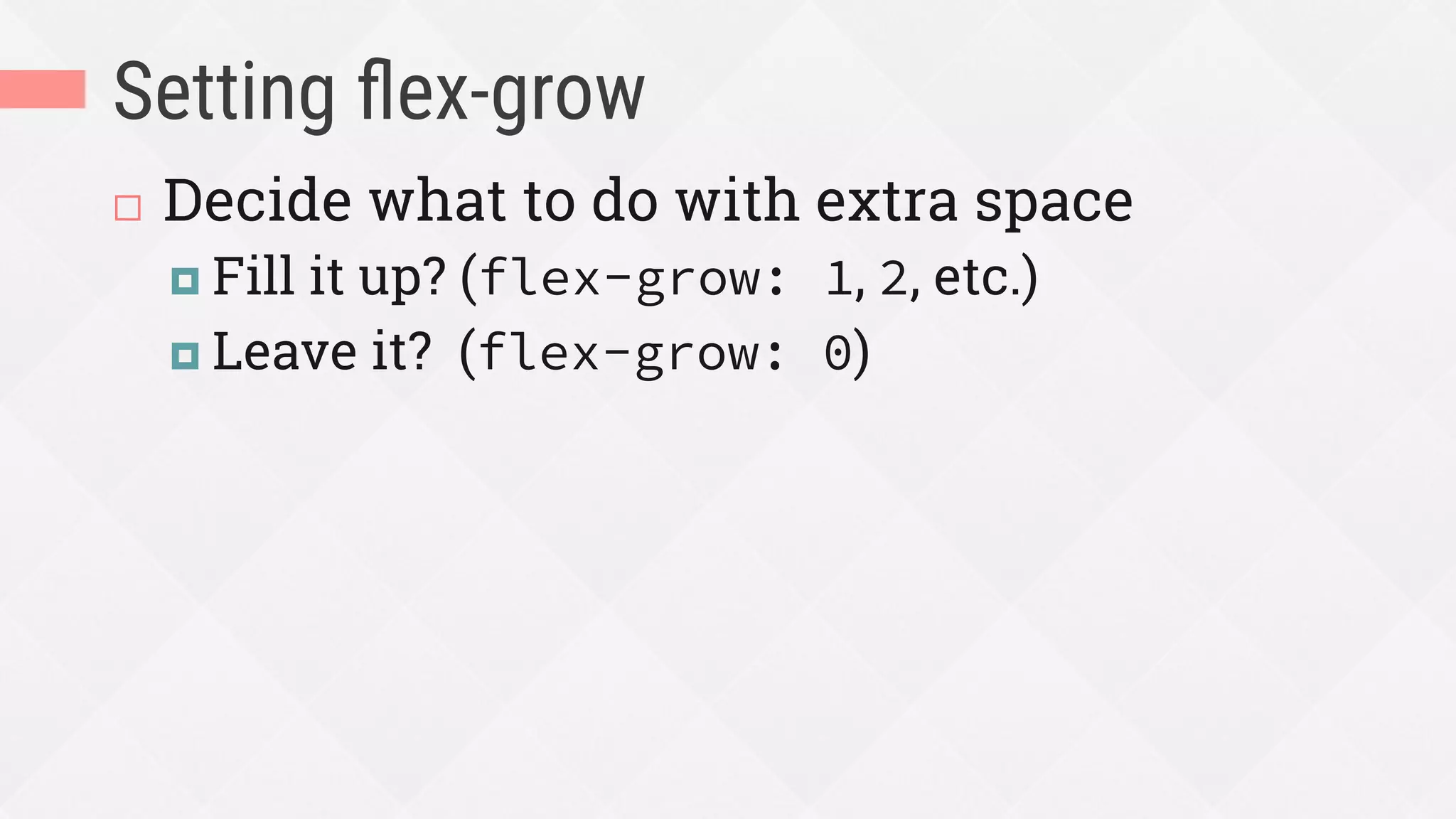
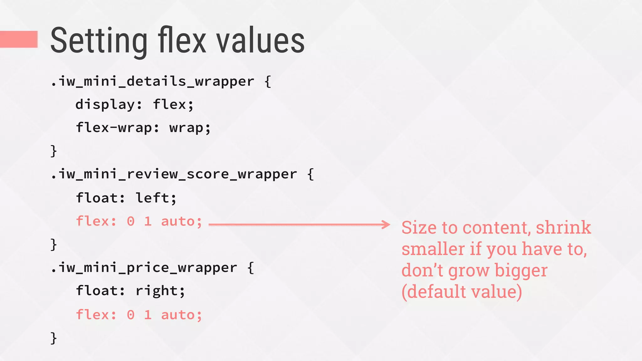

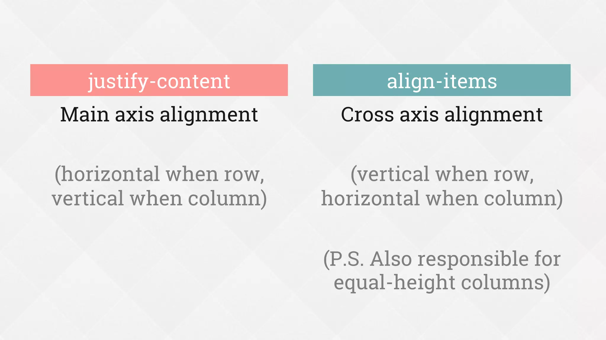
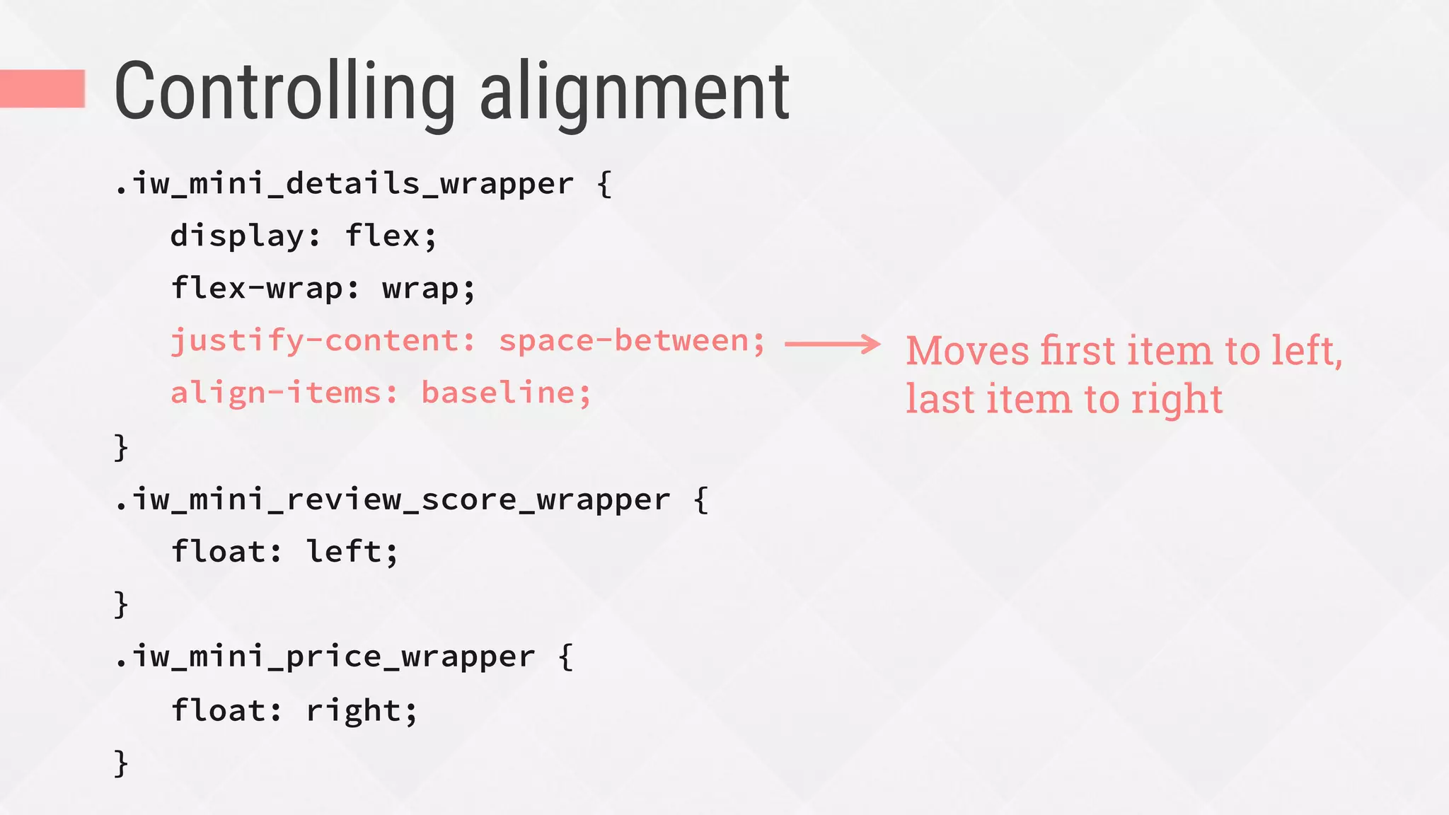
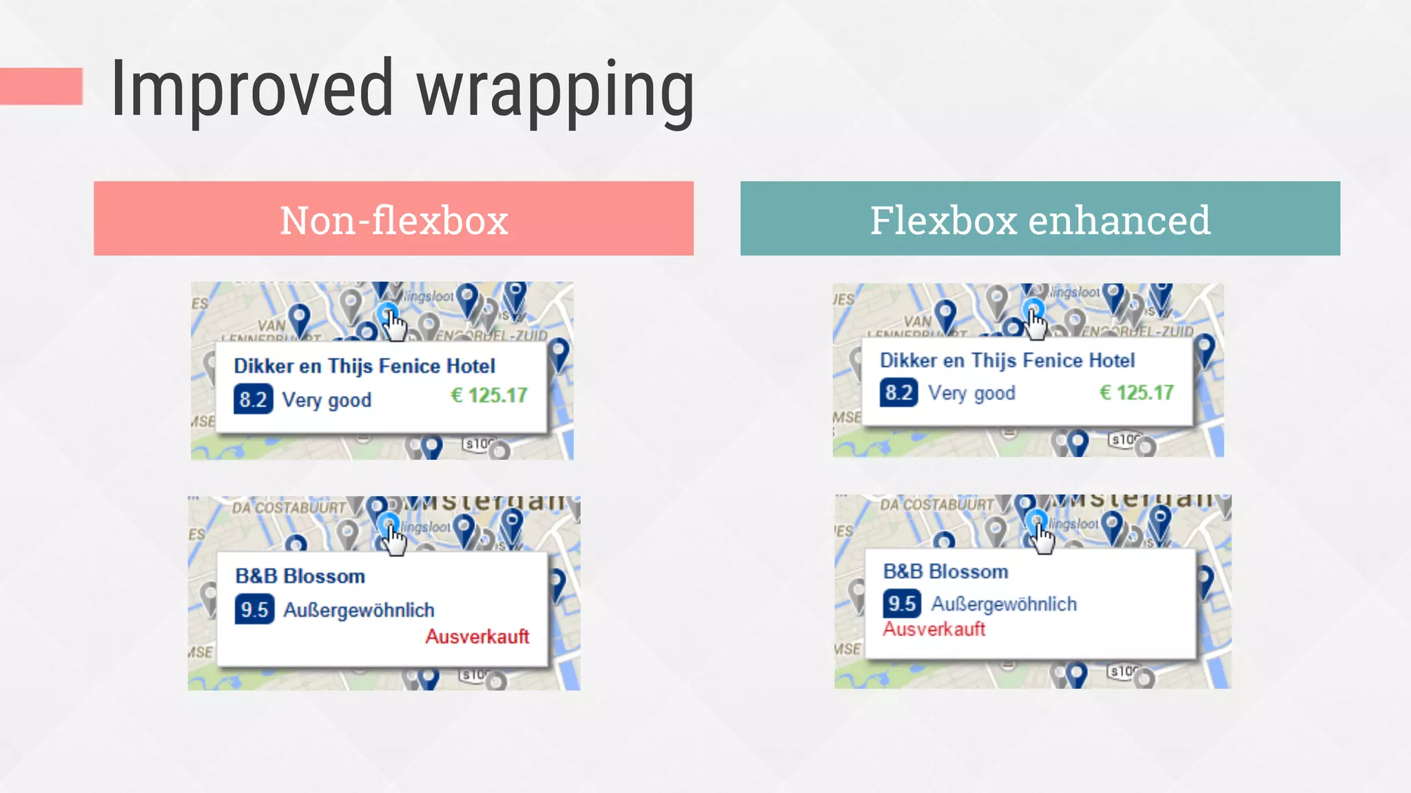
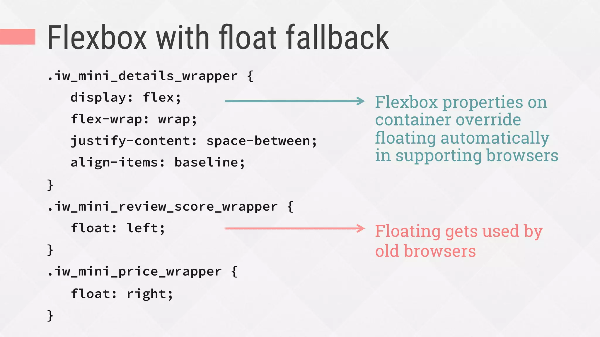


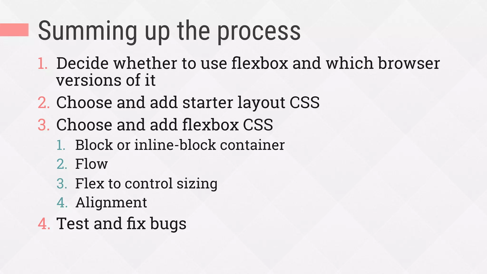
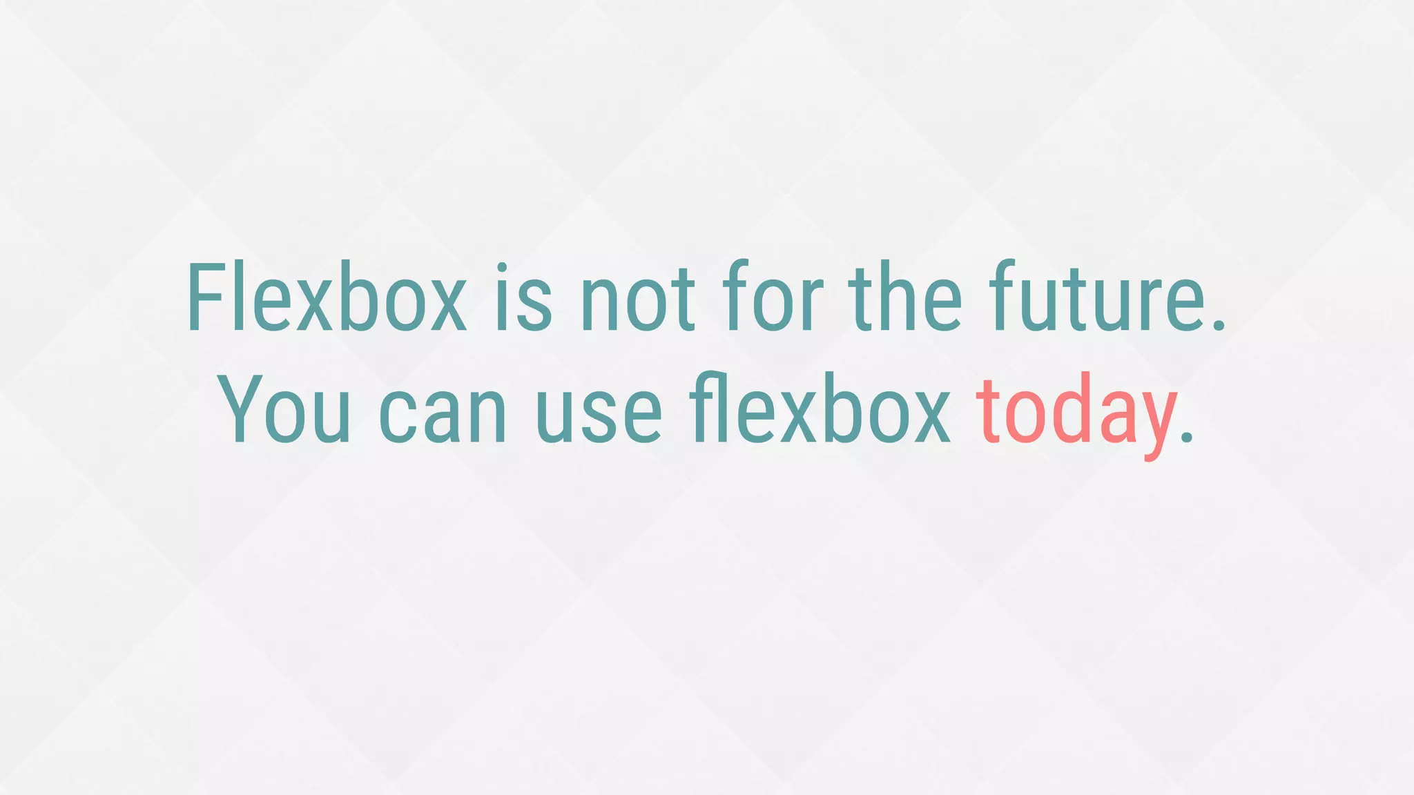

The document provides an extensive guide on using Flexbox for web layout and design, highlighting its capabilities for creating responsive components, enhancing UI alignment, and simplifying layout management. It discusses best practices, such as using content-driven sizing and the appropriate use of flex properties like flex-grow, flex-shrink, and flex-basis. Additionally, it covers compatibility concerns, offering strategies for browser support and fallbacks while illustrating concepts with code examples.


