Downloaded 201 times


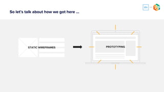
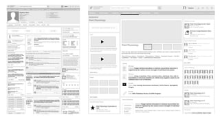


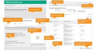


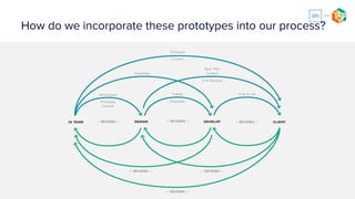

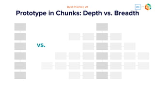

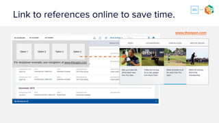
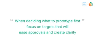
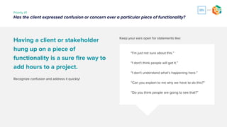


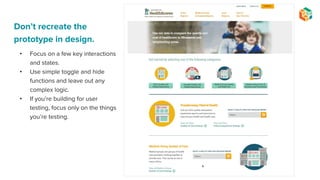


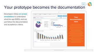
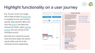
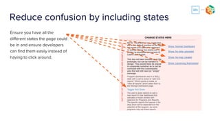
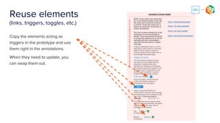
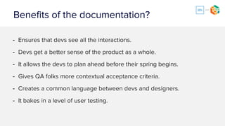

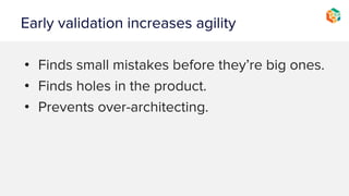
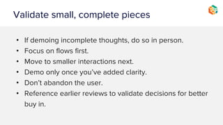


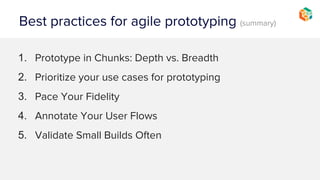


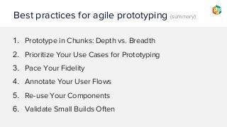


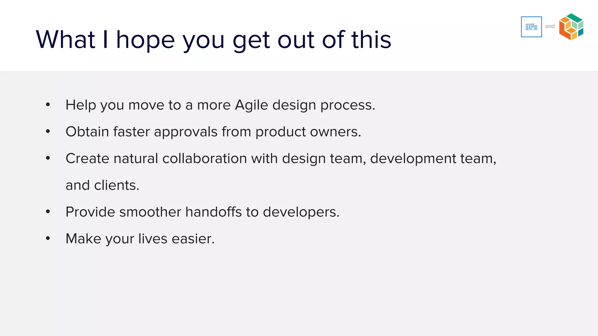
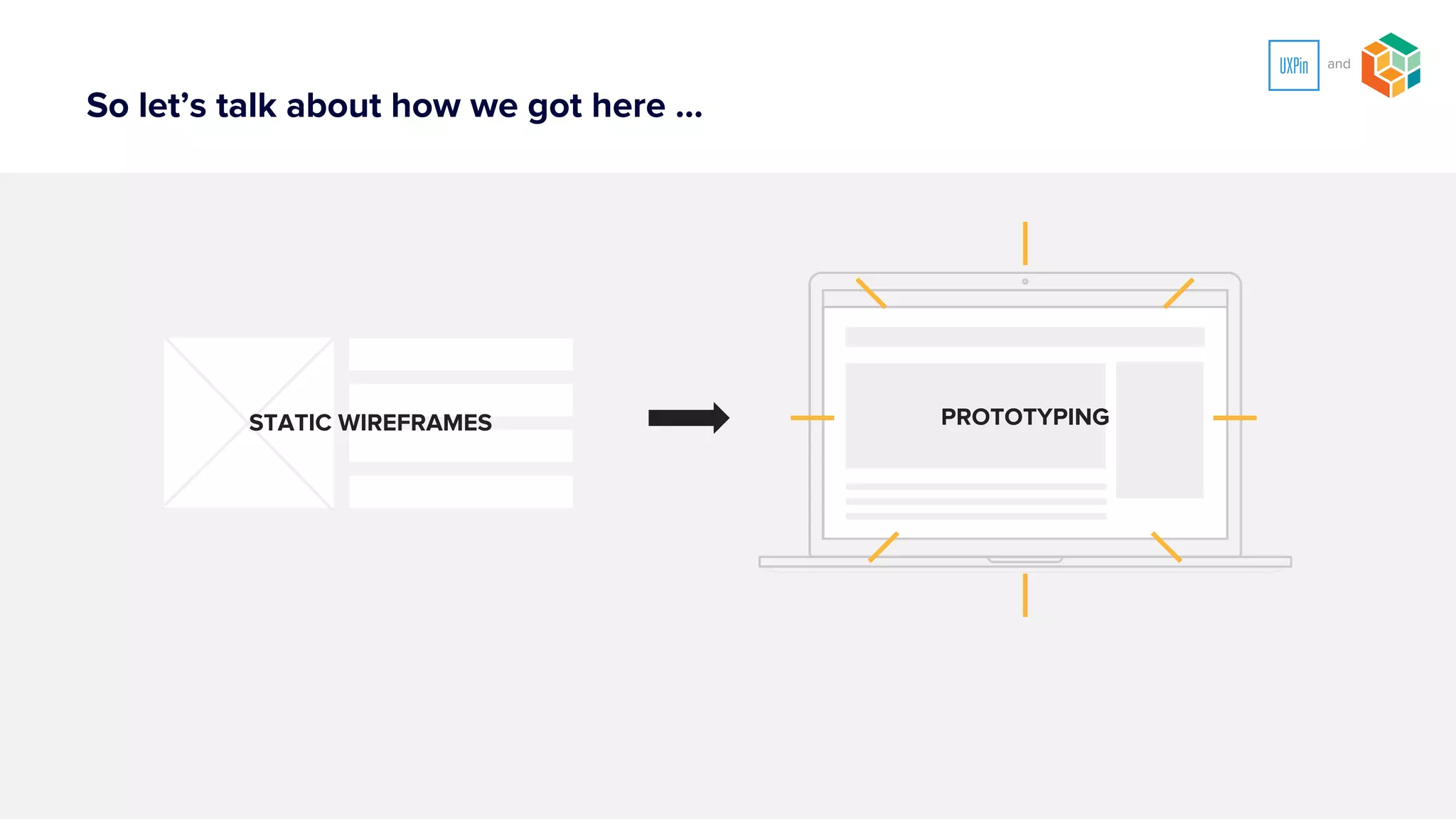


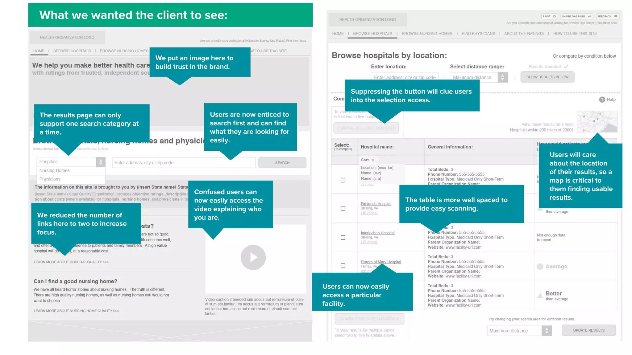
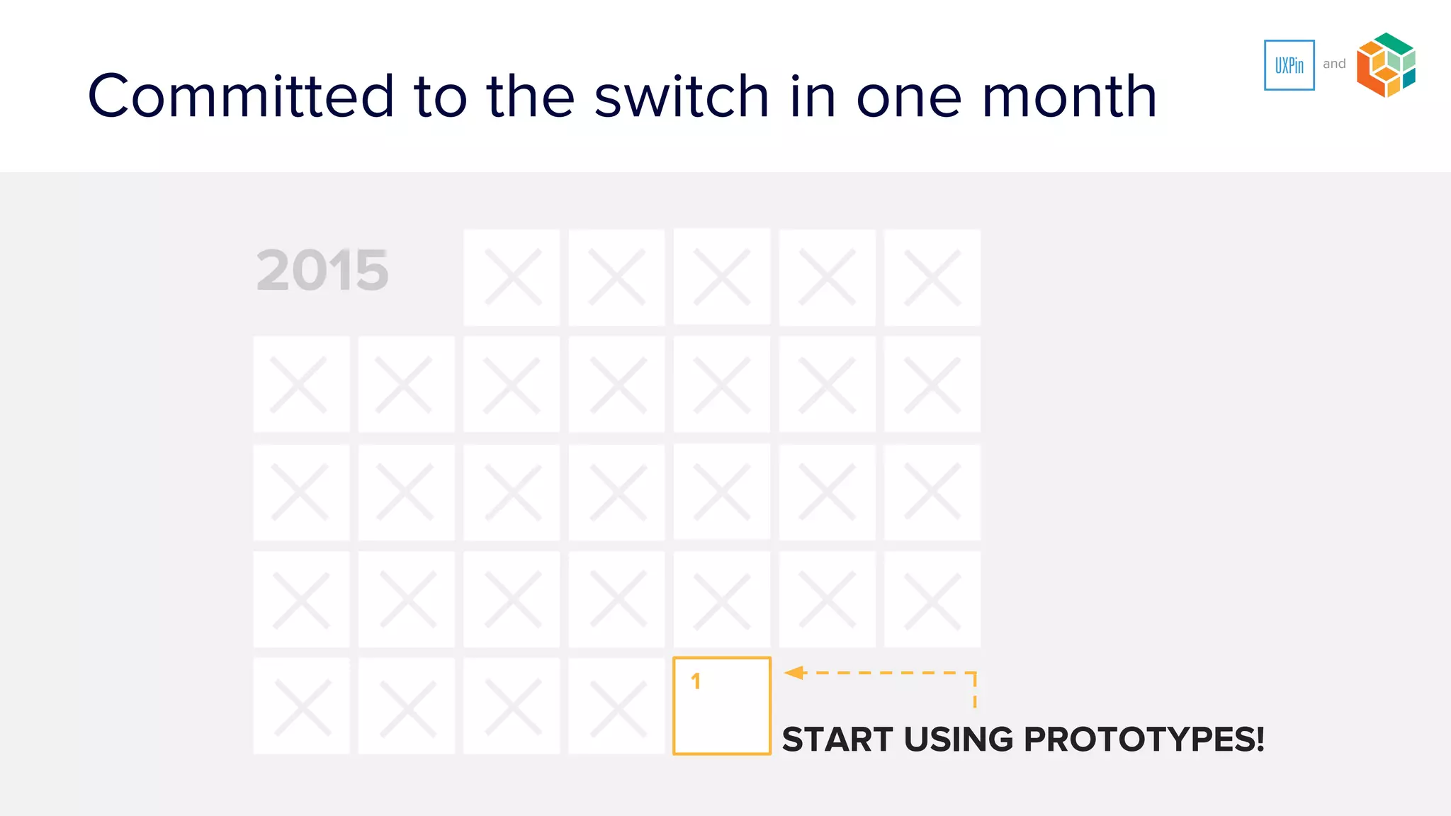


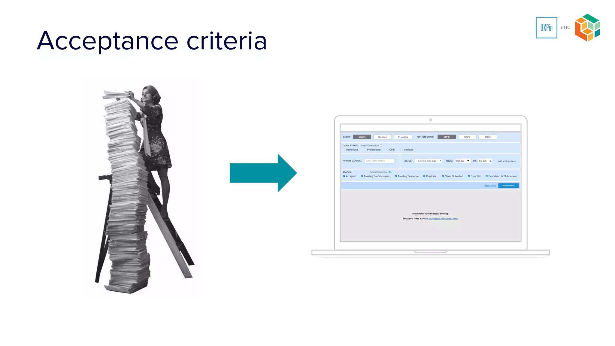
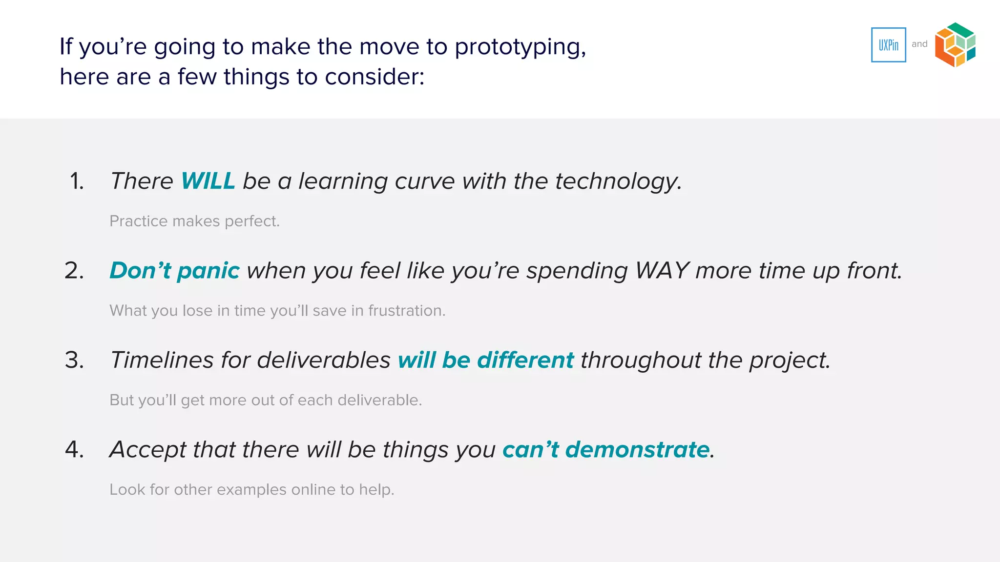
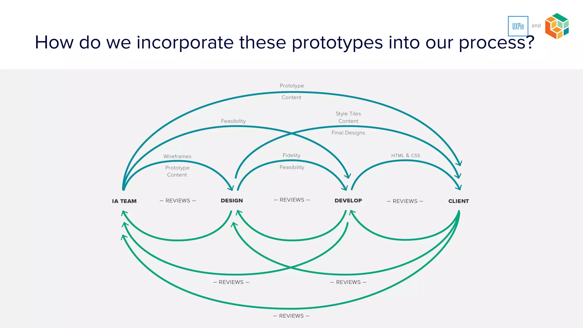

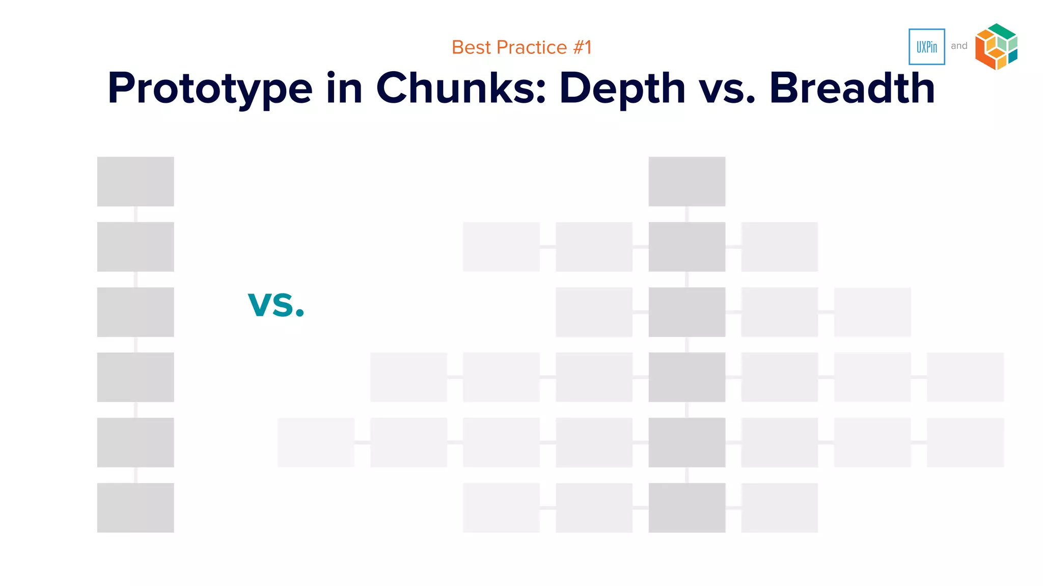
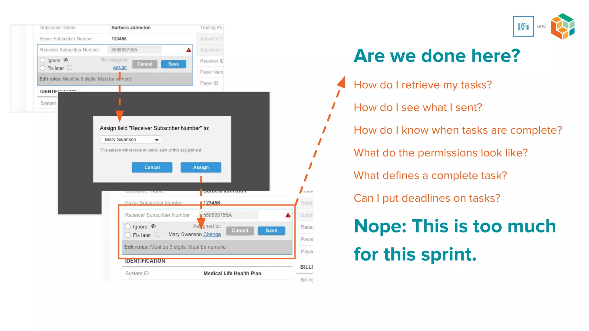
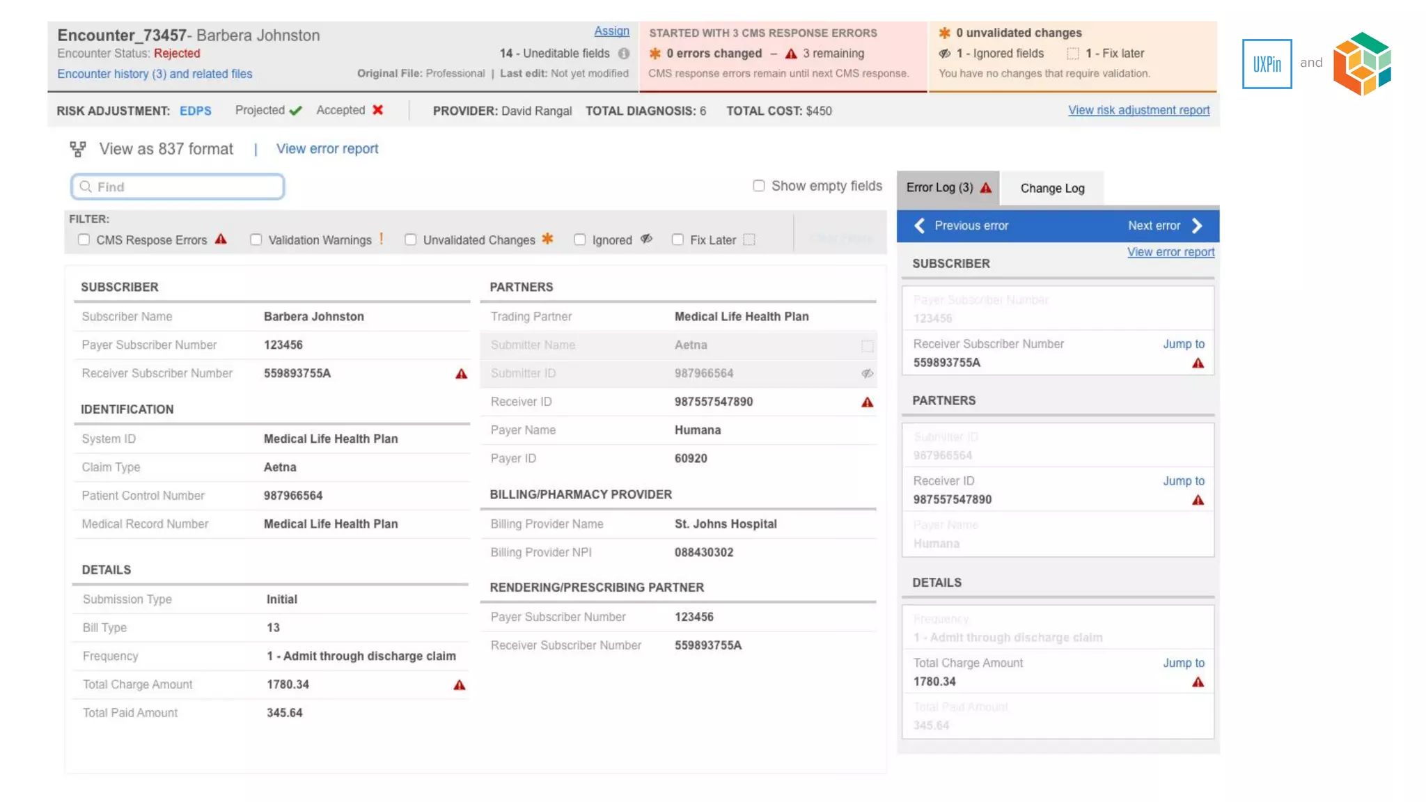

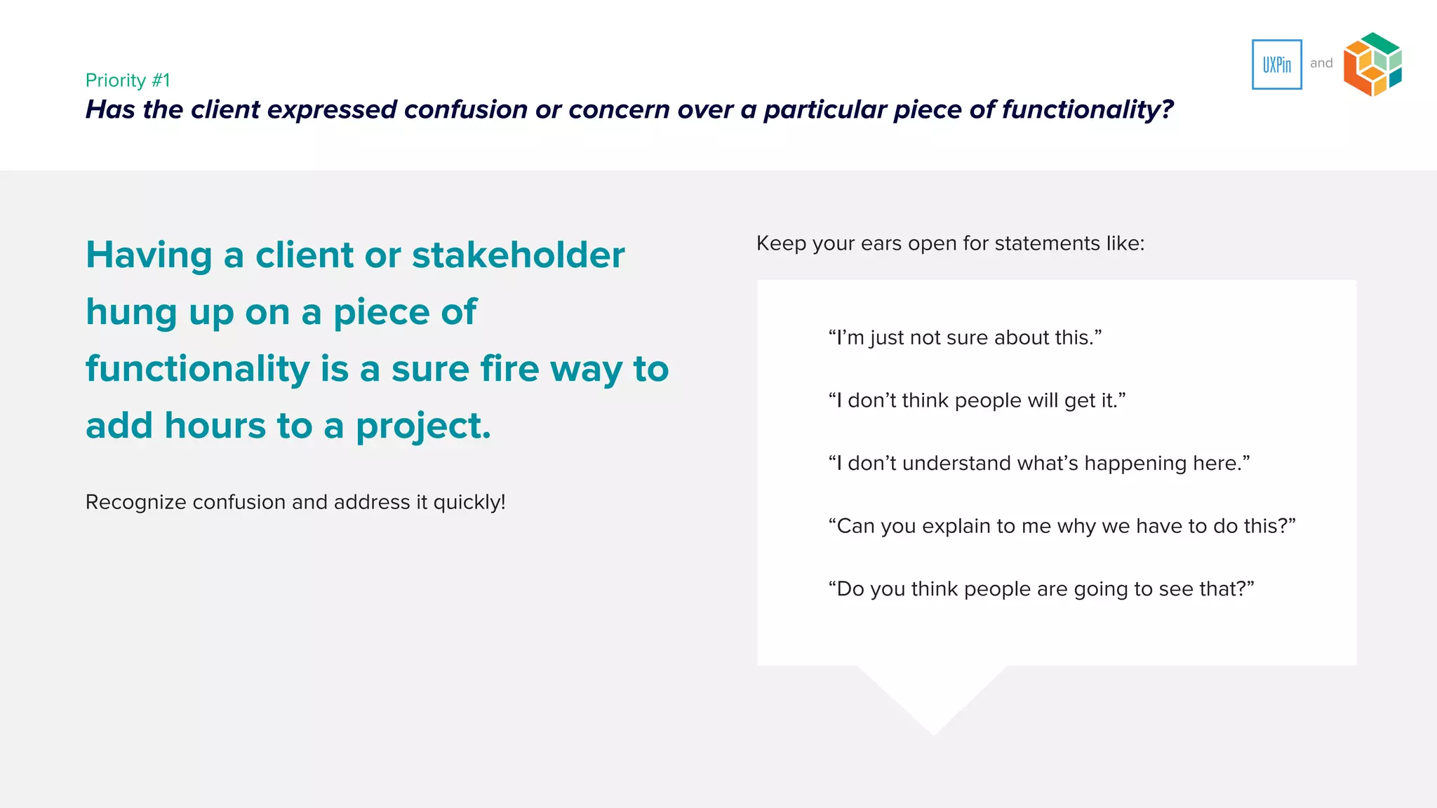


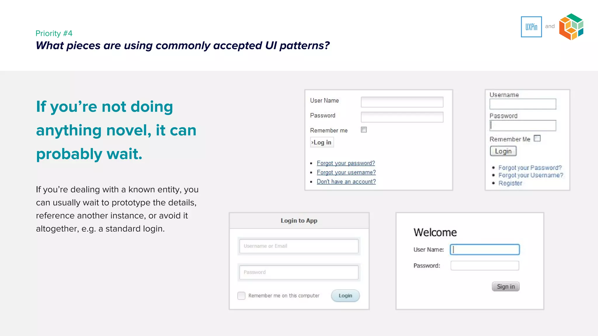
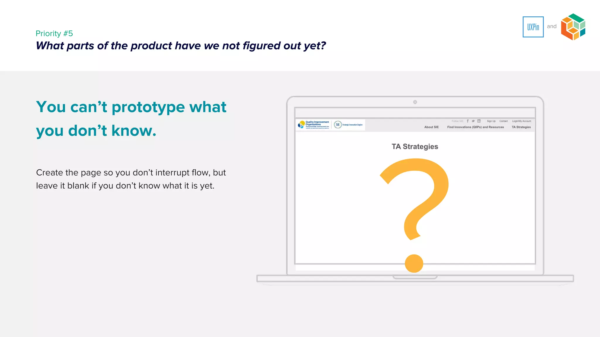

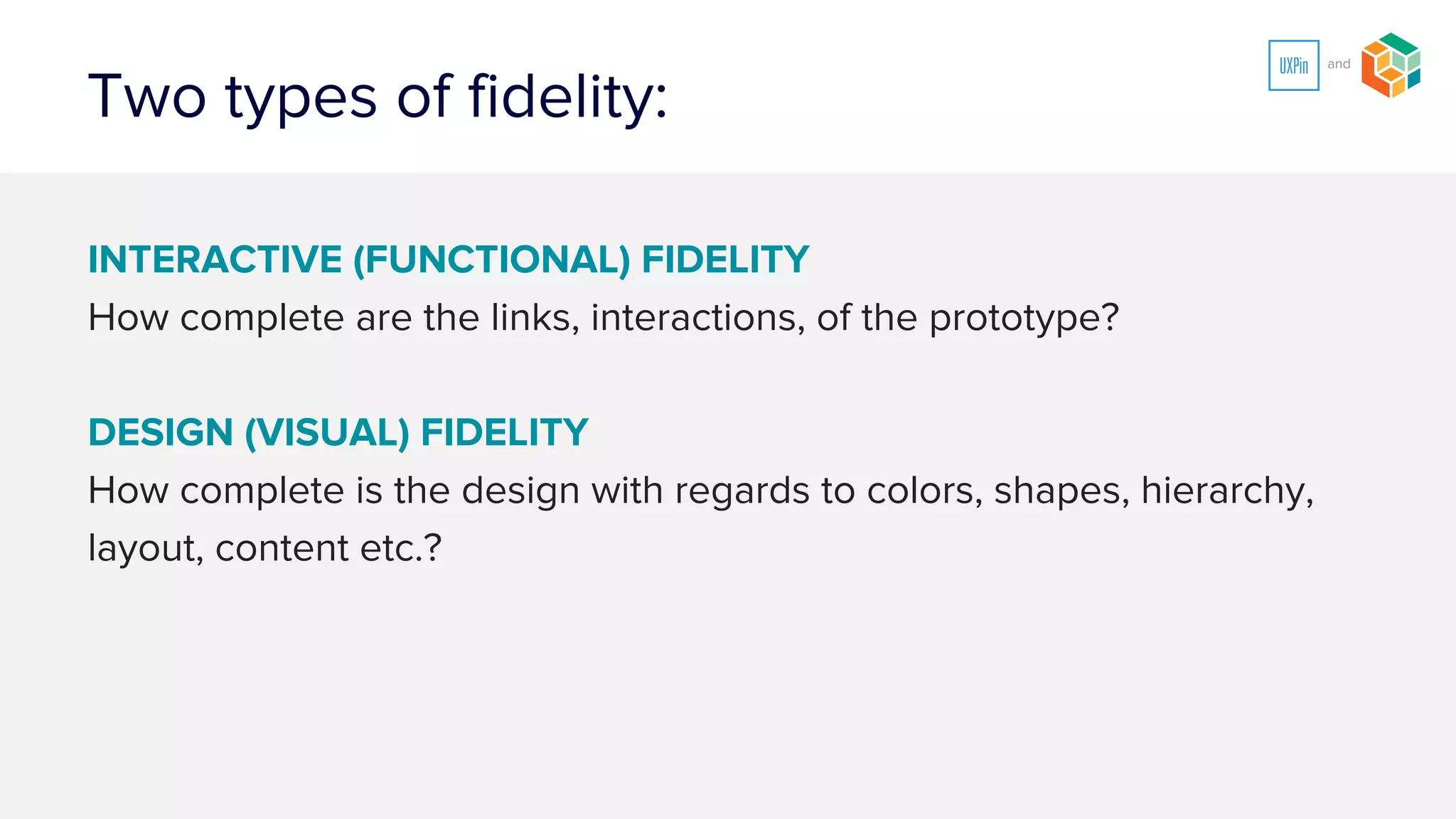


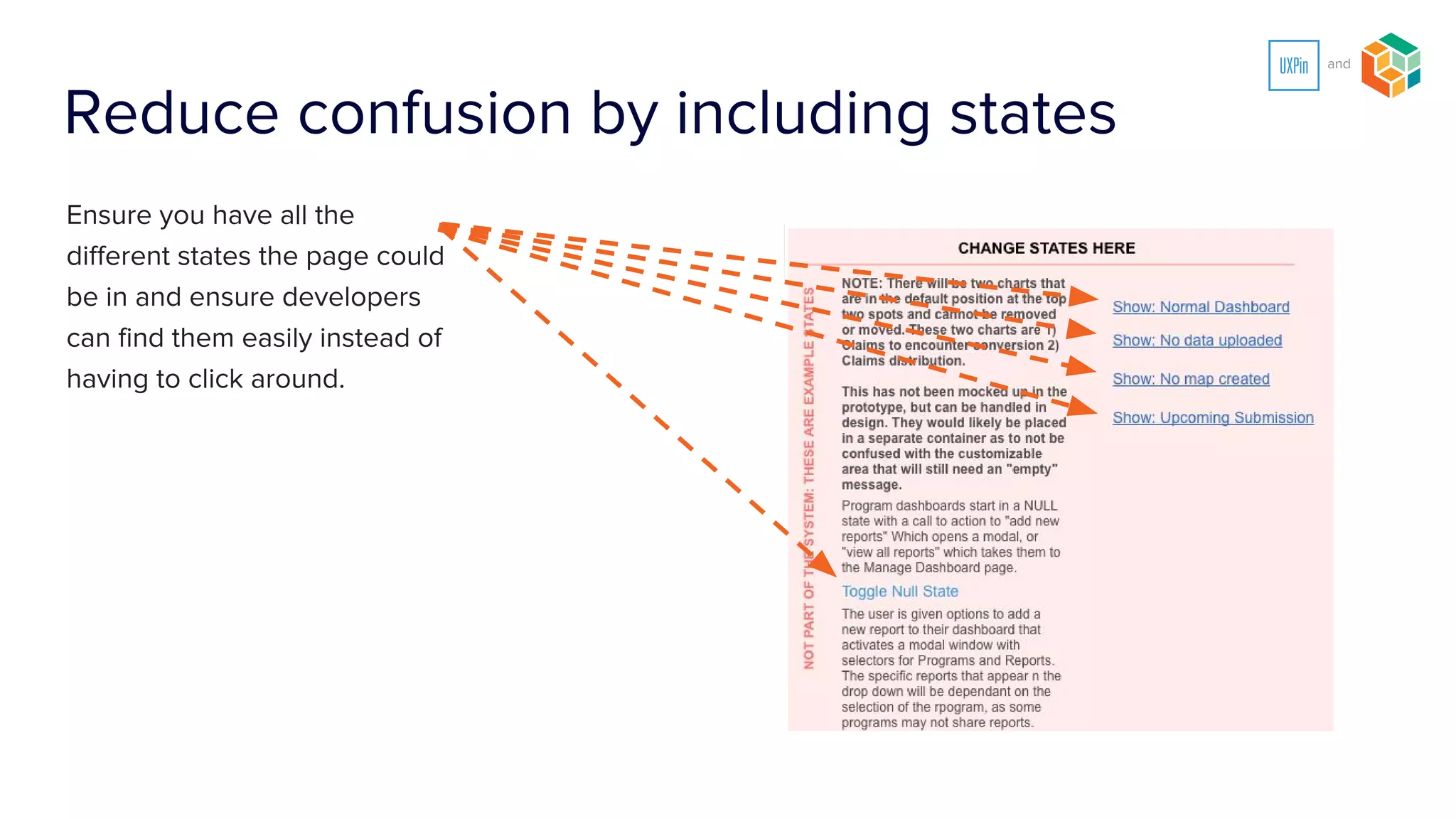
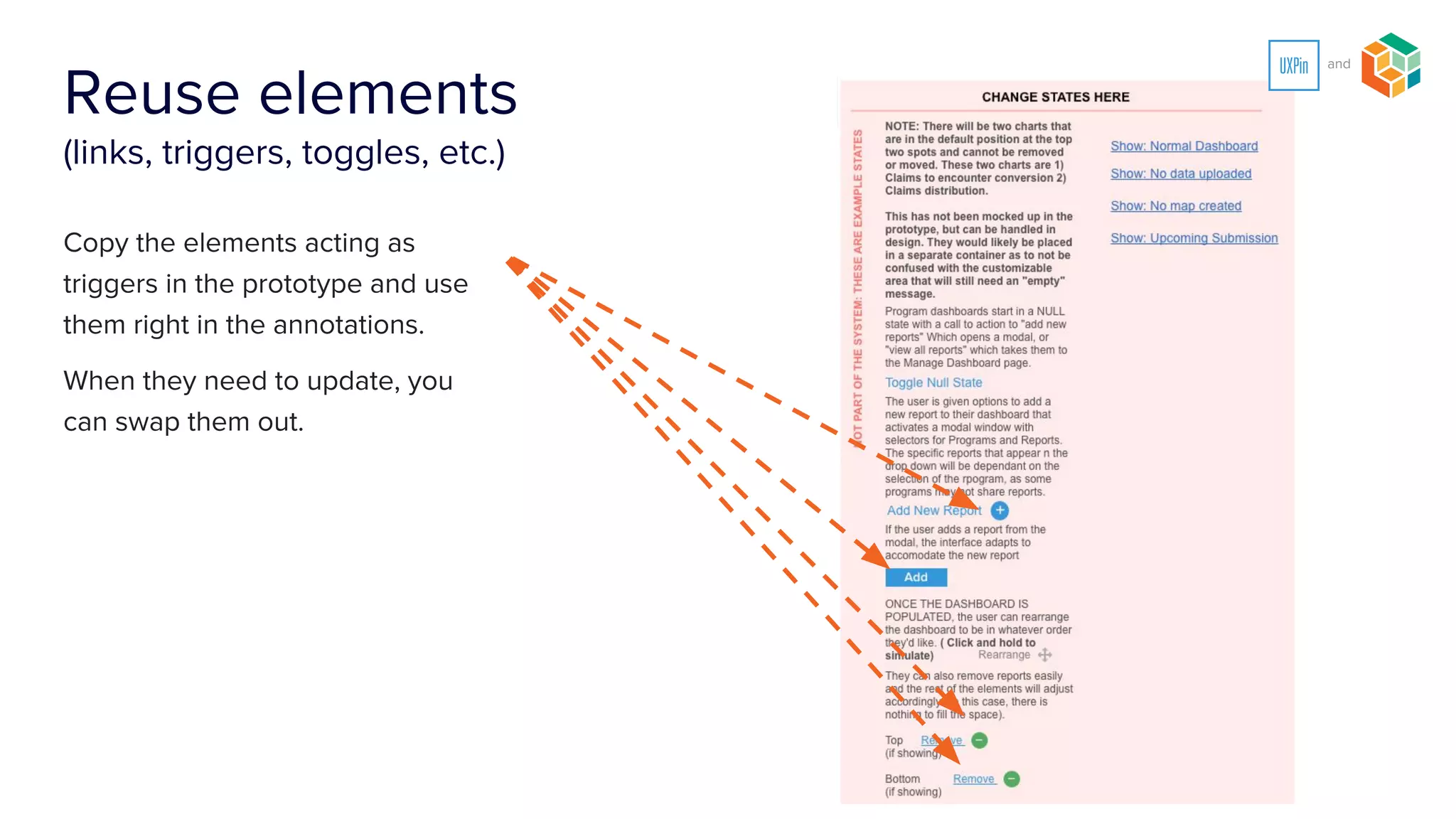

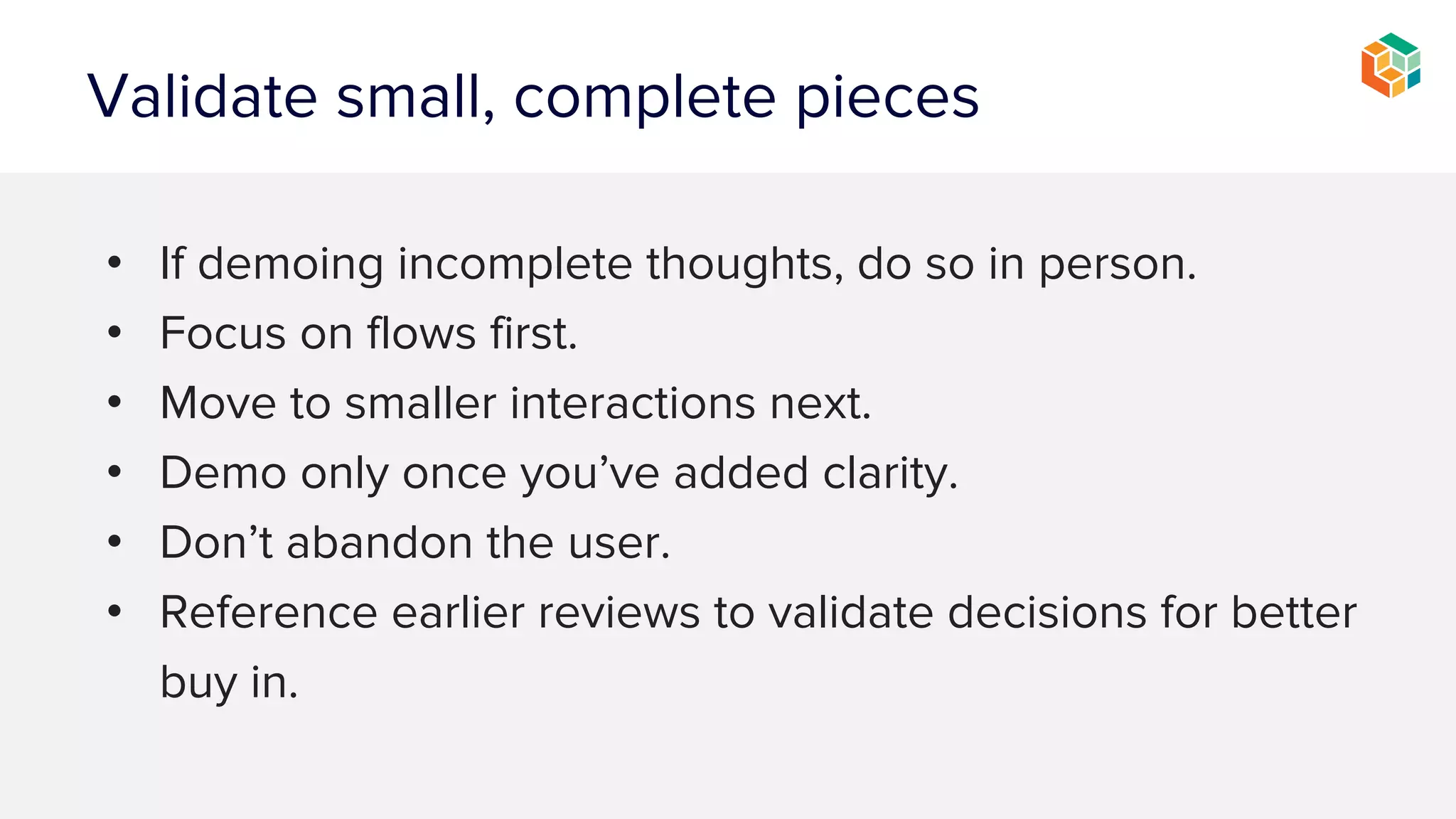


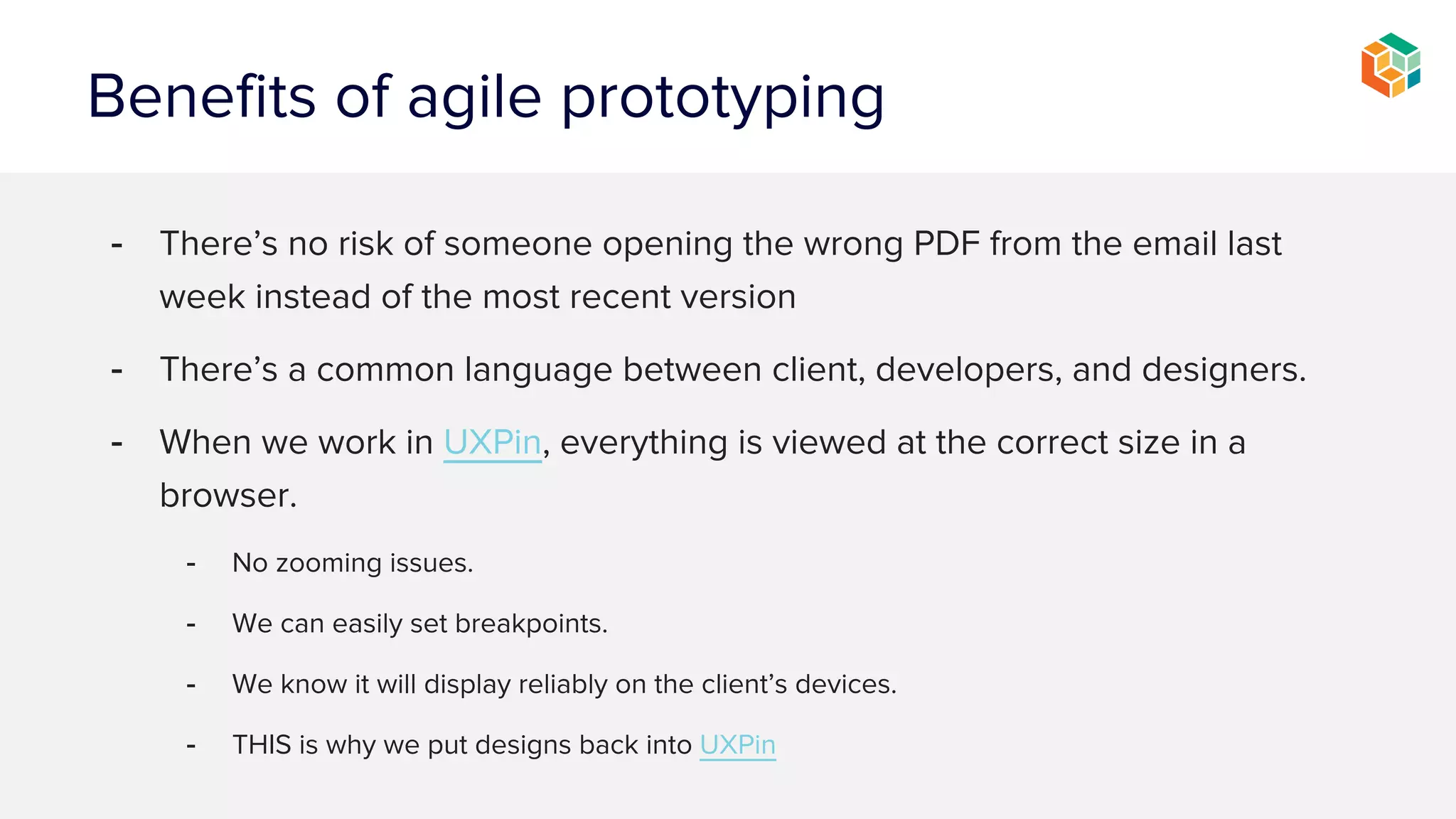
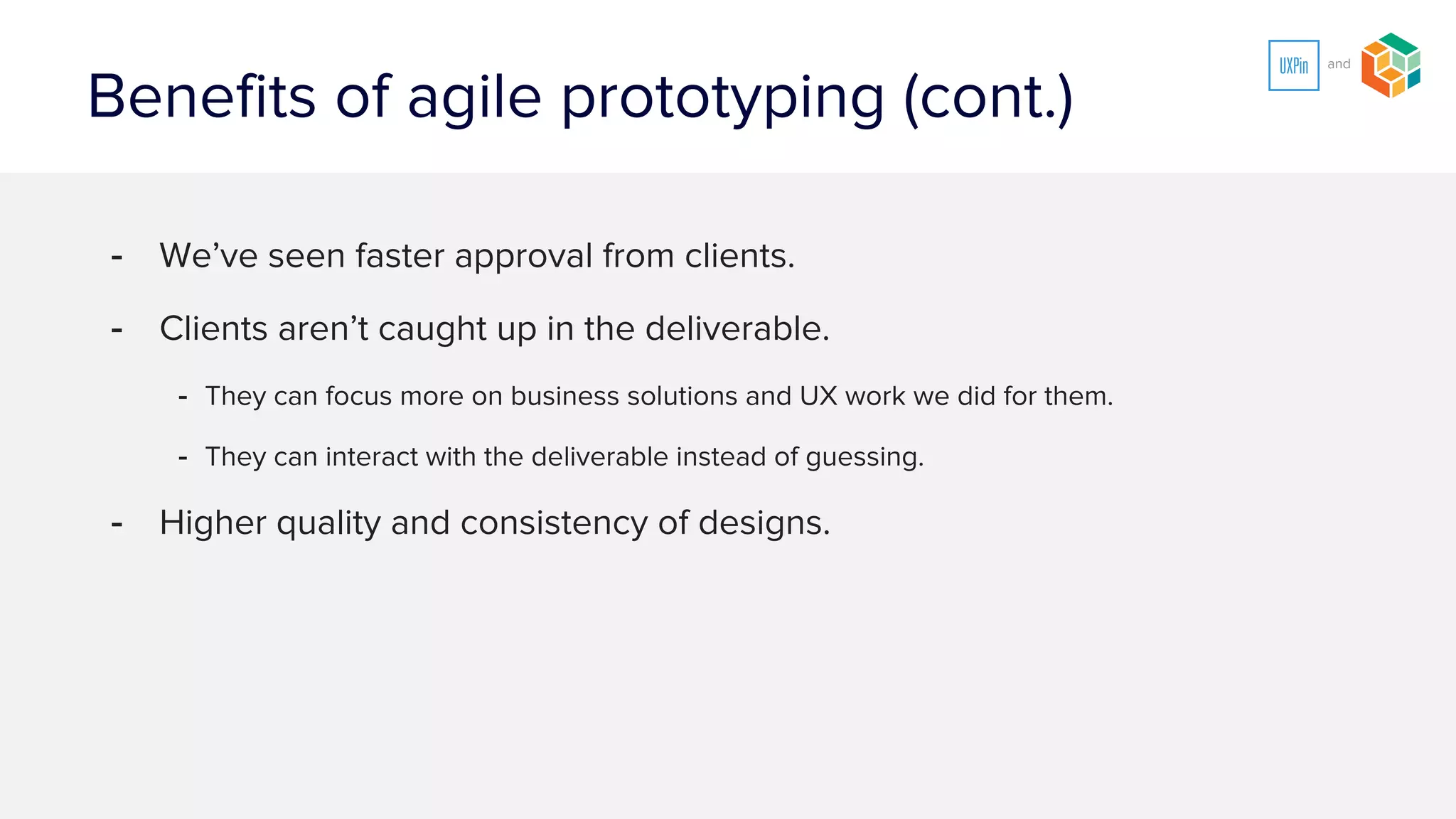
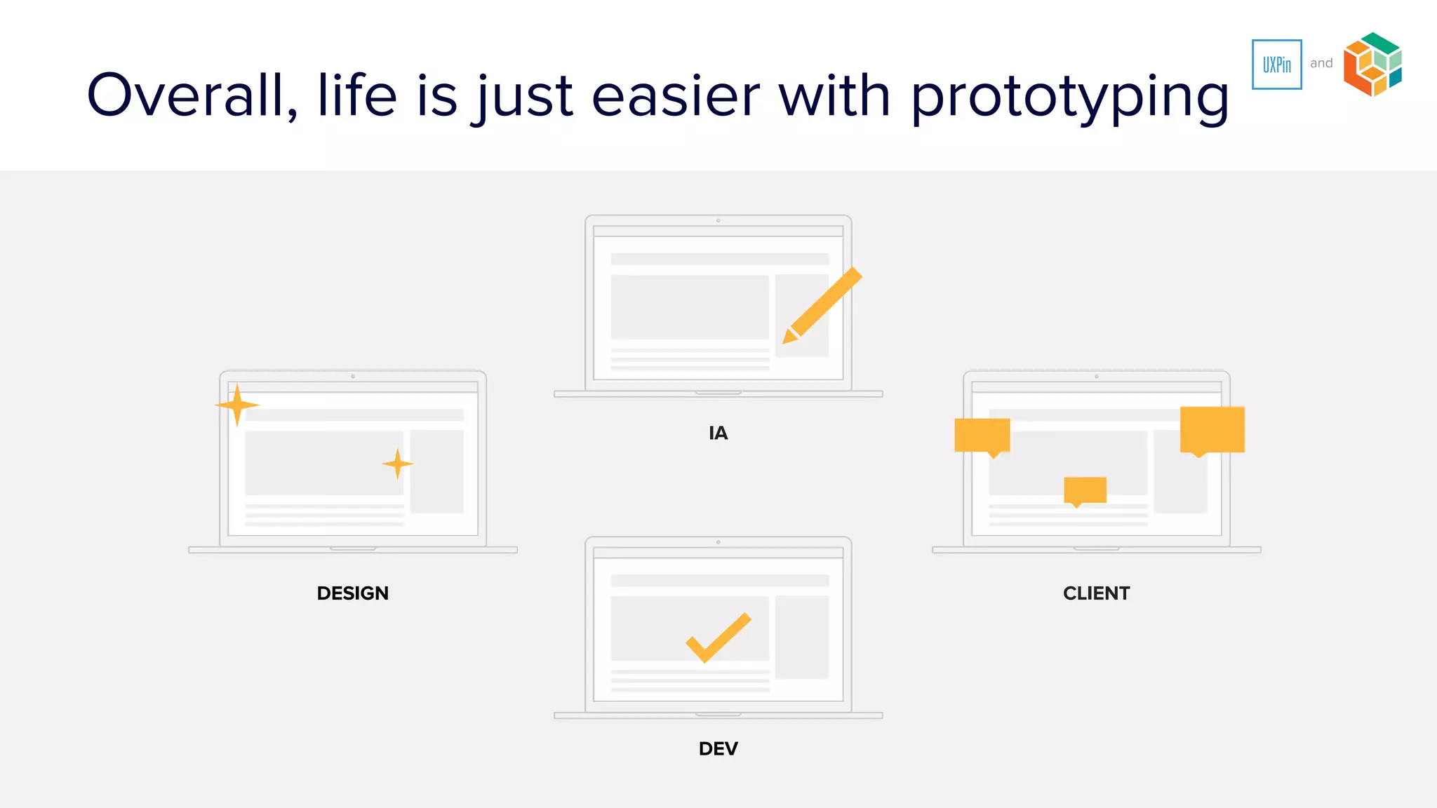
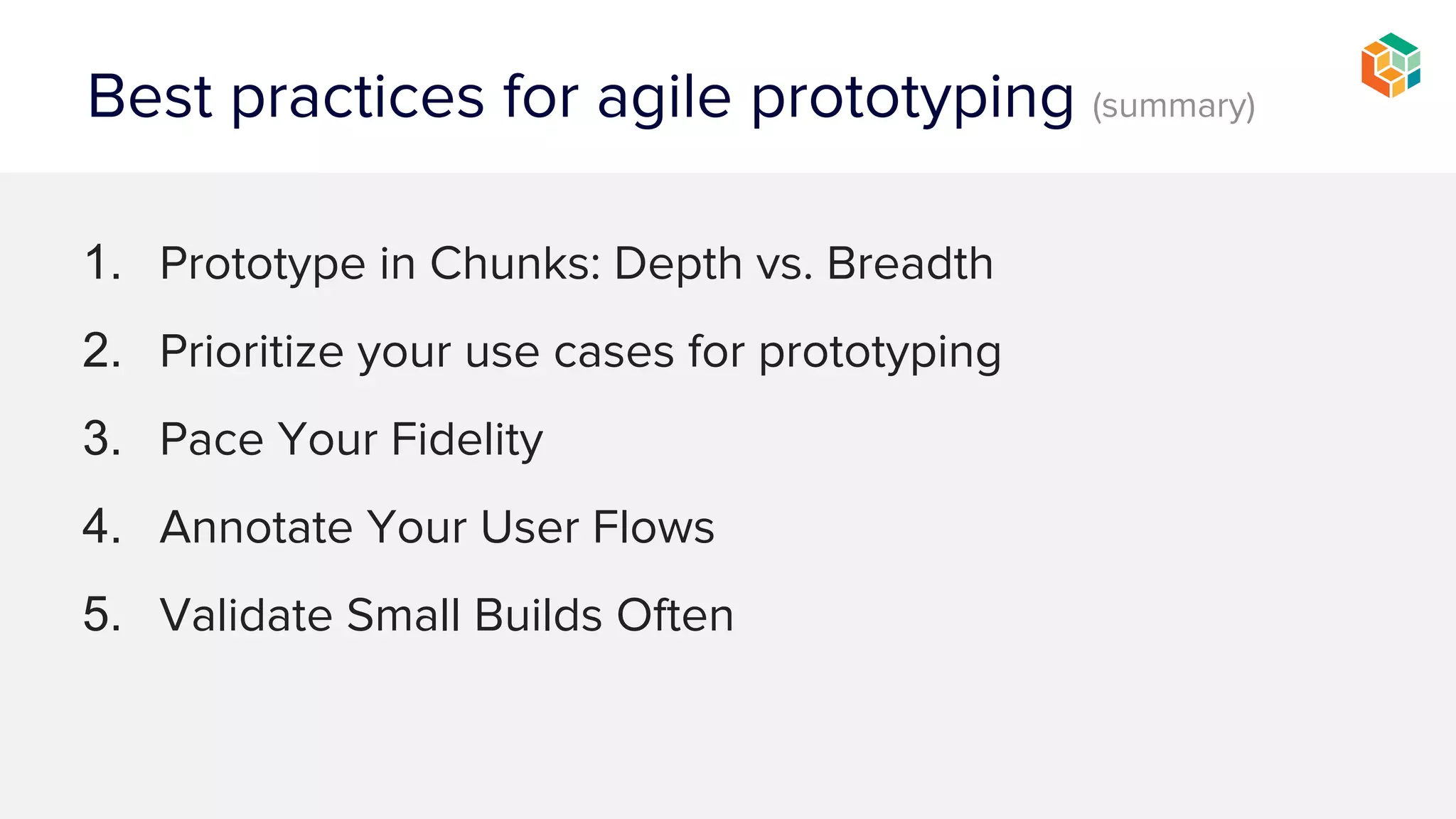


The document discusses best practices for agile prototyping in user experience design, emphasizing the importance of clear communication and collaboration between clients, designers, and developers. Key recommendations include prototyping in chunks, prioritizing use cases, pacing fidelity, annotating user flows, reusing components, and validating small builds frequently. These practices aim to streamline the design process, enhance client understanding, and improve project outcomes.


