keyframes
in an
Angular
application
◦@keyframes letsyou create animations by
gradually changing CSS styles from one state to
another.
◦In Angular, you can define and use
`@keyframes` in your component styles using
the Angular styles encapsulation mechanism.
◦@keyframes host-my-cmp_main {...}
◦creates an animation trigger named
myAnimation. You can use this trigger in your
component's template to control the
animation.
◦ This specifies the animation for when an
element enters the DOM. The :enter state is a
special state in Angular animations that applies
when an element is added to the view.
◦ The animation duration is 1 second, and the
ease-in timing function makes the animation
start slowly and then speed up.
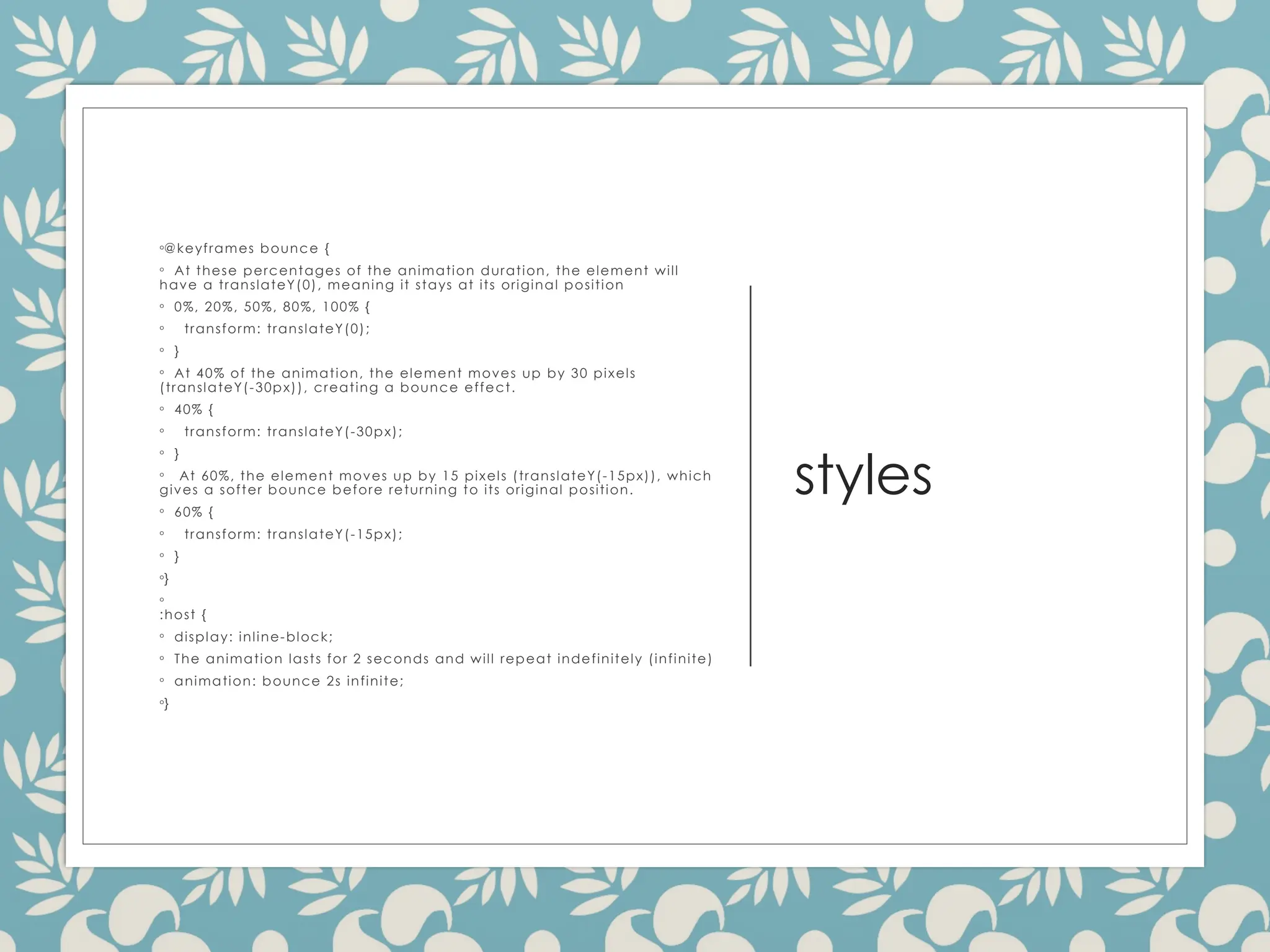
styles
◦@keyframes bounce {
◦At these percentages of the animation duration, the element will
have a translateY(0), meaning it stays at its original position
◦ 0%, 20%, 50%, 80%, 100% {
◦ transform: translateY(0);
◦ }
◦ At 40% of the animation, the element moves up by 30 pixels
(translateY(-30px)), creating a bounce effect.
◦ 40% {
◦ transform: translateY(-30px);
◦ }
◦ At 60%, the element moves up by 15 pixels (translateY(-15px)), which
gives a softer bounce before returning to its original position.
◦ 60% {
◦ transform: translateY(-15px);
◦ }
◦}
◦
:host {
◦ display: inline-block;
◦ The animation lasts for 2 seconds and will repeat indefinitely (infinite)
◦ animation: bounce 2s infinite;
◦}
5.
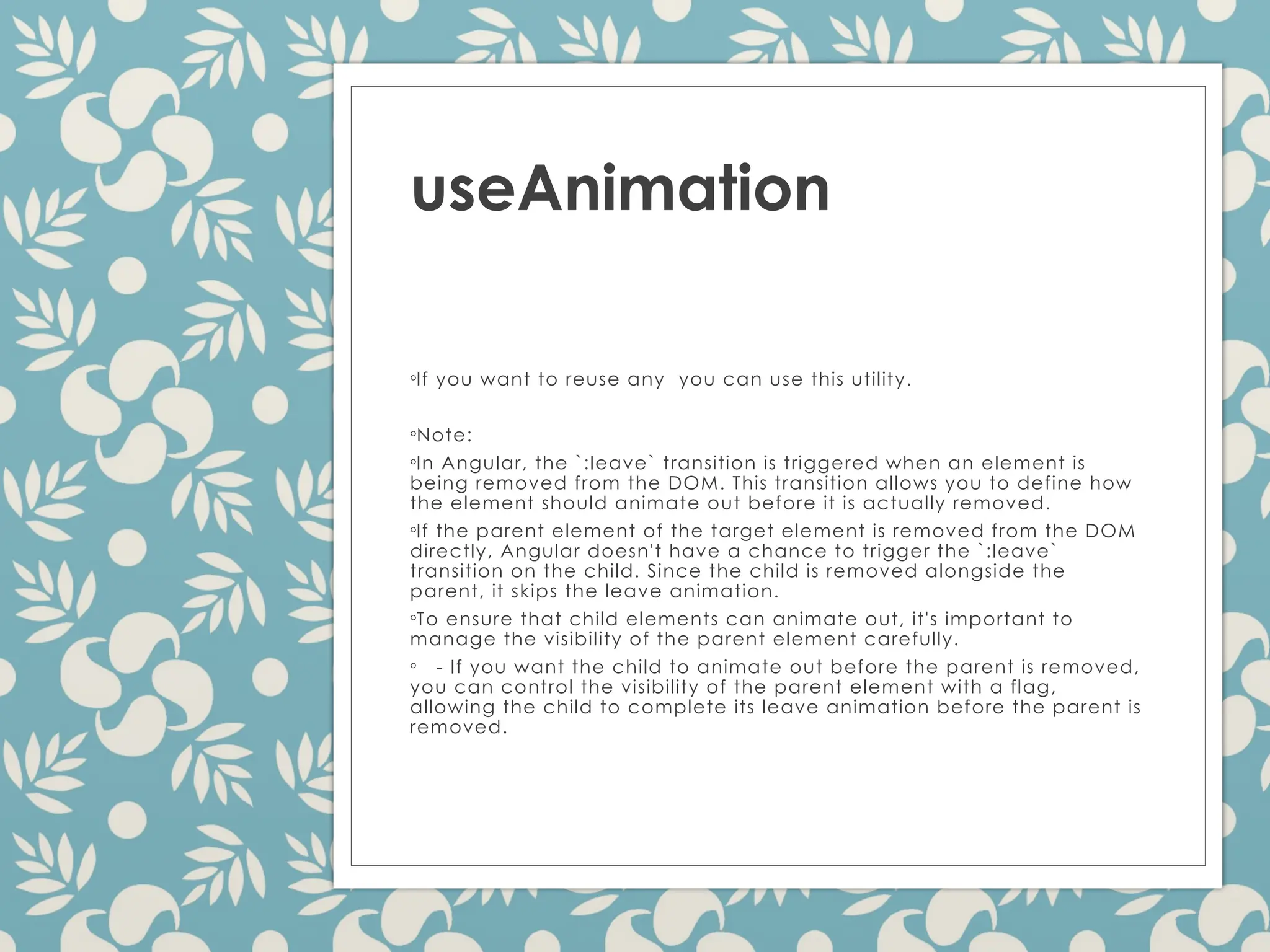
useAnimation
◦If you wantto reuse any you can use this utility.
◦Note:
◦In Angular, the `:leave` transition is triggered when an element is
being removed from the DOM. This transition allows you to define how
the element should animate out before it is actually removed.
◦If the parent element of the target element is removed from the DOM
directly, Angular doesn't have a chance to trigger the `:leave`
transition on the child. Since the child is removed alongside the
parent, it skips the leave animation.
◦To ensure that child elements can animate out, it's important to
manage the visibility of the parent element carefully.
◦ - If you want the child to animate out before the parent is removed,
you can control the visibility of the parent element with a flag,
allowing the child to complete its leave animation before the parent is
removed.
6.
Define the
reusable
color
animation
◦import {animation, style, animate } from
'@angular/animations';
◦
export const colorAnimation =
animation([
◦ style({ backgroundColor:
'{{startColor}}' }),
◦ animate('{{duration}}',
style({ backgroundColor: '{{endColor}}' })),
◦]);
◦<div *ngIf="showElement"
@animateColor>
◦ This element changes color!
◦</div>
◦<button (click)="toggle()">Toggle Color
Animation</button>
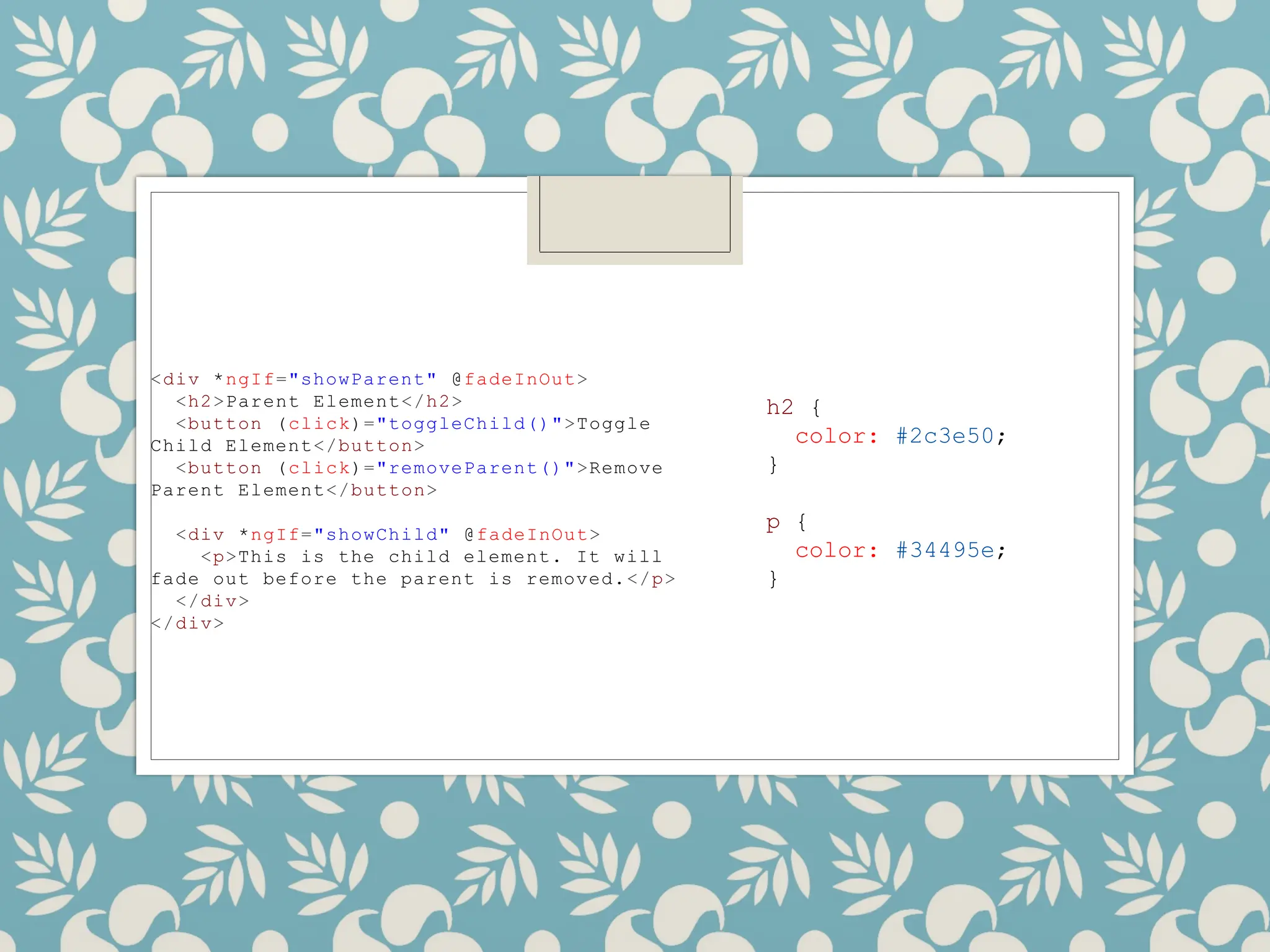
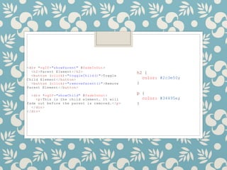
<div *ngIf="showParent" @fadeInOut>
<h2>ParentElement</h2>
<button (click)="toggleChild()">Toggle
Child Element</button>
<button (click)="removeParent()">Remove
Parent Element</button>
<div *ngIf="showChild" @fadeInOut>
<p>This is the child element. It will
fade out before the parent is removed.</p>
</div>
</div>
h2 {
color: #2c3e50;
}
p {
color: #34495e;
}

![Example
◦import { Component } from '@angular/core';
◦import { animate, style, transition, trigger } from
'@angular/animations';
◦
@Component({
◦ selector: 'app-my-component',
◦ templateUrl: './my-component.component.html',
◦ styleUrls: ['./my-component.component.css'],
◦ animations: [
◦ trigger('myAnimation', [
◦ transition(':enter', [
◦ style({ opacity: 0 }),
◦ animate('1s ease-in', style({ opacity: 1 }))
◦ ]),
◦ ])
◦ ]
◦})
◦export class MyComponent { }](https://image.slidesharecdn.com/animations-250708150533-61cc51cb/85/Animations-keyframes-in-an-Angular-application-3-320.jpg)

![Define the
reusable
color
animation
◦import { animation, style, animate } from
'@angular/animations';
◦
export const colorAnimation =
animation([
◦ style({ backgroundColor:
'{{startColor}}' }),
◦ animate('{{duration}}',
style({ backgroundColor: '{{endColor}}' })),
◦]);
◦<div *ngIf="showElement"
@animateColor>
◦ This element changes color!
◦</div>
◦<button (click)="toggle()">Toggle Color
Animation</button>](https://image.slidesharecdn.com/animations-250708150533-61cc51cb/85/Animations-keyframes-in-an-Angular-application-6-320.jpg)
![◦@Component({
◦ selector: 'app-my-component',
◦ templateUrl: './my-component.component.html',
◦ styleUrls: ['./my-component.component.css'],
◦ animations: [
◦ trigger('animateColor', [
◦ transition(':enter, :leave', [
◦ useAnimation(colorAnimation, {
◦ params: {
◦ startColor: 'white',
◦ endColor: 'blue',
◦ duration: '1s',
◦ },
◦ }),
◦ ]),
◦ ]),
◦ ],
◦})
◦export class MyComponent {
◦ // You can toggle a condition to trigger the animation
◦ showElement = false;
◦
toggle() {
◦ this.showElement = !this.showElement;
◦ }
◦}](https://image.slidesharecdn.com/animations-250708150533-61cc51cb/85/Animations-keyframes-in-an-Angular-application-7-320.jpg)
![import { Component } from
'@angular/core';
import { trigger, transition,
style, animate } from
'@angular/animations';
@Component({
selector: 'app-my-component',
templateUrl: './my-
component.component.html',
styleUrls: ['./my-
component.component.css'],
animations: [
trigger('fadeInOut', [
transition(':enter', [
style({ opacity: 0 }),
animate('1s',
style({ opacity: 1 })),
]),
transition(':leave', [
animate('1s',
style({ opacity: 0 })),
]),
]),
],
})
export class MyComponent {
showParent = true;
showChild = false;
toggleChild() {
this.showChild = !
this.showChild;
}
removeParent() {
this.showParent = false;
}
}](https://image.slidesharecdn.com/animations-250708150533-61cc51cb/85/Animations-keyframes-in-an-Angular-application-8-320.jpg)

![Example
◦import { Component } from '@angular/core';
◦import { animate, style, transition, trigger } from
'@angular/animations';
◦
@Component({
◦ selector: 'app-my-component',
◦ templateUrl: './my-component.component.html',
◦ styleUrls: ['./my-component.component.css'],
◦ animations: [
◦ trigger('myAnimation', [
◦ transition(':enter', [
◦ style({ opacity: 0 }),
◦ animate('1s ease-in', style({ opacity: 1 }))
◦ ]),
◦ ])
◦ ]
◦})
◦export class MyComponent { }](https://image.slidesharecdn.com/animations-250708150533-61cc51cb/75/Animations-keyframes-in-an-Angular-application-3-2048.jpg)
![Define the
reusable
color
animation
◦import { animation, style, animate } from
'@angular/animations';
◦
export const colorAnimation =
animation([
◦ style({ backgroundColor:
'{{startColor}}' }),
◦ animate('{{duration}}',
style({ backgroundColor: '{{endColor}}' })),
◦]);
◦<div *ngIf="showElement"
@animateColor>
◦ This element changes color!
◦</div>
◦<button (click)="toggle()">Toggle Color
Animation</button>](https://image.slidesharecdn.com/animations-250708150533-61cc51cb/75/Animations-keyframes-in-an-Angular-application-6-2048.jpg)
![◦@Component({
◦ selector: 'app-my-component',
◦ templateUrl: './my-component.component.html',
◦ styleUrls: ['./my-component.component.css'],
◦ animations: [
◦ trigger('animateColor', [
◦ transition(':enter, :leave', [
◦ useAnimation(colorAnimation, {
◦ params: {
◦ startColor: 'white',
◦ endColor: 'blue',
◦ duration: '1s',
◦ },
◦ }),
◦ ]),
◦ ]),
◦ ],
◦})
◦export class MyComponent {
◦ // You can toggle a condition to trigger the animation
◦ showElement = false;
◦
toggle() {
◦ this.showElement = !this.showElement;
◦ }
◦}](https://image.slidesharecdn.com/animations-250708150533-61cc51cb/75/Animations-keyframes-in-an-Angular-application-7-2048.jpg)
![import { Component } from
'@angular/core';
import { trigger, transition,
style, animate } from
'@angular/animations';
@Component({
selector: 'app-my-component',
templateUrl: './my-
component.component.html',
styleUrls: ['./my-
component.component.css'],
animations: [
trigger('fadeInOut', [
transition(':enter', [
style({ opacity: 0 }),
animate('1s',
style({ opacity: 1 })),
]),
transition(':leave', [
animate('1s',
style({ opacity: 0 })),
]),
]),
],
})
export class MyComponent {
showParent = true;
showChild = false;
toggleChild() {
this.showChild = !
this.showChild;
}
removeParent() {
this.showParent = false;
}
}](https://image.slidesharecdn.com/animations-250708150533-61cc51cb/75/Animations-keyframes-in-an-Angular-application-8-2048.jpg)