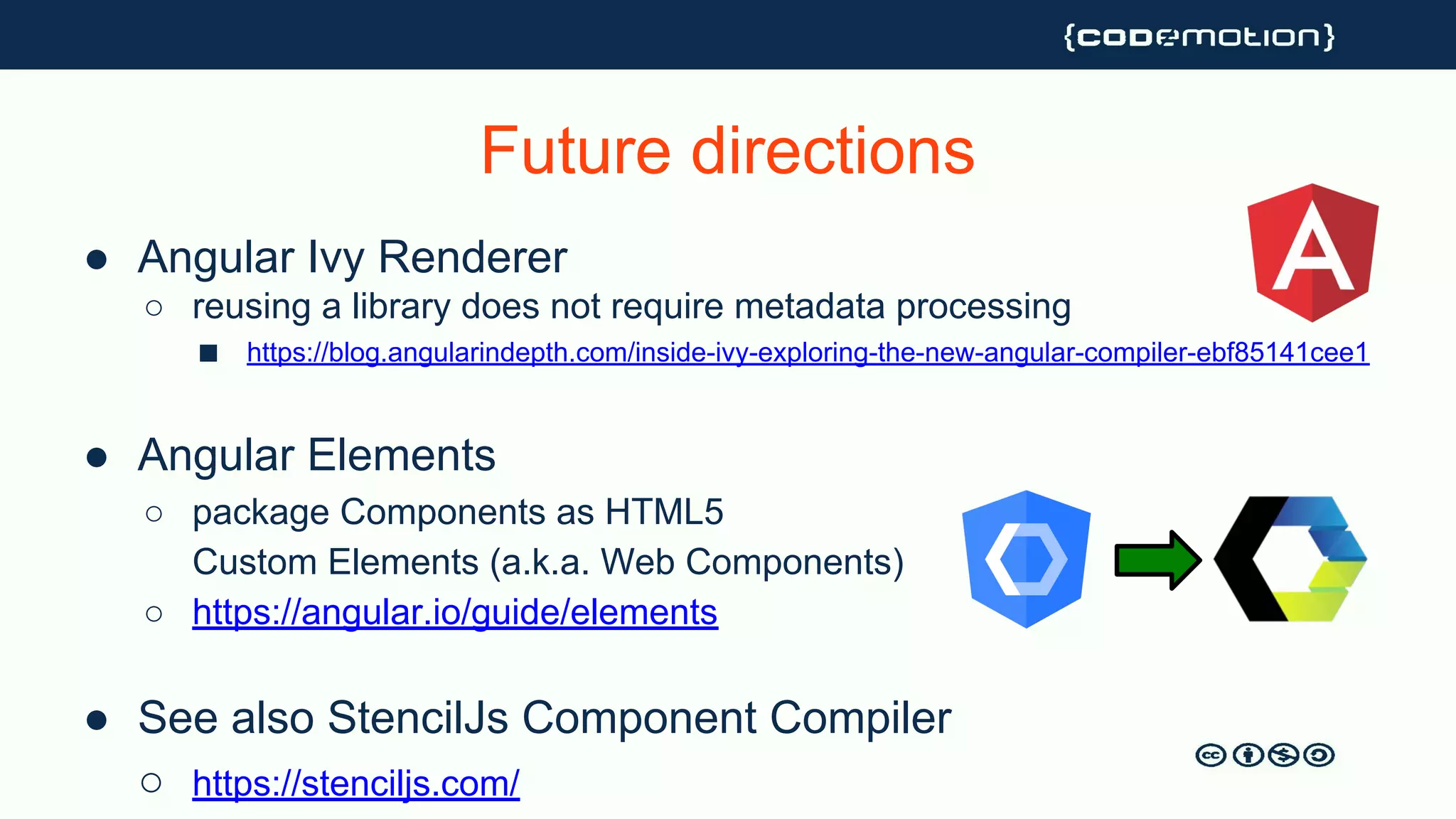
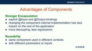
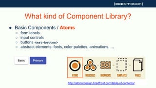
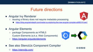
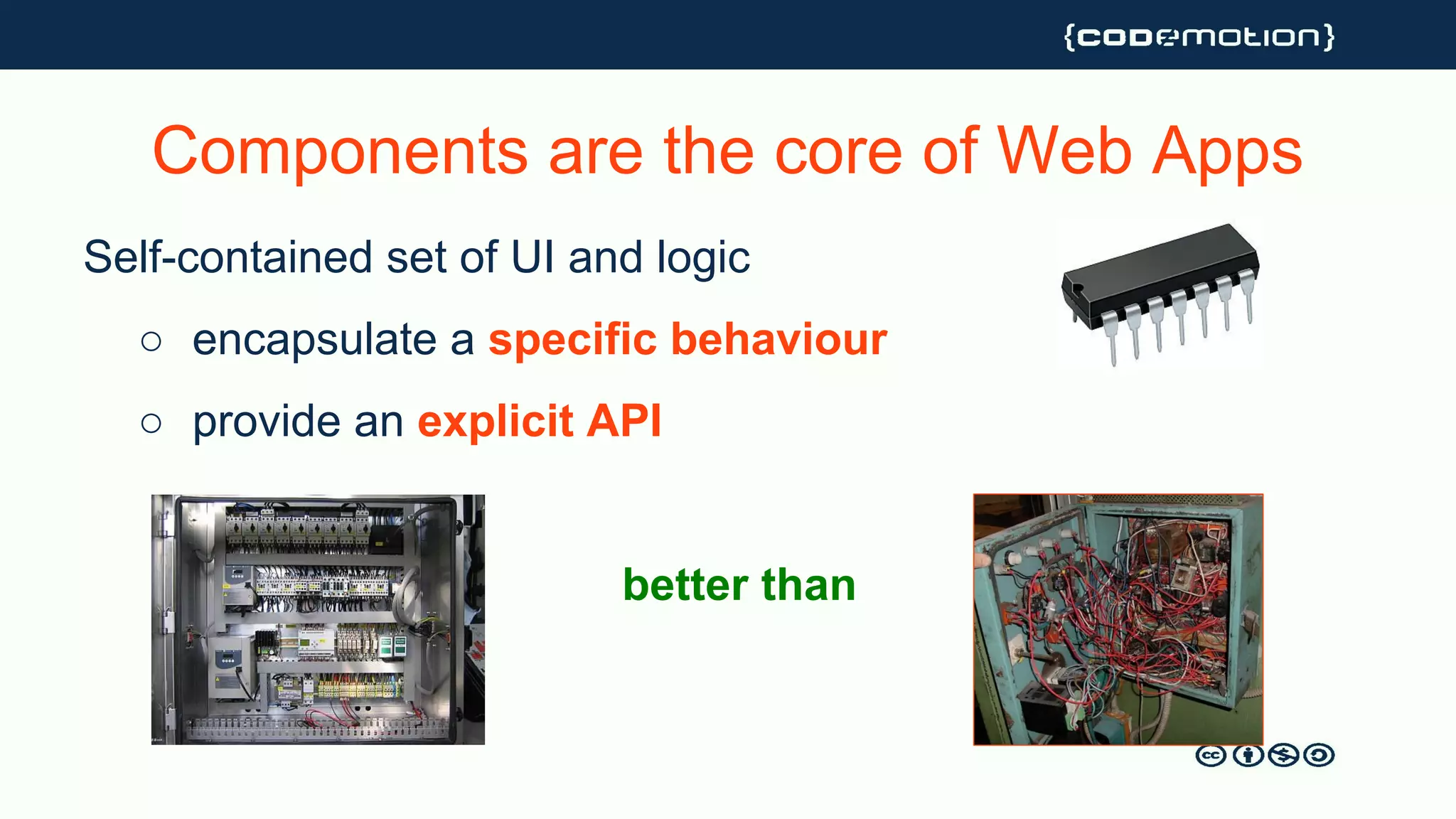
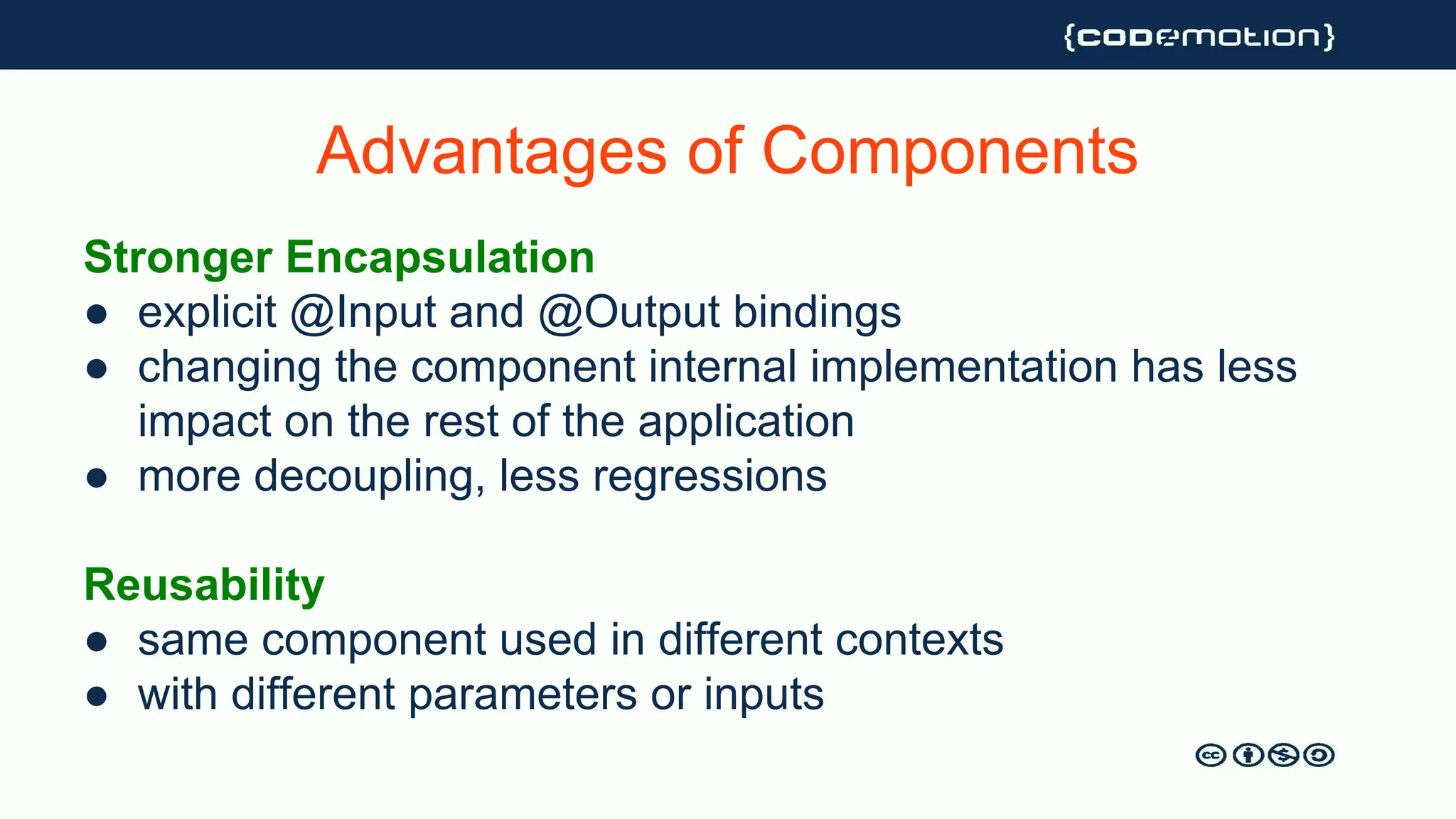
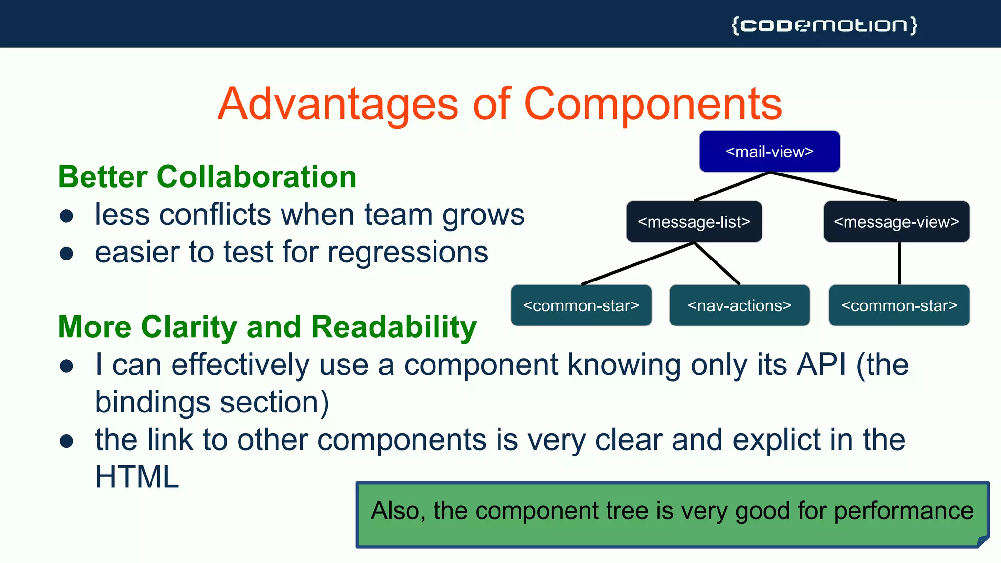
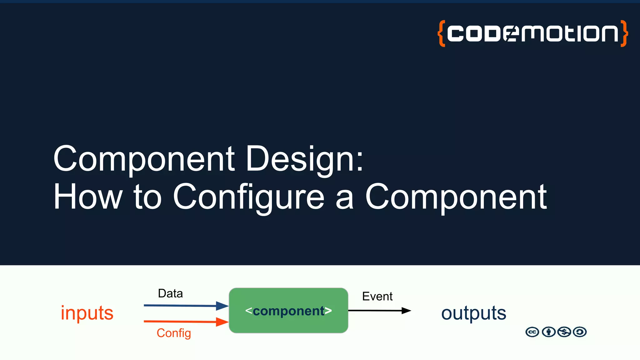
The document outlines the importance of building a component library in Angular, highlighting benefits such as encapsulation, reusability, and improved collaboration. It details the types of components (atoms, molecules, organisms) and their design patterns, encouraging a focus on clear API design, documentation, and packaging. Additionally, it discusses future directions for component libraries, including Angular Ivy and the concept of Angular elements.


![● Attributes
○ width, height, orientation
● Bindable @Inputs
○ mode, disabled <ht-button [disabled]=”!editable”>
● Library-Level Options
○ global defaults, from ConfigurationService or Injection Token
export const CONFIG = new InjectionToken<string>('config');
class DatePickerComponent {
constructor( @Inject(CONFIG) private configuration: Configuration) { }
ngOnInit() {
if (!this.dateFormat) this.dateFormat = this.configuration.defaultDateFormat;
}
Component Configuration](https://image.slidesharecdn.com/codemotionmilan2018-buildyourownangularcomponentlibrary1-181210095532/85/Build-Your-Own-Angular-Component-Library-17-320.jpg)


![Using @Input()
Using plain variables/arrays for @Input
● data owned by parent
● better for stateless / “dumb” components
<user-details [user]=”currentUser”>
Using Observable for @Input
● if you want to listen to changes continuously or
asynchronously
<realtime-chart [dataStream]=”stockValueStream” >](https://image.slidesharecdn.com/codemotionmilan2018-buildyourownangularcomponentlibrary1-181210095532/85/Build-Your-Own-Angular-Component-Library-20-320.jpg)
![Parent Component
todoList: string[] = [ ]
Output → Push string into todoList
@Input() todos: string[]](https://image.slidesharecdn.com/codemotionmilan2018-buildyourownangularcomponentlibrary1-181210095532/85/Build-Your-Own-Angular-Component-Library-21-320.jpg)
![Parent Component
todoList: Observable<string[]>
Output → Push string into todoList
@Input() todos: Observable<string[]>](https://image.slidesharecdn.com/codemotionmilan2018-buildyourownangularcomponentlibrary1-181210095532/85/Build-Your-Own-Angular-Component-Library-22-320.jpg)
![Parent Component
todoList: Observable<string[]>
Output → Push string into todoList
@Input() todos: string[]
Use “| async”](https://image.slidesharecdn.com/codemotionmilan2018-buildyourownangularcomponentlibrary1-181210095532/85/Build-Your-Own-Angular-Component-Library-23-320.jpg)

![An Example from Angular Material
abstract DataSource<T>
○ connect(...): Observable<T[]>
○ disconnect(...): void
TableDataSource<T> extends DataSource<T>
○ page(...): Observable<T[]>
○ sort(...): Observable<T[]>
○ filter(...): Observable<T[]>
https://material.angular.io/components/table/api#MatTableDataSource](https://image.slidesharecdn.com/codemotionmilan2018-buildyourownangularcomponentlibrary1-181210095532/85/Build-Your-Own-Angular-Component-Library-25-320.jpg)
![Multi-mode @Inputs
The component auto-adapts to the provided input
For example, to populate a mat-table we can use
○ a simple T[] if our data are static
○ an Observable<T[]>
○ a DataSource<T>](https://image.slidesharecdn.com/codemotionmilan2018-buildyourownangularcomponentlibrary1-181210095532/85/Build-Your-Own-Angular-Component-Library-26-320.jpg)


![Implement the Decorator Pattern to add cross-cutting
behaviour to a set of components
● <ht-modal>
● <ht-input-container>
○ provides label, required,
validation errors to an input
<ht-input-container>
<ht-input [(ngModel)]=...
</ht-input-container>
○ uses @ContentChild
to access the control
Decorator Component Pattern](https://image.slidesharecdn.com/codemotionmilan2018-buildyourownangularcomponentlibrary1-181210095532/85/Build-Your-Own-Angular-Component-Library-32-320.jpg)


![● Attributes
○ width, height, orientation
● Bindable @Inputs
○ mode, disabled <ht-button [disabled]=”!editable”>
● Library-Level Options
○ global defaults, from ConfigurationService or Injection Token
export const CONFIG = new InjectionToken<string>('config');
class DatePickerComponent {
constructor( @Inject(CONFIG) private configuration: Configuration) { }
ngOnInit() {
if (!this.dateFormat) this.dateFormat = this.configuration.defaultDateFormat;
}
Component Configuration](https://image.slidesharecdn.com/codemotionmilan2018-buildyourownangularcomponentlibrary1-181210095532/75/Build-Your-Own-Angular-Component-Library-17-2048.jpg)
![Using @Input()
Using plain variables/arrays for @Input
● data owned by parent
● better for stateless / “dumb” components
<user-details [user]=”currentUser”>
Using Observable for @Input
● if you want to listen to changes continuously or
asynchronously
<realtime-chart [dataStream]=”stockValueStream” >](https://image.slidesharecdn.com/codemotionmilan2018-buildyourownangularcomponentlibrary1-181210095532/75/Build-Your-Own-Angular-Component-Library-20-2048.jpg)
![Parent Component
todoList: string[] = [ ]
Output → Push string into todoList
@Input() todos: string[]](https://image.slidesharecdn.com/codemotionmilan2018-buildyourownangularcomponentlibrary1-181210095532/75/Build-Your-Own-Angular-Component-Library-21-2048.jpg)
![Parent Component
todoList: Observable<string[]>
Output → Push string into todoList
@Input() todos: Observable<string[]>](https://image.slidesharecdn.com/codemotionmilan2018-buildyourownangularcomponentlibrary1-181210095532/75/Build-Your-Own-Angular-Component-Library-22-2048.jpg)
![Parent Component
todoList: Observable<string[]>
Output → Push string into todoList
@Input() todos: string[]
Use “| async”](https://image.slidesharecdn.com/codemotionmilan2018-buildyourownangularcomponentlibrary1-181210095532/75/Build-Your-Own-Angular-Component-Library-23-2048.jpg)
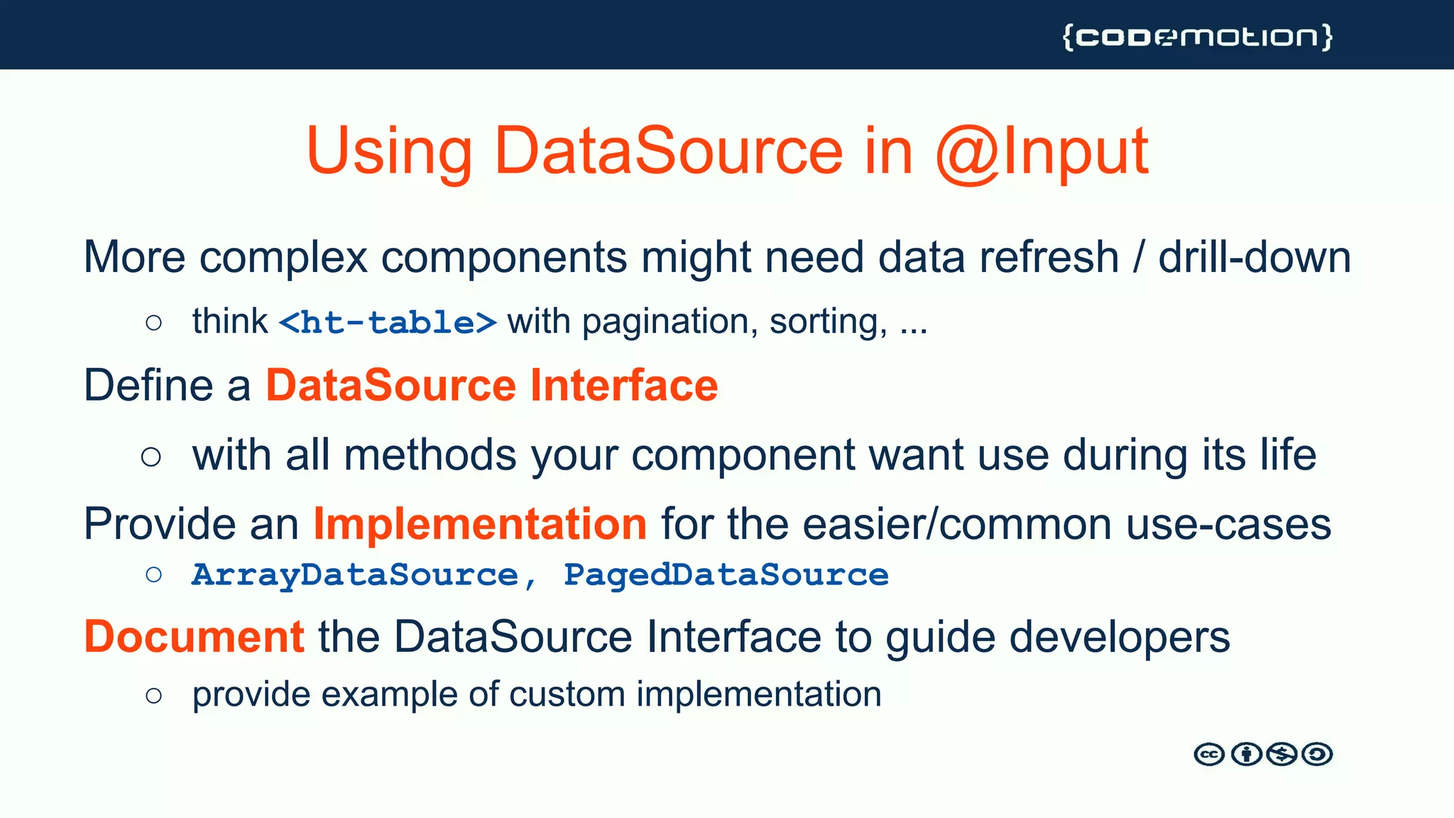
![An Example from Angular Material
abstract DataSource<T>
○ connect(...): Observable<T[]>
○ disconnect(...): void
TableDataSource<T> extends DataSource<T>
○ page(...): Observable<T[]>
○ sort(...): Observable<T[]>
○ filter(...): Observable<T[]>
https://material.angular.io/components/table/api#MatTableDataSource](https://image.slidesharecdn.com/codemotionmilan2018-buildyourownangularcomponentlibrary1-181210095532/75/Build-Your-Own-Angular-Component-Library-25-2048.jpg)
![Multi-mode @Inputs
The component auto-adapts to the provided input
For example, to populate a mat-table we can use
○ a simple T[] if our data are static
○ an Observable<T[]>
○ a DataSource<T>](https://image.slidesharecdn.com/codemotionmilan2018-buildyourownangularcomponentlibrary1-181210095532/75/Build-Your-Own-Angular-Component-Library-26-2048.jpg)

![Implement the Decorator Pattern to add cross-cutting
behaviour to a set of components
● <ht-modal>
● <ht-input-container>
○ provides label, required,
validation errors to an input
<ht-input-container>
<ht-input [(ngModel)]=...
</ht-input-container>
○ uses @ContentChild
to access the control
Decorator Component Pattern](https://image.slidesharecdn.com/codemotionmilan2018-buildyourownangularcomponentlibrary1-181210095532/75/Build-Your-Own-Angular-Component-Library-32-2048.jpg)