Download to read offline


![Example: setup
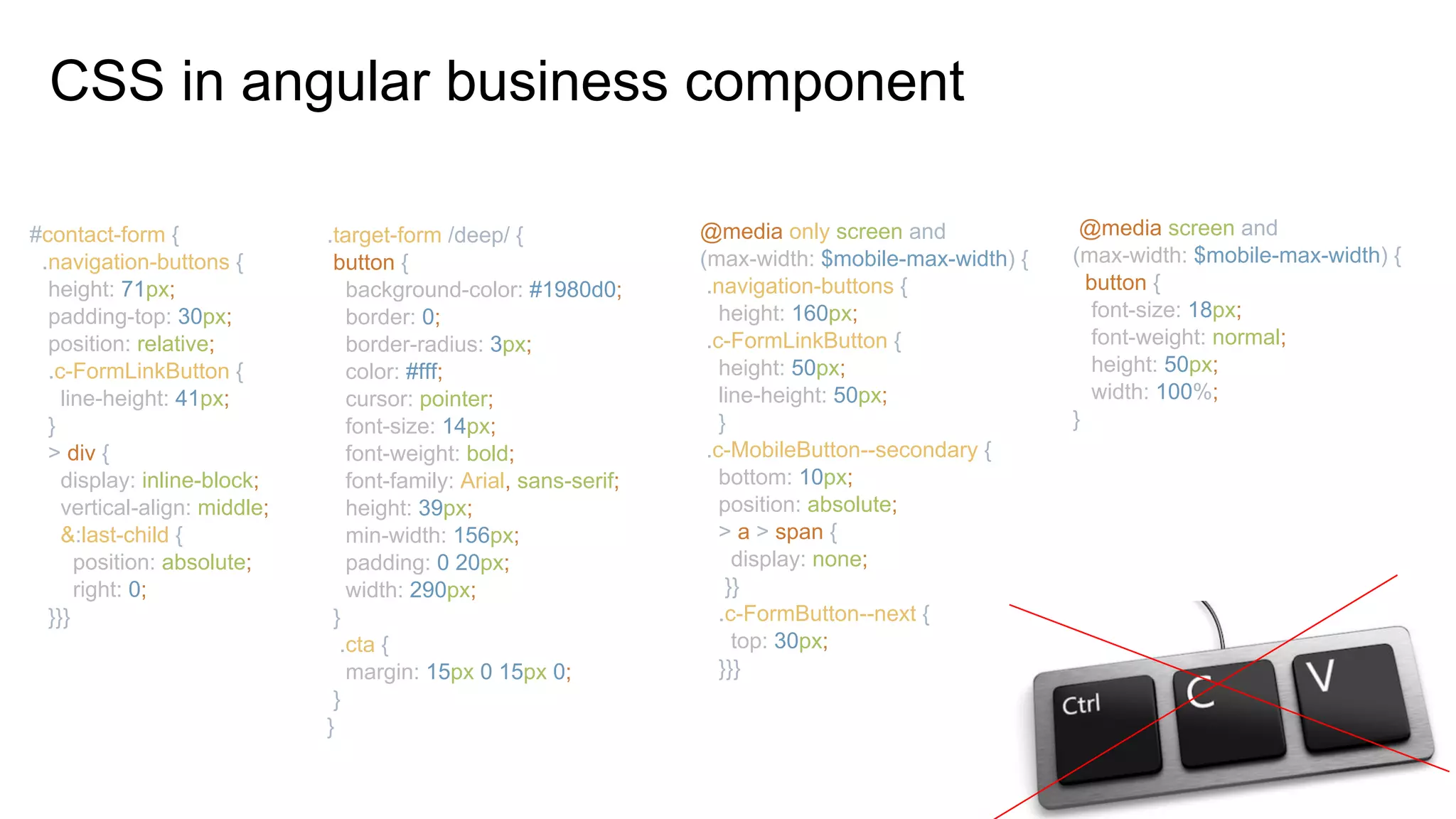
@Component({
selector: 'blue-button',
template: ` <h2>Blue</h2>
<button class="blue-button">click </button>`,
styles: [`
.blue-button {
color: blue;
}
h2 { font-size: 2rem;}
`]
}) export class BlueButtonComponent { }
@Component({
selector: 'app-root',
styleUrls:['./app.component.css'],
template: ` <h2>Buttons</h2>
<button class="red-button">click</button>
<blue-button></blue-button>
`})
export class AppComponent {
...
}](https://image.slidesharecdn.com/componentizationcssangular1-180620140952/85/Componentization-css-angular-9-320.jpg)
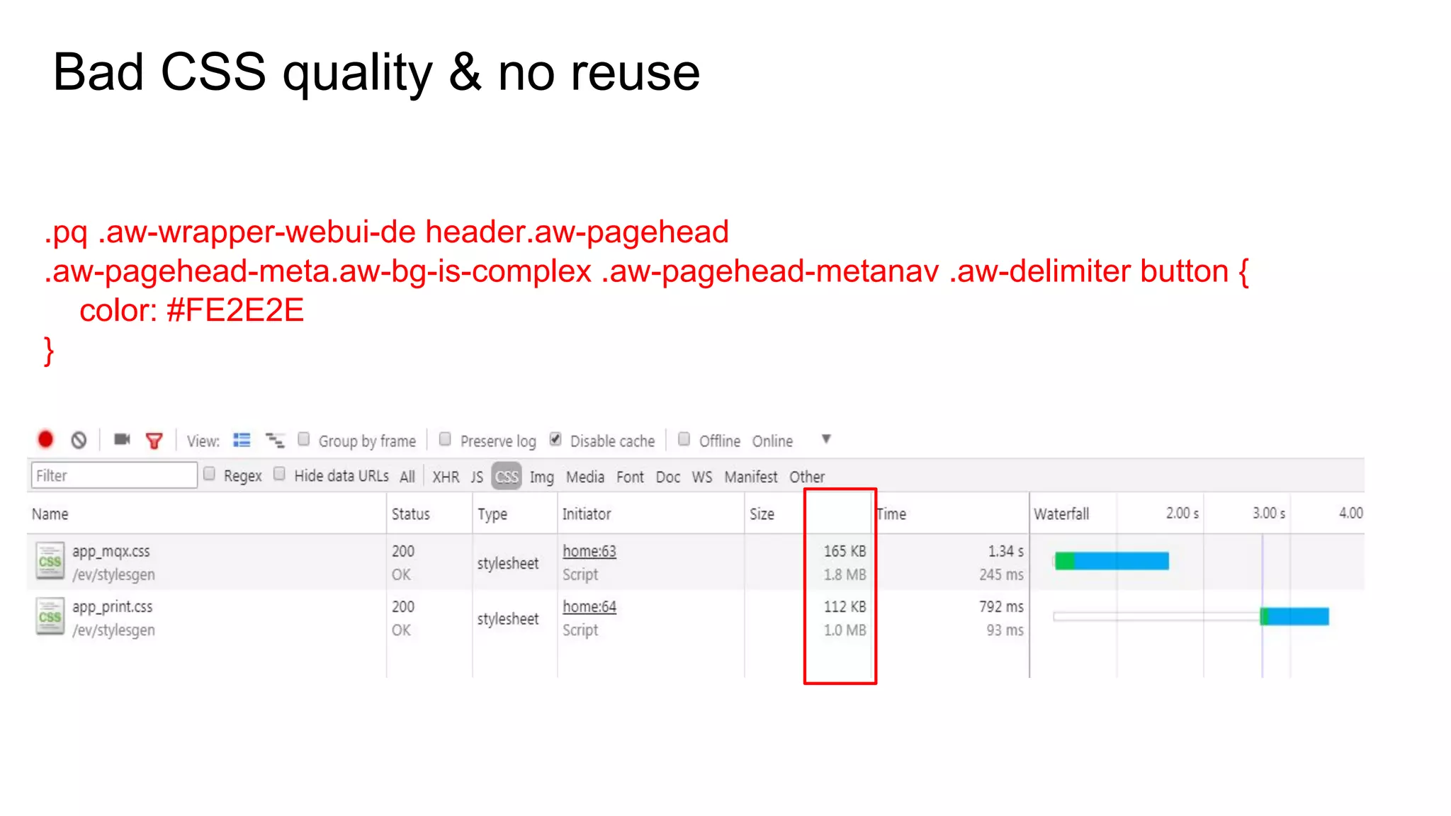
![Example: Compiled, ngcontent
<app-root _nghost-c0="">
<h2 _ngcontent-c0="">Buttons</h2>
<button _ngcontent-c0="" class="red-button">Button</button>
<blue-button _nghost-c1="" _ngcontent-c0="">
<h2 _ngcontent-c1="">Blue</h2>
<button _ngcontent-c1="" class="blue-button">click</button>
</blue-button>
</app-root>
<style>
.blue-button[_ngcontent-c1] {
color: blue;
}
h2[_ngcontent-c1] {
font-size: 2rem;
}
</style>
.blue-button {
color:blue;
}
h2 { font-size: 2rem;}](https://image.slidesharecdn.com/componentizationcssangular1-180620140952/85/Componentization-css-angular-10-320.jpg)
![:host(.red) h2 {
color: red;
}
<app-root _nghost-c0="">
<h2 _ngcontent-c0="">Button</h2>
<blue-button class=”red” _nghost-c1="" _ngcontent-c0="">
<h2 _ngcontent-c1="">Button</h2>
...
</app-root>
[_nghost-c1] h2[_ngcontent-c1] {
color: red;
}
:host {
padding: 20px;
}
[_nghost-c1] {
padding: 20px;
}](https://image.slidesharecdn.com/componentizationcssangular1-180620140952/85/Componentization-css-angular-11-320.jpg)
![@Component({
selector: 'themeable-button',
template: `
<button>Themeable Button </button>`
, styles: [`
:host-context(.red-theme) button{
background: red;
}
:host-context(.blue-theme) button {
background: blue;
}`]
}) export class ThemeableButtonComponent {}
<root-context class="blue-theme">
<childs> …
<childs>
<themeable-button></themeable-button>
<childs>
</childs>
</root-context>
.blue-theme[_nghost-c1] button[_ngcontent-c1],
.blue-theme [_nghost-c1] button[_ngcontent-c1] {
background: blue;
}](https://image.slidesharecdn.com/componentizationcssangular1-180620140952/85/Componentization-css-angular-12-320.jpg)
![ng-deep
:host ::ng-deep h2
{
color: black;
}
[_nghost-c1] h2 {
color: black;
}
Native
<app-root _nghost-c0="">
<h2 _ngcontent-c0="">Button</h2>
<blue-button class=”red” _nghost-c1="" _ngcontent-c0="">
<h2 _ngcontent-c1="">Button</h2>
...
</app-root>
Shadow Piercing combinators](https://image.slidesharecdn.com/componentizationcssangular1-180620140952/85/Componentization-css-angular-13-320.jpg)


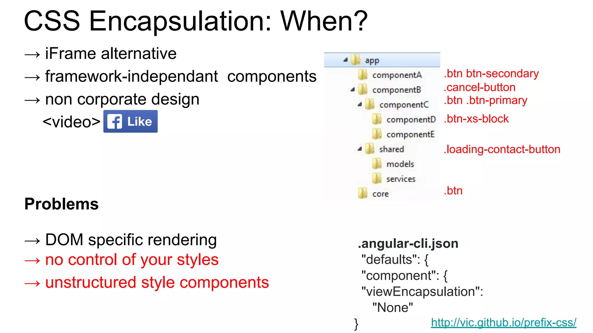
![.btn {
display: inline-block;
font-weight: $btn-font-weight;
text-align: center;
white-space: nowrap;
vertical-align: middle;
user-select: none;
border: $btn-border-width solid transparent;
@include button-size($btn-padding-y, $btn-padding-x, $font-size-base, $btn-line-height, $btn-border-radius);
@include transition($btn-transition);
@each $color, $value in $theme-colors {
.btn-#{$color} {
@include button-variant($value, $value);
}
}
&.disabled,
&:disabled {
opacity: $btn-disabled-opacity;
@include box-shadow(none);
}
.row {
@include make-row();
}
> .col,
> [class*="col-"] {
padding-right: 0;
padding-left: 0;
}
}
+ Flex](https://image.slidesharecdn.com/componentizationcssangular1-180620140952/85/Componentization-css-angular-21-320.jpg)


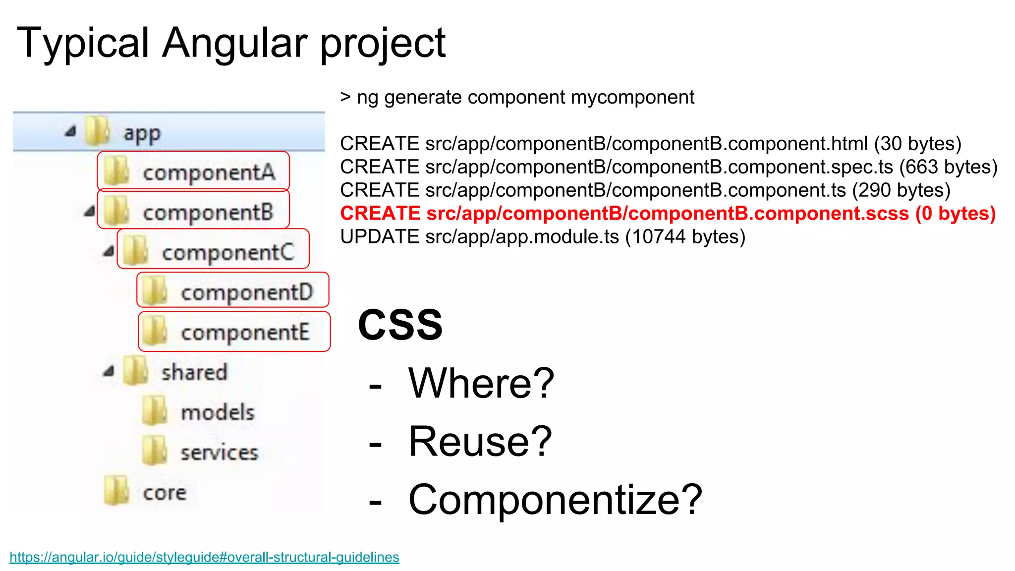
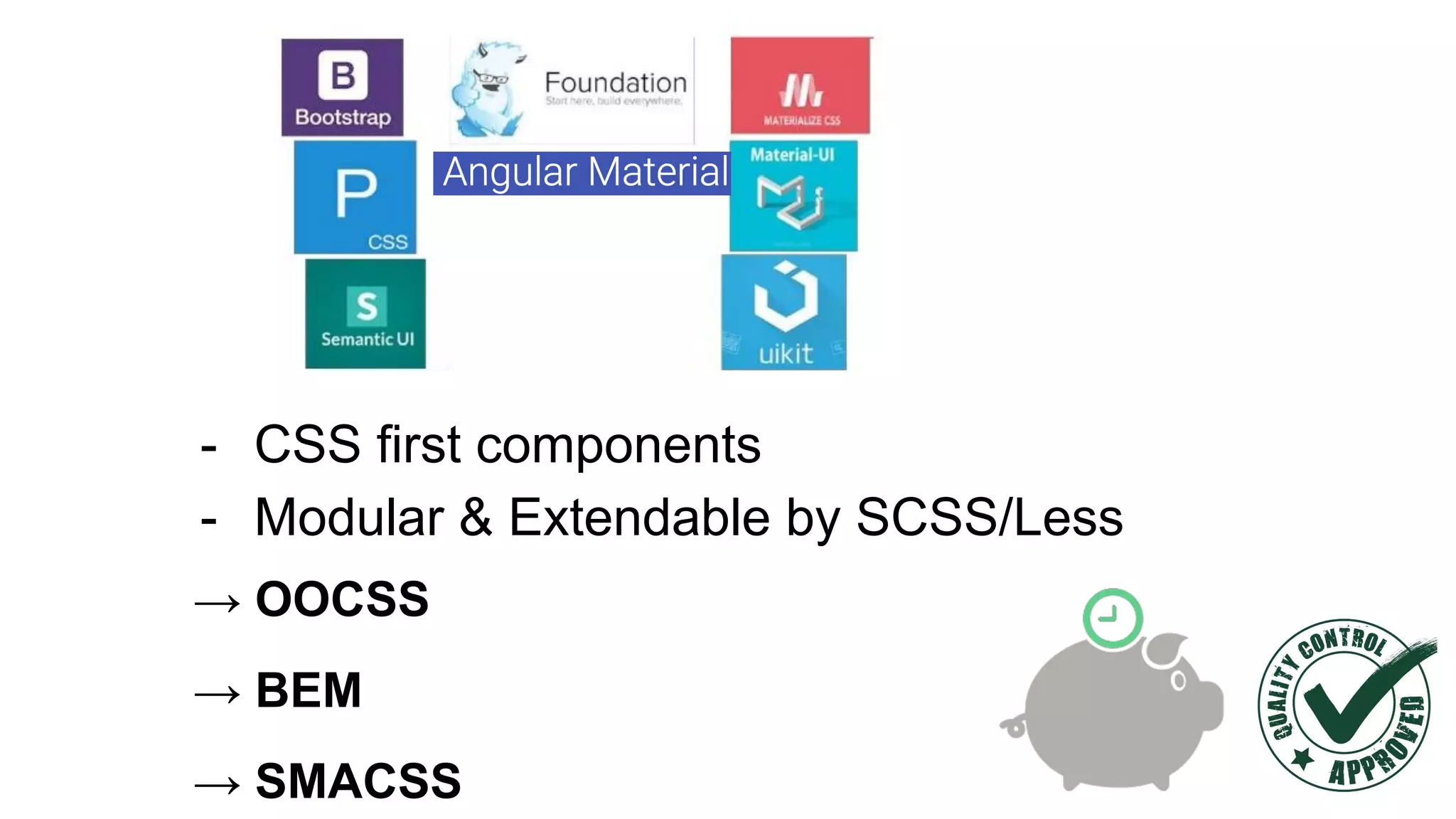
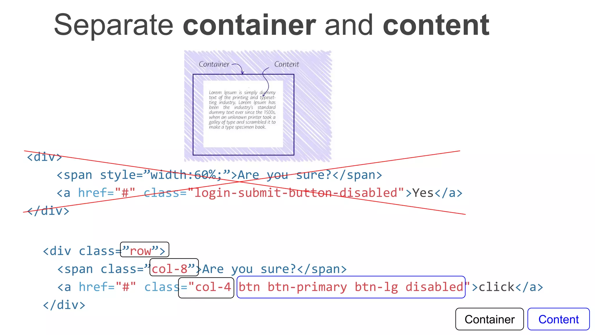
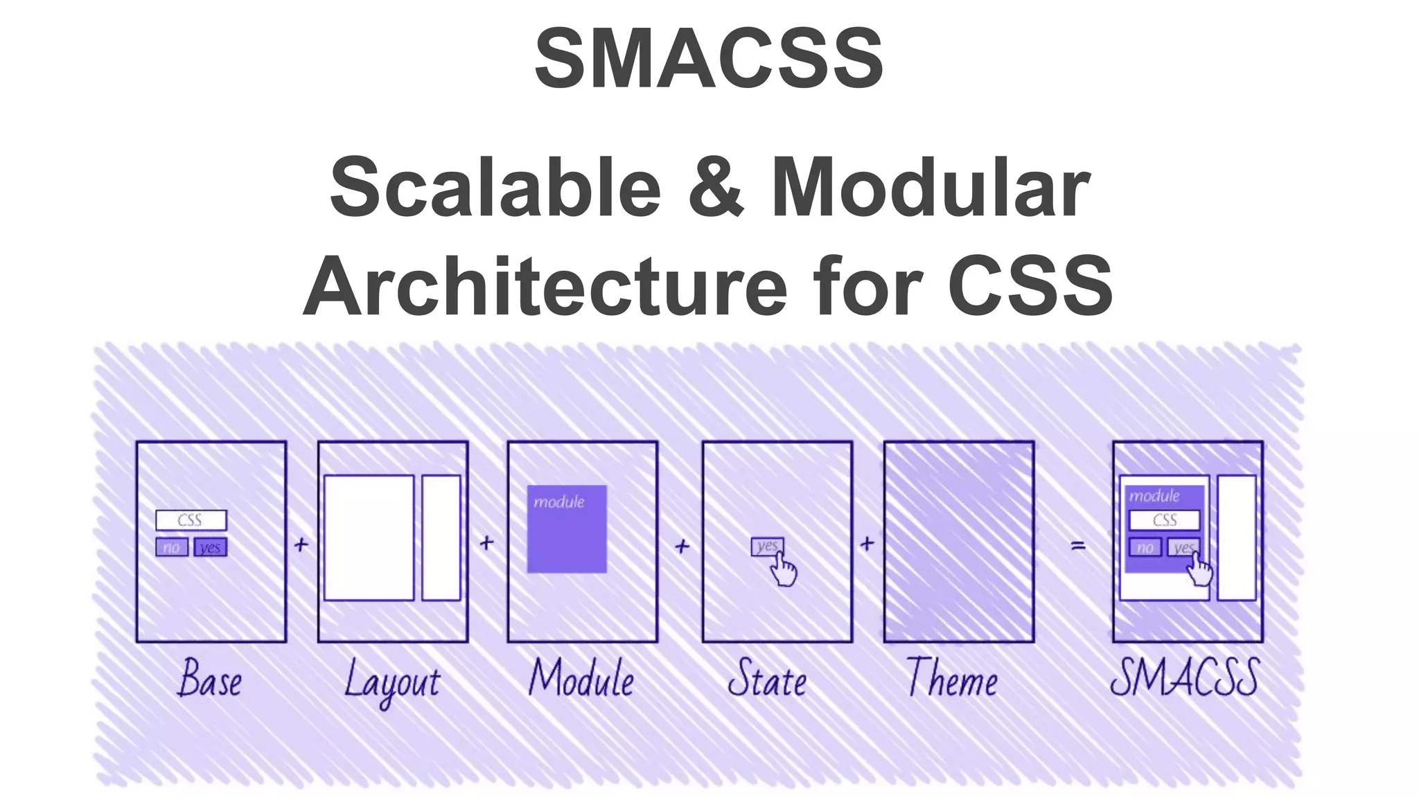
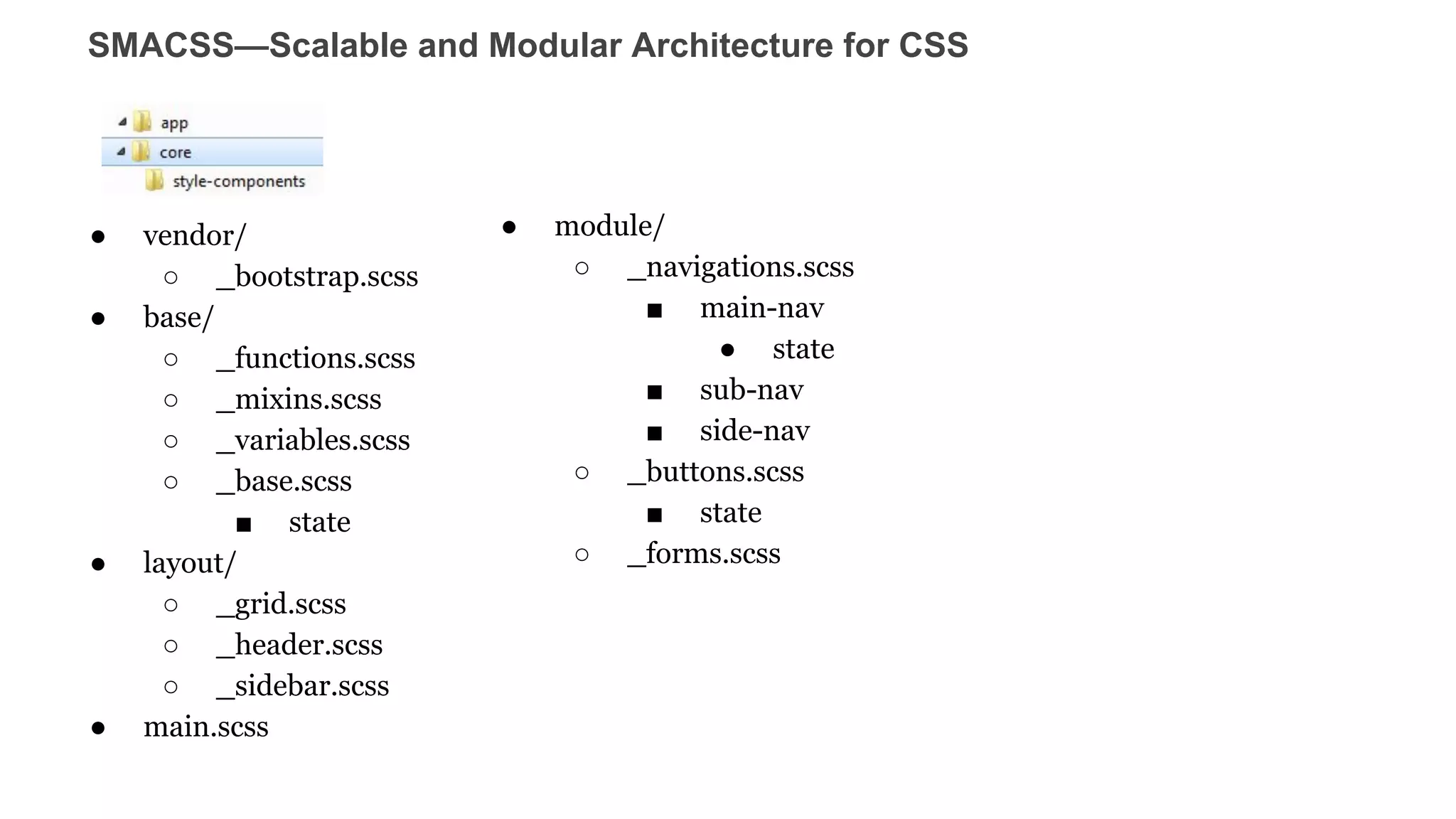
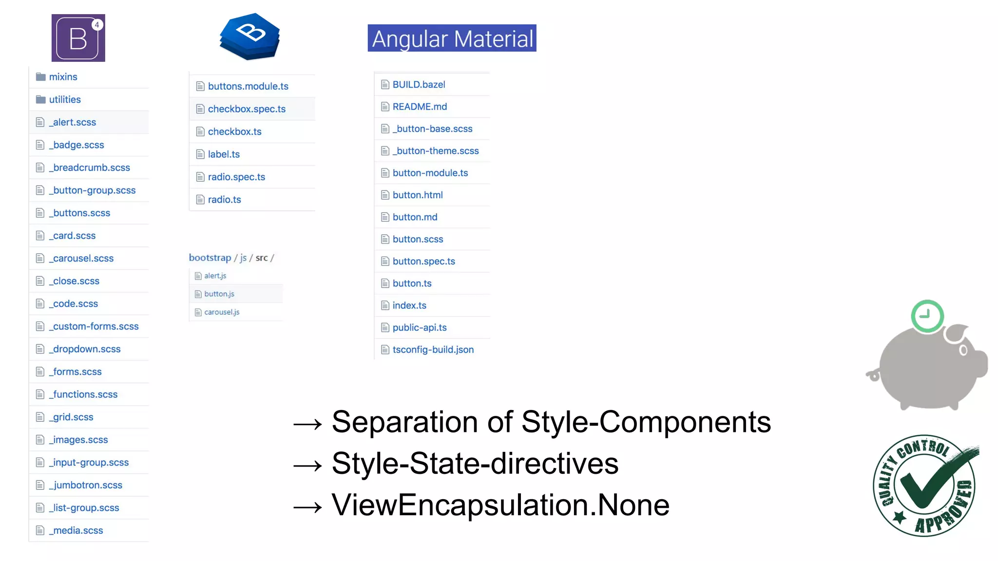
![Recap
- Corporate Design required. Performance restricted.
.angular-cli.json
"defaults": {
"component": {
"viewEncapsulation":
"None"
}
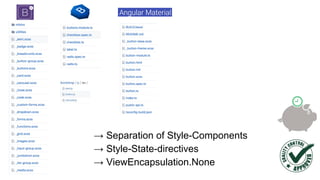
- Separation of Concerns
- /src/shared/styles/grid[fonts] Style Only Components
- /src/core/functions Angular Functional Components
- /src/core/styles/button/button.scss Style Component
- /src/core/styles/button/button.direcive.ts Angular Style-Support Component
- /src/app/ Angular Business Components
- Write Clean CSS code by OOCSS, BEM, SMACSS](https://image.slidesharecdn.com/componentizationcssangular1-180620140952/85/Componentization-css-angular-30-320.jpg)


![Example: setup
@Component({
selector: 'blue-button',
template: ` <h2>Blue</h2>
<button class="blue-button">click </button>`,
styles: [`
.blue-button {
color: blue;
}
h2 { font-size: 2rem;}
`]
}) export class BlueButtonComponent { }
@Component({
selector: 'app-root',
styleUrls:['./app.component.css'],
template: ` <h2>Buttons</h2>
<button class="red-button">click</button>
<blue-button></blue-button>
`})
export class AppComponent {
...
}](https://image.slidesharecdn.com/componentizationcssangular1-180620140952/75/Componentization-css-angular-9-2048.jpg)
![Example: Compiled, ngcontent
<app-root _nghost-c0="">
<h2 _ngcontent-c0="">Buttons</h2>
<button _ngcontent-c0="" class="red-button">Button</button>
<blue-button _nghost-c1="" _ngcontent-c0="">
<h2 _ngcontent-c1="">Blue</h2>
<button _ngcontent-c1="" class="blue-button">click</button>
</blue-button>
</app-root>
<style>
.blue-button[_ngcontent-c1] {
color: blue;
}
h2[_ngcontent-c1] {
font-size: 2rem;
}
</style>
.blue-button {
color:blue;
}
h2 { font-size: 2rem;}](https://image.slidesharecdn.com/componentizationcssangular1-180620140952/75/Componentization-css-angular-10-2048.jpg)
![:host(.red) h2 {
color: red;
}
<app-root _nghost-c0="">
<h2 _ngcontent-c0="">Button</h2>
<blue-button class=”red” _nghost-c1="" _ngcontent-c0="">
<h2 _ngcontent-c1="">Button</h2>
...
</app-root>
[_nghost-c1] h2[_ngcontent-c1] {
color: red;
}
:host {
padding: 20px;
}
[_nghost-c1] {
padding: 20px;
}](https://image.slidesharecdn.com/componentizationcssangular1-180620140952/75/Componentization-css-angular-11-2048.jpg)
![@Component({
selector: 'themeable-button',
template: `
<button>Themeable Button </button>`
, styles: [`
:host-context(.red-theme) button{
background: red;
}
:host-context(.blue-theme) button {
background: blue;
}`]
}) export class ThemeableButtonComponent {}
<root-context class="blue-theme">
<childs> …
<childs>
<themeable-button></themeable-button>
<childs>
</childs>
</root-context>
.blue-theme[_nghost-c1] button[_ngcontent-c1],
.blue-theme [_nghost-c1] button[_ngcontent-c1] {
background: blue;
}](https://image.slidesharecdn.com/componentizationcssangular1-180620140952/75/Componentization-css-angular-12-2048.jpg)
![ng-deep
:host ::ng-deep h2
{
color: black;
}
[_nghost-c1] h2 {
color: black;
}
Native
<app-root _nghost-c0="">
<h2 _ngcontent-c0="">Button</h2>
<blue-button class=”red” _nghost-c1="" _ngcontent-c0="">
<h2 _ngcontent-c1="">Button</h2>
...
</app-root>
Shadow Piercing combinators](https://image.slidesharecdn.com/componentizationcssangular1-180620140952/75/Componentization-css-angular-13-2048.jpg)
![.btn {
display: inline-block;
font-weight: $btn-font-weight;
text-align: center;
white-space: nowrap;
vertical-align: middle;
user-select: none;
border: $btn-border-width solid transparent;
@include button-size($btn-padding-y, $btn-padding-x, $font-size-base, $btn-line-height, $btn-border-radius);
@include transition($btn-transition);
@each $color, $value in $theme-colors {
.btn-#{$color} {
@include button-variant($value, $value);
}
}
&.disabled,
&:disabled {
opacity: $btn-disabled-opacity;
@include box-shadow(none);
}
.row {
@include make-row();
}
> .col,
> [class*="col-"] {
padding-right: 0;
padding-left: 0;
}
}
+ Flex](https://image.slidesharecdn.com/componentizationcssangular1-180620140952/75/Componentization-css-angular-21-2048.jpg)
![Recap
- Corporate Design required. Performance restricted.
.angular-cli.json
"defaults": {
"component": {
"viewEncapsulation":
"None"
}
- Separation of Concerns
- /src/shared/styles/grid[fonts] Style Only Components
- /src/core/functions Angular Functional Components
- /src/core/styles/button/button.scss Style Component
- /src/core/styles/button/button.direcive.ts Angular Style-Support Component
- /src/app/ Angular Business Components
- Write Clean CSS code by OOCSS, BEM, SMACSS](https://image.slidesharecdn.com/componentizationcssangular1-180620140952/75/Componentization-css-angular-30-2048.jpg)

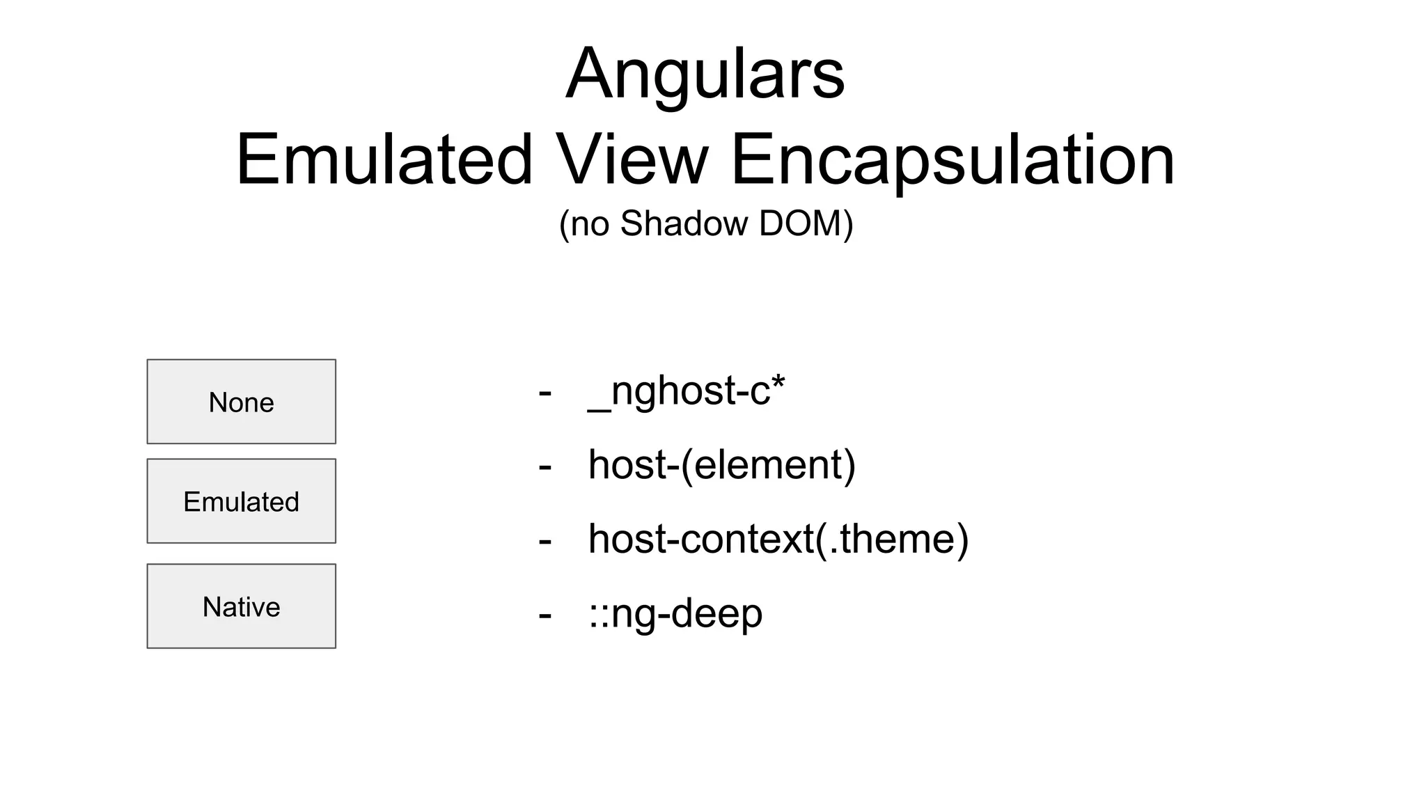
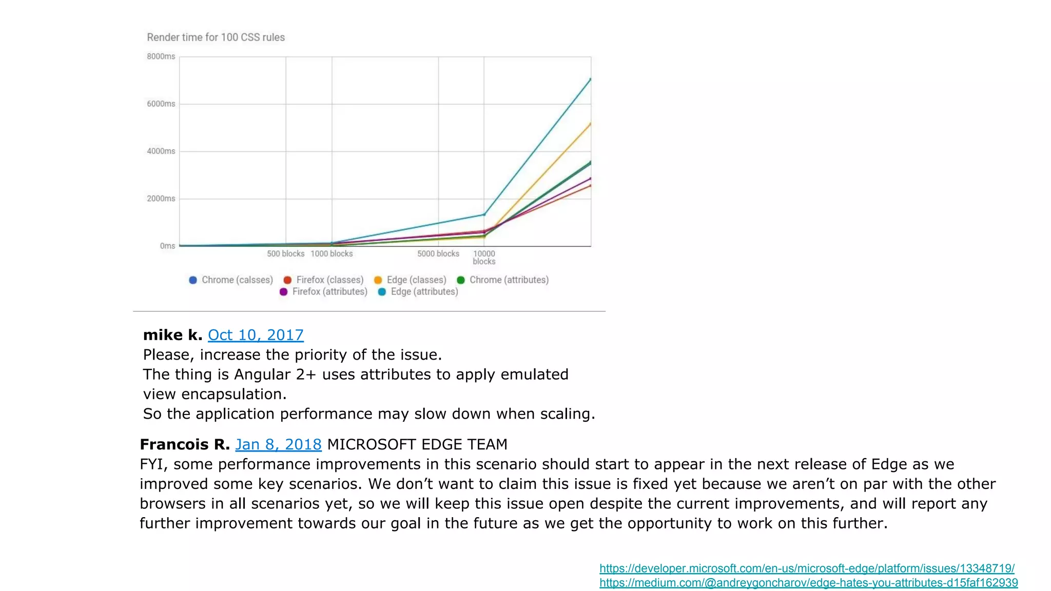
The document discusses CSS componentization strategies in Angular applications. It covers: - Angular's emulated view encapsulation and how it adds prefixes like _nghost and _ngcontent to isolate CSS - Using :host, :host-context and ::ng-deep to style components and apply themes - Different CSS architectures like OOCSS, BEM and SMACSS that can be used to structure CSS components - The benefits of separating CSS into standalone, reusable style components vs embedding styles directly in components - Best practices like defining styles using standalone CSS files and applying view encapsulation: None for performance


![Date difference[1]](https://cdn.slidesharecdn.com/ss_thumbnails/date-difference1-130203121126-phpapp01-thumbnail.jpg?width=600ounds&width=560&fit=bounds)


