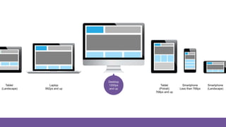
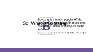
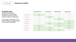
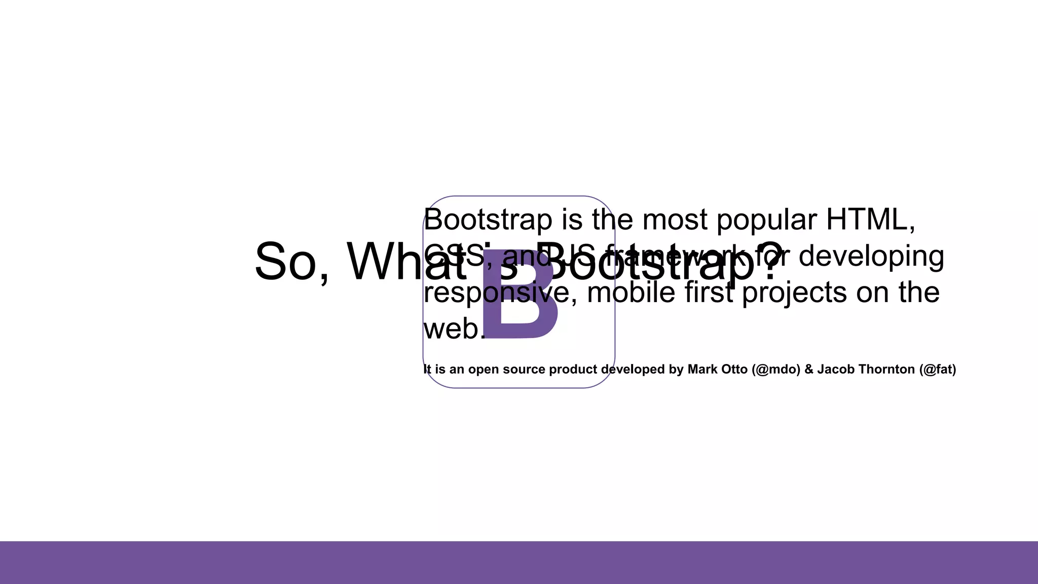
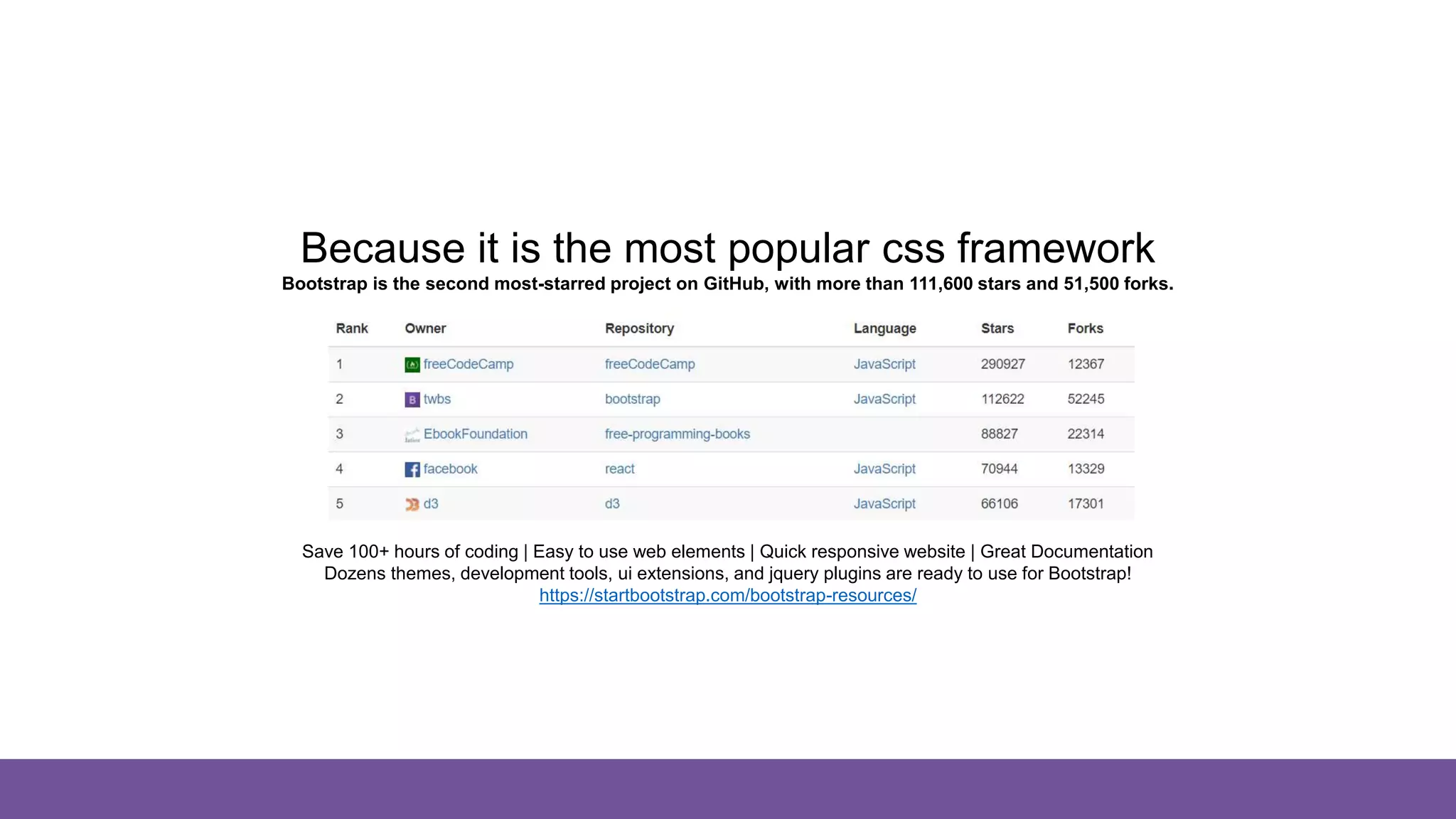
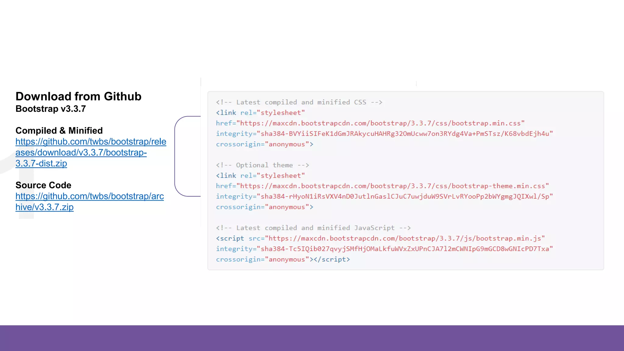
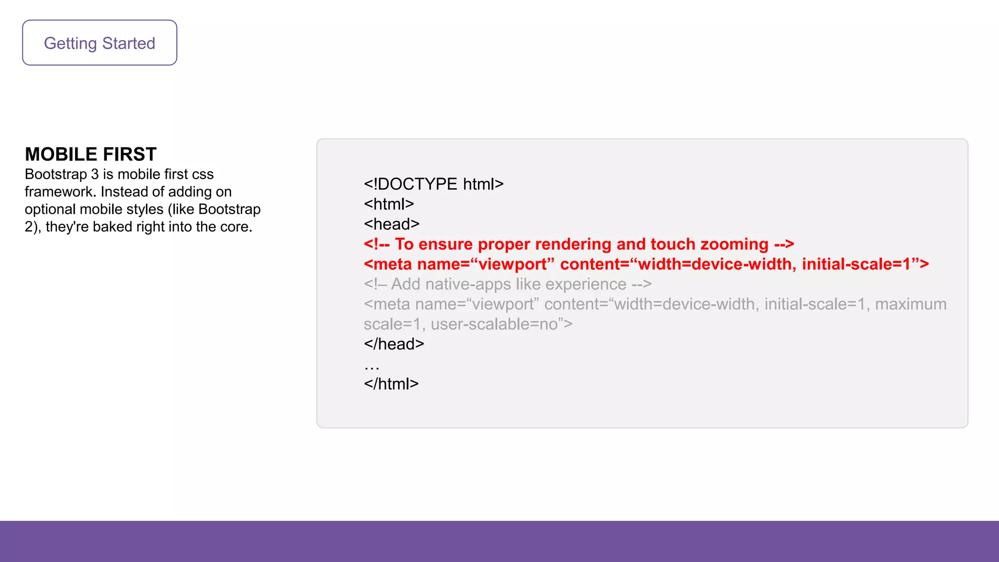
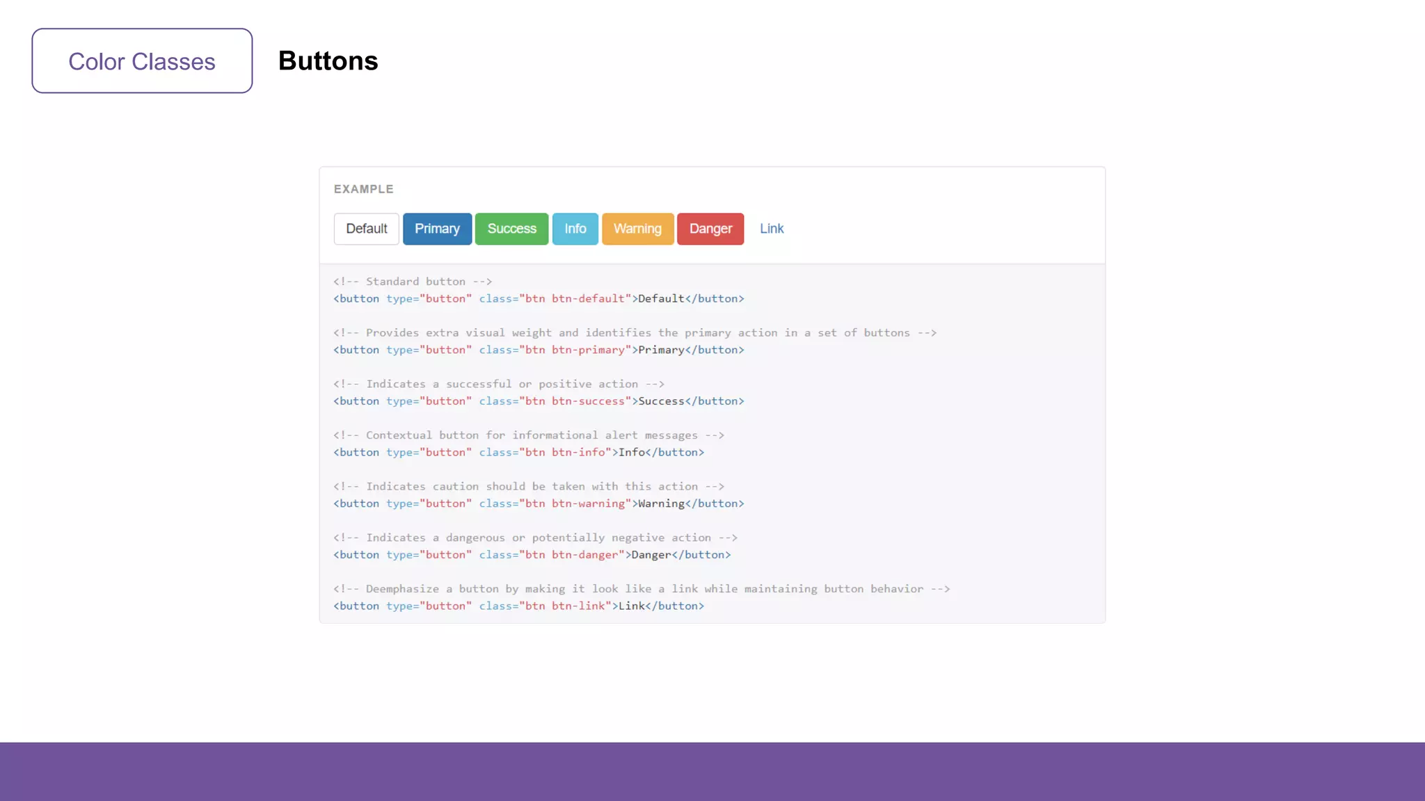
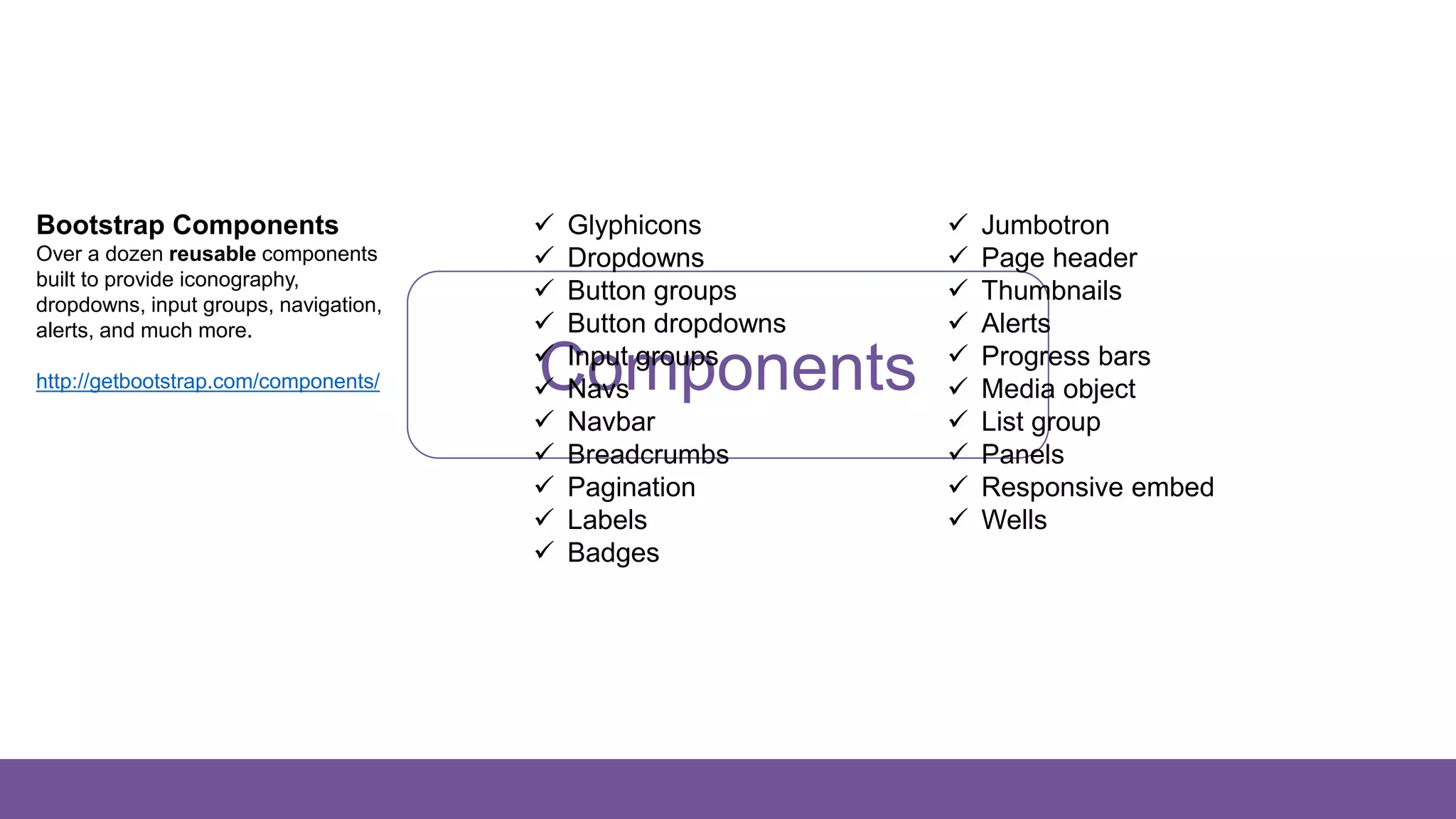
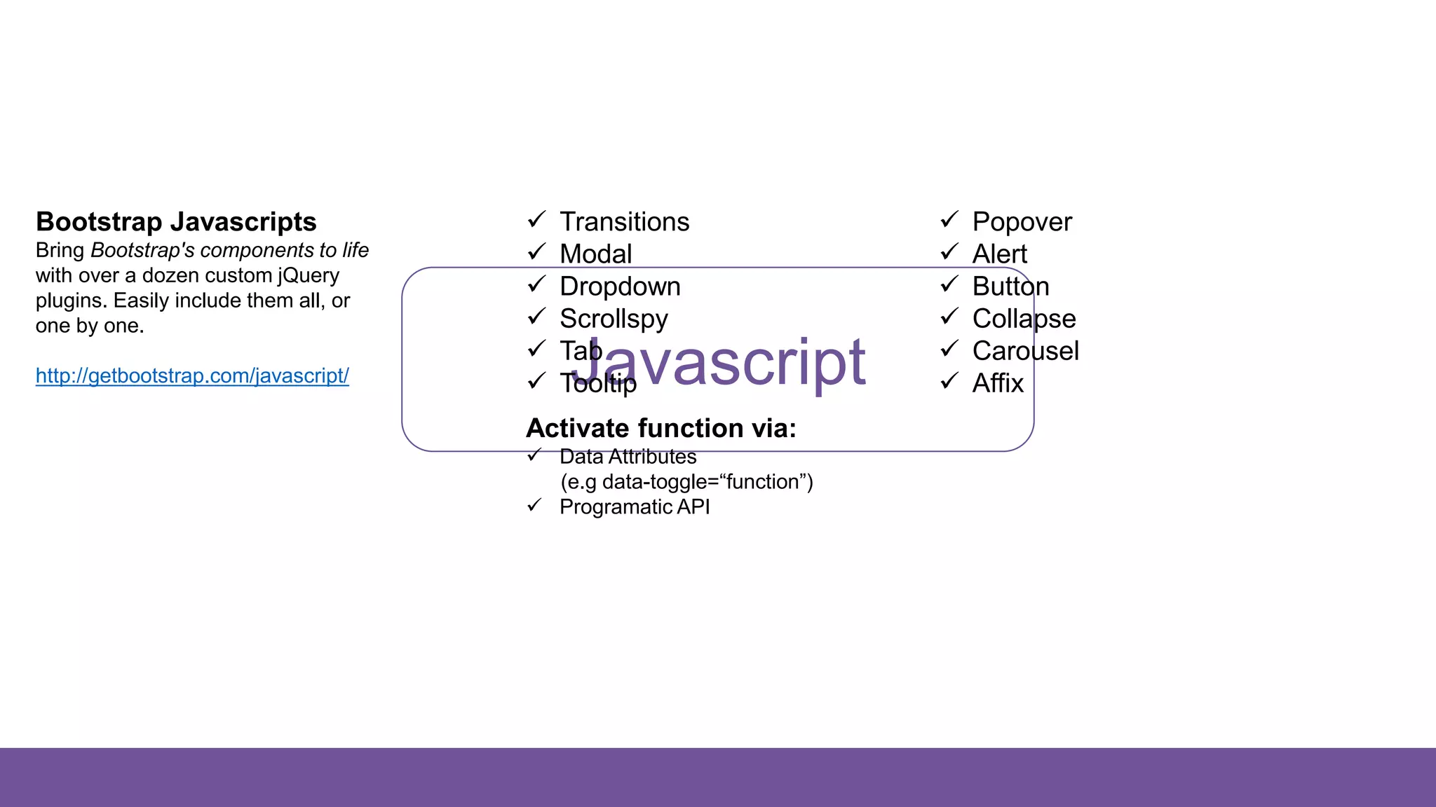
KEMBAR78
Create Responsive Website Design with Bootstrap 3 | PPTX
B
Create Responsive
Website Design with
Bootstrap 3
Wahyu Putra
CTO PT Startup Digital Indonesia & Co Founder WEBHAPPEN
Wordpress Enthusiast / Android Dev / F&B Entrepreneur
Desktop
1200px
and up
Laptop
992px and up
Tablet
(Landscape)
Tablet
(Potrait)
768px and up
Smartphone
Less than 768px
Smartphone
(Landscape)
Does Your Website
Need Responsive
Design?
BIG YES2.1 Billion Smartphone Users Worldwide (2016)
54 Million Smartphone Users in Indonesia (2015)
Responsive
is like water
So, What is Bootstrap?
B
Bootstrap is the most popular HTML,
CSS, and JS framework for developing
responsive, mobile first projects on the
web.
It is an open source product developed by Mark Otto (@mdo) & Jacob Thornton (@fat)
And why bootstrap?
Because it is the most popular css framework
Bootstrap is the second most-starred project on GitHub, with more than 111,600 stars and 51,500 forks.
Save 100+ hours of coding | Easy to use web elements | Quick responsive website | Great Documentation
Dozens themes, development tools, ui extensions, and jquery plugins are ready to use for Bootstrap!
https://startbootstrap.com/bootstrap-resources/
Website Created by Bootstrap
Getting Started
321
Download from Github
Bootstrap v3.3.7
Compiled & Minified
https://github.com/twbs/bootstrap/rele
ases/download/v3.3.7/bootstrap-
3.3.7-dist.zip
Source Code
https://github.com/twbs/bootstrap/arc
hive/v3.3.7.zip
Customize & Download
Bootstrap v3.3.7
Customize Bootstrap's
components, Less variables, and
jQuery plugins to get your very
own version.
http://getbootstrap.com/customize/
Bootstrap CDN
Bootstrap v3.3.7
The fastest and easy way to
getting started with Bootstrap
https://www.bootstrapcdn.com/
Getting Started
HTML DOCTYPE
Bootstrap makes use of certain
HTML elements and CSS properties
that require the use of the HTML5
doctype.
Include it at the beginning of all
your projects.
<!DOCTYPE html>
<html>
…
</html>
Getting Started
MOBILE FIRST
Bootstrap 3 is mobile first css
framework. Instead of adding on
optional mobile styles (like Bootstrap
2), they're baked right into the core.
<!DOCTYPE html>
<html>
<head>
<!-- To ensure proper rendering and touch zooming -->
<meta name=“viewport” content=“width=device-width, initial-scale=1”>
<!– Add native-apps like experience -->
<meta name=“viewport” content=“width=device-width, initial-scale=1, maximum
scale=1, user-scalable=no”>
</head>
…
</html>
Getting Started
NORMALIZE.CSS
For improved cross-browser
rendering, use Normalize.css, a
project by Nicolas Gallagher and
Jonathan Neal.
http://necolas.github.io/normalize.css/
<!DOCTYPE html>
<html>
<head>
<meta name=“viewport” content=“width=device-width, initial-scale=1”>
<link
rel="stylesheet“ href=“https://cdnjs.cloudflare.com/ajax/libs/normalize/7.0.0/normalize
.min.css”>
</head>
…
</html>
Getting Started
Bootstrap Itself
Don’t forget to include Bootstrap CSS
file into head tag and JS file before
the end of body tag.
Please note that all JavaScript
plugins require jQuery to be included.
https://www.bootstrapcdn.com/
<!DOCTYPE html>
<html>
<head>
<meta name=“viewport” content=“width=device-width, initial-scale=1”>
<link
rel="stylesheet“ href=“https://cdnjs.cloudflare.com/ajax/libs/normalize/7.0.0/normalize.min.cs
s”>
<link
rel="stylesheet“ href="https://maxcdn.bootstrapcdn.com/bootstrap/3.3.7/css/bootstra
p.min.css">
</head>
<body>
…
<script src="https://code.jquery.com/jquery-3.2.1.min.js"></script>
<script
src="https://maxcdn.bootstrapcdn.com/bootstrap/3.3.7/js/bootstrap.min.js"></script>
</body>
</html>
Grid System
What is grid in web design?
Grid
Grid systems are used for creating
page layouts through a series of rows
and columns that house your content.
Bootstrap includes a responsive,
mobile first fluid grid system that
appropriately scales up to 12
columns as the device or viewport
size increases.
Grid System
4 Grids x 3 Columns
= 12 Grids
Bootstrap allows you to create up to
12 columns and unlimited rows —
hence the name 12-Grid System.
1 2 3 4 5 6 7 8 9 10 11 12
How many grids in each portfolio image?
4 Grid 4 Grid 4 Grid
Grid System Let’s play with Grid Displayer! http://alefeuvre.github.io/foundation-grid-displayer/
Grid System
3 Easy Steps Mastering
Bootstrap Grid System
1. Add Container
2. Add Row
3. Add Columns
.container / .container-fluid
.row
Content Here
.col-*-*
Content Here
.col-*-*
.row
Grid System
md
Medium Devices
≥ 992px
sm
Small Devices
≥ 768px
xs
Extra Small Devices
< 768px
lg
Large Devices
≥ 1200px
Column Class Formula: .col-*-*
1 – 2 – 3 – 4 – 5 – 6 – 7 – 8 – 9 – 10 – 11 – 12
Grid System
1 Container, 1 Row, Columns
1 2 3 4 5 6 7 8 9 10 11 12
How many container, row and column?
3 Col 3 Col 6 Col
1 Row
1 Container
35
Grid System
6 Col 6 Col
1 Row
1 Container
6 Col 6 Col
<div class="container">
<div class="row">
<div class="col-md-6">
<div class="row">
<div class="col-md-6">
...
</div>
<div class="col-md-6">
...
</div>
</div>
</div>
<div class="col-md-6">
...
</div>
</div>
</div>
Grid System Columns stack on mobile
Desktop
Mobile
X✓
Grid System Responsive Utilities
Available Class
For faster mobile-friendly
development, use these utility
classes for showing and hiding
content by device via media query.
Use a single or combination of the
available classes for toggling content
across viewport breakpoints.
Images
Responsive Images
Images in Bootstrap 3 can be made
responsive-friendly via the addition of
the .img-responsive class.
This applies max-width: 100%;,
height: auto; and display: block; to
the image so that it scales nicely to
the parent element.
<img src="..." class="img-responsive" alt="Responsive image">
Images
Image Shapes
Add classes to an <img> element to
easily style images in any project.
<img src="..." alt="..." class="img-rounded">
<img src="..." alt="..." class="img-circle">
<img src="..." alt="..." class="img-thumbnail">
Typography
Typography
 Headings
 Body Copy
 Inline Text Elements
 Alignment Classes
 Transformation Classes
 Abbreviations
 Addresses
 Blockquotes
 Lists
http://getbootstrap.com/css/#type
Code
Code
 Inline
 User Input
 Basic Block
 Variables
 Sample Output
http://getbootstrap.com/css/#code
Tables
Tables
 Basic Table
 Striped Rows
 Bordered Table
 Hover Rows
 Condensed Table
 Contextual Classes
 Responsive Table
http://getbootstrap.com/css/#tables
Forms
Forms
 Basic Form
 Inline Form
 Horizontal Form
 Supported Controls
 Static Control
 Focus State
 Disabled State
 Readonly State
 Help Text
 Validation States
 Control Sizing
http://getbootstrap.com/css/#forms
Buttons
Buttons
 Button Tags
 Options
 Sizes
 Active State
 Disable State
http://getbootstrap.com/css/#buttons
Color Classes
It can be applied to:
 Typography
 Tables
 Forms
 Buttons
-primary -success -info -warning -danger
Color Classes Typography
Color Classes Tables
Color Classes Form Validation
Color Classes Buttons
Size Classes
It can be applied to: ✓Forms ✓Buttons
Components
Bootstrap Components
Over a dozen reusable components
built to provide iconography,
dropdowns, input groups, navigation,
alerts, and much more.
http://getbootstrap.com/components/
 Glyphicons
 Dropdowns
 Button groups
 Button dropdowns
 Input groups
 Navs
 Navbar
 Breadcrumbs
 Pagination
 Labels
 Badges
 Jumbotron
 Page header
 Thumbnails
 Alerts
 Progress bars
 Media object
 List group
 Panels
 Responsive embed
 Wells
Javascript
Bootstrap Javascripts
Bring Bootstrap's components to life
with over a dozen custom jQuery
plugins. Easily include them all, or
one by one.
http://getbootstrap.com/javascript/
 Transitions
 Modal
 Dropdown
 Scrollspy
 Tab
 Tooltip
 Popover
 Alert
 Button
 Collapse
 Carousel
 Affix
Activate function via:
 Data Attributes
(e.g data-toggle=“function”)
 Programatic API
Let’s Practice
Hints
321
Disable Zooming Capabilities
Add this syntax to viewport meta tags to
feel experience a bit more like a native
application
• maximum-scale=1
• user-scalable=no
Responsive Utility Classes
Use these utility classes for showing
and hiding content by device screen
• hidden-xs
• visible-md
• …
Javascript Function
• Carousel
• Affix
• Collapse
• Modal
• Off canvas (External JS)
Thank You
Any questions?

Create Responsive Website Design with Bootstrap 3

  • 1.
  • 2.
    Wahyu Putra CTO PTStartup Digital Indonesia & Co Founder WEBHAPPEN Wordpress Enthusiast / Android Dev / F&B Entrepreneur
  • 3.
    Desktop 1200px and up Laptop 992px andup Tablet (Landscape) Tablet (Potrait) 768px and up Smartphone Less than 768px Smartphone (Landscape)
  • 4.
    Does Your Website NeedResponsive Design? BIG YES2.1 Billion Smartphone Users Worldwide (2016) 54 Million Smartphone Users in Indonesia (2015)
  • 5.
  • 6.
    So, What isBootstrap? B Bootstrap is the most popular HTML, CSS, and JS framework for developing responsive, mobile first projects on the web. It is an open source product developed by Mark Otto (@mdo) & Jacob Thornton (@fat)
  • 7.
    And why bootstrap? Becauseit is the most popular css framework Bootstrap is the second most-starred project on GitHub, with more than 111,600 stars and 51,500 forks. Save 100+ hours of coding | Easy to use web elements | Quick responsive website | Great Documentation Dozens themes, development tools, ui extensions, and jquery plugins are ready to use for Bootstrap! https://startbootstrap.com/bootstrap-resources/
  • 8.
  • 9.
    Getting Started 321 Download fromGithub Bootstrap v3.3.7 Compiled & Minified https://github.com/twbs/bootstrap/rele ases/download/v3.3.7/bootstrap- 3.3.7-dist.zip Source Code https://github.com/twbs/bootstrap/arc hive/v3.3.7.zip Customize & Download Bootstrap v3.3.7 Customize Bootstrap's components, Less variables, and jQuery plugins to get your very own version. http://getbootstrap.com/customize/ Bootstrap CDN Bootstrap v3.3.7 The fastest and easy way to getting started with Bootstrap https://www.bootstrapcdn.com/
  • 10.
    Getting Started HTML DOCTYPE Bootstrapmakes use of certain HTML elements and CSS properties that require the use of the HTML5 doctype. Include it at the beginning of all your projects. <!DOCTYPE html> <html> … </html>
  • 11.
    Getting Started MOBILE FIRST Bootstrap3 is mobile first css framework. Instead of adding on optional mobile styles (like Bootstrap 2), they're baked right into the core. <!DOCTYPE html> <html> <head> <!-- To ensure proper rendering and touch zooming --> <meta name=“viewport” content=“width=device-width, initial-scale=1”> <!– Add native-apps like experience --> <meta name=“viewport” content=“width=device-width, initial-scale=1, maximum scale=1, user-scalable=no”> </head> … </html>
  • 12.
    Getting Started NORMALIZE.CSS For improvedcross-browser rendering, use Normalize.css, a project by Nicolas Gallagher and Jonathan Neal. http://necolas.github.io/normalize.css/ <!DOCTYPE html> <html> <head> <meta name=“viewport” content=“width=device-width, initial-scale=1”> <link rel="stylesheet“ href=“https://cdnjs.cloudflare.com/ajax/libs/normalize/7.0.0/normalize .min.css”> </head> … </html>
  • 13.
    Getting Started Bootstrap Itself Don’tforget to include Bootstrap CSS file into head tag and JS file before the end of body tag. Please note that all JavaScript plugins require jQuery to be included. https://www.bootstrapcdn.com/ <!DOCTYPE html> <html> <head> <meta name=“viewport” content=“width=device-width, initial-scale=1”> <link rel="stylesheet“ href=“https://cdnjs.cloudflare.com/ajax/libs/normalize/7.0.0/normalize.min.cs s”> <link rel="stylesheet“ href="https://maxcdn.bootstrapcdn.com/bootstrap/3.3.7/css/bootstra p.min.css"> </head> <body> … <script src="https://code.jquery.com/jquery-3.2.1.min.js"></script> <script src="https://maxcdn.bootstrapcdn.com/bootstrap/3.3.7/js/bootstrap.min.js"></script> </body> </html>
  • 14.
    Grid System What isgrid in web design? Grid Grid systems are used for creating page layouts through a series of rows and columns that house your content. Bootstrap includes a responsive, mobile first fluid grid system that appropriately scales up to 12 columns as the device or viewport size increases.
  • 15.
    Grid System 4 Gridsx 3 Columns = 12 Grids Bootstrap allows you to create up to 12 columns and unlimited rows — hence the name 12-Grid System. 1 2 3 4 5 6 7 8 9 10 11 12 How many grids in each portfolio image? 4 Grid 4 Grid 4 Grid
  • 16.
    Grid System Let’splay with Grid Displayer! http://alefeuvre.github.io/foundation-grid-displayer/
  • 17.
    Grid System 3 EasySteps Mastering Bootstrap Grid System 1. Add Container 2. Add Row 3. Add Columns .container / .container-fluid .row Content Here .col-*-* Content Here .col-*-* .row
  • 18.
    Grid System md Medium Devices ≥992px sm Small Devices ≥ 768px xs Extra Small Devices < 768px lg Large Devices ≥ 1200px Column Class Formula: .col-*-* 1 – 2 – 3 – 4 – 5 – 6 – 7 – 8 – 9 – 10 – 11 – 12
  • 19.
    Grid System 1 Container,1 Row, Columns 1 2 3 4 5 6 7 8 9 10 11 12 How many container, row and column? 3 Col 3 Col 6 Col 1 Row 1 Container 35
  • 20.
    Grid System 6 Col6 Col 1 Row 1 Container 6 Col 6 Col <div class="container"> <div class="row"> <div class="col-md-6"> <div class="row"> <div class="col-md-6"> ... </div> <div class="col-md-6"> ... </div> </div> </div> <div class="col-md-6"> ... </div> </div> </div>
  • 21.
    Grid System Columnsstack on mobile Desktop Mobile X✓
  • 22.
    Grid System ResponsiveUtilities Available Class For faster mobile-friendly development, use these utility classes for showing and hiding content by device via media query. Use a single or combination of the available classes for toggling content across viewport breakpoints.
  • 23.
    Images Responsive Images Images inBootstrap 3 can be made responsive-friendly via the addition of the .img-responsive class. This applies max-width: 100%;, height: auto; and display: block; to the image so that it scales nicely to the parent element. <img src="..." class="img-responsive" alt="Responsive image">
  • 24.
    Images Image Shapes Add classesto an <img> element to easily style images in any project. <img src="..." alt="..." class="img-rounded"> <img src="..." alt="..." class="img-circle"> <img src="..." alt="..." class="img-thumbnail">
  • 25.
    Typography Typography  Headings  BodyCopy  Inline Text Elements  Alignment Classes  Transformation Classes  Abbreviations  Addresses  Blockquotes  Lists http://getbootstrap.com/css/#type
  • 26.
    Code Code  Inline  UserInput  Basic Block  Variables  Sample Output http://getbootstrap.com/css/#code
  • 27.
    Tables Tables  Basic Table Striped Rows  Bordered Table  Hover Rows  Condensed Table  Contextual Classes  Responsive Table http://getbootstrap.com/css/#tables
  • 28.
    Forms Forms  Basic Form Inline Form  Horizontal Form  Supported Controls  Static Control  Focus State  Disabled State  Readonly State  Help Text  Validation States  Control Sizing http://getbootstrap.com/css/#forms
  • 29.
    Buttons Buttons  Button Tags Options  Sizes  Active State  Disable State http://getbootstrap.com/css/#buttons
  • 30.
    Color Classes It canbe applied to:  Typography  Tables  Forms  Buttons -primary -success -info -warning -danger
  • 31.
  • 32.
  • 33.
  • 34.
  • 35.
    Size Classes It canbe applied to: ✓Forms ✓Buttons
  • 36.
    Components Bootstrap Components Over adozen reusable components built to provide iconography, dropdowns, input groups, navigation, alerts, and much more. http://getbootstrap.com/components/  Glyphicons  Dropdowns  Button groups  Button dropdowns  Input groups  Navs  Navbar  Breadcrumbs  Pagination  Labels  Badges  Jumbotron  Page header  Thumbnails  Alerts  Progress bars  Media object  List group  Panels  Responsive embed  Wells
  • 37.
    Javascript Bootstrap Javascripts Bring Bootstrap'scomponents to life with over a dozen custom jQuery plugins. Easily include them all, or one by one. http://getbootstrap.com/javascript/  Transitions  Modal  Dropdown  Scrollspy  Tab  Tooltip  Popover  Alert  Button  Collapse  Carousel  Affix Activate function via:  Data Attributes (e.g data-toggle=“function”)  Programatic API
  • 38.
  • 41.
    Hints 321 Disable Zooming Capabilities Addthis syntax to viewport meta tags to feel experience a bit more like a native application • maximum-scale=1 • user-scalable=no Responsive Utility Classes Use these utility classes for showing and hiding content by device screen • hidden-xs • visible-md • … Javascript Function • Carousel • Affix • Collapse • Modal • Off canvas (External JS)
  • 44.