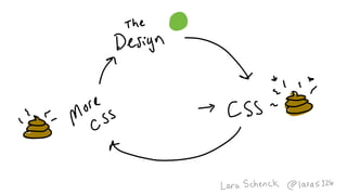
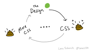
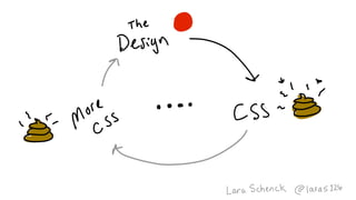
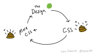
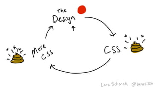
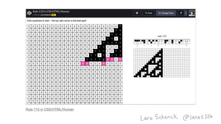
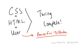
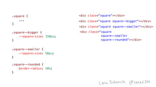
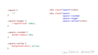
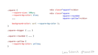
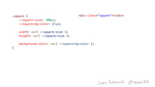
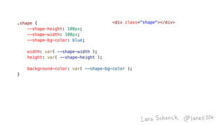
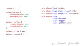
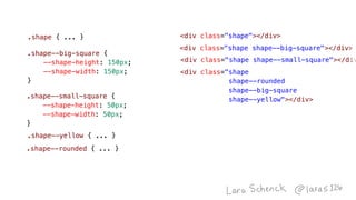
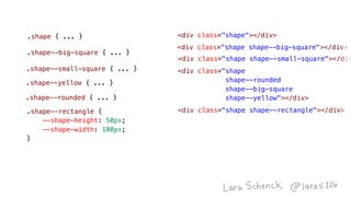
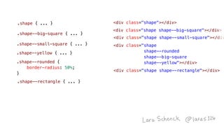
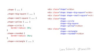
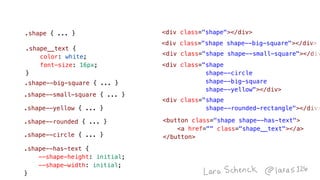
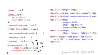
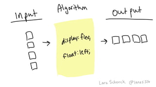
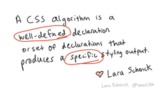
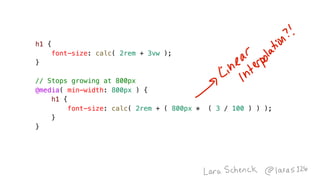
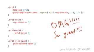
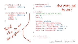
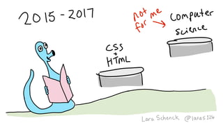
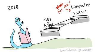
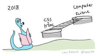
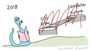
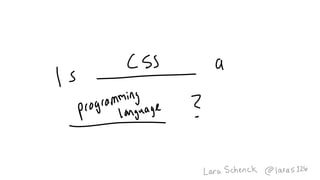
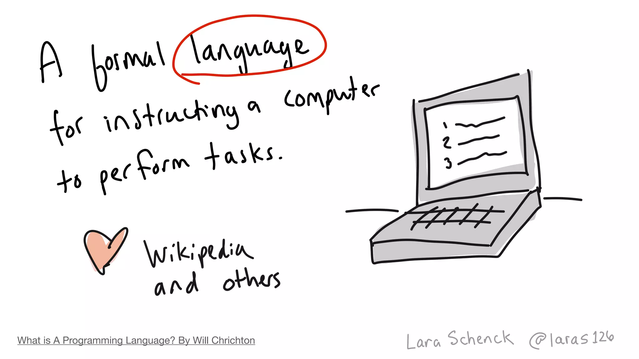
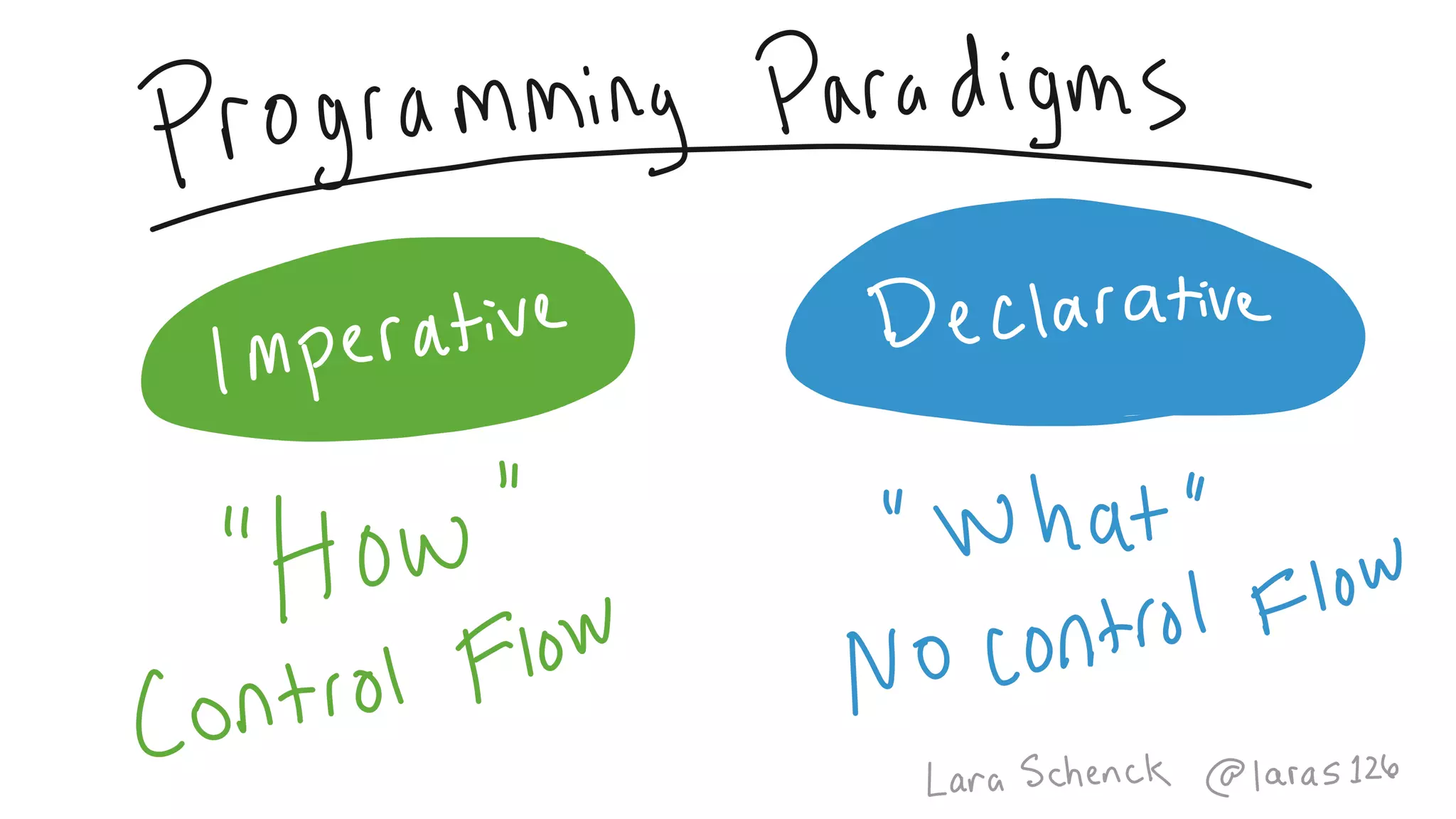
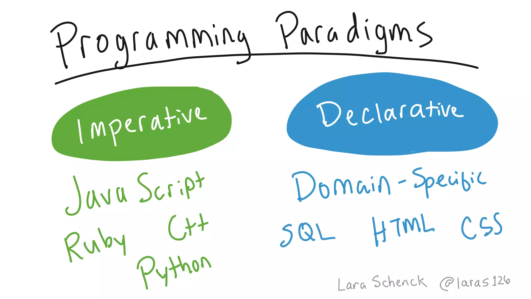
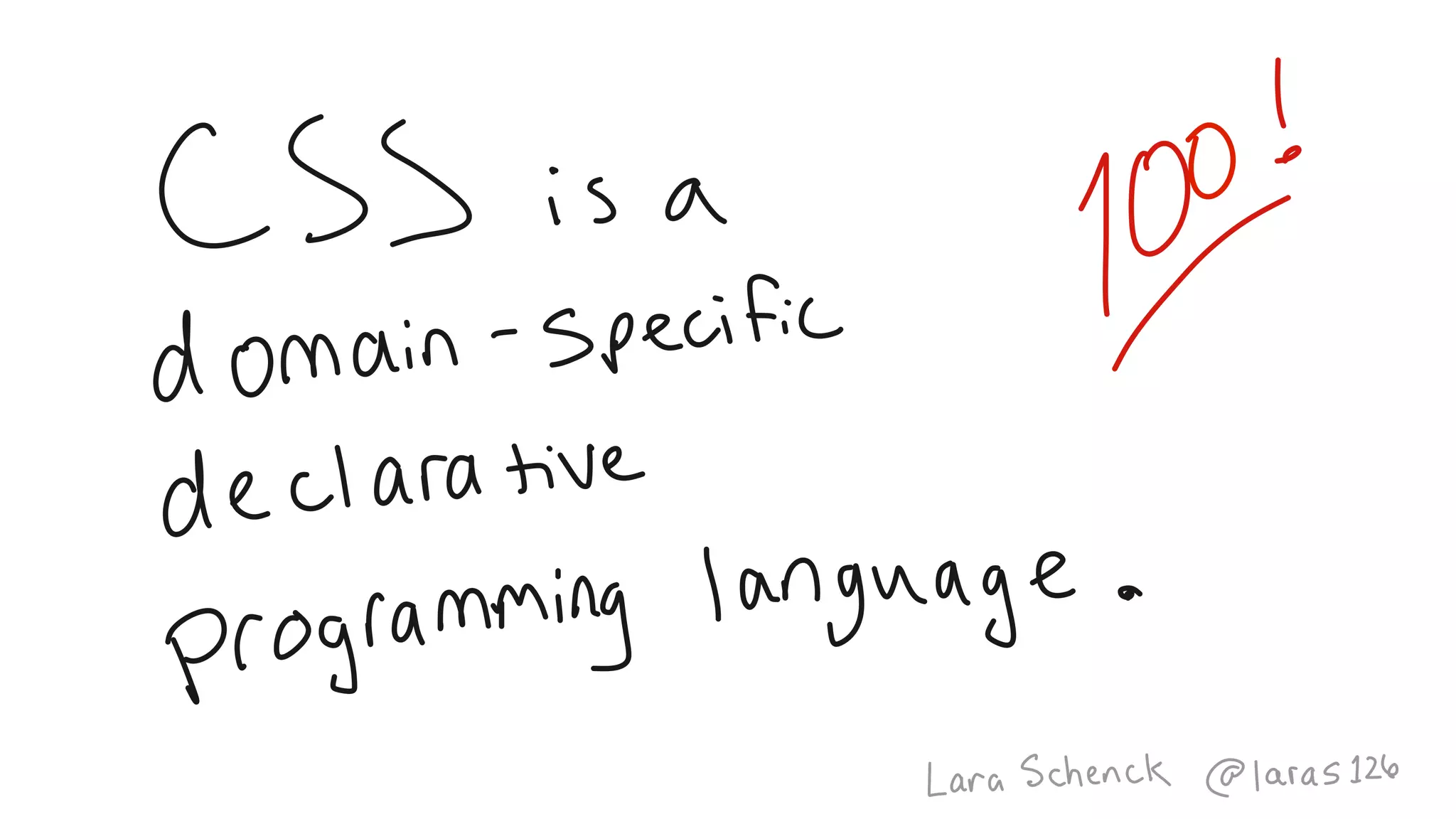
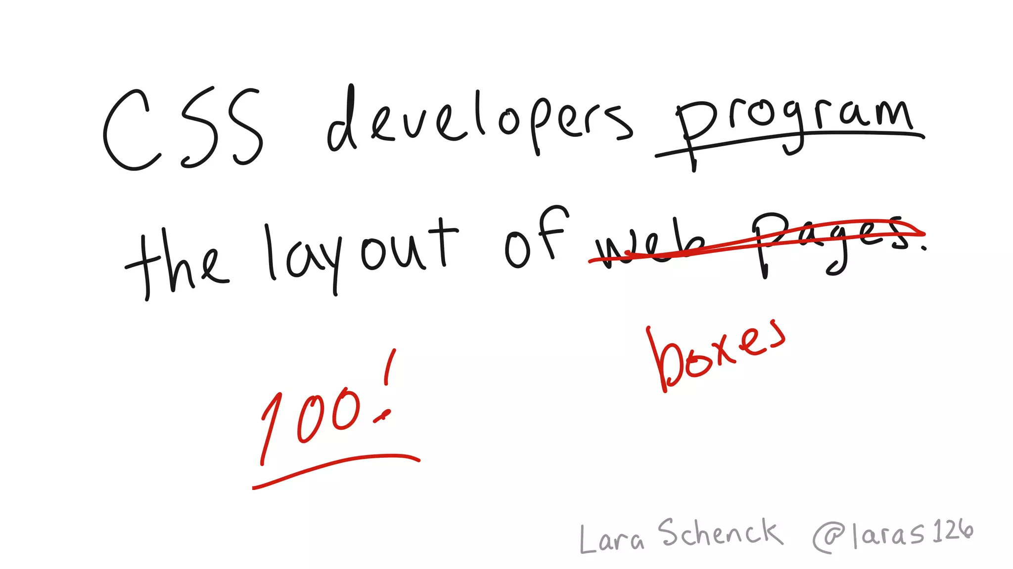
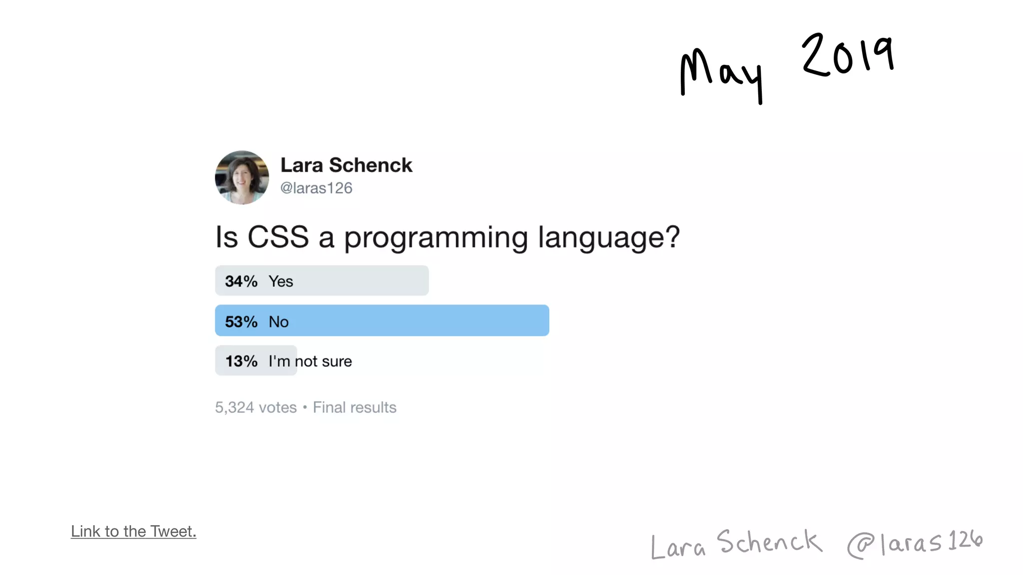
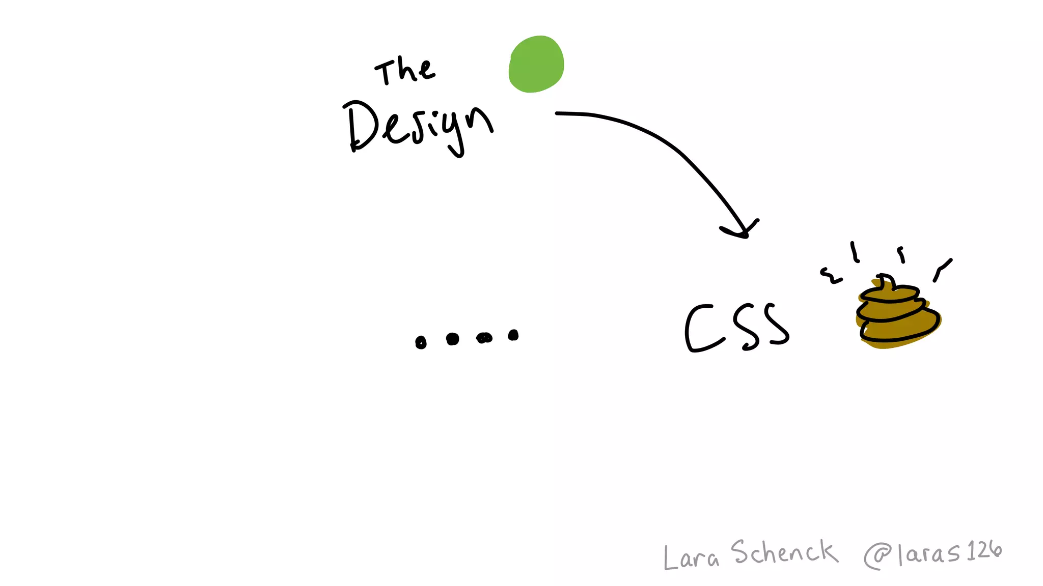
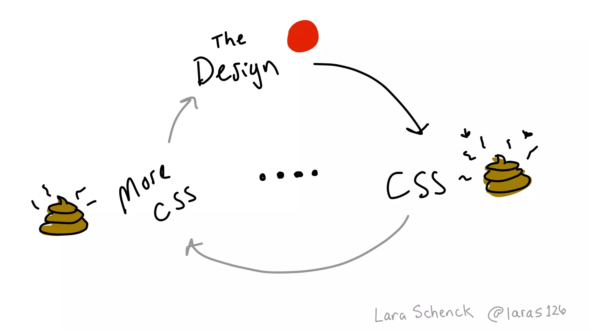
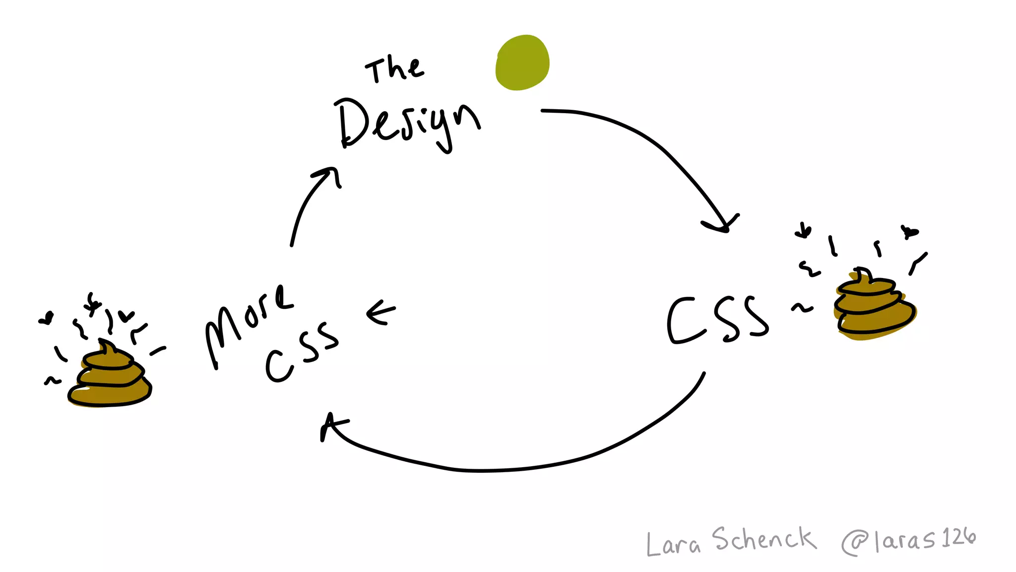
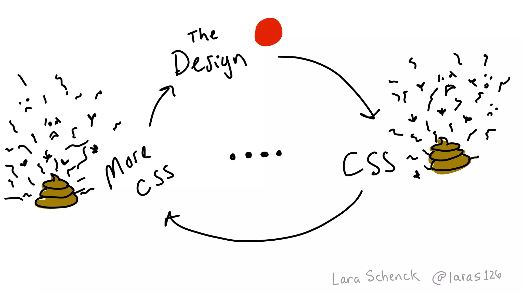
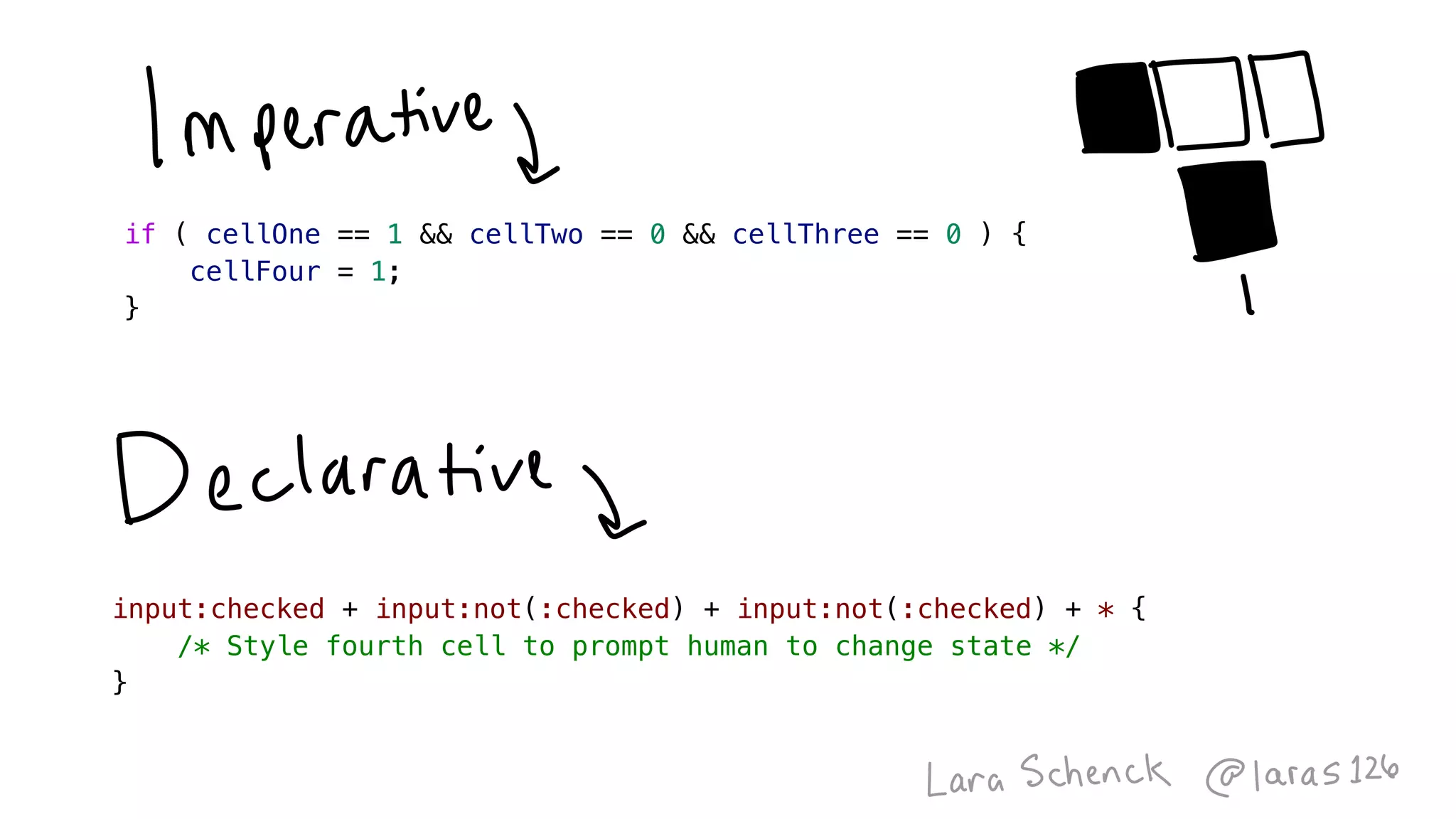
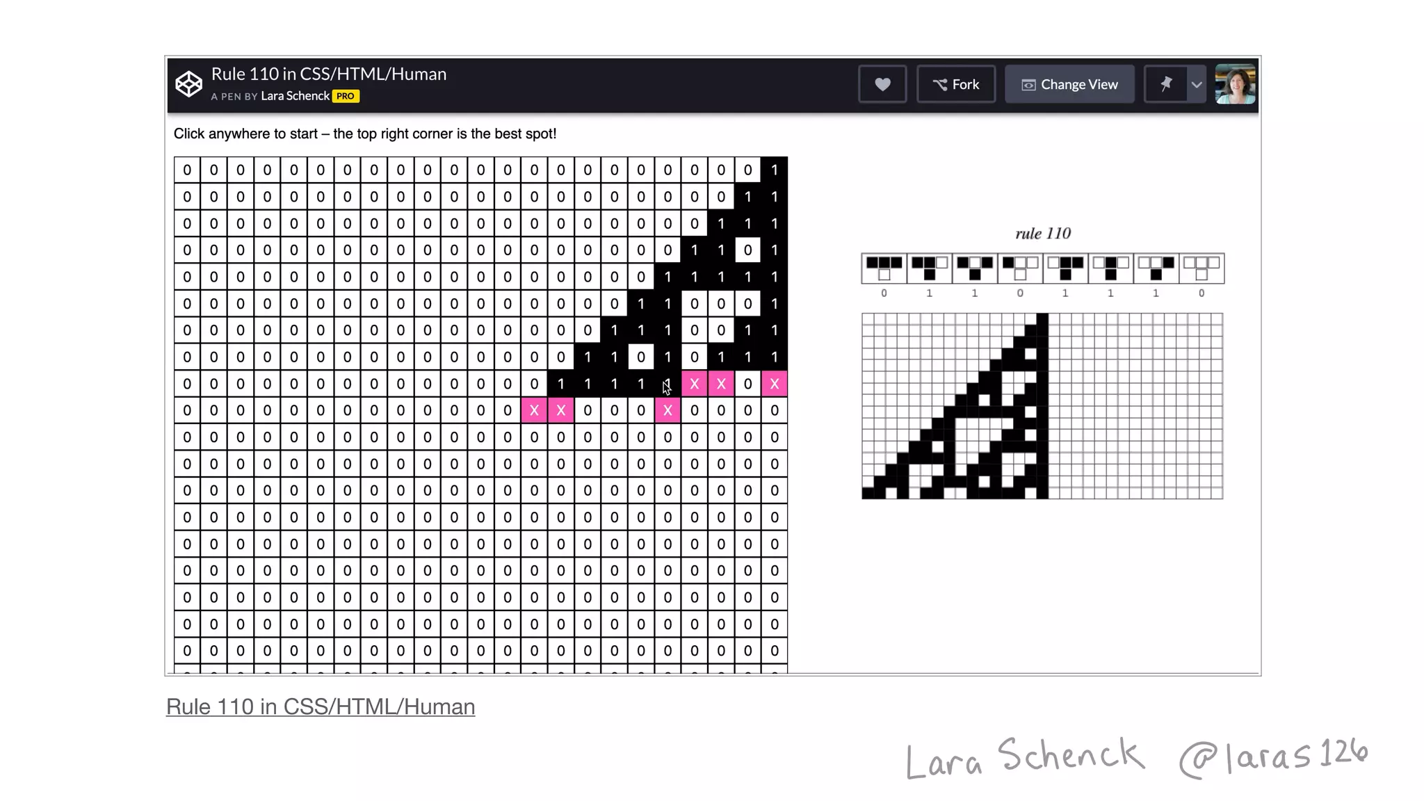
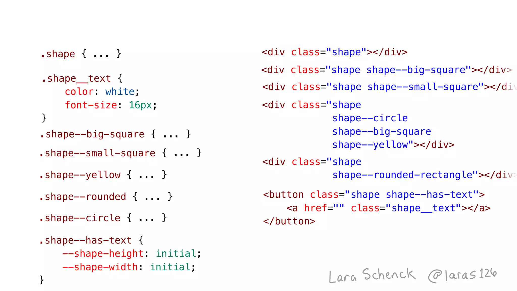
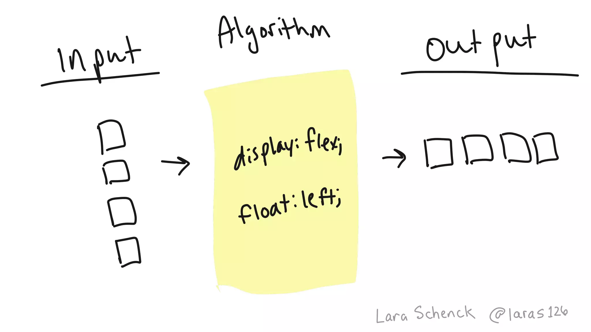
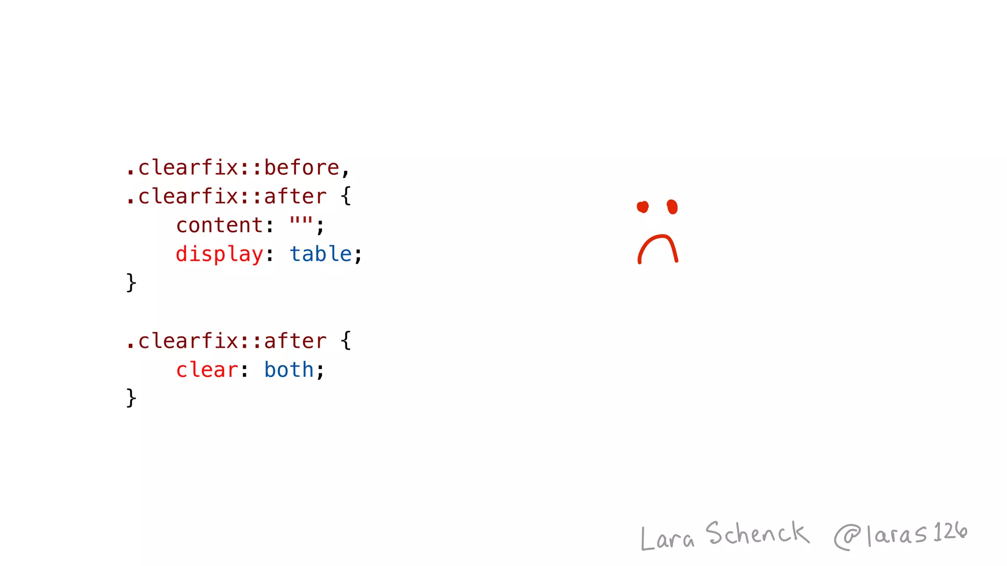
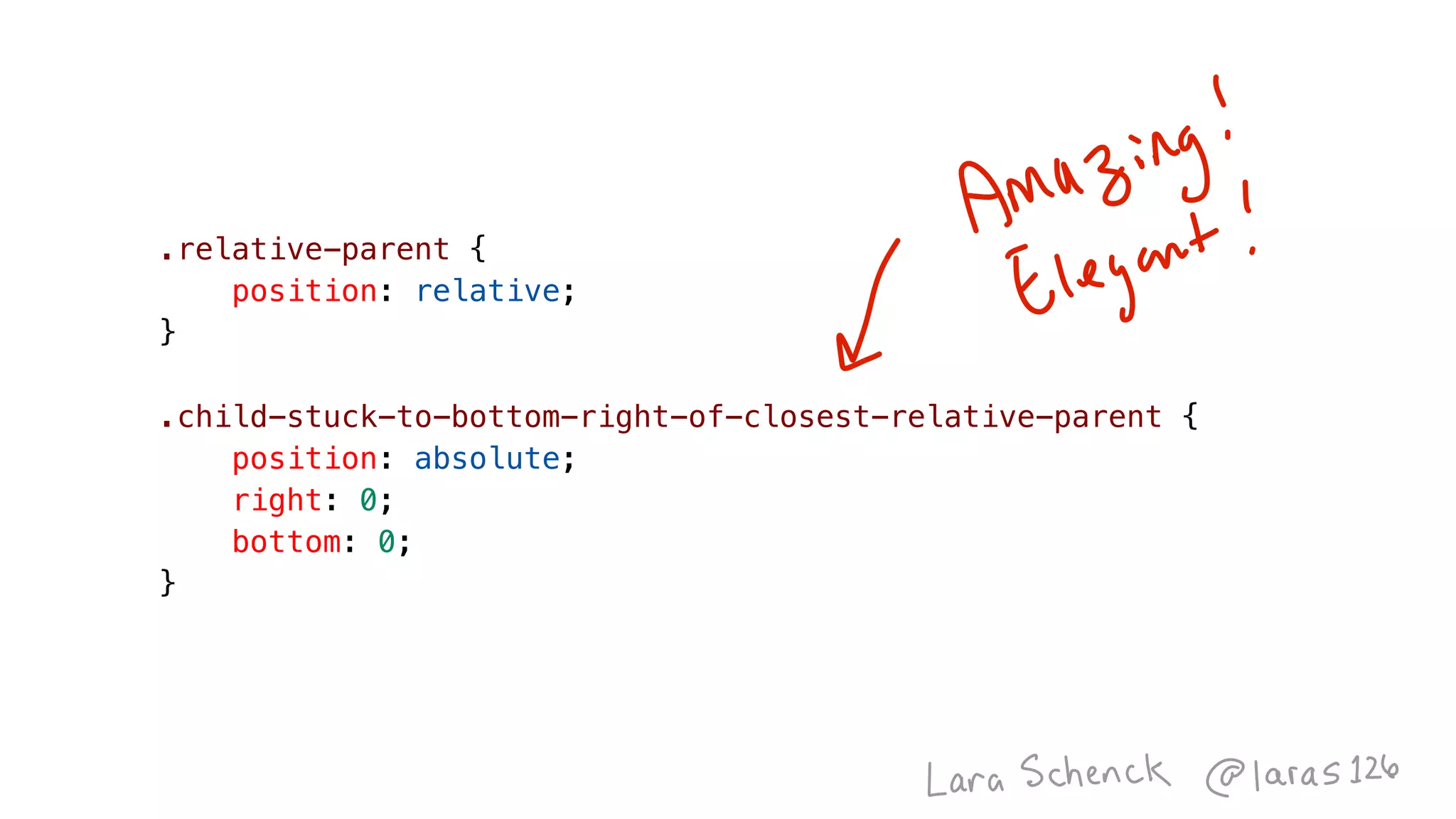
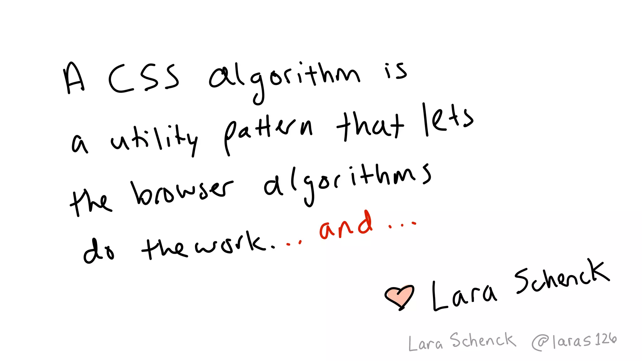
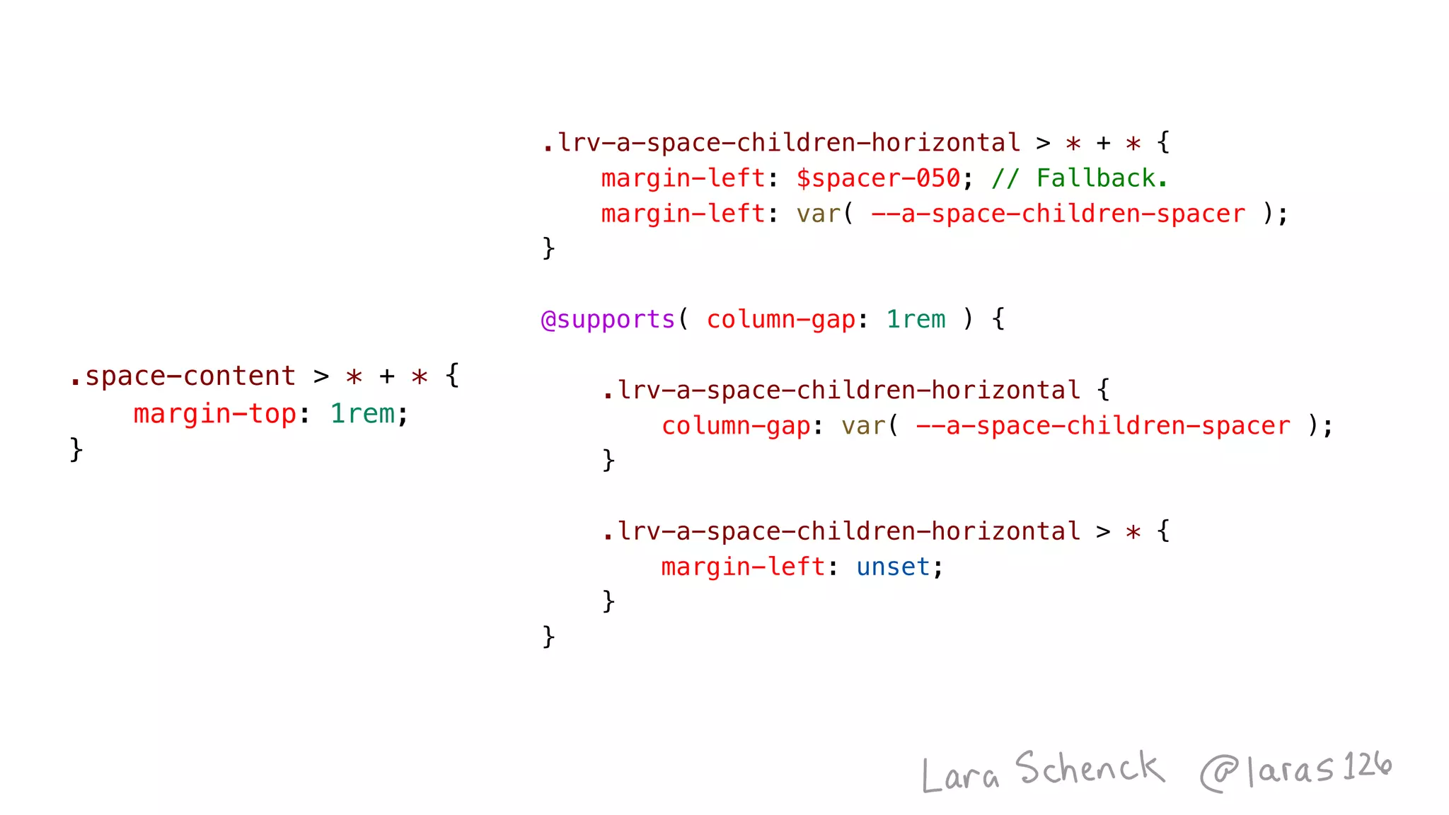
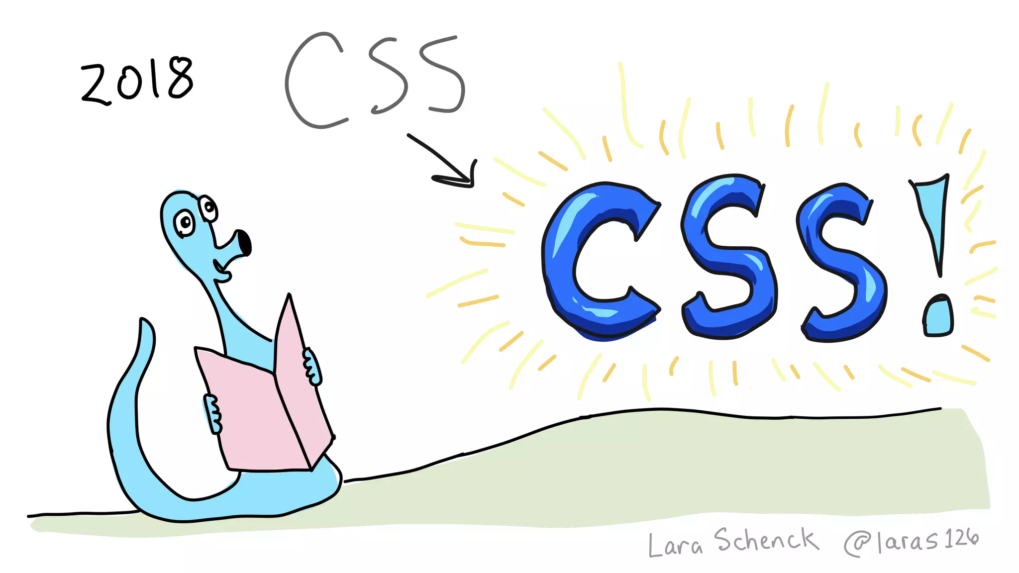
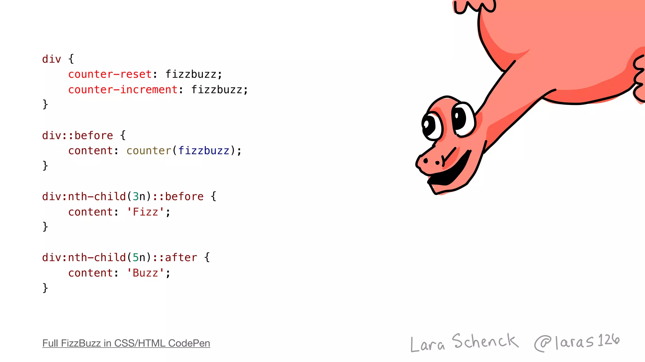
The document discusses using CSS and HTML to implement the FizzBuzz programming challenge without JavaScript. It resets and increments a counter for each div element, and uses the :nth-child pseudo-class and the content property to output "Fizz" for elements divisible by 3, "Buzz" for elements divisible by 5, and the counter value for other elements. This demonstrates how CSS selectors and properties can emulate basic programming logic.


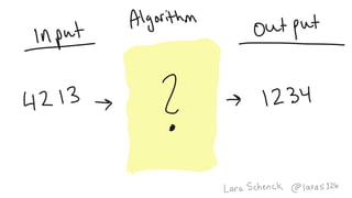
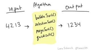
![function sort(array) {
for (let i = 0; i < array.length; i++) {
for (let ii = 0; ii < array.length; ii++) {
if (array[ii] > array[ii+1]) {
let temp = array[ii];
array[ii] = array[ii+1];
array[ii+1] = temp;
}
}
}
return array;
}
var sorted = sort([4, 2, 1, 3]);](https://image.slidesharecdn.com/algorithmsincss-v3-191110164557/85/CSS-Algorithms-v3-6-1-Strange-Loop-122-320.jpg)
![function sort(array) {
for (let i = 0; i < array.length; i++) {
for (let ii = 0; ii < array.length; ii++) {
if (array[ii] > array[ii+1]) {
let temp = array[ii];
array[ii] = array[ii+1];
array[ii+1] = temp;
}
}
}
return array;
}
var sorted = sort([4, 2, 1, 3]);](https://image.slidesharecdn.com/algorithmsincss-v3-191110164557/85/CSS-Algorithms-v3-6-1-Strange-Loop-123-320.jpg)


![function sort(array) {
for (let i = 0; i < array.length; i++) {
for (let ii = 0; ii < array.length; ii++) {
if (array[ii] > array[ii+1]) {
let temp = array[ii];
array[ii] = array[ii+1];
array[ii+1] = temp;
}
}
}
return array;
}
var sorted = sort([4, 2, 1, 3]);](https://image.slidesharecdn.com/algorithmsincss-v3-191110164557/75/CSS-Algorithms-v3-6-1-Strange-Loop-122-2048.jpg)
![function sort(array) {
for (let i = 0; i < array.length; i++) {
for (let ii = 0; ii < array.length; ii++) {
if (array[ii] > array[ii+1]) {
let temp = array[ii];
array[ii] = array[ii+1];
array[ii+1] = temp;
}
}
}
return array;
}
var sorted = sort([4, 2, 1, 3]);](https://image.slidesharecdn.com/algorithmsincss-v3-191110164557/75/CSS-Algorithms-v3-6-1-Strange-Loop-123-2048.jpg)


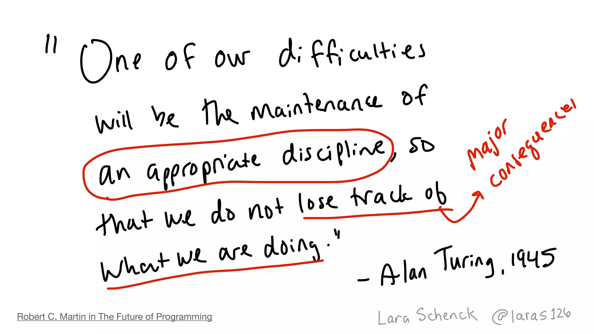
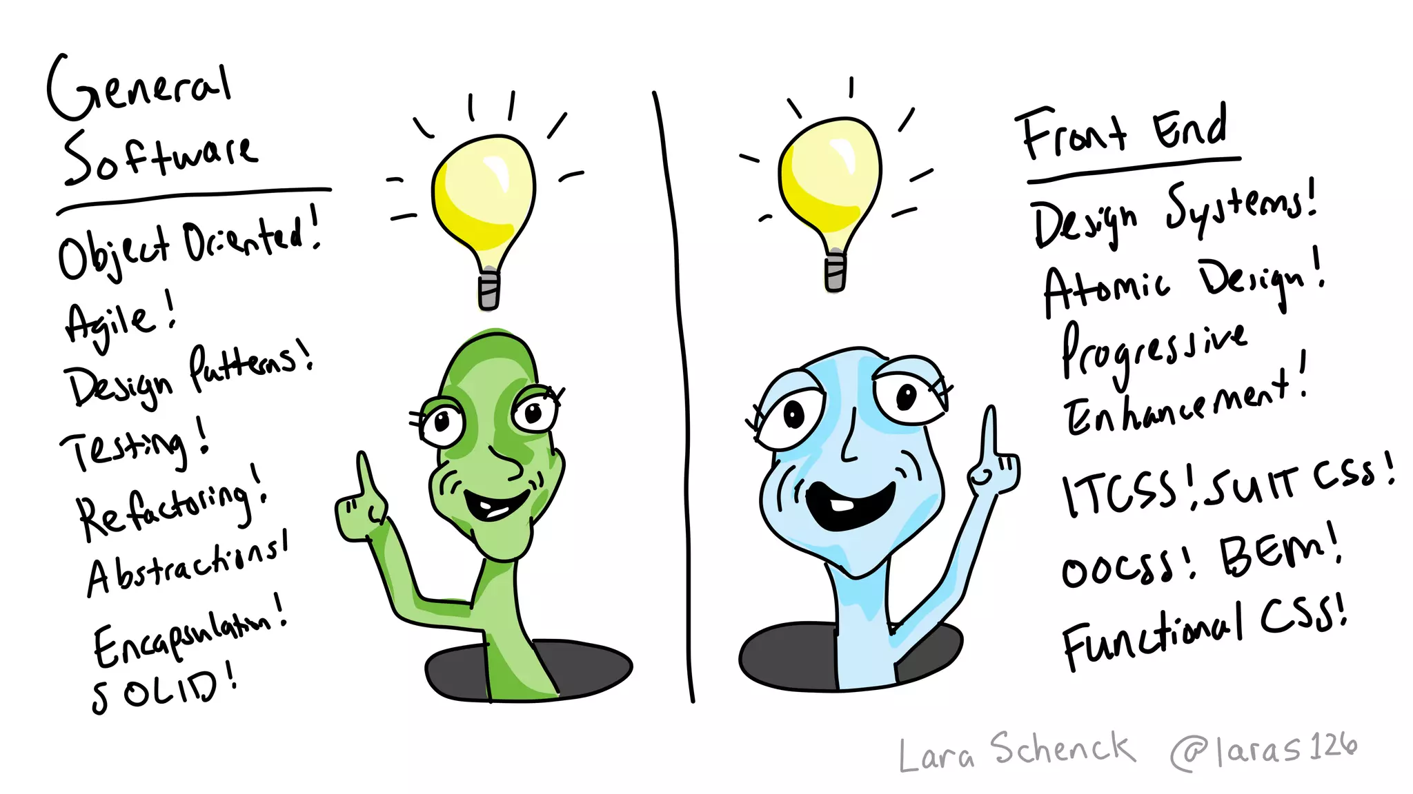
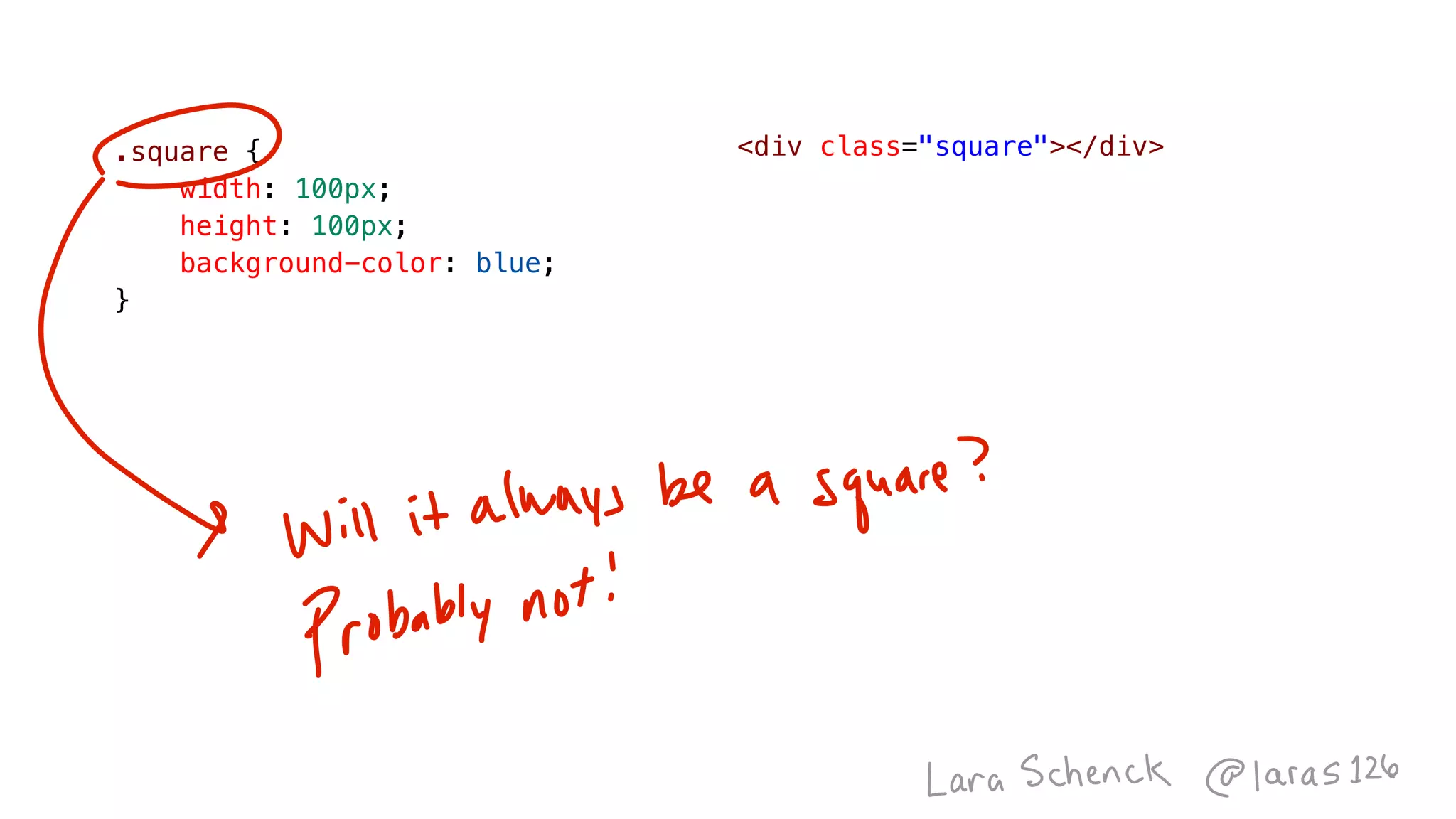


