Download as PDF, PPTX


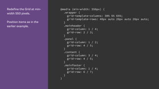


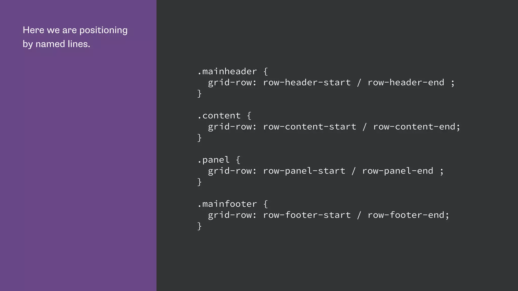
![Name lines with the name
in square brackets.
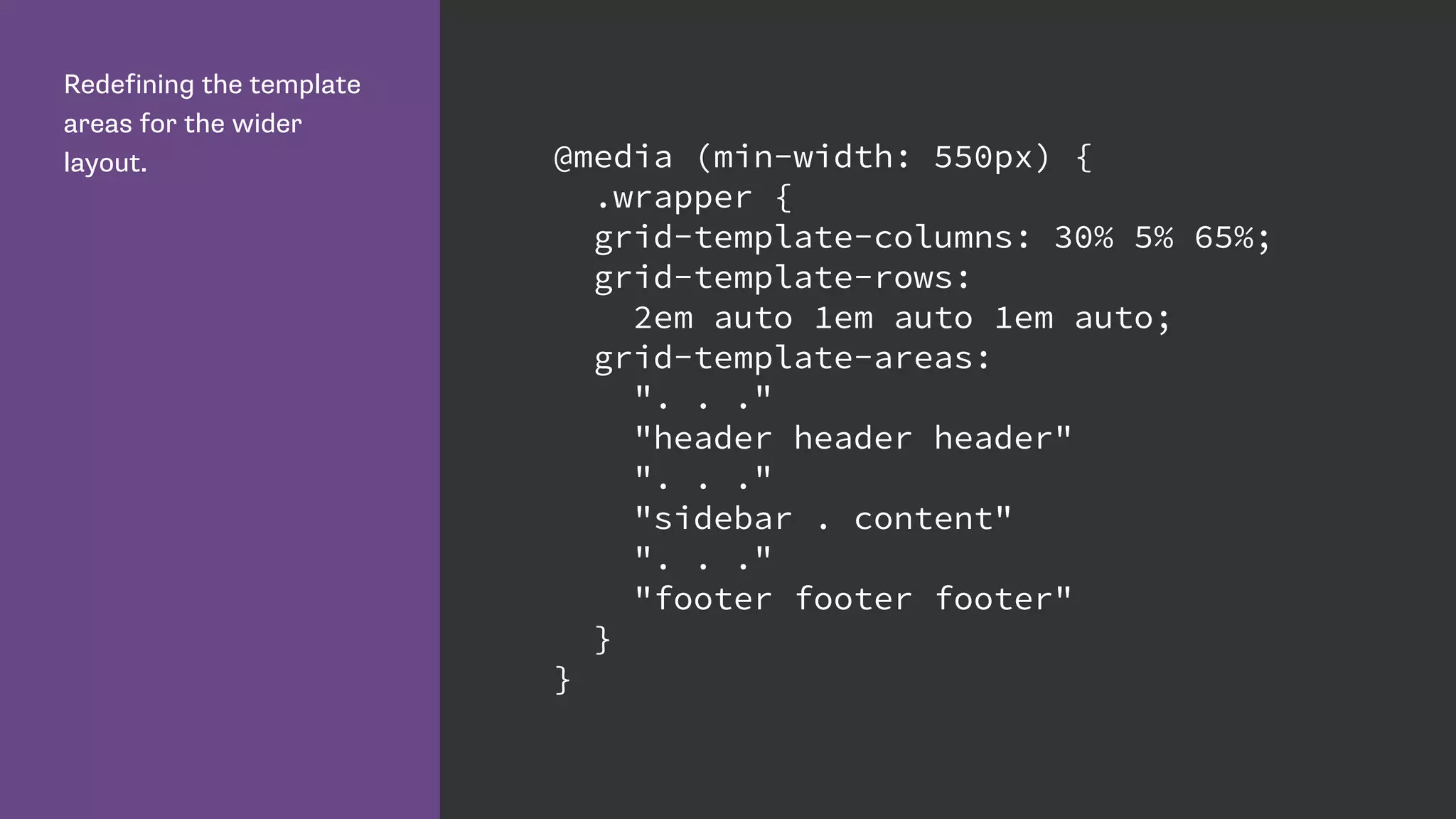
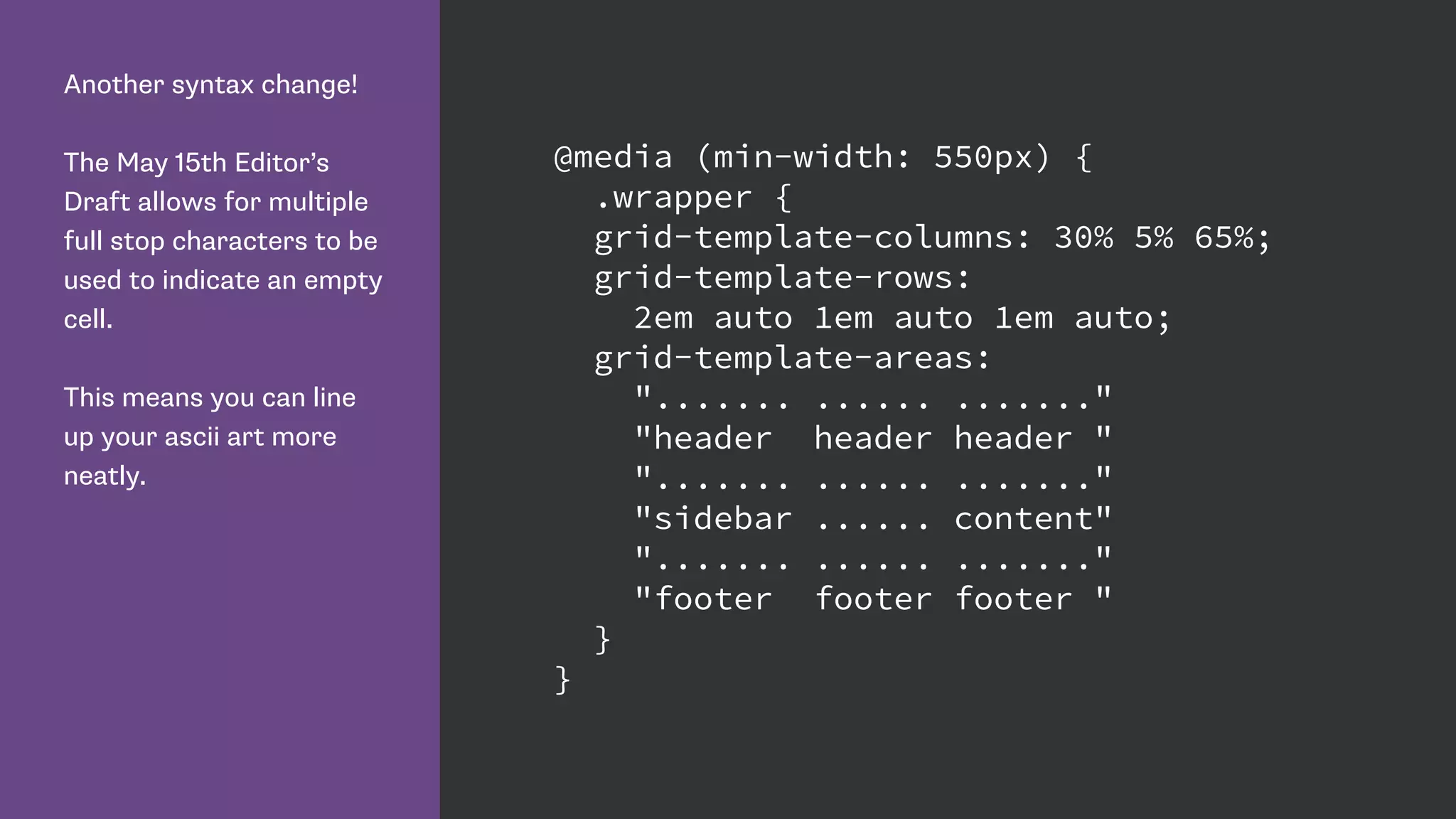
Remember we name grid
lines and not grid tracks.
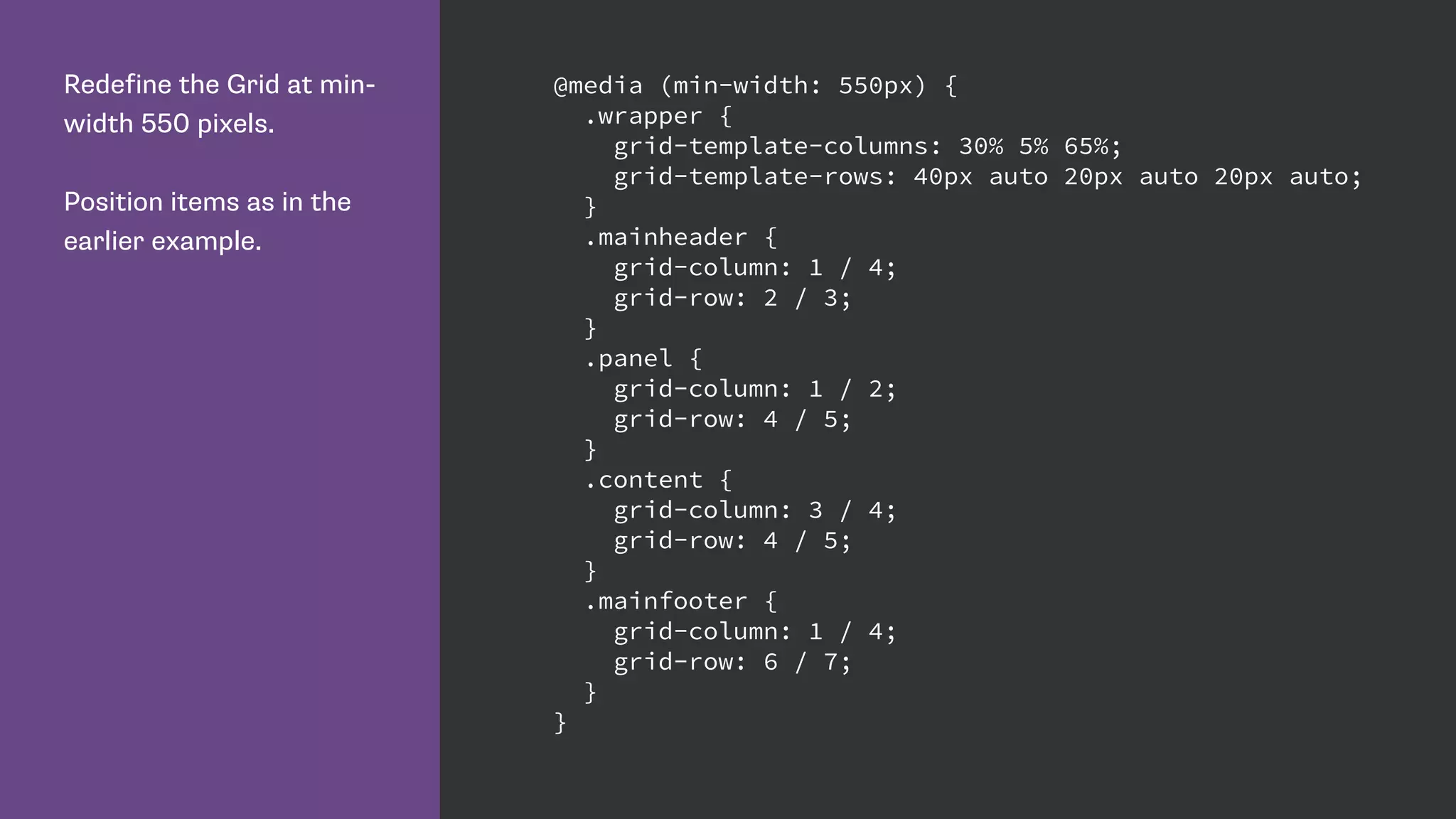
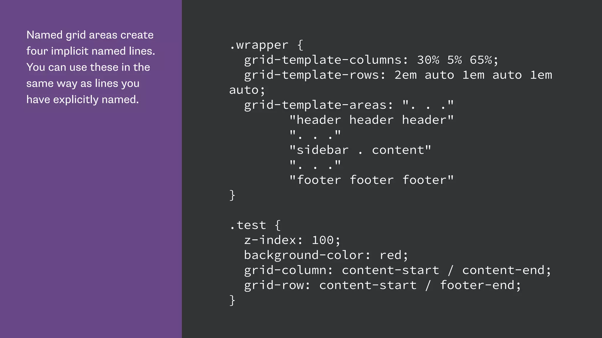
.wrapper {
display: grid;
grid-template-rows:
10px [row-header-start] auto [row-header-end]
10px [row-content-start] auto [row-content-end]
10px [row-panel-start] auto [row-panel-end]
10px [row-footer-start] auto [row-footer-end];
}](https://image.slidesharecdn.com/css-grid-40-generate-2015-150917081201-lva1-app6892/85/CSS-Grid-Layout-46-320.jpg)


![We can give multiple grid
lines the same name.
This means we can use
the span keyword to span
n number of lines, rather
than specifying a specific
grid line.
.wrapper {
grid-template-columns:
repeat(4, [col] 200px [gutter] 20px);
}
.content {
grid-column: col 2 / span gutter 2;
}](https://image.slidesharecdn.com/css-grid-40-generate-2015-150917081201-lva1-app6892/85/CSS-Grid-Layout-69-320.jpg)
![Defining the 12 column
grid.
The repeat keyword
repeats the pattern of
columns or rows the
number of times specified
before the comma.
.wrapper {
display: grid;
grid-template-columns:
repeat(11, [col] 4fr [gutter] 3.5fr ) [col] 4fr [gutter];
grid-template-rows:
auto repeat(4, [row] auto [gutter] 15px);
}](https://image.slidesharecdn.com/css-grid-40-generate-2015-150917081201-lva1-app6892/85/CSS-Grid-Layout-73-320.jpg)


![Defining the 12 column
grid.
We define Grid Tracks
that will be used as
columns, preceded by a
line named ‘col’ and those
used as gutters, preceded
by a line named ‘gutter’.
.wrapper {
display: grid;
grid-template-columns:
repeat(11, [col] 4fr [gutter] 3.5fr ) [col] 4fr [gutter];
grid-template-rows:
auto repeat(4, [row] auto [gutter] 15px);
}](https://image.slidesharecdn.com/css-grid-40-generate-2015-150917081201-lva1-app6892/85/CSS-Grid-Layout-101-320.jpg)

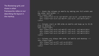
![Specifying gutters as grid
tracks.
.wrapper {
display: grid;
grid-template-columns: repeat(11, [col] 4fr
[gutter] 3.5fr ) [col] 4fr [gutter];
grid-template-rows: auto repeat(4, [row] auto
[gutter] 15px);
}](https://image.slidesharecdn.com/css-grid-40-generate-2015-150917081201-lva1-app6892/85/CSS-Grid-Layout-104-320.jpg)
![Specifying gutters with
the new properties:
grid-row-gap
grid-column-gap
.wrapper {
display: grid;
grid-column-gap: 1em;
grid-row-gap: 1em;
grid-template-columns: repeat(12, [col] 4fr );
grid-template-rows: auto;
}](https://image.slidesharecdn.com/css-grid-40-generate-2015-150917081201-lva1-app6892/85/CSS-Grid-Layout-105-320.jpg)
![Grid needs your feedback!
Enable Experimental Web Platform Features in Chrome.
Play with my examples and think up ways you would use Grid.
Blog, make examples, point out problems.
Follow the CSS Grid conversation on www-style by searching for
[css-grid].
See the current issues in the Editor’s Draft http://dev.w3.org/
csswg/css-grid/#issues-index](https://image.slidesharecdn.com/css-grid-40-generate-2015-150917081201-lva1-app6892/85/CSS-Grid-Layout-117-320.jpg)


![Name lines with the name
in square brackets.
Remember we name grid
lines and not grid tracks.
.wrapper {
display: grid;
grid-template-rows:
10px [row-header-start] auto [row-header-end]
10px [row-content-start] auto [row-content-end]
10px [row-panel-start] auto [row-panel-end]
10px [row-footer-start] auto [row-footer-end];
}](https://image.slidesharecdn.com/css-grid-40-generate-2015-150917081201-lva1-app6892/75/CSS-Grid-Layout-46-2048.jpg)


![We can give multiple grid
lines the same name.
This means we can use
the span keyword to span
n number of lines, rather
than specifying a specific
grid line.
.wrapper {
grid-template-columns:
repeat(4, [col] 200px [gutter] 20px);
}
.content {
grid-column: col 2 / span gutter 2;
}](https://image.slidesharecdn.com/css-grid-40-generate-2015-150917081201-lva1-app6892/75/CSS-Grid-Layout-69-2048.jpg)
![Defining the 12 column
grid.
The repeat keyword
repeats the pattern of
columns or rows the
number of times specified
before the comma.
.wrapper {
display: grid;
grid-template-columns:
repeat(11, [col] 4fr [gutter] 3.5fr ) [col] 4fr [gutter];
grid-template-rows:
auto repeat(4, [row] auto [gutter] 15px);
}](https://image.slidesharecdn.com/css-grid-40-generate-2015-150917081201-lva1-app6892/75/CSS-Grid-Layout-73-2048.jpg)


![Defining the 12 column
grid.
We define Grid Tracks
that will be used as
columns, preceded by a
line named ‘col’ and those
used as gutters, preceded
by a line named ‘gutter’.
.wrapper {
display: grid;
grid-template-columns:
repeat(11, [col] 4fr [gutter] 3.5fr ) [col] 4fr [gutter];
grid-template-rows:
auto repeat(4, [row] auto [gutter] 15px);
}](https://image.slidesharecdn.com/css-grid-40-generate-2015-150917081201-lva1-app6892/75/CSS-Grid-Layout-101-2048.jpg)
![Specifying gutters as grid
tracks.
.wrapper {
display: grid;
grid-template-columns: repeat(11, [col] 4fr
[gutter] 3.5fr ) [col] 4fr [gutter];
grid-template-rows: auto repeat(4, [row] auto
[gutter] 15px);
}](https://image.slidesharecdn.com/css-grid-40-generate-2015-150917081201-lva1-app6892/75/CSS-Grid-Layout-104-2048.jpg)
![Specifying gutters with
the new properties:
grid-row-gap
grid-column-gap
.wrapper {
display: grid;
grid-column-gap: 1em;
grid-row-gap: 1em;
grid-template-columns: repeat(12, [col] 4fr );
grid-template-rows: auto;
}](https://image.slidesharecdn.com/css-grid-40-generate-2015-150917081201-lva1-app6892/75/CSS-Grid-Layout-105-2048.jpg)


![Grid needs your feedback!
Enable Experimental Web Platform Features in Chrome.
Play with my examples and think up ways you would use Grid.
Blog, make examples, point out problems.
Follow the CSS Grid conversation on www-style by searching for
[css-grid].
See the current issues in the Editor’s Draft http://dev.w3.org/
csswg/css-grid/#issues-index](https://image.slidesharecdn.com/css-grid-40-generate-2015-150917081201-lva1-app6892/75/CSS-Grid-Layout-117-2048.jpg)


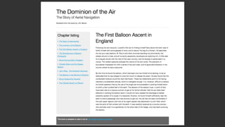
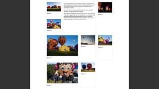
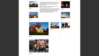
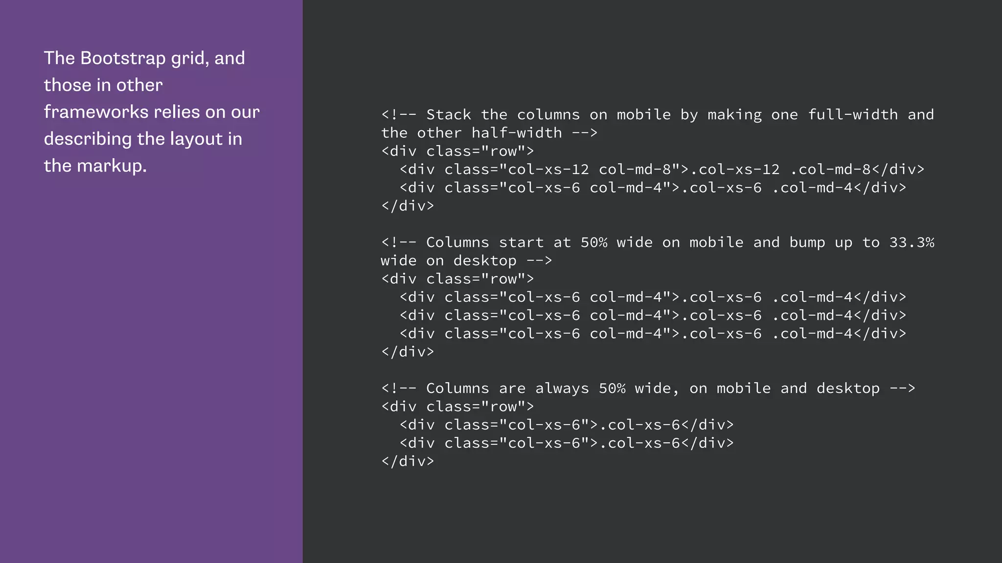
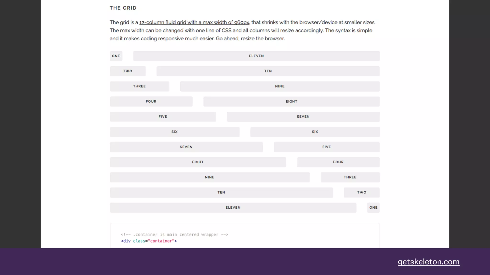
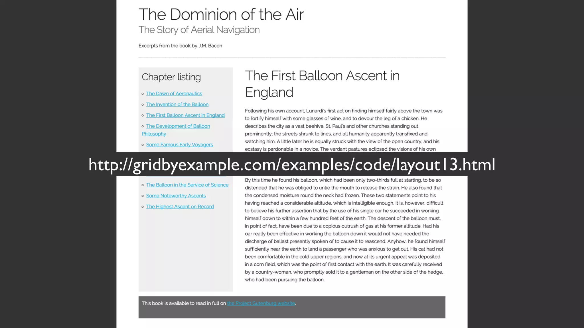
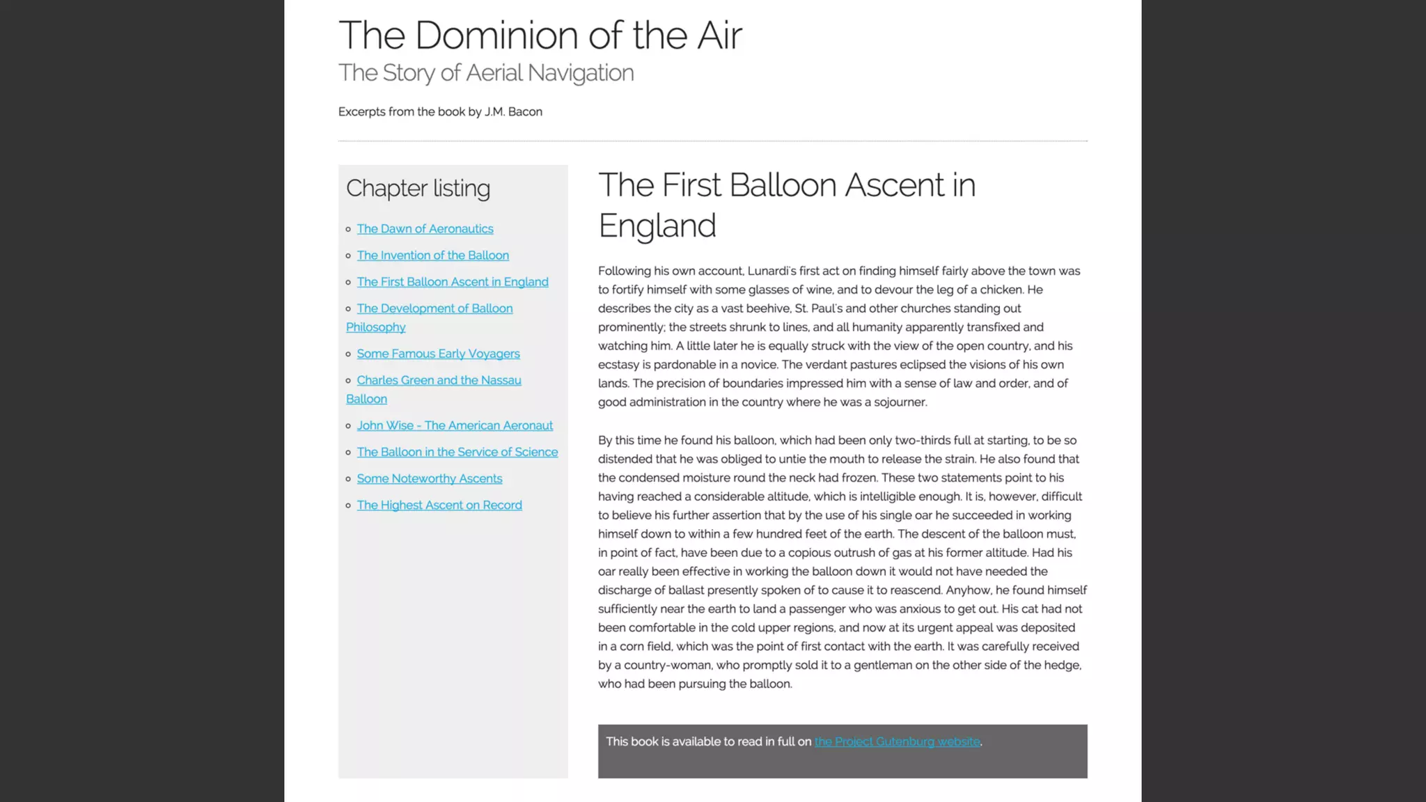
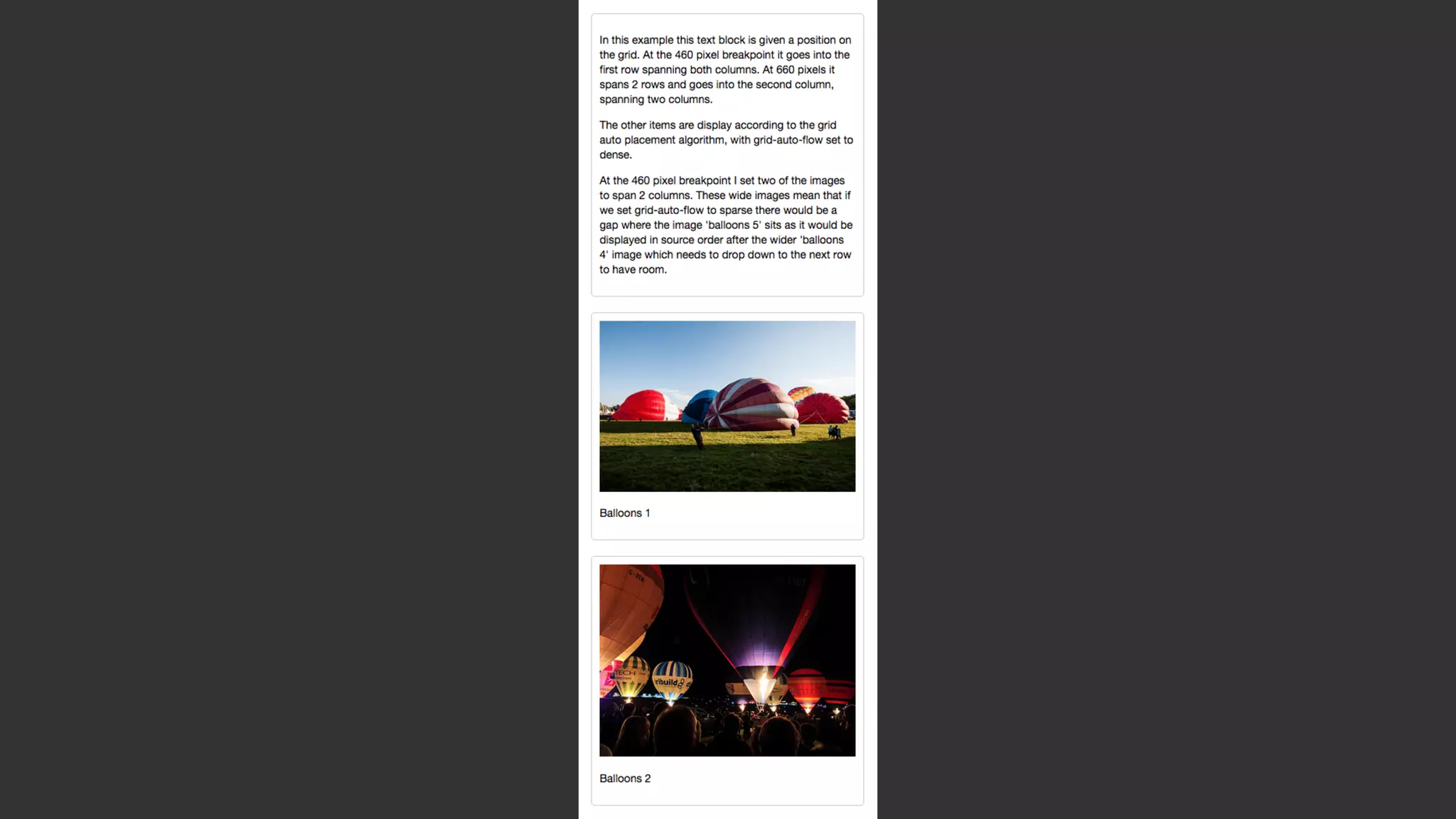
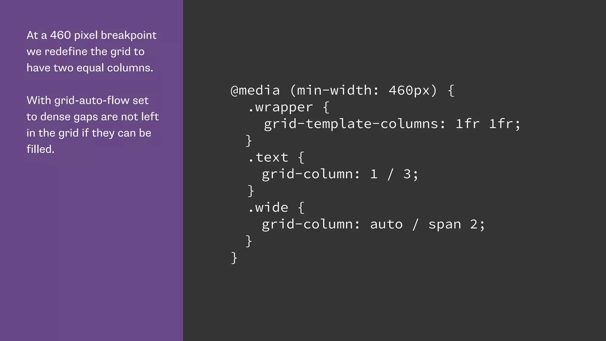
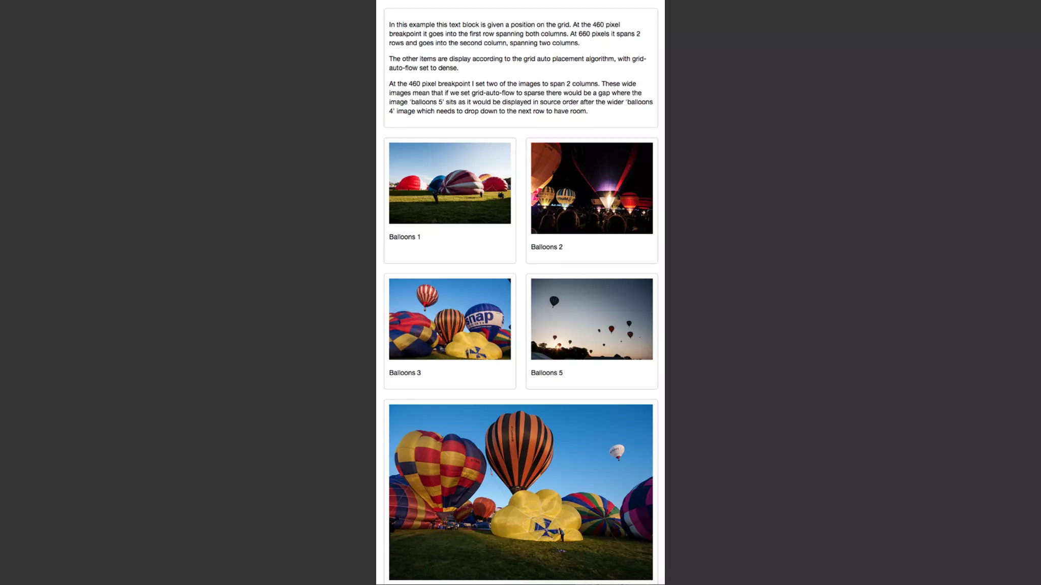
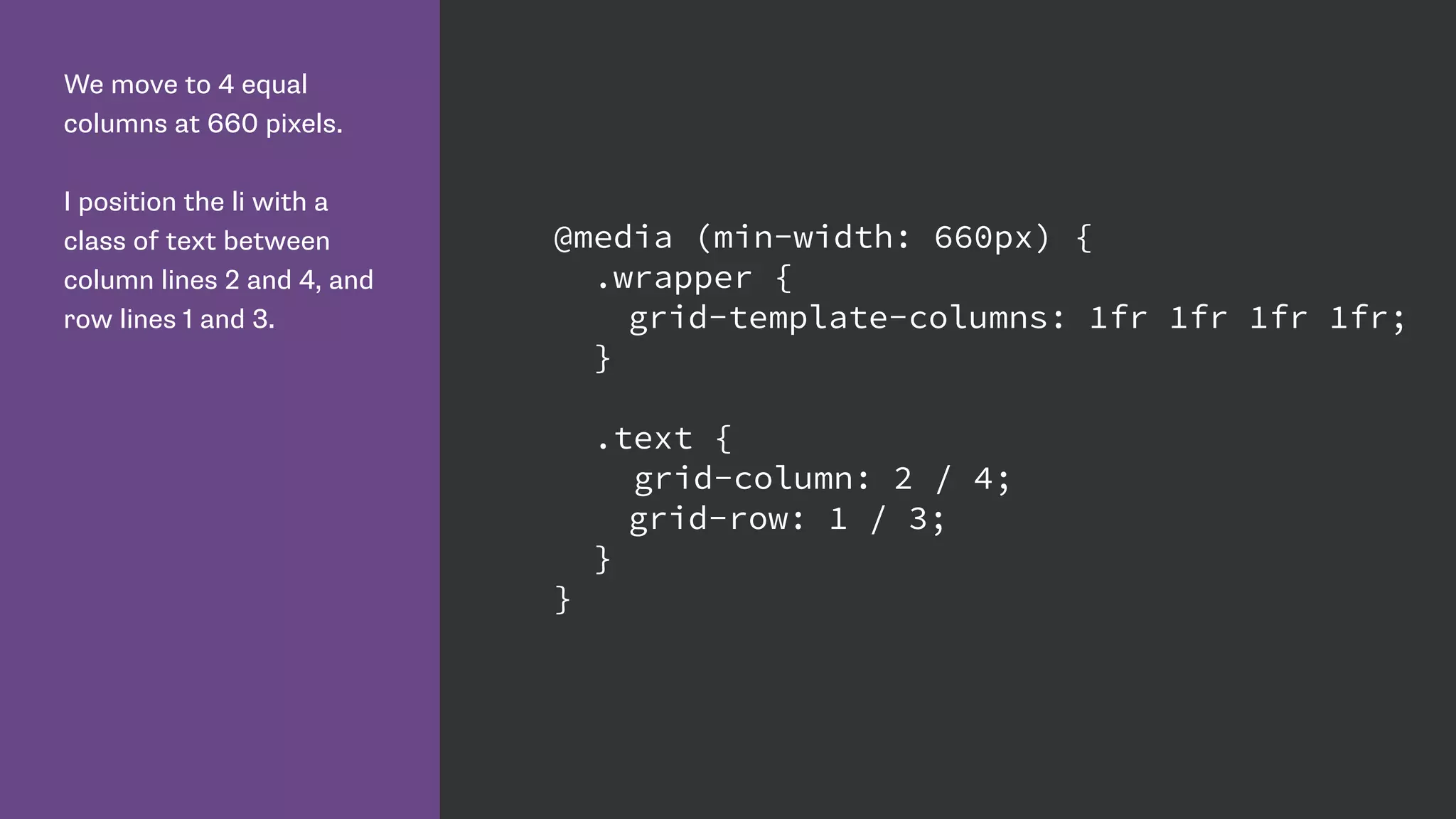
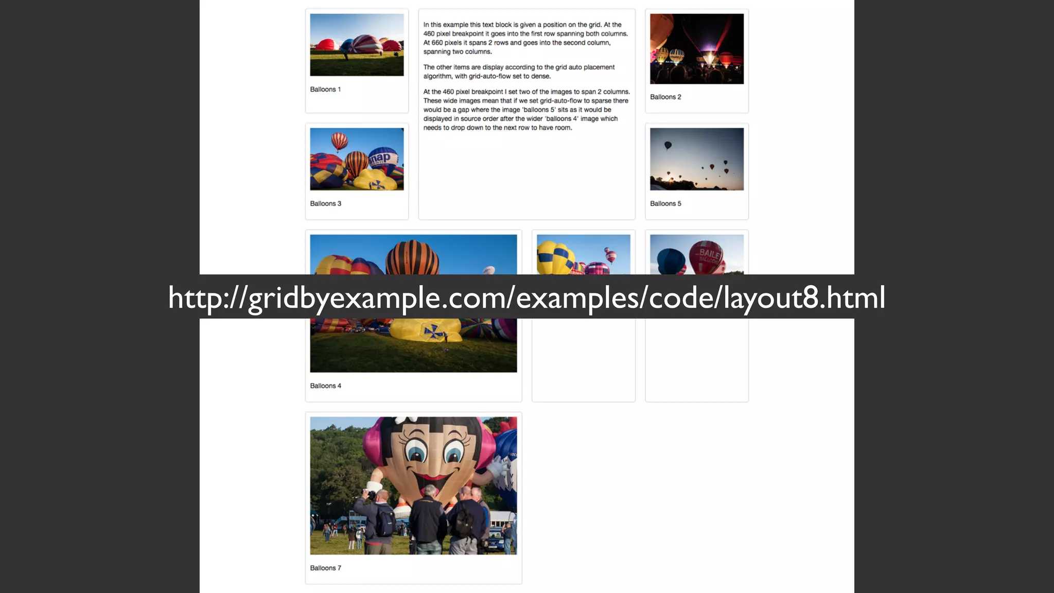
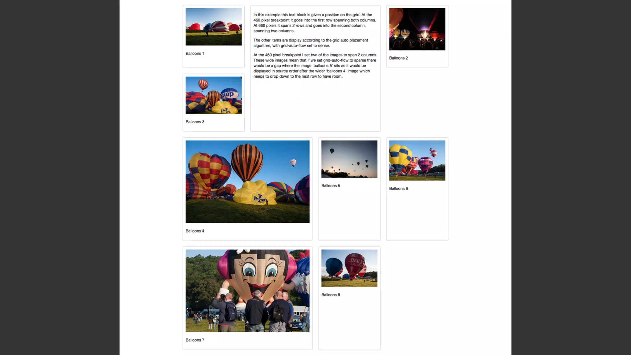
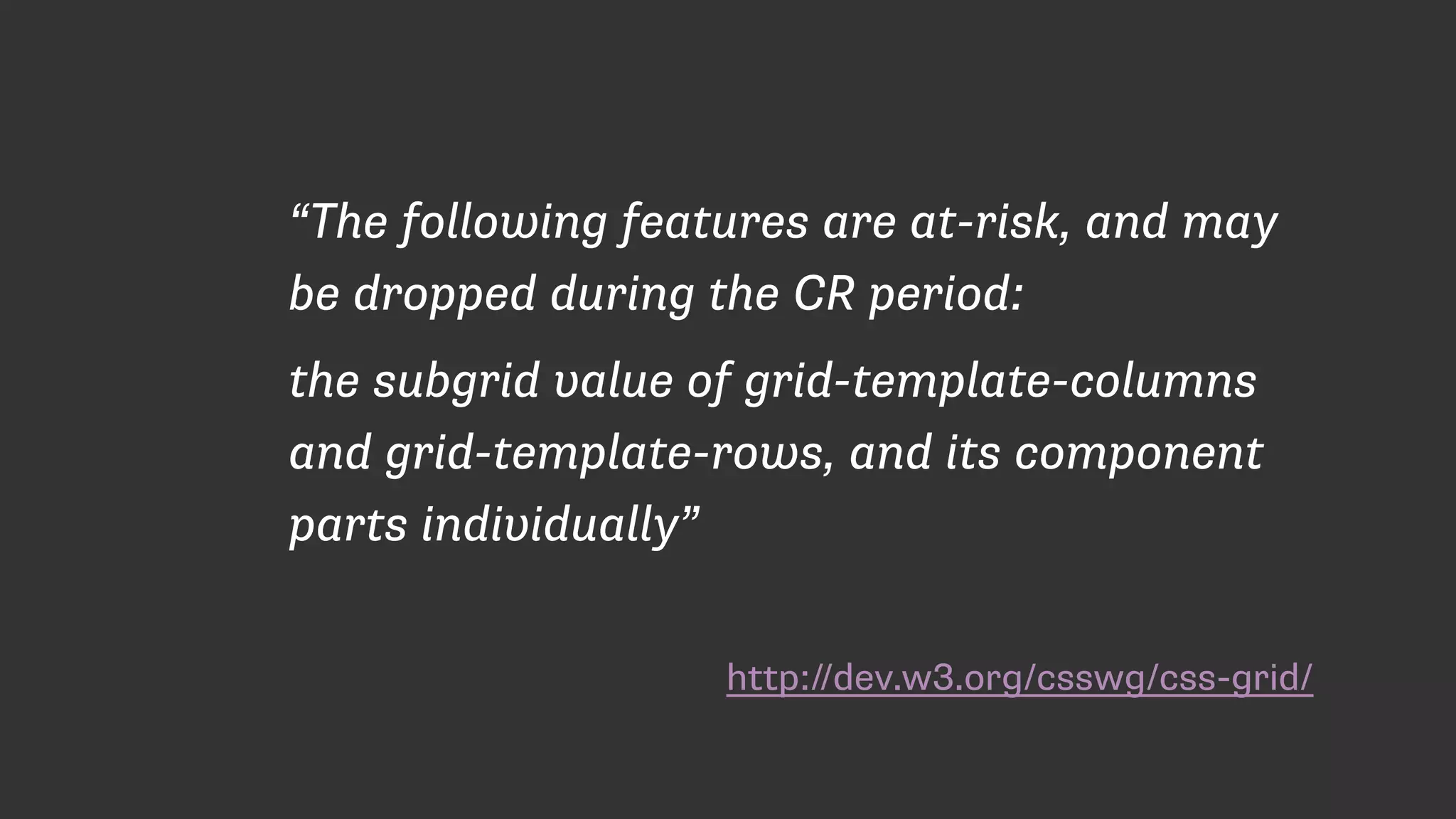
The document discusses CSS Grid Layout as a new method for controlling page layout with CSS. It provides examples of using Grid Layout properties like grid-template-columns, grid-template-rows, and grid-column to define a grid structure and position elements within that grid. Key benefits highlighted include describing the layout solely in CSS, ability to redefine the layout at different breakpoints, and eliminating the need for layout hacks or non-semantic markup used by older methods.
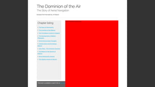
Introduction to the CSS Grid Layout by Rachel Andrew, highlighting her website and social media.
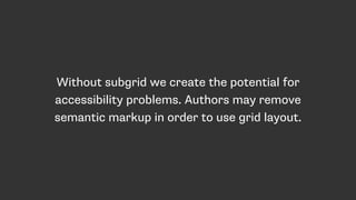
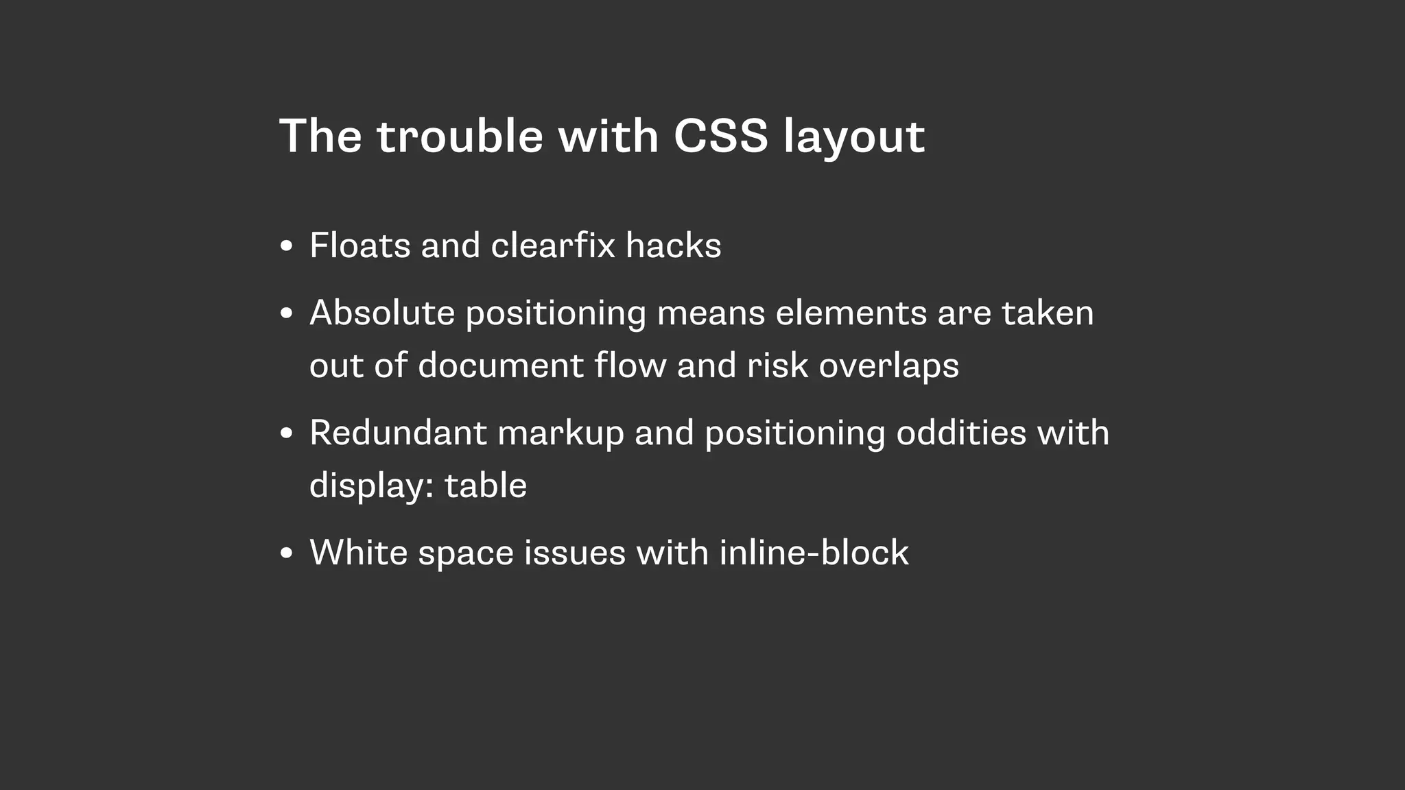
Discussion on issues with traditional CSS layouts (floats, positioning, markup) and the high cost of learning and implementing non-semantic layouts.
Warning against viewing Flexbox as a complete solution for layout problems, indicating that it may lead to more hacks.
Emphasizes the need for a well-designed layout system for modern web development, introducing CSS Grid Layout.
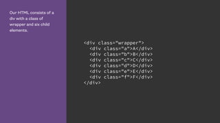
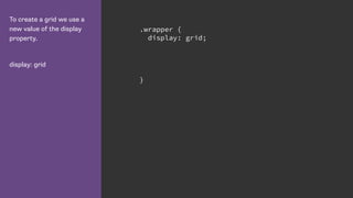
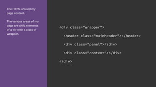
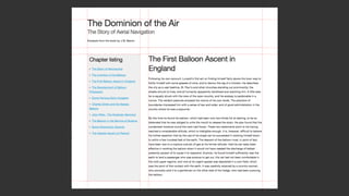
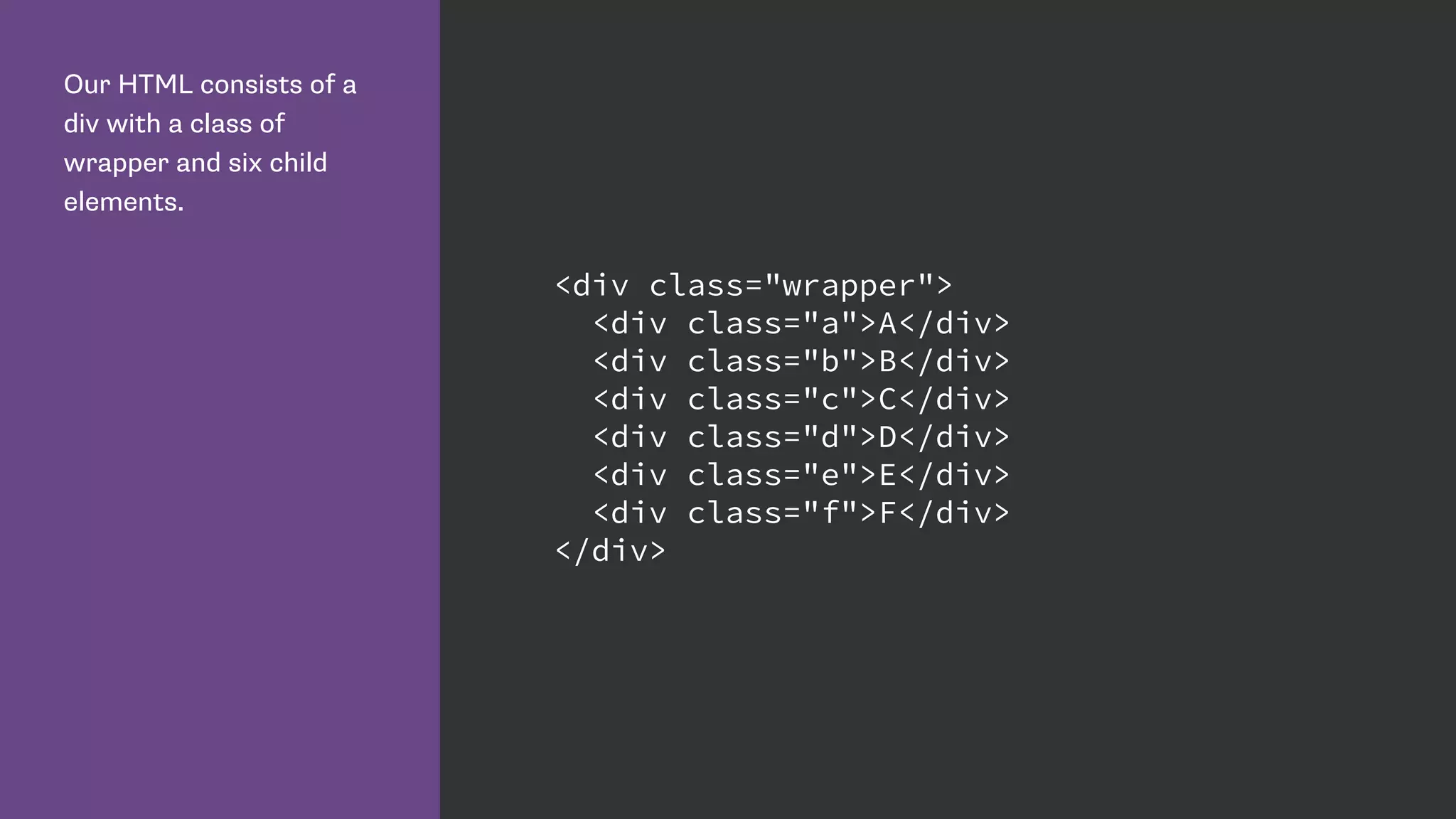
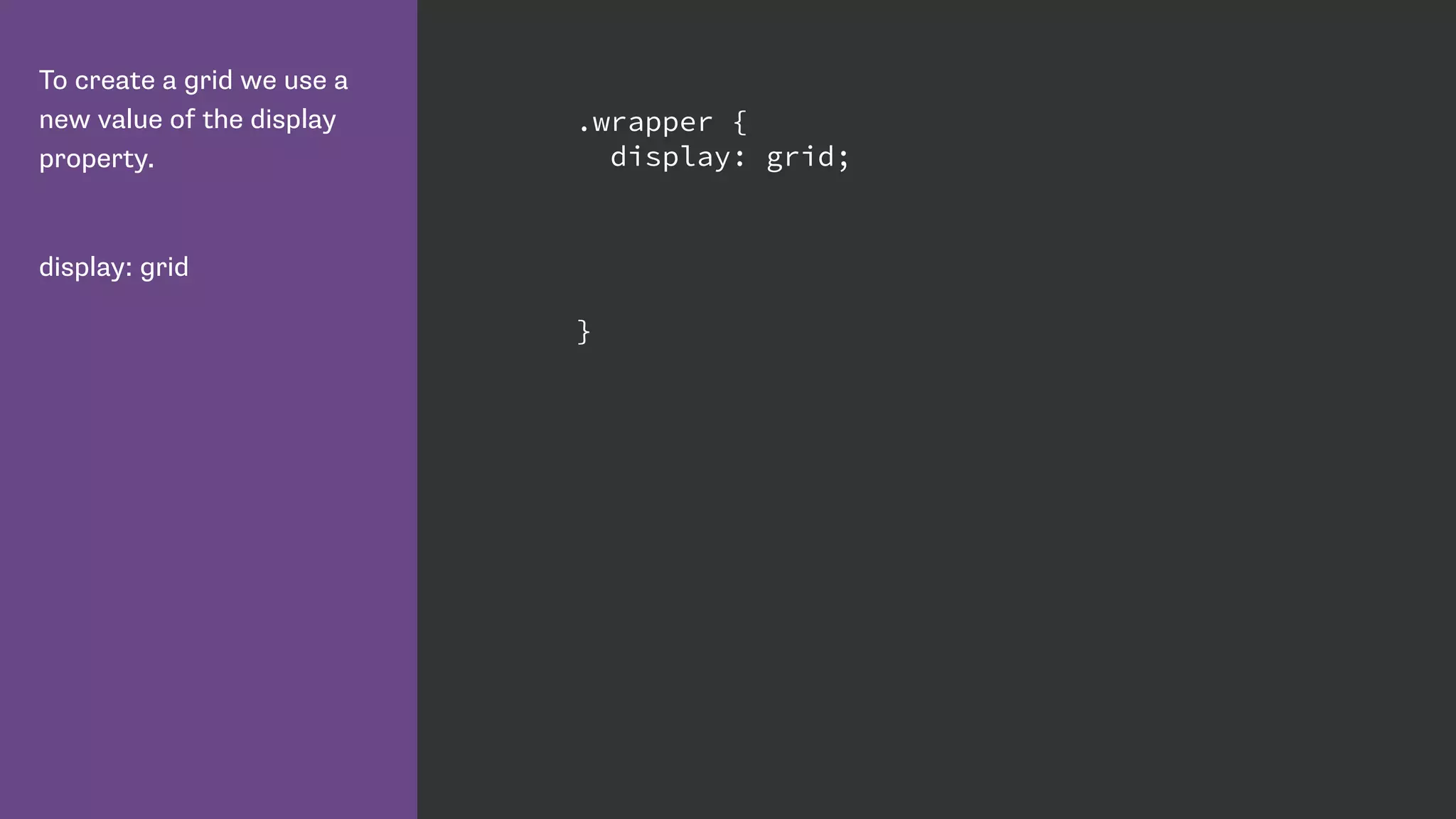
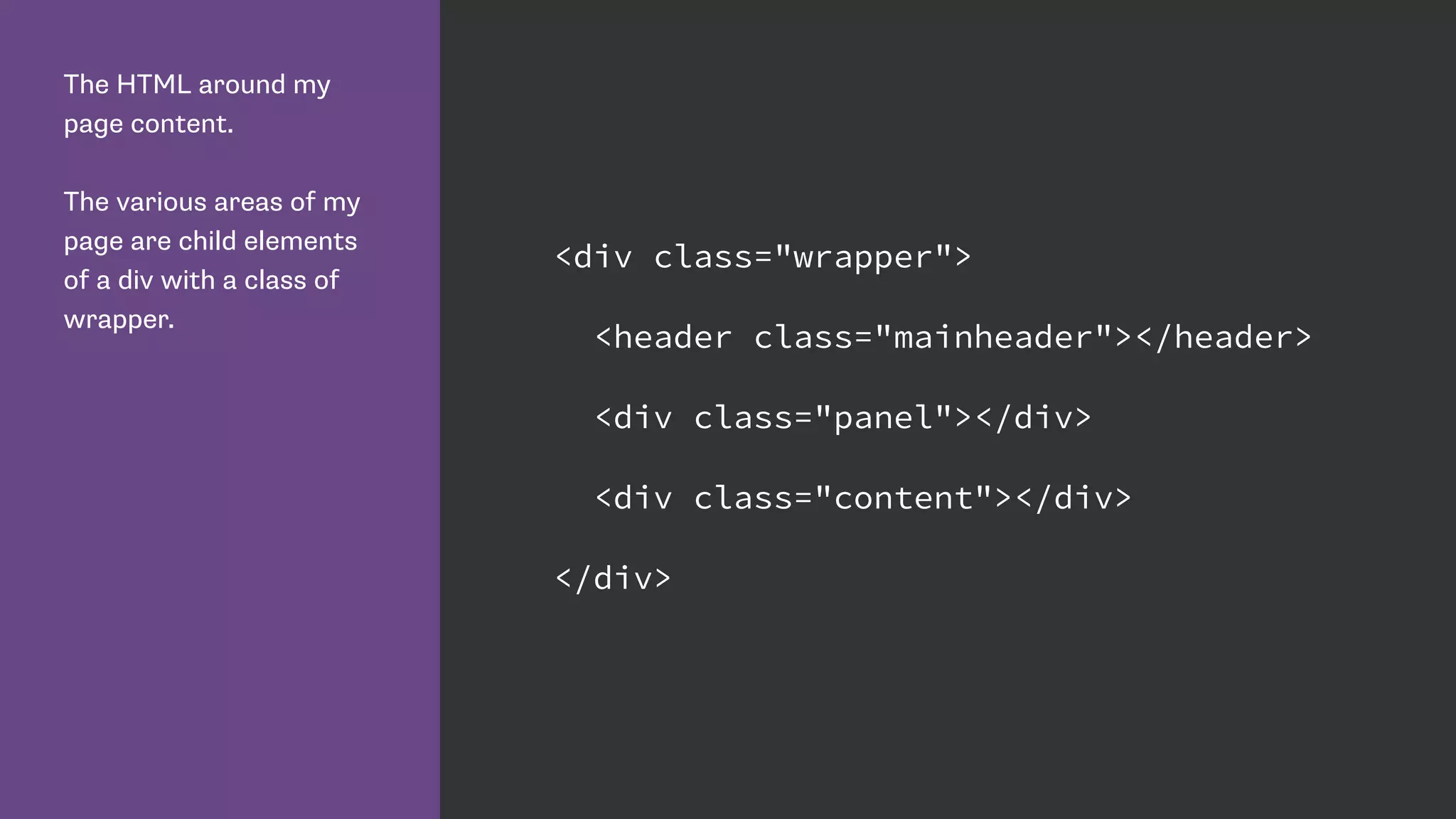
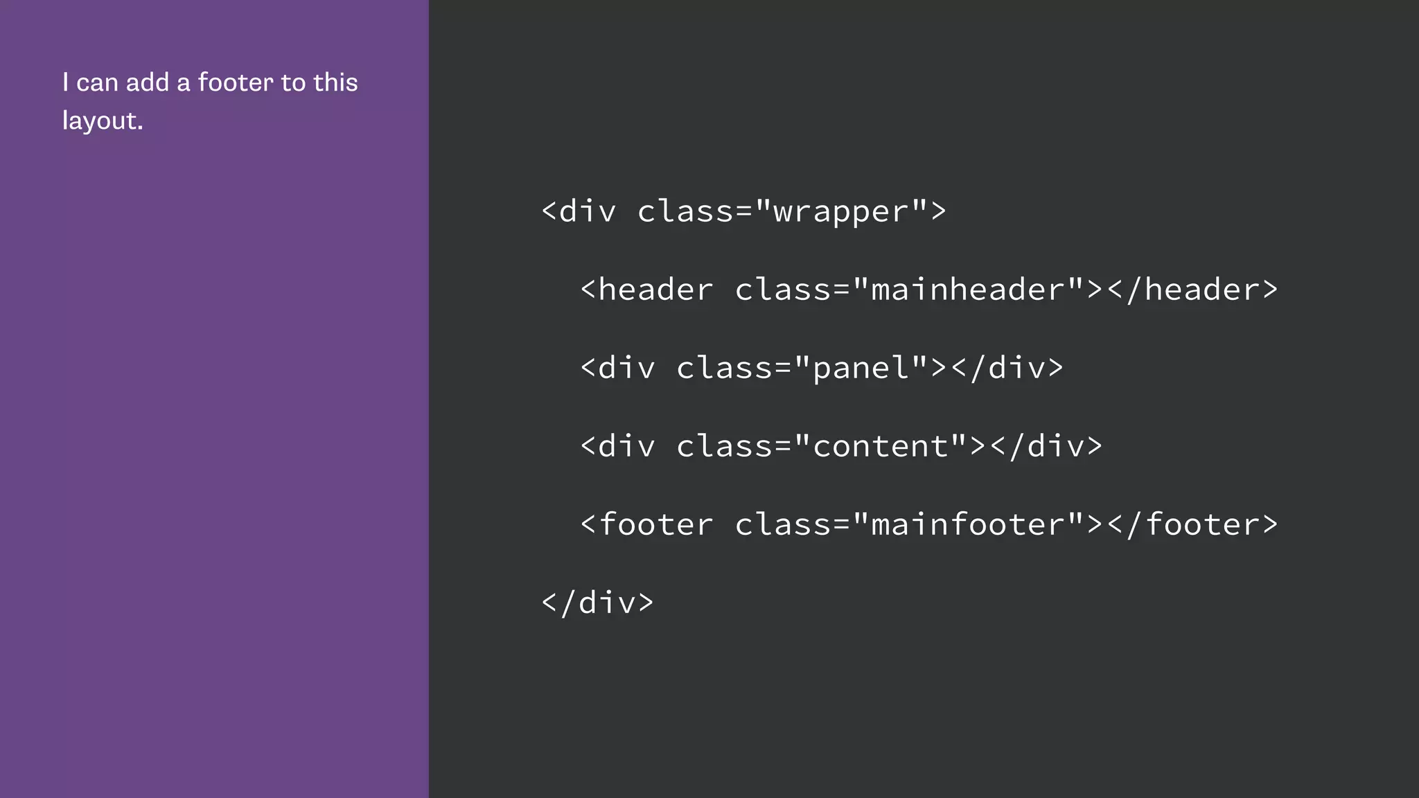
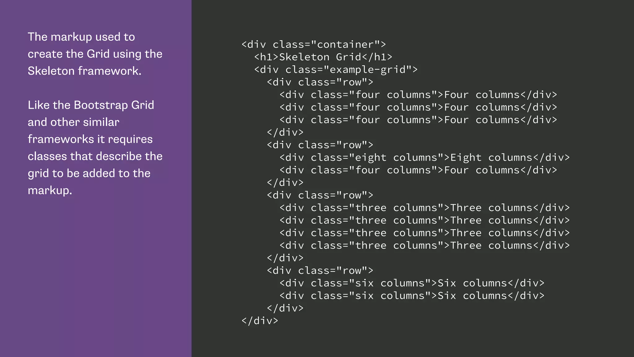
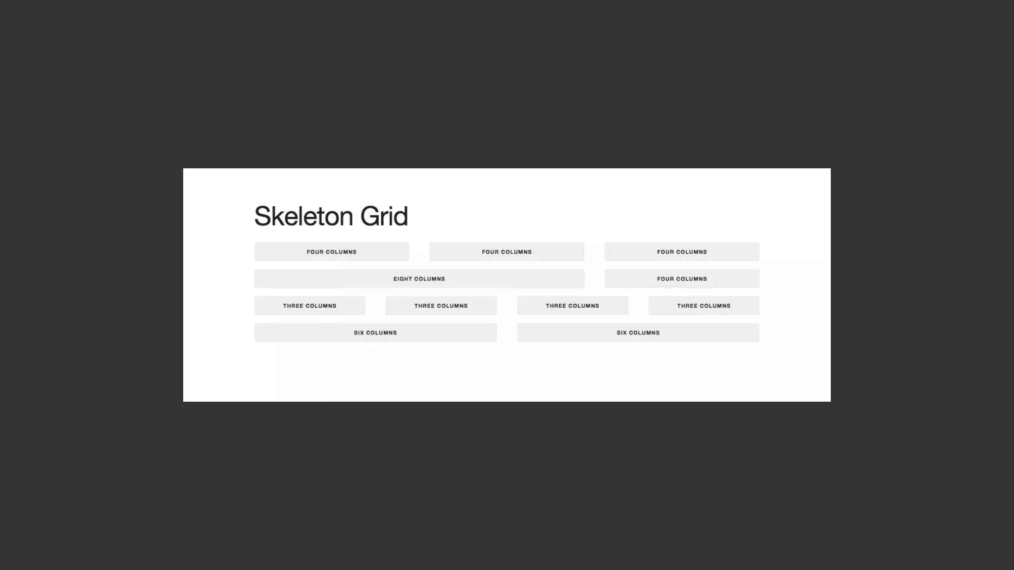
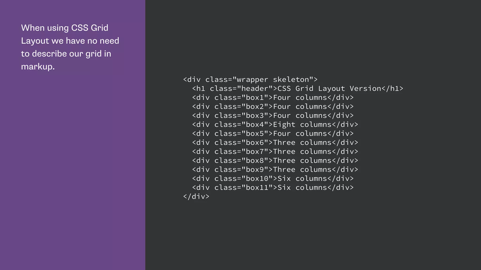
Introduction to HTML structure for CSS Grid, explaining the 'display: grid' property and basic item positioning.
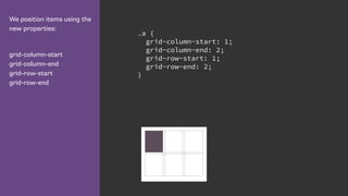
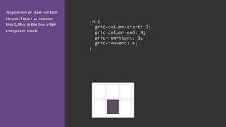
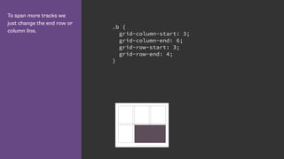
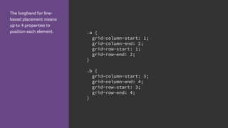
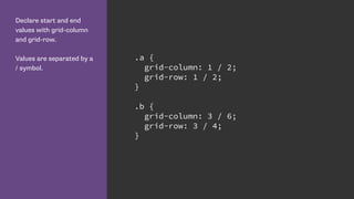
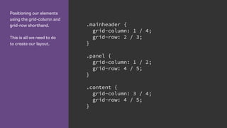
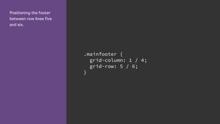
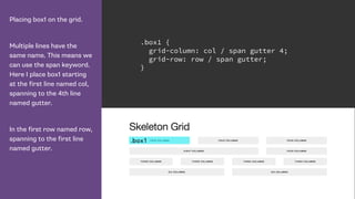
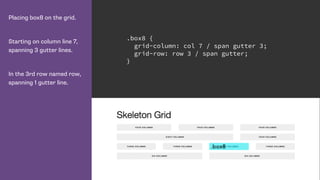
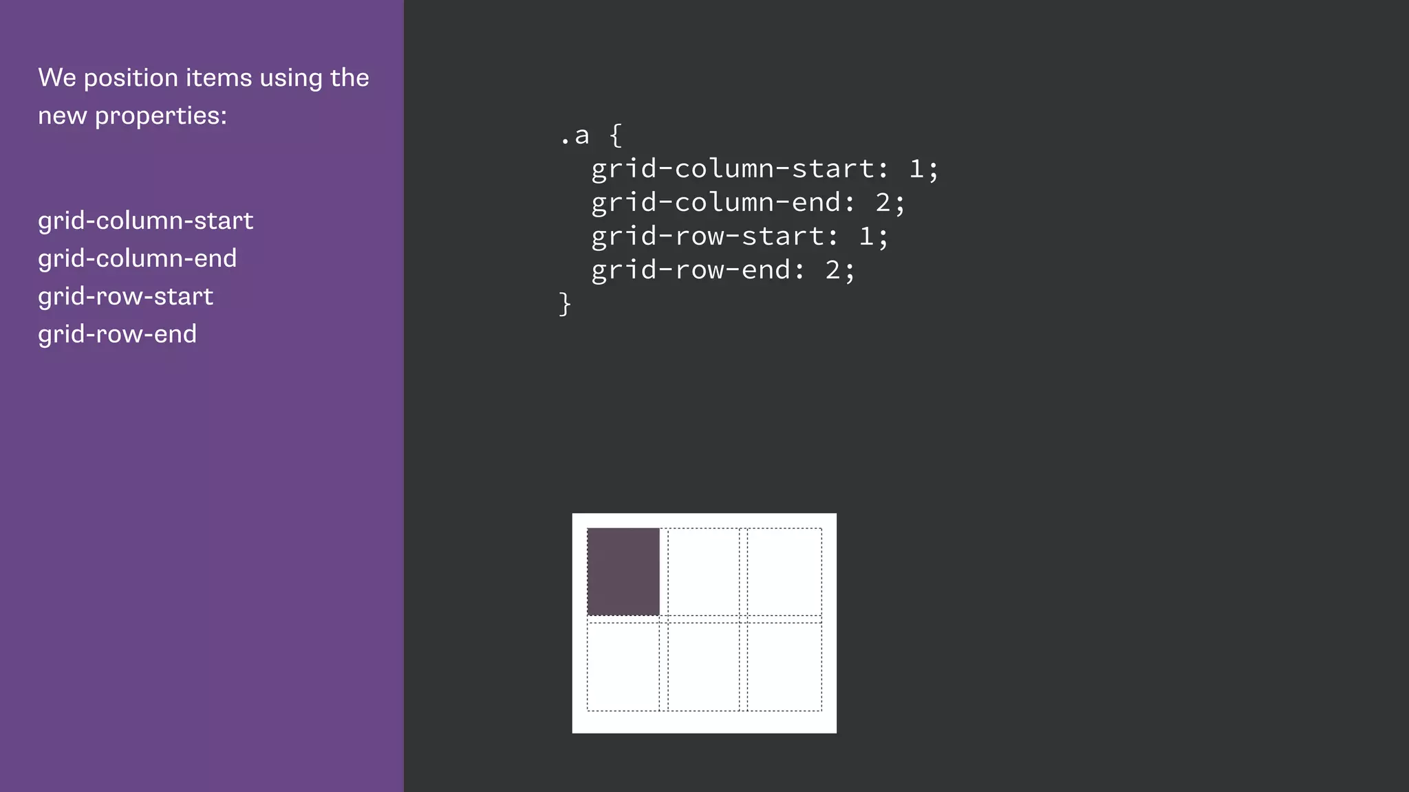
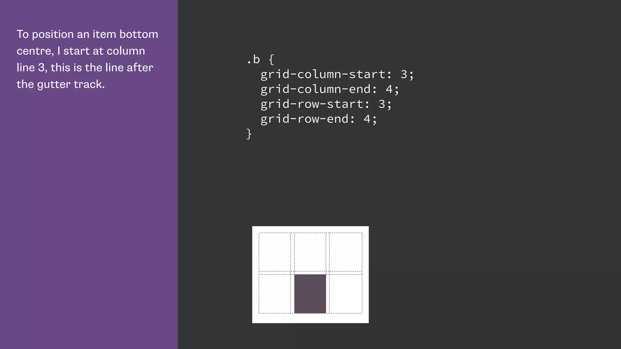
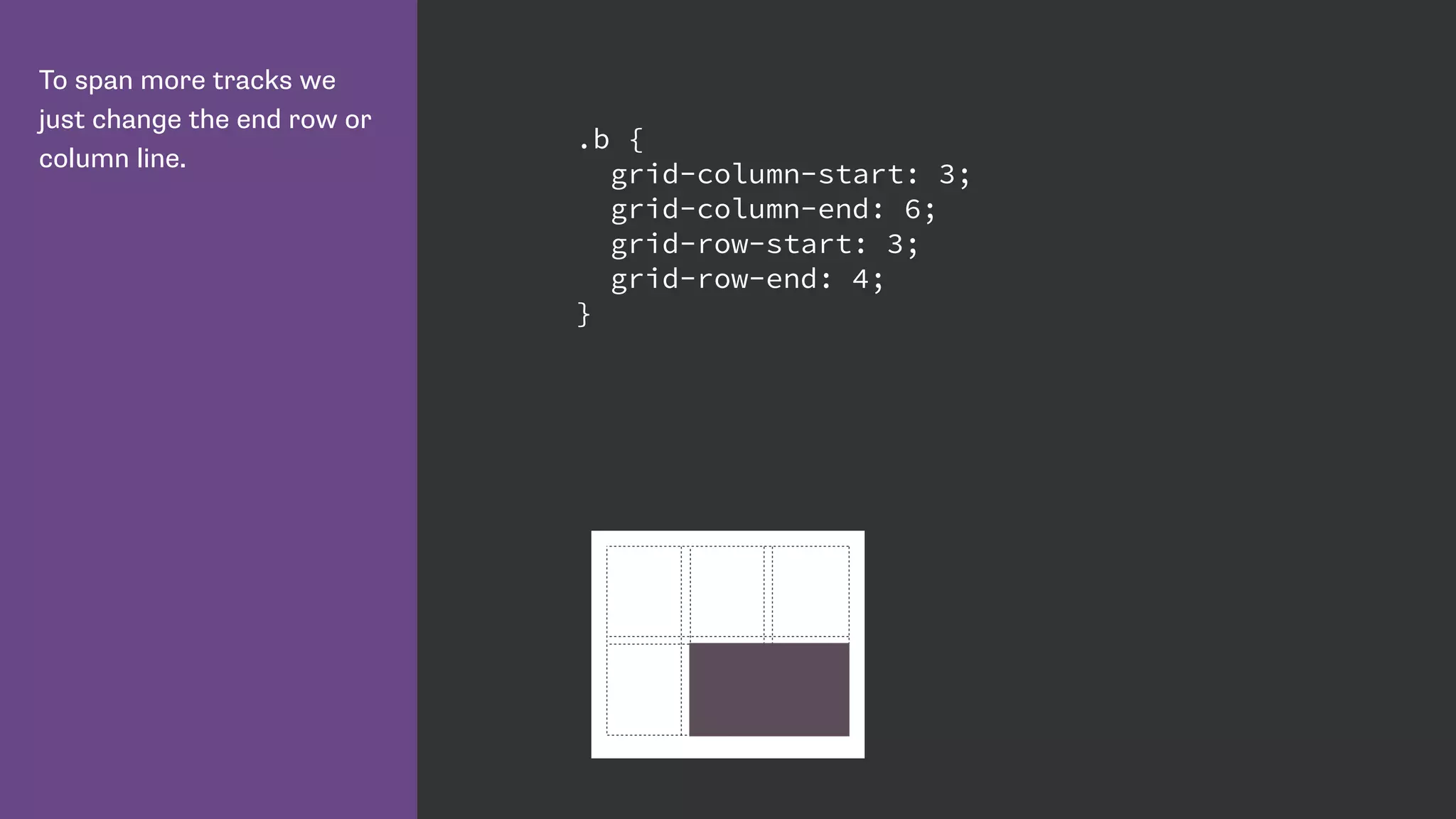
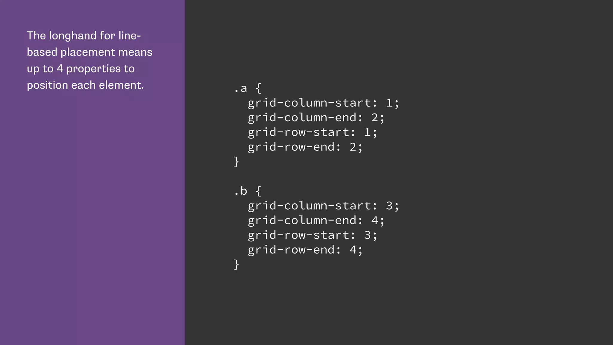
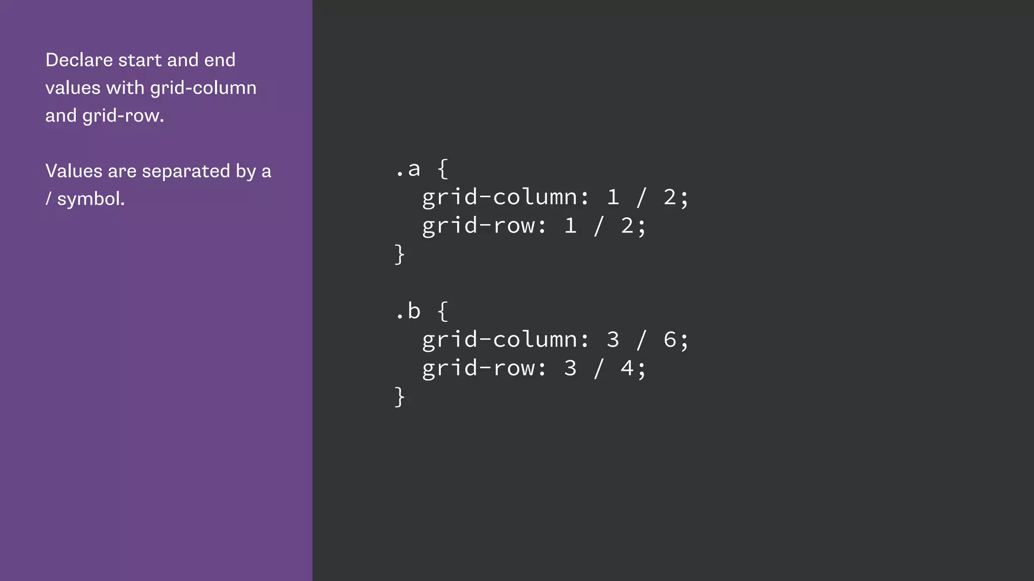
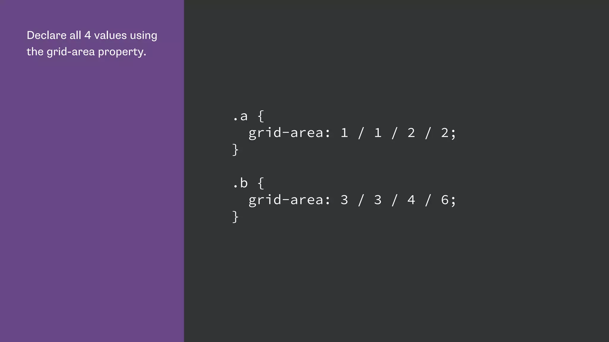
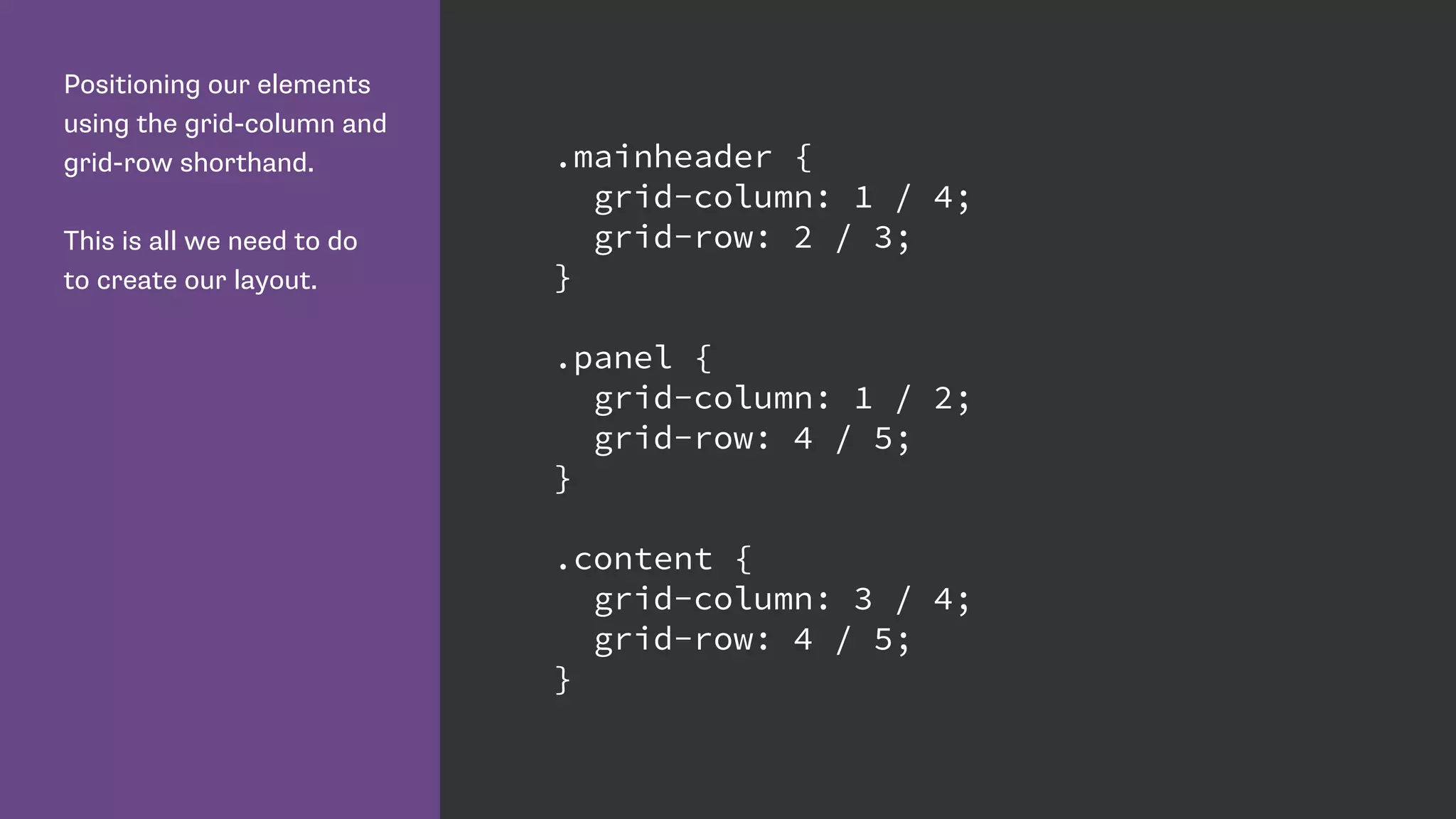
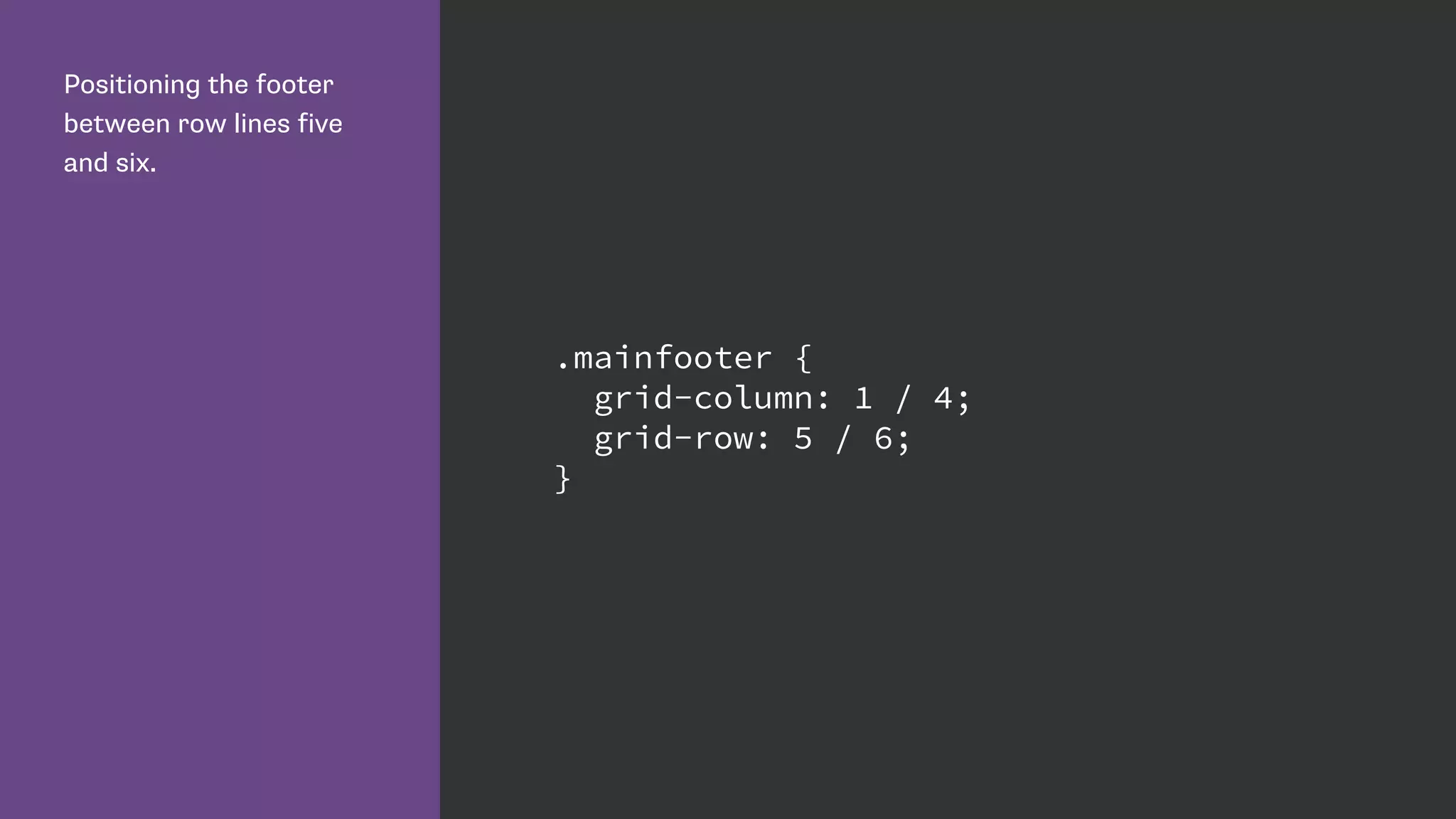
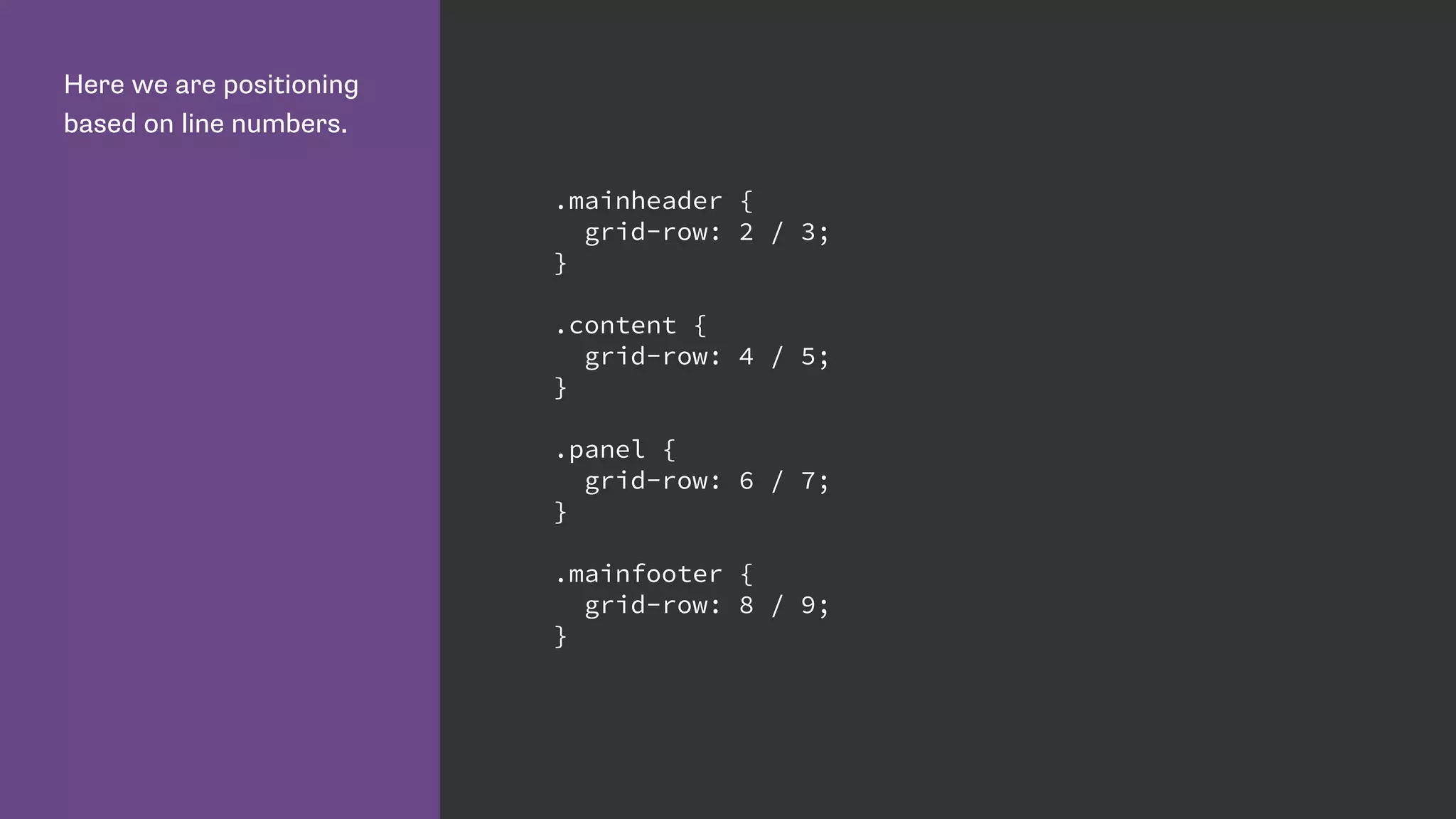
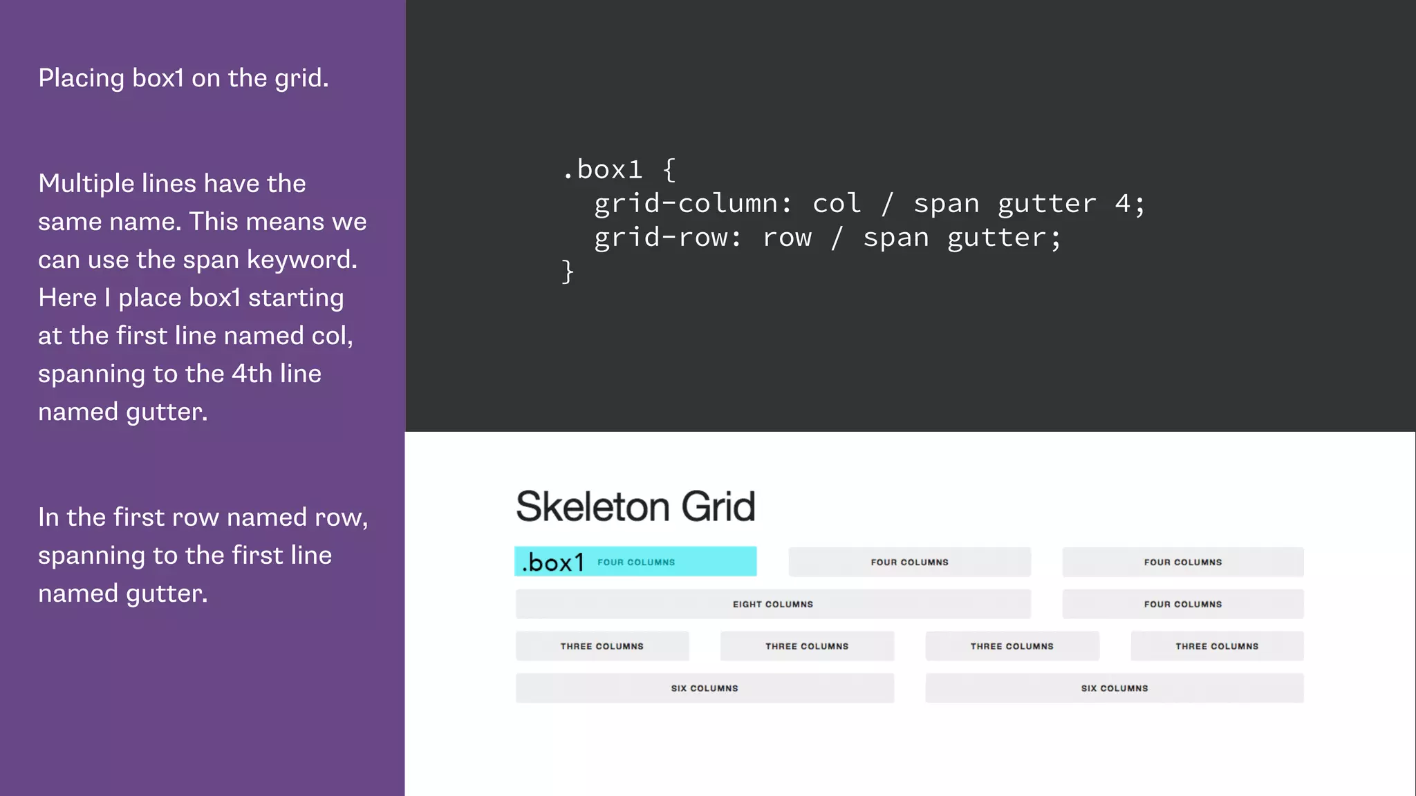
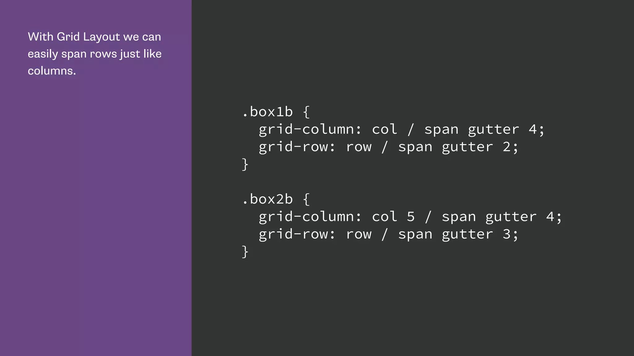
Describes how to position items in the grid using column and row lines, including shorthand properties.
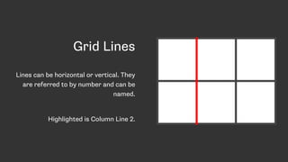
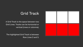
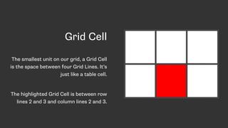
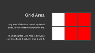
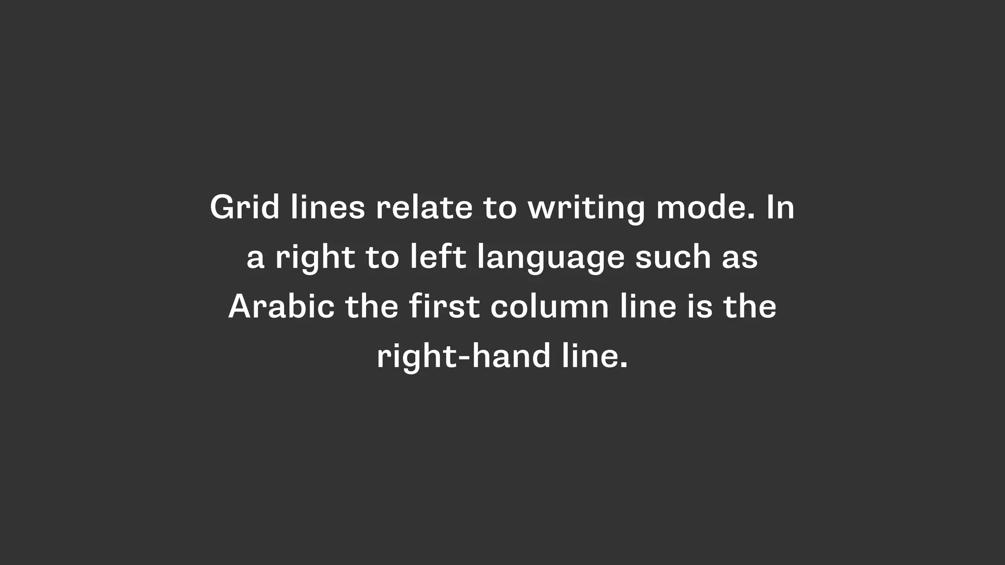
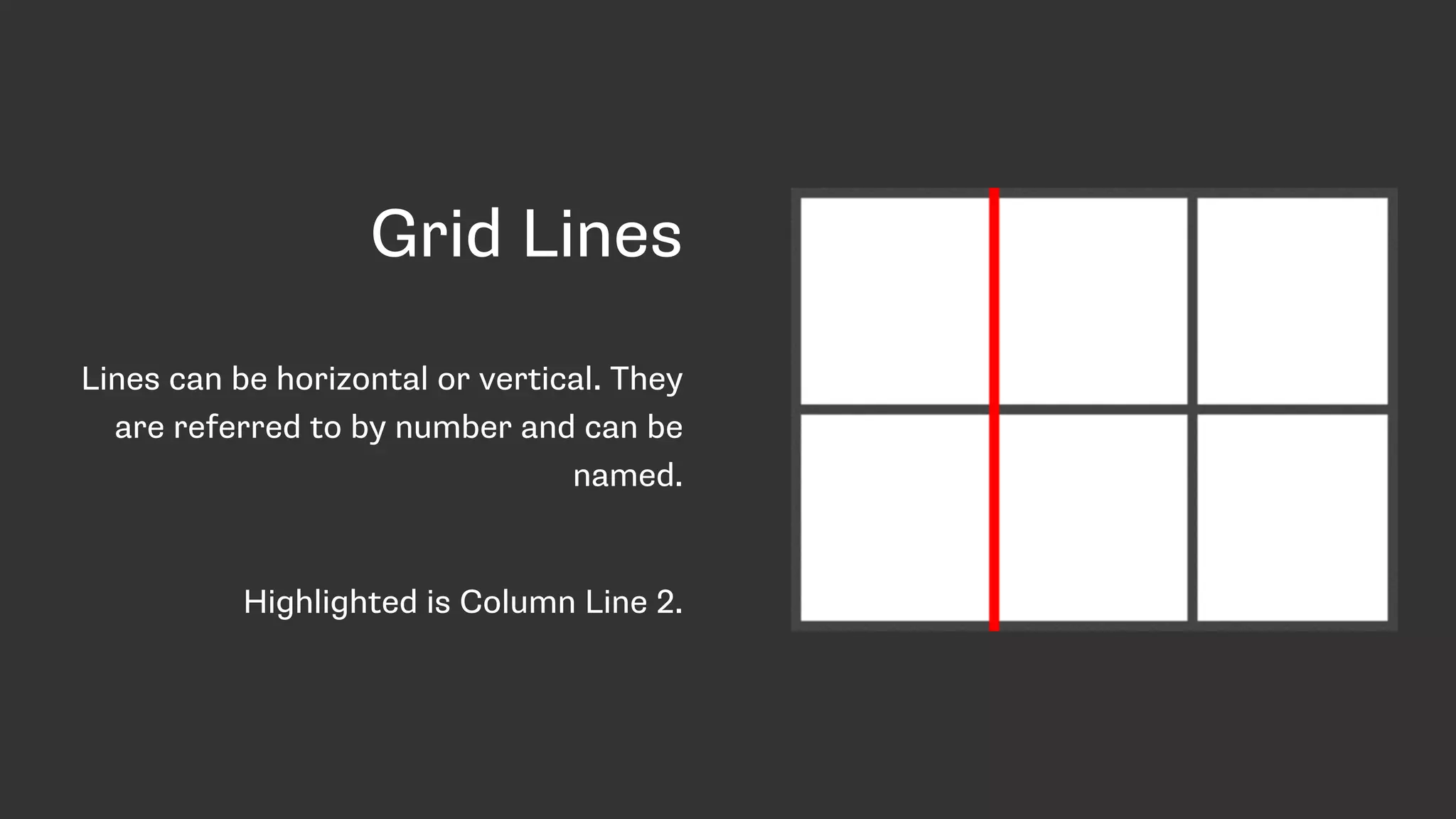
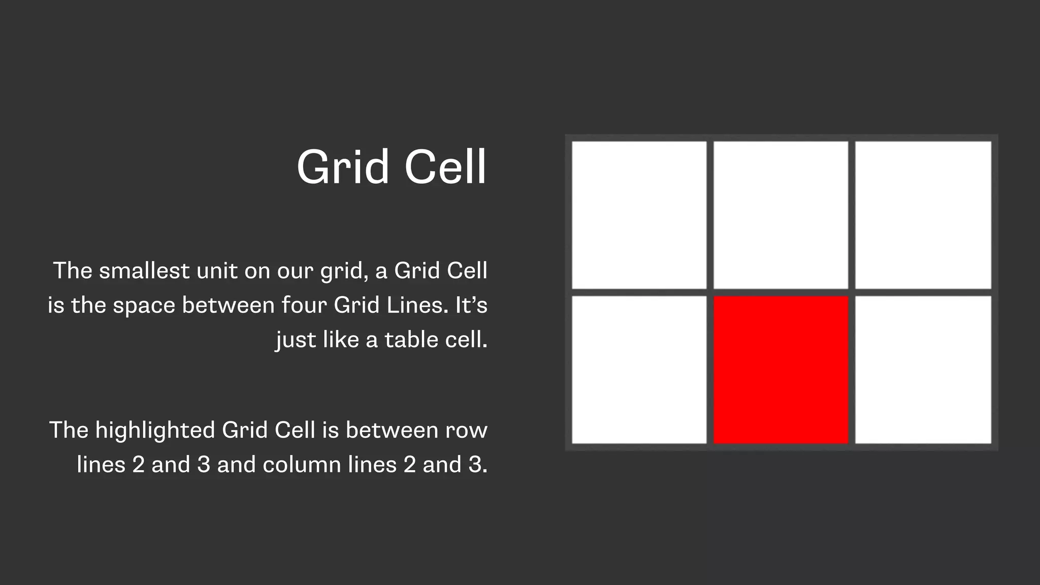
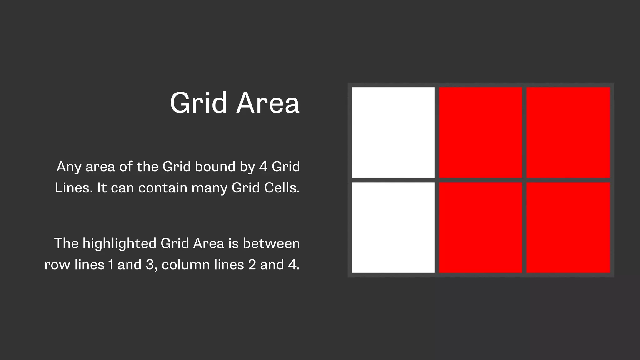
Introduction to grid terminology: grid lines, tracks, cells, and areas, providing definitions and illustrations.
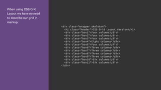
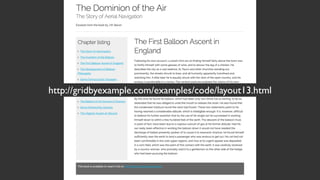
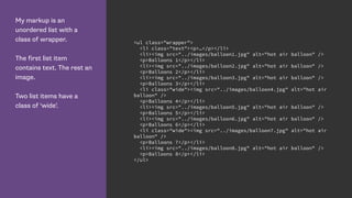
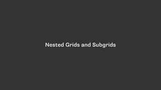
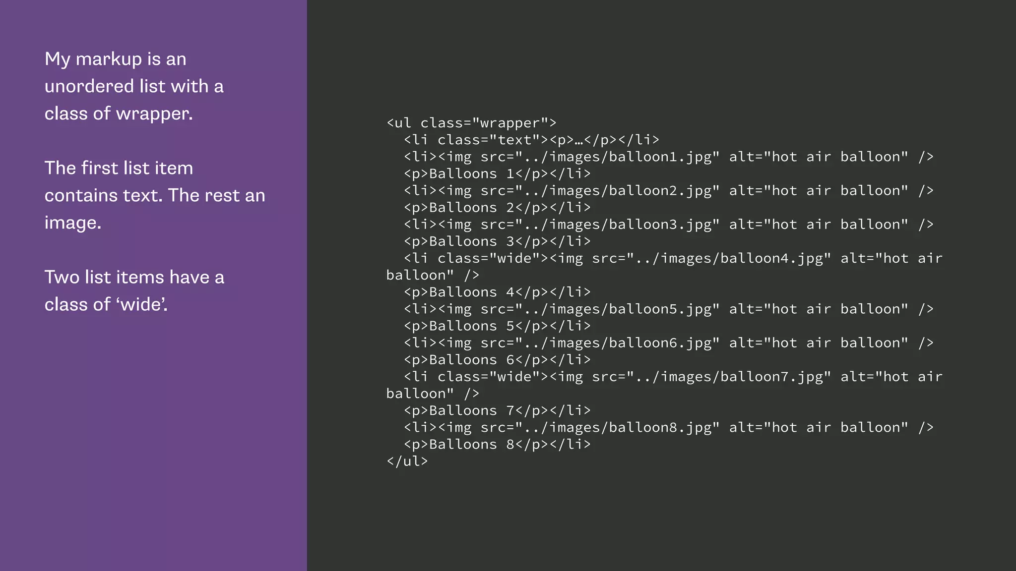
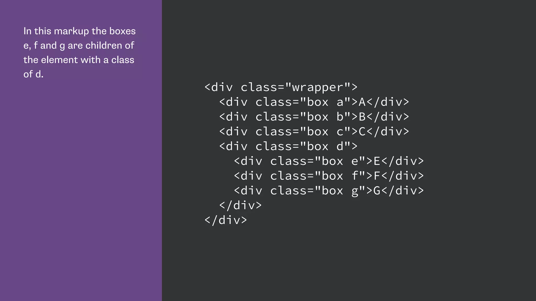
Explains line-based placement and showcases practical HTML structures for grid layouts.
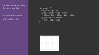
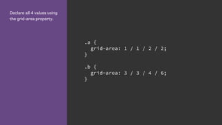
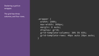
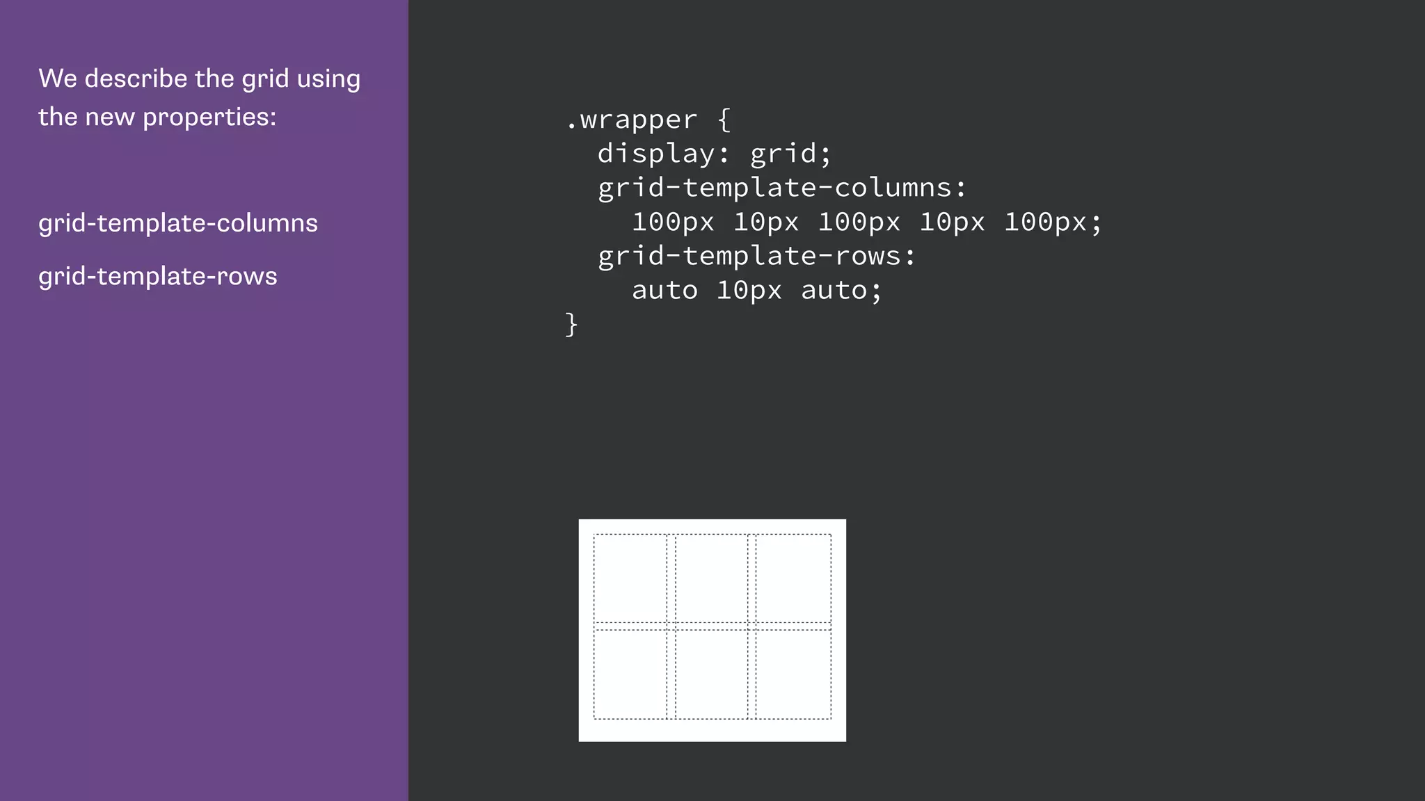
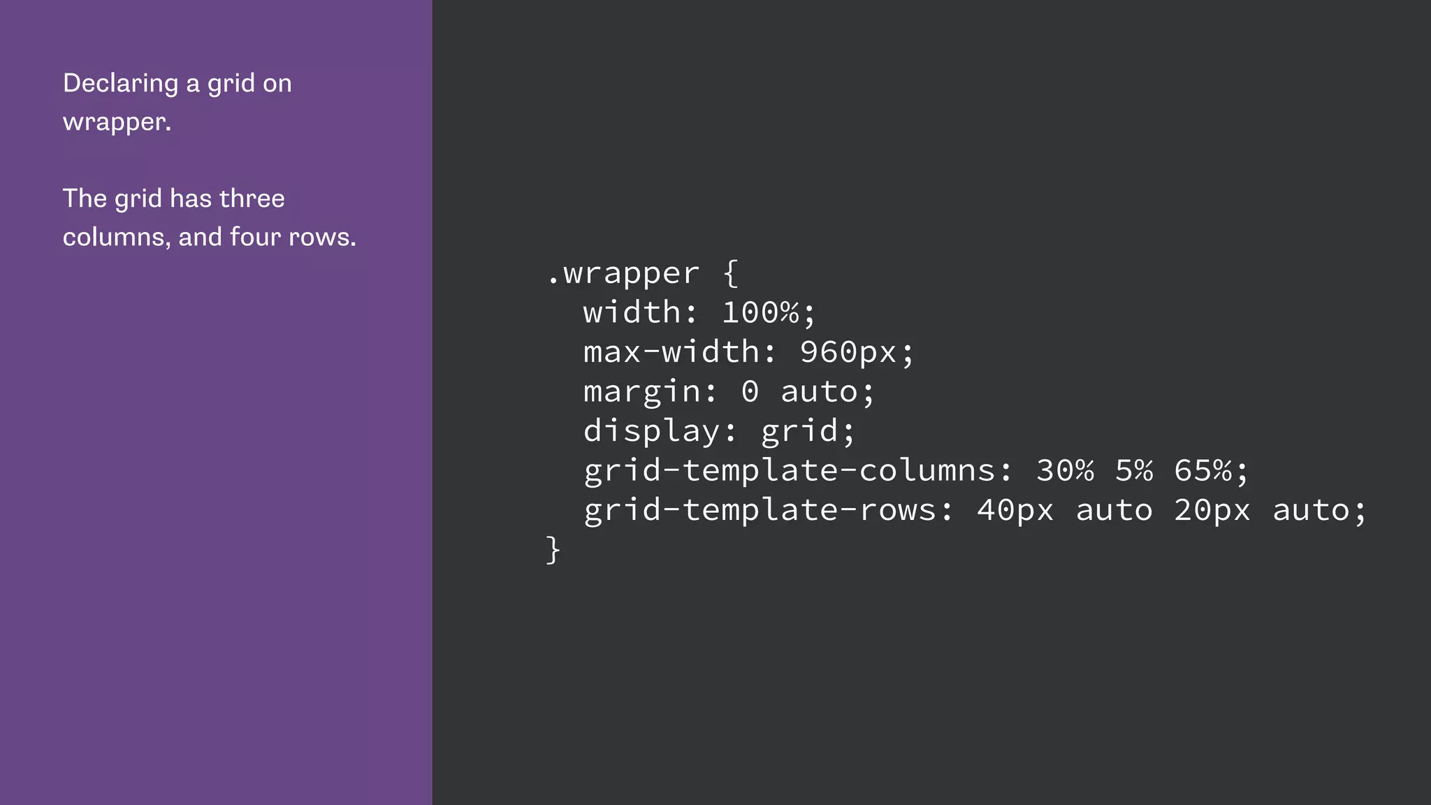
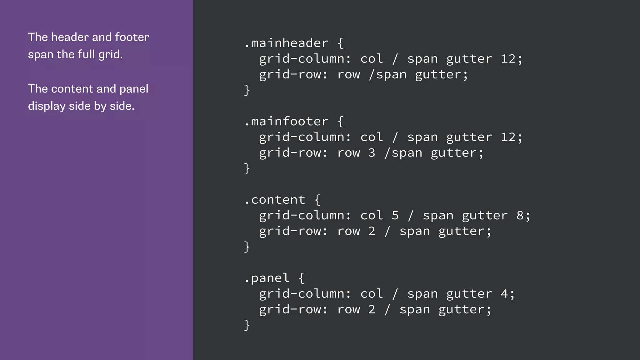
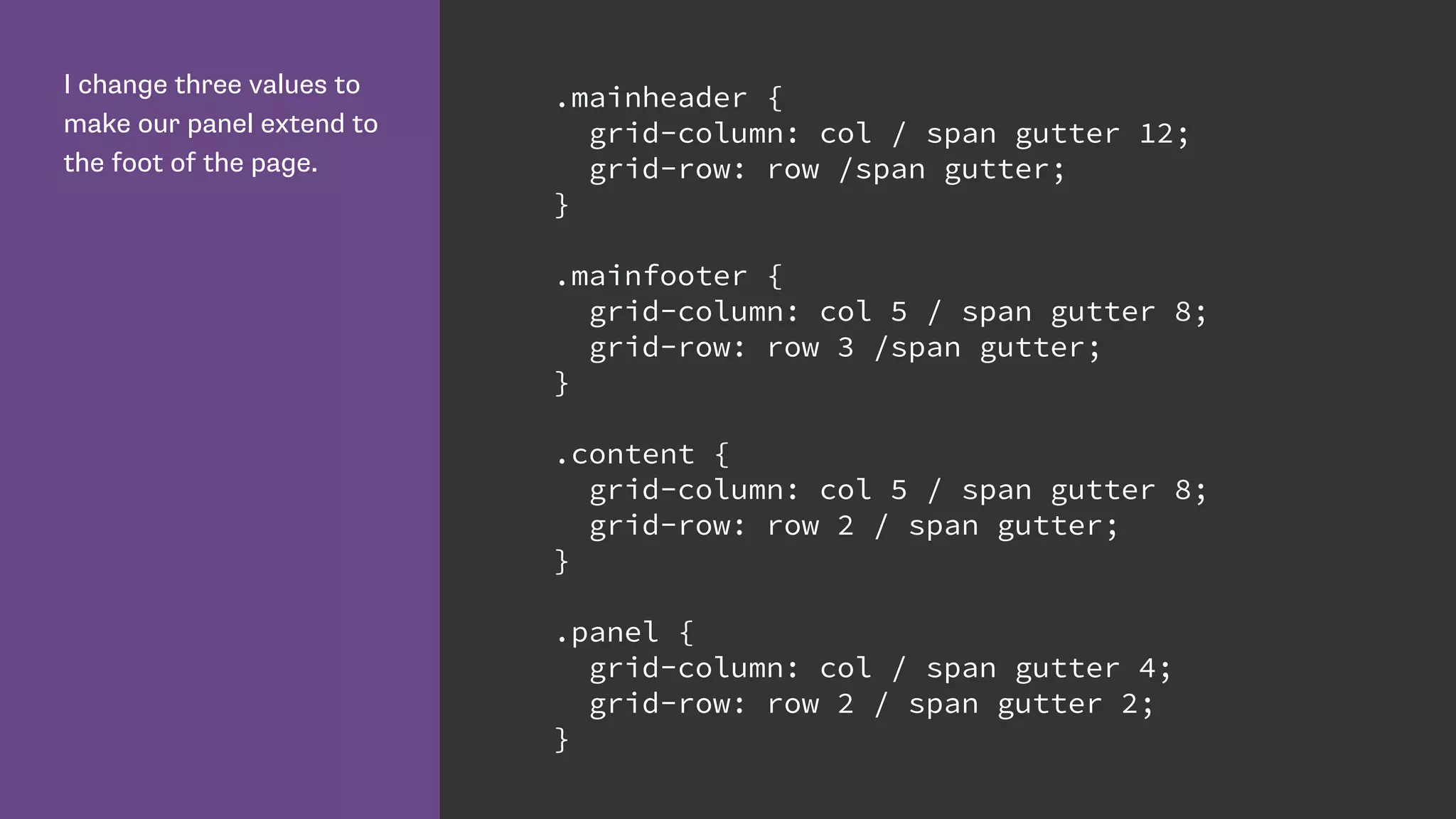
Details on declaring a grid layout in CSS and positioning elements using various grid properties.
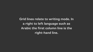
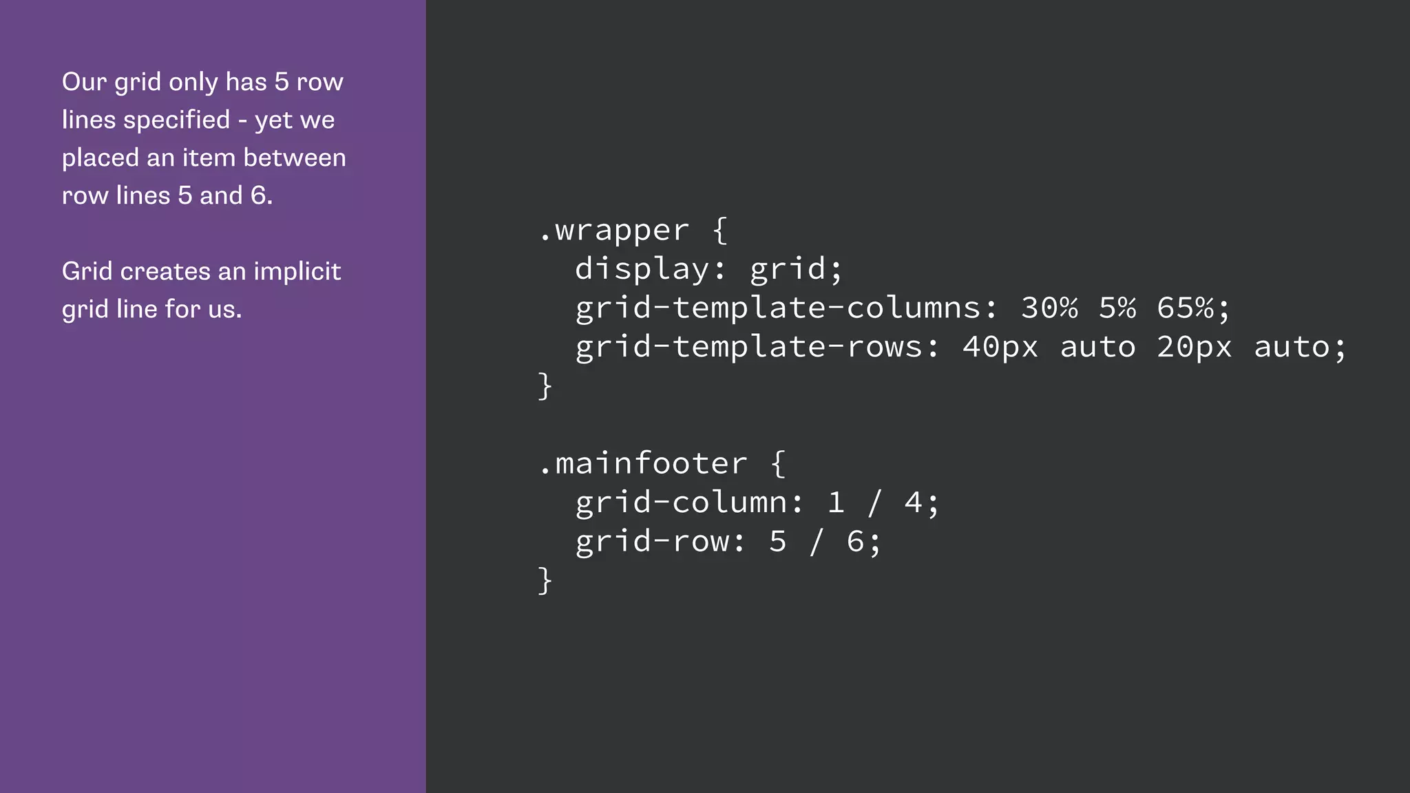
Discussion on implicit vs. explicit grid lines, with emphasis on their roles and implications for layout.
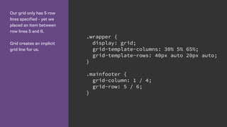
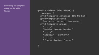
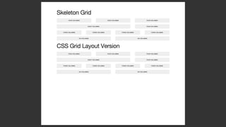
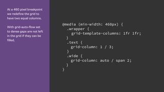
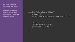
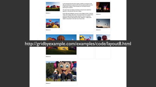
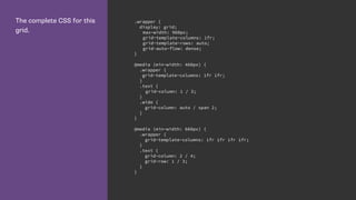
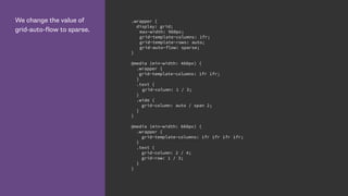
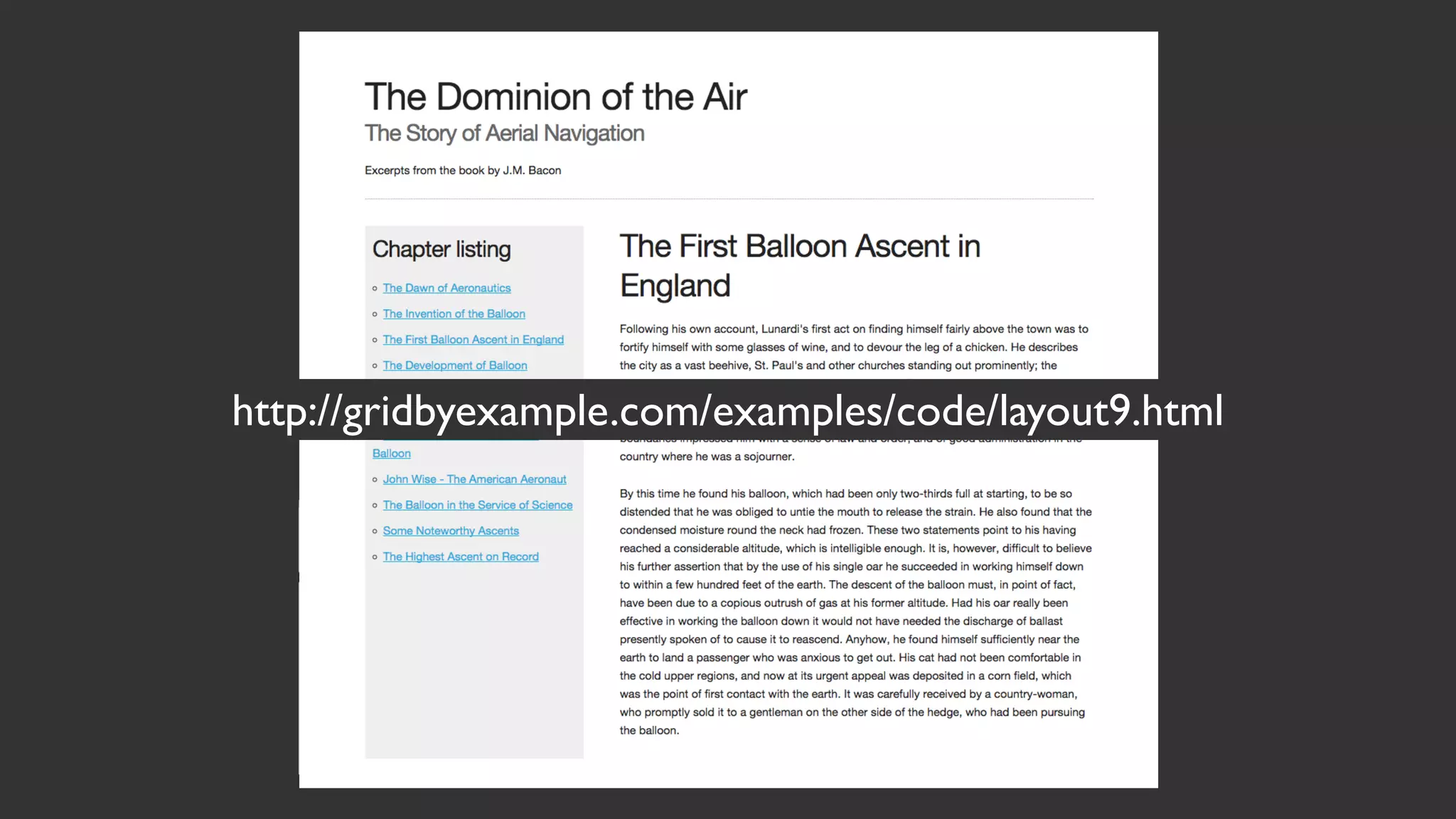
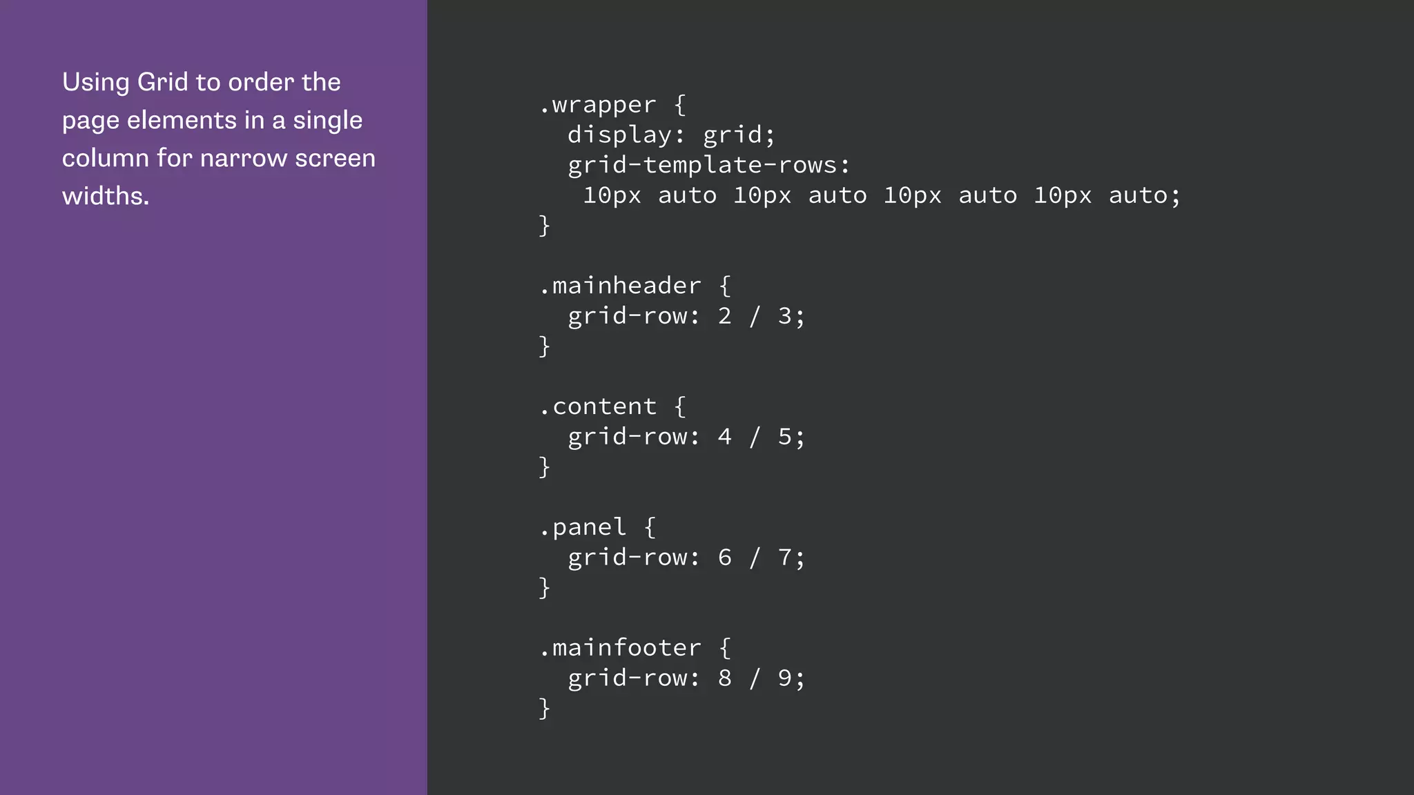
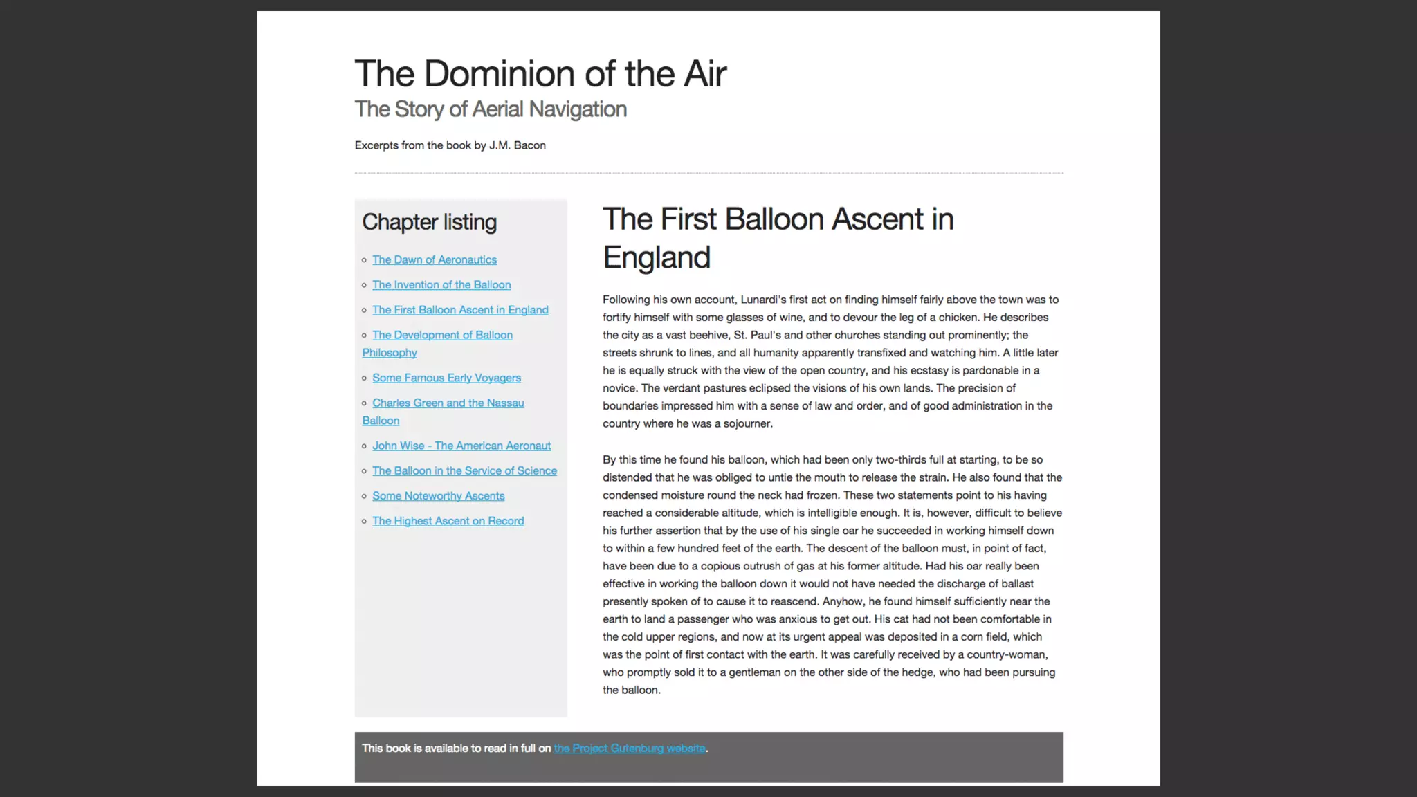
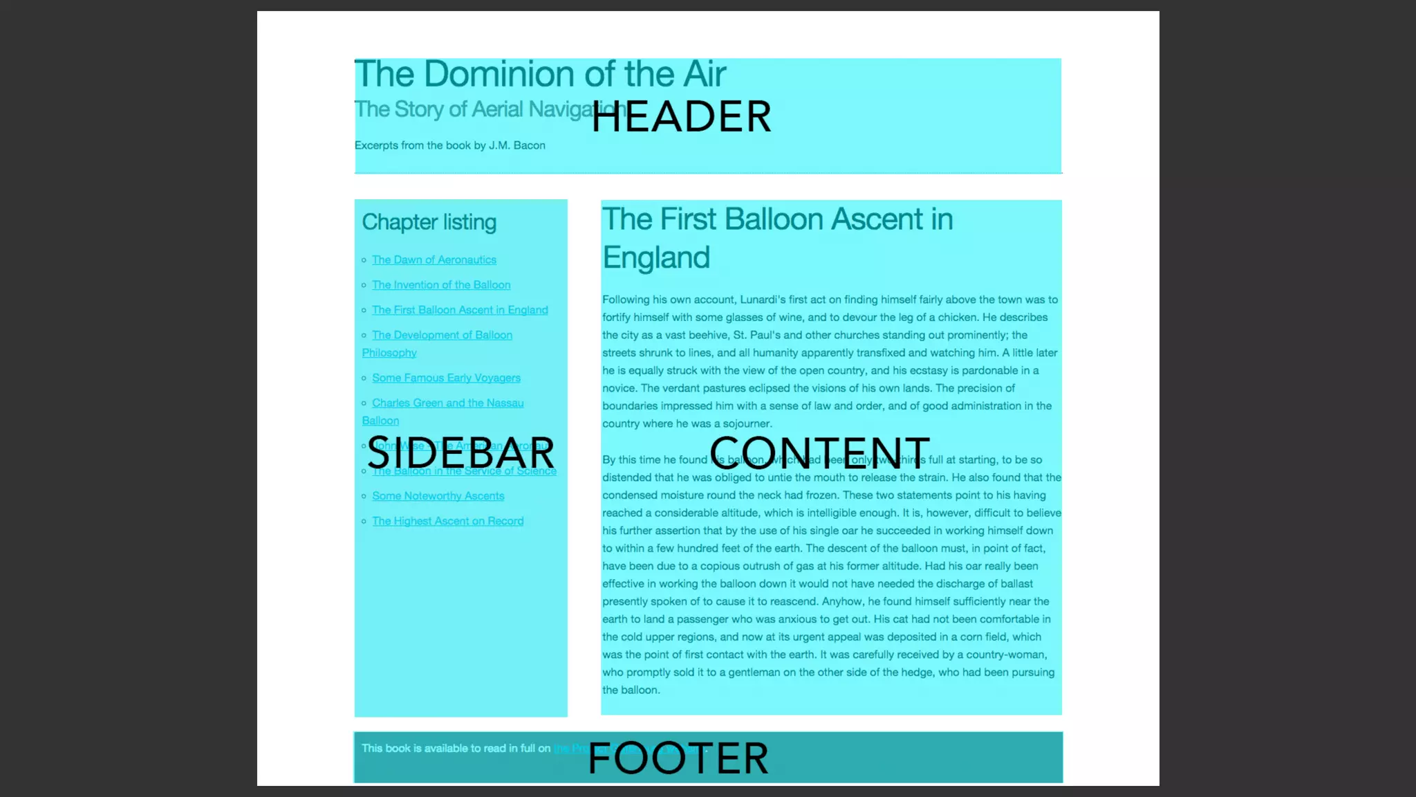
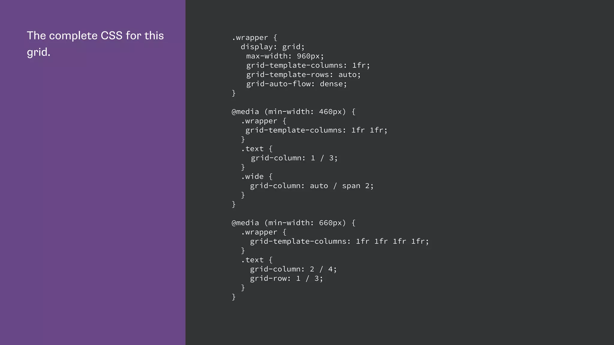
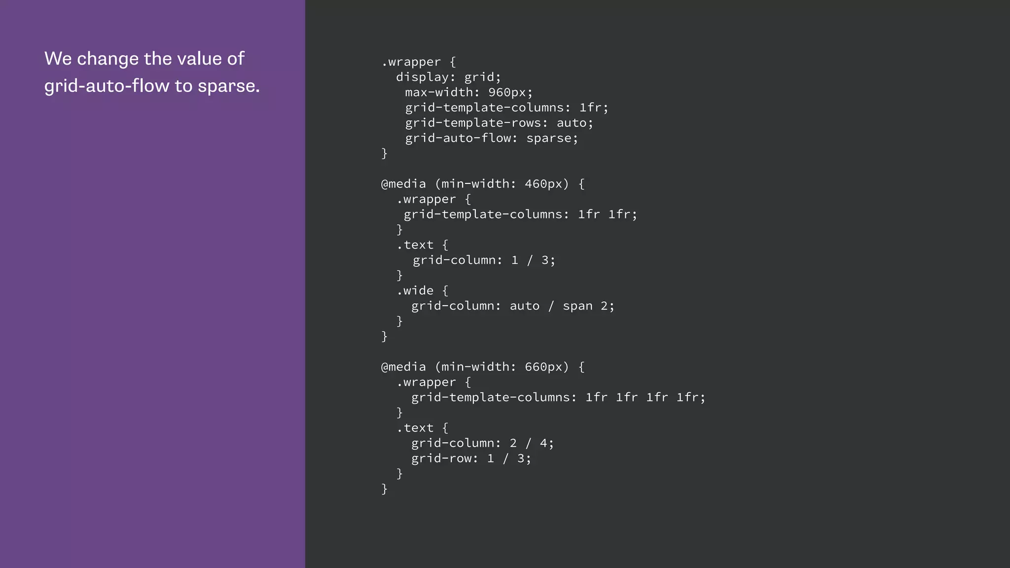
Demonstrates using CSS Grid for responsive layouts, along with how to manage grid lines and areas.
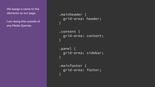
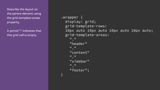
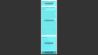
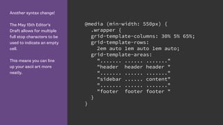
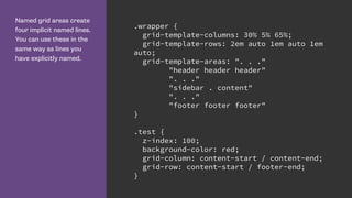
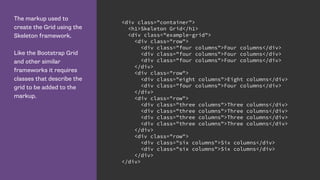
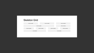
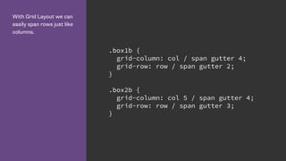
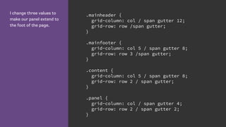
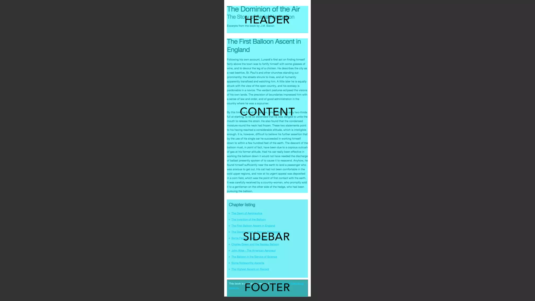
Shows how to utilize named lines and grid areas for improved readability and organization in layout.
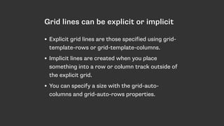
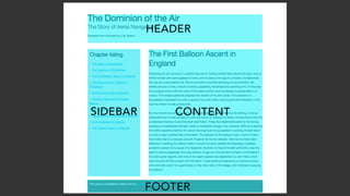
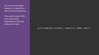
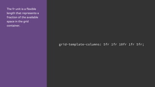
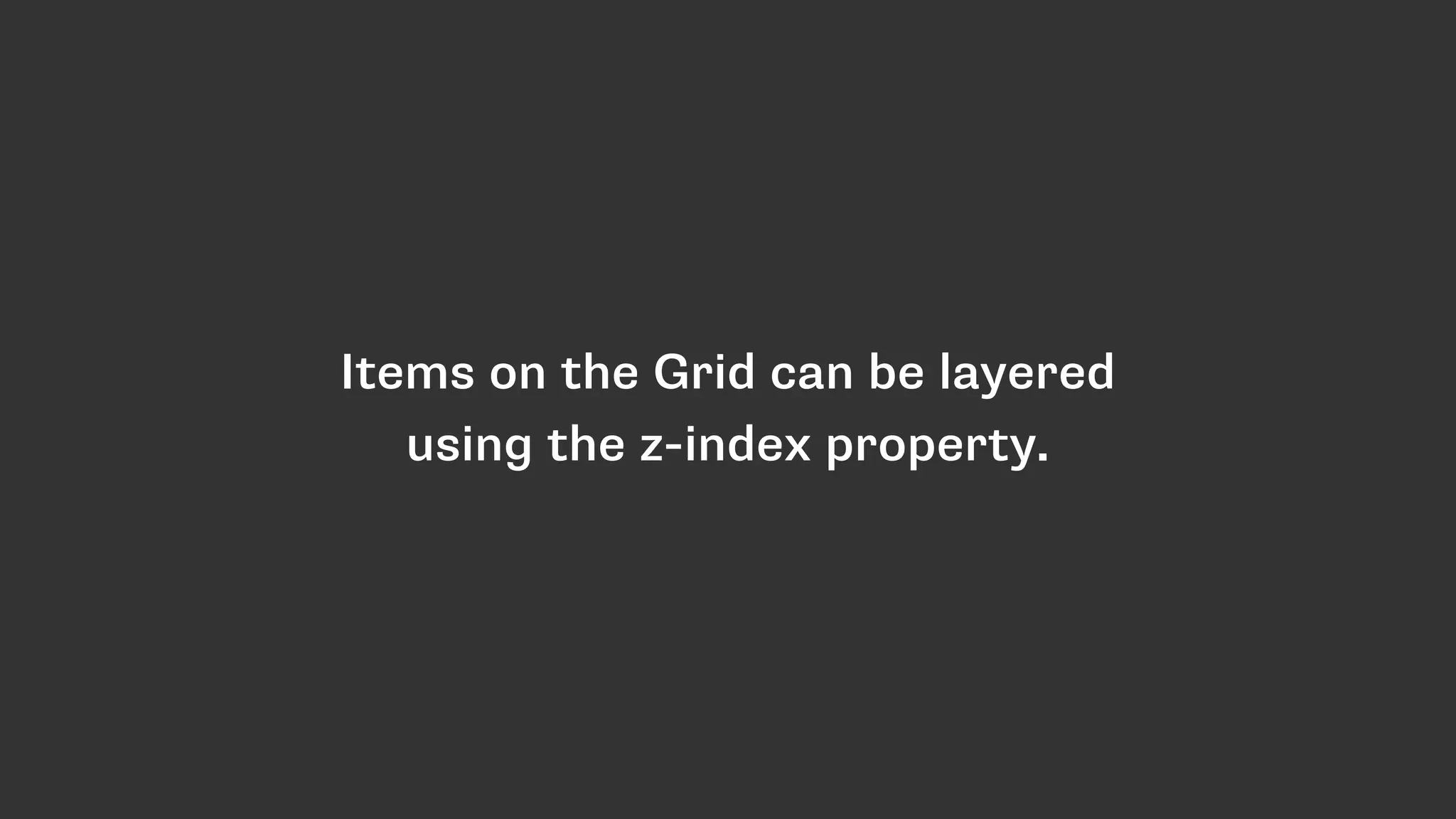
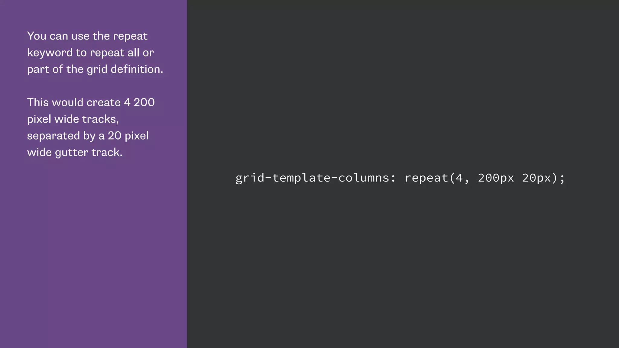
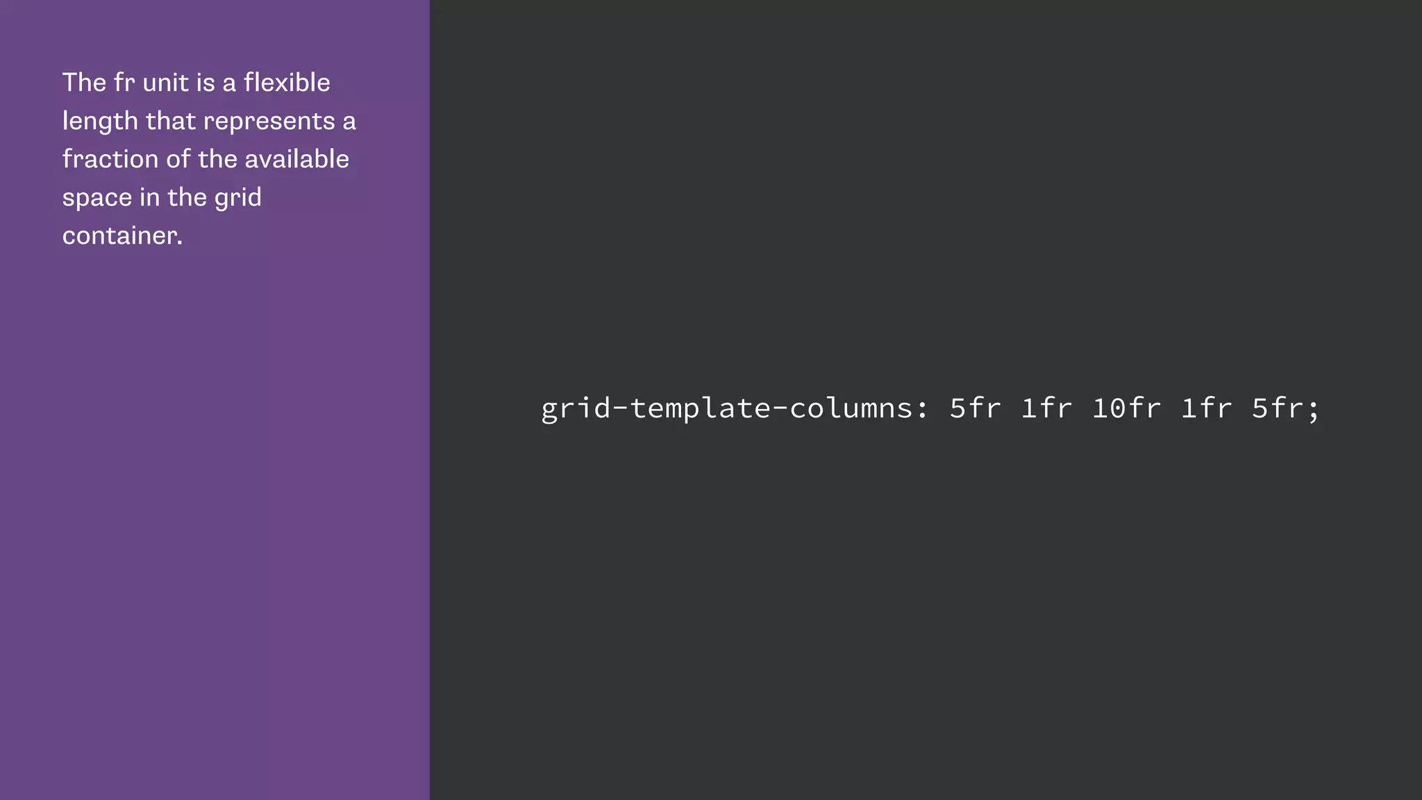
Explains flexibilities of grid layout with repeat keywords, fr units, and layering using z-index.
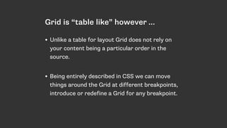
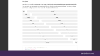
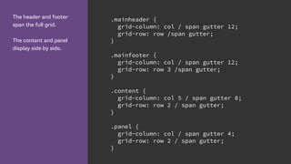
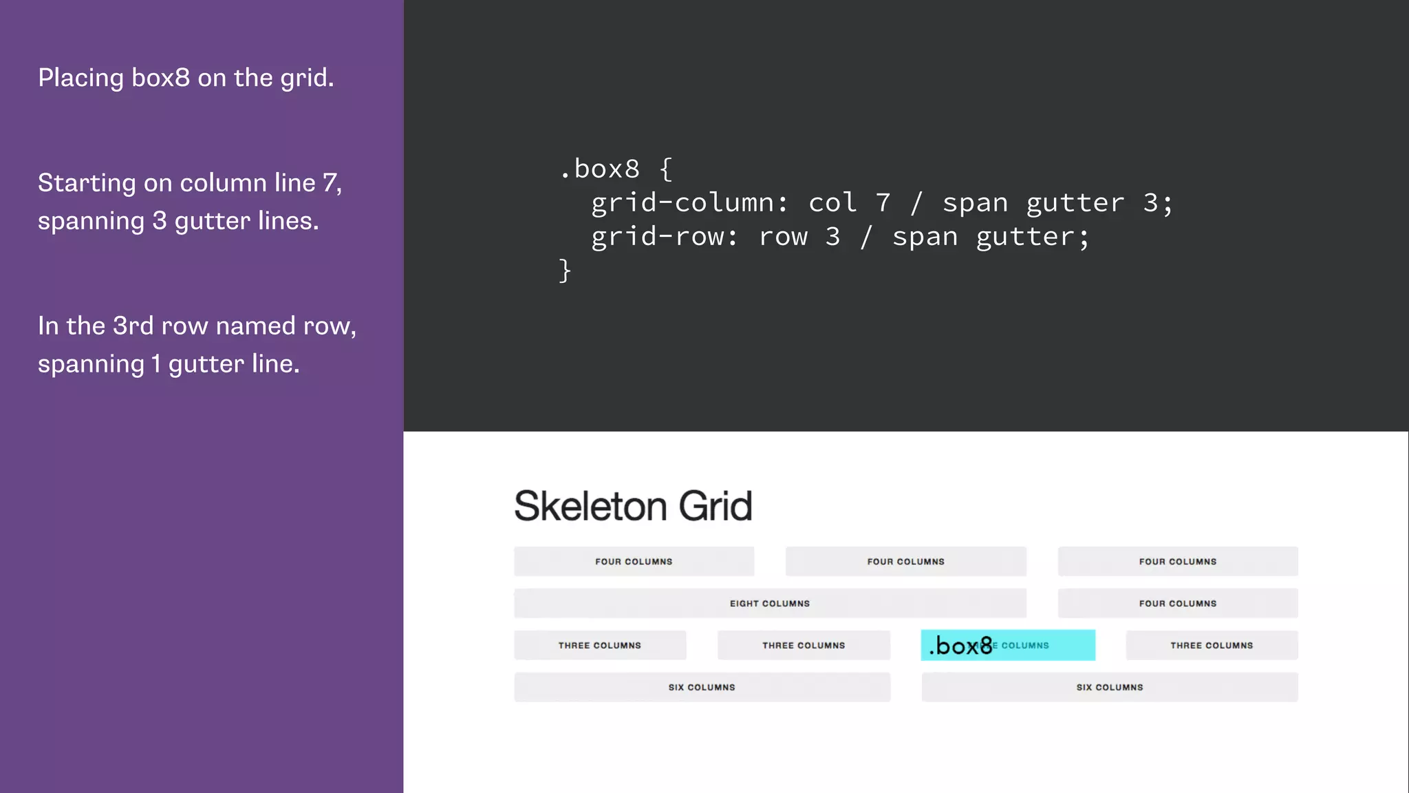
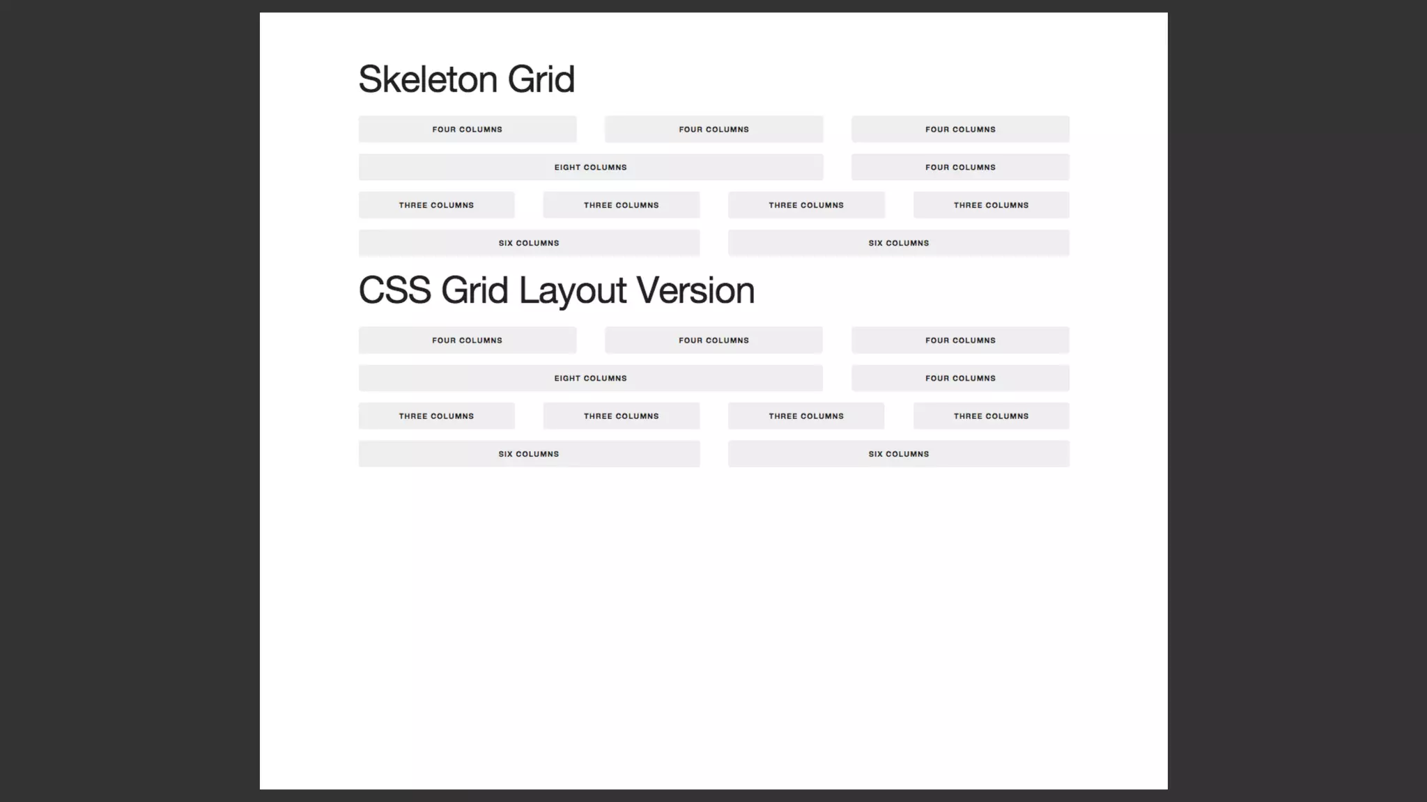
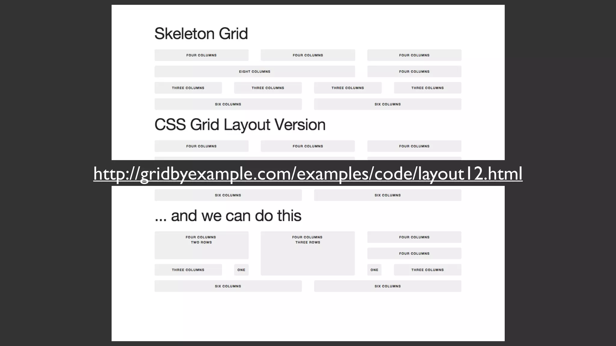
Describes how to define complex multi-column grids and strategically place content across grid lines.
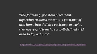
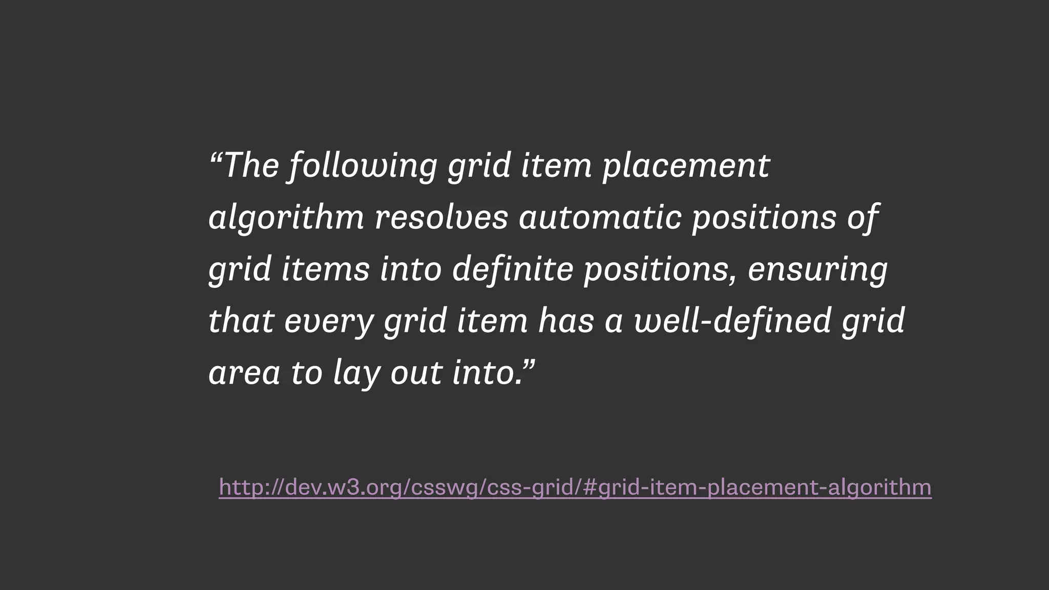
Covers the grid item placement algorithm, illustrating its behavior in grid layouts.
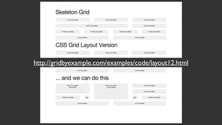
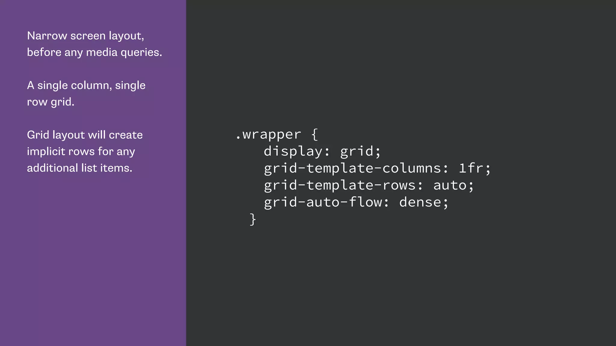
Demonstrates practical examples of grid layouts with varying screen sizes and implicit rows.
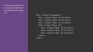
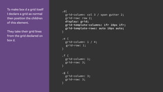
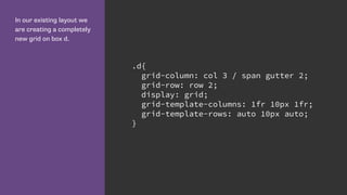
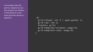
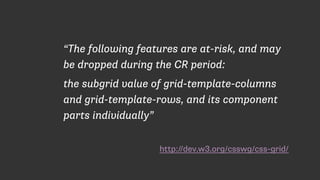
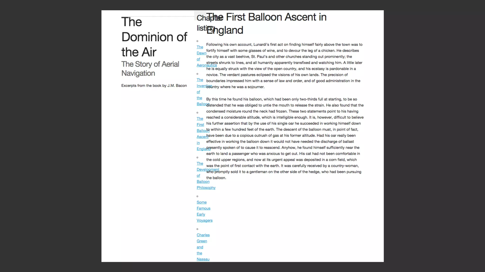
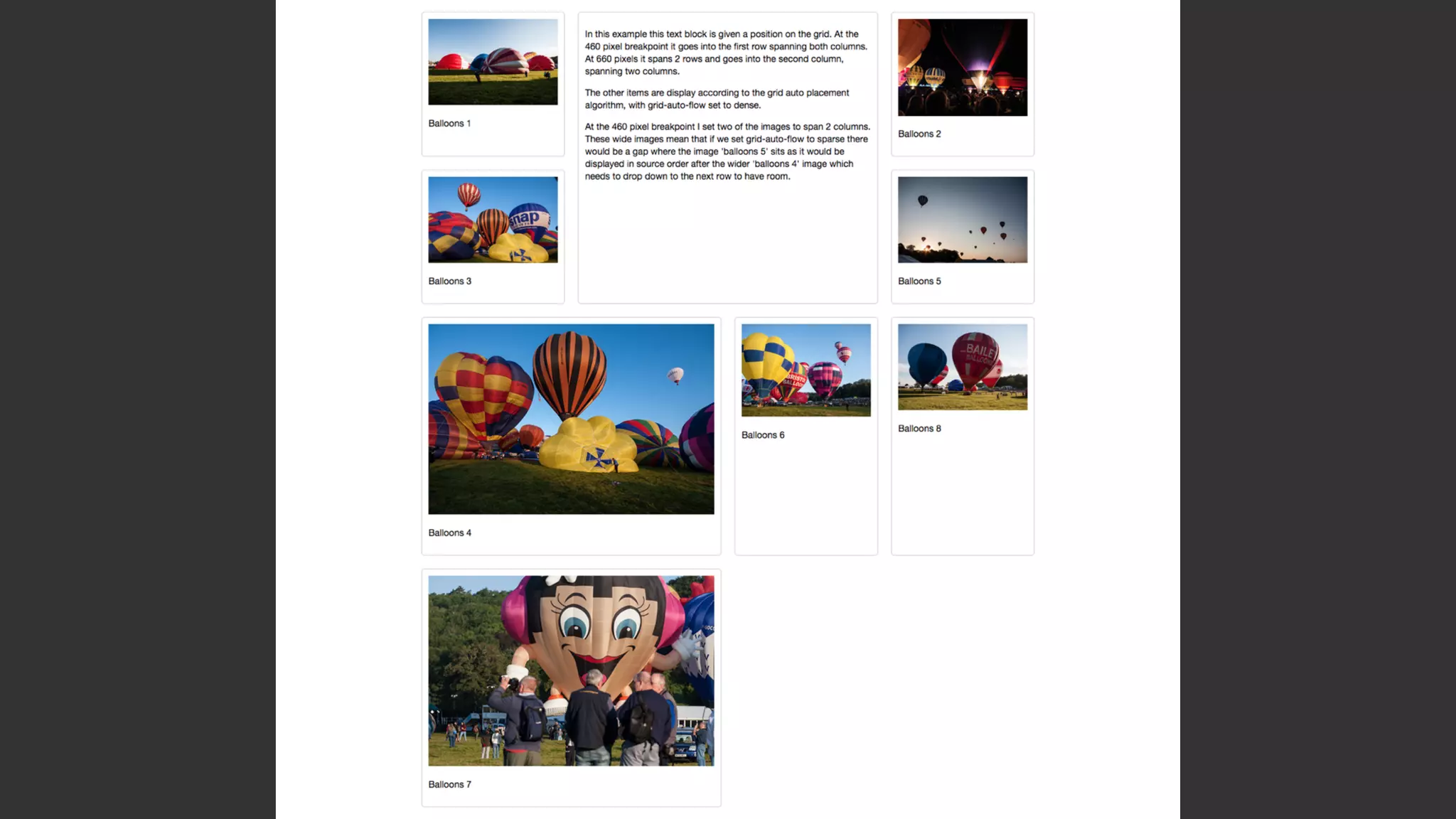
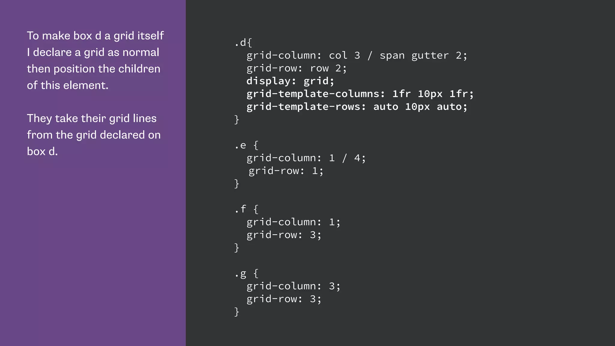
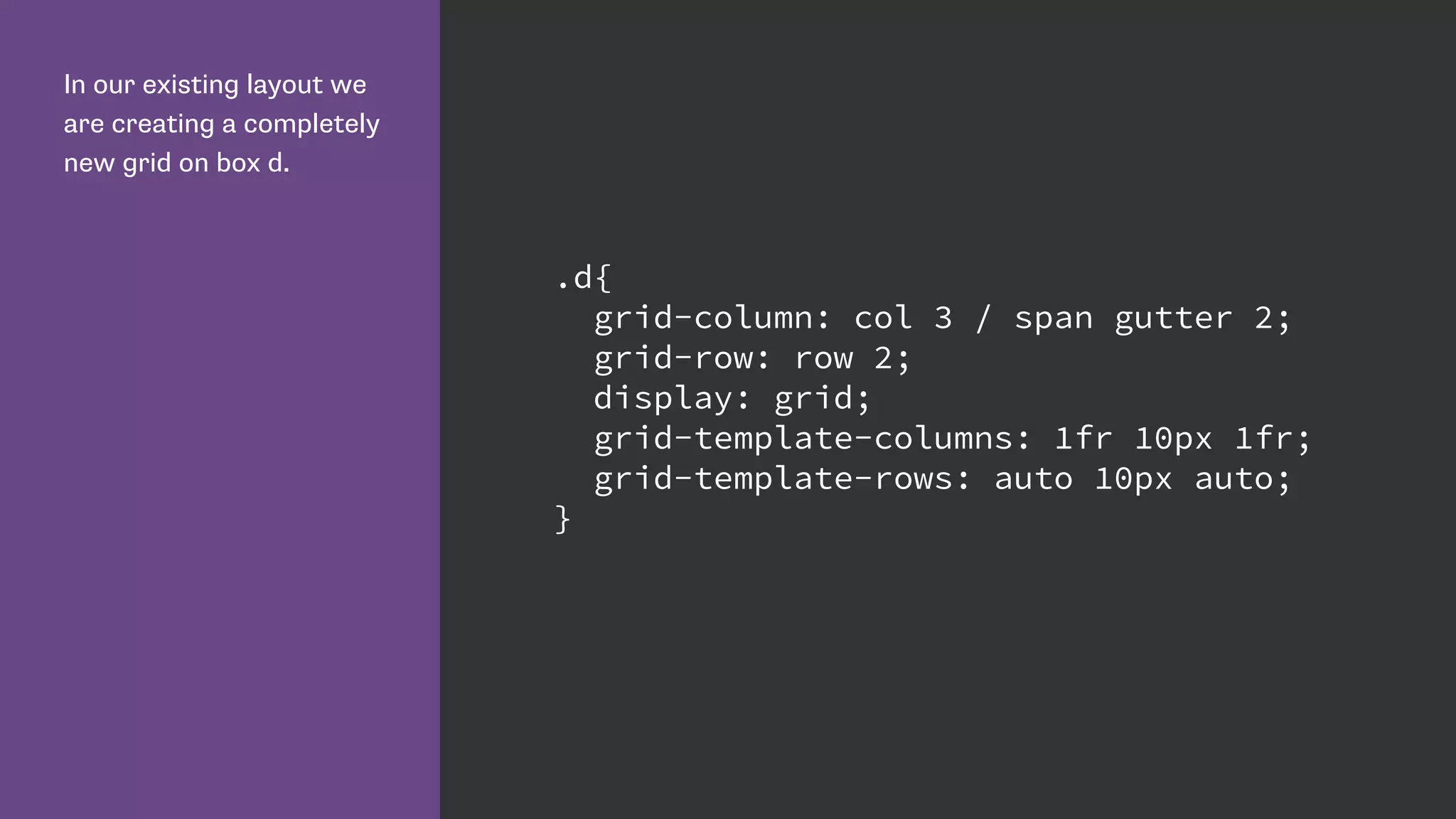
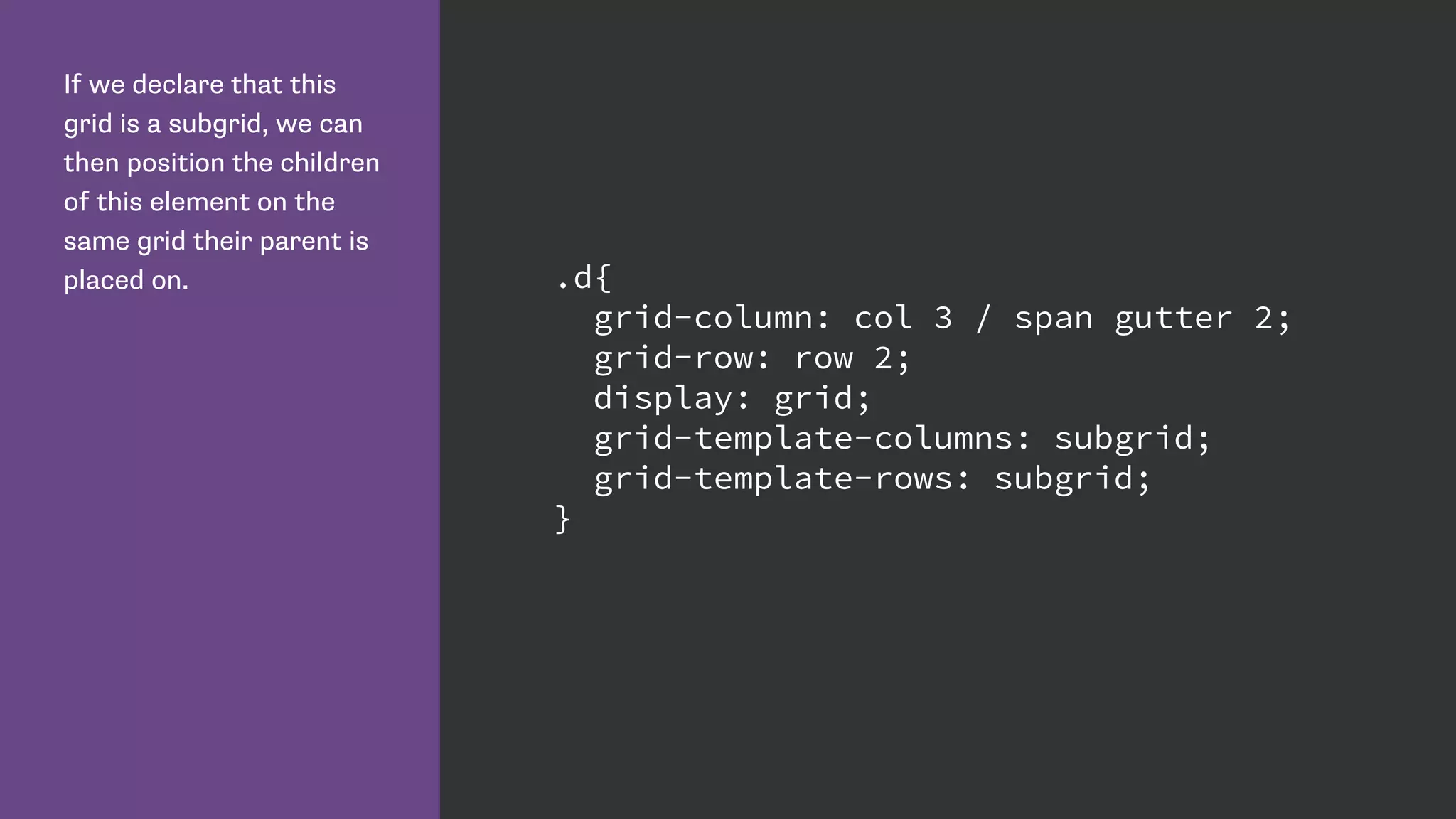
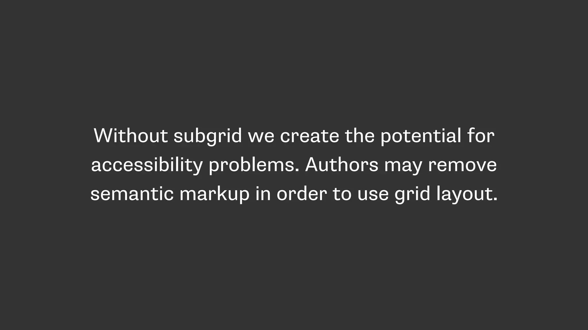
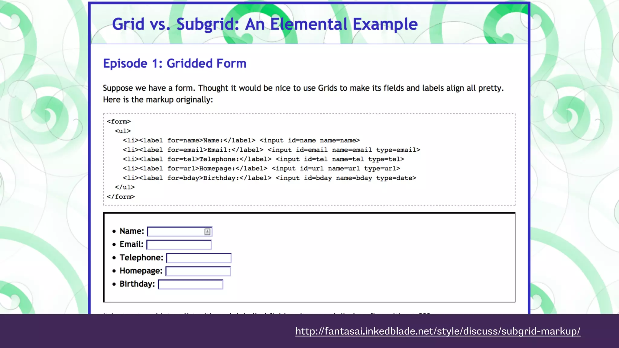
Discussion on specifying gaps in grid layouts, including gutters and column/row gaps improvements.Introduces nested grids, their structure, and the importance of subgrids for consistency in layouts.
Encourages feedback on grid usage, provides browser support information, and resources for further learning.


