Data Presentation, Organization and Interpretation
1.
Do you wantto edit this presentation?
1
Make a copy and edit
in Google Slides.
1. On the menu bar, click File and then
Make a copy and Entire Presentation.
2. Type a name for the file.
3. Choose where to save it on your Google
Drive.
4. Click Ok.
5. A new tab will open. Wait for the file to be
completely loaded on a new tab.
6. Once the file has loaded, edit this
presentation using Google Slides.
Download an offline copy
and edit in Microsoft
PowerPoint
1. On the menu bar, click File and then
Download as.
2. Choose a file type. Select Microsoft
PowerPoint (.pptx).
3. Wait for the file to be downloaded to your
local disk.
4. Once completely downloaded, open the
file and edit it using Microsoft PowerPoint
or any offline presentation program.
2.
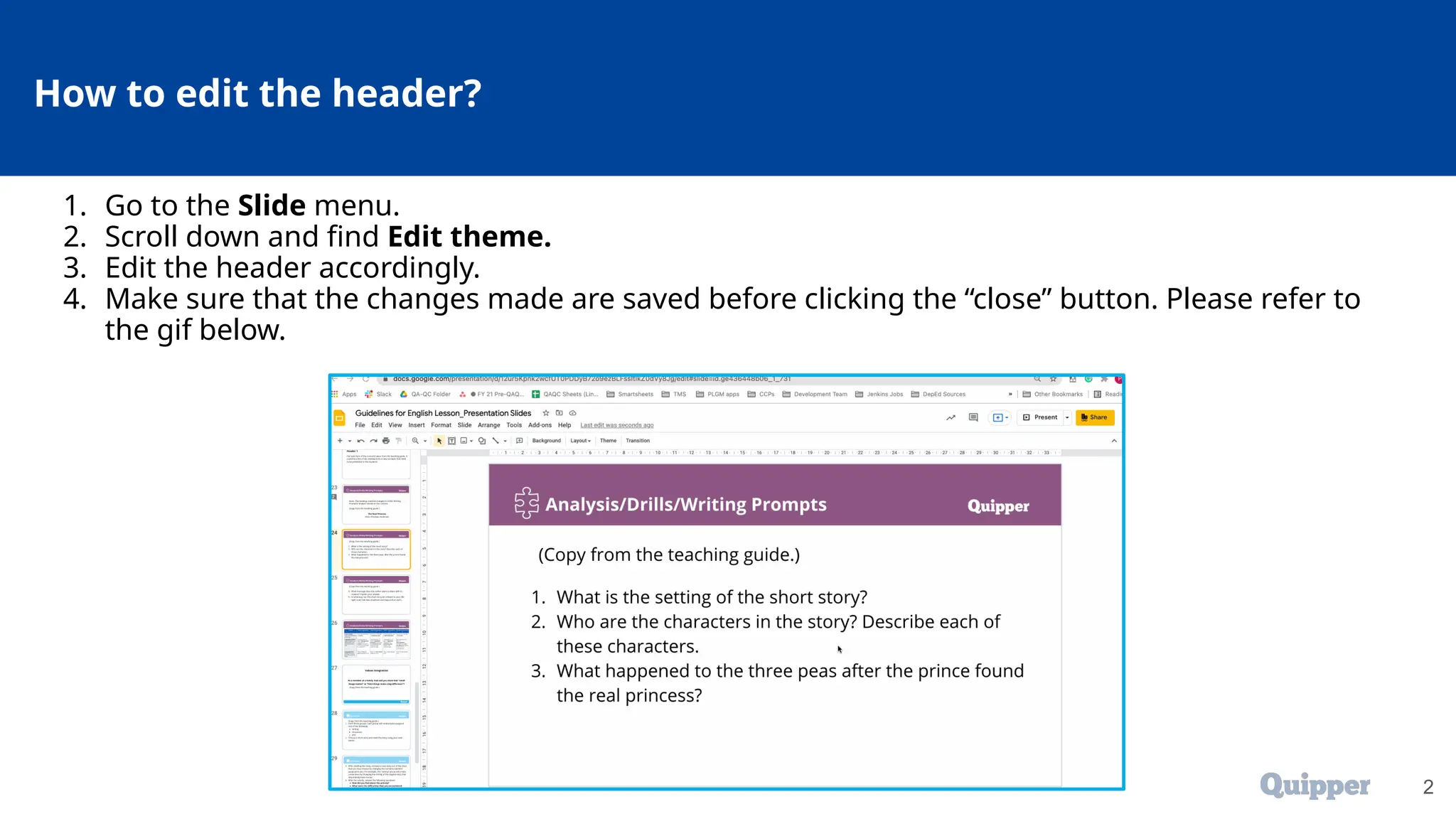
How to editthe header?
2
1. Go to the Slide menu.
2. Scroll down and find Edit theme.
3. Edit the header accordingly.
4. Make sure that the changes made are saved before clicking the “close” button. Please refer to
the gif below.
5
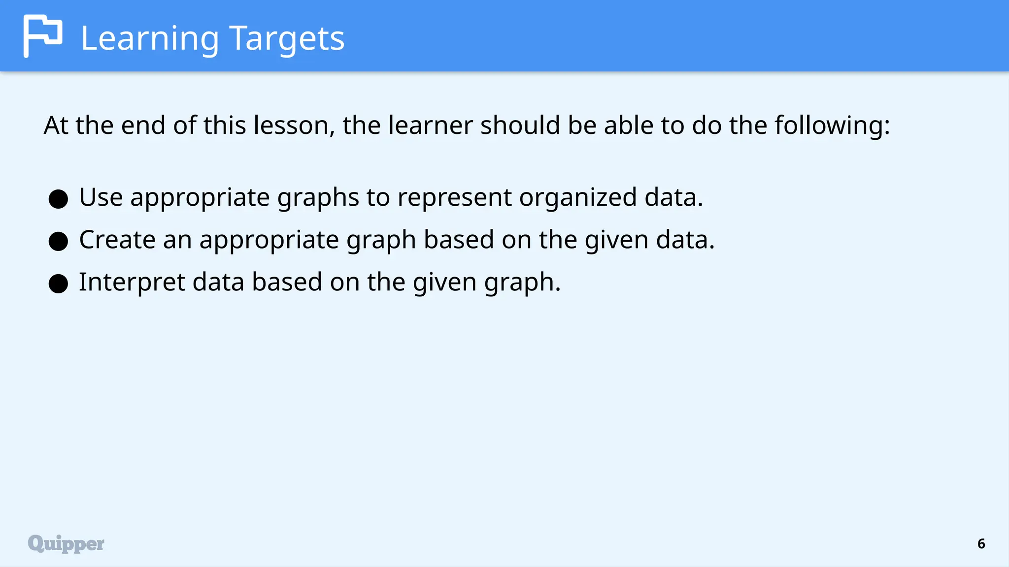
At the endof this lesson, the learner should be able to do the following:
Learning Competencies
● Use appropriate graphs to represent organized data: pie graph, bar graph,
line graph, and stem-and-leaf plot.
● Interpret statistical graphs.
6.
6
Learning Targets
At theend of this lesson, the learner should be able to do the following:
● Use appropriate graphs to represent organized data.
● Create an appropriate graph based on the given data.
● Interpret data based on the given graph.
7.
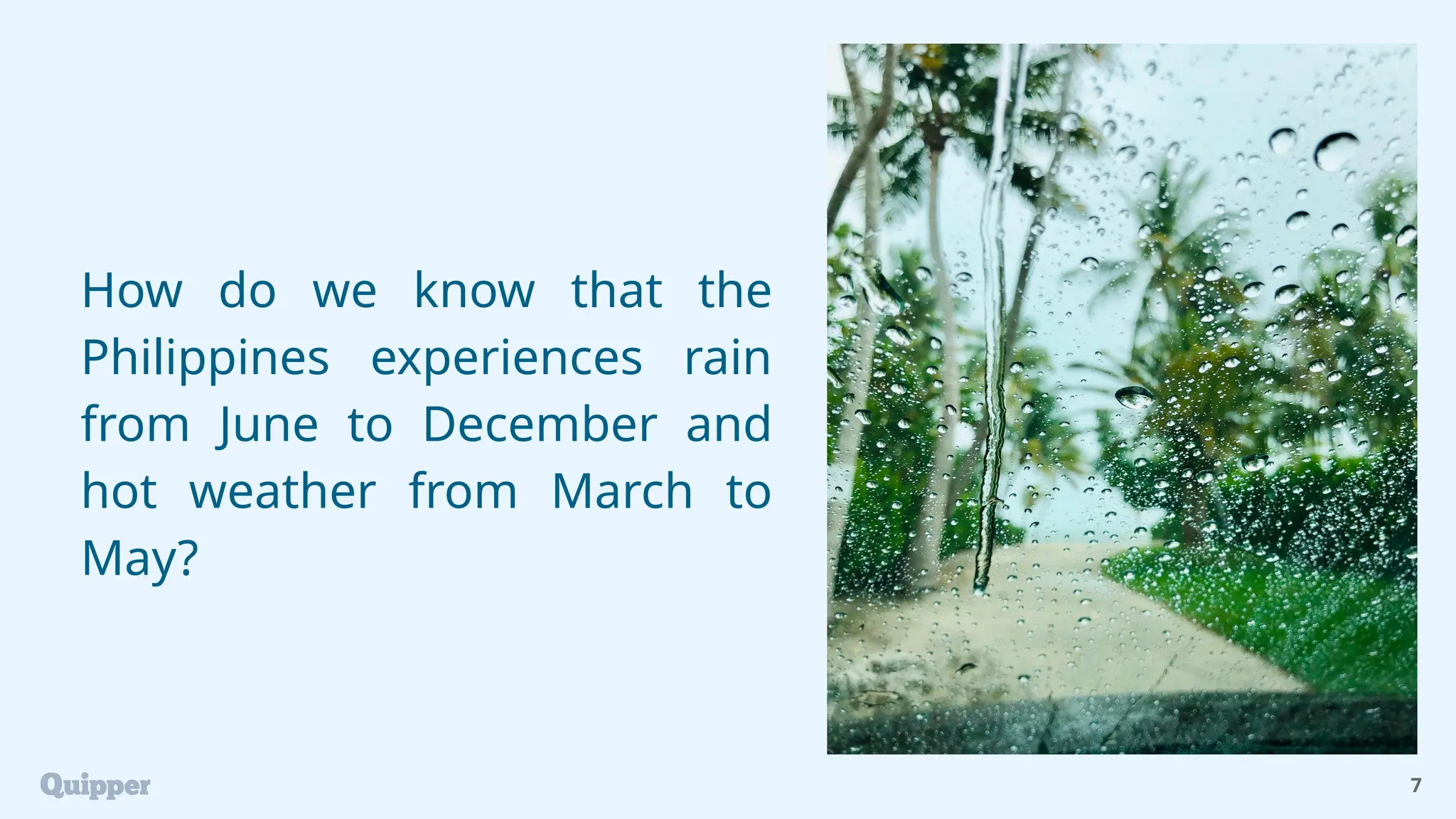
How do weknow that the
Philippines experiences rain
from June to December and
hot weather from March to
May?
7
8.
This pattern becomesclear through detailed collection
and analysis of weather data, which can be
demonstrated using data presentation tools.
In this lesson, you will learn about various tools for
displaying data and their applications. You will also
practice creating graphs that appropriately represent
the given data.
8
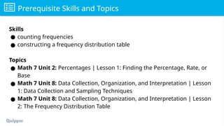
Prerequisite Skills andTopics
Skills
● counting frequencies
● constructing a frequency distribution table
Topics
● Math 7 Unit 2: Percentages | Lesson 1: Finding the Percentage, Rate, or
Base
● Math 7 Unit 8: Data Collection, Organization, and Interpretation | Lesson
1: Data Collection and Sampling Techniques
● Math 7 Unit 8: Data Collection, Organization, and Interpretation | Lesson
2: The Frequency Distribution Table
12.
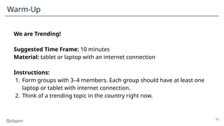
We are Trending!
SuggestedTime Frame: 10 minutes
Material: tablet or laptop with an internet connection
Instructions:
1. Form groups with 3–4 members. Each group should have at least one
laptop or tablet with internet connection.
2. Think of a trending topic in the country right now.
12
Warm-Up
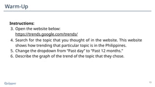
13.
Instructions:
3. Open thewebsite below:
https://trends.google.com/trends/
4. Search for the topic that you thought of in the website. This website
shows how trending that particular topic is in the Philippines.
5. Change the dropdown from “Past day” to “Past 12 months.”
6. Describe the graph of the trend of the topic that they chose.
13
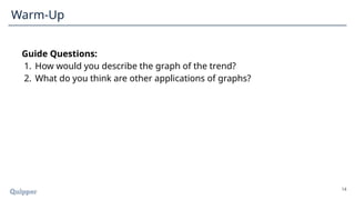
Warm-Up
14.
Guide Questions:
1. Howwould you describe the graph of the trend?
2. What do you think are other applications of graphs?
14
Warm-Up
15.
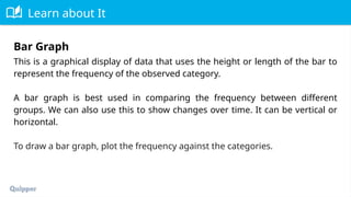
Learn about It
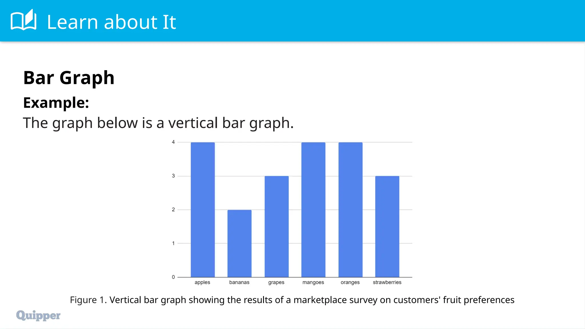
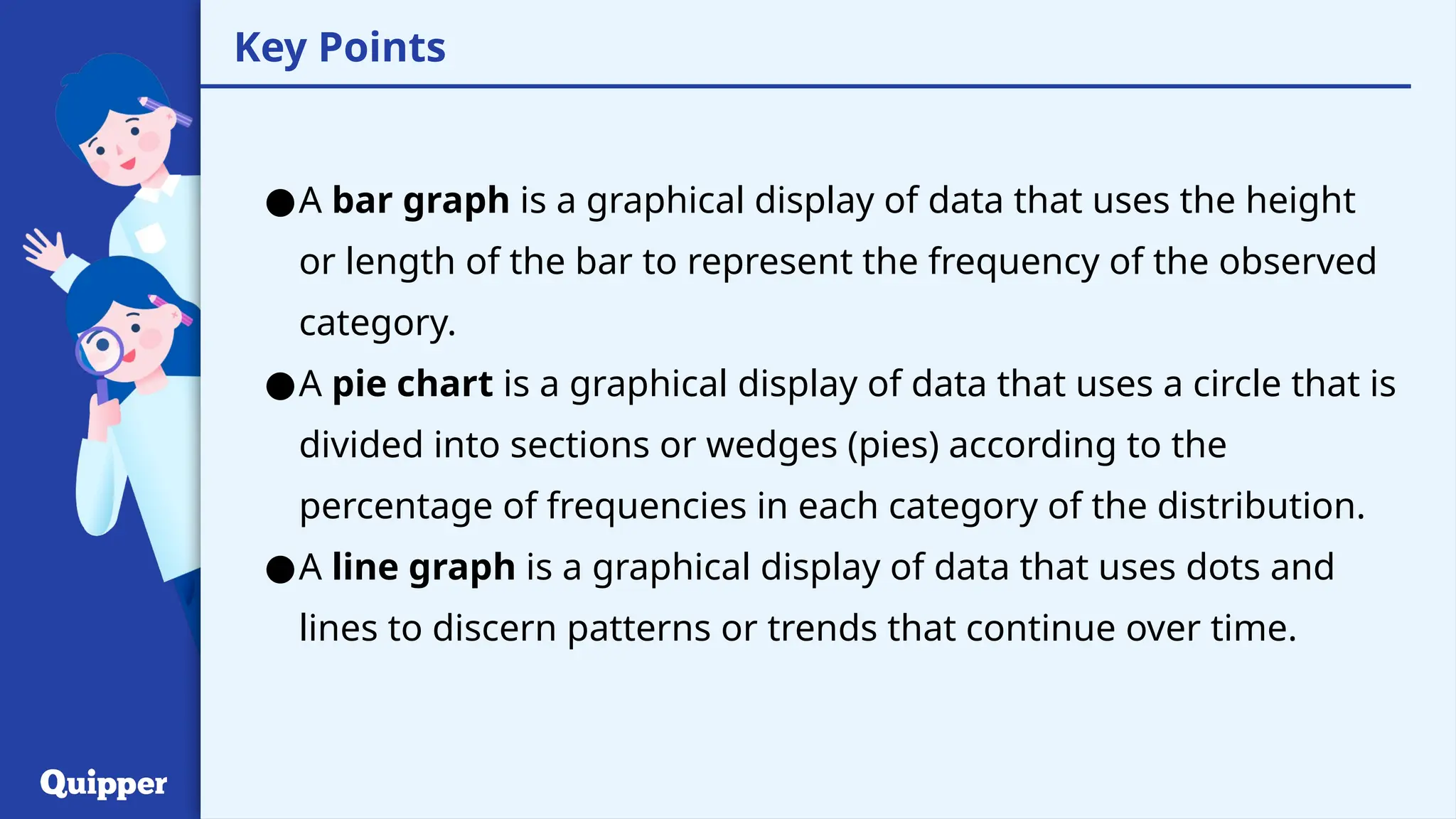
Thisis a graphical display of data that uses the height or length of the bar to
represent the frequency of the observed category.
A bar graph is best used in comparing the frequency between different
groups. We can also use this to show changes over time. It can be vertical or
horizontal.
To draw a bar graph, plot the frequency against the categories.
Bar Graph
16.
Learn about It
Example:
Thegraph below is a vertical bar graph.
Figure 1. Vertical bar graph showing the results of a marketplace survey on customers' fruit preferences
Bar Graph
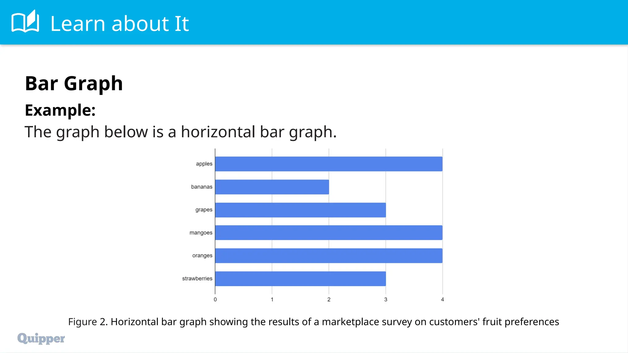
17.
Learn about It
Example:
Thegraph below is a horizontal bar graph.
Figure 2. Horizontal bar graph showing the results of a marketplace survey on customers' fruit preferences
Bar Graph
18.
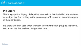
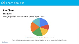
Learn about It
Thisis a graphical display of data that uses a circle that is divided into sections
or wedges (pies) according to the percentage of frequencies in each category
of the distribution.
Pie charts are best used when we want to compare each group to the whole.
We cannot use this to show changes over time.
Pie Chart
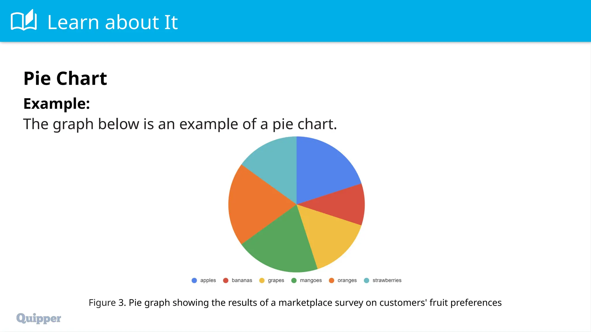
19.
Learn about It
Todraw a pie chart, assign one sector of a circle to each category. The angle of
each sector should be proportional to the relative frequency in that category.
Note that one full circle is 360°, so the angle for each category can be found
by multiplying the relative frequency by 360°.
Pie Chart
20.
Learn about It
Example:
Thegraph below is an example of a pie chart.
Figure 3. Pie graph showing the results of a marketplace survey on customers' fruit preferences
Pie Chart
21.
Learn about It
Thisis a graphical display of data that uses dots and lines to discern patterns
or trends that continue over time.
We use line graphs to track changes in data over certain periods of time. This
pattern could then be used to predict future events.
To draw a line graph, plot the time (horizontal) against the observed
phenomena (vertical) and then connect them using lines. This pattern could
then be used to predict future events. Time series is best presented on a line
graph.
Line Graph
22.
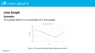
Learn about It
Example:
Thegraph below is an example of a line graph.
Figure 4. Line graph showing 5-day temperature records
Line Graph
23.
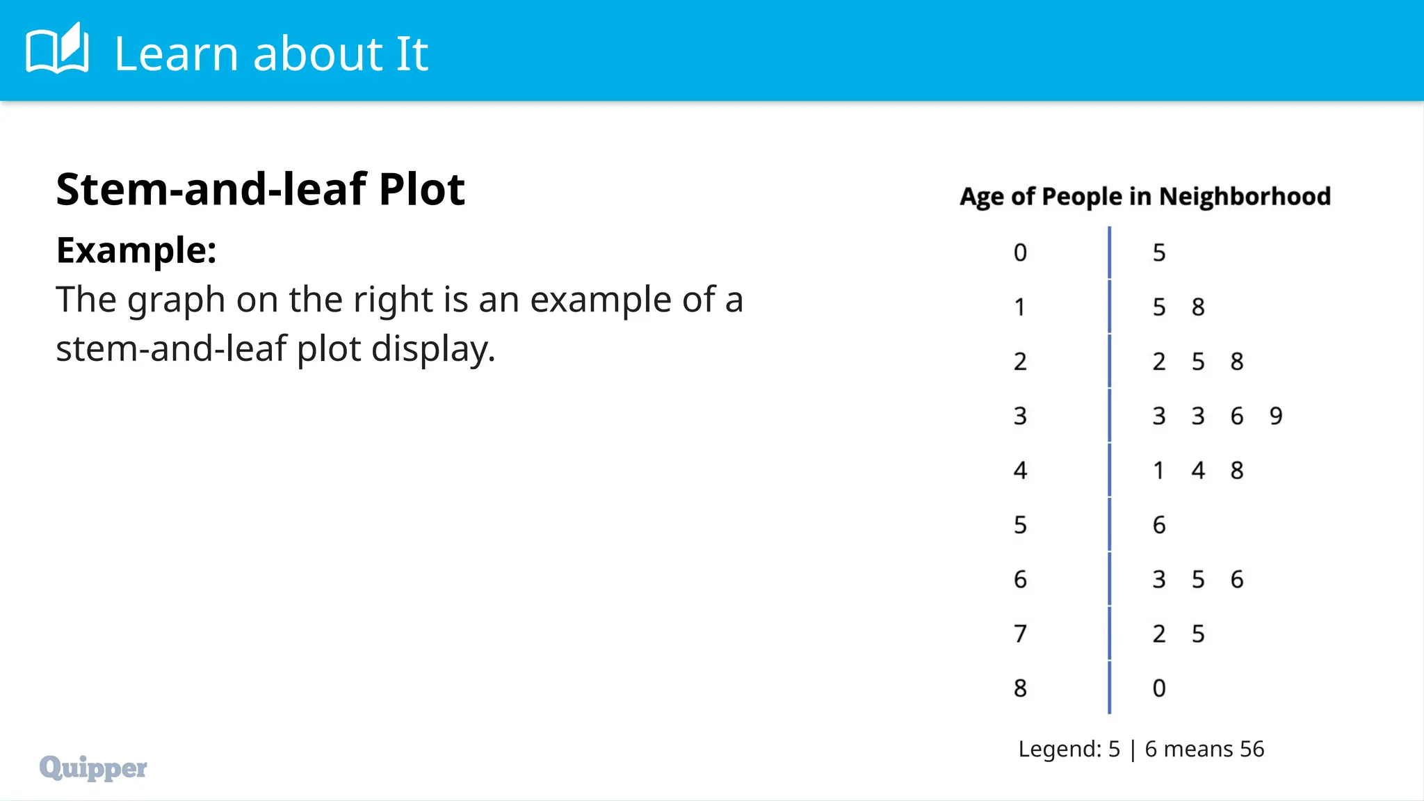
Learn about It
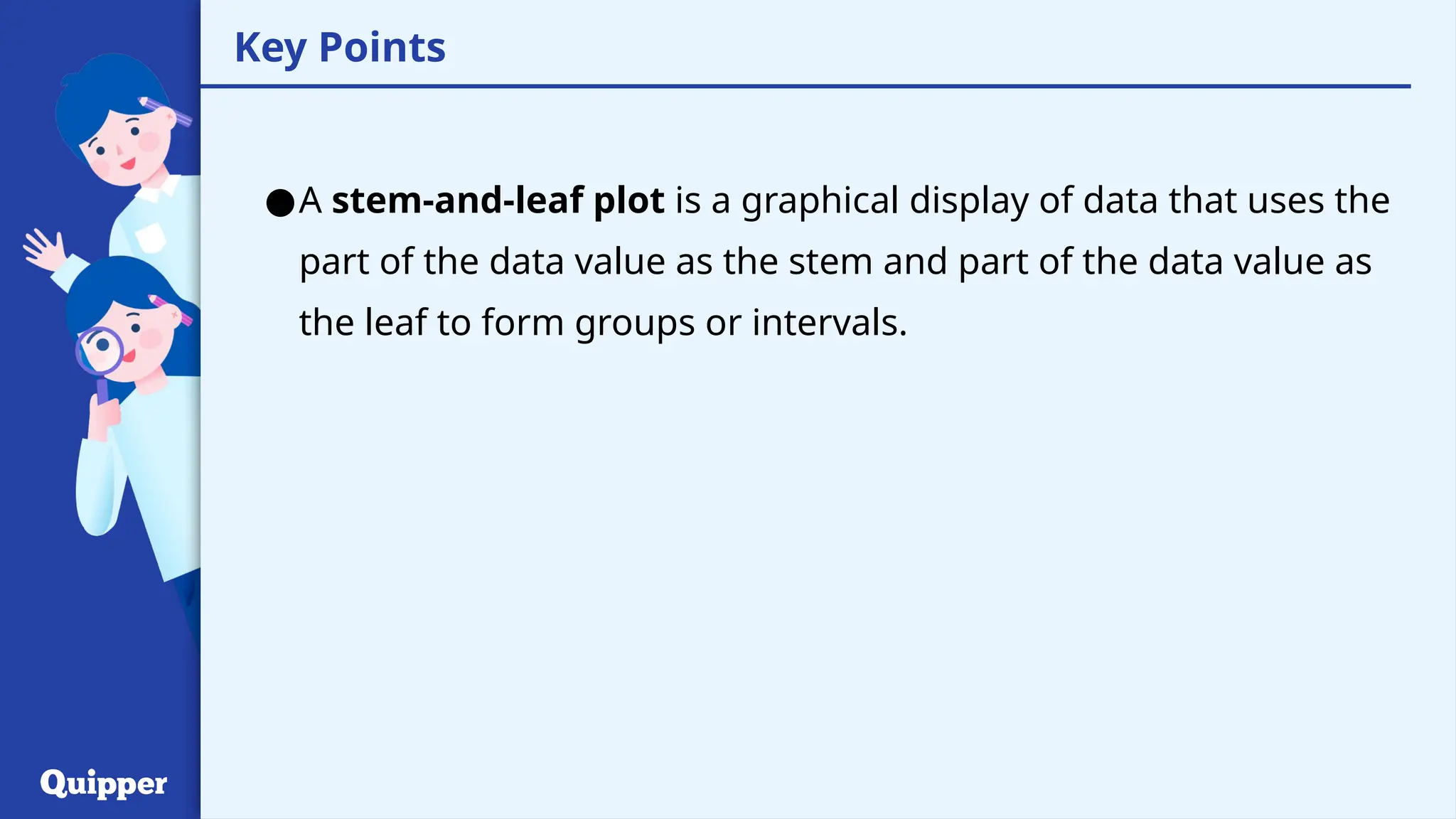
Thisis a graphical display of data that uses the part of the data value as the
stem and part of the data value as the leaf to form groups or intervals.
A display can be made by using the leading digit as the stem and the trailing
digit as the leaf. For example, for the value 25, the leading digit, 2, is the stem
and the trailing digit, 5, is the lead.
Stem-and-Leaf Plot
24.
Learn about It
Example:
Thegraph on the right is an example of a
stem-and-leaf plot display.
Stem-and-leaf Plot
Legend: 5 | 6 means 56
25.
25
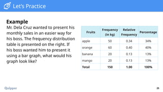
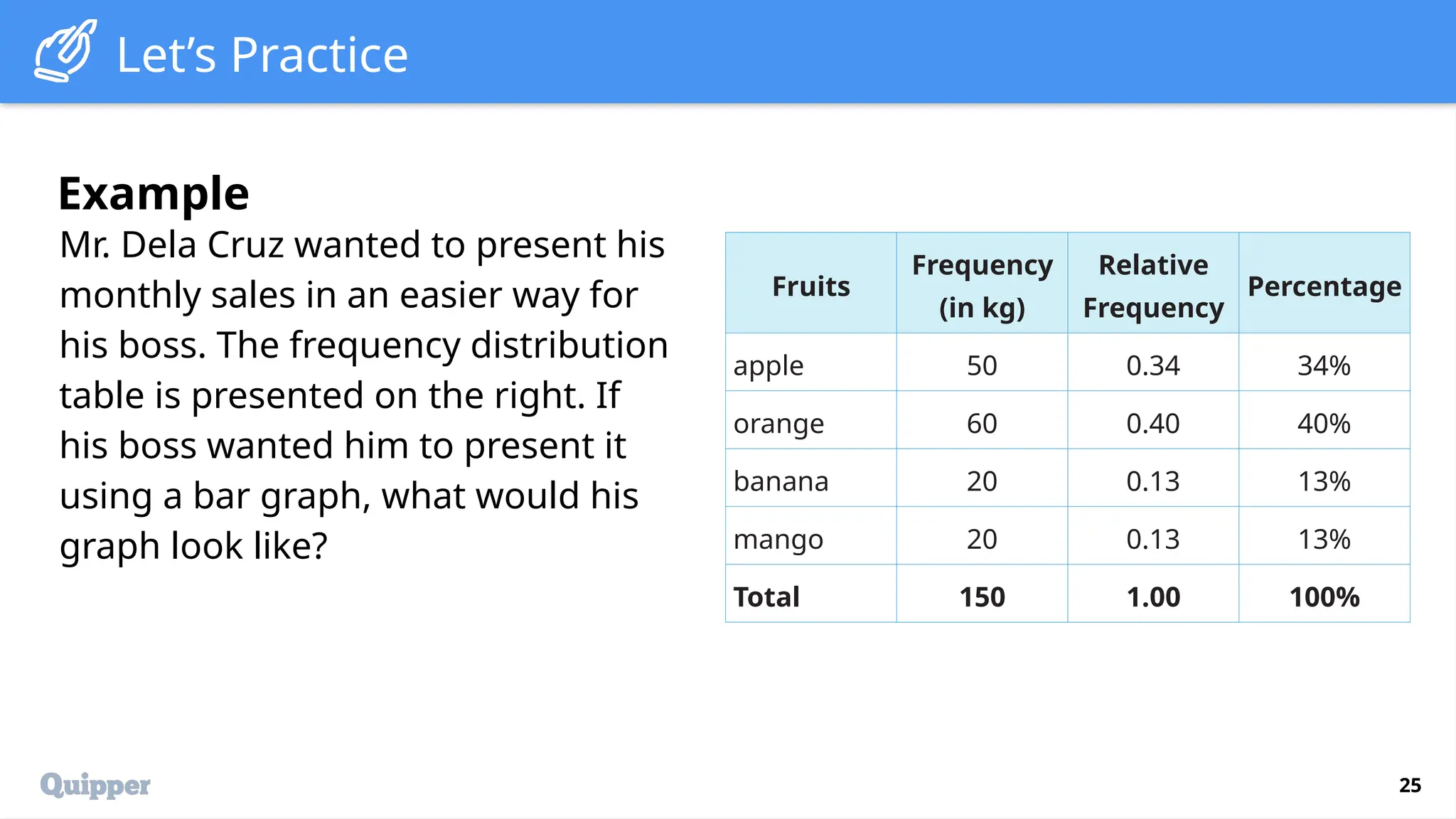
Let’s Practice
Mr. DelaCruz wanted to present his
monthly sales in an easier way for
his boss. The frequency distribution
table is presented on the right. If
his boss wanted him to present it
using a bar graph, what would his
graph look like?
Example
Fruits
Frequency
(in kg)
Relative
Frequency
Percentage
apple 50 0.34 34%
orange 60 0.40 40%
banana 20 0.13 13%
mango 20 0.13 13%
Total 150 1.00 100%
26.
26
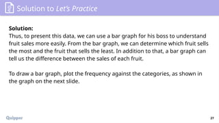
Solution to Let’sPractice
Solution:
Based on the given table, we can conclude that each category is best
described by its frequencies.
Recall that a bar graph uses the height or length of the bar to represent how
often a particular category was observed. The height of each bar tells us the
corresponding frequency for each category.
27.
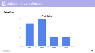
27
Solution to Let’sPractice
Solution:
Thus, to present this data, we can use a bar graph for his boss to understand
fruit sales more easily. From the bar graph, we can determine which fruit sells
the most and the fruit that sells the least. In addition to that, a bar graph can
tell us the difference between the sales of each fruit.
To draw a bar graph, plot the frequency against the categories, as shown in
the graph on the next slide.
29
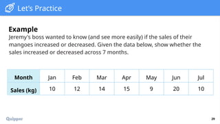
Let’s Practice
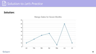
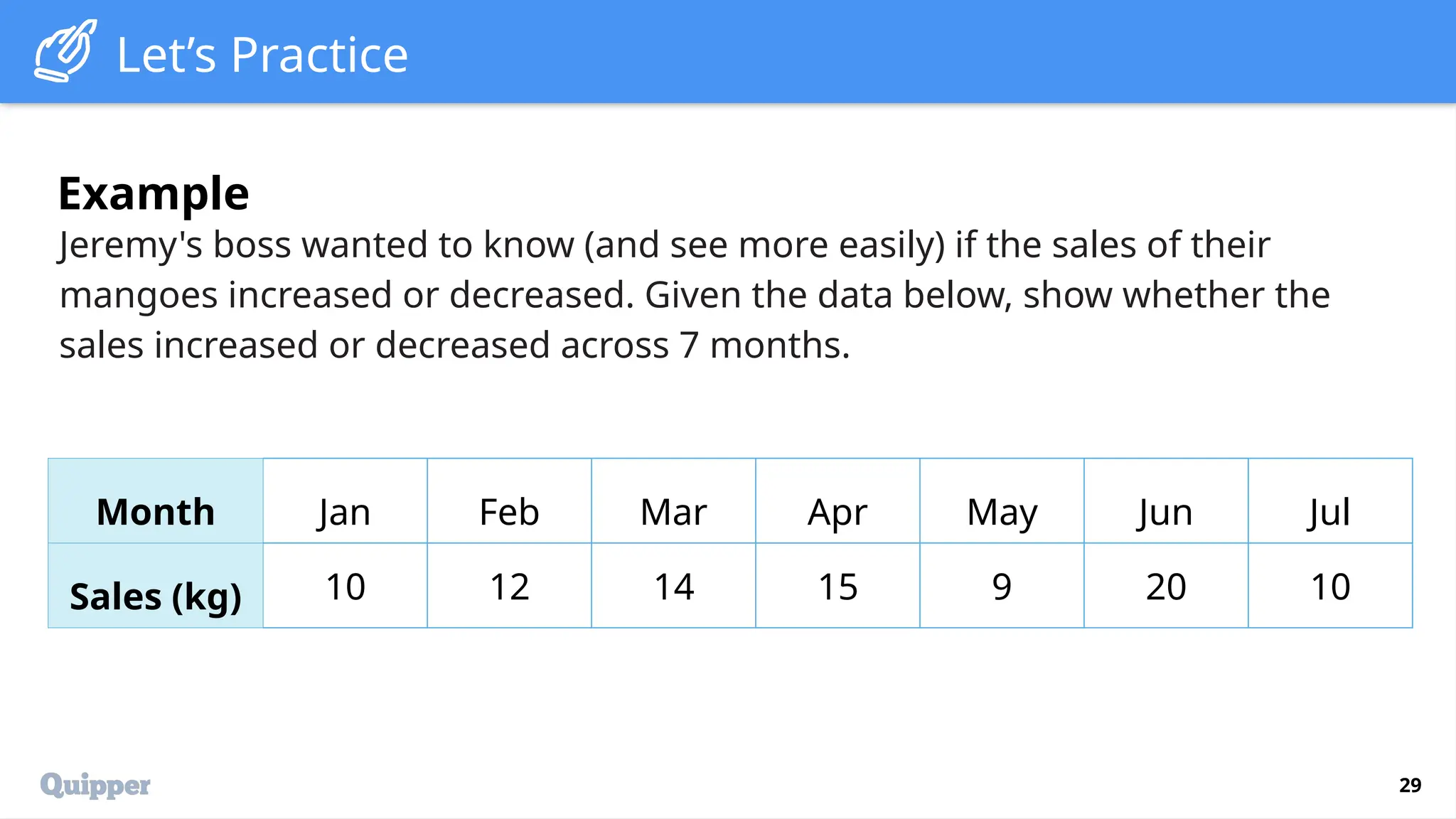
Jeremy's bosswanted to know (and see more easily) if the sales of their
mangoes increased or decreased. Given the data below, show whether the
sales increased or decreased across 7 months.
Example
Month Jan Feb Mar Apr May Jun Jul
Sales (kg) 10 12 14 15 9 20 10
30.
30
Solution to Let’sPractice
Solution:
The given data is an example of a time series. It is a series that depends on a
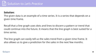
given time frame.
Recall that a line graph uses dots and lines to discern a pattern or trend that
could continue into the future. It means that the line graph is best suited for a
time series.
The line graph can easily tell us the sales trend from a given time frame. It
also allows us to give a prediction for the sales in the next few months.
31.
31
Solution to Let’sPractice
Solution:
To draw a line graph, plot the time (horizontal) against the observed
phenomena (vertical) and then connect them using lines. This pattern could
then be used to predict future events.
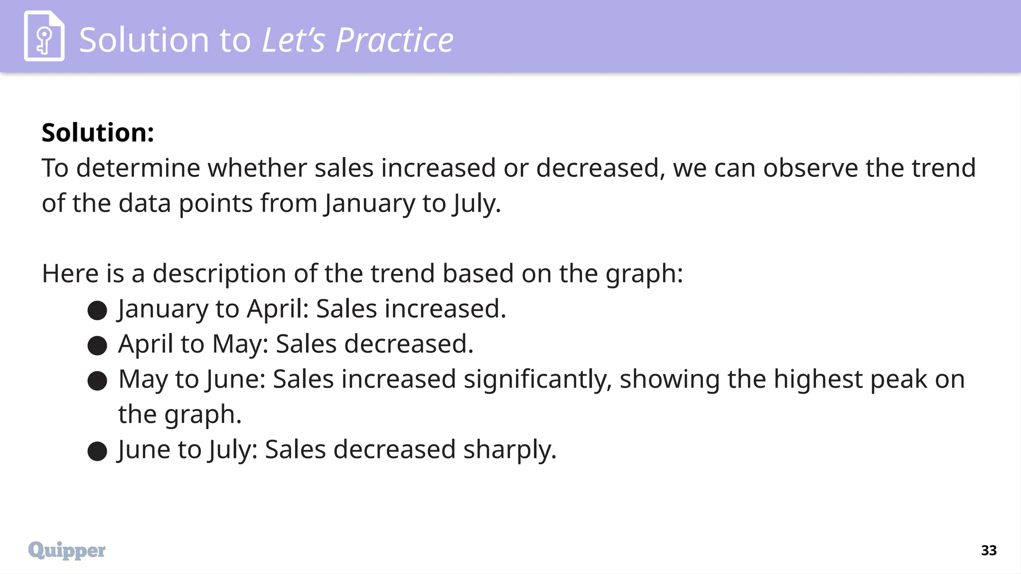
33
Solution to Let’sPractice
Solution:
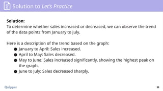
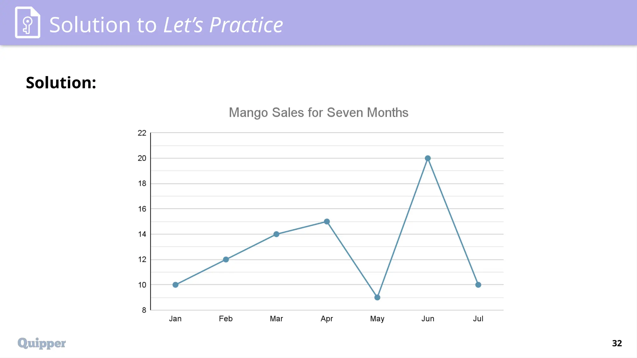
To determine whether sales increased or decreased, we can observe the trend
of the data points from January to July.
Here is a description of the trend based on the graph:
● January to April: Sales increased.
● April to May: Sales decreased.
● May to June: Sales increased significantly, showing the highest peak on
the graph.
● June to July: Sales decreased sharply.
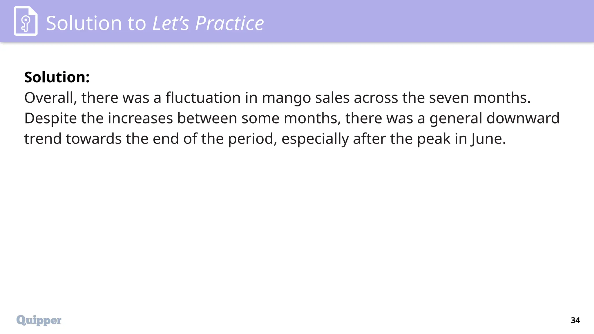
34.
34
Solution to Let’sPractice
Solution:
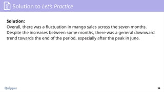
Overall, there was a fluctuation in mango sales across the seven months.
Despite the increases between some months, there was a general downward
trend towards the end of the period, especially after the peak in June.
35.
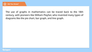
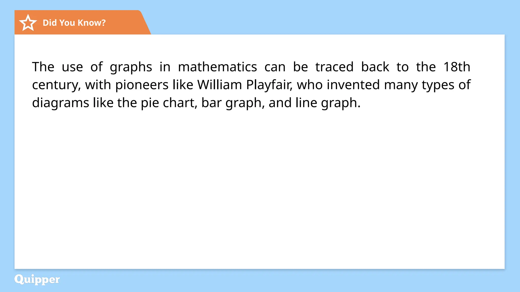
Did You Know?
Theuse of graphs in mathematics can be traced back to the 18th
century, with pioneers like William Playfair, who invented many types of
diagrams like the pie chart, bar graph, and line graph.
36.
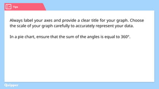
Tips
Always label youraxes and provide a clear title for your graph. Choose
the scale of your graph carefully to accurately represent your data.
In a pie chart, ensure that the sum of the angles is equal to 360°.
37.
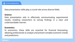
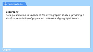
Practical Applications
Data presentationskills play a crucial role across diverse fields.
Science
Data presentation aids in effectively communicating experimental
results, enabling researchers to convey findings in a clear and
understandable manner.
Economics
In economics, these skills are essential for financial forecasting,
allowing professionals to analyze and present complex economic trends
and predictions.
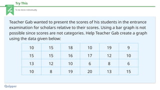
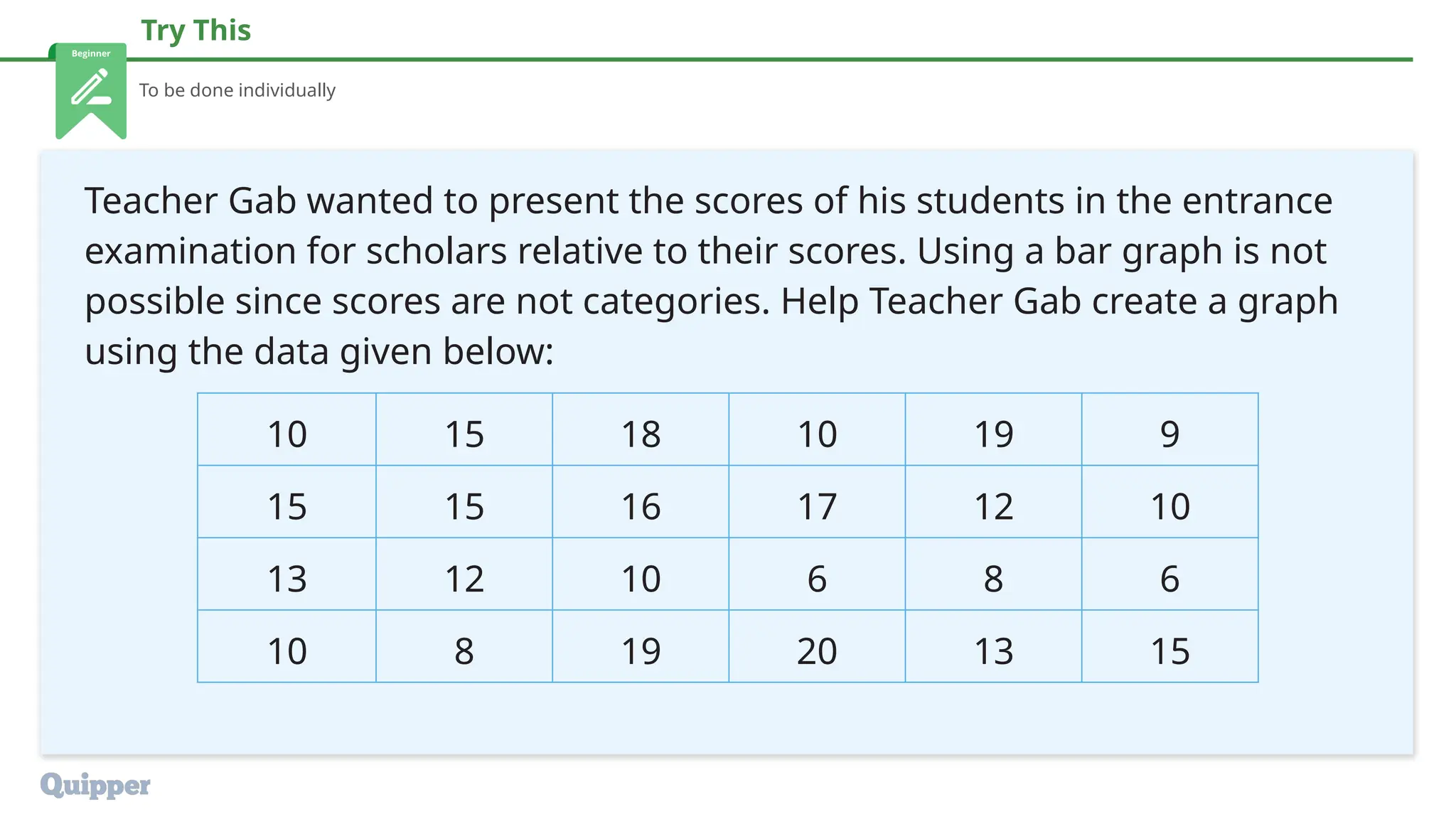
Try This
To bedone individually
Teacher Gab wanted to present the scores of his students in the entrance
examination for scholars relative to their scores. Using a bar graph is not
possible since scores are not categories. Help Teacher Gab create a graph
using the data given below:
10 15 18 10 19 9
15 15 16 17 12 10
13 12 10 6 8 6
10 8 19 20 13 15
40.
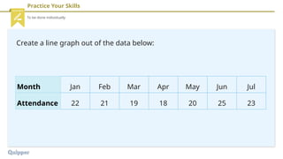
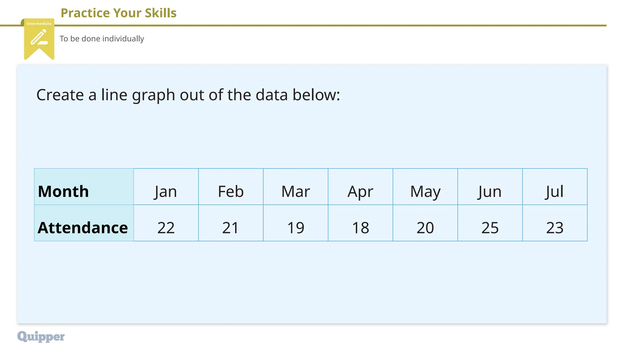
Practice Your Skills
Tobe done individually
Create a line graph out of the data below:
Month Jan Feb Mar Apr May Jun Jul
Attendance 22 21 19 18 20 25 23
41.
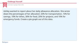
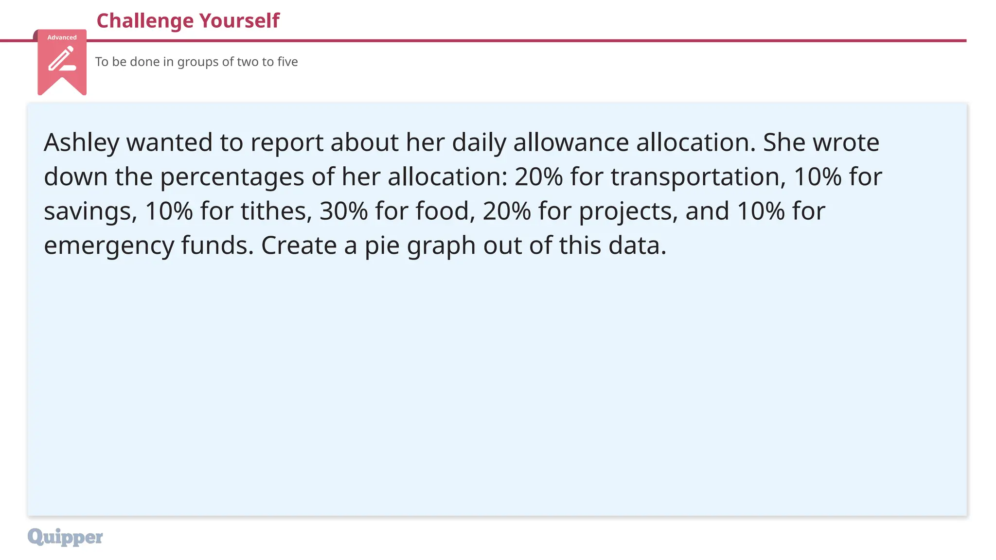
Challenge Yourself
To bedone in groups of two to five
Ashley wanted to report about her daily allowance allocation. She wrote
down the percentages of her allocation: 20% for transportation, 10% for
savings, 10% for tithes, 30% for food, 20% for projects, and 10% for
emergency funds. Create a pie graph out of this data.
42.
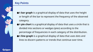
Key Points
●A bargraph is a graphical display of data that uses the height
or length of the bar to represent the frequency of the observed
category.
●A pie chart is a graphical display of data that uses a circle that is
divided into sections or wedges (pies) according to the
percentage of frequencies in each category of the distribution.
●A line graph is a graphical display of data that uses dots and
lines to discern patterns or trends that continue over time.
43.
Key Points
●A stem-and-leafplot is a graphical display of data that uses the
part of the data value as the stem and part of the data value as
the leaf to form groups or intervals.
44.
44
Synthesis
Wrap-Up
1. What arethe key differences between a bar graph and a pie chart?
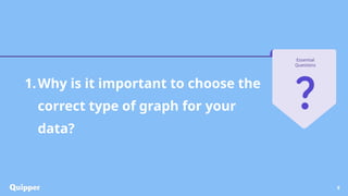
2. Why is it important to choose the right type of graph for your data?
45.
45
Synthesis
Application and ValuesIntegration
1. How can the skills learned in this lesson be applied in real life?
2. What values can be learned from this lesson?
46.
46
Synthesis
Bridge to theNext Topic
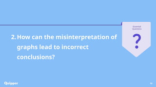
1. How do the graphs we've learned about help us understand statistical
data better?
2. What additional information might we need to interpret these graphs
more effectively in our next lesson?
47.
Attributions References
● Slide4:
Business chart showing financial success on paper
by travnikovstudio is licensed under
Envato License via Envato Elements.
● Slide 7:
Rain drops on the window looking out at the beach
by marisap7 is licensed under Envato License via
Envato Elements.
“Types of Graphs and Charts And Their Uses”.
Intellspot. Accessed February 5, 2024.
https://www.intellspot.com/types-graphs-charts/.
"Types of Graphs in Statistics." BYJU’s. Accessed
January 19, 2024
https://byjus.com/maths/types-of-graphs/.
47


![Presenting-Experimental-Data-Grade-8 [Autosaved].pptx](https://cdn.slidesharecdn.com/ss_thumbnails/presenting-experimental-data-grade-8autosaved-240925105557-9775d0ae-thumbnail.jpg?width=600ounds&width=560&fit=bounds)
![Presenting-Experimental-Data-Grade-8 [Autosaved].pptx](https://cdn.slidesharecdn.com/ss_thumbnails/presenting-experimental-data-grade-8autosaved-240925104859-008a237a-thumbnail.jpg?width=600ounds&width=560&fit=bounds)


