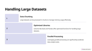
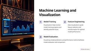
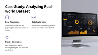
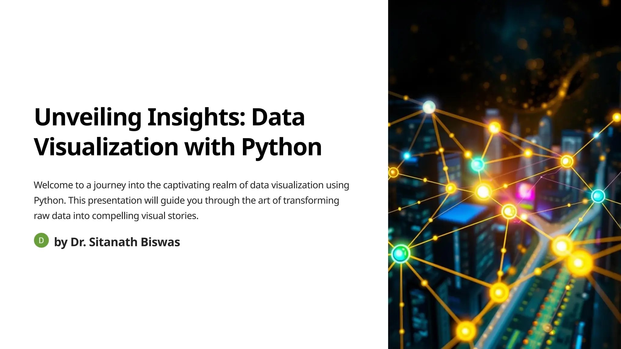
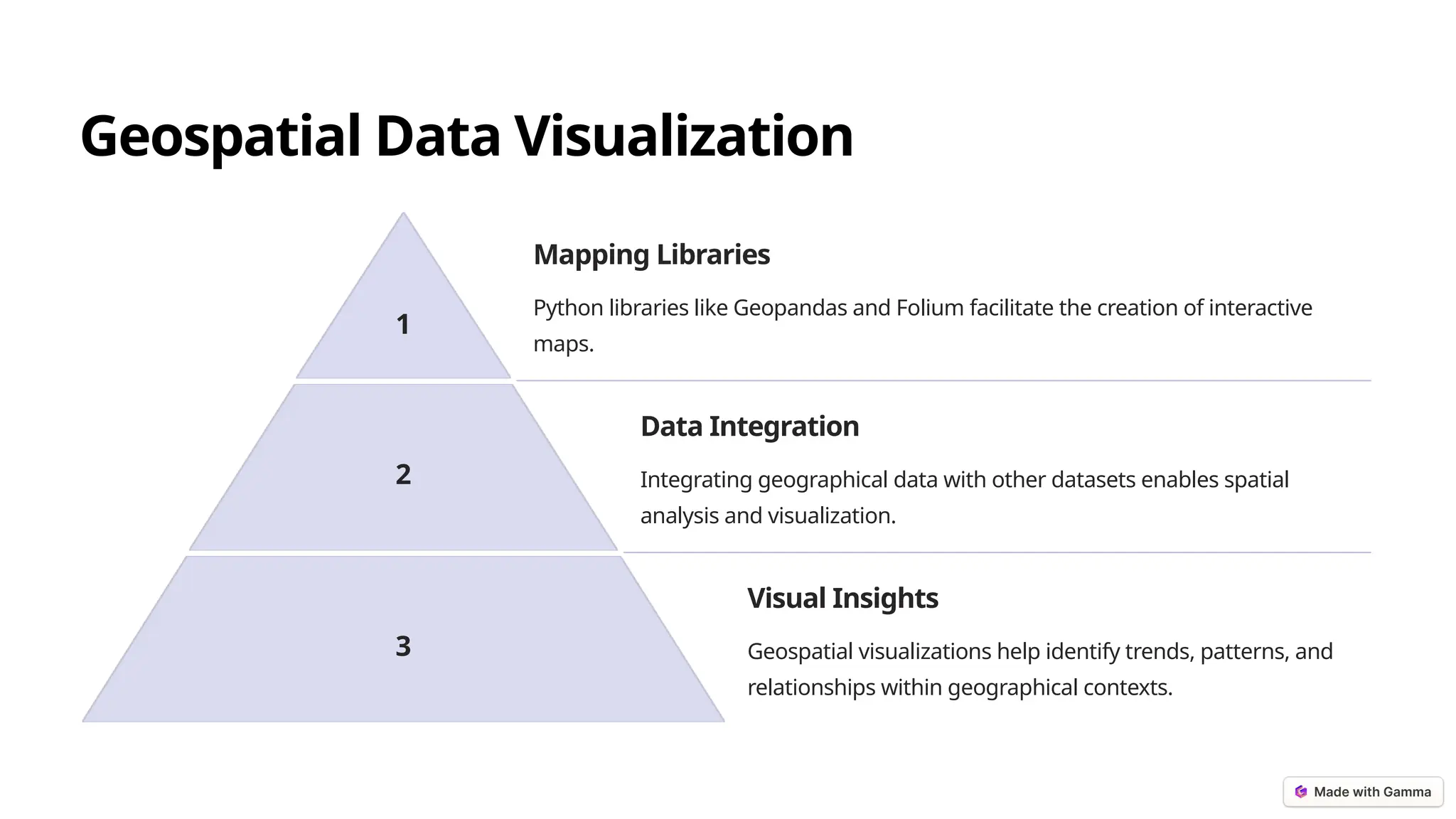
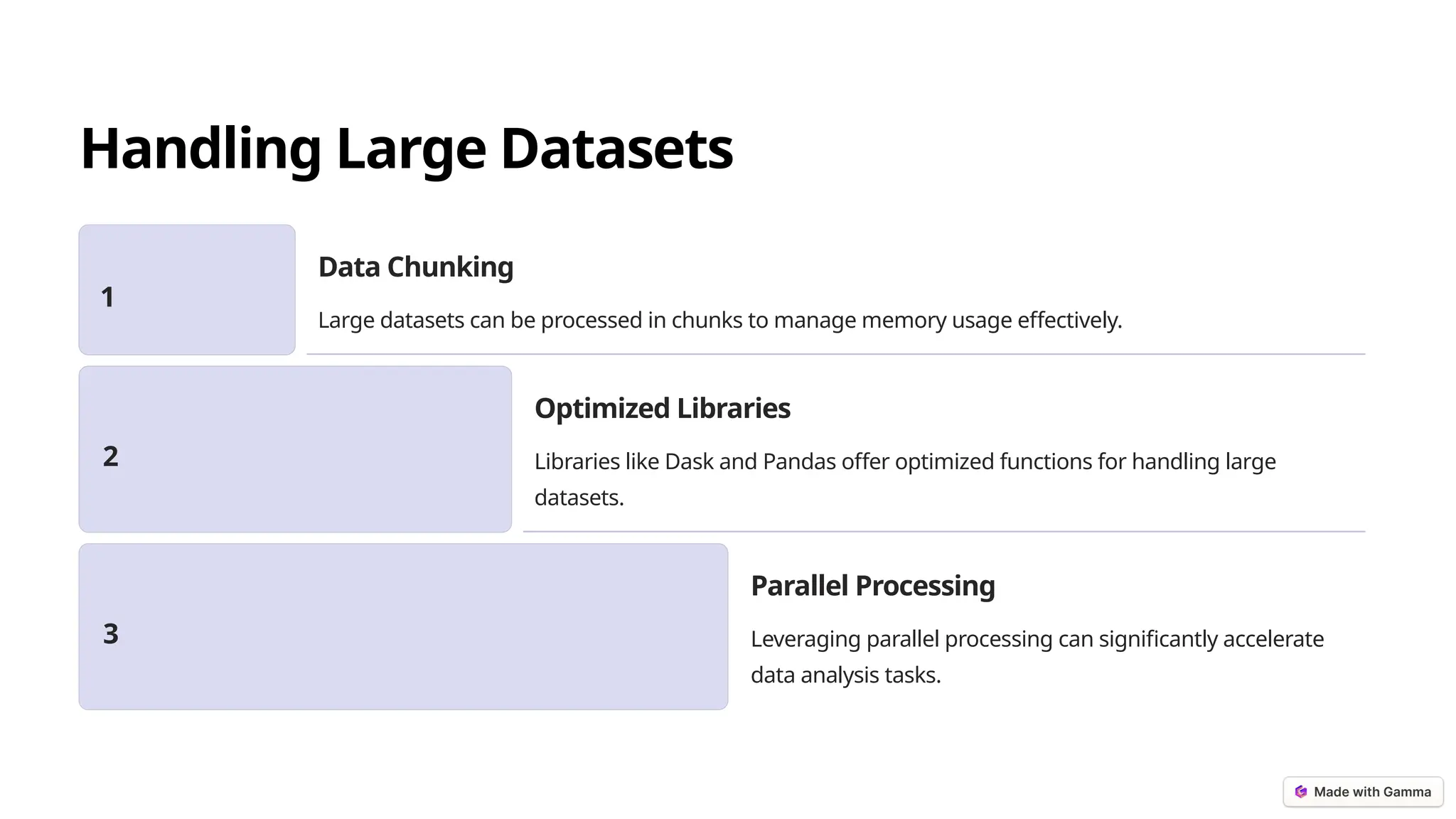
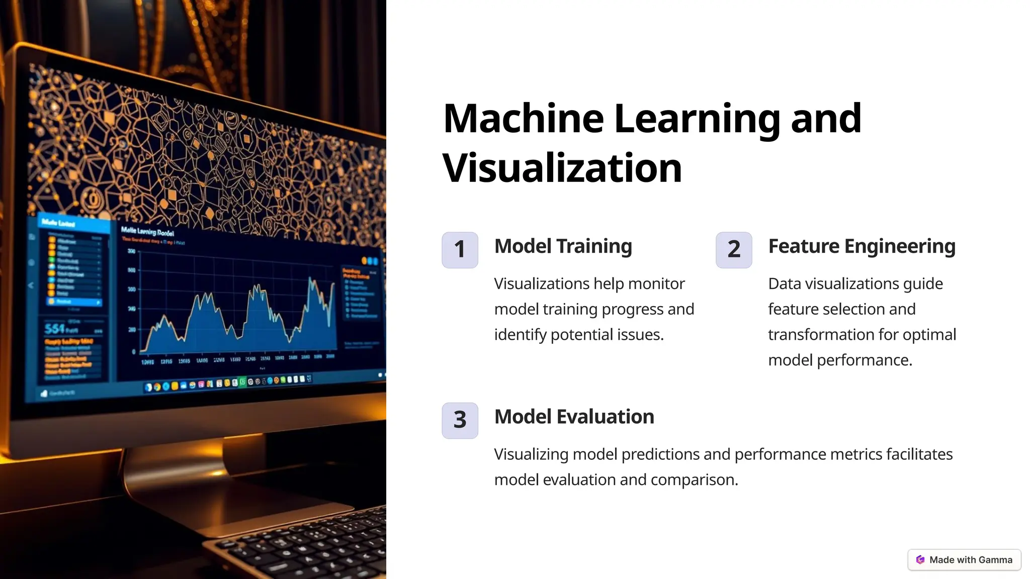
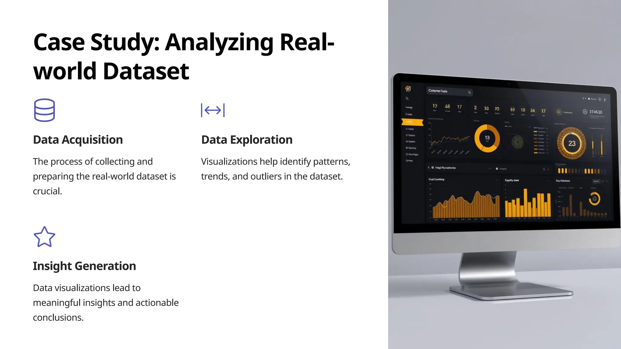
KEMBAR78
Data-Visualization-with-Python-2 PPT.pptx
Unveiling Insights: Data
Visualization with Python
Welcome to a journey into the captivating realm of data visualization using
Python. This presentation will guide you through the art of transforming
raw data into compelling visual stories.
by Dr. Sitanath Biswas
Interactive Visualizations with Plotly
Interactive Exploration
Plotly empowers users to delve deeper into data by allowing
for zooming, panning, and hovering over specific data points.
Customization
It offers extensive customization options, enabling you to fine-
tune the appearance and interactivity of your visualizations.
Geospatial Data Visualization
1
Mapping Libraries
Python libraries like Geopandas and Folium facilitate the creation of interactive
maps.
2
Data Integration
Integrating geographical data with other datasets enables spatial
analysis and visualization.
3
Visual Insights
Geospatial visualizations help identify trends, patterns, and
relationships within geographical contexts.
Handling Large Datasets
1
Data Chunking
Large datasets can be processed in chunks to manage memory usage effectively.
2
Optimized Libraries
Libraries like Dask and Pandas offer optimized functions for handling large
datasets.
3
Parallel Processing
Leveraging parallel processing can significantly accelerate
data analysis tasks.
Machine Learning and
Visualization
1 Model Training
Visualizations help monitor
model training progress and
identify potential issues.
2 Feature Engineering
Data visualizations guide
feature selection and
transformation for optimal
model performance.
3 Model Evaluation
Visualizing model predictions and performance metrics facilitates
model evaluation and comparison.
Case Study: Analyzing Real-
world Dataset
Data Acquisition
The process of collecting and
preparing the real-world dataset is
crucial.
Data Exploration
Visualizations help identify patterns,
trends, and outliers in the dataset.
Insight Generation
Data visualizations lead to
meaningful insights and actionable
conclusions.
Best Practices in Data
Visualization
Clarity
Use clear labels, consistent
color schemes, and appropriate
chart types for effective
communication.
Conciseness
Avoid information overload by
focusing on key insights and
minimizing unnecessary
details.
Context
Provide context and background information to help the audience
understand the data and its implications.
Tools for Dashboard Creation
Dash
A powerful framework for building
interactive web dashboards.
Plotly Dash
A popular library for creating
customizable and interactive
dashboards.
Streamlit
A lightweight framework for building
web applications, including
dashboards.
Sharing and Presenting Data
Insights
1
Visual Storytelling
Transform data insights into engaging
narratives for effective communication.
2
Interactive Reports
Share interactive reports that allow
users to explore data on their own.
3
Data Collaboration
Enable data sharing and collaboration
among team members.
Future Trends in Data Visualization

Data-Visualization-with-Python-2 PPT.pptx

  • 1.
    Unveiling Insights: Data Visualizationwith Python Welcome to a journey into the captivating realm of data visualization using Python. This presentation will guide you through the art of transforming raw data into compelling visual stories. by Dr. Sitanath Biswas
  • 2.
    Interactive Visualizations withPlotly Interactive Exploration Plotly empowers users to delve deeper into data by allowing for zooming, panning, and hovering over specific data points. Customization It offers extensive customization options, enabling you to fine- tune the appearance and interactivity of your visualizations.
  • 3.
    Geospatial Data Visualization 1 MappingLibraries Python libraries like Geopandas and Folium facilitate the creation of interactive maps. 2 Data Integration Integrating geographical data with other datasets enables spatial analysis and visualization. 3 Visual Insights Geospatial visualizations help identify trends, patterns, and relationships within geographical contexts.
  • 4.
    Handling Large Datasets 1 DataChunking Large datasets can be processed in chunks to manage memory usage effectively. 2 Optimized Libraries Libraries like Dask and Pandas offer optimized functions for handling large datasets. 3 Parallel Processing Leveraging parallel processing can significantly accelerate data analysis tasks.
  • 5.
    Machine Learning and Visualization 1Model Training Visualizations help monitor model training progress and identify potential issues. 2 Feature Engineering Data visualizations guide feature selection and transformation for optimal model performance. 3 Model Evaluation Visualizing model predictions and performance metrics facilitates model evaluation and comparison.
  • 6.
    Case Study: AnalyzingReal- world Dataset Data Acquisition The process of collecting and preparing the real-world dataset is crucial. Data Exploration Visualizations help identify patterns, trends, and outliers in the dataset. Insight Generation Data visualizations lead to meaningful insights and actionable conclusions.
  • 7.
    Best Practices inData Visualization Clarity Use clear labels, consistent color schemes, and appropriate chart types for effective communication. Conciseness Avoid information overload by focusing on key insights and minimizing unnecessary details. Context Provide context and background information to help the audience understand the data and its implications.
  • 8.
    Tools for DashboardCreation Dash A powerful framework for building interactive web dashboards. Plotly Dash A popular library for creating customizable and interactive dashboards. Streamlit A lightweight framework for building web applications, including dashboards.
  • 9.
    Sharing and PresentingData Insights 1 Visual Storytelling Transform data insights into engaging narratives for effective communication. 2 Interactive Reports Share interactive reports that allow users to explore data on their own. 3 Data Collaboration Enable data sharing and collaboration among team members.
  • 10.
    Future Trends inData Visualization