This document discusses data visualization and various techniques used to visually represent data. It defines data visualization as the pictorial or visual representation of data using visual elements such as charts, graphs, and diagrams. It describes different types of visualization including linear, planar, volumetric, temporal, multidimensional, tree, and network visualizations. It also discusses specific techniques like isolines, isosurfaces, streamlines, parallel coordinate plots, and timelines. The document outlines applications of data visualization in fields like education, science, and systems visualization. It notes that big data poses challenges for traditional visualization techniques due to its large volume and speed of generation.
Overview of data visualization; it represents data visually using graphs, charts, and infographics.
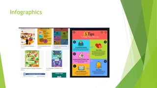
Discussion on infographics; they tell structured narratives and help interpret data visually.
Classification of data visualizations based on creation method, quantity, and creativity.
Descriptions of various graphical tools for data visualization: graphs, diagrams, timelines, etc.
Various techniques for visual data representation, including isolines, isosurfaces, and Venn diagrams.
Different data visualization types: linear, planar, volumetric, temporal, multidimensional, tree, network.
Applications in education, production, science, and business, highlighting data visualization's usefulness.Solutions for analyzing Big Data challenges and the importance of visualization in deriving insights.
Overview of tools used in data visualization, including both commercial and open-source solutions.
Introduction
Visualization isa pictorial or visual representation technique.
Anything which is represented in pictorial or graphical form with the help of
diagrams, charts, pictures, and flowcharts are known as visualization.
Data visualization is a pictorial or visual representation of data with the help
of visual aids such as graphs, bars, histograms, tables, pie charts, mind maps
etc.
Depending upon the complexity of the data and the aspects from which it is
analysed, visuals can vary in terms of their dimensions (1-D,2-
D/Multidimensional) or types such as a temporal, hierarchical, network.
All these visuals are used for presenting different types of datasets.
Different types of tools are available in the market for visualizing data.
3.
One ofthe most commonly used data visualization tools is Tableau, which is
available for free as Tableau Public.
We can use Tableau products for both individual as well as corporate purposes
creating several types of 1D,2D and 3D visualizations.
4.
Ways for representingVisual Data
The data is first analyzed and then the result of that analysis is visualized as:
Infographics
Data visualization
Infographics are the visual representation of information or data rapidly or
accurately.
The use of colorful graphics in drawing charts and graphs helps in improving
the interpretation of the given data.
Infographics tella premeditated story to guide the audience to conclusions (subjective).
Infographics are visual representations of facts, events, or numbers that reflect patterns and align
with a story.
They not only represent specific data points but information as well. They are instruments for
reasoning about qualitative information.
Infographics are:
Emphasizes a structured narrative rather than patterns in data
Typically shows simple, aggregated data points to support the narrative
Are typically static images
Best for telling a premeditated story and offer subjectivity
Best for guiding the audience to conclusions and points out relationships
Created manually for one specific dataset
7.
Data visualization
Itis the study of representing the data or information in visual form.
With the advancement of digital technologies, the scope of multimedia has
increased.
Visuals in the form of graphs, images, diagrams or animations have
completely proliferated the media industry and the Internet.
Human mind can comprehend information more easily if it is presented in the
form of visuals.
Instructional designers focus on abstract and model-based scientific
visualizations to make the learning content more interesting and easy to
understand.
Scientific data is also represented through digitally constructed images,
created with the help of software.
8.
Data visualizationsare visual representation of data abstracted into a schematic form so that the
audience can more easily process the information and get a clear idea about the data at a glance.
They help you understand trends, patterns and to make correlations. They are instruments for
reasoning quantitative information.
Data visualizations are:
Highlights patterns in the data for you to draw your own conclusions
Dives deep into data and uses visual representation to surface trends, relationships and patterns.
May use dynamic interactions to help you explore the data
Best for allowing the audience to draw their own conclusions, and offer objectivity
Ideal for understanding data at a glance
Automatically generated for arbitrary datasets
9.
Visualization isan excellent medium to analyse, comprehend and share
information.
Visual images help to transmit a huge amount of information to the human brain at
a glance.
They help in establishing relationships and distinction between different patterns
or processes easily.
They help in exploring data from different angles which help gain indights.
They help in identifying problems and understanding trends and outliers.
They point out key or interesting break throughs in a large dataset.
10.
Data canbe classified on the basis of the following three criteria irrespective
of whether it is presented as data visualization or infographics.
Method of creation- It refers to the type of content used while creating any
graphical representation.
Quantity of data displayed- it refers to the amount of data which is
represented. For eg: geographical maps, companies’ financial data, etc.
Degree of creativity applied- It refers to the extent to which the data is
created graphically or designed in a colourful way or it is just showing some
important data in black and white diagrams.
11.
On thebasis of above evaluation, we can understand which is the correct
form of representation for a given data type.
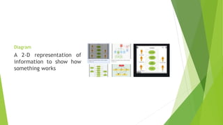
Graphs
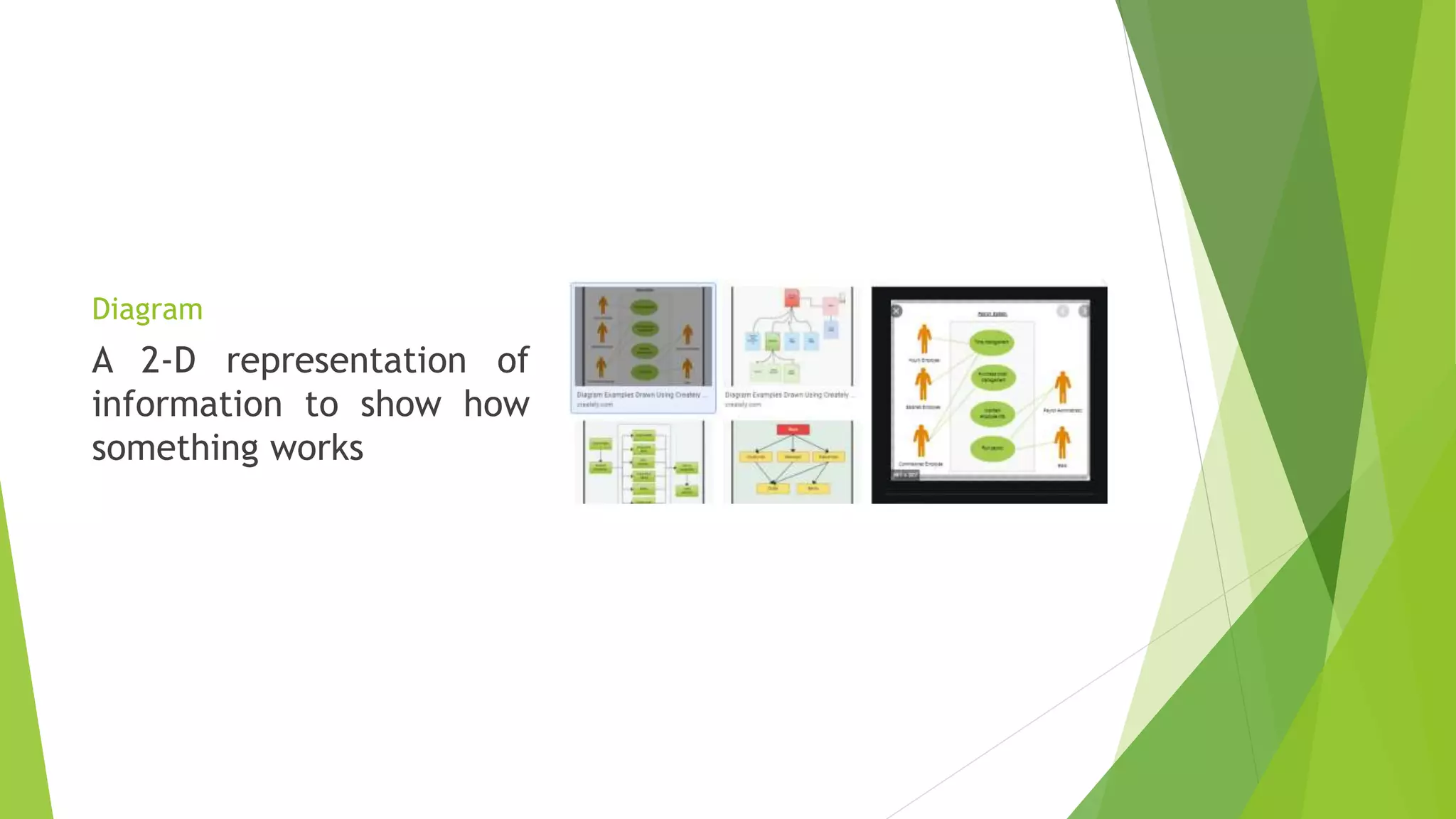
Diagram
Timeline
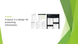
Template
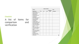
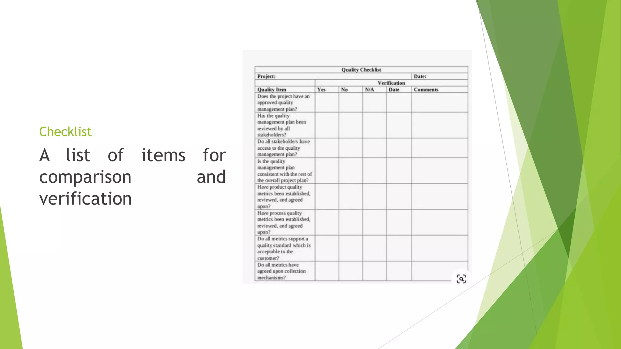
Checklist
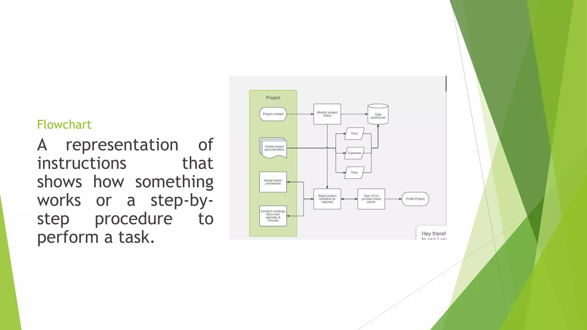
Flowchart
Mindmap
12.
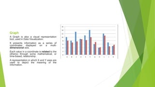
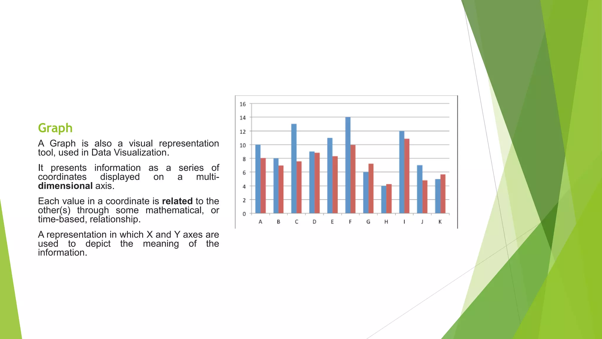
Graph
A Graph isalso a visual representation
tool, used in Data Visualization.
It presents information as a series of
coordinates displayed on a multi-
dimensional axis.
Each value in a coordinate is related to the
other(s) through some mathematical, or
time-based, relationship.
A representation in which X and Y axes are
used to depict the meaning of the
information.
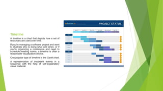
Timeline
A timeline isa chart that depicts how a set of
resources are used over time.
If you're managing a software project and want
to illustrate who is doing what and when, or if
you're organizing a conference and need to
schedule meeting rooms, a timeline is often a
reasonable visualization choice.
One popular type of timeline is the Gantt chart.
A representation of important events in a
sequence with the help of self-explanatory
visual material.
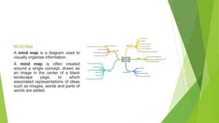
Mind Map
A mindmap is a diagram used to
visually organise information.
A mind map is often created
around a single concept, drawn as
an image in the center of a blank
landscape page, to which
associated representations of ideas
such as images, words and parts of
words are added.
19.
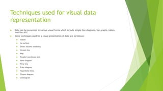
Techniques used forvisual data
representation
Data can be presented in various visual forms which include simple line diagrams, bar graphs, tables,
matrices etc.
Some techniques used for a visual presentation of data are as follows:
Isoline
Iso surface
Direct volume rendering
Stream line
Map
Parallel coordinate plot
Venn diagram
Time line
Euler diagram
Hyperbolic trees
Cluster diagram
Ordinogram
20.
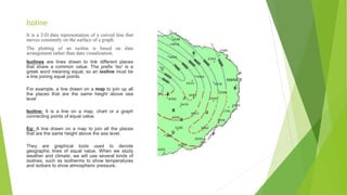
Isoline
It is a2-D data representation of a curved line that
moves constantly on the surface of a graph.
The plotting of an isoline is based on data
arrangement rather than data visualization.
Isolines are lines drawn to link different places
that share a common value. The prefix 'iso' is a
greek word meaning equal, so an isoline must be
a line joining equal points.
For example, a line drawn on a map to join up all
the places that are the same height above sea
level
Isoline: It is a line on a map, chart or a graph
connecting points of equal value.
Eg: A line drawn on a map to join all the places
that are the same height above the sea level.
They are graphical tools used to denote
geographic lines of equal value. When we study
weather and climate, we will use several kinds of
isolines, such as isotherms to show temperatures
and isobars to show atmospheric pressure.
21.
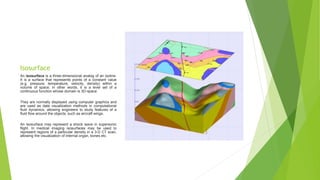
Isosurface
An isosurface isa three-dimensional analog of an isoline.
It is a surface that represents points of a constant value
(e.g. pressure, temperature, velocity, density) within a
volume of space; in other words, it is a level set of a
continuous function whose domain is 3D-space
They are normally displayed using computer graphics and
are used as data visualization methods in computational
fluid dynamics, allowing engineers to study features of a
fluid flow around the objects, such as aircraft wings.
An isosurface may represent a shock wave in supersonic
flight. In medical imaging isosurfaces may be used to
represent regions of a particular density in a 3-D CT scan,
allowing the visualization of internal organ, bones etc.
22.
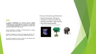
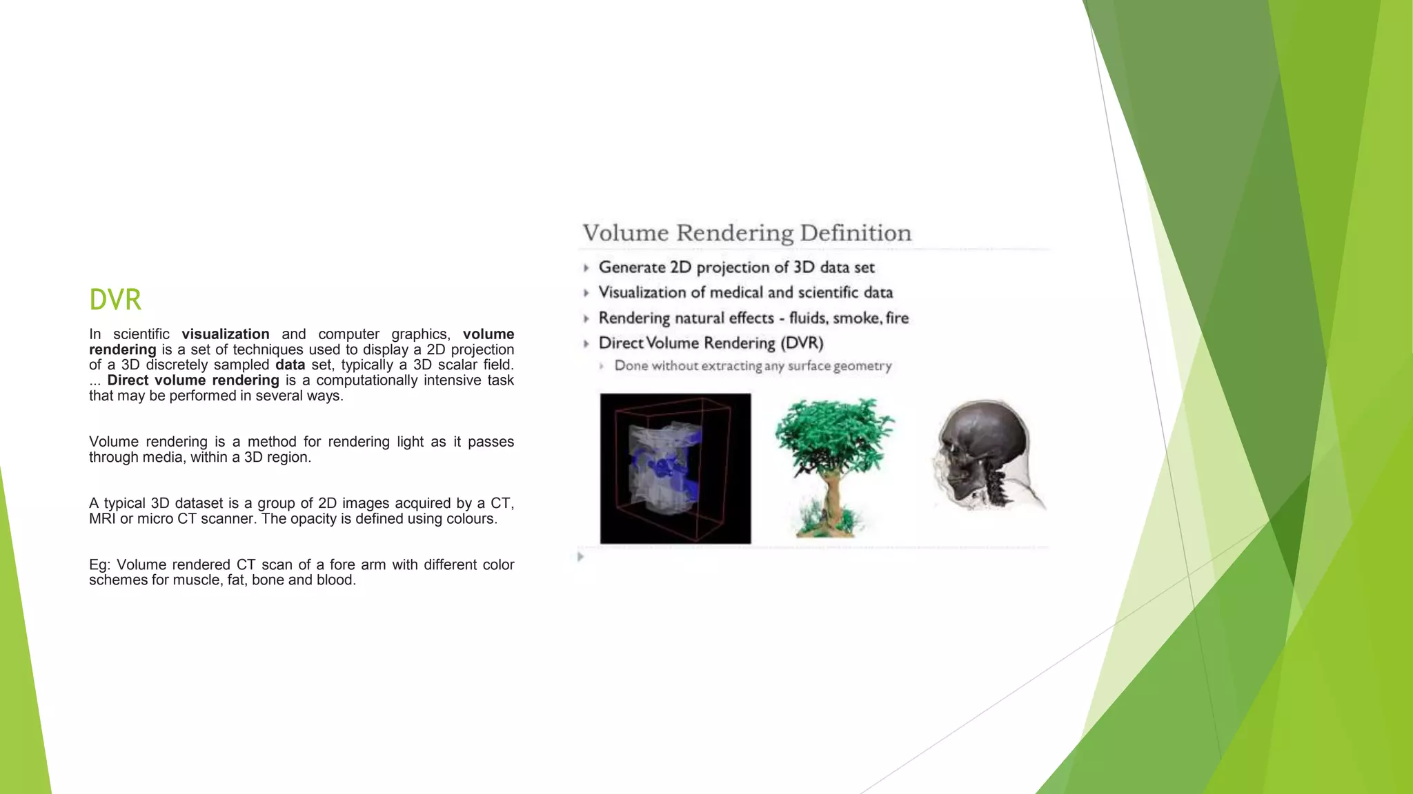
DVR
In scientific visualizationand computer graphics, volume
rendering is a set of techniques used to display a 2D projection
of a 3D discretely sampled data set, typically a 3D scalar field.
... Direct volume rendering is a computationally intensive task
that may be performed in several ways.
Volume rendering is a method for rendering light as it passes
through media, within a 3D region.
A typical 3D dataset is a group of 2D images acquired by a CT,
MRI or micro CT scanner. The opacity is defined using colours.
Eg: Volume rendered CT scan of a fore arm with different color
schemes for muscle, fat, bone and blood.
23.
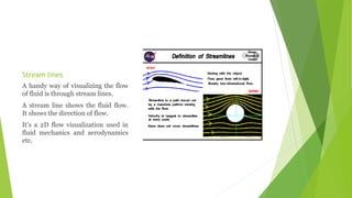
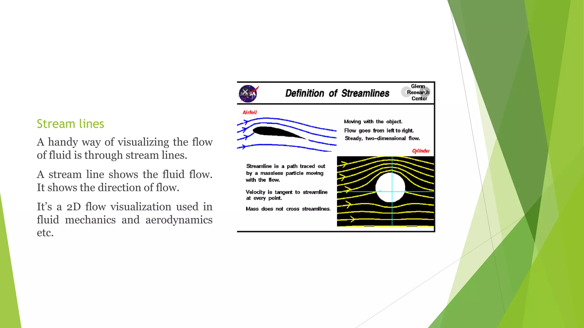
Stream lines
A handyway of visualizing the flow
of fluid is through stream lines.
A stream line shows the fluid flow.
It shows the direction of flow.
It’s a 2D flow visualization used in
fluid mechanics and aerodynamics
etc.
24.
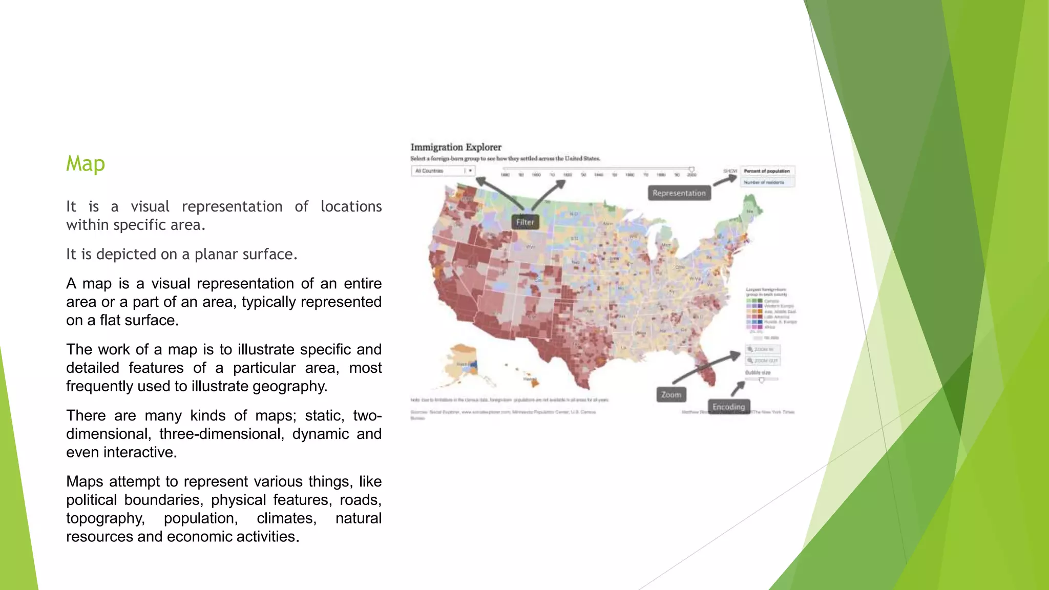
Map
It is avisual representation of locations
within specific area.
It is depicted on a planar surface.
A map is a visual representation of an entire
area or a part of an area, typically represented
on a flat surface.
The work of a map is to illustrate specific and
detailed features of a particular area, most
frequently used to illustrate geography.
There are many kinds of maps; static, two-
dimensional, three-dimensional, dynamic and
even interactive.
Maps attempt to represent various things, like
political boundaries, physical features, roads,
topography, population, climates, natural
resources and economic activities.
25.
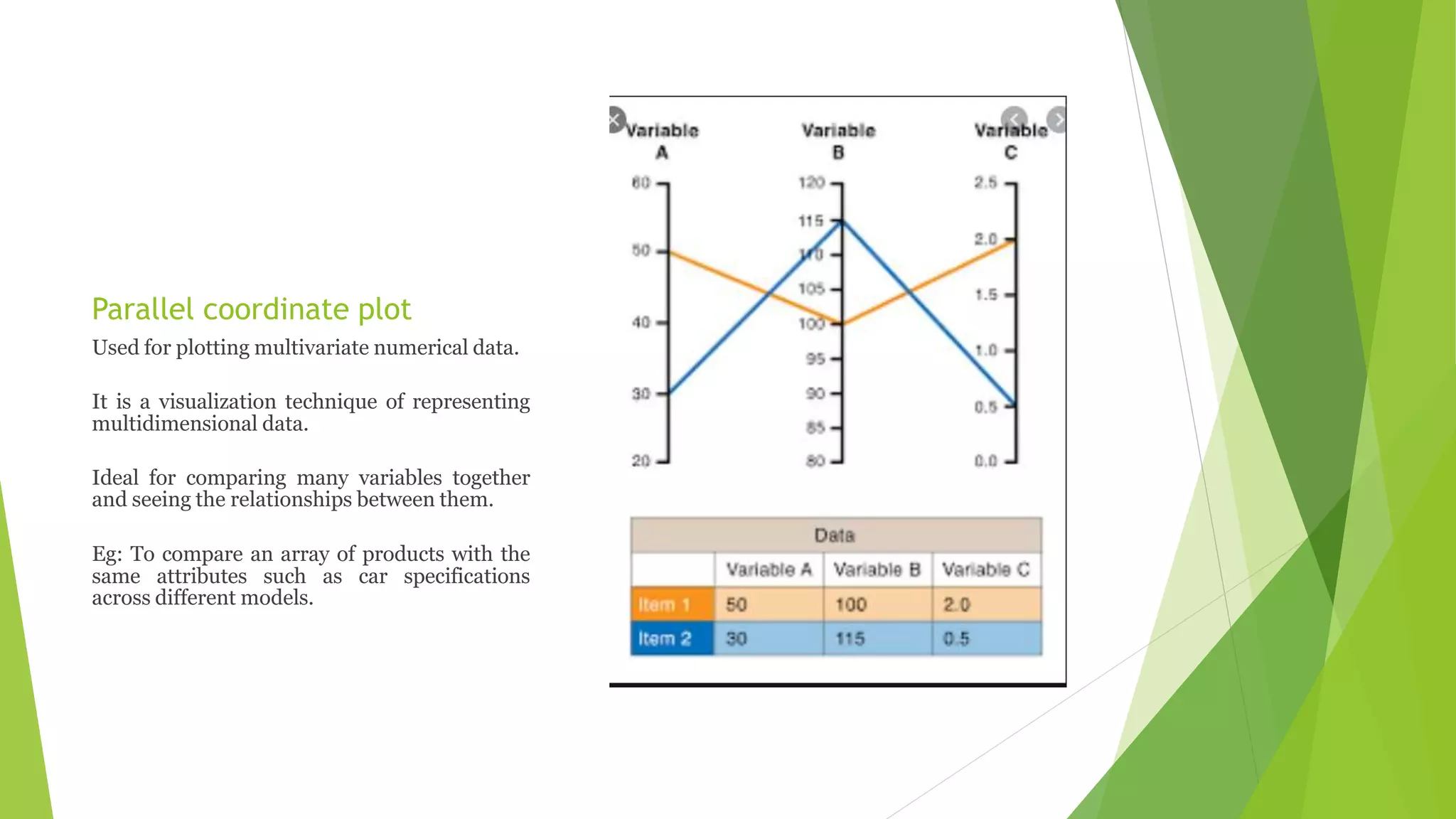
Parallel coordinate plot
Usedfor plotting multivariate numerical data.
It is a visualization technique of representing
multidimensional data.
Ideal for comparing many variables together
and seeing the relationships between them.
Eg: To compare an array of products with the
same attributes such as car specifications
across different models.
26.
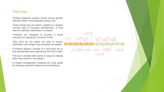
Time line
Timeline diagramspresent events during specific
intervals shown chronologically along a line.
These events may be historic, related to a specific
criminal case or business development, or they
may be important milestones in a project.
Timelines are designed to provide a broad
overview of a sequence of events in time.
They don't go into detail, but links to events,
information and images may be added as needed.
A timeline diagram consists of a horizontal bar or
line representing time progressing from left to right.
This bar is marked with events or steps to indicate
when they should or did happen.
In project management, timelines are most useful
for showing important milestones and deadlines
27.
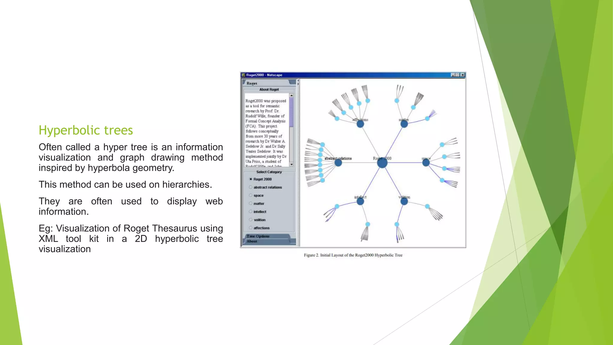
Hyperbolic trees
Often calleda hyper tree is an information
visualization and graph drawing method
inspired by hyperbola geometry.
This method can be used on hierarchies.
They are often used to display web
information.
Eg: Visualization of Roget Thesaurus using
XML tool kit in a 2D hyperbolic tree
visualization
28.
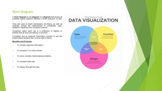
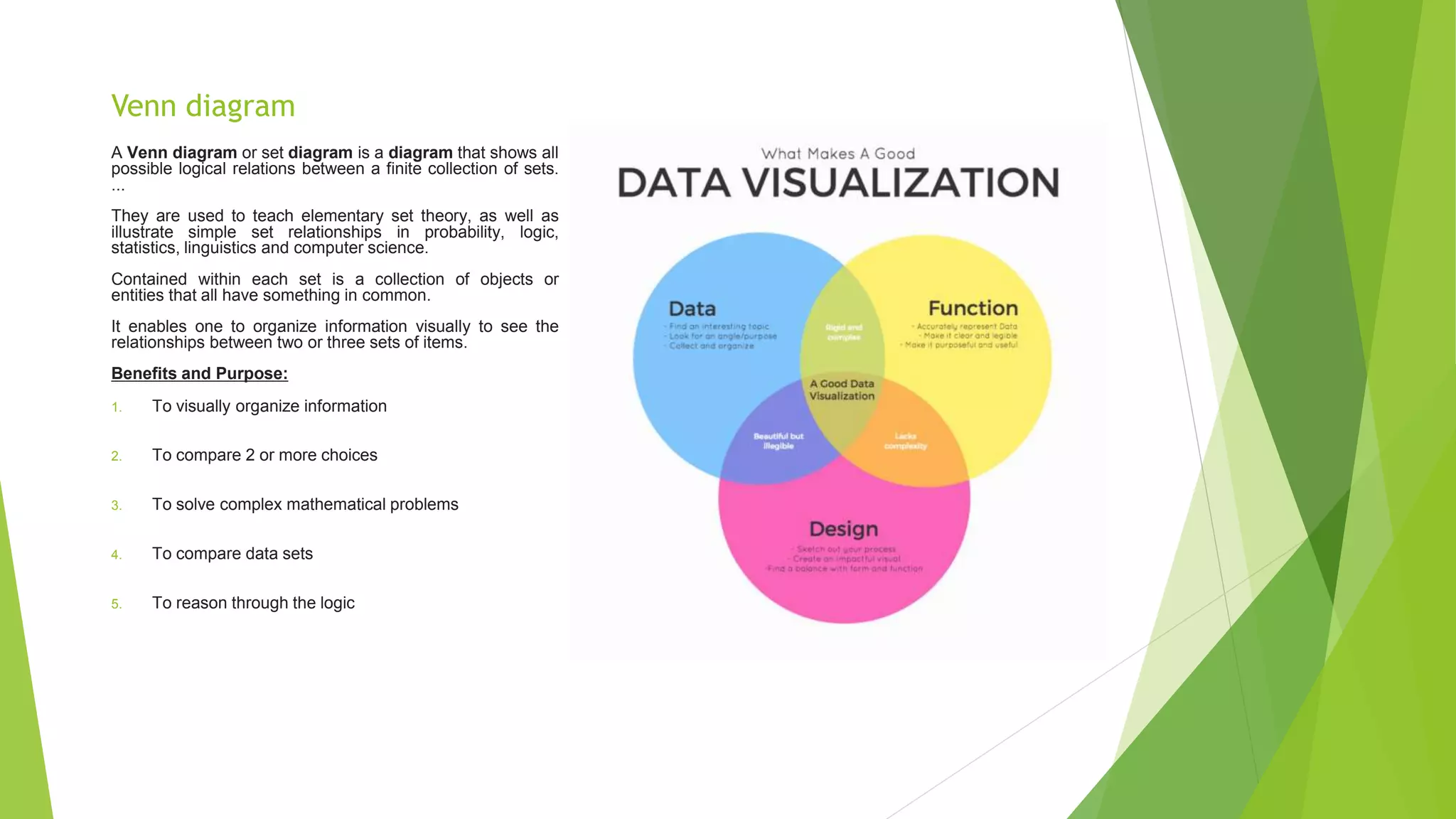
Venn diagram
A Venndiagram or set diagram is a diagram that shows all
possible logical relations between a finite collection of sets.
...
They are used to teach elementary set theory, as well as
illustrate simple set relationships in probability, logic,
statistics, linguistics and computer science.
Contained within each set is a collection of objects or
entities that all have something in common.
It enables one to organize information visually to see the
relationships between two or three sets of items.
Benefits and Purpose:
1. To visually organize information
2. To compare 2 or more choices
3. To solve complex mathematical problems
4. To compare data sets
5. To reason through the logic
29.
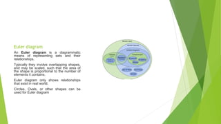
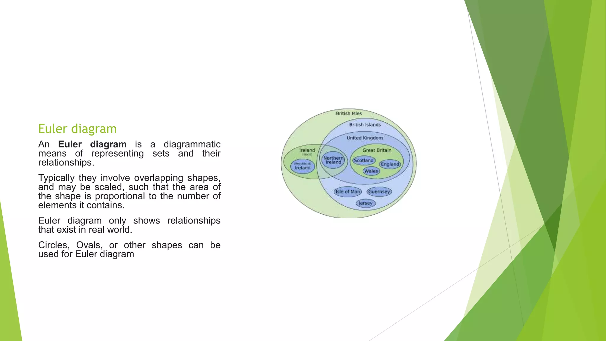
Euler diagram
An Eulerdiagram is a diagrammatic
means of representing sets and their
relationships.
Typically they involve overlapping shapes,
and may be scaled, such that the area of
the shape is proportional to the number of
elements it contains.
Euler diagram only shows relationships
that exist in real world.
Circles, Ovals, or other shapes can be
used for Euler diagram
30.
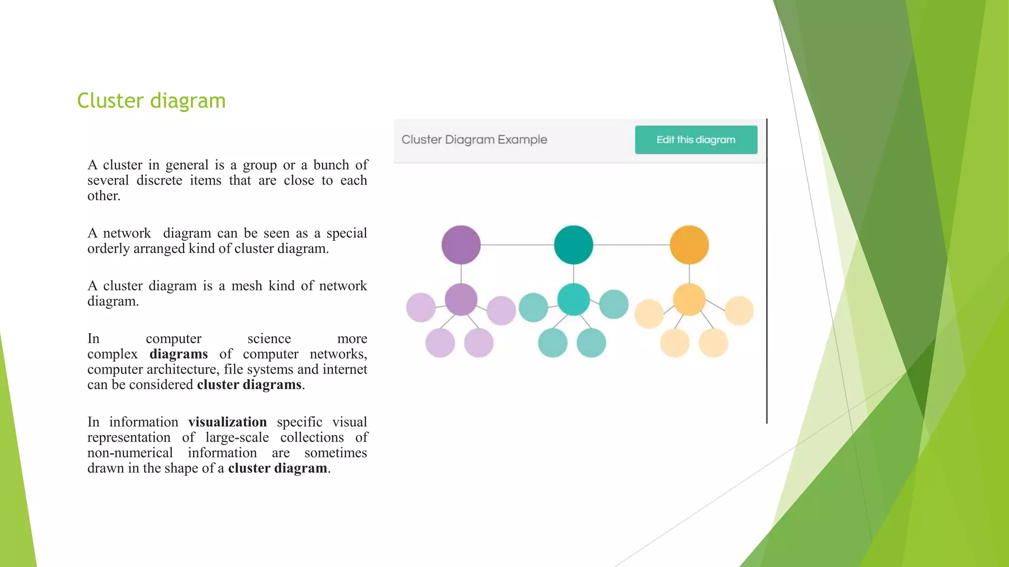
Cluster diagram
A clusterin general is a group or a bunch of
several discrete items that are close to each
other.
A network diagram can be seen as a special
orderly arranged kind of cluster diagram.
A cluster diagram is a mesh kind of network
diagram.
In computer science more
complex diagrams of computer networks,
computer architecture, file systems and internet
can be considered cluster diagrams.
In information visualization specific visual
representation of large-scale collections of
non-numerical information are sometimes
drawn in the shape of a cluster diagram.
31.
Types of Datavisualization
Linear
Planar
Volumetric
Temporal
Multidimensional
Tree
Network
32.
Linear Data Visualization
Linear Data Visualization- In this visualization technique data always
represented in list format.
Basically we can’t consider it as a visualization technique rather than it is
consider as a data organization technique.
Hence in this process no tool is used to visualize the data.
It is also called as 1D data visualization
33.
Planar data visualization
In this type of visualization data generally take in the form of images or
charts over a plane surface.
The best example of this type of data visualization is Cartogram and dot
distribution map.
Some tools used to build planar data visualization are Geocommons, Google
fusion tables, Google Maps API, Tableau Public, Poly maps etc.
34.
Volumetric Data visualization
In this approach the presentation of data generally involves with three
dimensions to present the simulations, surface and volume rendering and
commonly used scientific studies.
Today many organizations use 3D computer modelling and volume rendering in
advertisements to provide users a better feel of their products.
Basic tools used for it are AC3D, Auto3D, True-space etc.
35.
Temporal Data visualization
In some approach visualizations are time dependent in nature so to visualize
on the analyses of time the temporal data visualization is used which consist
of Gantt chart, Time series and sanky diagram etc.
Now-a-days it is widely used to visualize the real time data.
TimeFlow, Timeline JS, Excel, TimePlot, TimeSearcher, Google Charts,
Tableau Public, Google Fusion tables are the tools for creating temporal data
visualization.
36.
Multidimensional Data Visualization
In this approach numerous dimensions are generally used to represent the
data.
Generally pie charts, histograms, bar charts etc are generally used to
multidimensional data visualization.
Many Eyes, Tableau, Google charts tool is used to create multidimensional
data visualization
37.
Tree Data visualization
Data relationships need to be shown in the form of tree hierarchies.
To represent such kind of relationships, we use tree or hierarchical data
visualizations.
Hyperbolic trees, wedge stack graph are some of the examples.
Tools: d3, Google Charts, Network bench and Sci2
38.
Network Data visualization
This approach is generally used to represent the relations that are too
complex in the form of hierarchies.
Some of the basic tools used for network data visualization are hive plot,
Pajek, Gephi, NodeXL, Google Fusion tables etc.
39.
Applications of datavisualization
Education
It is applied to teach a topic that requires simulation or modeling of any object or process.
It is suitable in case where we need to explain any organ or organ system with the help of diagrams
or animation
Information- it is applied to transform abstract data into visual forms for easy interpretation
and further exploration
Production- it is used to create 3D models of products for better viewing and manipulation.
Eg: real estate, automobile industry
Science- every field of science including dynamics, astrophysics and medicine use visuals for
representing information. Isosurfaces and DVR.
Systems visualization: it is a new concept that integrates visual techniques to describe
complex systems.
Visual communication: multimedia and entertainment industry use visuals to communicate
ideas and information.
Visual analytics: it refers to the science of analytical reasoning supported by interactive
visual surface. The data generated by social media interaction is interpreted using visual
analytics techniques.
40.
Visualizing Big Data
Almost every organization today is struggling to tackle the huge amount of
data pouring in every day.
Data visualization is a great way to reduce the turn around time consumed in
interpreting Big Data.
Traditional visualization techniques are not efficient enough to capture or
interpret the information that Big Data possesses.
Such techniques are not able to interpret videos, audios and complex
sentences.
The volume and speed with which it is generating pose a great challenge.
Most of the traditional analytics techniques are unable to cater to any of
these problems.
41.
Big datacomprises both structured and unstructured forms of data collected
from various sources.
Heterogeneity of data sources, data streaming and real time data are also
difficult to handle by using traditional tools.
Traditional tools are developed by using relational models that work best on
static interaction.
Big data is highly dynamic in function and therefore most traditional tools are
not able to generate quality results.
The response time of traditional tools is quite high making it unfit for quality
interaction.
42.
Deriving business solution
The most common notation used for Big Data is 3Vs.
Big data generated through social media sites is a valuable source of information to
understand consumer sentiments and demographics.
Challenges faced:
Data is in unstructured form
Data is not analysed in real time
The amount of data generated is huge.
There is a lack of efficient tools and techniques.
IT companies are focusing more on research and development of robust algorithms, software
and tools to analyze the data that is scattered in the internet space.
Tools such as Hadoop are providing the state of the art technology to store and process Big
data.
Analytical tools are now able to produce interpretations on smart phones and tablets.
43.
Turning data intoinformation
Visualization facilitates identification of patterns in the form of graphs or
charts which in turn help to derive useful information.
Visual data mining also works on the same principle as data mining; however
it involves the integration of information, visualization and HCI.
Data Visualization produces cluttered images that are filtered with the help
of clutter reduction techniques.
Unform sampling and dimension reduction are two commonly used
techniques.
Visual data reduction process involves automated data analysis to measure
density, outliers and their differences. These measures are then used as
quality metrics to evaluate data reduction activity.
44.
Visual qualitymetrics can be categorized as:
Size metrics
Visual effectiveness metrics
Feature perseveration metrics.
Visual analytics tool should be:
Simple enough so that even nontechnical users can operate it.
Interactive to connect with different sources.
Competent to create appropriate visuals for interpretations.
Able to interpret big data and share information.
Visualization tool must be able to establish links between different data
values, the missing data and polish data for further analysis.`
45.
TOOLS USED INDATA VISUALIZATION
Excel
It is a new tool that is used for data analysis. It helps you to track and visualize
data for deriving better insights.
The tool provides ways to share data and analytical conclusions within across
organization.
Last.forward
It is an open-source software provided by last.fm for analysing and visualizing
social music networks.
Digg.com
It provides some of the best web based visualization tool
Pics
It is used to track activity of images on the website.
46.
Arc
Itis used to display the topics and stories in a spherical form. Sphere is used to
display stories and topics, and bunches of stories are aligned at the outer
circumference of sphere.
Google Charts API
This tool allows user to create dynamic charts to be embedded in a web page. A
chart obtained from data and formatting parameters supplied in a HTTP request is
converted to PNG image by Google to simplify embedding process.
TwittEarth
This tool is capable of showing live tweets from all over the world on a 3D globe, it
is an effort to improve social media visualization and provide a global image
mapping in tweets.
47.
Tag Galaxy
It provides a stunning way of finding a collection of Flickr images.
It is a usual site which provides search tool which makes the online combing
process a memorable visual experience.
If you want to search a picture, you have to enter a tag of your choice and it will
find the picture.
The central star contains all images directly relating to the initial tag and revolving
planets consist of similar or corresponding tag.
Click on the planet and additional sub-categories will appear.
Click on the central star and flickr images gather and land on a gigantic 3D sphere.
48.
D3
Itallows to bind of arbitrary data to DOM and then applies data-driven
transformations to the document.
D3 is used to generate an HTML table from the array of numbers or use the same
data to create an interactive SVG bar chart with smooth transitions and
interactions.
Rootzmap Mapping the Internet
It is a tool to generate a series of maps on the basis of data sets provided by
National Aeronautics and Space Administration.
49.
Open Source DVT
Big Data analytics requires the implementation of advanced tools and
technologies.
Due to economic and infrastructural limitations, every organization cannot
purchase all the applications required for analyzing data.
To full fill their requirement of advanced tools and technologies, organizations
often turn to open source libraries.
These libraries can be defined as pools of freely available applications and
analytical tools.
Eg: VTK, Cave5D, ELKI, Gephi, Tableau public
Open source tools are easy to use, consistent and resuable. They deliver high
quality performance and are complaint with web as well as web security.
They provide multichannel analytics for modelling as well as customized business
solutions that can be altered with changing business demands.


![Matrix and determinant URT [Autosaved].pptx](https://cdn.slidesharecdn.com/ss_thumbnails/matrixanddeterminanturtautosaved-251018190340-9e6a6deb-thumbnail.jpg?width=600ounds&width=560&fit=bounds)


