Download to read offline

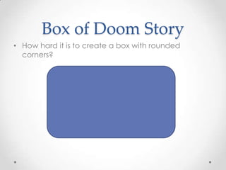
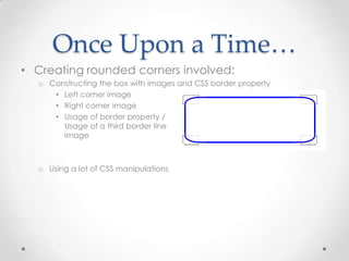

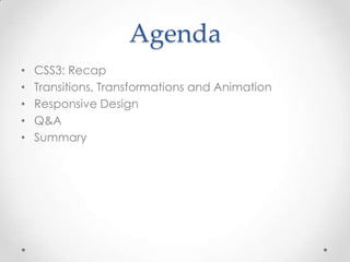
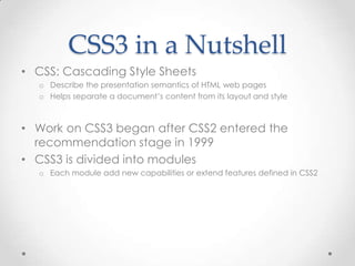
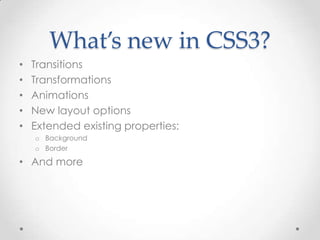
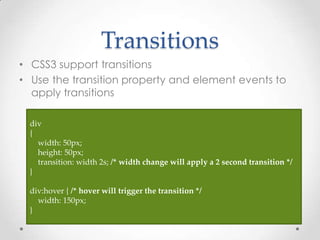
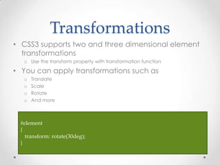
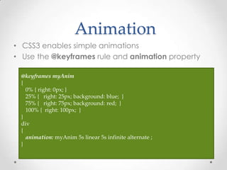
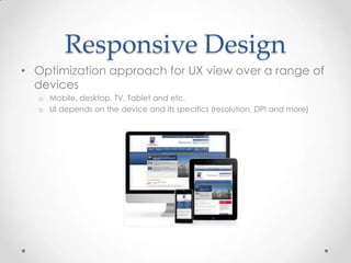

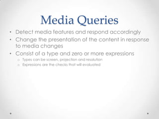
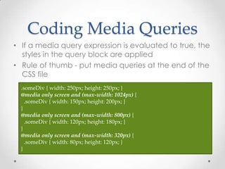


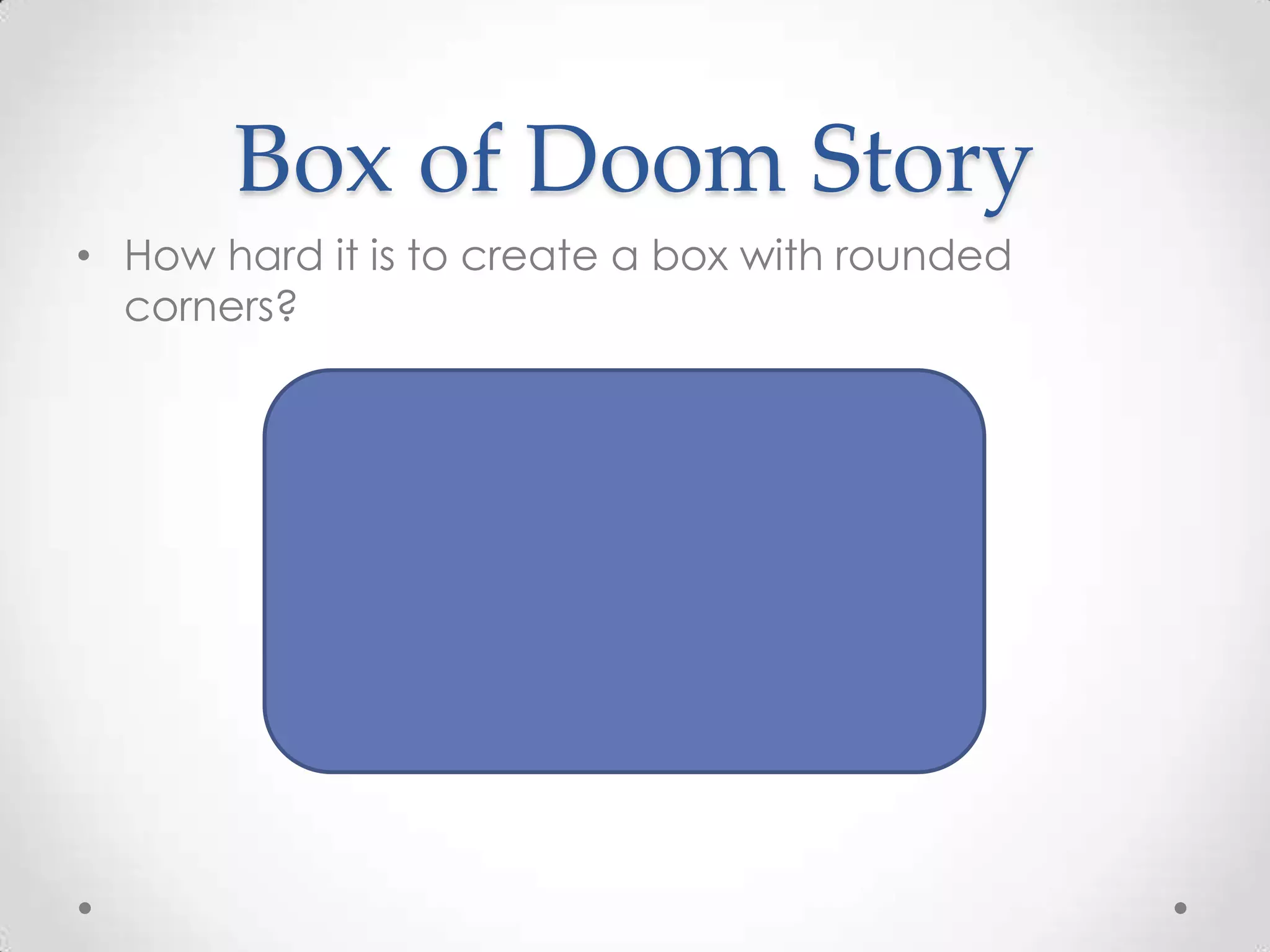
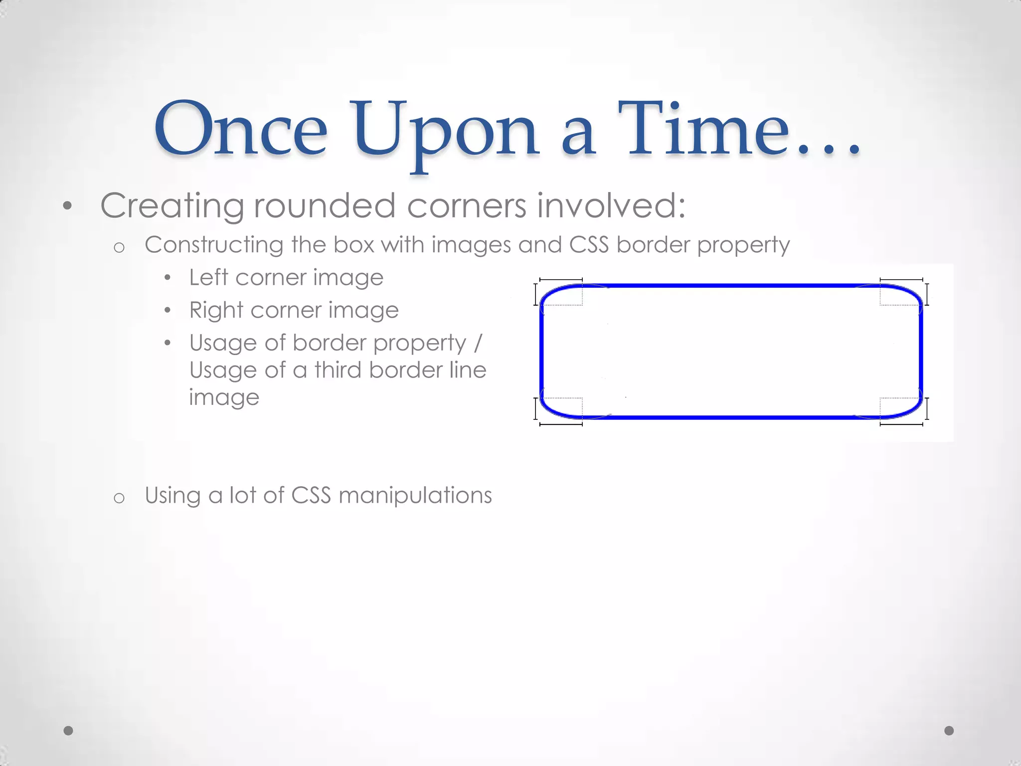

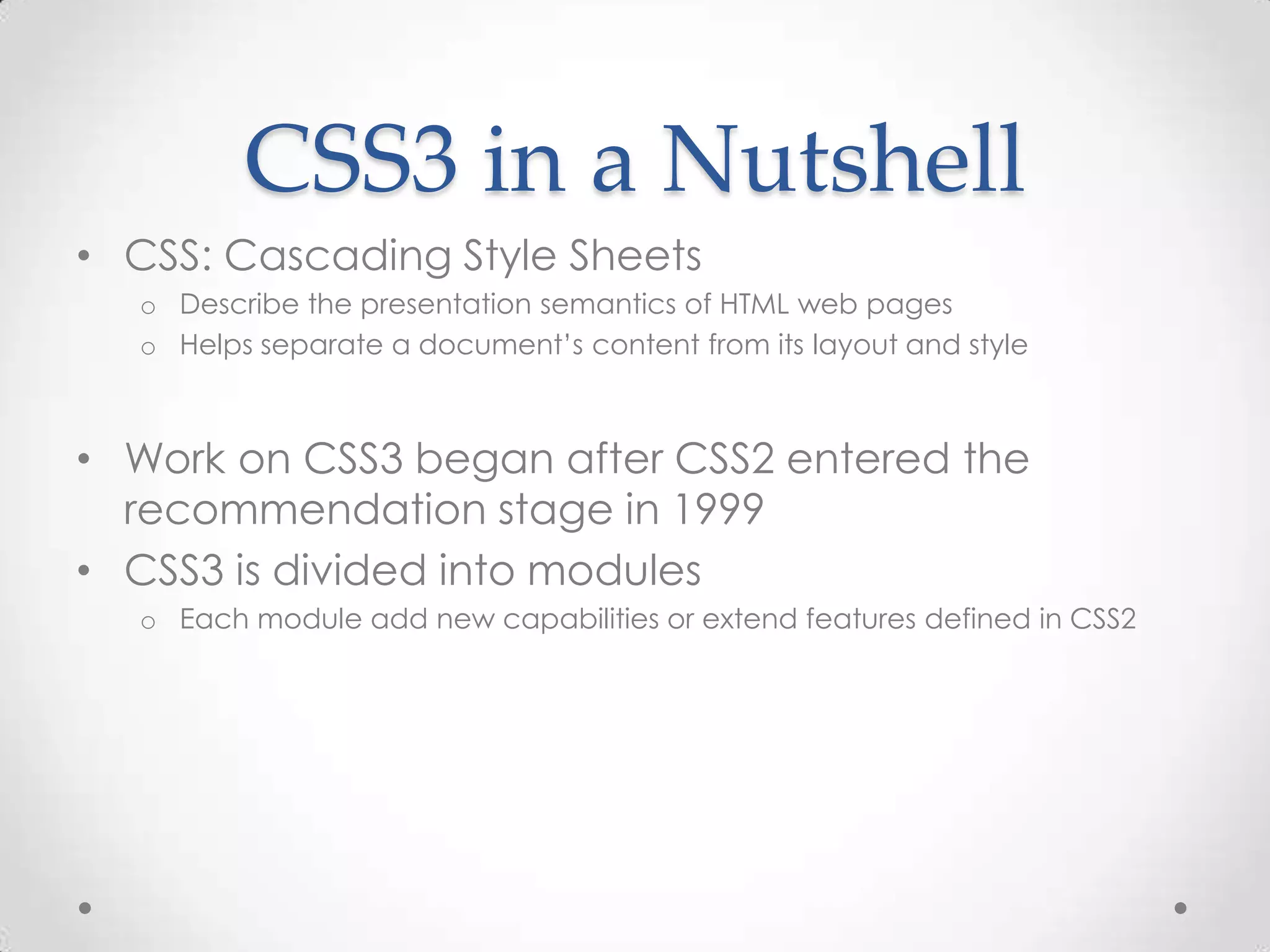
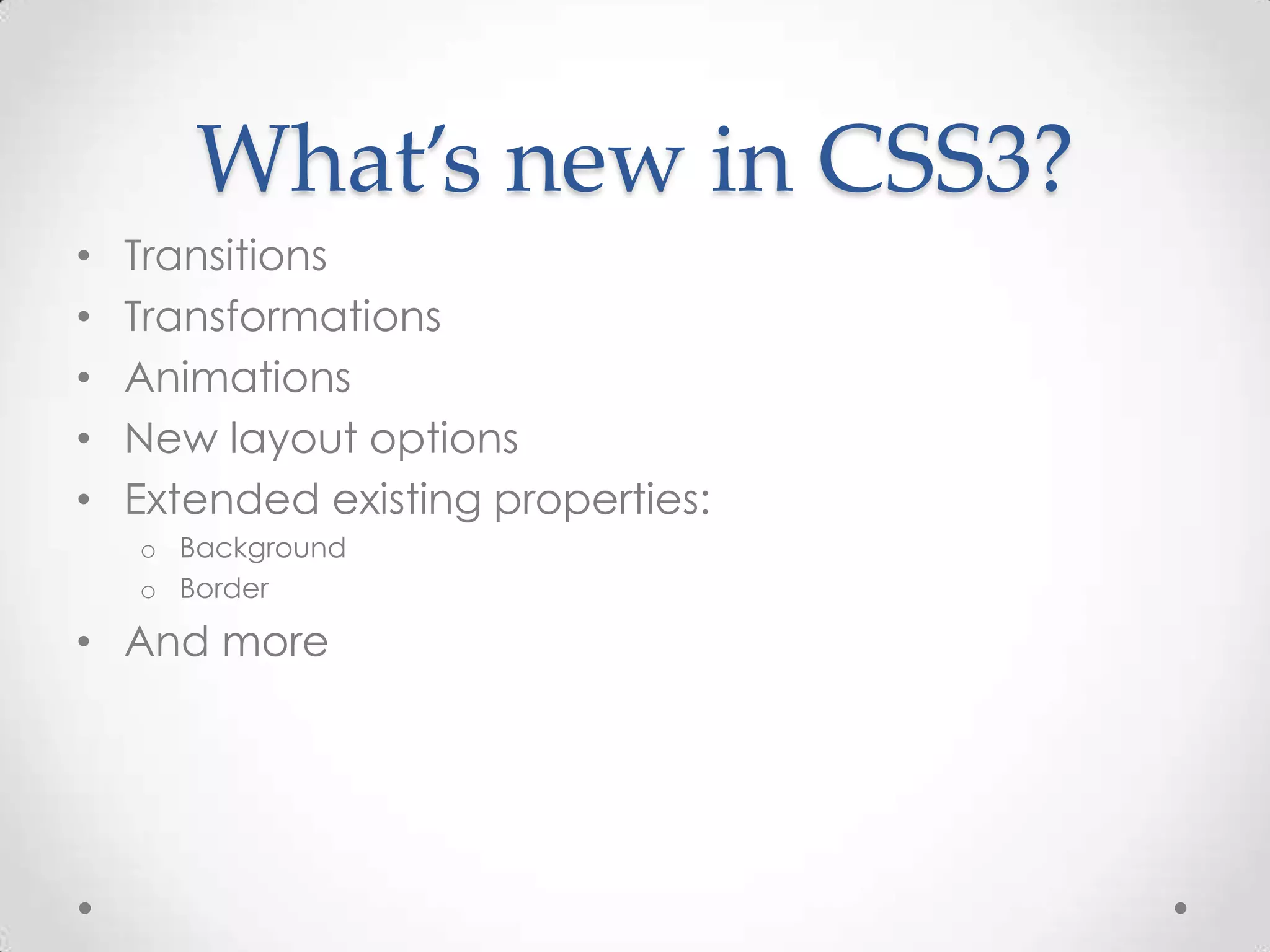
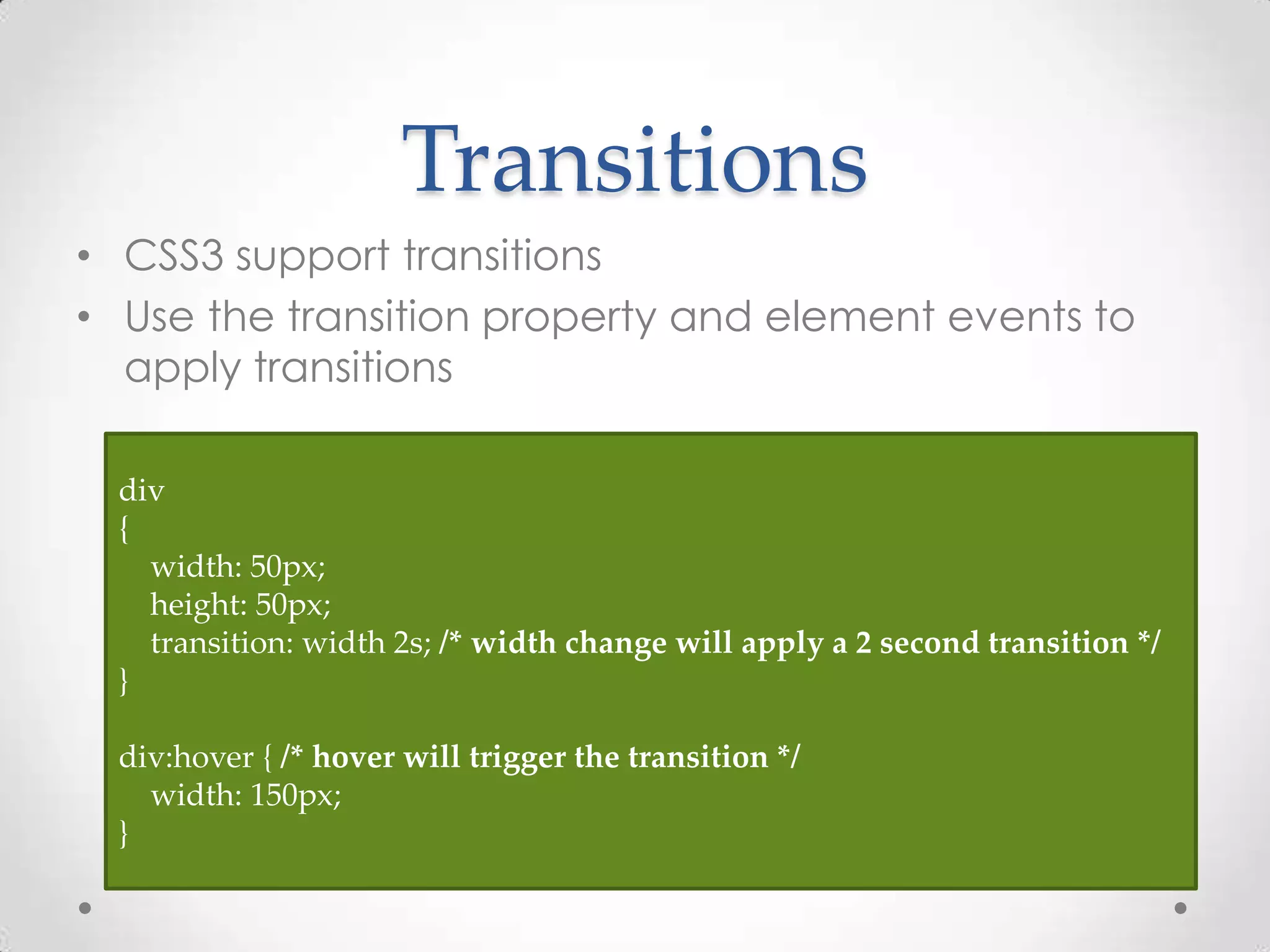
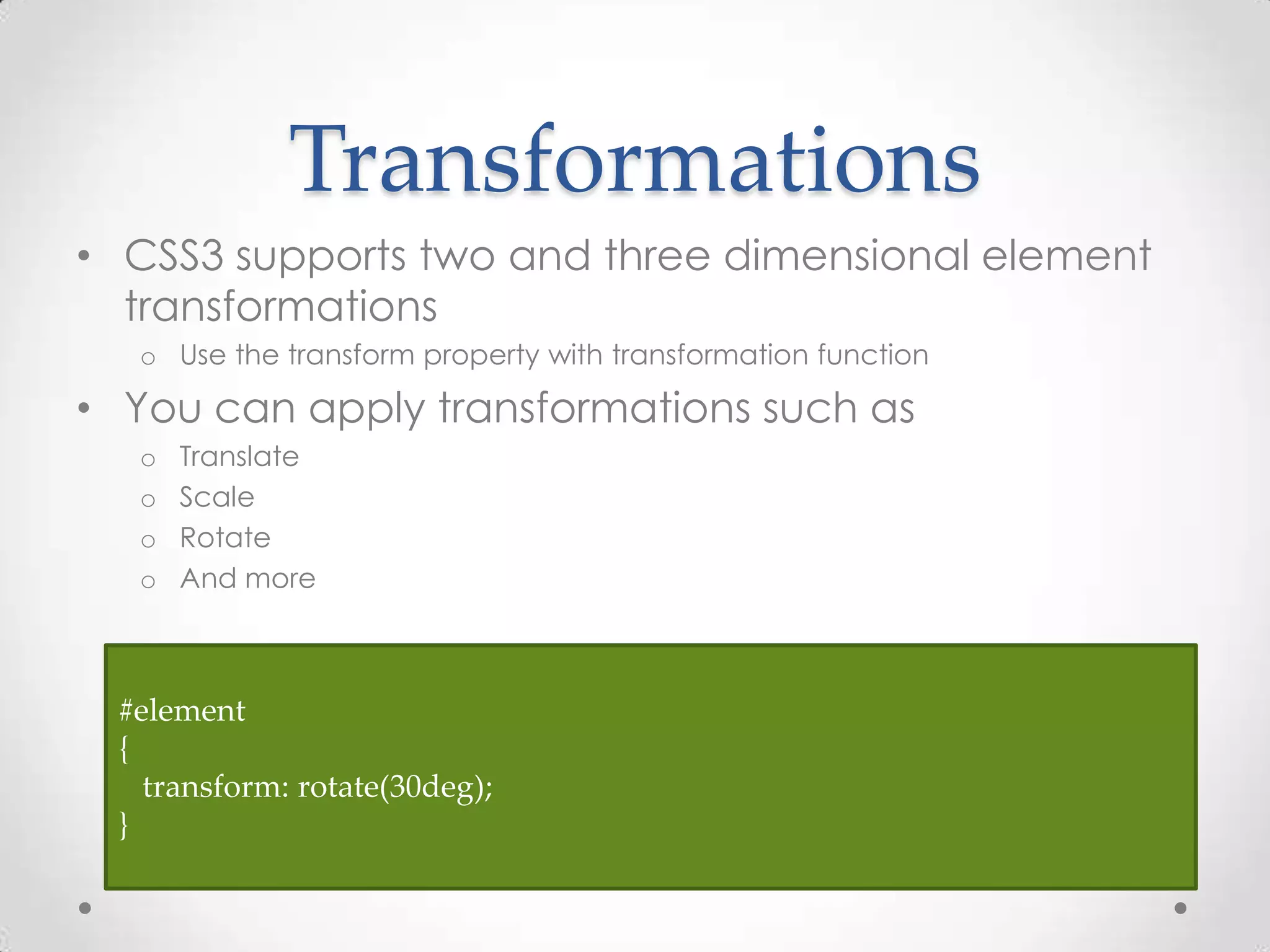
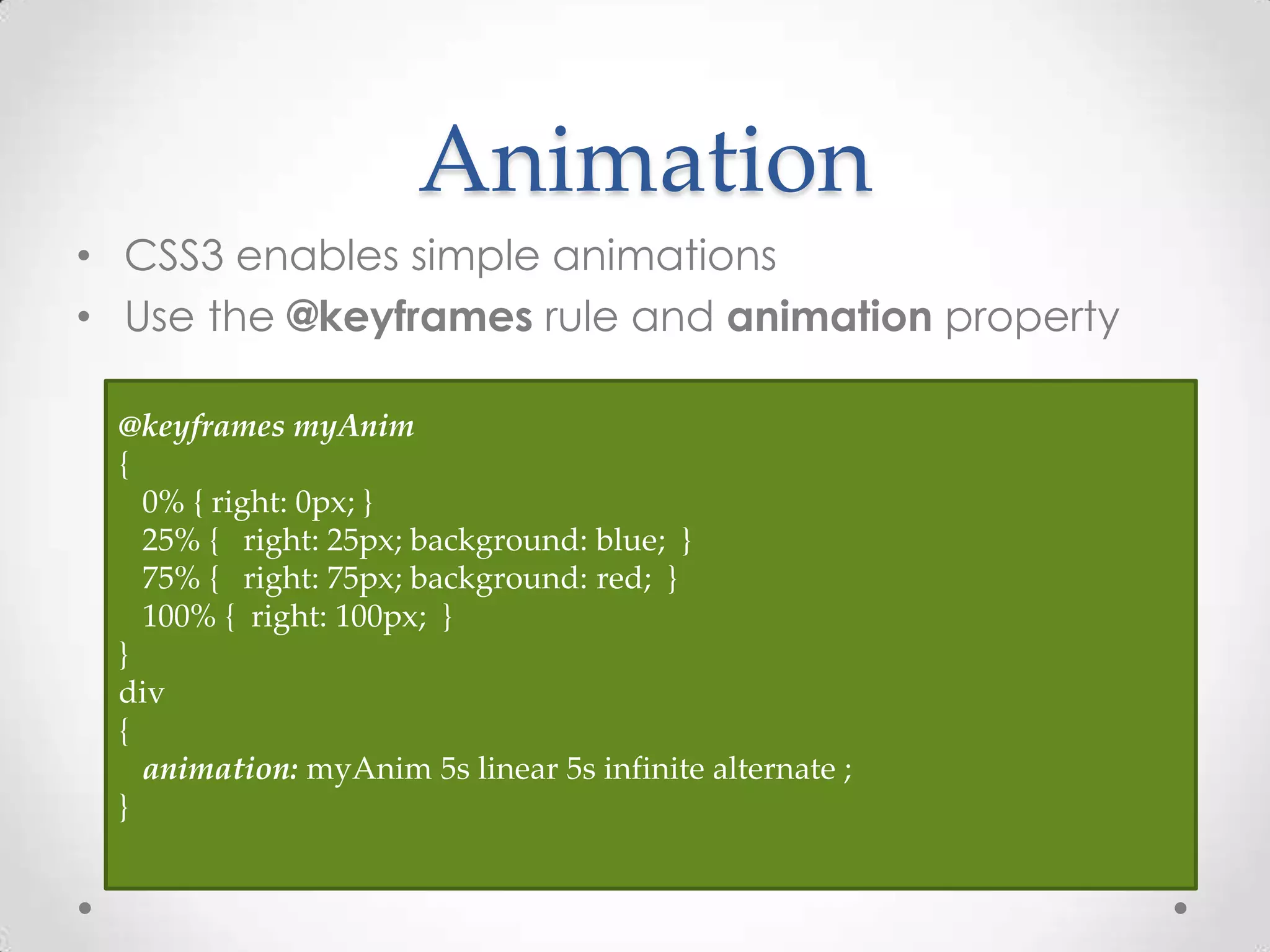
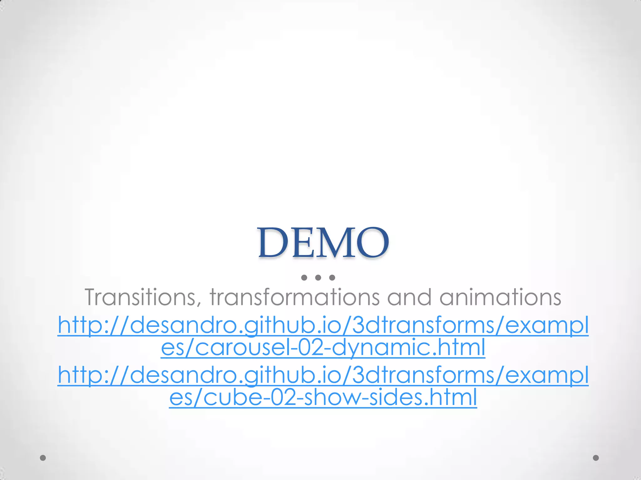
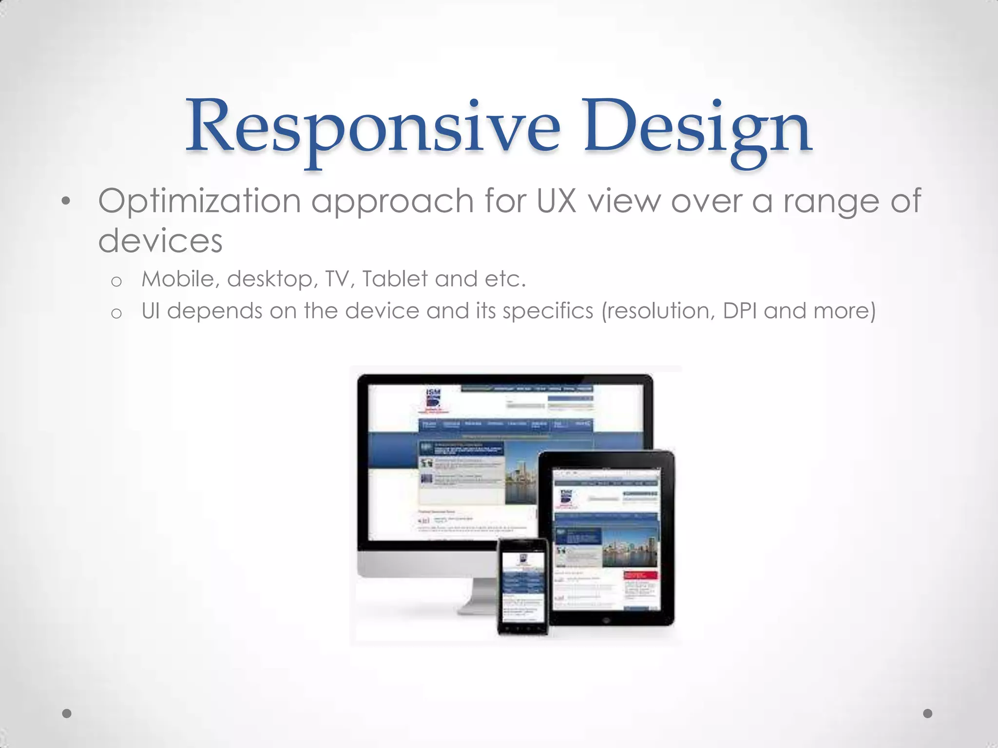
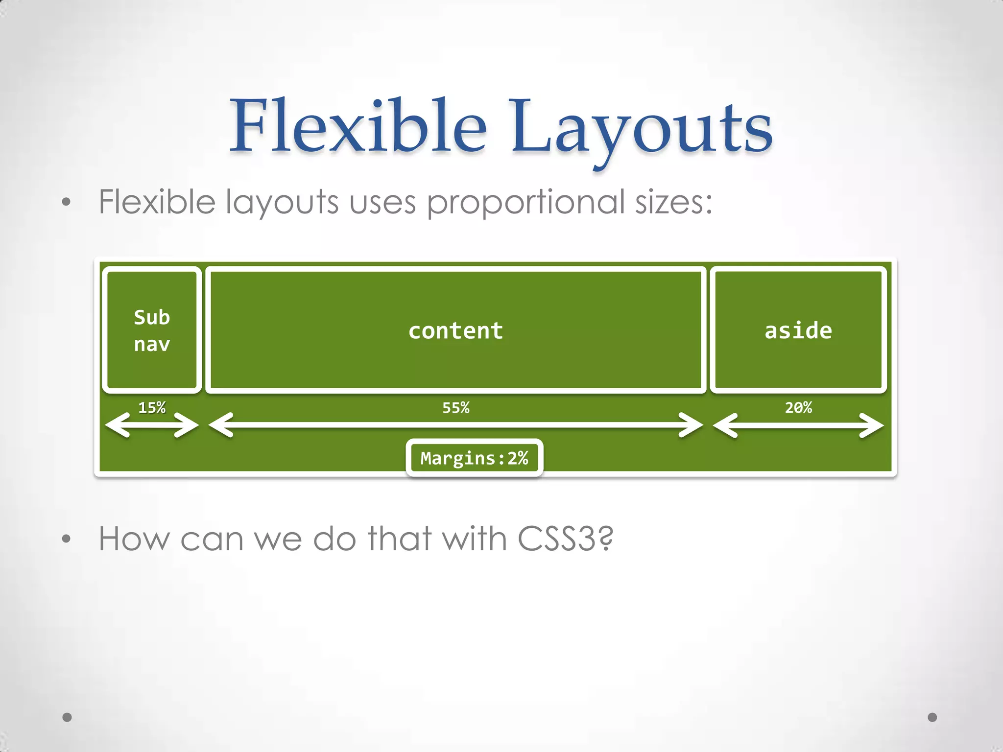
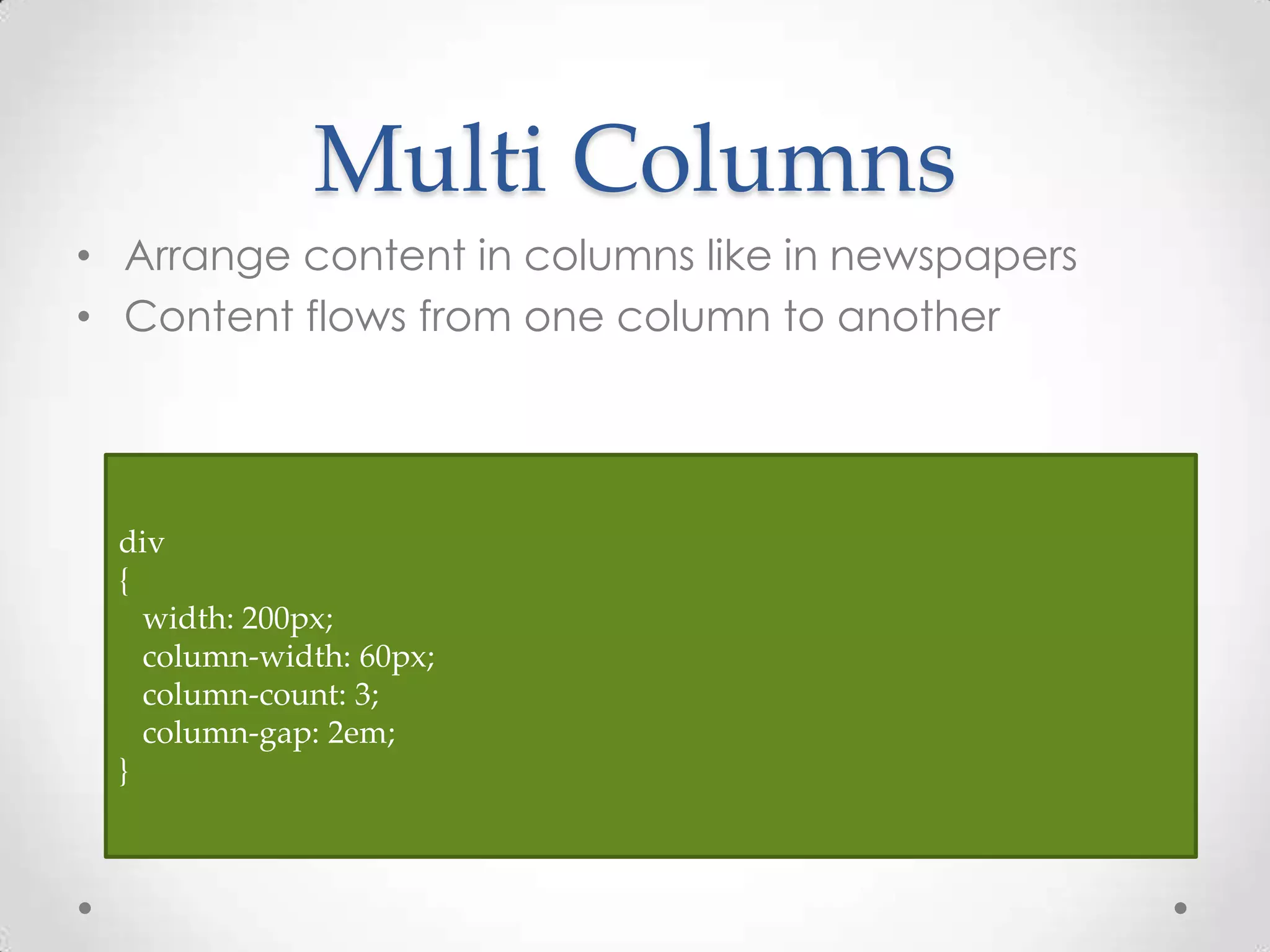
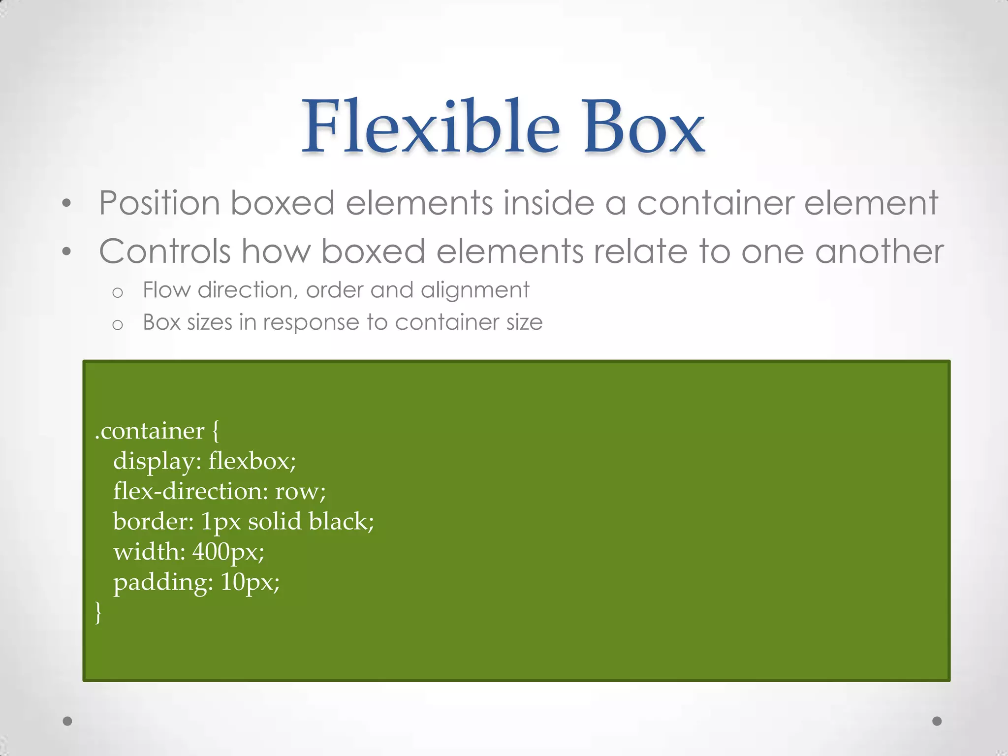
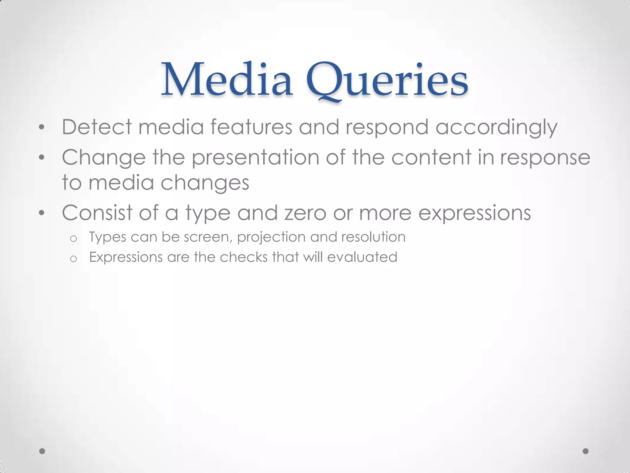
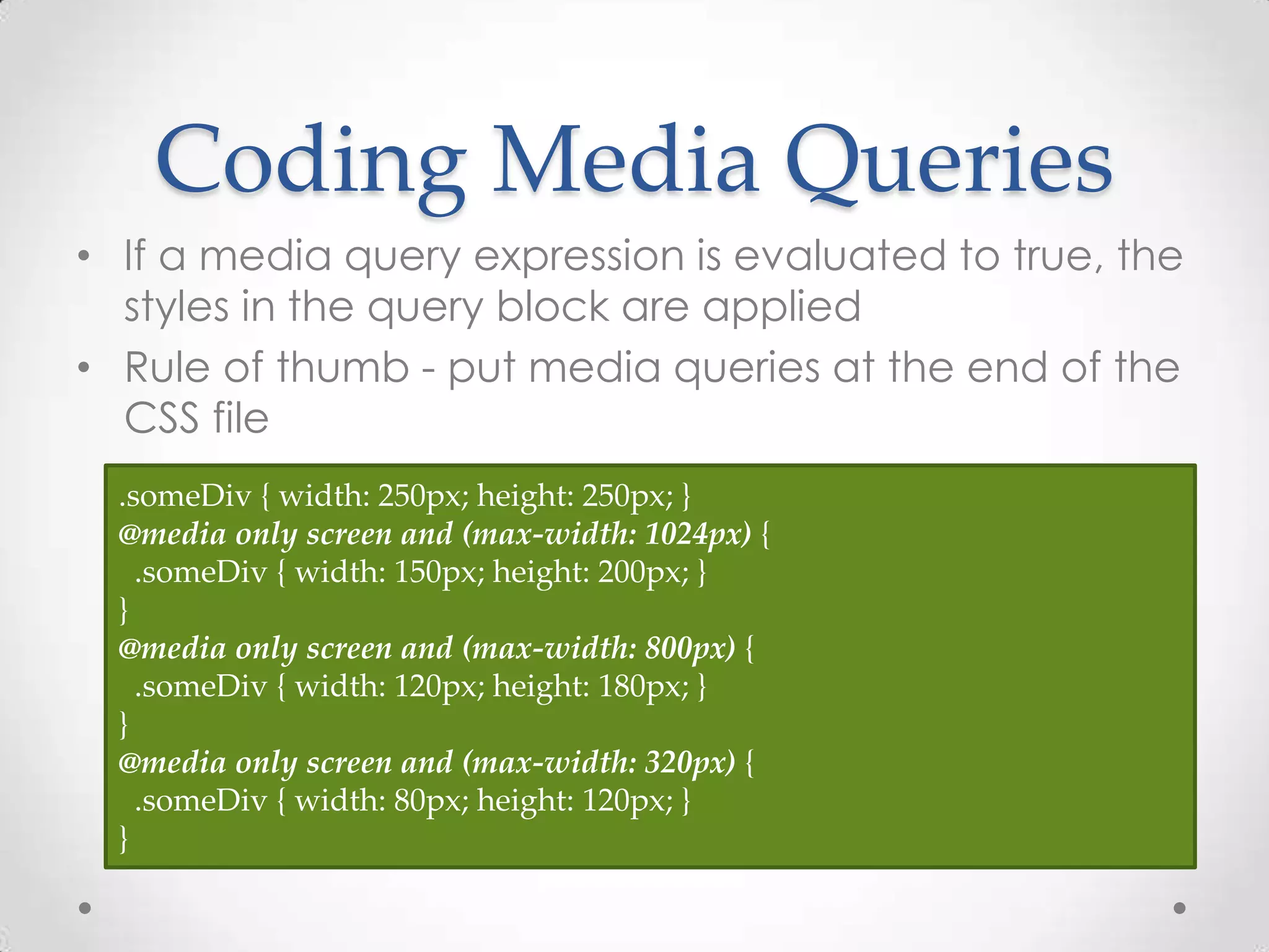


This document discusses using CSS3 for designing next generation web pages. It begins with how creating rounded corners previously required images but can now be done with CSS3's border-radius property. It then covers new CSS3 features like transitions, transformations, and animations that can provide visual effects without JavaScript. The document also discusses responsive design approaches like flexible layouts using Flexbox and grids, along with media queries, to adapt designs across devices. Code examples are provided and demos are referenced to illustrate these CSS3 capabilities for modern web page design.


