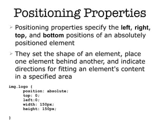
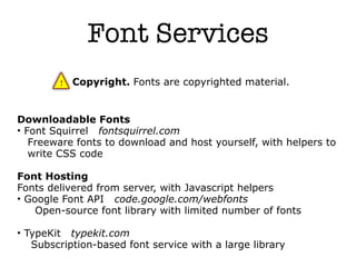
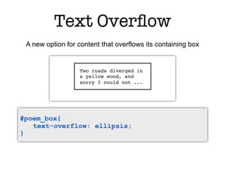
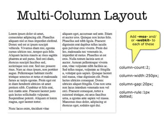
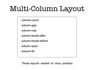
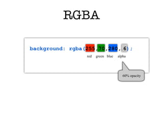
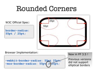
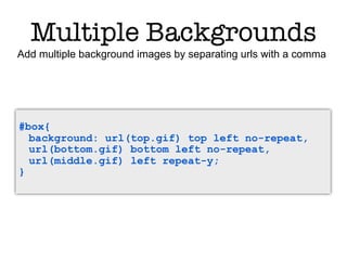
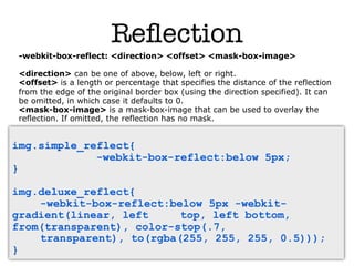
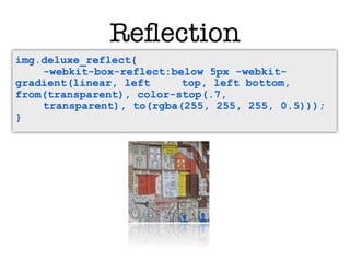
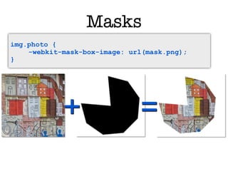
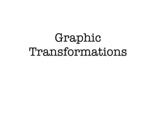
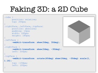
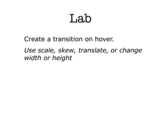
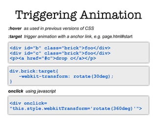
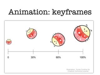
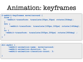
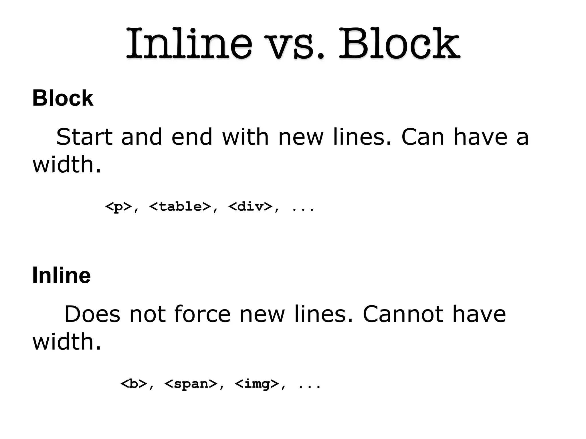
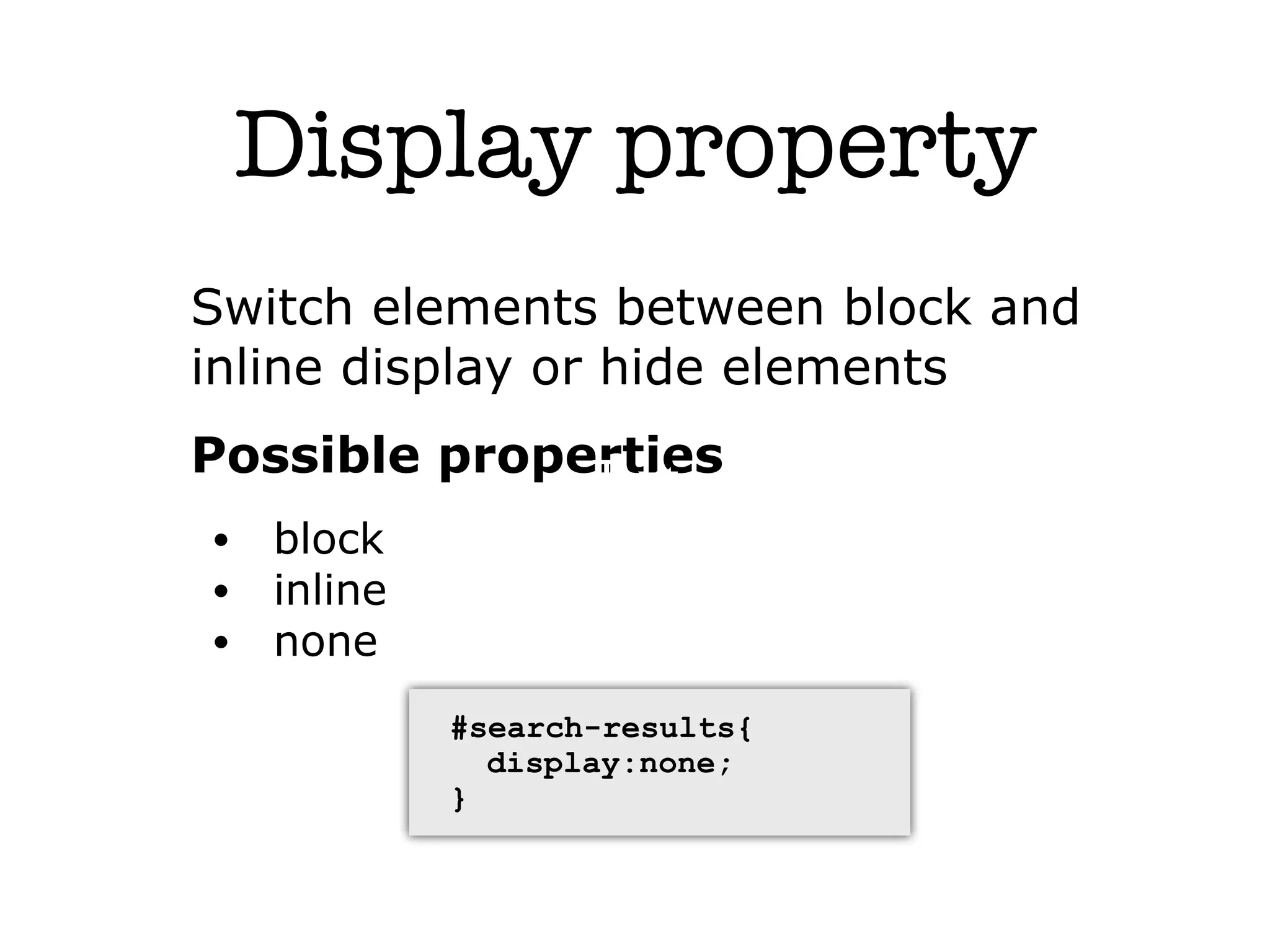
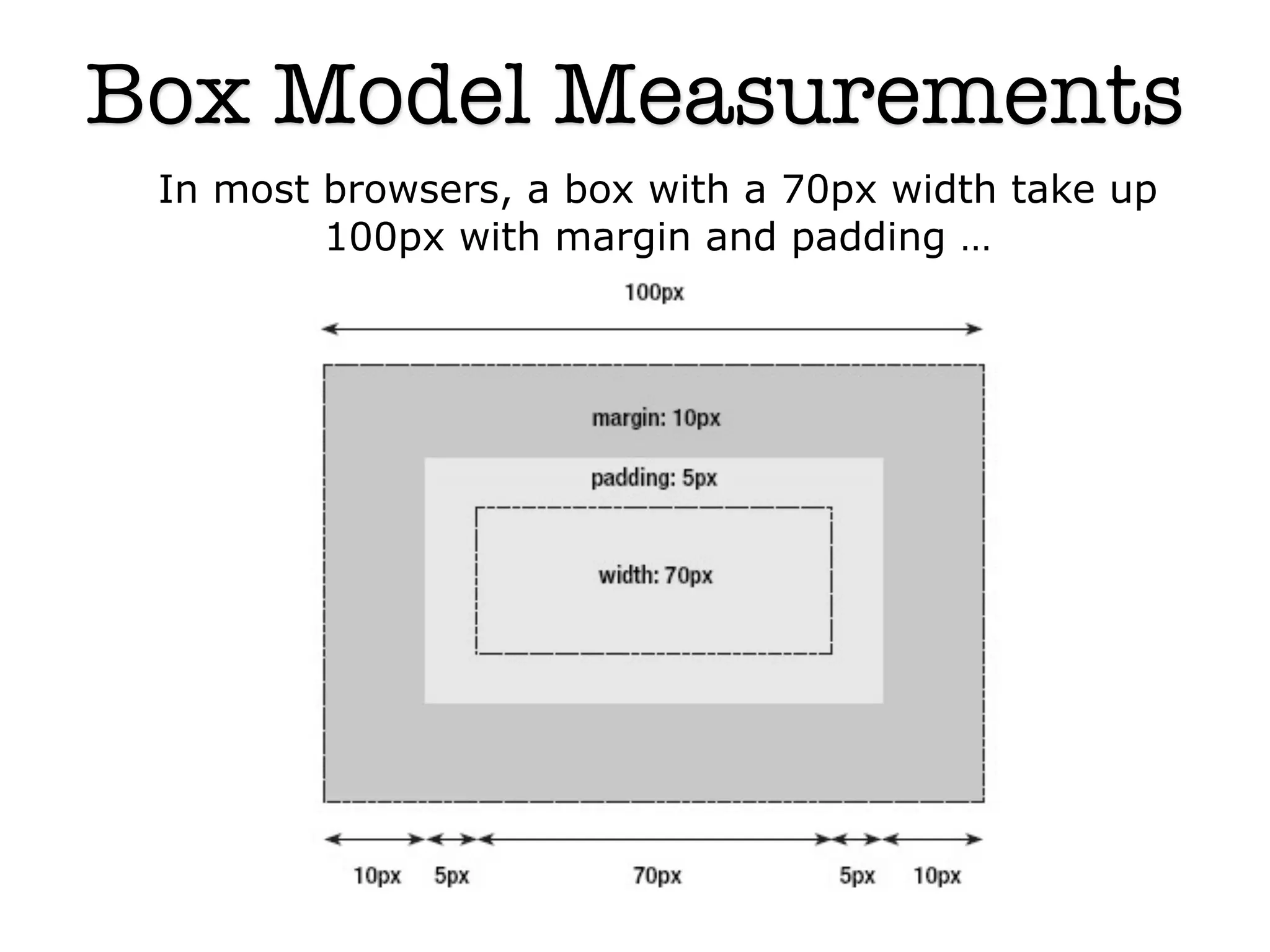
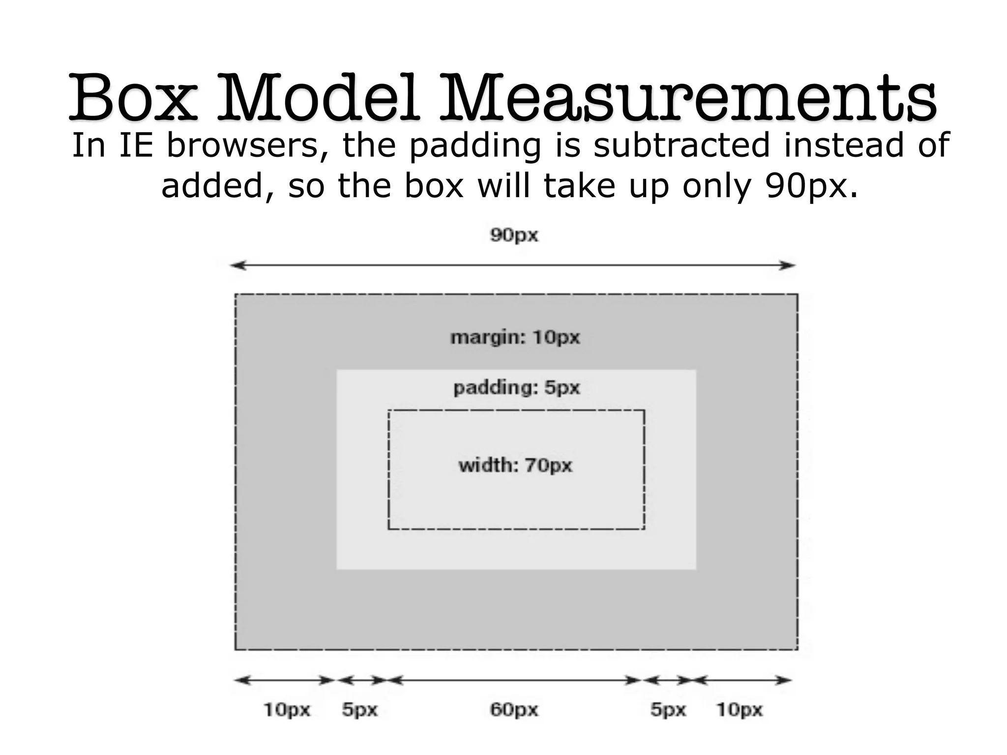
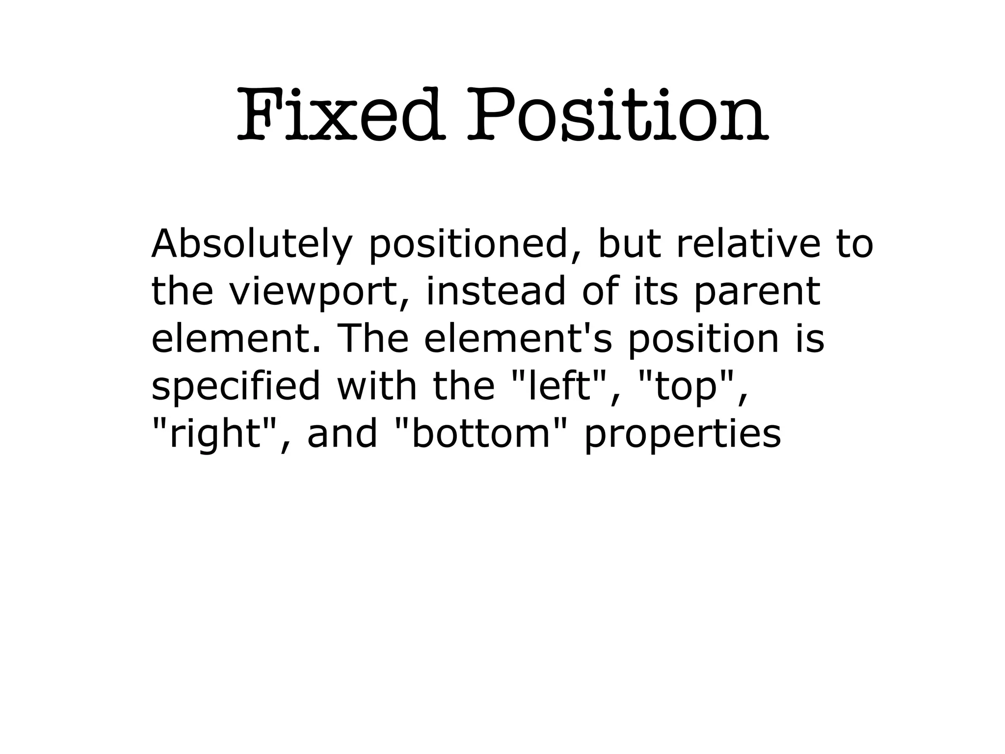
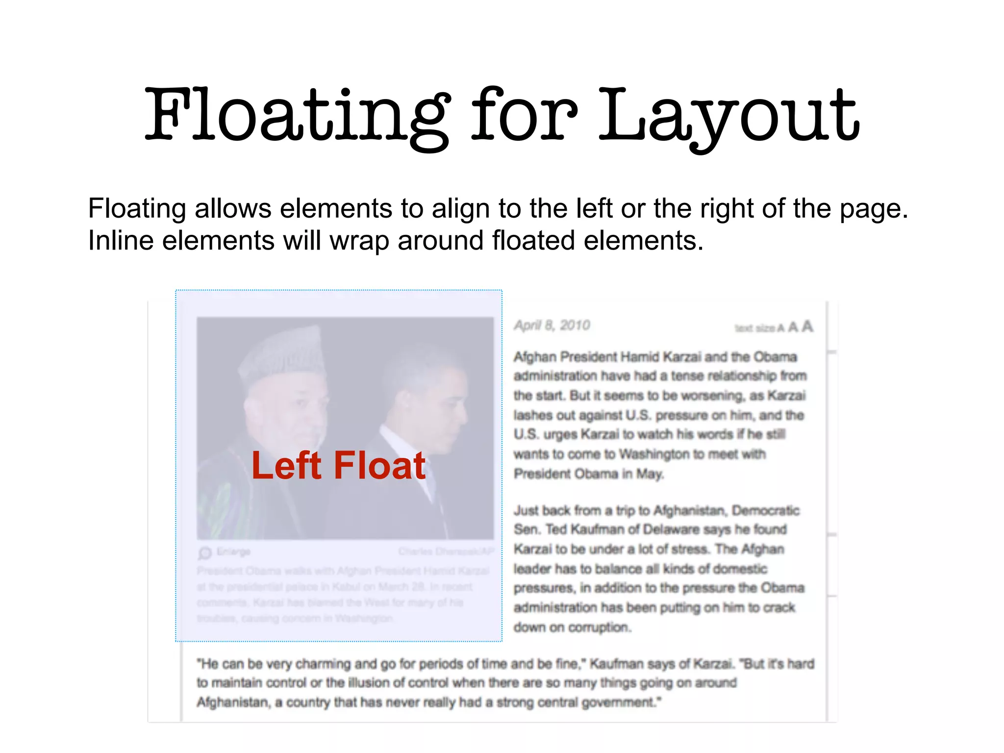
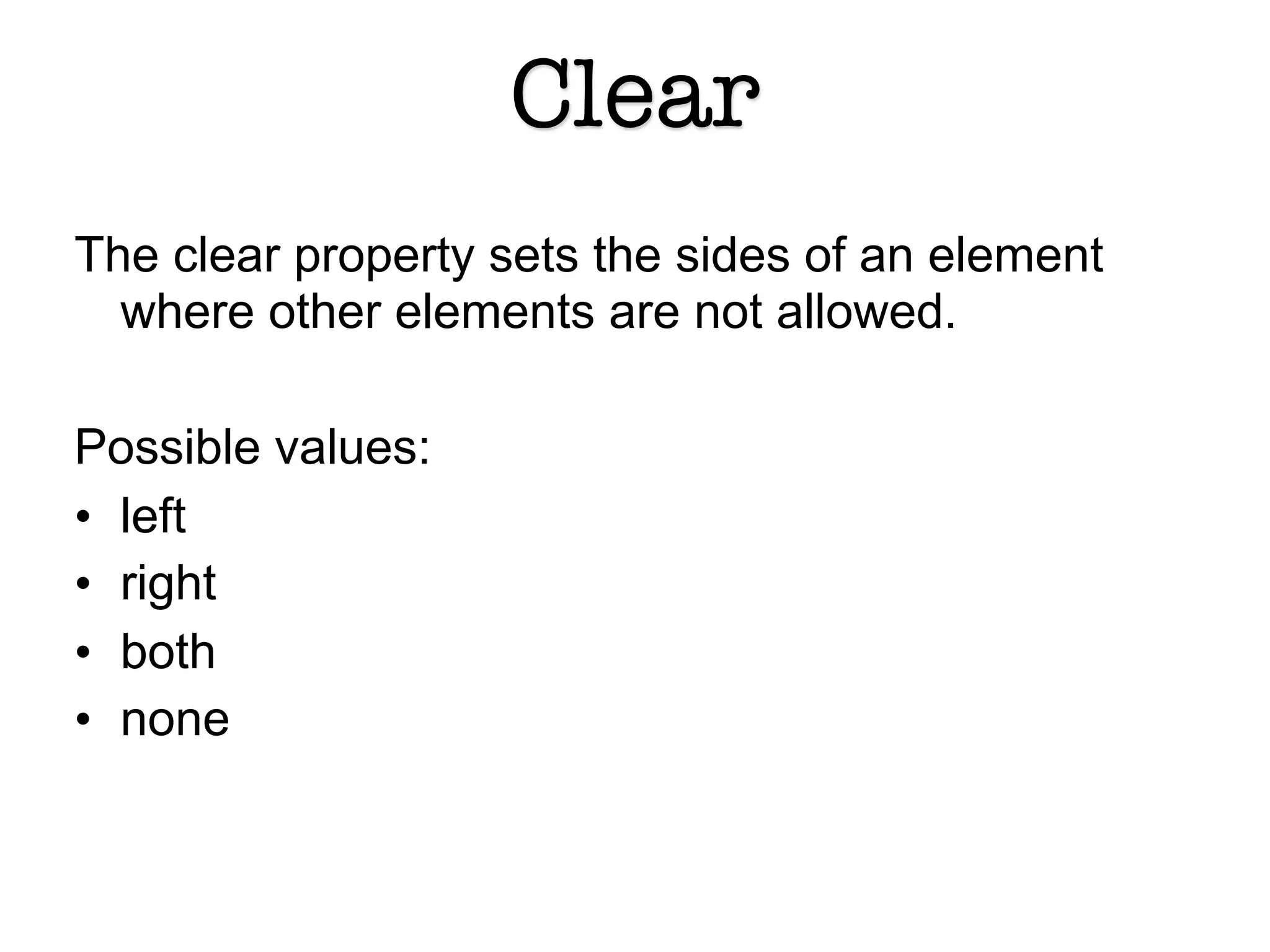
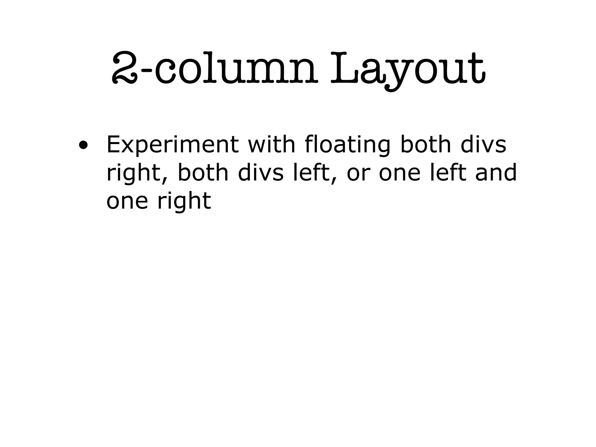
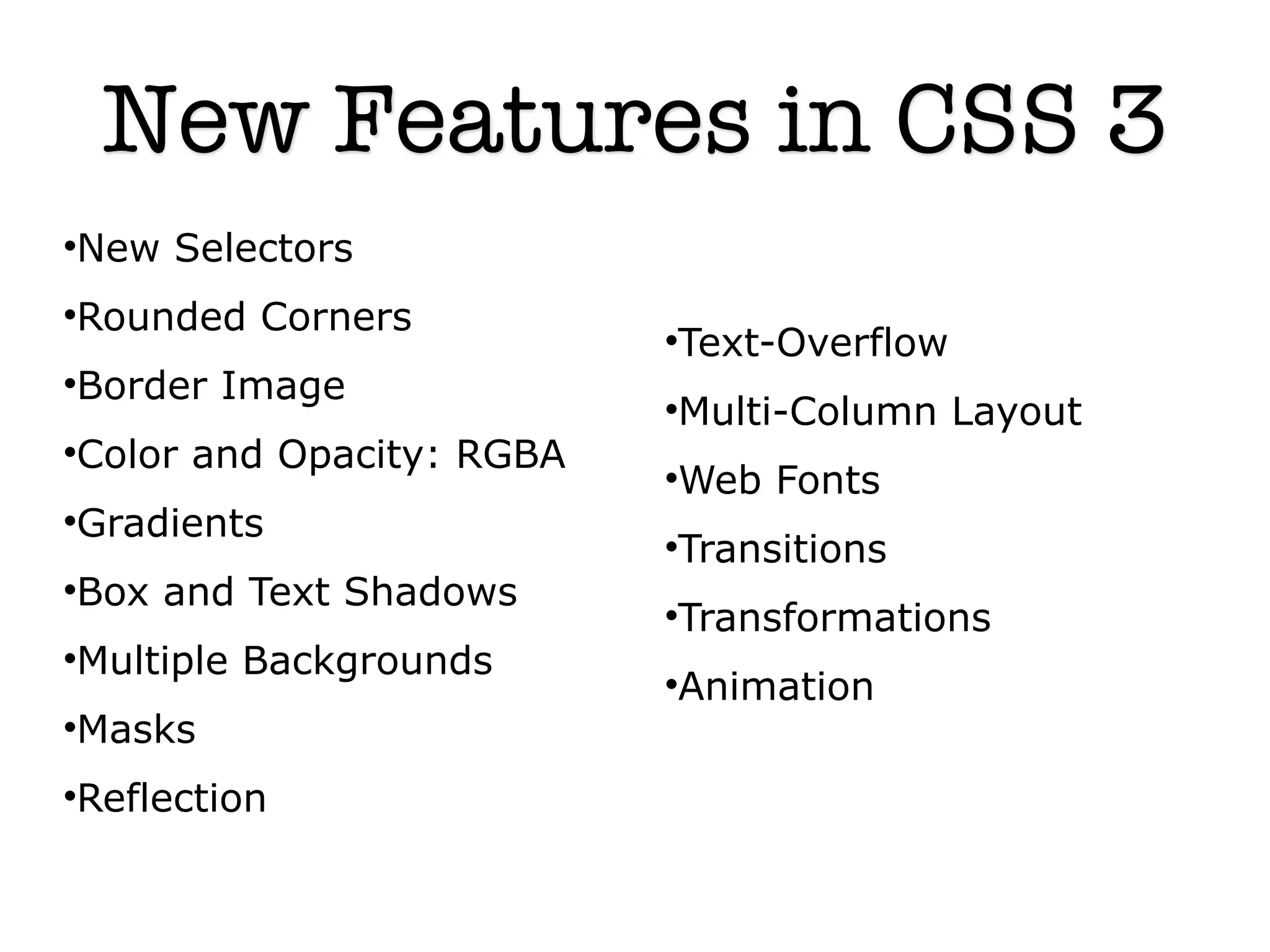
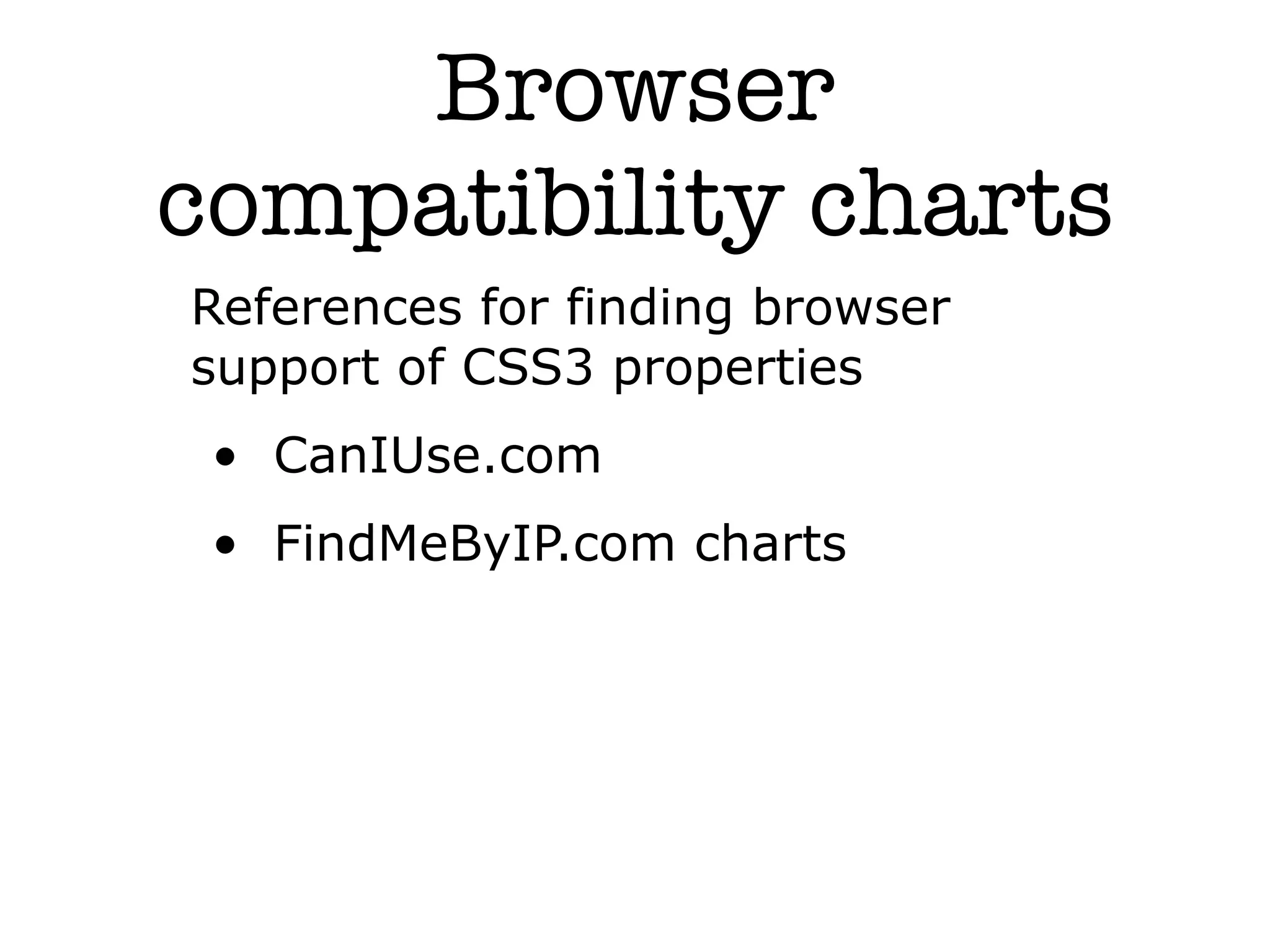
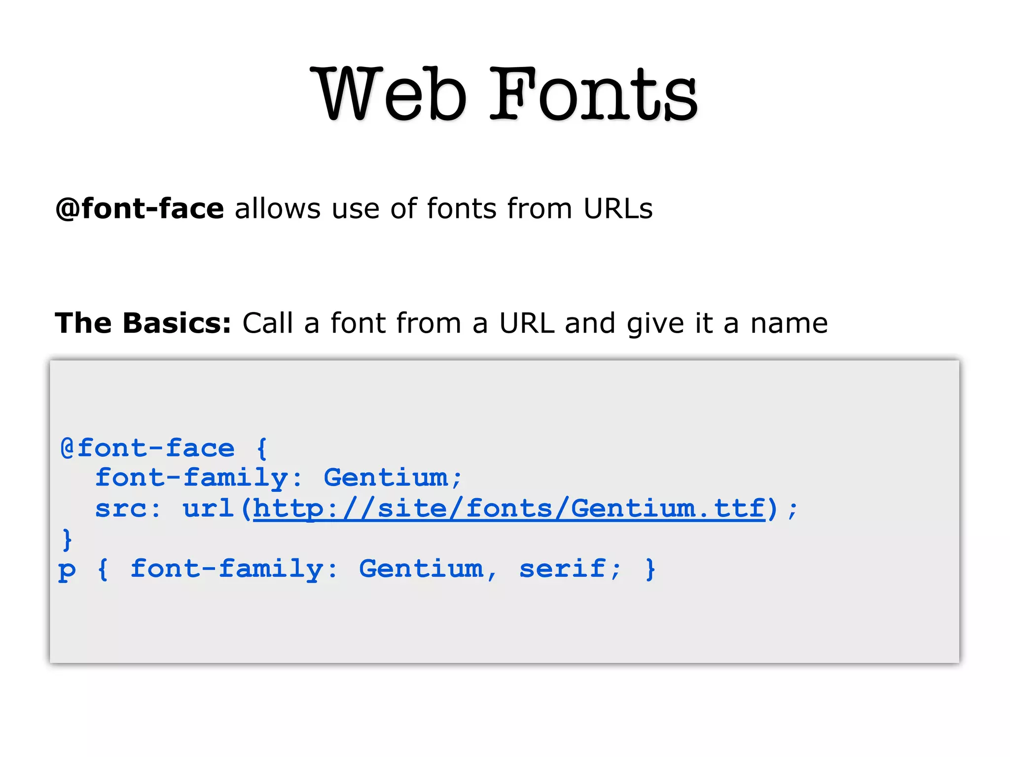
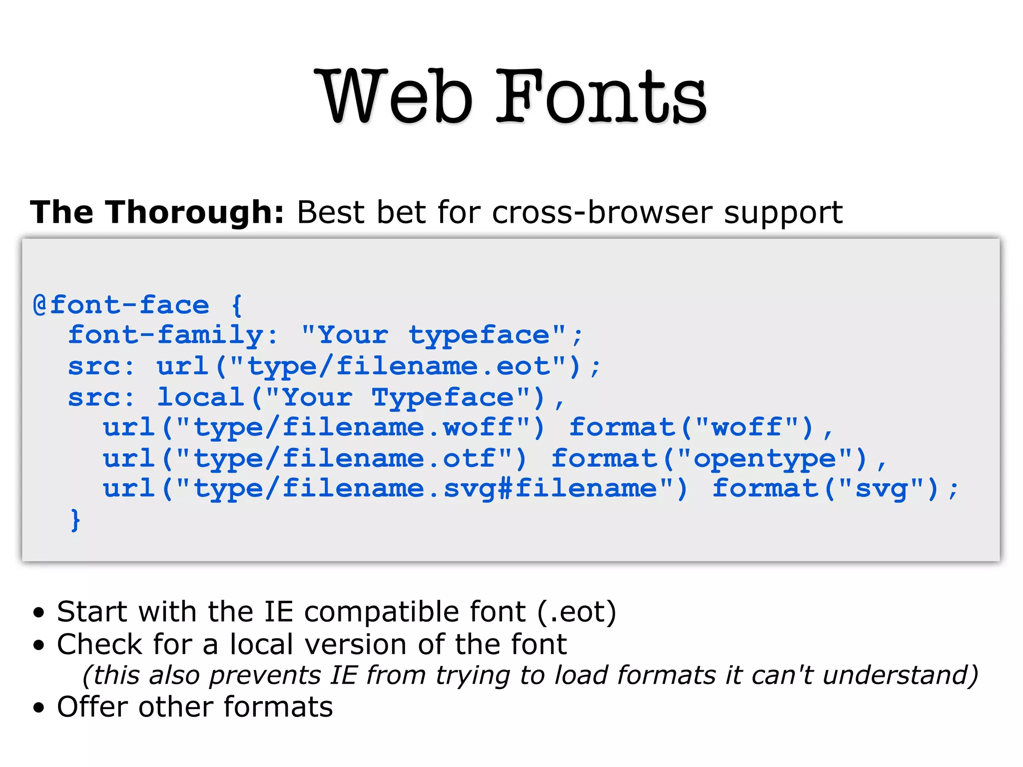
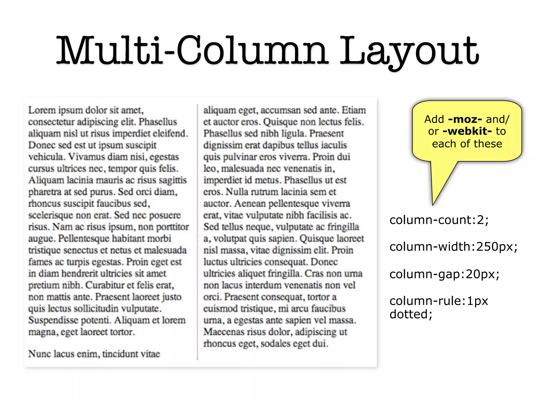
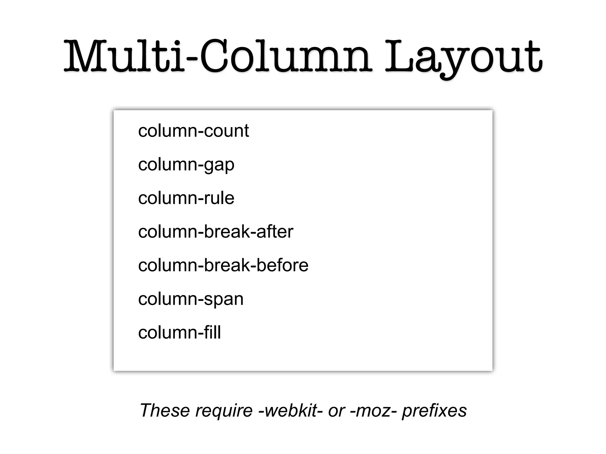
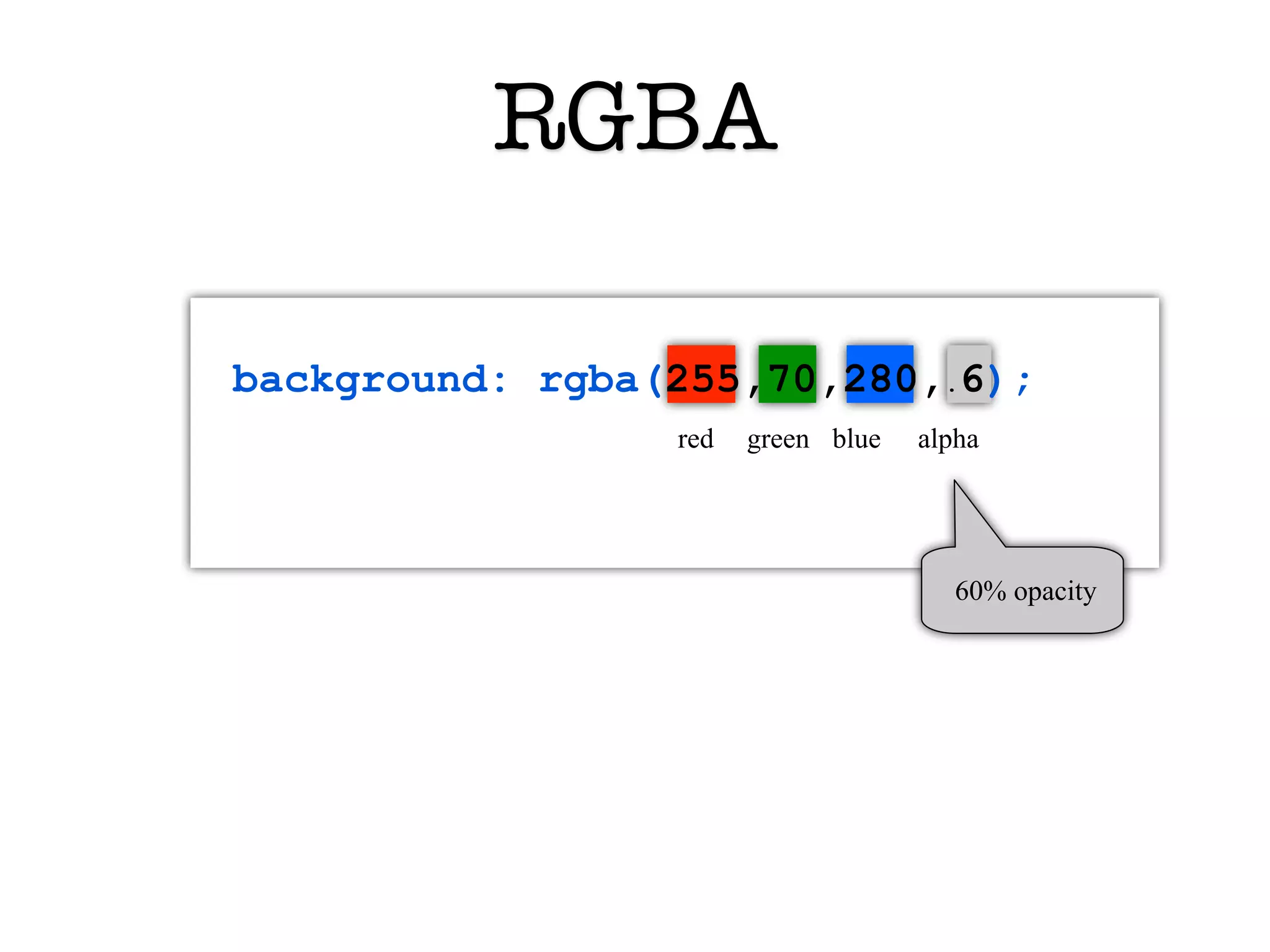
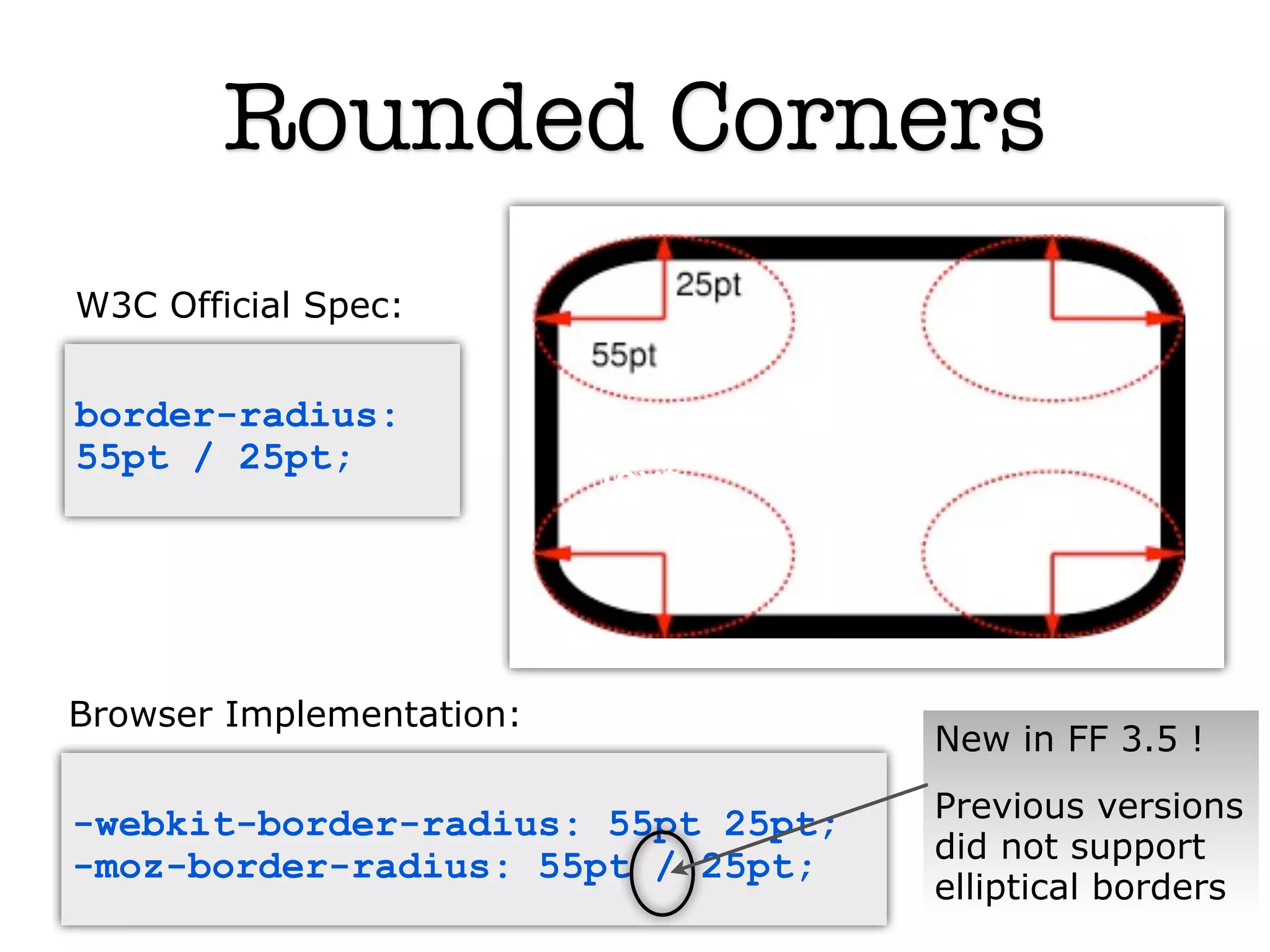
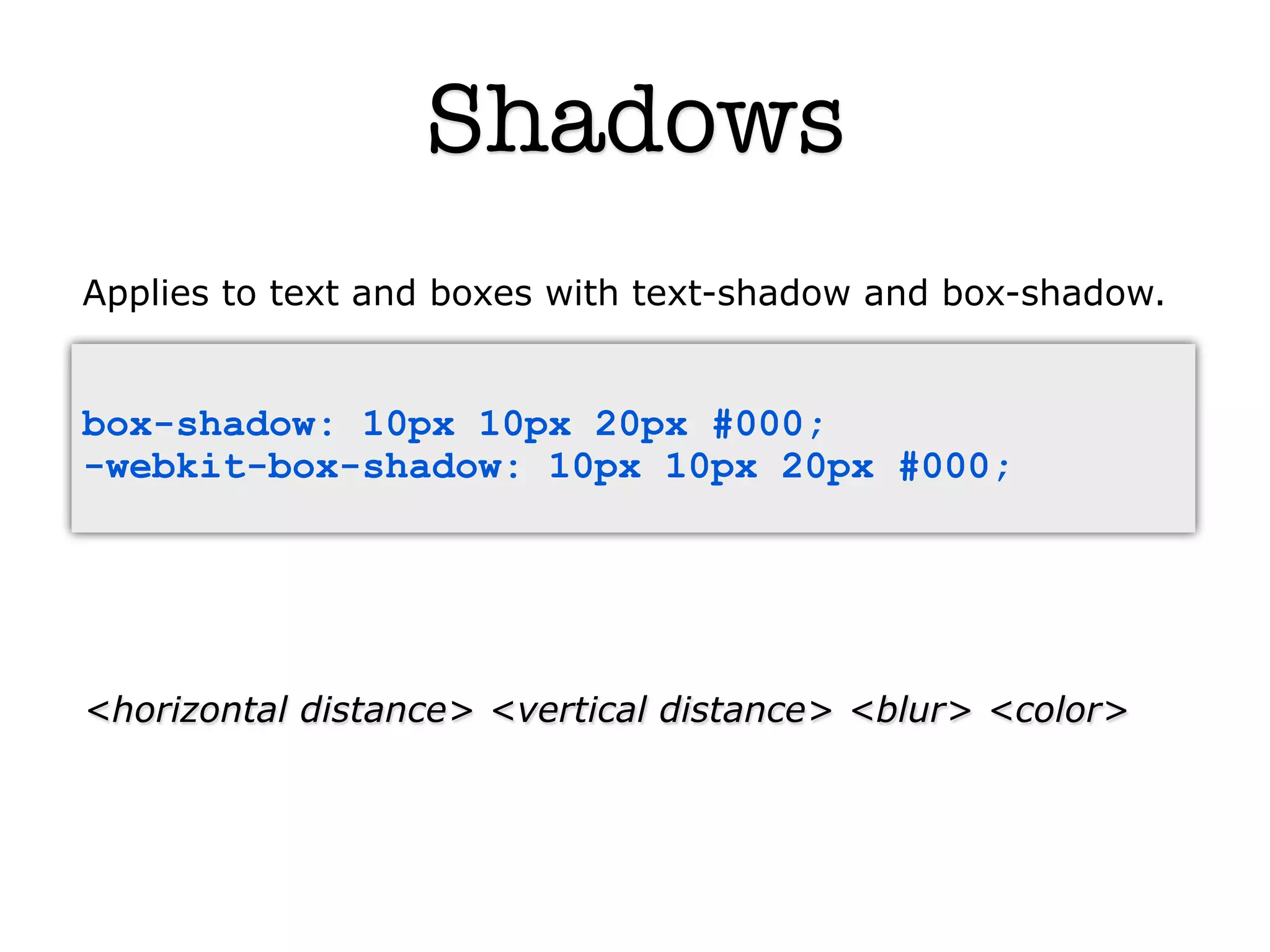
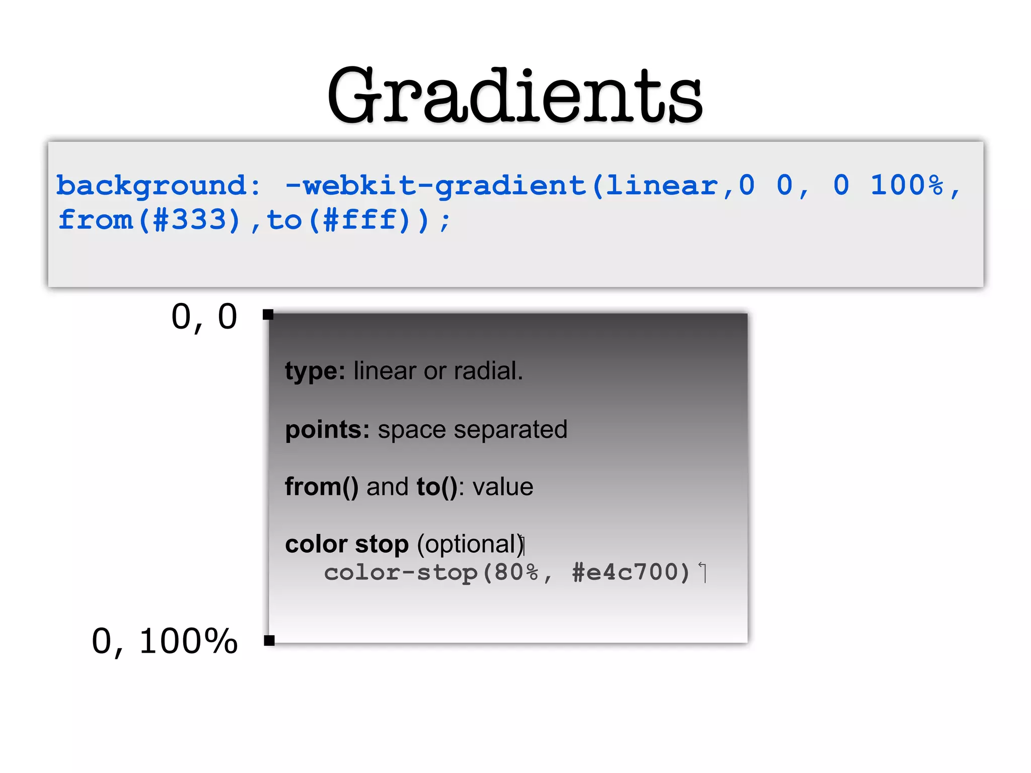
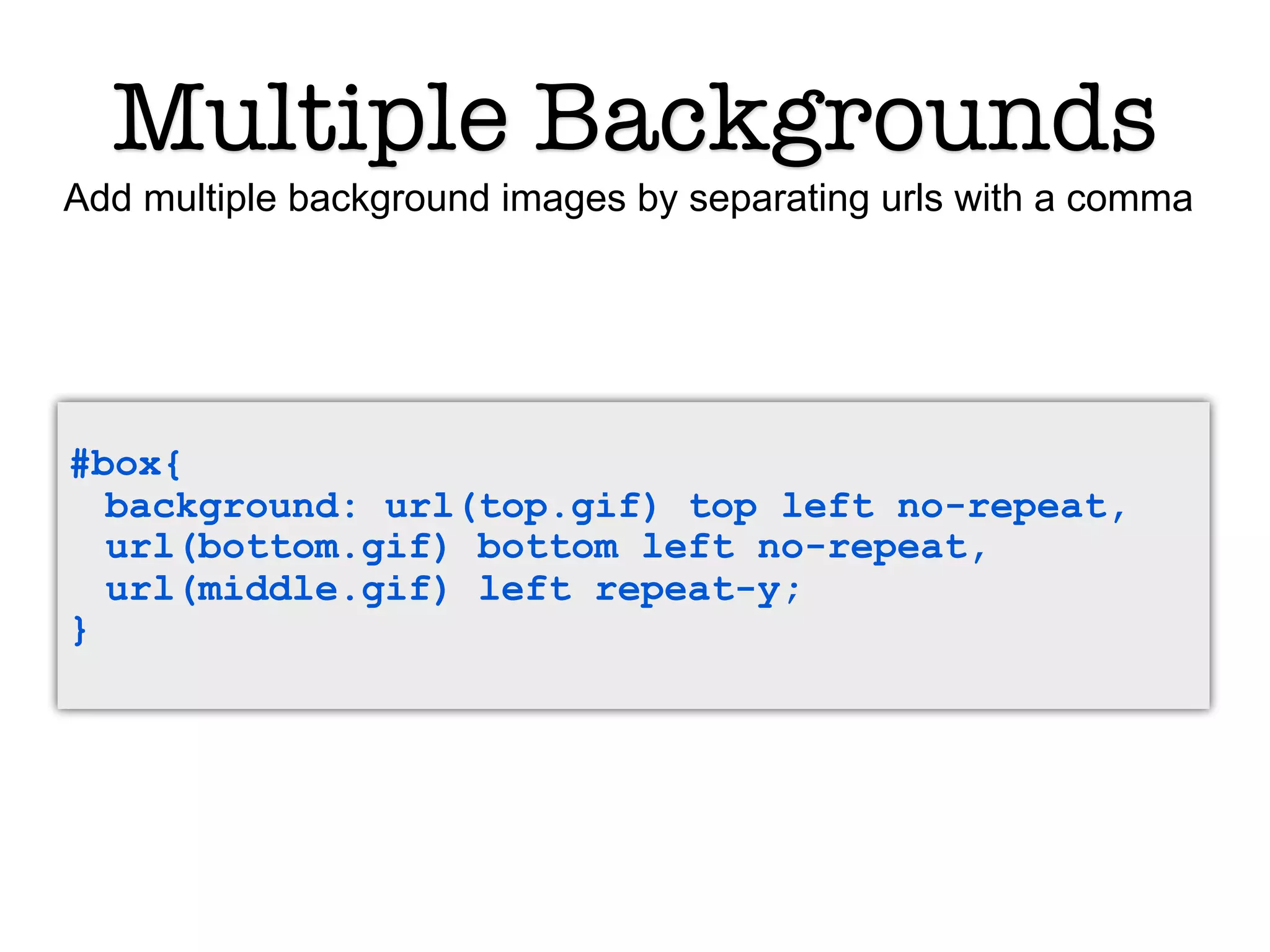
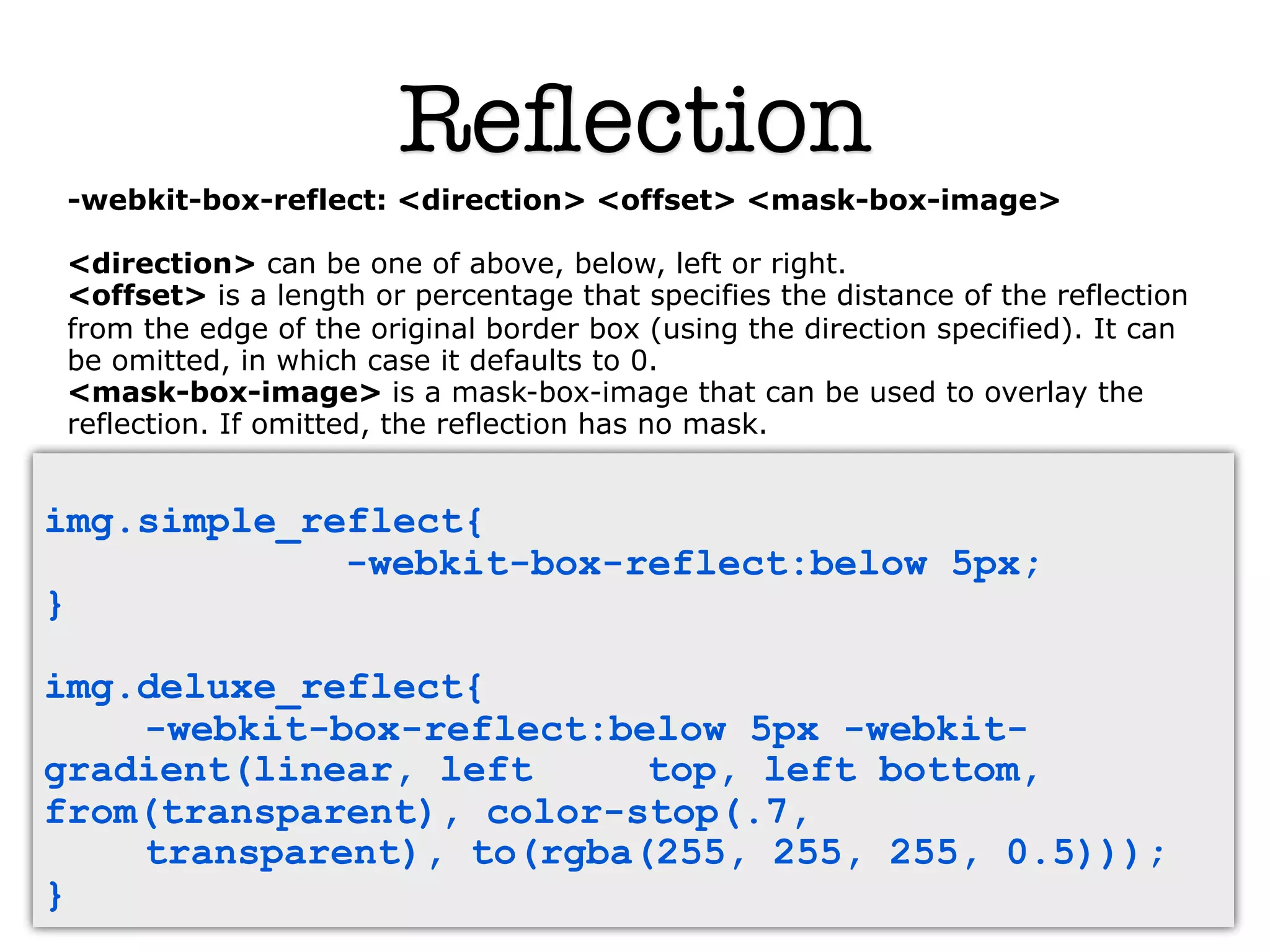
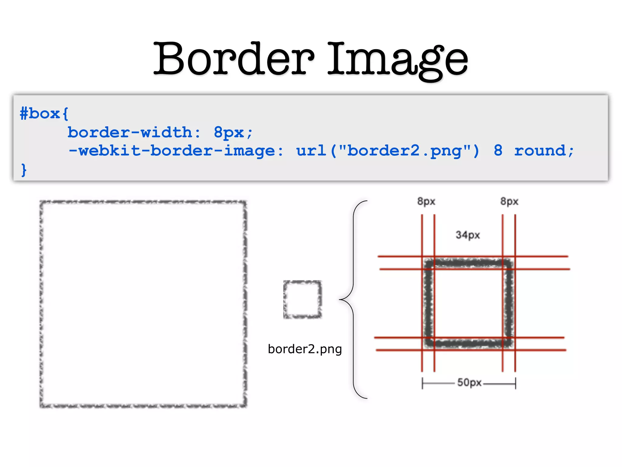
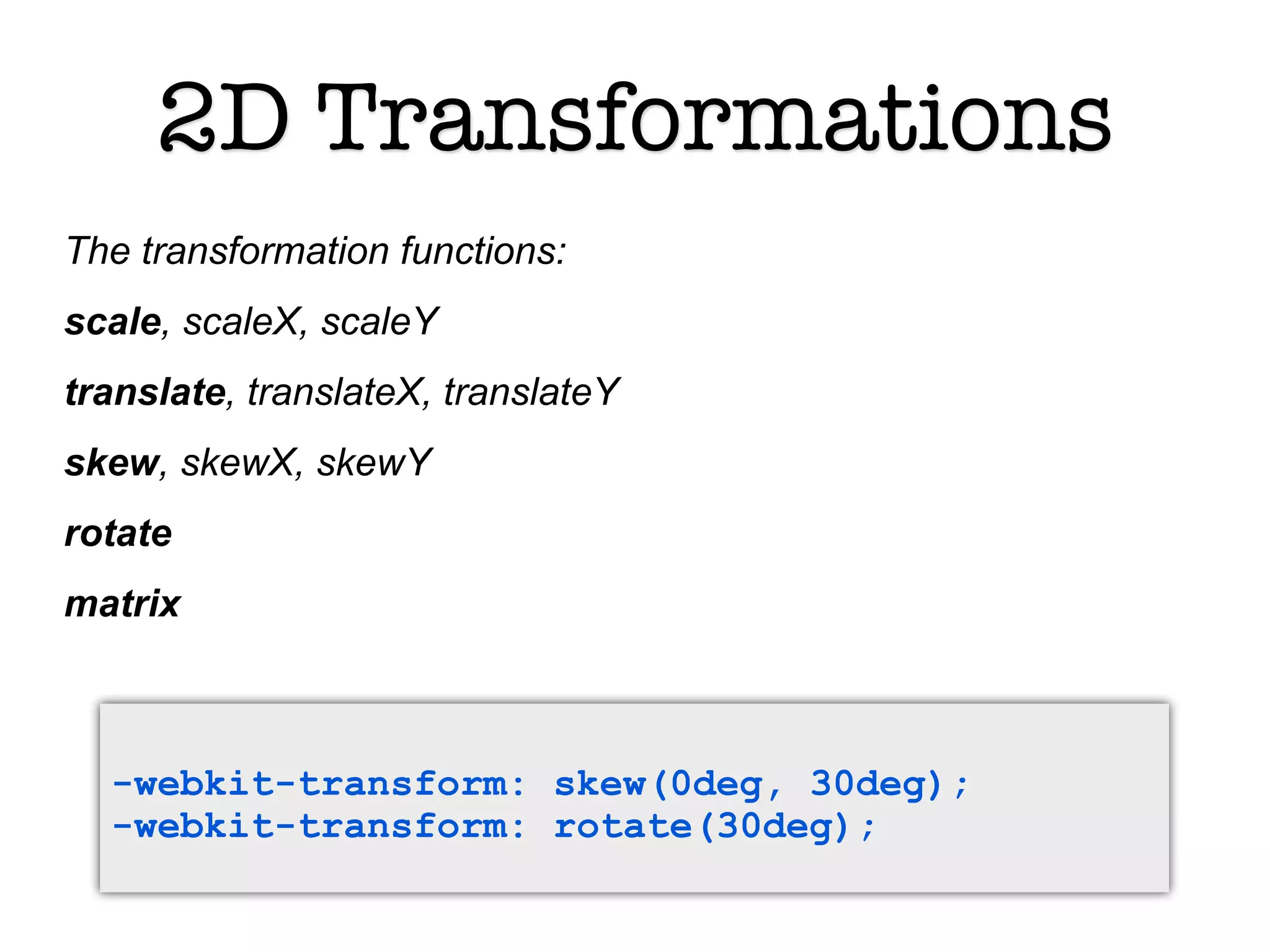
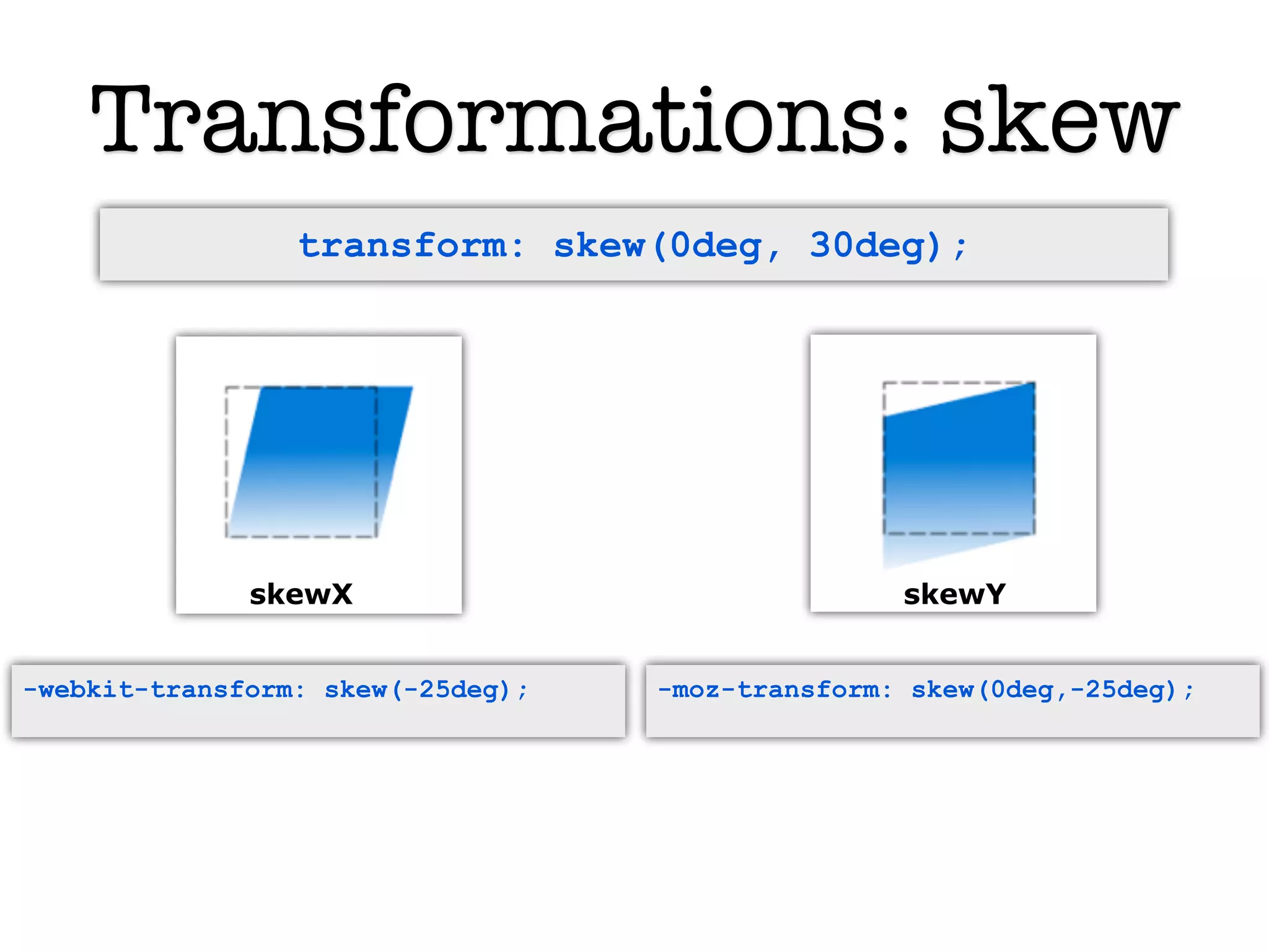
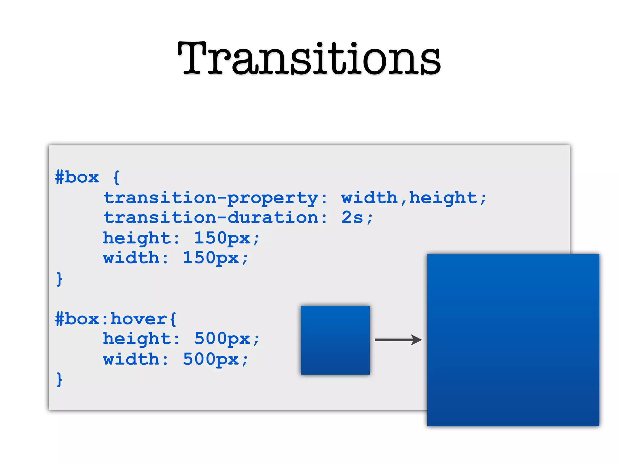
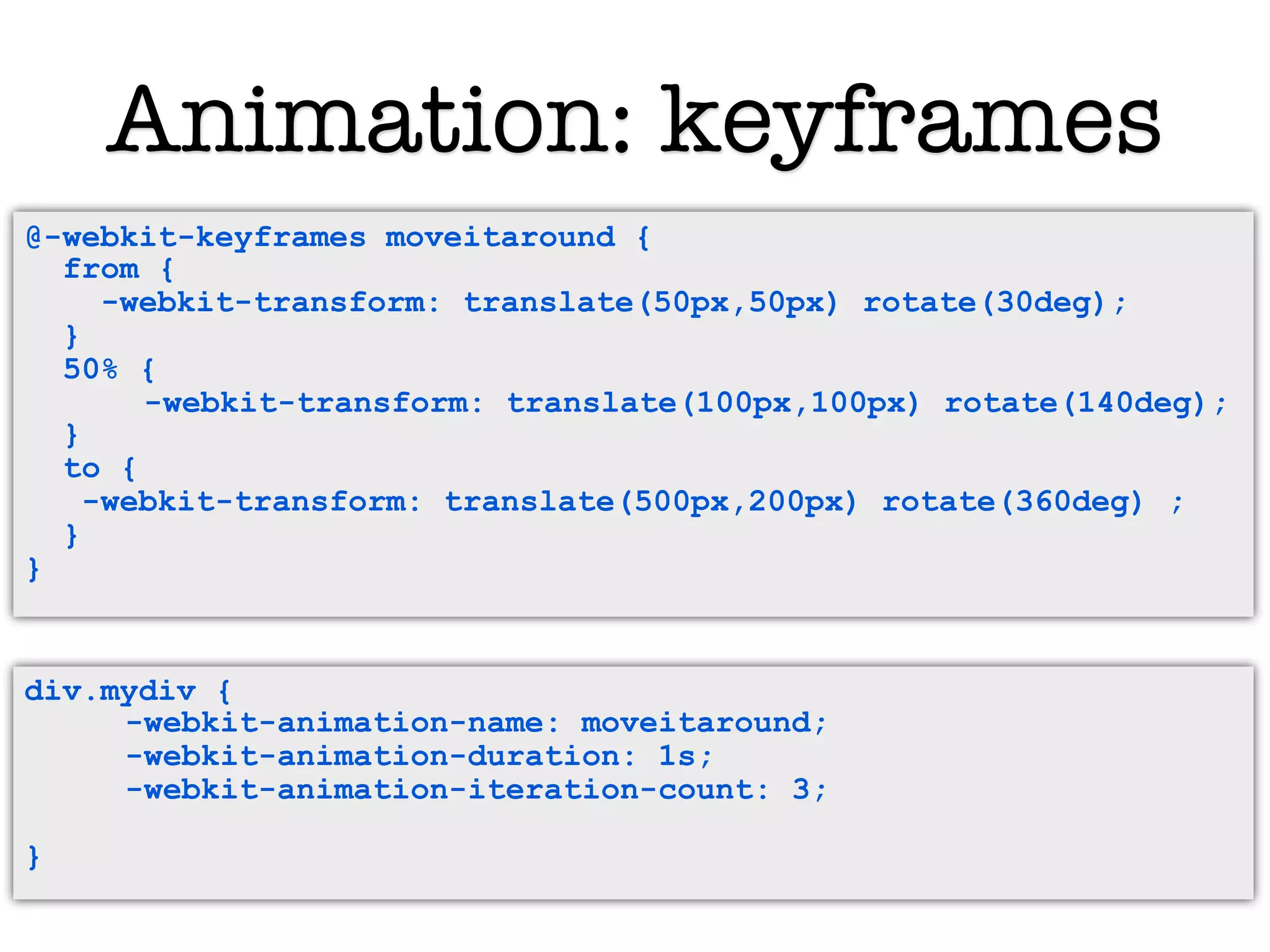
KEMBAR78
CSS and CSS3 | KEY
CSS
& CSS3
    Robyn Overstreet
More CSS Layout
CSS Layout
• Positioning
• Display
• Floats
Inline vs. Block
Block
  Start and end with new lines. Can have a
width.
         <p>, <table>, <div>, ...


Inline
   Does not force new lines. Cannot have
width.
          <b>, <span>, <img>, ...

                              4
Display property
Switch elements between block and
inline display or hide elements
Possible properties
              Text
•   block
•   inline
•   none
             #search-results{
               display:none;
             }
The Box Model
Four parts:
  Content
  Padding
  Border
  Margin


              6
Box Model Measurementsā€«ā€ā€¬
 In most browsers, a box with a 70px width take up
         100px with margin and padding …


                        7
Box Model Measurementsā€«ā€ā€¬
In IE browsers, the padding is subtracted instead of
      added, so the box will take up only 90px.


                         8
Window & Document
Relative Position
Positioned in relation to the other elements
around it
Absolute Position
Positioned in relation to its parent
without regard to the normal flow of
elements
Fixed Position
Absolutely positioned, but relative to
the viewport, instead of its parent
element. The element's position is
specified with the "left", "top",
"right", and "bottom" properties
Positioning Properties
   Positioning properties specify the left, right,
    top, and bottom positions of an absolutely
    positioned element
   They set the shape of an element, place
    one element behind another, and indicate
    directions for fitting an element's content
    in a specified area
img.logo {
      position: absolute;
      top: 0;
      left:0;
      width: 150px;
      height: 150px;
                            13
}
Floating for Layout
Floating allows elements to align to the left or the right of the page.
Inline elements will wrap around floated elements.


              Left Float
Clear
The clear property sets the sides of an element
  where other elements are not allowed.

Possible values:
• left
• right
• both
• none


                         15
2-column Layout
• Experiment with floating both divs
  right, both divs left, or one left and
  one right
3-column Layout
Lab: Layout
• Sketch a design layout on paper
• Build the wireframe in CSS and HTML
• Try positioning a sidebar on the left or
  the right by just changing the CSS
  (not the HTML)
   • Extra: Position a logo over the columns
     using absolute positioning
CSS 3
Modular
CSS3 is a collection of modules
• Allows updates on a module-by-
  module basis (instead of waiting
  for an update of the full spec)
• Browsers can add support for
  features one module at a time
• Browsers are able to implement
  some modules and not others
New Features in CSS 3
New Selectors



Rounded Corners


                          Text-Overflow
                          


Border Image


                          Multi-Column Layout
                          


Color and Opacity: RGBA


                          Web Fonts
                          


Gradients


                          Transitions
                          


Box and Text Shadows


                          Transformations
                          


Multiple Backgrounds


                          Animation
                          


Masks



Reflection

Browser Compatibility
• Many of the CSS3 features only work on specific browsers.
• Need to use browser-specific property names in those cases.
• Prefix with -webkit or -moz

Webkit-specific properties
http://qooxdoo.org/documentation/general/webkit_css_styles


Mozilla-specific properties
https://developer.mozilla.org/en/CSS_Reference/Mozilla_Extensions
Browser
compatibility charts
References for finding browser
support of CSS3 properties
 • CanIUse.com
 • FindMeByIP.com charts
Web Fonts
Web Fonts
@font-face allows use of fonts from URLs


The Basics: Call a font from a URL and give it a name


@font-face {
  font-family: Gentium;
  src: url(http://site/fonts/Gentium.ttf);
}
p { font-family: Gentium, serif; }
Web Fonts
The Thorough: Best bet for cross-browser support

@font-face {
  font-family: "Your typeface";
  src: url("type/filename.eot");
  src: local("Your Typeface"),
    url("type/filename.woff") format("woff"),
    url("type/filename.otf") format("opentype"),
    url("type/filename.svg#filename") format("svg");
  }


• Start with the IE compatible font (.eot)ā€«ā€ā€¬
• Check for a local version of the font
   (this also prevents IE from trying to load formats it can't understand)
• Offer other formats
Font Services
        !   Copyright. Fonts are copyrighted material.


Downloadable Fonts
• Font Squirrel fontsquirrel.com
   Freeware fonts to download and host yourself, with helpers to
   write CSS code

Font Hosting
Fonts delivered from server, with Javascript helpers
• Google Font API code.google.com/webfonts
    Open-source font library with limited number of fonts

• TypeKit typekit.com
   Subscription-based font service with a large library
Lab: Fonts
• Add fonts to your page using the Google
  web fonts API
• Check display across browsers
Text Features
Text Overflow
 A new option for content that overflows its containing box


                   Two roads diverged in
                   a yellow wood, and
                   sorry I could not ...


#poem_box{
   text-overflow: ellipsis;
}
Multi-Column Layout
                   Add -moz- and/
                    or -webkit- to
                     each of these


              column-count:2;

              column-width:250px;

              column-gap:20px;

              column-rule:1px
              dotted;
Multi-Column Layout
  column-count
  column-gap
  column-rule
  column-break-after
  column-break-before
  column-span
  column-fill


  These require -webkit- or -moz- prefixes
New Visual Effects
    in CSS3
RGBA

background: rgba(255,70,280,.6);
                 red   green blue   alpha


                                       60% opacity
Rounded Corners
W3C Official Spec:


border-radius:
55pt / 25pt;
                          Text


Browser Implementation:
                                    New in FF 3.5 !

-webkit-border-radius: 55pt 25pt;   Previous versions
                                    did not support
-moz-border-radius: 55pt / 25pt;
                                    elliptical borders
Quick-fire Lab
Round the corners of a div
Shadows
Applies to text and boxes with text-shadow and box-shadow.


box-shadow: 10px 10px 20px #000;
-webkit-box-shadow: 10px 10px 20px #000;


<horizontal distance> <vertical distance> <blur> <color>
Quick-fire Lab
Apply a shadow to a box or to text
Gradients
background: -webkit-gradient(linear,0 0, 0 100%,
from(#333),to(#fff));


     0, 0
            type: linear or radial.

            points: space separated

            from() and to(): value

            color stop (optional)ā€«ā€ā€¬
               color-stop(80%, #e4c700)ā€«ā€ā€¬

 0, 100%
Quick-fire Lab
Create a gradient background for a
div
Multiple Backgrounds
Add multiple background images by separating urls with a comma


#box{
  background: url(top.gif) top left no-repeat,
  url(bottom.gif) bottom left no-repeat,
  url(middle.gif) left repeat-y;
}
Reflection
 -webkit-box-reflect: <direction> <offset> <mask-box-image>

 <direction> can be one of above, below, left or right.
 <offset> is a length or percentage that specifies the distance of the reflection
 from the edge of the original border box (using the direction specified). It can
 be omitted, in which case it defaults to 0.
 <mask-box-image> is a mask-box-image that can be used to overlay the
 reflection. If omitted, the reflection has no mask.


img.simple_reflect{
             -webkit-box-reflect:below 5px;
}

img.deluxe_reflect{
    -webkit-box-reflect:below 5px -webkit-
gradient(linear, left     top, left bottom,
from(transparent), color-stop(.7,
    transparent), to(rgba(255, 255, 255, 0.5)));
}
Reflection
img.deluxe_reflect{
    -webkit-box-reflect:below 5px -webkit-
gradient(linear, left     top, left bottom,
from(transparent), color-stop(.7,
    transparent), to(rgba(255, 255, 255, 0.5)));
}
Quick-fire Lab
Try multiple background images
and/or reflection
Masks
img.photo {
    -webkit-mask-box-image: url(mask.png);
}


            +                 =
Border Image
#box{
     border-width: 8px;
     -webkit-border-image: url("border2.png") 8 round;
}


   <div id=ā€boxā€>


                        border2.png
Graphic
Transformations
2D Transformations
The transformation functions:
scale, scaleX, scaleY
translate, translateX, translateY
skew, skewX, skewY
rotate
matrix


  -webkit-transform: skew(0deg, 30deg);
  -webkit-transform: rotate(30deg);
Transformations: scale


   -moz-transform:   scale(3);      1     = 100%
   or   transform:   scale(1,4);    .2    = 20%
-webkit-transform:   scaleY(1.5);   1.5   = 150%
        transform:   scaleX(.2);    3     = 300%
Transformations: skew
                 transform: skew(0deg, 30deg);


              skewX                               skewY


-webkit-transform: skew(-25deg);   -moz-transform: skew(0deg,-25deg);
Faking 3D: a 2D Cube
.cube {
      position: relative;
      top: 200px;
}
.rightFace,.leftFace,.topFace{
      position: absolute;
      padding: 10px;
      width: 180px;
       height: 180px;
}
.leftFace {
      -webkit-transform: skew(0deg, 30deg);
}
.rightFace {
      -webkit-transform: skew(0deg, -30deg);
      left: 200px;
}
.topFace {
      -webkit-transform: rotate(60deg) skew(0deg, -30deg) scale(1,
1.16);
      top: -158px;
      left: 100px;
}
Lab
Create a skewed box
Animation!
Transitions

#box {
    transition-property: width,height;
    transition-duration: 2s;
    height: 150px;
    width: 150px;
}

#box:hover{
    height: 500px;
    width: 500px;
}
Lab
Create a transition on hover.
Use scale, skew, translate, or change
width or height
Triggering Animation
:hover as used in previous versions of CSS
:target trigger animation with a anchor link, e.g. page.html#start

<div id="b" class="brick">foo</div>
<div id="c" class="brick">foo</div>
<p><a href="#c">drop c</a></p>

div.brick:target{
   -webkit-transform: rotate(30deg);
}

onclick using javascript

<div onclick=
"this.style.webkitTransform='rotate(360deg)'">
Animation: keyframes


             Illustration: Yurike Cynthia Go
                Creative Commons License
Animation: keyframes
@-webkit-keyframes moveitaround{ {
  @-webkit-keyframes moveitaround
  from { {
     from
     -webkit-transform: translate(50px,50px) rotate(30deg);
        -webkit-transform: translate(50px,50px) rotate(30deg);
  } }
  50% { {
     50%
           -webkit-transform: translate(100px,100px) rotate(140deg);
         -webkit-transform: translate(100px,100px) rotate(140deg);
  } }
     to {
  to -webkit-transform: translate(500px,200px) rotate(360deg) ;
       {
    -webkit-transform: translate(500px,200px) rotate(360deg) ;
     }
  }
  }
}


div.mydiv {
     -webkit-animation-name: moveitaround;
     -webkit-animation-duration: 1s;
     -webkit-animation-iteration-count: 3;

}
Animation Examples
Lab
Make an object move across the
screen using keyframes

CSS and CSS3

  • 1.
    CSS & CSS3 Robyn Overstreet
  • 2.
  • 3.
  • 4.
    Inline vs. Block Block Start and end with new lines. Can have a width. <p>, <table>, <div>, ... Inline Does not force new lines. Cannot have width. <b>, <span>, <img>, ... 4
  • 5.
    Display property Switch elementsbetween block and inline display or hide elements Possible properties Text • block • inline • none #search-results{ display:none; }
  • 6.
    The Box Model Fourparts: Content Padding Border Margin 6
  • 7.
    Box Model Measurementsā€«ā€ā€¬ In most browsers, a box with a 70px width take up 100px with margin and padding … 7
  • 8.
    Box Model Measurementsā€«ā€ā€¬ InIE browsers, the padding is subtracted instead of added, so the box will take up only 90px. 8
  • 9.
  • 10.
    Relative Position Positioned inrelation to the other elements around it
  • 11.
    Absolute Position Positioned inrelation to its parent without regard to the normal flow of elements
  • 12.
    Fixed Position Absolutely positioned,but relative to the viewport, instead of its parent element. The element's position is specified with the "left", "top", "right", and "bottom" properties
  • 13.
    Positioning Properties  Positioning properties specify the left, right, top, and bottom positions of an absolutely positioned element  They set the shape of an element, place one element behind another, and indicate directions for fitting an element's content in a specified area img.logo { position: absolute; top: 0; left:0; width: 150px; height: 150px; 13 }
  • 14.
    Floating for Layout Floatingallows elements to align to the left or the right of the page. Inline elements will wrap around floated elements. Left Float
  • 15.
    Clear The clear propertysets the sides of an element where other elements are not allowed. Possible values: • left • right • both • none 15
  • 16.
    2-column Layout • Experimentwith floating both divs right, both divs left, or one left and one right
  • 17.
  • 18.
    Lab: Layout • Sketcha design layout on paper • Build the wireframe in CSS and HTML • Try positioning a sidebar on the left or the right by just changing the CSS (not the HTML) • Extra: Position a logo over the columns using absolute positioning
  • 19.
  • 20.
    Modular CSS3 is acollection of modules • Allows updates on a module-by- module basis (instead of waiting for an update of the full spec) • Browsers can add support for features one module at a time • Browsers are able to implement some modules and not others
  • 21.
    New Features inCSS 3 New Selectors  Rounded Corners  Text-Overflow  Border Image  Multi-Column Layout  Color and Opacity: RGBA  Web Fonts  Gradients  Transitions  Box and Text Shadows  Transformations  Multiple Backgrounds  Animation  Masks  Reflection 
  • 22.
    Browser Compatibility • Manyof the CSS3 features only work on specific browsers. • Need to use browser-specific property names in those cases. • Prefix with -webkit or -moz Webkit-specific properties http://qooxdoo.org/documentation/general/webkit_css_styles Mozilla-specific properties https://developer.mozilla.org/en/CSS_Reference/Mozilla_Extensions
  • 23.
    Browser compatibility charts References forfinding browser support of CSS3 properties • CanIUse.com • FindMeByIP.com charts
  • 24.
  • 25.
    Web Fonts @font-face allowsuse of fonts from URLs The Basics: Call a font from a URL and give it a name @font-face { font-family: Gentium; src: url(http://site/fonts/Gentium.ttf); } p { font-family: Gentium, serif; }
  • 26.
    Web Fonts The Thorough:Best bet for cross-browser support @font-face { font-family: "Your typeface"; src: url("type/filename.eot"); src: local("Your Typeface"), url("type/filename.woff") format("woff"), url("type/filename.otf") format("opentype"), url("type/filename.svg#filename") format("svg"); } • Start with the IE compatible font (.eot)ā€«ā€ā€¬ • Check for a local version of the font (this also prevents IE from trying to load formats it can't understand) • Offer other formats
  • 27.
    Font Services ! Copyright. Fonts are copyrighted material. Downloadable Fonts • Font Squirrel fontsquirrel.com Freeware fonts to download and host yourself, with helpers to write CSS code Font Hosting Fonts delivered from server, with Javascript helpers • Google Font API code.google.com/webfonts Open-source font library with limited number of fonts • TypeKit typekit.com Subscription-based font service with a large library
  • 28.
    Lab: Fonts • Addfonts to your page using the Google web fonts API • Check display across browsers
  • 29.
  • 30.
    Text Overflow Anew option for content that overflows its containing box Two roads diverged in a yellow wood, and sorry I could not ... #poem_box{ text-overflow: ellipsis; }
  • 31.
    Multi-Column Layout Add -moz- and/ or -webkit- to each of these column-count:2; column-width:250px; column-gap:20px; column-rule:1px dotted;
  • 32.
    Multi-Column Layout column-count column-gap column-rule column-break-after column-break-before column-span column-fill These require -webkit- or -moz- prefixes
  • 33.
  • 34.
    RGBA background: rgba(255,70,280,.6); red green blue alpha 60% opacity
  • 35.
    Rounded Corners W3C OfficialSpec: border-radius: 55pt / 25pt; Text Browser Implementation: New in FF 3.5 ! -webkit-border-radius: 55pt 25pt; Previous versions did not support -moz-border-radius: 55pt / 25pt; elliptical borders
  • 36.
  • 37.
    Shadows Applies to textand boxes with text-shadow and box-shadow. box-shadow: 10px 10px 20px #000; -webkit-box-shadow: 10px 10px 20px #000; <horizontal distance> <vertical distance> <blur> <color>
  • 38.
    Quick-fire Lab Apply ashadow to a box or to text
  • 39.
    Gradients background: -webkit-gradient(linear,0 0,0 100%, from(#333),to(#fff)); 0, 0 type: linear or radial. points: space separated from() and to(): value color stop (optional)ā€«ā€ā€¬ color-stop(80%, #e4c700)ā€«ā€ā€¬ 0, 100%
  • 40.
    Quick-fire Lab Create agradient background for a div
  • 41.
    Multiple Backgrounds Add multiplebackground images by separating urls with a comma #box{ background: url(top.gif) top left no-repeat, url(bottom.gif) bottom left no-repeat, url(middle.gif) left repeat-y; }
  • 42.
    Reflection -webkit-box-reflect: <direction><offset> <mask-box-image> <direction> can be one of above, below, left or right. <offset> is a length or percentage that specifies the distance of the reflection from the edge of the original border box (using the direction specified). It can be omitted, in which case it defaults to 0. <mask-box-image> is a mask-box-image that can be used to overlay the reflection. If omitted, the reflection has no mask. img.simple_reflect{ -webkit-box-reflect:below 5px; } img.deluxe_reflect{ -webkit-box-reflect:below 5px -webkit- gradient(linear, left top, left bottom, from(transparent), color-stop(.7, transparent), to(rgba(255, 255, 255, 0.5))); }
  • 43.
    Reflection img.deluxe_reflect{ -webkit-box-reflect:below 5px -webkit- gradient(linear, left top, left bottom, from(transparent), color-stop(.7, transparent), to(rgba(255, 255, 255, 0.5))); }
  • 44.
    Quick-fire Lab Try multiplebackground images and/or reflection
  • 45.
    Masks img.photo { -webkit-mask-box-image: url(mask.png); } + =
  • 46.
    Border Image #box{ border-width: 8px; -webkit-border-image: url("border2.png") 8 round; } <div id=ā€boxā€> border2.png
  • 47.
  • 48.
    2D Transformations The transformationfunctions: scale, scaleX, scaleY translate, translateX, translateY skew, skewX, skewY rotate matrix -webkit-transform: skew(0deg, 30deg); -webkit-transform: rotate(30deg);
  • 49.
    Transformations: scale -moz-transform: scale(3); 1 = 100% or transform: scale(1,4); .2 = 20% -webkit-transform: scaleY(1.5); 1.5 = 150% transform: scaleX(.2); 3 = 300%
  • 50.
    Transformations: skew transform: skew(0deg, 30deg); skewX skewY -webkit-transform: skew(-25deg); -moz-transform: skew(0deg,-25deg);
  • 51.
    Faking 3D: a2D Cube .cube { position: relative; top: 200px; } .rightFace,.leftFace,.topFace{ position: absolute; padding: 10px; width: 180px; height: 180px; } .leftFace { -webkit-transform: skew(0deg, 30deg); } .rightFace { -webkit-transform: skew(0deg, -30deg); left: 200px; } .topFace { -webkit-transform: rotate(60deg) skew(0deg, -30deg) scale(1, 1.16); top: -158px; left: 100px; }
  • 52.
  • 53.
  • 54.
    Transitions #box { transition-property: width,height; transition-duration: 2s; height: 150px; width: 150px; } #box:hover{ height: 500px; width: 500px; }
  • 55.
    Lab Create a transitionon hover. Use scale, skew, translate, or change width or height
  • 56.
    Triggering Animation :hover asused in previous versions of CSS :target trigger animation with a anchor link, e.g. page.html#start <div id="b" class="brick">foo</div> <div id="c" class="brick">foo</div> <p><a href="#c">drop c</a></p> div.brick:target{ -webkit-transform: rotate(30deg); } onclick using javascript <div onclick= "this.style.webkitTransform='rotate(360deg)'">
  • 57.
    Animation: keyframes Illustration: Yurike Cynthia Go Creative Commons License
  • 58.
    Animation: keyframes @-webkit-keyframes moveitaround{{ @-webkit-keyframes moveitaround from { { from -webkit-transform: translate(50px,50px) rotate(30deg); -webkit-transform: translate(50px,50px) rotate(30deg); } } 50% { { 50% -webkit-transform: translate(100px,100px) rotate(140deg); -webkit-transform: translate(100px,100px) rotate(140deg); } } to { to -webkit-transform: translate(500px,200px) rotate(360deg) ; { -webkit-transform: translate(500px,200px) rotate(360deg) ; } } } } div.mydiv { -webkit-animation-name: moveitaround; -webkit-animation-duration: 1s; -webkit-animation-iteration-count: 3; }
  • 59.
  • 60.
    Lab Make an objectmove across the screen using keyframes

Editor's Notes

  • #2Ā \n
  • #3Ā \n
  • #4Ā \n
  • #5Ā \n
  • #6Ā \n
  • #7Ā \n
  • #8Ā \n
  • #9Ā \n
  • #10Ā \n
  • #11Ā \n
  • #12Ā \n
  • #13Ā \n
  • #14Ā \n
  • #15Ā \n
  • #16Ā \n
  • #17Ā \n
  • #18Ā \n
  • #19Ā Tip: Start basic.\nLayout and Design Inspiration: \nhttp://www.smashingmagazine.com/2010/08/19/100-free-high-quality-wordpress-themes-for-2010/\nhttp://www.smashingmagazine.com/2010/11/11/designing-memorable-websites-showcase-of-creative-designs/\nhttp://designm.ag/inspiration/non-profit-websites/\nhttp://designm.ag/inspiration/30-beautifully-simple-websites/\nSee the CSS cheat sheet\n\nHTML example:\n &lt;html&gt;&lt;head&gt;&lt;title&gt;The Site&lt;/title&gt;\n &lt;link href=&quot;layout1.css&quot; rel=&quot;stylesheet&quot; type=&quot;text/css&quot;/&gt;\n &lt;/head&gt;\n &lt;body&gt;\n &lt;div id=&quot;header&quot;&gt;&lt;h1&gt;The Site.&lt;/h1&gt;&lt;/div&gt;\n &lt;div id=&quot;navigation&gt;\n &lt;ul&gt;\n &lt;li&gt;Home&lt;/li&gt;\n &lt;li&gt;Services&lt;/li&gt;\n &lt;li&gt;Blog&lt;/li&gt;\n &lt;li&gt;About&lt;/li&gt;\n &lt;/ul&gt;\n &lt;/div&gt;\n &lt;div id=&quot;sidebar&quot;&gt;\n &lt;h3&gt;Sites I like&lt;/h3&gt;\n &lt;ul&gt;\n &lt;li&gt;alistapart.com&lt;/li&gt;\n &lt;li&gt;lifehacker.com&lt;/li&gt;\n &lt;/ul&gt;\n &lt;/div&gt; \n &lt;div id=&quot;main-content&quot;&gt;\n &lt;h2&gt;Welcome to my site&lt;/h2&gt;\n &lt;p&gt;But, soft! What light through yonder window breaks?\n It is the east, and Juliet is the sun!\n Arise fair sun and kill the envious moon,\n Who is already sick and pale with grief\n That thou her maid are more fair than she. &lt;/p&gt;\n \n &lt;/div&gt;\n&lt;/body&gt;\n
  • #20Ā \n
  • #21Ā \n
  • #22Ā \n
  • #23Ā \n
  • #24Ā http://caniuse.com/#cats=CSS\nhttp://www.findmebyip.com/litmus\n
  • #25Ā \n
  • #26Ā \n
  • #27Ā \n
  • #28Ā http://code.google.com/webfonts\nhttp://typekit.com/\n
  • #29Ā http://code.google.com/apis/webfonts/docs/getting_started.html#Quick_Start\nhttps://browserlab.adobe.com\n
  • #30Ā \n
  • #31Ā \n
  • #32Ā \n
  • #33Ā \n
  • #34Ā \n
  • #35Ā \n
  • #36Ā \n
  • #37Ā \n
  • #38Ā \n
  • #39Ā \n
  • #40Ā \n
  • #41Ā \n
  • #42Ā \n
  • #43Ā \n
  • #44Ā \n
  • #45Ā \n
  • #46Ā \n
  • #47Ā http://www.lrbabe.com/sdoms/borderImage/\n
  • #48Ā \n
  • #49Ā \n
  • #50Ā \n
  • #51Ā \n
  • #52Ā \n
  • #53Ā \n
  • #54Ā \n
  • #55Ā \n
  • #56Ā \n
  • #57Ā \n
  • #58Ā \n
  • #59Ā \n
  • #60Ā keyframes example : anim.html\nother links: walk cycle, photo viewer\n
  • #61Ā \n