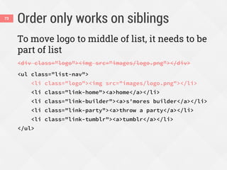
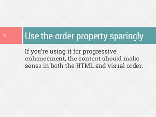
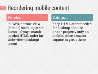
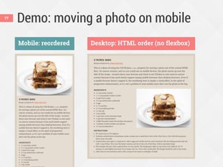
Download as PDF, PPTX


![Combining units of measurement across
a line can make RWD tricky.
ems + % + px + [blank] = ???42](https://image.slidesharecdn.com/enhancing-responsiveness-with-flexboxcss-day150612-150611211156-lva1-app6891/85/Enhancing-Responsiveness-With-Flexbox-CSS-Day-42-320.jpg)


![Combining units of measurement across
a line can make RWD tricky.
ems + % + px + [blank] = ???42](https://image.slidesharecdn.com/enhancing-responsiveness-with-flexboxcss-day150612-150611211156-lva1-app6891/75/Enhancing-Responsiveness-With-Flexbox-CSS-Day-42-2048.jpg)
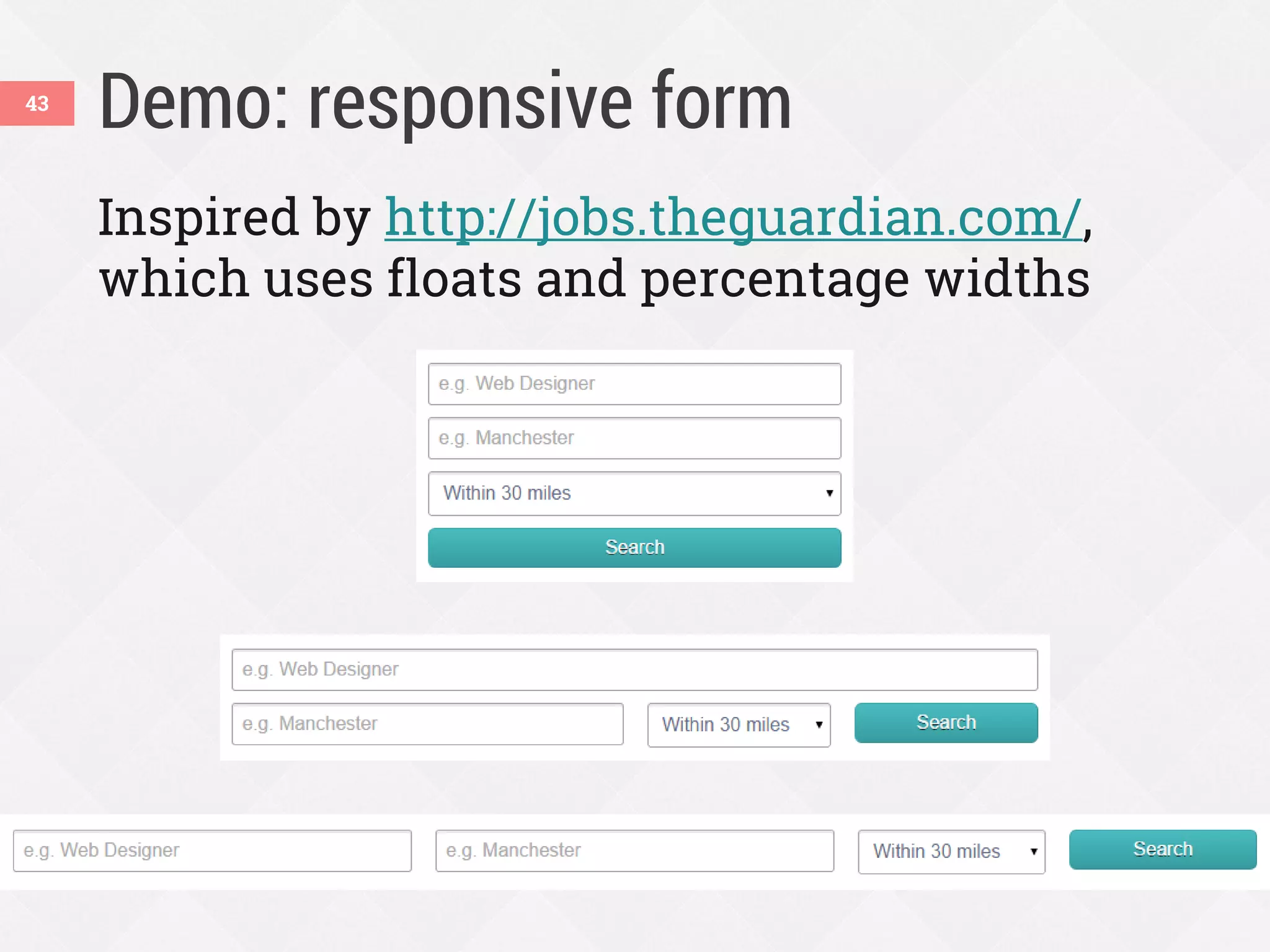
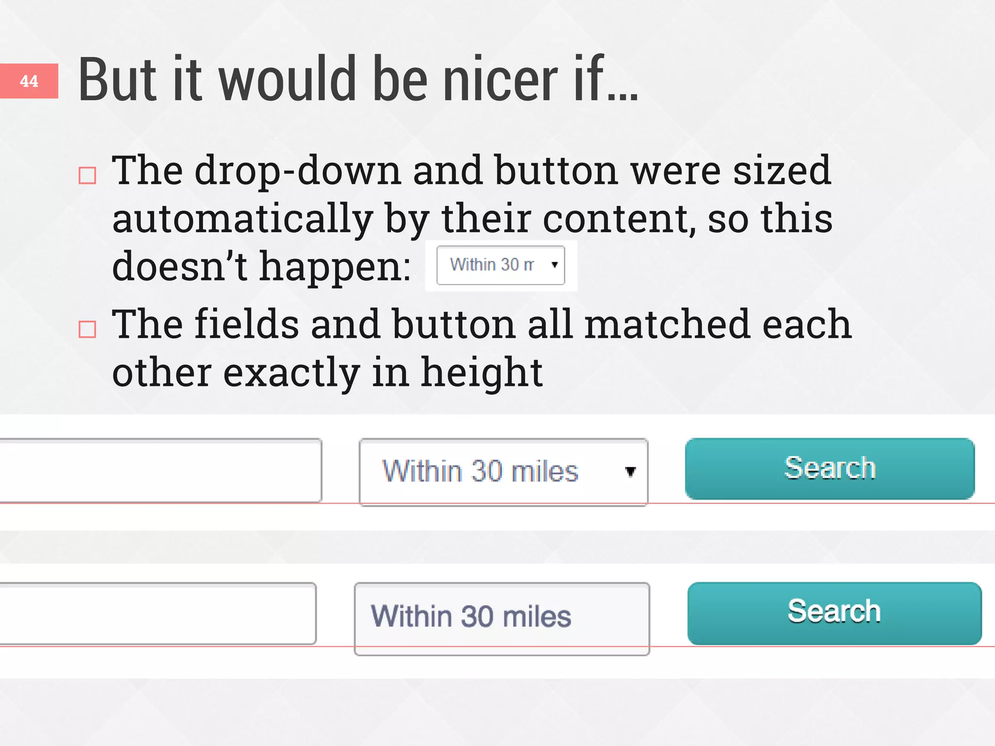
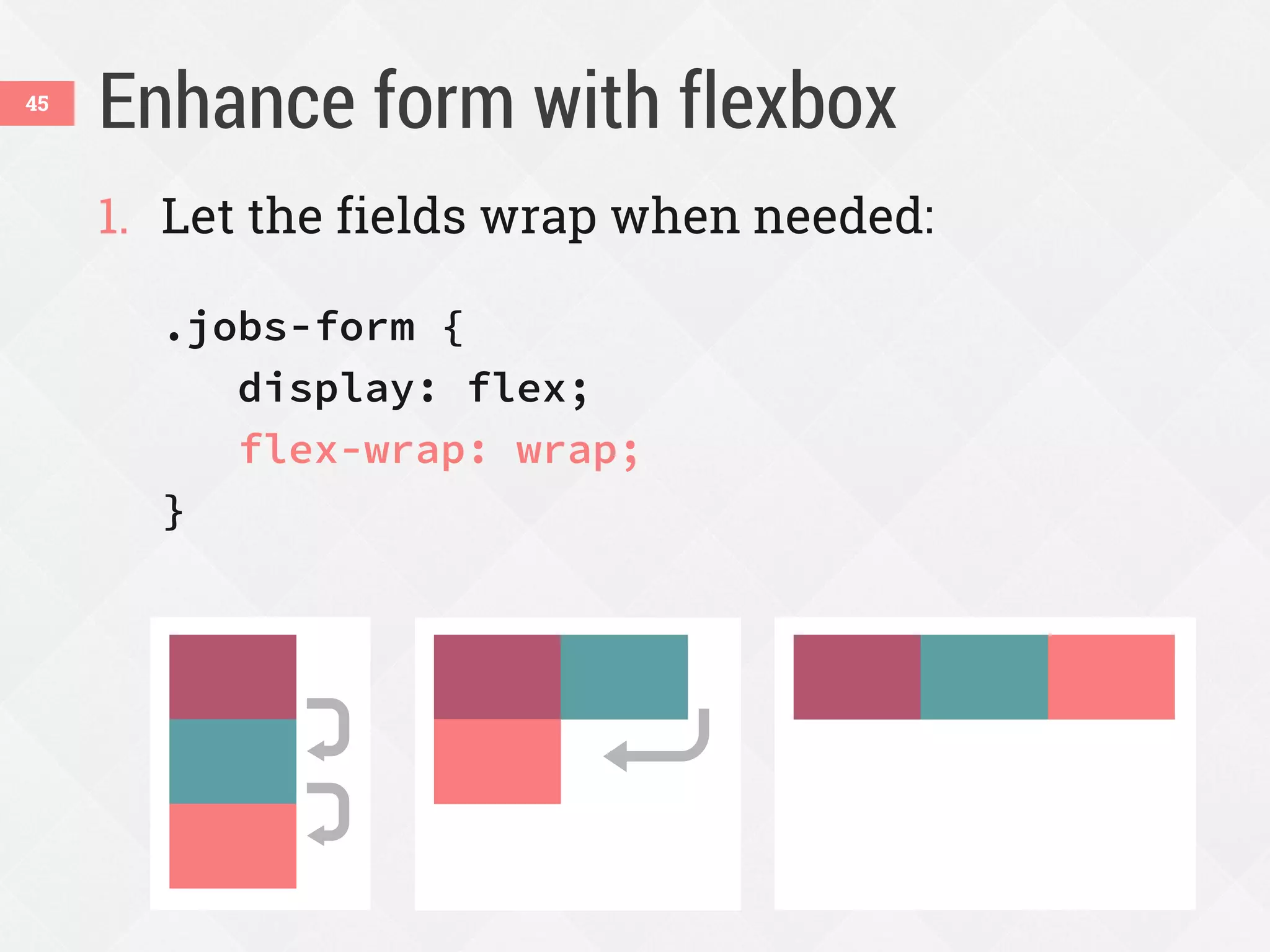
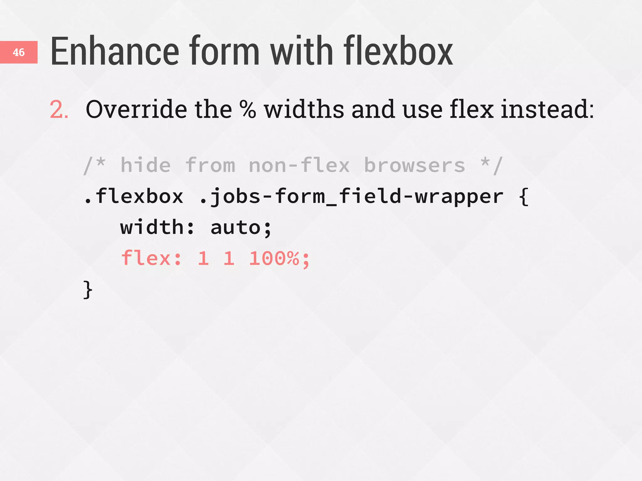
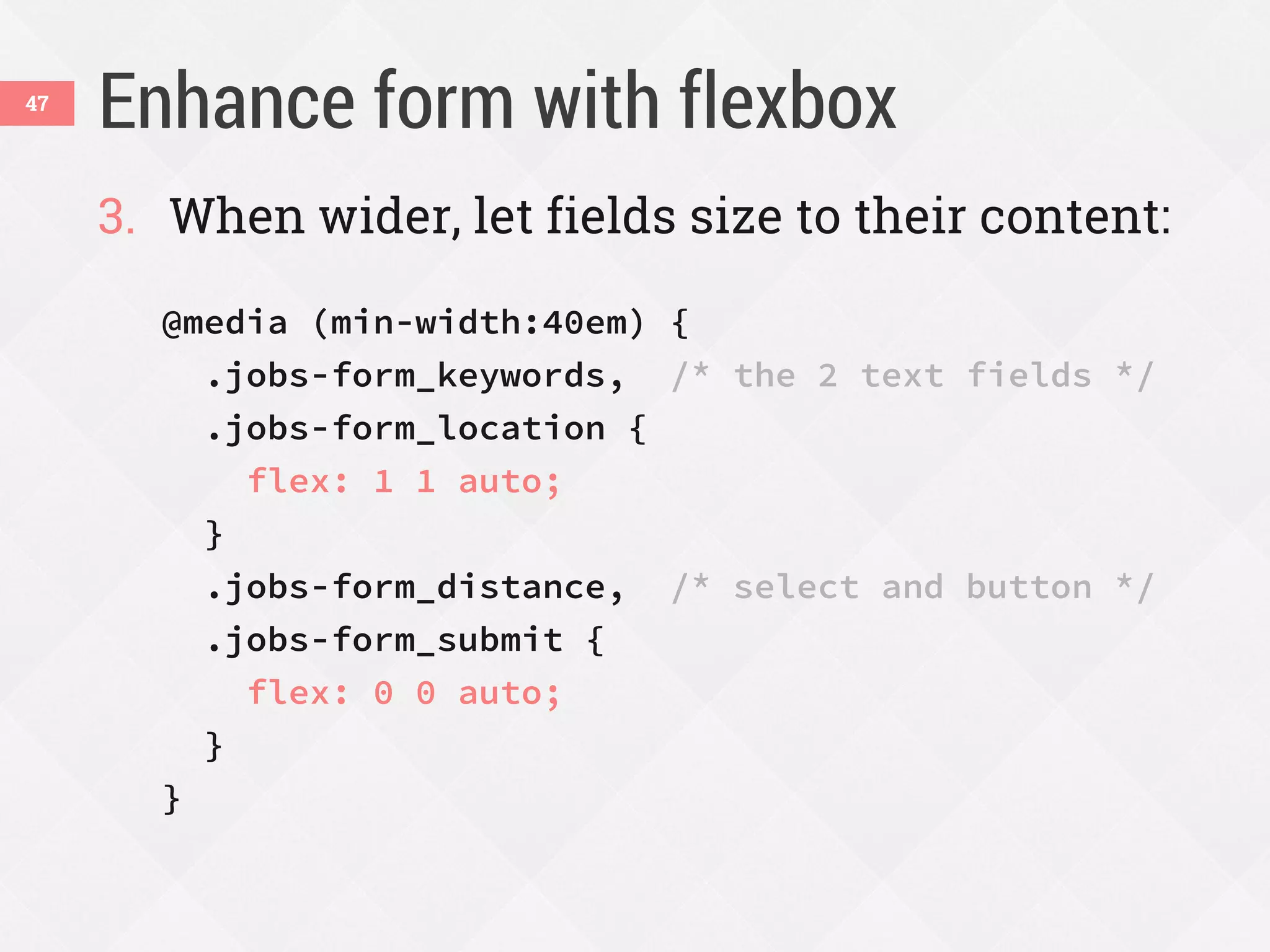
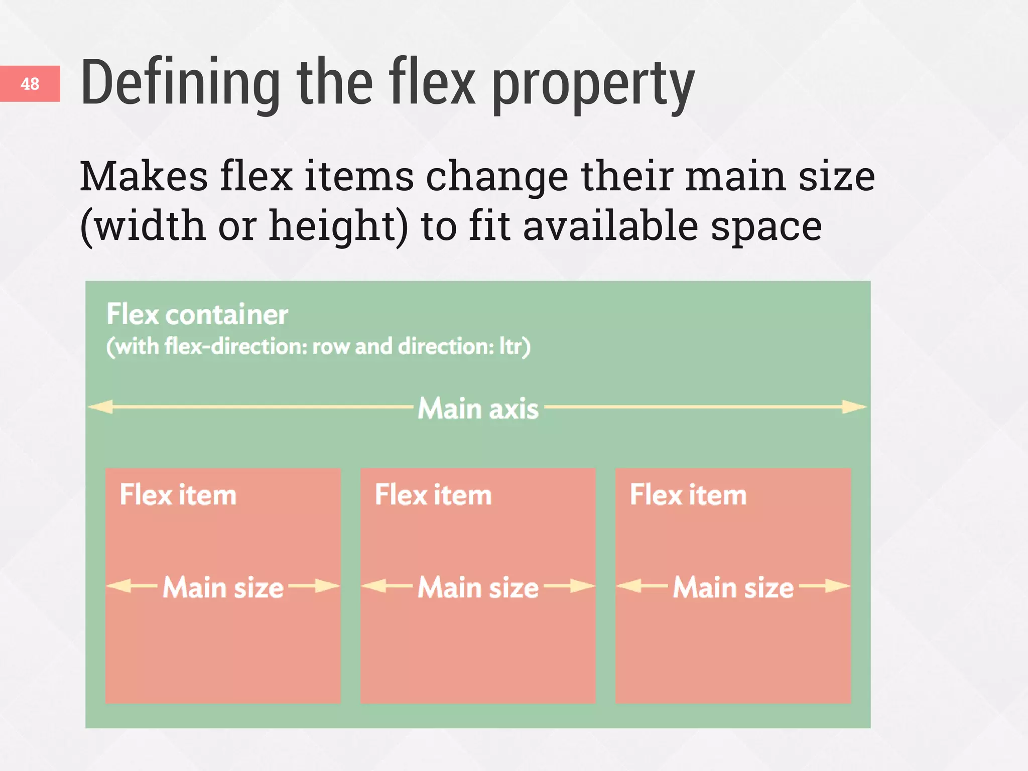
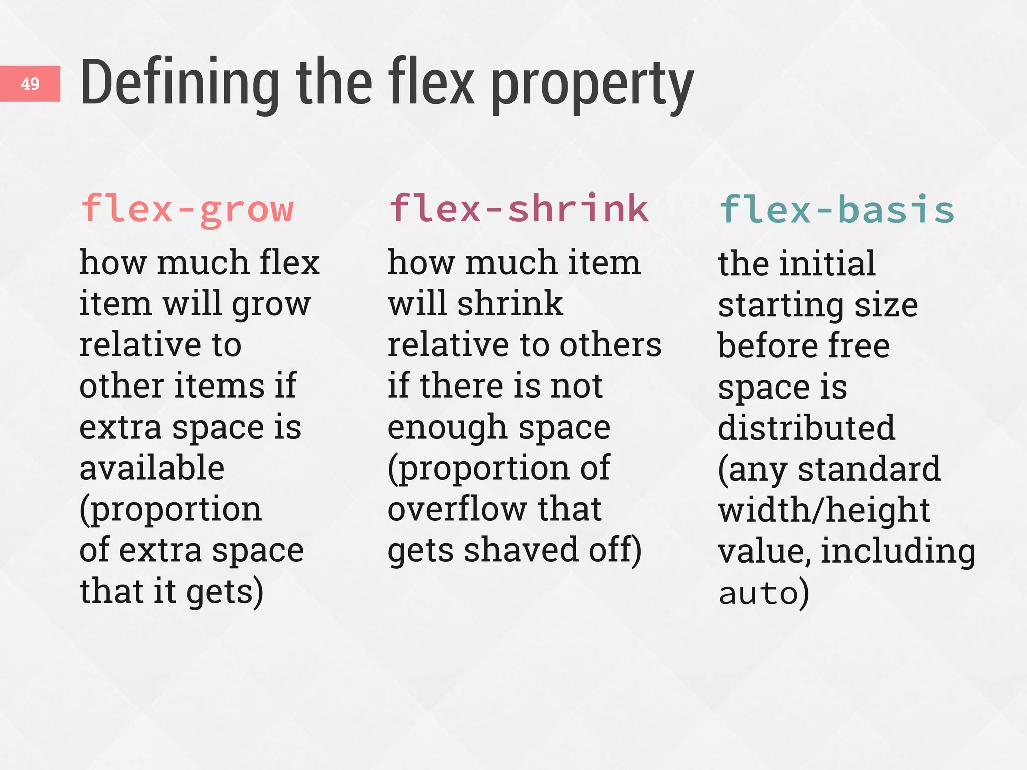
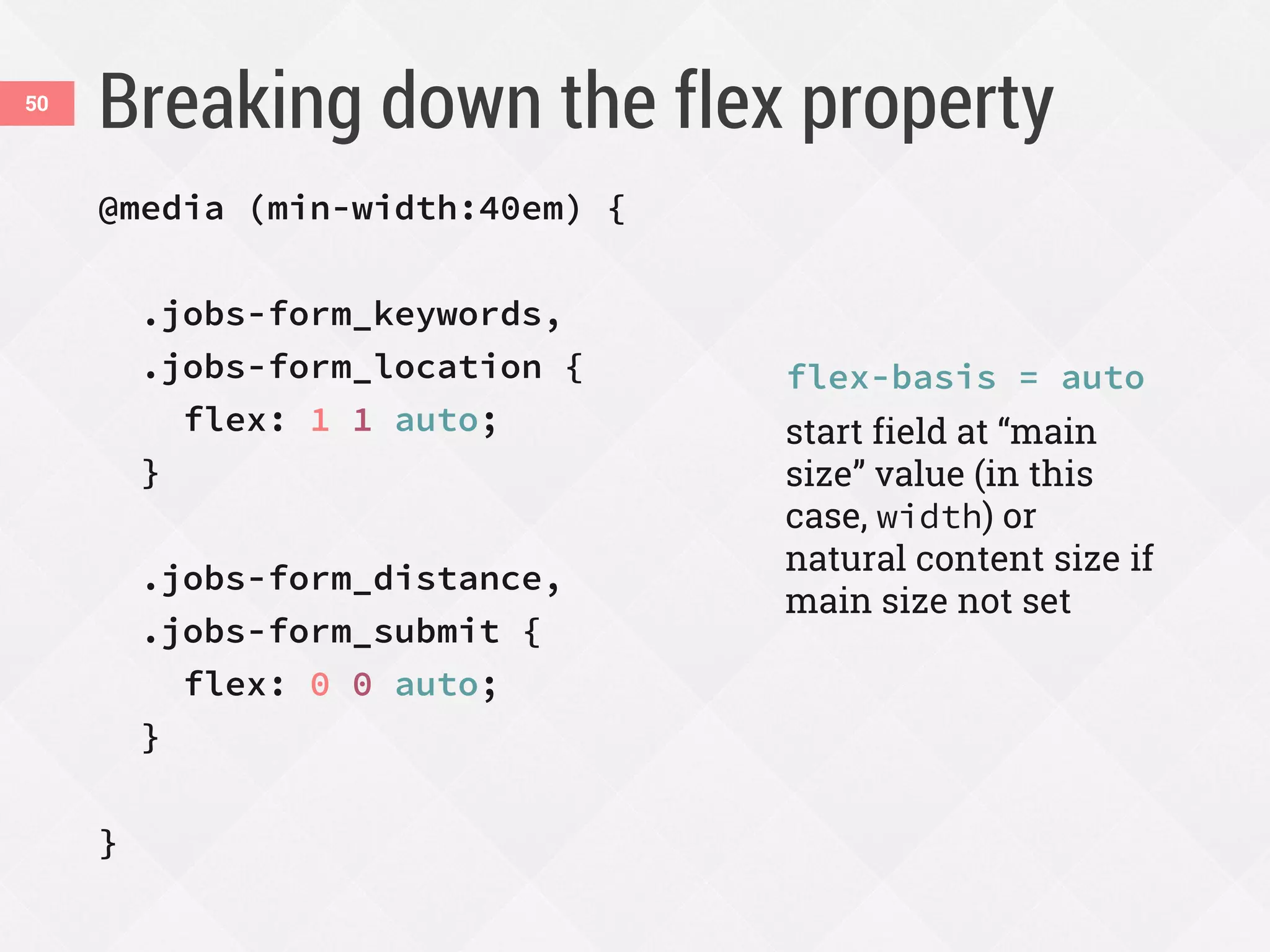
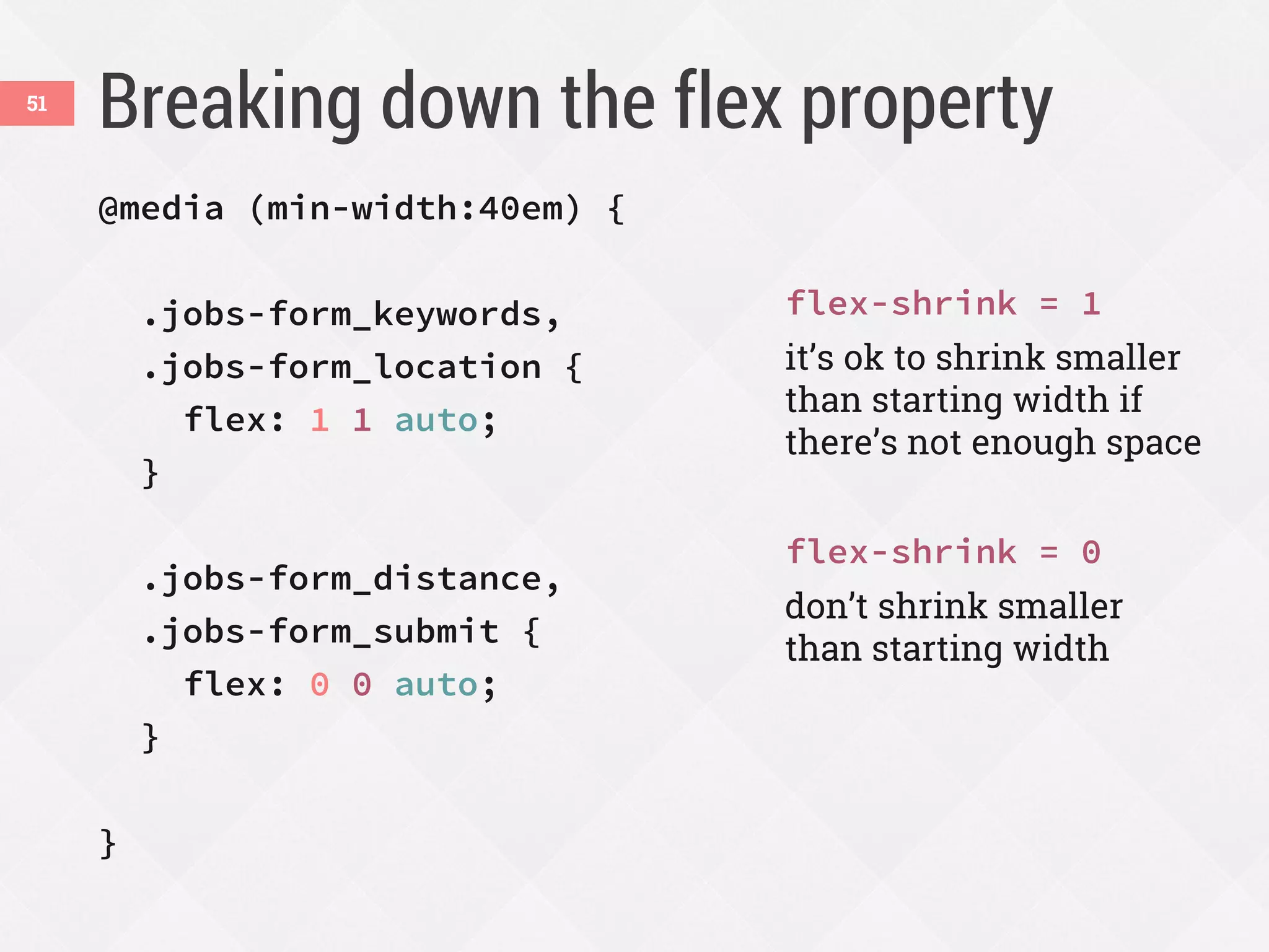
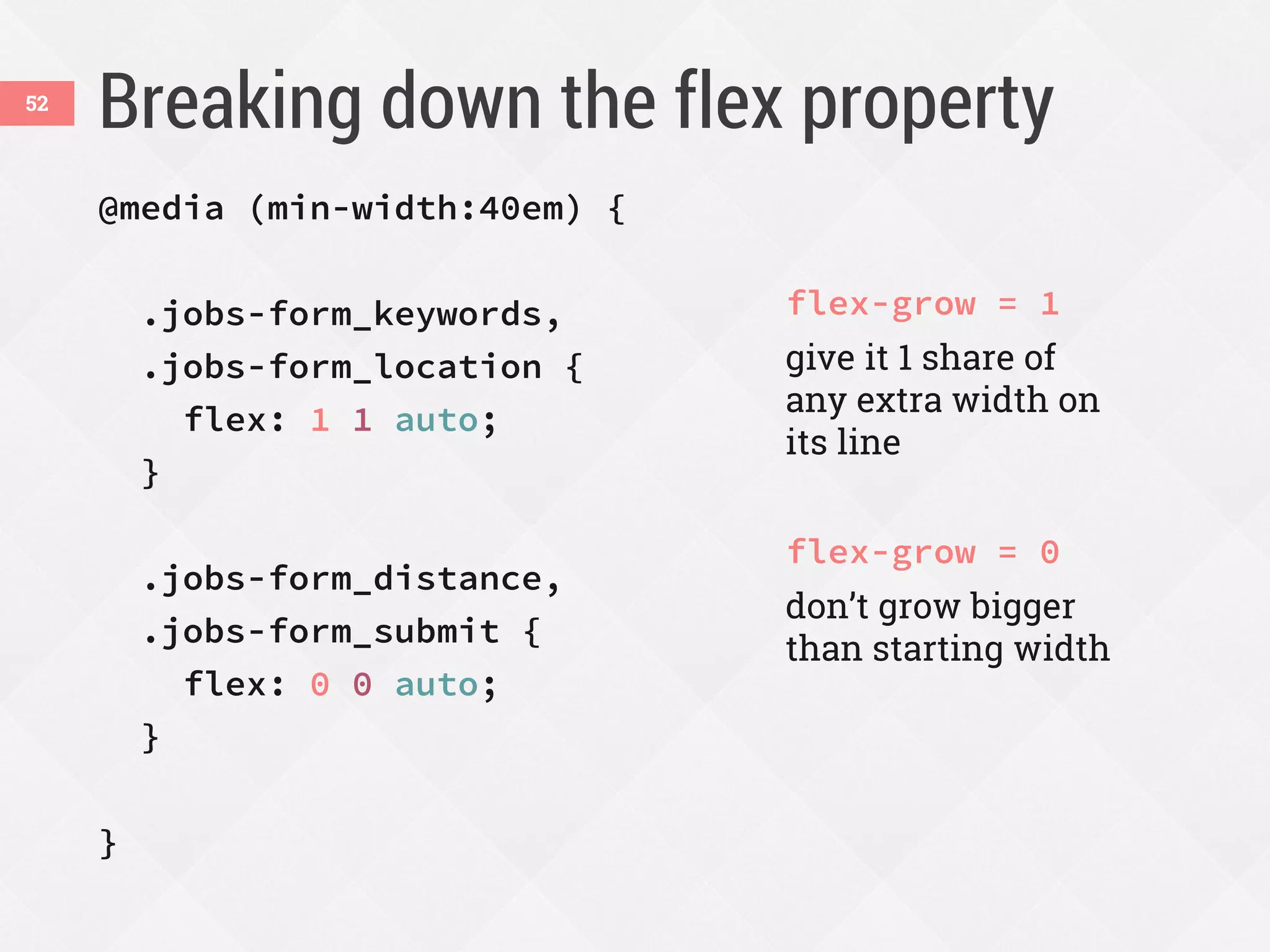

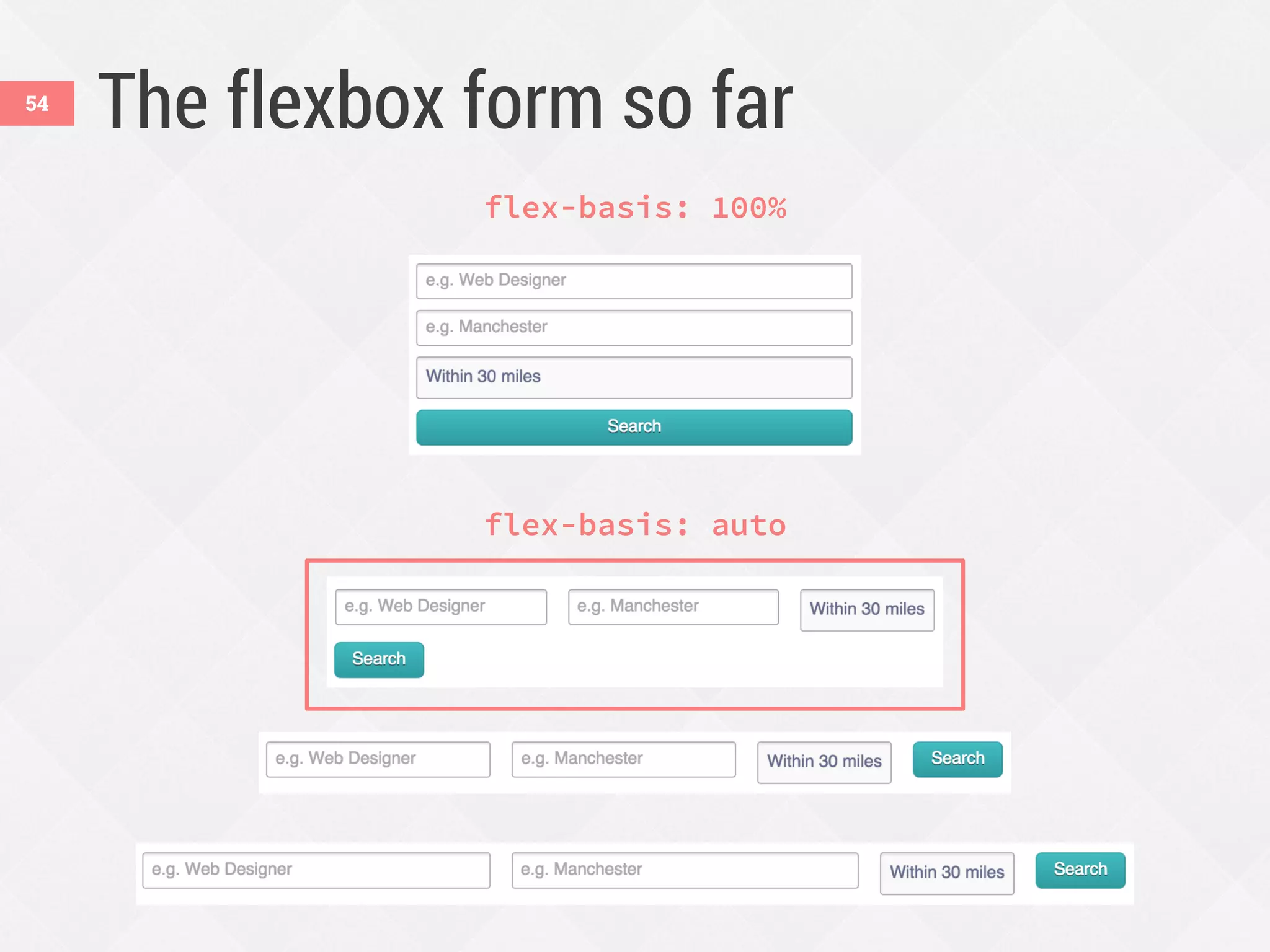
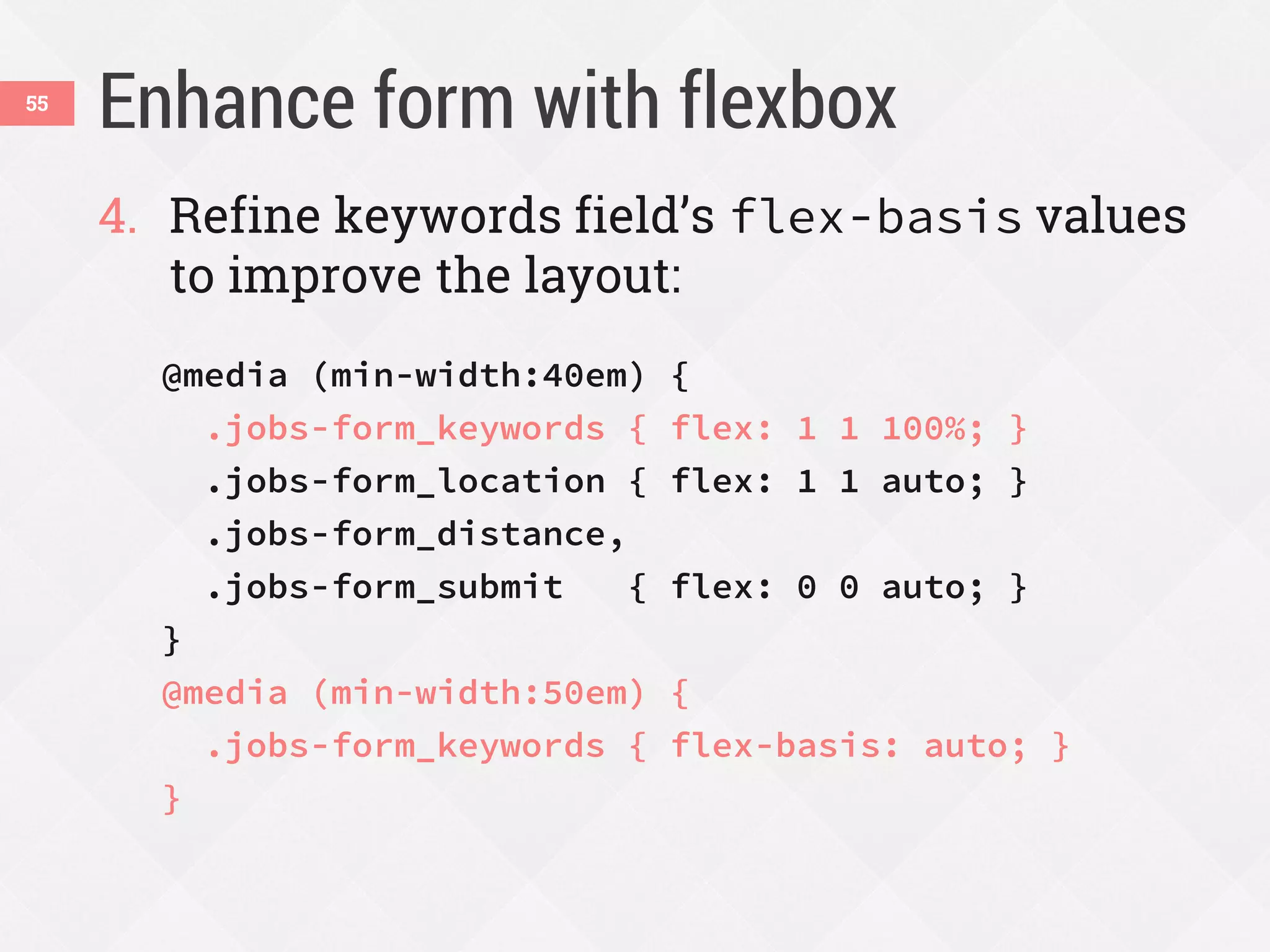
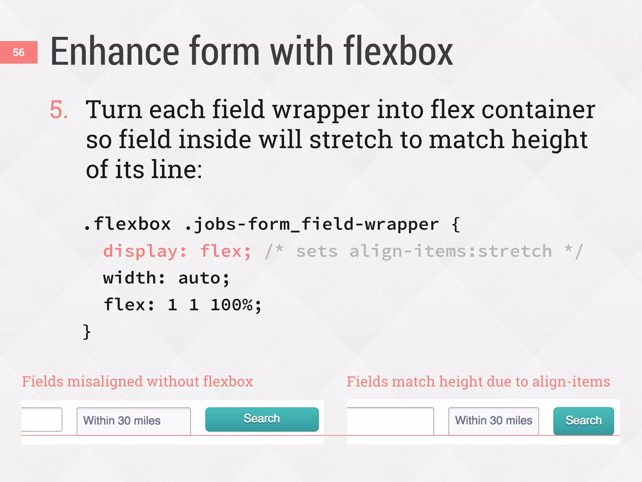
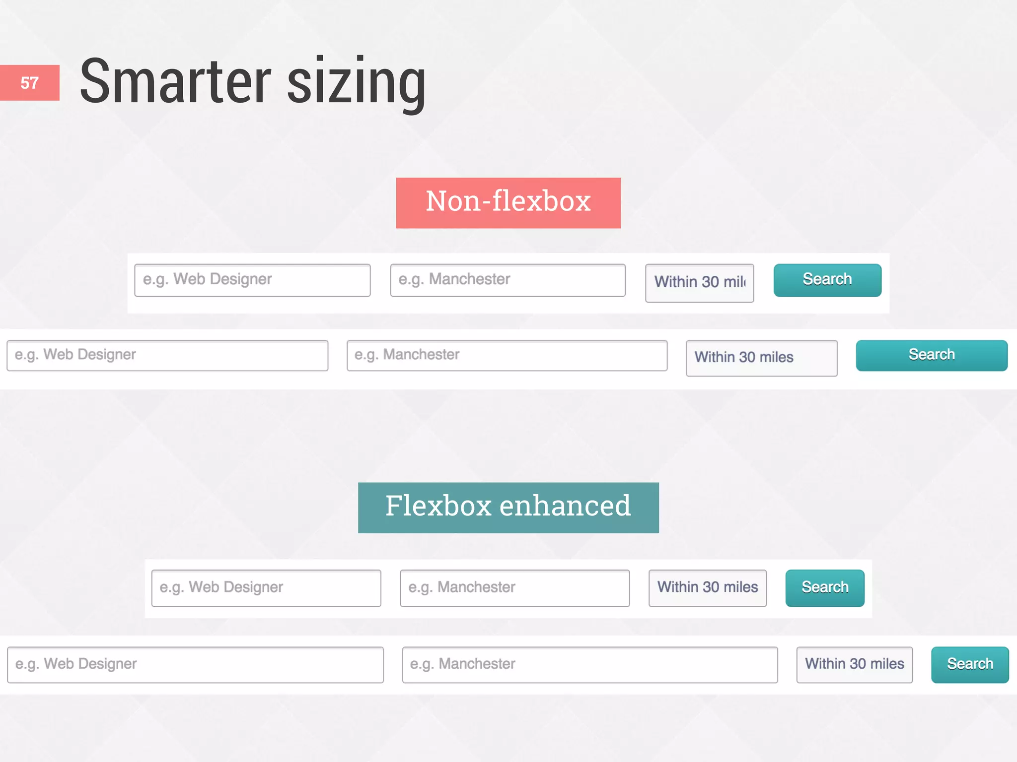

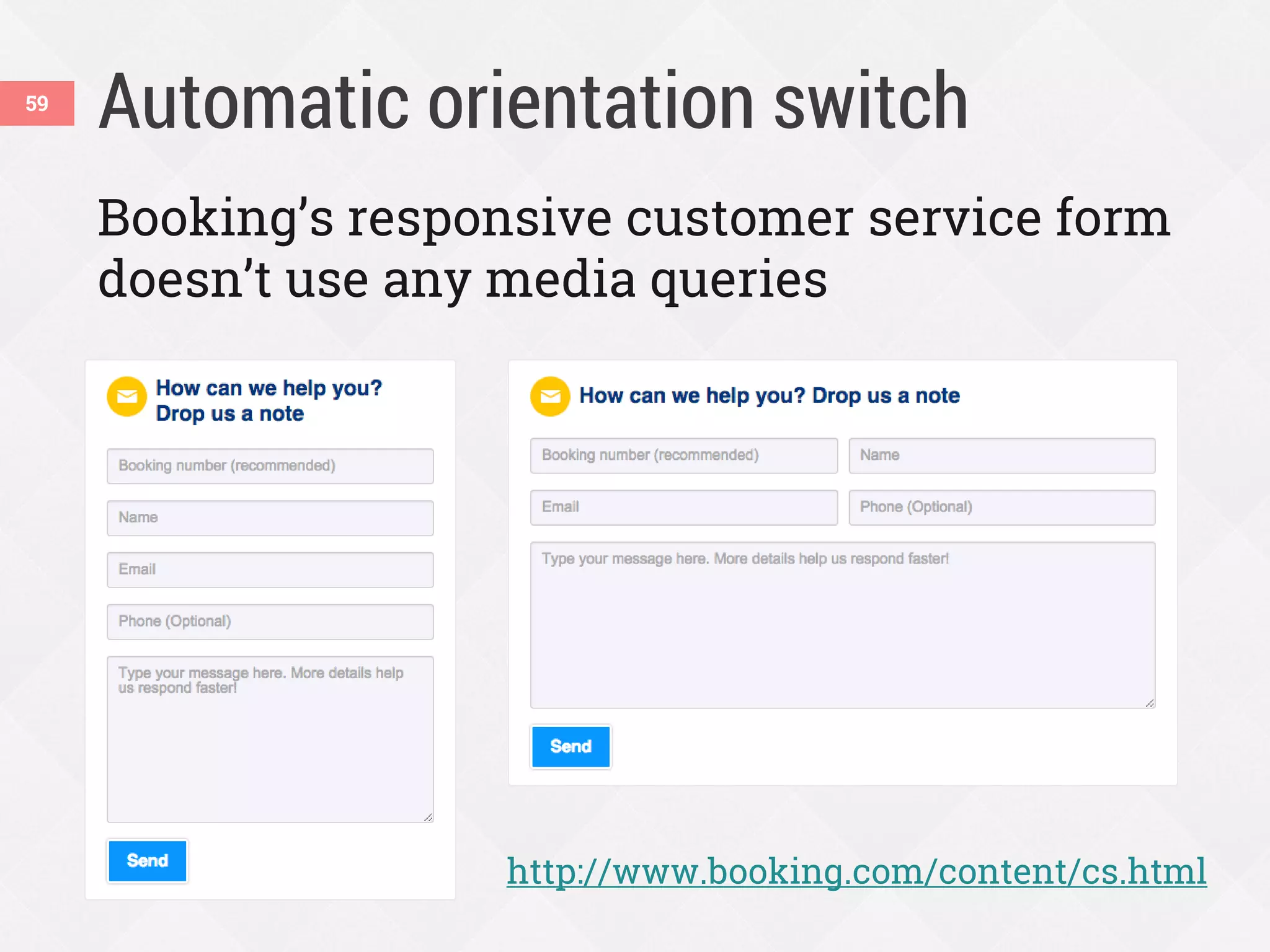
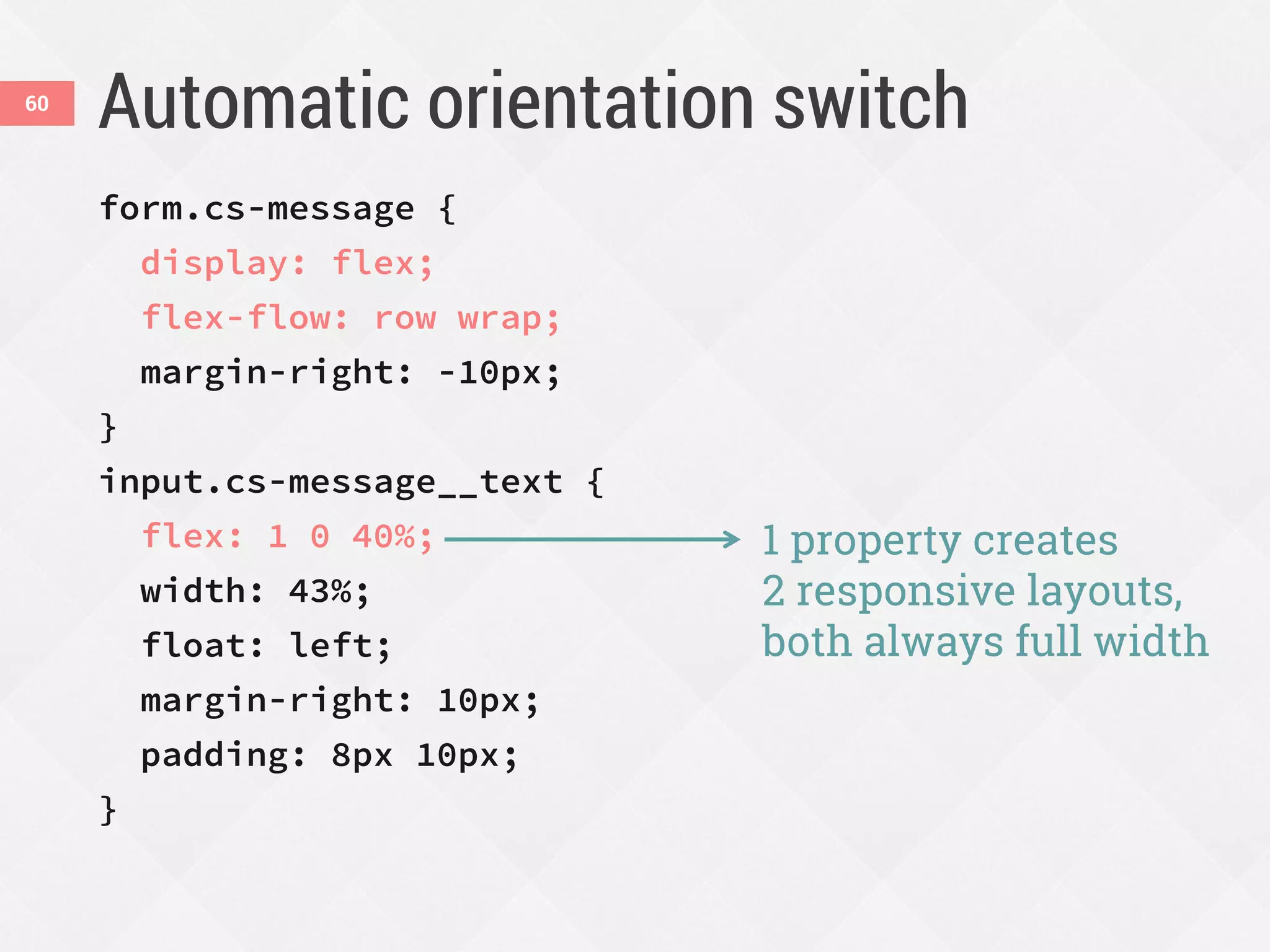
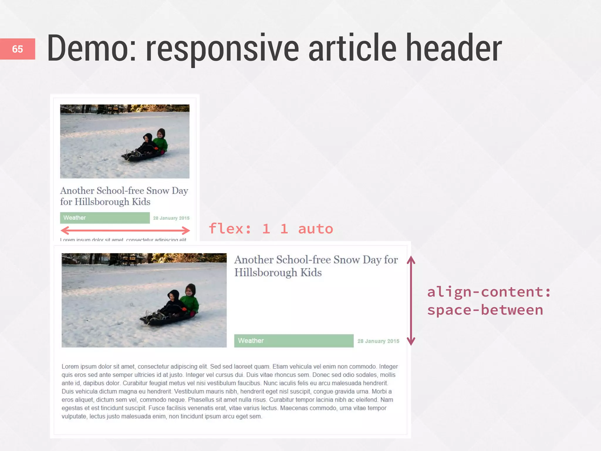
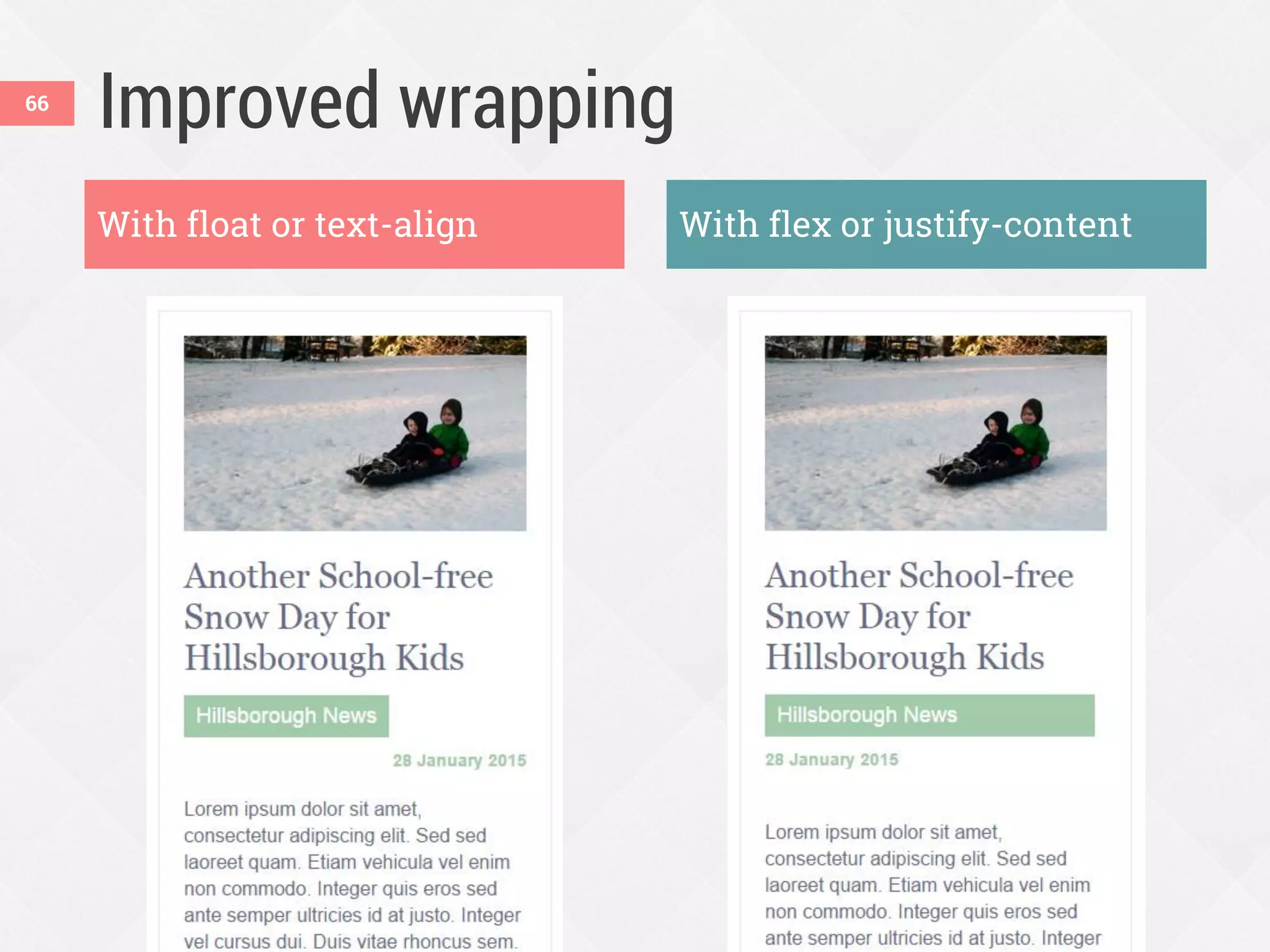
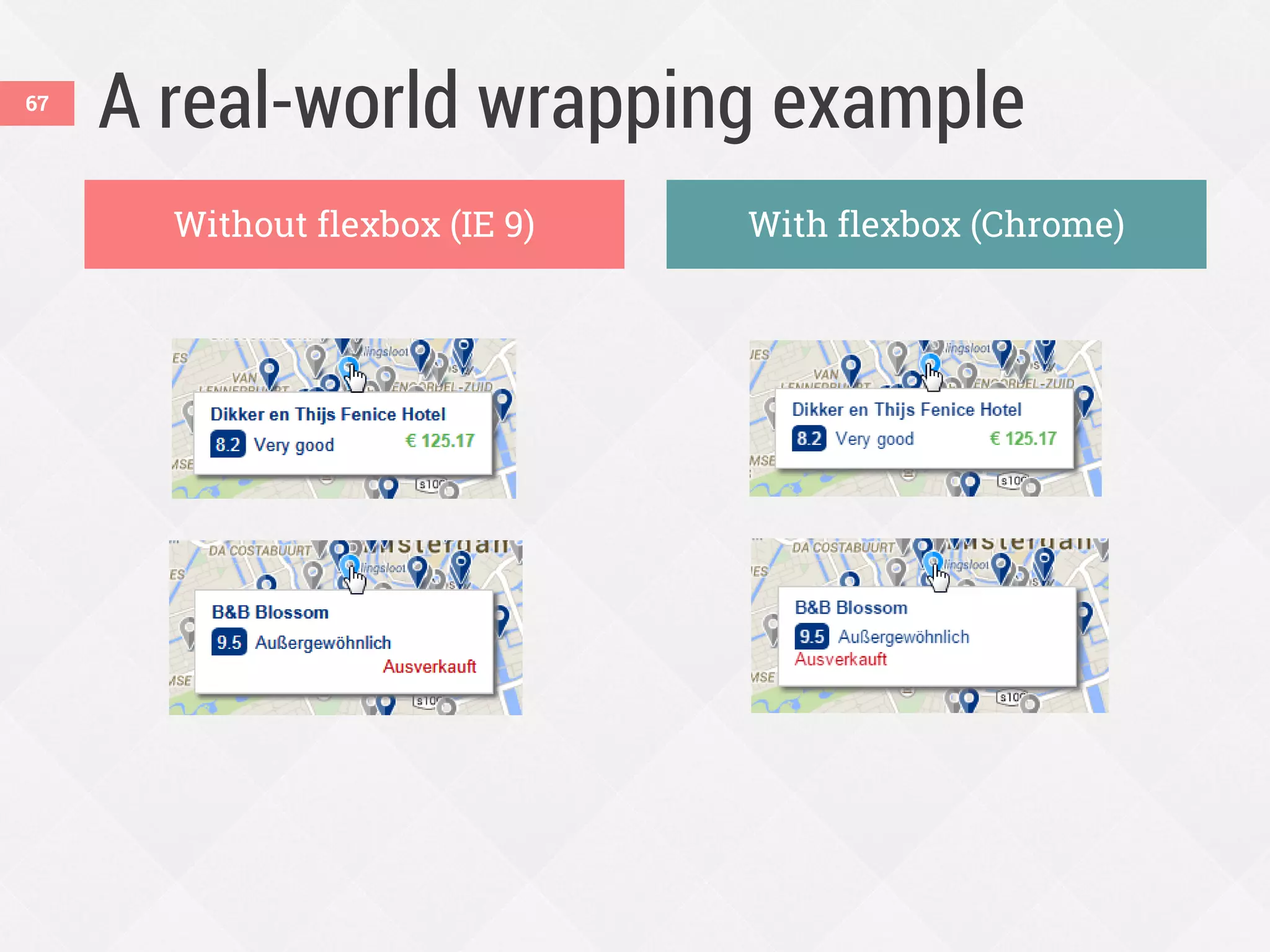
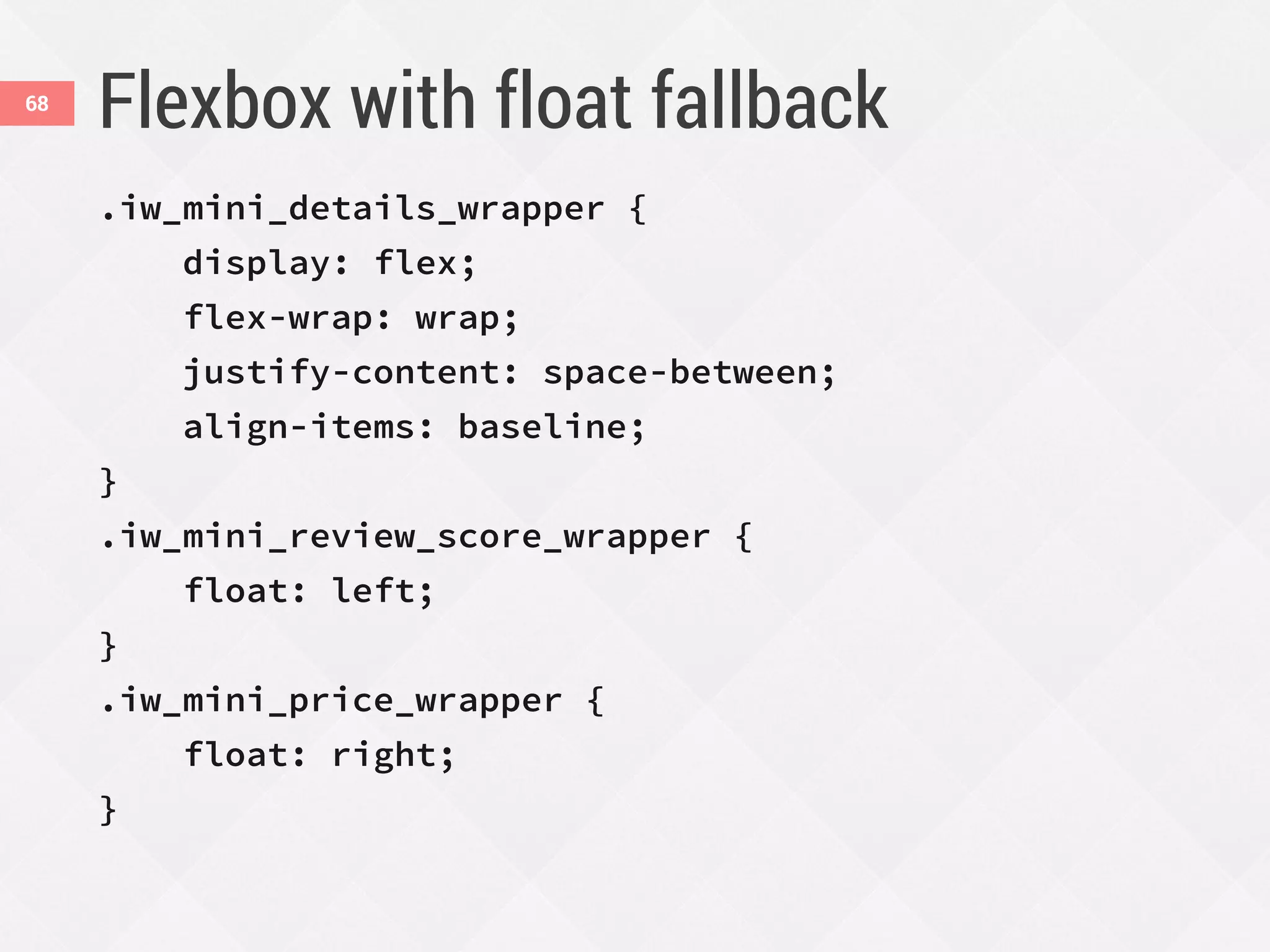
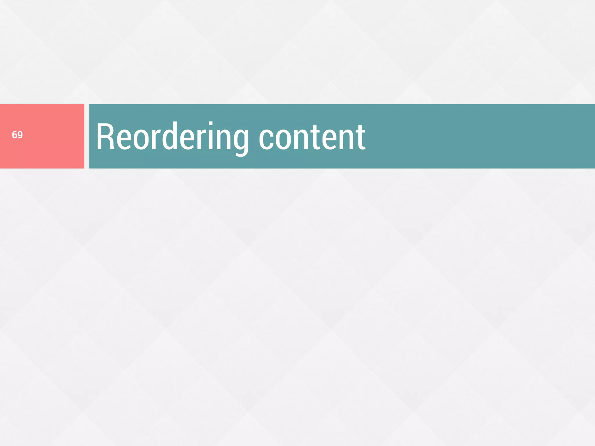

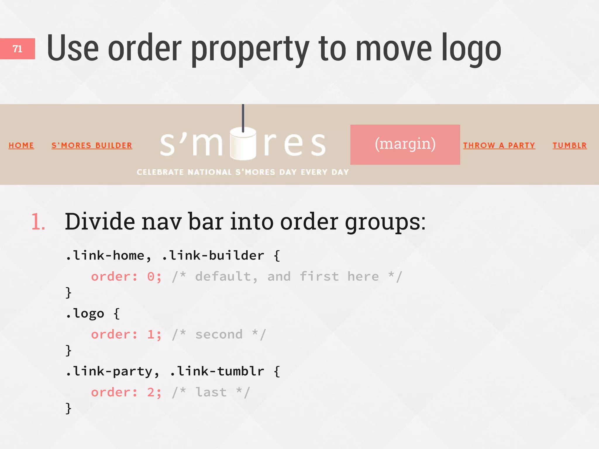
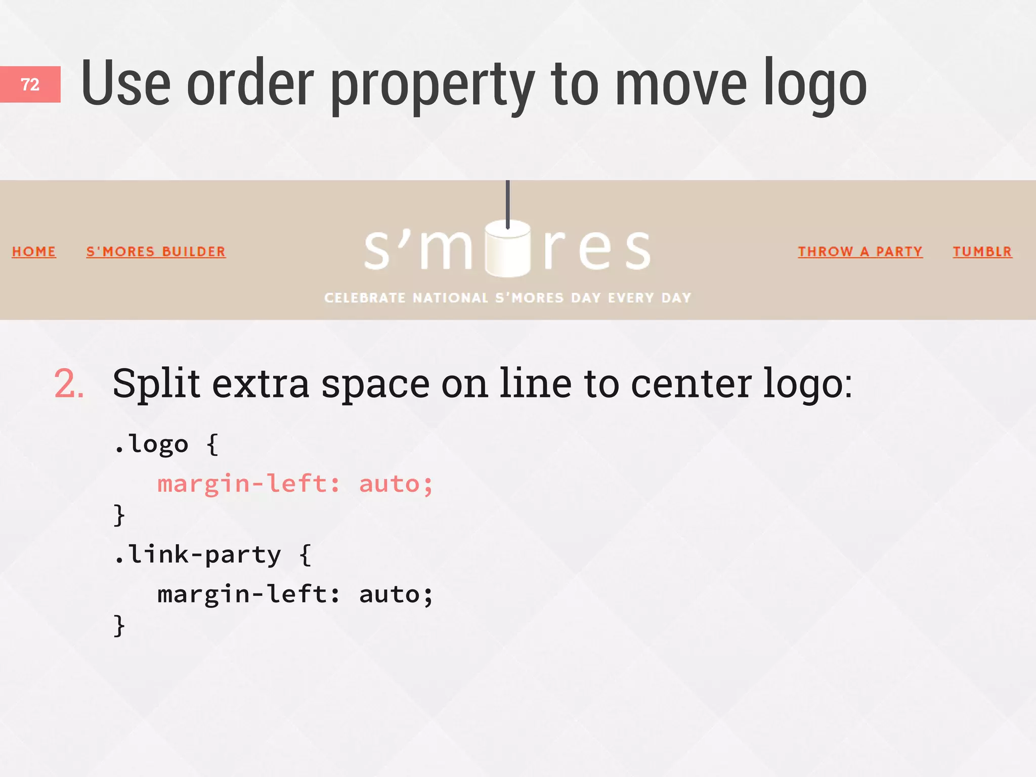

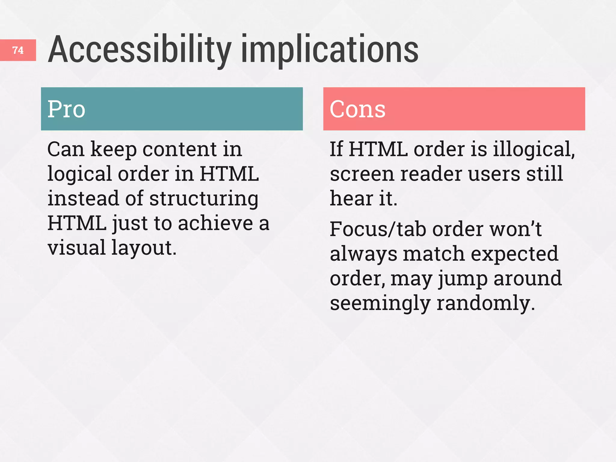

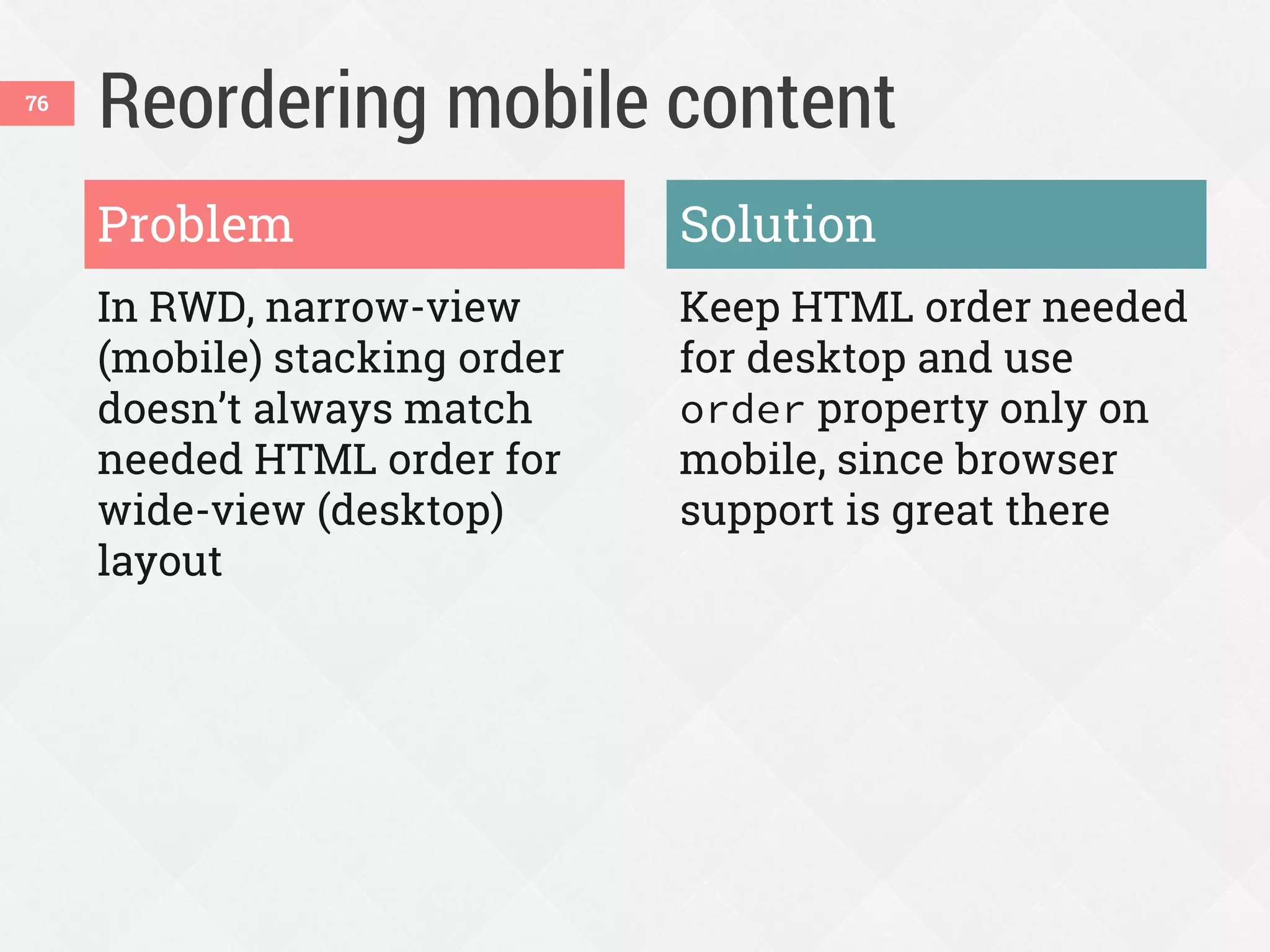

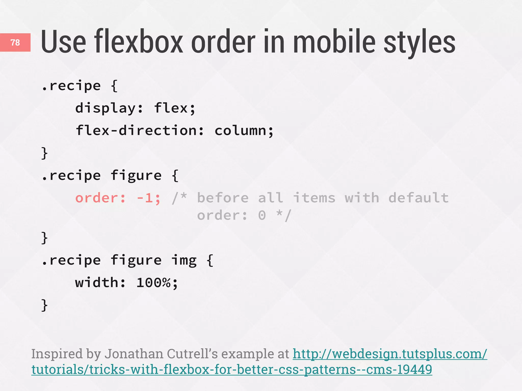


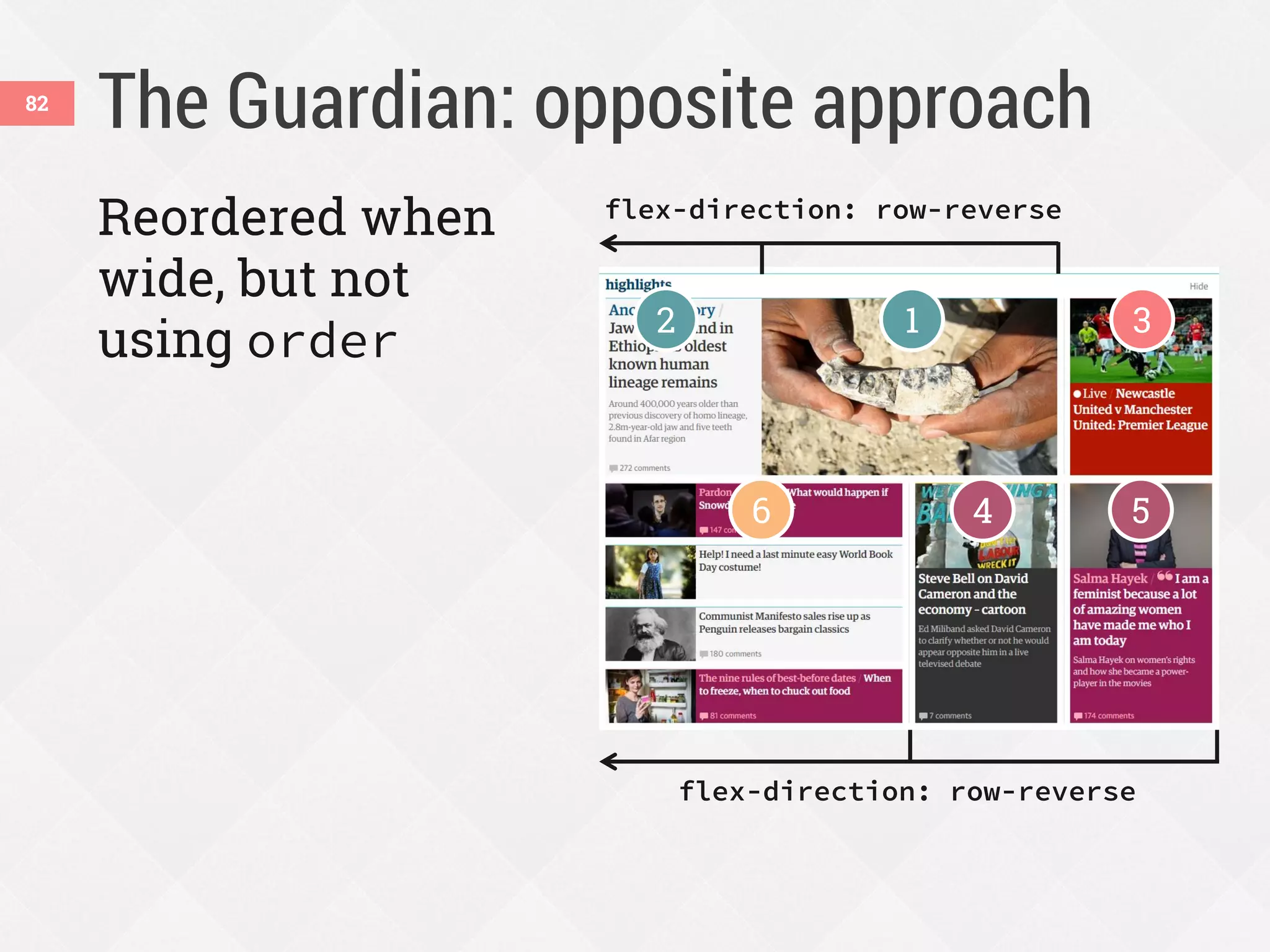
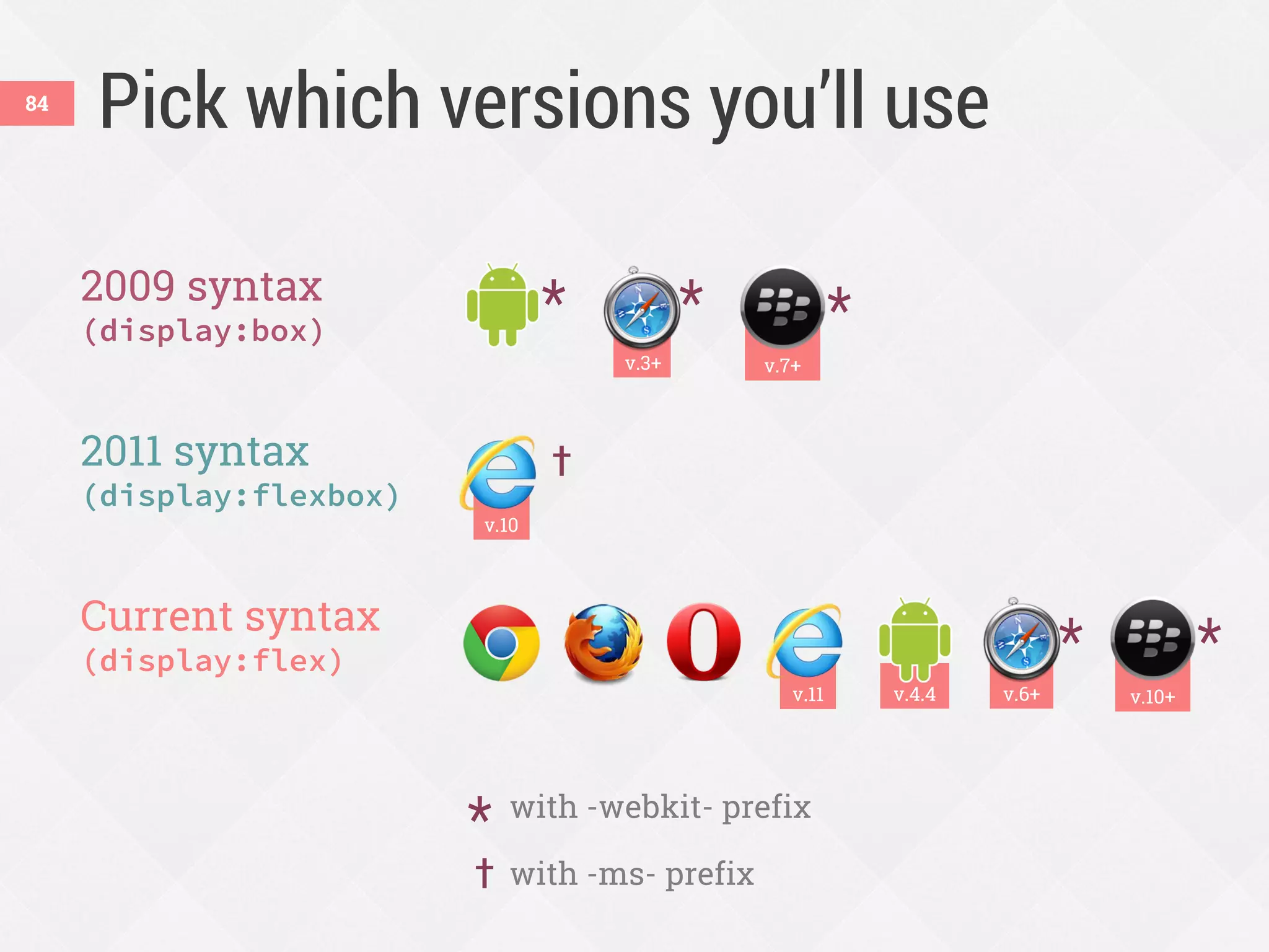


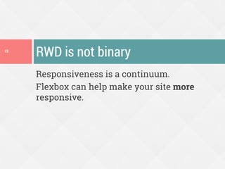
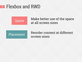
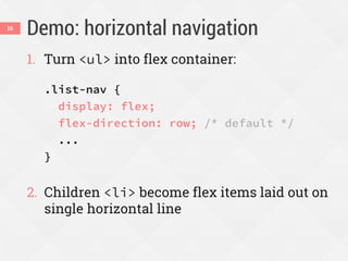
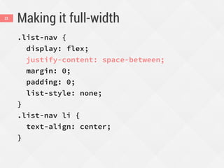
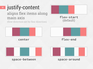
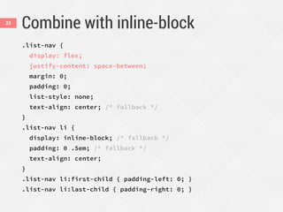
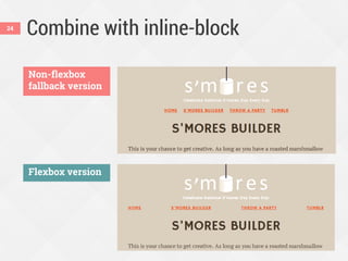
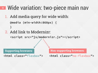
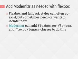
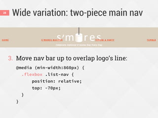
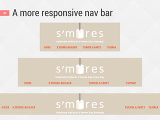
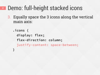
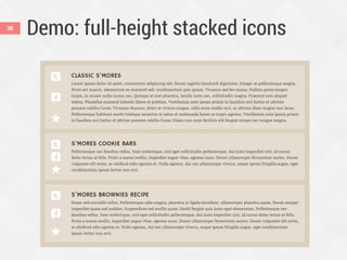
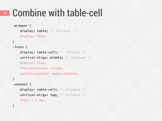
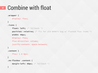
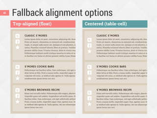
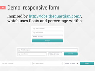
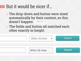
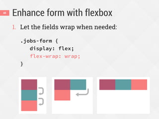
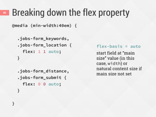
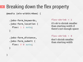
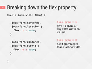
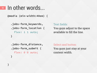
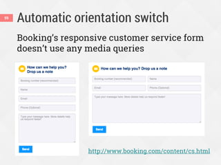
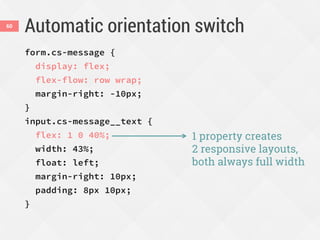
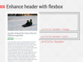
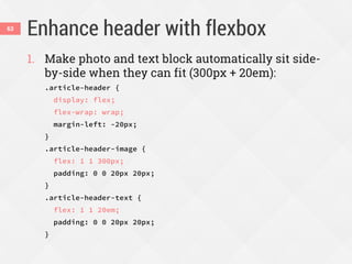
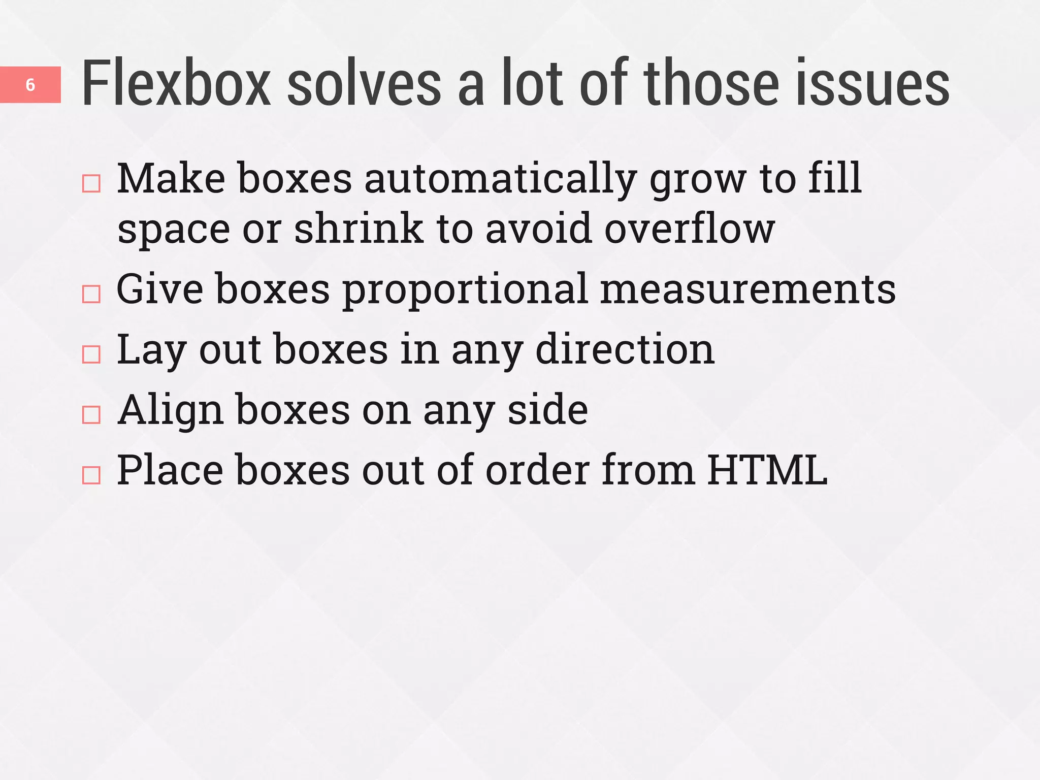
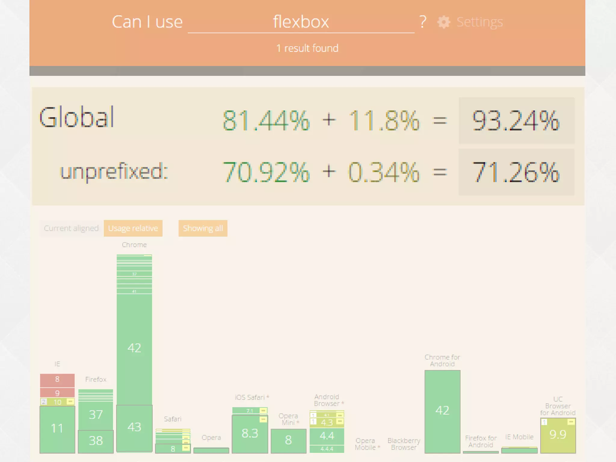
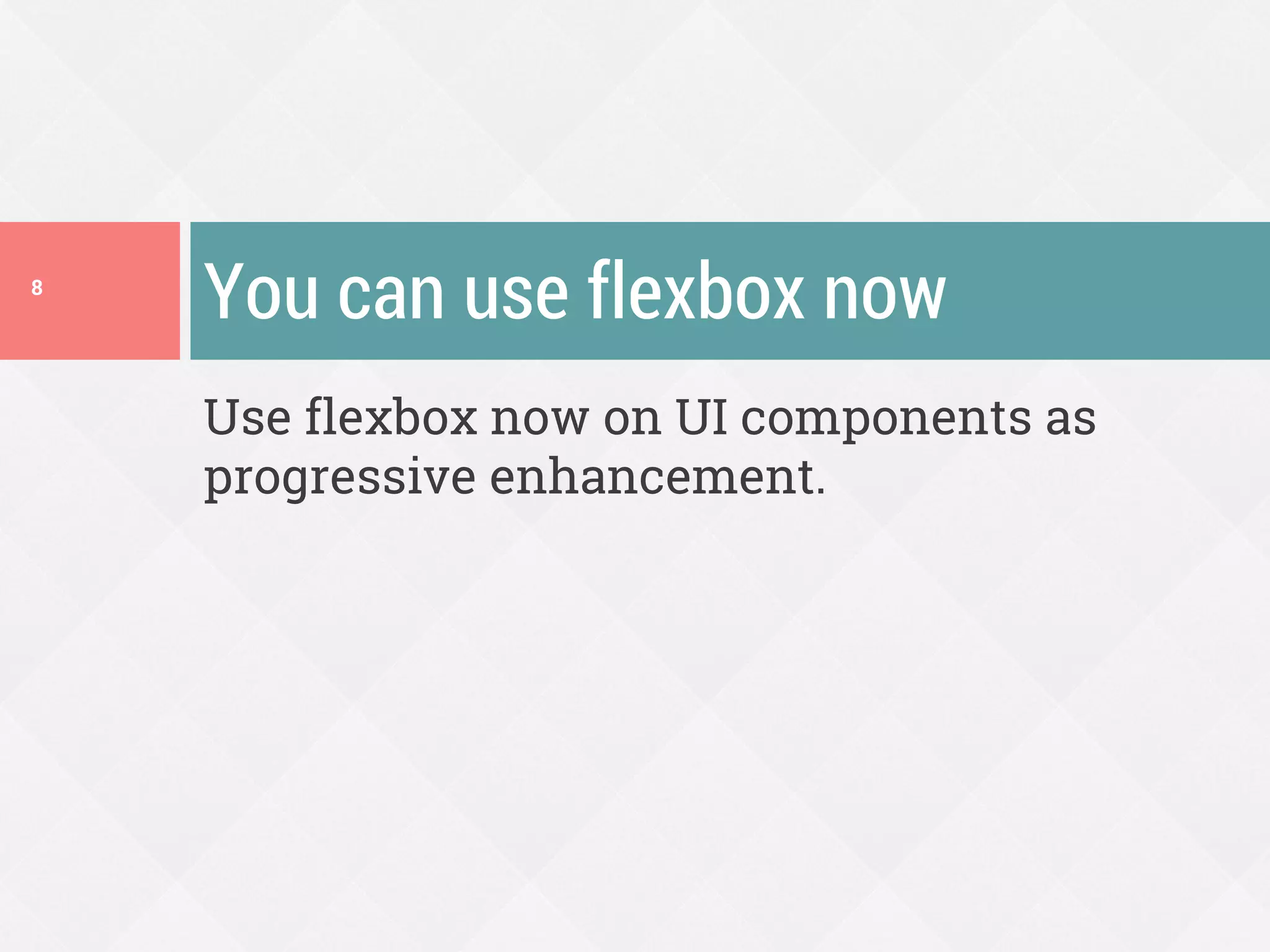
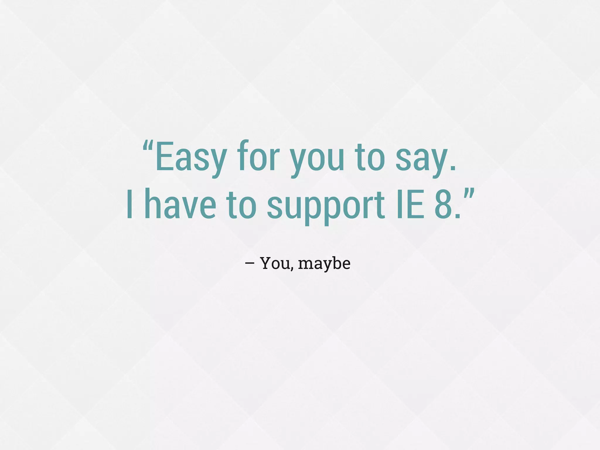
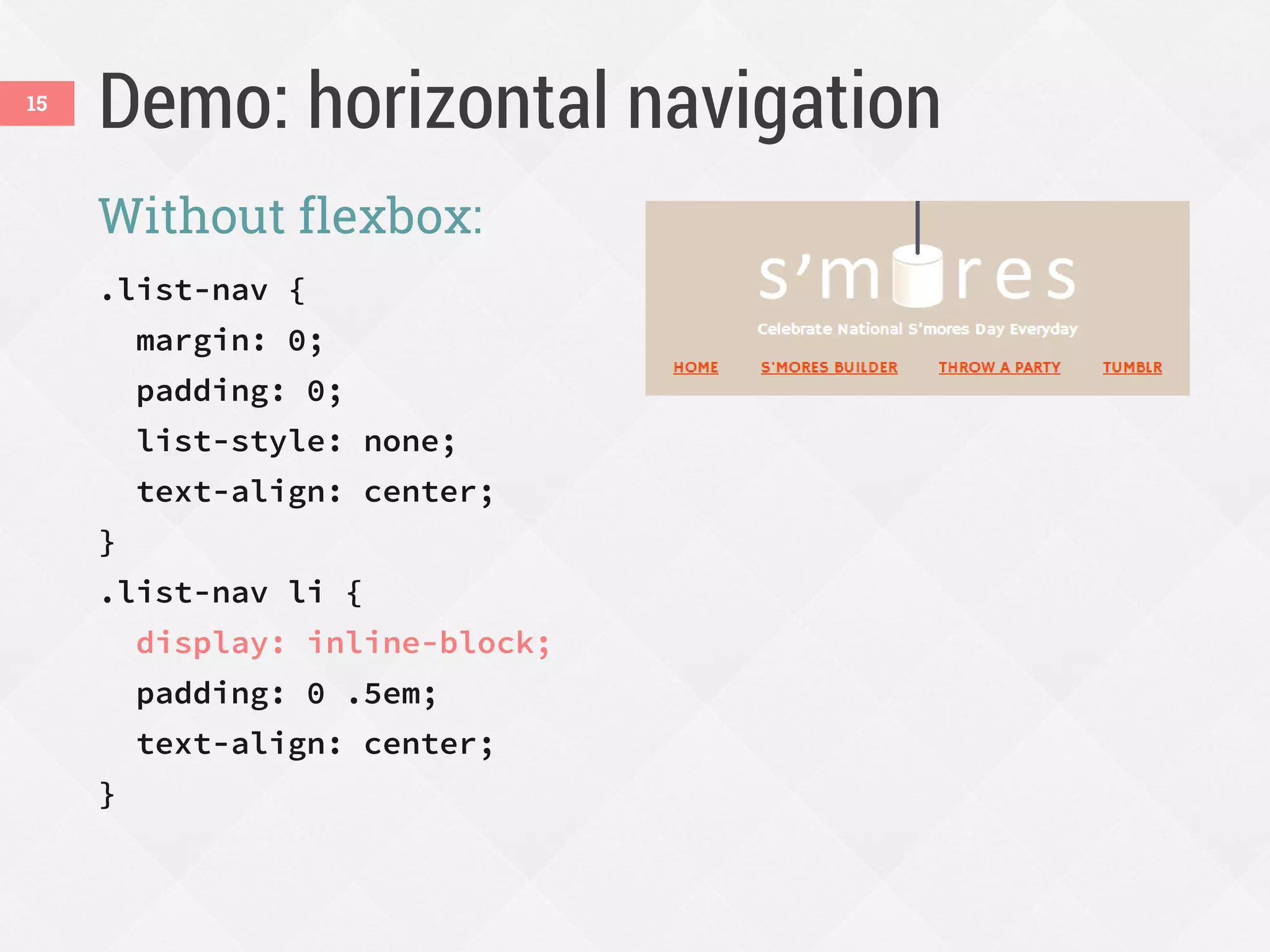
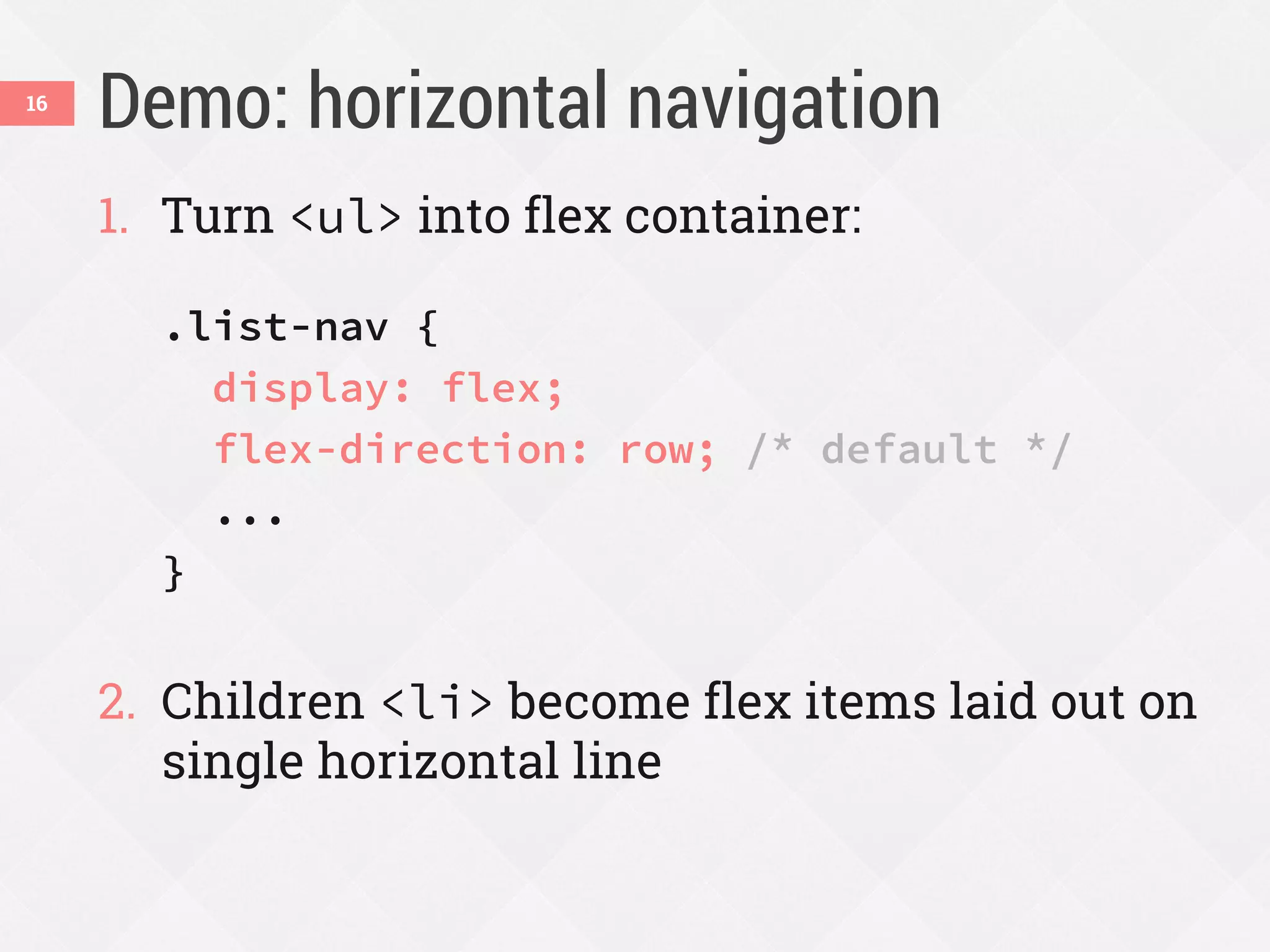
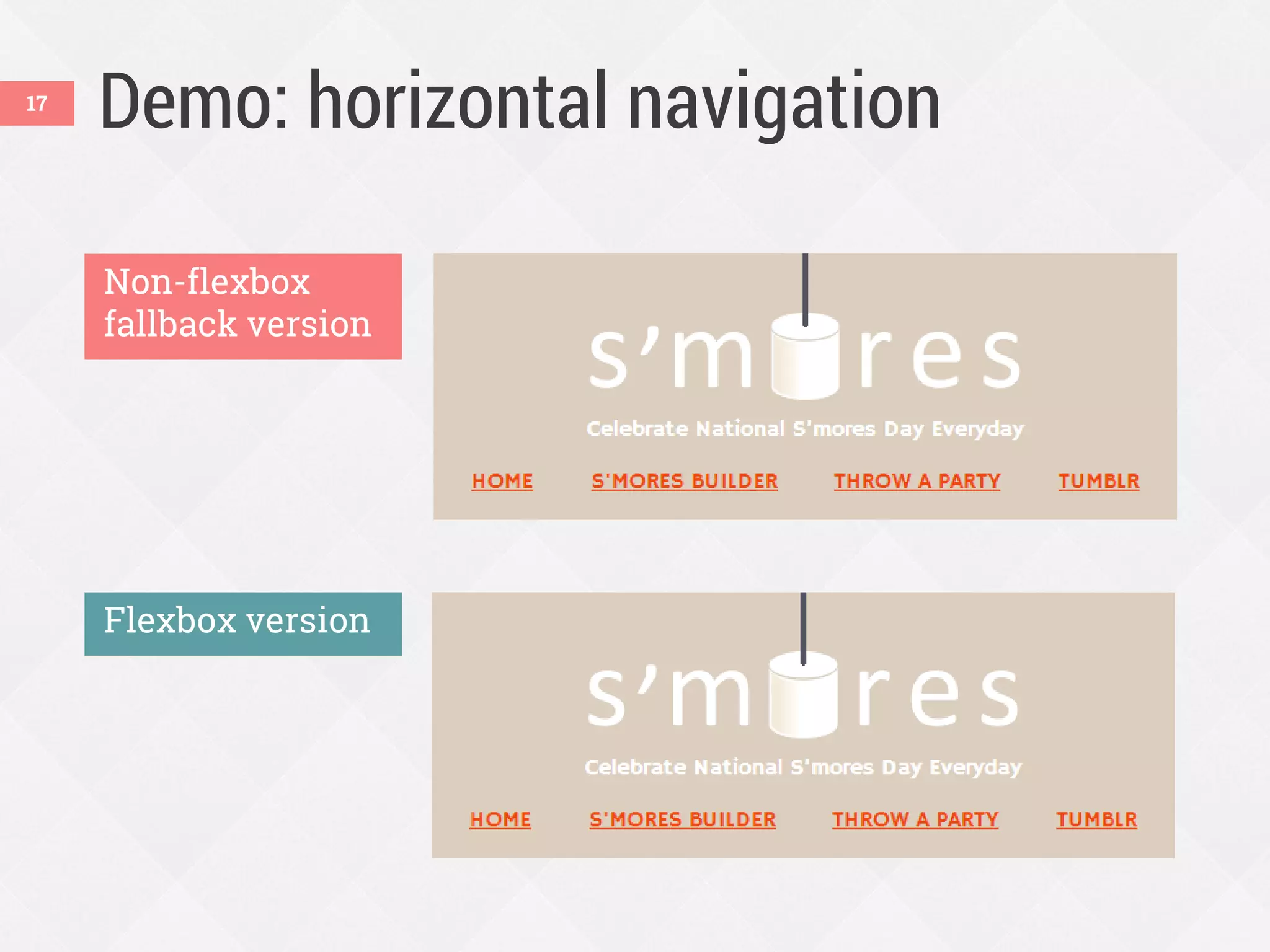
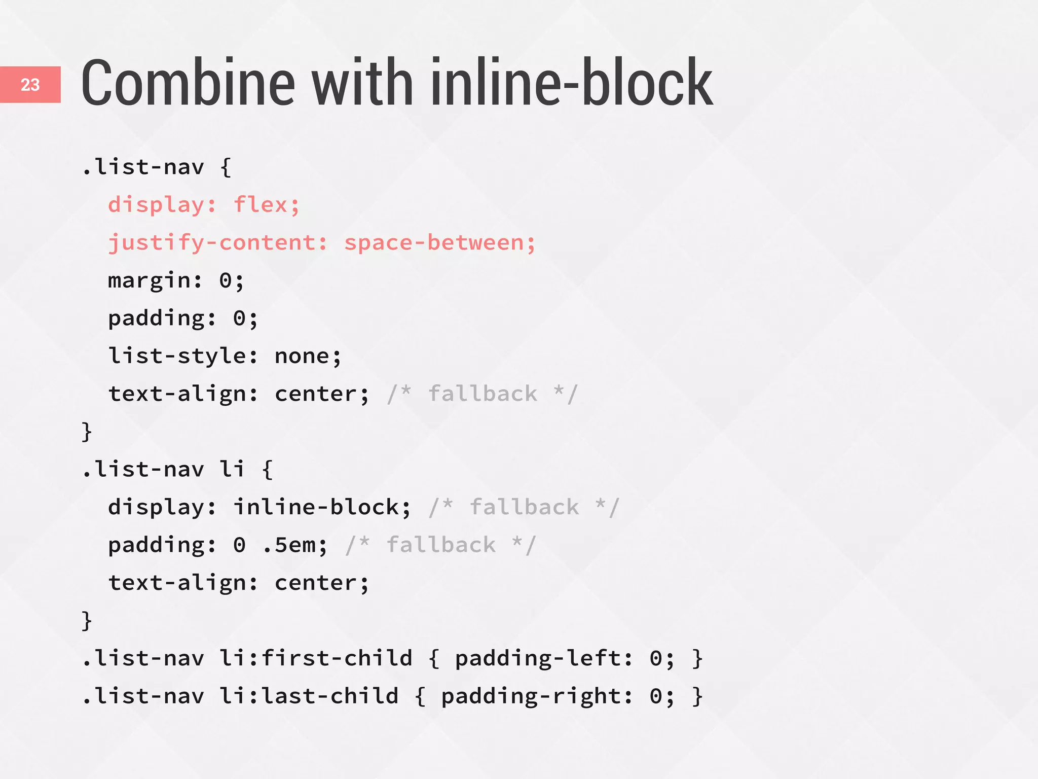
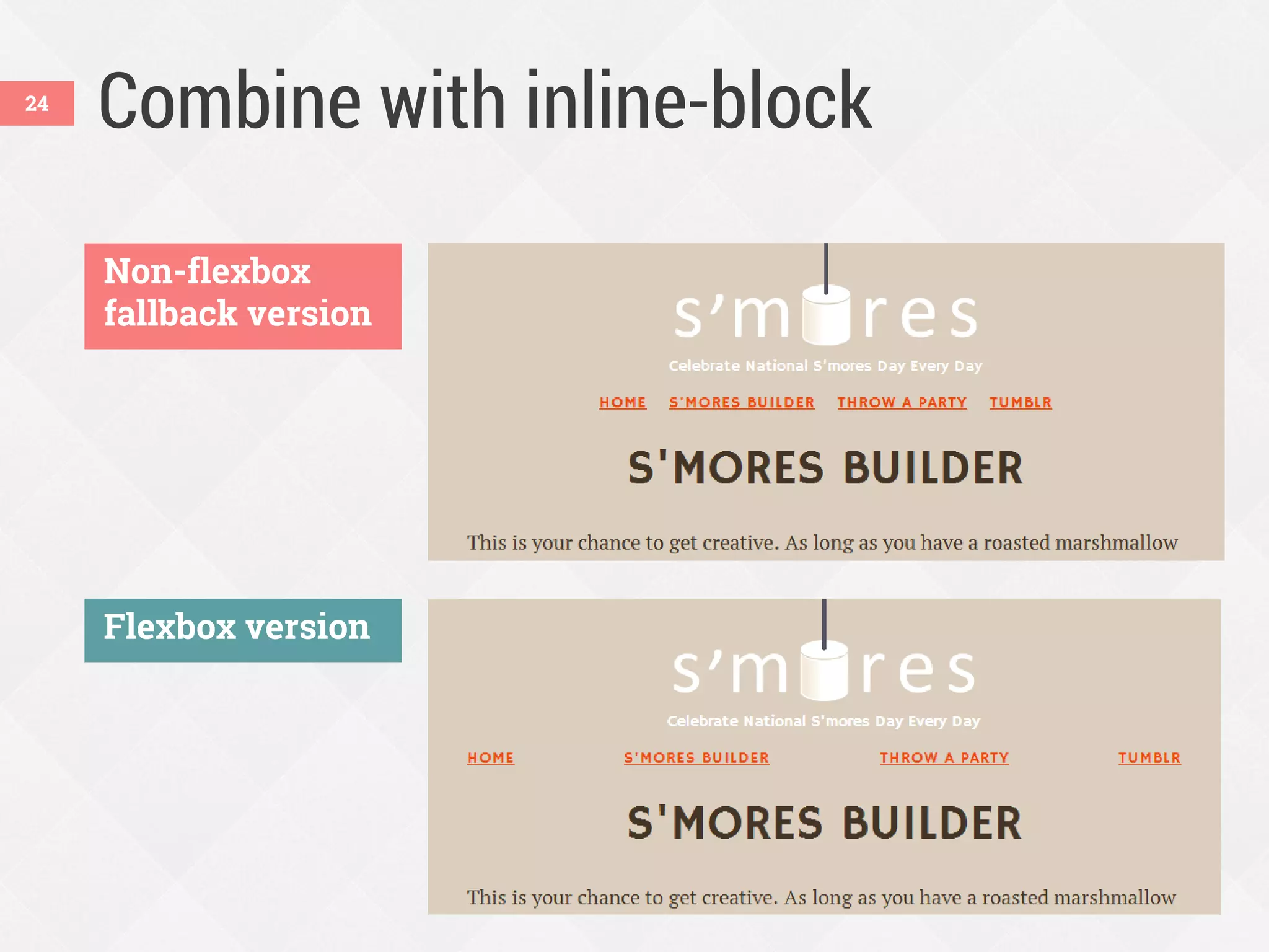
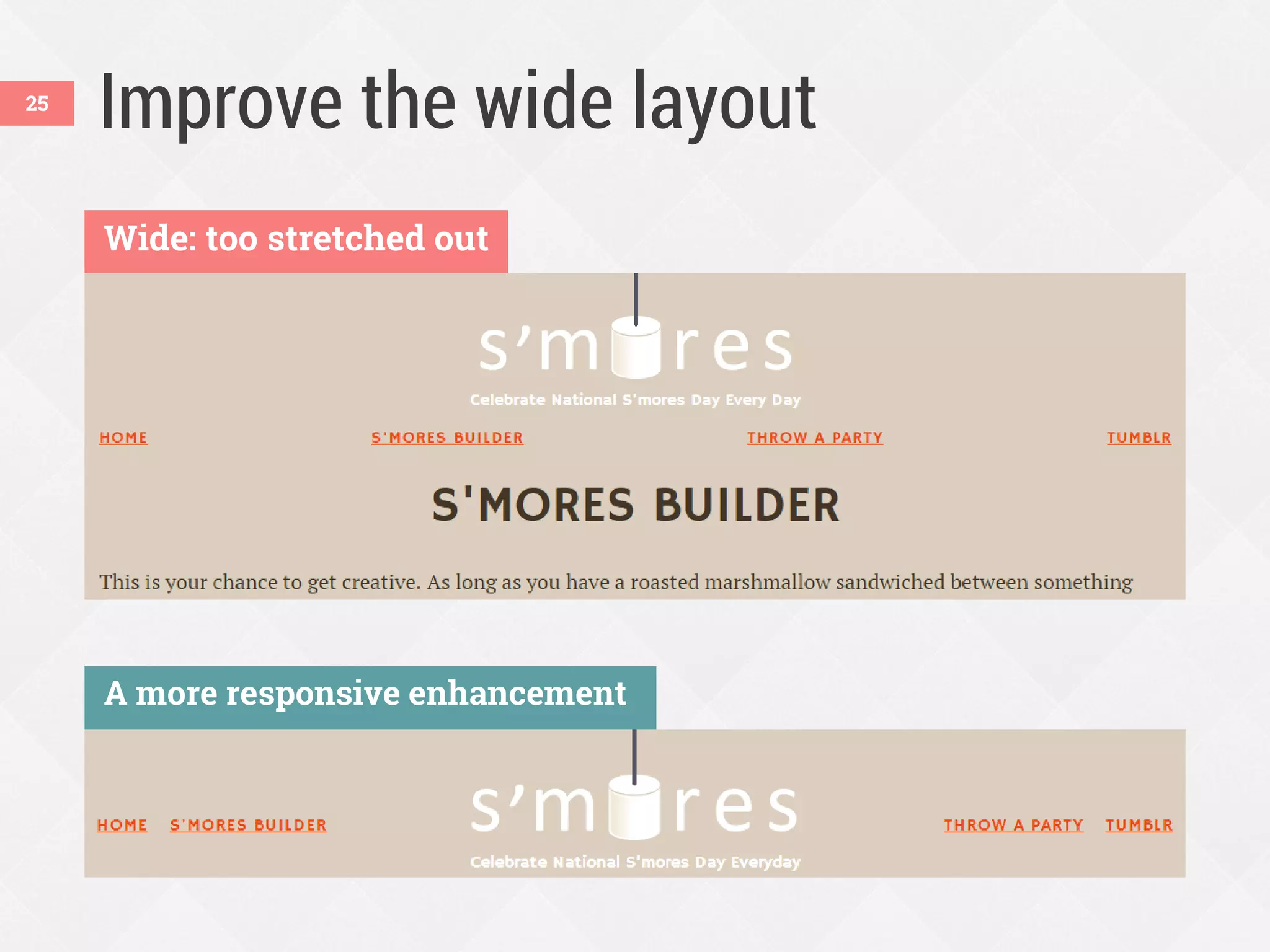
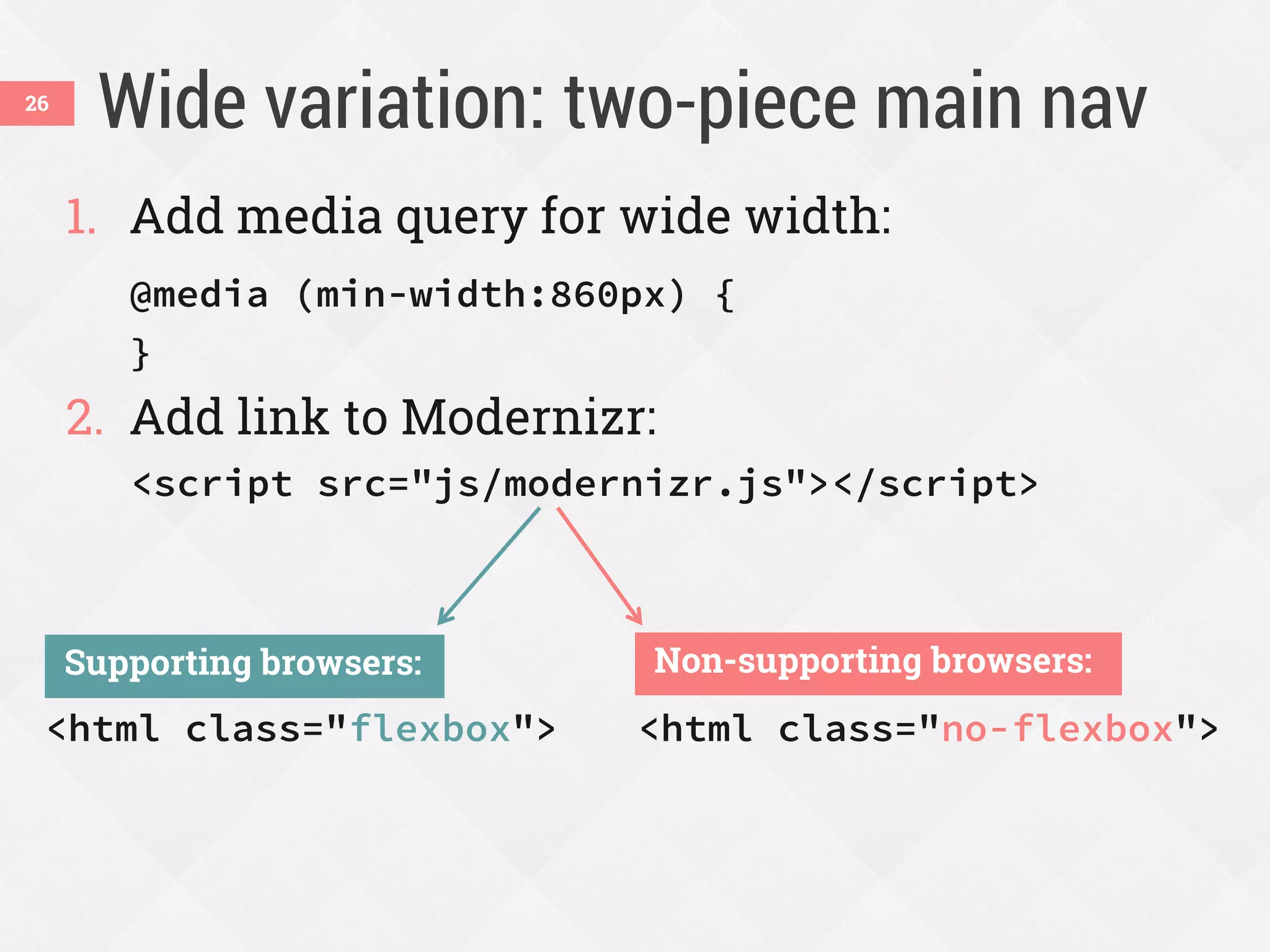
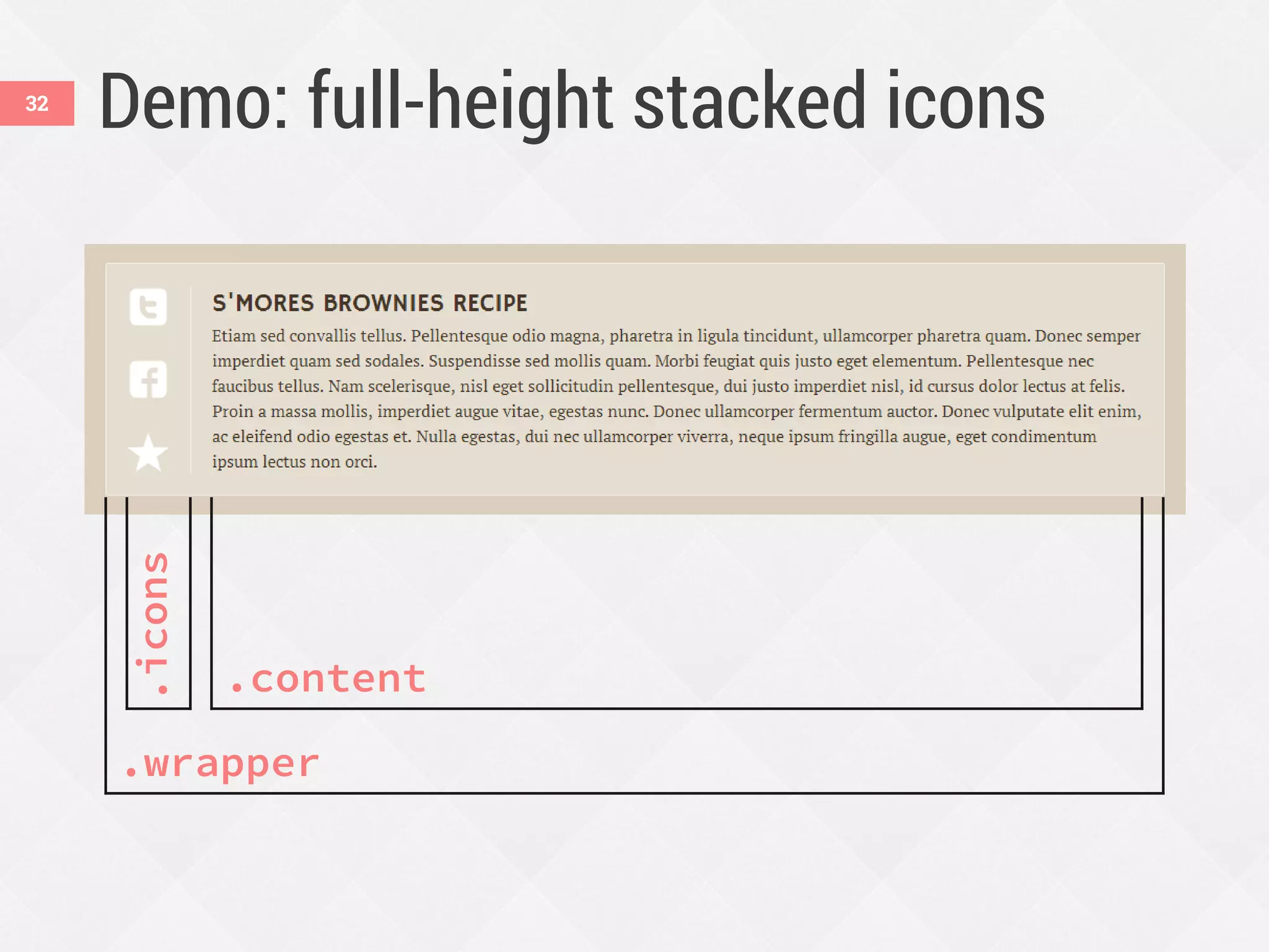
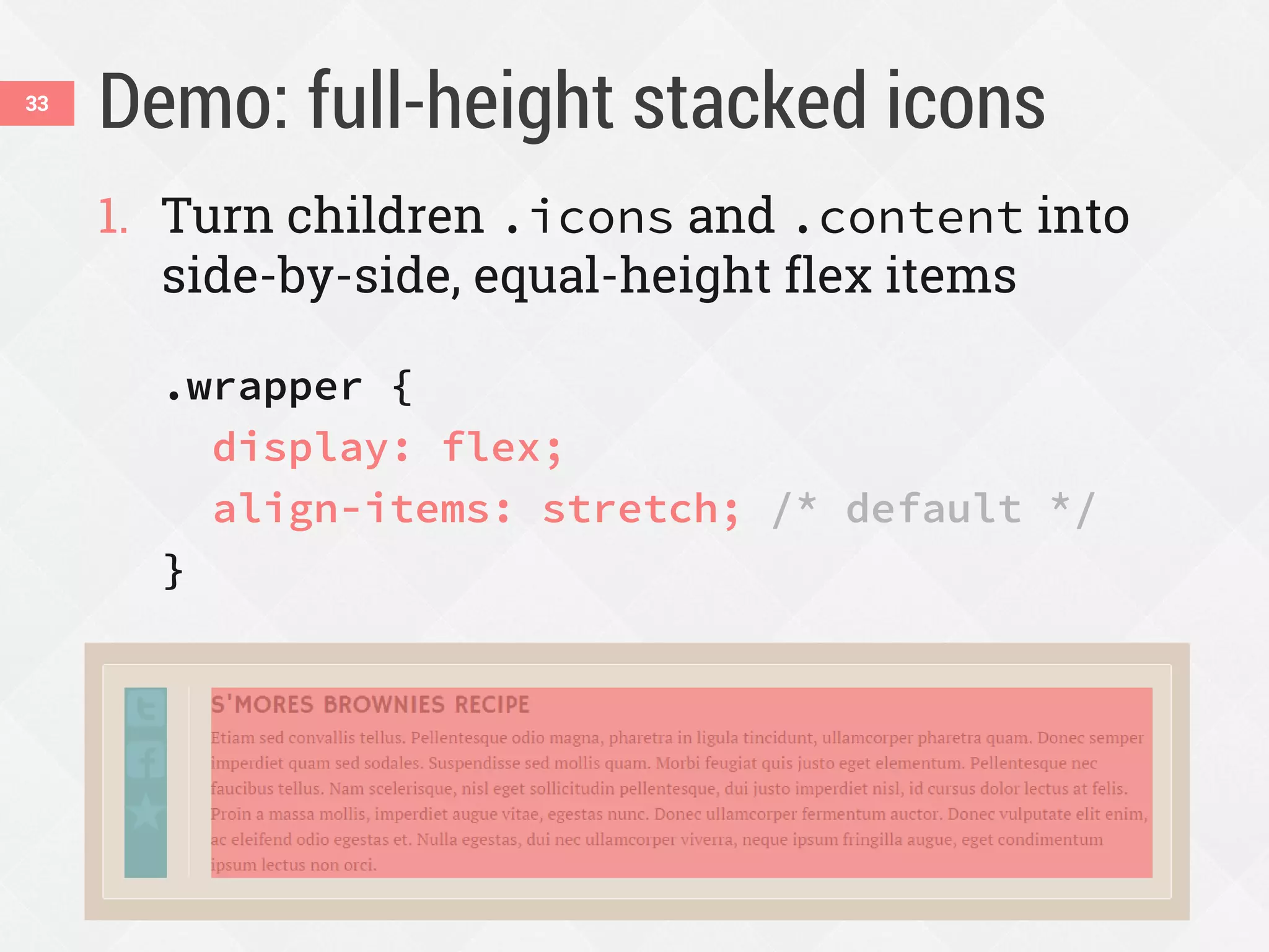
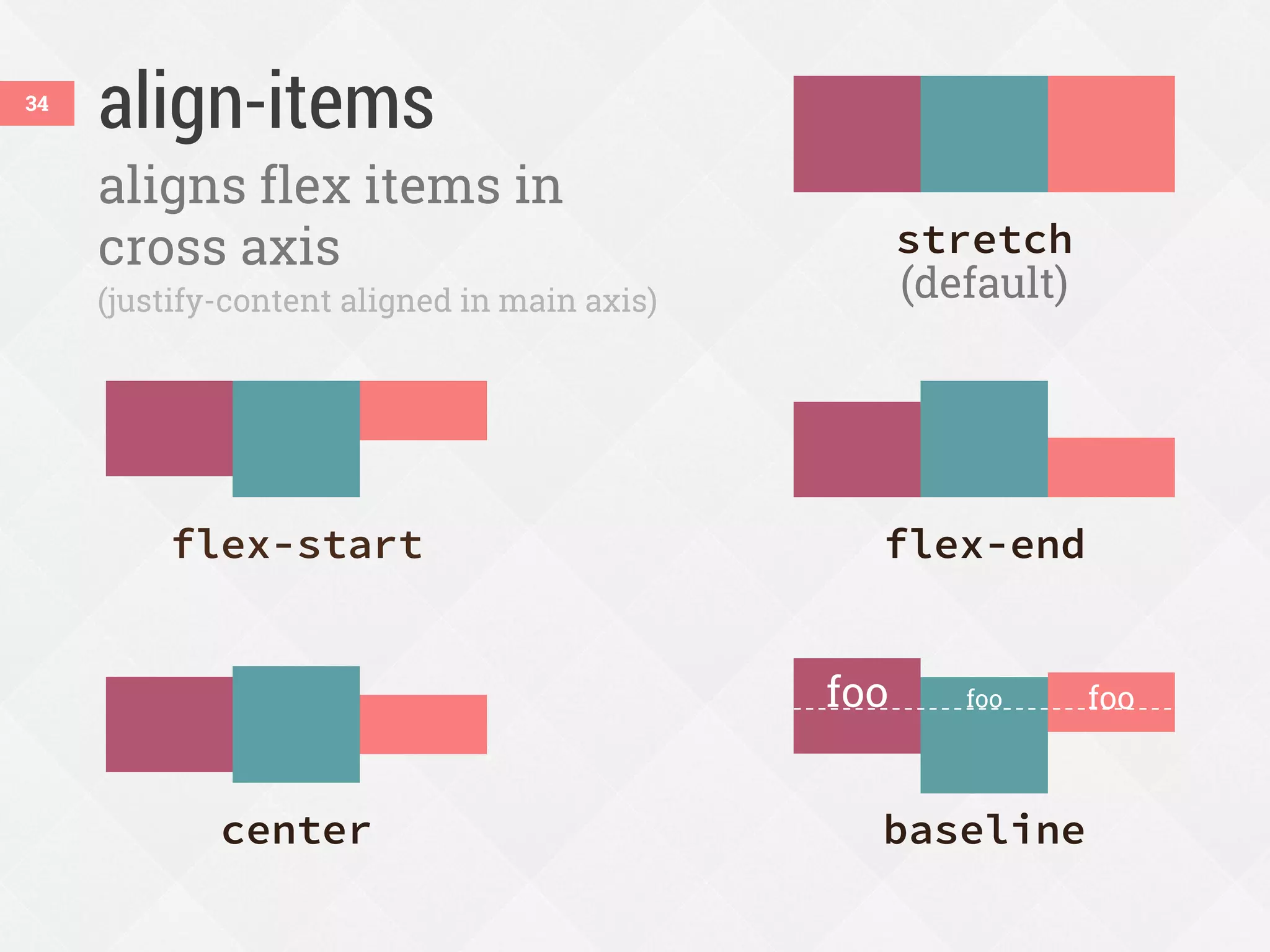
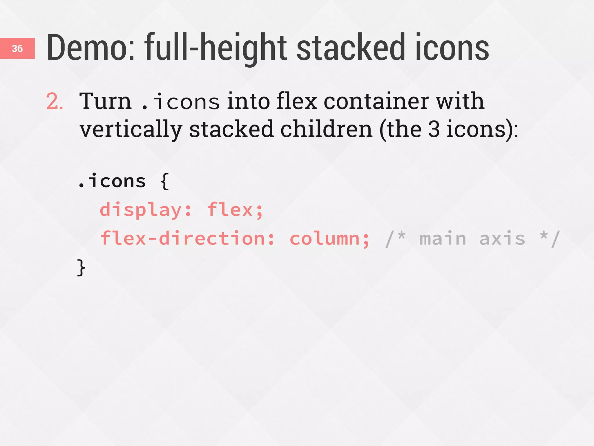
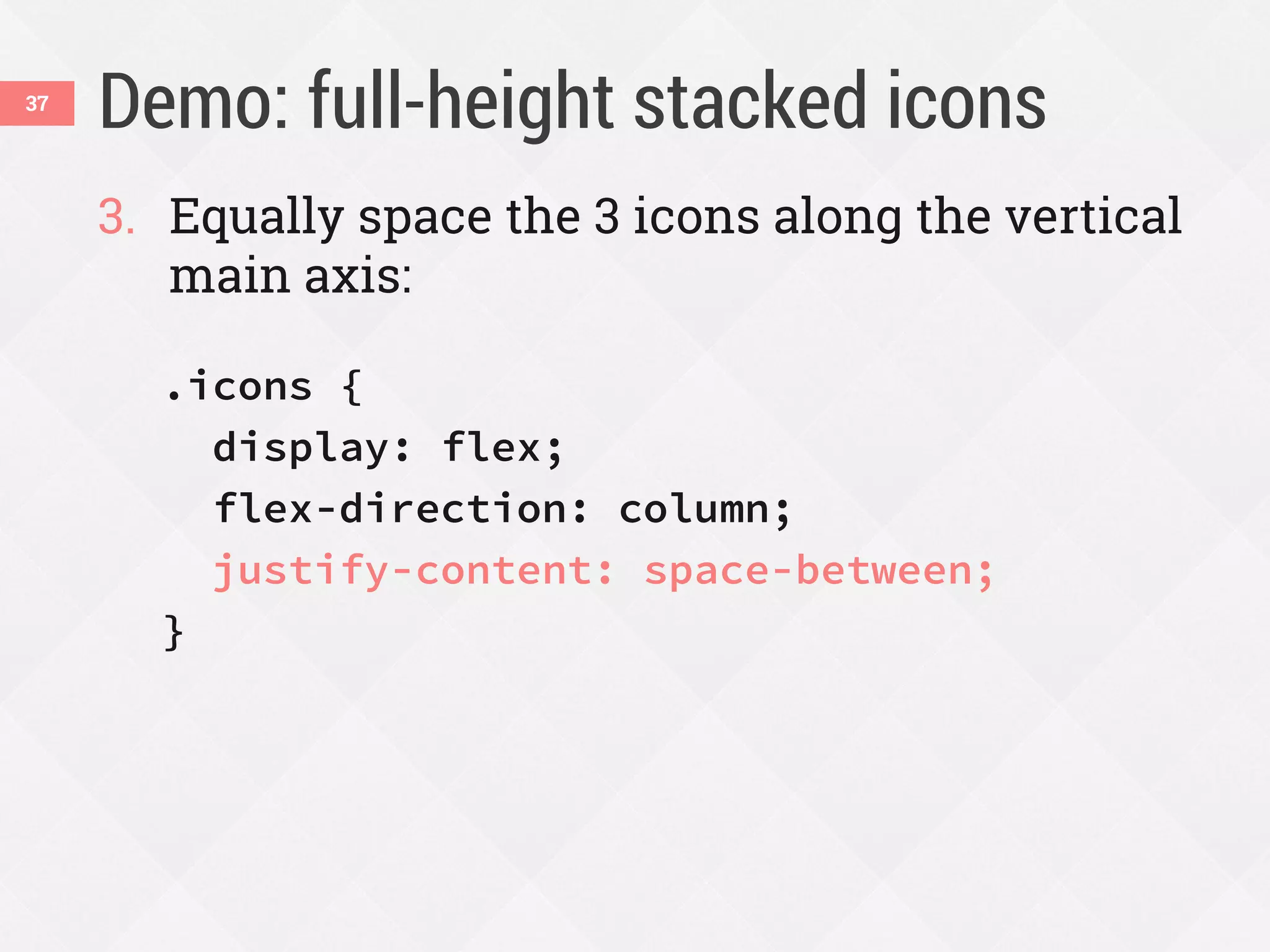
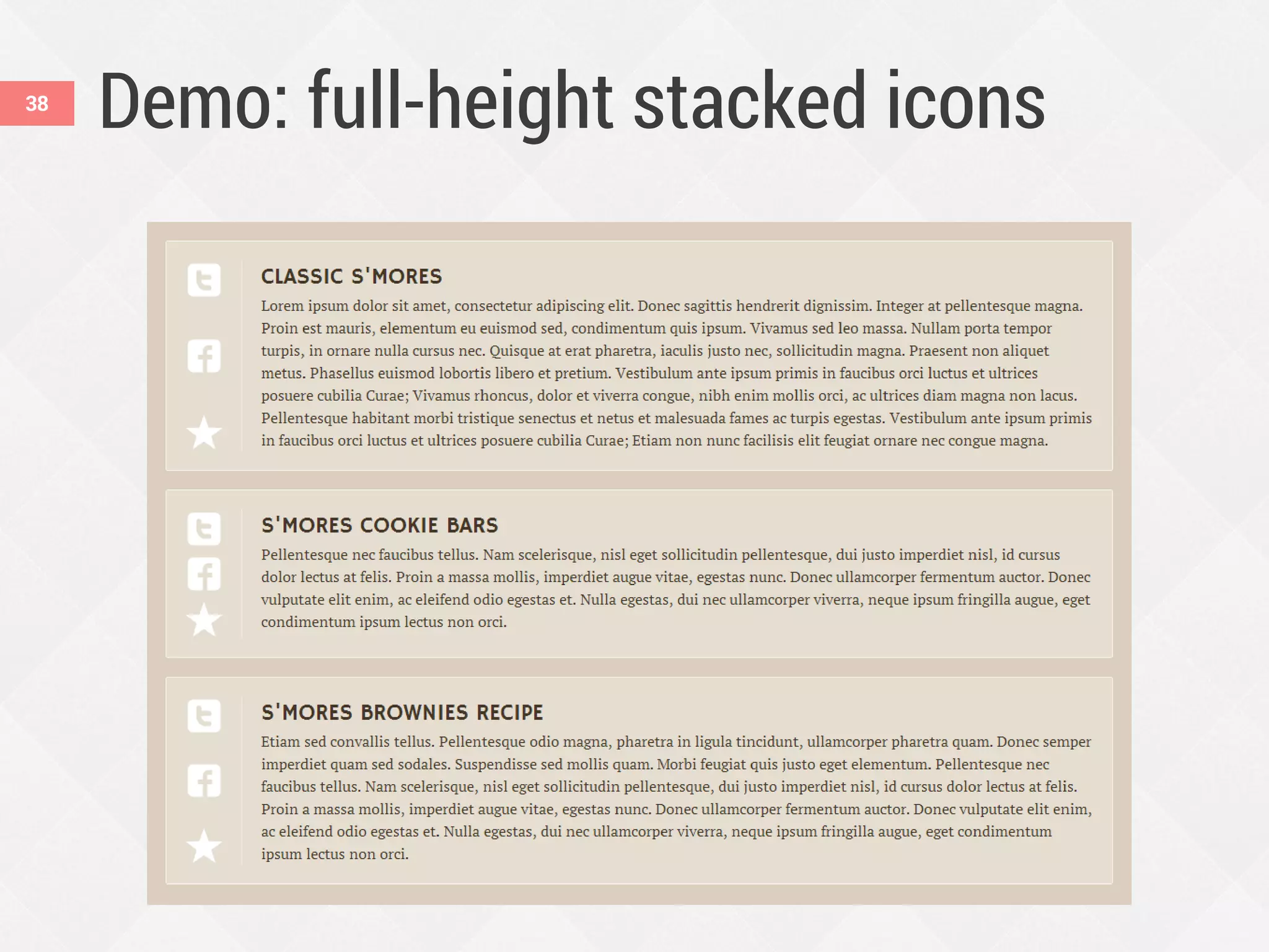
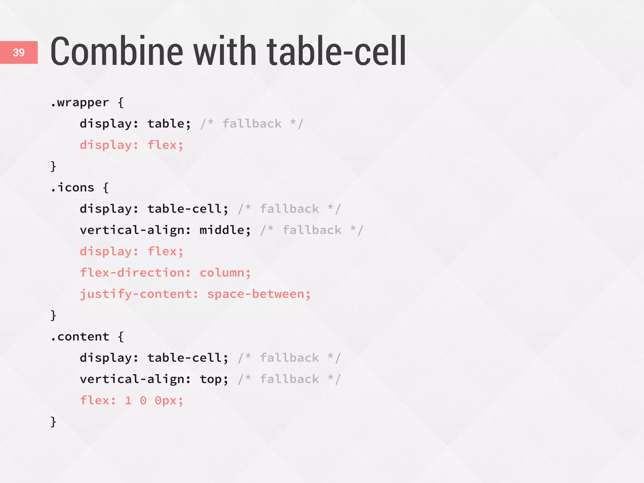
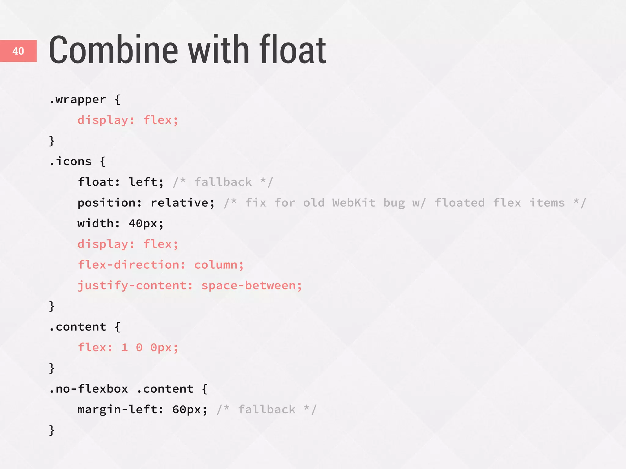
The document discusses the advantages of using CSS Flexbox for creating responsive web designs, addressing issues found in traditional fixed-width layouts. It highlights Flexbox's ability to effectively manage spacing, alignment, and content ordering in various screen sizes, promoting an improved user experience. Practical examples are provided to demonstrate how to implement Flexbox in navigation bars, forms, and content alignment, while also considering browser compatibility.


