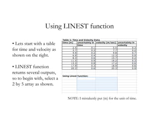
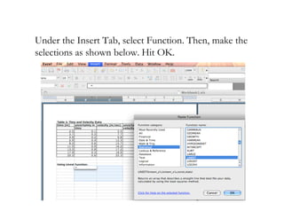
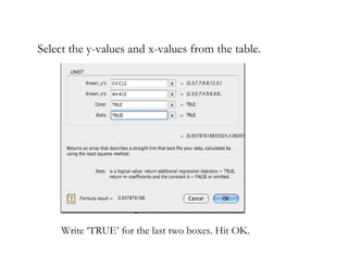
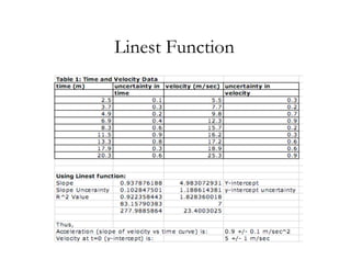
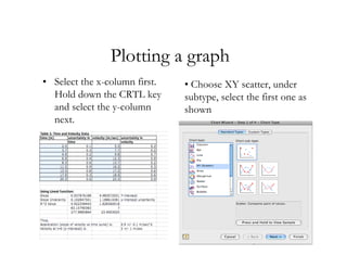
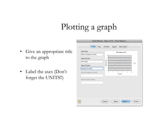
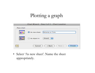
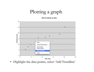
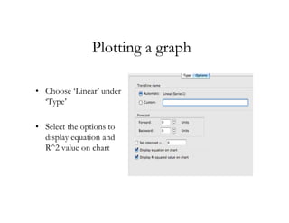
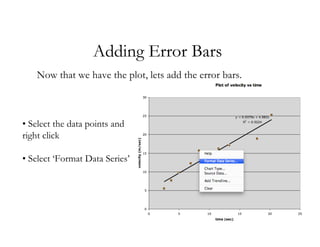
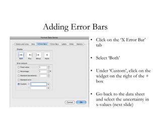
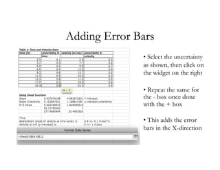
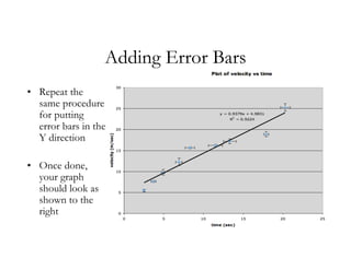
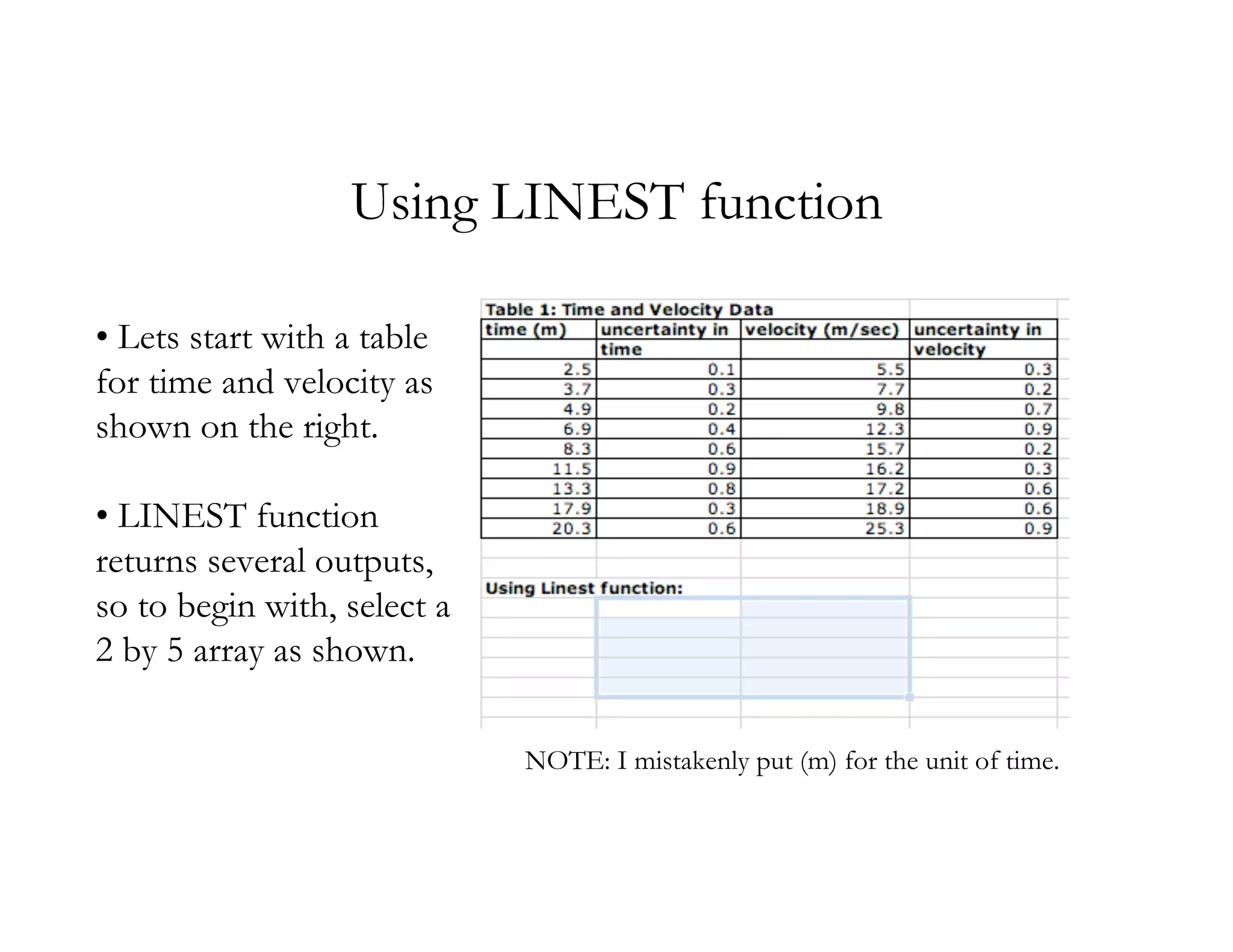
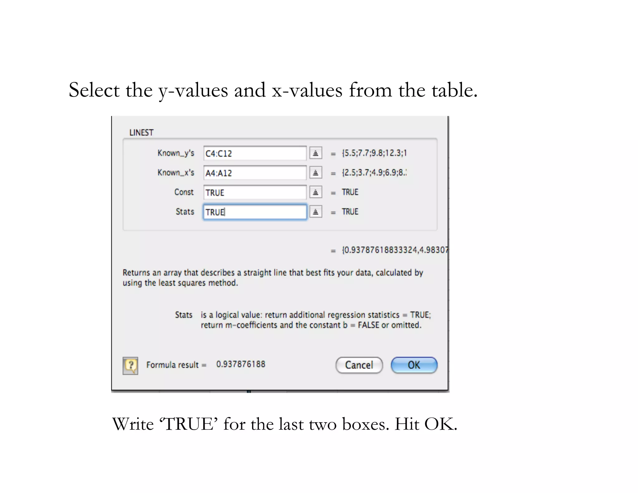
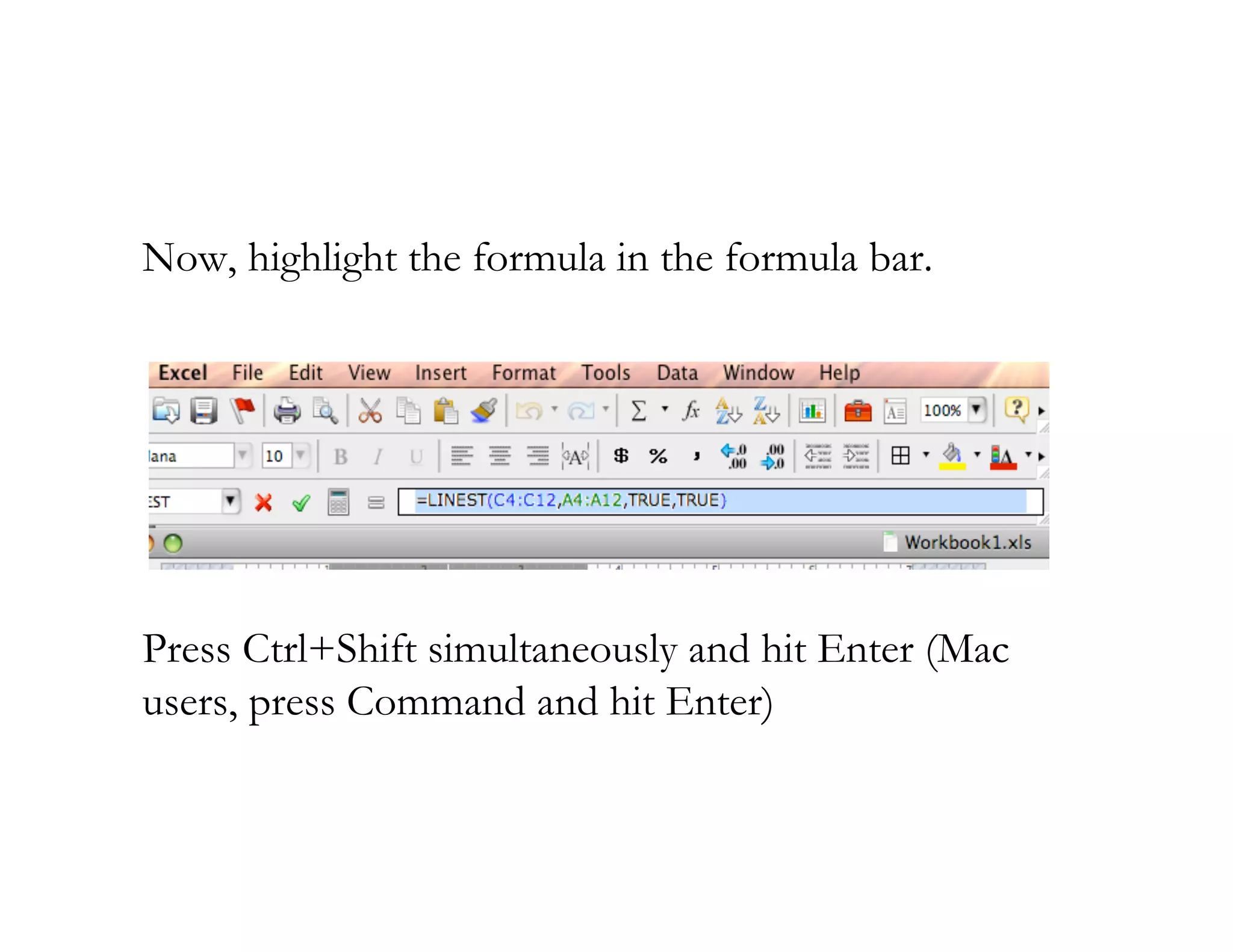
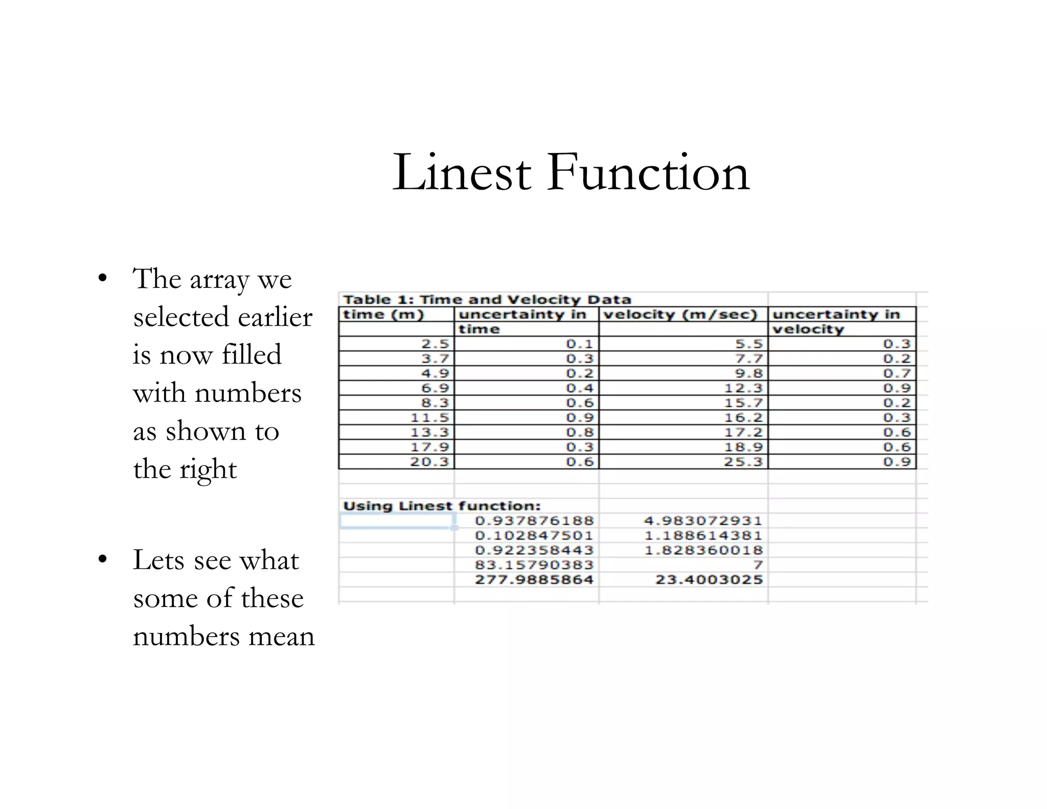
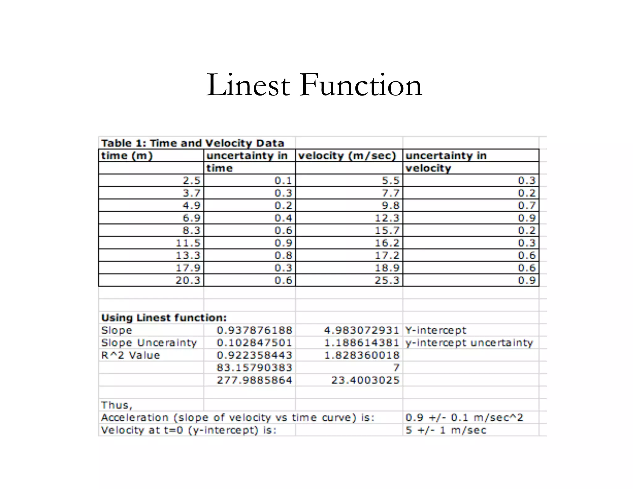
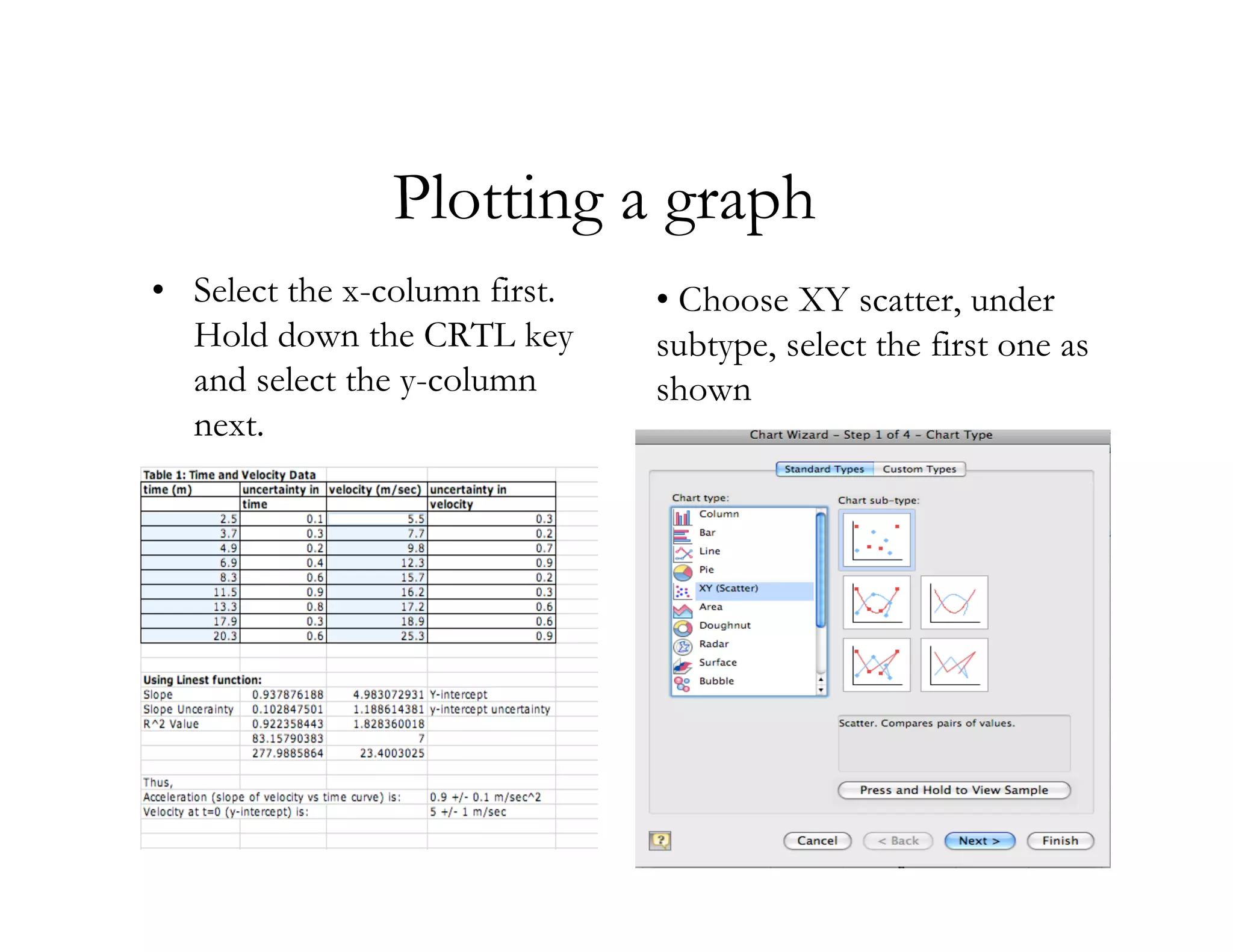
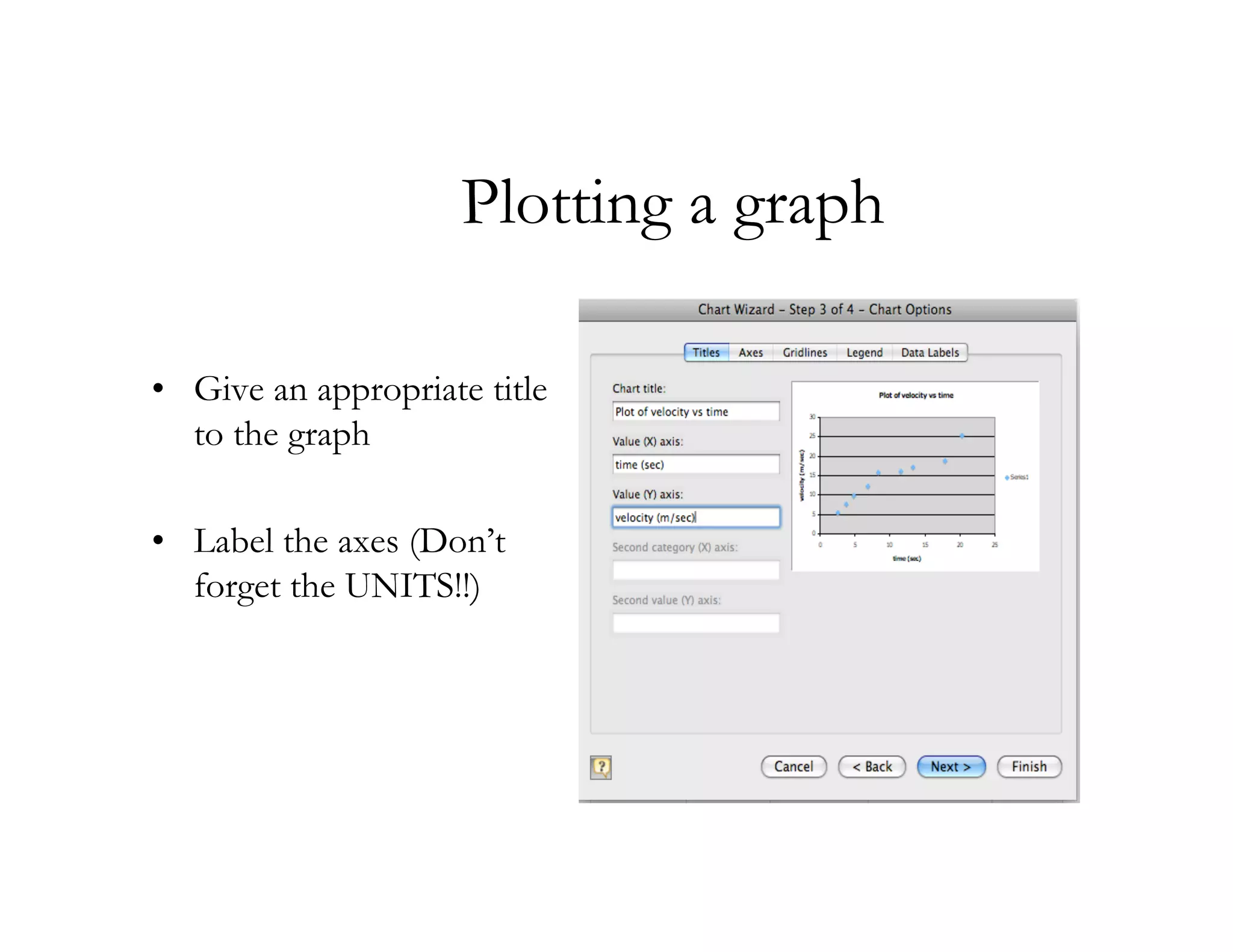
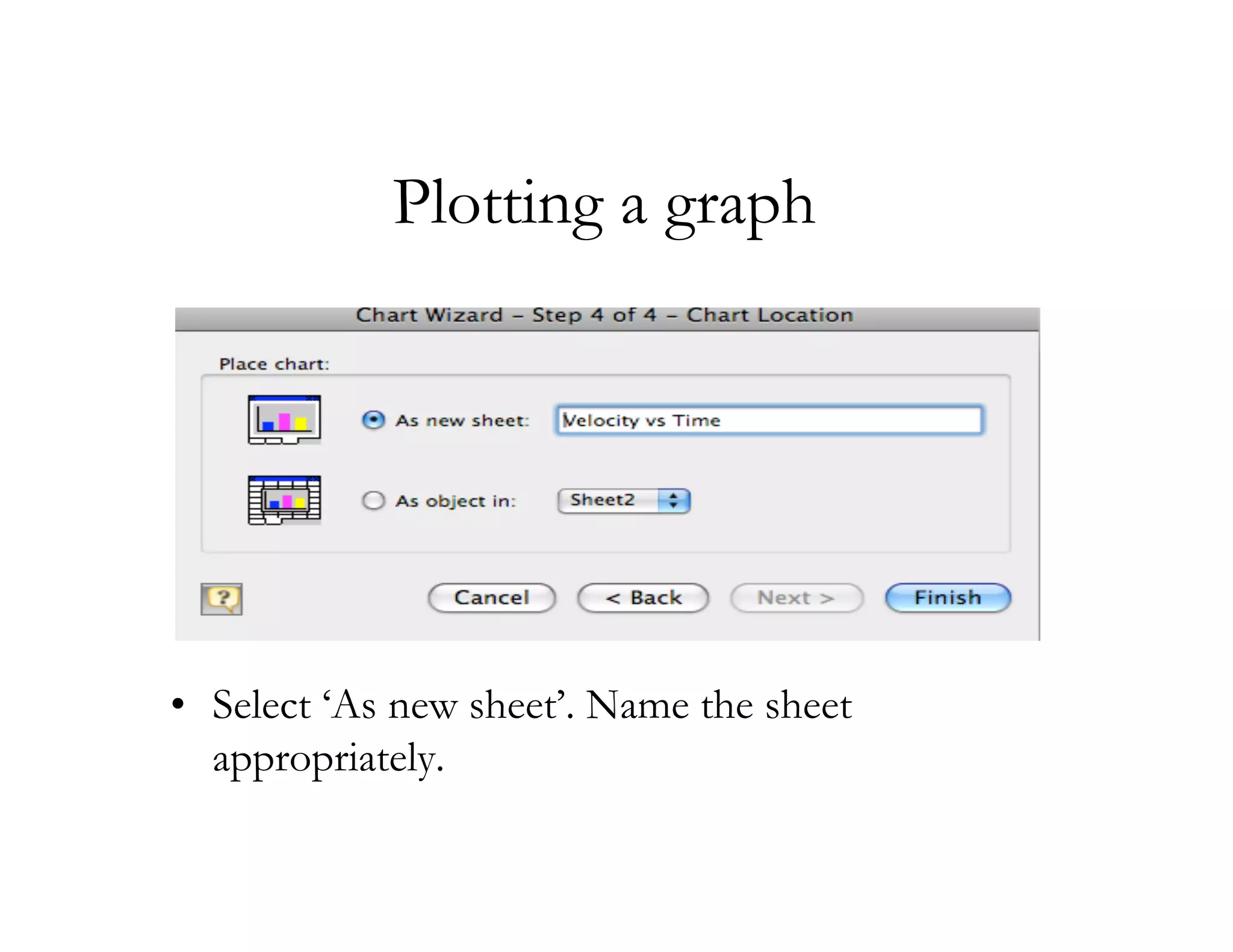
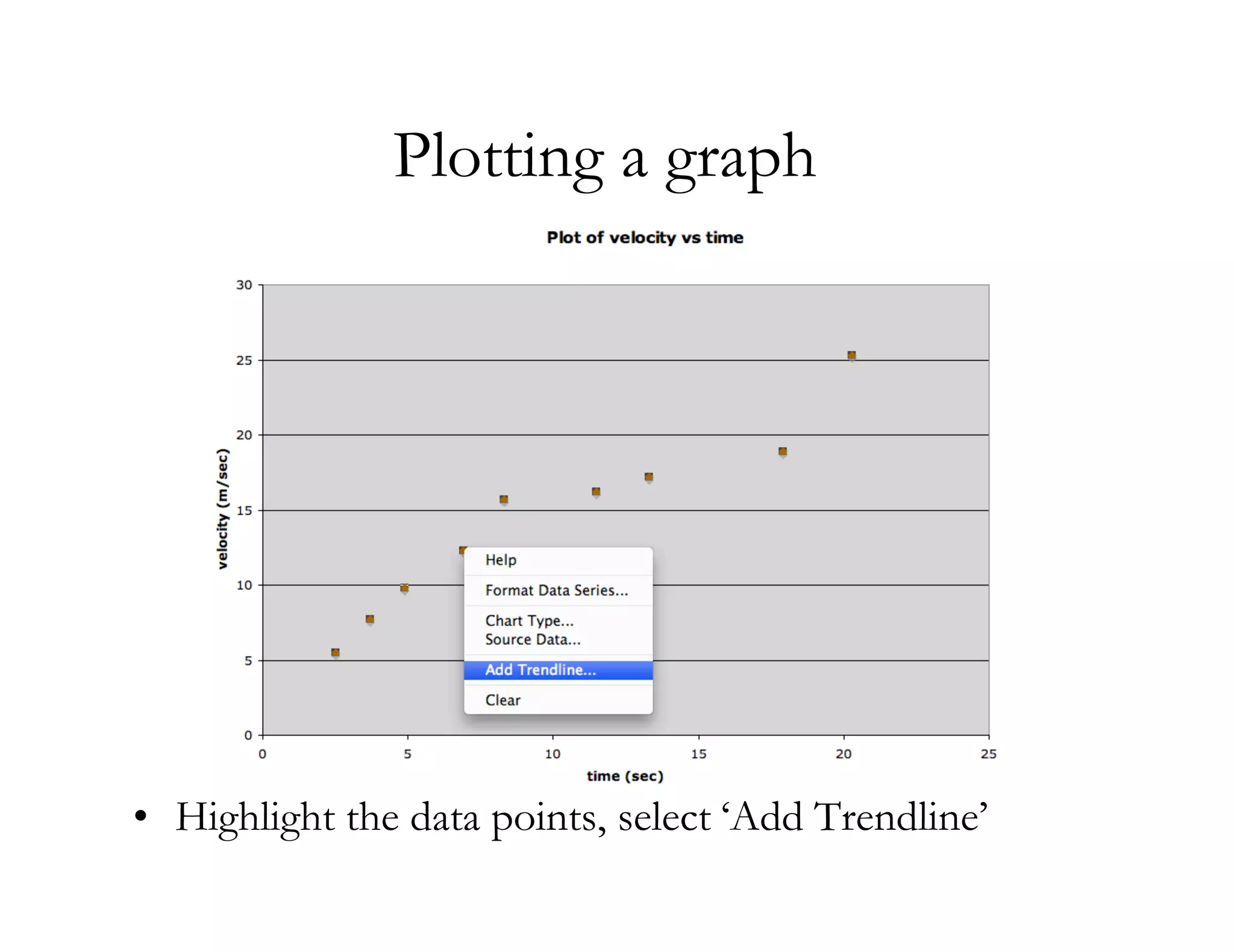
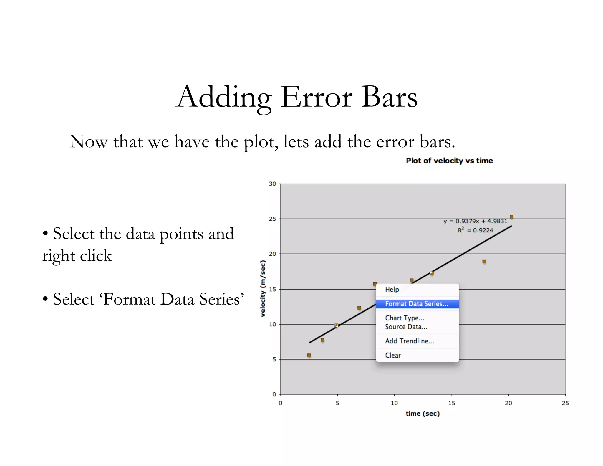
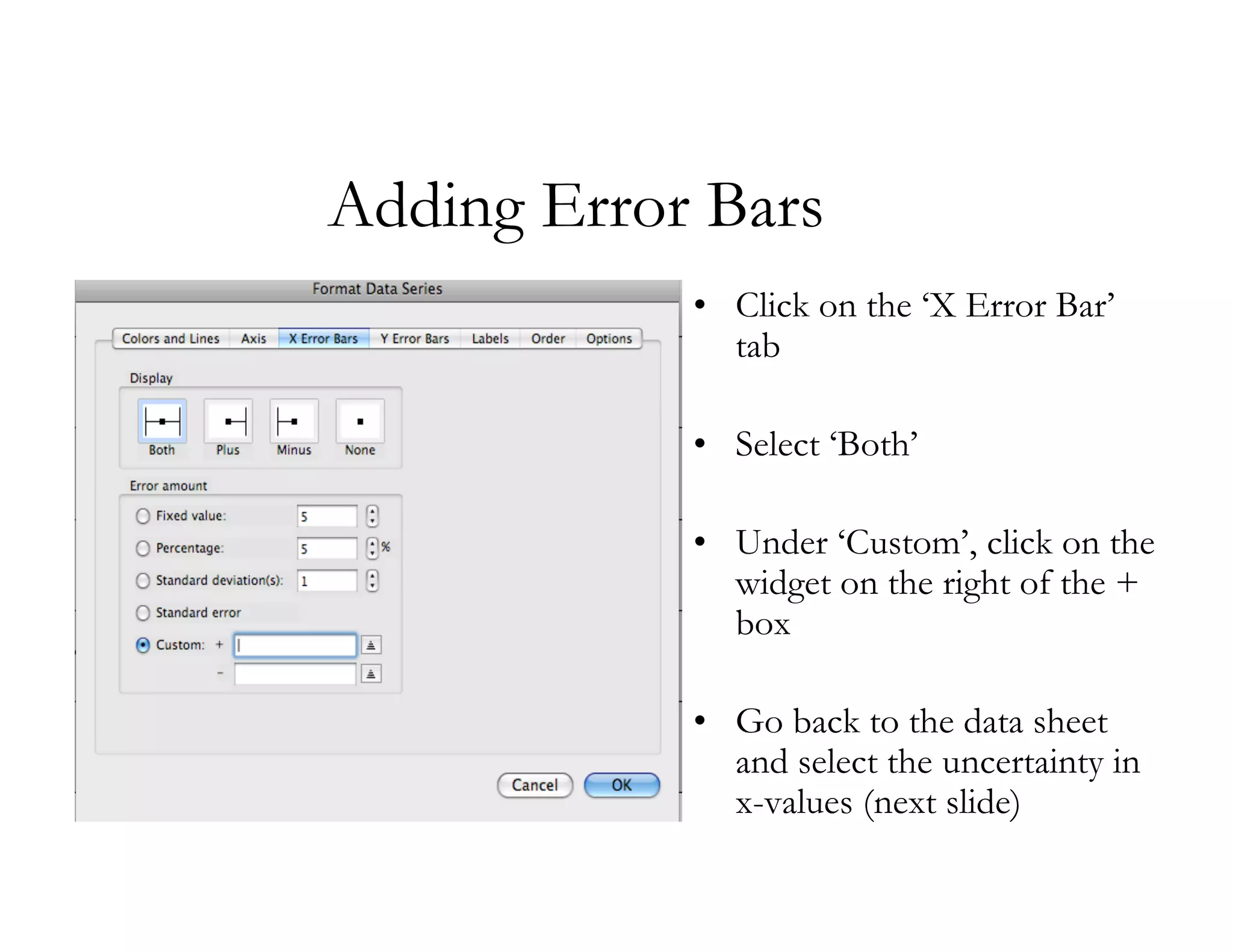
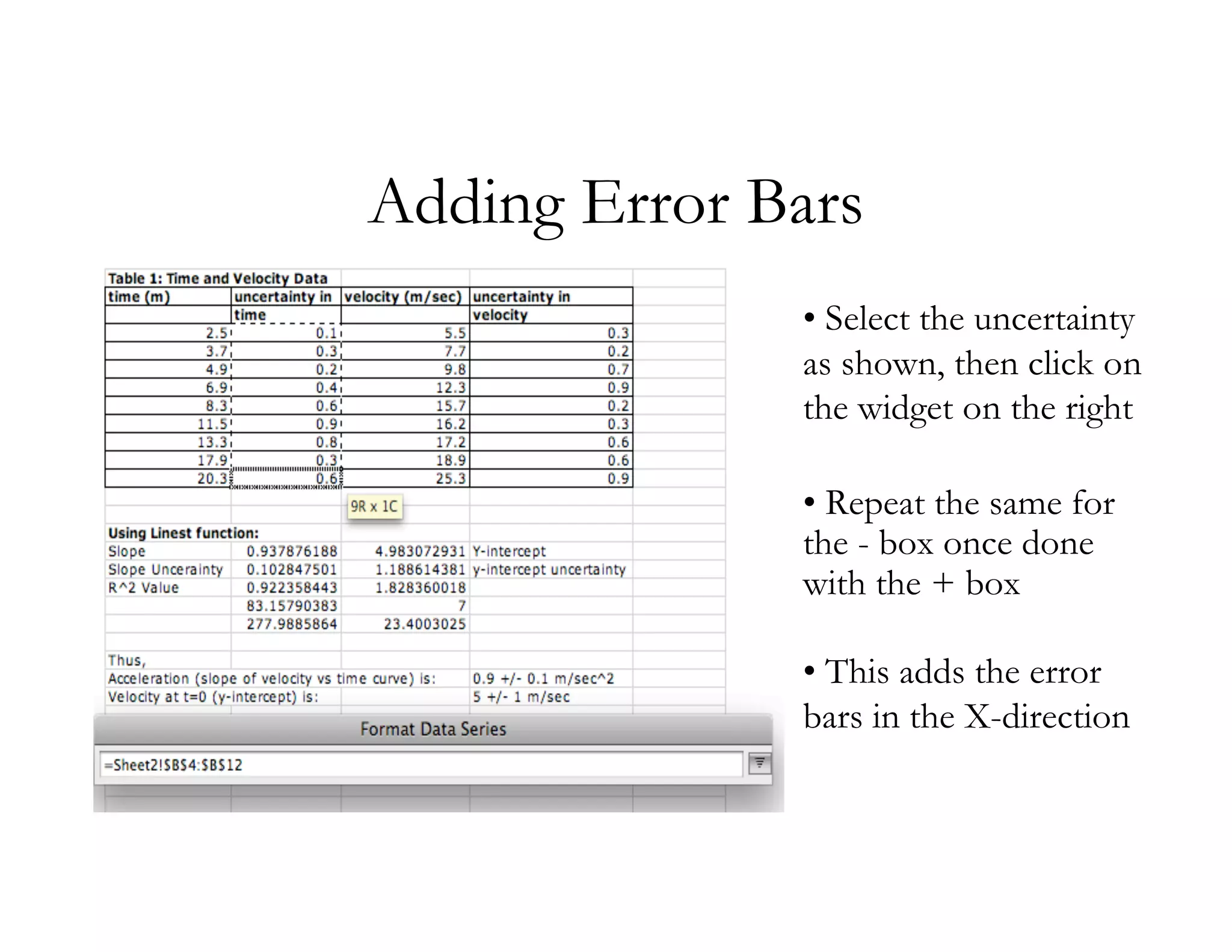
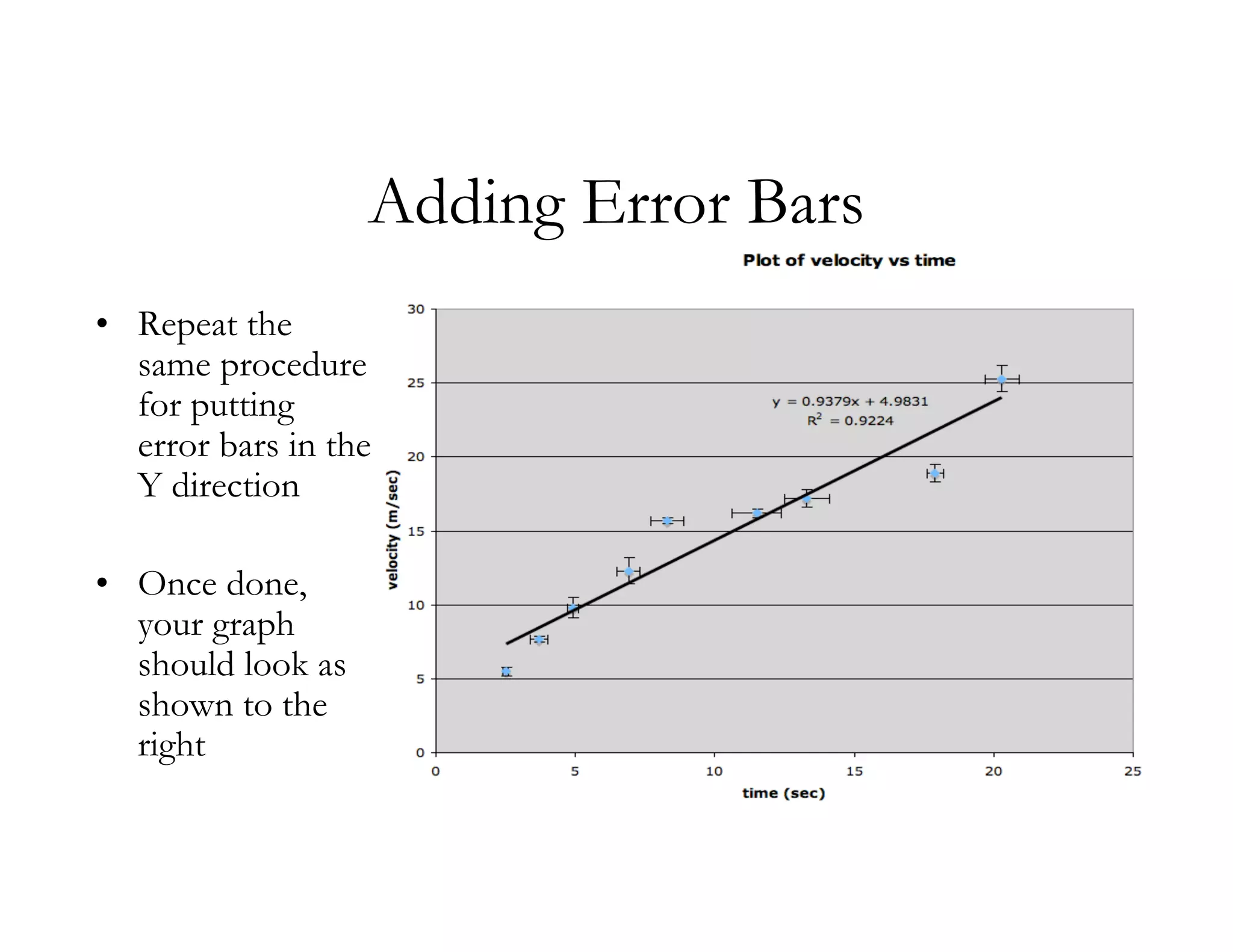
KEMBAR78
Excel 2003 tutorial 4 graphs | PDF
Excel: Using LINEST function, Plotting a
        graph, Adding Error Bars

            Raghav K Chhetri
              01/24/2009
Using LINEST function

• Lets start with a table
for time and velocity as
shown on the right.

• LINEST function
returns several outputs,
so to begin with, select a
2 by 5 array as shown.

                             NOTE: I mistakenly put (m) for the unit of time.
Under the Insert Tab, select Function. Then, make the
selections as shown below. Hit OK.
Select the y-values and x-values from the table.


     Write ‘TRUE’ for the last two boxes. Hit OK.
Now, highlight the formula in the formula bar.


Press Ctrl+Shift simultaneously and hit Enter (Mac
users, press Command and hit Enter)
Linest Function
• The array we
  selected earlier
  is now filled
  with numbers
  as shown to
  the right

• Lets see what
  some of these
  numbers mean
Linest Function
Plotting a graph
• Select the x-column first.   • Choose XY scatter, under
  Hold down the CRTL key       subtype, select the first one as
  and select the y-column      shown
  next.
Plotting a graph

• Give an appropriate title
  to the graph

• Label the axes (Don’t
  forget the UNITS!!)
Plotting a graph


• Select ‘As new sheet’. Name the sheet
  appropriately.
Plotting a graph


• Highlight the data points, select ‘Add Trendline’
Plotting a graph

• Choose ‘Linear’ under
  ‘Type’

• Select the options to
  display equation and
  R^2 value on chart
Adding Error Bars
   Now that we have the plot, lets add the error bars.


• Select the data points and
right click

• Select ‘Format Data Series’
Adding Error Bars
            • Click on the ‘X Error Bar’
              tab

            • Select ‘Both’

            • Under ‘Custom’, click on the
              widget on the right of the +
              box

            • Go back to the data sheet
              and select the uncertainty in
              x-values (next slide)
Adding Error Bars
              • Select the uncertainty
              as shown, then click on
              the widget on the right

              • Repeat the same for
              the - box once done
              with the + box

              • This adds the error
              bars in the X-direction
Adding Error Bars
• Repeat the
  same procedure
  for putting
  error bars in the
  Y direction

• Once done,
  your graph
  should look as
  shown to the
  right
The End.

Excel 2003 tutorial 4 graphs

  • 1.
    Excel: Using LINESTfunction, Plotting a graph, Adding Error Bars Raghav K Chhetri 01/24/2009
  • 2.
    Using LINEST function •Lets start with a table for time and velocity as shown on the right. • LINEST function returns several outputs, so to begin with, select a 2 by 5 array as shown. NOTE: I mistakenly put (m) for the unit of time.
  • 3.
    Under the InsertTab, select Function. Then, make the selections as shown below. Hit OK.
  • 4.
    Select the y-valuesand x-values from the table. Write ‘TRUE’ for the last two boxes. Hit OK.
  • 5.
    Now, highlight theformula in the formula bar. Press Ctrl+Shift simultaneously and hit Enter (Mac users, press Command and hit Enter)
  • 6.
    Linest Function • Thearray we selected earlier is now filled with numbers as shown to the right • Lets see what some of these numbers mean
  • 7.
  • 8.
    Plotting a graph •Select the x-column first. • Choose XY scatter, under Hold down the CRTL key subtype, select the first one as and select the y-column shown next.
  • 9.
    Plotting a graph •Give an appropriate title to the graph • Label the axes (Don’t forget the UNITS!!)
  • 10.
    Plotting a graph •Select ‘As new sheet’. Name the sheet appropriately.
  • 11.
    Plotting a graph •Highlight the data points, select ‘Add Trendline’
  • 12.
    Plotting a graph •Choose ‘Linear’ under ‘Type’ • Select the options to display equation and R^2 value on chart
  • 13.
    Adding Error Bars Now that we have the plot, lets add the error bars. • Select the data points and right click • Select ‘Format Data Series’
  • 14.
    Adding Error Bars • Click on the ‘X Error Bar’ tab • Select ‘Both’ • Under ‘Custom’, click on the widget on the right of the + box • Go back to the data sheet and select the uncertainty in x-values (next slide)
  • 15.
    Adding Error Bars • Select the uncertainty as shown, then click on the widget on the right • Repeat the same for the - box once done with the + box • This adds the error bars in the X-direction
  • 16.
    Adding Error Bars •Repeat the same procedure for putting error bars in the Y direction • Once done, your graph should look as shown to the right
  • 17.