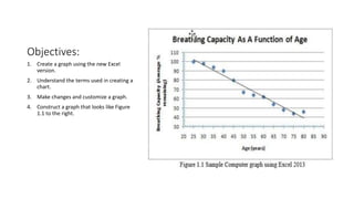
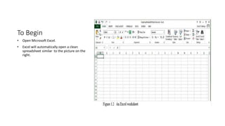
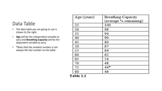
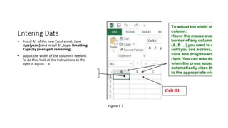
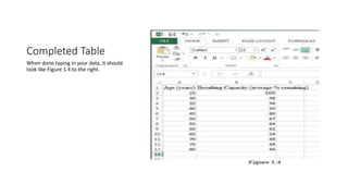
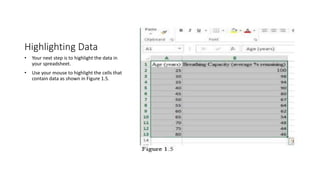
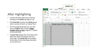
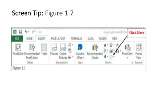
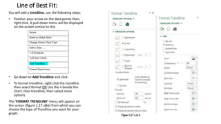
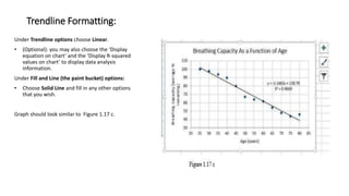
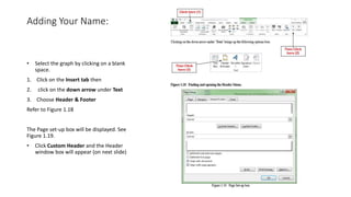
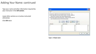
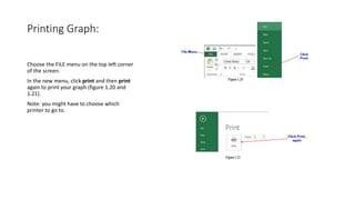
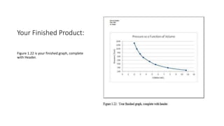
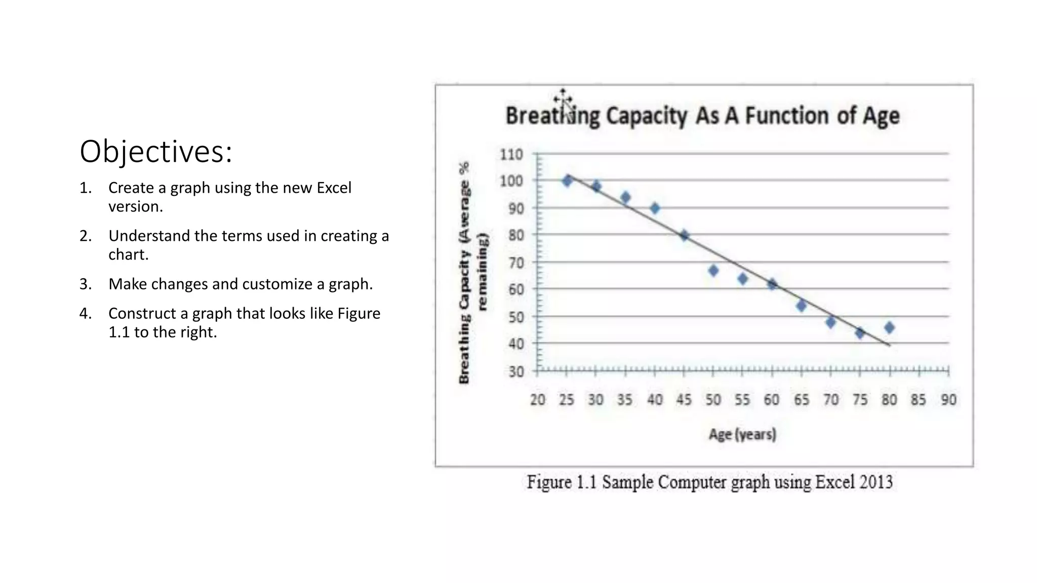
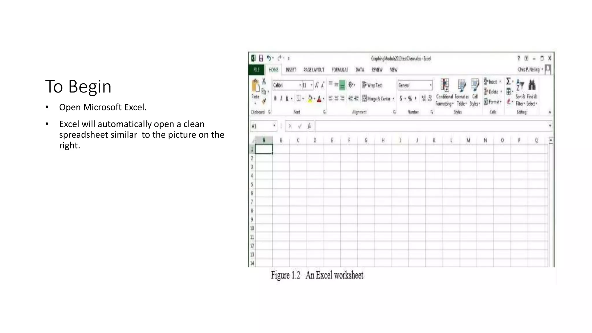
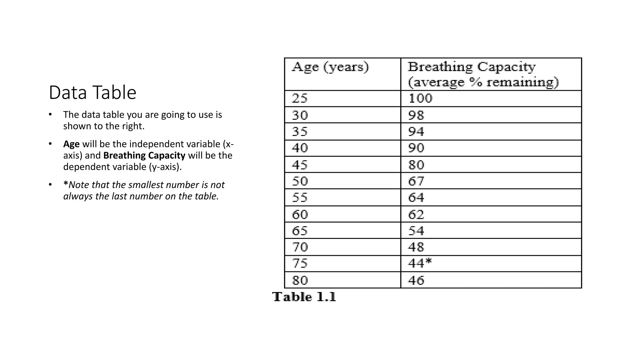
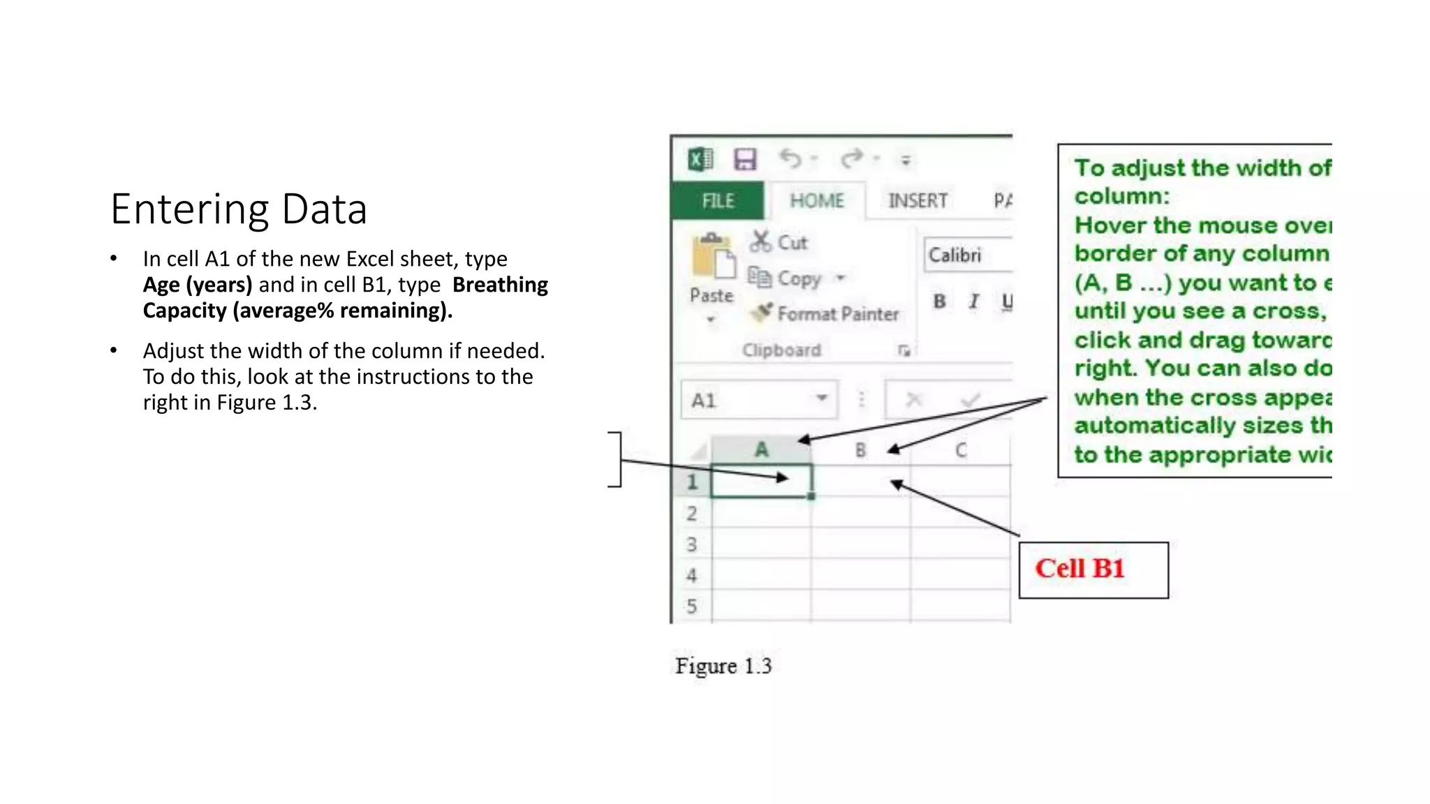
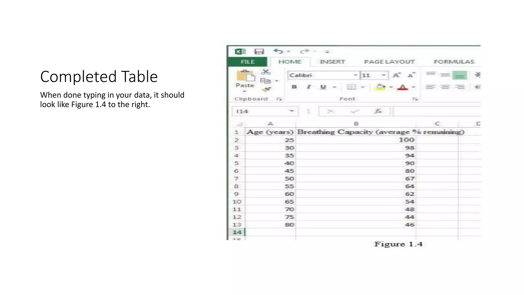
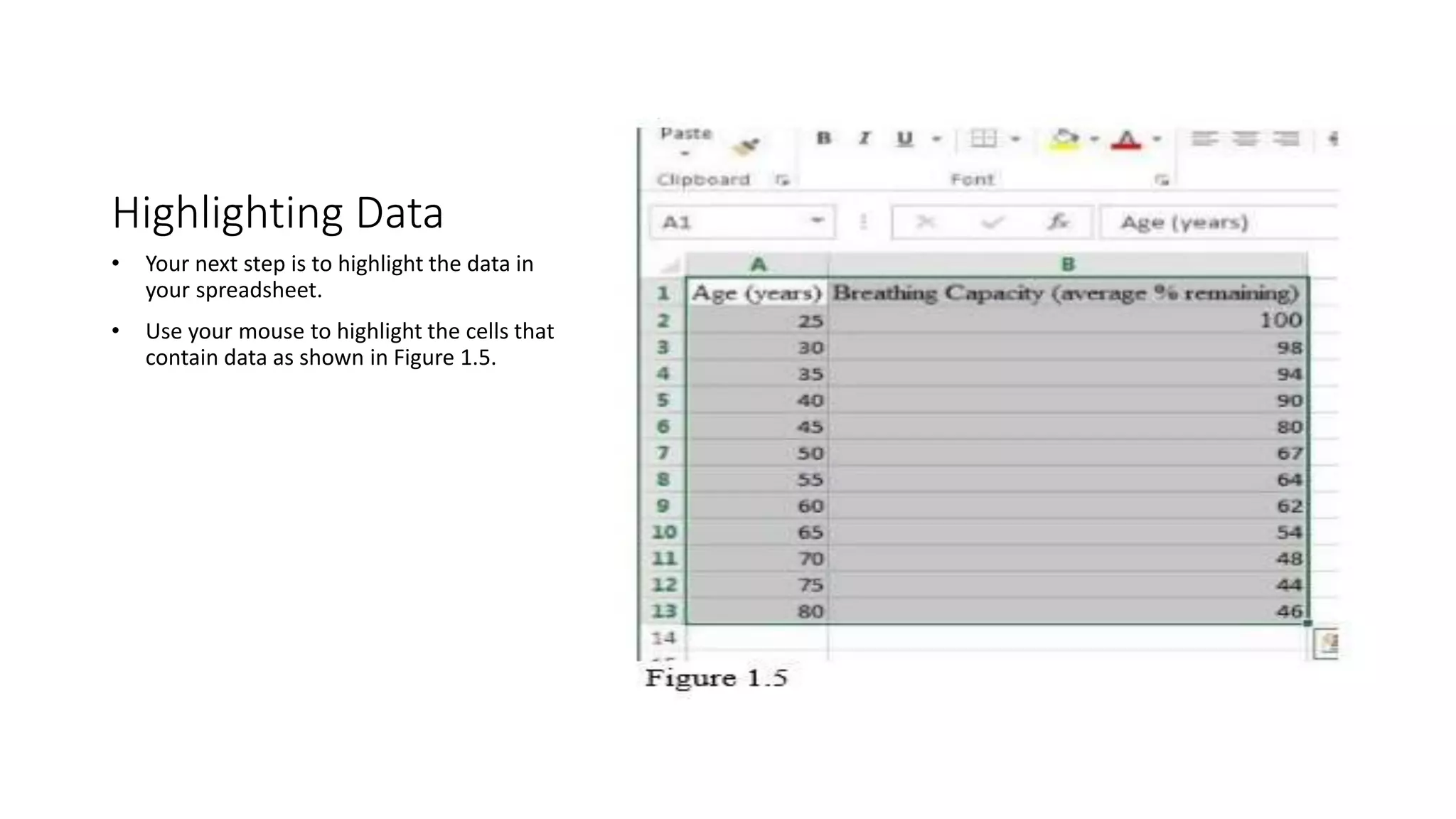
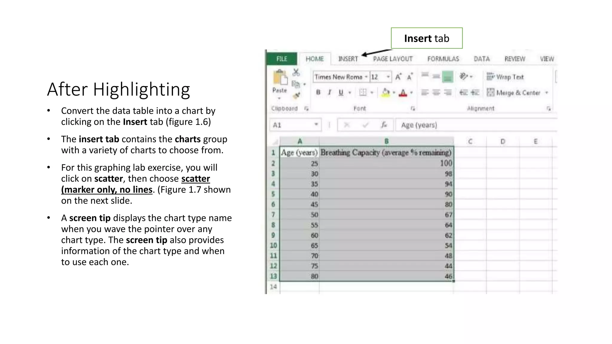
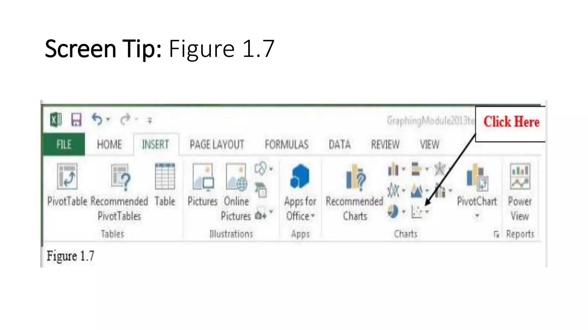
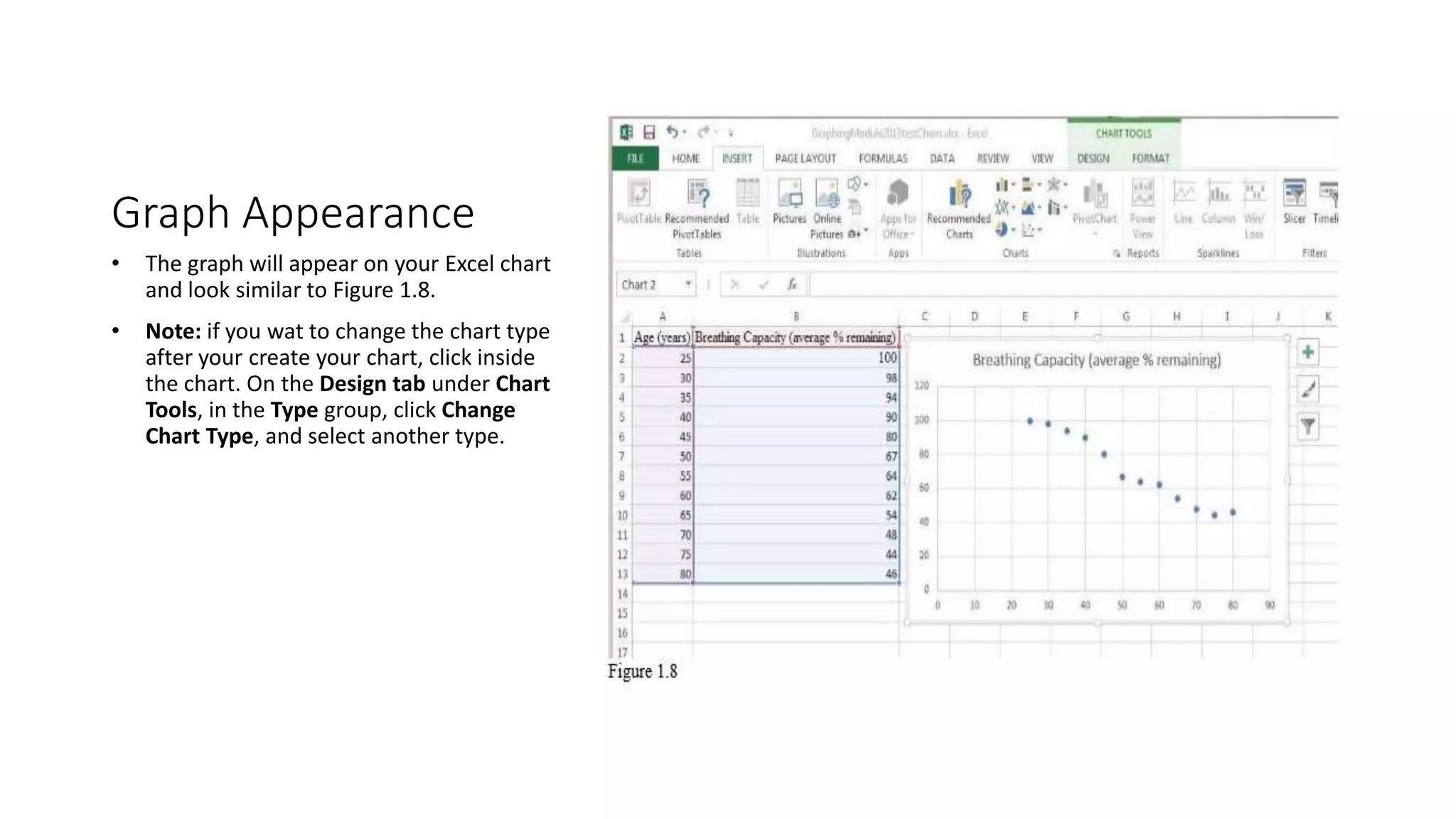
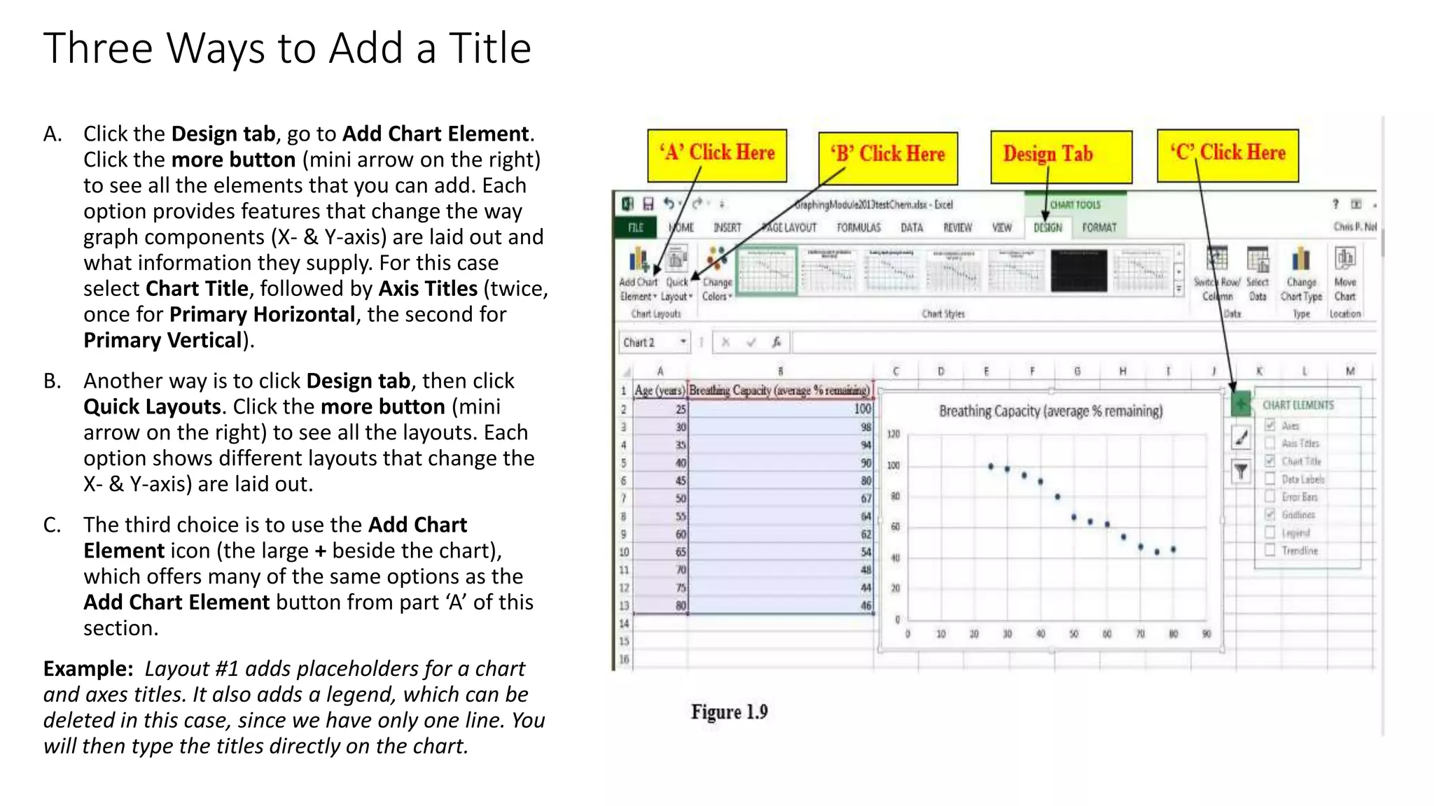
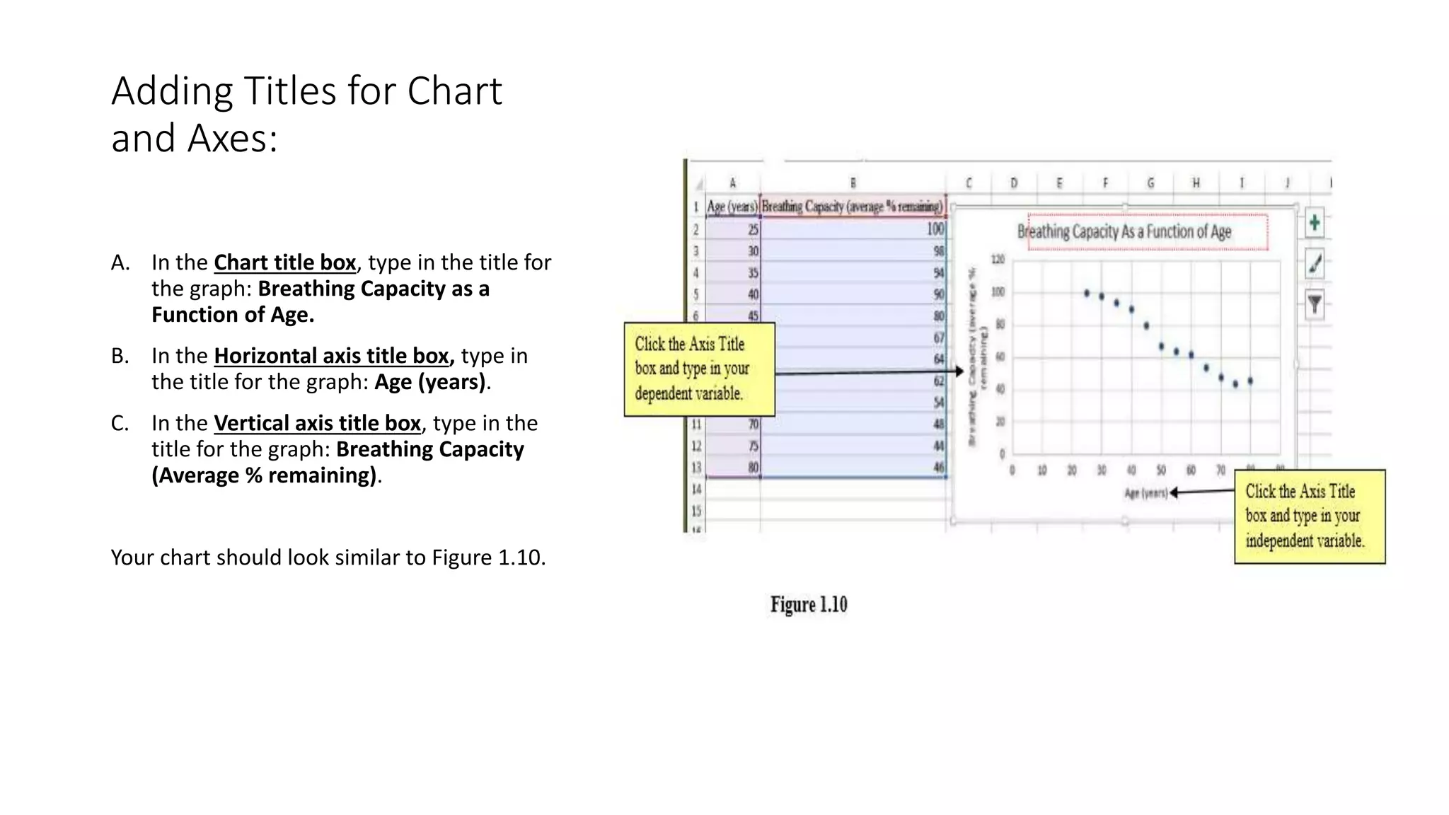
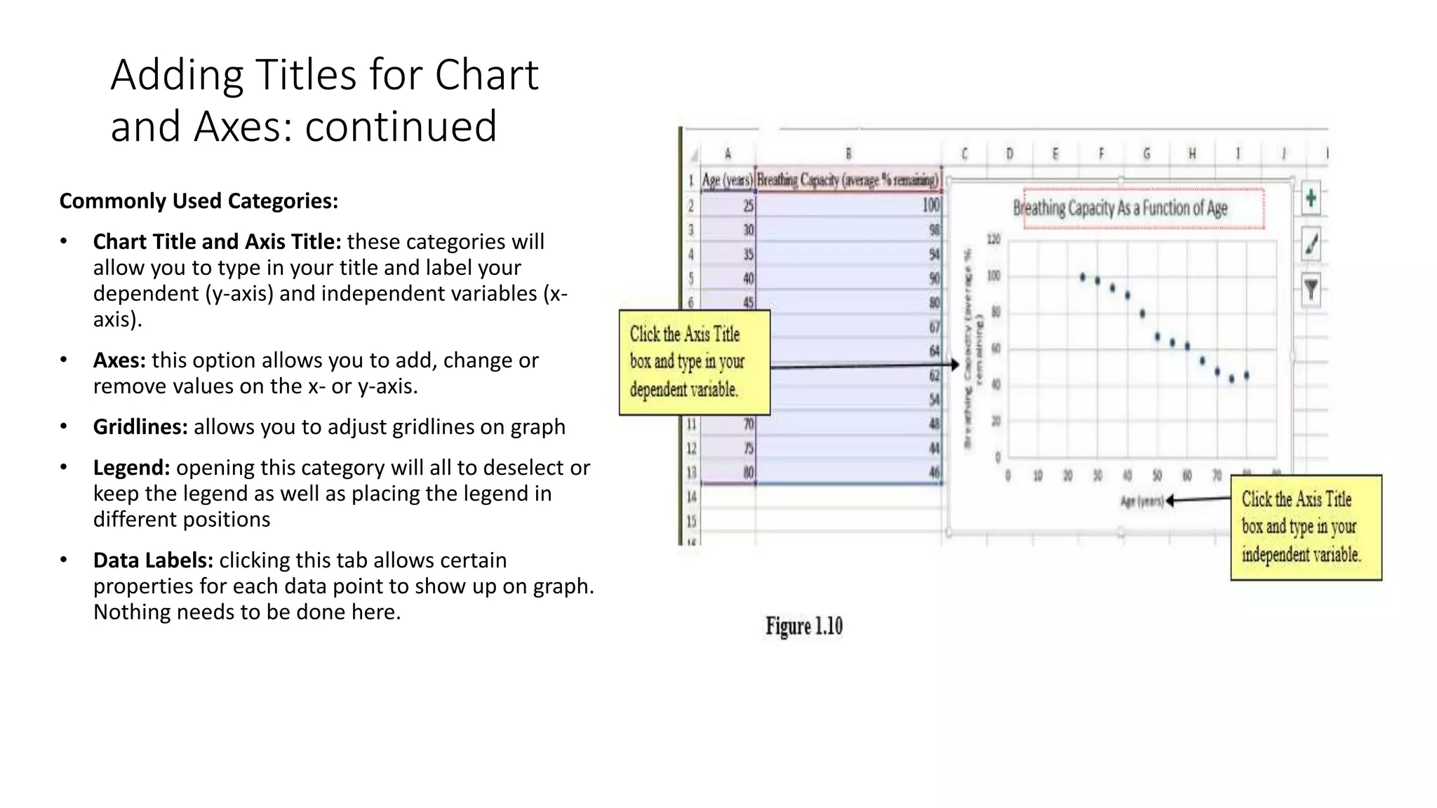
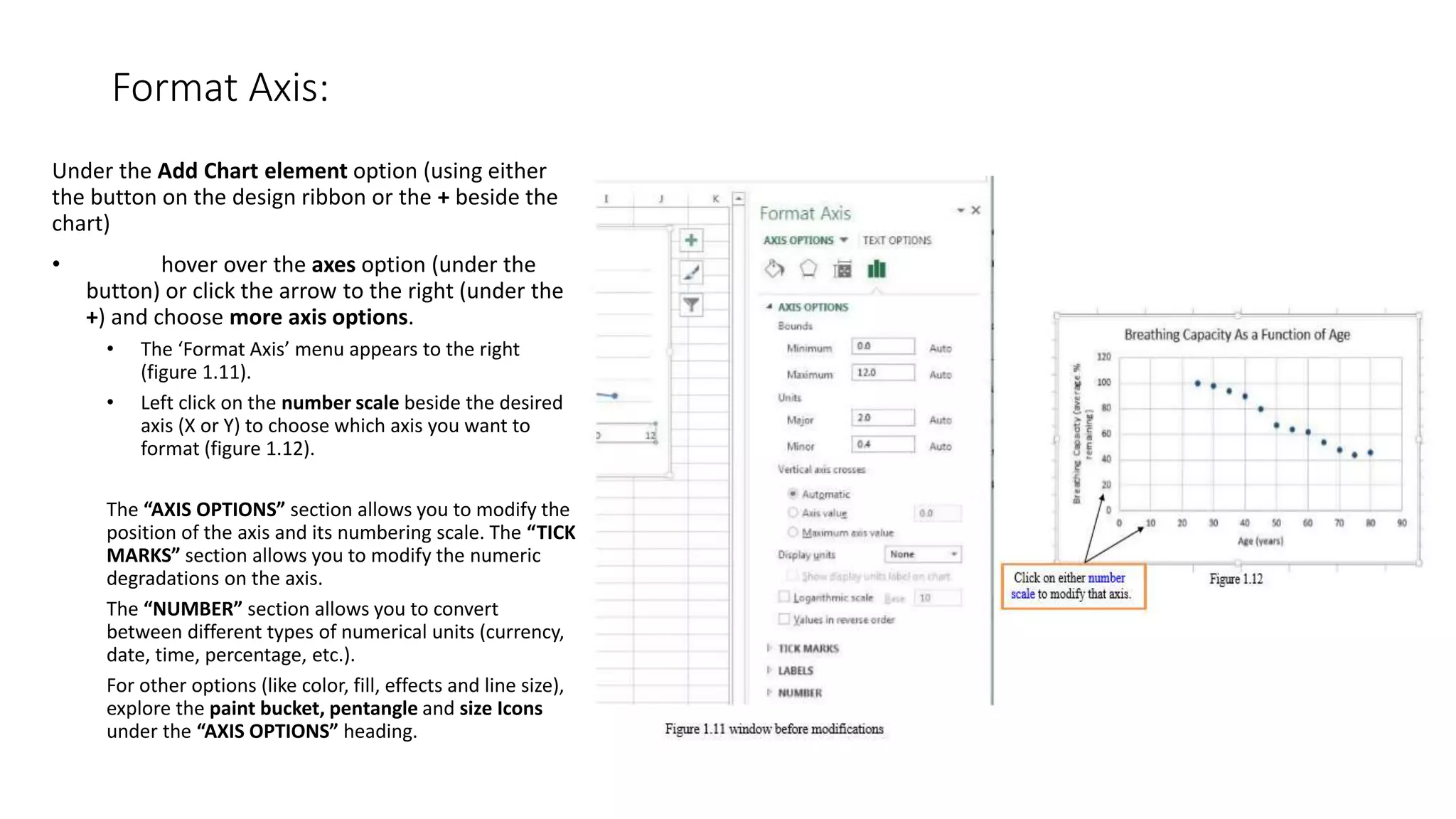
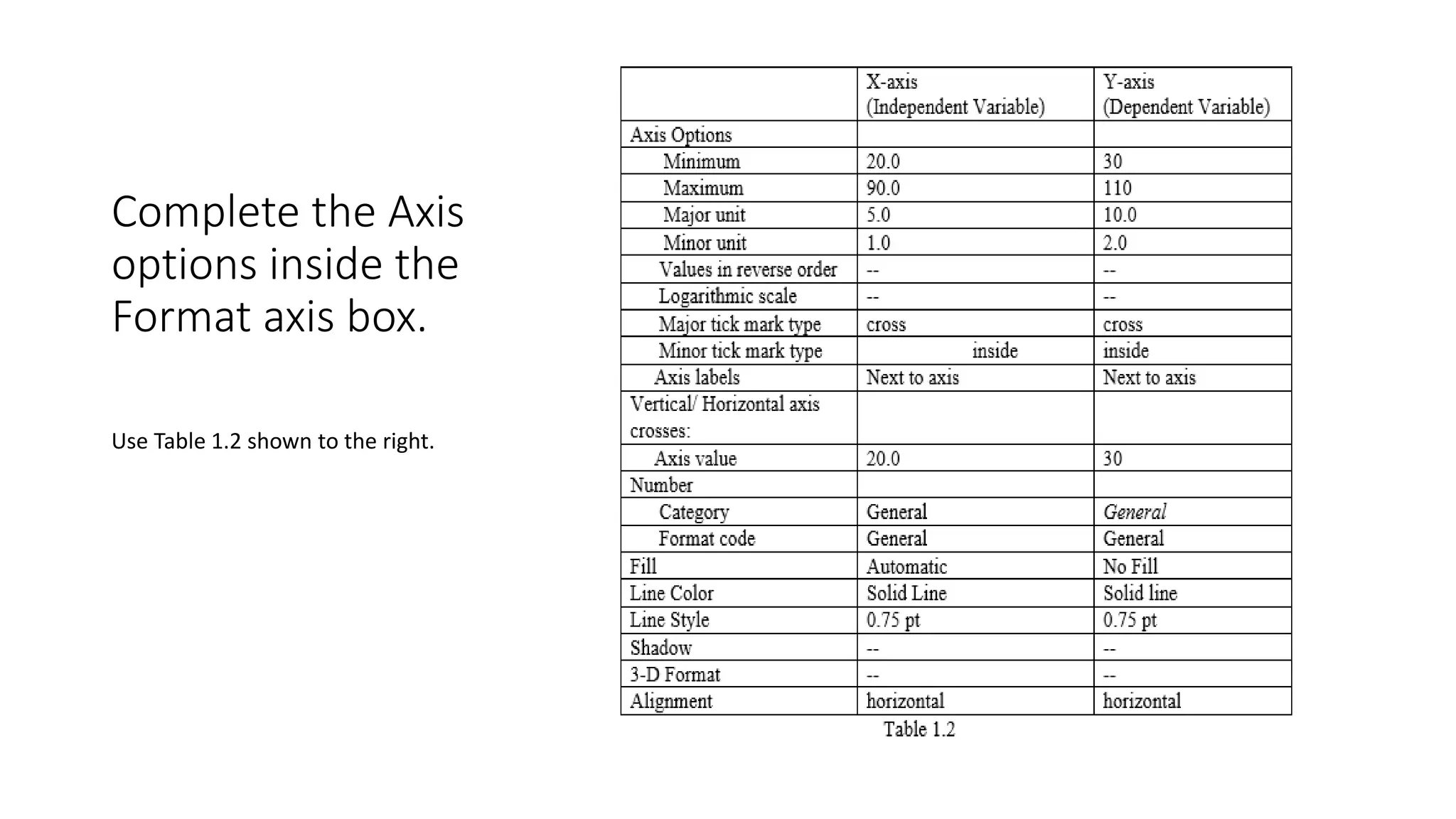
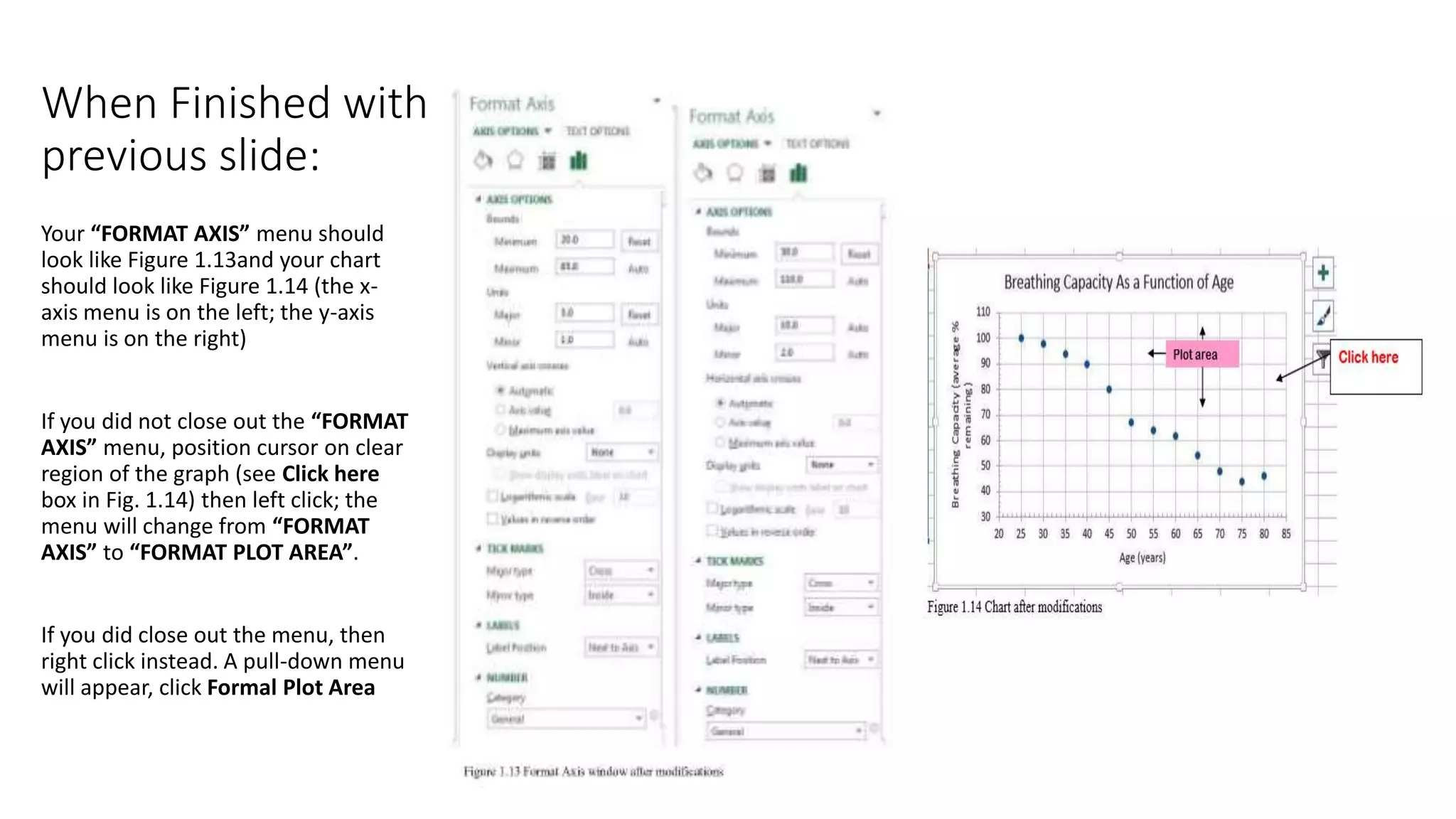
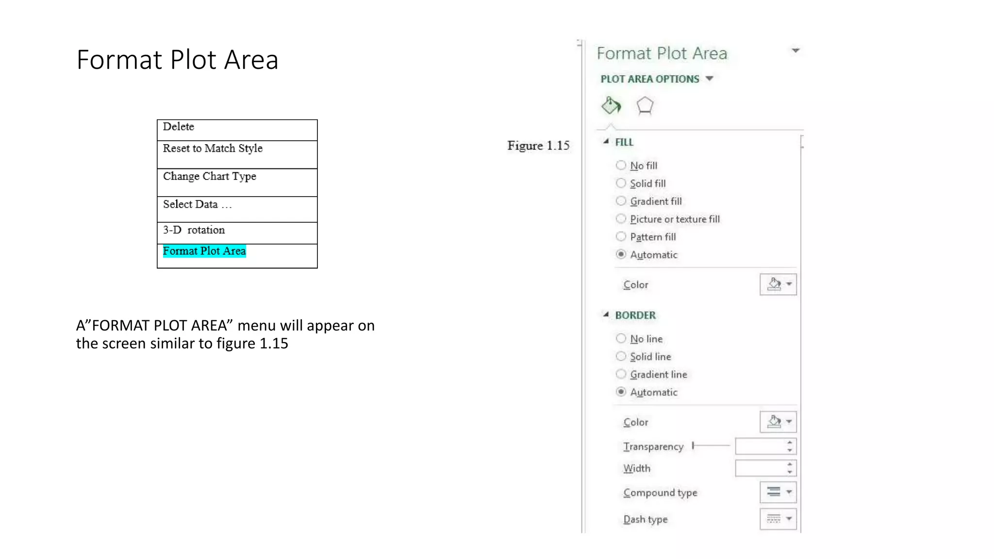
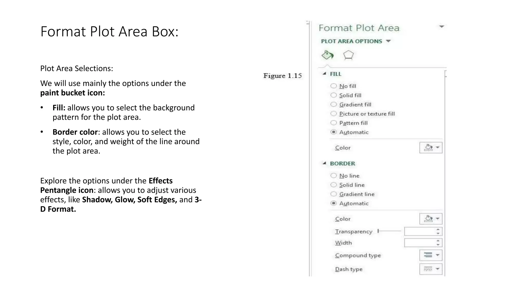
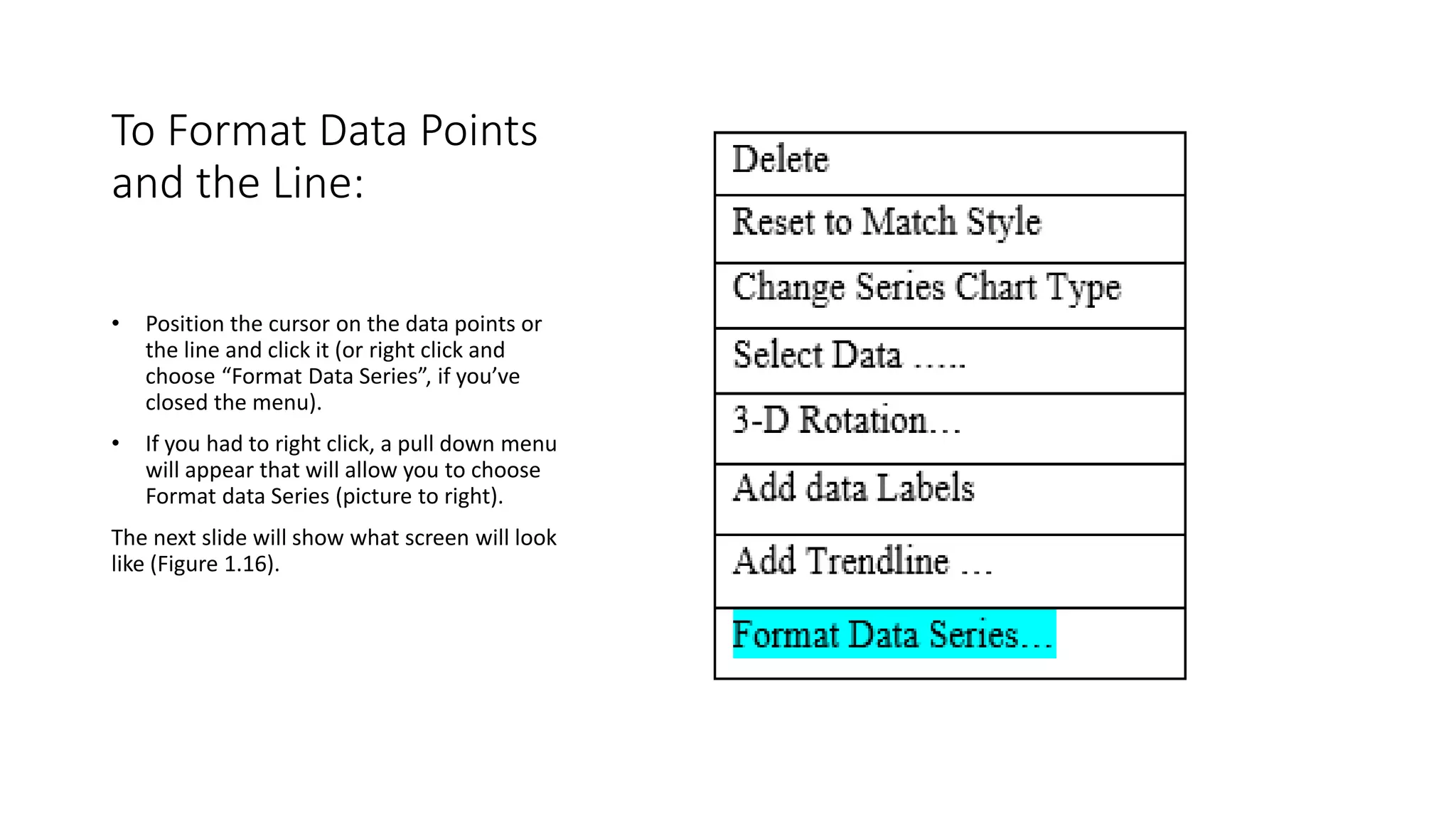
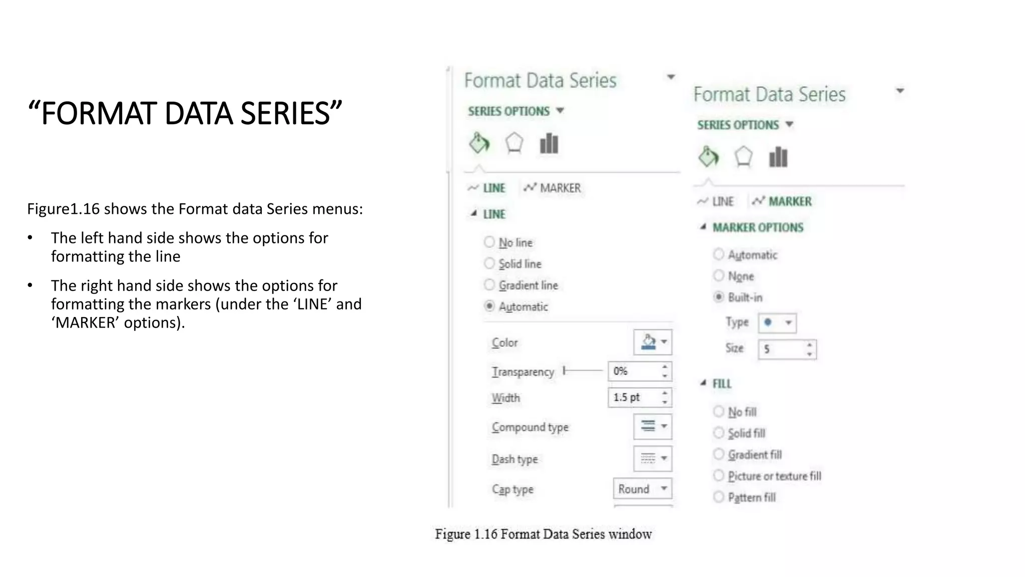
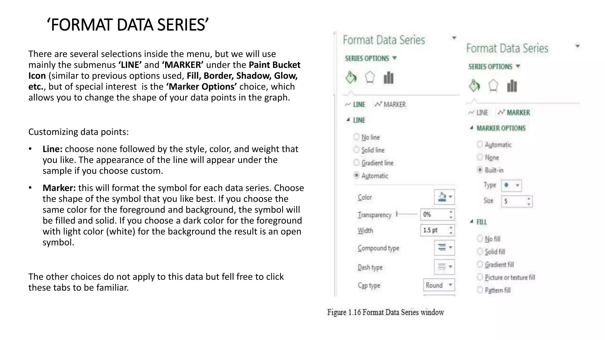
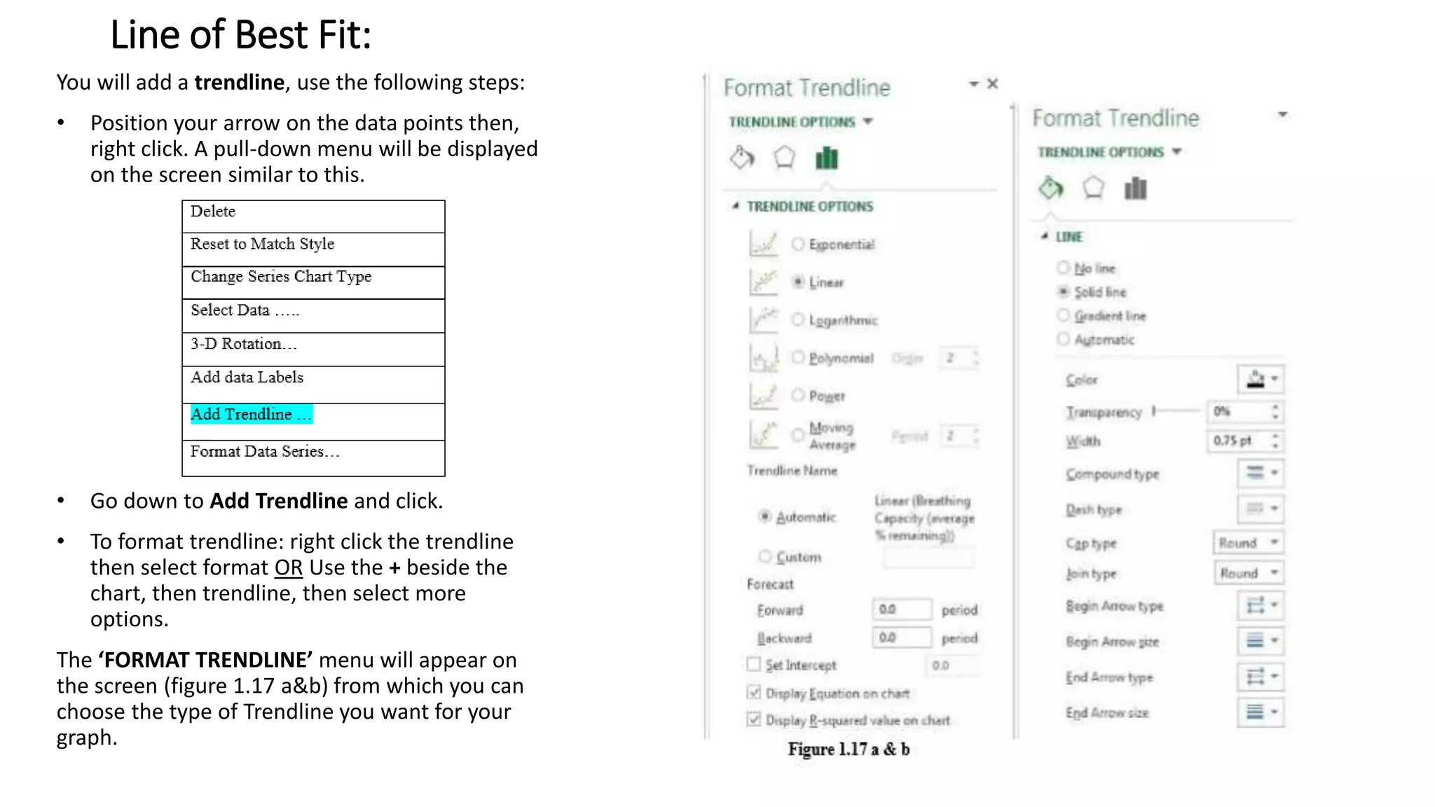
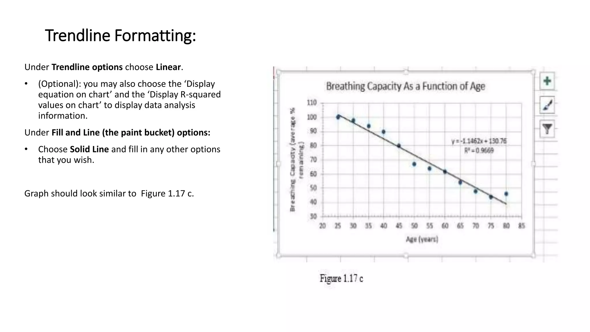
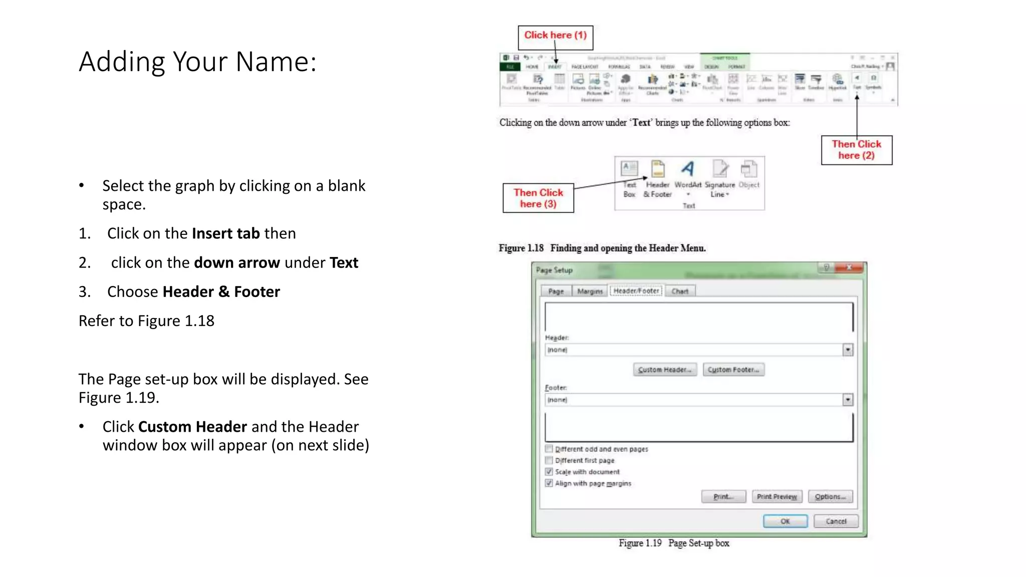
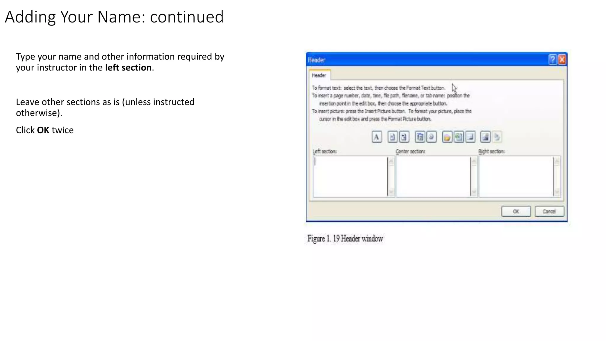
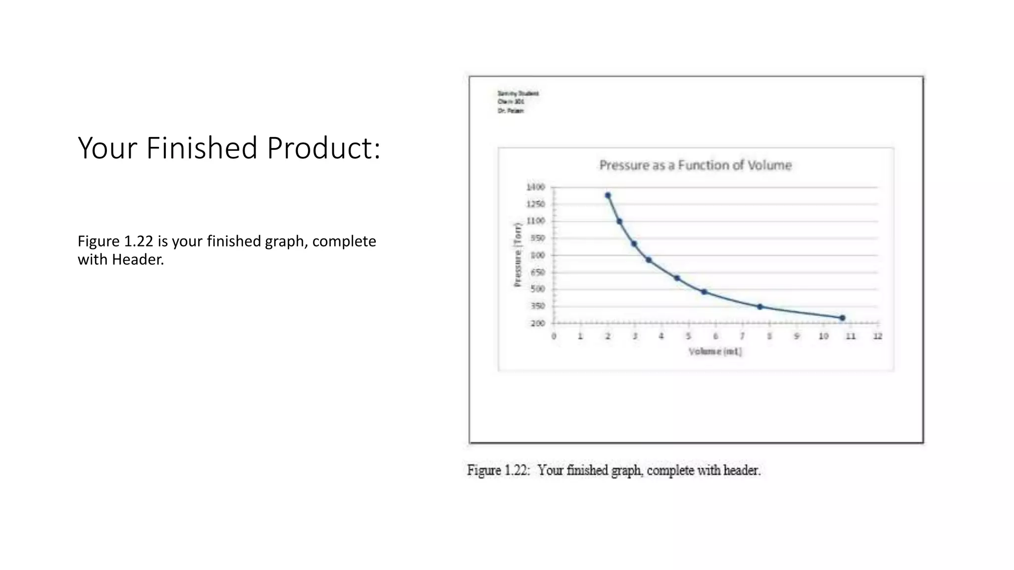
This document provides instructions for creating a scatter plot graph in Microsoft Excel. It describes how to enter age and breathing capacity data into a spreadsheet, select the data, insert a scatter plot graph, format axes and data points, add titles and labels, include a trendline, and print the finished graph. The overall goal is to construct a graph visualizing the relationship between age and breathing capacity using sample data provided.