Download as PDF, PPTX


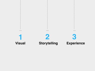
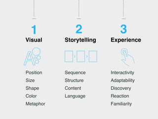
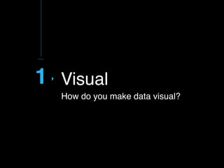
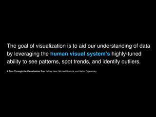
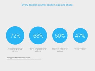
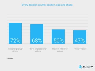

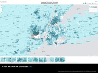
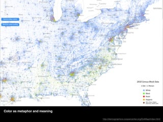


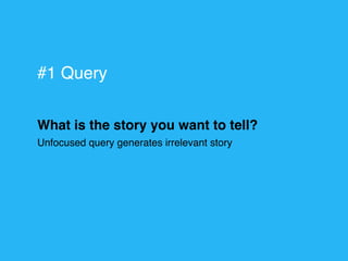
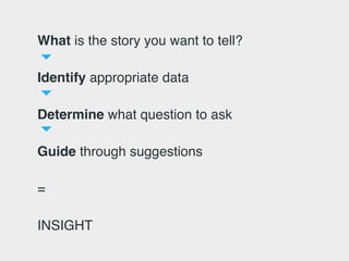
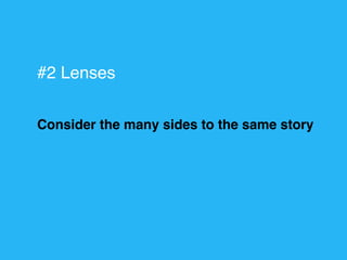
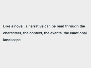
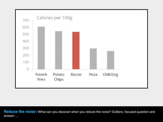

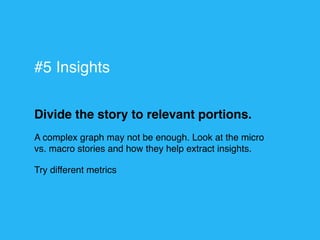
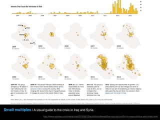


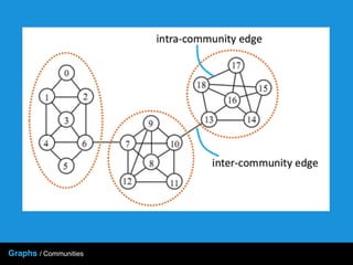
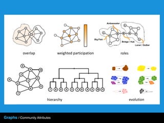
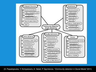
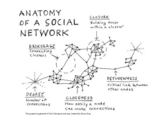
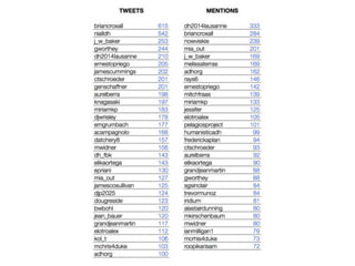


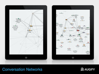

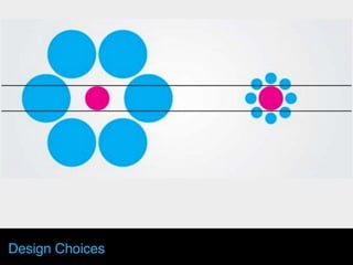
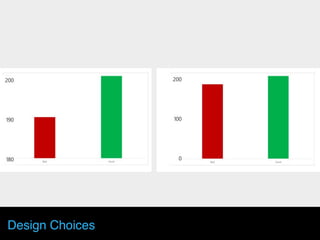

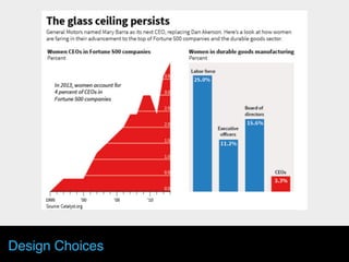
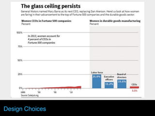
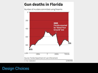


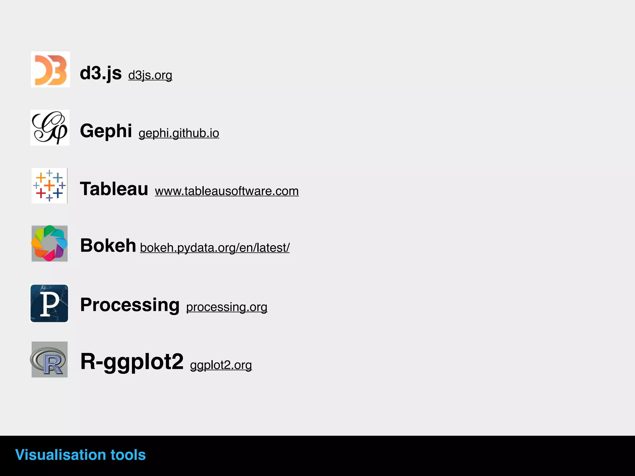

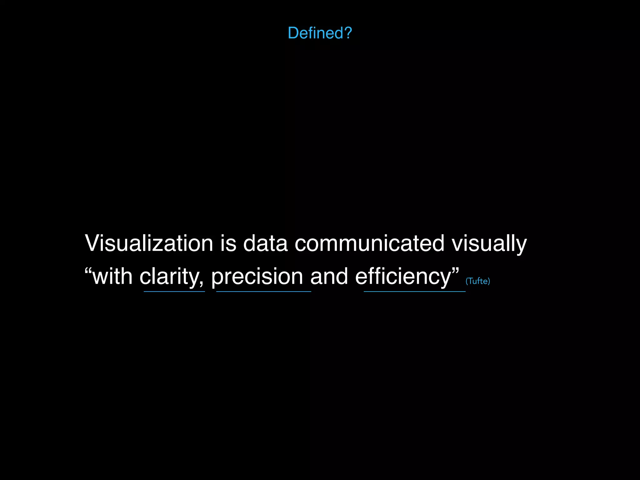
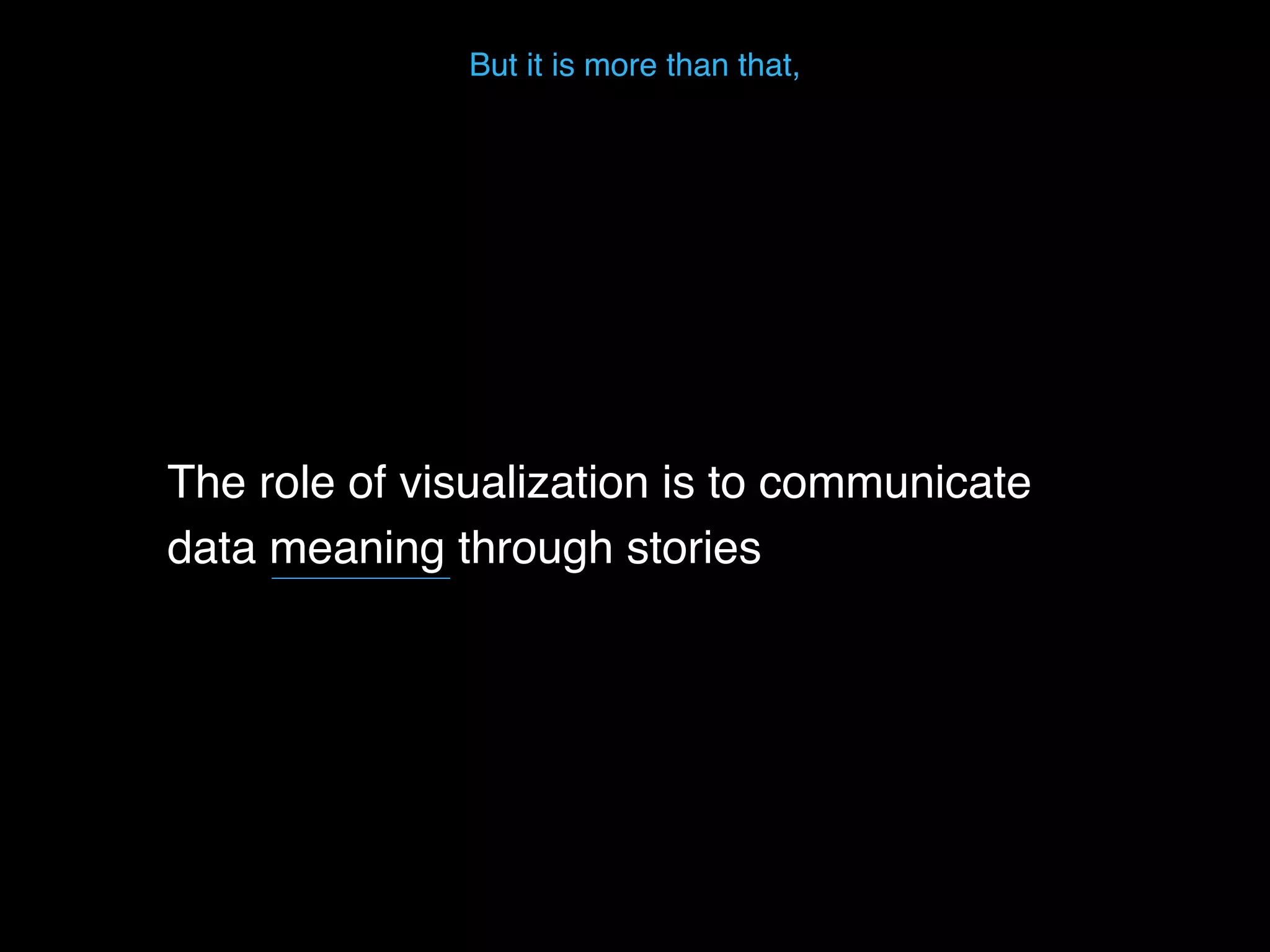
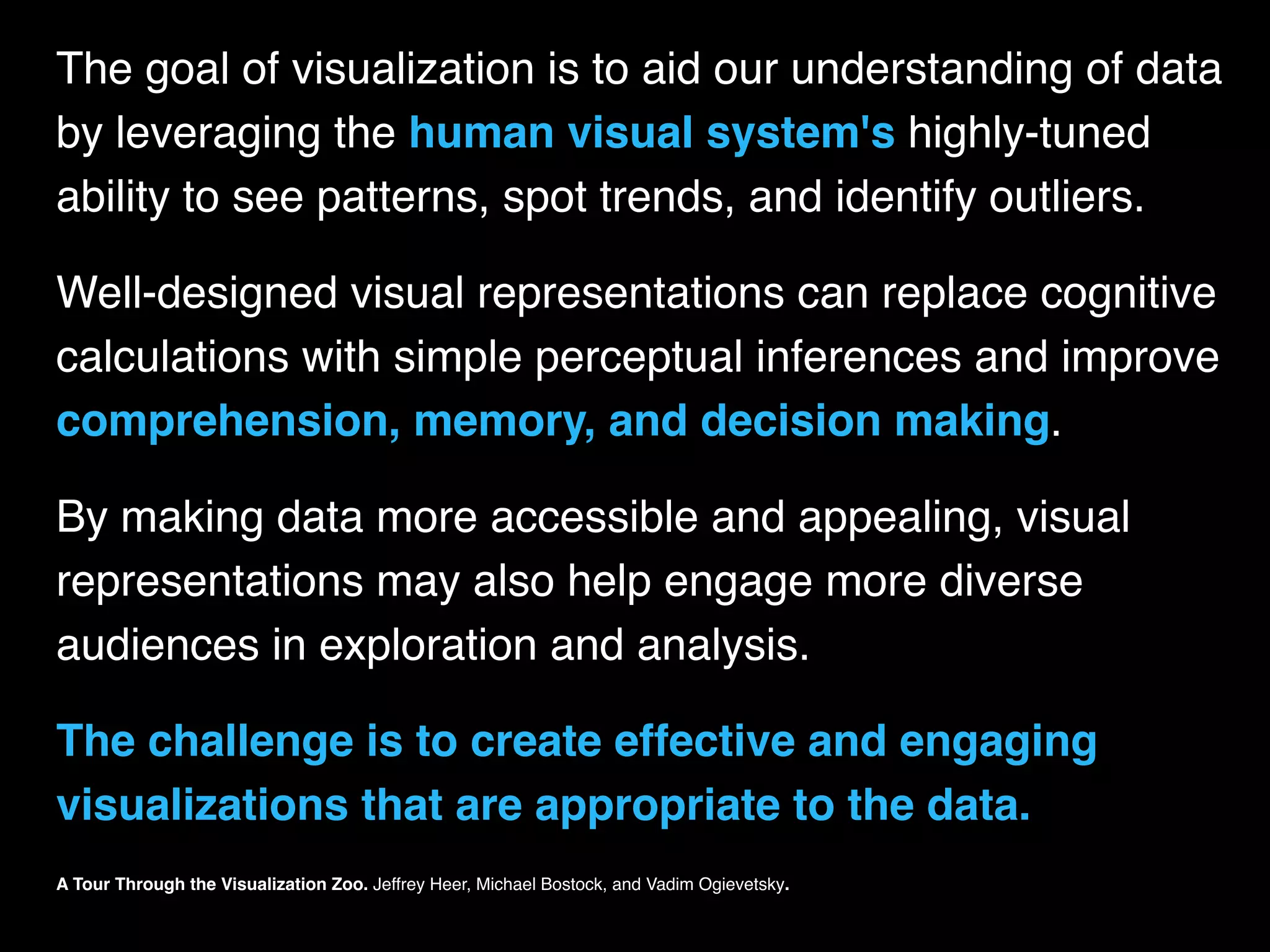
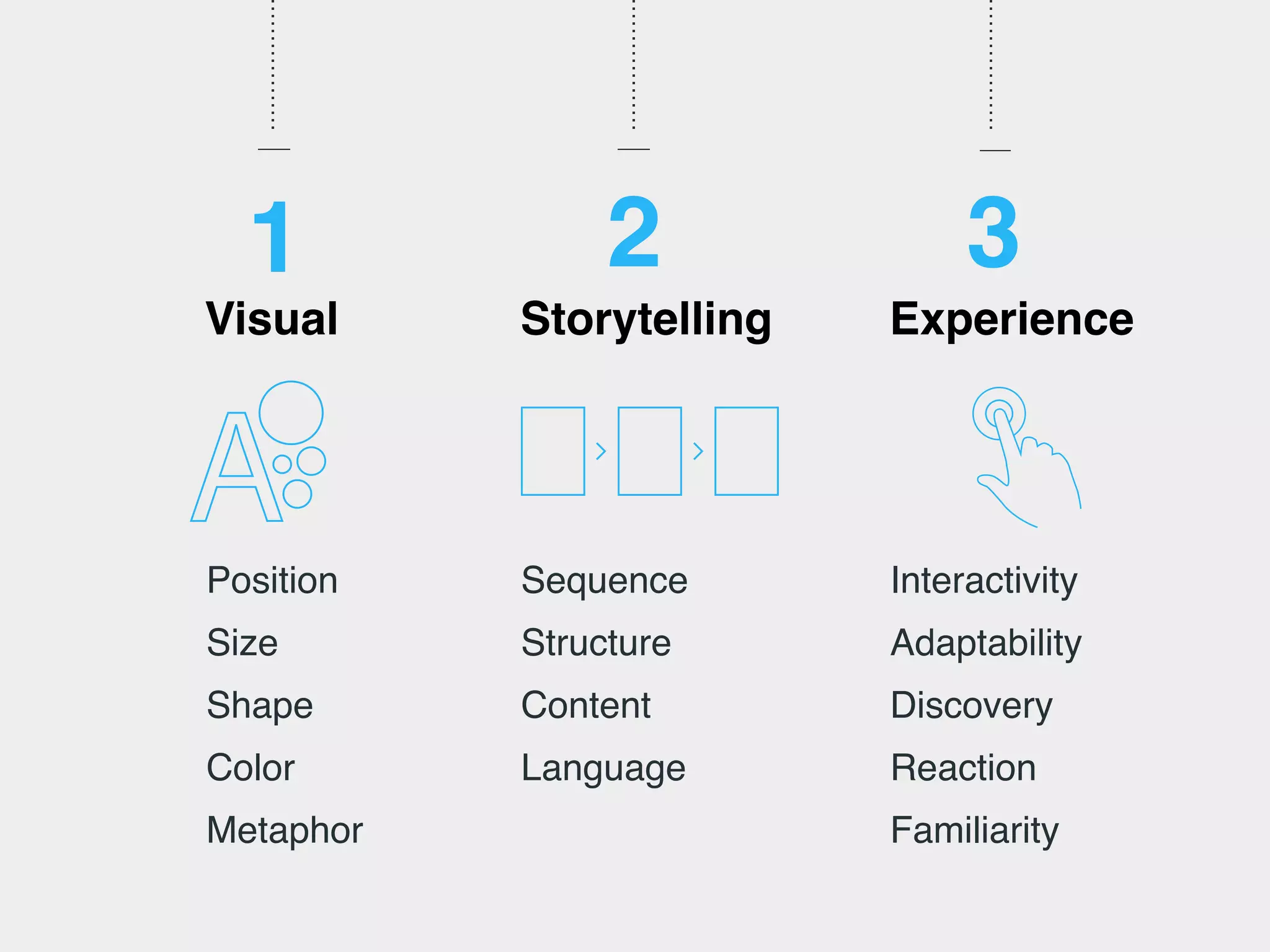

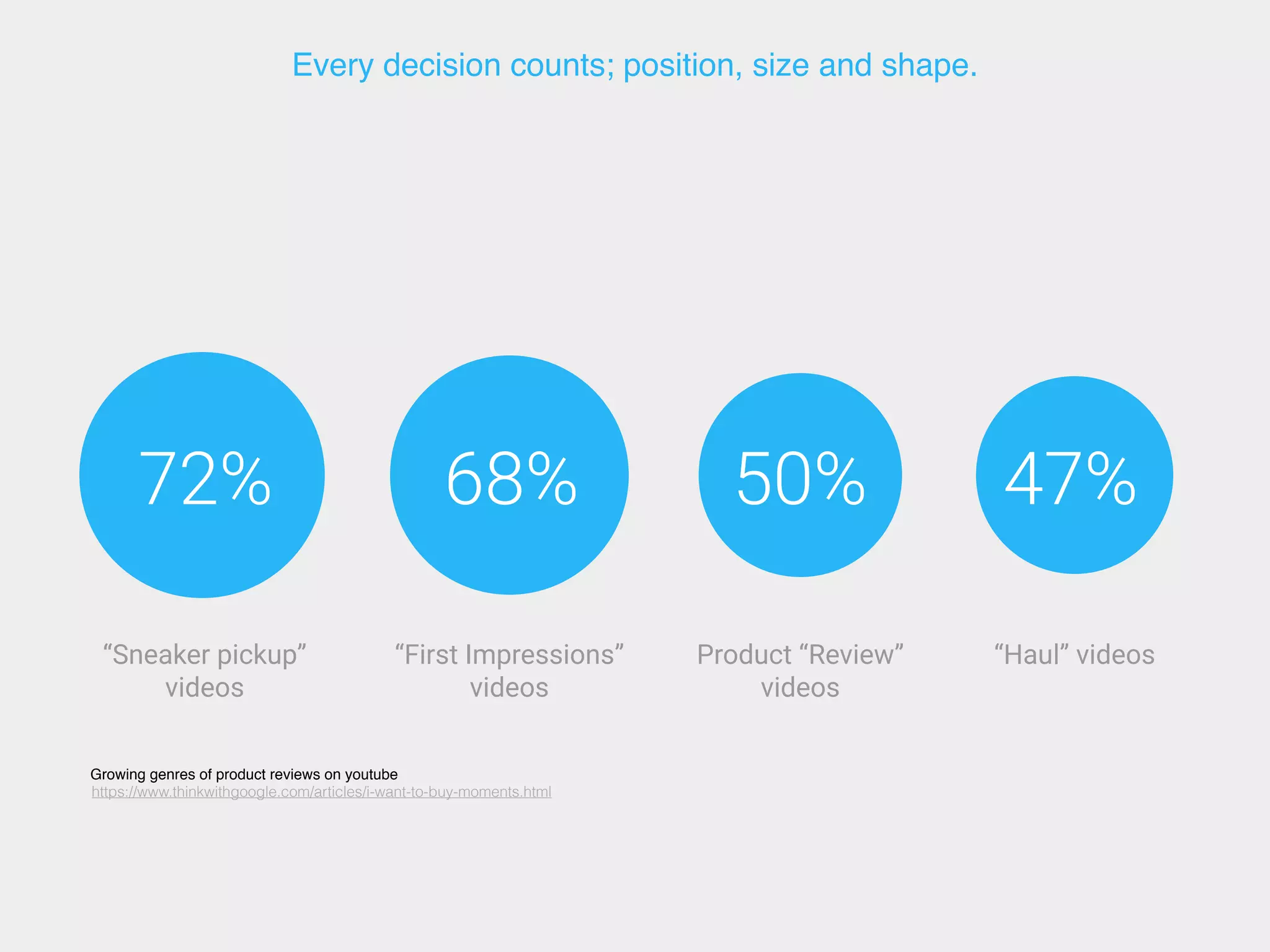


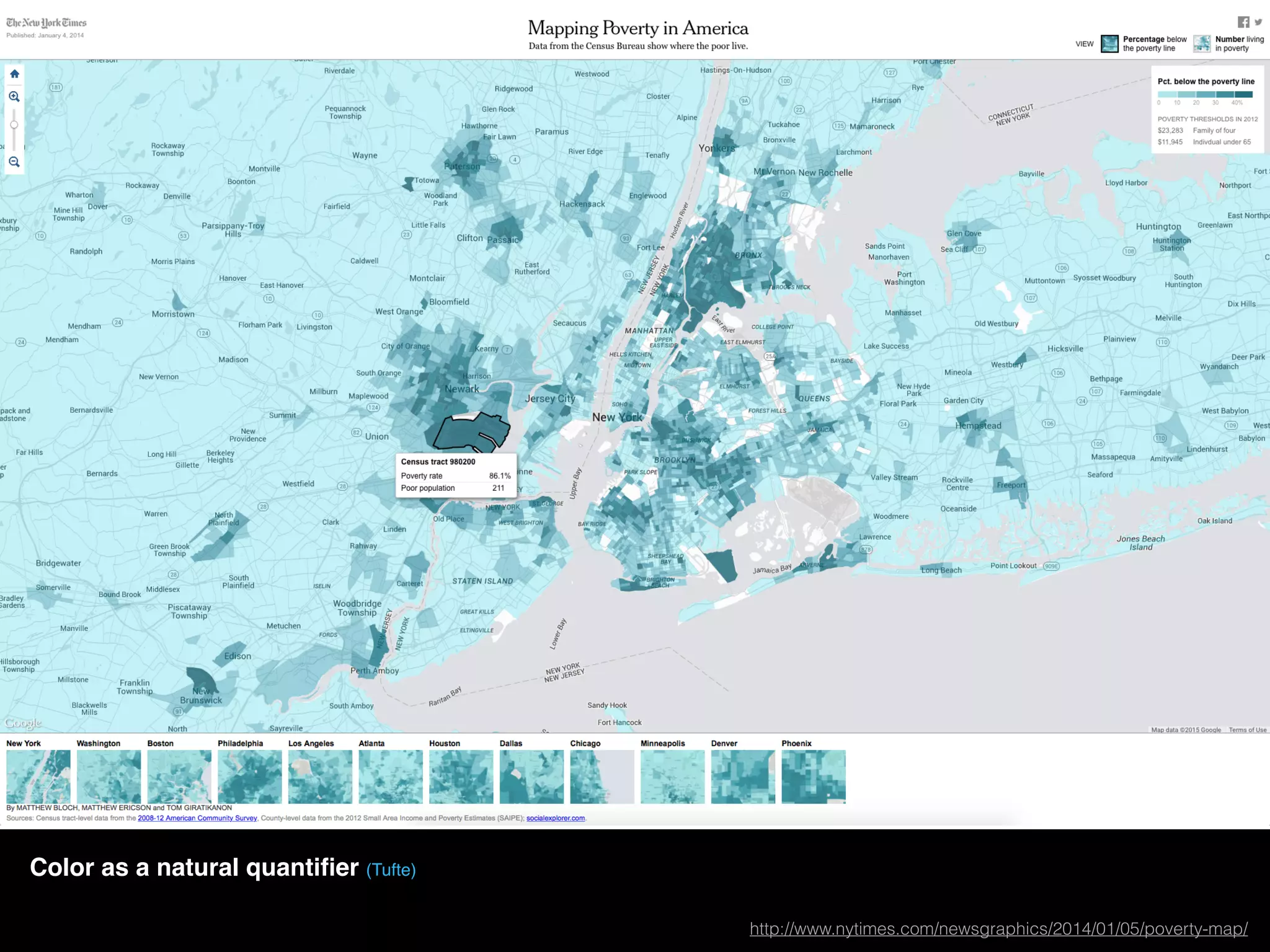
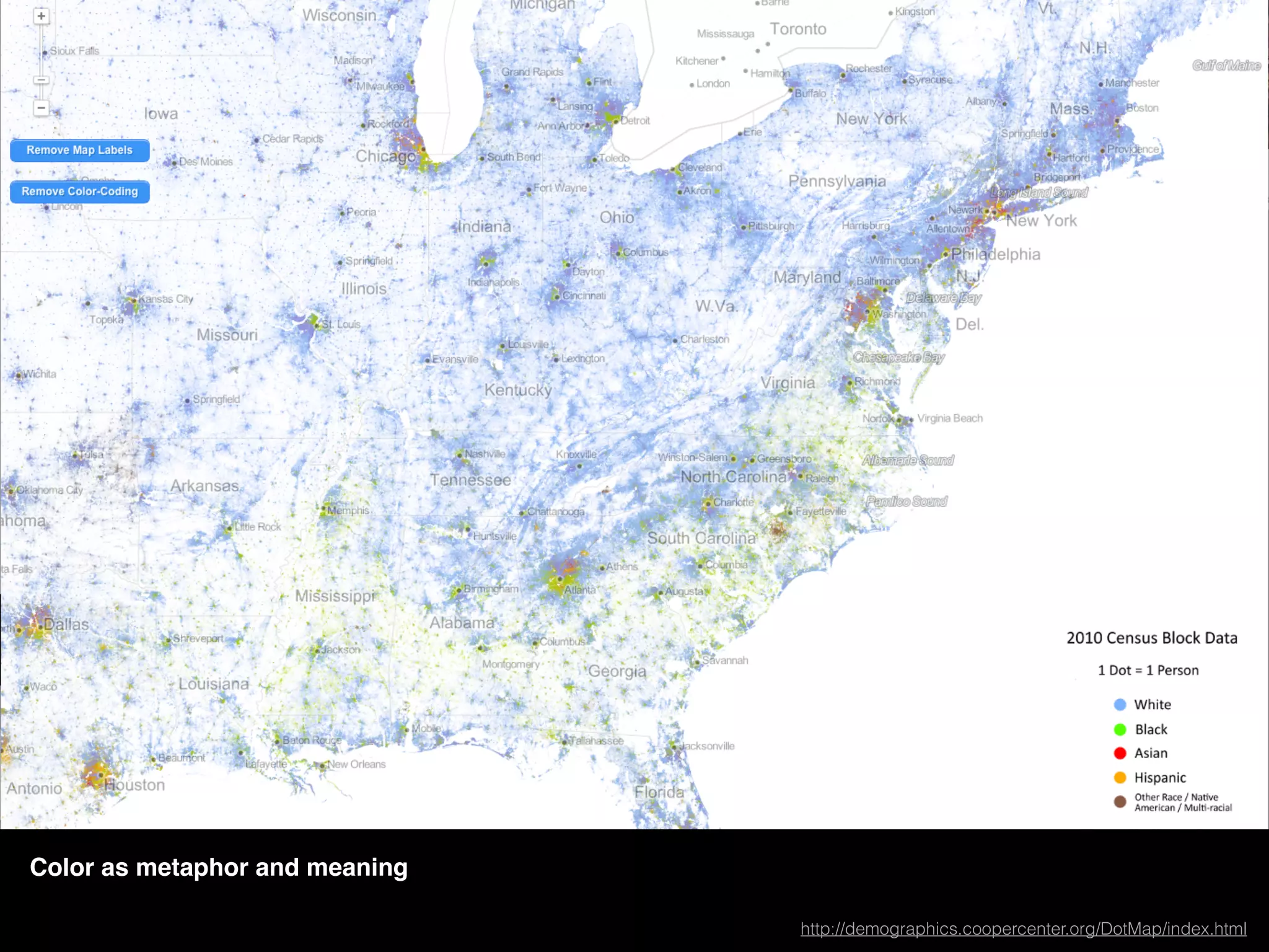
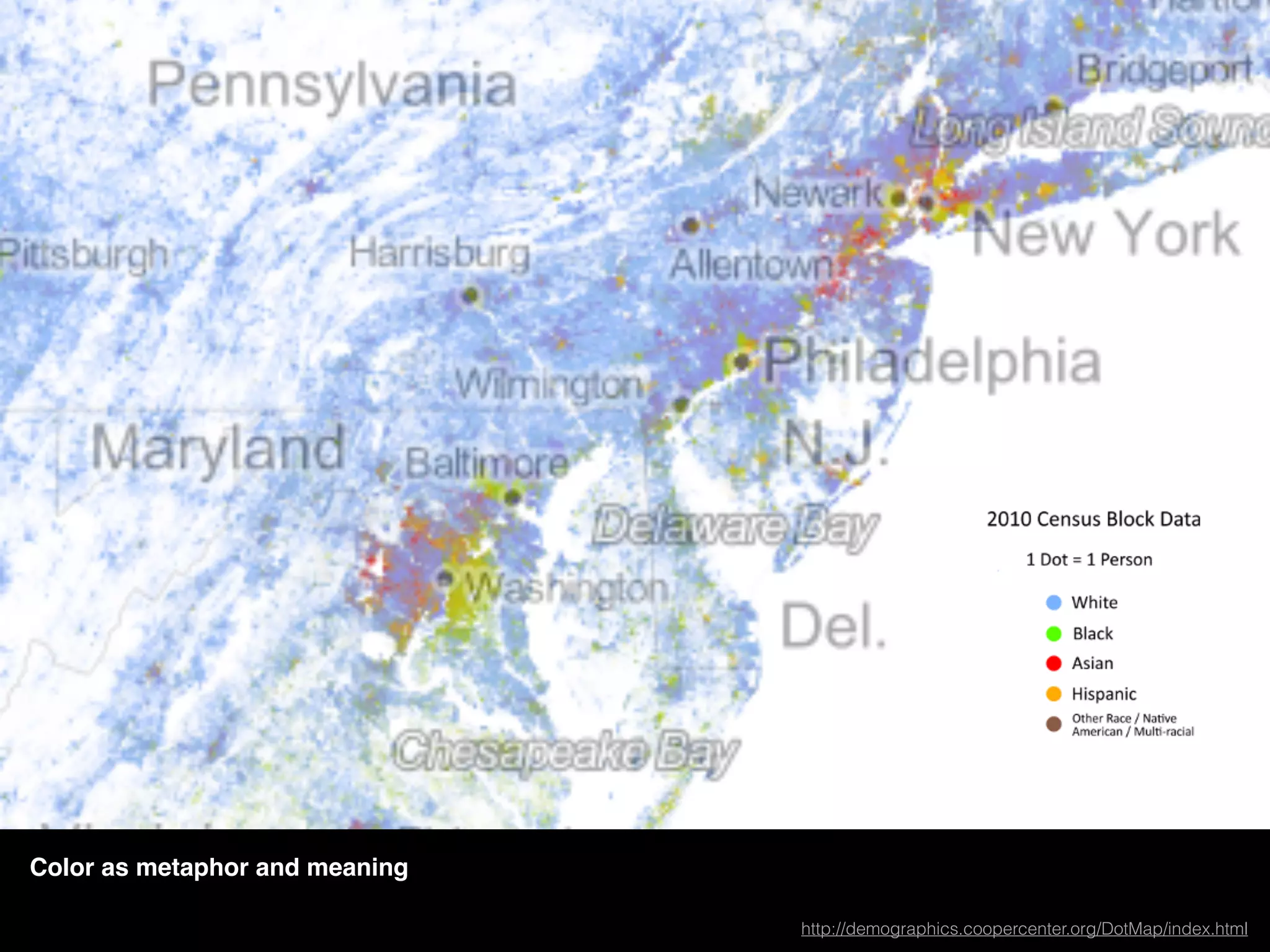
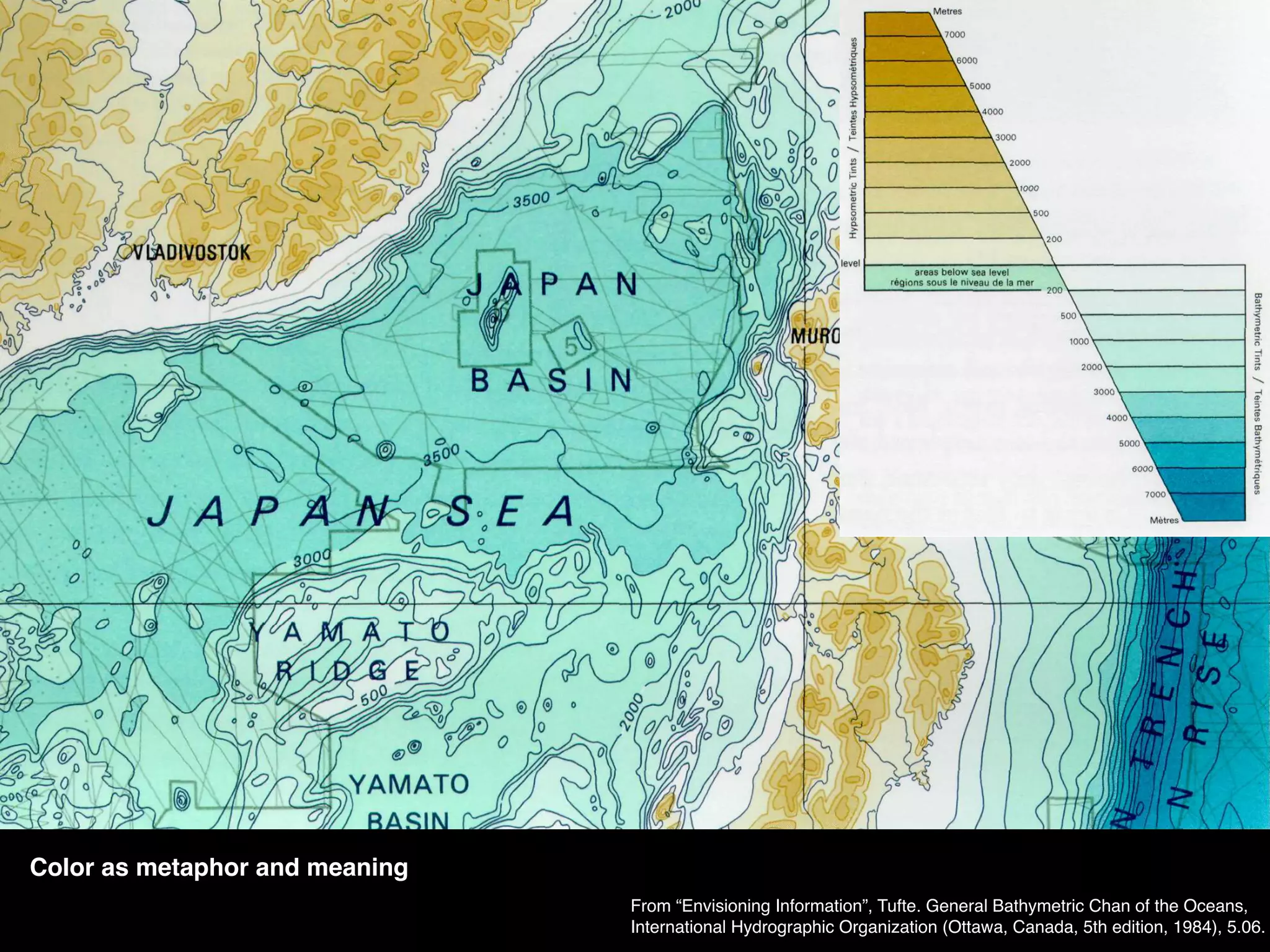
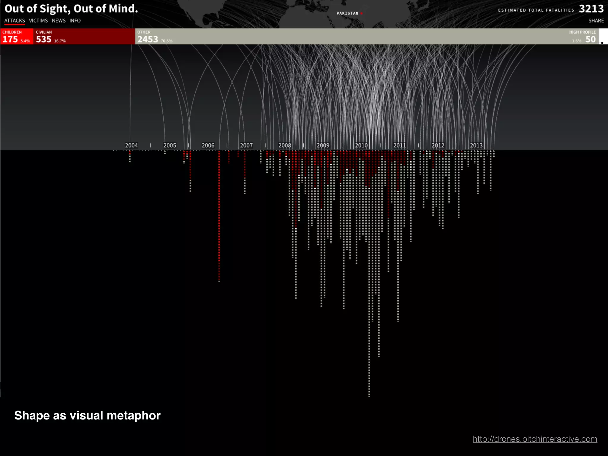
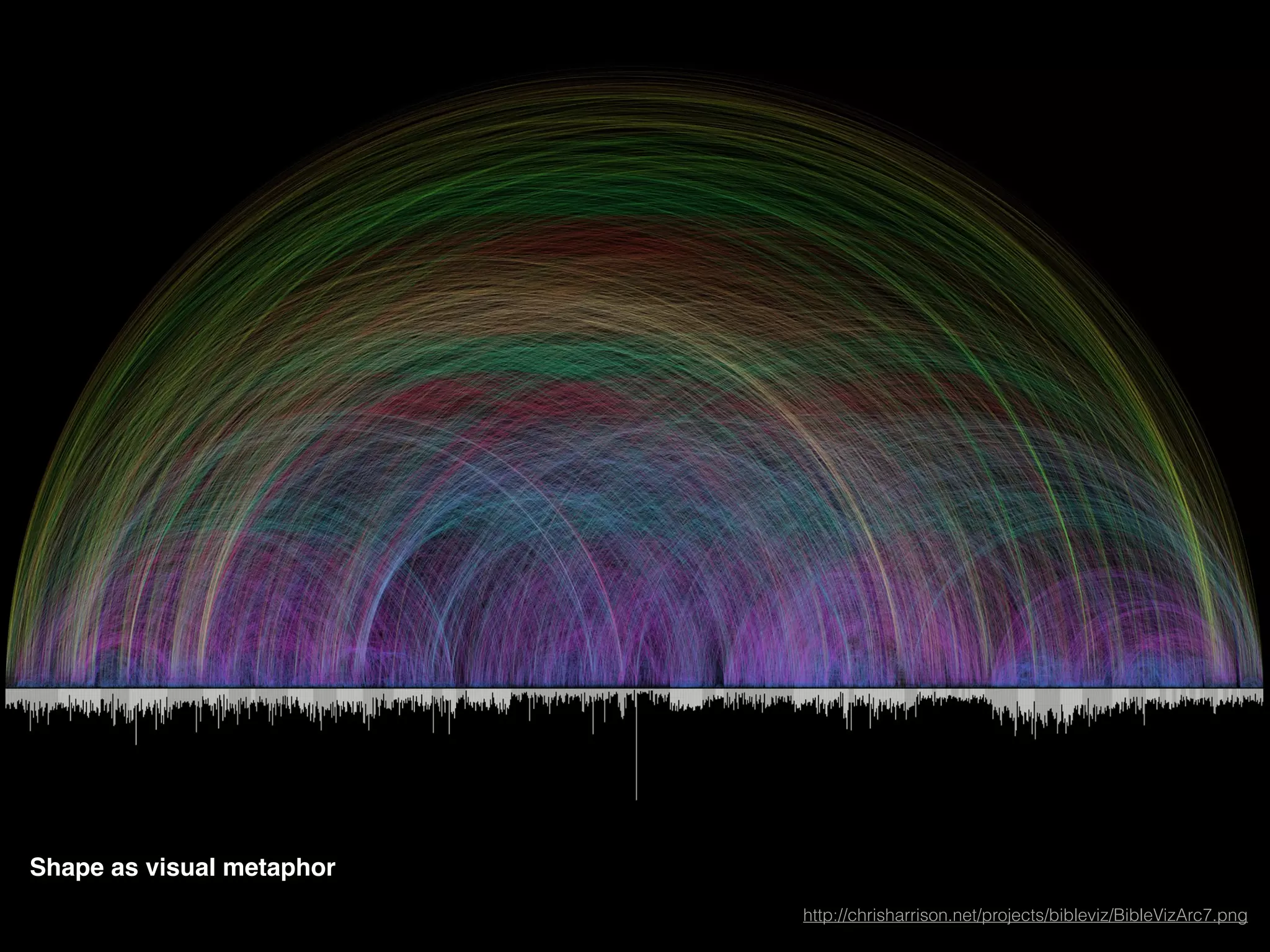

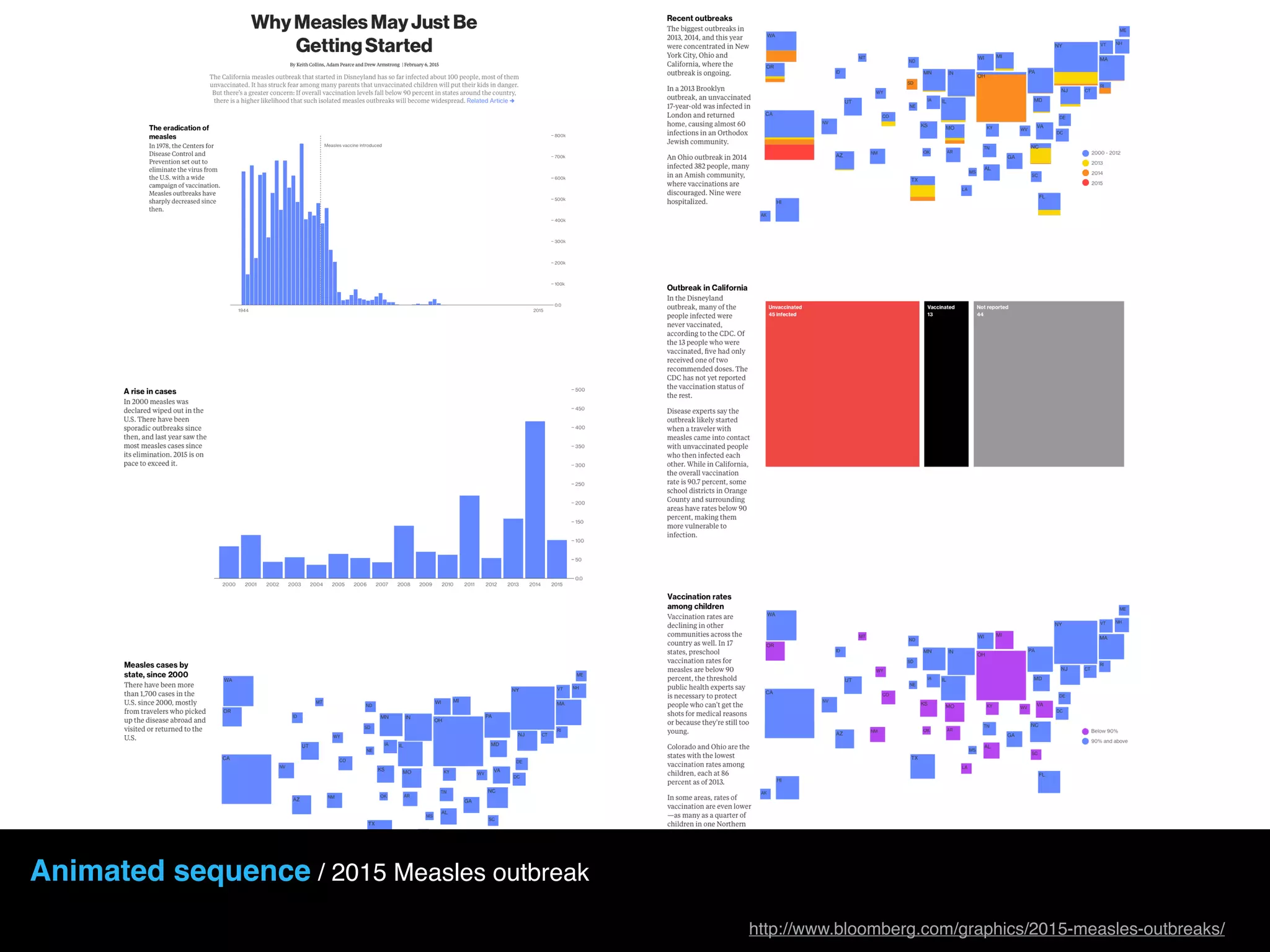
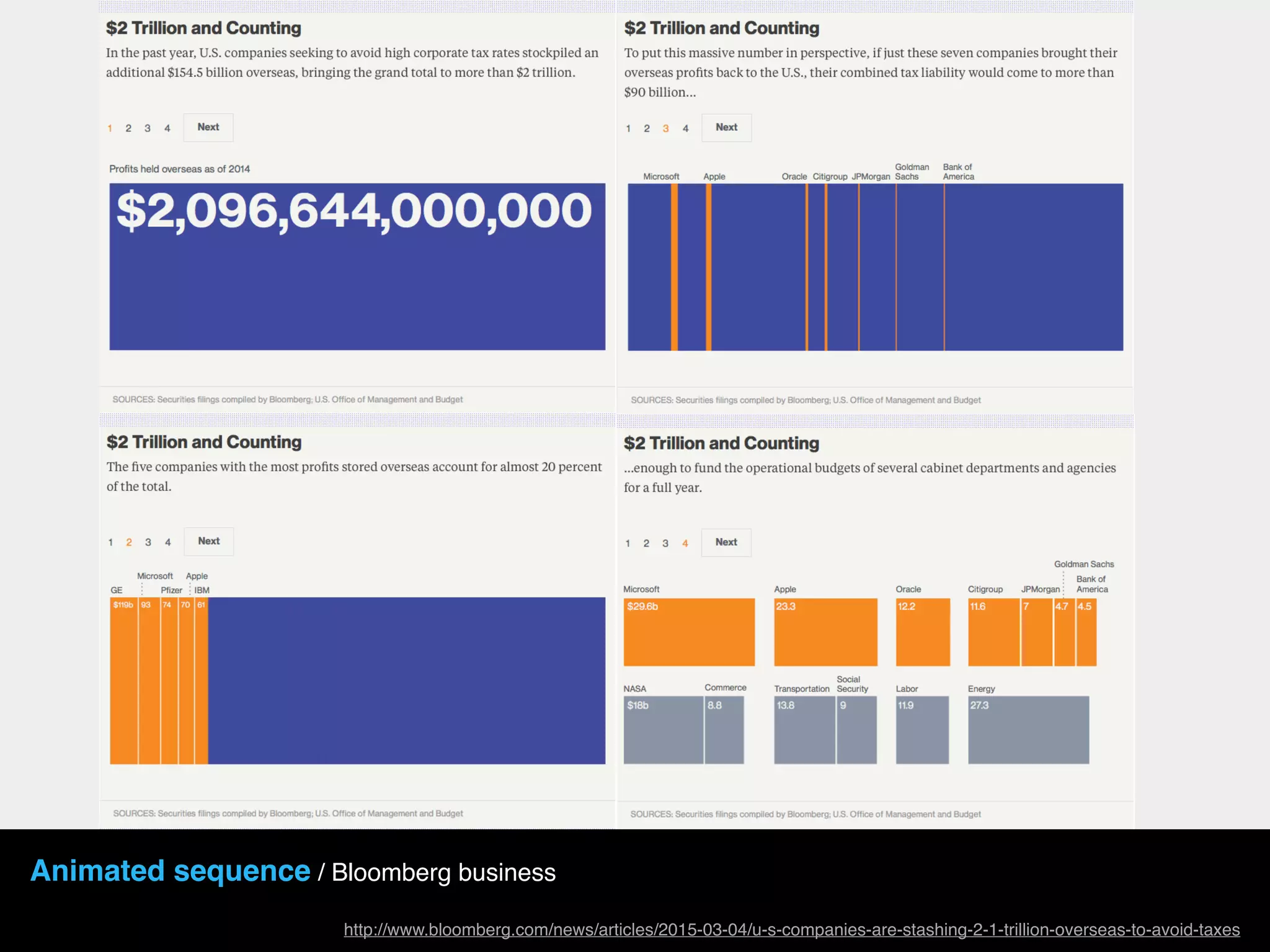
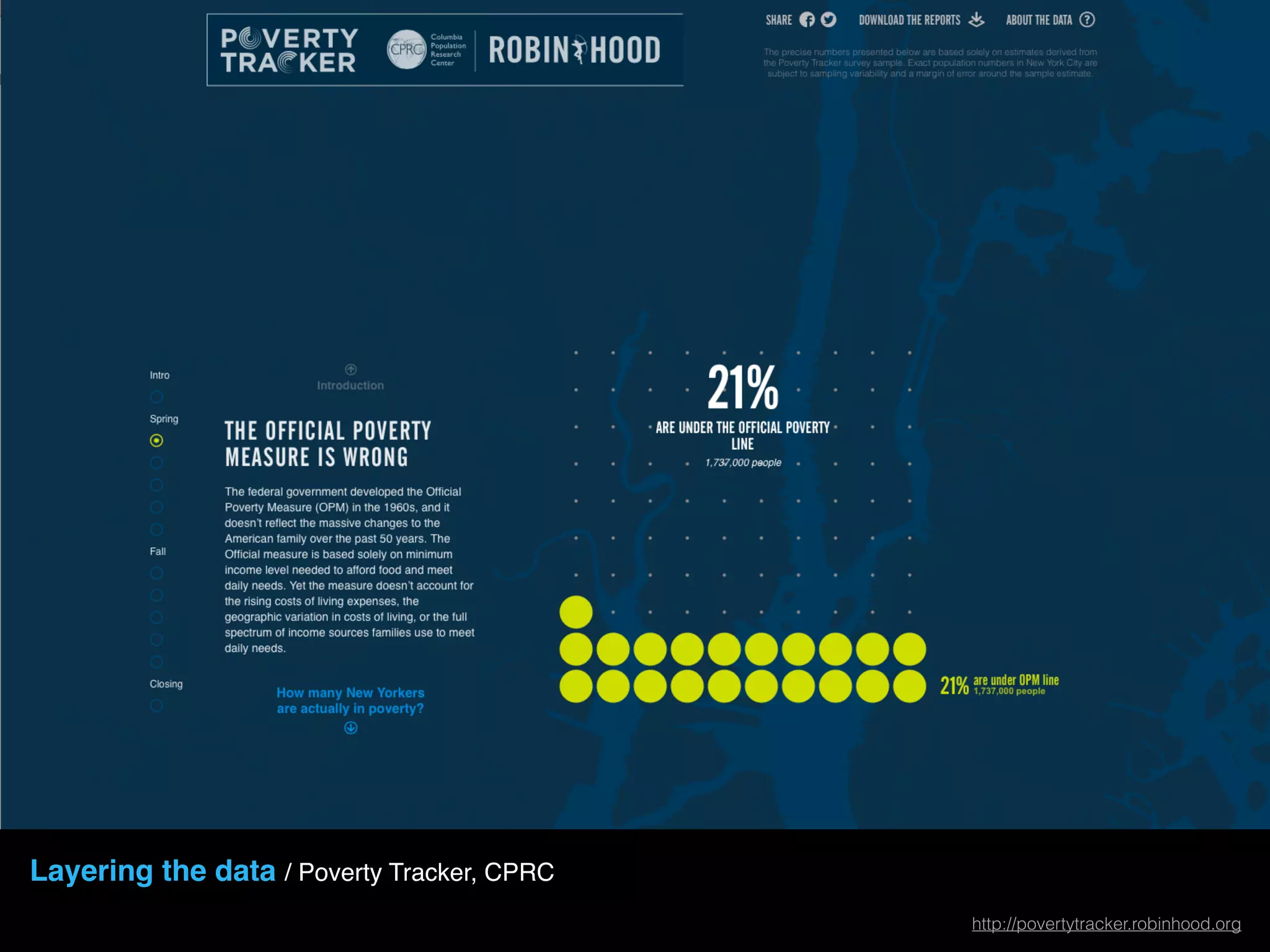


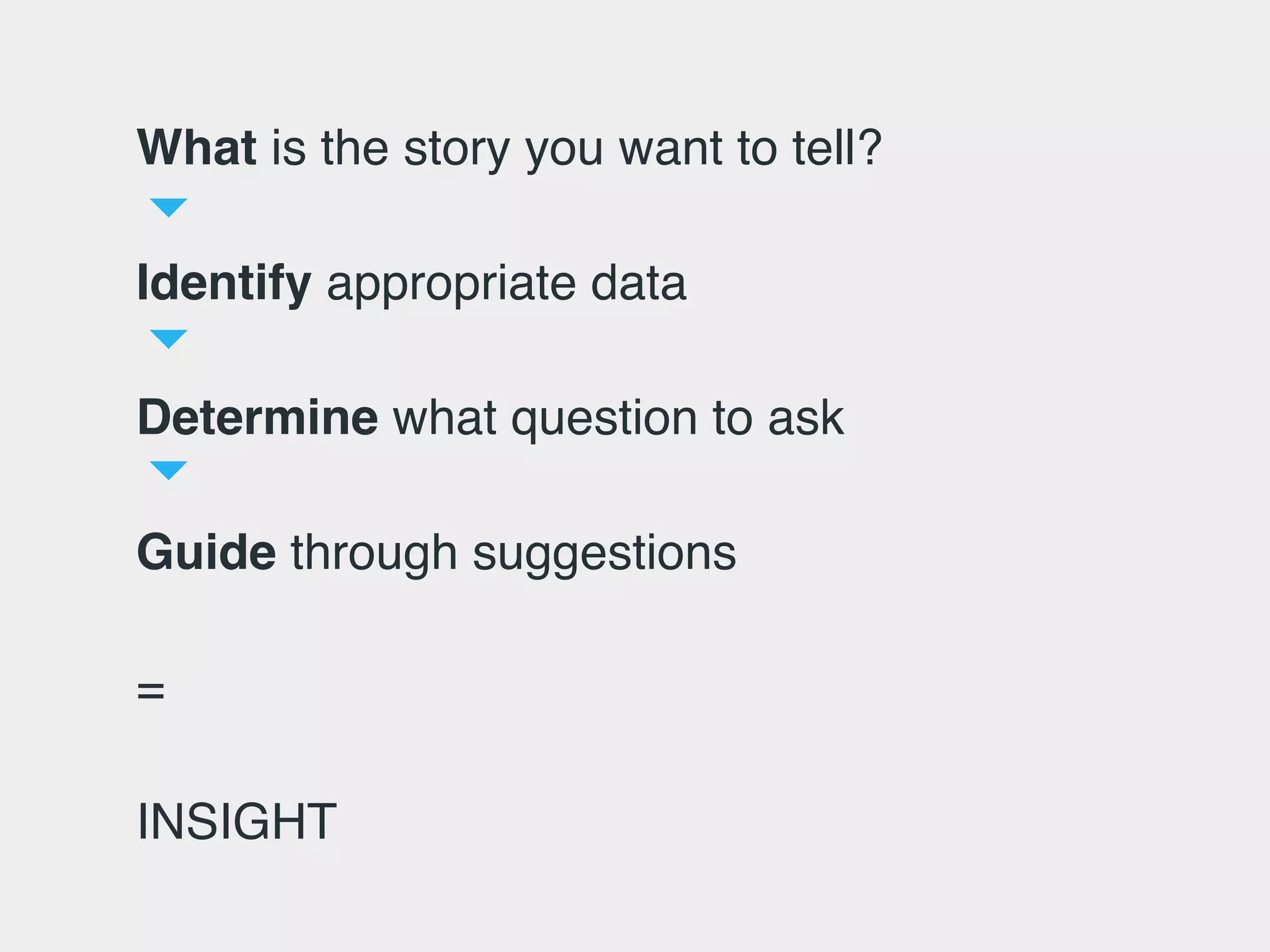
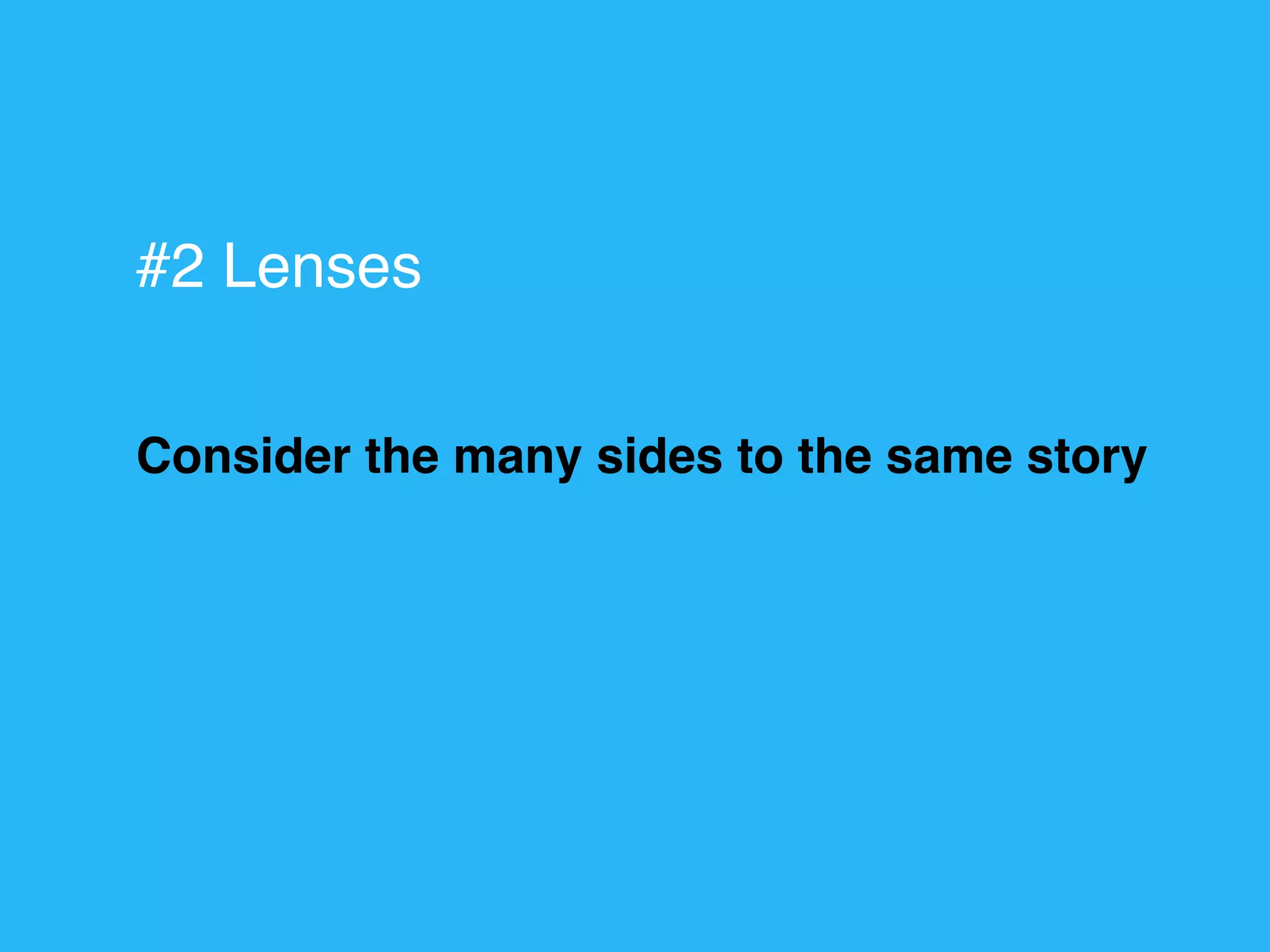
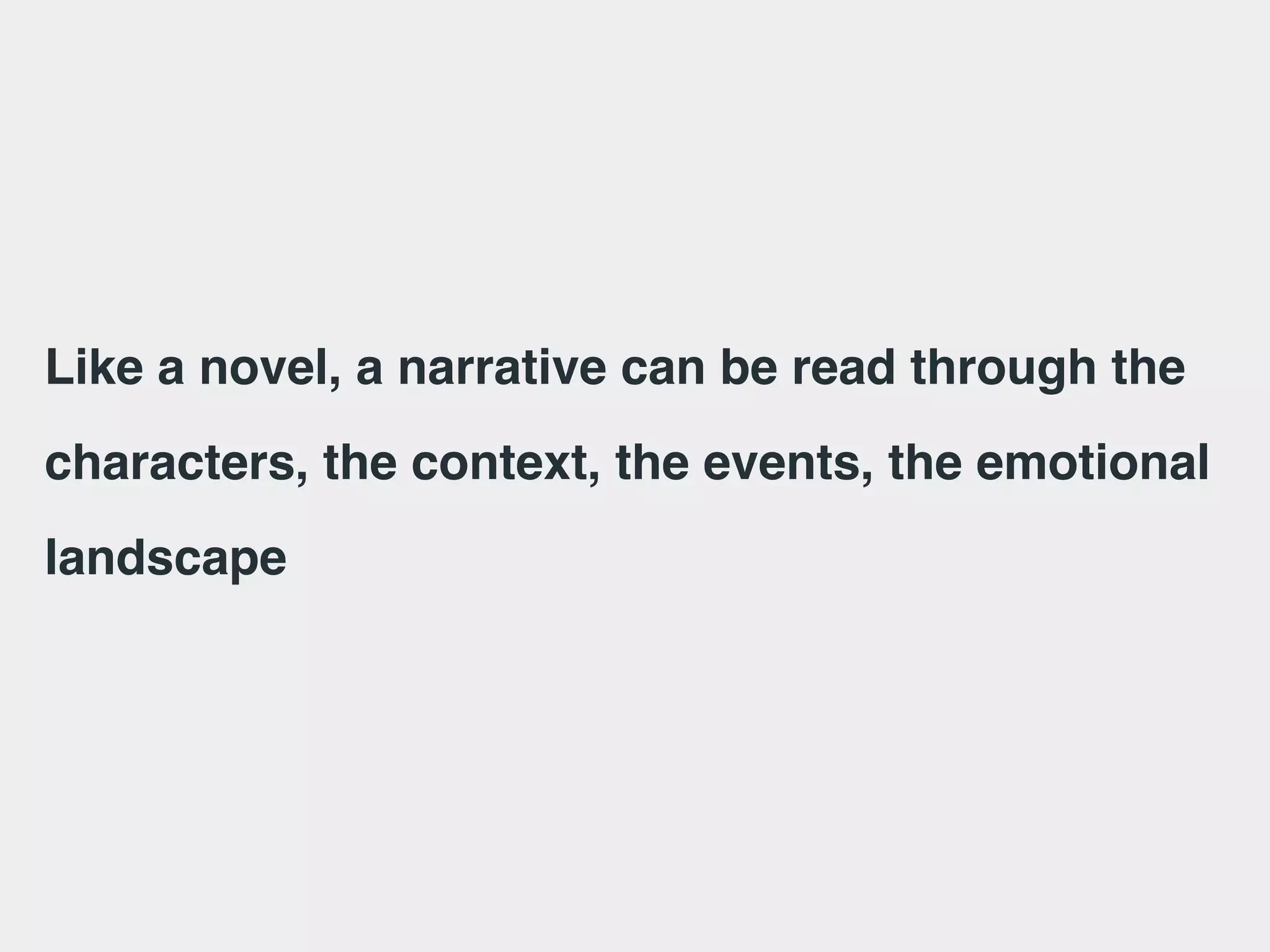
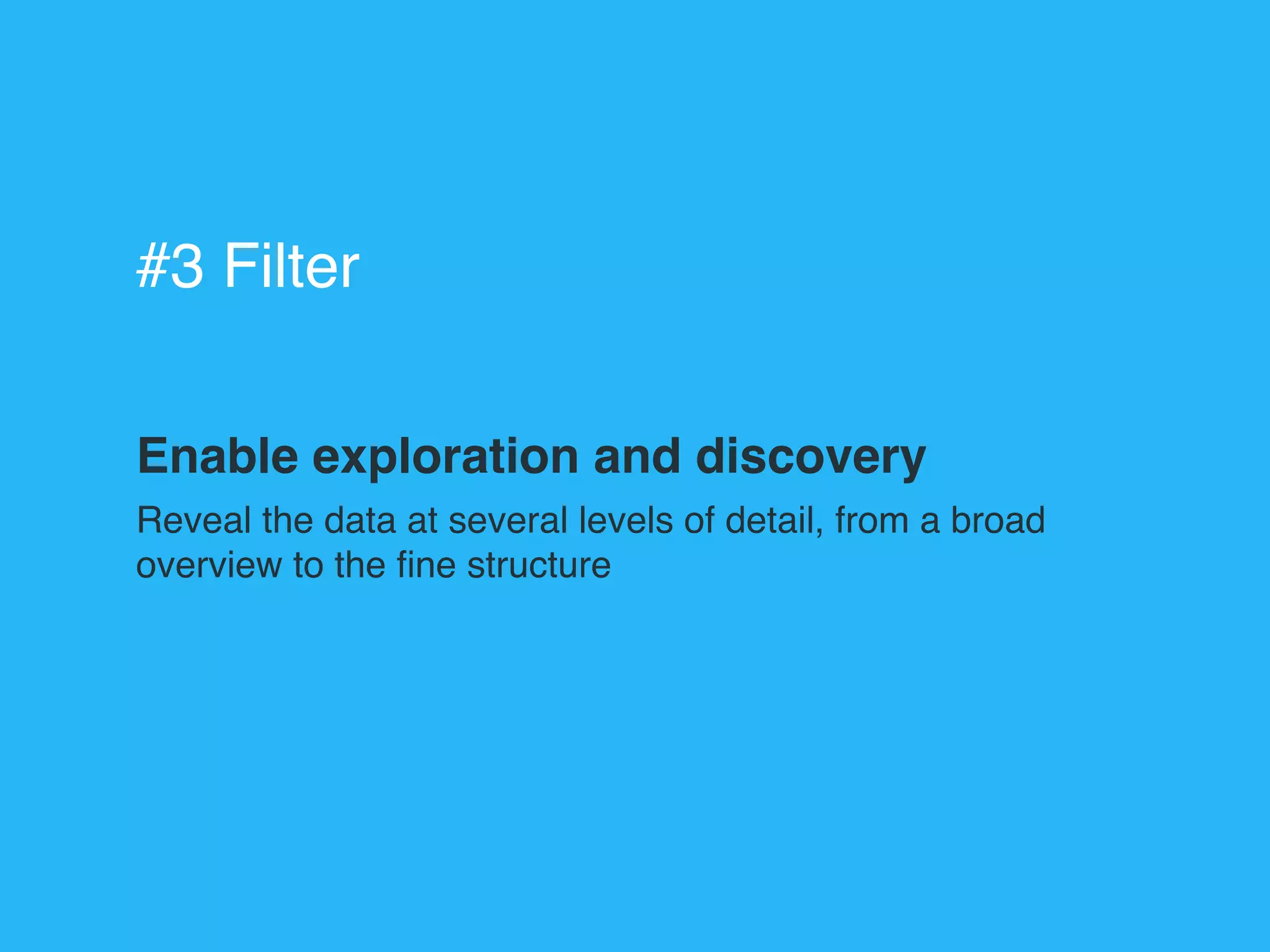

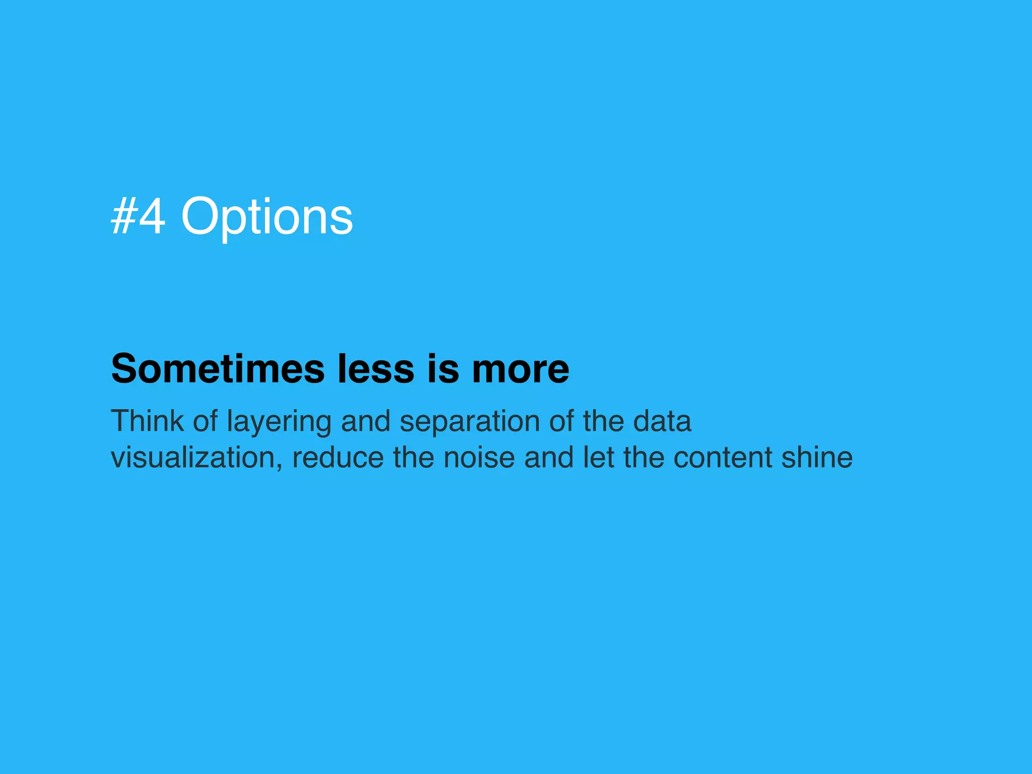
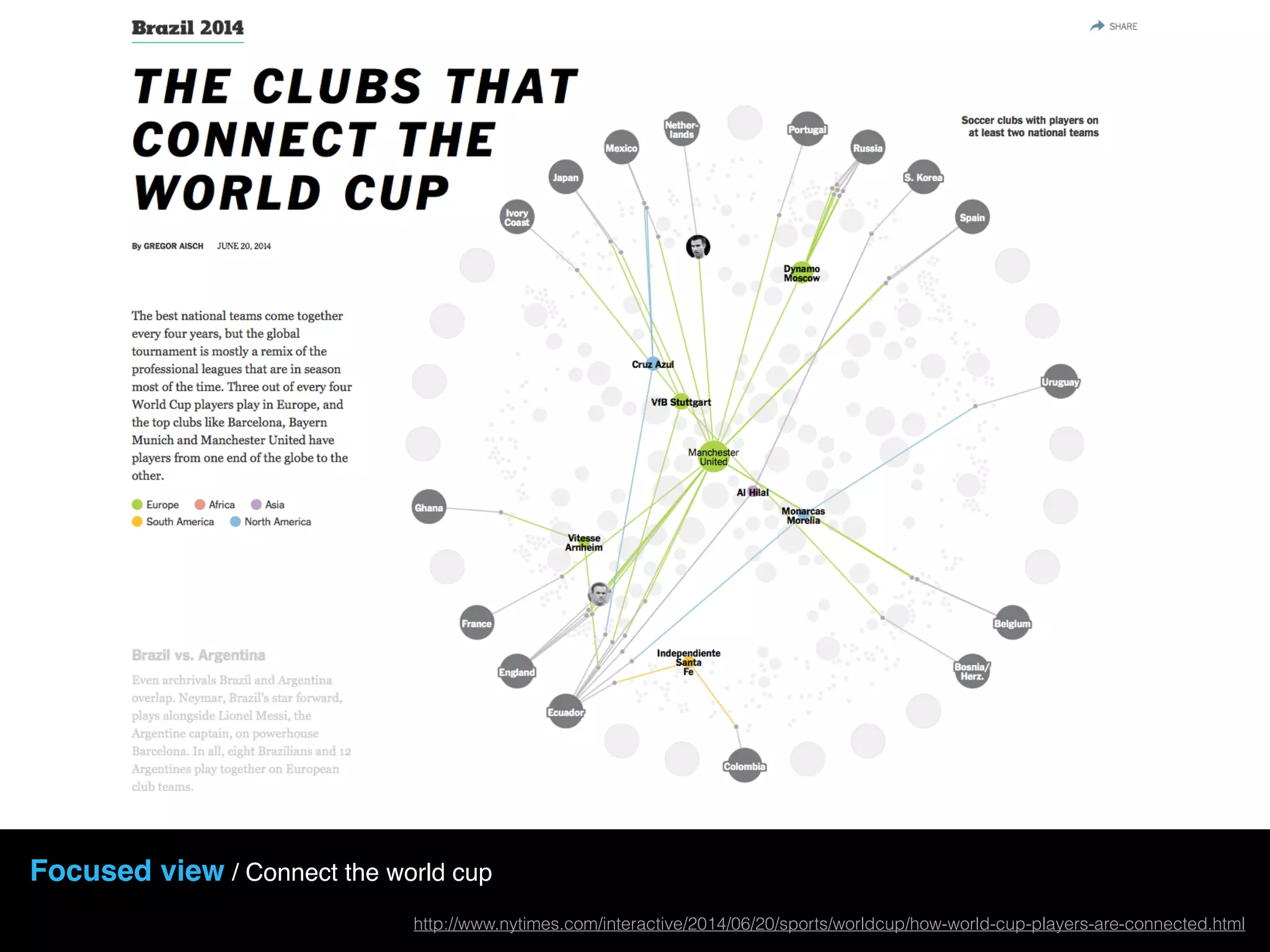


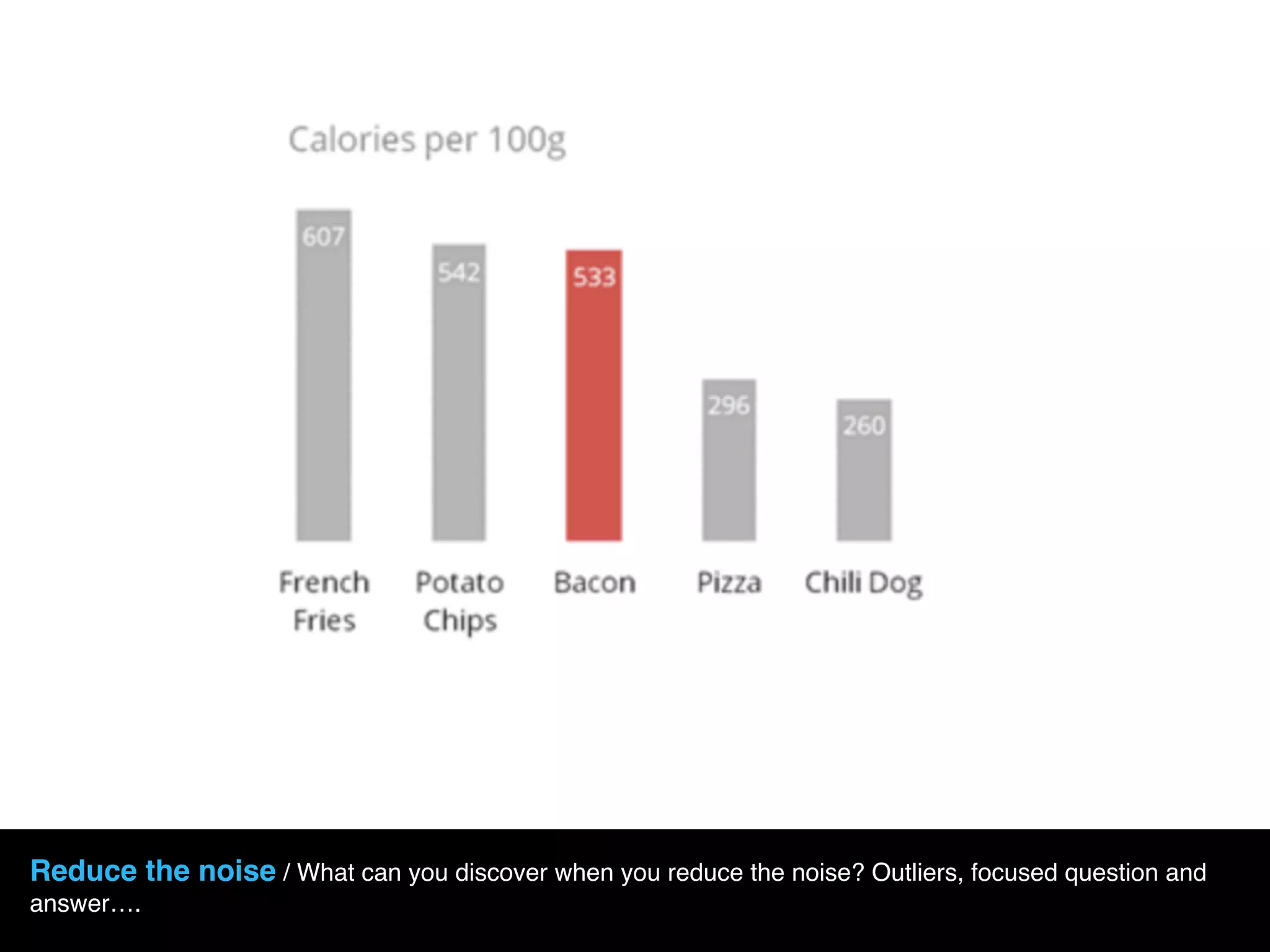
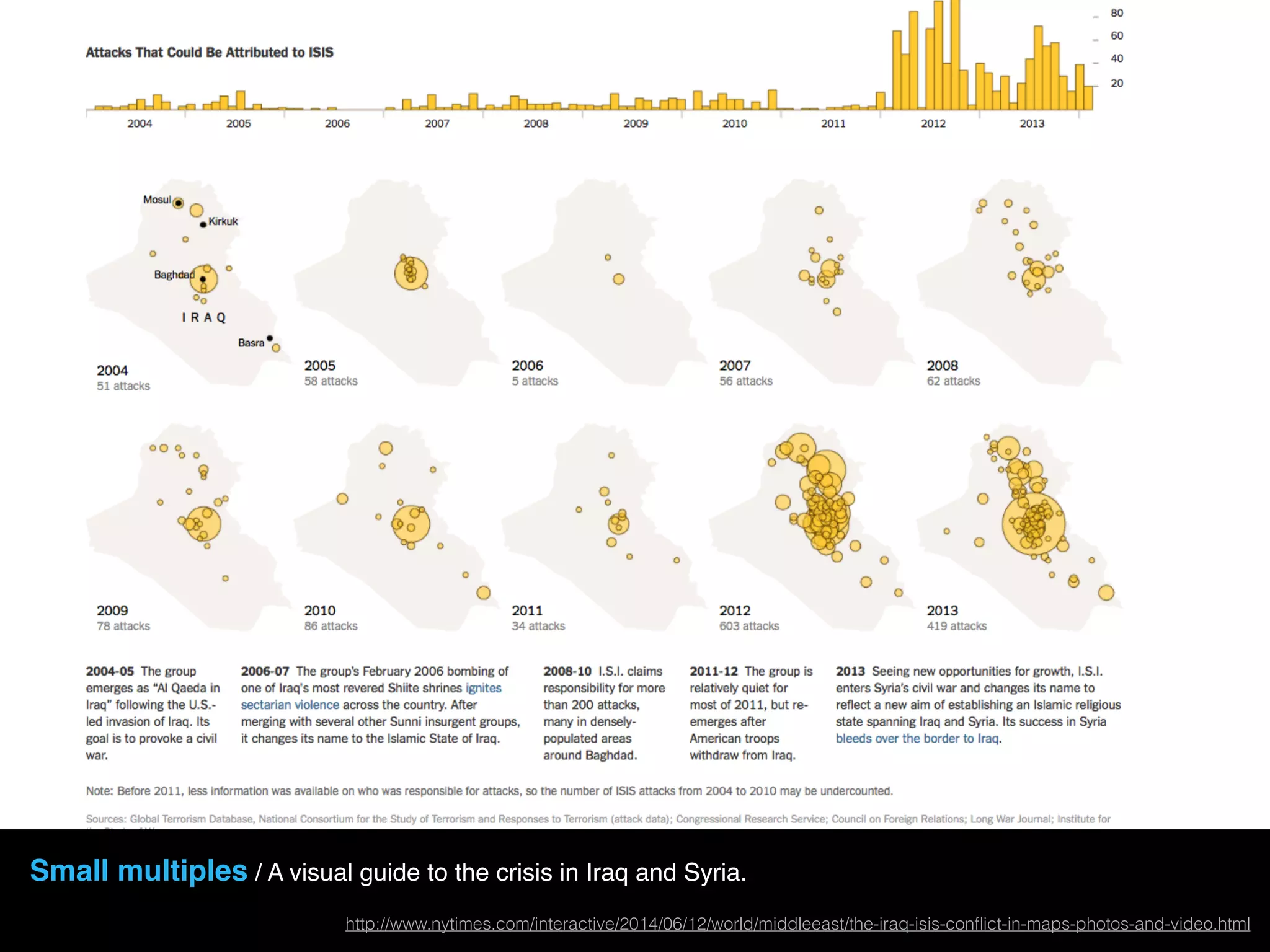


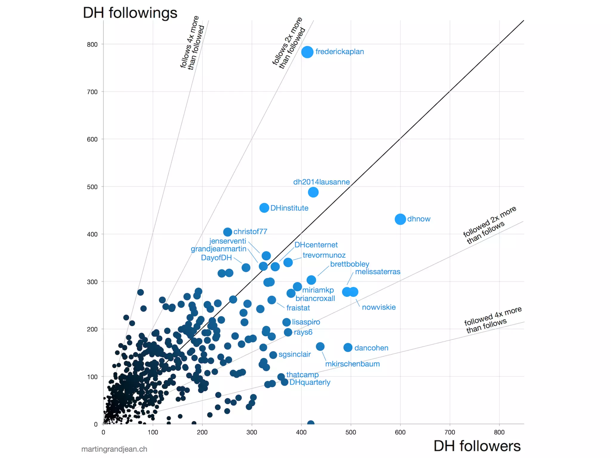
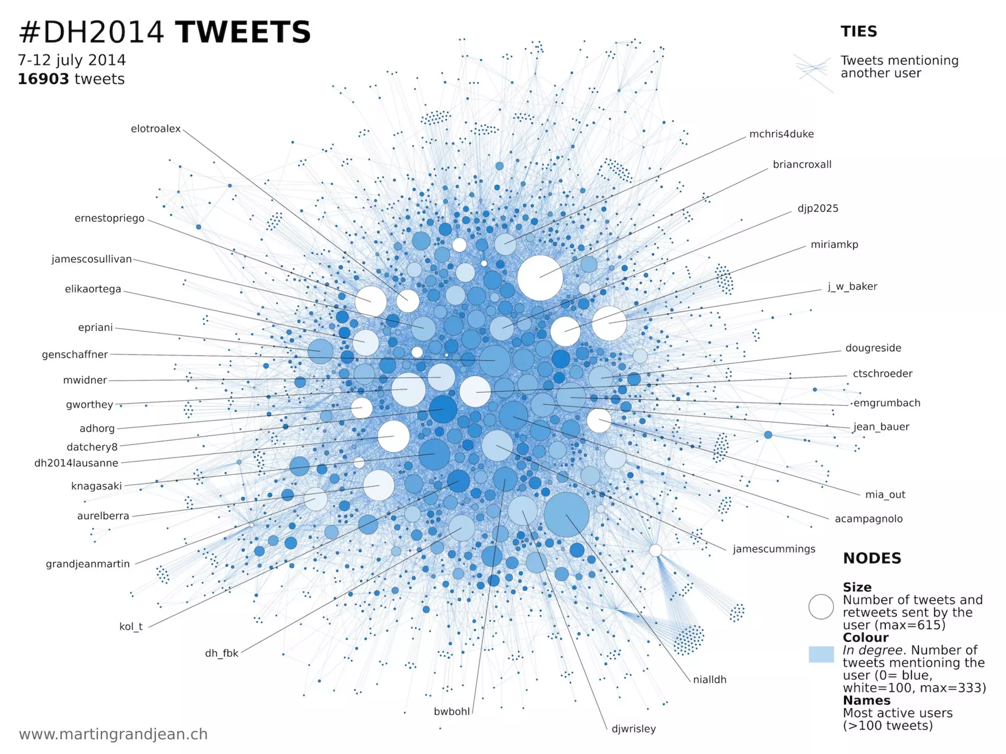
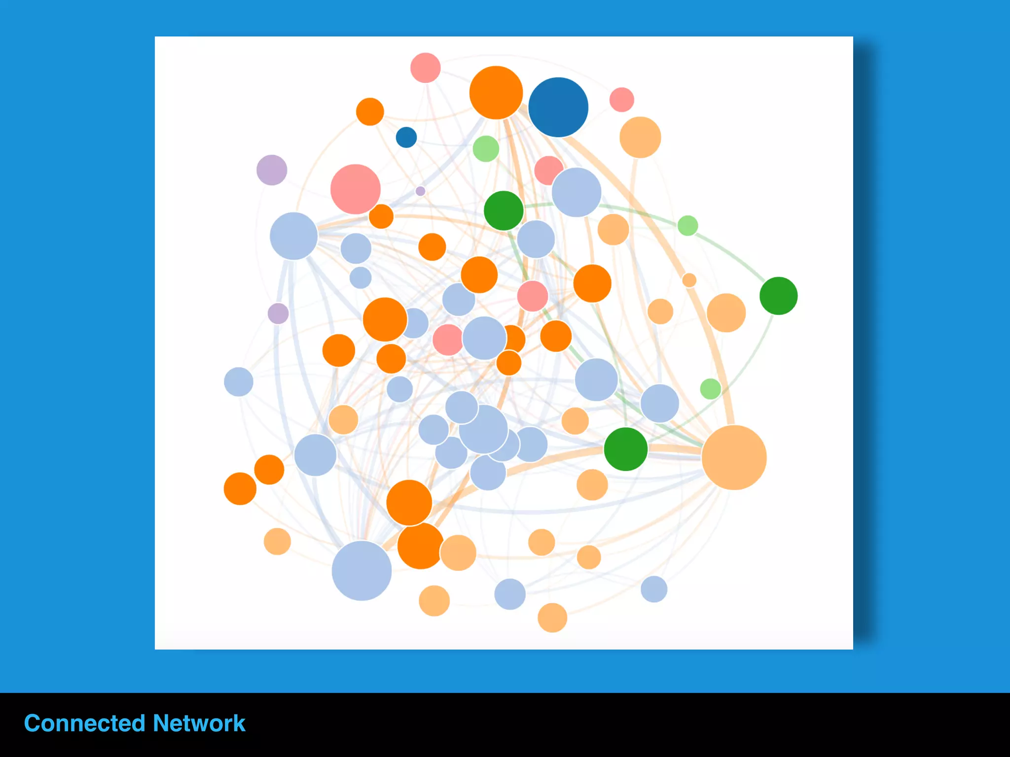
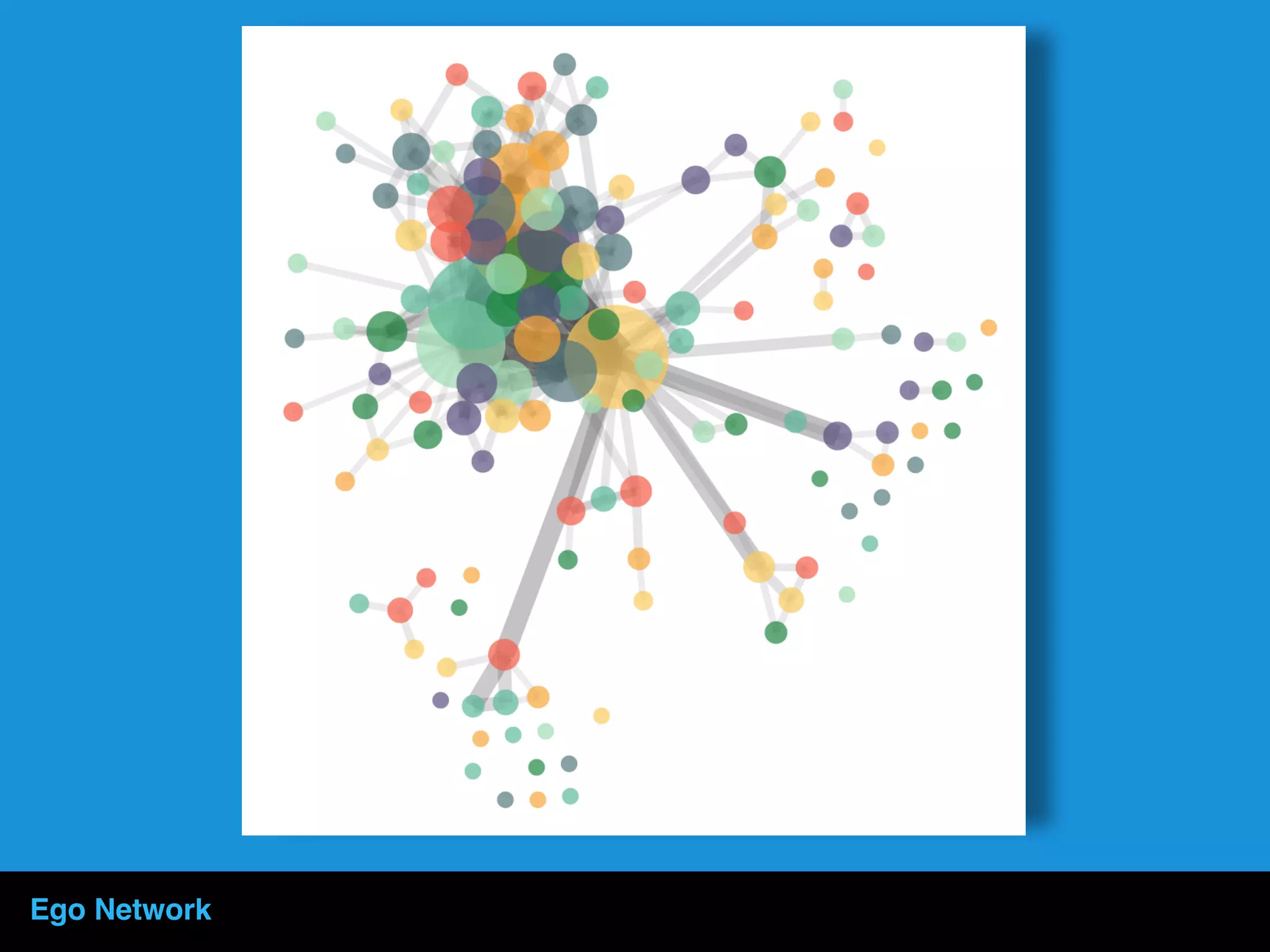


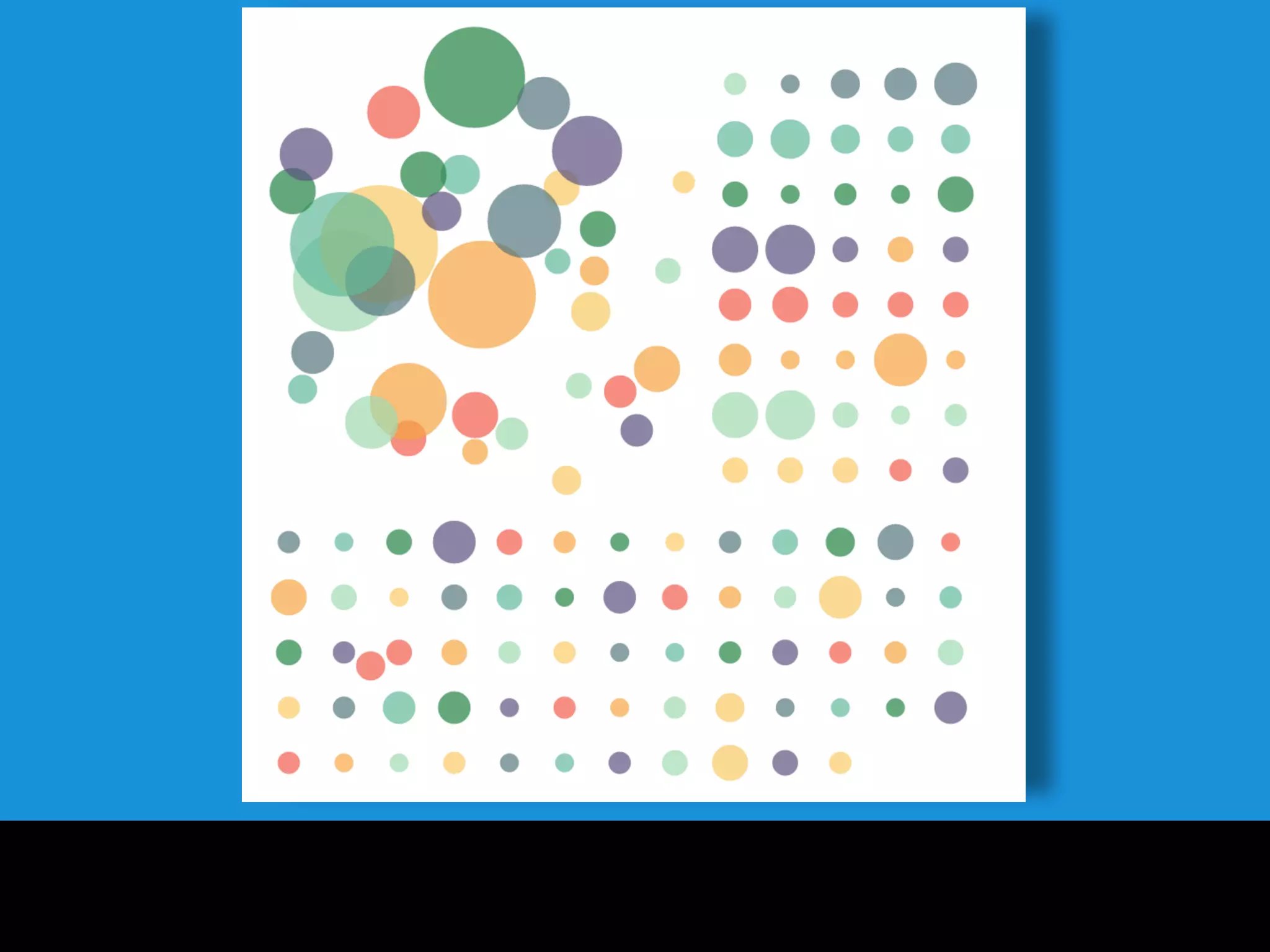
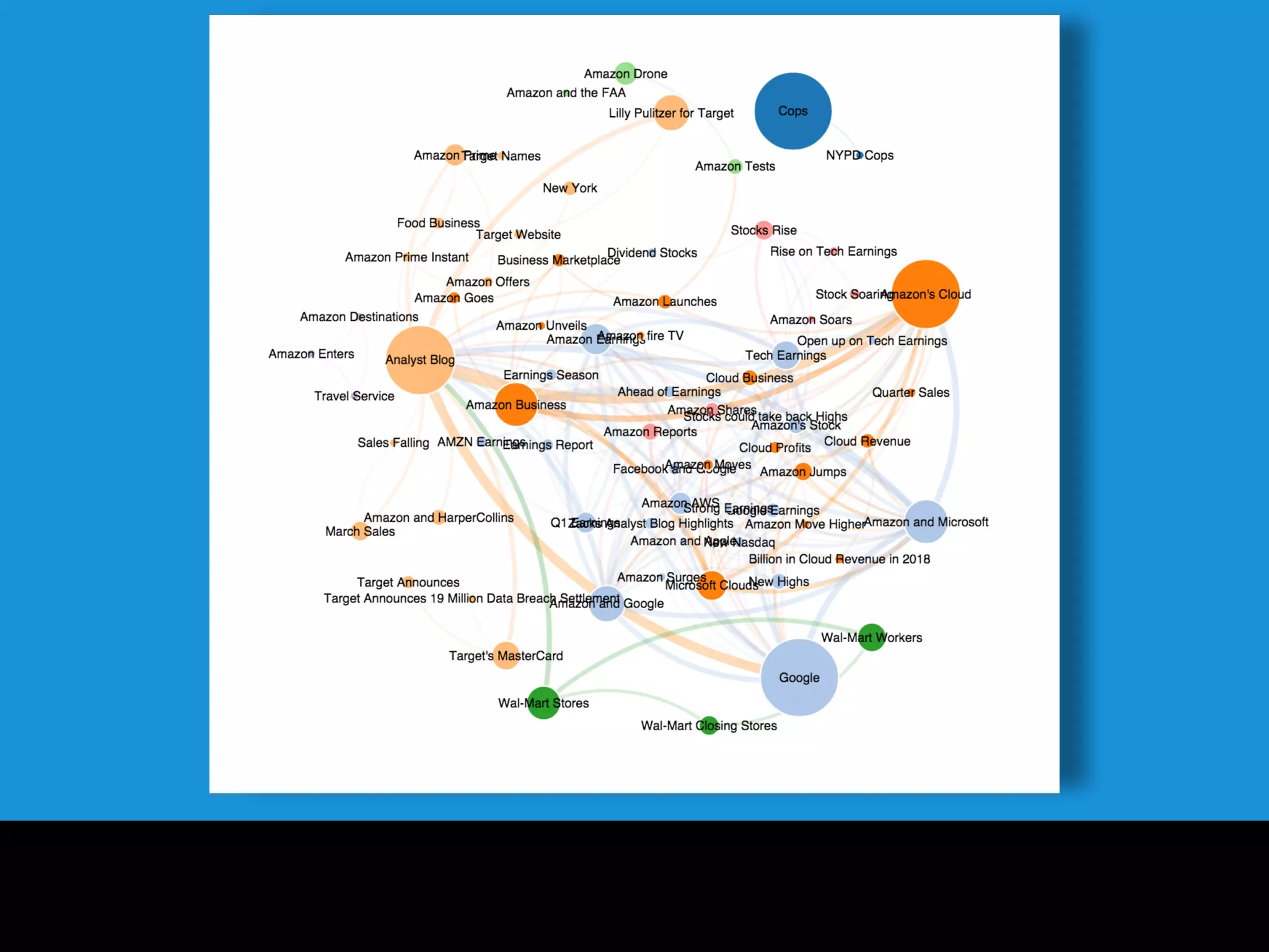


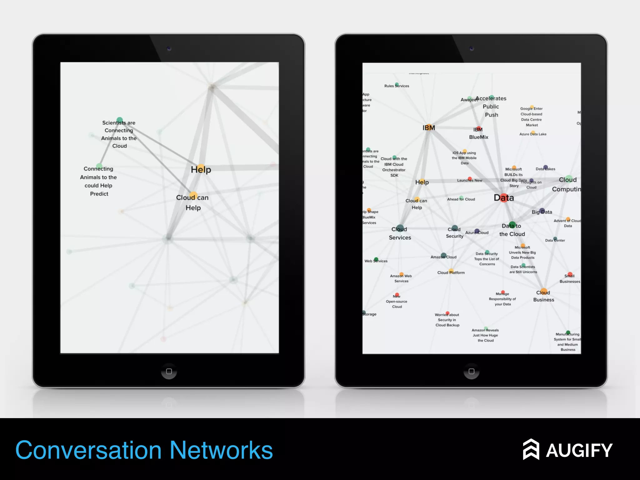


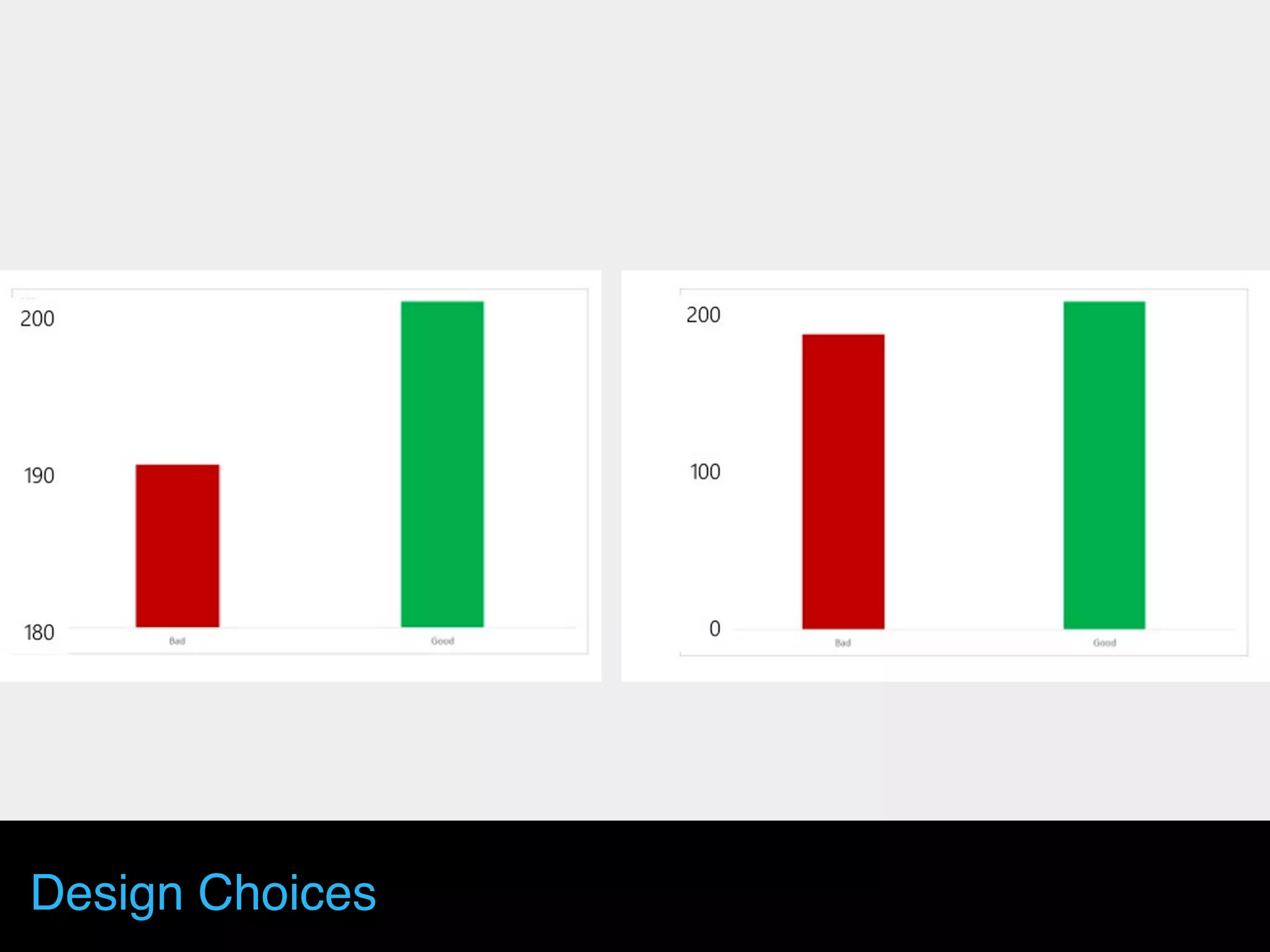


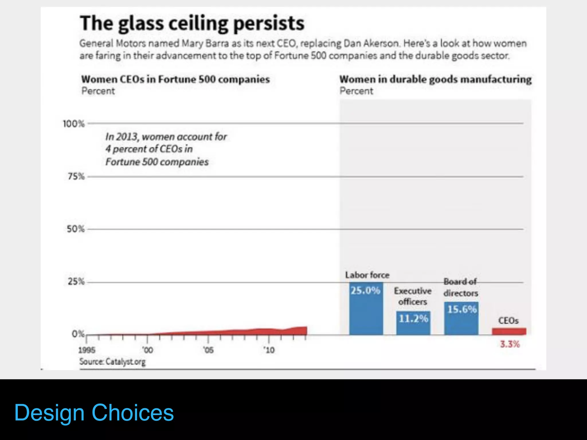


The document discusses the importance of data visualization in data science, emphasizing its role in enhancing understanding and storytelling through visual means. It highlights various visualization tools and techniques, the significance of design choices, and how effective visualizations can aid in conveying insights and engaging audiences. The document also delves into the creation of meanings through visual storytelling and the interaction between users and data visualizations.


