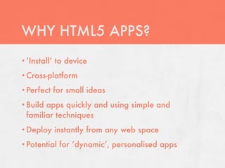
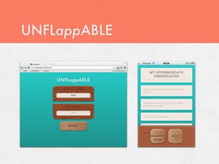
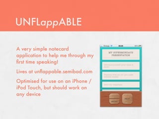
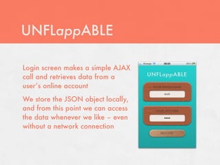
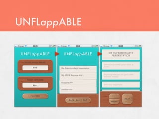
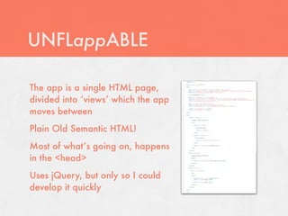
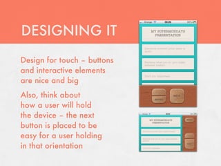
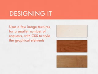
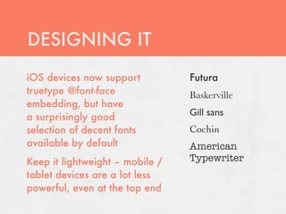
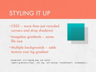
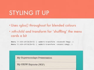
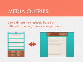
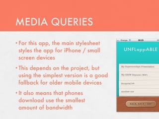
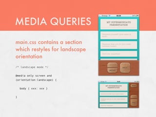
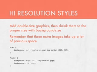
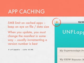
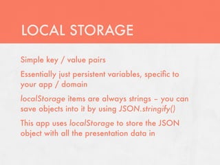
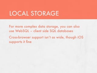
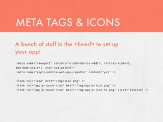
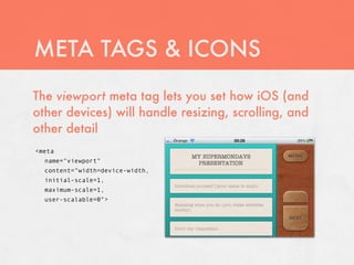
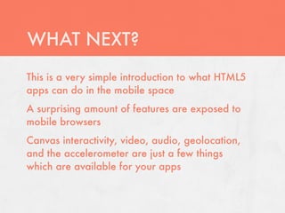
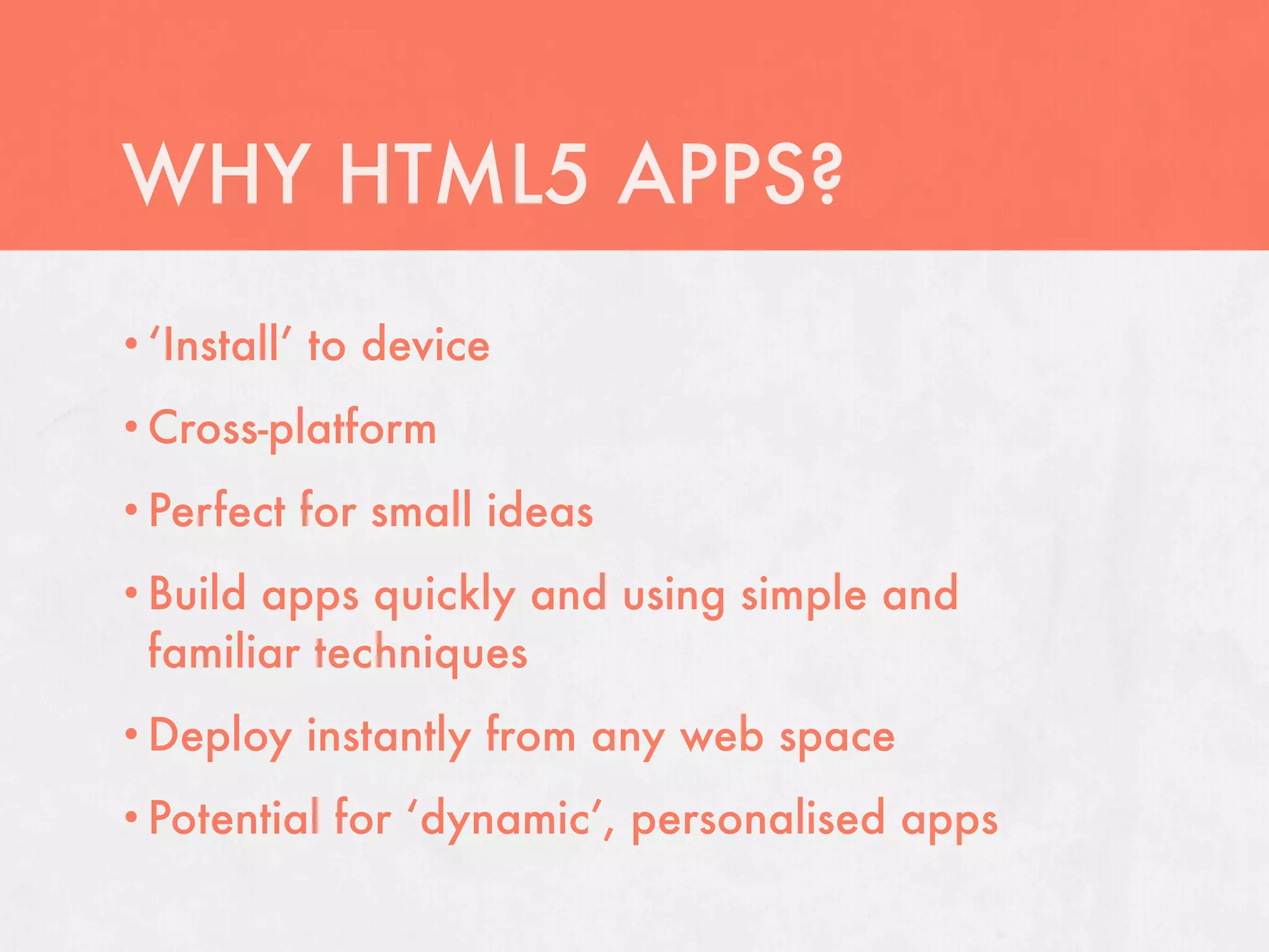
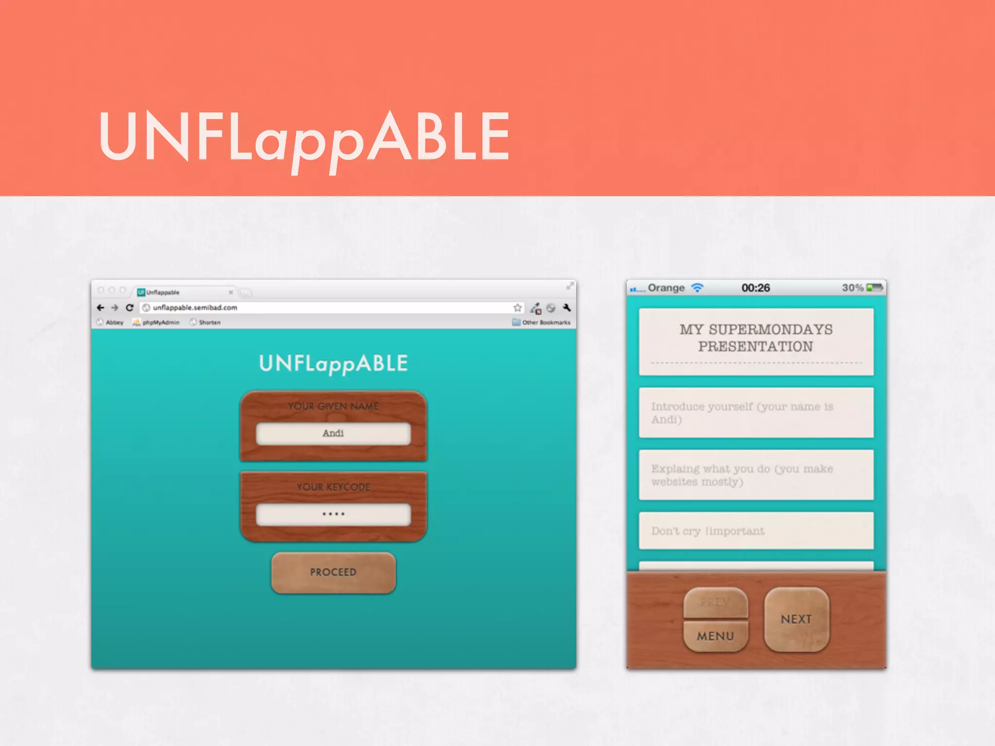
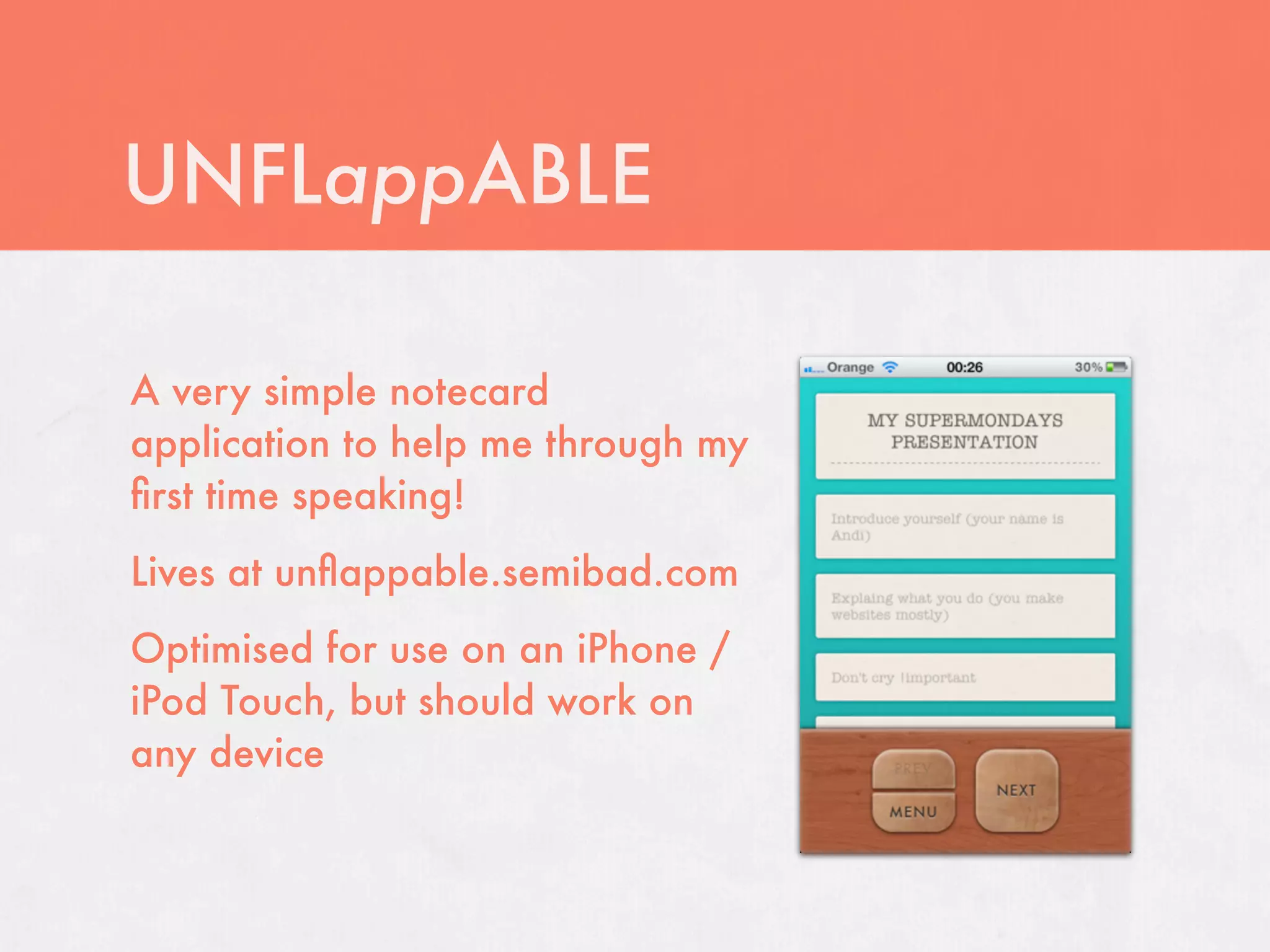
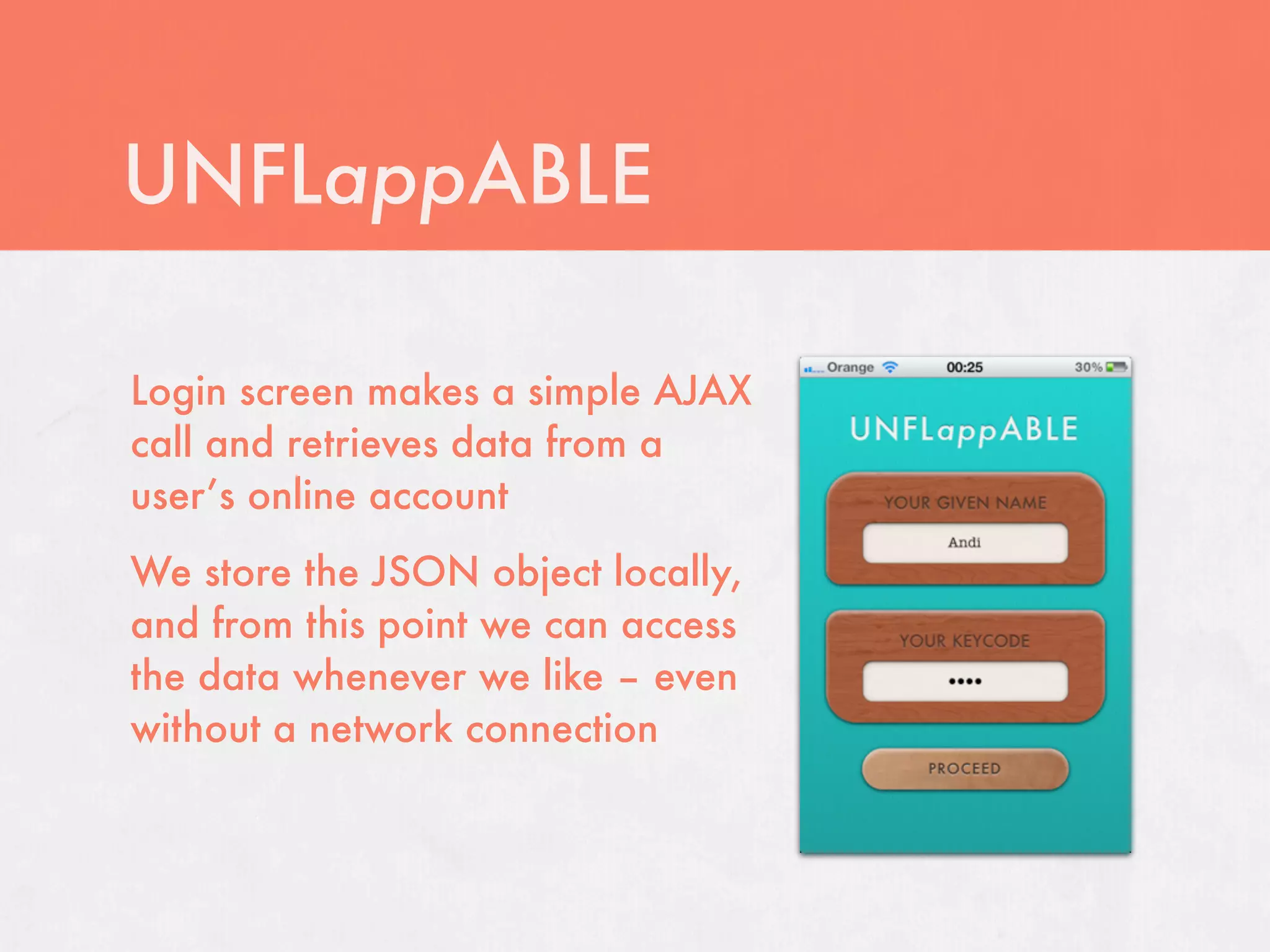
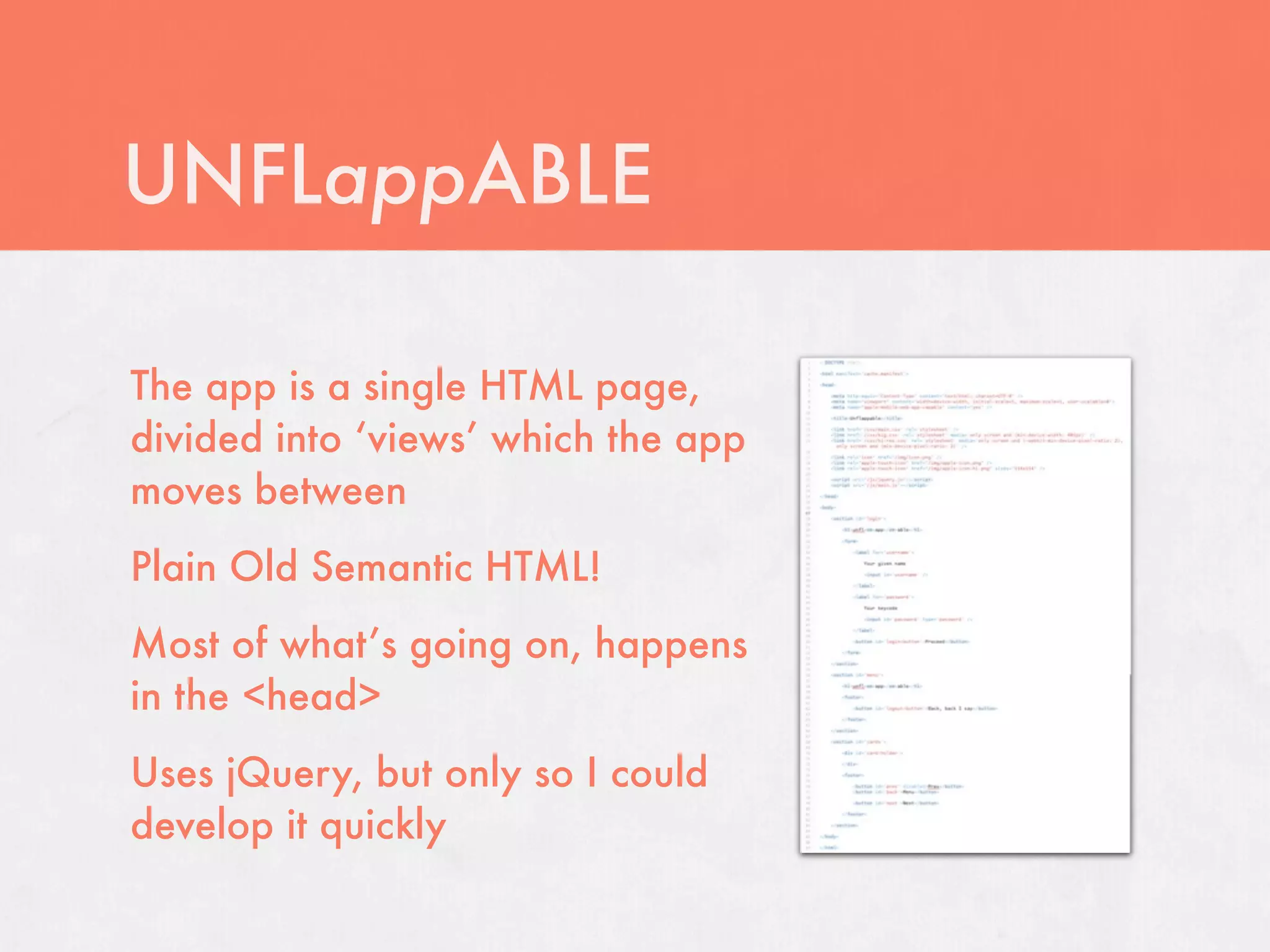
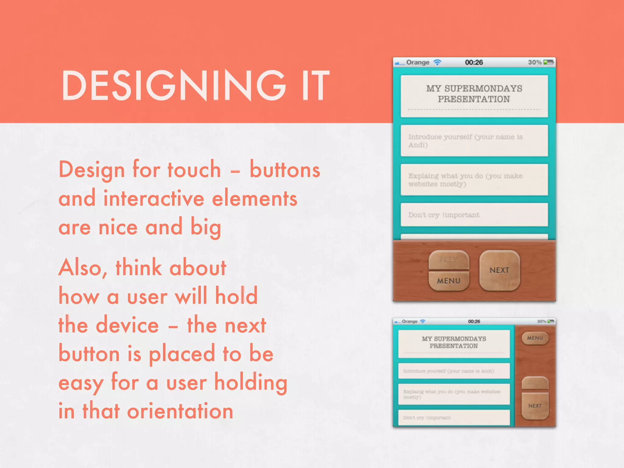
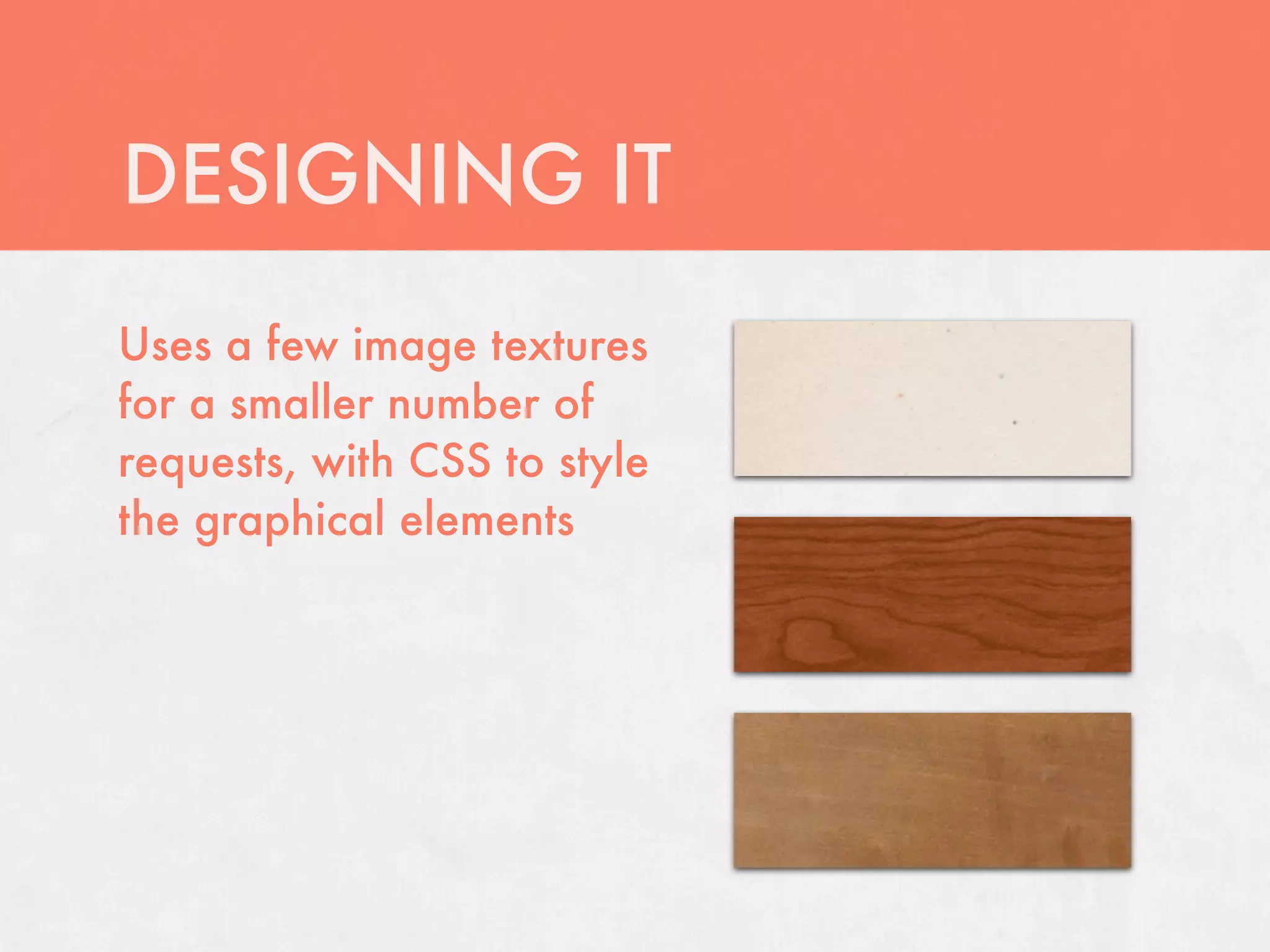
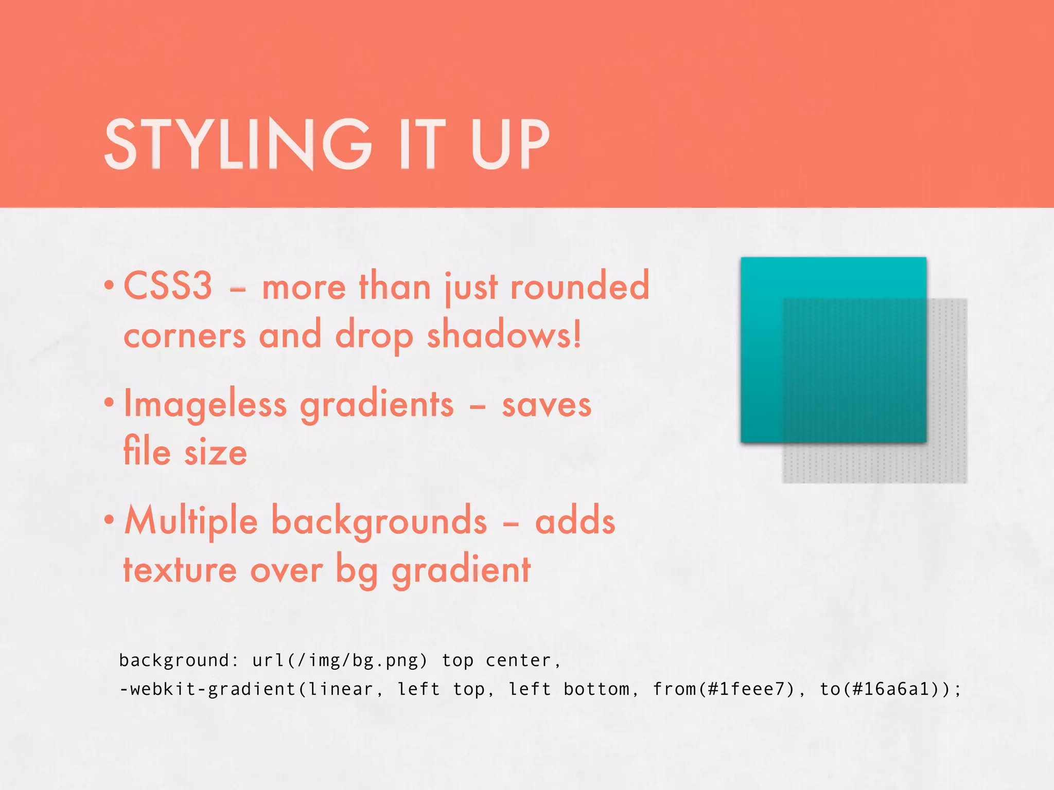
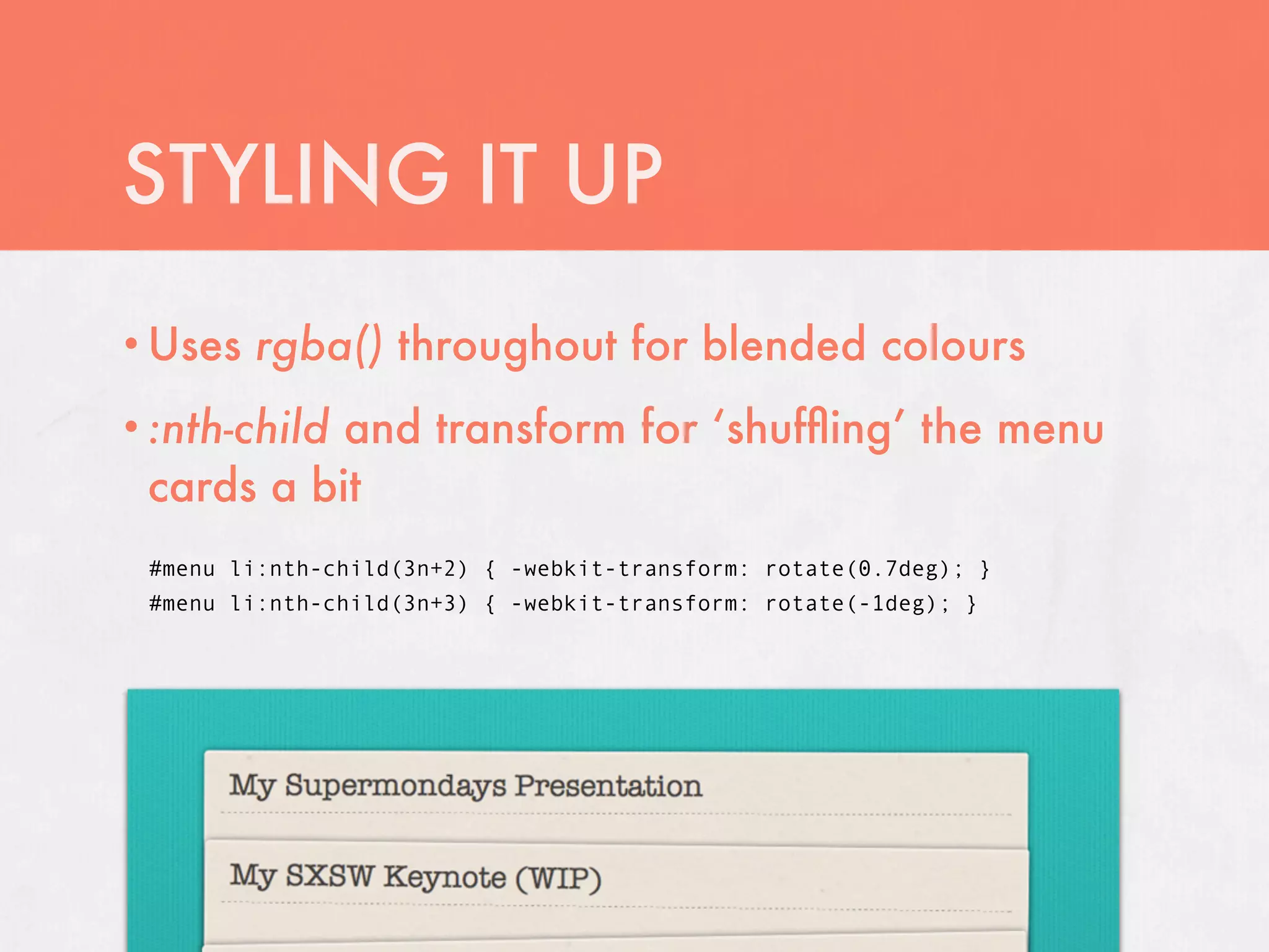
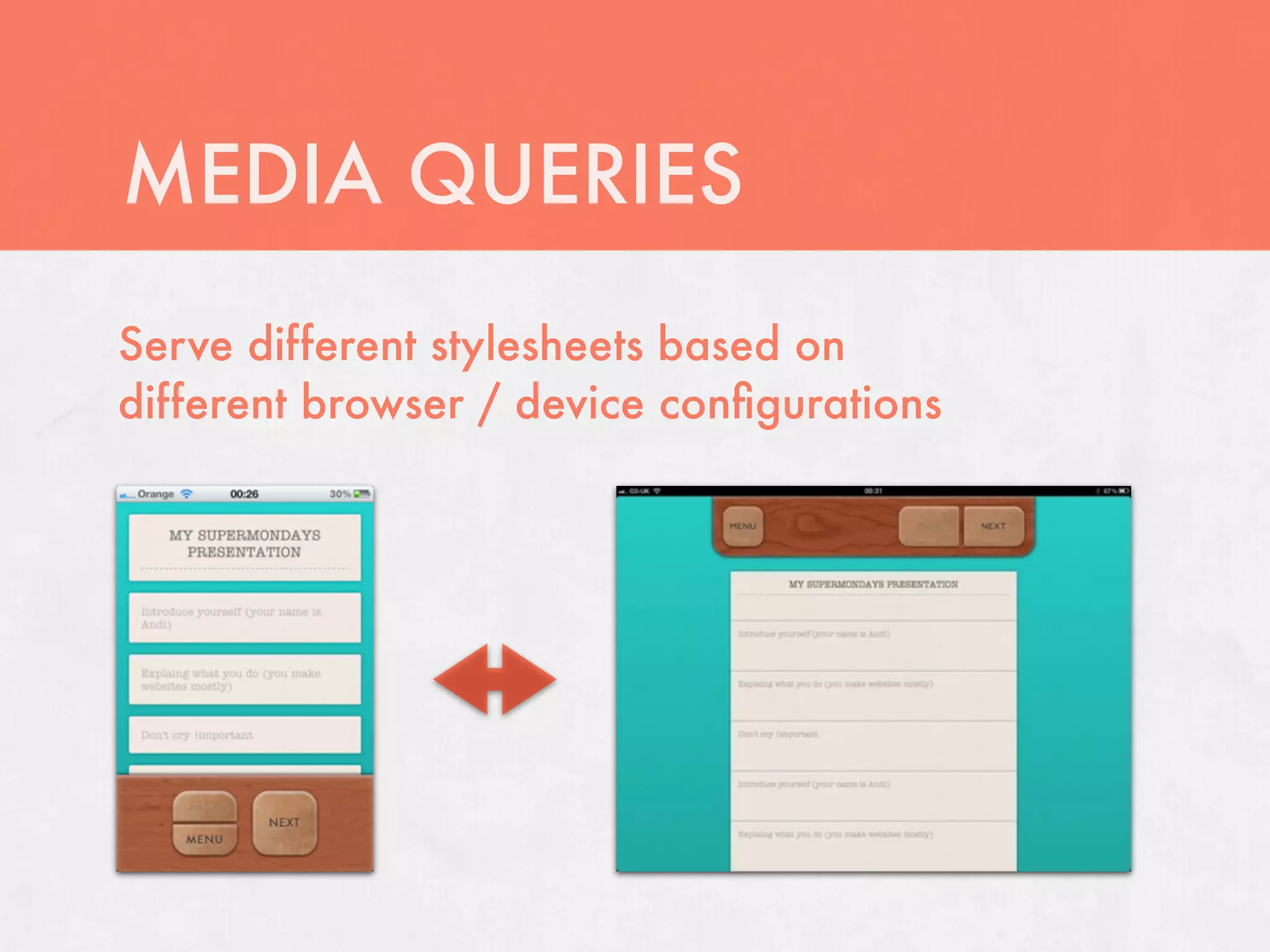
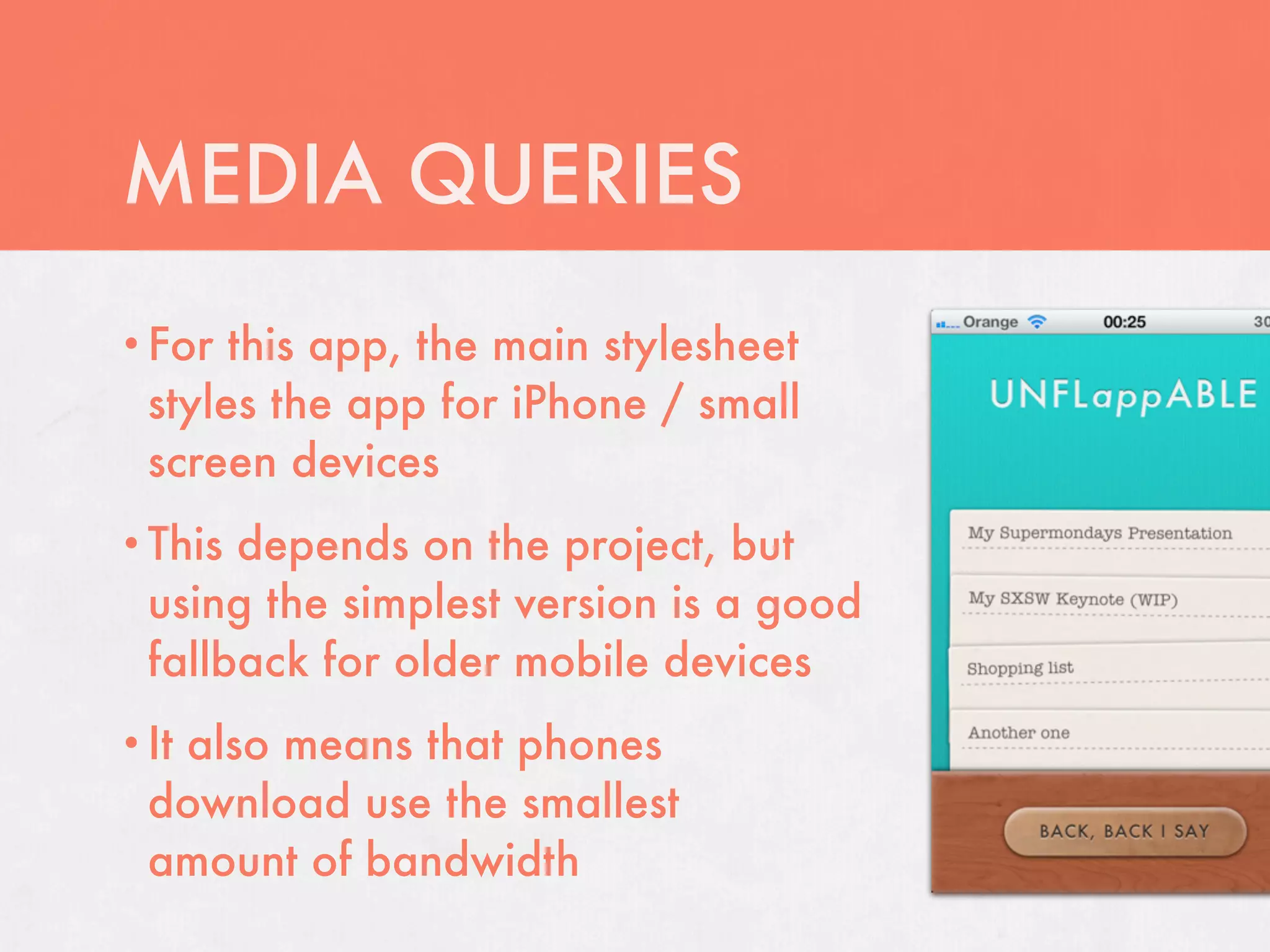
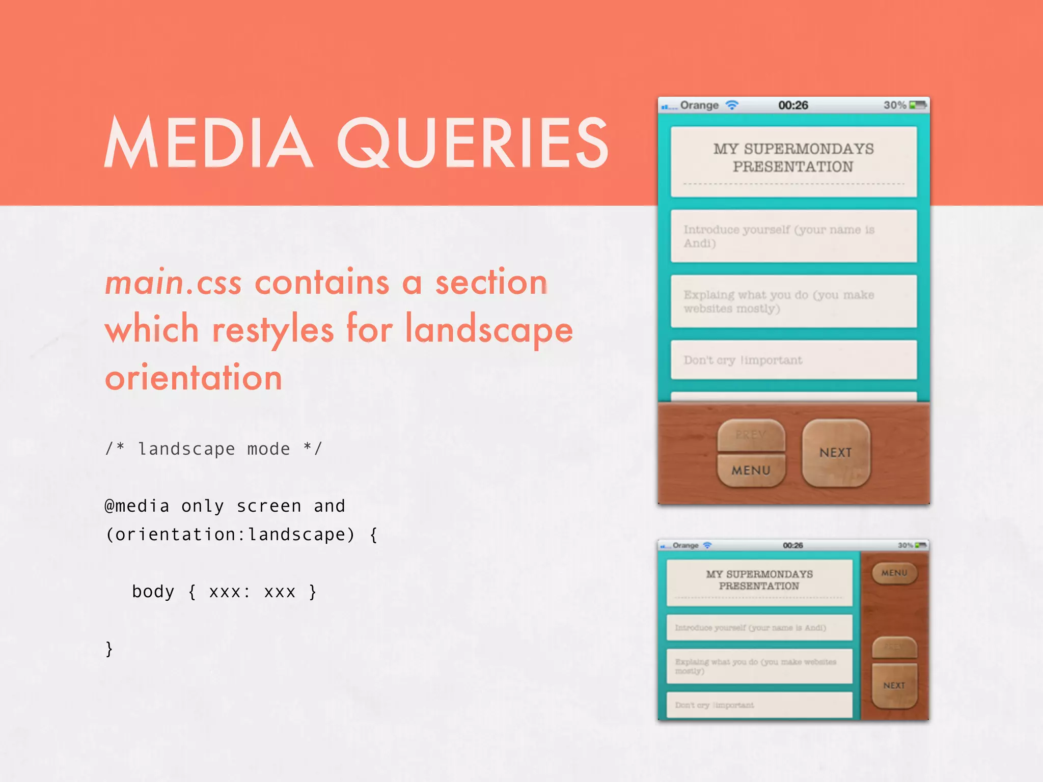
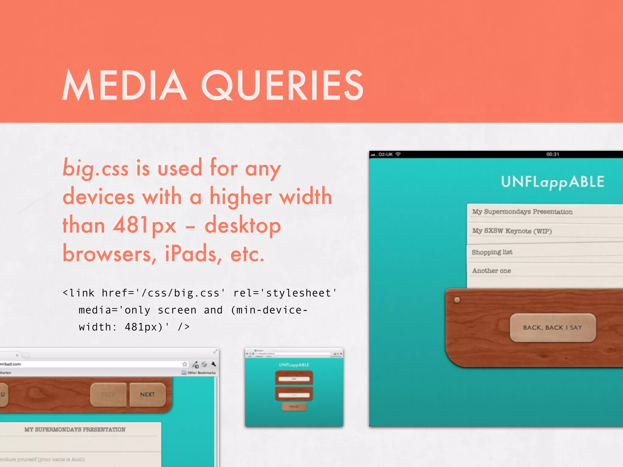
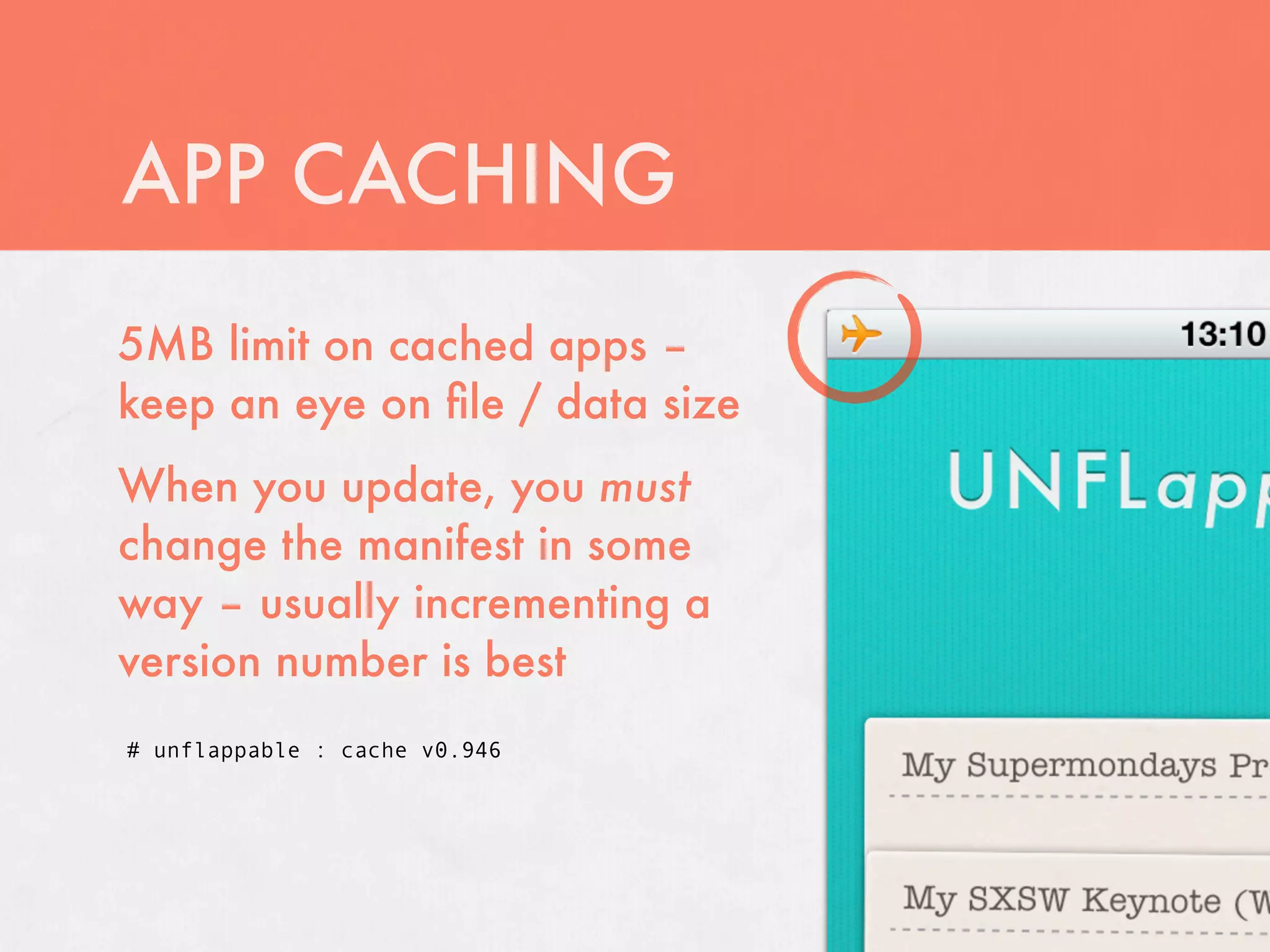
KEMBAR78
HTML5 apps for iOS (and probably beyond) | KEY
HTML5 APPS FOR iOS
(and probably beyond)


by Andi Farr
aka @semiBad


andi@semibad.com
http://semibad.com


                        ;(
WHY HTML5 APPS?
• ‘Install’   to device
• Cross-platform

• Perfect     for small ideas
• Buildapps quickly and using simple and
 familiar techniques
• Deploy      instantly from any web space
• Potential    for ‘dynamic’, personalised apps
UNFLappABLE
UNFLappABLE

A very simple notecard
application to help me through my
first time speaking!
Lives at unflappable.semibad.com
Optimised for use on an iPhone /
iPod Touch, but should work on
any device
UNFLappABLE

Login screen makes a simple AJAX
call and retrieves data from a
user’s online account
We store the JSON object locally,
and from this point we can access
the data whenever we like – even
without a network connection
UNFLappABLE
UNFLappABLE

The app is a single HTML page,
divided into ‘views’ which the app
moves between
Plain Old Semantic HTML!
Most of what’s going on, happens
in the <head>
Uses jQuery, but only so I could
develop it quickly
DESIGNING IT
Design for touch – buttons
and interactive elements
are nice and big
Also, think about
how a user will hold
the device – the next
button is placed to be
easy for a user holding
in that orientation
DESIGNING IT
Uses a few image textures
for a smaller number of
requests, with CSS to style
the graphical elements
DESIGNING IT
iOS devices now support          Futura
truetype @font-face              Baskerville
embedding, but have
a surprisingly good              Gill sans
selection of decent fonts        Cochin
available by default             American
Keep it lightweight – mobile /   Typewriter
tablet devices are a lot less
powerful, even at the top end
STYLING IT UP
• CSS3 – more than just rounded
 corners and drop shadows!
• Imageless      gradients – saves
 file size
• Multiplebackgrounds – adds
 texture over bg gradient

 background: url(/img/bg.png) top center,
 -webkit-gradient(linear, left top, left bottom, from(#1feee7), to(#16a6a1));
STYLING IT UP

• Multiplebox-shadow
 on flat textured
 elements – inset light
 colours for highlights
• Use box-sizing to
 change the box model
 of an element – useful
 for fluid designs
STYLING IT UP
• Uses   rgba() throughout for blended colours
           and transform for ‘shuffling’ the menu
• :nth-child
 cards a bit
 #menu li:nth-child(3n+2) { -webkit-transform: rotate(0.7deg); }
 #menu li:nth-child(3n+3) { -webkit-transform: rotate(-1deg); }
MEDIA QUERIES
Serve different stylesheets based on
different browser / device configurations
MEDIA QUERIES
• For  this app, the main stylesheet
  styles the app for iPhone / small
  screen devices
• This depends on the project, but
  using the simplest version is a good
  fallback for older mobile devices
• It
   also means that phones
  download use the smallest
  amount of bandwidth
MEDIA QUERIES
main.css contains a section
which restyles for landscape
orientation
/* landscape mode */


@media only screen and
(orientation:landscape) {


    body { xxx: xxx }


}
MEDIA QUERIES
MEDIA QUERIES
big.css is used for any
devices with a higher width
than 481px – desktop
browsers, iPads, etc.
<link href='/css/big.css' rel='stylesheet'
  media='only screen and (min-device-
  width: 481px)' />
HI RESOLUTION STYLES
Include using a min-device-pixels media query to
serve to high-DPI devices
<link href='/css/hi-res.css' rel='stylesheet'
  media='only screen and (-webkit-min-device-pixel-ratio: 2),
  only screen and (min-device-pixel-ratio: 2)' />
HI RESOLUTION STYLES
Add double-size graphics, then shrink them to the
proper size with background-size
Remember that these extra images take up a lot
of precious space
html {
    background: url(/img/bg-hi.png) top center (50%, 50%);
}


footer {
    background-image: url(/img/wood-hi.jpg);
    background-size: cover;
}
APP CACHING
Your cache manifest is a simple file that tells the
browser to cache certain files
You specify it using a manifest attribute on your
opening <html> tag:

<html manifest=‘cache.manifest’>
APP CACHING
The browser will need to be told how to read it,
either in the .htaccess file or using a PHP
wrapper file (or similar):
AddType text/cache-manifest .manifest


You could quite easily write a backend script to
generate your manifest automatically
APP CACHING
This one is very simple –       CACHE MANIFEST


it’s just a list of files that   # unflappable : cache v0.17

need caching (I’ve cut          /css/reset.css

some out here)                  /css/main.css
                                /css/big.css
                                /css/hi-res.css
Your file must start with
CACHE MANIFEST
                                /img/icon.png
                                /img/bg.png
                                /img/bg-hi.png
                                /img/brass.jpg
                                /img/brass-hi.jpg
                                /img/paper.jpg
                                /img/wood.jpg
                                /img/wood-hi.jpg
APP CACHING
Difficult to debug – fails silently if missing
files or on bad syntax. Chrome dev tools are
your friend!
APP CACHING
5MB limit on cached apps –
keep an eye on file / data size
When you update, you must
change the manifest in some
way – usually incrementing a
version number is best
# unflappable : cache v0.946
LOCAL STORAGE
Simple key / value pairs
Essentially just persistent variables, specific to
your app / domain
localStorage items are always strings – you can
save objects into it by using JSON.stringify()
This app uses localStorage to store the JSON
object with all the presentation data in
LOCAL STORAGE
To set a localStorage variable:
localStorage.setItem(‘key’, ‘value’);


To retrieve a localStorage variable:
localStorage.getItem(‘key’);


And then delete it permanently:
localStorage.removeItem(‘key’)
LOCAL STORAGE
For more complex data storage, you can also
use WebSQL – client side SQL databases
Cross-browser support isn’t as wide, though iOS
supports it fine
META TAGS & ICONS
A bunch of stuff in the <head> to set up
your app!
<meta name="viewport" content="width=device-width, initial-scale=1,
maximum-scale=1, user-scalable=0">
<meta name="apple-mobile-web-app-capable" content="yes" />


<link rel="icon" href="/img/icon.png" />
<link rel="apple-touch-icon" href="/img/apple-icon.png" />
<link rel="apple-touch-icon" href="/img/apple-icon-hi.png" sizes="114x114" />
META TAGS & ICONS
The viewport meta tag lets you set how iOS (and
other devices) will handle resizing, scrolling, and
other detail
<meta
  name="viewport"
  content="width=device-width,
  initial-scale=1,
  maximum-scale=1,
  user-scalable=0">
META TAGS & ICONS
The apple-mobile-web-app-capable meta tag tells
iOS to not display browser chrome when a user
runs this app from the home screen
<meta name="apple-mobile-web-app-capable" content="yes" />
META TAGS & ICONS
apple-mobile-web-app-status-bar-style allows you
to set the status bar colour
Default is the light bar, also black or black-
translucent
If you use black-translucent, your content will
have an extra 20px to fill:
META TAGS & ICONS
Icons specified in the <head> are used on the
user’s home screen alongside native apps
Use a 72px icon for iPad, and a 114px icon for
Retina displays – if you have more than one,
specify which is which using the sizes attribute

<link rel="icon" href="/img/icon.png" />
<link rel="apple-touch-icon"
href="/img/apple-icon.png" />
<link rel="apple-touch-icon"
href="/img/apple-icon-hi.png" sizes="114x114" />
WHAT NEXT?
This is a very simple introduction to what HTML5
apps can do in the mobile space
A surprising amount of features are exposed to
mobile browsers
Canvas interactivity, video, audio, geolocation,
and the accelerometer are just a few things
which are available for your apps
WHAT NEXT?
Dive into HTML5 (Mark Pilgrim)
http://diveintohtml5.org
The HTML5 Doctor (various)
http://html5doctor.com
HTML5 Poker cheat sheet (by... me)
http://semibad.com/s/poker
THANK YOU
Please refrain from asking difficult questions


@semibad
andi@semibad.com
http://semibad.com

HTML5 apps for iOS (and probably beyond)

  • 1.
    HTML5 APPS FORiOS (and probably beyond) by Andi Farr aka @semiBad andi@semibad.com http://semibad.com ;(
  • 2.
    WHY HTML5 APPS? •‘Install’ to device • Cross-platform • Perfect for small ideas • Buildapps quickly and using simple and familiar techniques • Deploy instantly from any web space • Potential for ‘dynamic’, personalised apps
  • 3.
  • 4.
    UNFLappABLE A very simplenotecard application to help me through my first time speaking! Lives at unflappable.semibad.com Optimised for use on an iPhone / iPod Touch, but should work on any device
  • 5.
    UNFLappABLE Login screen makesa simple AJAX call and retrieves data from a user’s online account We store the JSON object locally, and from this point we can access the data whenever we like – even without a network connection
  • 6.
  • 7.
    UNFLappABLE The app isa single HTML page, divided into ‘views’ which the app moves between Plain Old Semantic HTML! Most of what’s going on, happens in the <head> Uses jQuery, but only so I could develop it quickly
  • 8.
    DESIGNING IT Design fortouch – buttons and interactive elements are nice and big Also, think about how a user will hold the device – the next button is placed to be easy for a user holding in that orientation
  • 9.
    DESIGNING IT Uses afew image textures for a smaller number of requests, with CSS to style the graphical elements
  • 10.
    DESIGNING IT iOS devicesnow support Futura truetype @font-face Baskerville embedding, but have a surprisingly good Gill sans selection of decent fonts Cochin available by default American Keep it lightweight – mobile / Typewriter tablet devices are a lot less powerful, even at the top end
  • 11.
    STYLING IT UP •CSS3 – more than just rounded corners and drop shadows! • Imageless gradients – saves file size • Multiplebackgrounds – adds texture over bg gradient background: url(/img/bg.png) top center, -webkit-gradient(linear, left top, left bottom, from(#1feee7), to(#16a6a1));
  • 12.
    STYLING IT UP •Multiplebox-shadow on flat textured elements – inset light colours for highlights • Use box-sizing to change the box model of an element – useful for fluid designs
  • 13.
    STYLING IT UP •Uses rgba() throughout for blended colours and transform for ‘shuffling’ the menu • :nth-child cards a bit #menu li:nth-child(3n+2) { -webkit-transform: rotate(0.7deg); } #menu li:nth-child(3n+3) { -webkit-transform: rotate(-1deg); }
  • 14.
    MEDIA QUERIES Serve differentstylesheets based on different browser / device configurations
  • 15.
    MEDIA QUERIES • For this app, the main stylesheet styles the app for iPhone / small screen devices • This depends on the project, but using the simplest version is a good fallback for older mobile devices • It also means that phones download use the smallest amount of bandwidth
  • 16.
    MEDIA QUERIES main.css containsa section which restyles for landscape orientation /* landscape mode */ @media only screen and (orientation:landscape) { body { xxx: xxx } }
  • 17.
  • 18.
    MEDIA QUERIES big.css isused for any devices with a higher width than 481px – desktop browsers, iPads, etc. <link href='/css/big.css' rel='stylesheet' media='only screen and (min-device- width: 481px)' />
  • 19.
    HI RESOLUTION STYLES Includeusing a min-device-pixels media query to serve to high-DPI devices <link href='/css/hi-res.css' rel='stylesheet' media='only screen and (-webkit-min-device-pixel-ratio: 2), only screen and (min-device-pixel-ratio: 2)' />
  • 20.
    HI RESOLUTION STYLES Adddouble-size graphics, then shrink them to the proper size with background-size Remember that these extra images take up a lot of precious space html { background: url(/img/bg-hi.png) top center (50%, 50%); } footer { background-image: url(/img/wood-hi.jpg); background-size: cover; }
  • 21.
    APP CACHING Your cachemanifest is a simple file that tells the browser to cache certain files You specify it using a manifest attribute on your opening <html> tag: <html manifest=‘cache.manifest’>
  • 22.
    APP CACHING The browserwill need to be told how to read it, either in the .htaccess file or using a PHP wrapper file (or similar): AddType text/cache-manifest .manifest You could quite easily write a backend script to generate your manifest automatically
  • 23.
    APP CACHING This oneis very simple – CACHE MANIFEST it’s just a list of files that # unflappable : cache v0.17 need caching (I’ve cut /css/reset.css some out here) /css/main.css /css/big.css /css/hi-res.css Your file must start with CACHE MANIFEST /img/icon.png /img/bg.png /img/bg-hi.png /img/brass.jpg /img/brass-hi.jpg /img/paper.jpg /img/wood.jpg /img/wood-hi.jpg
  • 24.
    APP CACHING Difficult todebug – fails silently if missing files or on bad syntax. Chrome dev tools are your friend!
  • 25.
    APP CACHING 5MB limiton cached apps – keep an eye on file / data size When you update, you must change the manifest in some way – usually incrementing a version number is best # unflappable : cache v0.946
  • 26.
    LOCAL STORAGE Simple key/ value pairs Essentially just persistent variables, specific to your app / domain localStorage items are always strings – you can save objects into it by using JSON.stringify() This app uses localStorage to store the JSON object with all the presentation data in
  • 27.
    LOCAL STORAGE To seta localStorage variable: localStorage.setItem(‘key’, ‘value’); To retrieve a localStorage variable: localStorage.getItem(‘key’); And then delete it permanently: localStorage.removeItem(‘key’)
  • 28.
    LOCAL STORAGE For morecomplex data storage, you can also use WebSQL – client side SQL databases Cross-browser support isn’t as wide, though iOS supports it fine
  • 29.
    META TAGS &ICONS A bunch of stuff in the <head> to set up your app! <meta name="viewport" content="width=device-width, initial-scale=1, maximum-scale=1, user-scalable=0"> <meta name="apple-mobile-web-app-capable" content="yes" /> <link rel="icon" href="/img/icon.png" /> <link rel="apple-touch-icon" href="/img/apple-icon.png" /> <link rel="apple-touch-icon" href="/img/apple-icon-hi.png" sizes="114x114" />
  • 30.
    META TAGS &ICONS The viewport meta tag lets you set how iOS (and other devices) will handle resizing, scrolling, and other detail <meta name="viewport" content="width=device-width, initial-scale=1, maximum-scale=1, user-scalable=0">
  • 31.
    META TAGS &ICONS The apple-mobile-web-app-capable meta tag tells iOS to not display browser chrome when a user runs this app from the home screen <meta name="apple-mobile-web-app-capable" content="yes" />
  • 32.
    META TAGS &ICONS apple-mobile-web-app-status-bar-style allows you to set the status bar colour Default is the light bar, also black or black- translucent If you use black-translucent, your content will have an extra 20px to fill:
  • 33.
    META TAGS &ICONS Icons specified in the <head> are used on the user’s home screen alongside native apps Use a 72px icon for iPad, and a 114px icon for Retina displays – if you have more than one, specify which is which using the sizes attribute <link rel="icon" href="/img/icon.png" /> <link rel="apple-touch-icon" href="/img/apple-icon.png" /> <link rel="apple-touch-icon" href="/img/apple-icon-hi.png" sizes="114x114" />
  • 34.
    WHAT NEXT? This isa very simple introduction to what HTML5 apps can do in the mobile space A surprising amount of features are exposed to mobile browsers Canvas interactivity, video, audio, geolocation, and the accelerometer are just a few things which are available for your apps
  • 35.
    WHAT NEXT? Dive intoHTML5 (Mark Pilgrim) http://diveintohtml5.org The HTML5 Doctor (various) http://html5doctor.com HTML5 Poker cheat sheet (by... me) http://semibad.com/s/poker
  • 36.
    THANK YOU Please refrainfrom asking difficult questions @semibad andi@semibad.com http://semibad.com