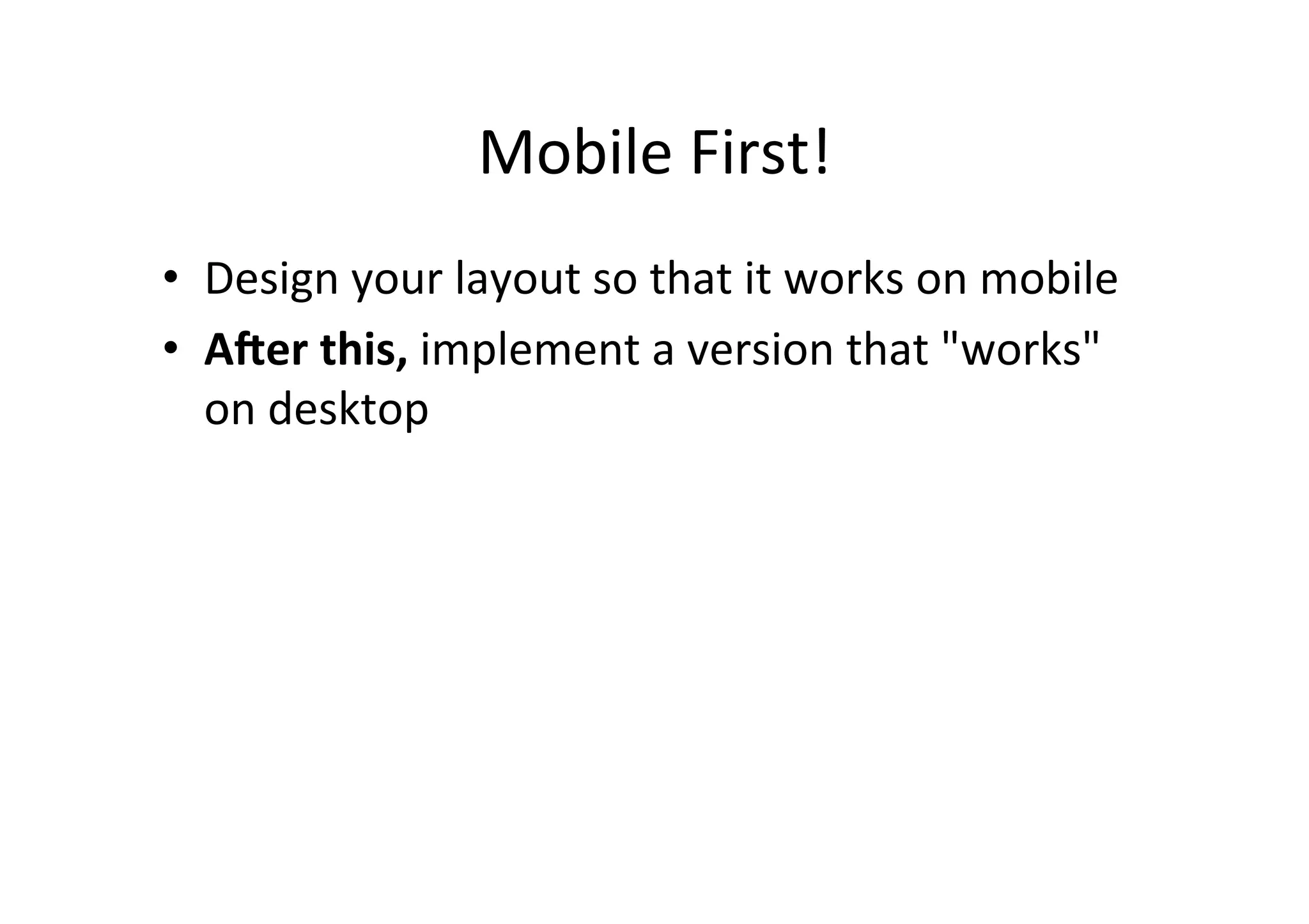
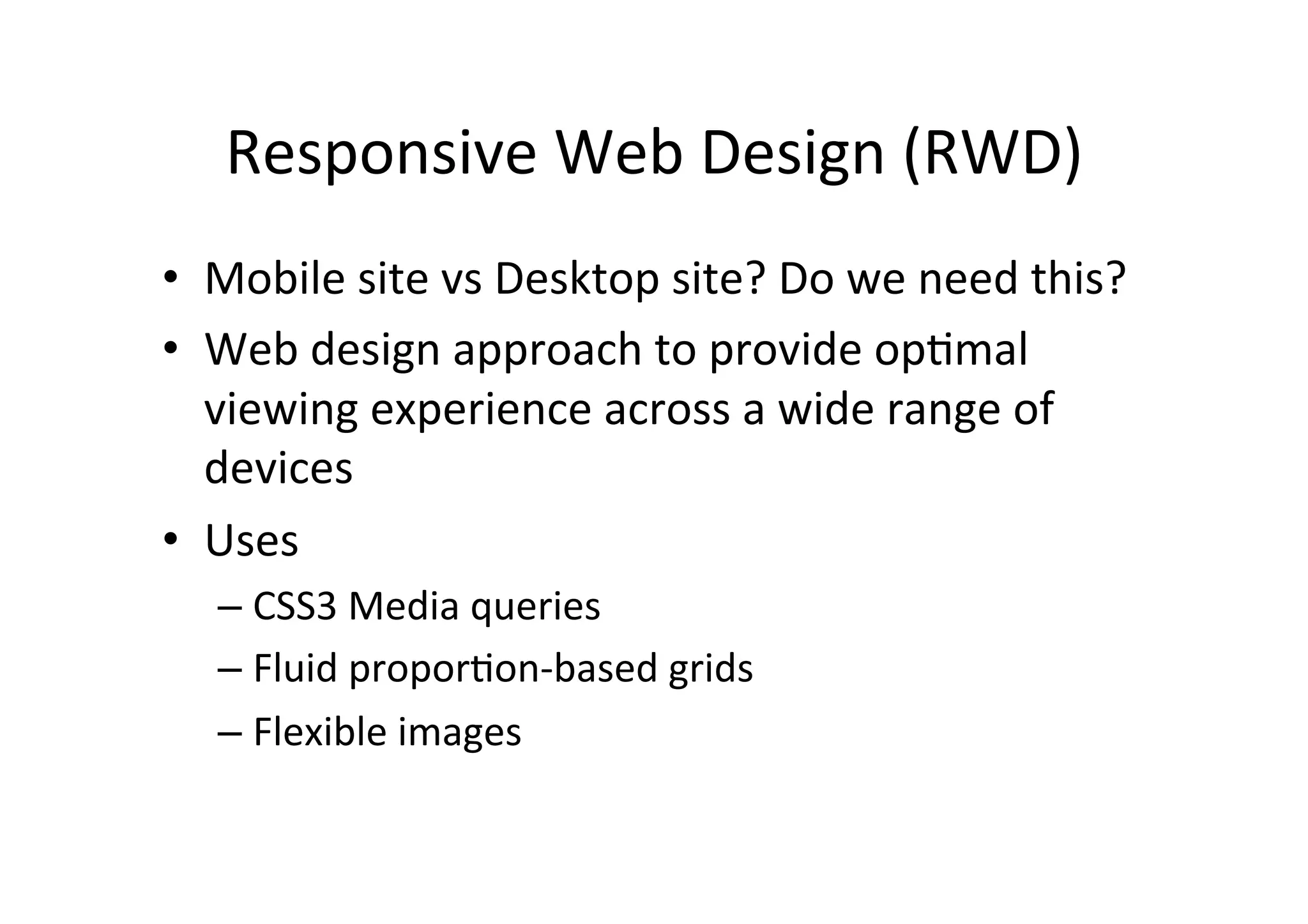
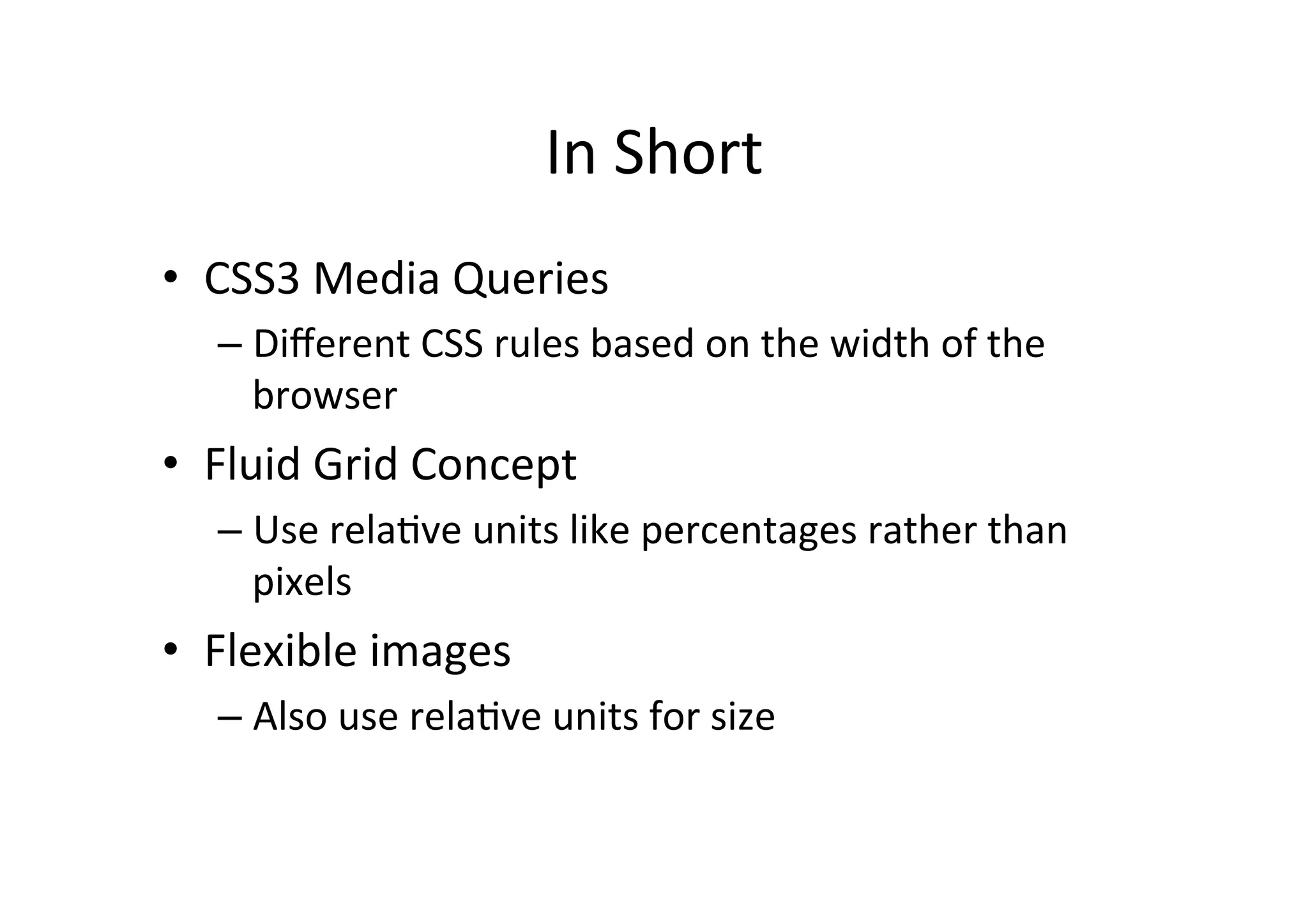
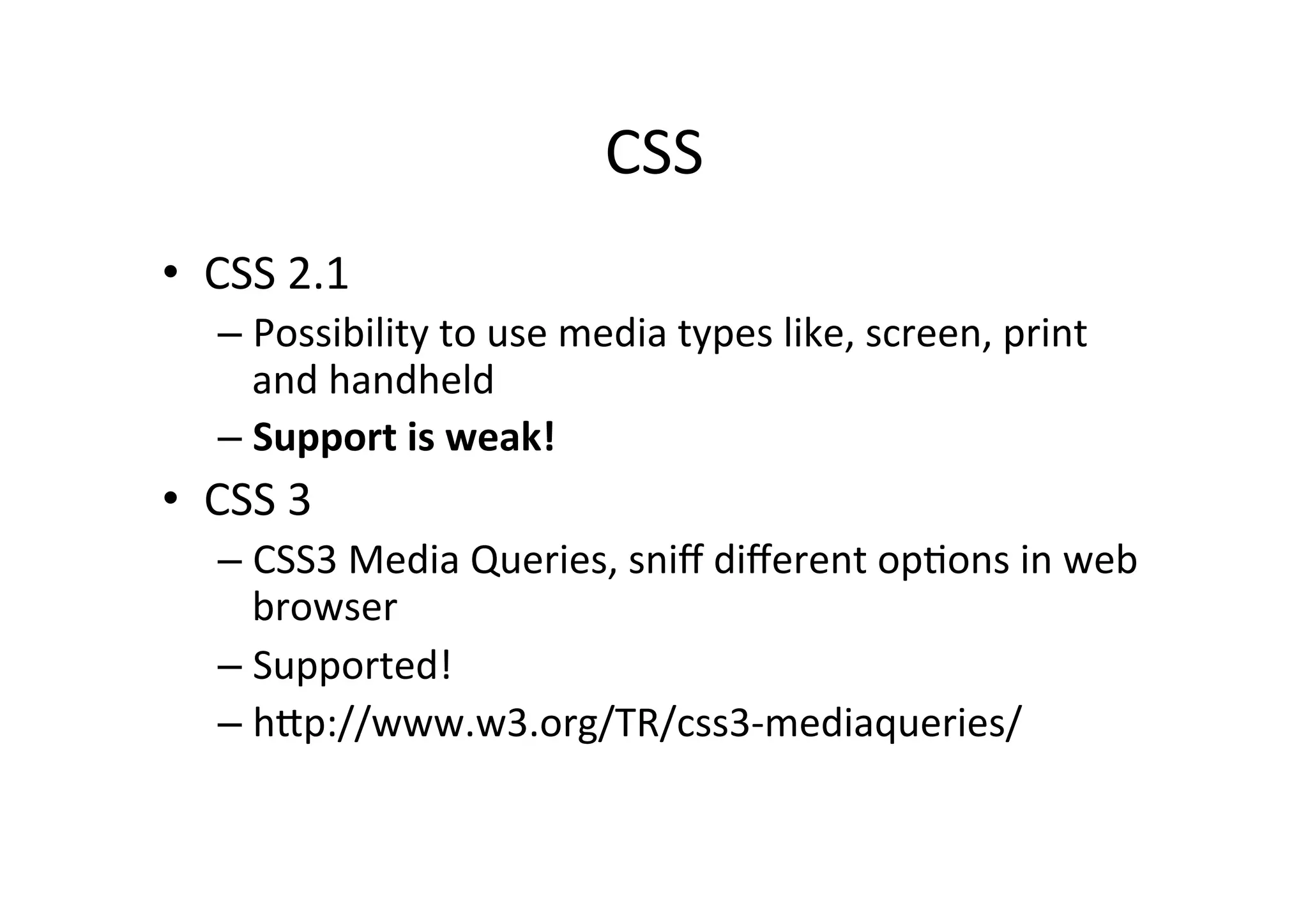
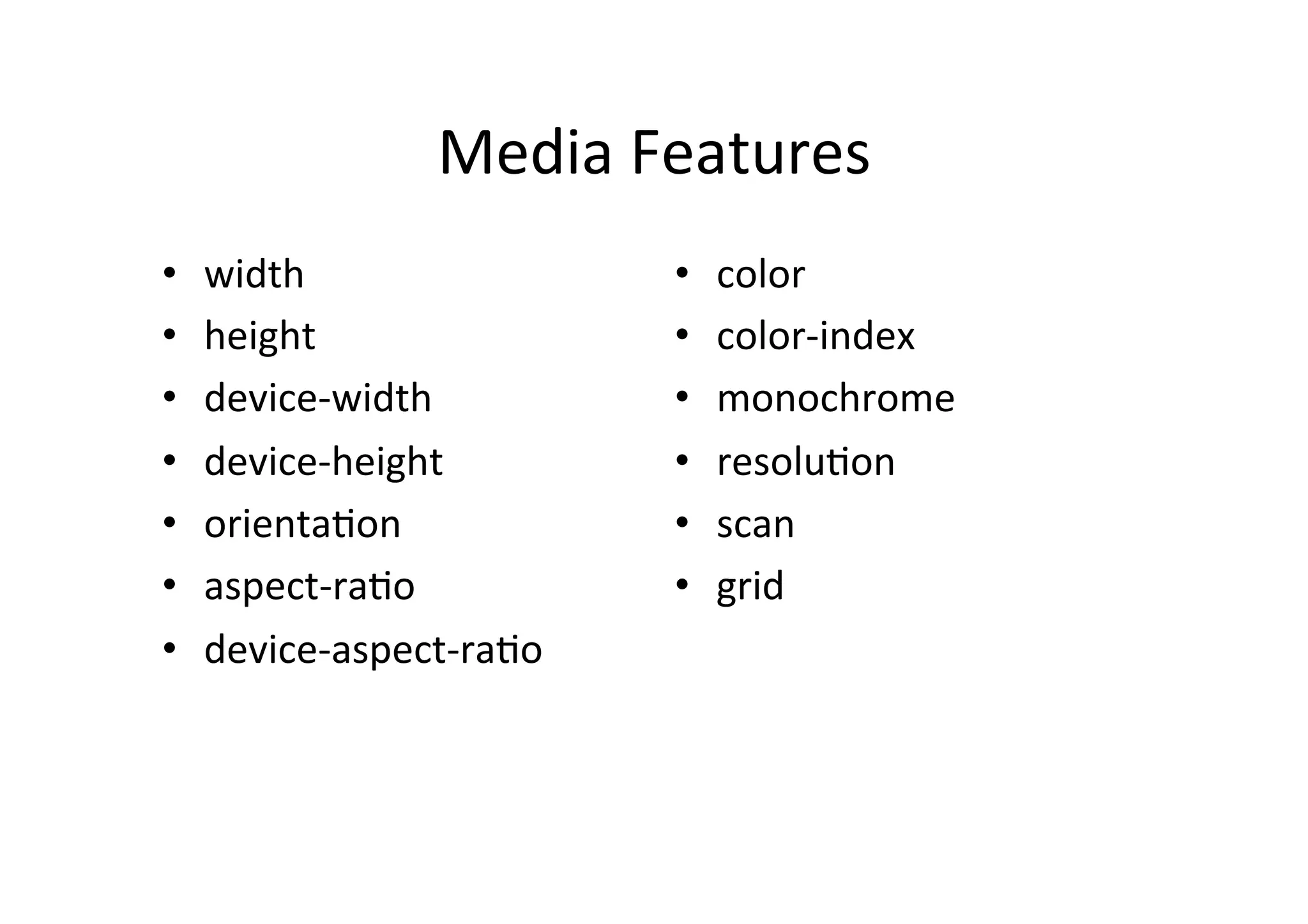
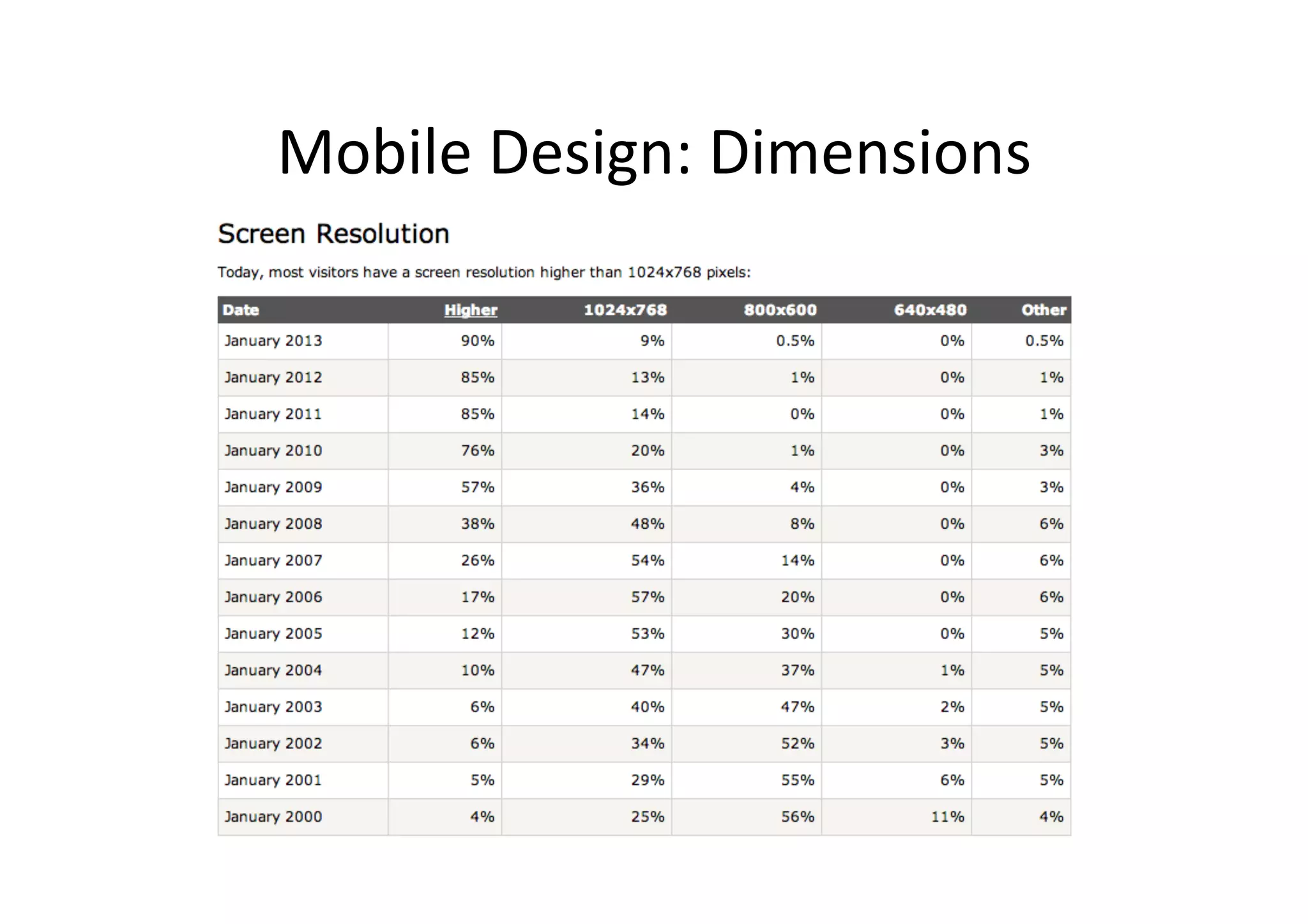
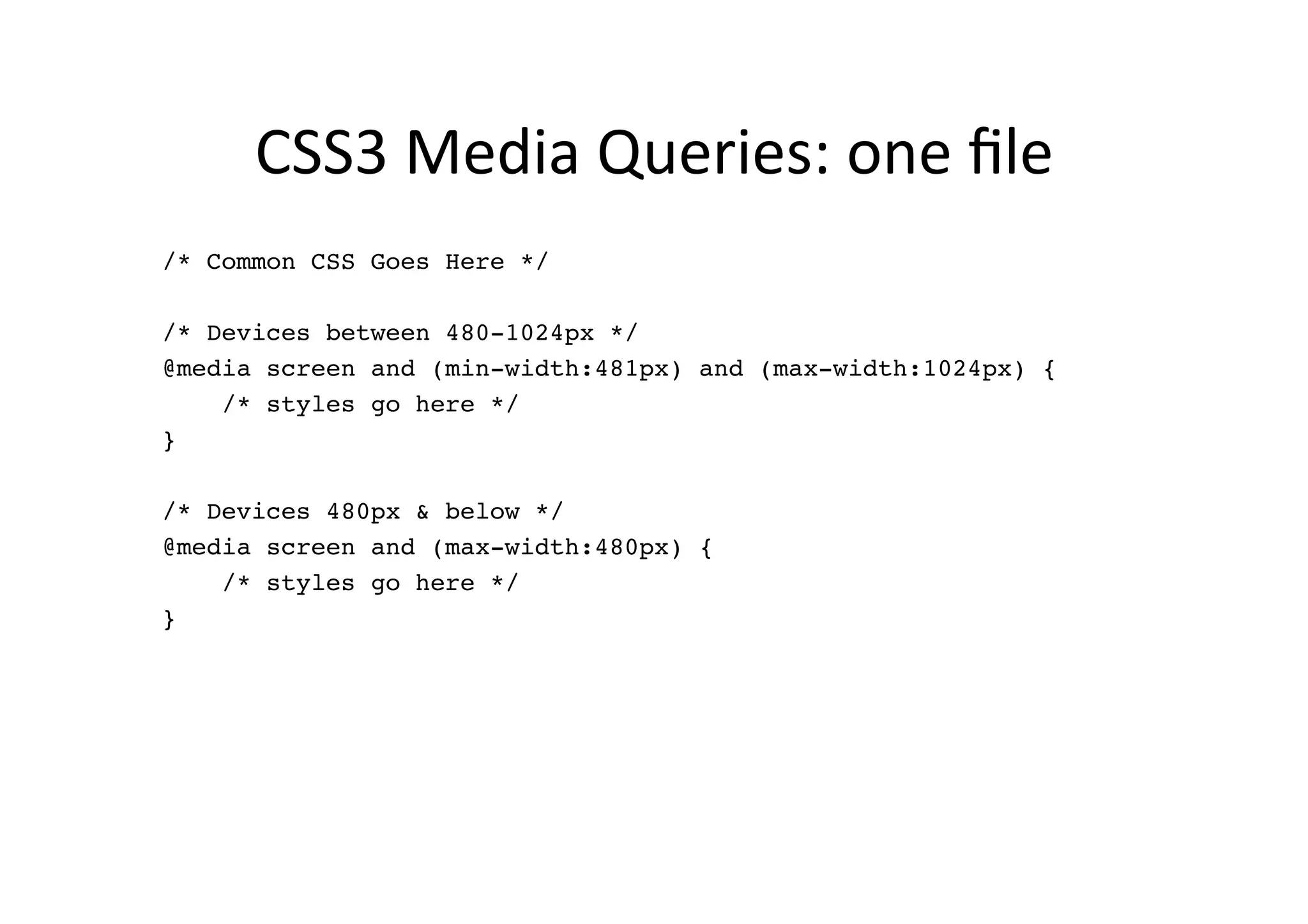
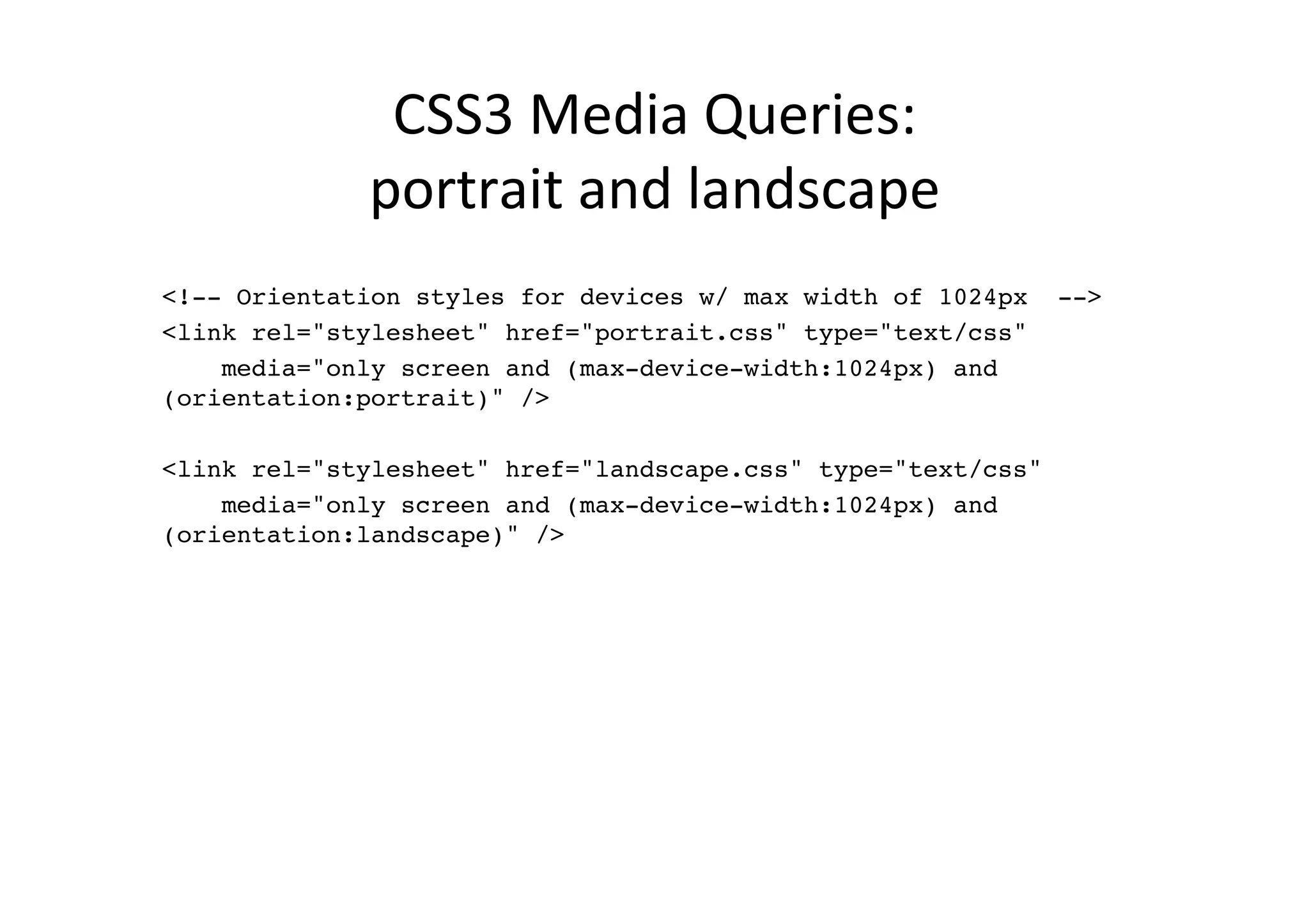
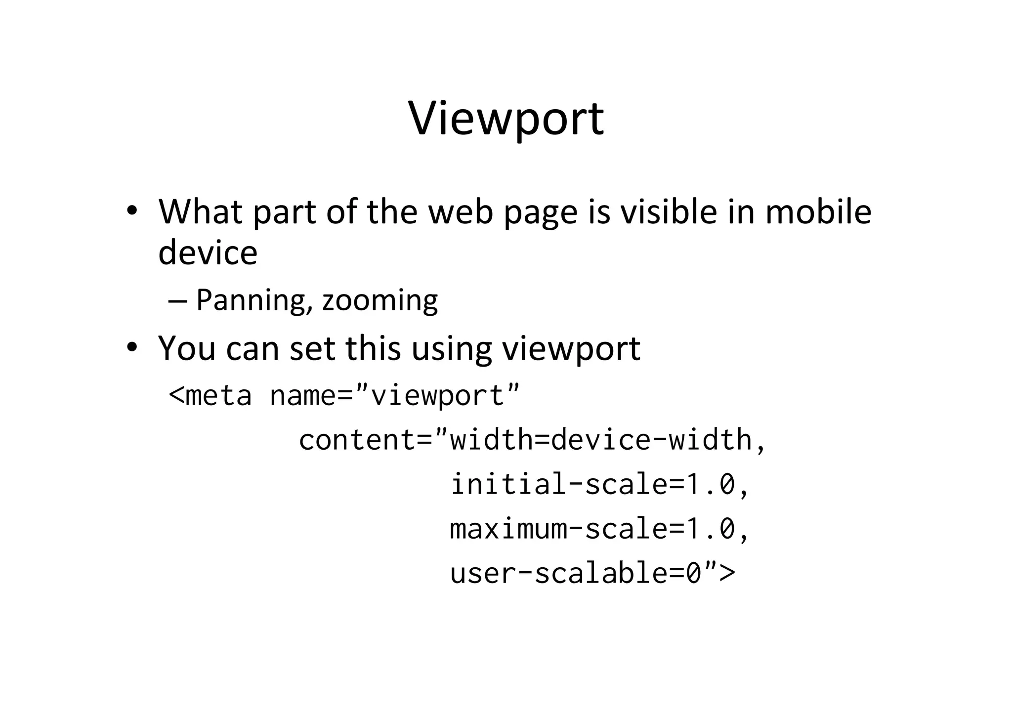
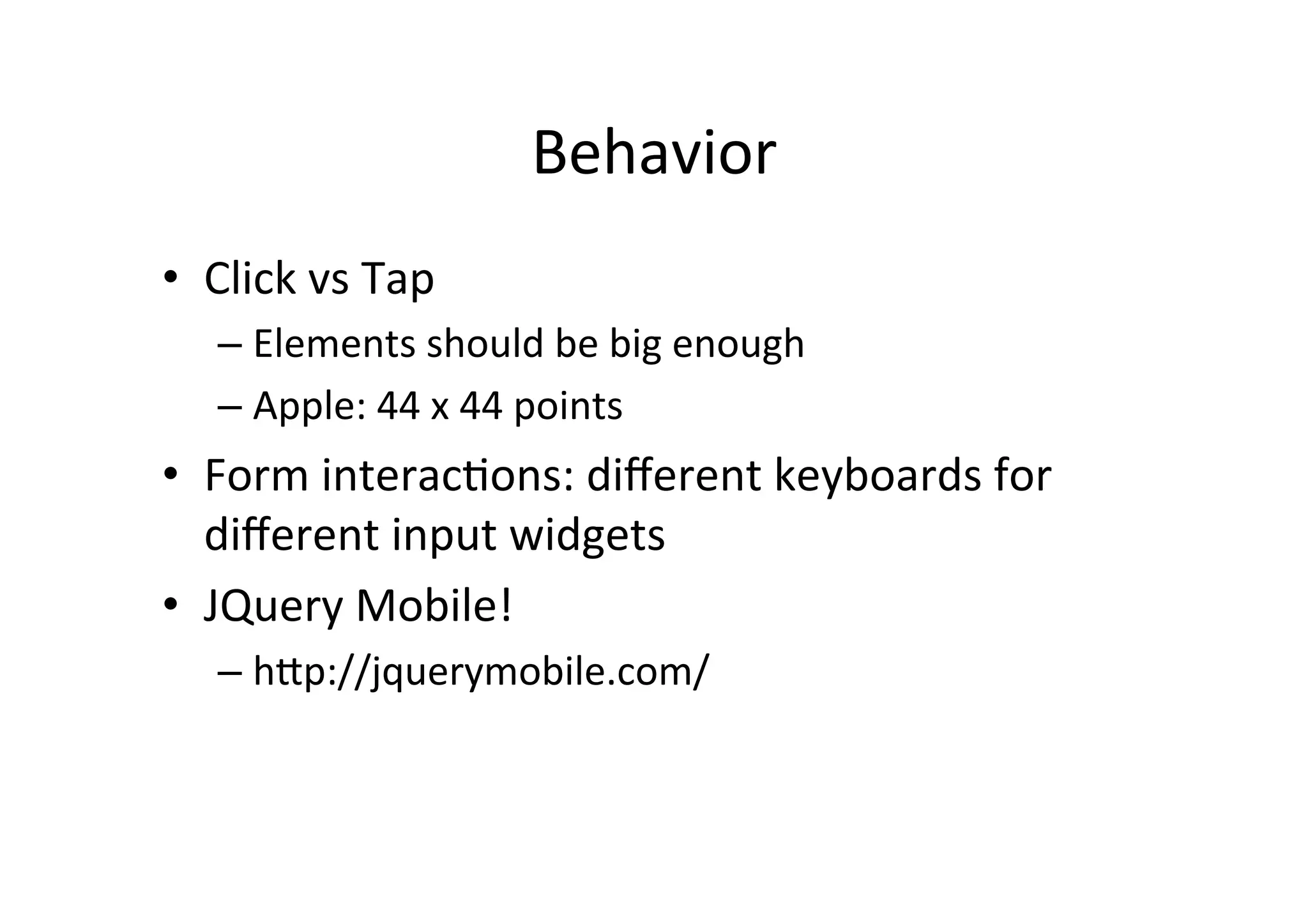
KEMBAR78
Responsive Web Site Design | PDF
Responsive	
  Web	
  Design	
  

       Jussi	
  Pohjolainen	


Smartphones	
  outsell	
  PCs!	
  
•  Depending	
  on	
  the	
  source,	
  smartphones	
  
   outsell	
  PCs	
  in	
  2010	
  or	
  2011!	
  
•  Mobile	
  internet	
  data	
  traffic	
  increases	
  heavily	
  
•  Lot	
  of	
  new	
  devices	
  
•  Post-­‐PC	
  era	
  
Mobile	
  First!	
  
•  Design	
  your	
  layout	
  so	
  that	
  it	
  works	
  on	
  mobile	
  
•  A"er	
  this,	
  implement	
  a	
  version	
  that	
  "works"	
  
   on	
  desktop	
  
Responsive	
  Web	
  Design	
  (RWD)	
  
•  Mobile	
  site	
  vs	
  Desktop	
  site?	
  Do	
  we	
  need	
  this?	
  
•  Web	
  design	
  approach	
  to	
  provide	
  opNmal	
  
   viewing	
  experience	
  across	
  a	
  wide	
  range	
  of	
  
   devices	
  
•  Uses	
  
    –  CSS3	
  Media	
  queries	
  
    –  Fluid	
  proporNon-­‐based	
  grids	
  
    –  Flexible	
  images	
  
In	
  Short	
  
•  CSS3	
  Media	
  Queries	
  
    –  Different	
  CSS	
  rules	
  based	
  on	
  the	
  width	
  of	
  the	
  
       browser	
  
•  Fluid	
  Grid	
  Concept	
  
    –  Use	
  relaNve	
  units	
  like	
  percentages	
  rather	
  than	
  
       pixels	
  
•  Flexible	
  images	
  
    –  Also	
  use	
  relaNve	
  units	
  for	
  size	
  
CSS	
  
•  CSS	
  2.1	
  
     –  Possibility	
  to	
  use	
  media	
  types	
  like,	
  screen,	
  print	
  
        and	
  handheld	
  
     –  Support	
  is	
  weak!	
  
•  CSS	
  3	
  
     –  CSS3	
  Media	
  Queries,	
  sniff	
  different	
  opNons	
  in	
  web	
  
        browser	
  
     –  Supported!	
  
     –  hZp://www.w3.org/TR/css3-­‐mediaqueries/	
  
Media	
  Features	
  
•    width	
                      •    color	
  
•    height	
                     •    color-­‐index	
  
•    device-­‐width	
             •    monochrome	
  
•    device-­‐height	
            •    resoluNon	
  
•    orientaNon	
                 •    scan	
  
•    aspect-­‐raNo	
              •    grid	
  
•    device-­‐aspect-­‐raNo	
  
Mobile	
  Design:	
  Speed	
  
•  Speed!	
  
   –  User	
  use	
  the	
  web	
  to	
  get	
  things	
  done	
  
   –  The	
  choice	
  which	
  sites	
  people	
  use,	
  is	
  influenced	
  by	
  
      how	
  quickly	
  tool	
  accomplishes	
  their	
  goals	
  
   –  Op5mize	
  your	
  site	
  for	
  speed	
  
   –  Souders:	
  High	
  Performance	
  Web	
  Sites:	
  Essen6al	
  
      Knowledge	
  for	
  Front-­‐End	
  Engineers	
  	
  
Mobile	
  Design:	
  Dimensions	
  
Mobile	
  Design:	
  Dimensions	
  
•  In	
  mobile	
  world,	
  dimensions	
  change	
  even	
  
   faster!	
  
•  Should	
  we	
  target	
  the	
  lowest	
  common	
  
   resoluNon?	
  
•  How	
  do	
  we	
  scale	
  up	
  for	
  tablets?	
  
•  =>	
  Create	
  fluid	
  layout	
  using	
  CSS3	
  
CSS3	
  Media	
  Queries:	
  three	
  files	
  
<!-- All common styles -->!
!
<link rel="stylesheet" href="common.css" type="text/css"
media="screen" />!
      !
<!-- Devices between 480-1024px -->!
<link rel="stylesheet" href="styles_max_1024.css" type="text/css" !
      media="only screen and (min-width:481px) and (max-width:
1024px)" />!
      !
<!-- Devices below 480px -->!
<link rel="stylesheet" href="styles_max_480.css" type="text/css" !
      media="only screen and (max-width:480px)" />!
CSS3	
  Media	
  Queries:	
  one	
  file	
  
/* Common CSS Goes Here */!
      !
/* Devices between 480-1024px */!
@media screen and (min-width:481px) and (max-width:1024px) {!
    /* styles go here */!
}!
      !
/* Devices 480px & below */!
@media screen and (max-width:480px) {!
    /* styles go here */!
}!
CSS3	
  Media	
  Queries:	
  	
  
             portrait	
  and	
  landscape	
  
!
<!-- Orientation styles for devices w/ max width of 1024px -->!
<link rel="stylesheet" href="portrait.css" type="text/css" !
    media="only screen and (max-device-width:1024px) and
(orientation:portrait)" />!
        !
<link rel="stylesheet" href="landscape.css" type="text/css" !
    media="only screen and (max-device-width:1024px) and
(orientation:landscape)" />!
Viewport	
  
•  What	
  part	
  of	
  the	
  web	
  page	
  is	
  visible	
  in	
  mobile	
  
   device	
  
    –  Panning,	
  zooming	
  
•  You	
  can	
  set	
  this	
  using	
  viewport	
  
    <meta name="viewport"
            content="width=device-width,
                     initial-scale=1.0,
                     maximum-scale=1.0,
                     user-scalable=0">
Behavior	
  
•  Click	
  vs	
  Tap	
  
    –  Elements	
  should	
  be	
  big	
  enough	
  
    –  Apple:	
  44	
  x	
  44	
  points	
  
•  Form	
  interacNons:	
  different	
  keyboards	
  for	
  
   different	
  input	
  widgets	
  
•  JQuery	
  Mobile!	
  
    –  hZp://jquerymobile.com/	
  
Exercise	
  1	
  
•  Create	
  web	
  page	
  that	
  has	
  only	
  one	
  Ntle.	
  The	
  
   color	
  of	
  the	
  Ntle	
  changes	
  when	
  viewing	
  on	
  
   different	
  devices	
  
    –  Large	
  display	
  
    –  Medium	
  display	
  
    –  Small	
  display	
  
Exercise	
  2	
  
•  Create	
  responsive	
  web	
  page	
  that	
  adapts	
  to	
  
   screen	
  sizes	
  
    –  Large	
  display:	
  four	
  columns	
  side	
  by	
  side	
  
    –  Medium	
  display:	
  2	
  x	
  2	
  grid	
  
    –  Small	
  display:	
  one	
  column	
  
•  Use	
  HTML5	
  secNon,	
  nav,	
  etc	
  for	
  creaNng	
  the	
  
   site	
  

Responsive Web Site Design

  • 1.
    Responsive  Web  Design   Jussi  Pohjolainen    
  • 2.
    Smartphones  outsell  PCs!   •  Depending  on  the  source,  smartphones   outsell  PCs  in  2010  or  2011!   •  Mobile  internet  data  traffic  increases  heavily   •  Lot  of  new  devices   •  Post-­‐PC  era  
  • 3.
    Mobile  First!   • Design  your  layout  so  that  it  works  on  mobile   •  A"er  this,  implement  a  version  that  "works"   on  desktop  
  • 4.
    Responsive  Web  Design  (RWD)   •  Mobile  site  vs  Desktop  site?  Do  we  need  this?   •  Web  design  approach  to  provide  opNmal   viewing  experience  across  a  wide  range  of   devices   •  Uses   –  CSS3  Media  queries   –  Fluid  proporNon-­‐based  grids   –  Flexible  images  
  • 5.
    In  Short   • CSS3  Media  Queries   –  Different  CSS  rules  based  on  the  width  of  the   browser   •  Fluid  Grid  Concept   –  Use  relaNve  units  like  percentages  rather  than   pixels   •  Flexible  images   –  Also  use  relaNve  units  for  size  
  • 6.
    CSS   •  CSS  2.1   –  Possibility  to  use  media  types  like,  screen,  print   and  handheld   –  Support  is  weak!   •  CSS  3   –  CSS3  Media  Queries,  sniff  different  opNons  in  web   browser   –  Supported!   –  hZp://www.w3.org/TR/css3-­‐mediaqueries/  
  • 7.
    Media  Features   •  width   •  color   •  height   •  color-­‐index   •  device-­‐width   •  monochrome   •  device-­‐height   •  resoluNon   •  orientaNon   •  scan   •  aspect-­‐raNo   •  grid   •  device-­‐aspect-­‐raNo  
  • 8.
    Mobile  Design:  Speed   •  Speed!   –  User  use  the  web  to  get  things  done   –  The  choice  which  sites  people  use,  is  influenced  by   how  quickly  tool  accomplishes  their  goals   –  Op5mize  your  site  for  speed   –  Souders:  High  Performance  Web  Sites:  Essen6al   Knowledge  for  Front-­‐End  Engineers    
  • 9.
  • 10.
    Mobile  Design:  Dimensions   •  In  mobile  world,  dimensions  change  even   faster!   •  Should  we  target  the  lowest  common   resoluNon?   •  How  do  we  scale  up  for  tablets?   •  =>  Create  fluid  layout  using  CSS3  
  • 11.
    CSS3  Media  Queries:  three  files   <!-- All common styles -->! ! <link rel="stylesheet" href="common.css" type="text/css" media="screen" />! ! <!-- Devices between 480-1024px -->! <link rel="stylesheet" href="styles_max_1024.css" type="text/css" ! media="only screen and (min-width:481px) and (max-width: 1024px)" />! ! <!-- Devices below 480px -->! <link rel="stylesheet" href="styles_max_480.css" type="text/css" ! media="only screen and (max-width:480px)" />!
  • 12.
    CSS3  Media  Queries:  one  file   /* Common CSS Goes Here */! ! /* Devices between 480-1024px */! @media screen and (min-width:481px) and (max-width:1024px) {! /* styles go here */! }! ! /* Devices 480px & below */! @media screen and (max-width:480px) {! /* styles go here */! }!
  • 13.
    CSS3  Media  Queries:     portrait  and  landscape   ! <!-- Orientation styles for devices w/ max width of 1024px -->! <link rel="stylesheet" href="portrait.css" type="text/css" ! media="only screen and (max-device-width:1024px) and (orientation:portrait)" />! ! <link rel="stylesheet" href="landscape.css" type="text/css" ! media="only screen and (max-device-width:1024px) and (orientation:landscape)" />!
  • 14.
    Viewport   •  What  part  of  the  web  page  is  visible  in  mobile   device   –  Panning,  zooming   •  You  can  set  this  using  viewport   <meta name="viewport" content="width=device-width, initial-scale=1.0, maximum-scale=1.0, user-scalable=0">
  • 15.
    Behavior   •  Click  vs  Tap   –  Elements  should  be  big  enough   –  Apple:  44  x  44  points   •  Form  interacNons:  different  keyboards  for   different  input  widgets   •  JQuery  Mobile!   –  hZp://jquerymobile.com/  
  • 16.
    Exercise  1   • Create  web  page  that  has  only  one  Ntle.  The   color  of  the  Ntle  changes  when  viewing  on   different  devices   –  Large  display   –  Medium  display   –  Small  display  
  • 17.
    Exercise  2   • Create  responsive  web  page  that  adapts  to   screen  sizes   –  Large  display:  four  columns  side  by  side   –  Medium  display:  2  x  2  grid   –  Small  display:  one  column   •  Use  HTML5  secNon,  nav,  etc  for  creaNng  the   site