Download as PDF, PPTX


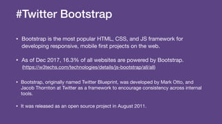
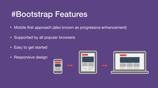
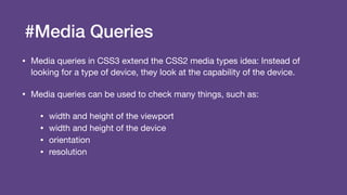
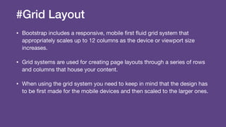

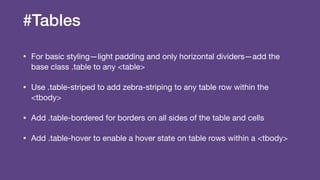

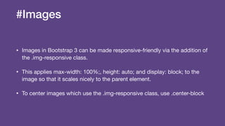
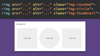

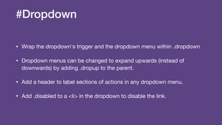
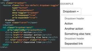


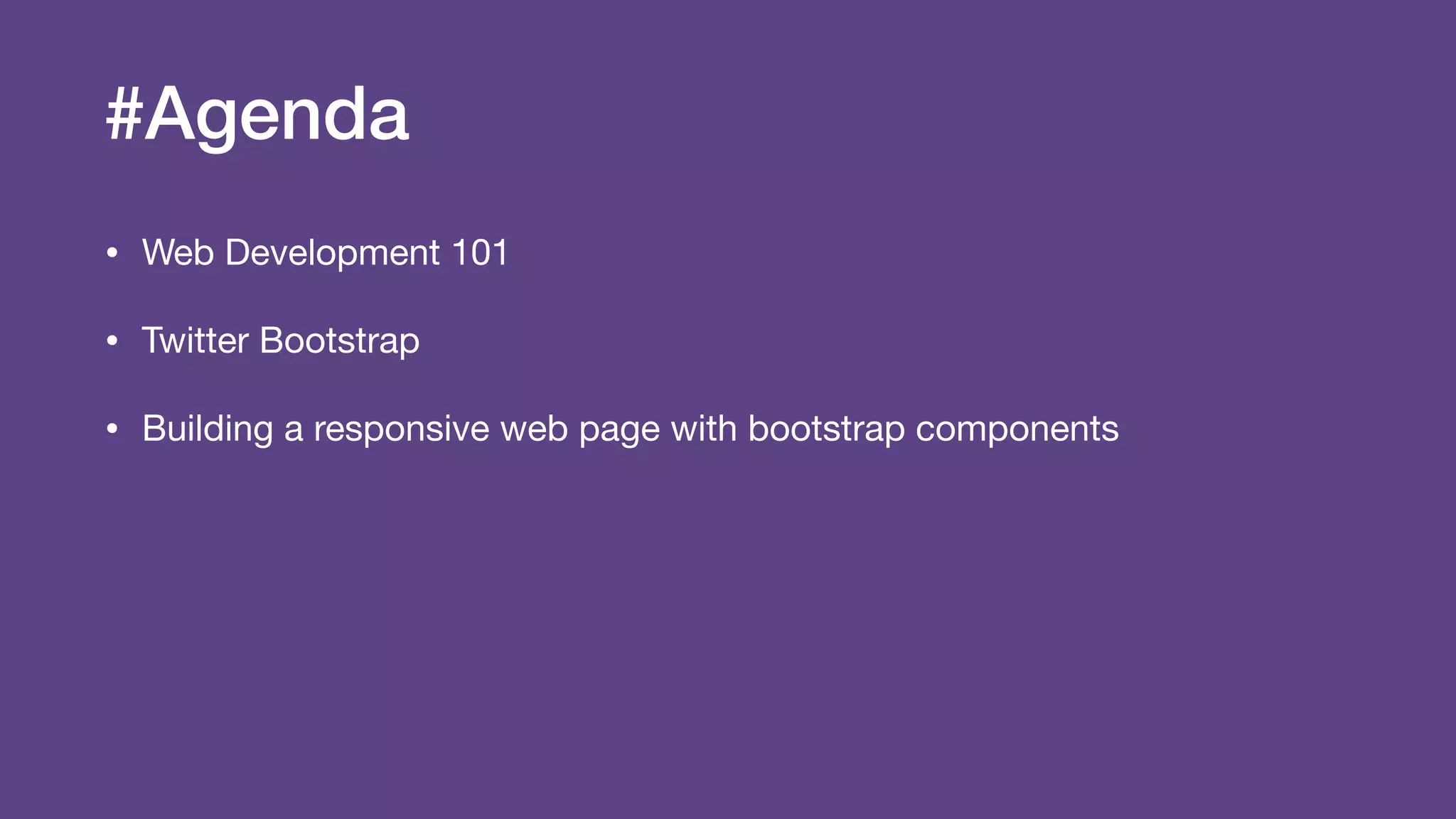
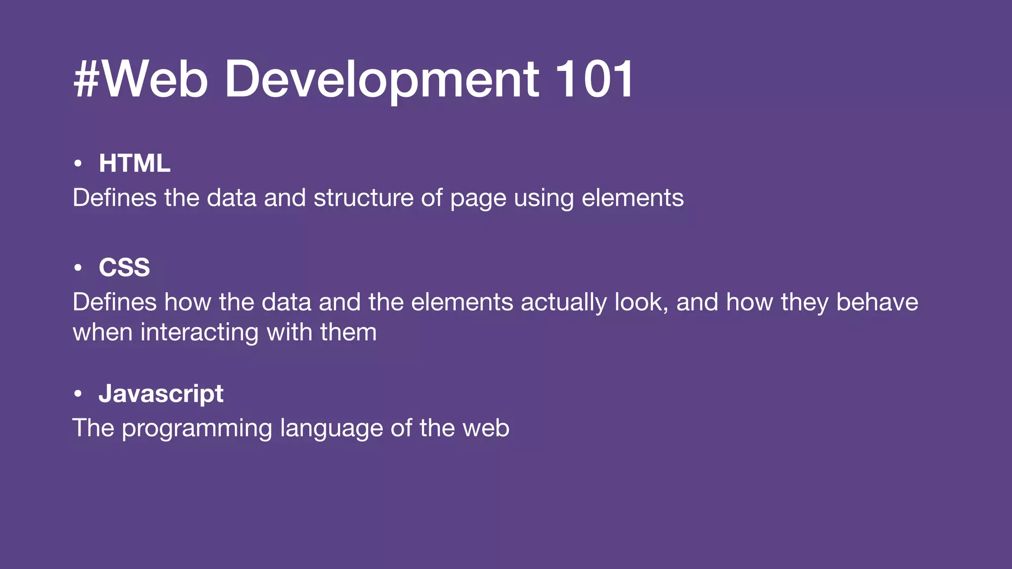
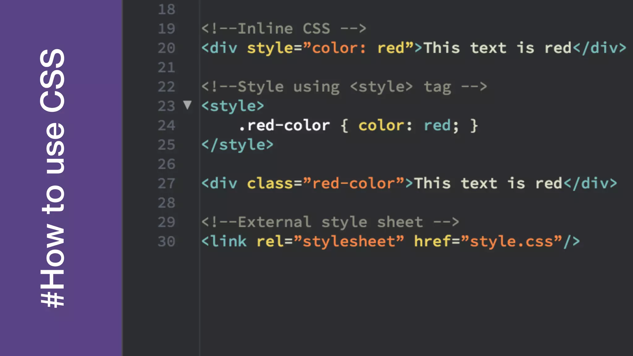
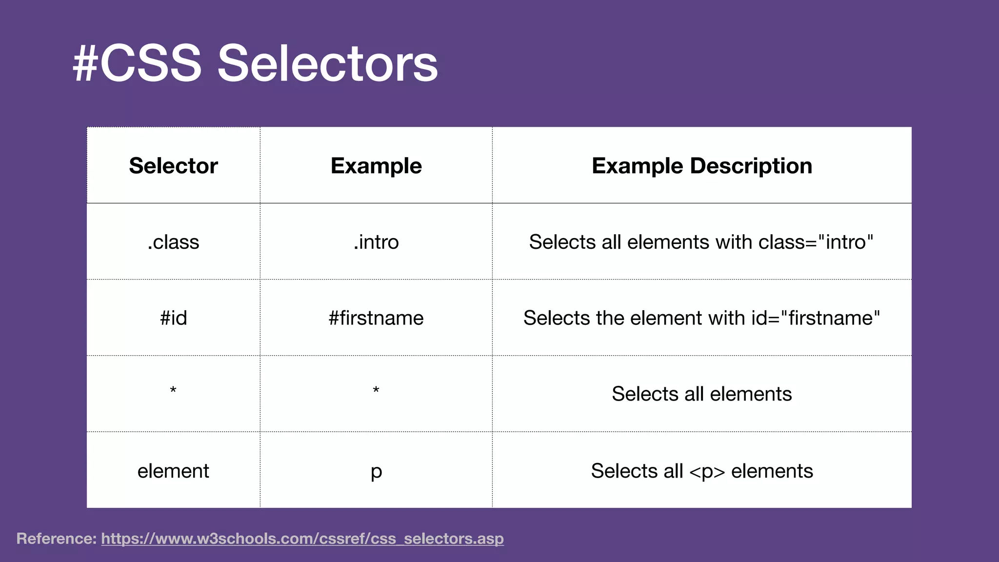
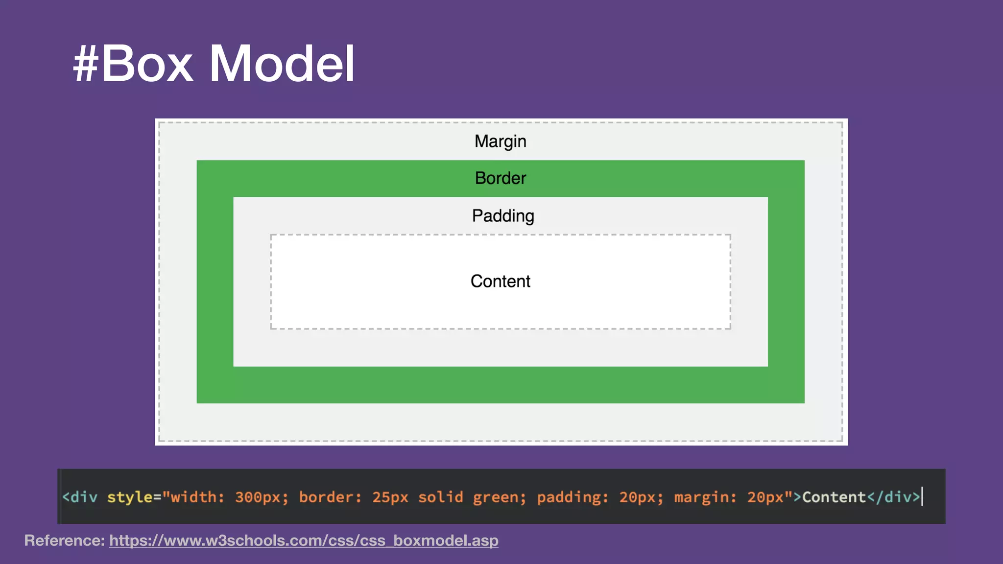

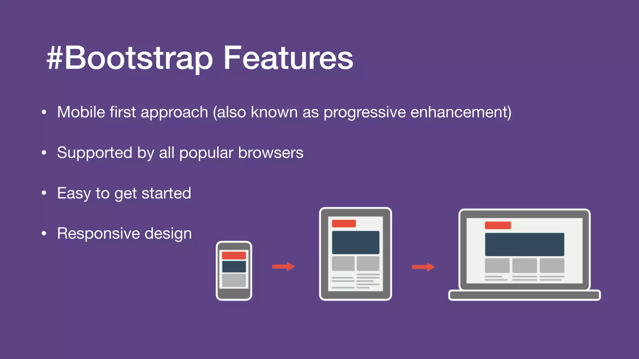
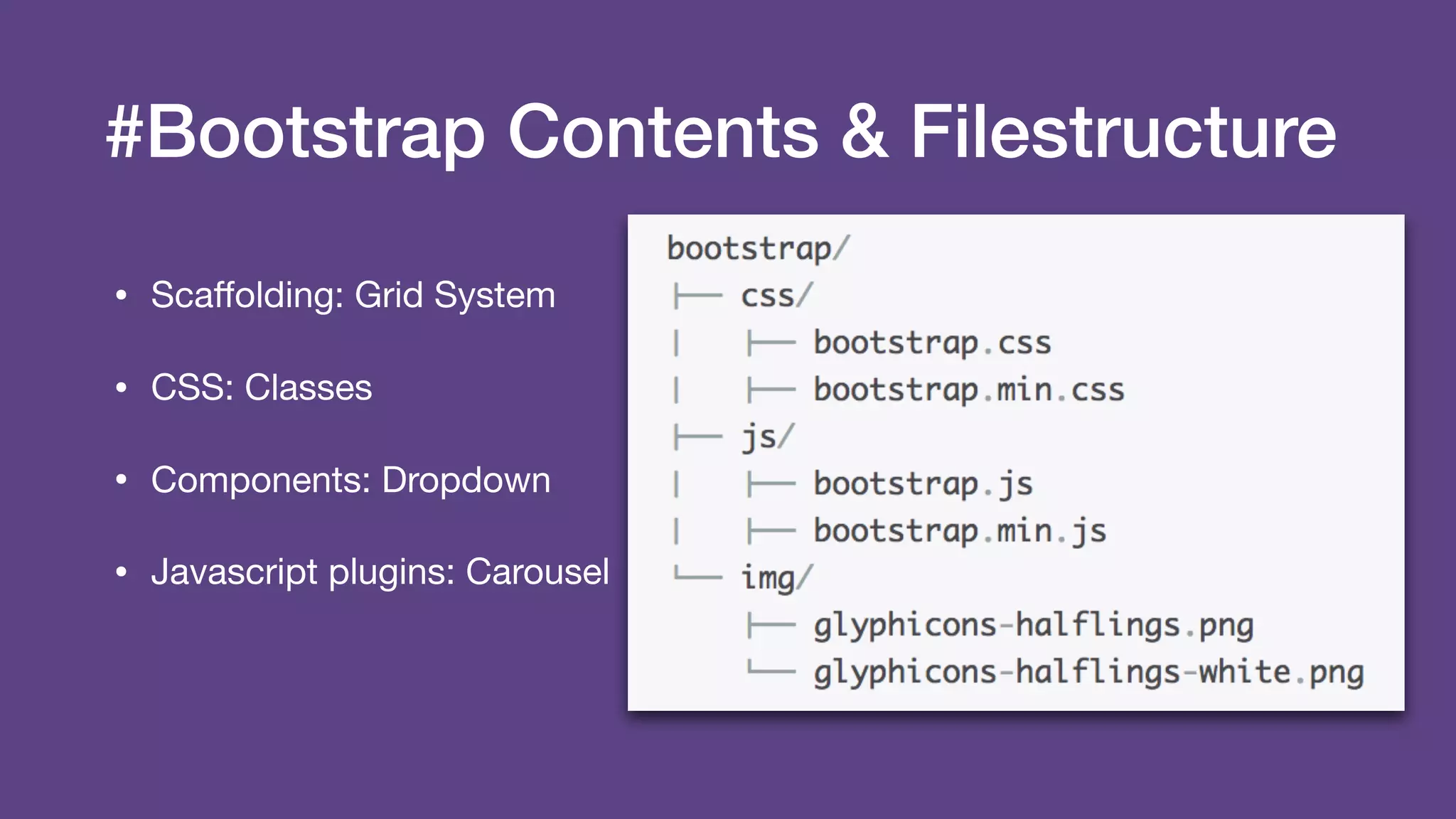
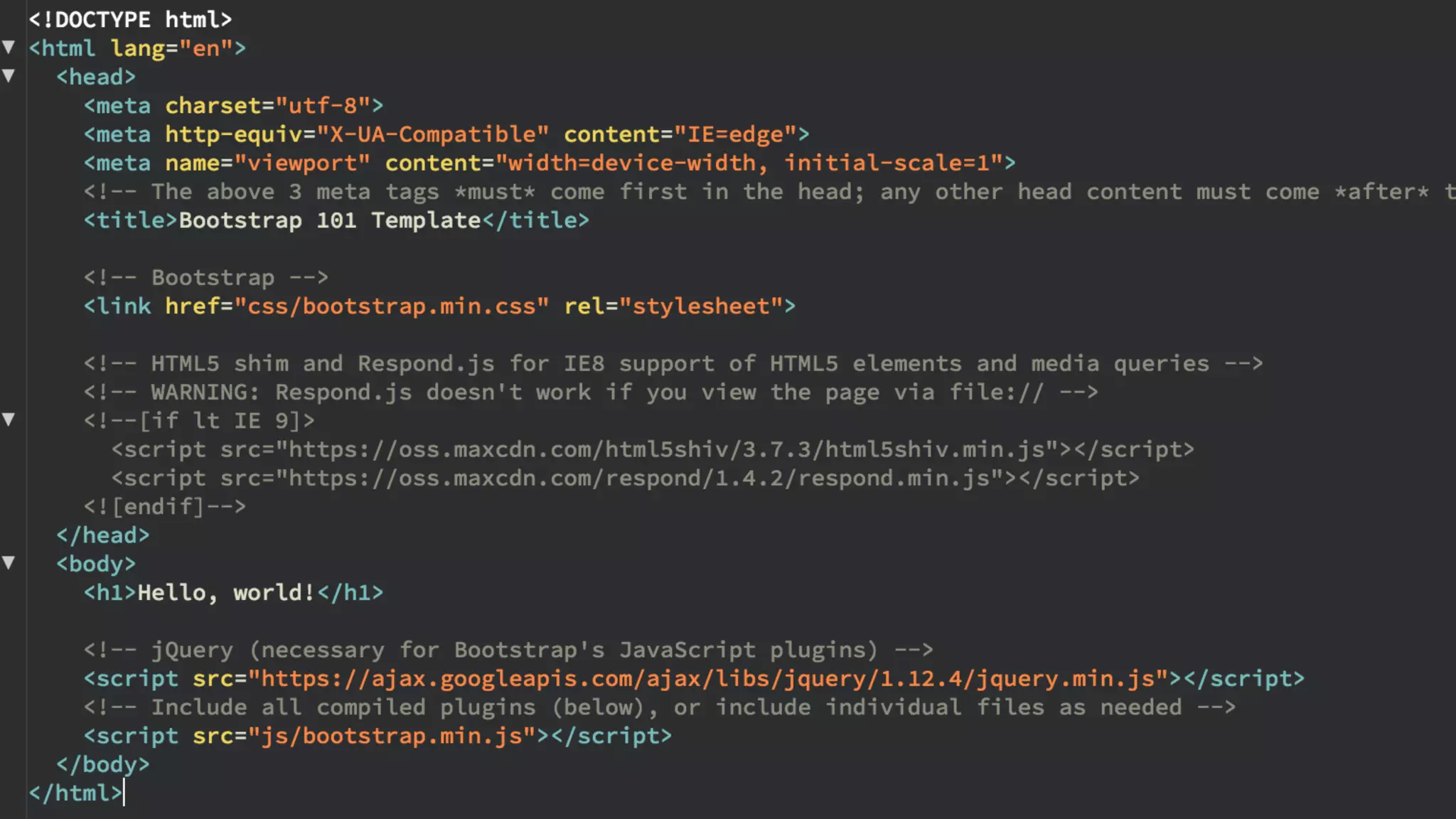

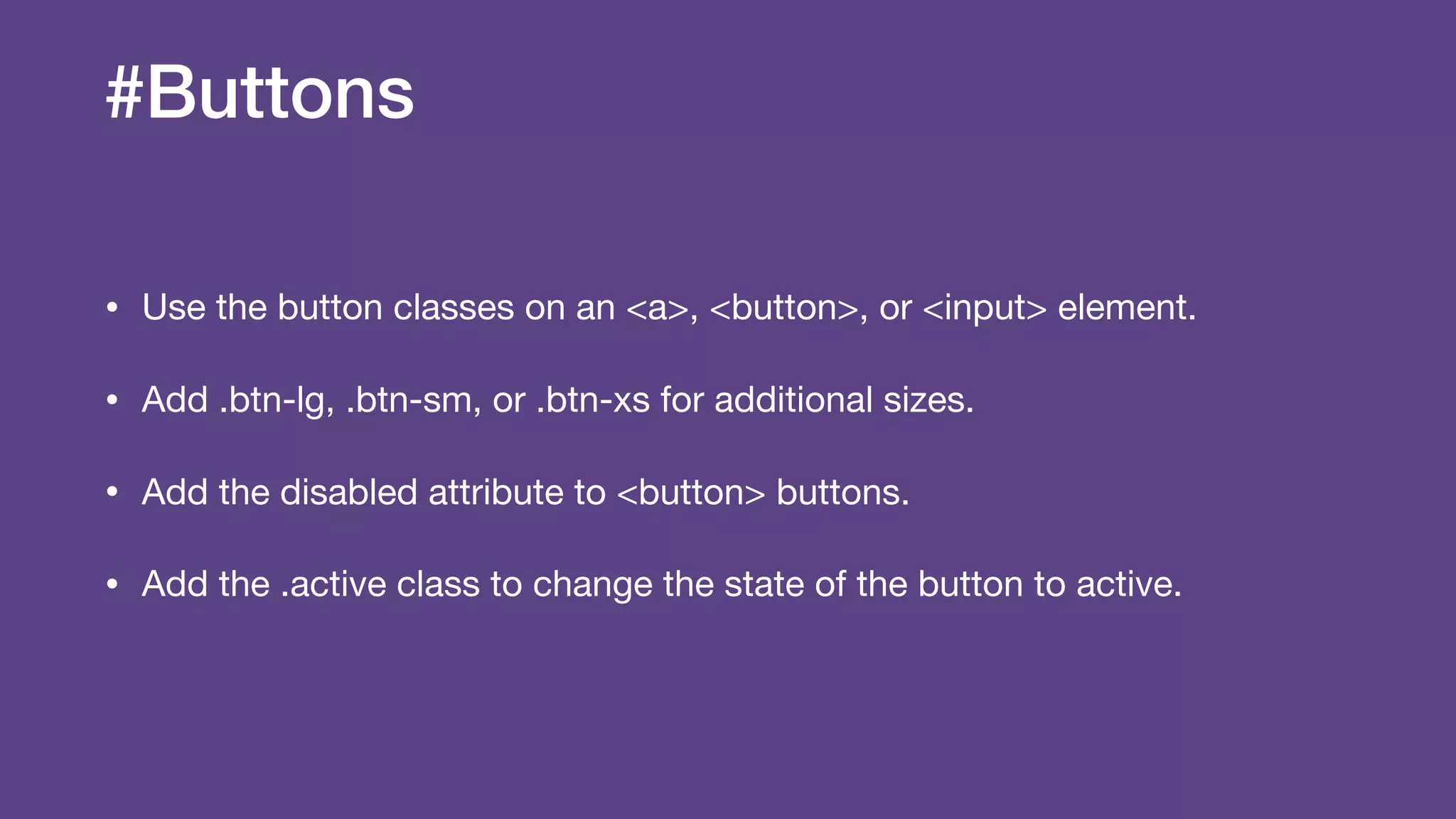
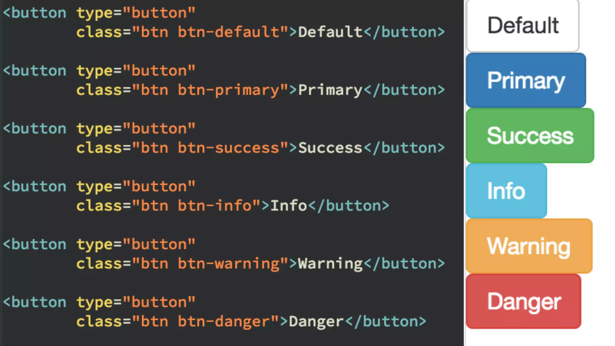
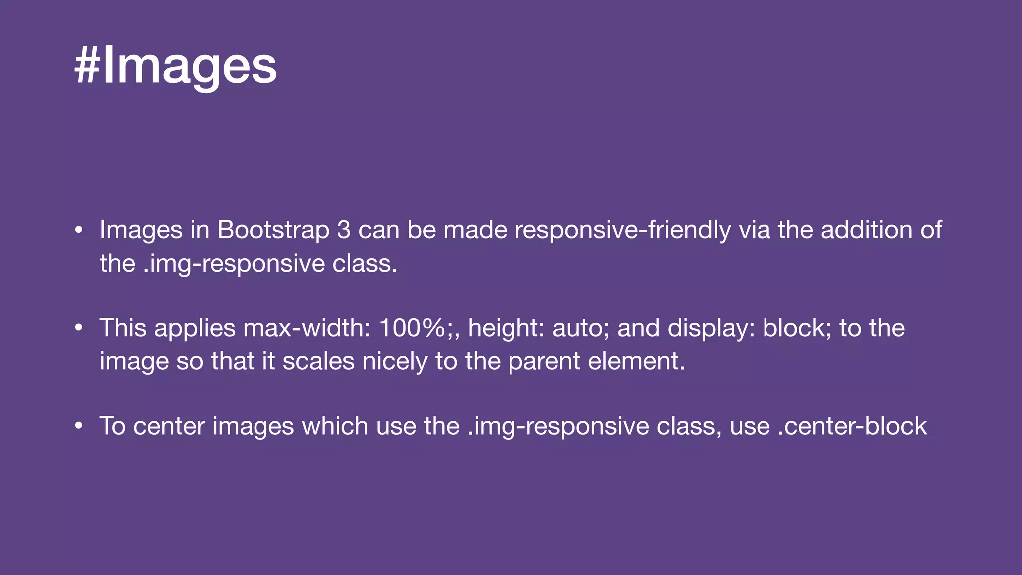


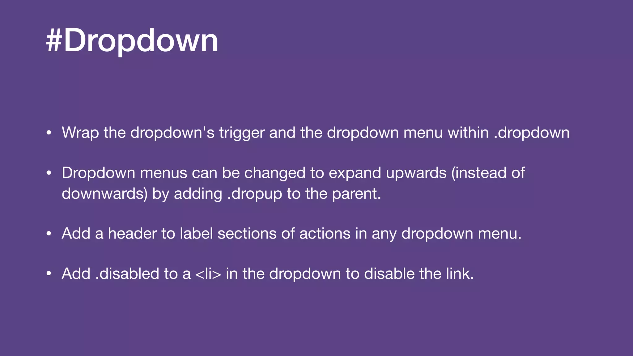
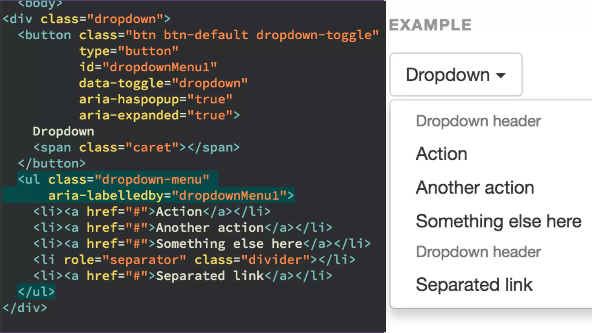
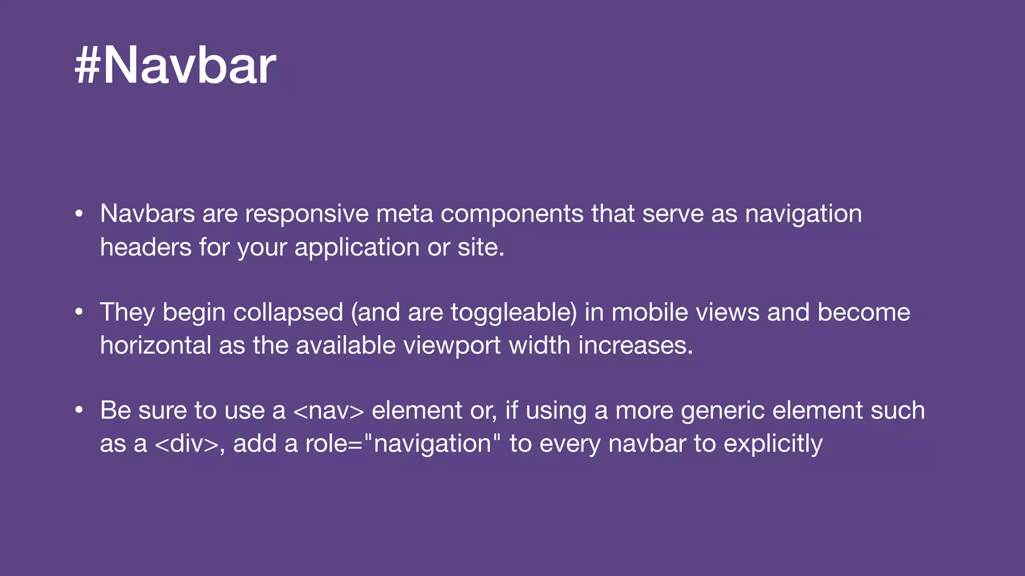
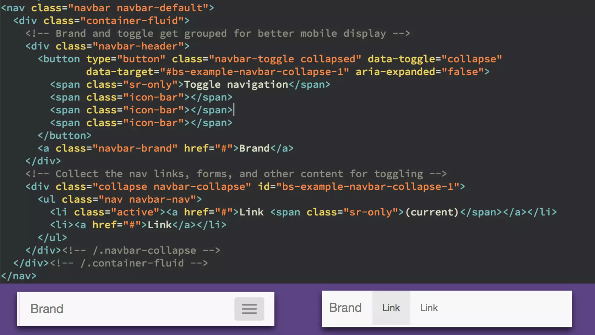

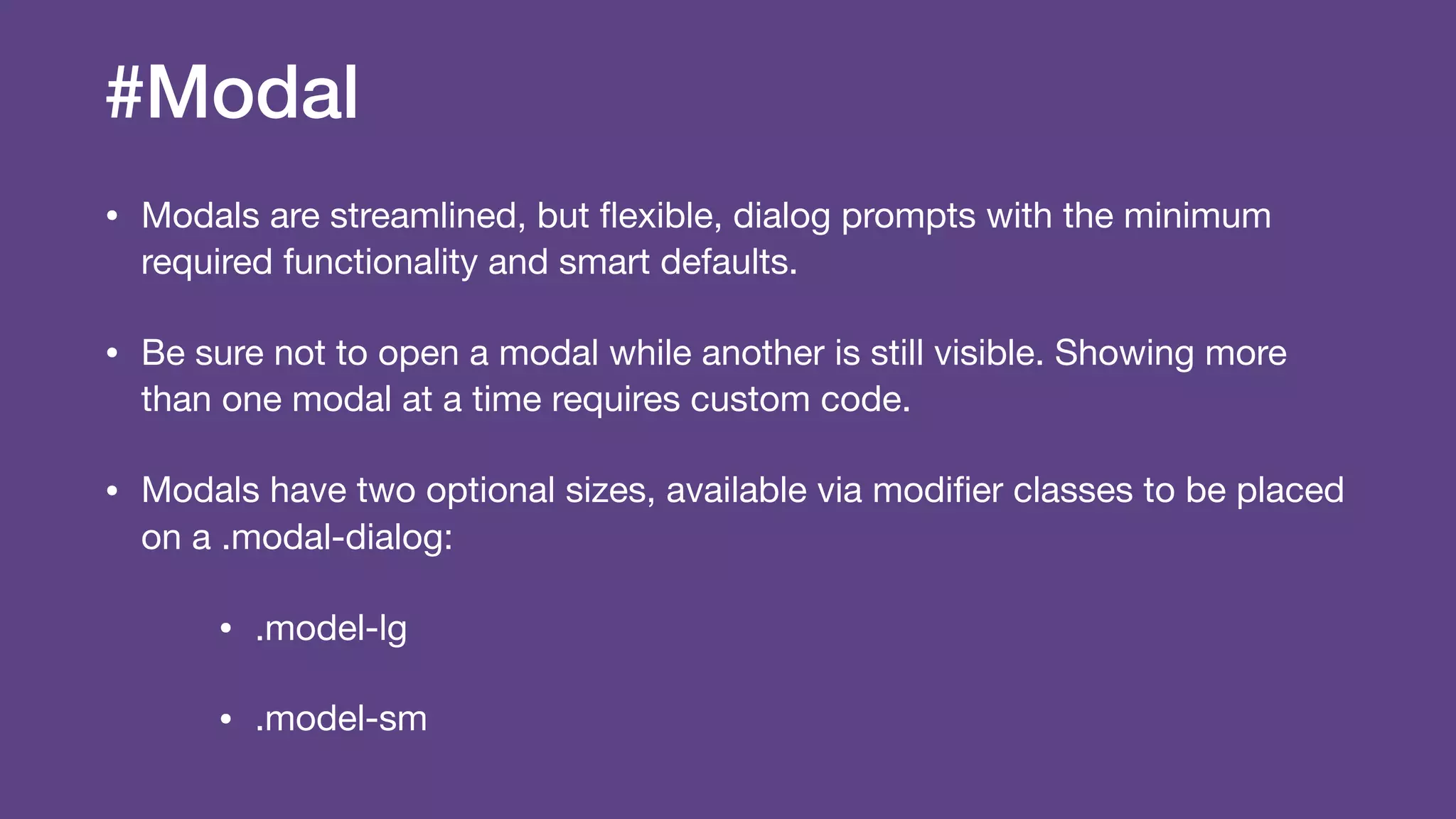


The document provides an introduction to Twitter Bootstrap, detailing its features, structure, and core components for web development. It emphasizes Bootstrap's mobile-first approach, responsive design capabilities, and components like grids, tables, forms, buttons, dropdowns, and modals. Additionally, it covers the basics of CSS usage, media queries, and responsive images to enhance web projects.


![Bootstrap [part 1]](https://cdn.slidesharecdn.com/ss_thumbnails/bootstrappart-11-170208154053-thumbnail.jpg?width=600ounds&width=560&fit=bounds)


