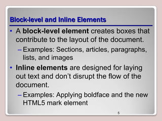
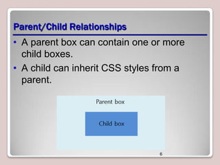
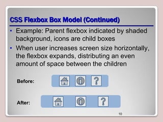
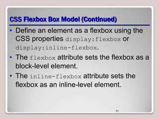
Download to read offline
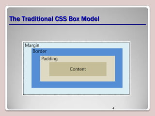


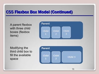

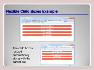
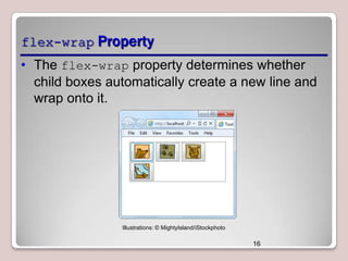


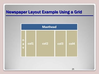
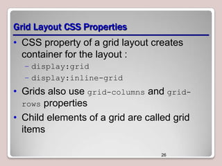

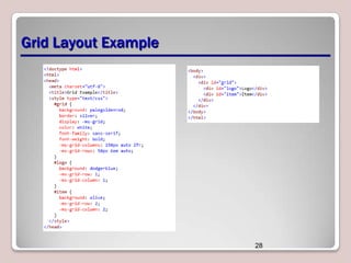

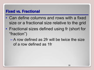

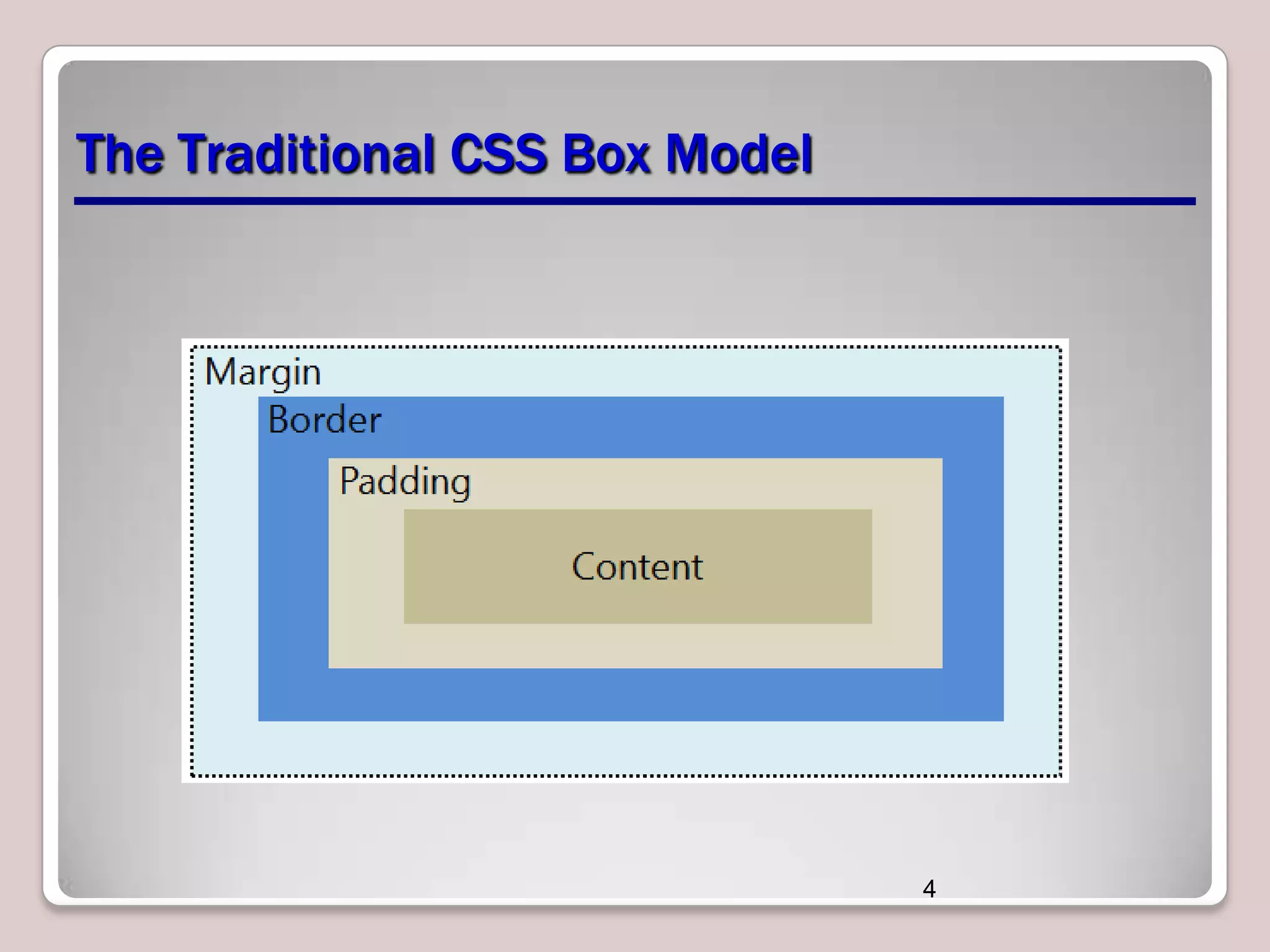

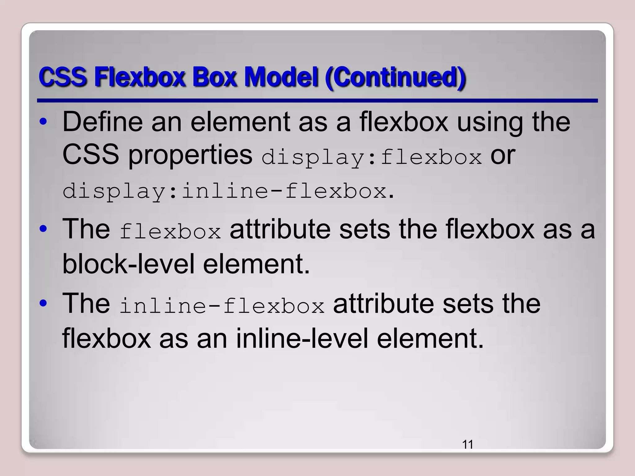
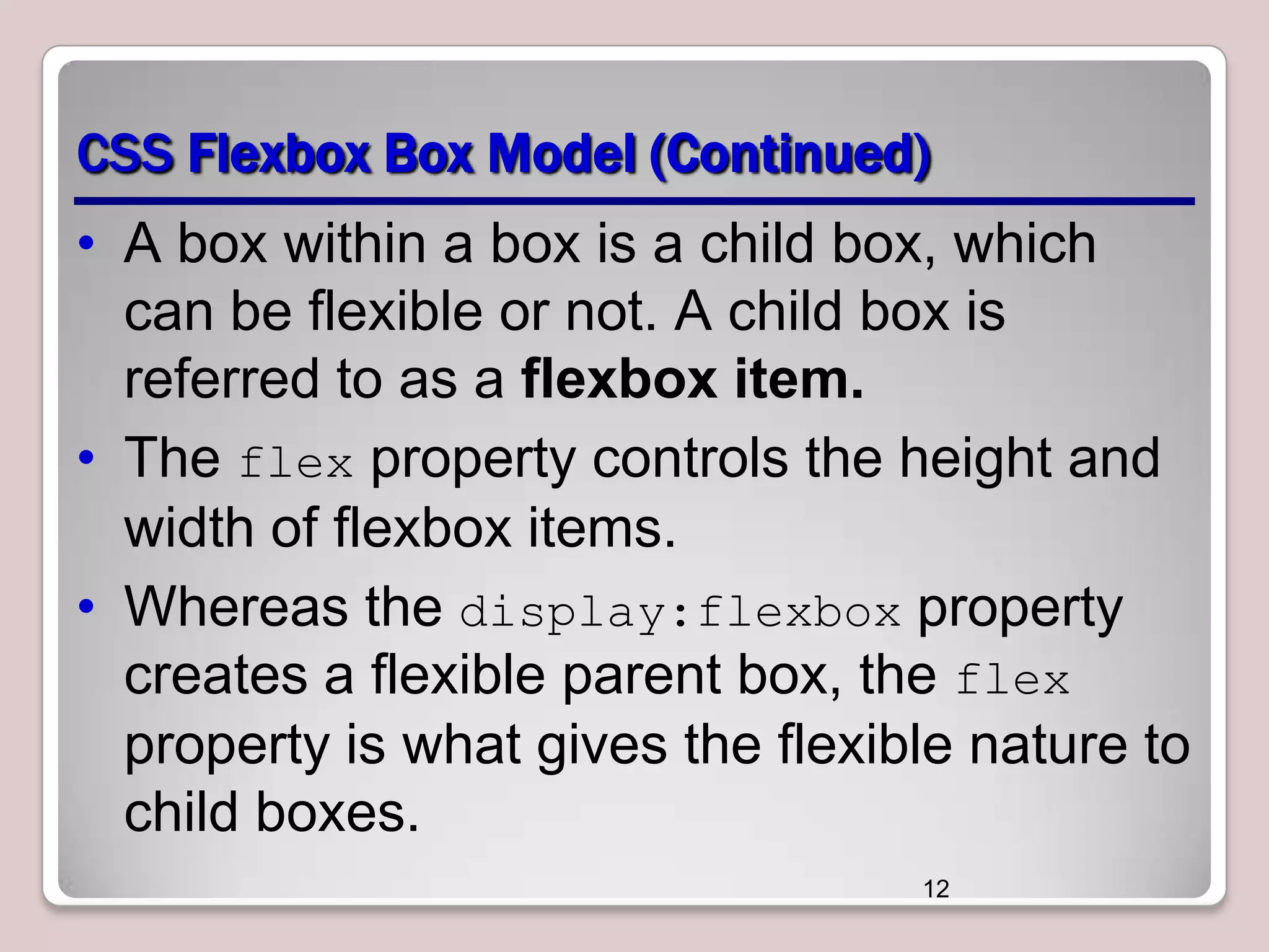
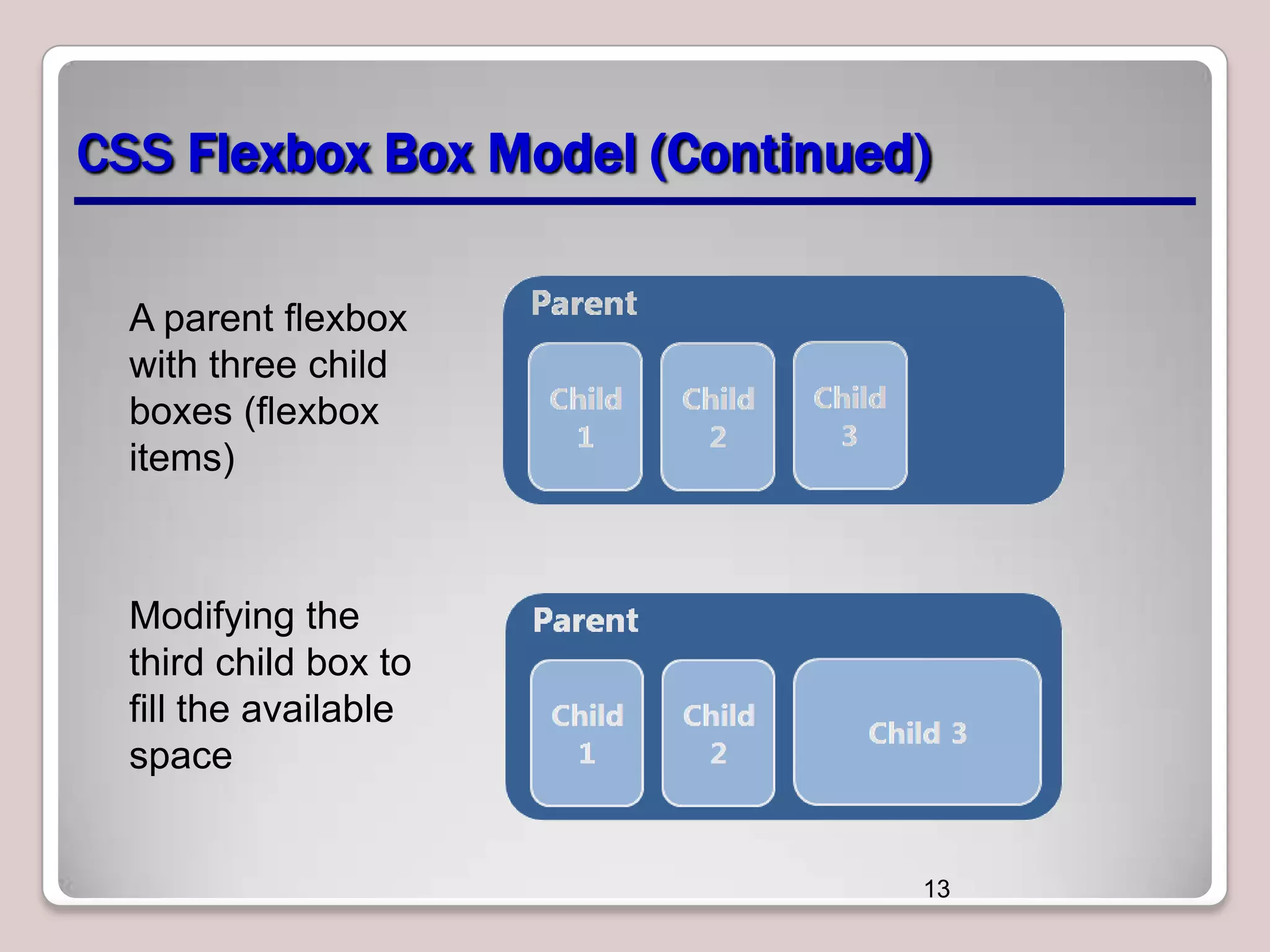
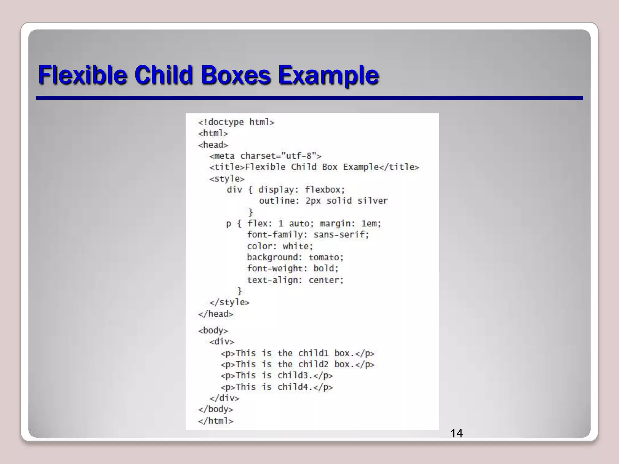
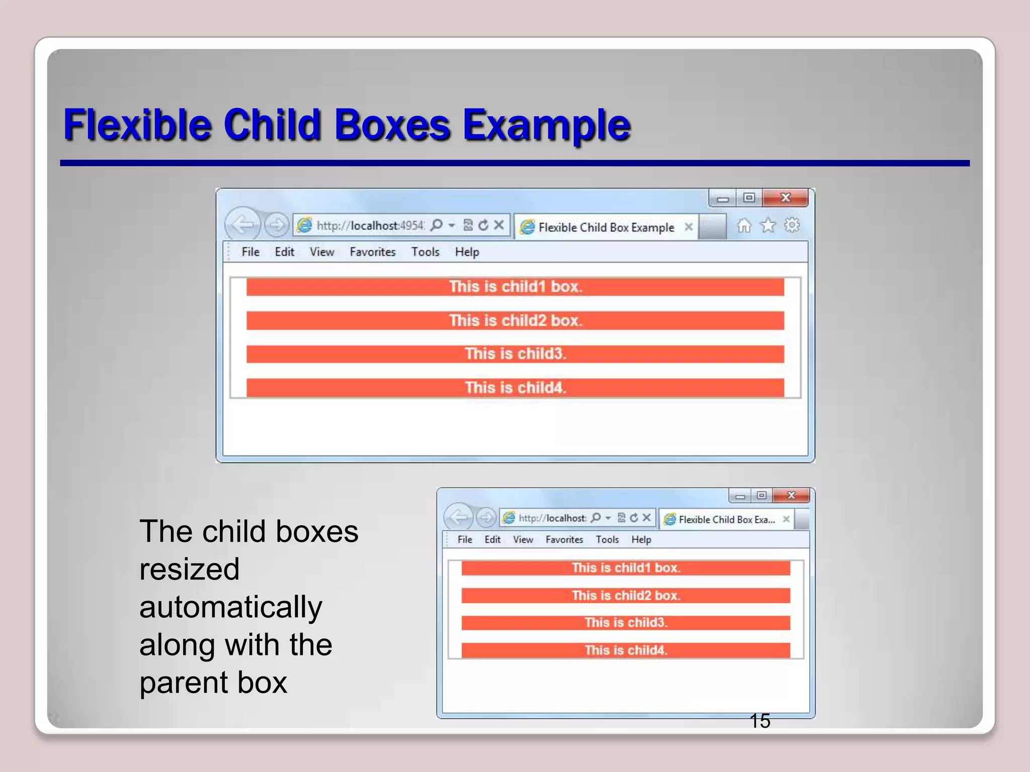
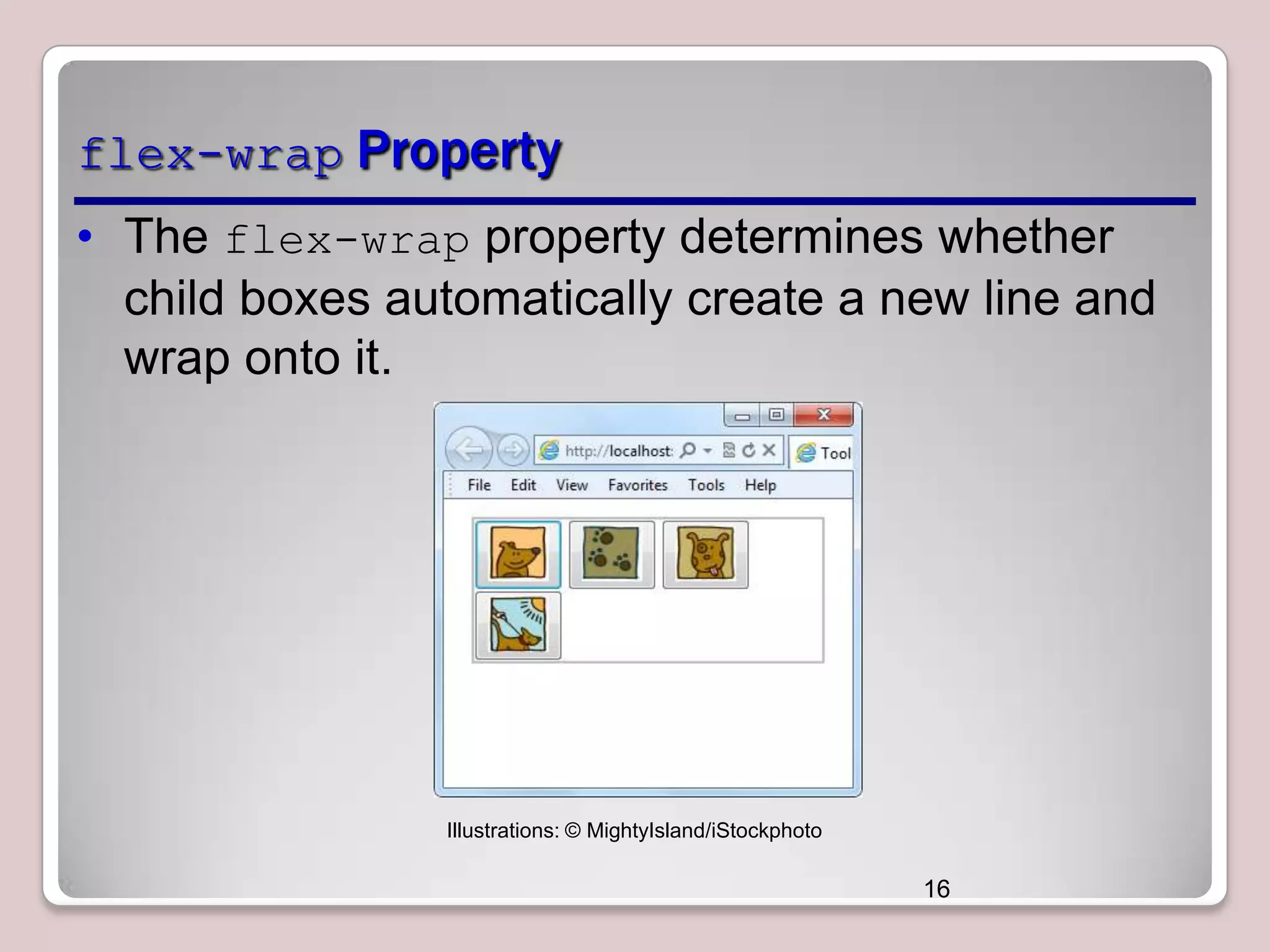


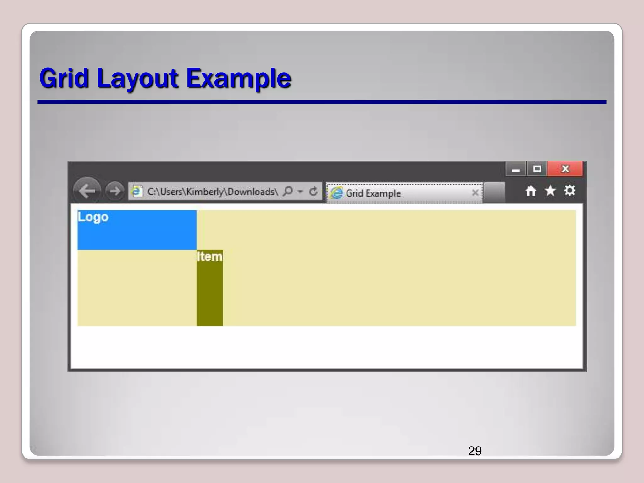


This document provides an overview of CSS layout techniques for arranging user interface content, including flexible box and grid layout models. It discusses the traditional box model and block/inline elements, and covers CSS flexbox properties for flexible layouts like flex-direction and flex-wrap. CSS grid properties are explained for controlling column, row, and cell sizes. The grid template layout module is also introduced for positioning items alphabetically within a grid.


