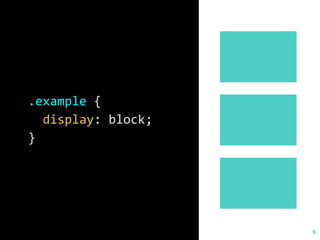
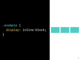
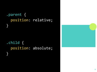
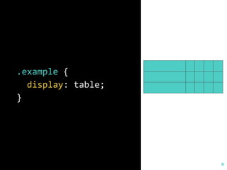
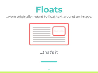
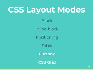
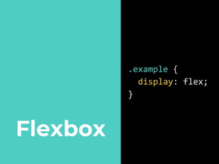
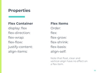
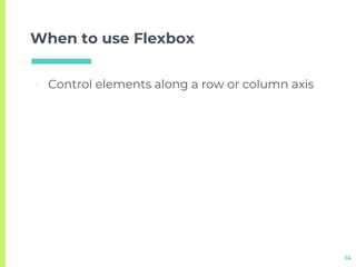
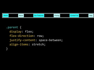
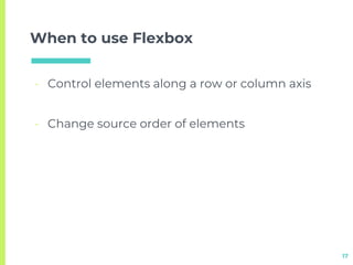
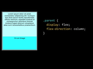
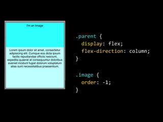
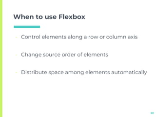
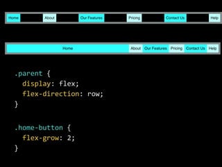
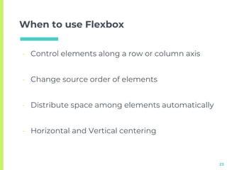
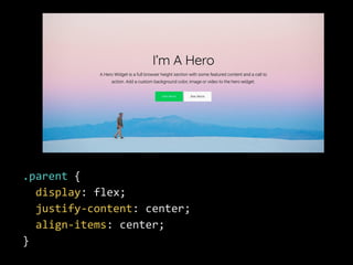
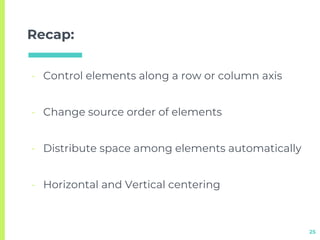
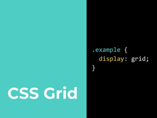
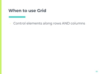
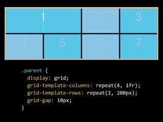
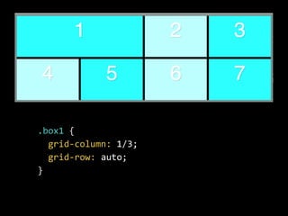
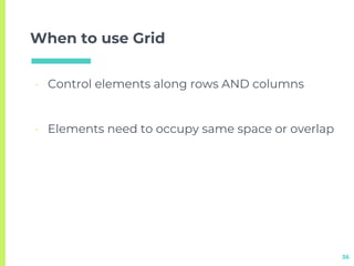
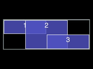
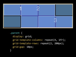
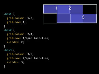
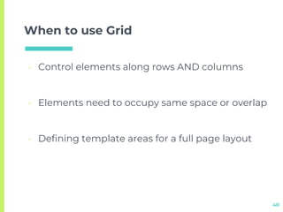
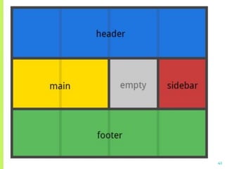
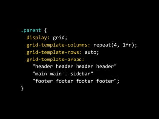
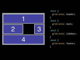
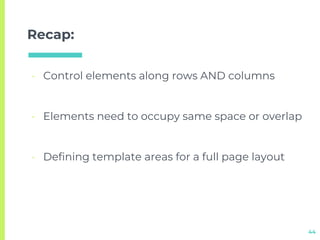
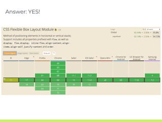
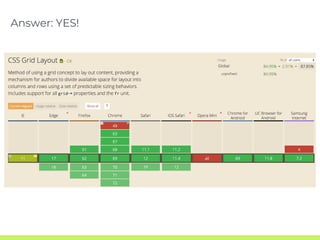
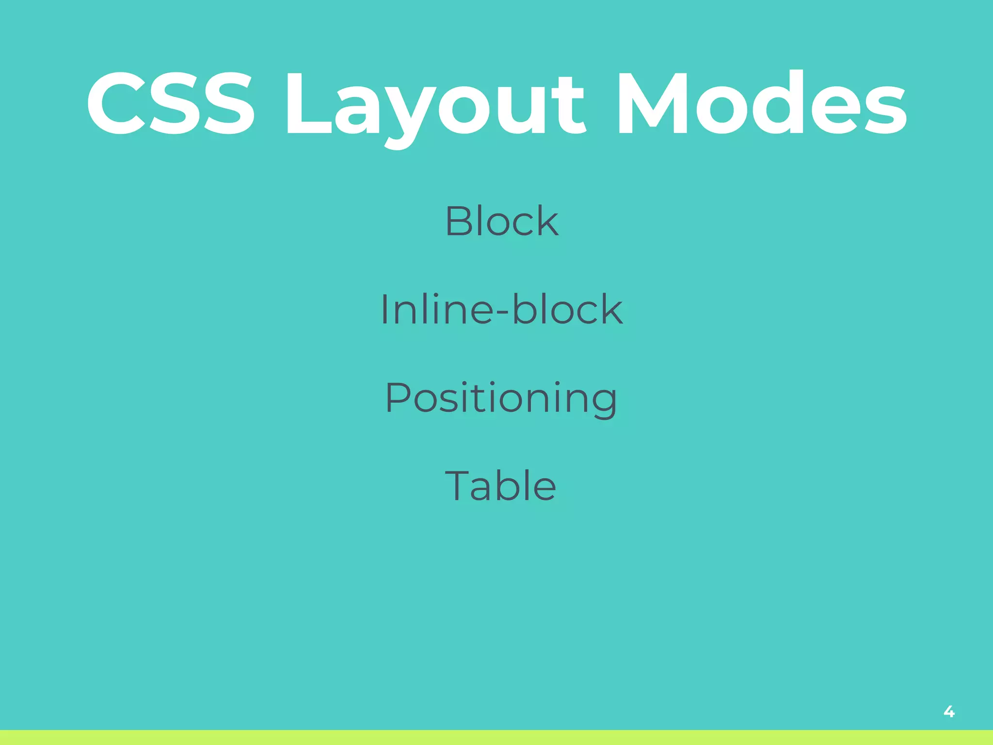
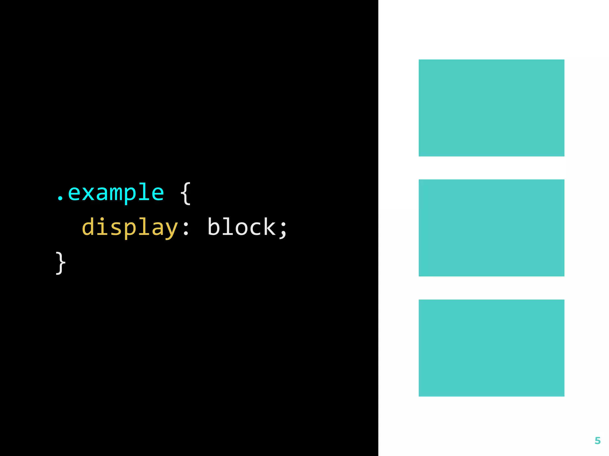
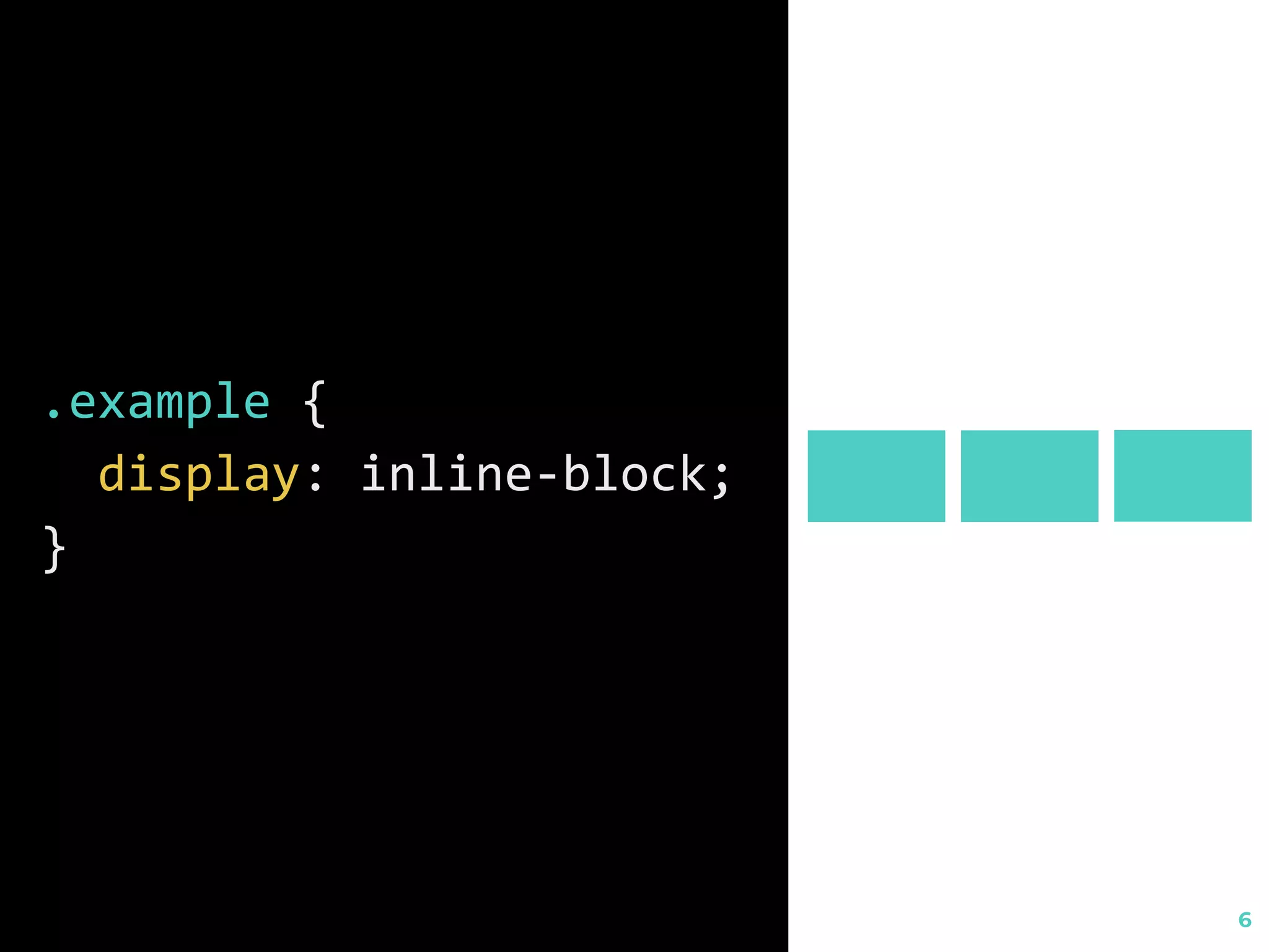
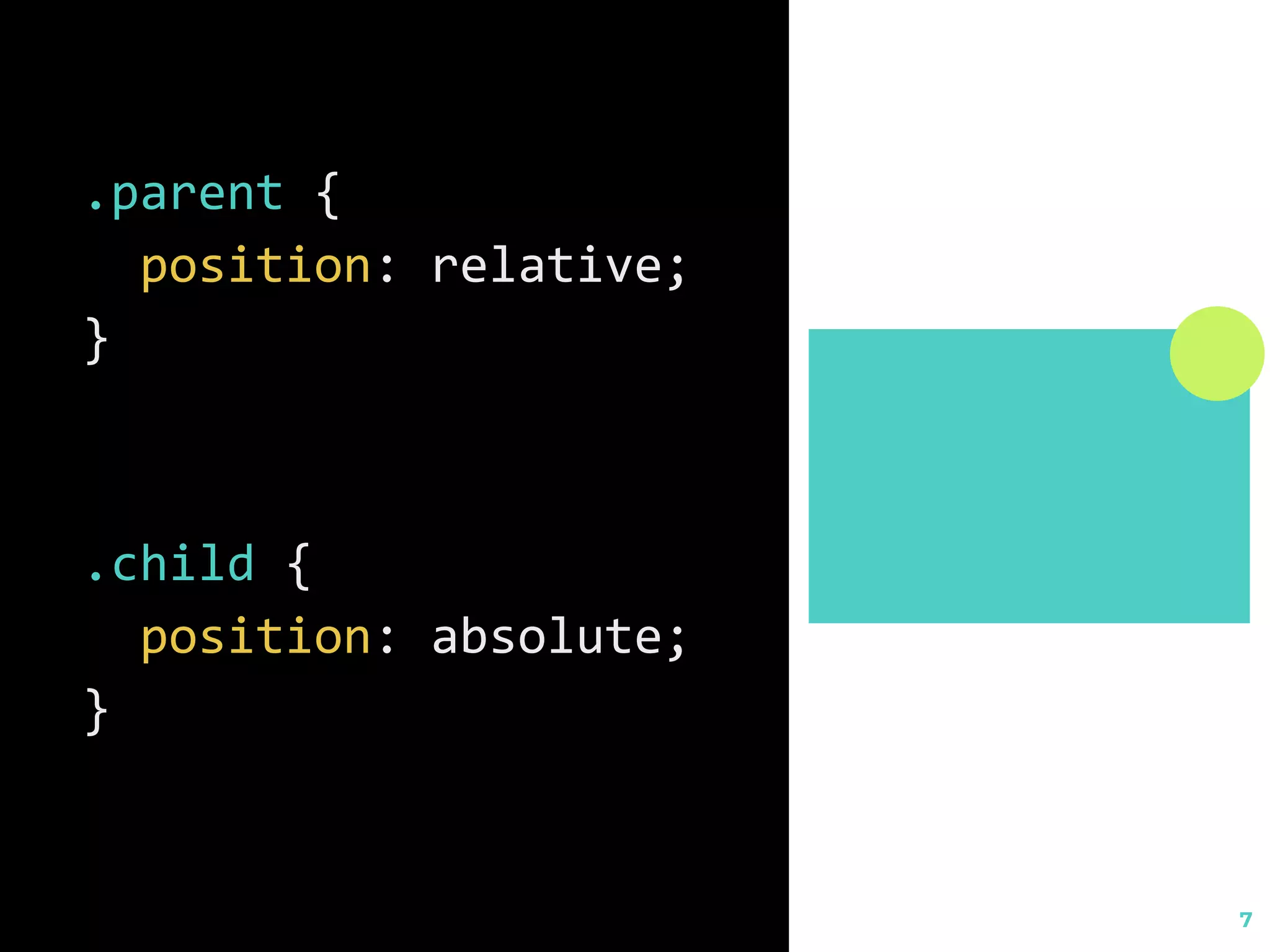
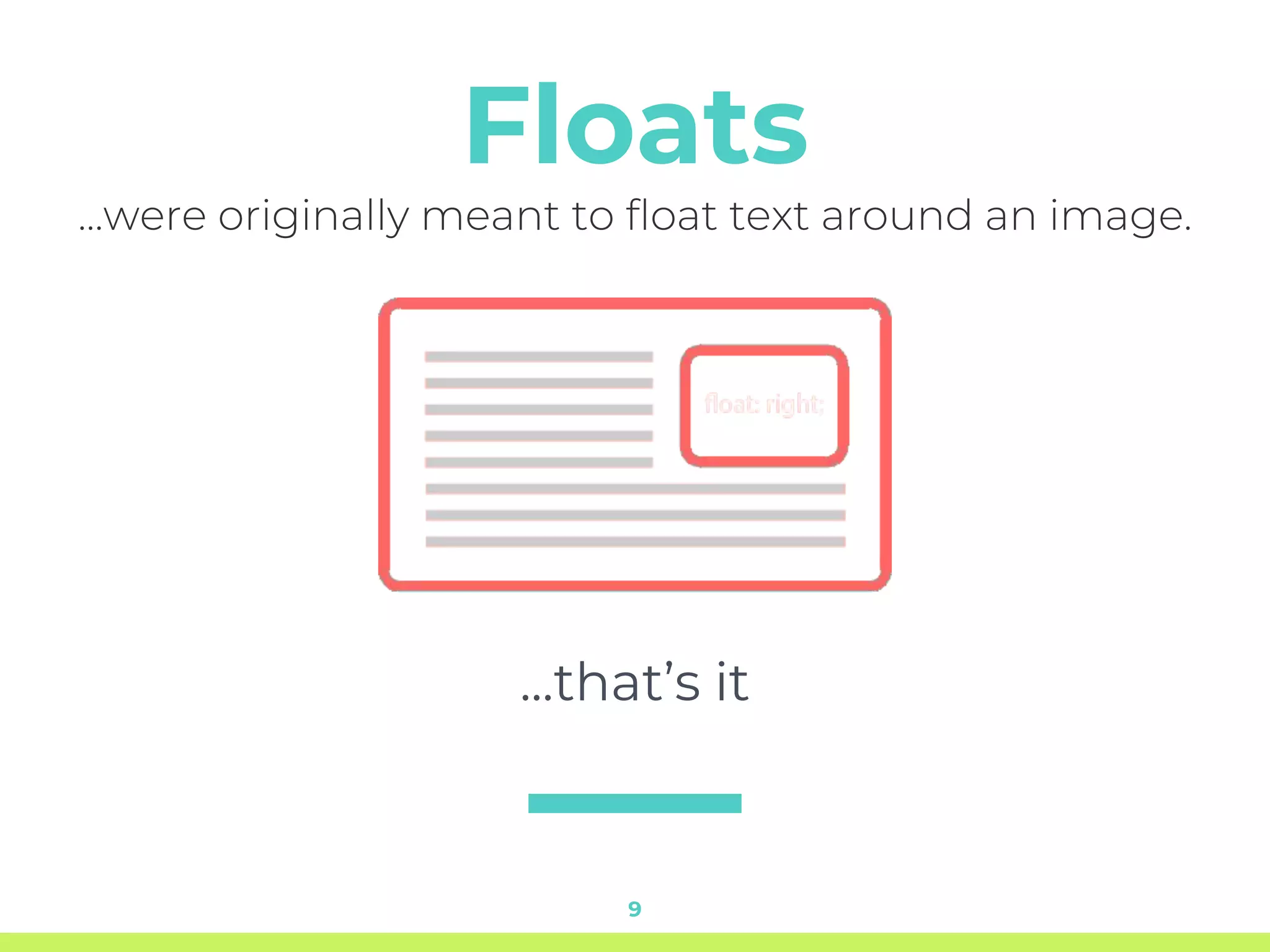
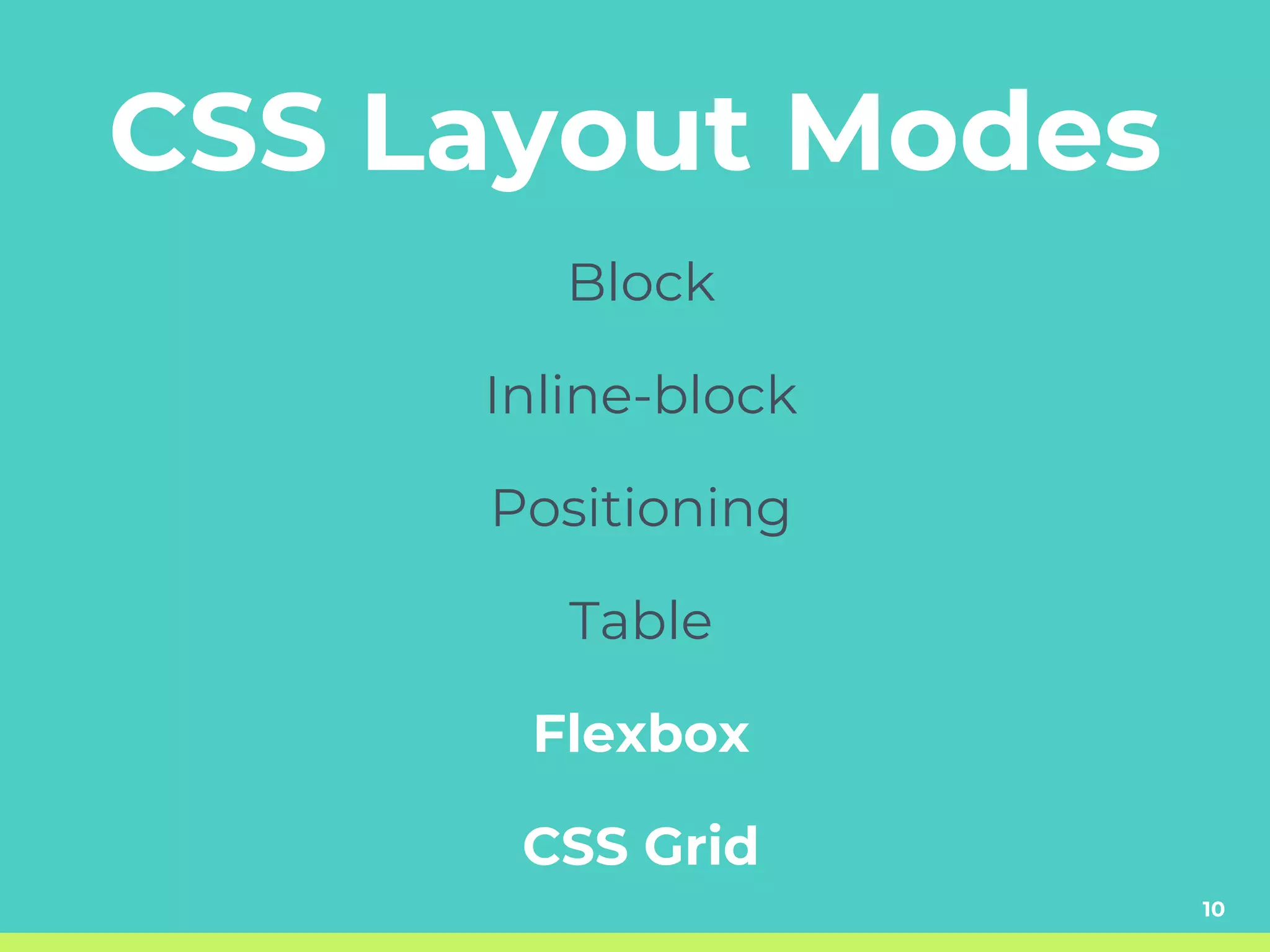
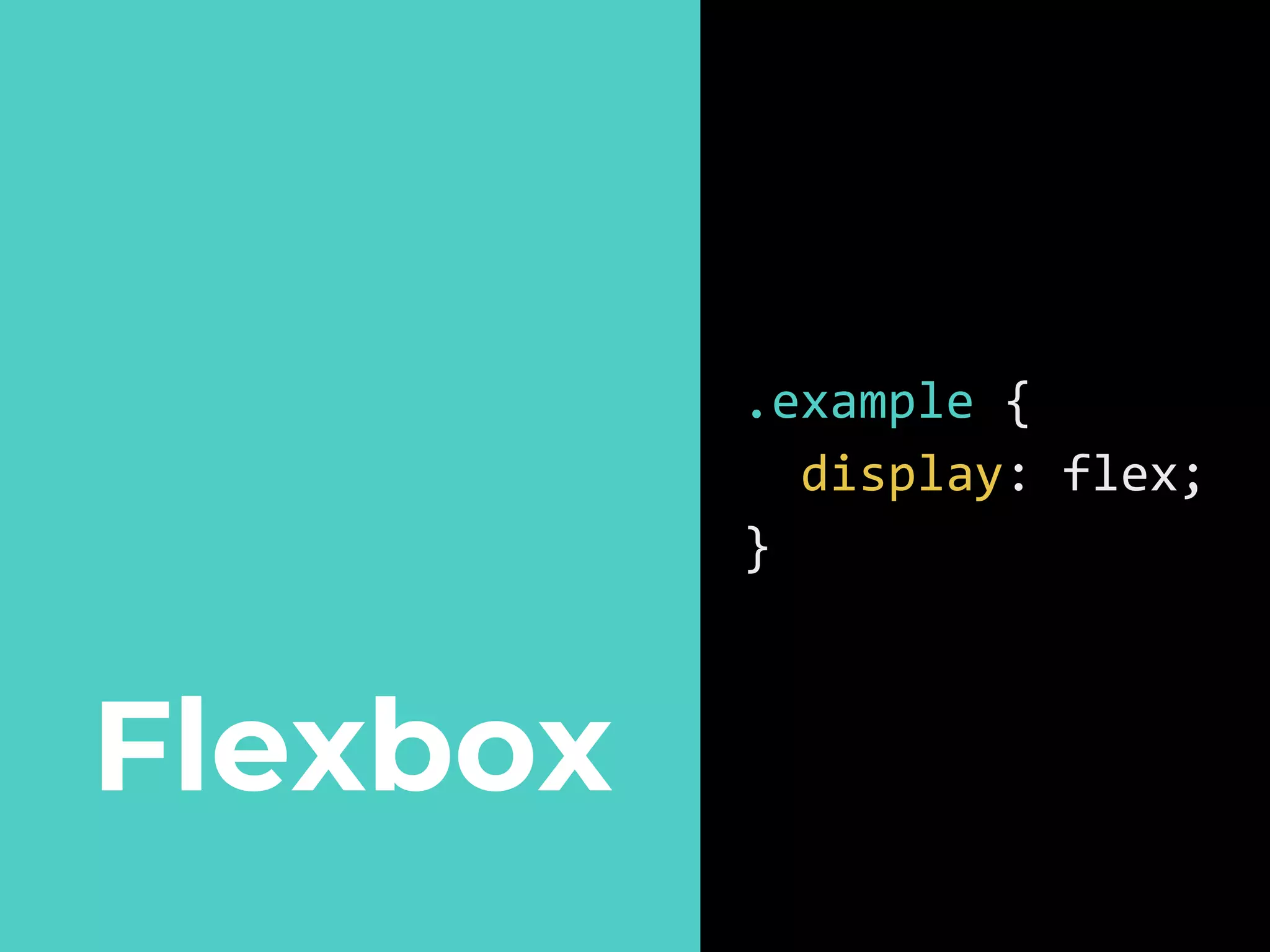
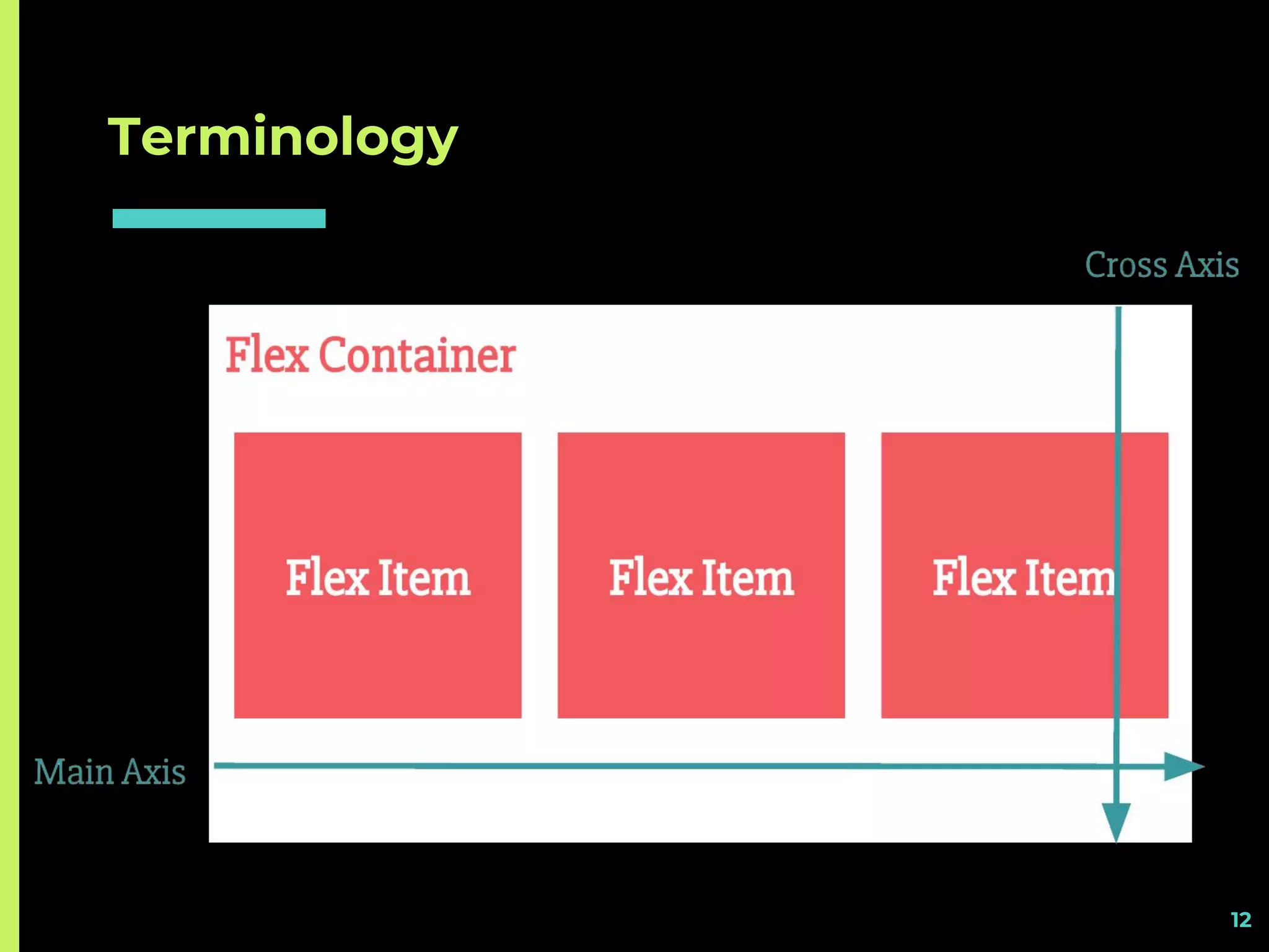
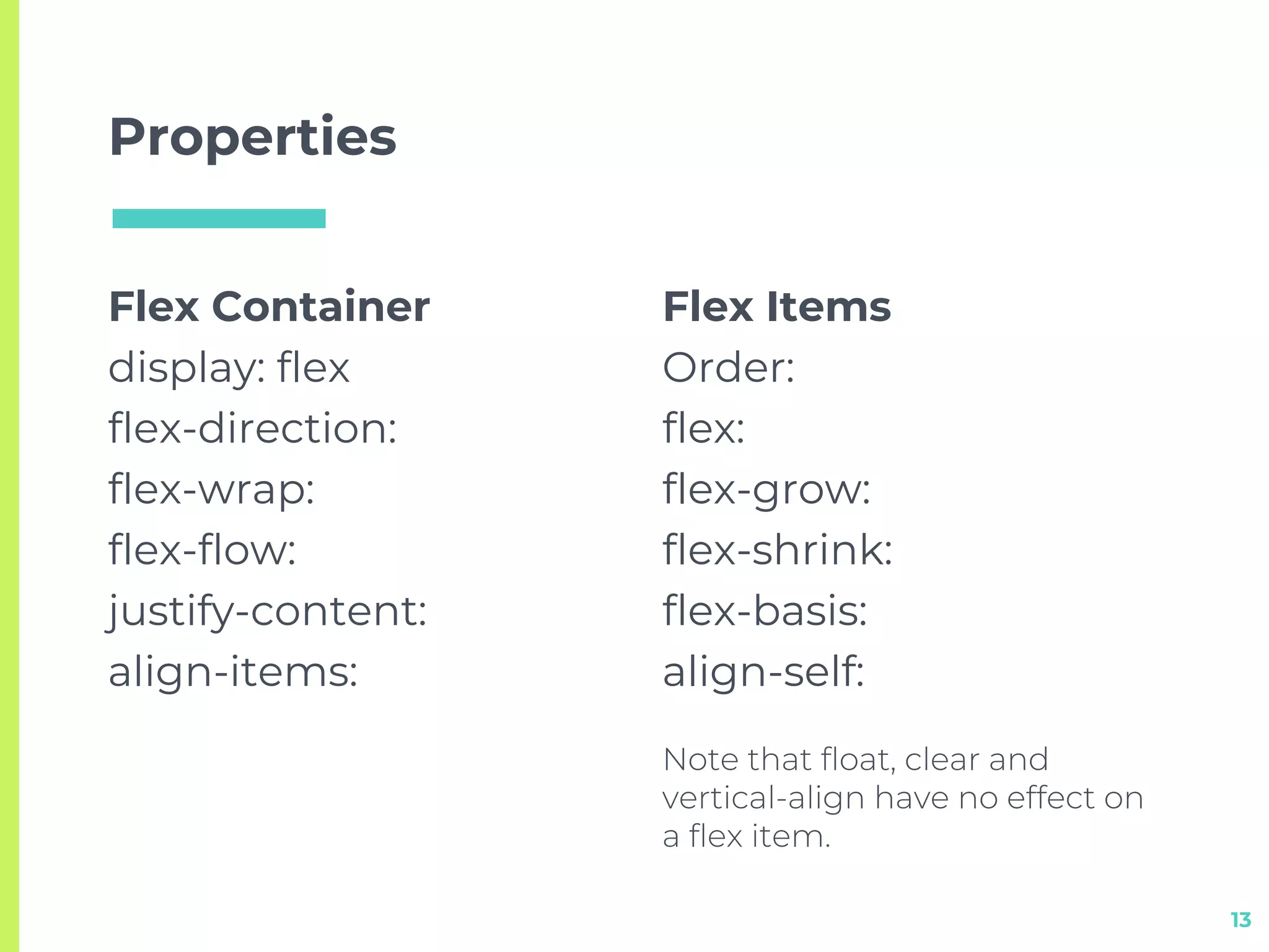
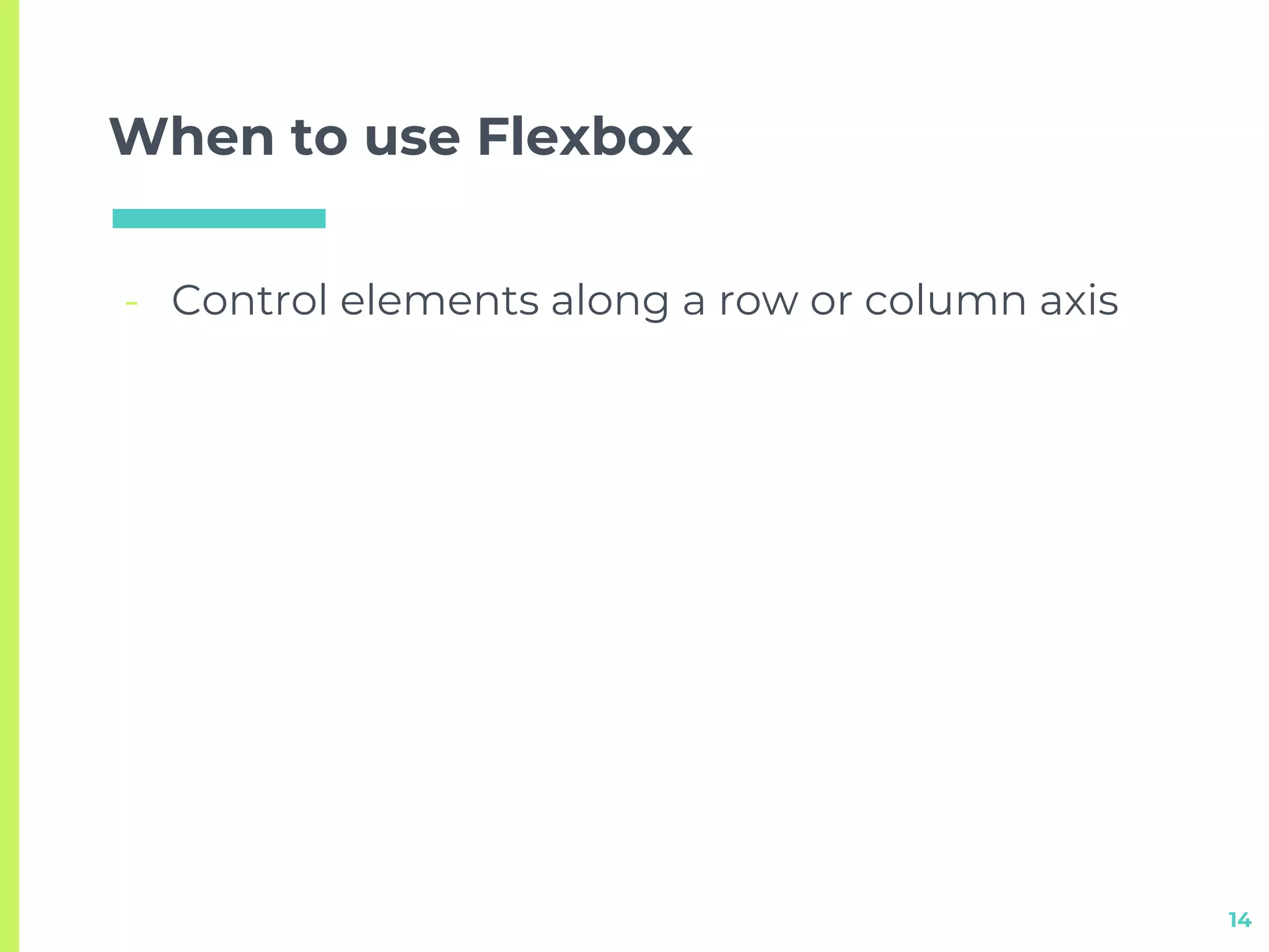
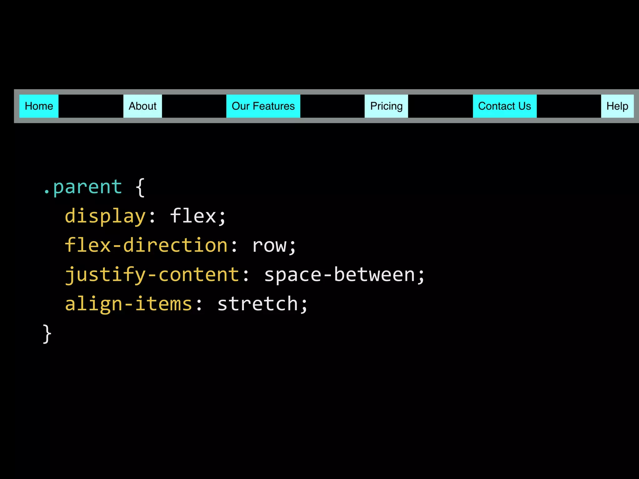
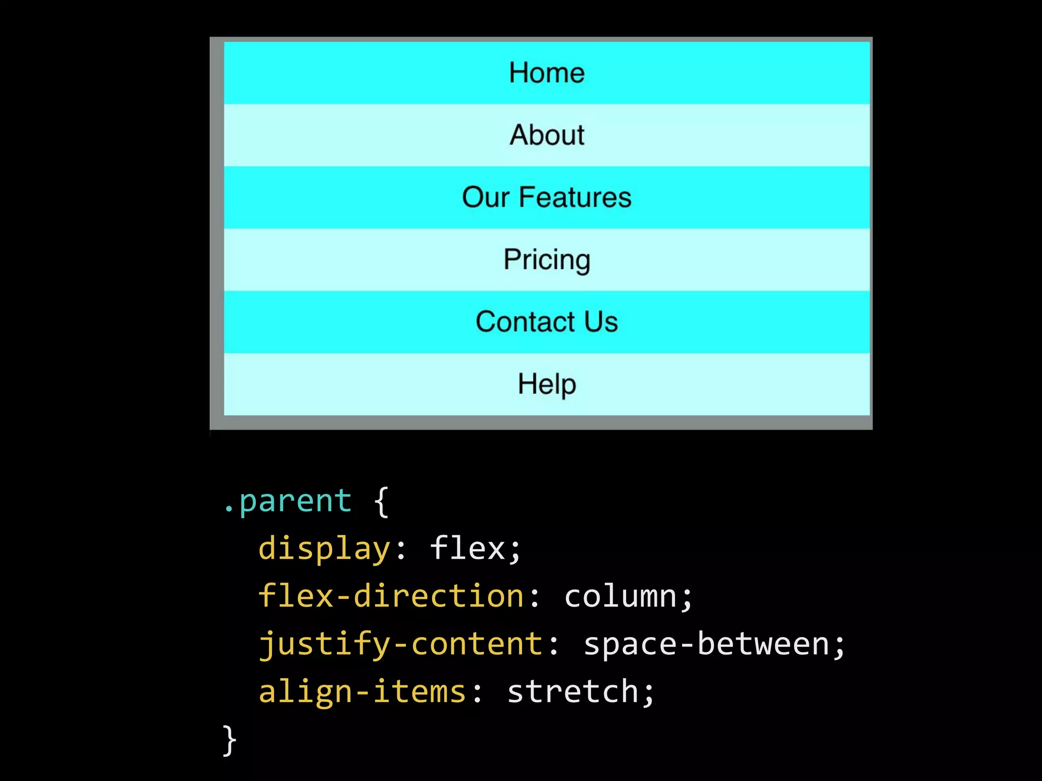
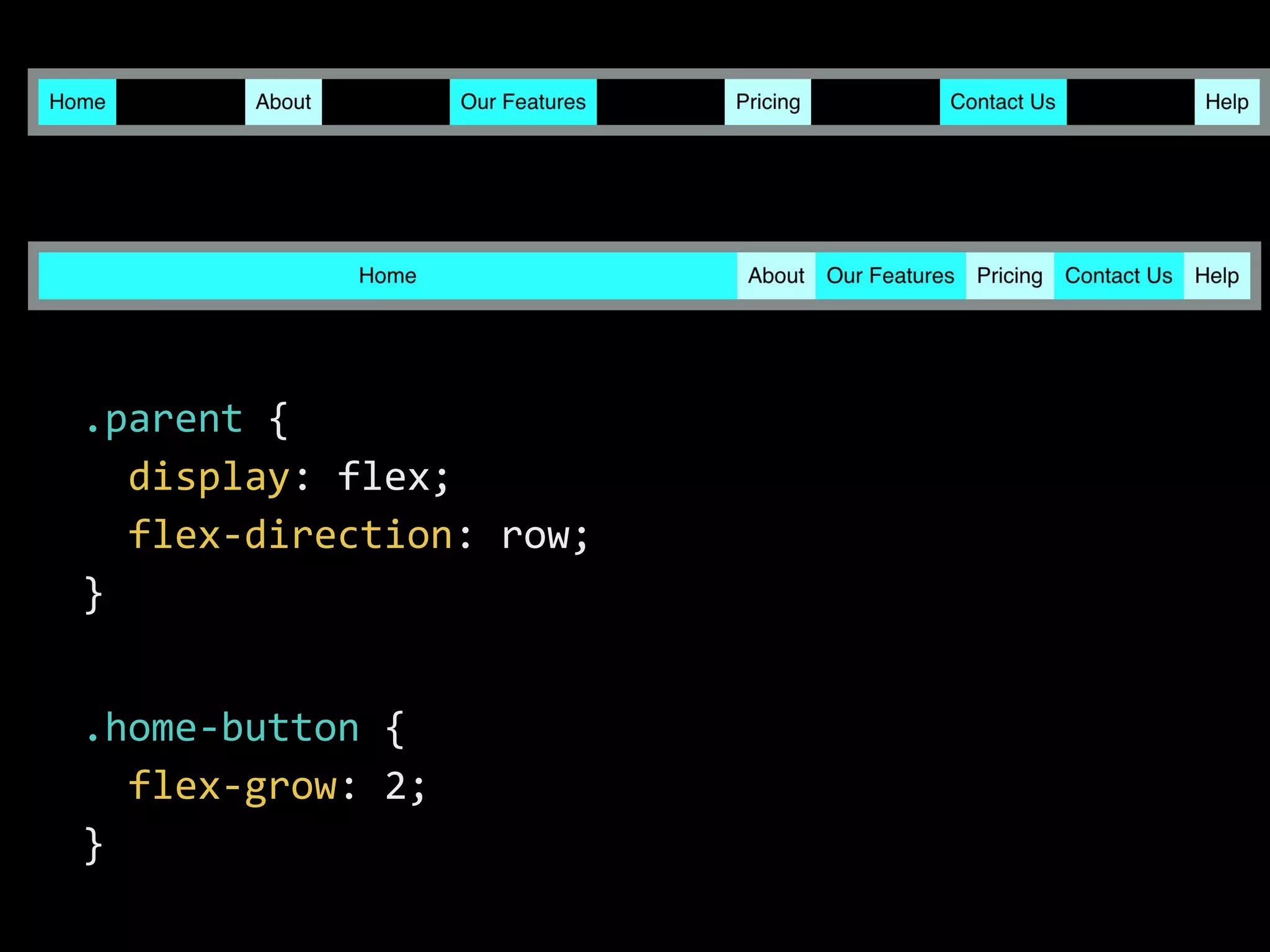
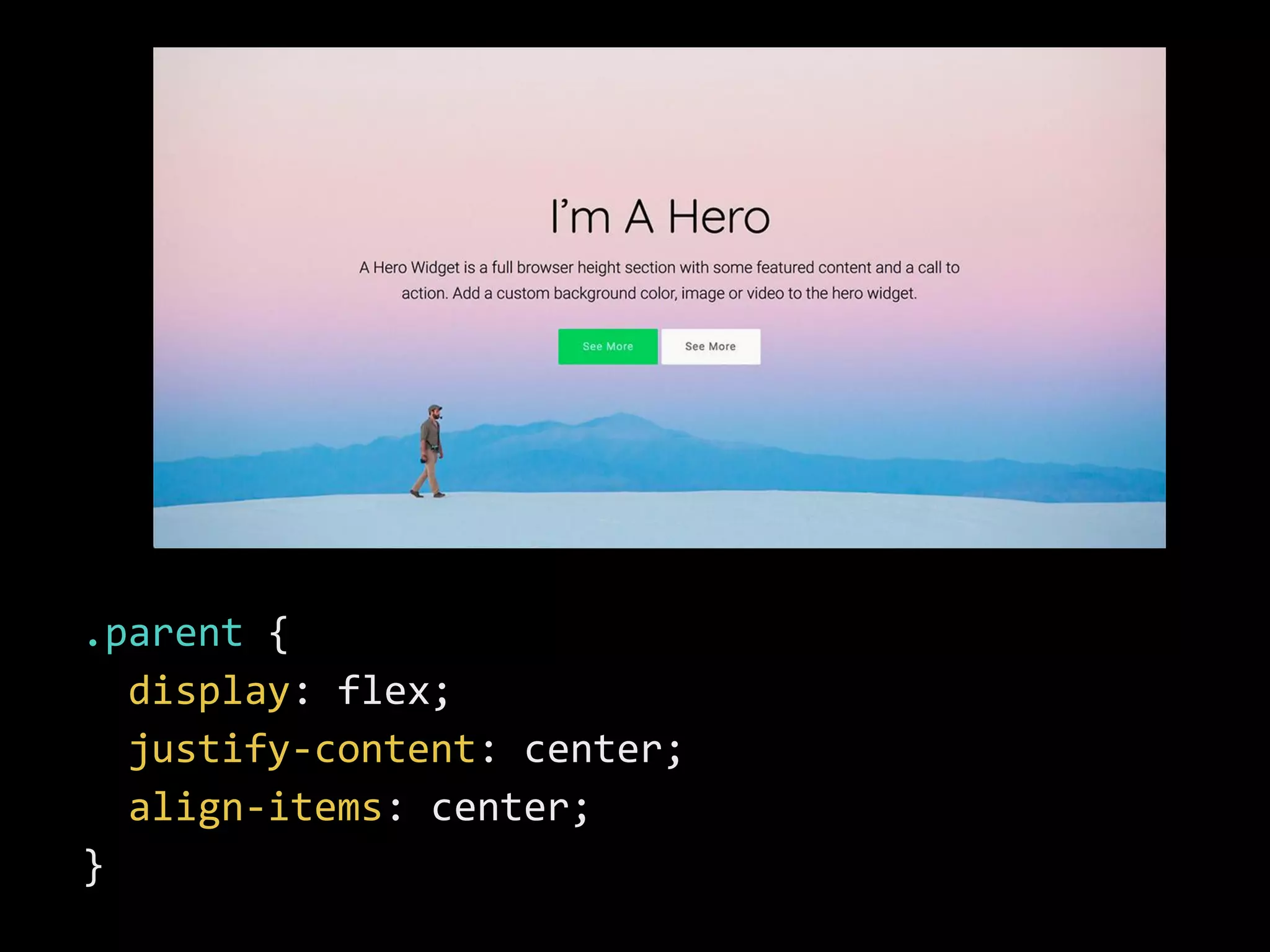
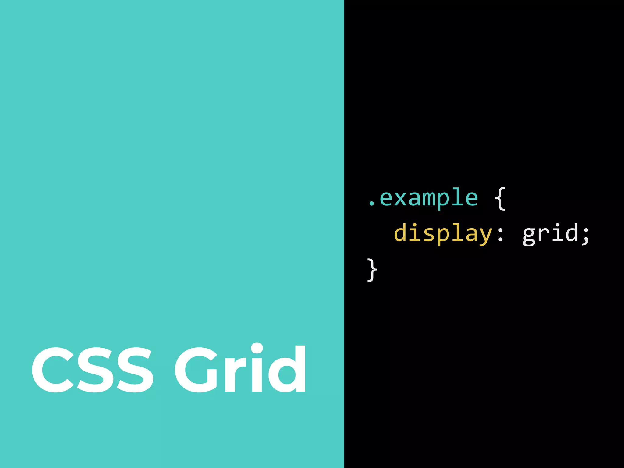
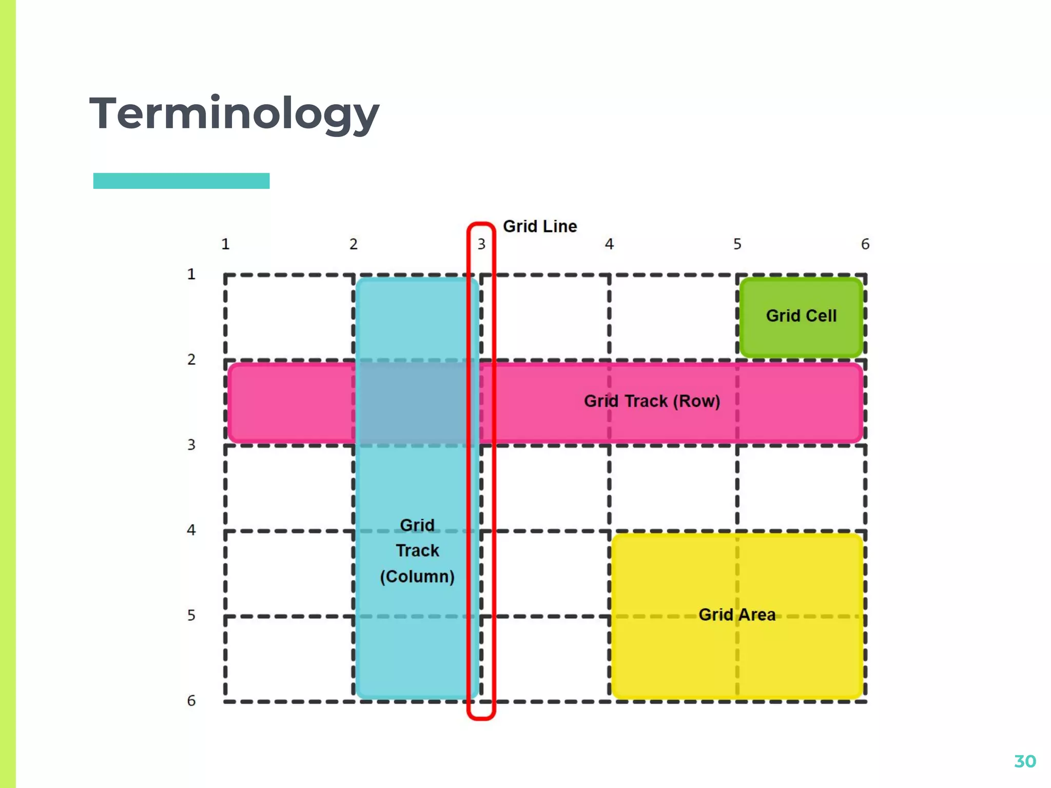
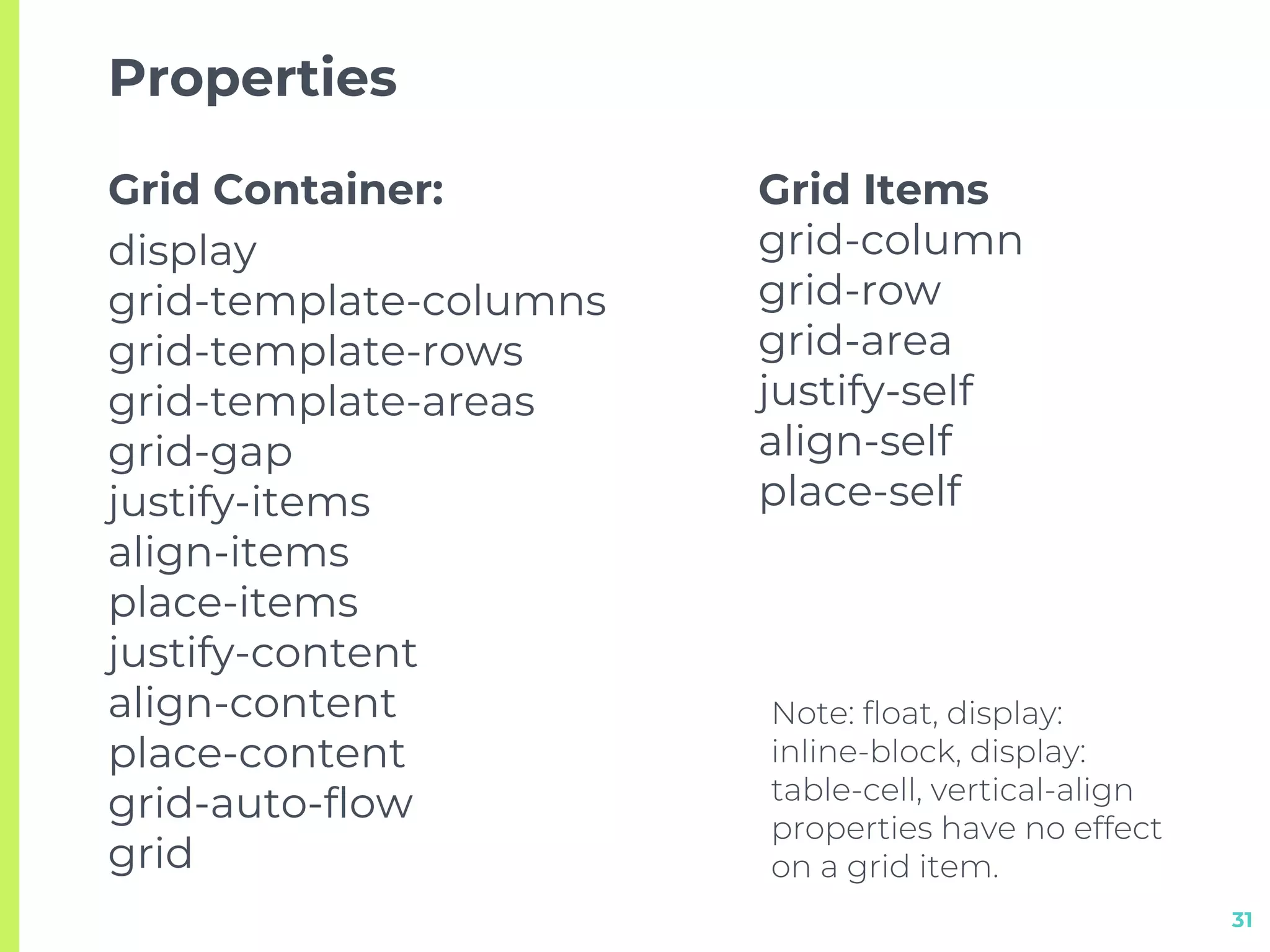
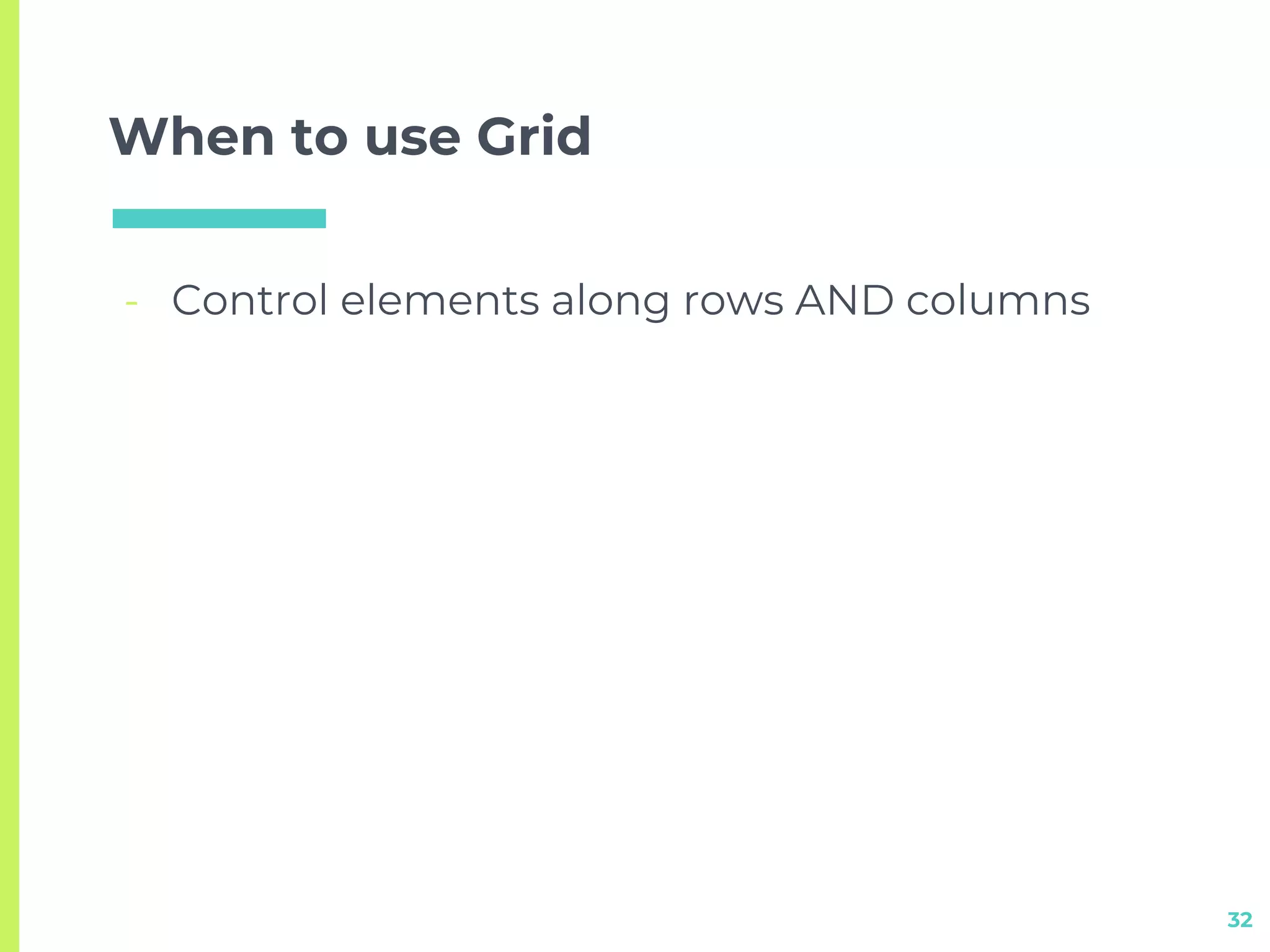
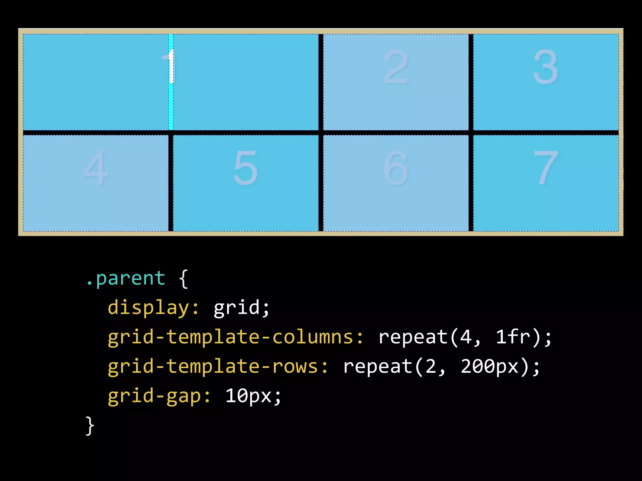
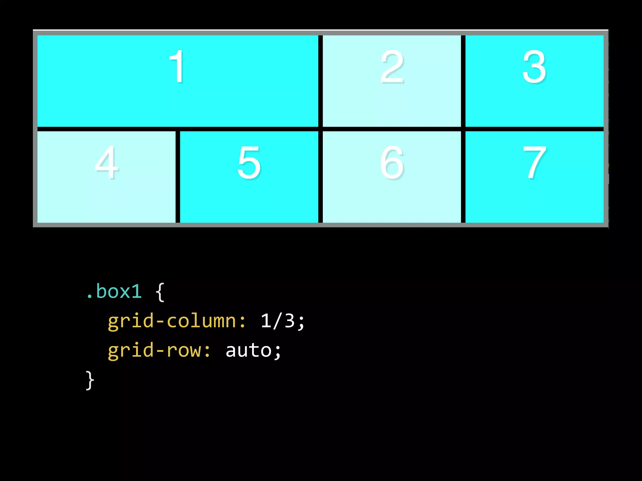
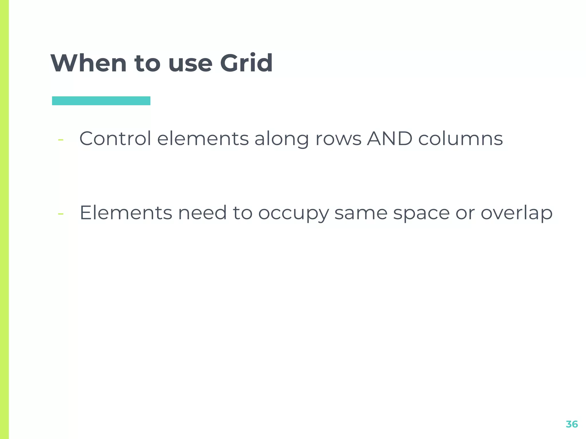
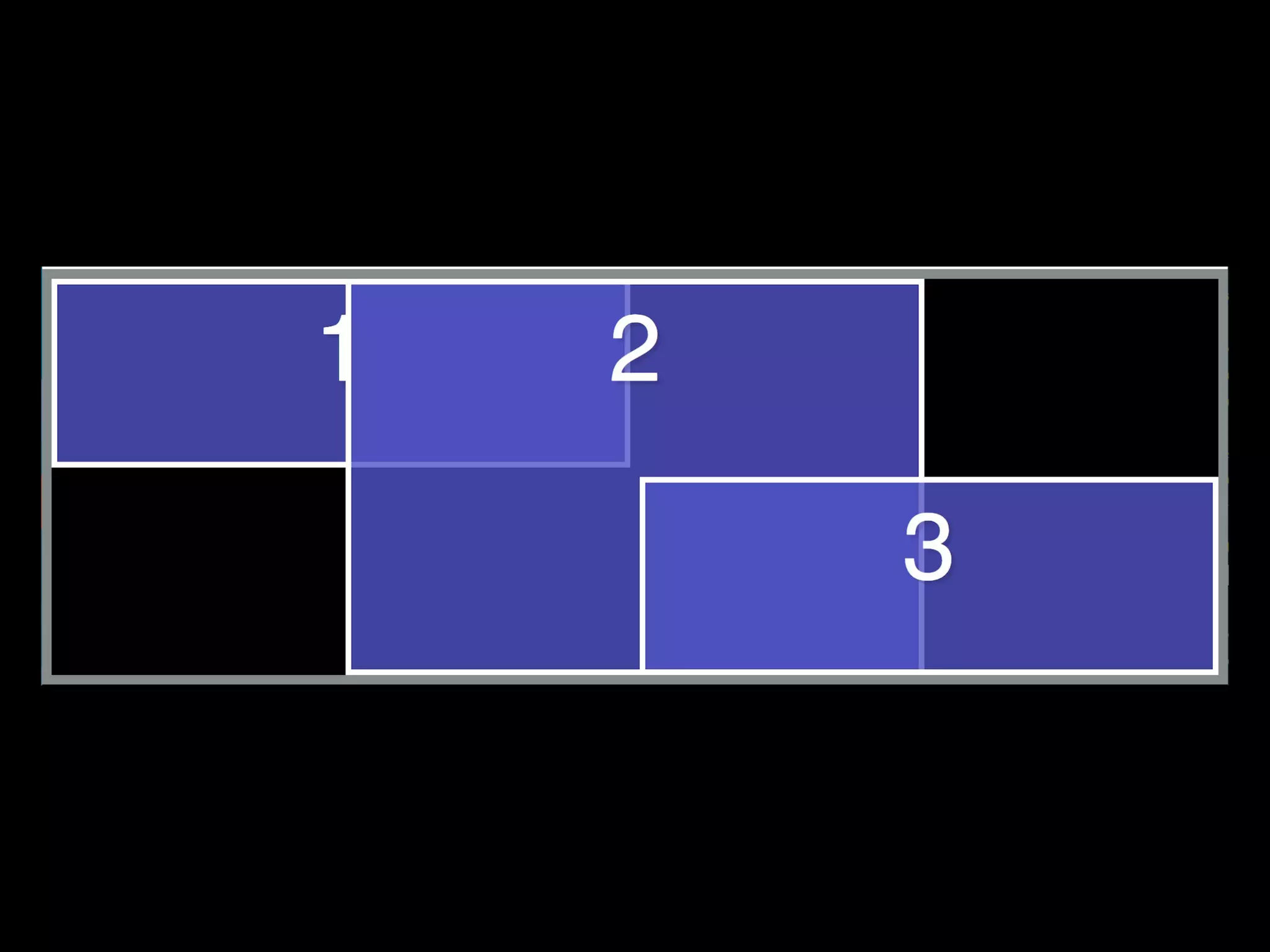
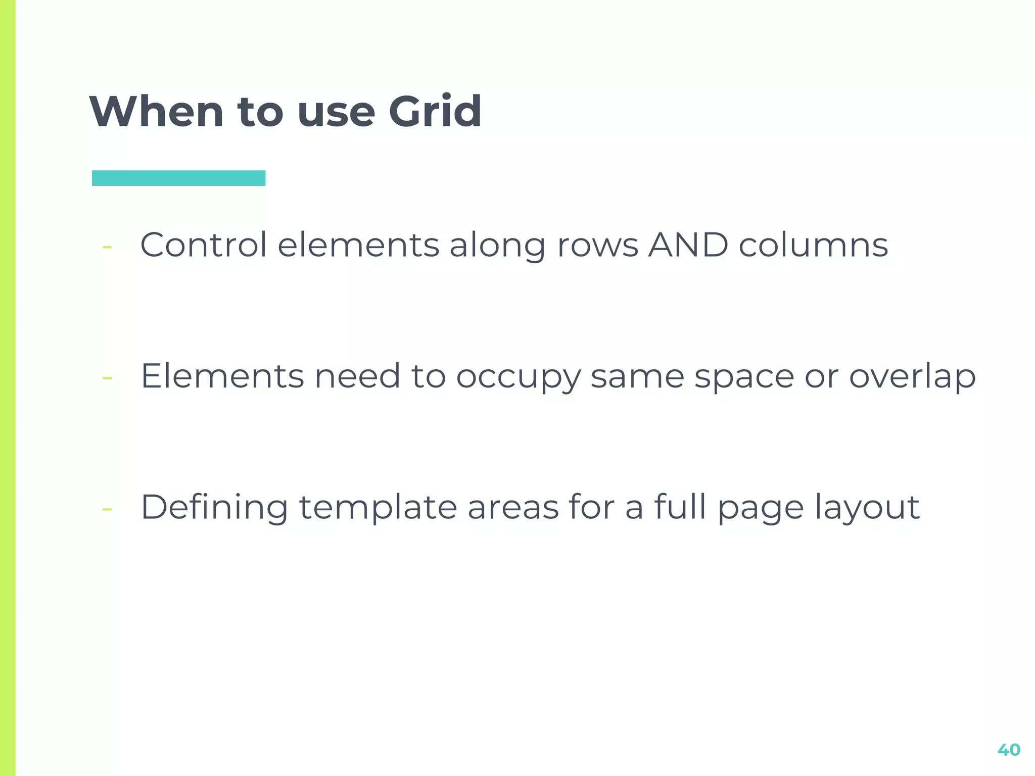
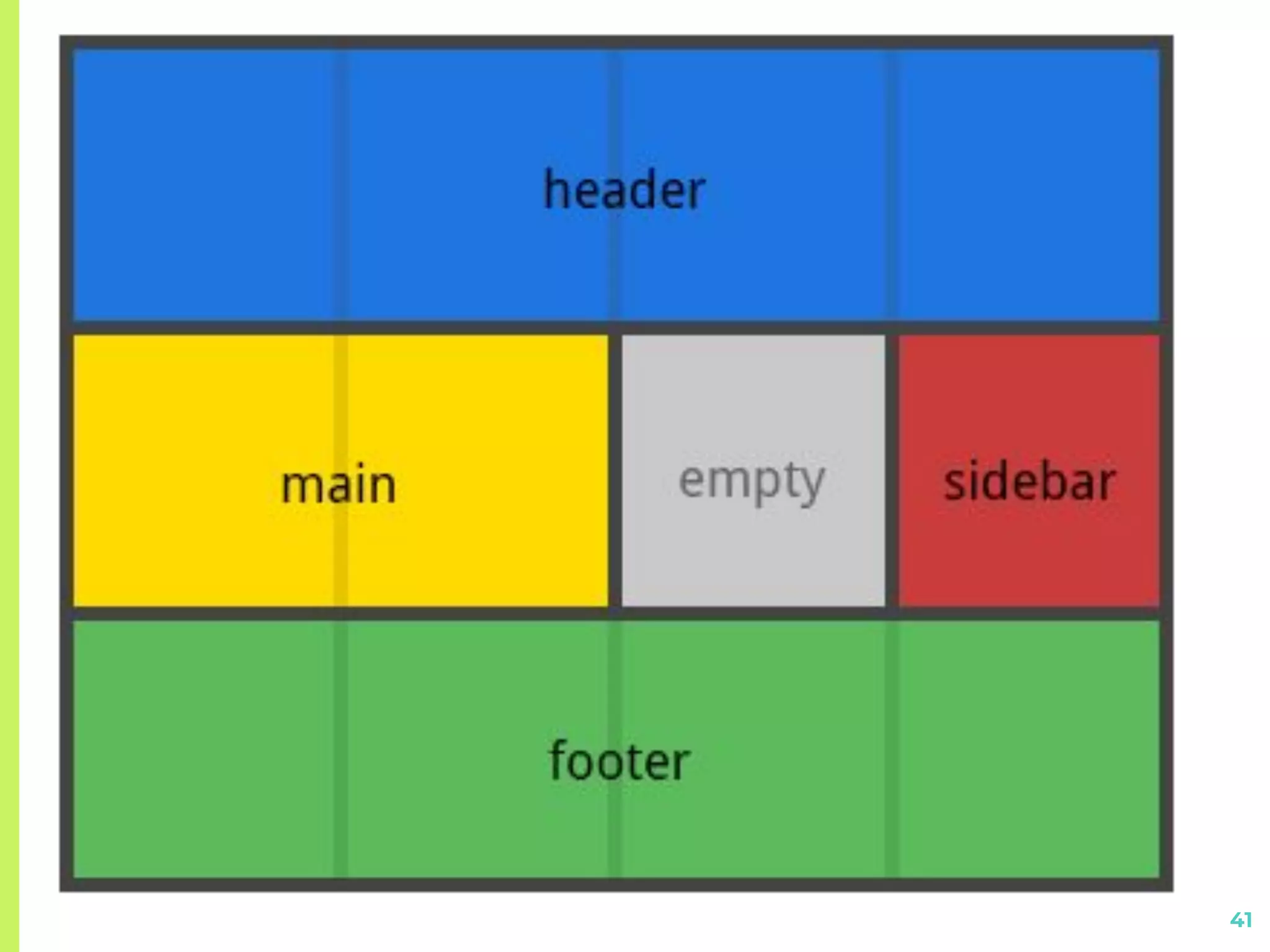
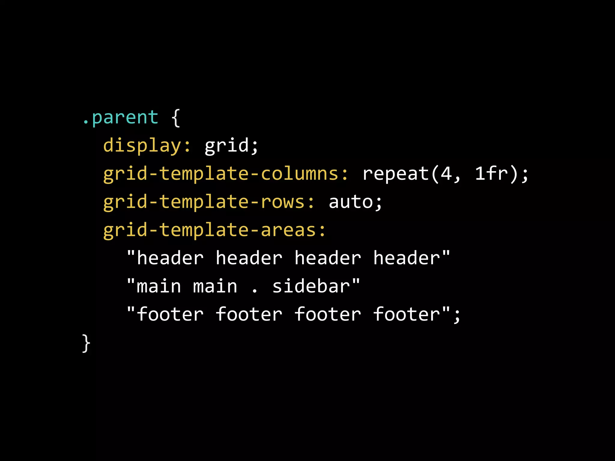
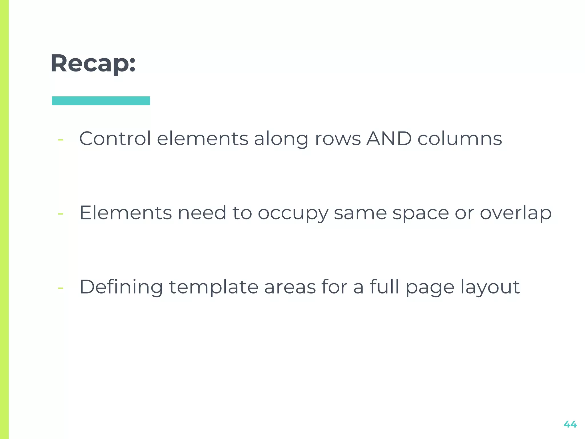
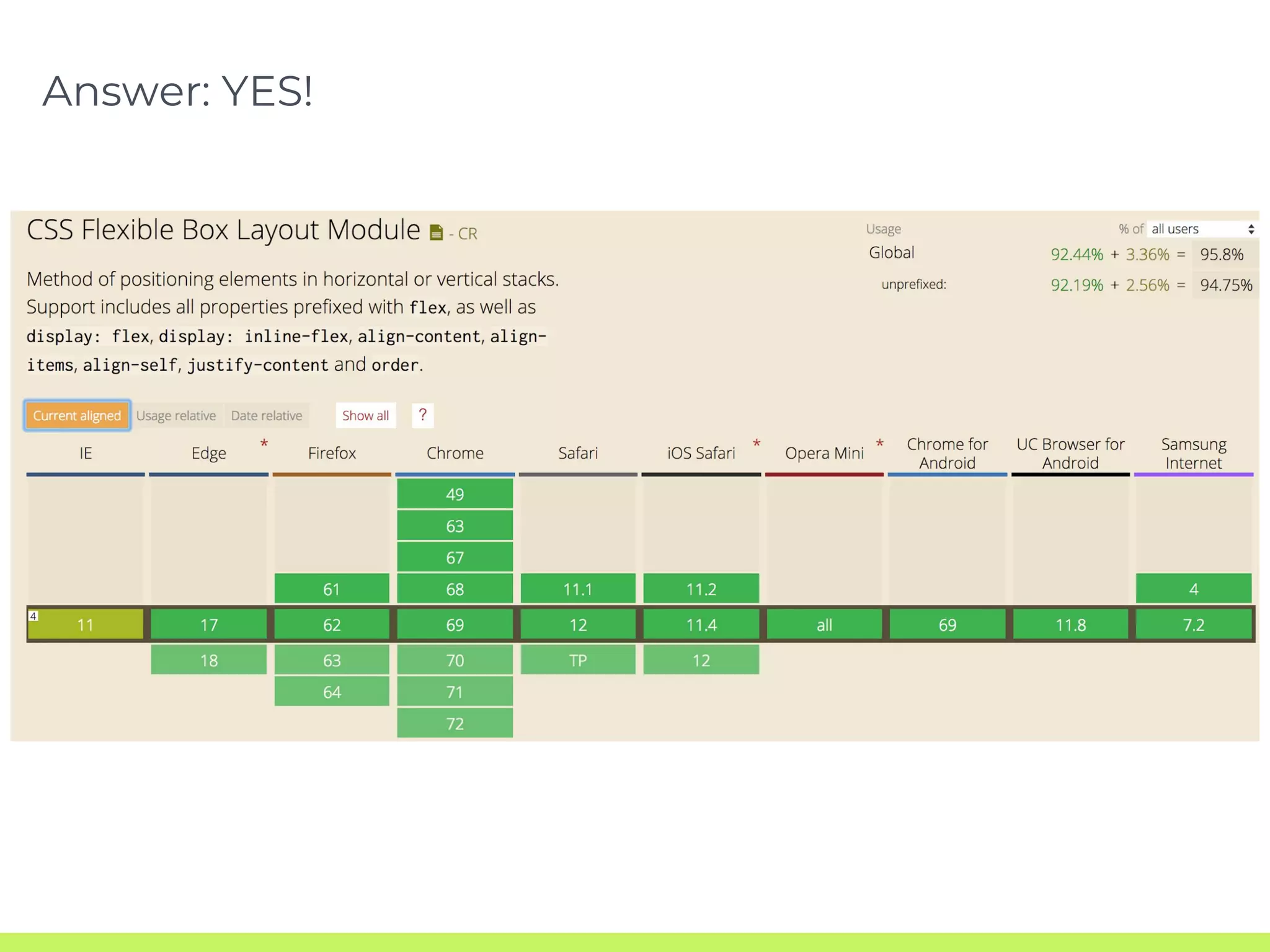
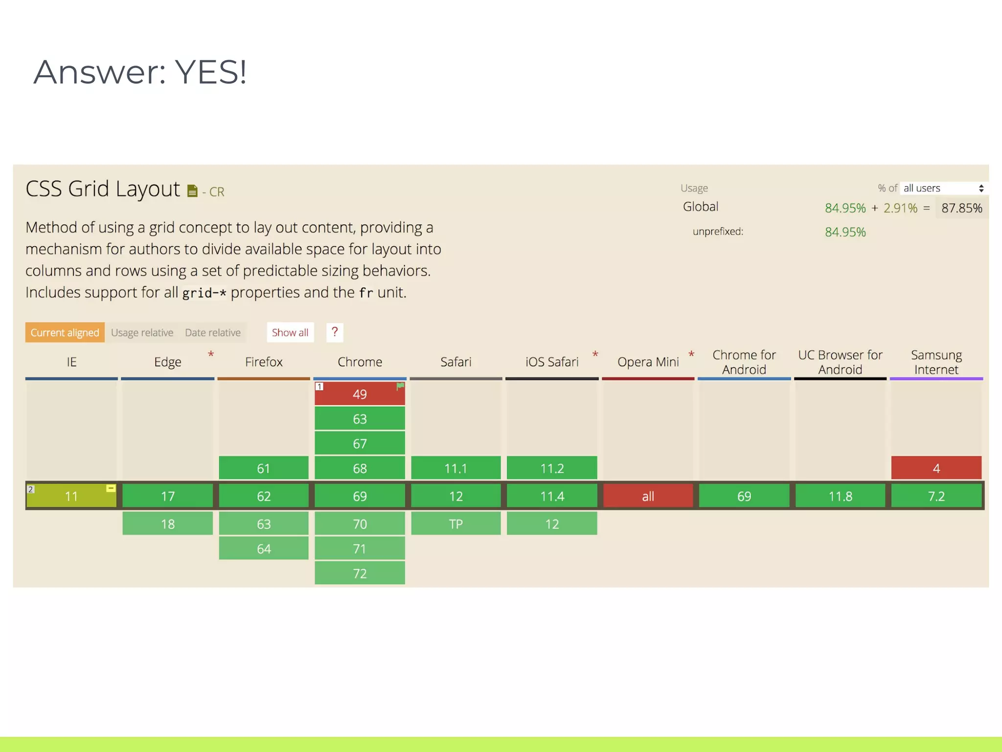
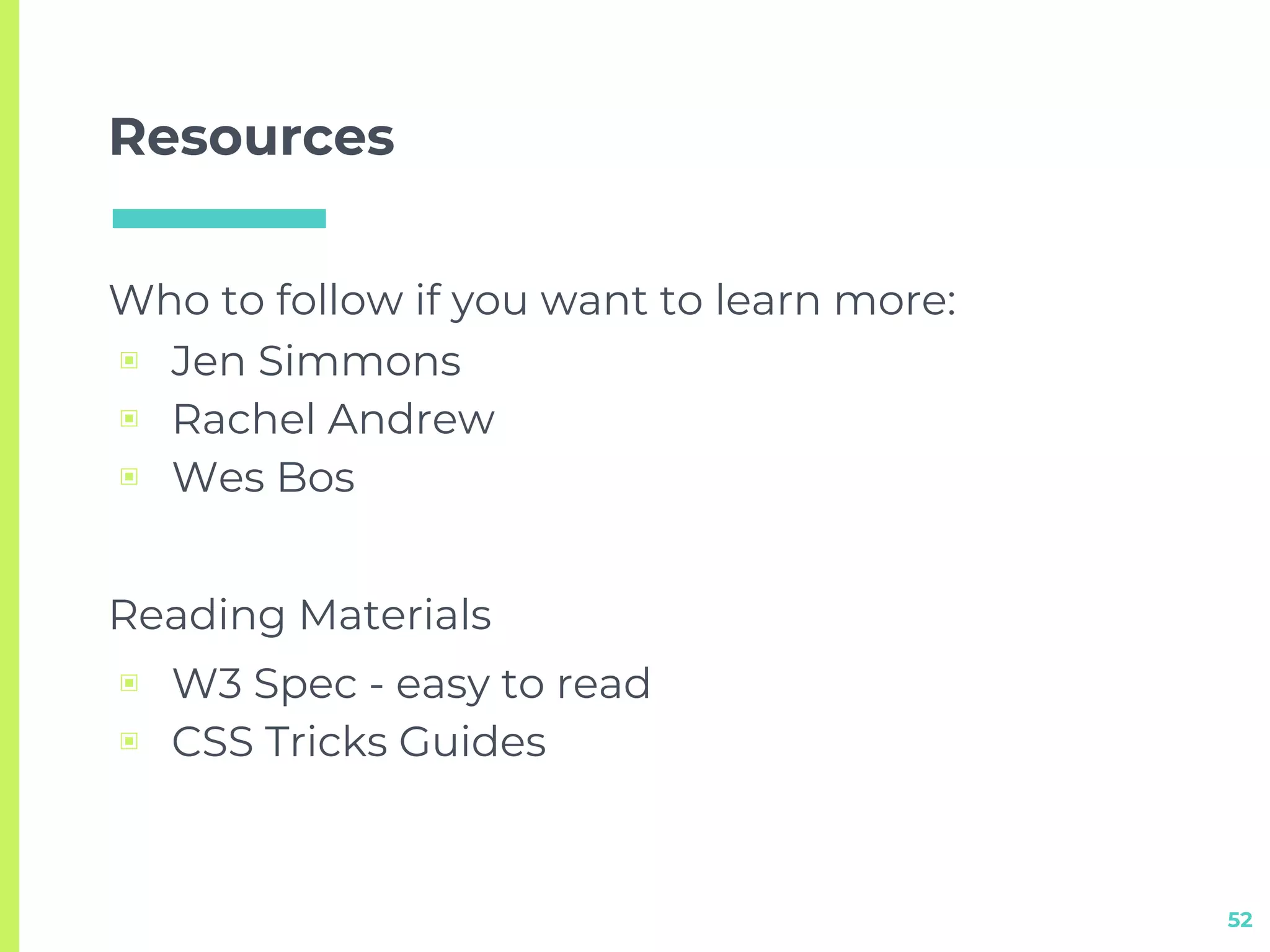
KEMBAR78
Better Layouts with Flexbox + CSS Grids | PDF
Better Layouts with
Flexbox + CSS Grids
Hello!I am Sam Provenza (she/her)
2
3
www.tailwindapp.com/careers
CSS Layout Modes
4
Block
Inline-block
Positioning
Table
5
.example {
display: block;
}
6
.example {
display: inline-block;
}
7
.parent {
position: relative;
}
.child {
position: absolute;
}
8
.example {
display: table;
}
9
Floats
...that’s it
CSS Layout Modes
10
Block
Inline-block
Positioning
Table
Flexbox
CSS Grid
Flexbox
11
.example {
display: flex;
}
Terminology
12
Flex Container
display: flex
flex-direction:
flex-wrap:
flex-flow:
justify-content:
align-items:
Properties
Flex Items
Order:
flex:
flex-grow:
flex-shrink:
flex-basis:
align-self:
13
When to use Flexbox
- Control elements along a row or column axis
14
15
.parent {
display: flex;
flex-direction: row;
justify-content: space-between;
align-items: stretch;
}
16
.parent {
display: flex;
flex-direction: column;
justify-content: space-between;
align-items: stretch;
}
When to use Flexbox
- Control elements along a row or column axis
17
- Change source order of elements
18
.parent {
display: flex;
flex-direction: column;
}
19
.parent {
display: flex;
flex-direction: column;
}
.image {
order: -1;
}
When to use Flexbox
- Control elements along a row or column axis
20
- Change source order of elements
- Distribute space among elements automatically
21
22
.parent {
display: flex;
flex-direction: row;
}
.home-button {
flex-grow: 2;
}
When to use Flexbox
- Control elements along a row or column axis
23
- Change source order of elements
- Distribute space among elements automatically
- Horizontal and Vertical centering
24
.parent {
display: flex;
justify-content: center;
align-items: center;
}
Recap:
- Control elements along a row or column axis
25
- Change source order of elements
- Distribute space among elements automatically
- Horizontal and Vertical centering
http://www.samserif.co
https://bashooka.com
CSS Grid
29
.example {
display: grid;
}
Terminology
30
Grid Container:
display
grid-template-columns
grid-template-rows
grid-template-areas
grid-gap
justify-items
align-items
place-items
justify-content
align-content
place-content
grid-auto-flow
grid
Properties
Grid Items
grid-column
grid-row
grid-area
justify-self
align-self
place-self
31
When to use Grid
- Control elements along rows AND columns
32
33
34
.parent {
display: grid;
grid-template-columns: repeat(4, 1fr);
grid-template-rows: repeat(2, 200px);
grid-gap: 10px;
}
35
.box1 {
grid-column: 1/3;
grid-row: auto;
}
When to use Grid
- Control elements along rows AND columns
36
- Elements need to occupy same space or overlap
37
38
.parent {
display: grid;
grid-template-columns: repeat(4, 1fr);
grid-template-rows: repeat(2, 200px);
grid-gap: 10px;
}
39
.box1 {
grid-column: 1/3;
grid-row: 1;
}
.box2 {
grid-column: 2/4;
grid-row: 1/span last-line;
z-index: 2;
}
.box3 {
grid-column: 3/5;
grid-row: 2/span last-line;
z-index: 3;
}
When to use Grid
- Control elements along rows AND columns
40
- Elements need to occupy same space or overlap
- Defining template areas for a full page layout
41
42
.parent {
display: grid;
grid-template-columns: repeat(4, 1fr);
grid-template-rows: auto;
grid-template-areas:
"header header header header"
"main main . sidebar"
"footer footer footer footer";
}
43
.box1 {
grid-area: header;
}
.box2 {
grid-area: main;
}
.box3 {
grid-area: sidebar;
}
.box4 {
grid-area: footer;
}
Recap:
- Control elements along rows AND columns
44
- Elements need to occupy same space or overlap
- Defining template areas for a full page layout
http://www.gridexamples.com
‘’
This seems cool but do
browsers actually
support these CSS
layout models?
48
49
Answer: YES!
50
Answer: YES!
‘’
Where can I go to learn
more?
51
Resources
Who to follow if you want to learn more:
▣ Jen Simmons
▣ Rachel Andrew
▣ Wes Bos
Reading Materials
▣ W3 Spec - easy to read
▣ CSS Tricks Guides
52
Thanks!
53
Follow me: @samserif

Better Layouts with Flexbox + CSS Grids