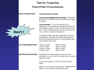
The document provides guidelines for creating effective PowerPoint presentations, emphasizing the importance of readability, consistent layout, and strategic use of fonts, colors, and graphics. Key recommendations include keeping slides simple, limiting text, and ensuring visual elements reinforce the spoken presentation without distracting the audience. It warns against common mistakes such as using small fonts, cluttered slides, and inconsistent backgrounds that hinder audience engagement.
PowerPoint Presentation GuidelinesThefollowing 37 slides present guidelines and suggestions for the use of fonts, colors, and graphics when preparing PowerPoint presentations for Sessions and Seminars.This media (PPT) is designed to ENHANCE your presentation, not BE the presentation.
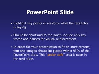
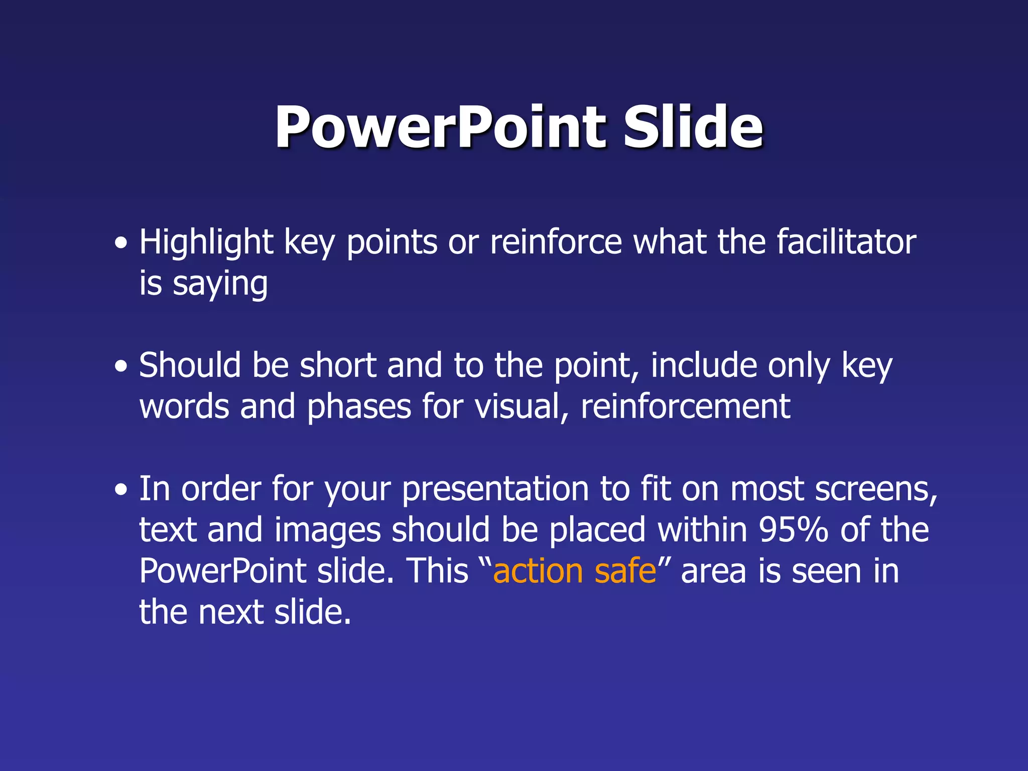
Should be shortand to the point, include only key words and phases for visual, reinforcement
5.
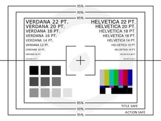
In order foryour presentation to fit on most screens, text and images should be placed within 95% of the PowerPoint slide. This “action safe” area is seen in the next slide.
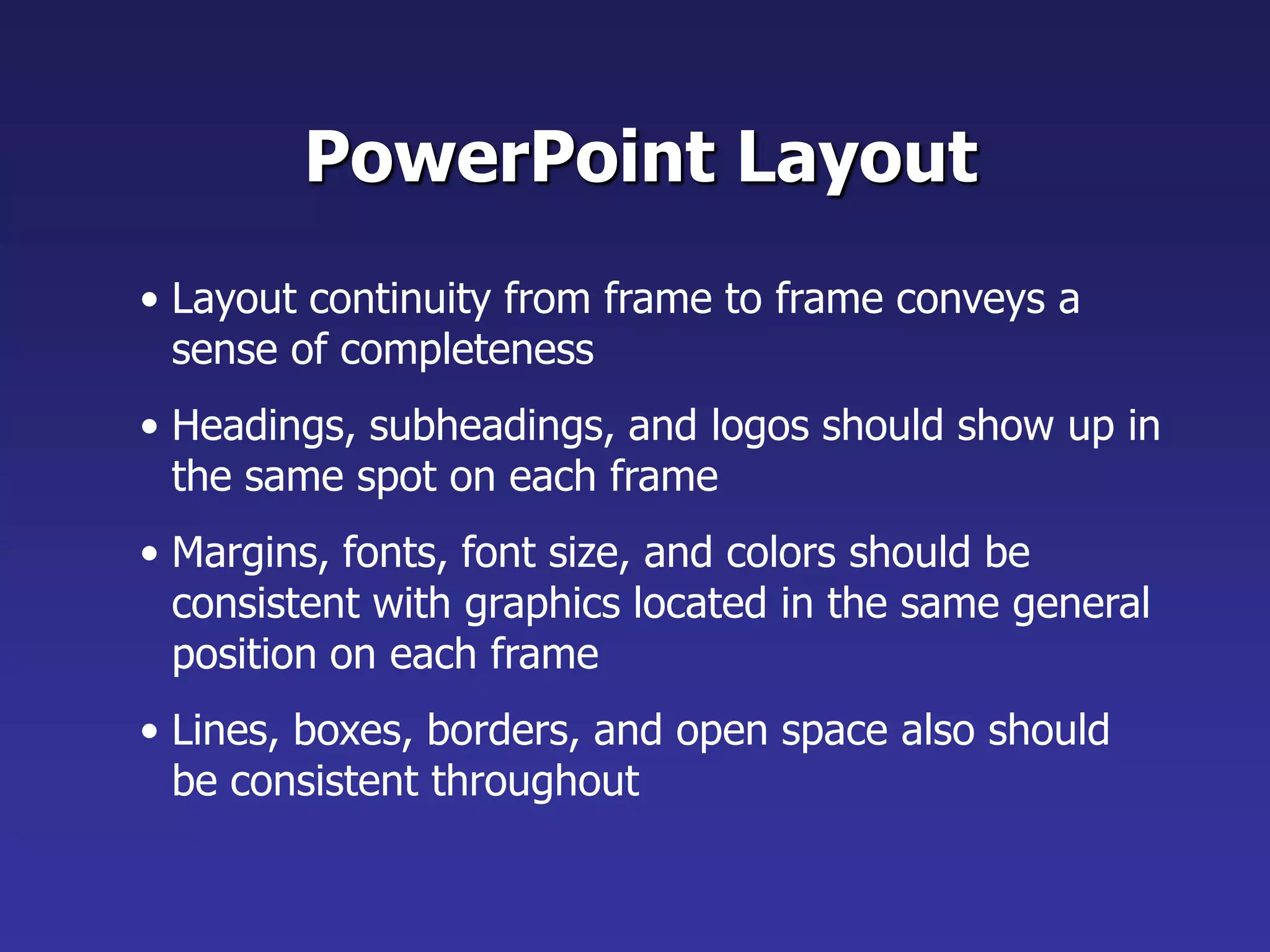
Margins, fonts, fontsize, and colors should be consistent with graphics located in the same general position on each frame
9.
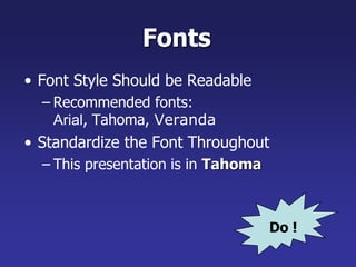
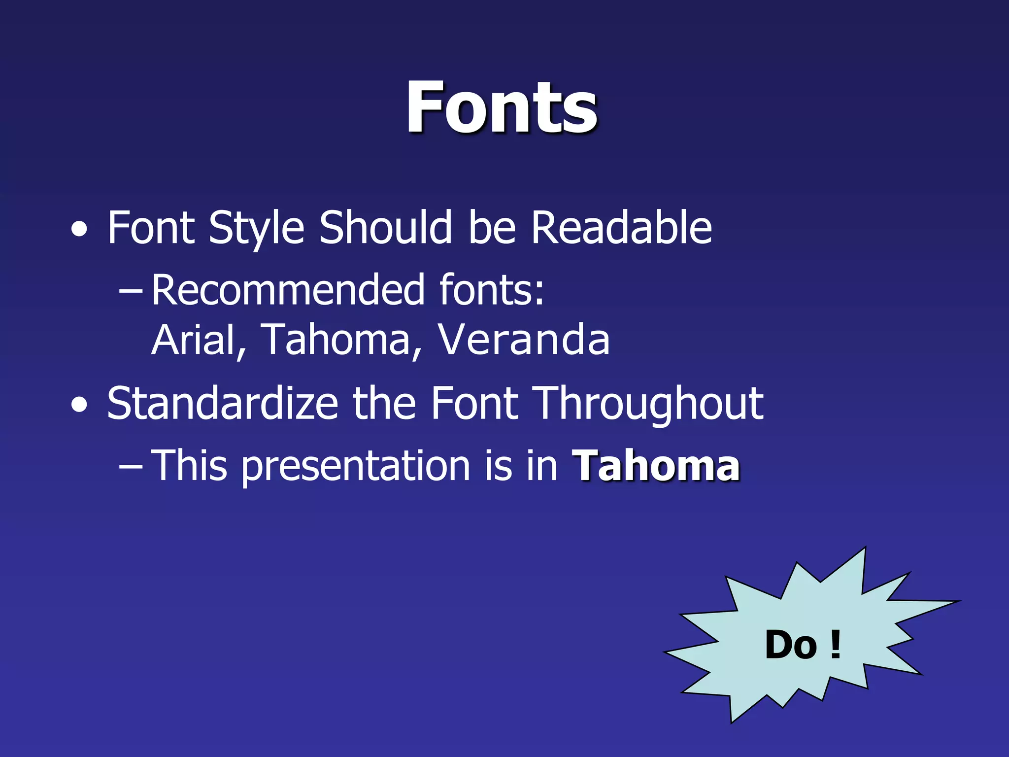
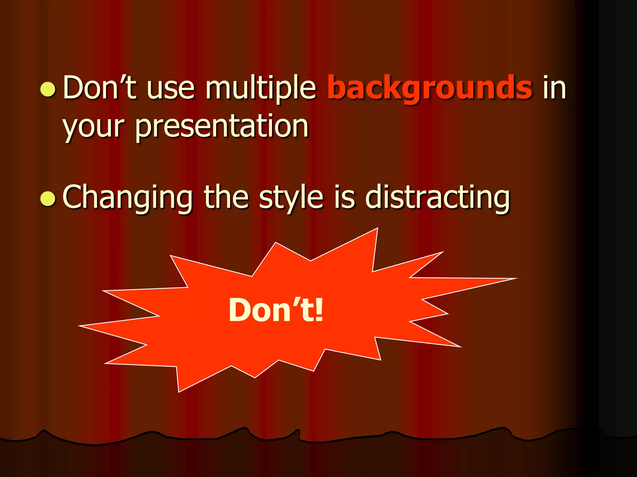
Lines, boxes, borders,and open space also should be consistent throughout Do !FontsFont Style Should be ReadableRecommended fonts: Arial, Tahoma, VerandaStandardize the Font ThroughoutThis presentation is in Tahoma
10.
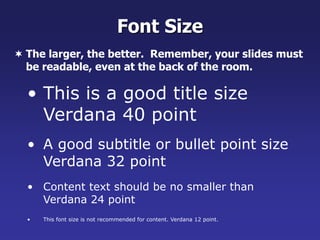
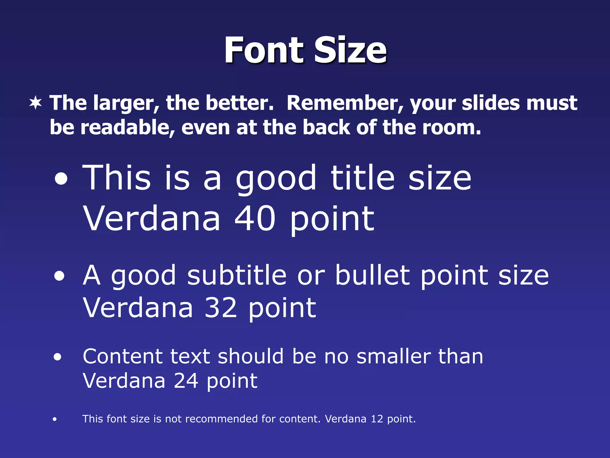
Font SizeThe larger,the better. Remember, your slides must be readable, even at the back of the room.
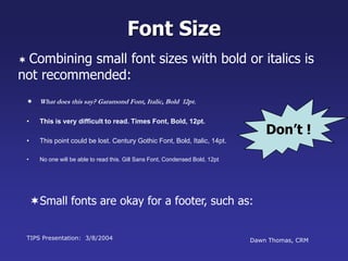
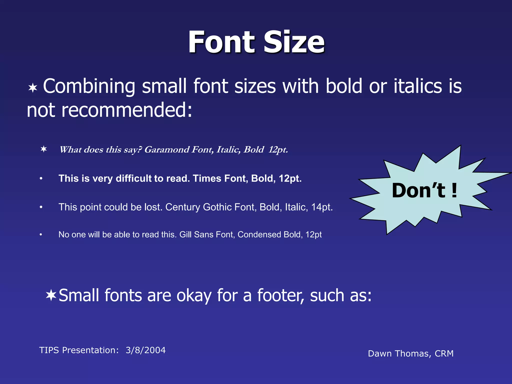
This font sizeis not recommended for content. Verdana 12 point.Don’t !Font SizeCombining small font sizes with bold or italics is not recommended:
15.
What does thissay? Garamond Font, Italic, Bold 12pt.This is very difficult to read. Times Font, Bold, 12pt.This point could be lost. Century Gothic Font, Bold, Italic, 14pt.No one will be able to read this. Gill Sans Font, Condensed Bold, 12ptSmall fonts are okay for a footer, such as:TIPS Presentation: 3/8/2004Dawn Thomas, CRM
16.
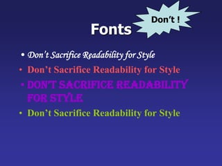
FontsDon’t Sacrifice Readabilityfor StyleDon’t Sacrifice Readability for StyleDon’t Sacrifice Readability for StyleDon’t Sacrifice Readability for StyleDon’t !
17.
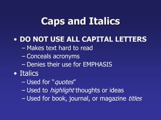
Caps and ItalicsDONOT USE ALL CAPITAL LETTERSMakes text hard to readConceals acronymsDenies their use for EMPHASISItalicsUsed for “quotes”Used to highlight thoughts or ideasUsed for book, journal, or magazine titles
18.
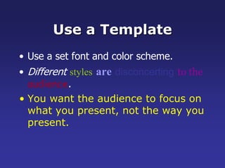
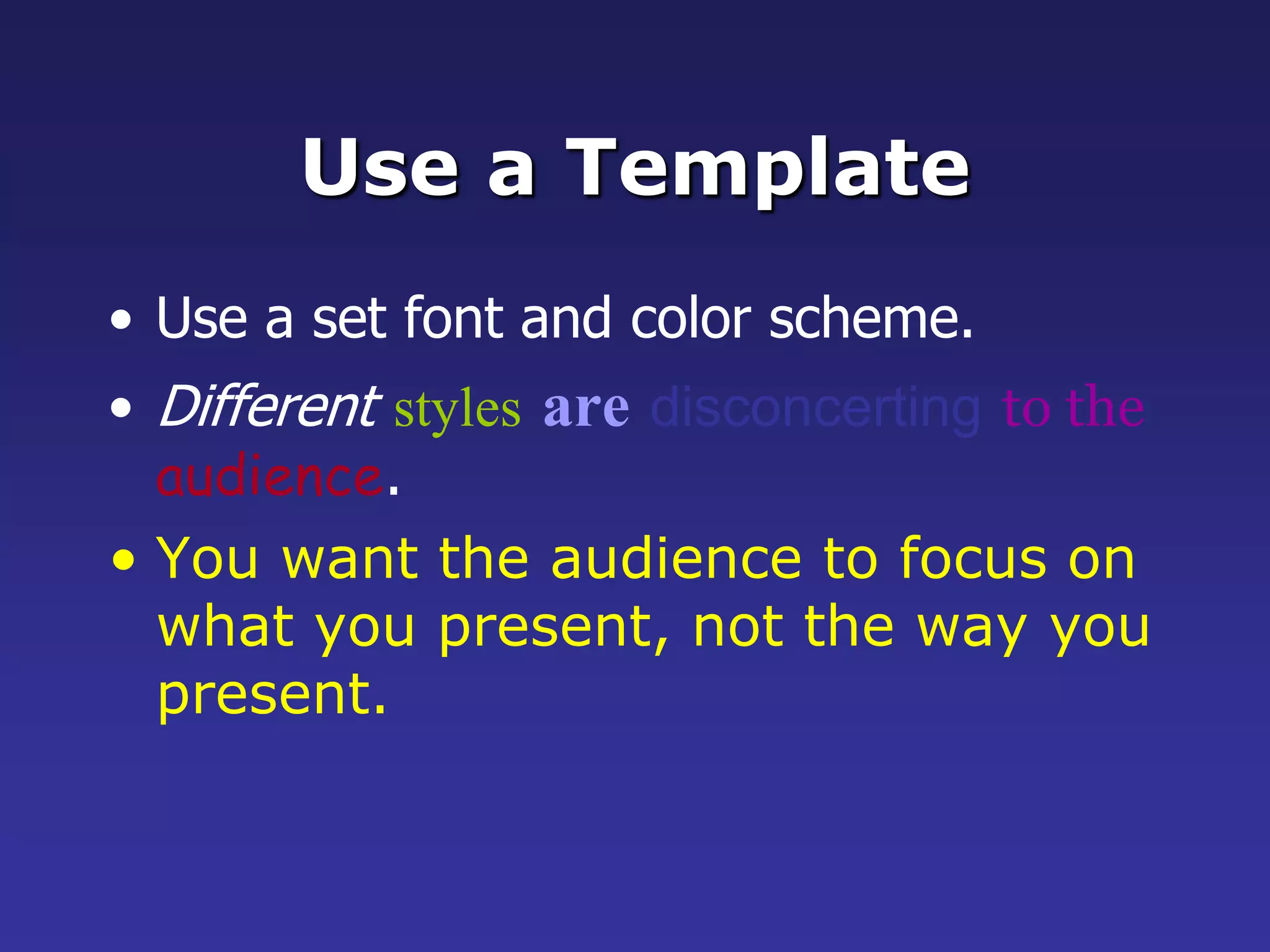
Use a TemplateUsea set font and color scheme.Differentstylesaredisconcertingto theaudience.You want the audience to focus on what you present, not the way you present.
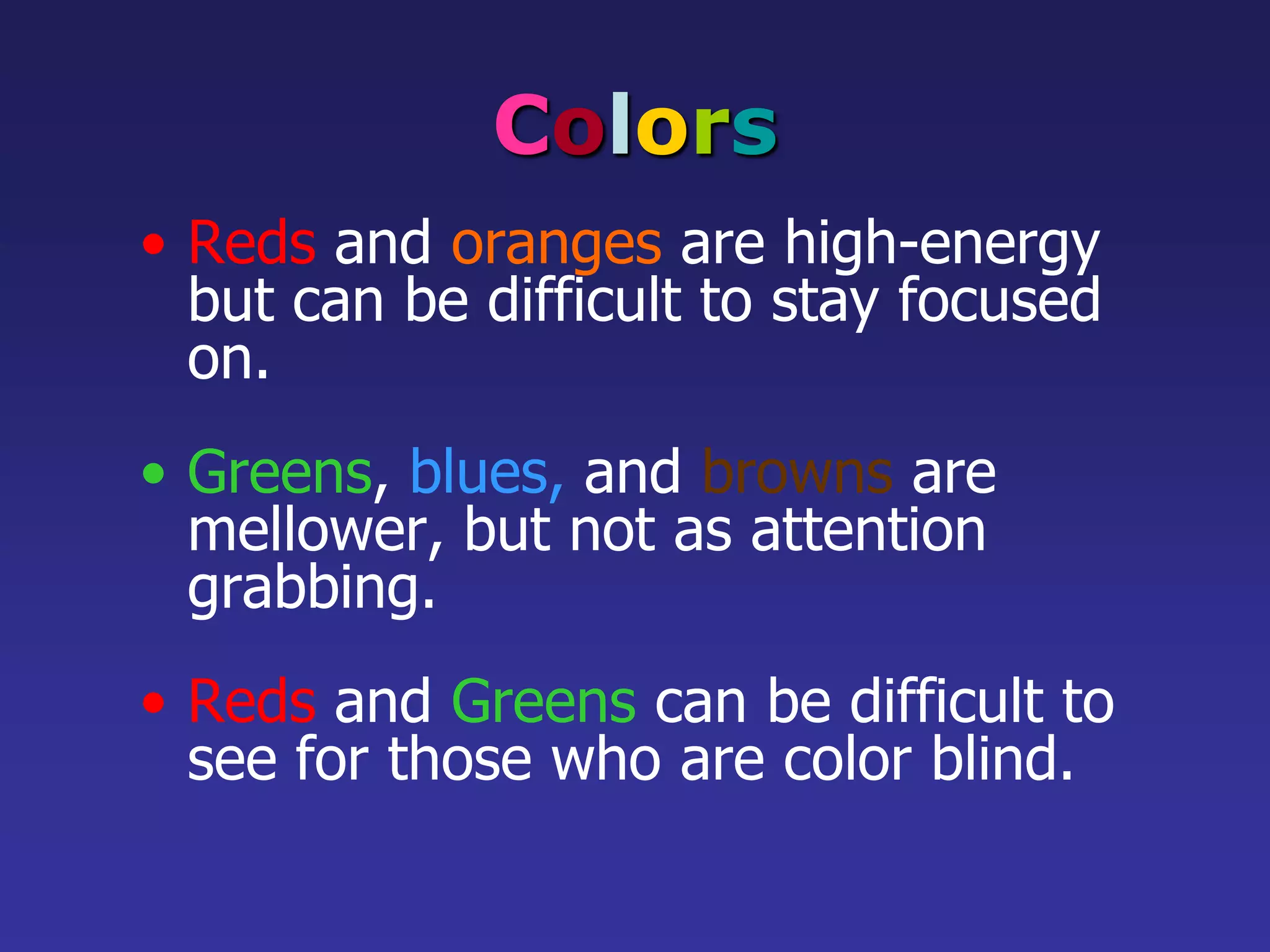
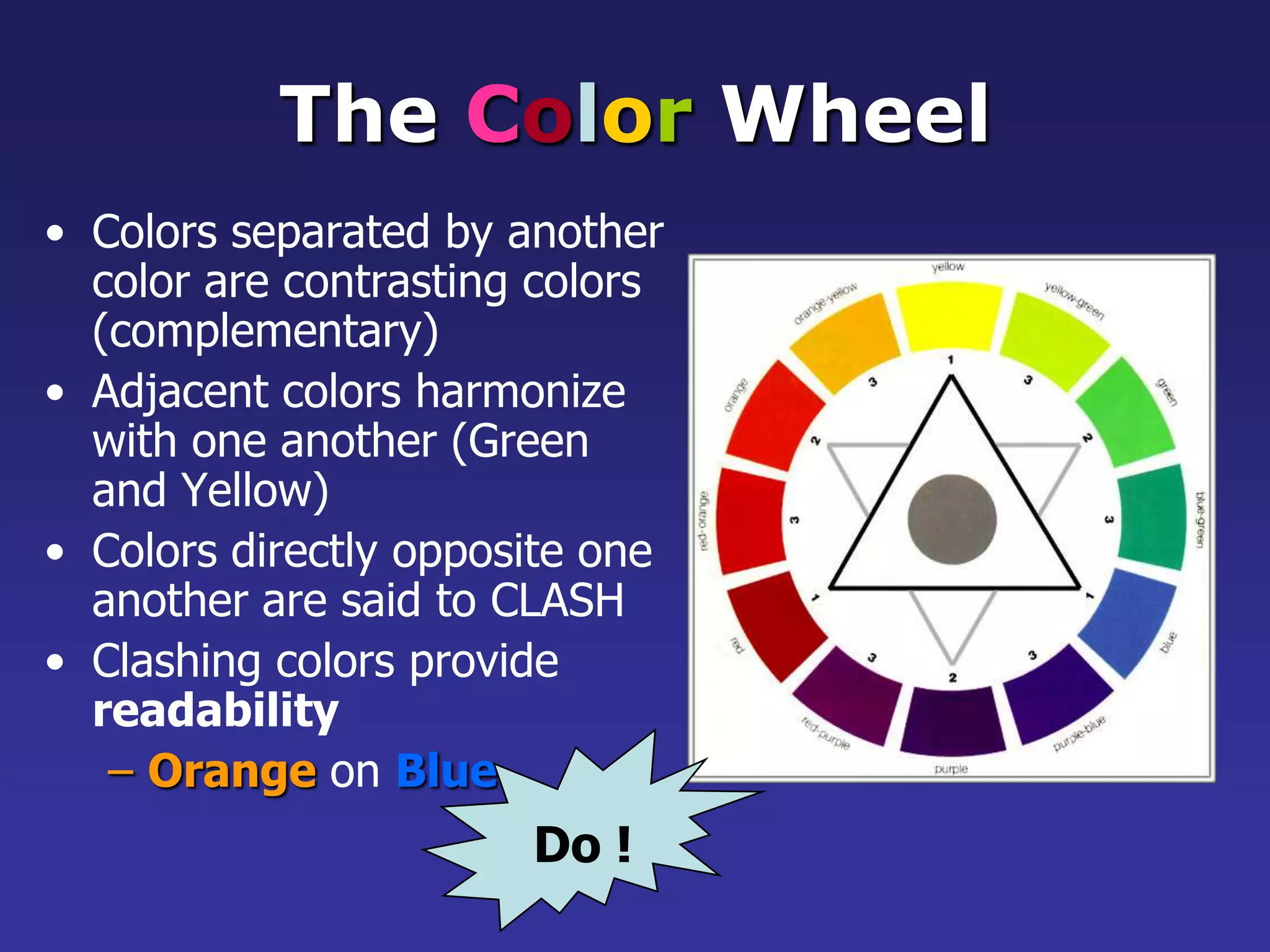
ColorsRedsandorangesare high-energy butcan be difficult to stay focused on.Greens,blues,andbrownsare mellower, but not as attention grabbing.Reds and Greens can be difficult to see for those who are color blind.
22.
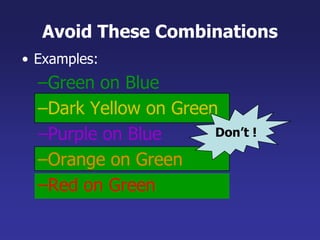
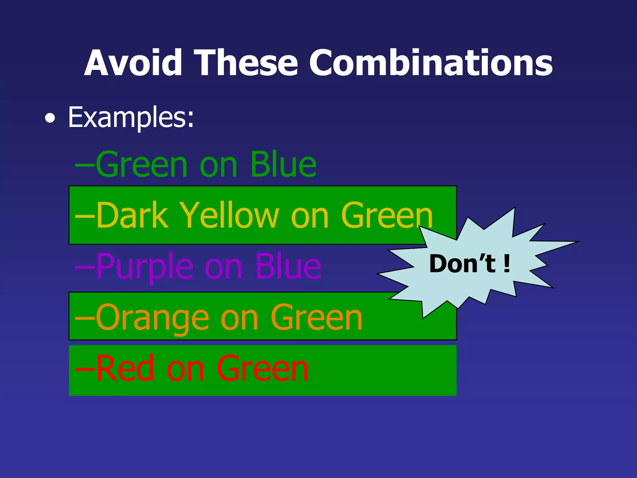
Don’t !Avoid TheseCombinationsExamples:Green on BlueDark Yellow on GreenPurple on BlueOrange on GreenRed on Green
23.
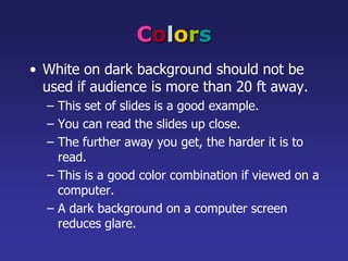
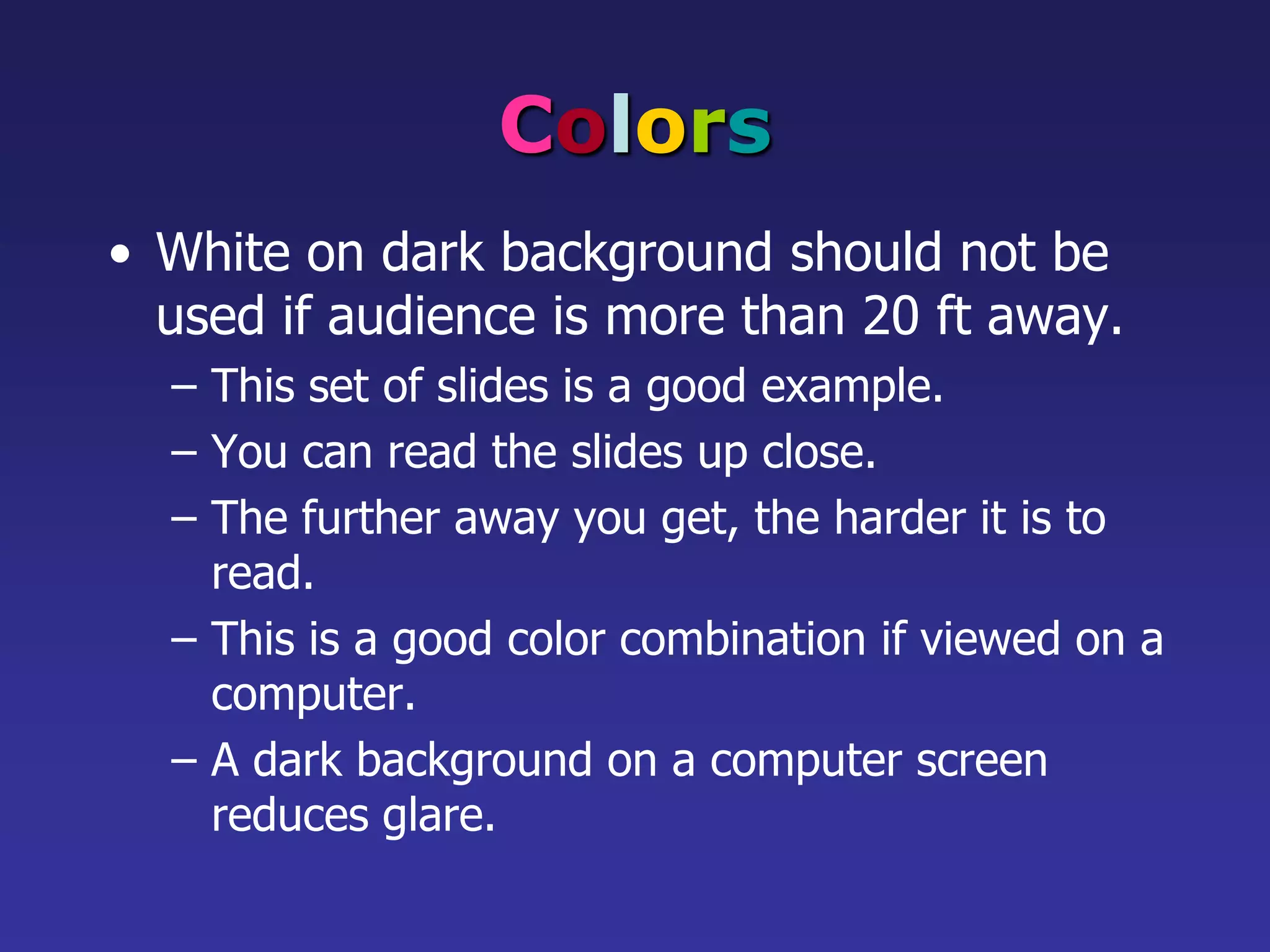
ColorsWhite on darkbackground should not be used if audience is more than 20 ft away.This set of slides is a good example.You can read the slides up close.The further away you get, the harder it is to read.This is a good color combination if viewed on a computer.A dark background on a computer screen reduces glare.
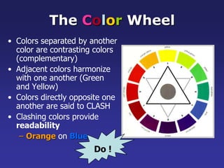
Do !The ColorWheelColors separated by another color are contrasting colors (complementary)Adjacent colors harmonize with one another (Green and Yellow)Colors directly opposite one another are said to CLASHClashing colors provide readabilityOrangeonBlue
26.
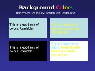
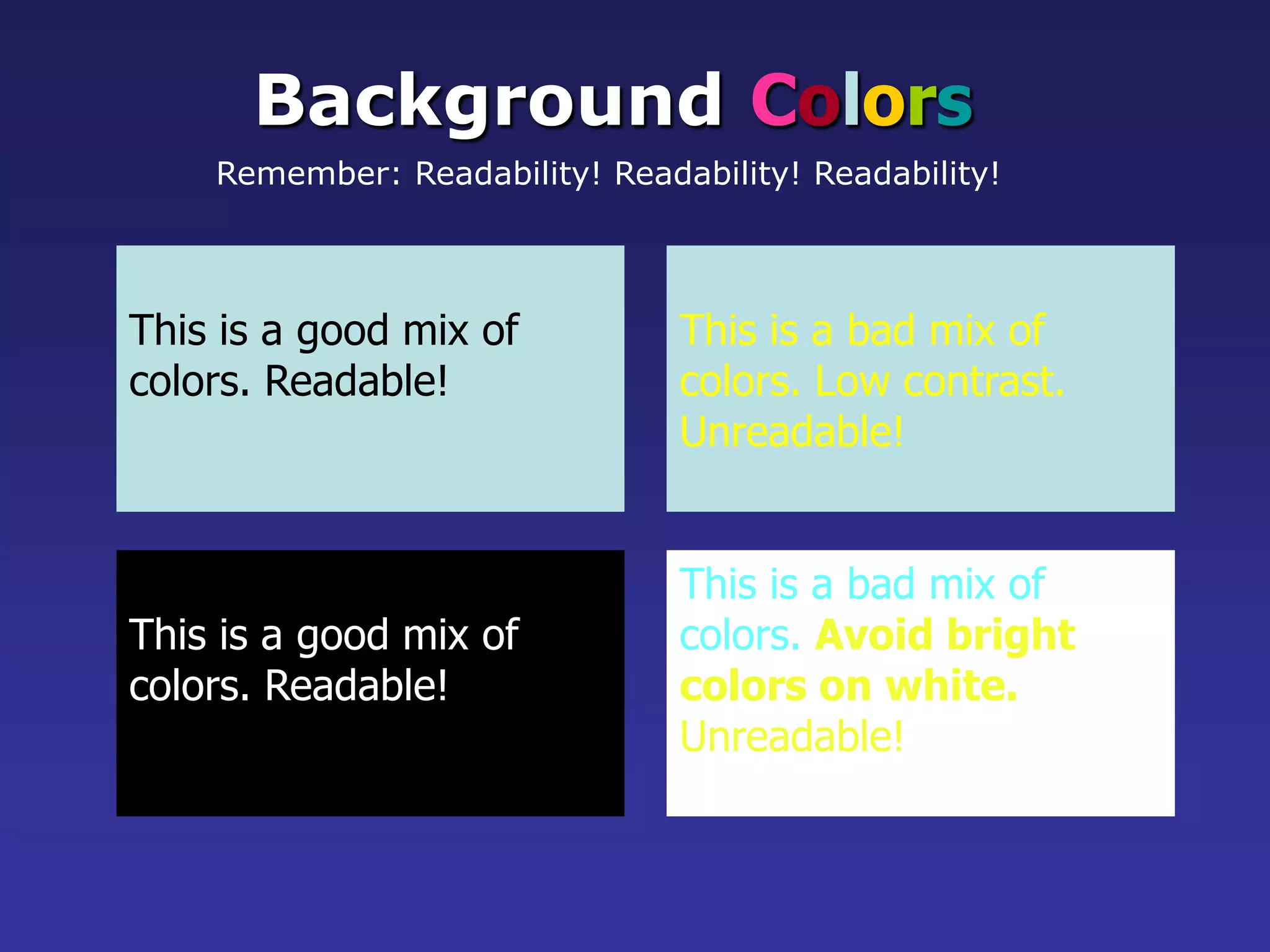
BackgroundColorsRemember: Readability! Readability!Readability!This is a good mix of colors. Readable!This is a bad mix of colors. Low contrast.Unreadable!This is a good mix of colors. Readable!This is a bad mix of colors. Avoid brightcolors on white.Unreadable!
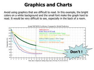
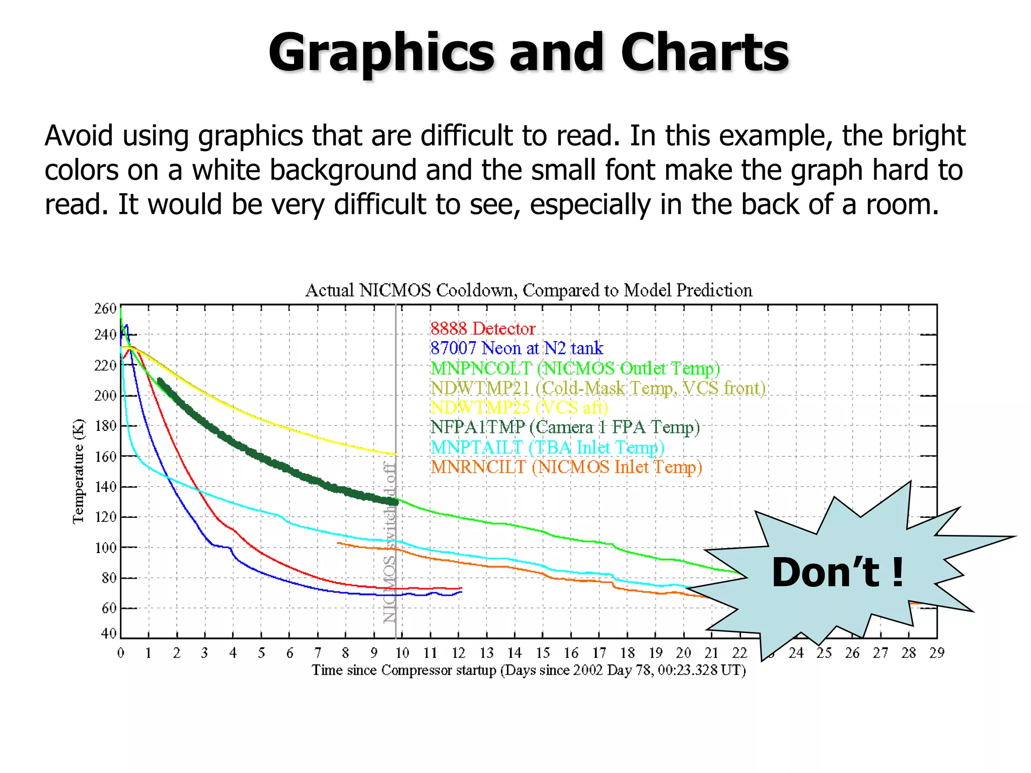
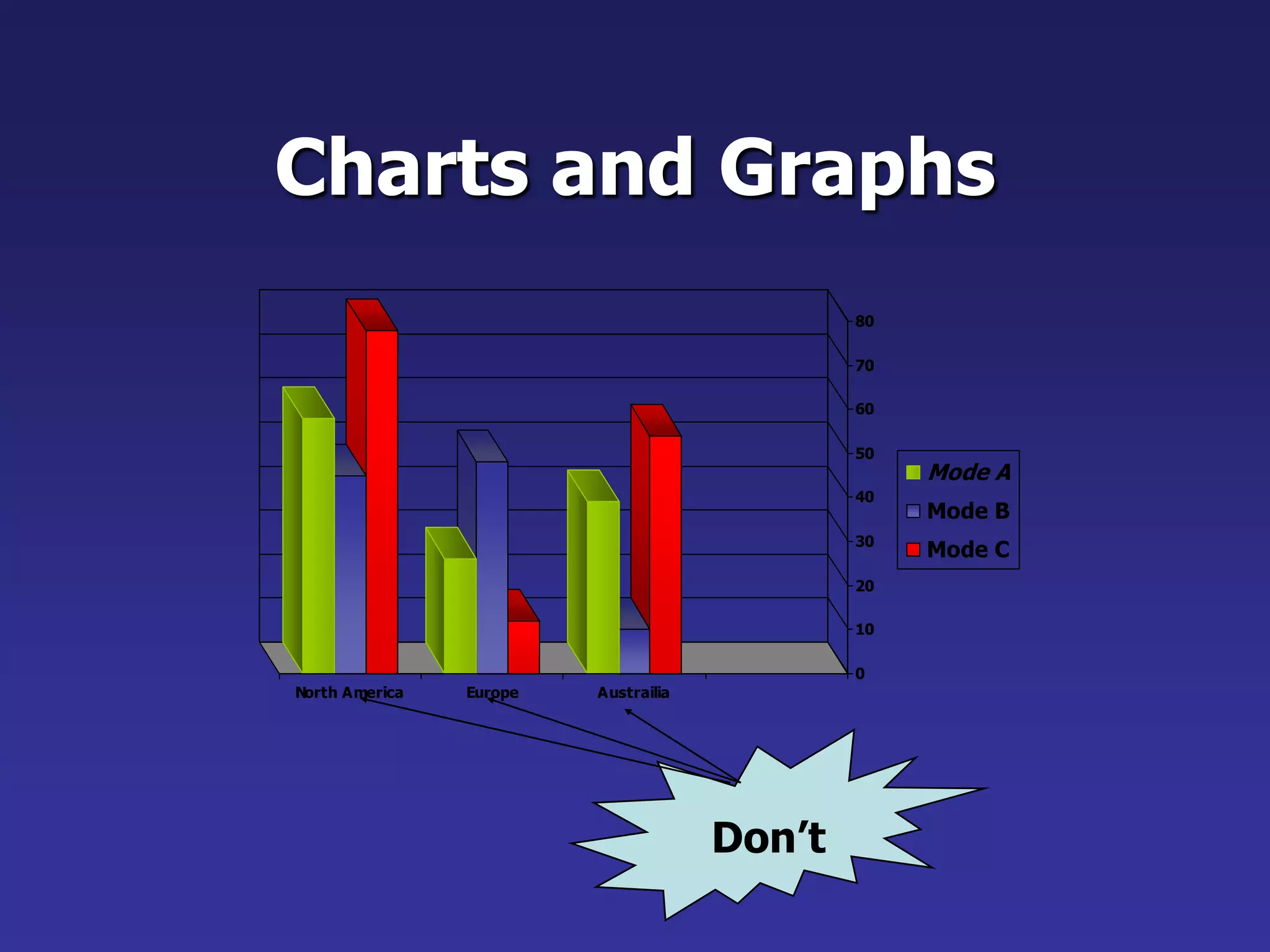
Graphics and ChartsDon’t!Avoid using graphics that are difficult to read. In this example, the bright colors on a white background and the small font make the graph hard to read. It would be very difficult to see, especially in the back of a room.8
29.
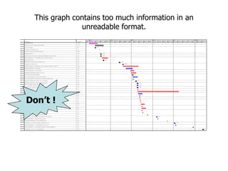
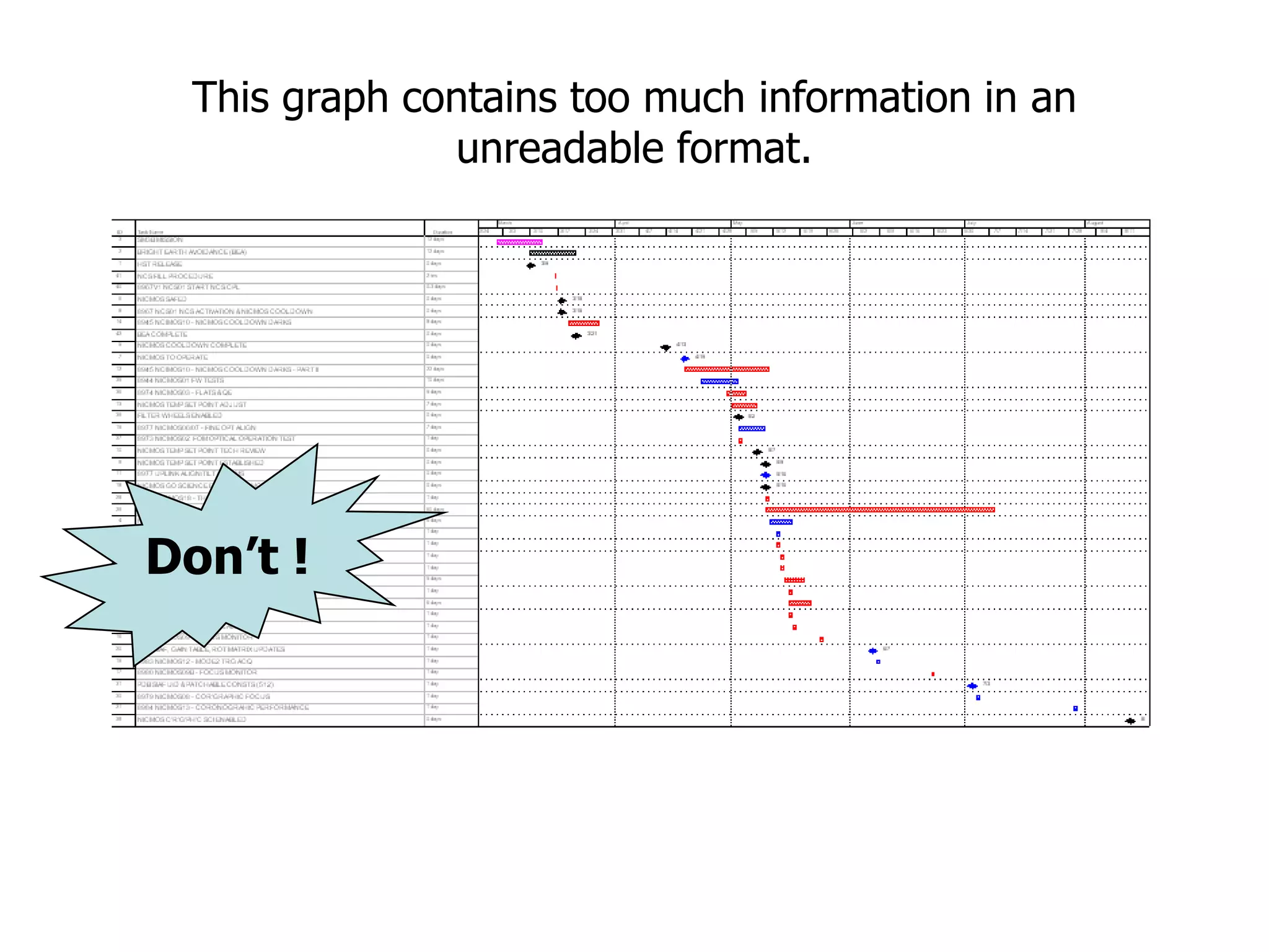
Don’t !This graphcontains too much information in an unreadable format.10
30.
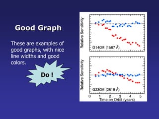
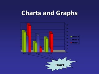
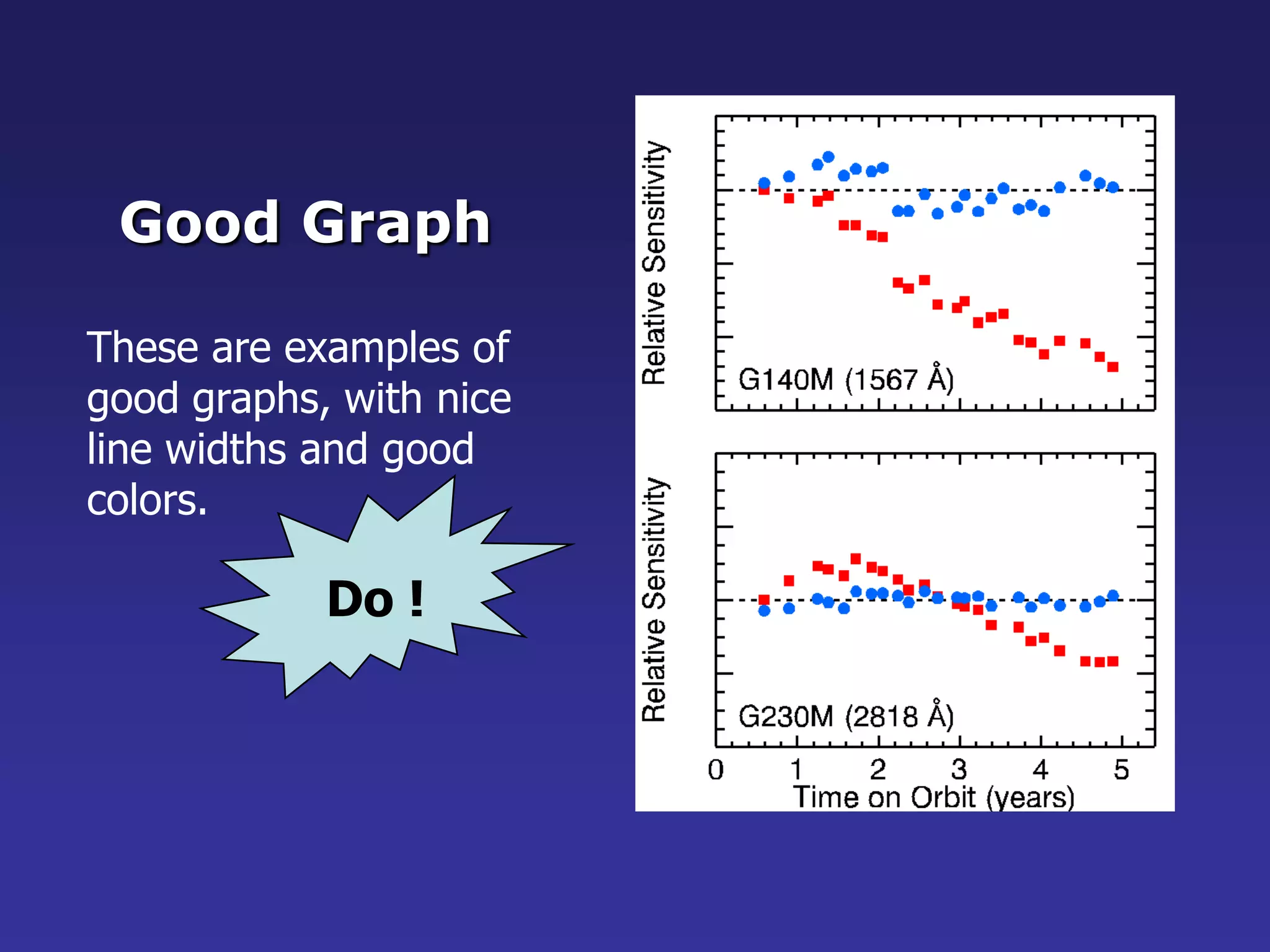
Do !Good GraphTheseare examples ofgood graphs, with niceline widths and goodcolors.
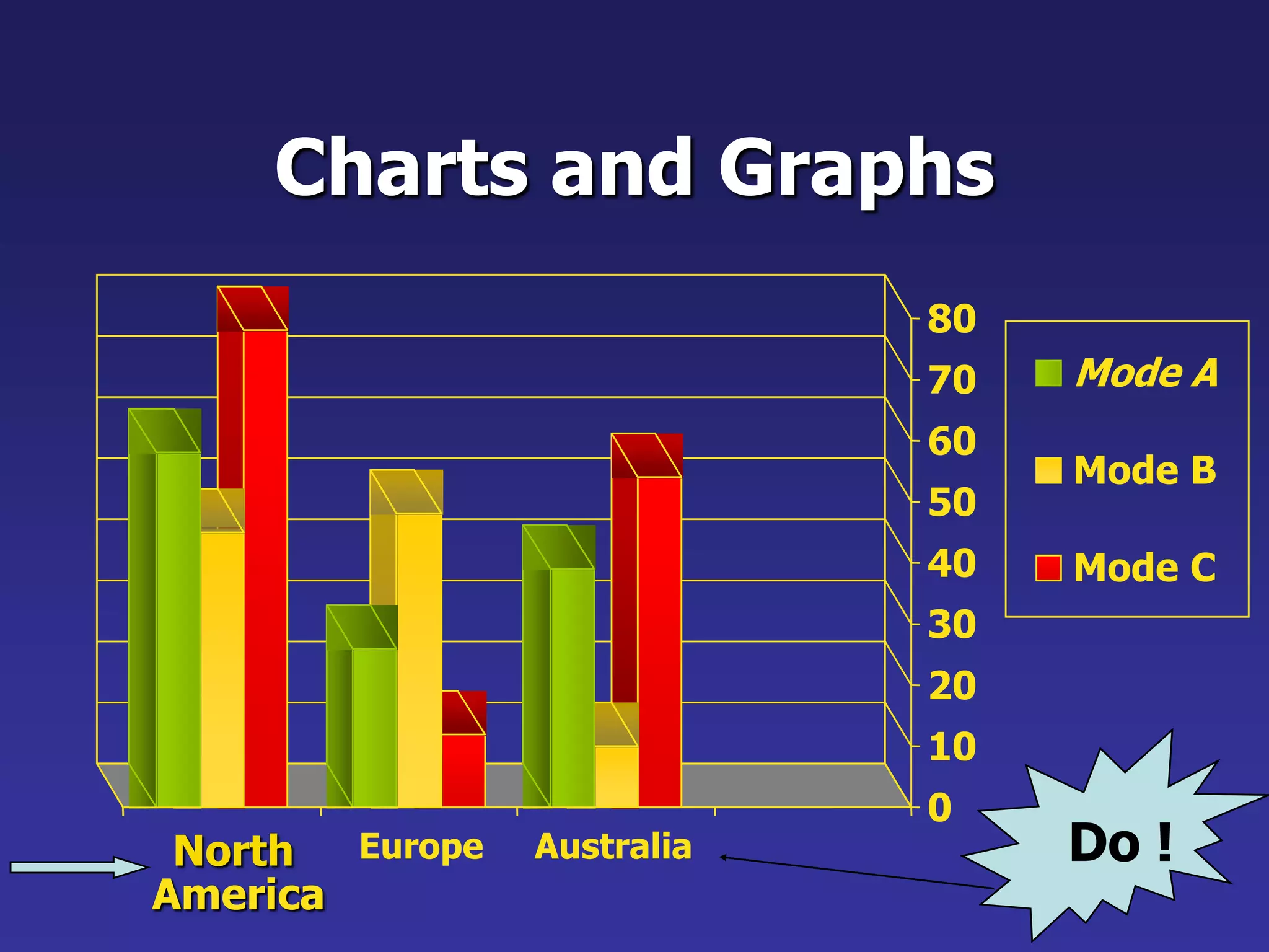
Charts and GraphsDo!80Mode A7060Mode B5040Mode C3020100NorthEuropeAustraliaAmerica
33.
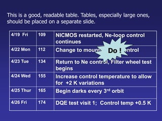
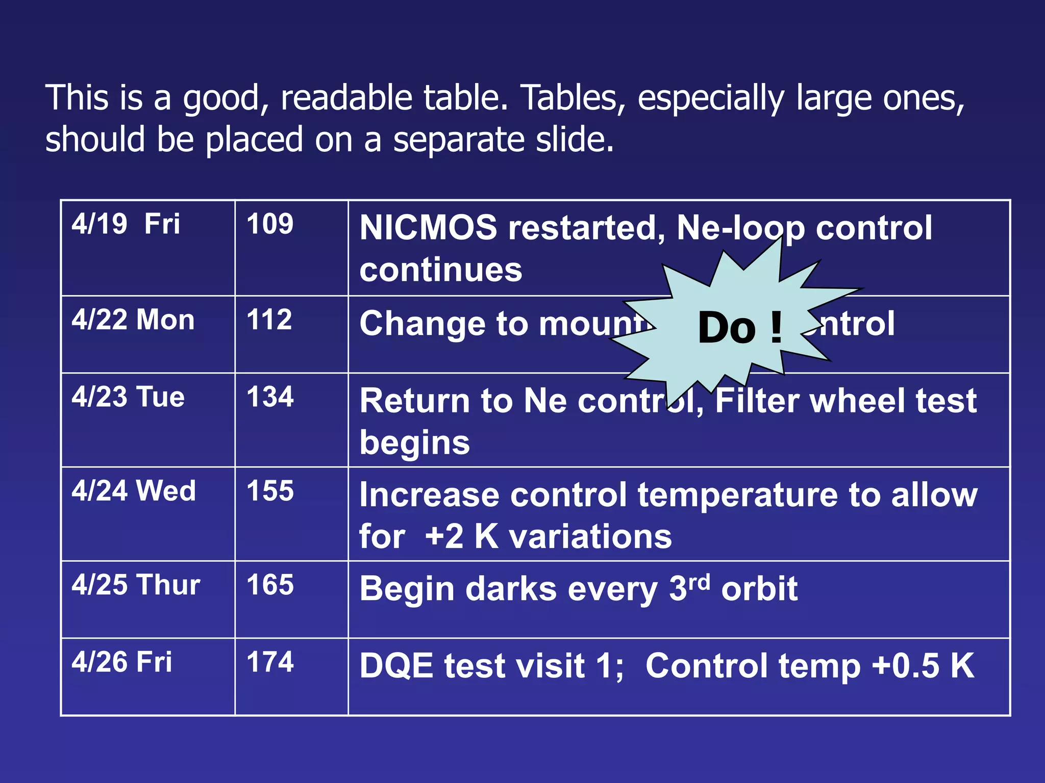
Do !This isa good, readable table. Tables, especially large ones, should be placed on a separate slide.
34.
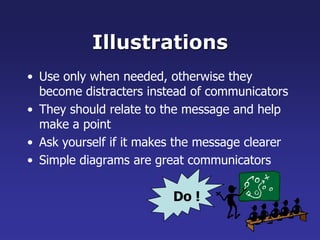
IllustrationsDo !Use onlywhen needed, otherwise they become distracters instead of communicatorsThey should relate to the message and help make a pointAsk yourself if it makes the message clearer Simple diagrams are great communicators
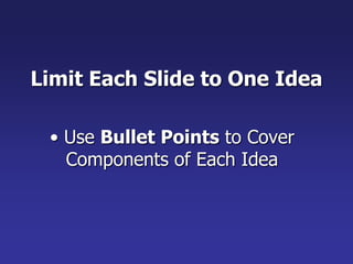
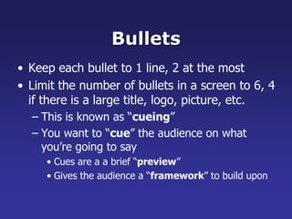
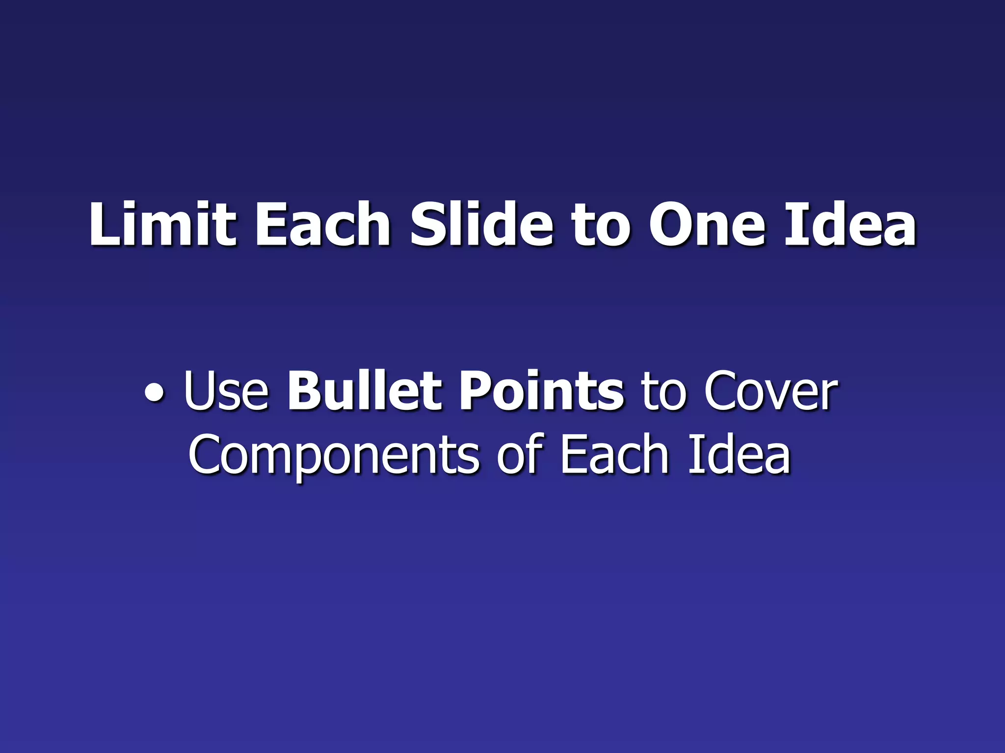
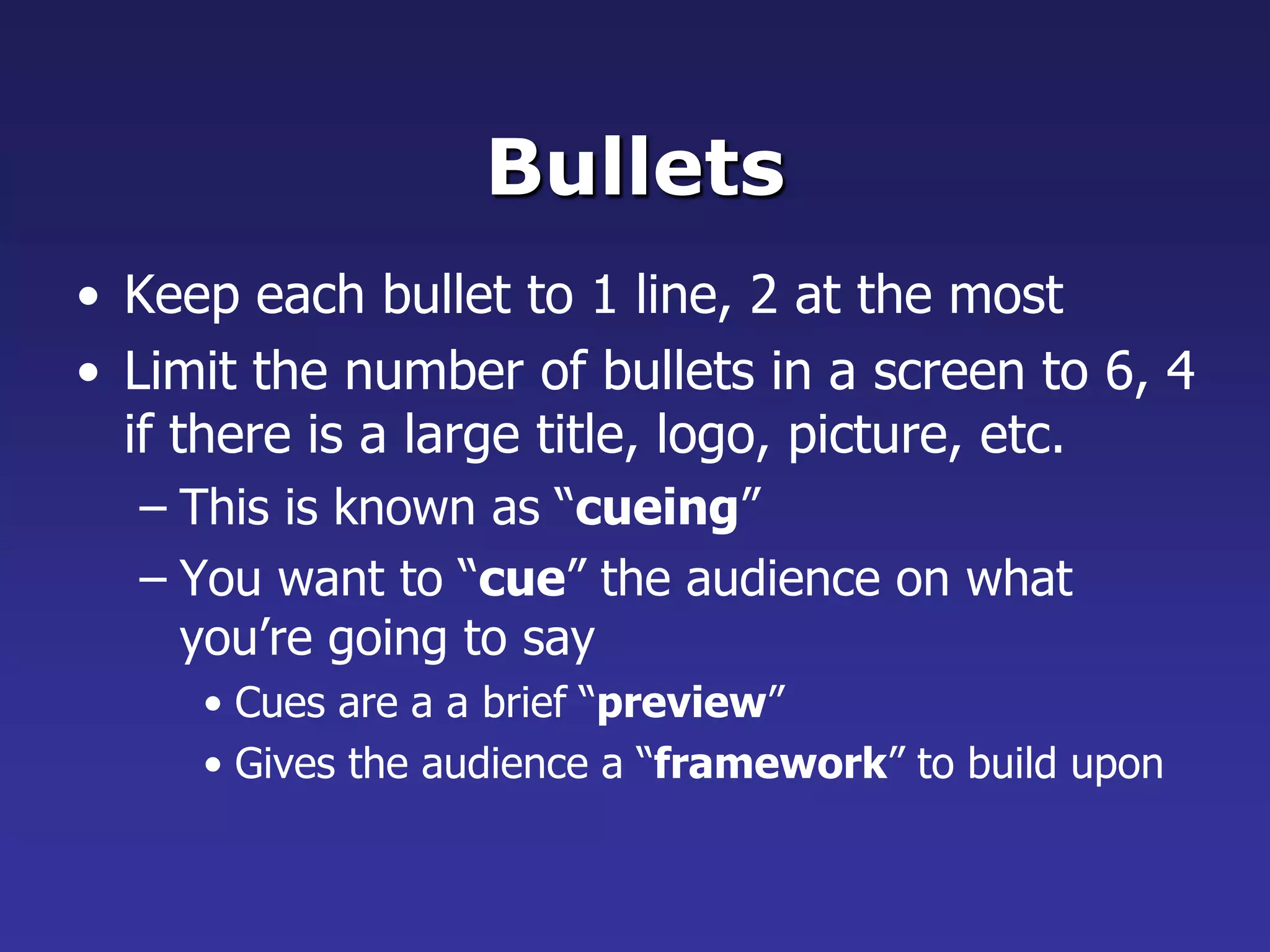
Limit Each Slideto One Idea Use Bullet Points to Cover Components of Each IdeaBulletsKeep each bullet to 1 line, 2 at the mostLimit the number of bullets in a screen to 6, 4 if there is a large title, logo, picture, etc.This is known as “cueing”You want to “cue” the audience on what you’re going to sayCues are a a brief “preview”Gives the audience a “framework” to build upon
37.
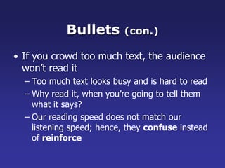
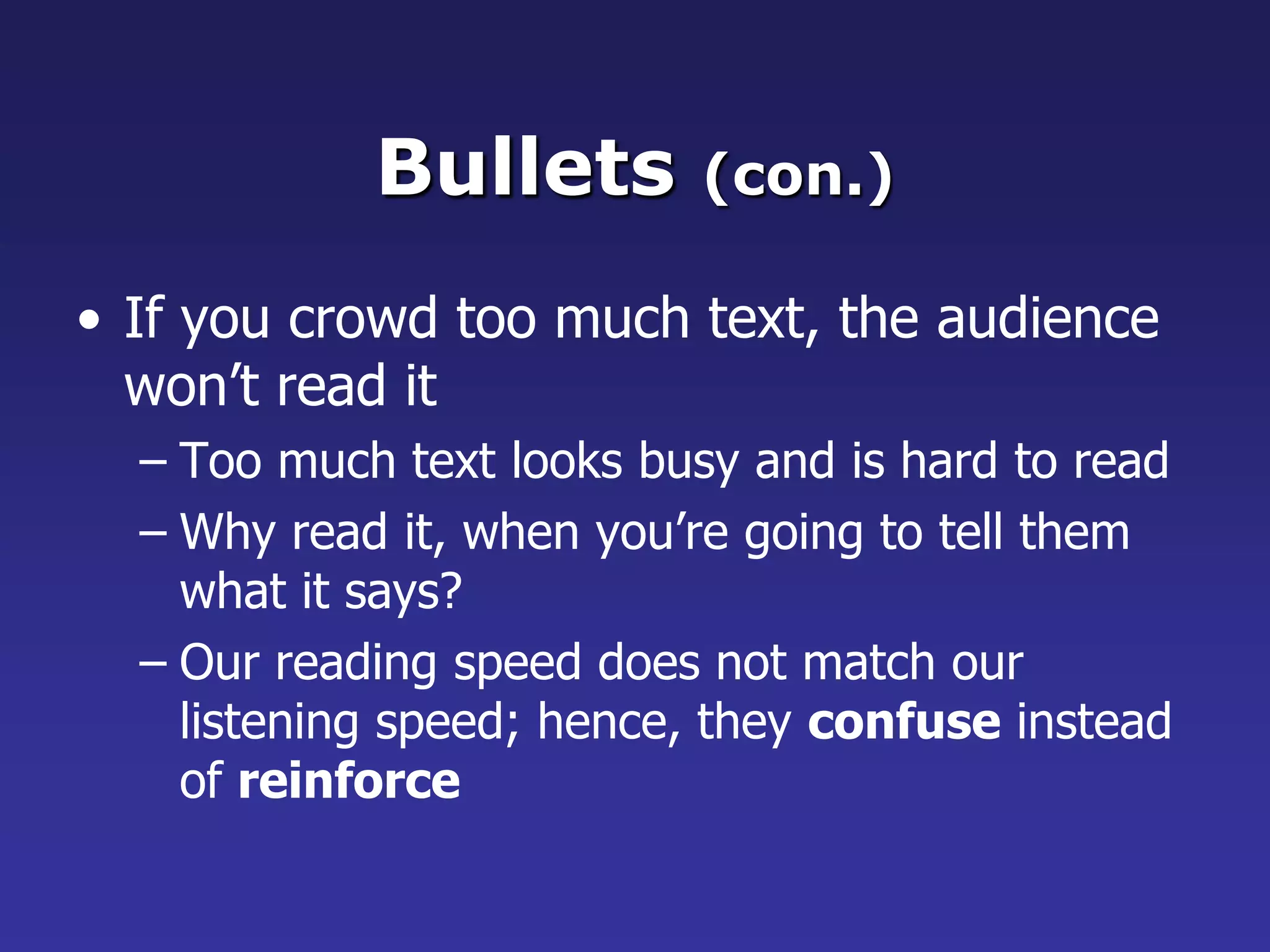
Bullets (con.)If youcrowd too much text, the audience won’t read itToo much text looks busy and is hard to readWhy read it, when you’re going to tell them what it says?Our reading speed does not match our listening speed; hence, they confuse instead of reinforce
38.
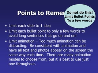
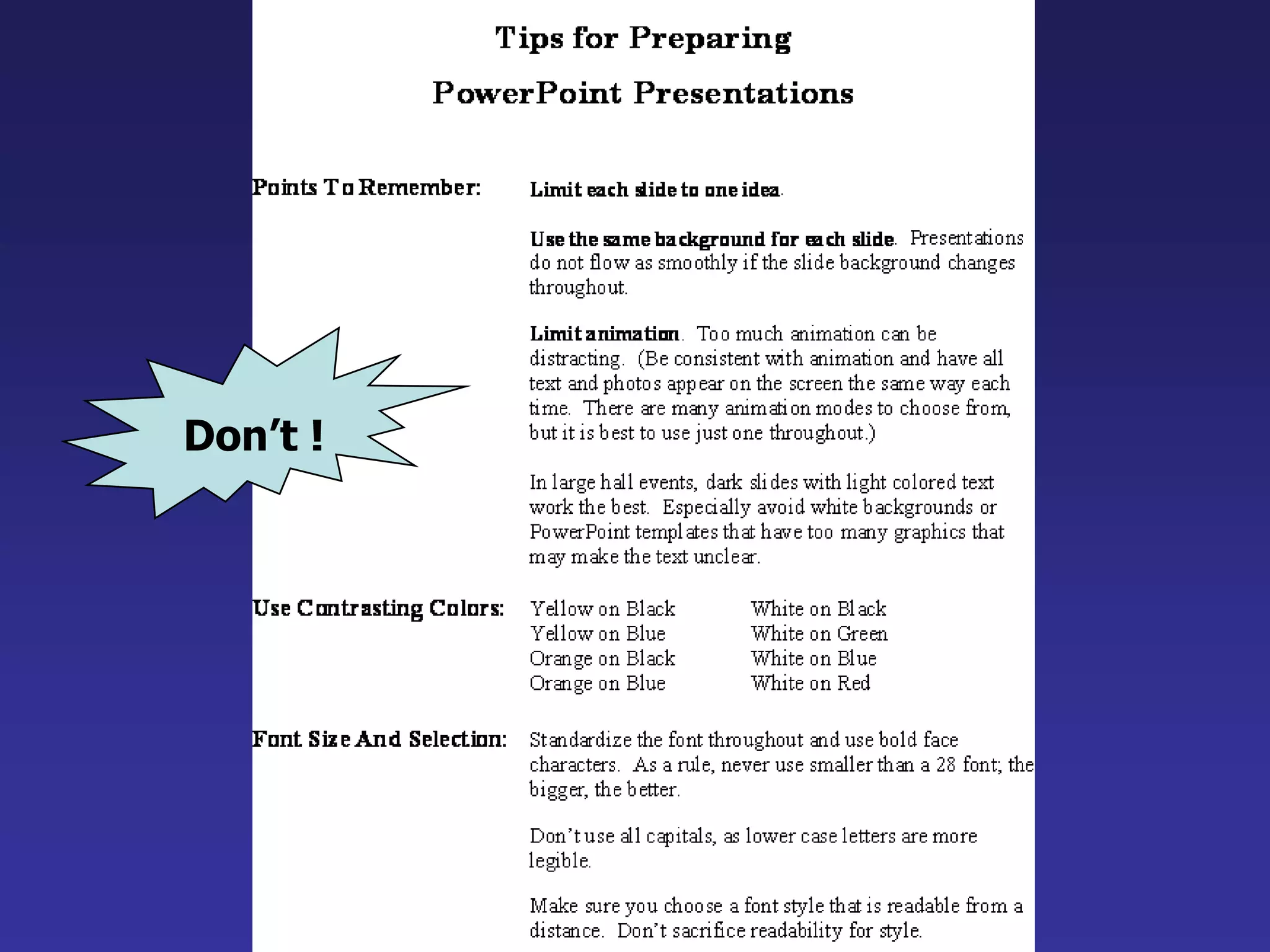
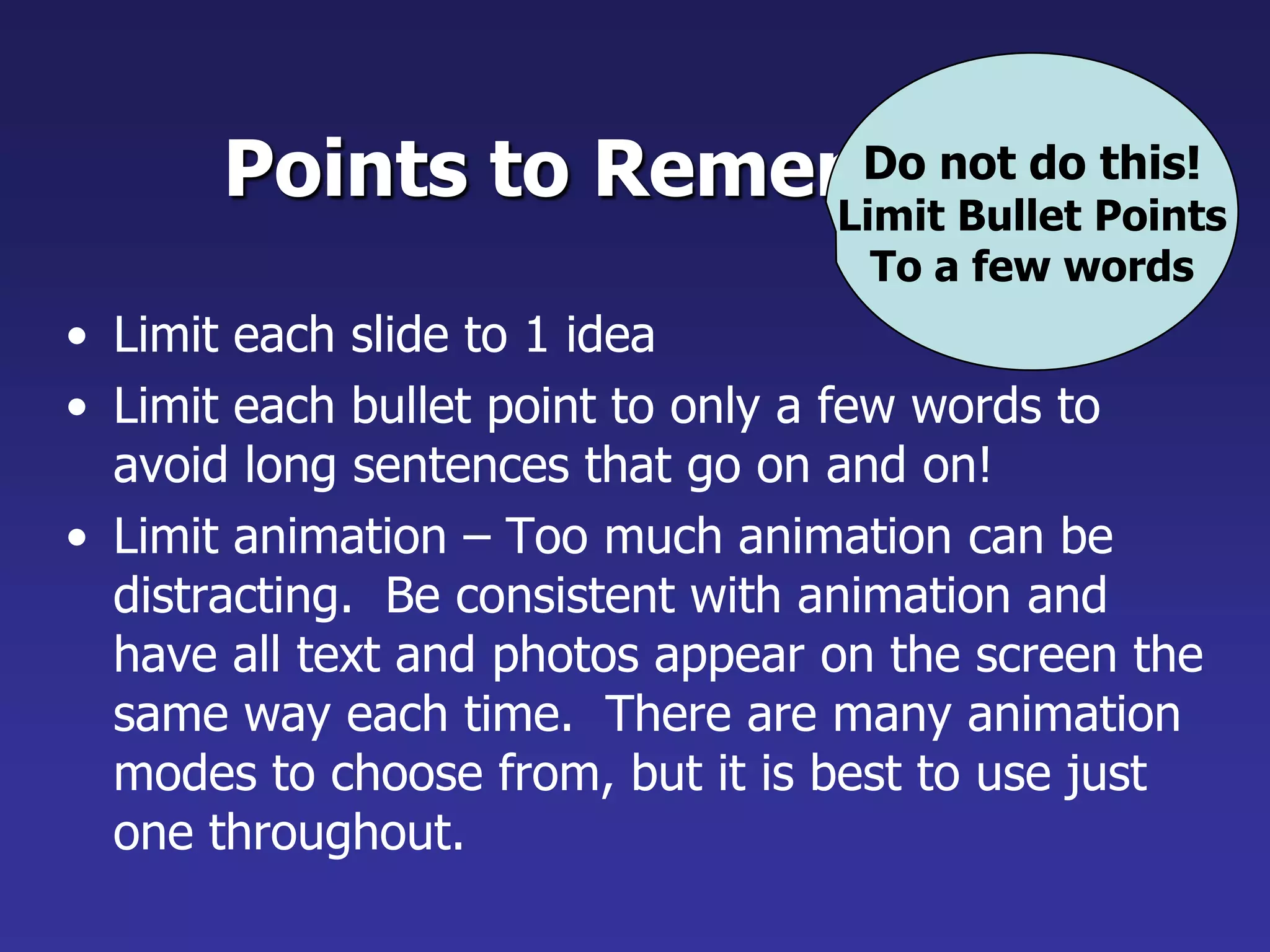
Do not dothis!Limit Bullet PointsTo a few wordsPoints to RememberLimit each slide to 1 ideaLimit each bullet point to only a few words to avoid long sentences that go on and on!Limit animation – Too much animation can be distracting. Be consistent with animation and have all text and photos appear on the screen the same way each time. There are many animation modes to choose from, but it is best to use just one throughout.
39.
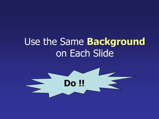
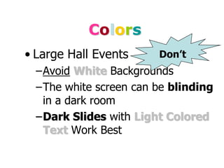
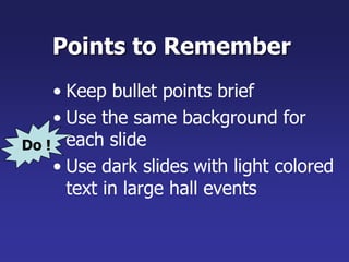
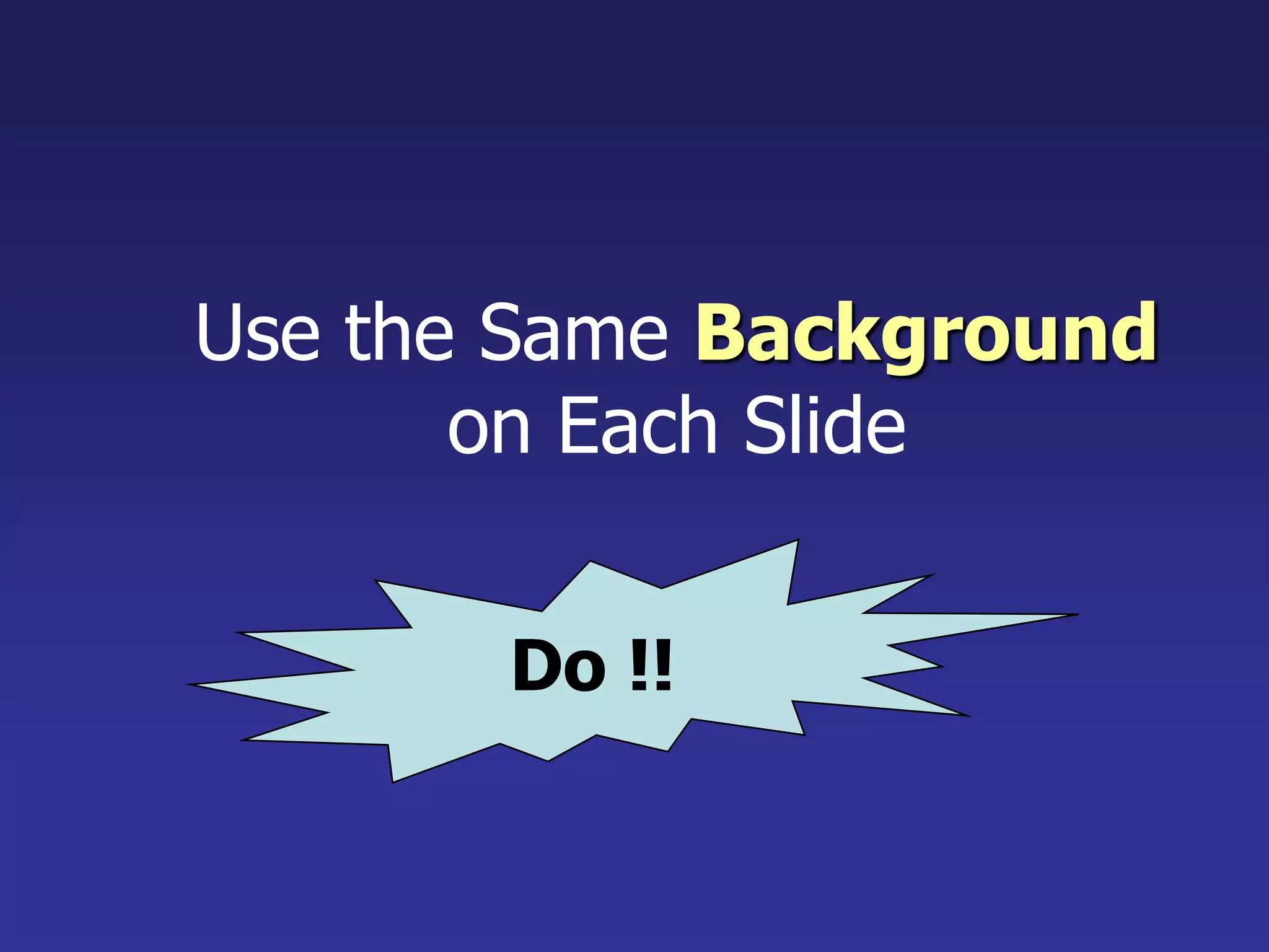
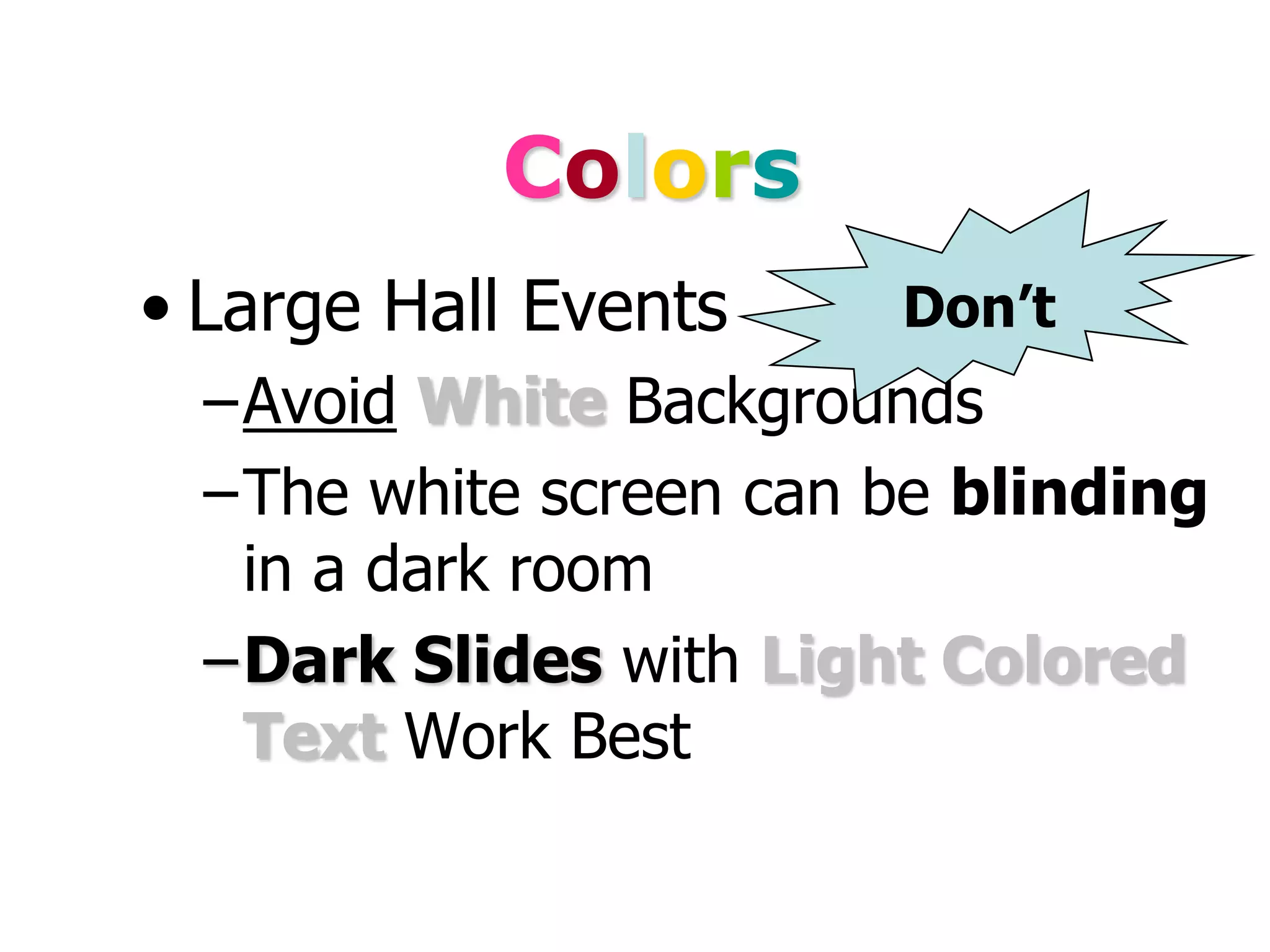
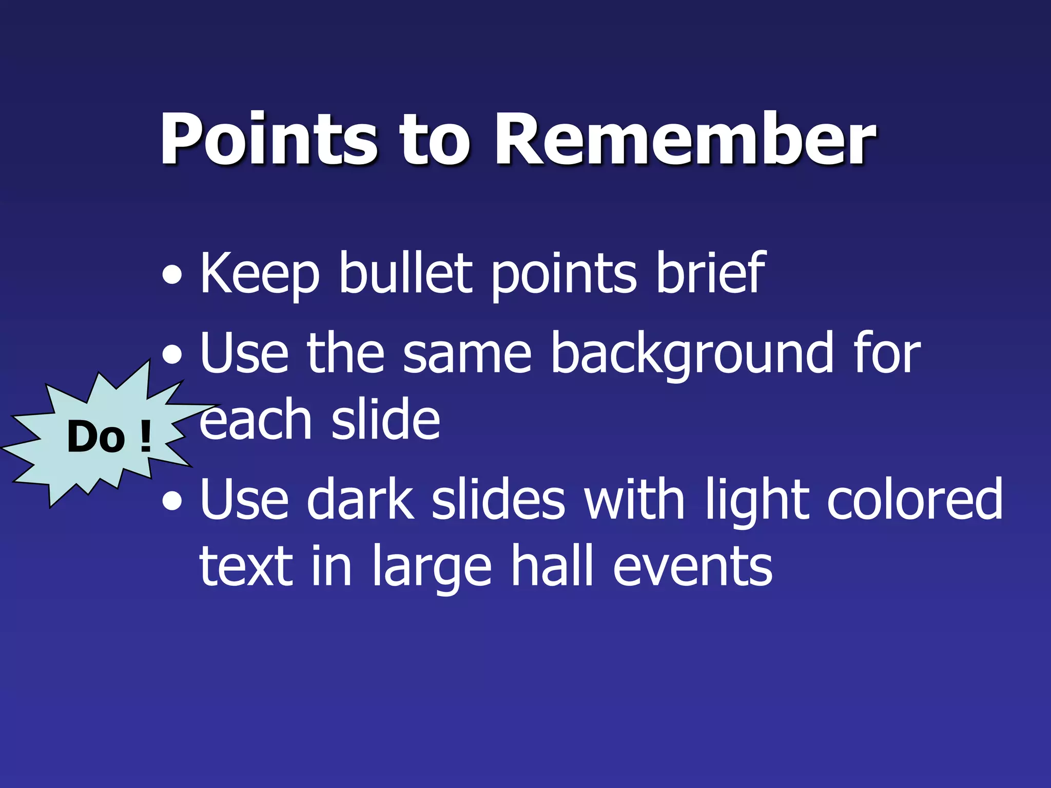
Points to RememberDo!Keep bullet points briefUse the same background for each slideUse dark slides with light colored text in large hall events
40.
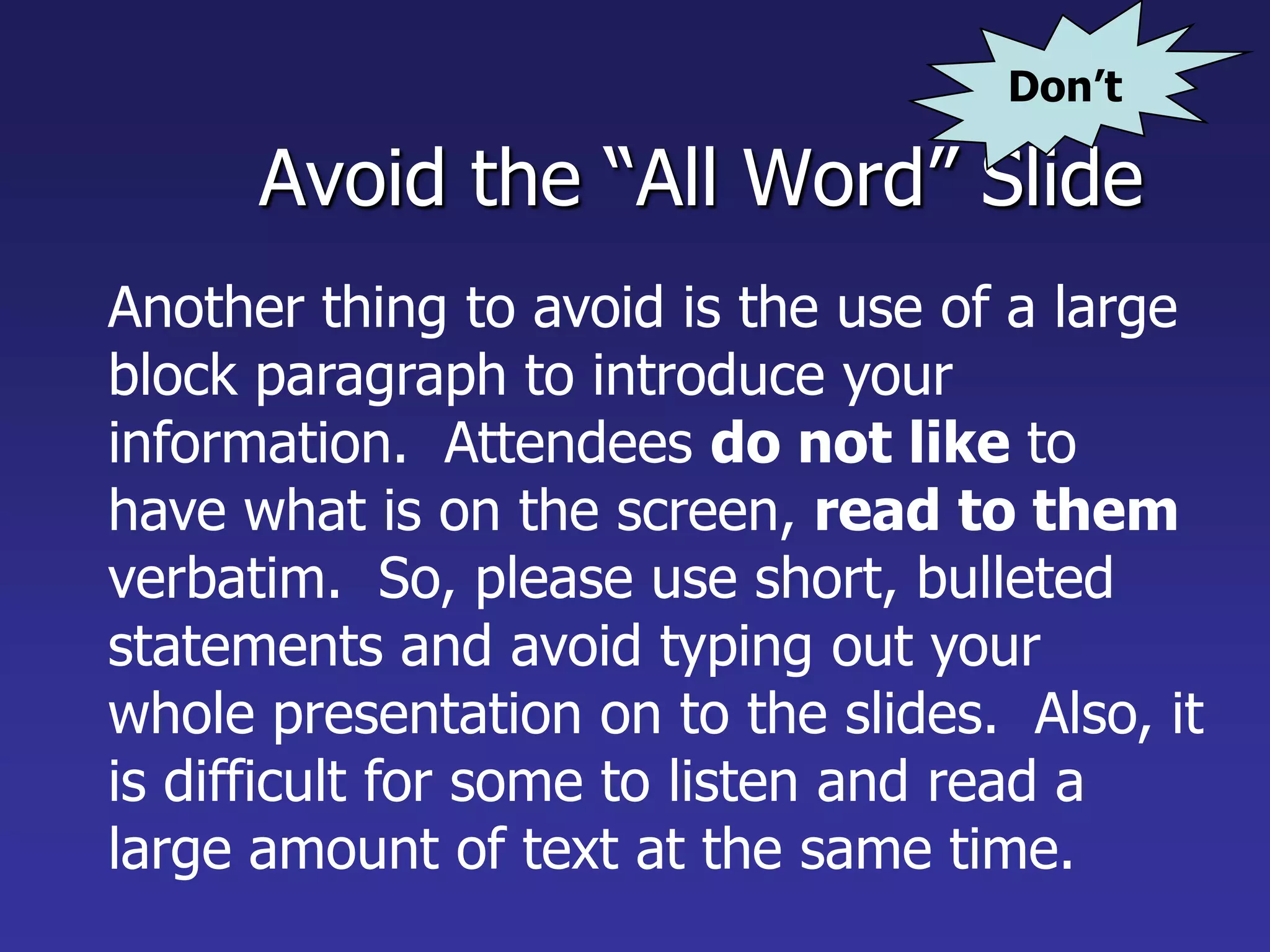
Don’tAvoid the “AllWord” SlideAnother thing to avoid is the use of a large block paragraph to introduce your information. Attendees do not like to have what is on the screen, read to them verbatim. So, please use short, bulleted statements and avoid typing out your whole presentation on to the slides. Also, it is difficult for some to listen and read a large amount of text at the same time.
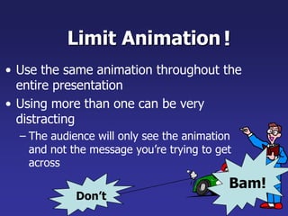
Limit Animation!Use thesame animation throughout the entire presentationUsing more than one can be very distractingThe audience will only see the animation and not the message you’re trying to get acrossBam!Don’t
43.
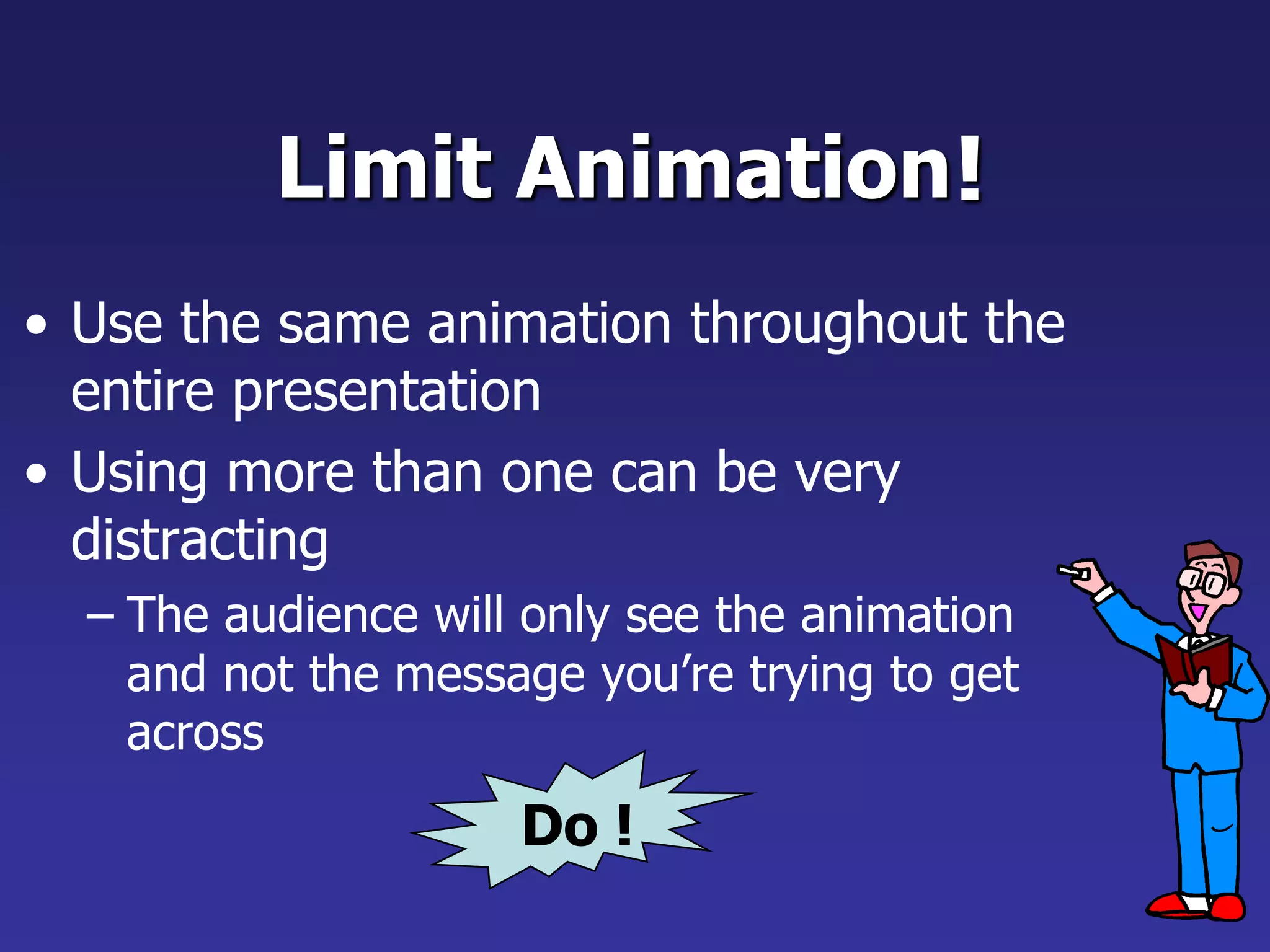
Do !Limit Animation!Usethe same animation throughout the entire presentationUsing more than one can be very distractingThe audience will only see the animation and not the message you’re trying to get across
44.
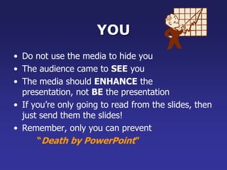
YOUDo not usethe media to hide youThe audience came to SEE youThe media should ENHANCE the presentation, not BE the presentationIf you’re only going to read from the slides, then just send them the slides!Remember, only you can prevent “Death by PowerPoint”