Downloaded 36 times

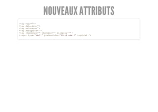
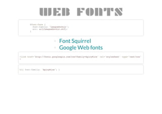
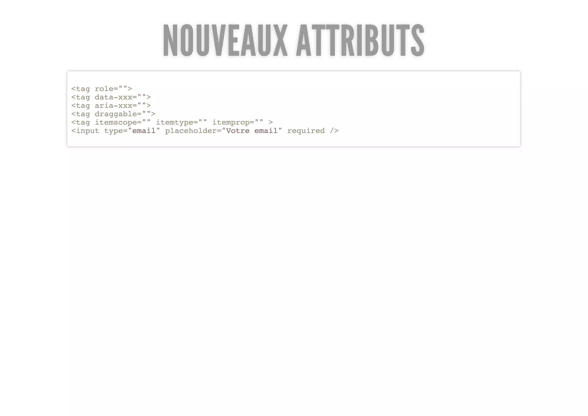
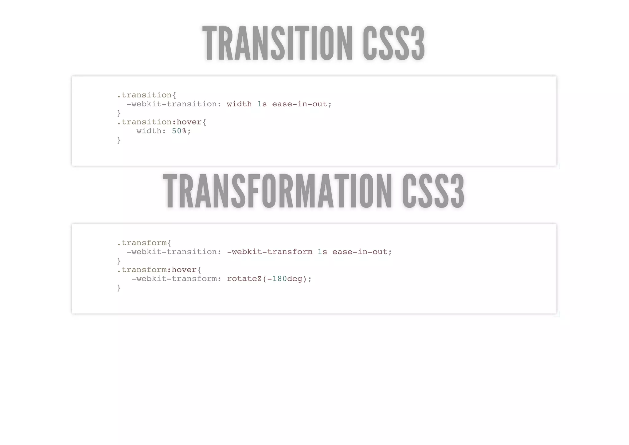
![NOUVEAUX FORMULAIRES
<input type="email" placeholder="mail@mail.com"/> mail@mail.com
<input type="number" min="13" max="110" value="20"/> 20
<input type="range" min="0" max="50" step="10"/>
<input type="search" results="10" placeholder="Search..." /> Search...
<input type="tel" pattern="^(?d{3})?[-s]d{3}[-s]d{4}.*?$" /> (555) 555-5555
<input type="color" placeholder="e.g. #bbbbbb" />
Avantage pour les claviers mobiles :](https://image.slidesharecdn.com/presentationhtml5css3bythibaut-120108041132-phpapp01/85/Presentation-html5-css3-by-thibaut-8-320.jpg)


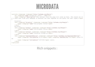
![NOUVEAUX FORMULAIRES
<input type="email" placeholder="mail@mail.com"/> mail@mail.com
<input type="number" min="13" max="110" value="20"/> 20
<input type="range" min="0" max="50" step="10"/>
<input type="search" results="10" placeholder="Search..." /> Search...
<input type="tel" pattern="^(?d{3})?[-s]d{3}[-s]d{4}.*?$" /> (555) 555-5555
<input type="color" placeholder="e.g. #bbbbbb" />
Avantage pour les claviers mobiles :](https://image.slidesharecdn.com/presentationhtml5css3bythibaut-120108041132-phpapp01/75/Presentation-html5-css3-by-thibaut-8-2048.jpg)


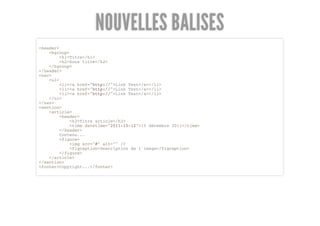
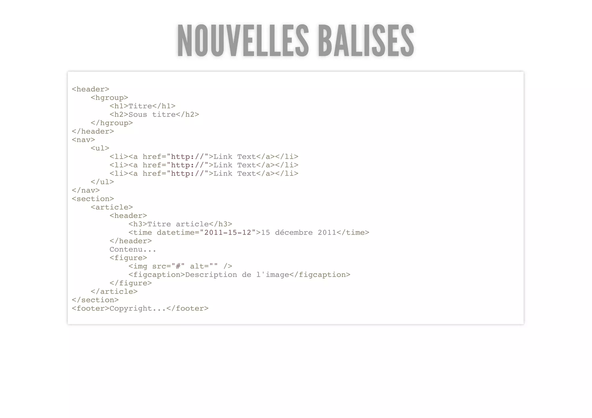
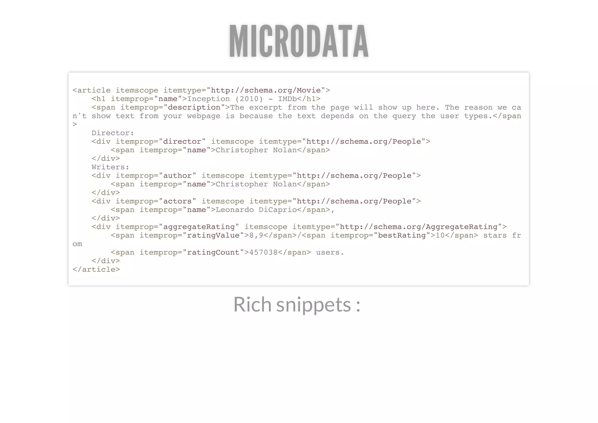
The document discusses new features in HTML5 including: 1. New semantic HTML5 elements like <header>, <nav>, <section>, <article>, and <footer> that help structure and provide meaning to content. 2. New attributes like "role", "data-", "aria-", "draggable", and microdata attributes that add more semantics and meaning. 3. New form input types like email, number, date, time, etc. and new form attributes that make forms more usable.


