Downloaded 302 times


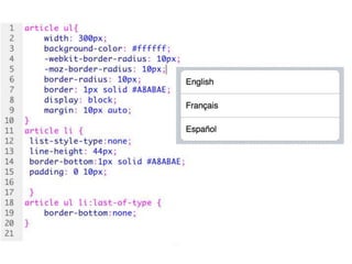
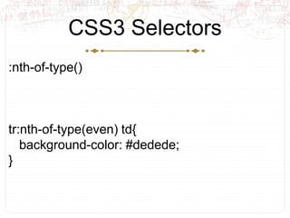
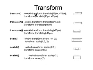
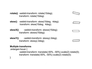
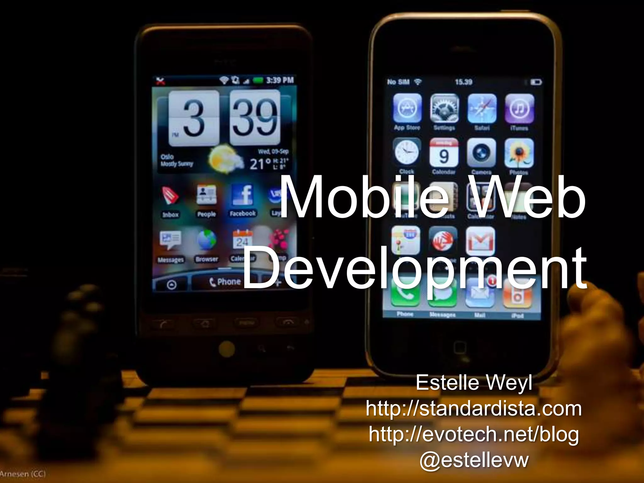

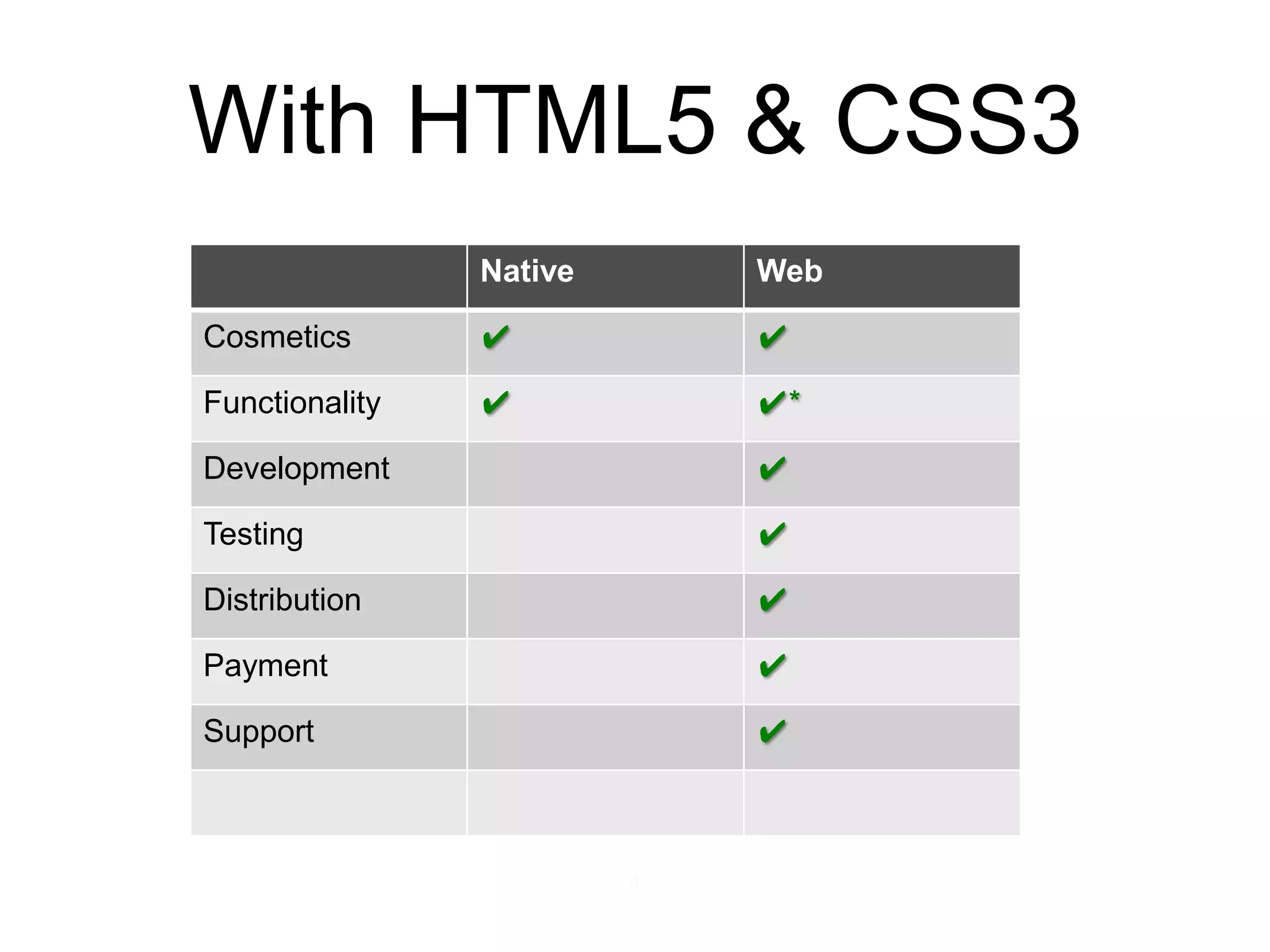
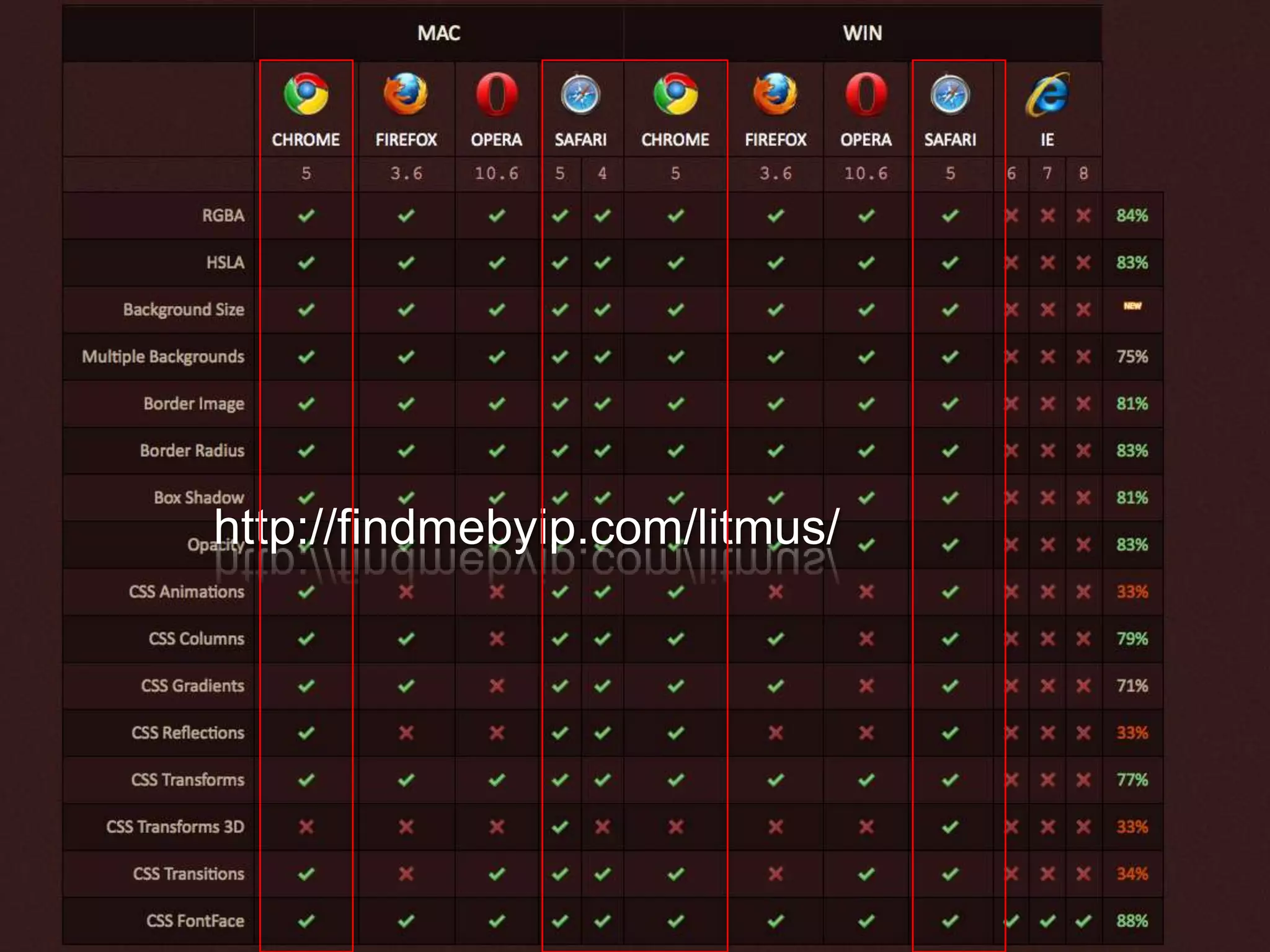

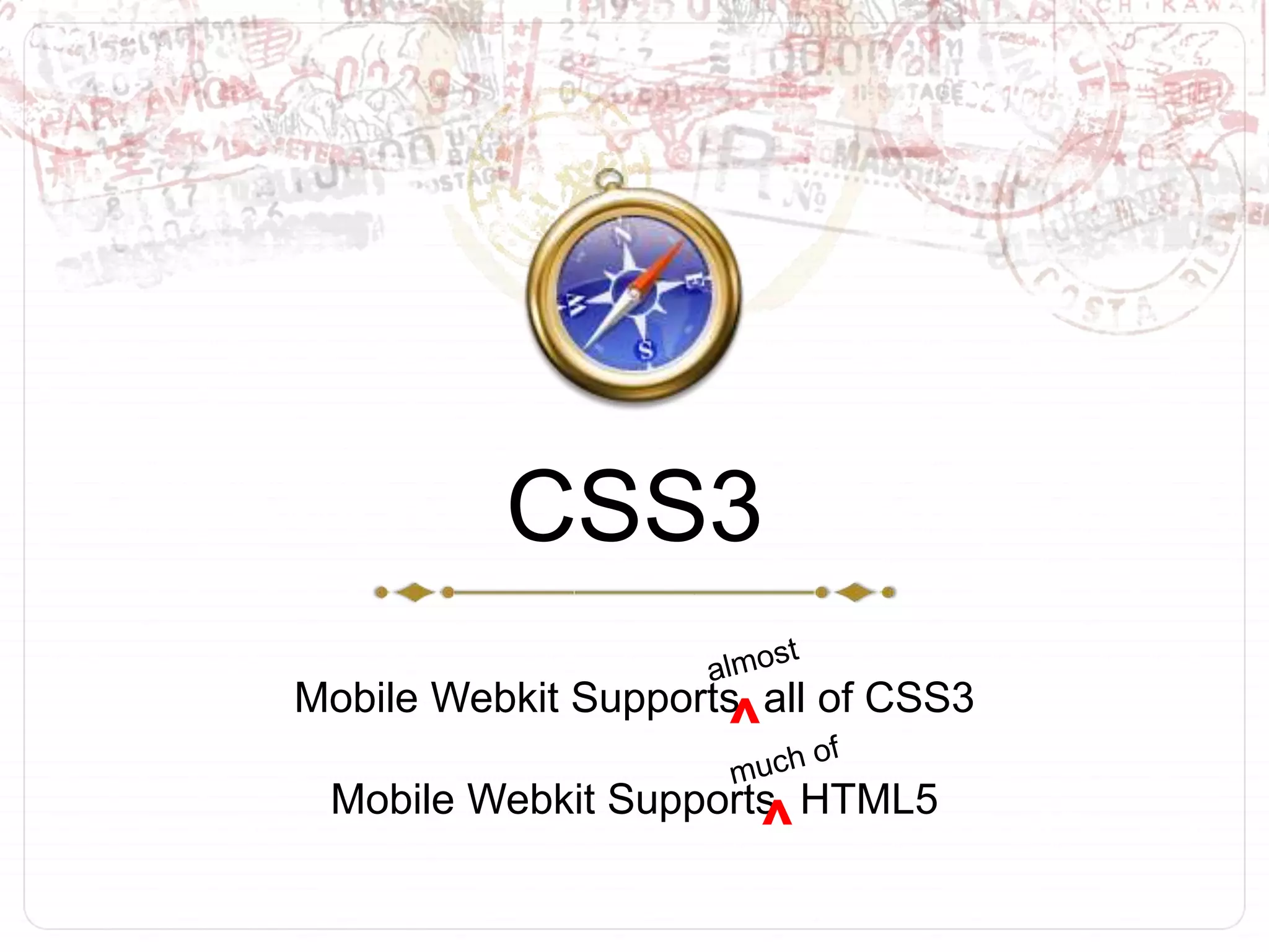
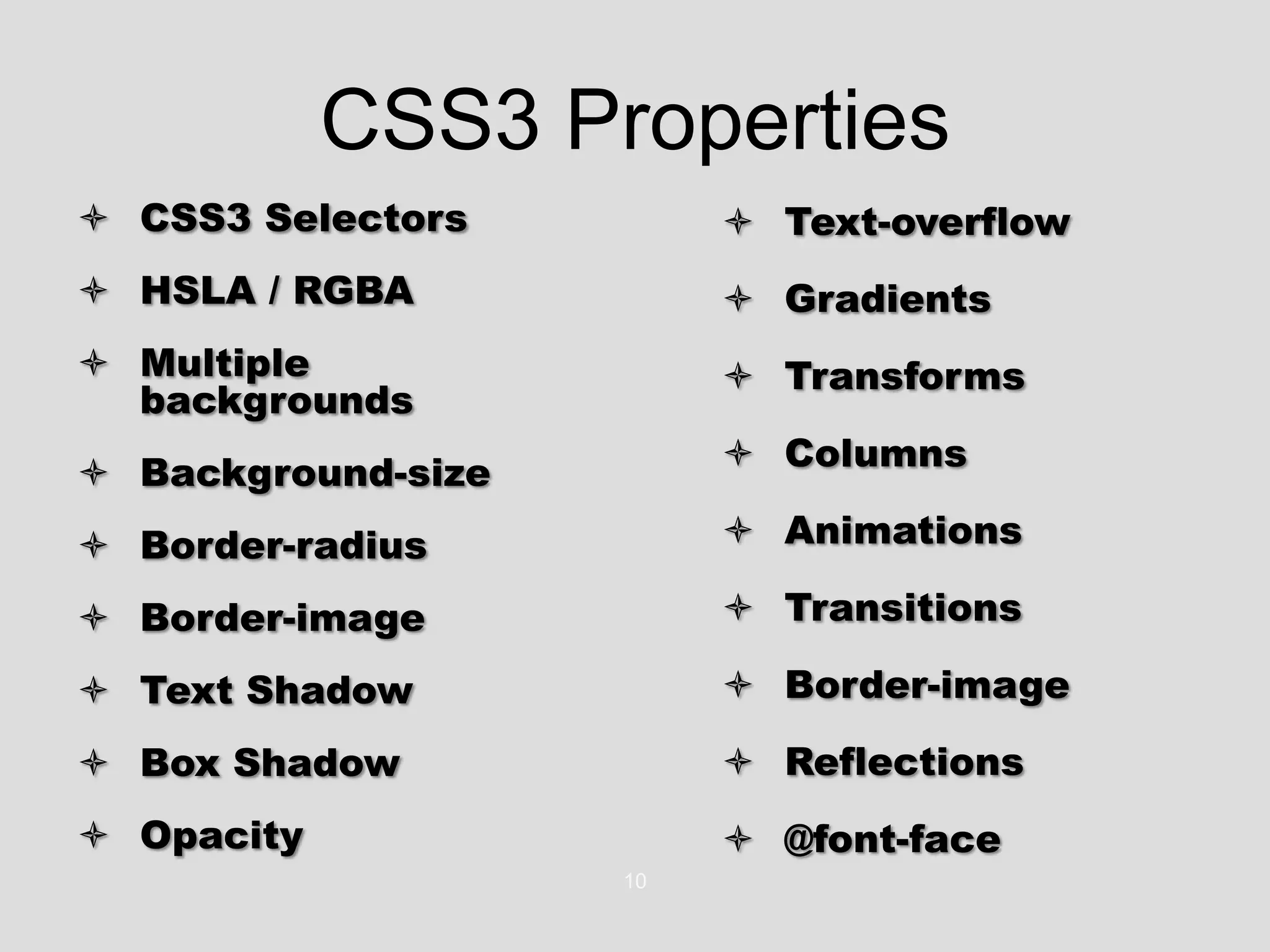
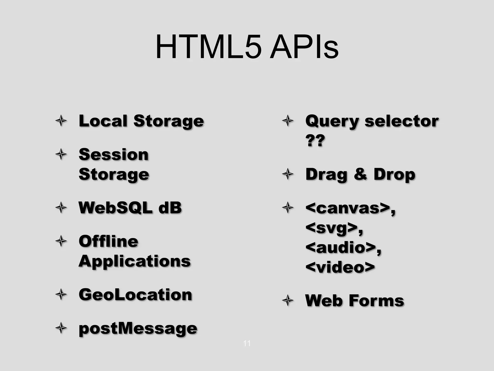
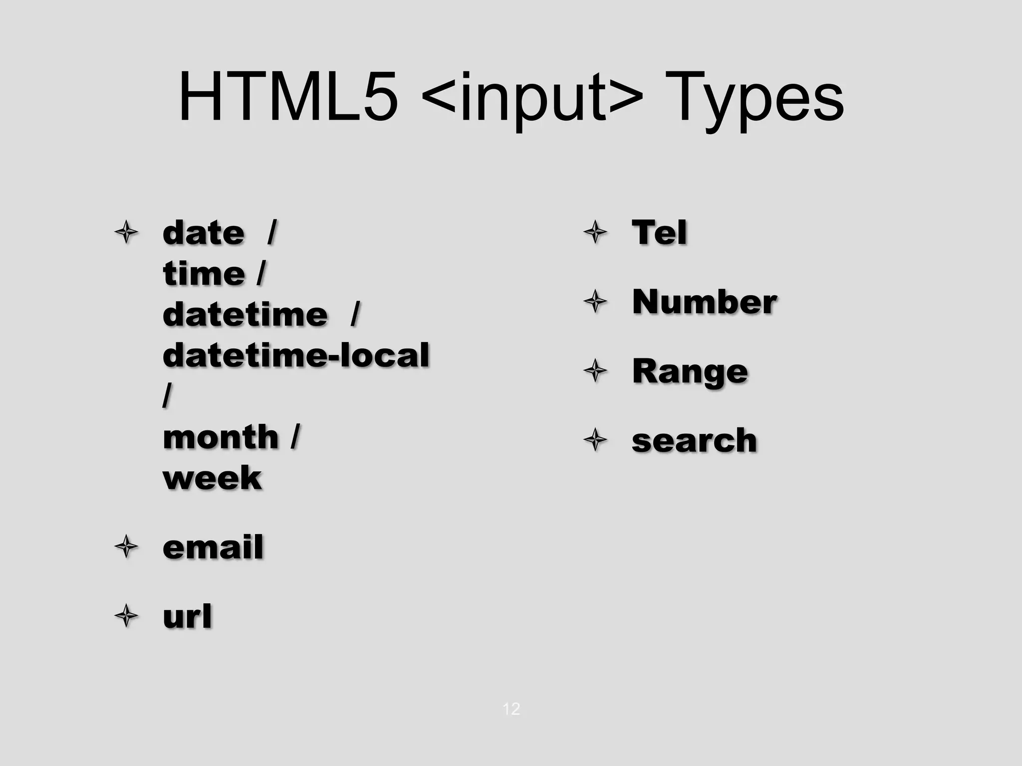
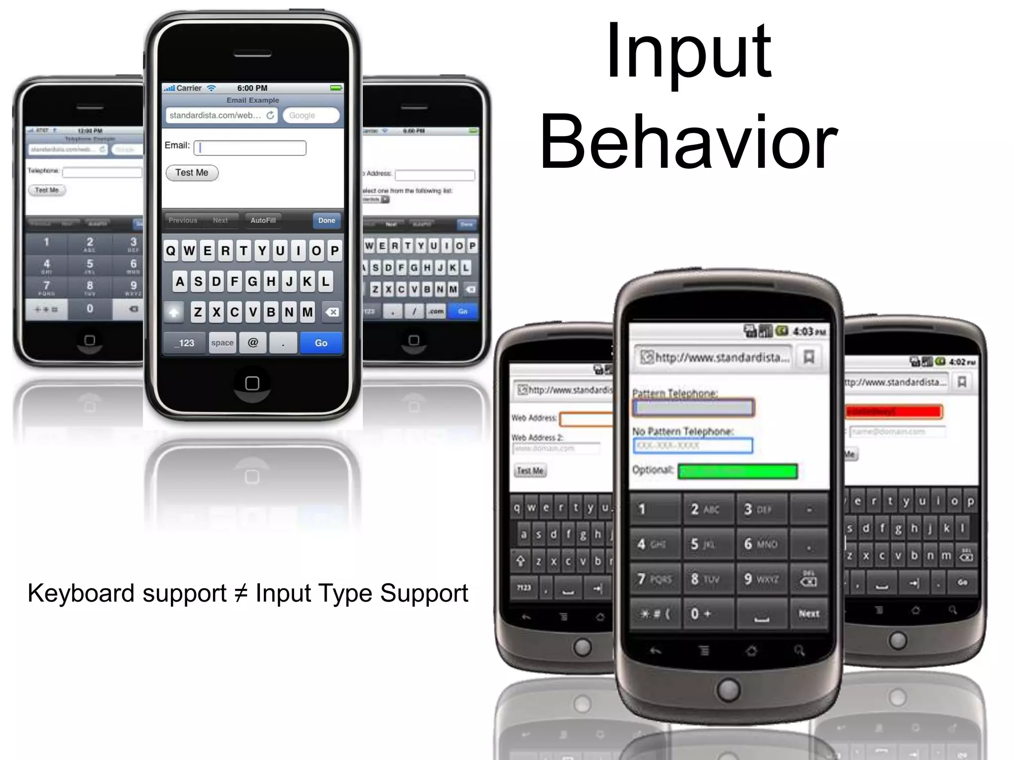
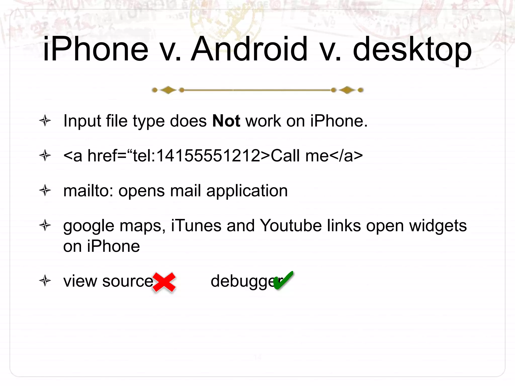
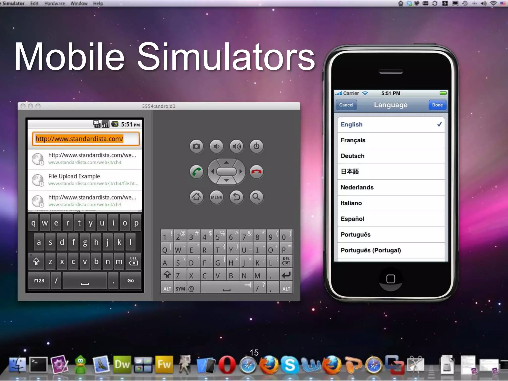
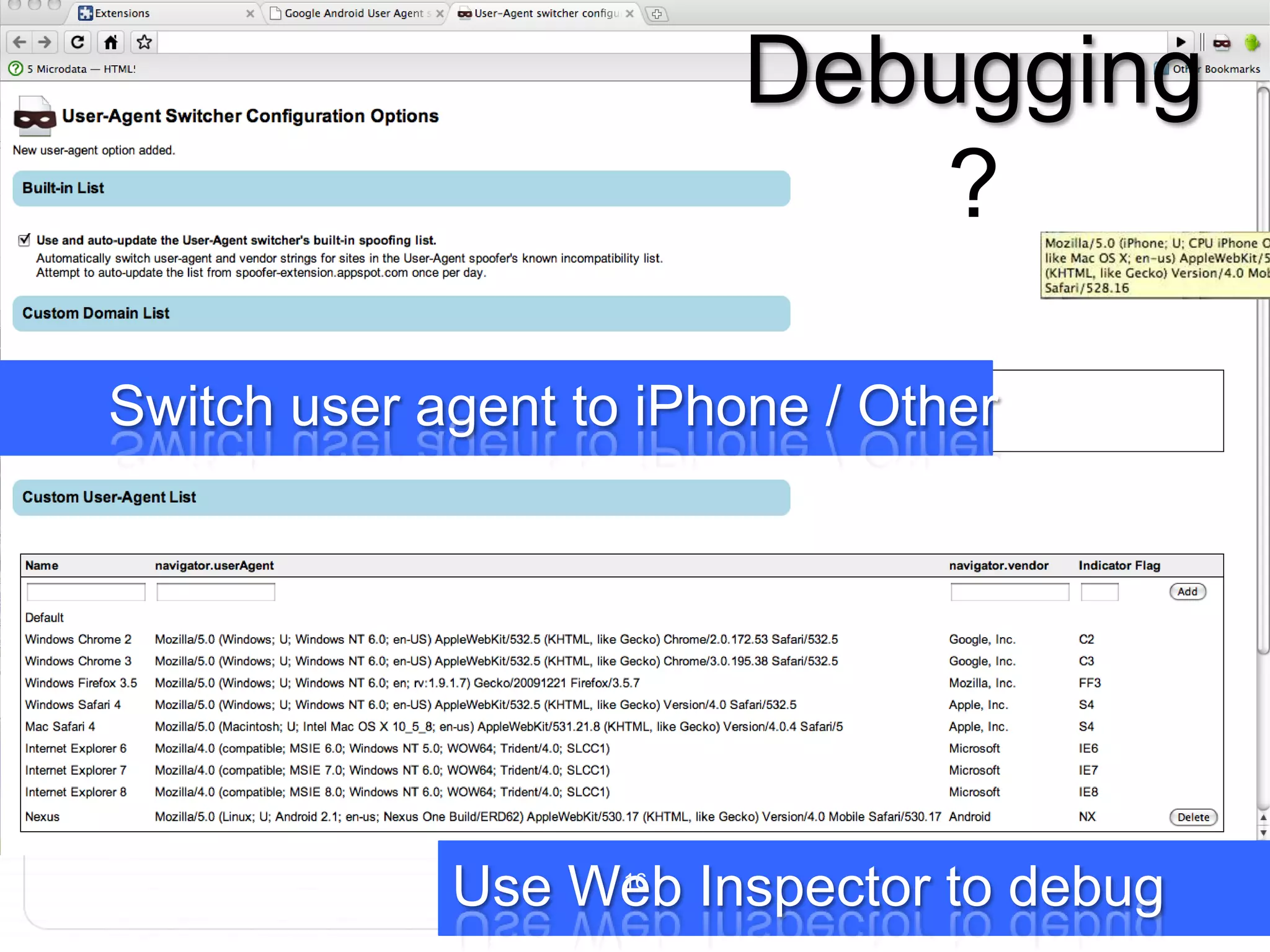
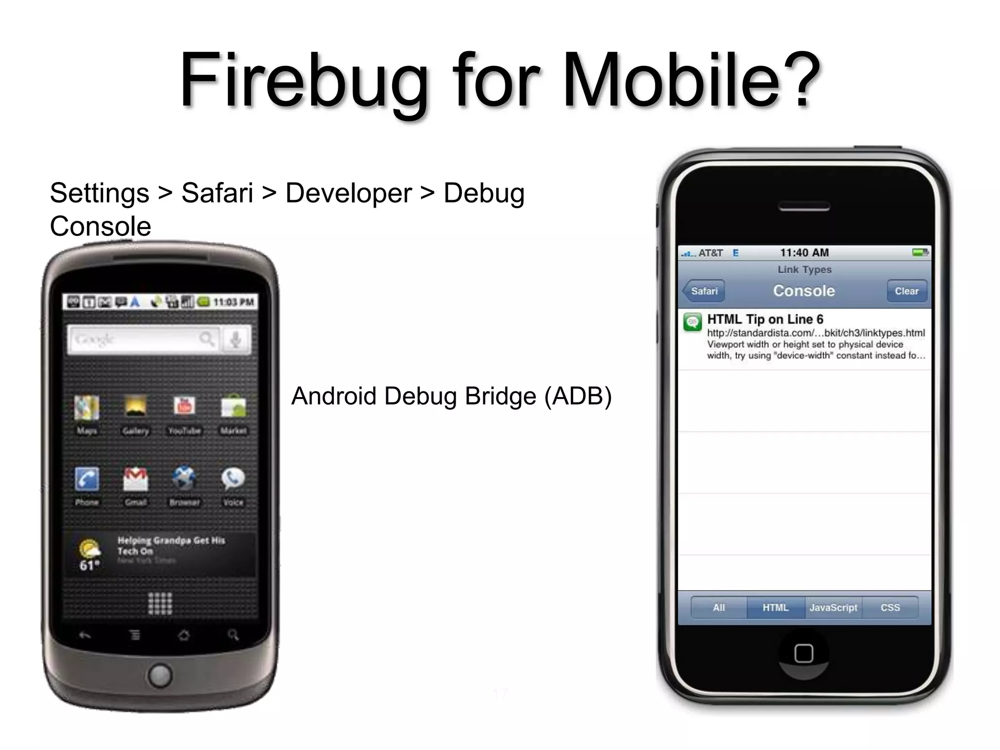
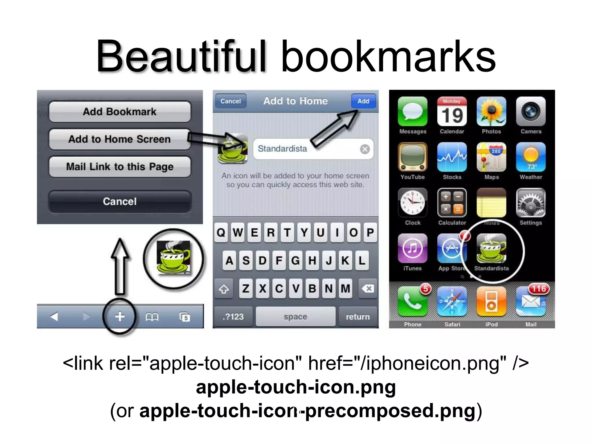


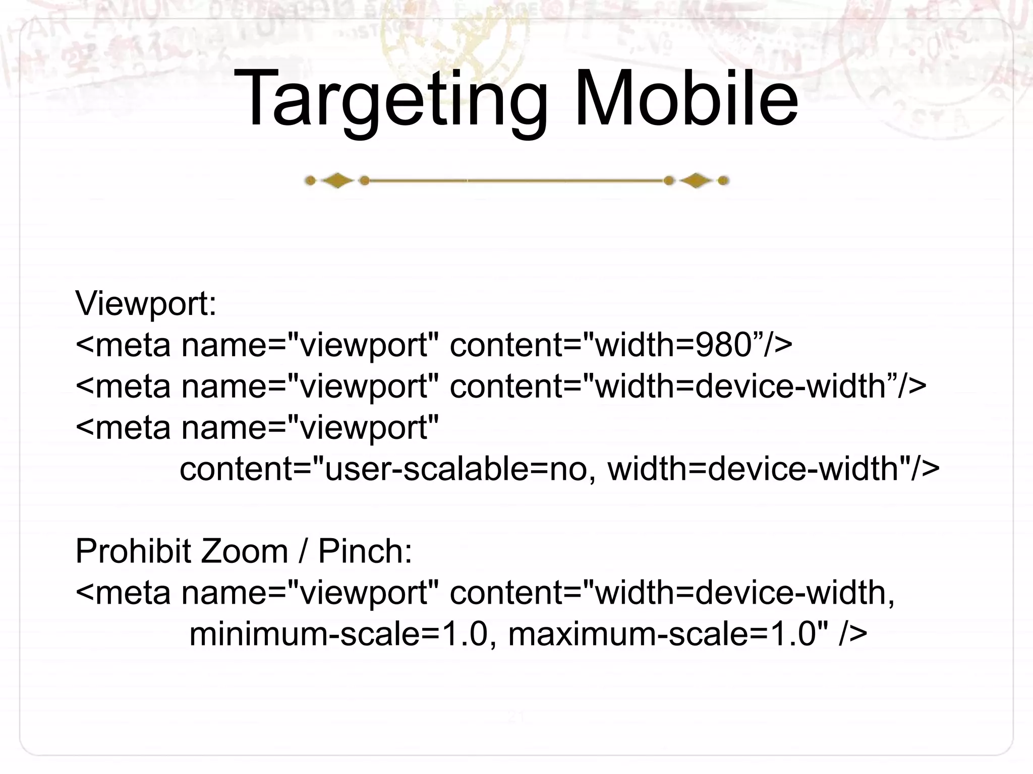
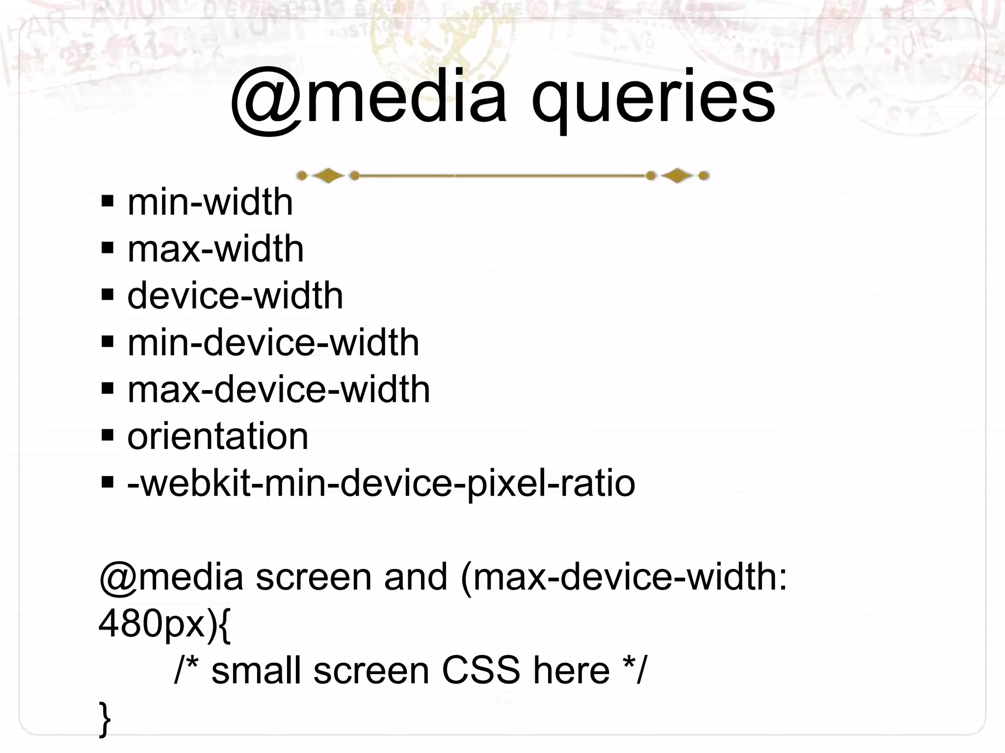


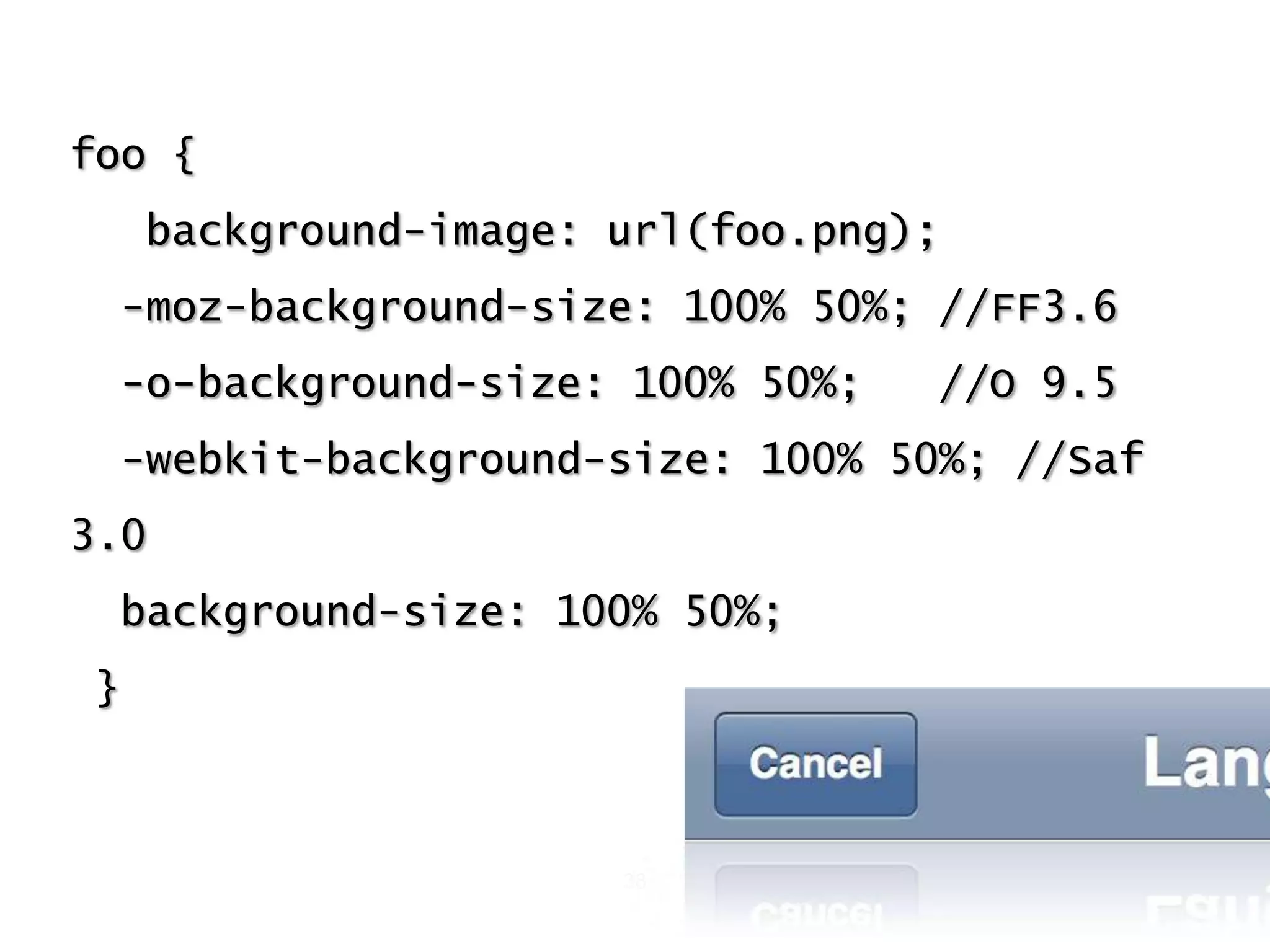
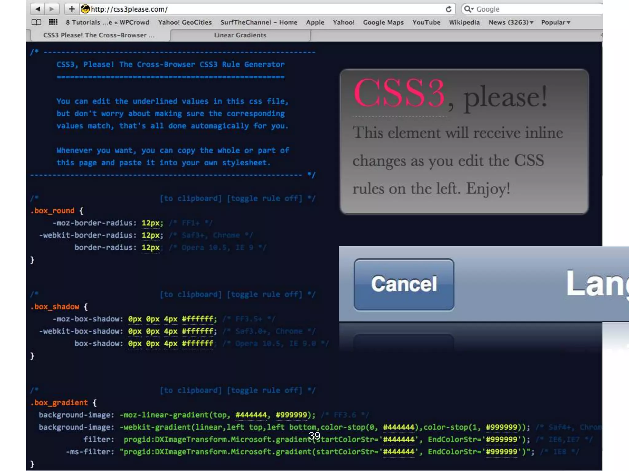
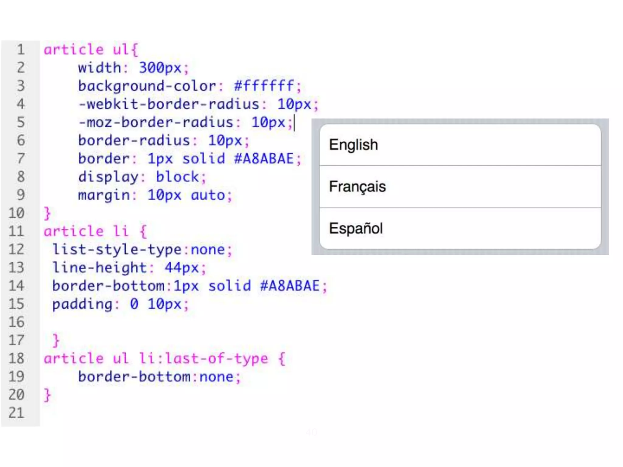
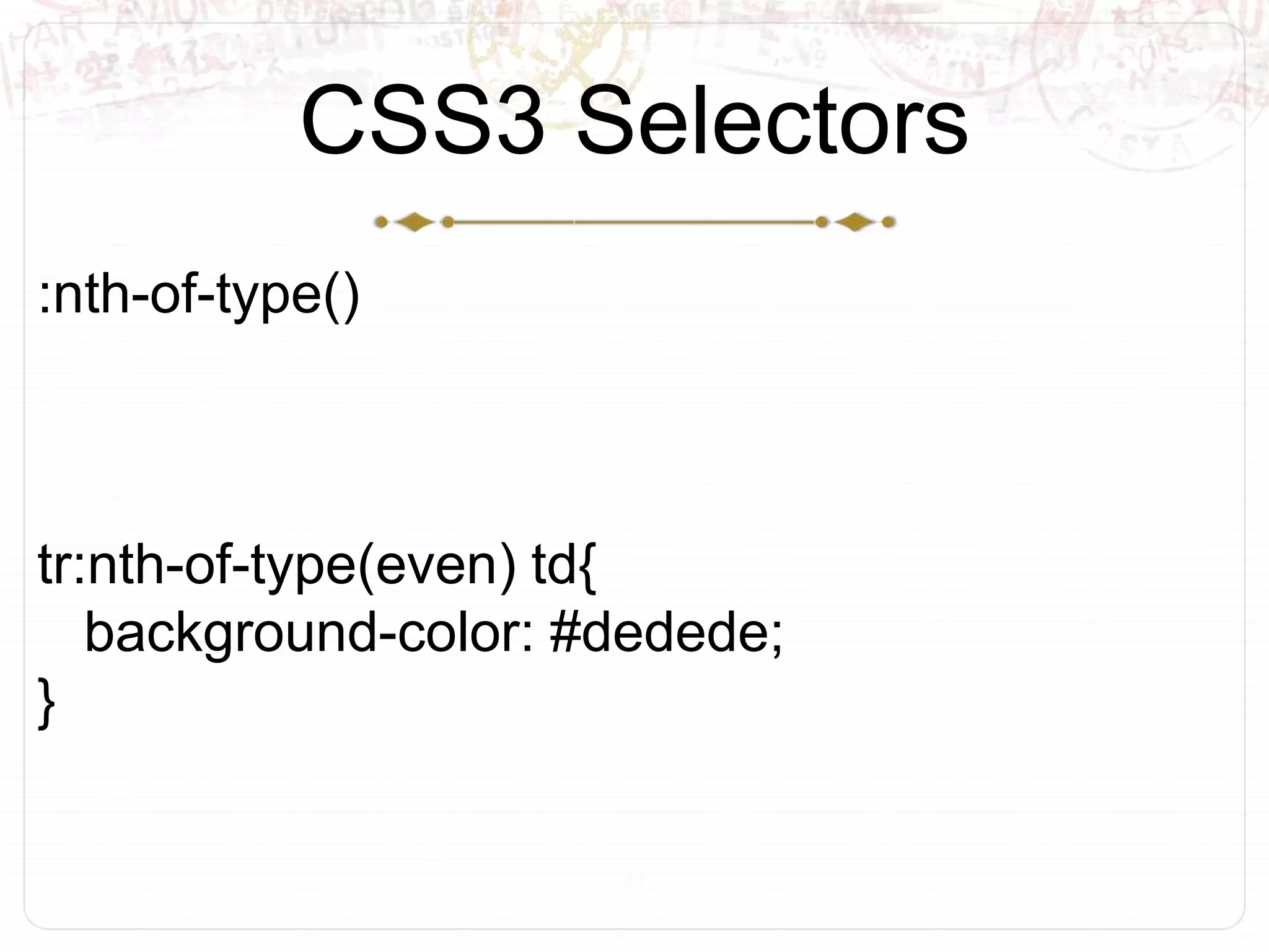


The document discusses mobile web development, focusing on the use of HTML5 and CSS3, including their compatibility on iPhone and Android devices. It covers various topics such as debugging, mobile applications settings, and media queries for responsive design. Additionally, the document highlights relevant resources and tools for improving mobile web applications.


![UiPath Automation Suite Installation (Hands-On) [2/3]](https://cdn.slidesharecdn.com/ss_thumbnails/automationsuitecommunitysession2-251015095633-a6d862f1-thumbnail.jpg?width=600ounds&width=560&fit=bounds)


