


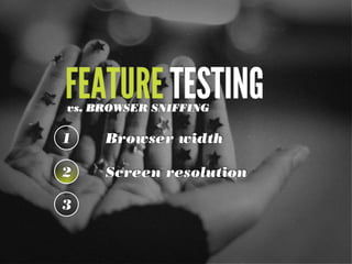
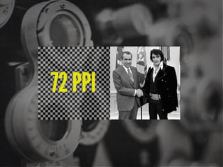
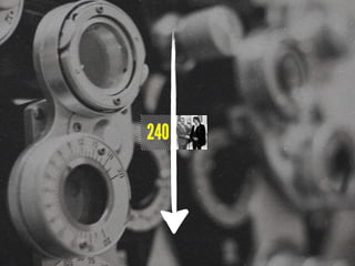
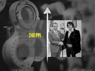
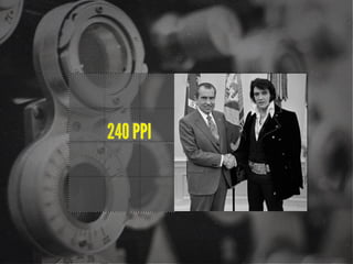
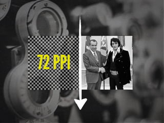
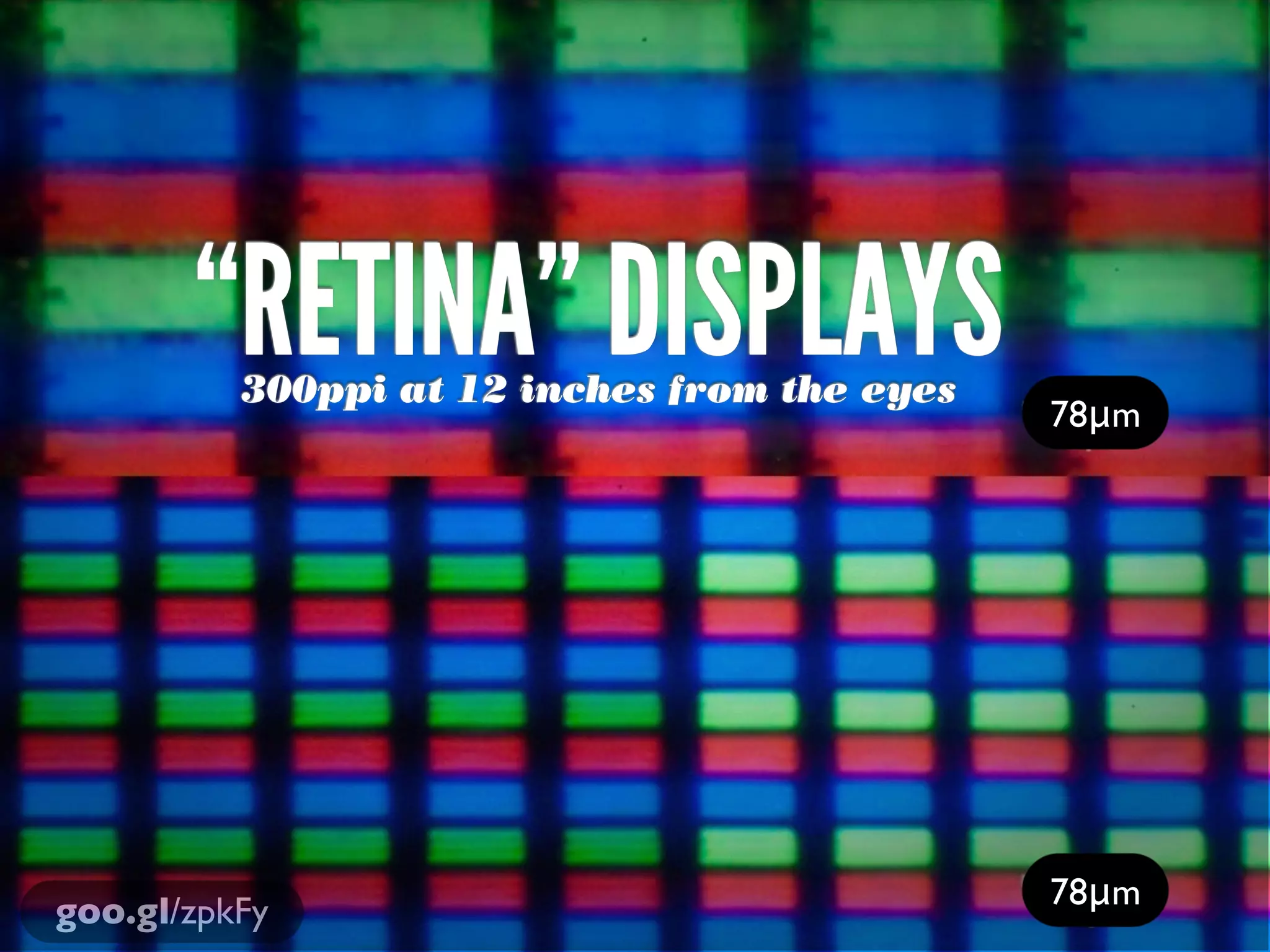
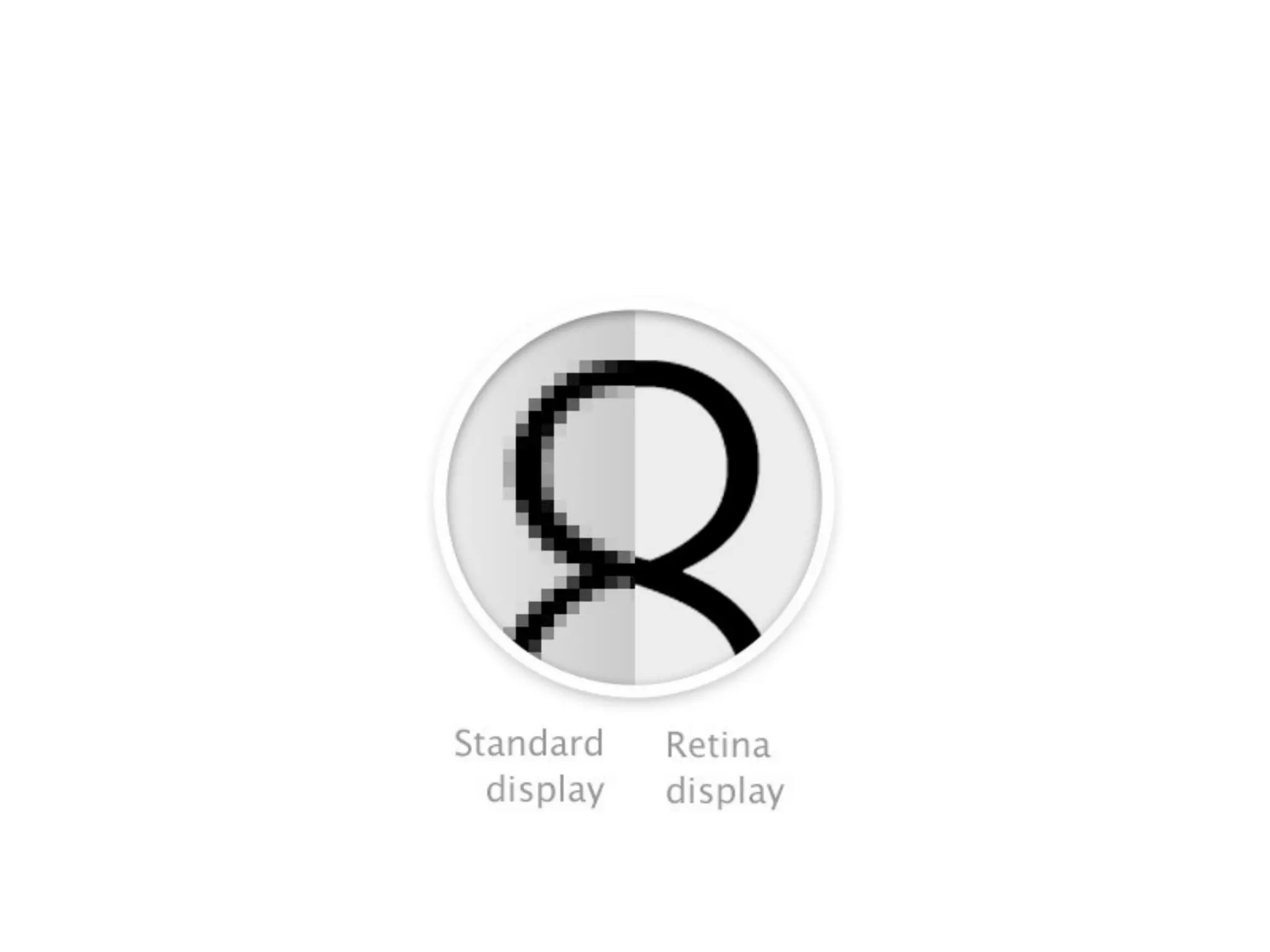
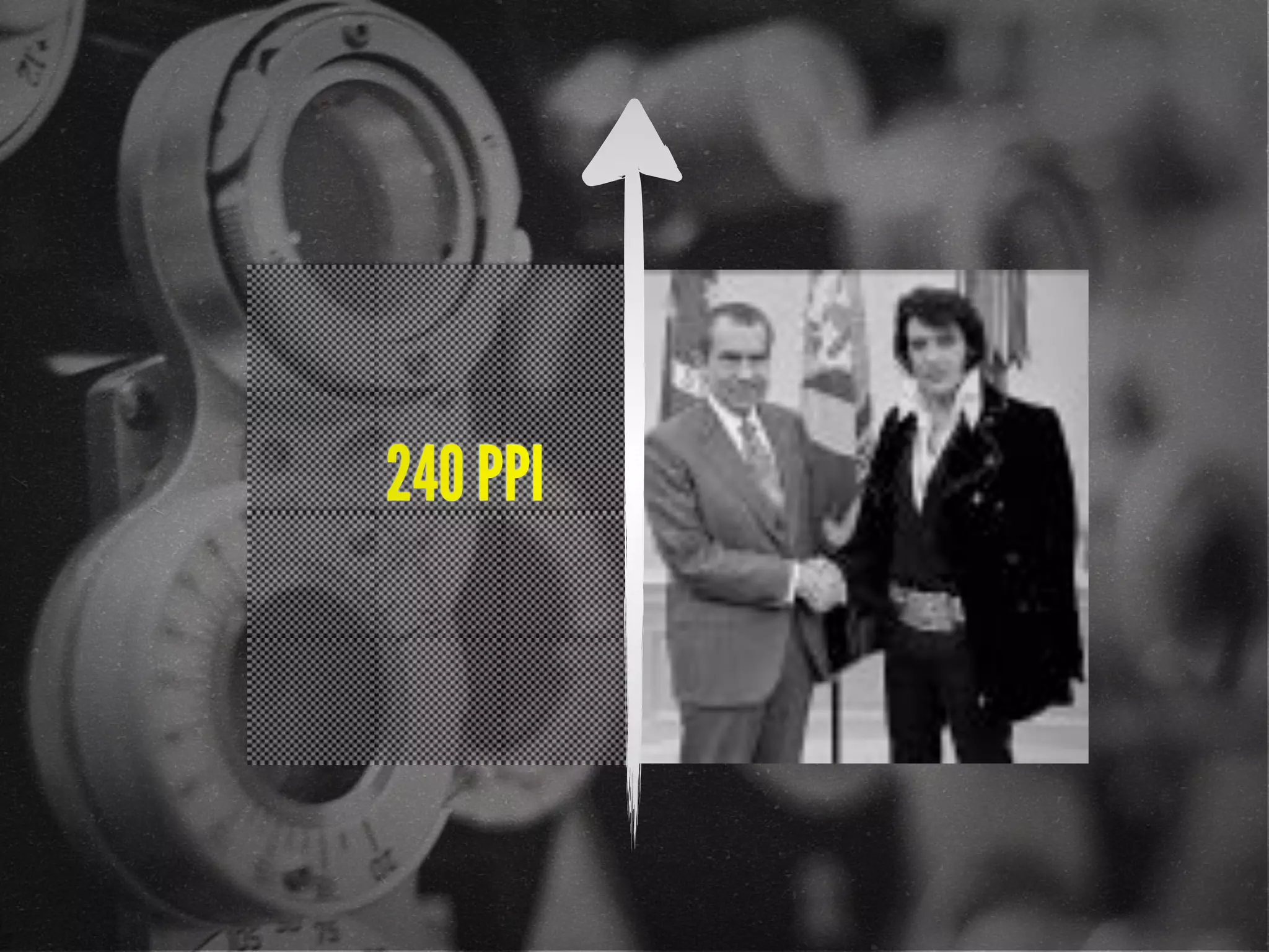
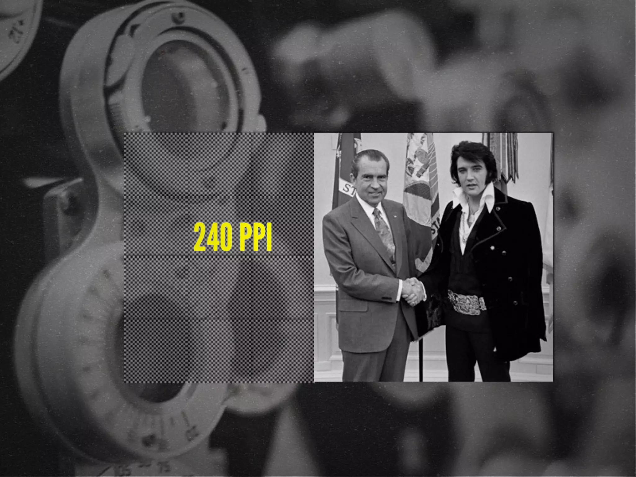
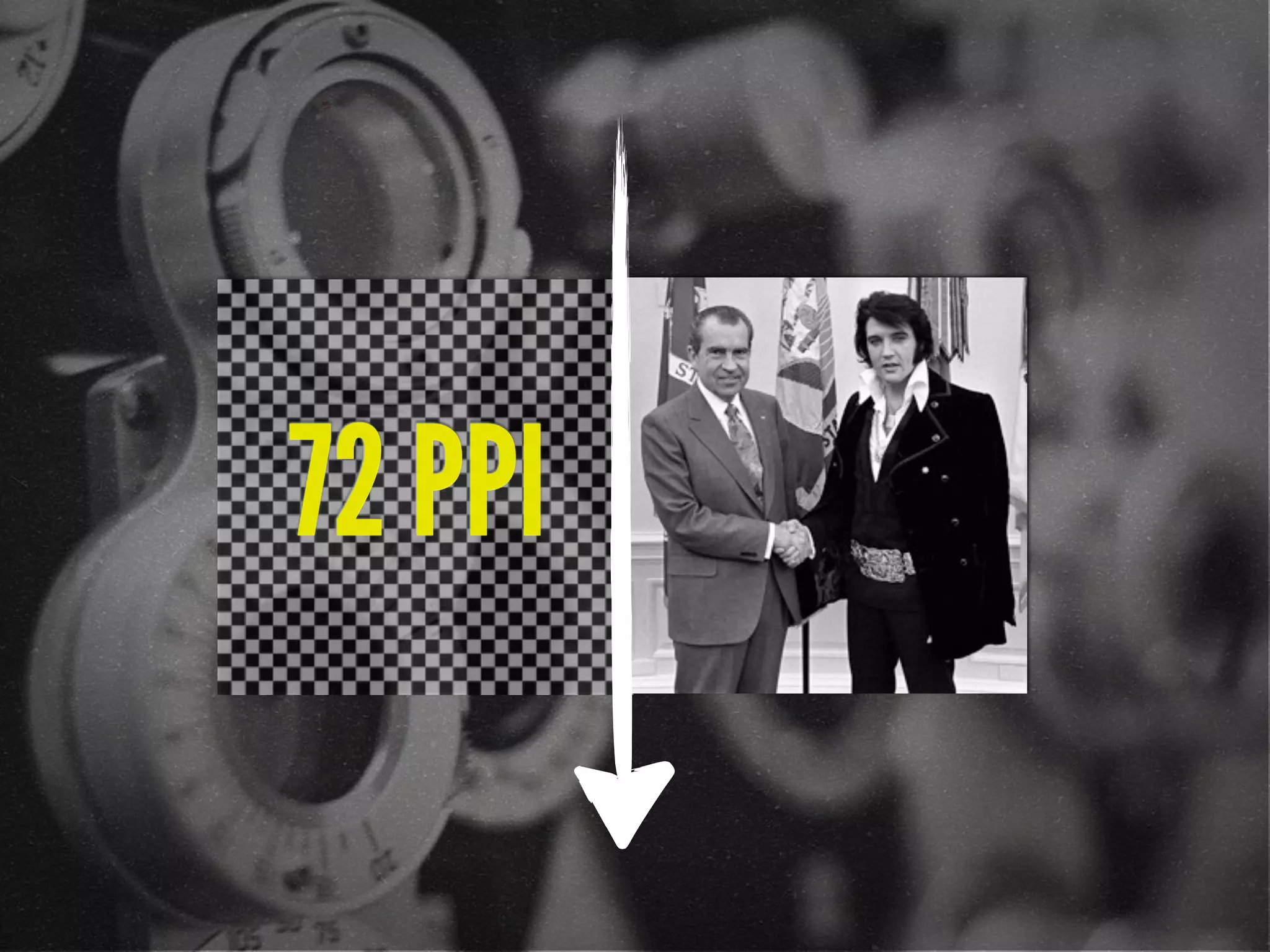
![72 points-per-inch
x [1+(1/3)]
= 96 PPI](https://image.slidesharecdn.com/adaptive-images-psuwebv2-130606095220-phpapp01/85/psuweb-Adaptive-Images-in-Responsive-Web-Design-29-320.jpg)
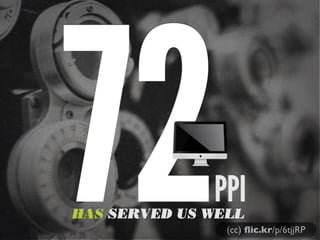
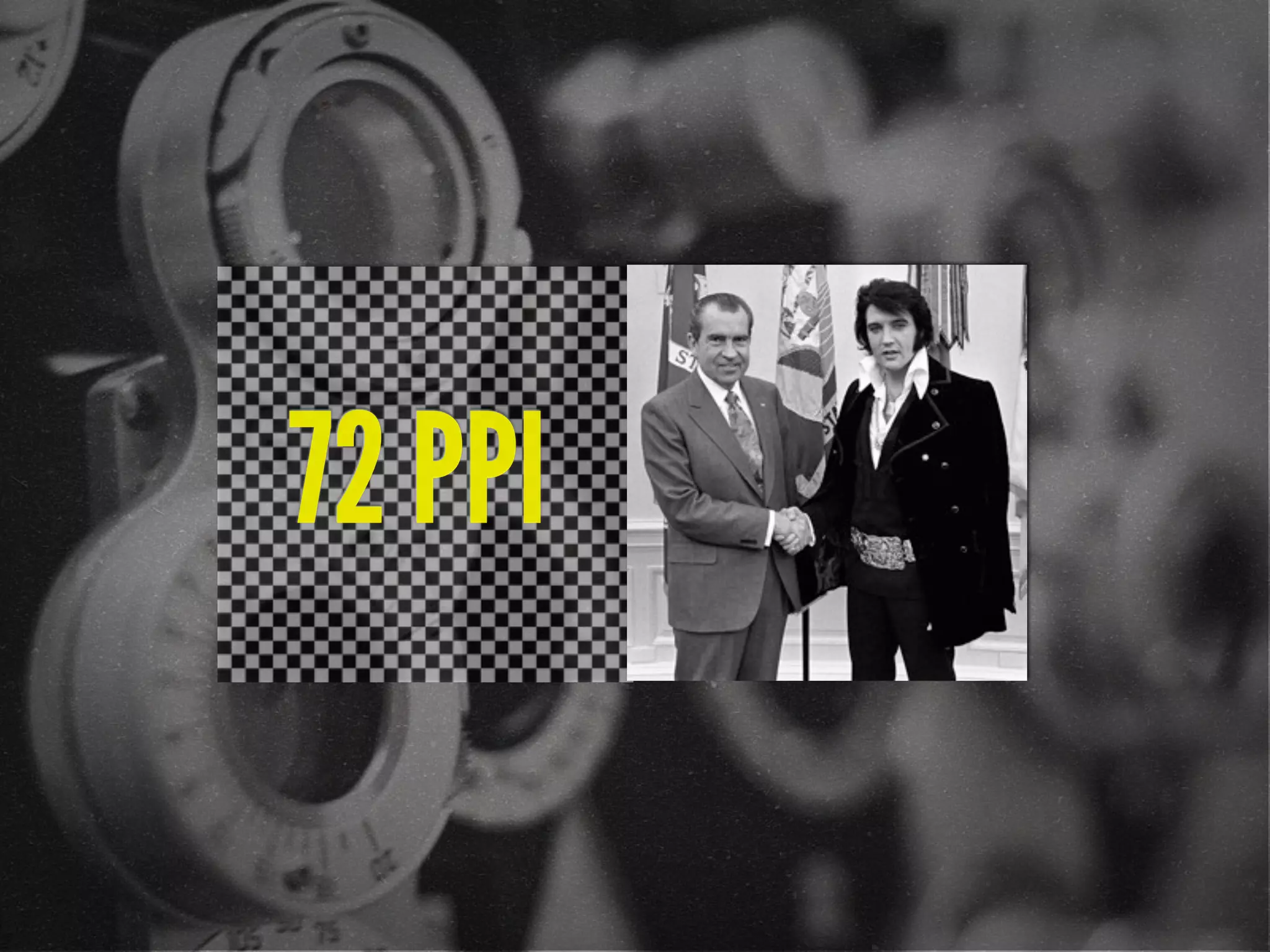
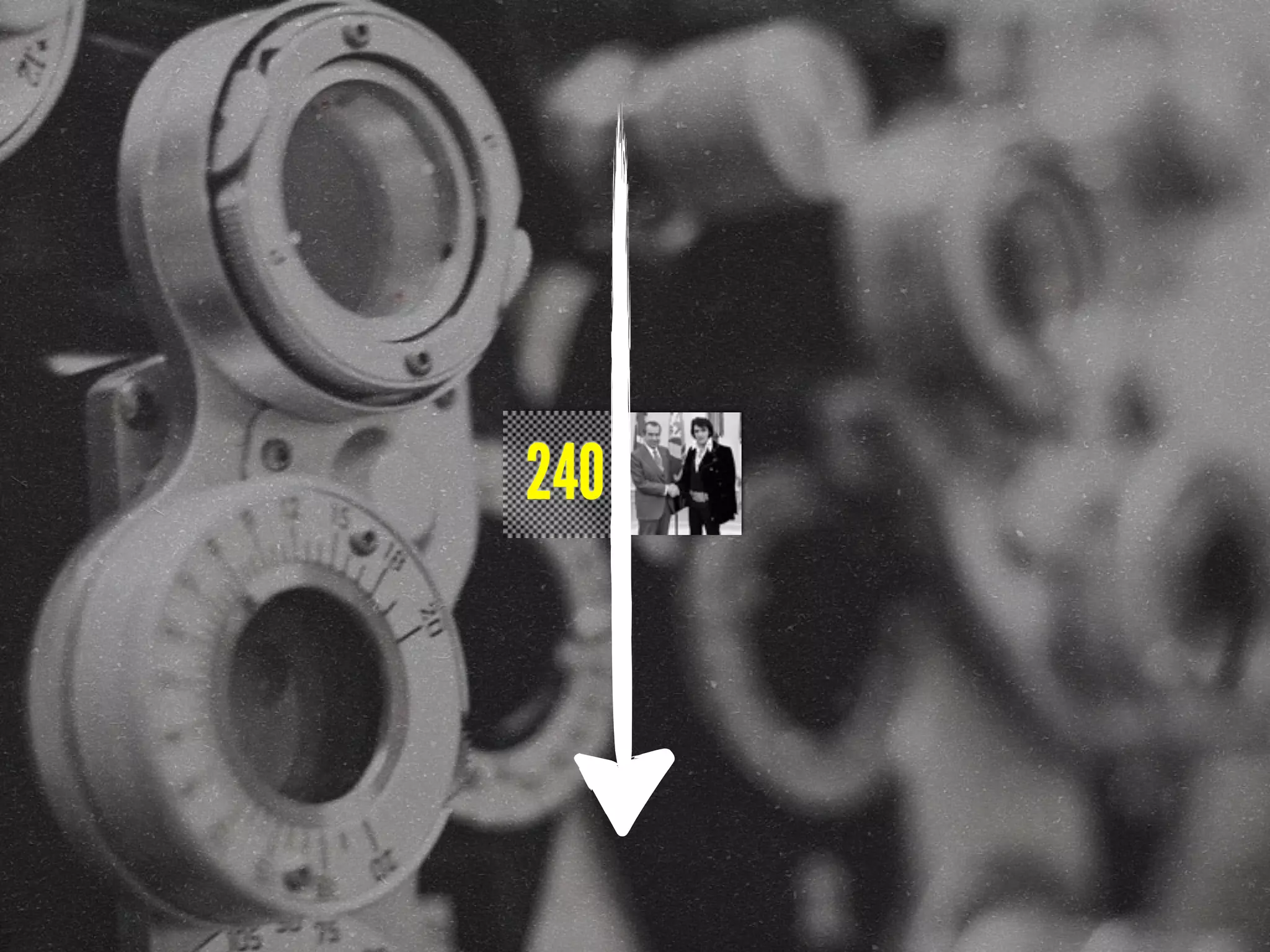
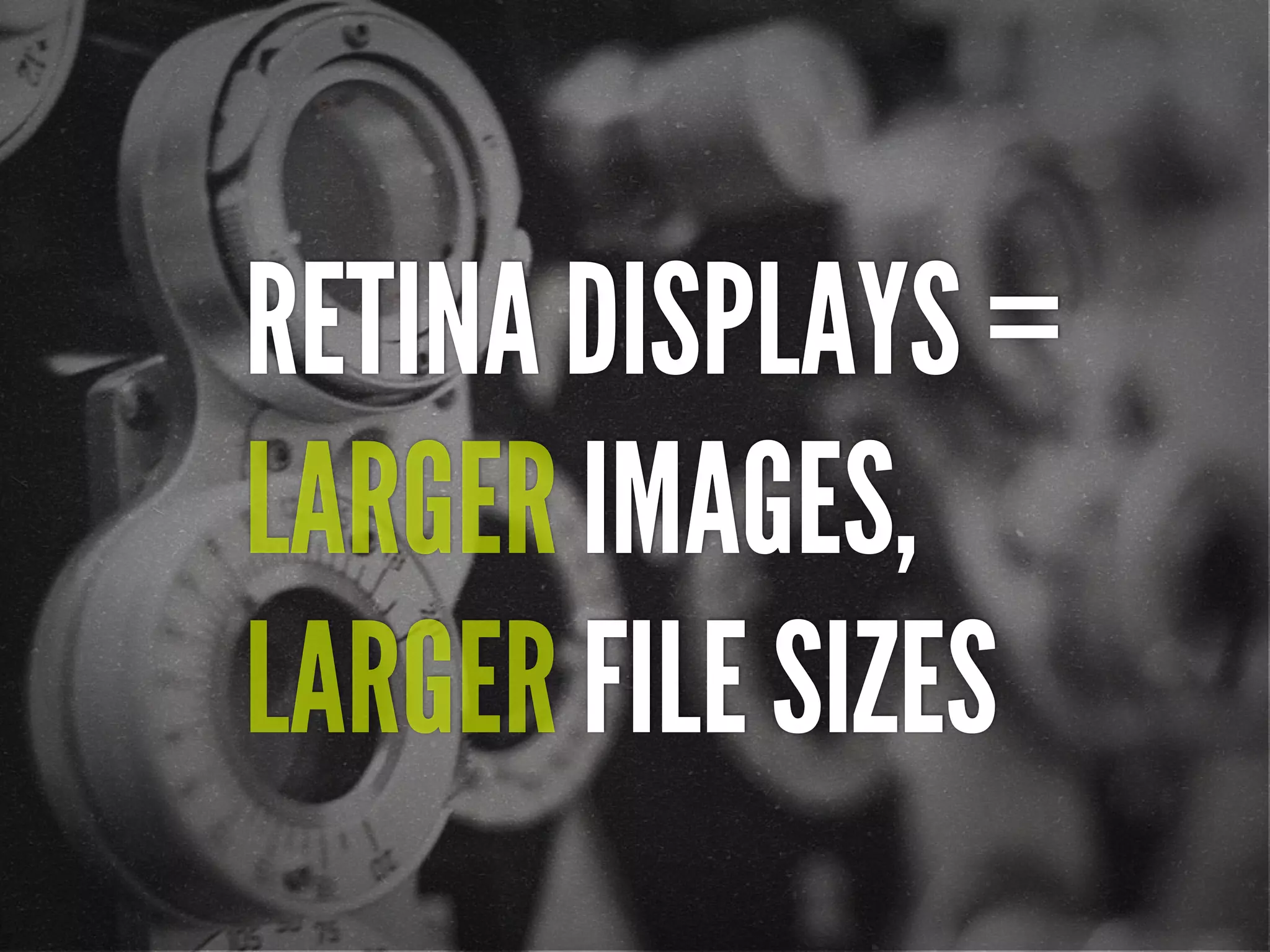
![[In 2013, Intel sees their
product line] offer a higher
resolution experience than a
top-of-the-line 1080p HDTV.”
“
http://liliputing.com/2012/04/intel-retina-laptop-
desktop-displays-coming-in-2013.html](https://image.slidesharecdn.com/adaptive-images-psuwebv2-130606095220-phpapp01/85/psuweb-Adaptive-Images-in-Responsive-Web-Design-32-320.jpg)
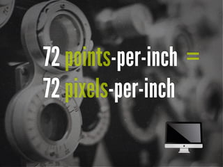
![Native speed test
// @Modernizr's network-connection.js
connection = navigator.connection || {
type: 0 }, // polyfill
isSlowConnection = connection.type == 3
|| connection.type == 4
| /^[23]g$/.test(connection.type);
http://davidbcalhoun.com/2010/using-navigator-connection-android](https://image.slidesharecdn.com/adaptive-images-psuwebv2-130606095220-phpapp01/85/psuweb-Adaptive-Images-in-Responsive-Web-Design-45-320.jpg)
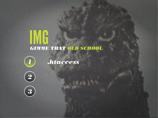
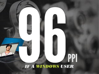
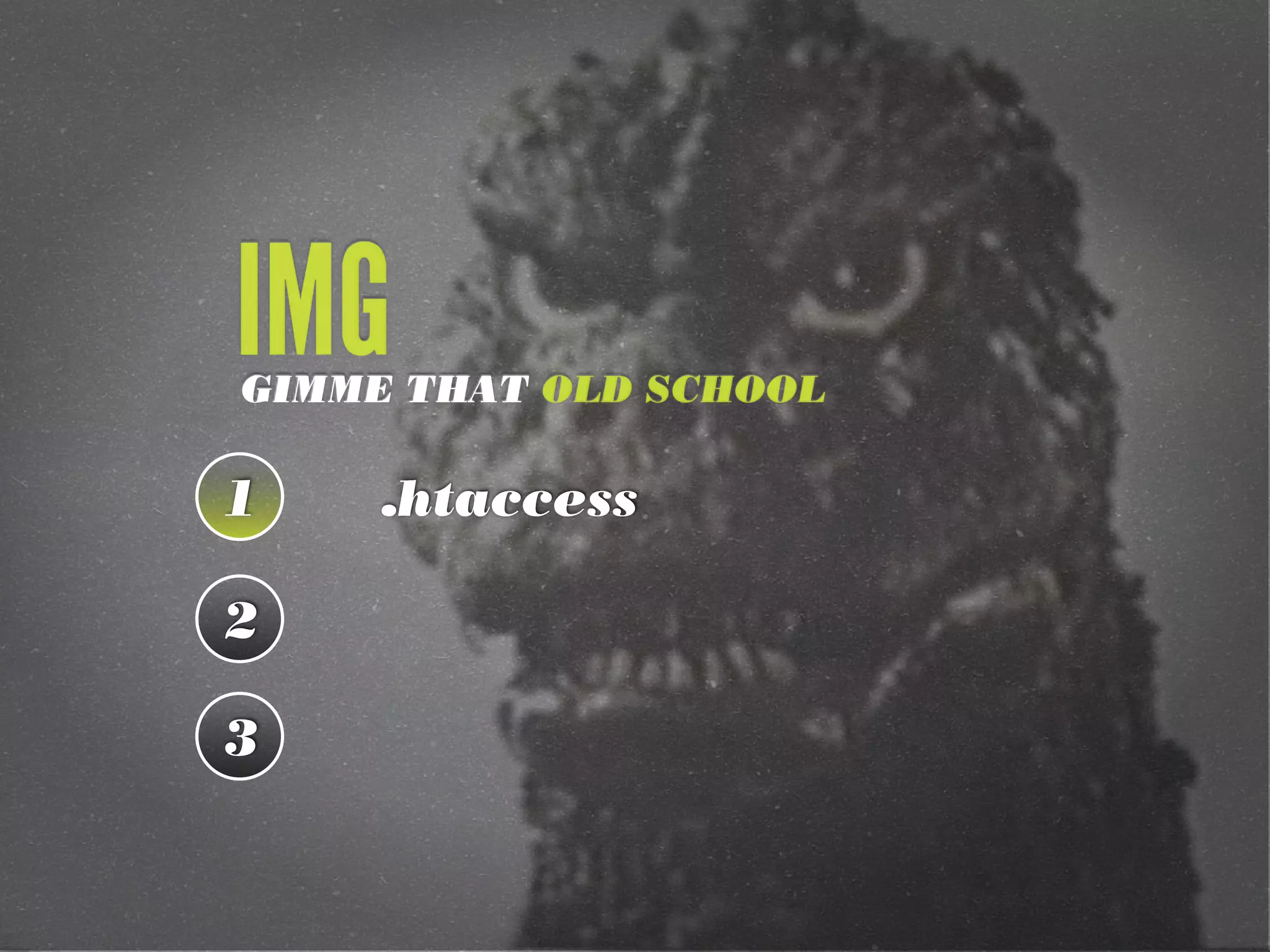
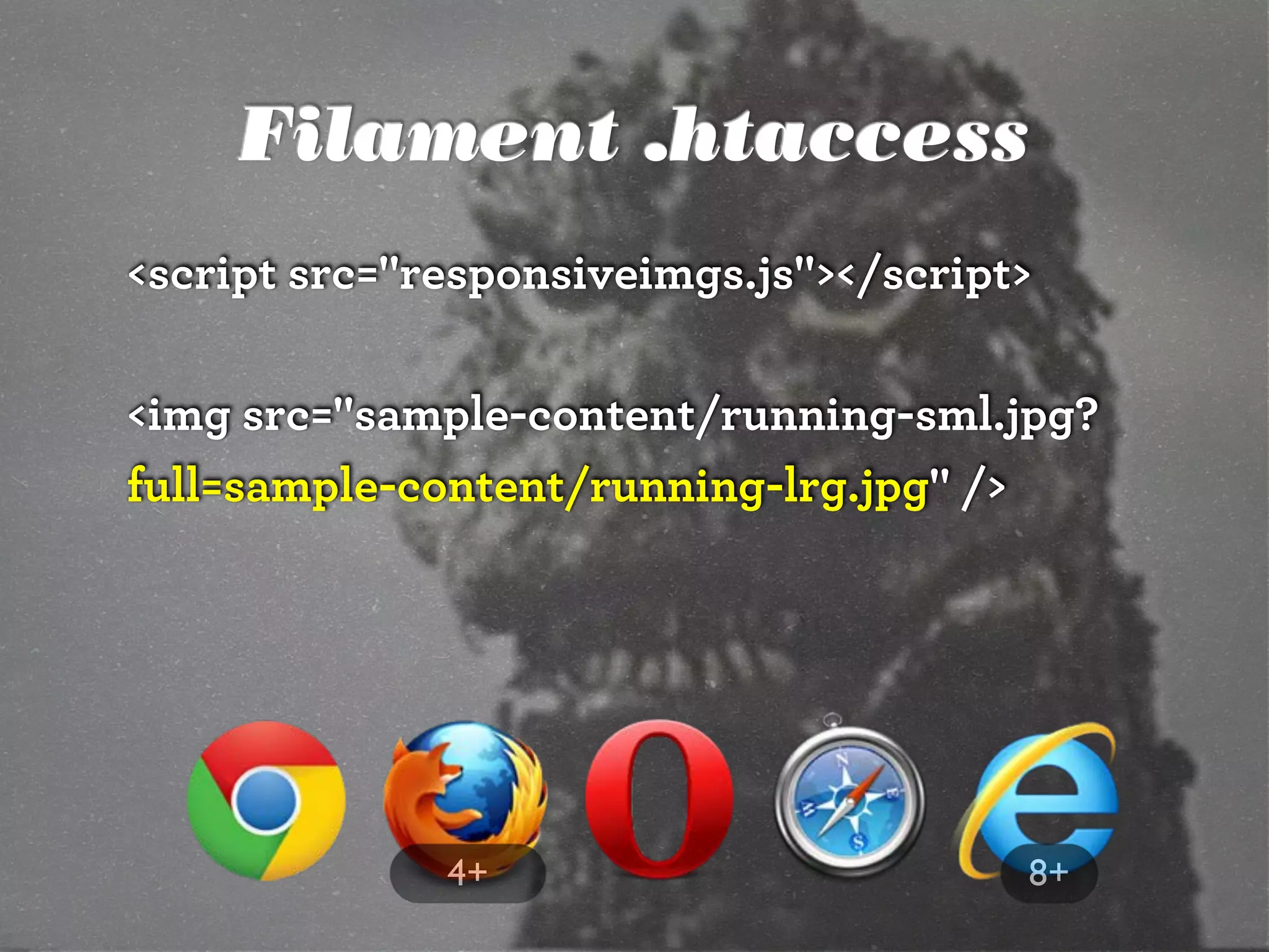
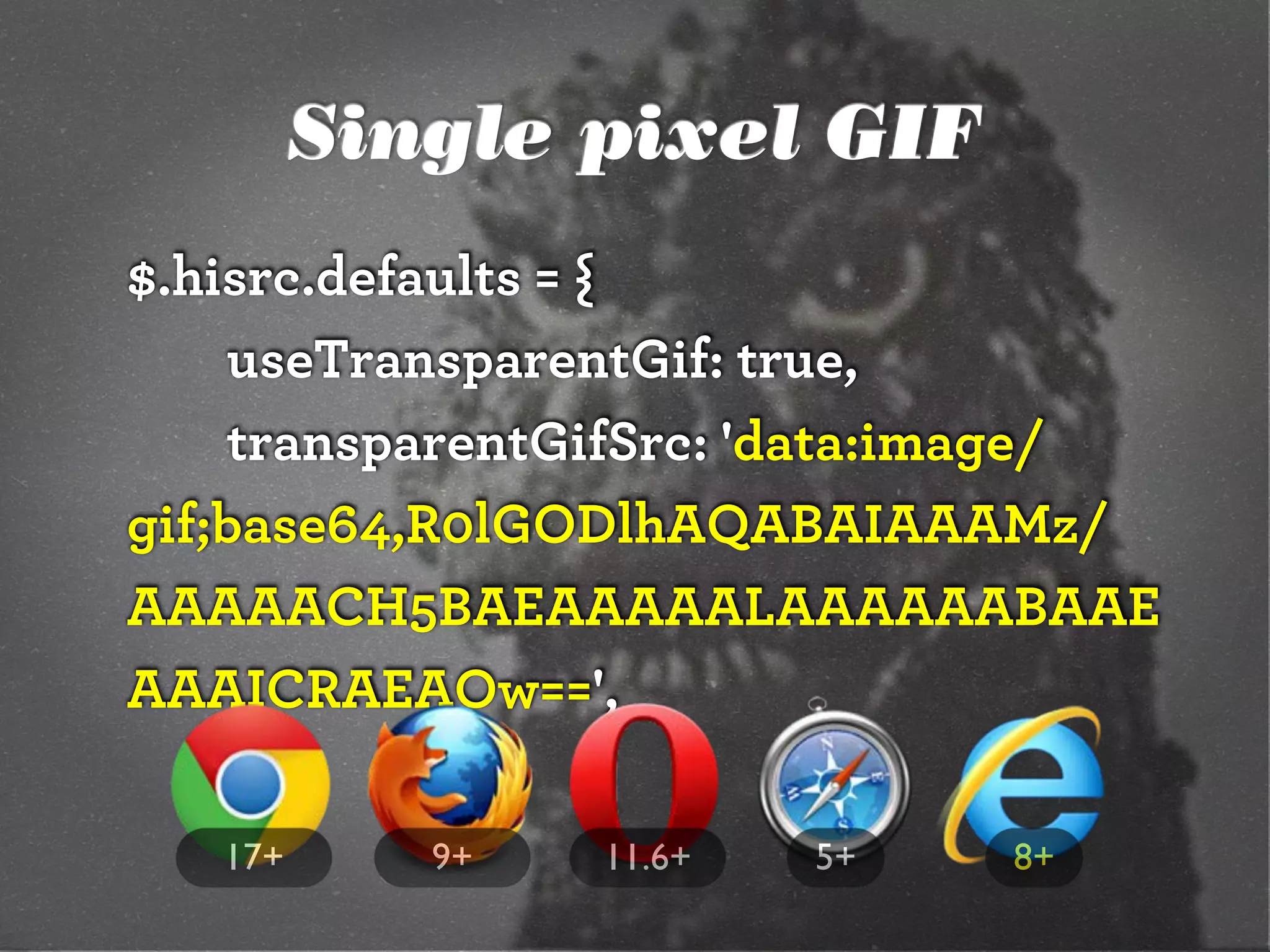
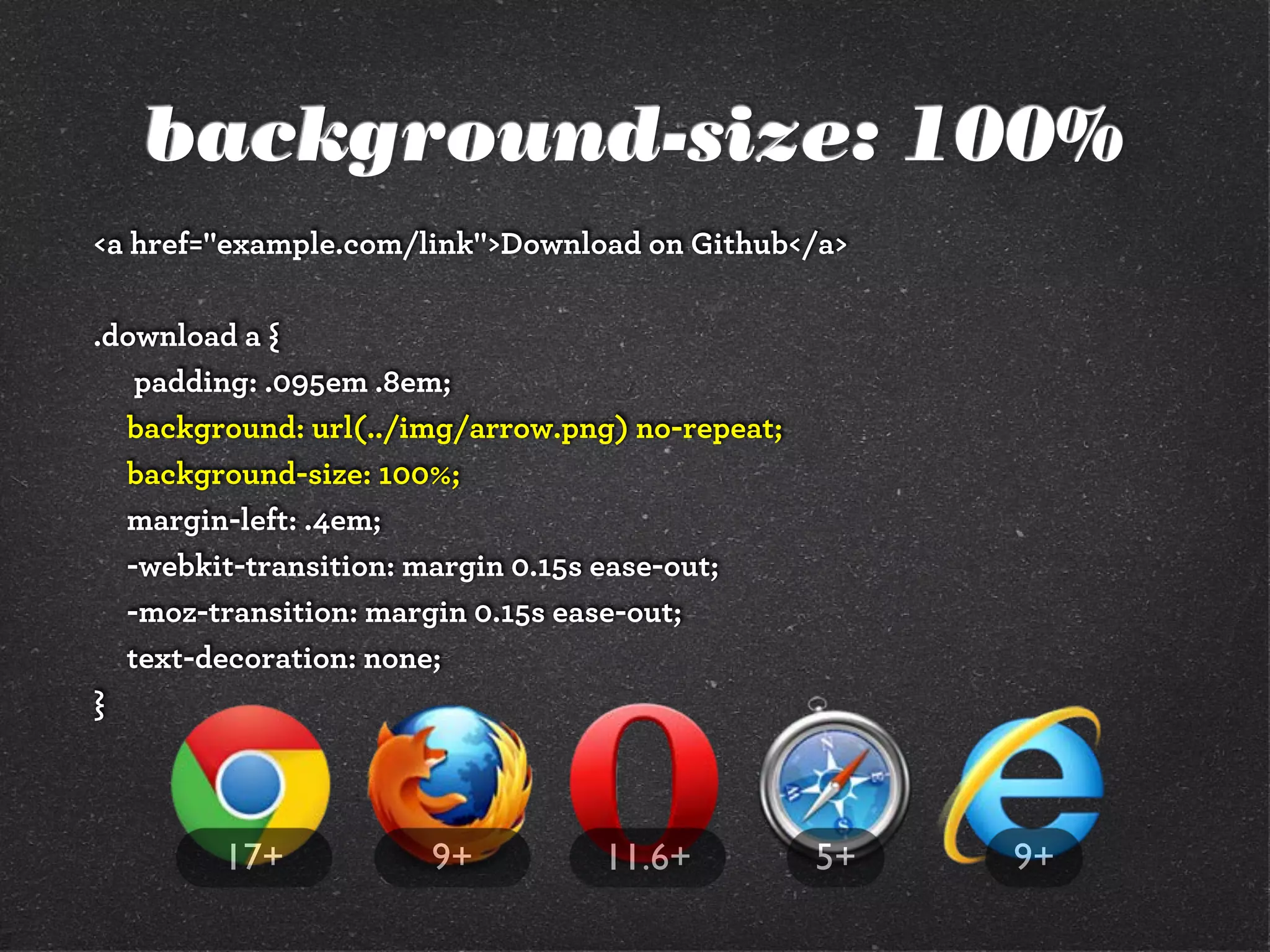
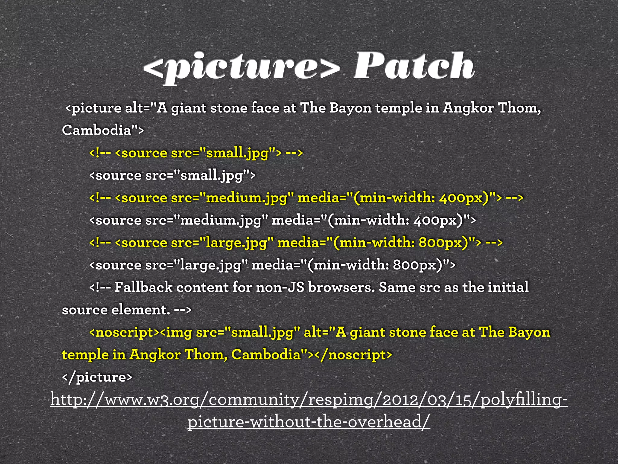
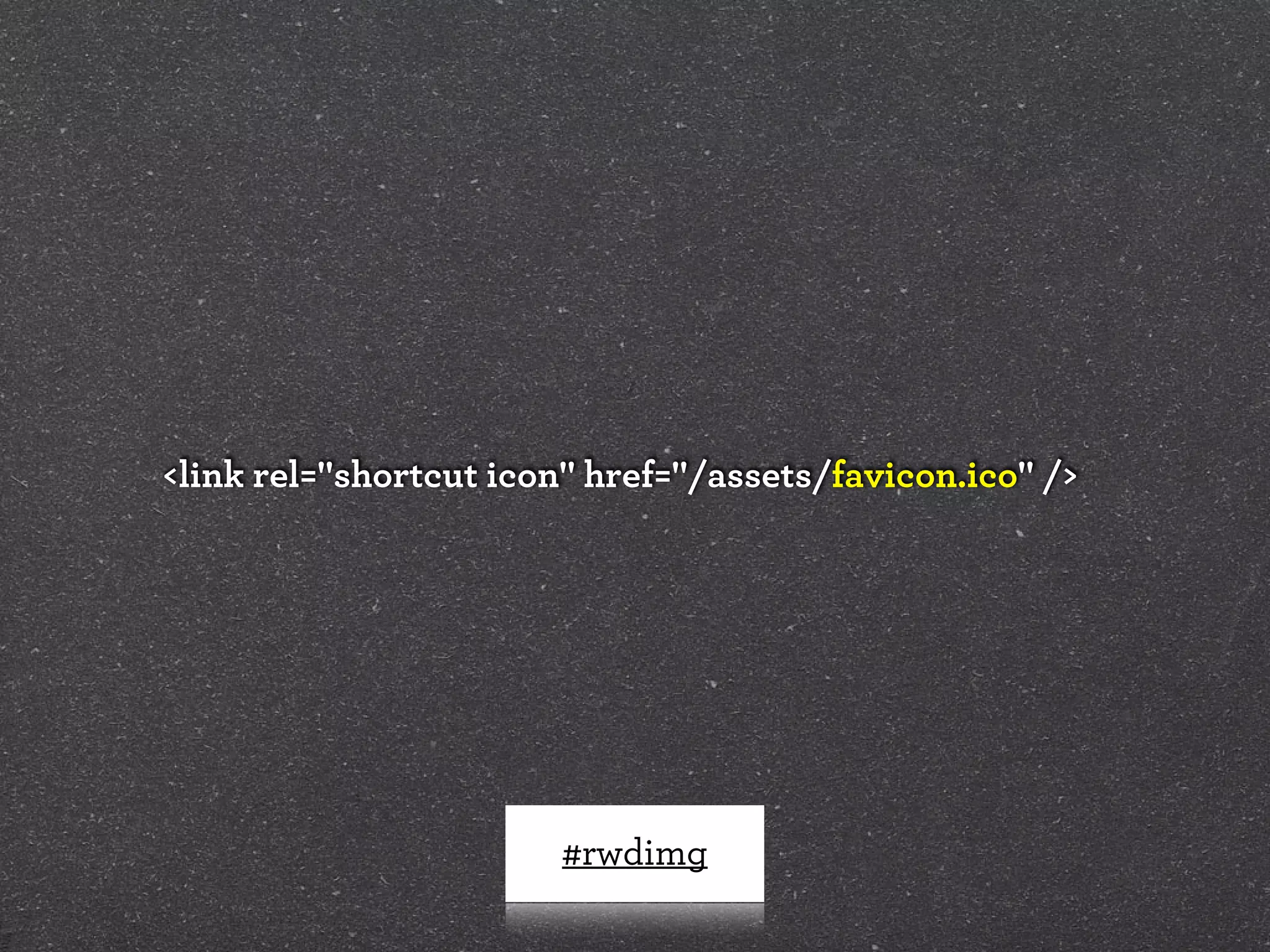
![Filament .htaccess
# Responsive Images
# Mobile-First images that scale responsively and responsibly
# Copyright 2010, Scott Jehl, Filament Group, Inc
# Dual licensed under the MIT or GPL Version 2 licenses.
# //Start Responsive Images
RewriteEngine On
# direct image requests to temp
RewriteCond %{QUERY_STRING} full=(.*)&?
RewriteRule (.*)rwd-router/.*.(jpe?g|png|gif|webp) $1%1 [L]
# ignore trap for non-image requests, rewrite URL without trap segment
RewriteRule (.*)rwd-router/(.*)$ $1$2
# //End Responsive Images
https://github.com/filamentgroup/Responsive-Images](https://image.slidesharecdn.com/adaptive-images-psuwebv2-130606095220-phpapp01/85/psuweb-Adaptive-Images-in-Responsive-Web-Design-48-320.jpg)


![Modernizr check
if(!Modernizr.svg){
var images =
document.getElementsByTagName("img");
for(var i = 0; i < images.length; i++){
var src = images[i].src.split(".");
images[i].src = src[0] + ".png";
}
}
http://stackoverflow.com/questions/12846852/
svg-png-extension-switch](https://image.slidesharecdn.com/adaptive-images-psuwebv2-130606095220-phpapp01/85/psuweb-Adaptive-Images-in-Responsive-Web-Design-89-320.jpg)
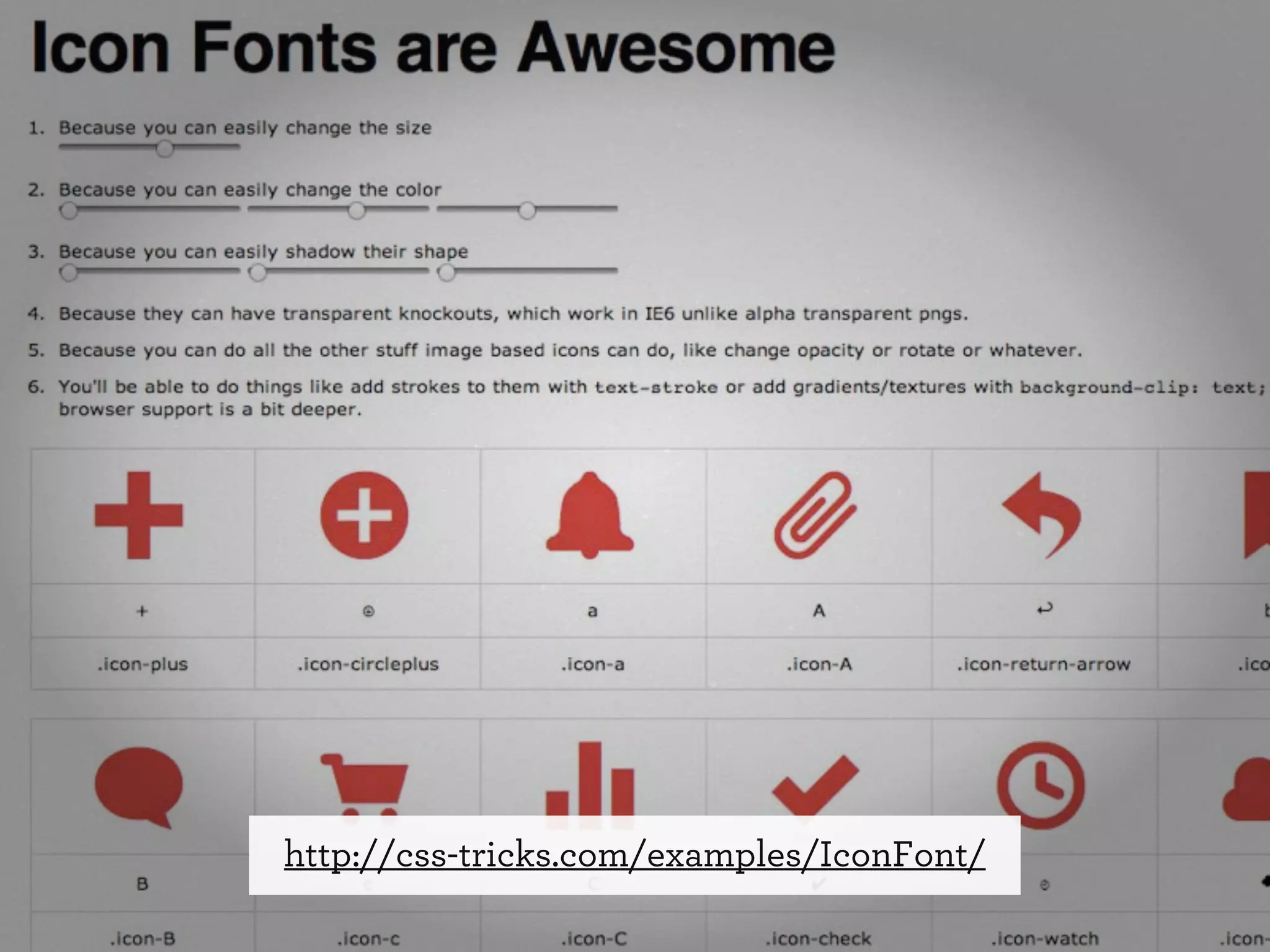
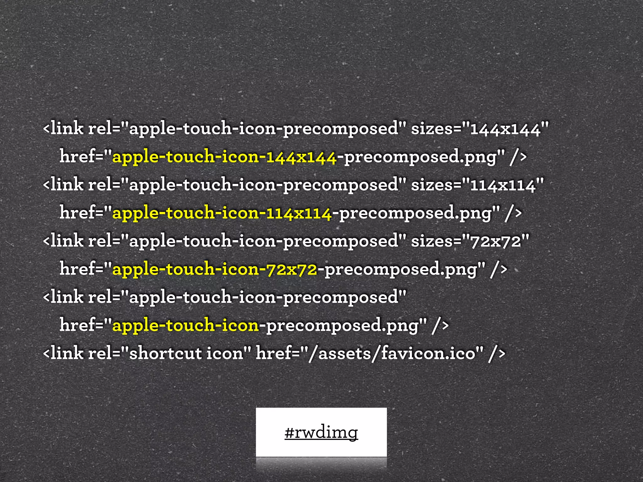
![Font-based icons
<style>
[data-icon]:before {
font-family: 'icon-font';
content: attr(data-icon);
}
</style>
<a href="http://example.com/cloud/save/">
<span data-icon="C" aria-hidden="true"></span>
Save to Cloud
</a>](https://image.slidesharecdn.com/adaptive-images-psuwebv2-130606095220-phpapp01/85/psuweb-Adaptive-Images-in-Responsive-Web-Design-96-320.jpg)


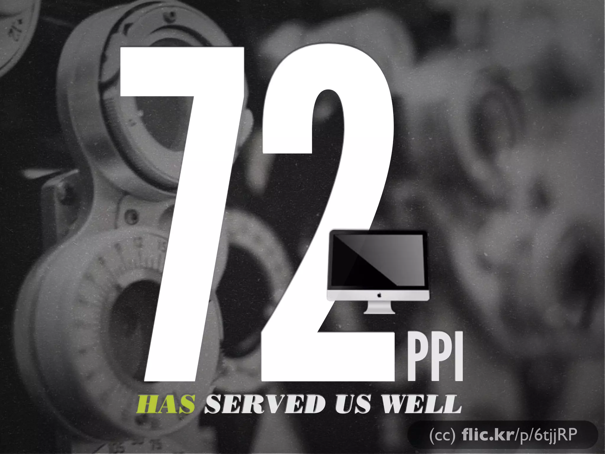
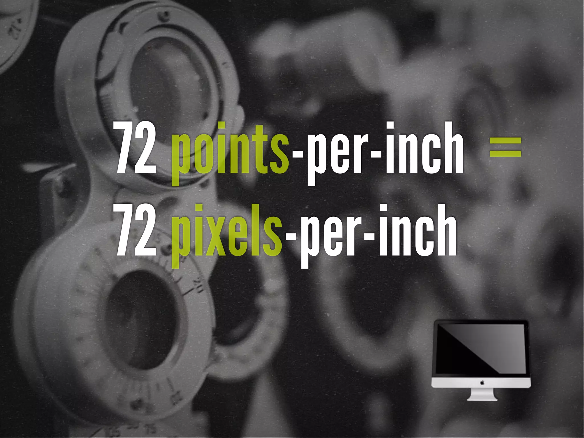
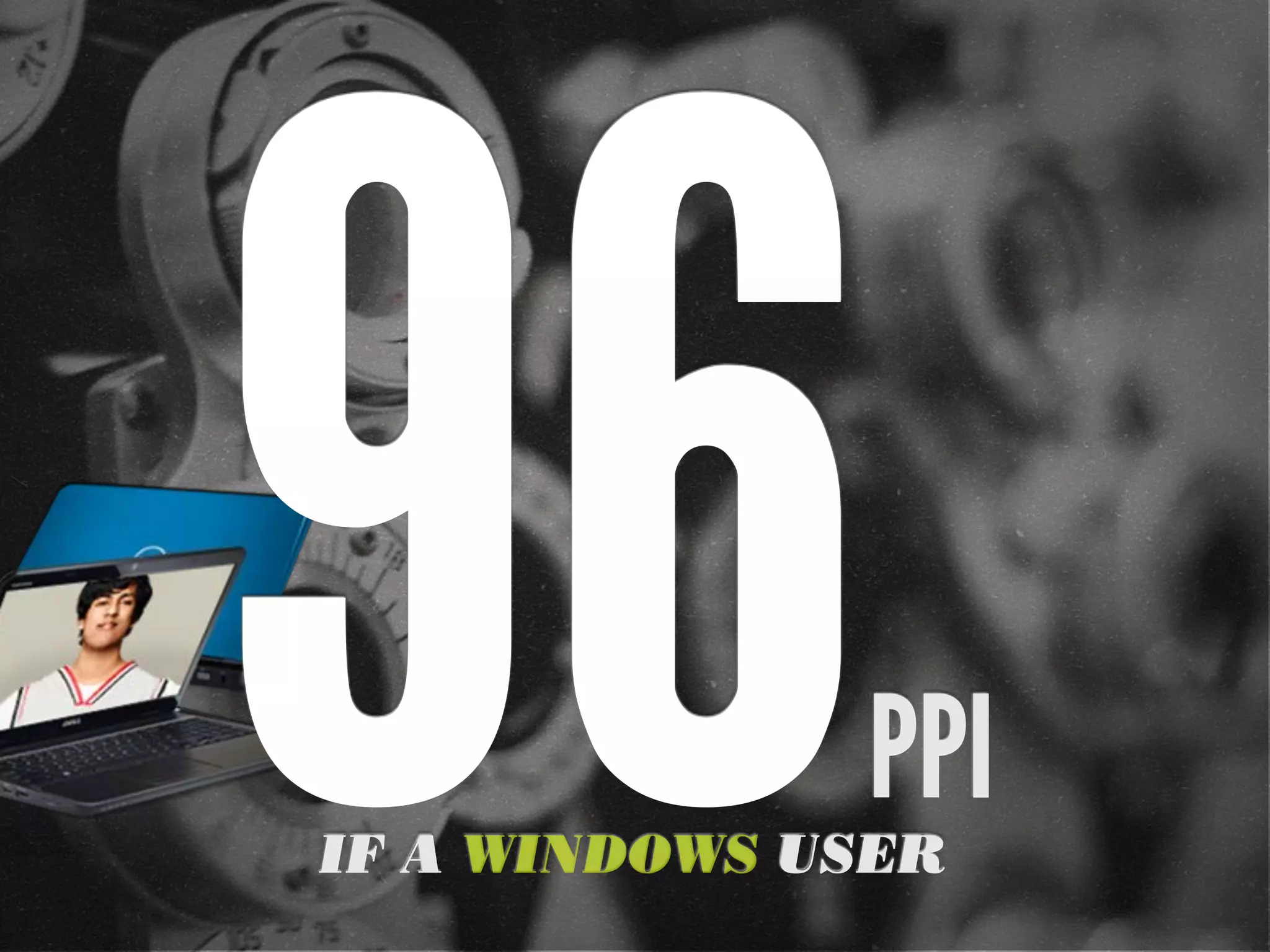
![72 points-per-inch
x [1+(1/3)]
= 96 PPI](https://image.slidesharecdn.com/adaptive-images-psuwebv2-130606095220-phpapp01/75/psuweb-Adaptive-Images-in-Responsive-Web-Design-29-2048.jpg)
![[In 2013, Intel sees their
product line] offer a higher
resolution experience than a
top-of-the-line 1080p HDTV.”
“
http://liliputing.com/2012/04/intel-retina-laptop-
desktop-displays-coming-in-2013.html](https://image.slidesharecdn.com/adaptive-images-psuwebv2-130606095220-phpapp01/75/psuweb-Adaptive-Images-in-Responsive-Web-Design-32-2048.jpg)
![Native speed test
// @Modernizr's network-connection.js
connection = navigator.connection || {
type: 0 }, // polyfill
isSlowConnection = connection.type == 3
|| connection.type == 4
| /^[23]g$/.test(connection.type);
http://davidbcalhoun.com/2010/using-navigator-connection-android](https://image.slidesharecdn.com/adaptive-images-psuwebv2-130606095220-phpapp01/75/psuweb-Adaptive-Images-in-Responsive-Web-Design-45-2048.jpg)
![Filament .htaccess
# Responsive Images
# Mobile-First images that scale responsively and responsibly
# Copyright 2010, Scott Jehl, Filament Group, Inc
# Dual licensed under the MIT or GPL Version 2 licenses.
# //Start Responsive Images
RewriteEngine On
# direct image requests to temp
RewriteCond %{QUERY_STRING} full=(.*)&?
RewriteRule (.*)rwd-router/.*.(jpe?g|png|gif|webp) $1%1 [L]
# ignore trap for non-image requests, rewrite URL without trap segment
RewriteRule (.*)rwd-router/(.*)$ $1$2
# //End Responsive Images
https://github.com/filamentgroup/Responsive-Images](https://image.slidesharecdn.com/adaptive-images-psuwebv2-130606095220-phpapp01/75/psuweb-Adaptive-Images-in-Responsive-Web-Design-48-2048.jpg)


![Modernizr check
if(!Modernizr.svg){
var images =
document.getElementsByTagName("img");
for(var i = 0; i < images.length; i++){
var src = images[i].src.split(".");
images[i].src = src[0] + ".png";
}
}
http://stackoverflow.com/questions/12846852/
svg-png-extension-switch](https://image.slidesharecdn.com/adaptive-images-psuwebv2-130606095220-phpapp01/75/psuweb-Adaptive-Images-in-Responsive-Web-Design-89-2048.jpg)
![Font-based icons
<style>
[data-icon]:before {
font-family: 'icon-font';
content: attr(data-icon);
}
</style>
<a href="http://example.com/cloud/save/">
<span data-icon="C" aria-hidden="true"></span>
Save to Cloud
</a>](https://image.slidesharecdn.com/adaptive-images-psuwebv2-130606095220-phpapp01/75/psuweb-Adaptive-Images-in-Responsive-Web-Design-96-2048.jpg)
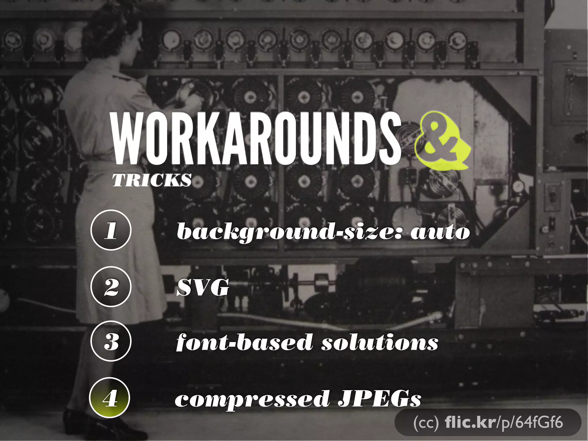


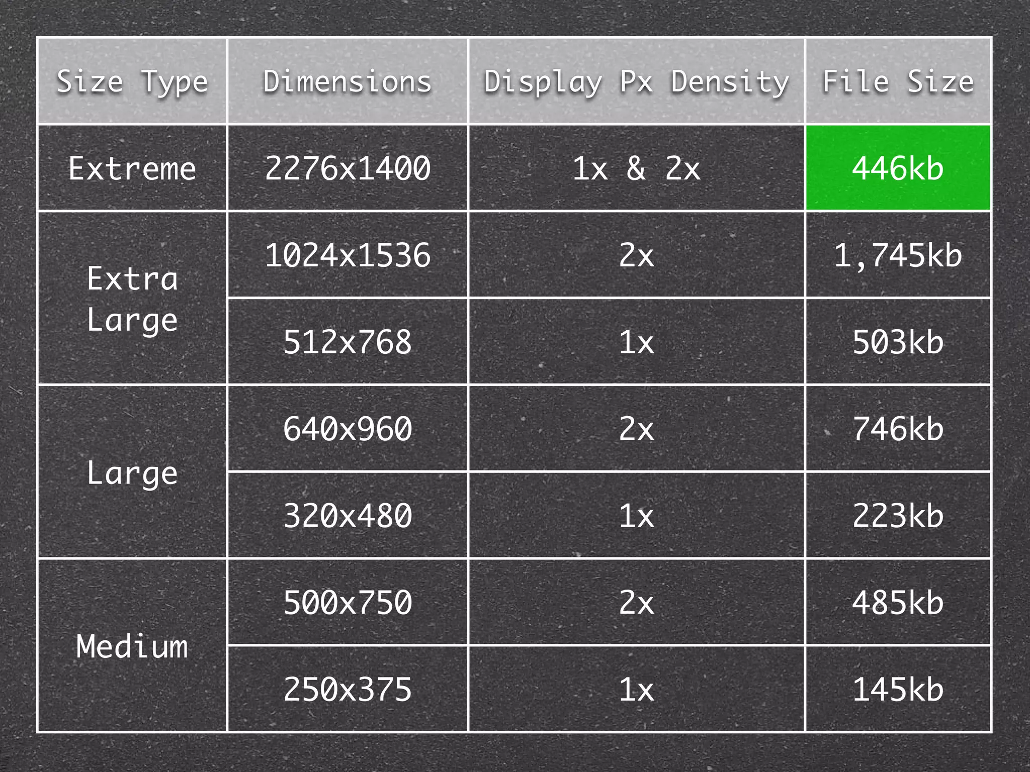
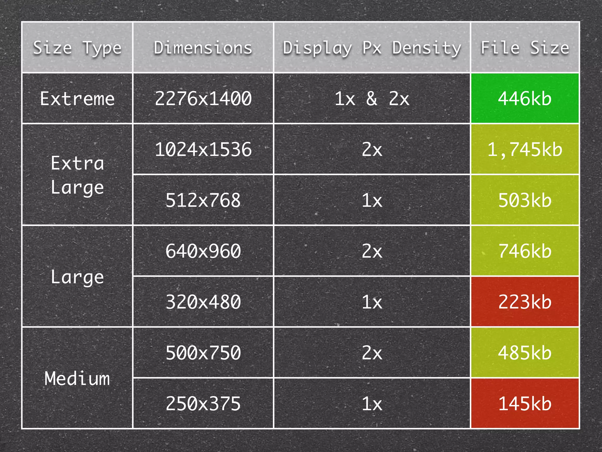


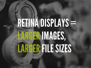
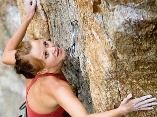
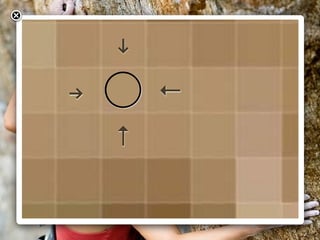
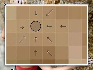
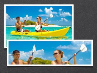
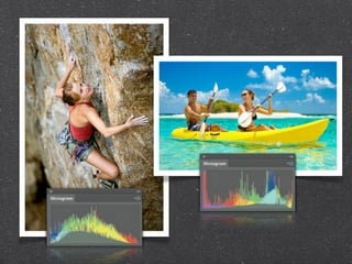
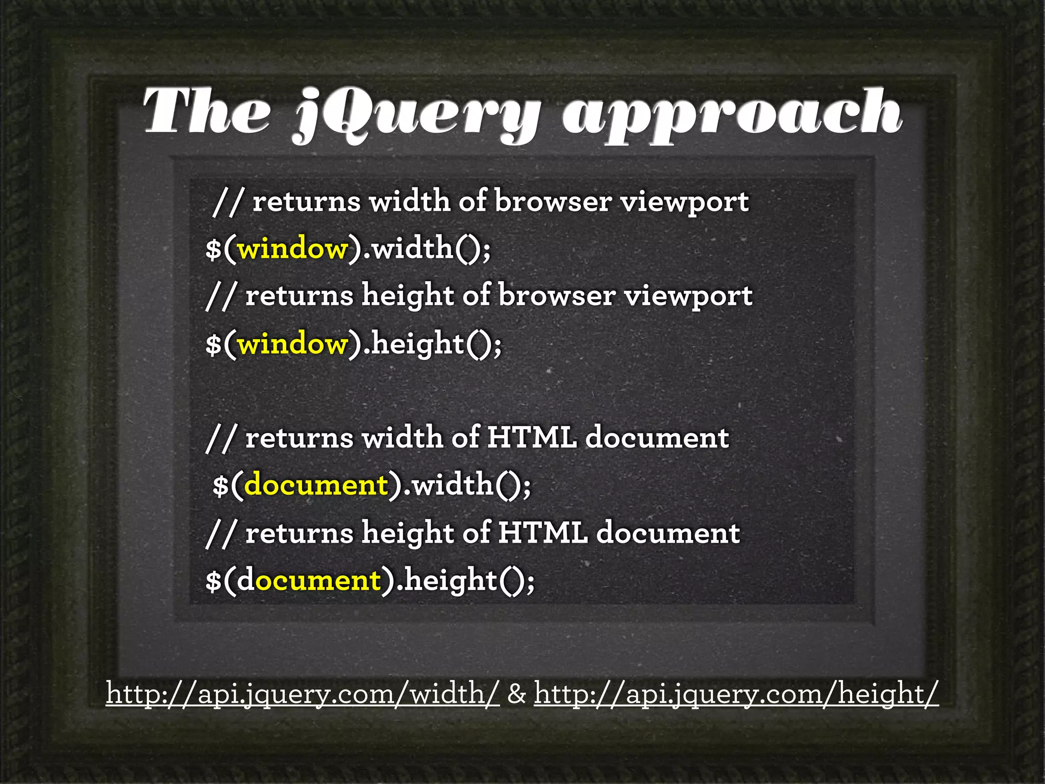
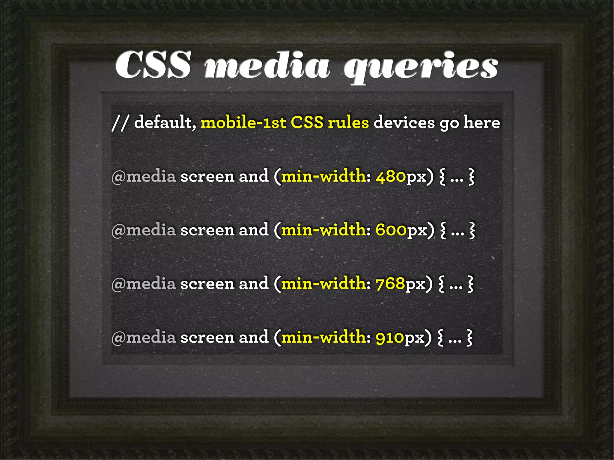
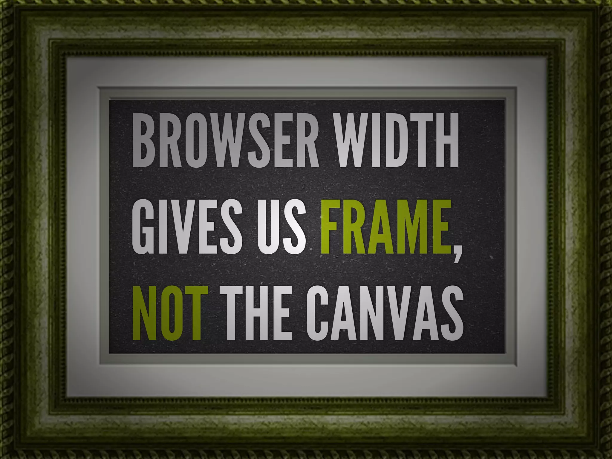
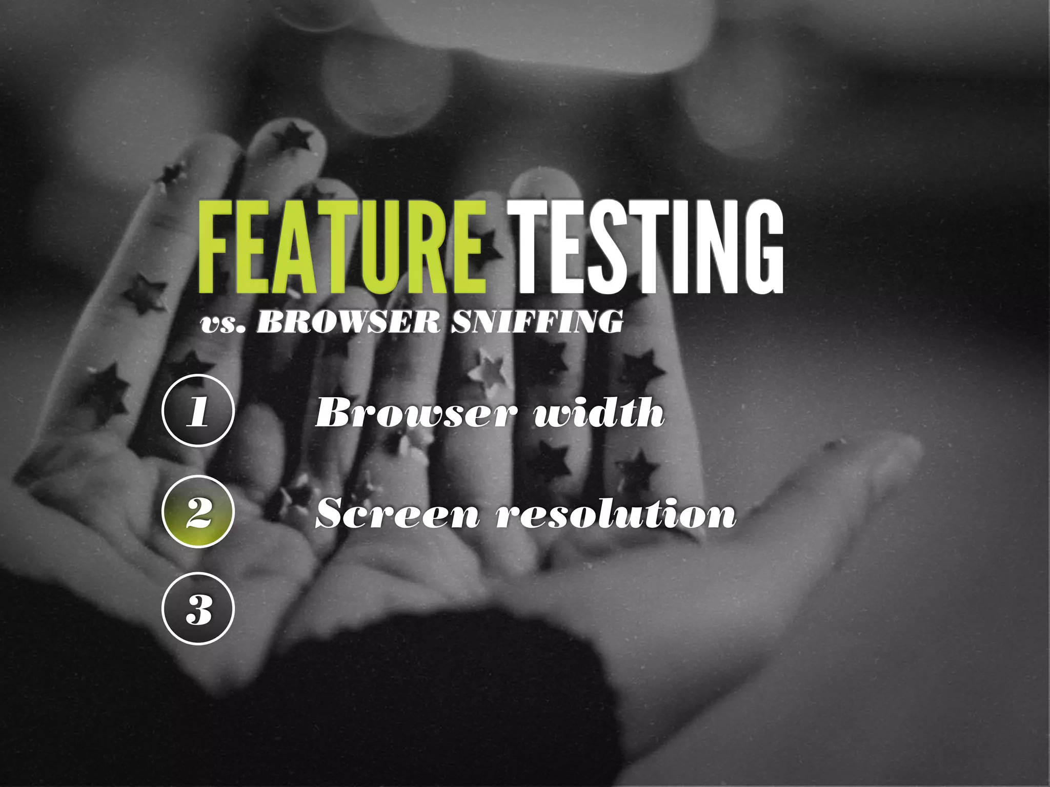
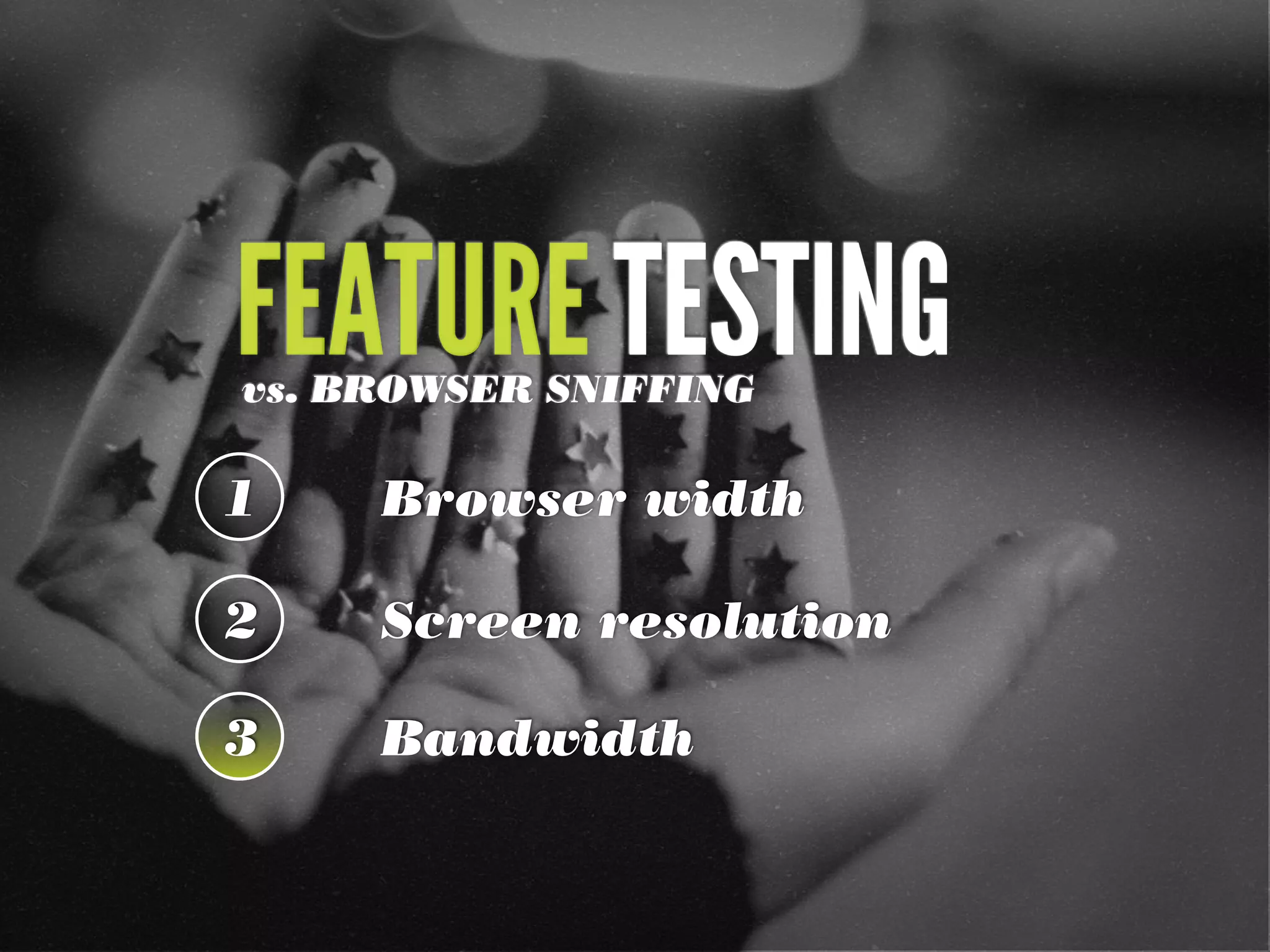
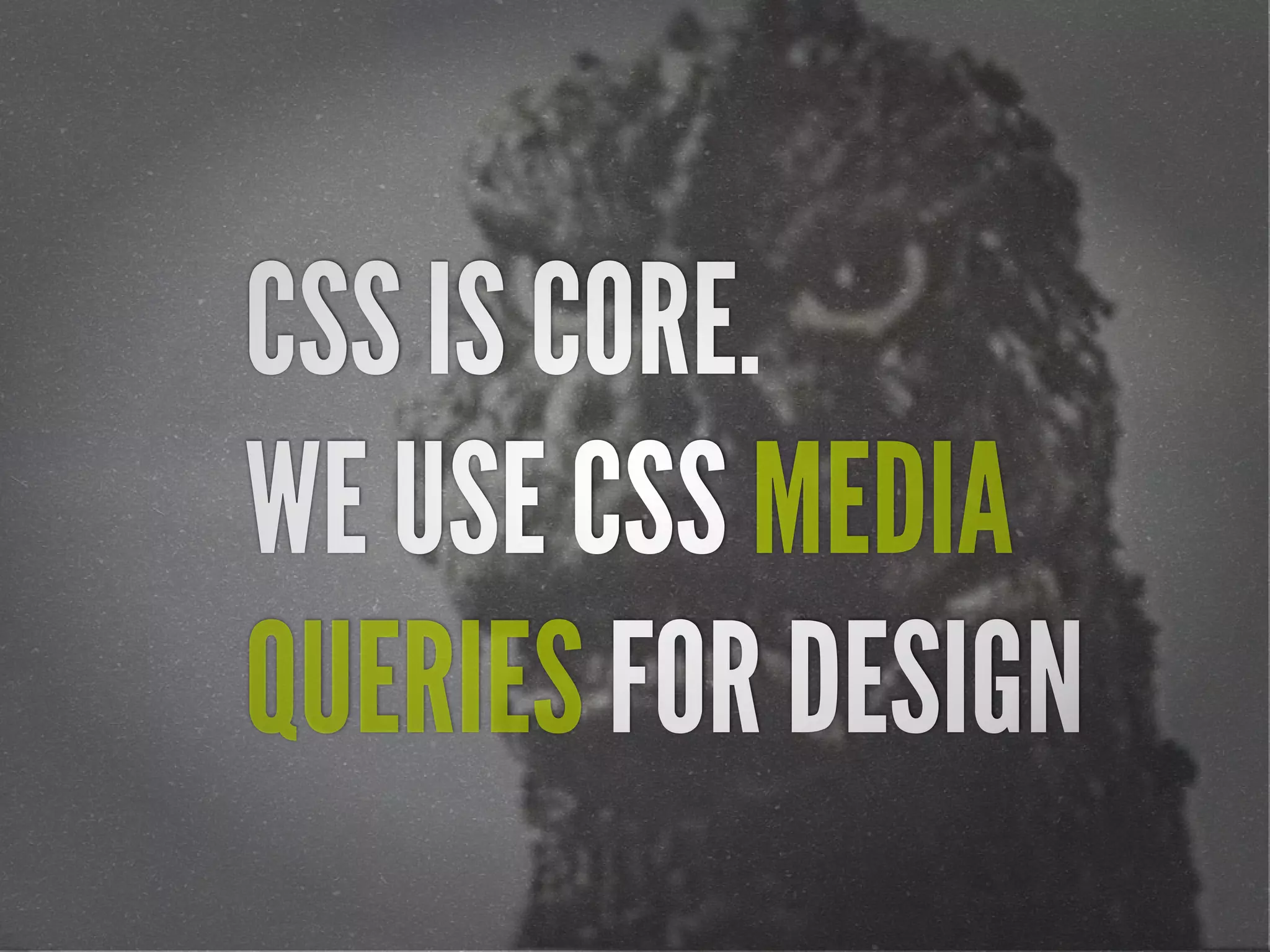
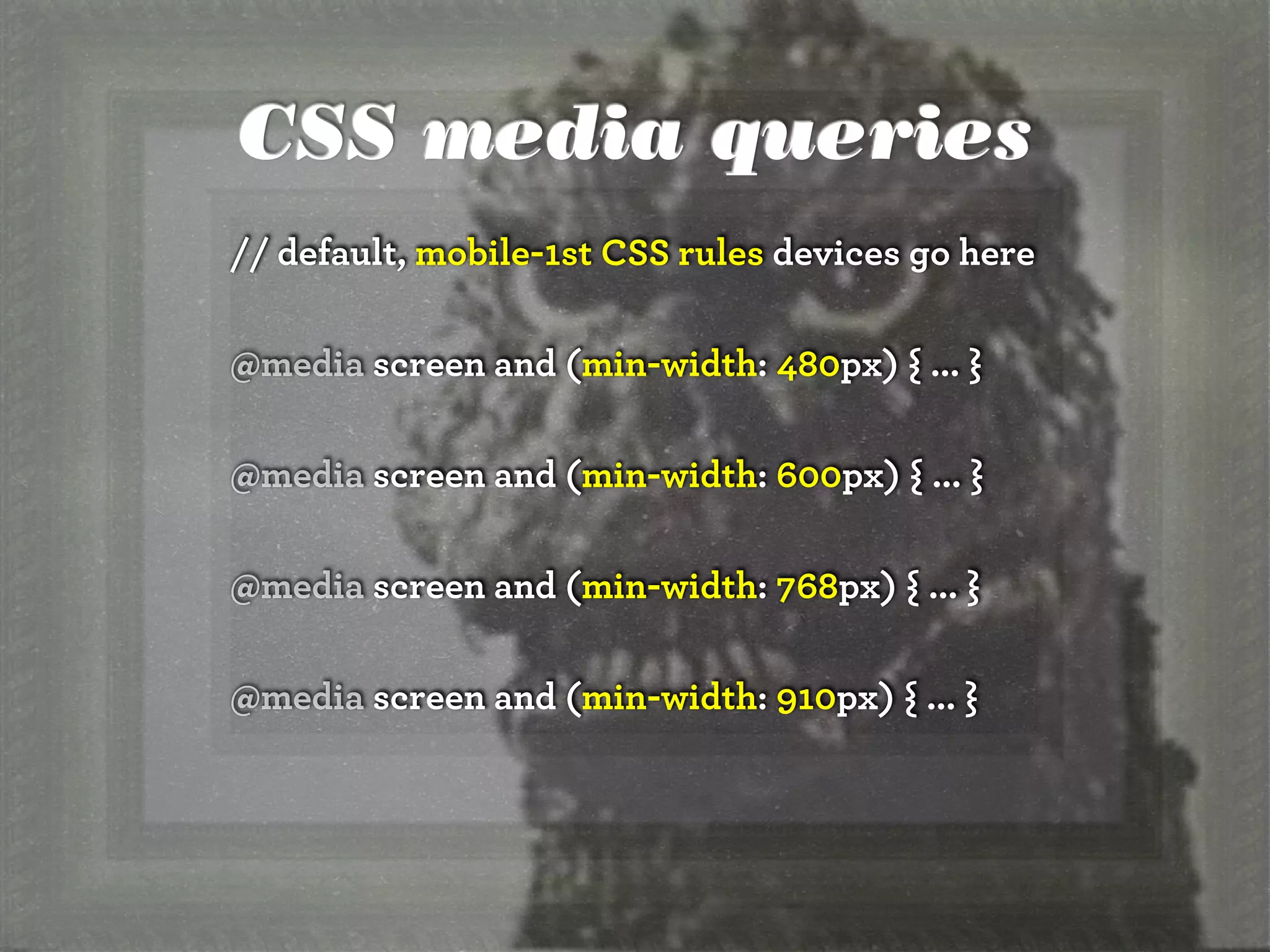
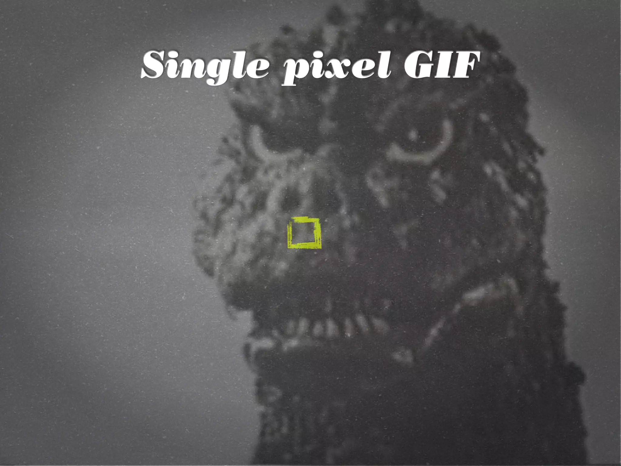
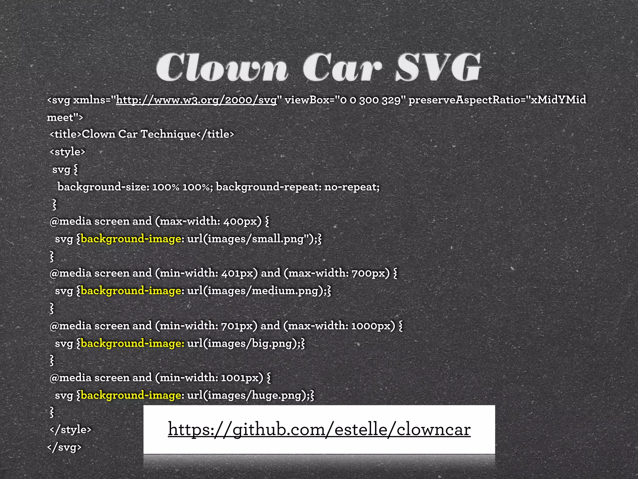
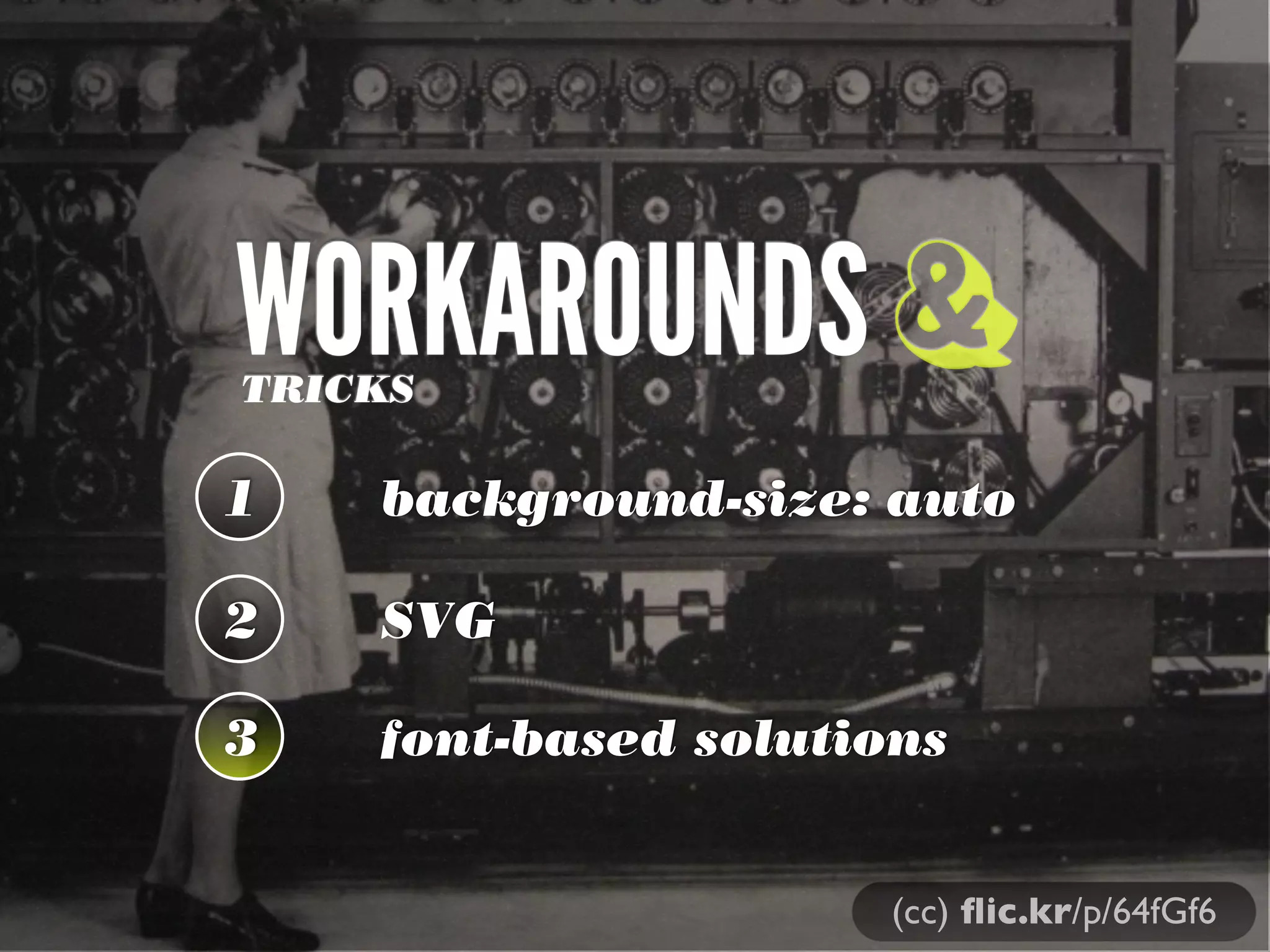
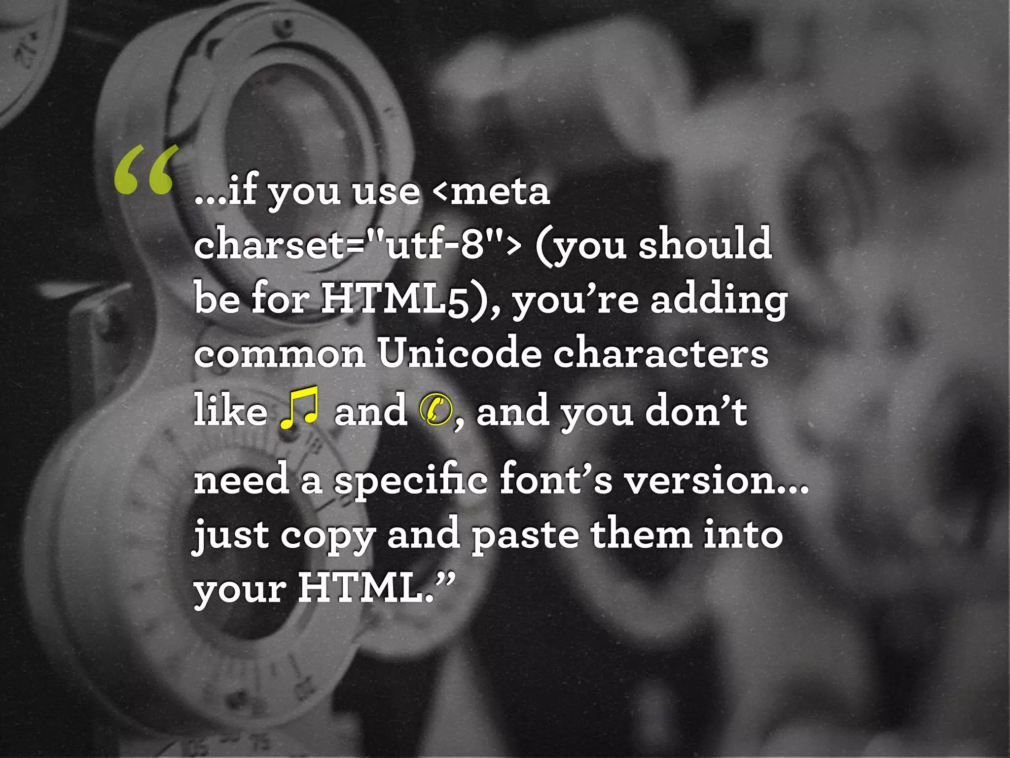
The document discusses adaptive images in responsive web design. It covers techniques like using the browser width and screen resolution to determine the appropriate image size via JavaScript or media queries. It also discusses checking bandwidth and using techniques like picture, srcset, .htaccess rewriting, and single pixel GIFs to serve the right image. The document recommends using CSS media queries for design and covers workaround techniques like background-size, SVG, and font-based solutions.
![[drupalcampatx] Adaptive Images in Responsive Web Design](https://cdn.slidesharecdn.com/ss_thumbnails/adaptive-imagesv12v2-130623122711-phpapp01-thumbnail.jpg?width=600ounds&width=560&fit=bounds)
![[refreshpitt] Adaptive Images in Responsive Web Design](https://cdn.slidesharecdn.com/ss_thumbnails/adaptive-imagesv10-130609110047-phpapp01-thumbnail.jpg?width=600ounds&width=560&fit=bounds)
![[wcatx] Adaptive Images in Responsive Web Design](https://cdn.slidesharecdn.com/ss_thumbnails/wcatx-adaptive-images-130518143751-phpapp01-thumbnail.jpg?width=600ounds&width=560&fit=bounds)
![[HEWEBFL] Adaptive Images in Responsive Web Design](https://cdn.slidesharecdn.com/ss_thumbnails/hewebfl-adaptive-images2-130423085801-phpapp02-thumbnail.jpg?width=600ounds&width=560&fit=bounds)
![[wvbcn] Adaptive Images in Responsive Web Design](https://cdn.slidesharecdn.com/ss_thumbnails/adaptive-imagesv13v2-130629093334-phpapp01-thumbnail.jpg?width=600ounds&width=560&fit=bounds)
![[peachpit] Adaptive Images in Responsive Web Design](https://cdn.slidesharecdn.com/ss_thumbnails/peachpit-schmitt-adaptive-images-v2-130925150604-phpapp01-thumbnail.jpg?width=600ounds&width=560&fit=bounds)
![[Austin WordPress Meetup] Adaptive Images in Responsive Web Design](https://cdn.slidesharecdn.com/ss_thumbnails/adaptiveimages-wpaustinmeetup-150204100924-conversion-gate01-thumbnail.jpg?width=600ounds&width=560&fit=bounds)
![[cssdevconf] Adaptive Images in Responsive Web Design](https://cdn.slidesharecdn.com/ss_thumbnails/adaptive-imagesv16-131021133151-phpapp01-thumbnail.jpg?width=600ounds&width=560&fit=bounds)
![[convergese] Adaptive Images in Responsive Web Design](https://cdn.slidesharecdn.com/ss_thumbnails/2012-adaptive-images-convergese-120509135732-phpapp01-thumbnail.jpg?width=600ounds&width=560&fit=bounds)
![[HEWEBAR 2012] Adaptive Images in Responsive Web Design](https://cdn.slidesharecdn.com/ss_thumbnails/hewebar-2012-adaptive-images-in-rwd-120729151800-phpapp02-thumbnail.jpg?width=600ounds&width=560&fit=bounds)


![[rwdsummit] Adaptive Images in Responsive Web Design](https://cdn.slidesharecdn.com/ss_thumbnails/adaptive-imagesv18-1-140325201134-phpapp02-thumbnail.jpg?width=600ounds&width=560&fit=bounds)
![[refreshaustin] Adaptive Images in Responsive Web Design](https://cdn.slidesharecdn.com/ss_thumbnails/adaptive-imagesv7-130410122323-phpapp02-thumbnail.jpg?width=600ounds&width=560&fit=bounds)
![[cssdevconf] Adaptive Images in RWD](https://cdn.slidesharecdn.com/ss_thumbnails/adaptive-imagesv6-121210084537-phpapp02-thumbnail.jpg?width=600ounds&width=560&fit=bounds)
![[parisweb] Adaptive Images in Responsive Web Design](https://cdn.slidesharecdn.com/ss_thumbnails/adaptive-imagesv15v2-131014003217-phpapp01-thumbnail.jpg?width=600ounds&width=560&fit=bounds)
![[html5tx] Adaptive Images in Responsive Web Design](https://cdn.slidesharecdn.com/ss_thumbnails/adaptive-images-html5tx-130202100125-phpapp01-thumbnail.jpg?width=600ounds&width=560&fit=bounds)
![[rwdsummit2012] Adaptive Images in Responsive Web Design](https://cdn.slidesharecdn.com/ss_thumbnails/schmitt-adaptive-imagesv2-120829225201-phpapp02-thumbnail.jpg?width=600ounds&width=560&fit=bounds)
![[CSSDevConf] Adaptive Images in Responsive Web Design 2014](https://cdn.slidesharecdn.com/ss_thumbnails/adaptive-images-cssdevconf-141013185313-conversion-gate02-thumbnail.jpg?width=600ounds&width=560&fit=bounds)
![[jqconatx] Adaptive Images for Responsive Web Design](https://cdn.slidesharecdn.com/ss_thumbnails/adaptive-imagesv14-130911193737-phpapp01-thumbnail.jpg?width=600ounds&width=560&fit=bounds)
![[funka] Adaptive Images in Responsive Web Design](https://cdn.slidesharecdn.com/ss_thumbnails/adaptive-images-funkav5-150415072902-conversion-gate01-thumbnail.jpg?width=600ounds&width=560&fit=bounds)


![[artifactconf] Github for People Who Don't Code](https://cdn.slidesharecdn.com/ss_thumbnails/github-for-people-that-dont-code-131115221827-phpapp02-thumbnail.jpg?width=600ounds&width=560&fit=bounds)

![[sxsw2013] Extremely Compressed JPEGs](https://cdn.slidesharecdn.com/ss_thumbnails/adaptive-imagesfordwmgv7-130312172016-phpapp01-thumbnail.jpg?width=600ounds&width=560&fit=bounds)
![[amigos] HTML5 and CSS3](https://cdn.slidesharecdn.com/ss_thumbnails/html5-and-css3v6-130208132048-phpapp01-thumbnail.jpg?width=600ounds&width=560&fit=bounds)
![[convergefl] Adaptive Images in Responsive Web Design](https://cdn.slidesharecdn.com/ss_thumbnails/christopher-schmitt-adaptive-images-121014200507-phpapp02-thumbnail.jpg?width=600ounds&width=560&fit=bounds)
![[HEWEBAR 2012] Beyond Desktop Browsing (HTML5)](https://cdn.slidesharecdn.com/ss_thumbnails/hewebar-2012-beyond-desktop-browsing-120729151254-phpapp01-thumbnail.jpg?width=600ounds&width=560&fit=bounds)
![[O'Reilly] HTML5 Design](https://cdn.slidesharecdn.com/ss_thumbnails/html5-workshop-111215160913-phpapp01-thumbnail.jpg?width=600ounds&width=560&fit=bounds)
![[heweb11] CSS3 Makeover](https://cdn.slidesharecdn.com/ss_thumbnails/css3-makeover-111027113114-phpapp01-thumbnail.jpg?width=600ounds&width=560&fit=bounds)
![[heweb11] HTML5 Makeover](https://cdn.slidesharecdn.com/ss_thumbnails/html5-makeover-111027112644-phpapp01-thumbnail.jpg?width=600ounds&width=560&fit=bounds)
![[edUi] HTML5 Workshop](https://cdn.slidesharecdn.com/ss_thumbnails/html5-workshop-2-111014103112-phpapp02-thumbnail.jpg?width=600ounds&width=560&fit=bounds)


