


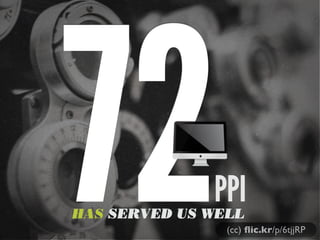
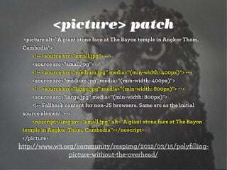
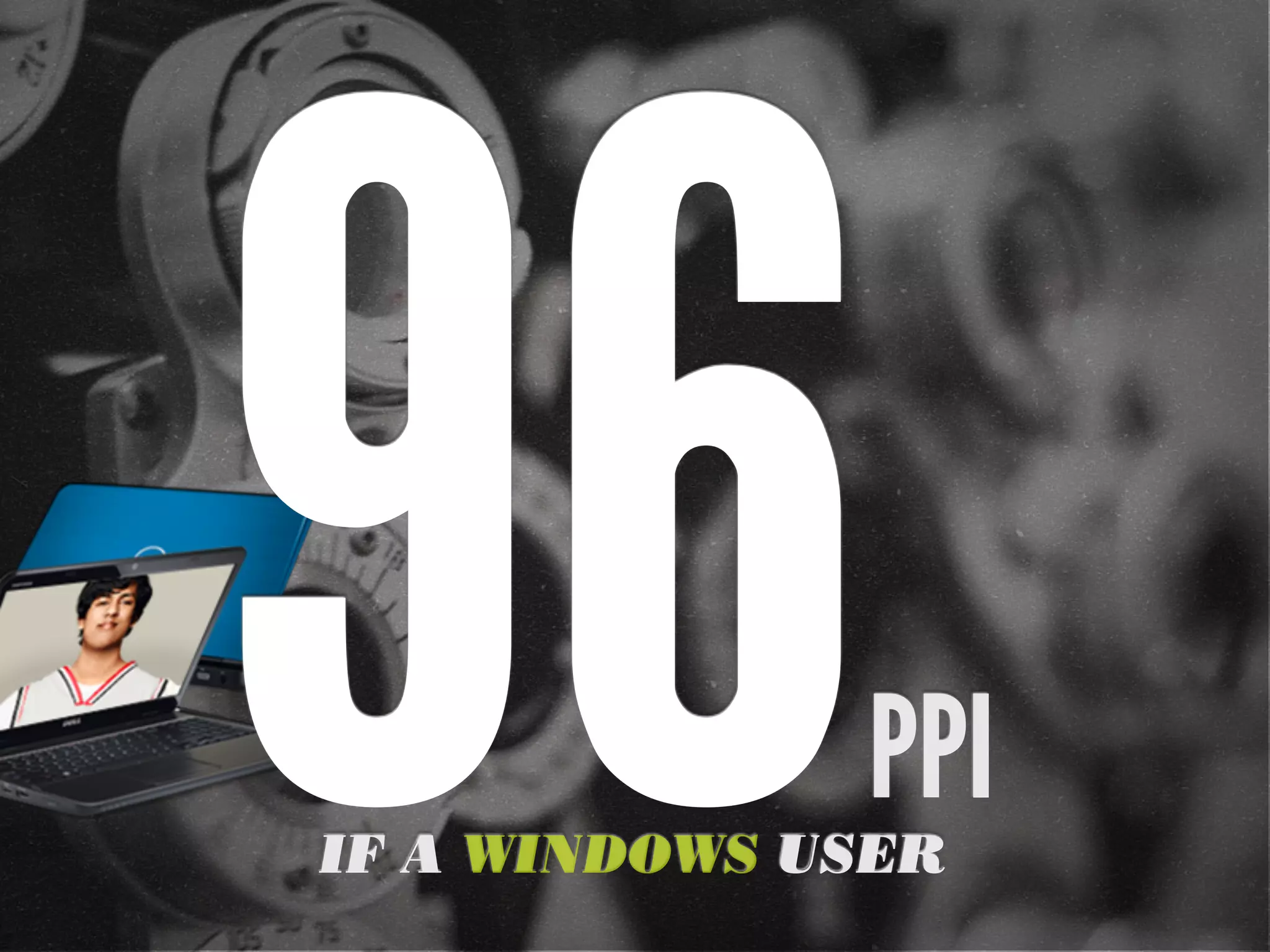
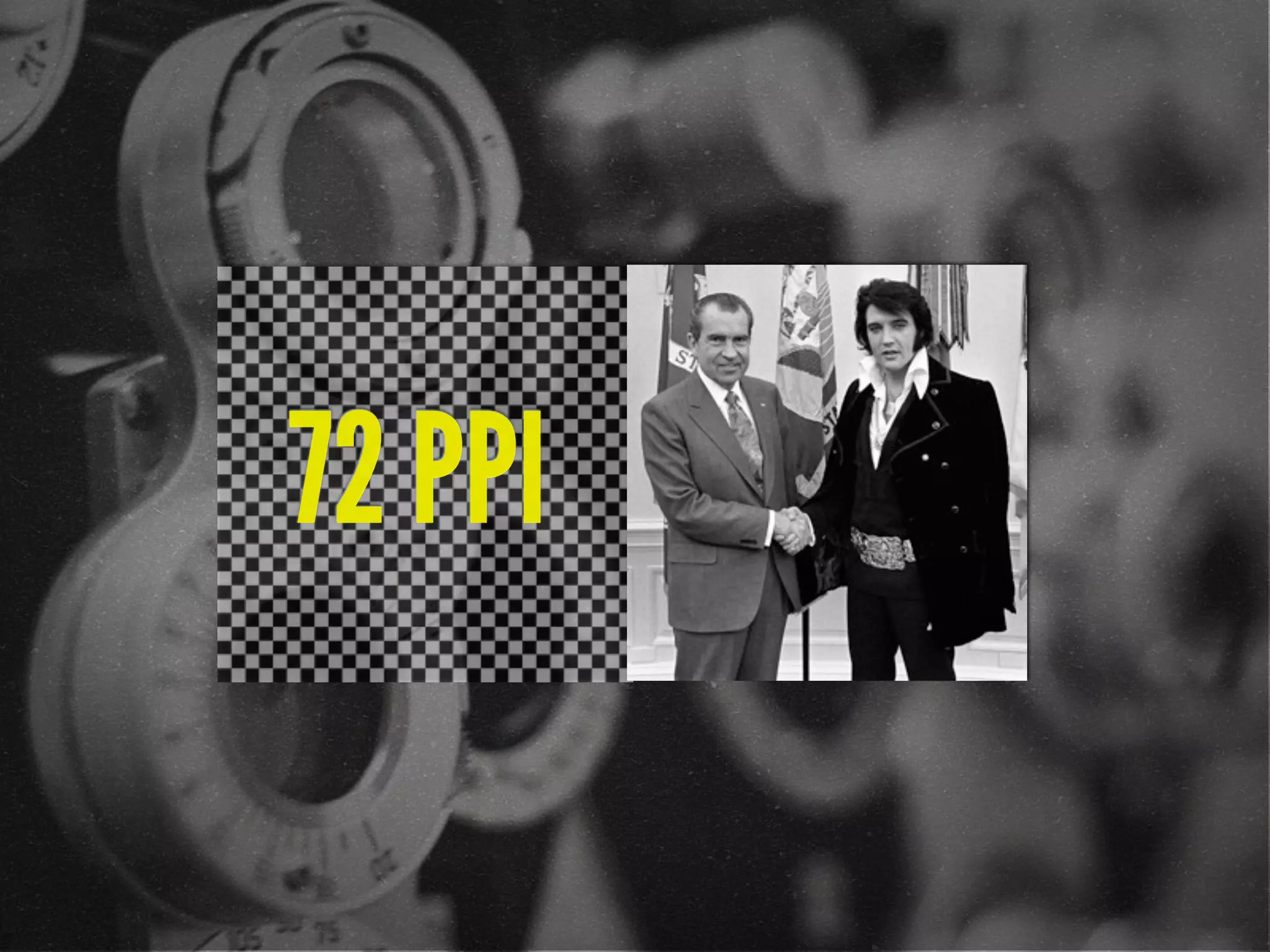
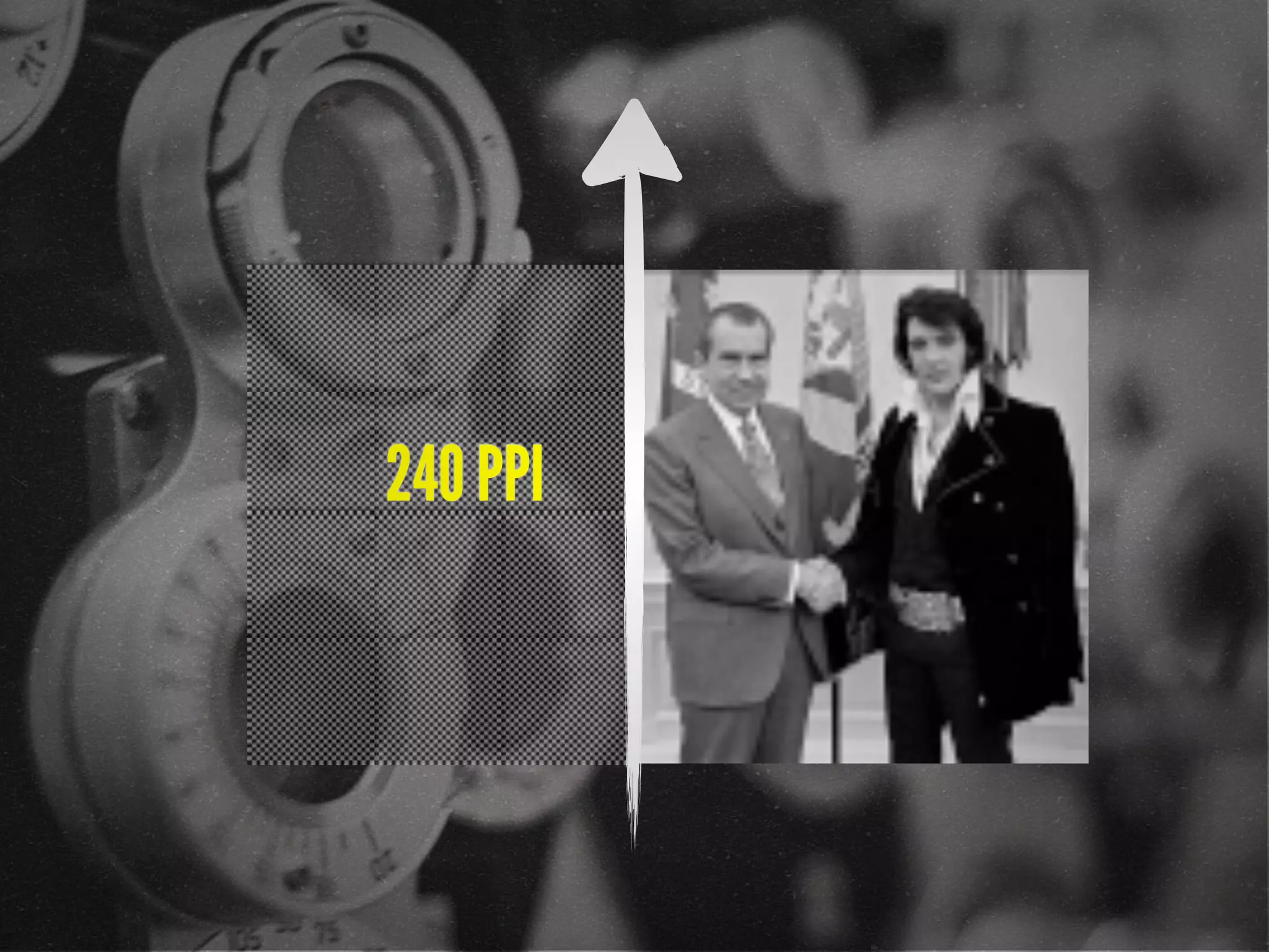
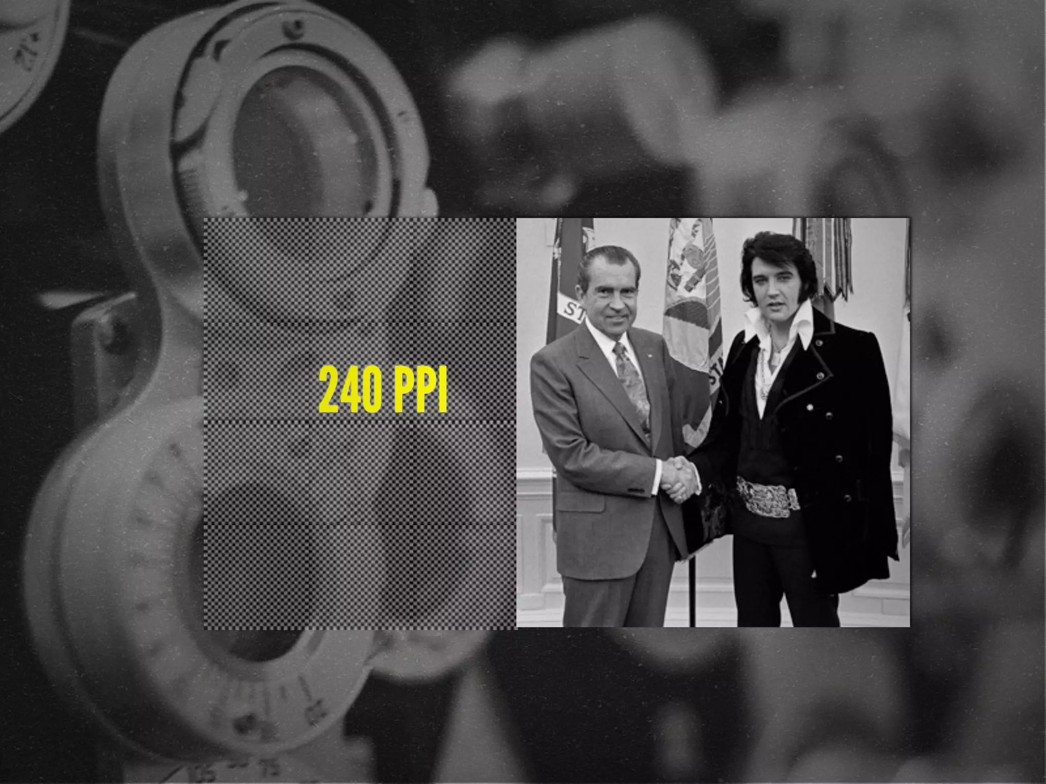
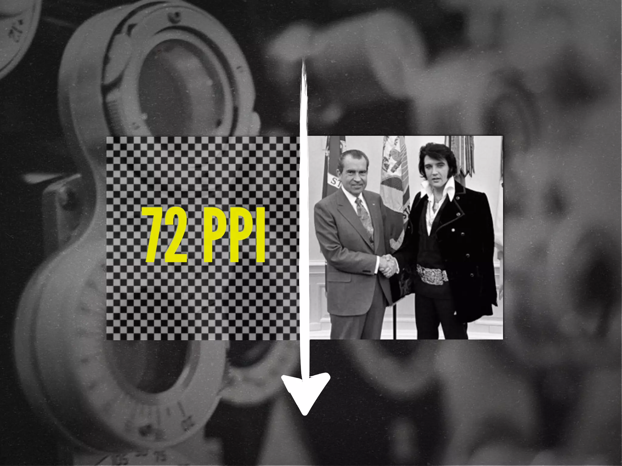
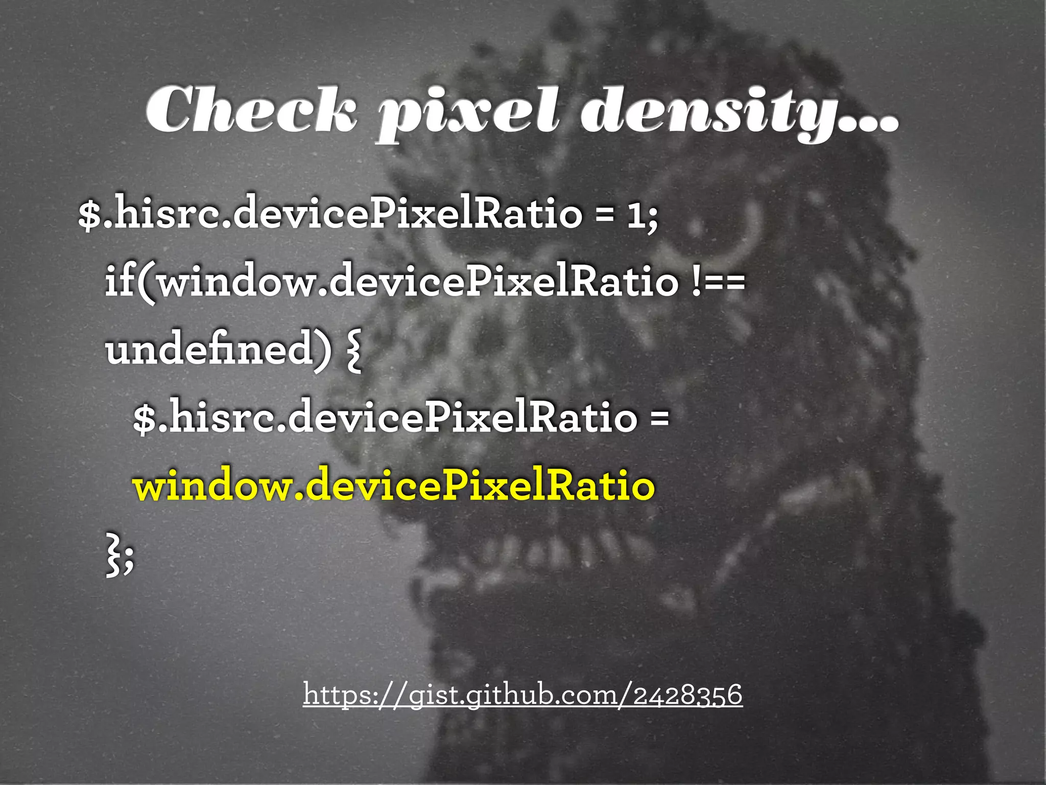
![72 points-per-inch
x [1+(1/3)]
= 96 PPI](https://image.slidesharecdn.com/adaptive-images-html5tx-130202100125-phpapp01/85/html5tx-Adaptive-Images-in-Responsive-Web-Design-20-320.jpg)
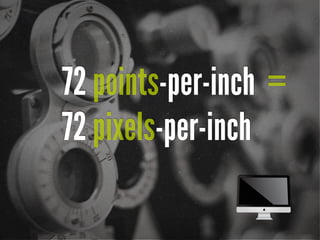
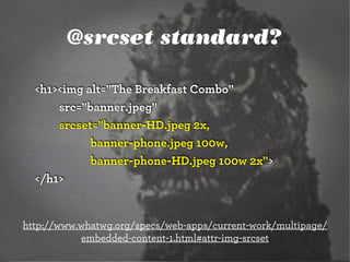
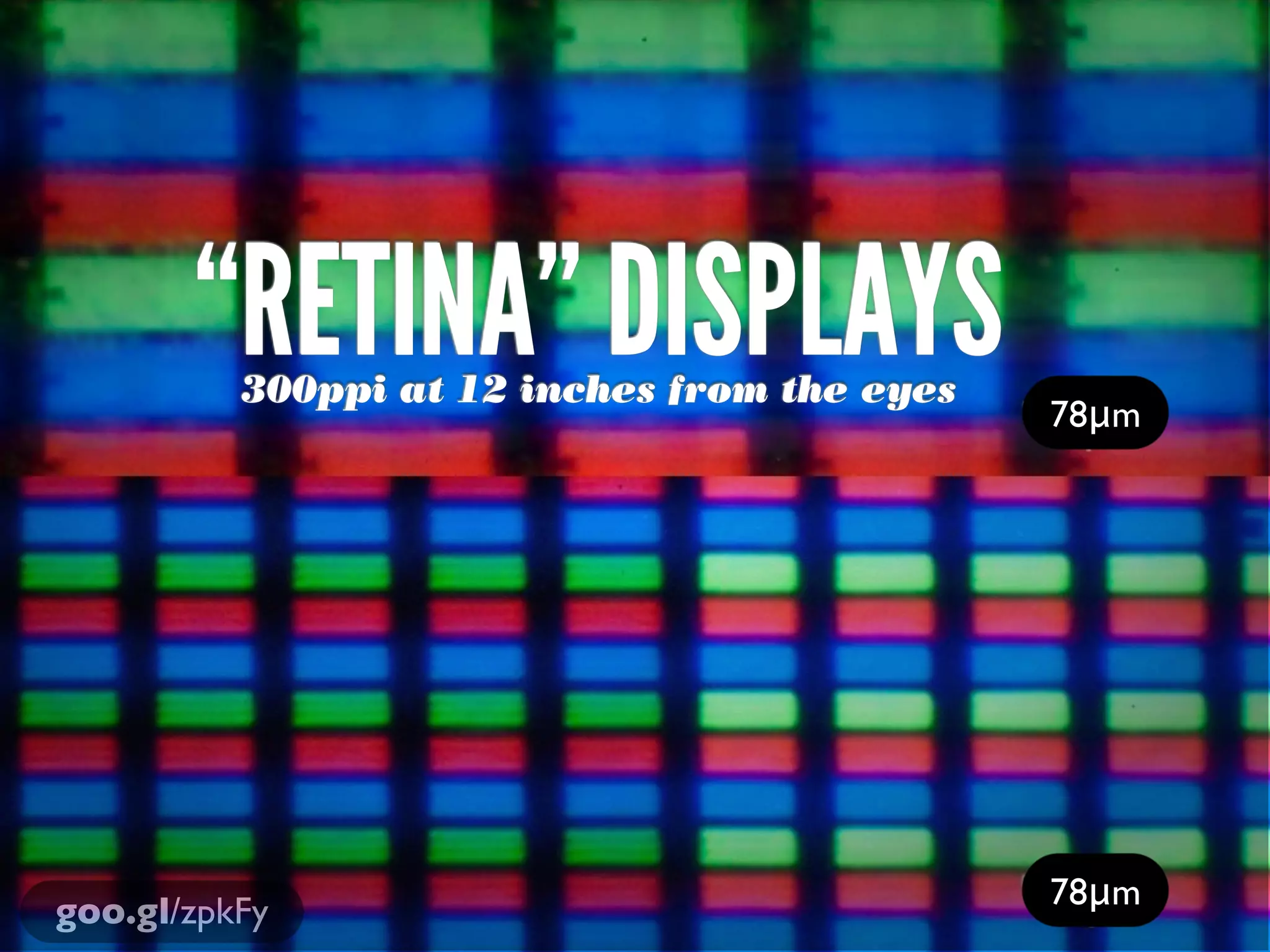
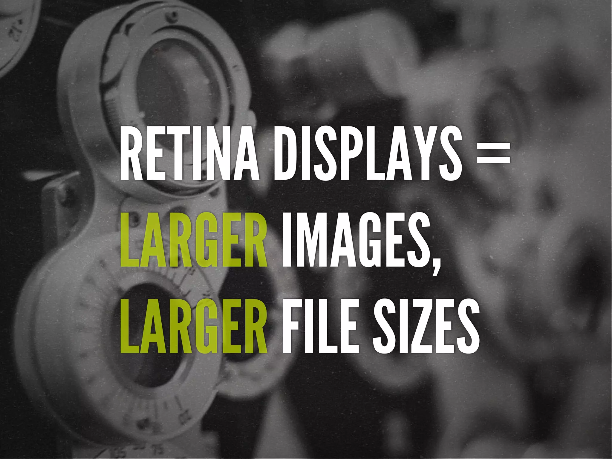
![“ [In 2013, Intel sees their
product line] offer a higher
resolution experience than a
top-of-the-line 1080p HDTV.”
http://liliputing.com/2012/04/intel-retina-laptop-
desktop-displays-coming-in-2013.html](https://image.slidesharecdn.com/adaptive-images-html5tx-130202100125-phpapp01/85/html5tx-Adaptive-Images-in-Responsive-Web-Design-24-320.jpg)
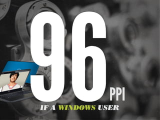
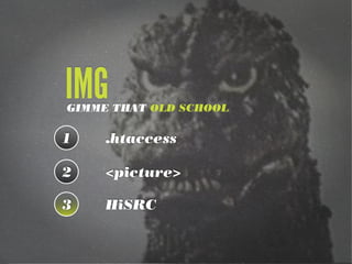
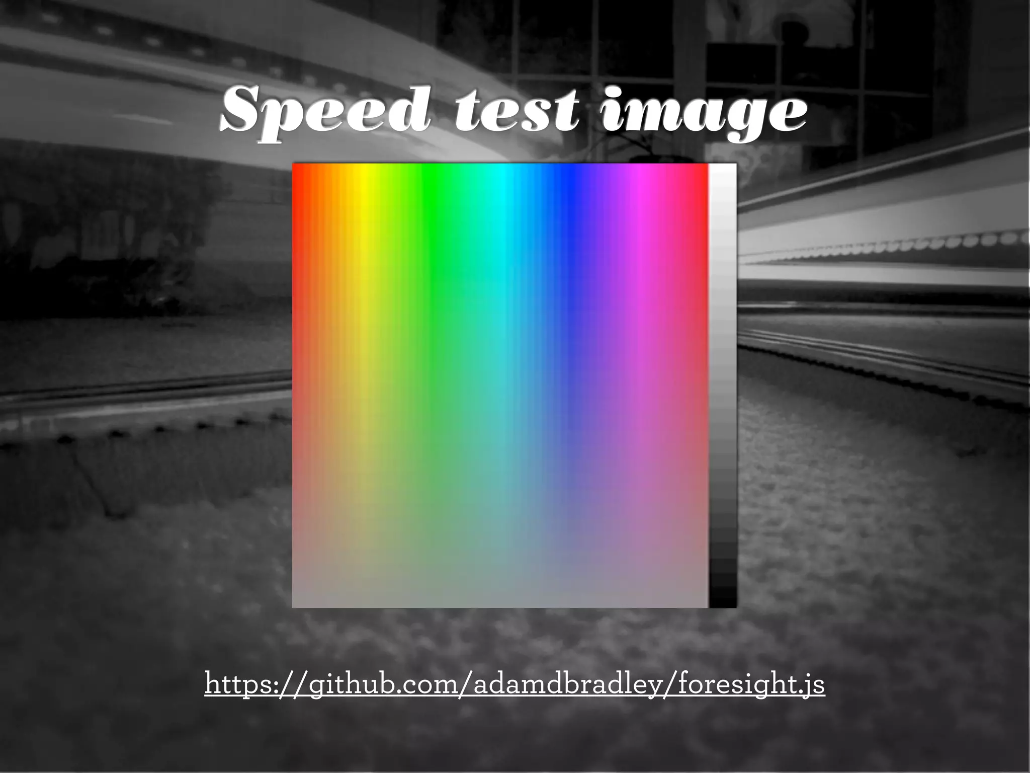
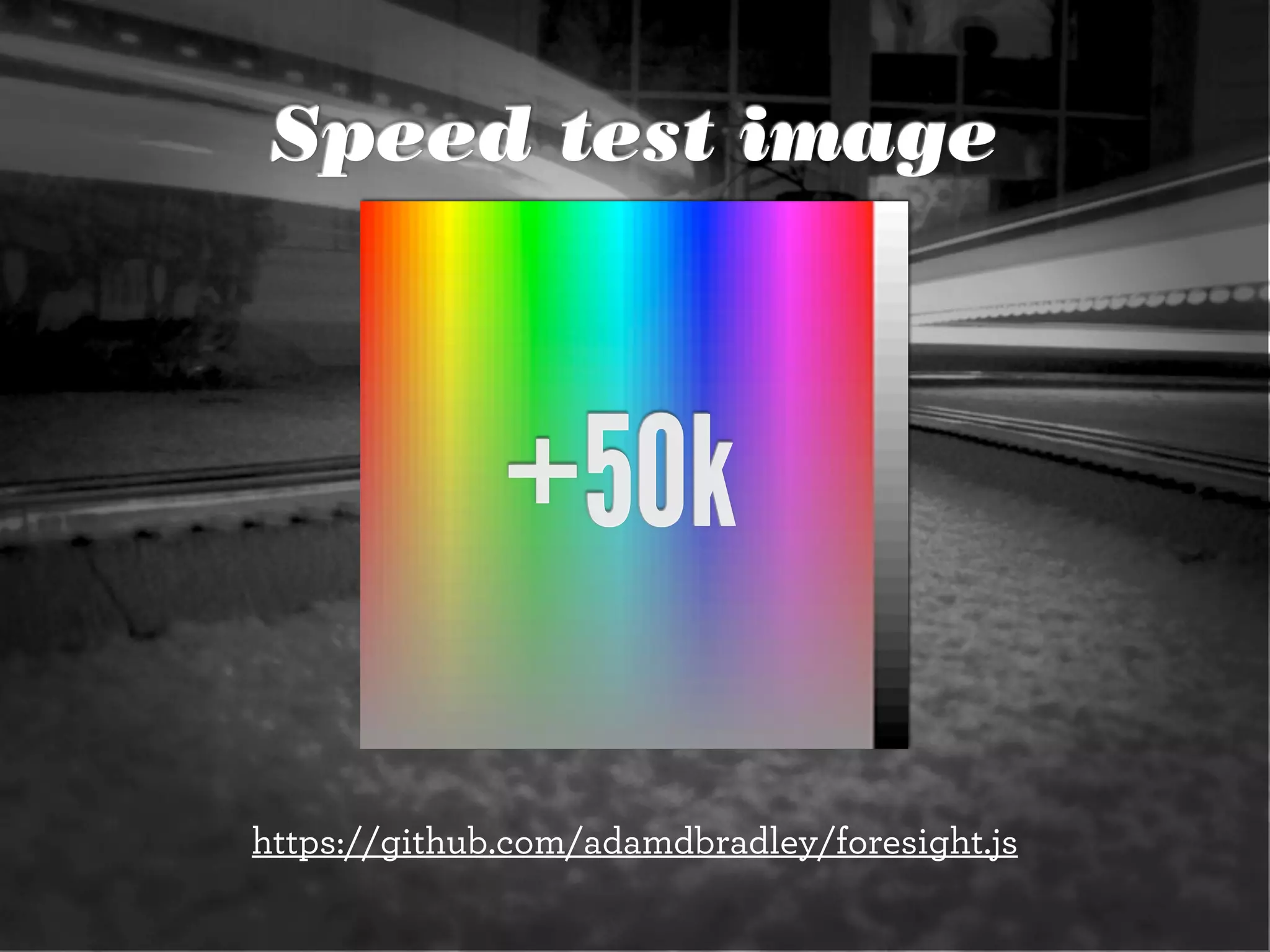
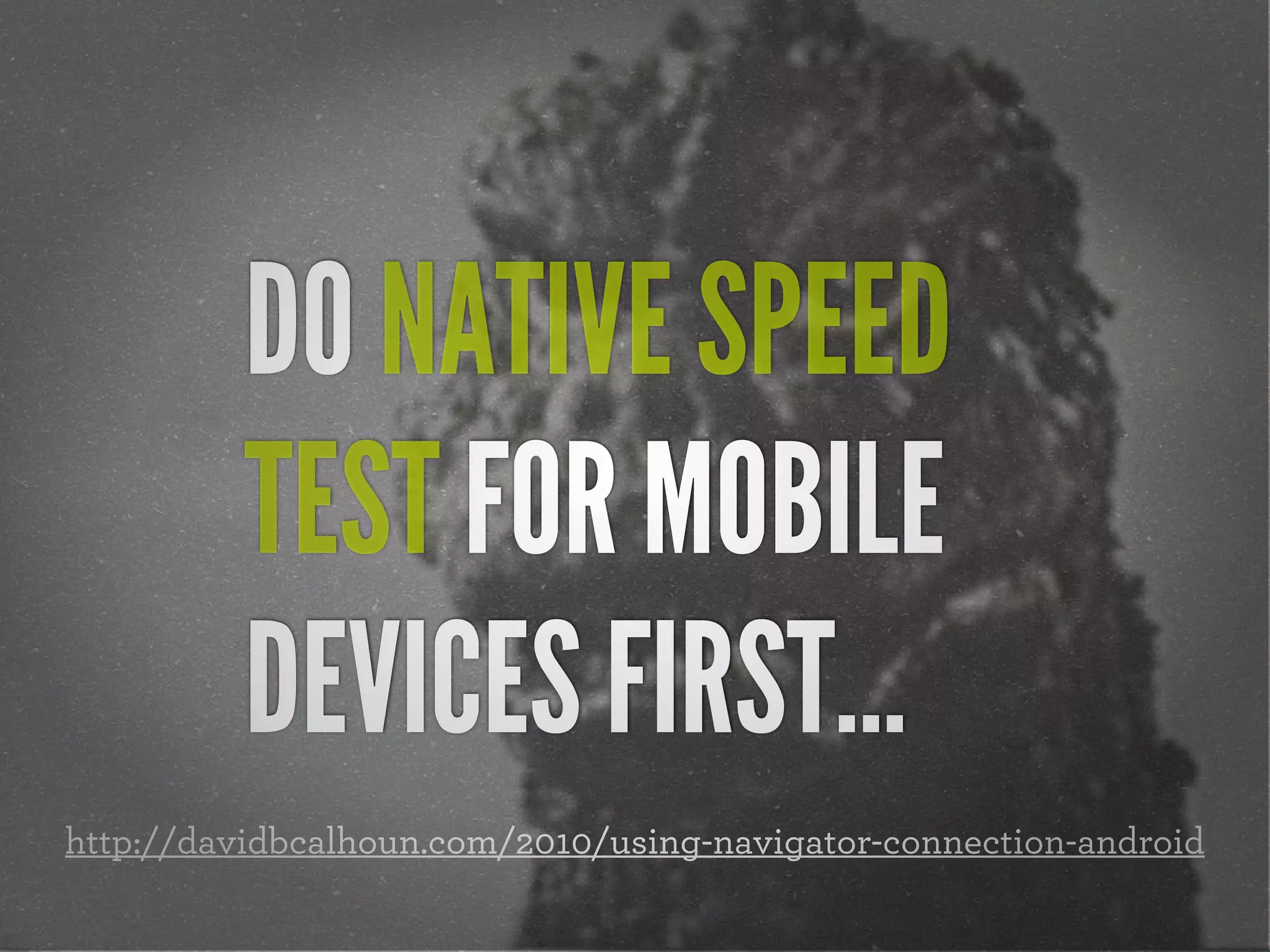
![Native speed test
// @Modernizr's network-connection.js
connection = navigator.connection || {
type: 0 }, // polyfill
isSlowConnection = connection.type == 3
|| connection.type == 4
| /^[23]g$/.test(connection.type);
http://davidbcalhoun.com/2010/using-navigator-connection-android](https://image.slidesharecdn.com/adaptive-images-html5tx-130202100125-phpapp01/85/html5tx-Adaptive-Images-in-Responsive-Web-Design-37-320.jpg)
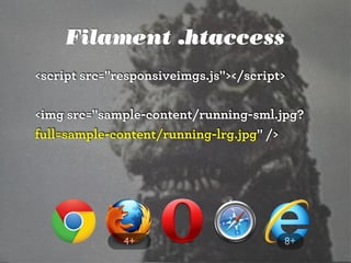
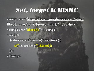
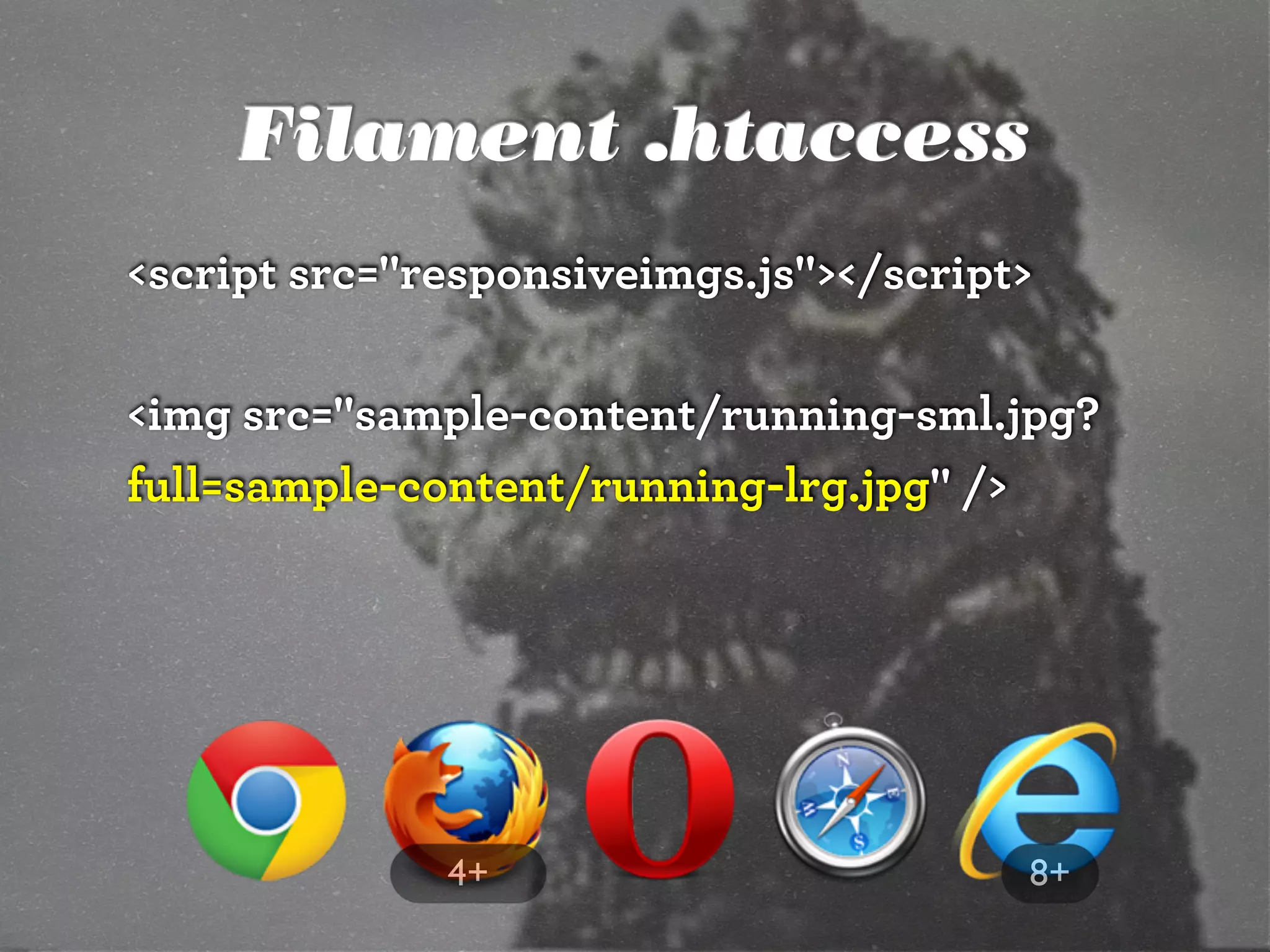
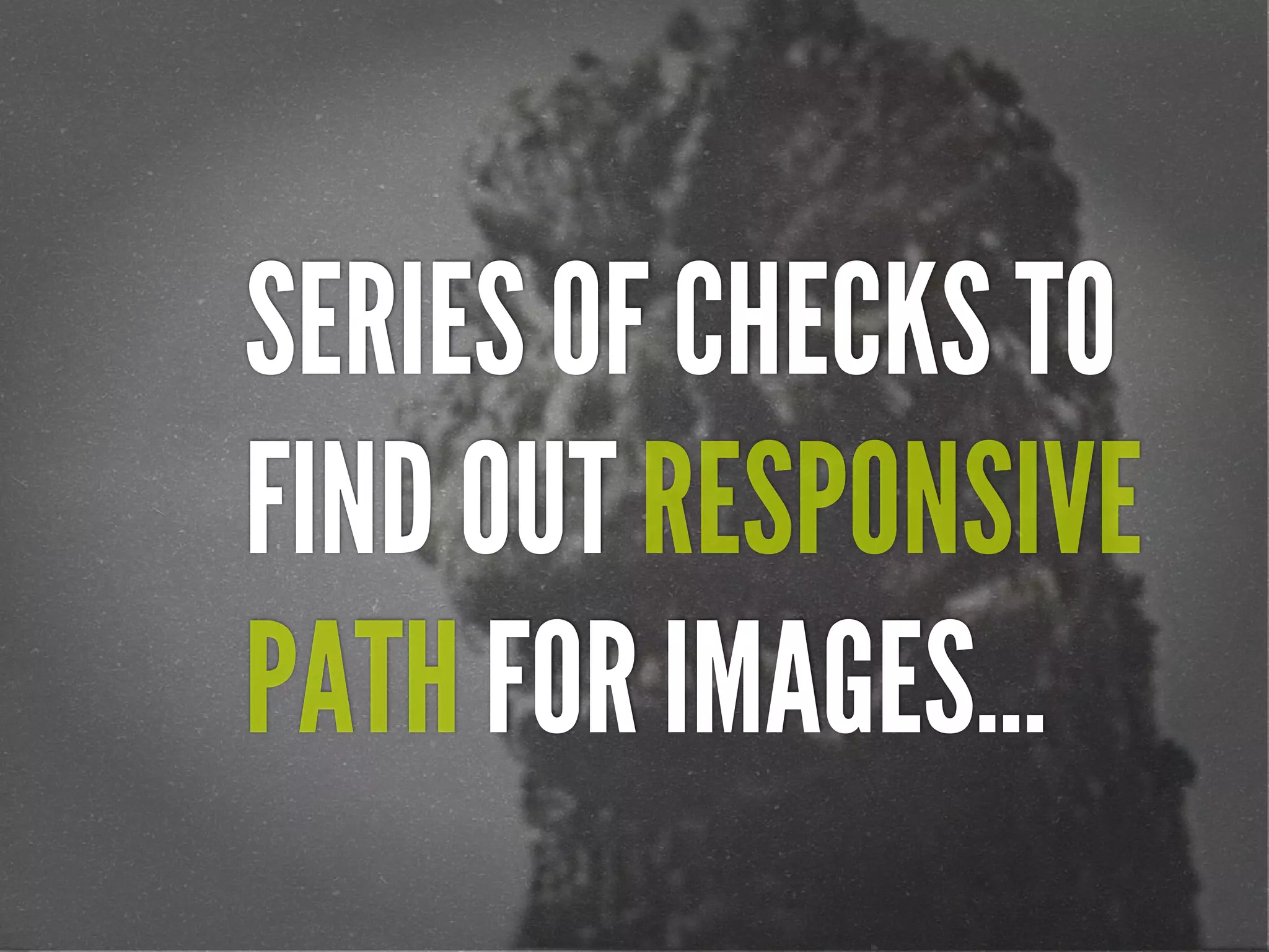
![Filament .htaccess
# Responsive Images
# Mobile-First images that scale responsively and responsibly
# Copyright 2010, Scott Jehl, Filament Group, Inc
# Dual licensed under the MIT or GPL Version 2 licenses.
# //Start Responsive Images
RewriteEngine On
# direct image requests to temp
RewriteCond %{QUERY_STRING} full=(.*)&?
RewriteRule (.*)rwd-router/.*.(jpe?g|png|gif|webp) $1%1 [L]
# ignore trap for non-image requests, rewrite URL without trap segment
RewriteRule (.*)rwd-router/(.*)$ $1$2
# //End Responsive Images
https://github.com/filamentgroup/Responsive-Images](https://image.slidesharecdn.com/adaptive-images-html5tx-130202100125-phpapp01/85/html5tx-Adaptive-Images-in-Responsive-Web-Design-40-320.jpg)


![HTML5 Boilerplate
<!doctype html>
<!--[if lt IE 7]> <html class="no-js lt-ie9 lt-ie8 lt-ie7"
lang="en">
<![endif]-->
<!--[if IE 7]> <html class="no-js lt-ie9 lt-ie8" lang="en">
<![endif]-->
<!--[if IE 8]> <html class="no-js lt-ie9" lang="en"> <!
[endif]-->
<!--[if gt IE 8]><!--> <html class="no-js" lang="en"> <!--<!
[endif]-->
<head>](https://image.slidesharecdn.com/adaptive-images-html5tx-130202100125-phpapp01/85/html5tx-Adaptive-Images-in-Responsive-Web-Design-82-320.jpg)


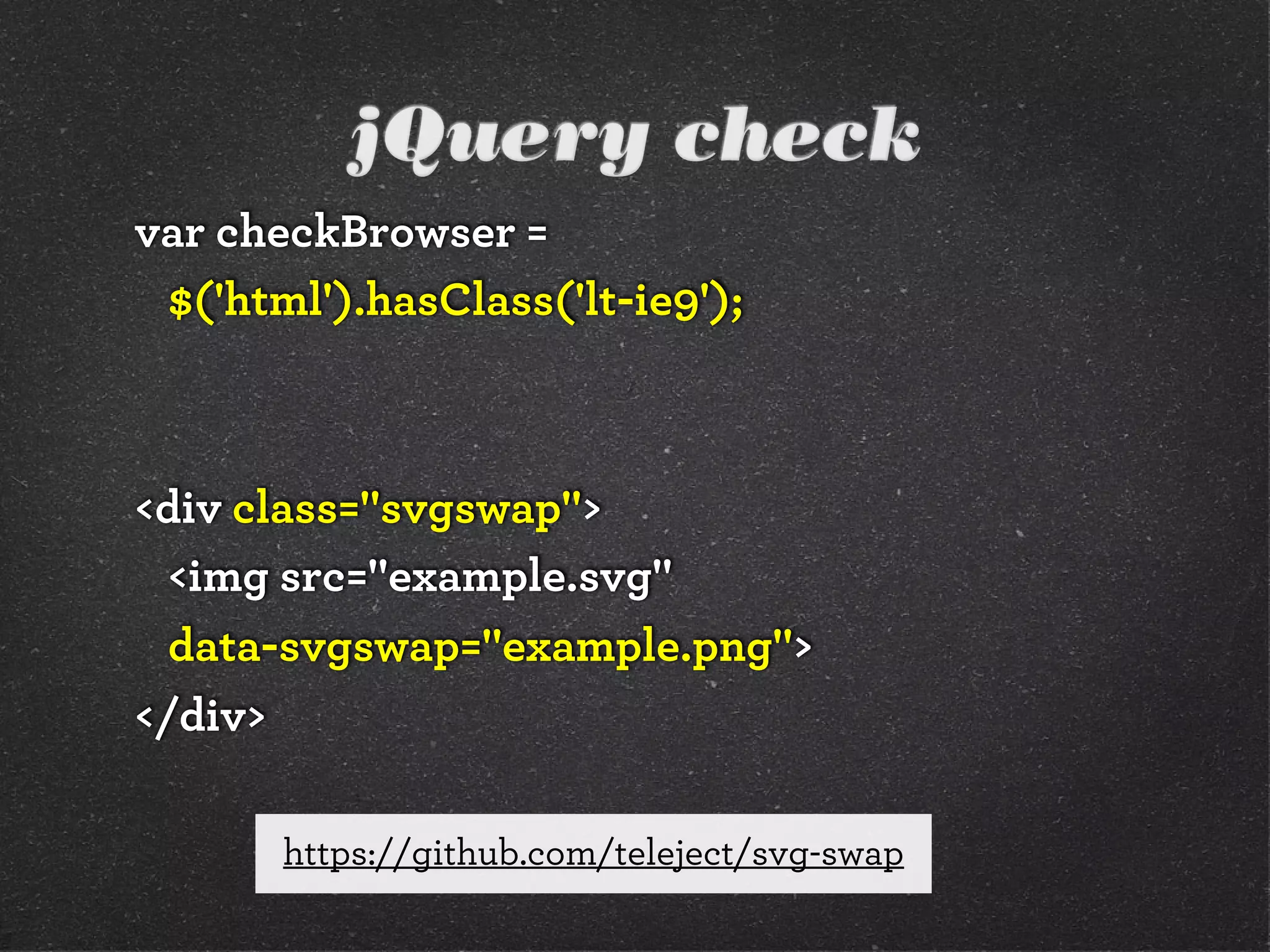
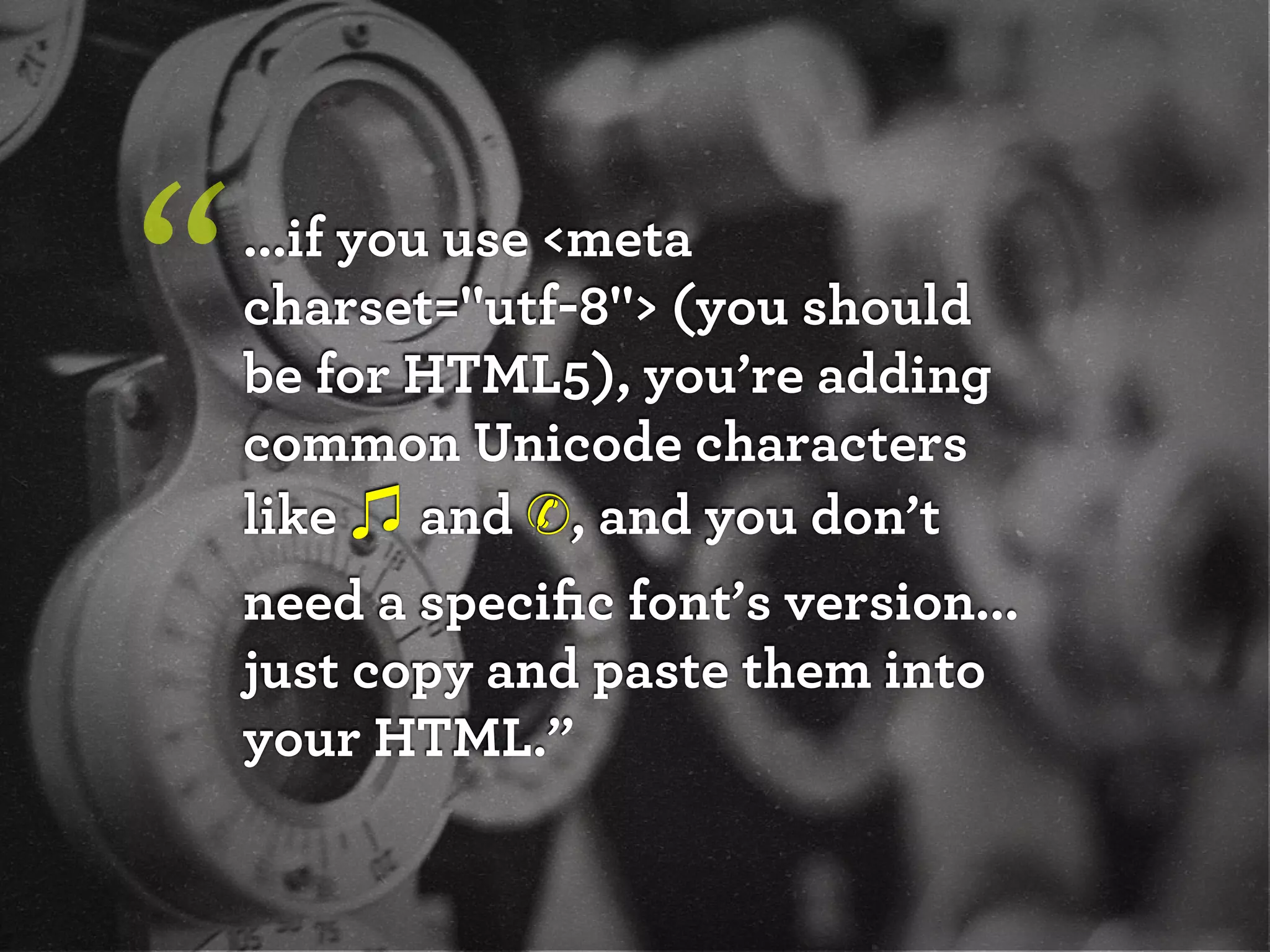
![Font-based icons
<style>
[data-icon]:before {
font-family: 'icon-font';
content: attr(data-icon);
}
</style>
<a href="http://example.com/cloud/save/">
<span data-icon="C" aria-hidden="true"></span>
Save to Cloud
</a>](https://image.slidesharecdn.com/adaptive-images-html5tx-130202100125-phpapp01/85/html5tx-Adaptive-Images-in-Responsive-Web-Design-89-320.jpg)


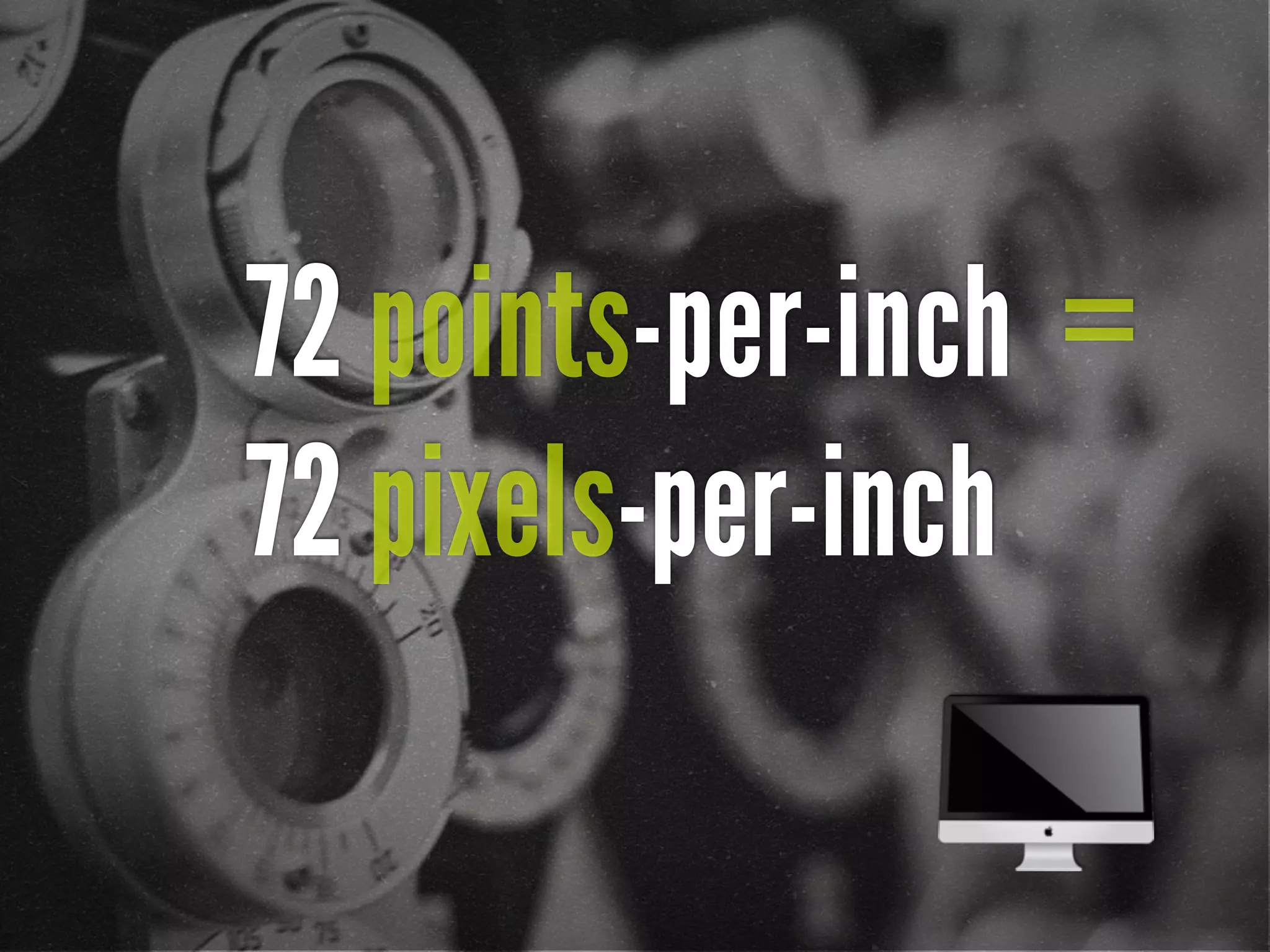
![72 points-per-inch
x [1+(1/3)]
= 96 PPI](https://image.slidesharecdn.com/adaptive-images-html5tx-130202100125-phpapp01/75/html5tx-Adaptive-Images-in-Responsive-Web-Design-20-2048.jpg)
![“ [In 2013, Intel sees their
product line] offer a higher
resolution experience than a
top-of-the-line 1080p HDTV.”
http://liliputing.com/2012/04/intel-retina-laptop-
desktop-displays-coming-in-2013.html](https://image.slidesharecdn.com/adaptive-images-html5tx-130202100125-phpapp01/75/html5tx-Adaptive-Images-in-Responsive-Web-Design-24-2048.jpg)
![Native speed test
// @Modernizr's network-connection.js
connection = navigator.connection || {
type: 0 }, // polyfill
isSlowConnection = connection.type == 3
|| connection.type == 4
| /^[23]g$/.test(connection.type);
http://davidbcalhoun.com/2010/using-navigator-connection-android](https://image.slidesharecdn.com/adaptive-images-html5tx-130202100125-phpapp01/75/html5tx-Adaptive-Images-in-Responsive-Web-Design-37-2048.jpg)
![Filament .htaccess
# Responsive Images
# Mobile-First images that scale responsively and responsibly
# Copyright 2010, Scott Jehl, Filament Group, Inc
# Dual licensed under the MIT or GPL Version 2 licenses.
# //Start Responsive Images
RewriteEngine On
# direct image requests to temp
RewriteCond %{QUERY_STRING} full=(.*)&?
RewriteRule (.*)rwd-router/.*.(jpe?g|png|gif|webp) $1%1 [L]
# ignore trap for non-image requests, rewrite URL without trap segment
RewriteRule (.*)rwd-router/(.*)$ $1$2
# //End Responsive Images
https://github.com/filamentgroup/Responsive-Images](https://image.slidesharecdn.com/adaptive-images-html5tx-130202100125-phpapp01/75/html5tx-Adaptive-Images-in-Responsive-Web-Design-40-2048.jpg)


![HTML5 Boilerplate
<!doctype html>
<!--[if lt IE 7]> <html class="no-js lt-ie9 lt-ie8 lt-ie7"
lang="en">
<![endif]-->
<!--[if IE 7]> <html class="no-js lt-ie9 lt-ie8" lang="en">
<![endif]-->
<!--[if IE 8]> <html class="no-js lt-ie9" lang="en"> <!
[endif]-->
<!--[if gt IE 8]><!--> <html class="no-js" lang="en"> <!--<!
[endif]-->
<head>](https://image.slidesharecdn.com/adaptive-images-html5tx-130202100125-phpapp01/75/html5tx-Adaptive-Images-in-Responsive-Web-Design-82-2048.jpg)
![Font-based icons
<style>
[data-icon]:before {
font-family: 'icon-font';
content: attr(data-icon);
}
</style>
<a href="http://example.com/cloud/save/">
<span data-icon="C" aria-hidden="true"></span>
Save to Cloud
</a>](https://image.slidesharecdn.com/adaptive-images-html5tx-130202100125-phpapp01/75/html5tx-Adaptive-Images-in-Responsive-Web-Design-89-2048.jpg)


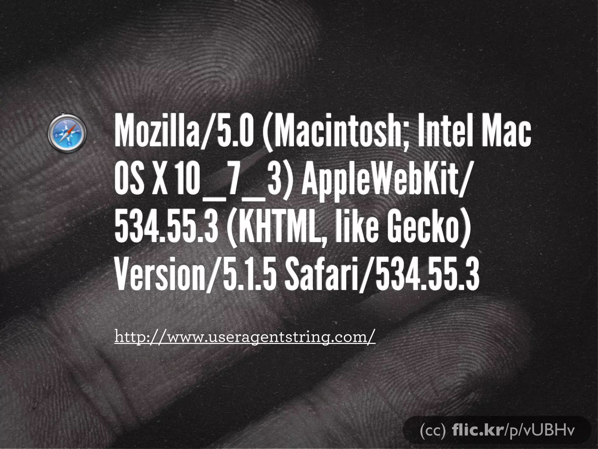
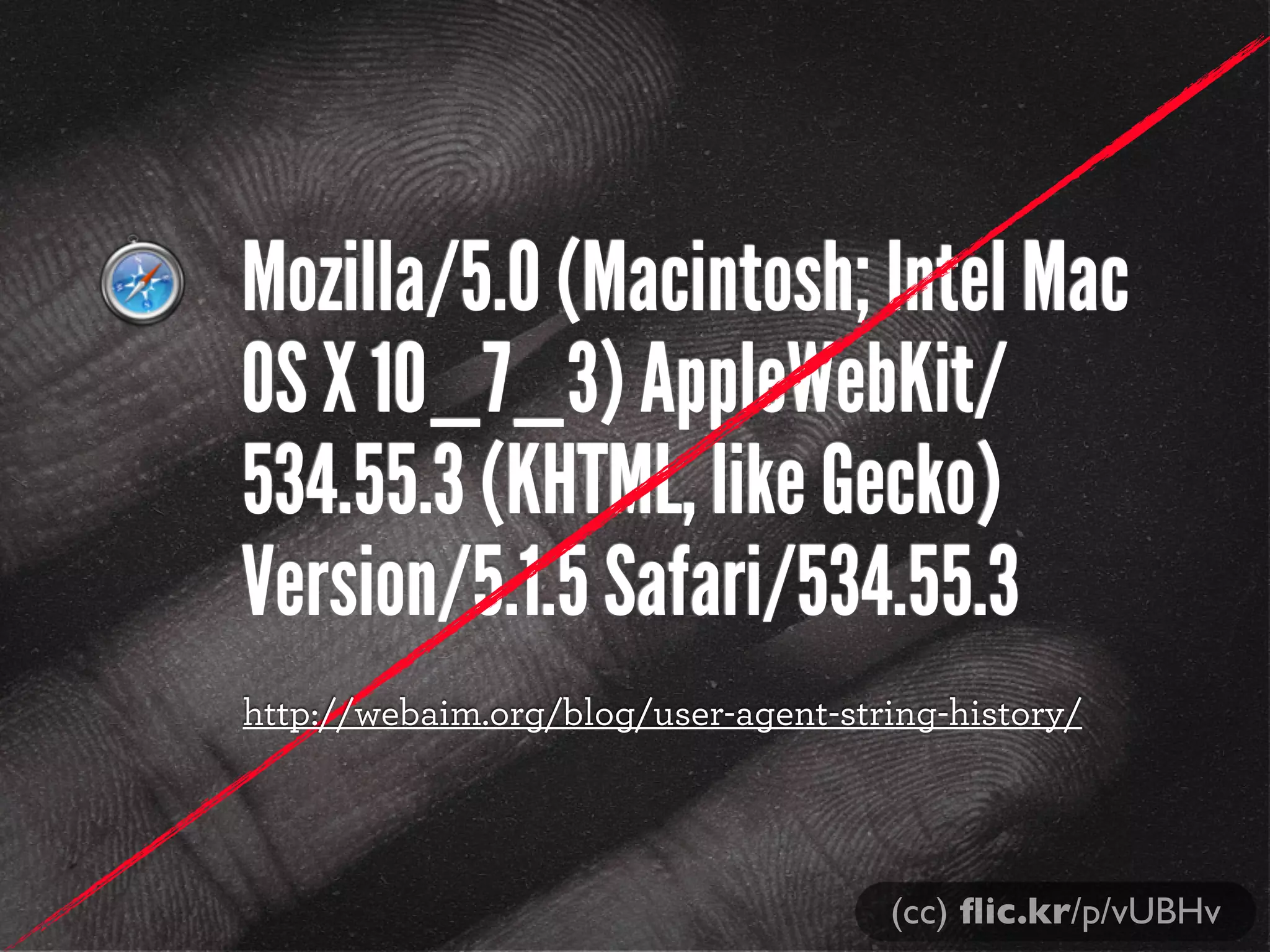
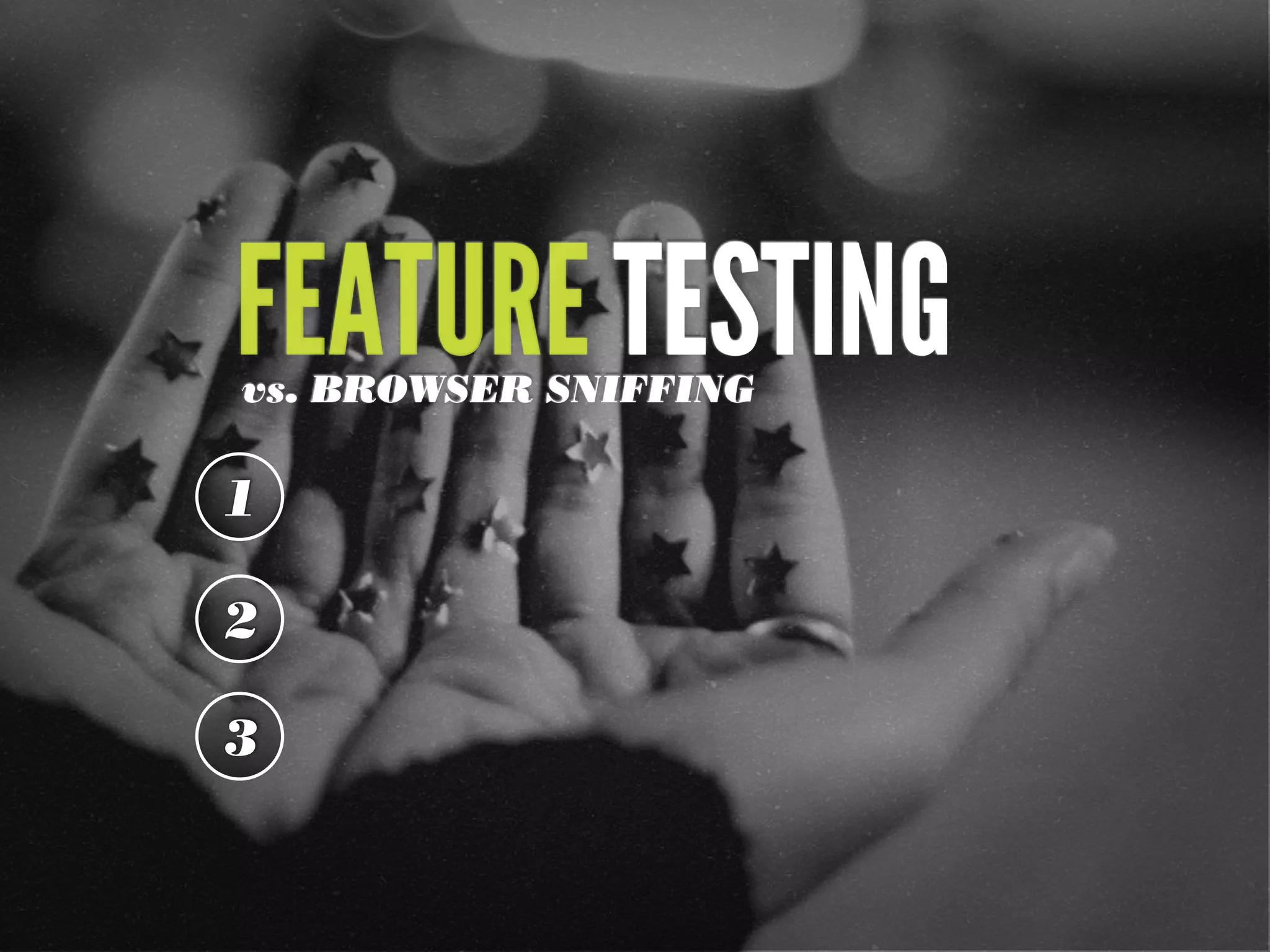
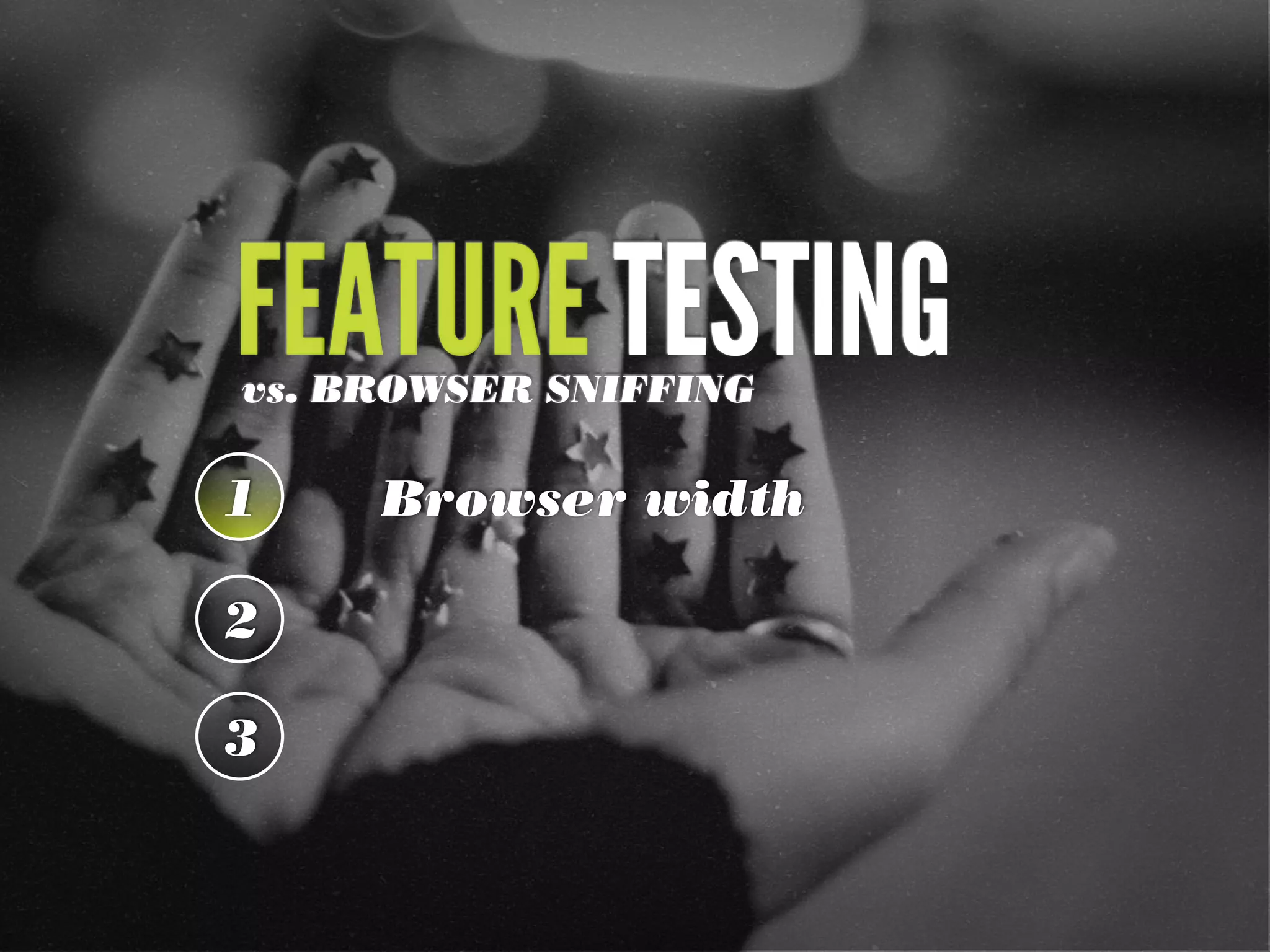
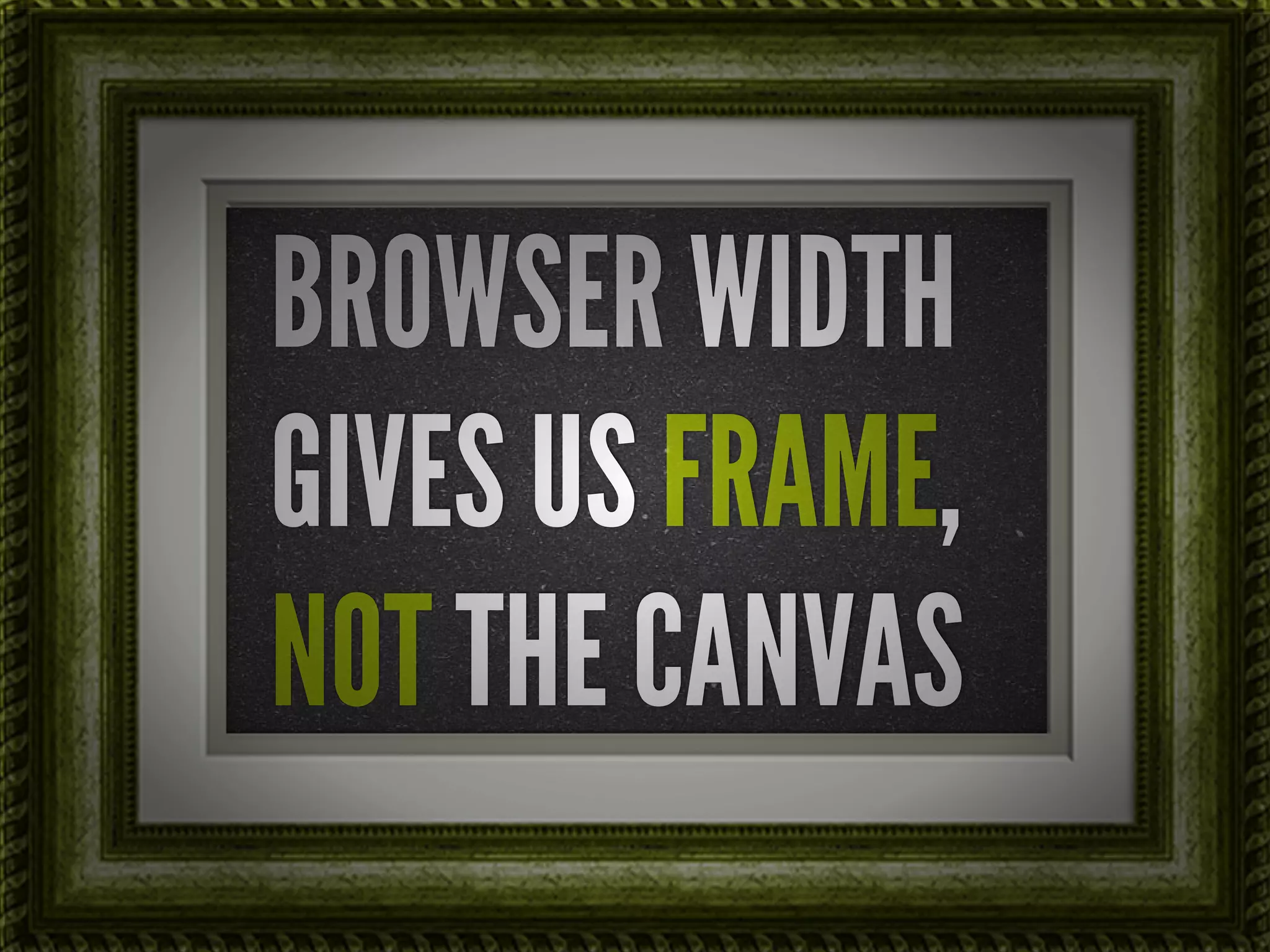
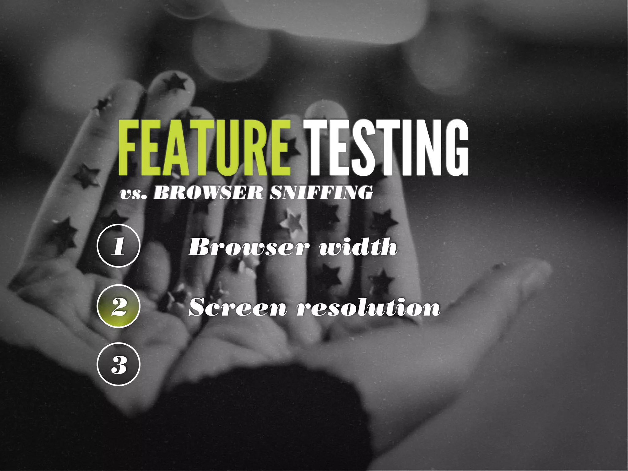
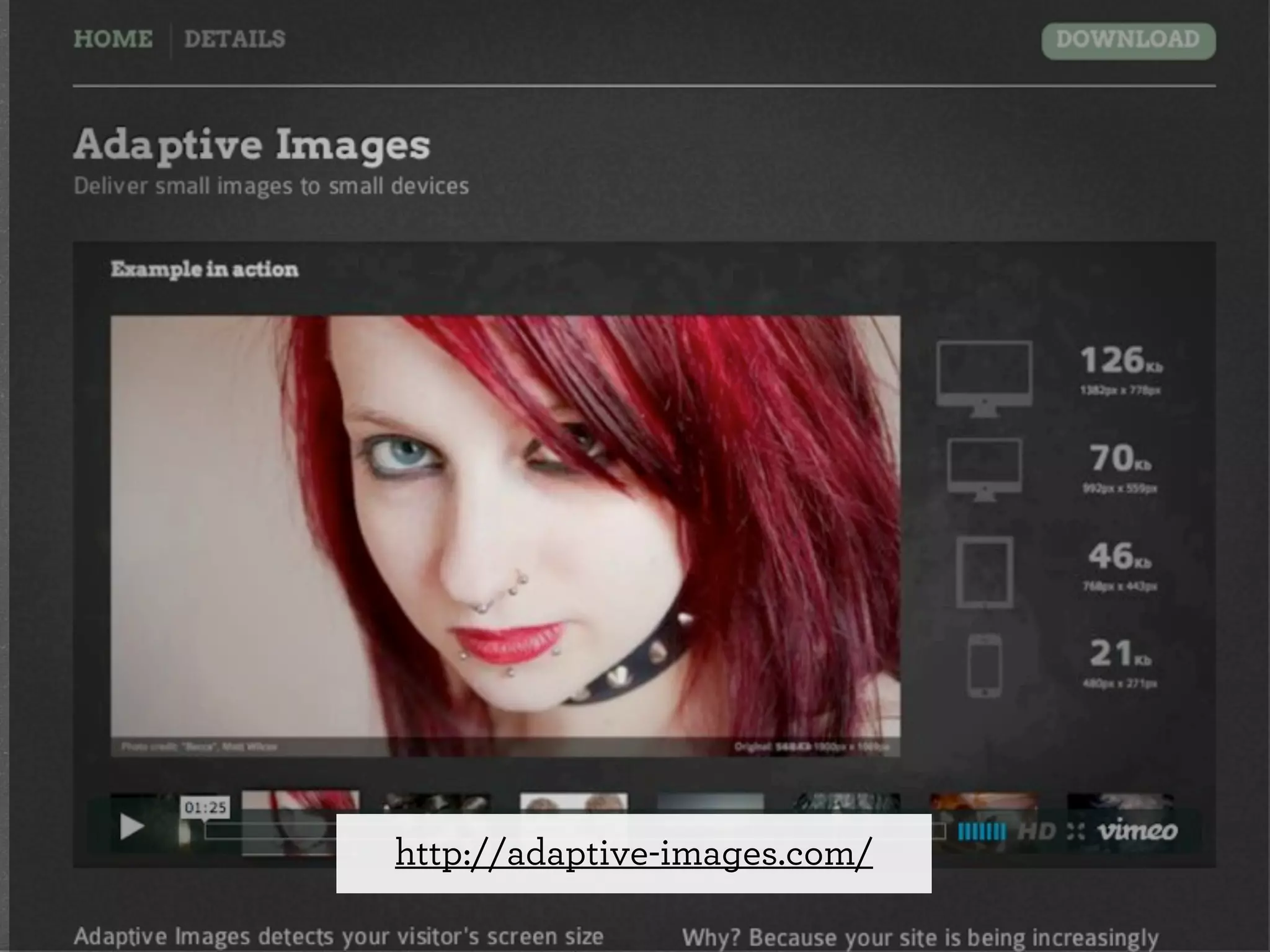
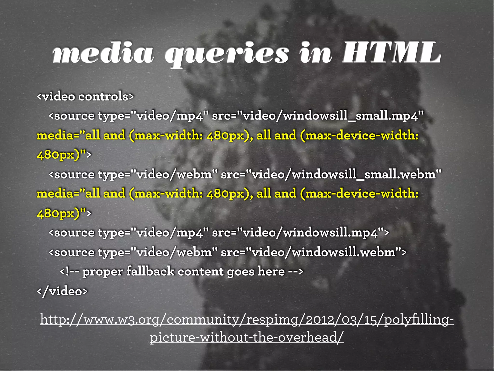
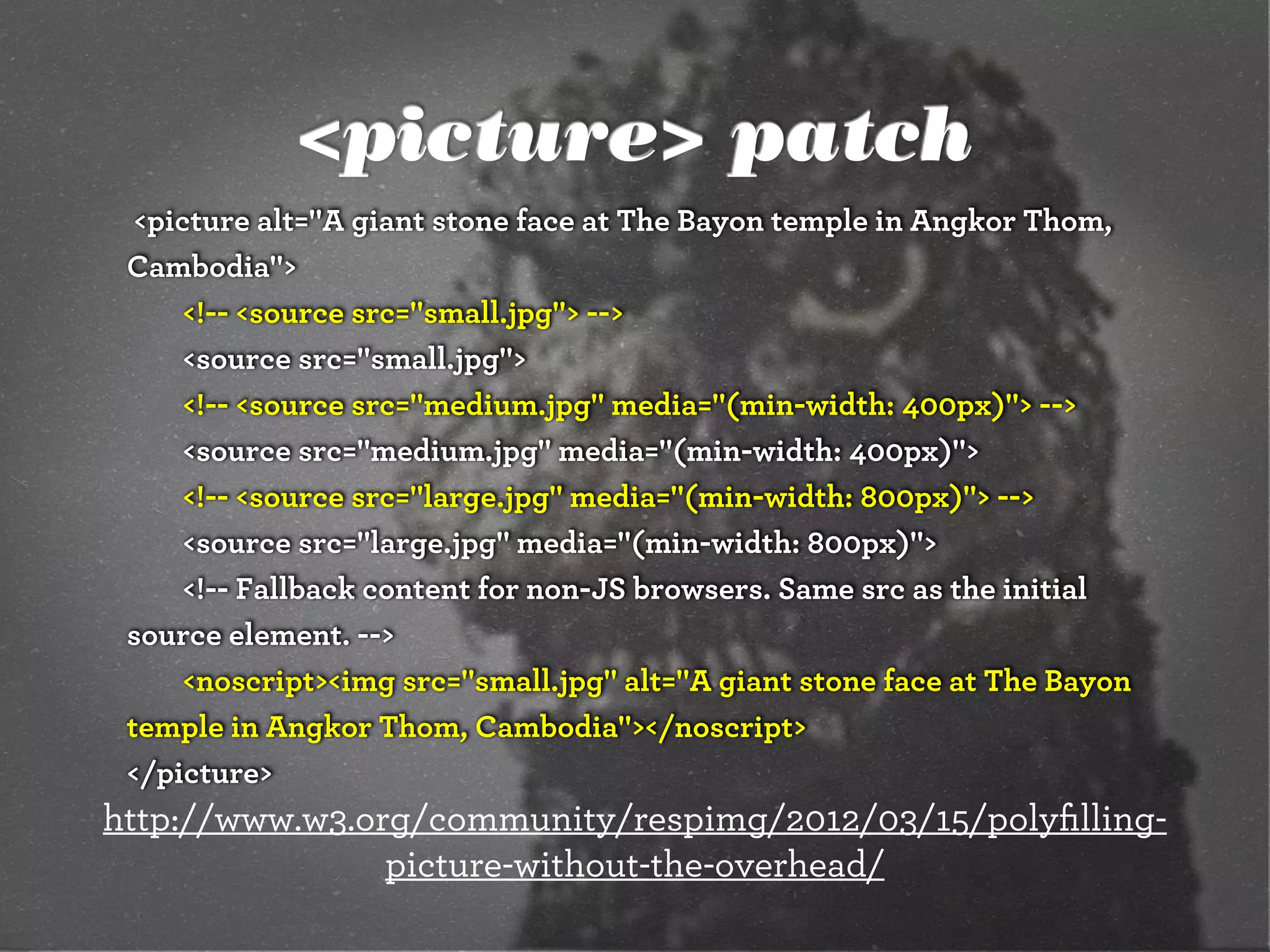
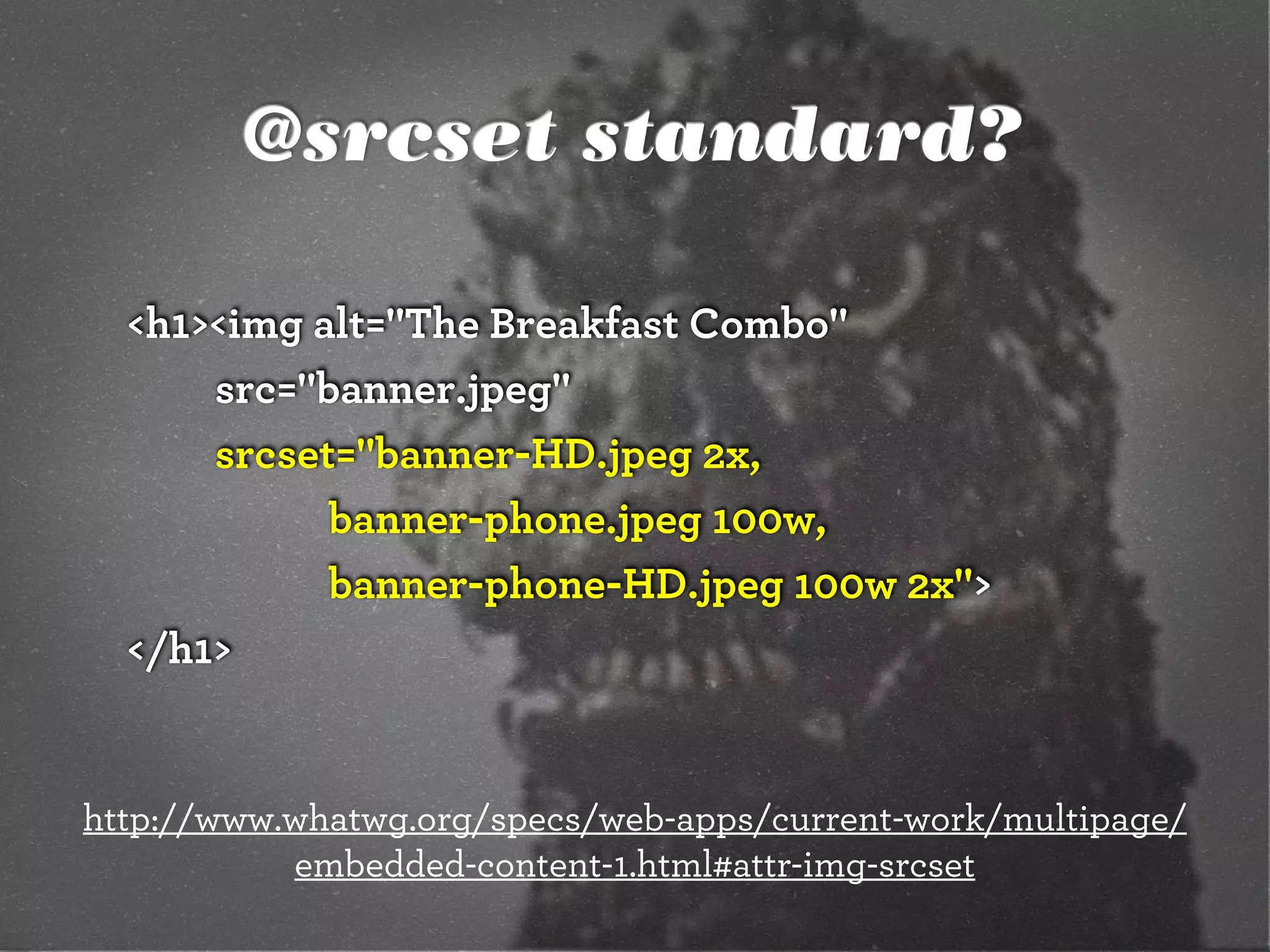
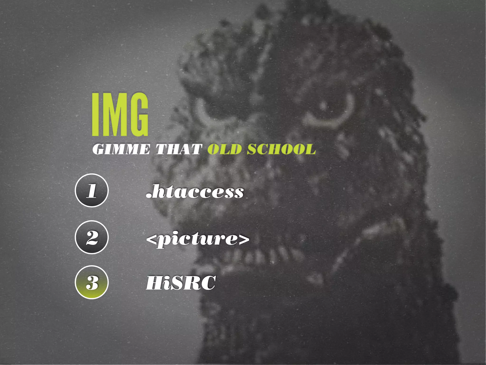
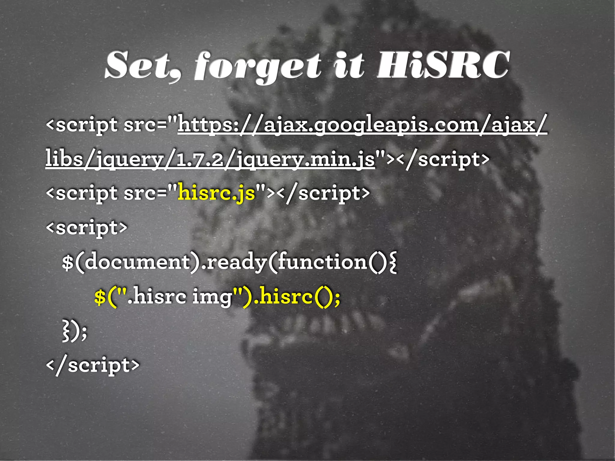
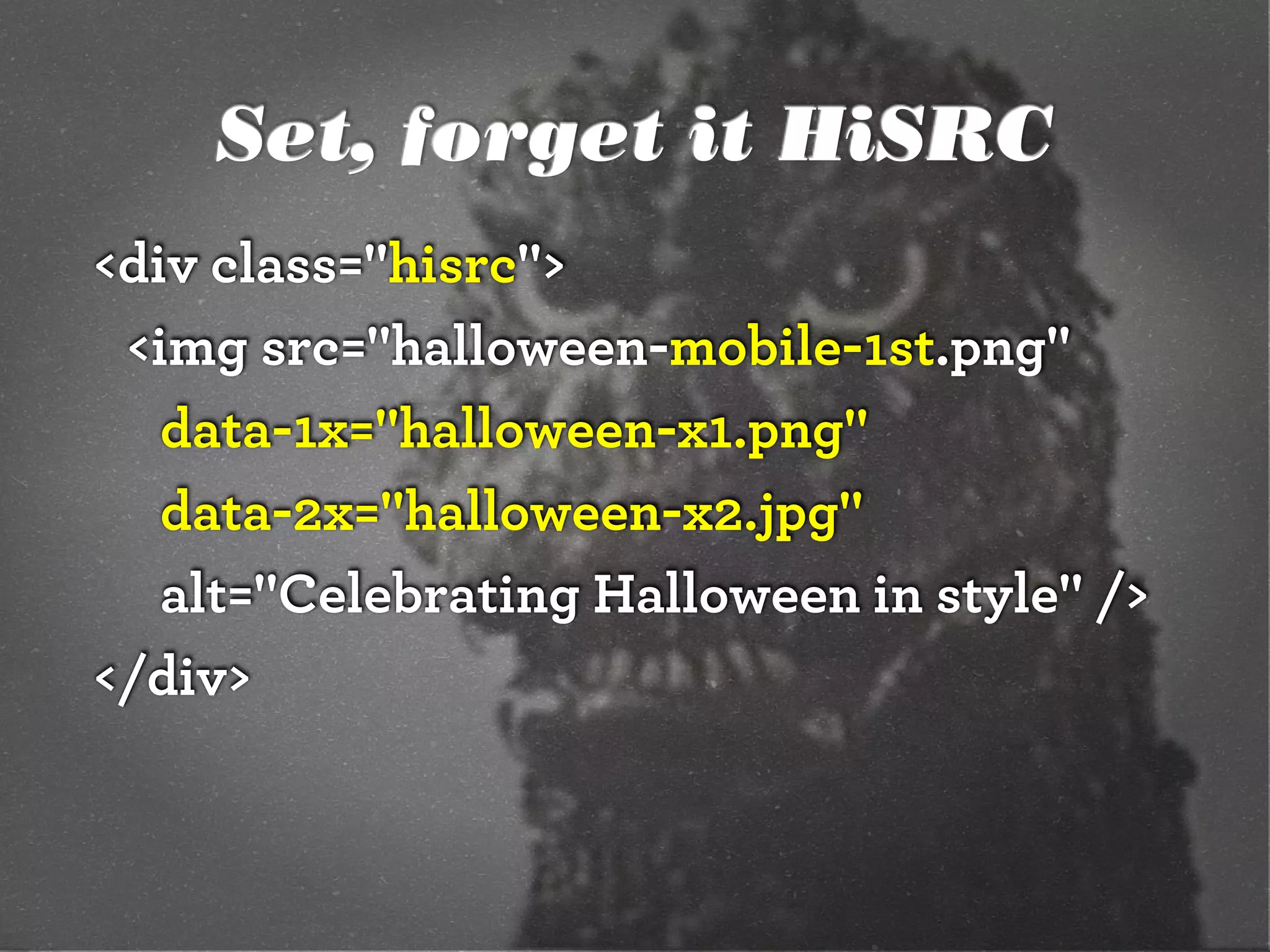
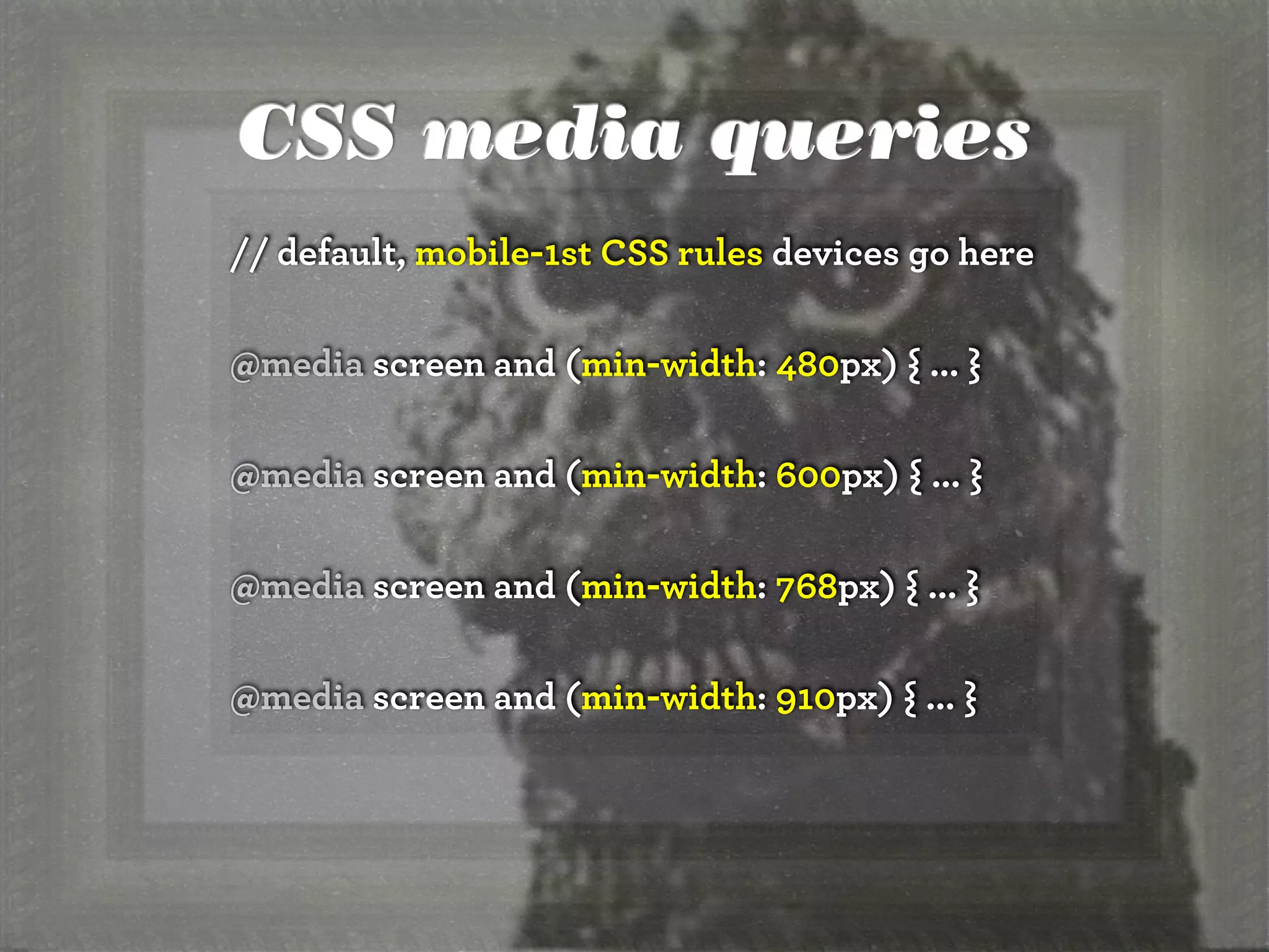
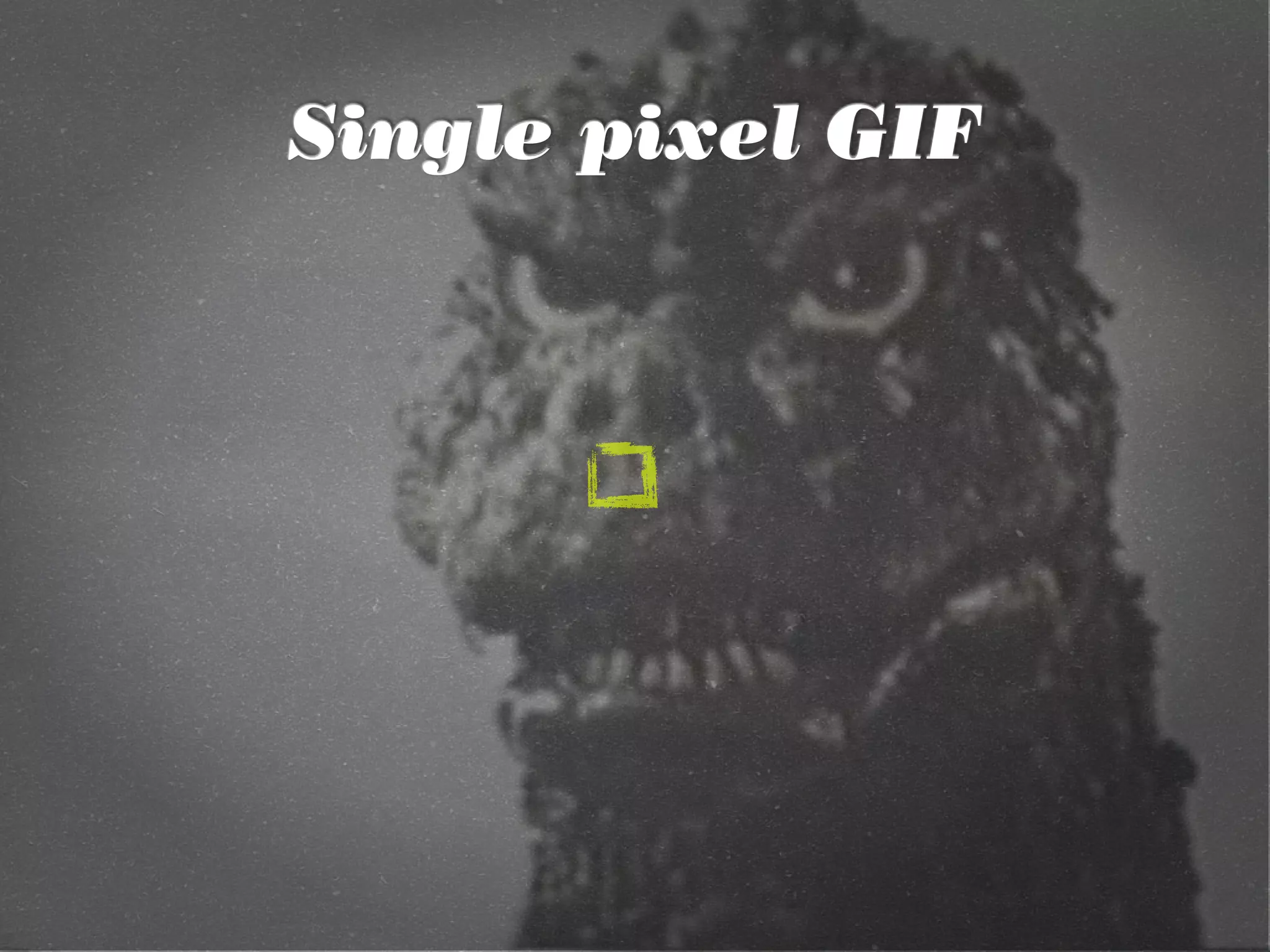
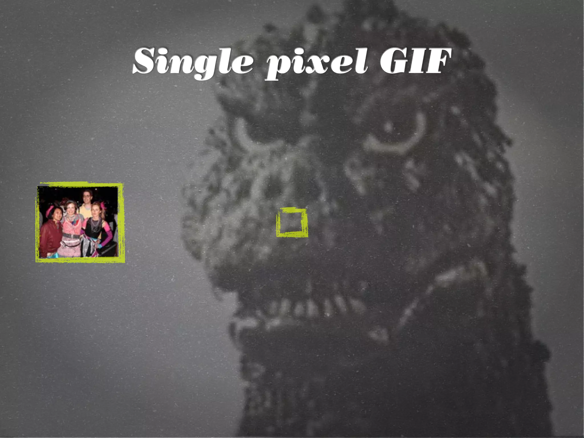
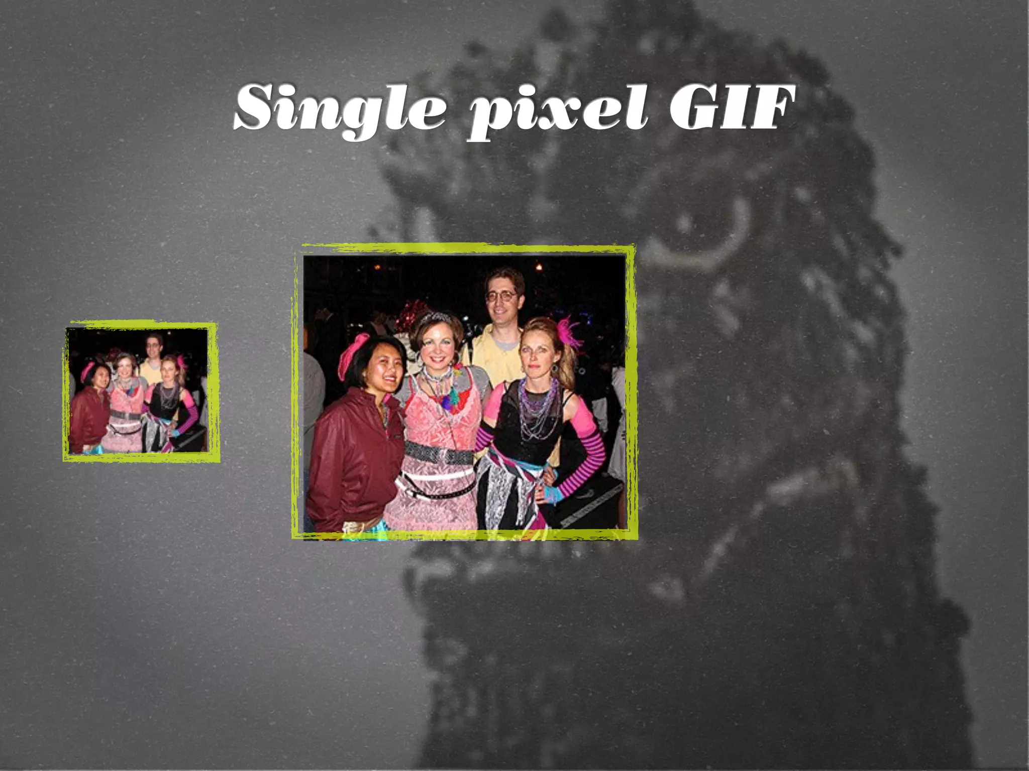
The document discusses adaptive images in responsive web design, emphasizing the importance of utilizing feature testing over browser sniffing to enhance user experience. It describes various approaches to implement responsive images through CSS media queries, HTML elements like <picture> and srcset, and JavaScript techniques. Additionally, it highlights the challenges of delivering appropriately sized images based on device resolution and bandwidth, while providing practical examples and code snippets for implementation.


![[jqconatx] Adaptive Images for Responsive Web Design](https://cdn.slidesharecdn.com/ss_thumbnails/adaptive-imagesv14-130911193737-phpapp01-thumbnail.jpg?width=600ounds&width=560&fit=bounds)

![[wvbcn] Adaptive Images in Responsive Web Design](https://cdn.slidesharecdn.com/ss_thumbnails/adaptive-imagesv13v2-130629093334-phpapp01-thumbnail.jpg?width=600ounds&width=560&fit=bounds)


![Progressive Enhancement & Mobile [Funka 2012]](https://cdn.slidesharecdn.com/ss_thumbnails/progressiveenhancementmobile-120418173201-phpapp01-thumbnail.jpg?width=600ounds&width=560&fit=bounds)


![[cssdevconf] Adaptive Images in RWD](https://cdn.slidesharecdn.com/ss_thumbnails/adaptive-imagesv6-121210084537-phpapp02-thumbnail.jpg?width=600ounds&width=560&fit=bounds)
![[rwdsummit2012] Adaptive Images in Responsive Web Design](https://cdn.slidesharecdn.com/ss_thumbnails/schmitt-adaptive-imagesv2-120829225201-phpapp02-thumbnail.jpg?width=600ounds&width=560&fit=bounds)
![[refreshaustin] Adaptive Images in Responsive Web Design](https://cdn.slidesharecdn.com/ss_thumbnails/adaptive-imagesv7-130410122323-phpapp02-thumbnail.jpg?width=600ounds&width=560&fit=bounds)
![[convergese] Adaptive Images in Responsive Web Design](https://cdn.slidesharecdn.com/ss_thumbnails/2012-adaptive-images-convergese-120509135732-phpapp01-thumbnail.jpg?width=600ounds&width=560&fit=bounds)
![[CSSDevConf] Adaptive Images in Responsive Web Design 2014](https://cdn.slidesharecdn.com/ss_thumbnails/adaptive-images-cssdevconf-141013185313-conversion-gate02-thumbnail.jpg?width=600ounds&width=560&fit=bounds)
![[HEWEBAR 2012] Adaptive Images in Responsive Web Design](https://cdn.slidesharecdn.com/ss_thumbnails/hewebar-2012-adaptive-images-in-rwd-120729151800-phpapp02-thumbnail.jpg?width=600ounds&width=560&fit=bounds)
![[HEWEBFL] Adaptive Images in Responsive Web Design](https://cdn.slidesharecdn.com/ss_thumbnails/hewebfl-adaptive-images2-130423085801-phpapp02-thumbnail.jpg?width=600ounds&width=560&fit=bounds)
![[cssdevconf] Adaptive Images in Responsive Web Design](https://cdn.slidesharecdn.com/ss_thumbnails/adaptive-imagesv16-131021133151-phpapp01-thumbnail.jpg?width=600ounds&width=560&fit=bounds)
![[rwdsummit] Adaptive Images in Responsive Web Design](https://cdn.slidesharecdn.com/ss_thumbnails/adaptive-imagesv18-1-140325201134-phpapp02-thumbnail.jpg?width=600ounds&width=560&fit=bounds)
![[drupalcampatx] Adaptive Images in Responsive Web Design](https://cdn.slidesharecdn.com/ss_thumbnails/adaptive-imagesv12v2-130623122711-phpapp01-thumbnail.jpg?width=600ounds&width=560&fit=bounds)
![[psuweb] Adaptive Images in Responsive Web Design](https://cdn.slidesharecdn.com/ss_thumbnails/adaptive-images-psuwebv2-130606095220-phpapp01-thumbnail.jpg?width=600ounds&width=560&fit=bounds)
![[wcatx] Adaptive Images in Responsive Web Design](https://cdn.slidesharecdn.com/ss_thumbnails/wcatx-adaptive-images-130518143751-phpapp01-thumbnail.jpg?width=600ounds&width=560&fit=bounds)
![[refreshpitt] Adaptive Images in Responsive Web Design](https://cdn.slidesharecdn.com/ss_thumbnails/adaptive-imagesv10-130609110047-phpapp01-thumbnail.jpg?width=600ounds&width=560&fit=bounds)
![[peachpit] Adaptive Images in Responsive Web Design](https://cdn.slidesharecdn.com/ss_thumbnails/peachpit-schmitt-adaptive-images-v2-130925150604-phpapp01-thumbnail.jpg?width=600ounds&width=560&fit=bounds)
![[Austin WordPress Meetup] Adaptive Images in Responsive Web Design](https://cdn.slidesharecdn.com/ss_thumbnails/adaptiveimages-wpaustinmeetup-150204100924-conversion-gate01-thumbnail.jpg?width=600ounds&width=560&fit=bounds)

![[parisweb] Adaptive Images in Responsive Web Design](https://cdn.slidesharecdn.com/ss_thumbnails/adaptive-imagesv15v2-131014003217-phpapp01-thumbnail.jpg?width=600ounds&width=560&fit=bounds)


![[funka] Adaptive Images in Responsive Web Design](https://cdn.slidesharecdn.com/ss_thumbnails/adaptive-images-funkav5-150415072902-conversion-gate01-thumbnail.jpg?width=600ounds&width=560&fit=bounds)
![[artifactconf] Github for People Who Don't Code](https://cdn.slidesharecdn.com/ss_thumbnails/github-for-people-that-dont-code-131115221827-phpapp02-thumbnail.jpg?width=600ounds&width=560&fit=bounds)

![[sxsw2013] Extremely Compressed JPEGs](https://cdn.slidesharecdn.com/ss_thumbnails/adaptive-imagesfordwmgv7-130312172016-phpapp01-thumbnail.jpg?width=600ounds&width=560&fit=bounds)
![[amigos] HTML5 and CSS3](https://cdn.slidesharecdn.com/ss_thumbnails/html5-and-css3v6-130208132048-phpapp01-thumbnail.jpg?width=600ounds&width=560&fit=bounds)
![[convergefl] Adaptive Images in Responsive Web Design](https://cdn.slidesharecdn.com/ss_thumbnails/christopher-schmitt-adaptive-images-121014200507-phpapp02-thumbnail.jpg?width=600ounds&width=560&fit=bounds)
![[HEWEBAR 2012] Beyond Desktop Browsing (HTML5)](https://cdn.slidesharecdn.com/ss_thumbnails/hewebar-2012-beyond-desktop-browsing-120729151254-phpapp01-thumbnail.jpg?width=600ounds&width=560&fit=bounds)
![[O'Reilly] HTML5 Design](https://cdn.slidesharecdn.com/ss_thumbnails/html5-workshop-111215160913-phpapp01-thumbnail.jpg?width=600ounds&width=560&fit=bounds)
![[heweb11] CSS3 Makeover](https://cdn.slidesharecdn.com/ss_thumbnails/css3-makeover-111027113114-phpapp01-thumbnail.jpg?width=600ounds&width=560&fit=bounds)
![[heweb11] HTML5 Makeover](https://cdn.slidesharecdn.com/ss_thumbnails/html5-makeover-111027112644-phpapp01-thumbnail.jpg?width=600ounds&width=560&fit=bounds)
![[edUi] HTML5 Workshop](https://cdn.slidesharecdn.com/ss_thumbnails/html5-workshop-2-111014103112-phpapp02-thumbnail.jpg?width=600ounds&width=560&fit=bounds)


![UiPath Automation Suite Installation (Hands-On) [2/3]](https://cdn.slidesharecdn.com/ss_thumbnails/automationsuitecommunitysession2-251015095633-a6d862f1-thumbnail.jpg?width=600ounds&width=560&fit=bounds)


