KEMBAR78
Daftar
Login
Python_Matplotlib_13_Slides_With_Diagrams.pptx
Download free for 30 days
Sign in
Upload
Language (EN)
Support
Business
Mobile
Social Media
Marketing
Technology
Art & Photos
Career
Design
Education
Presentations & Public Speaking
Government & Nonprofit
Healthcare
Internet
Law
Leadership & Management
Automotive
Engineering
Software
Recruiting & HR
Retail
Sales
Services
Science
Small Business & Entrepreneurship
Food
Environment
Economy & Finance
Data & Analytics
Investor Relations
Sports
Spiritual
News & Politics
Travel
Self Improvement
Real Estate
Entertainment & Humor
Health & Medicine
Devices & Hardware
Lifestyle
Change Language
Language
English
Español
Português
Français
Deutsche
Cancel
Save
Submit search
EN
Uploaded by
sukeerthankoyyada
PPTX, PDF
3 views
Python_Matplotlib_13_Slides_With_Diagrams.pptx
Python_Matplotlib_13_Slides_With_Diagrams.pptx
Engineering
◦
Read more
0
Save
Share
Embed
Download
Download to read offline
1
/ 13
2
/ 13
3
/ 13
4
/ 13
5
/ 13
6
/ 13
7
/ 13
8
/ 13
9
/ 13
10
/ 13
11
/ 13
12
/ 13
13
/ 13
More Related Content
PPTX
Introduction to matplotlib
by
Piyush rai
PPTX
Python_Matplotlib_13. _Slides.pptx
by
sukeerthankoyyada
PPTX
Data Visualization using Matplotlib to understand Graphs
by
MohammadRaza119
PPTX
Python Pyplot Class XII
by
ajay_opjs
PPTX
Matplotlib_Presentation jk jdjklskncncsjkk
by
sarfarazkhanwattoo
PPT
How Do You Create Data Visualizations in Python with Matplotlib?
by
xploreitcorp
PPTX
Introduction_to_Matplotlibpresenatration.pptx
by
nomikhanpc2004
PPTX
Matplotlib - Python Plotting Library Description
by
rishabhparmartpoint
Introduction to matplotlib
by
Piyush rai
Python_Matplotlib_13. _Slides.pptx
by
sukeerthankoyyada
Data Visualization using Matplotlib to understand Graphs
by
MohammadRaza119
Python Pyplot Class XII
by
ajay_opjs
Matplotlib_Presentation jk jdjklskncncsjkk
by
sarfarazkhanwattoo
How Do You Create Data Visualizations in Python with Matplotlib?
by
xploreitcorp
Introduction_to_Matplotlibpresenatration.pptx
by
nomikhanpc2004
Matplotlib - Python Plotting Library Description
by
rishabhparmartpoint
Similar to Python_Matplotlib_13_Slides_With_Diagrams.pptx
PPTX
Introduction to Pylab and Matploitlib.
by
yazad dumasia
PPTX
Python chart plotting using Matplotlib.pptx
by
sonali sonavane
PPTX
Matplotlib yayyyyyyyyyyyyyin Python.pptx
by
AamnaRaza1
DOCX
Data visualization using py plot part i
by
TutorialAICSIP
PPTX
Python_for_Data_Visualization.pptx python for BE &Mtech
by
PoojaPatil286778
PPTX
matplotlib.pptxdsfdsfdsfdsdsfdsdfdsfsdf cvvf
by
zmulani8
PDF
12-IP.pdf
by
kajalkhorwal106
PPTX
Introduction to Matplotlib Library in Python.pptx
by
bajajrishabh96tech
PPTX
UNIT_4_data visualization.pptx
by
BhagyasriPatel2
PDF
UNit-III. part 2.pdf
by
MastiCreation
PPTX
Matplot Lib Practicals artificial intelligence.pptx
by
PianoPianist
PPTX
PYTHON-Chapter 4-Plotting and Data Science PyLab - MAULIK BORSANIYA
by
Maulik Borsaniya
PPTX
Matplotlib.pptx
by
AbdulrahmanMohammed166612
PPTX
Visualization and Matplotlib using Python.pptx
by
SharmilaMore5
PPTX
UNIT-5-II IT-DATA VISUALIZATION TECHNIQUES
by
hemalathab24
PPTX
Python Visualization API Primersubplots
by
VidhyaB10
PPTX
a9bf73_Introduction to Matplotlib01.pptx
by
Rahidkhan10
PPTX
MatplotLib.pptx
by
Paras Intotech
PDF
Matplotlib Review 2021
by
Bhaskar J.Roy
PDF
Matplotlib_Complete review_2021_abridged_version
by
Bhaskar J.Roy
Introduction to Pylab and Matploitlib.
by
yazad dumasia
Python chart plotting using Matplotlib.pptx
by
sonali sonavane
Matplotlib yayyyyyyyyyyyyyin Python.pptx
by
AamnaRaza1
Data visualization using py plot part i
by
TutorialAICSIP
Python_for_Data_Visualization.pptx python for BE &Mtech
by
PoojaPatil286778
matplotlib.pptxdsfdsfdsfdsdsfdsdfdsfsdf cvvf
by
zmulani8
12-IP.pdf
by
kajalkhorwal106
Introduction to Matplotlib Library in Python.pptx
by
bajajrishabh96tech
UNIT_4_data visualization.pptx
by
BhagyasriPatel2
UNit-III. part 2.pdf
by
MastiCreation
Matplot Lib Practicals artificial intelligence.pptx
by
PianoPianist
PYTHON-Chapter 4-Plotting and Data Science PyLab - MAULIK BORSANIYA
by
Maulik Borsaniya
Matplotlib.pptx
by
AbdulrahmanMohammed166612
Visualization and Matplotlib using Python.pptx
by
SharmilaMore5
UNIT-5-II IT-DATA VISUALIZATION TECHNIQUES
by
hemalathab24
Python Visualization API Primersubplots
by
VidhyaB10
a9bf73_Introduction to Matplotlib01.pptx
by
Rahidkhan10
MatplotLib.pptx
by
Paras Intotech
Matplotlib Review 2021
by
Bhaskar J.Roy
Matplotlib_Complete review_2021_abridged_version
by
Bhaskar J.Roy
Recently uploaded
PPTX
Heat Transfer Power Point presentation 1.1.pptx
by
Solomon Raj
PDF
The CULTURIST Design Portfolio 2025 architecture and interior
by
design and architecture
PPTX
Centrigugal Compressors Foundations and Operation
by
RobertWaters35
PDF
How Are Learning-Based Methods Reshaping Trajectory Planning in Autonomous D...
by
imagnejane
PPTX
AUV DESIGN and DEVELOPMENT FOR DEEP SEA MINING ( POLYMETALLIC NODULES) in MRC...
by
Arijit Biswas
PDF
Certified Cloud Security Professional (CCSP): Unit 4
by
VICTOR MAESTRE RAMIREZ
PDF
Energias renovables estudio energias.pdf
by
CarlosPrezBuelga
PPTX
Hydrocarbon traps, migration and accumulation of petroleum
by
Ahmadnawaz144515
PDF
Overcoming QoS Challenges in a Full Automotive Ethernet Architecture
by
RealTime-at-Work (RTaW)
PDF
Replacing react with hotwire - Scot Ruby September 2025
by
pythonandchips
PPT
UNIT 5 BIST.ppt-Built in self test for Integrated circuit design
by
vmspraneeth
PDF
【EN】Accelerating Flutter UI Development with Figma Dev Mode MCP × Claude Code
by
Yuta Asada
PDF
Performance analysis of recycled PET composites reinforced with waste slate d...
by
ADITYA CHAUHAN
PPTX
Data types and datatype conversions of python programming.pptx
by
AmyPrasannaTella1
PPTX
Electrical_Draftsman_AutoCAD_Mastery_Roadmap.pptx
by
Ken Felix Lubega
PDF
Certified Kubernetes Security Specialist (CKS): Unit 8
by
VICTOR MAESTRE RAMIREZ
PDF
(17-30)Geotechnical Research in India - Scenario up to 2025.pdf
by
Dharmsinh Desai of University
PDF
An architecture to build high performance infrastructures on cloud computing ...
by
TELKOMNIKA JOURNAL
PDF
SE APPIA LIFE VOL 2-3GR for service manual.pdf
by
troneelektrik
PPTX
Build an UWB Indoor Positioning System using ESP32 and Qorvo DWM3000
by
CircuitDigest
Heat Transfer Power Point presentation 1.1.pptx
by
Solomon Raj
The CULTURIST Design Portfolio 2025 architecture and interior
by
design and architecture
Centrigugal Compressors Foundations and Operation
by
RobertWaters35
How Are Learning-Based Methods Reshaping Trajectory Planning in Autonomous D...
by
imagnejane
AUV DESIGN and DEVELOPMENT FOR DEEP SEA MINING ( POLYMETALLIC NODULES) in MRC...
by
Arijit Biswas
Certified Cloud Security Professional (CCSP): Unit 4
by
VICTOR MAESTRE RAMIREZ
Energias renovables estudio energias.pdf
by
CarlosPrezBuelga
Hydrocarbon traps, migration and accumulation of petroleum
by
Ahmadnawaz144515
Overcoming QoS Challenges in a Full Automotive Ethernet Architecture
by
RealTime-at-Work (RTaW)
Replacing react with hotwire - Scot Ruby September 2025
by
pythonandchips
UNIT 5 BIST.ppt-Built in self test for Integrated circuit design
by
vmspraneeth
【EN】Accelerating Flutter UI Development with Figma Dev Mode MCP × Claude Code
by
Yuta Asada
Performance analysis of recycled PET composites reinforced with waste slate d...
by
ADITYA CHAUHAN
Data types and datatype conversions of python programming.pptx
by
AmyPrasannaTella1
Electrical_Draftsman_AutoCAD_Mastery_Roadmap.pptx
by
Ken Felix Lubega
Certified Kubernetes Security Specialist (CKS): Unit 8
by
VICTOR MAESTRE RAMIREZ
(17-30)Geotechnical Research in India - Scenario up to 2025.pdf
by
Dharmsinh Desai of University
An architecture to build high performance infrastructures on cloud computing ...
by
TELKOMNIKA JOURNAL
SE APPIA LIFE VOL 2-3GR for service manual.pdf
by
troneelektrik
Build an UWB Indoor Positioning System using ESP32 and Qorvo DWM3000
by
CircuitDigest
Python_Matplotlib_13_Slides_With_Diagrams.pptx
1.
Data Visualization Using
Python Matplotlib • An Overview of Python’s Powerful Plotting Library • Presented by: [Your Name]
2.
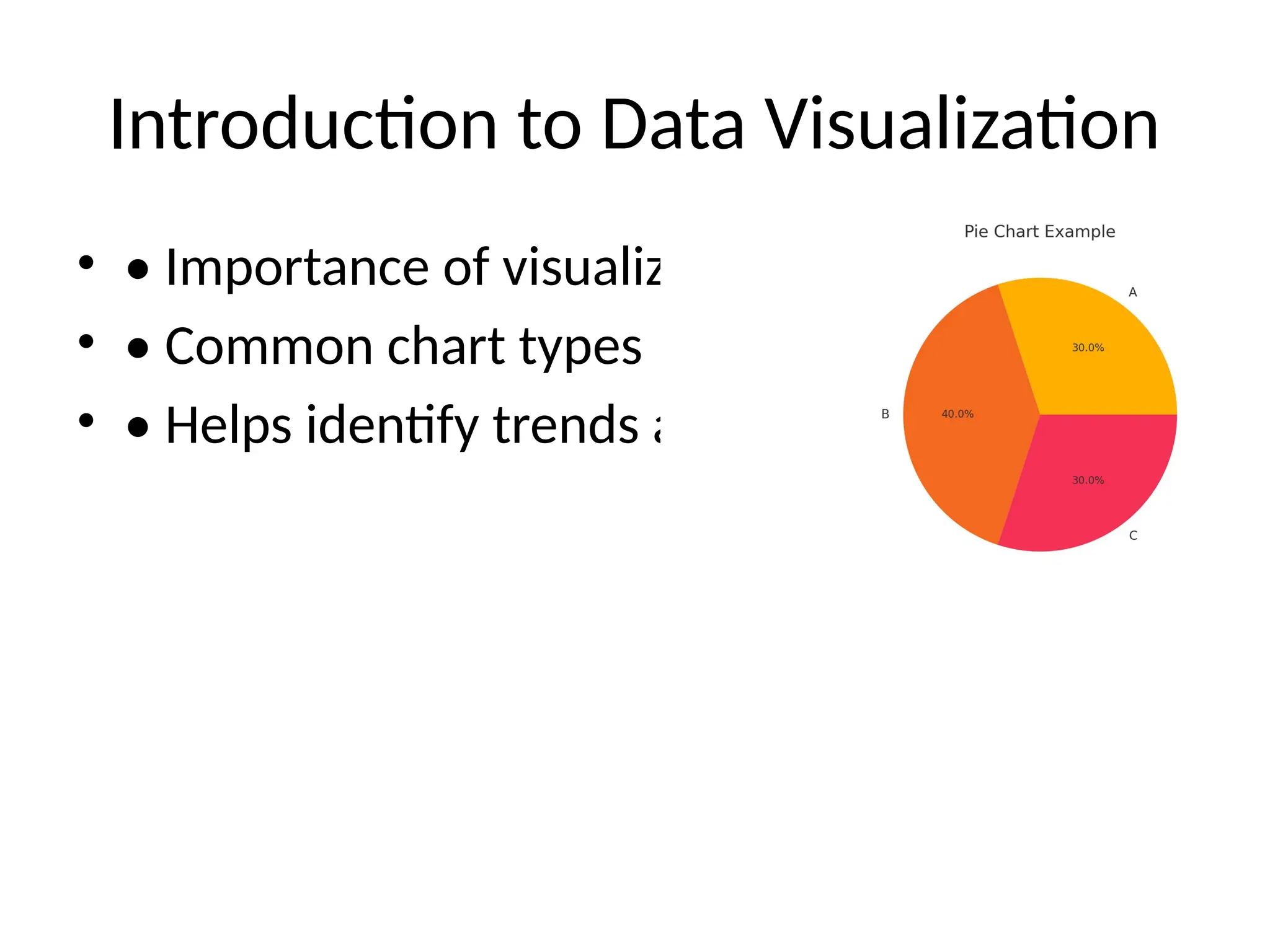
Introduction to Data
Visualization • • Importance of visualizing data • • Common chart types • • Helps identify trends and outliers
3.
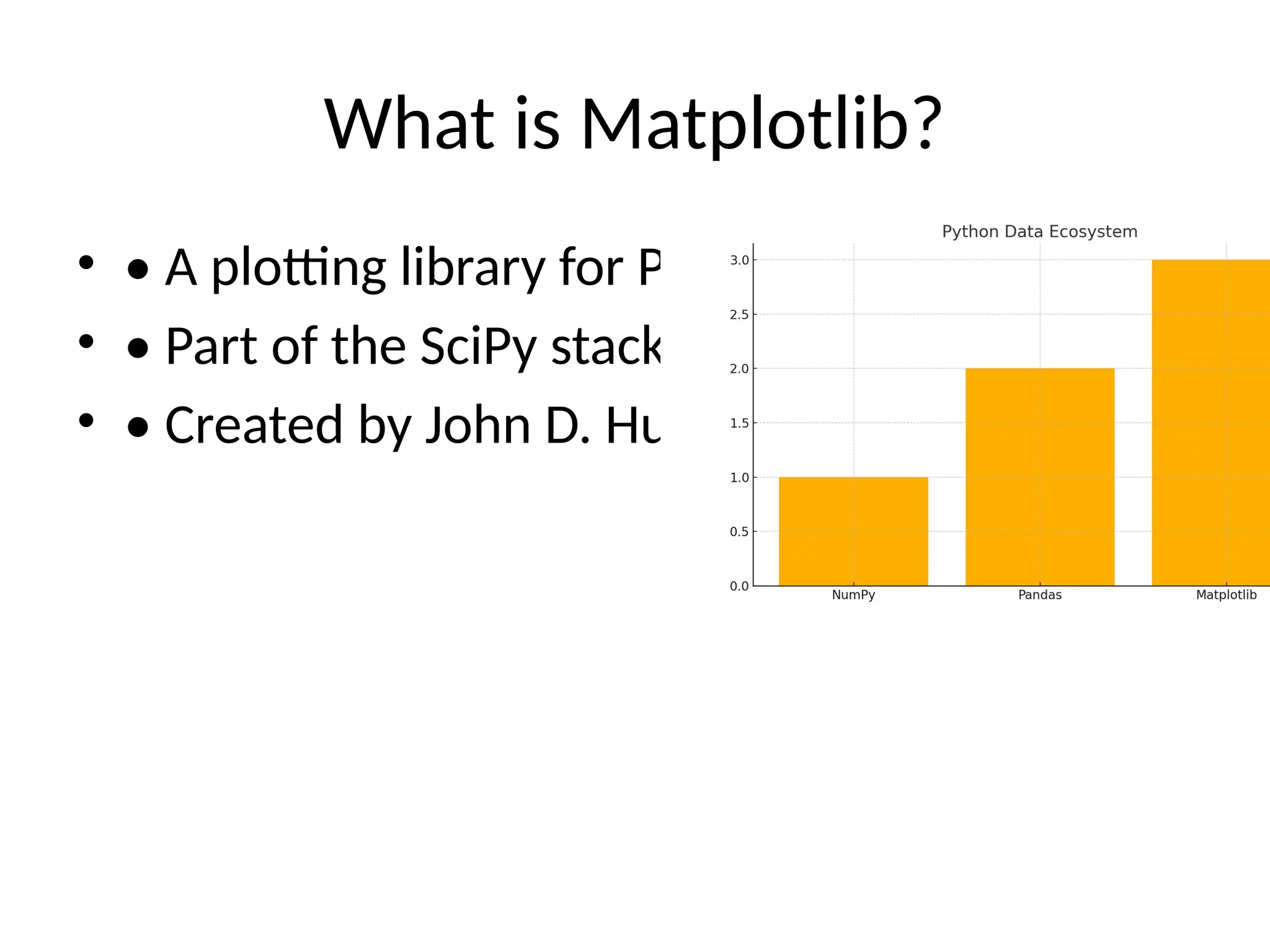
What is Matplotlib? •
• A plotting library for Python • • Part of the SciPy stack • • Created by John D. Hunter
4.
Installing and Importing
Matplotlib • • Install: pip install matplotlib • • Import: import matplotlib.pyplot as plt
5.
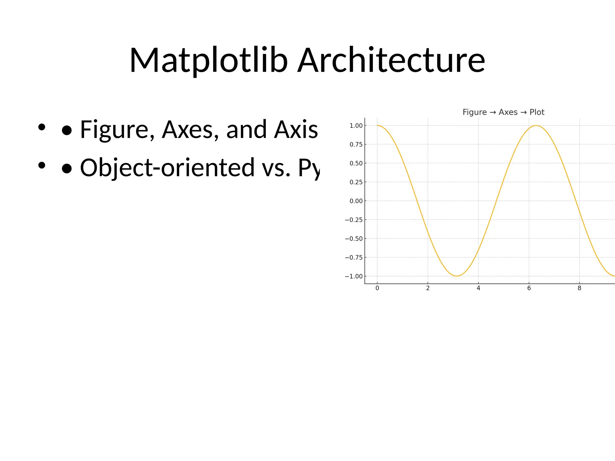
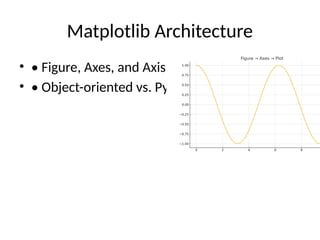
Matplotlib Architecture • •
Figure, Axes, and Axis • • Object-oriented vs. Pyplot interface
6.
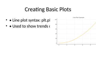
Creating Basic Plots •
• Line plot syntax: plt.plot(x, y) • • Used to show trends over time
7.
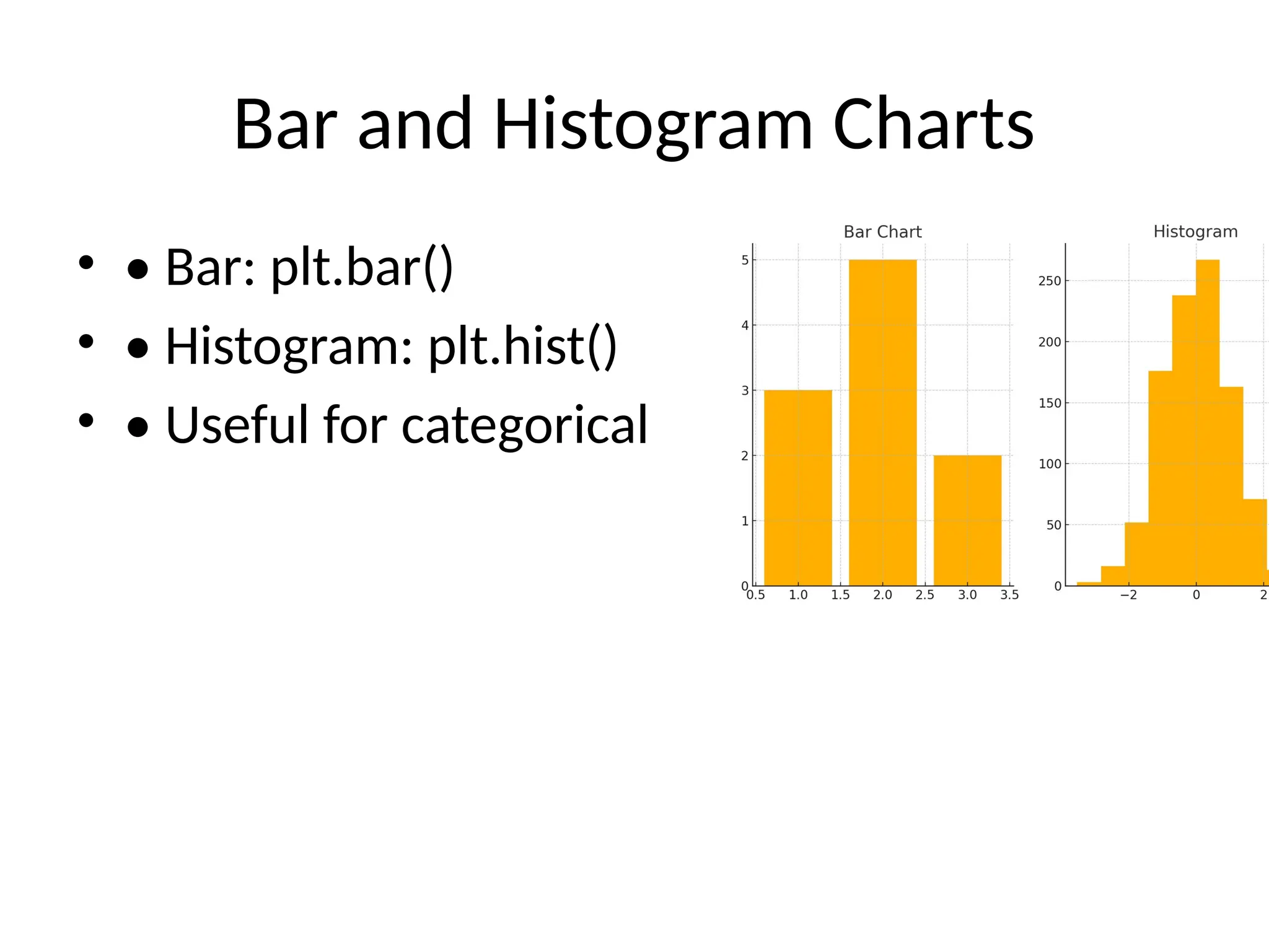
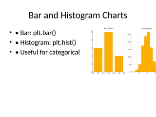
Bar and Histogram
Charts • • Bar: plt.bar() • • Histogram: plt.hist() • • Useful for categorical and frequency data
8.
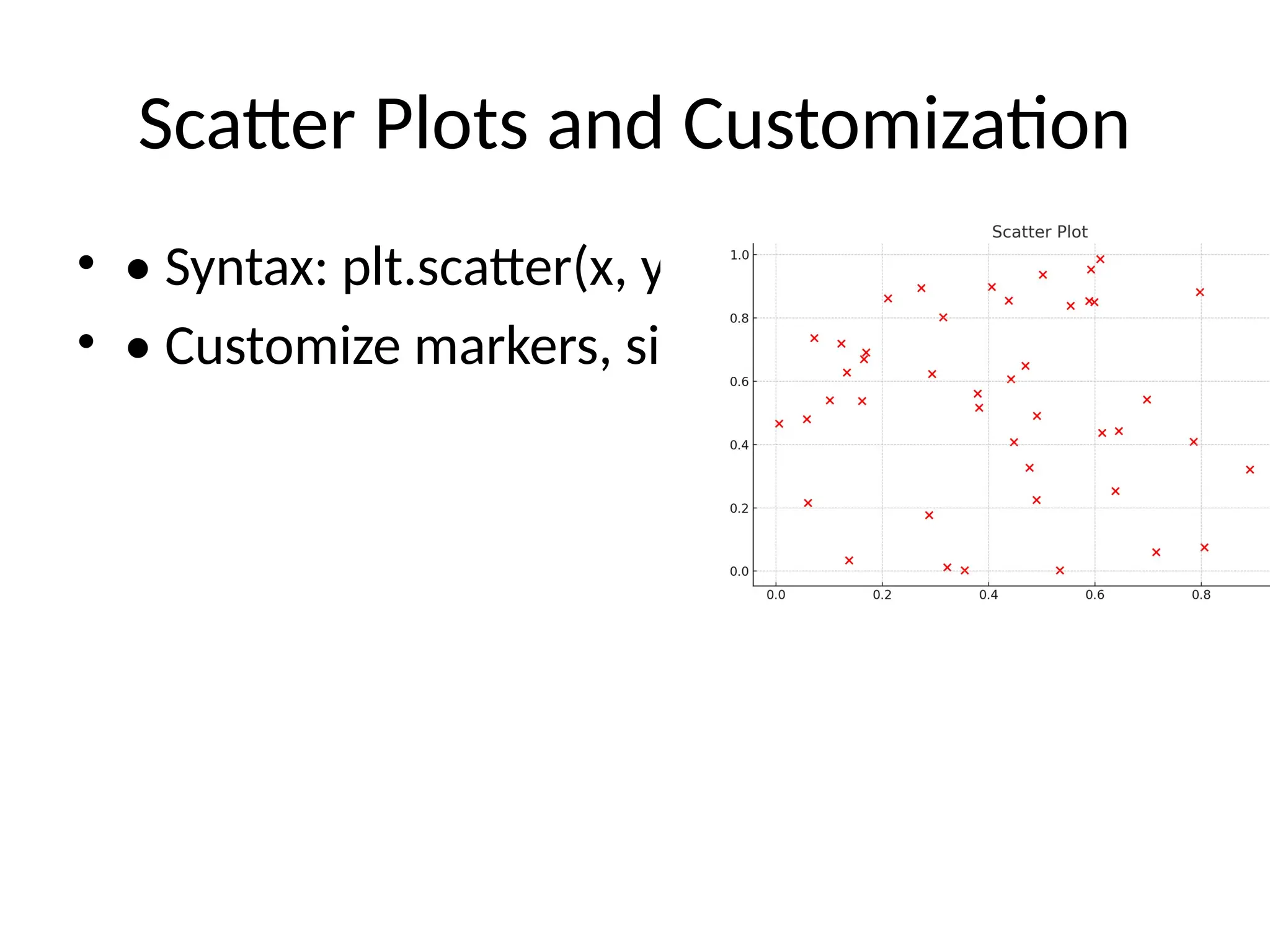
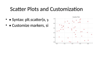
Scatter Plots and
Customization • • Syntax: plt.scatter(x, y) • • Customize markers, size, and color
9.
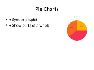
Pie Charts • •
Syntax: plt.pie() • • Show parts of a whole
10.
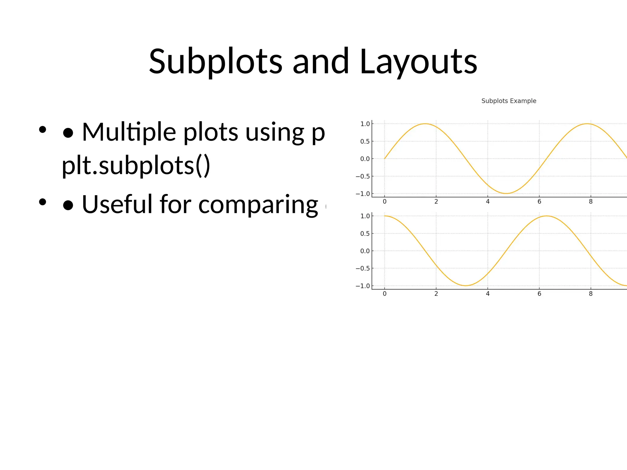
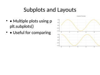
Subplots and Layouts •
• Multiple plots using plt.subplot() or plt.subplots() • • Useful for comparing data
11.
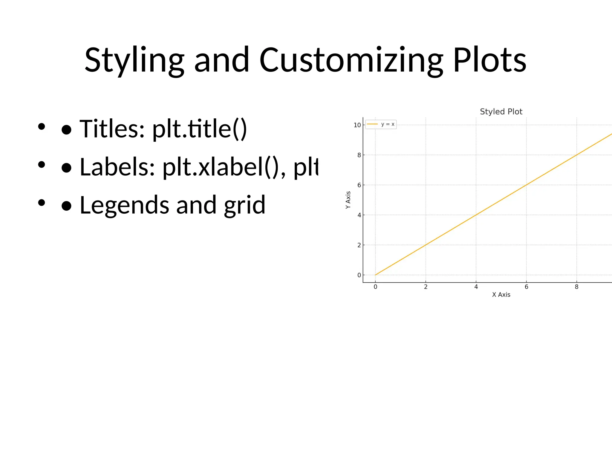
Styling and Customizing
Plots • • Titles: plt.title() • • Labels: plt.xlabel(), plt.ylabel() • • Legends and grid
12.
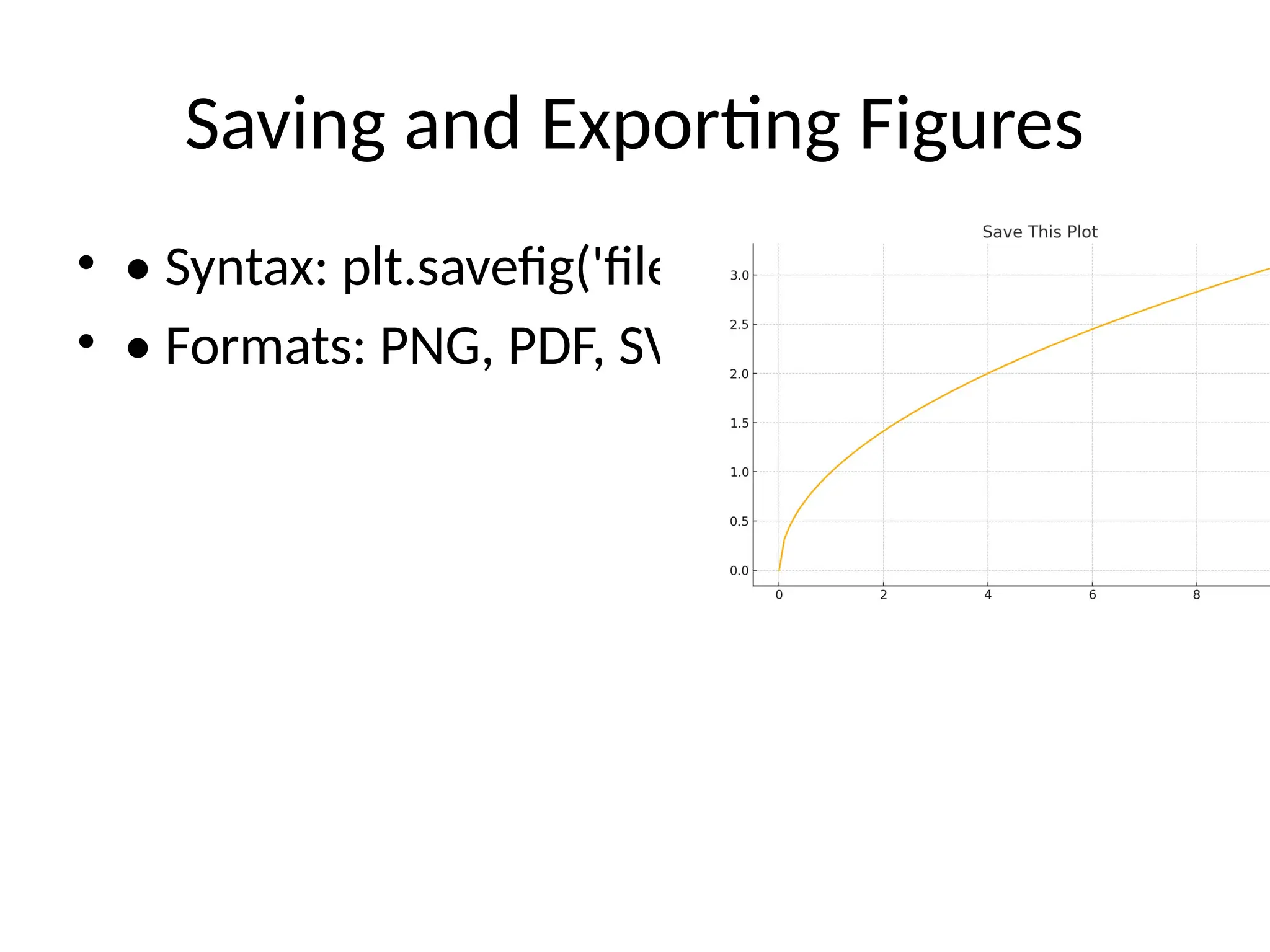
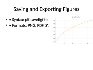
Saving and Exporting
Figures • • Syntax: plt.savefig('filename.png') • • Formats: PNG, PDF, SVG
13.
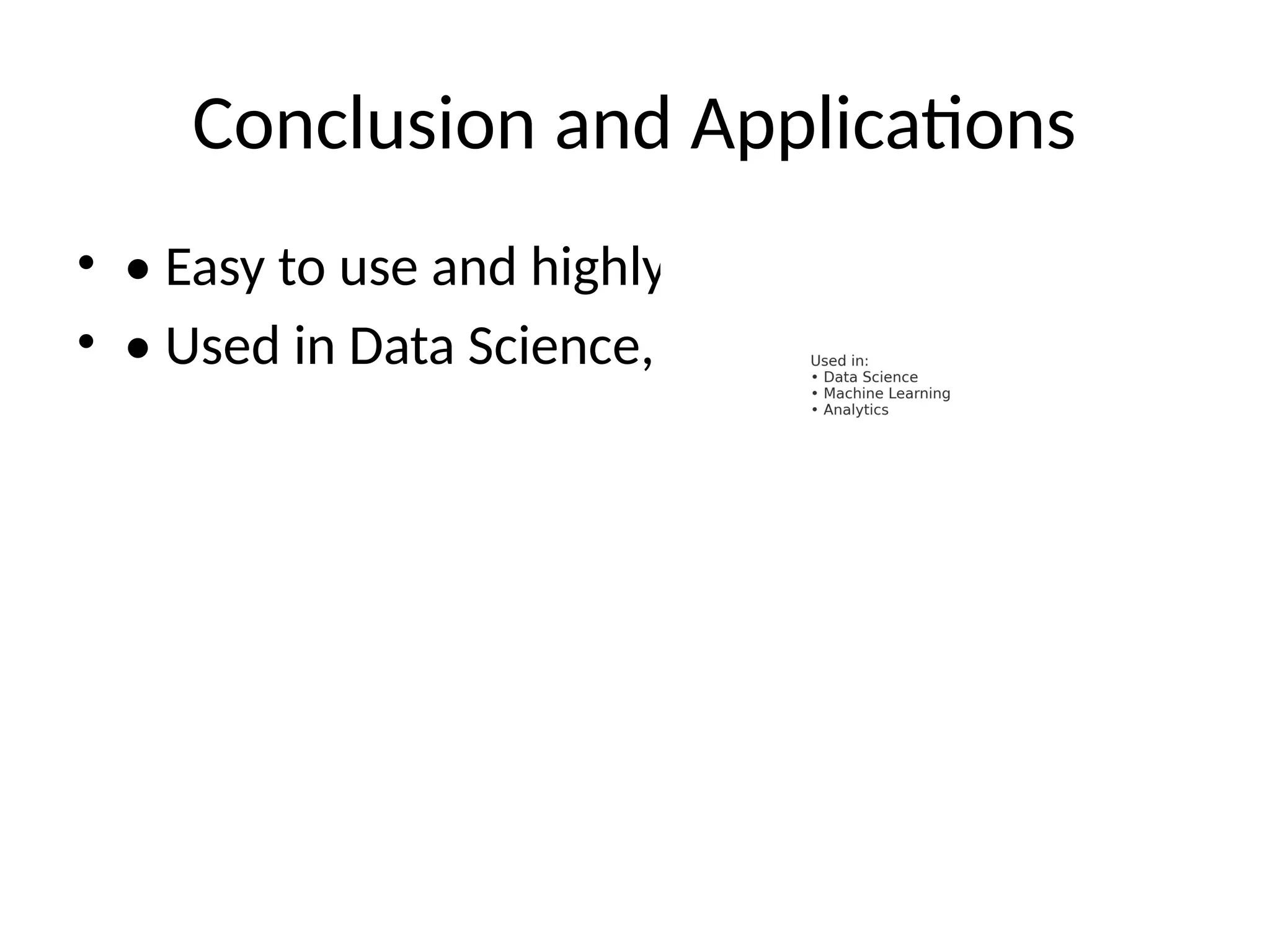
Conclusion and Applications •
• Easy to use and highly customizable • • Used in Data Science, Machine Learning, etc.
Download
![Data Visualization Using Python
Matplotlib
• An Overview of Python’s Powerful Plotting
Library
• Presented by: [Your Name]](https://image.slidesharecdn.com/pythonmatplotlib13slideswithdiagrams-250619061112-ffc7e755/85/Python_Matplotlib_13_Slides_With_Diagrams-pptx-1-320.jpg)


![Data Visualization Using Python
Matplotlib
• An Overview of Python’s Powerful Plotting
Library
• Presented by: [Your Name]](https://image.slidesharecdn.com/pythonmatplotlib13slideswithdiagrams-250619061112-ffc7e755/75/Python_Matplotlib_13_Slides_With_Diagrams-pptx-1-2048.jpg)