KEMBAR78
Data visualization using py plot part i | DOCX
1
Data Visualization using PyPlot
Read the following quotes:
“Visualization gives you answers to questions you didn’t know you had.” - Ben Schneiderman
“An editorial approach to visualization design requires us to take responsibility to filter out the noise from the
signals, identifying the most valuable, most striking or most relevant dimensions of the subject matter in
question.” - Andy Kirk
“Data visualization doesn’t live in an ethereal dimension, separated from the data. When there’s a large number
of pie-charts in a report or a presentation, there is something wrong in the organization, and it’s not the pie. A
pie chart is a potential symptom of lack of data analysis skills that have to be resolved.” – Jorge Camoes
Quotes Source
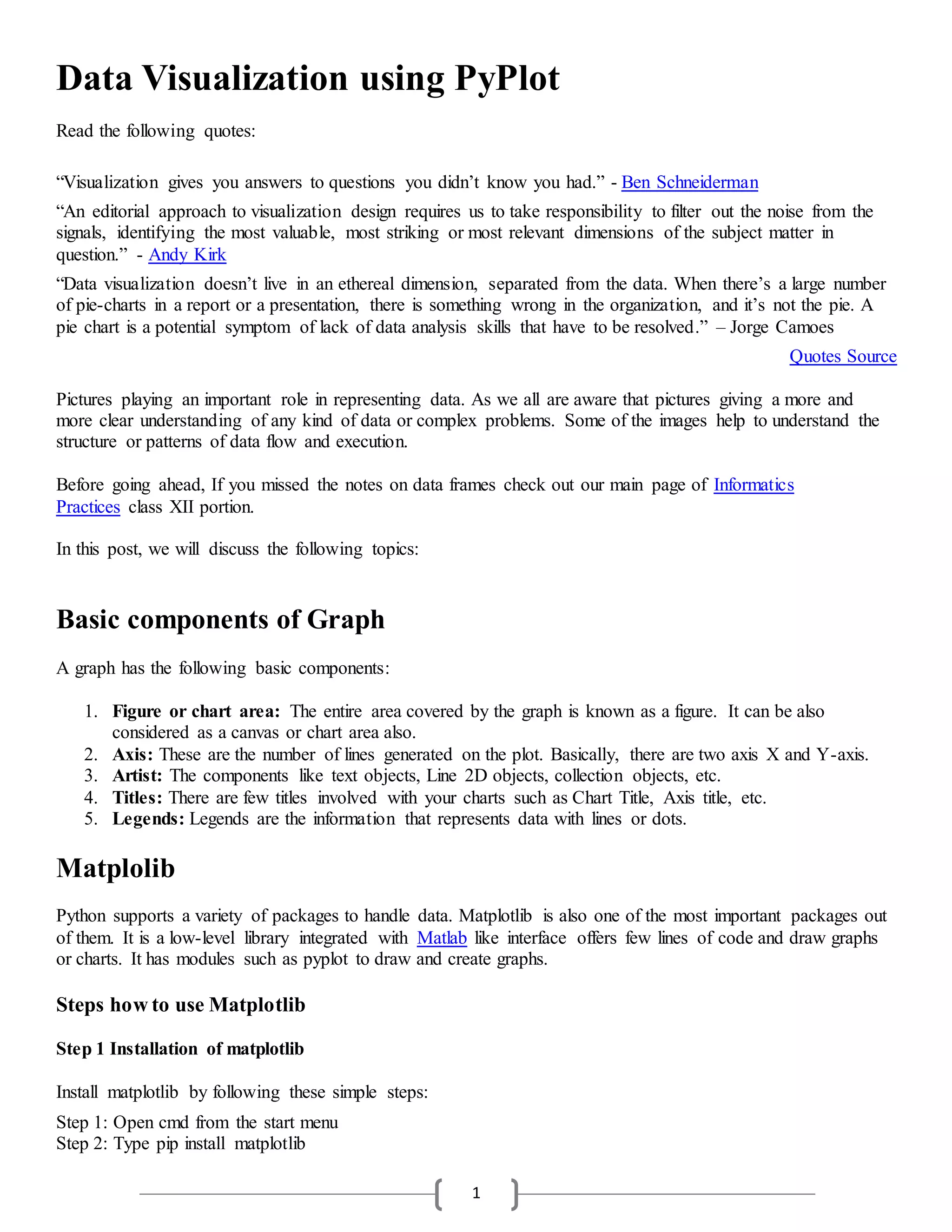
Pictures playing an important role in representing data. As we all are aware that pictures giving a more and
more clear understanding of any kind of data or complex problems. Some of the images help to understand the
structure or patterns of data flow and execution.
Before going ahead, If you missed the notes on data frames check out our main page of Informatics
Practices class XII portion.
In this post, we will discuss the following topics:
Basic components of Graph
A graph has the following basic components:
1. Figure or chart area: The entire area covered by the graph is known as a figure. It can be also
considered as a canvas or chart area also.
2. Axis: These are the number of lines generated on the plot. Basically, there are two axis X and Y-axis.
3. Artist: The components like text objects, Line 2D objects, collection objects, etc.
4. Titles: There are few titles involved with your charts such as Chart Title, Axis title, etc.
5. Legends: Legends are the information that represents data with lines or dots.
Matplolib
Python supports a variety of packages to handle data. Matplotlib is also one of the most important packages out
of them. It is a low-level library integrated with Matlab like interface offers few lines of code and draw graphs
or charts. It has modules such as pyplot to draw and create graphs.
Steps how to use Matplotlib
Step 1 Installation of matplotlib
Install matplotlib by following these simple steps:
Step 1: Open cmd from the start menu
Step 2: Type pip install matplotlib
2
Step 2 import module
Import matplotlib.pylot using import command in the following two ways:
1. Without instance
import matplotlib.pyplot
2. With instance
import matplotlib.pyplot as mpp
Step 3 Choose desired plot type (graph type)
In this step, select your desired chart type for plotting. For example, line chart
Step 4 Give proper labels to axis, categories
A graph is made up of two-axis i.e. X and Y-axis. In this step label them as per the need as well as apply proper
labels for categories also.
Step 5 Add data points
The next point is to add data points. Data points depict the point on the plot at a particular place.
Step 6 Add more functionality like colors, sizes etc
To make your graphs more effective and informative use different colors and different sizes.
The common method used to plot a chart is plot().
The Pyplot package provides an interface to plot the graph automatically as per the requirements. You just need
to provide accurate values for axes, categories, labels, title, legend, and data points.
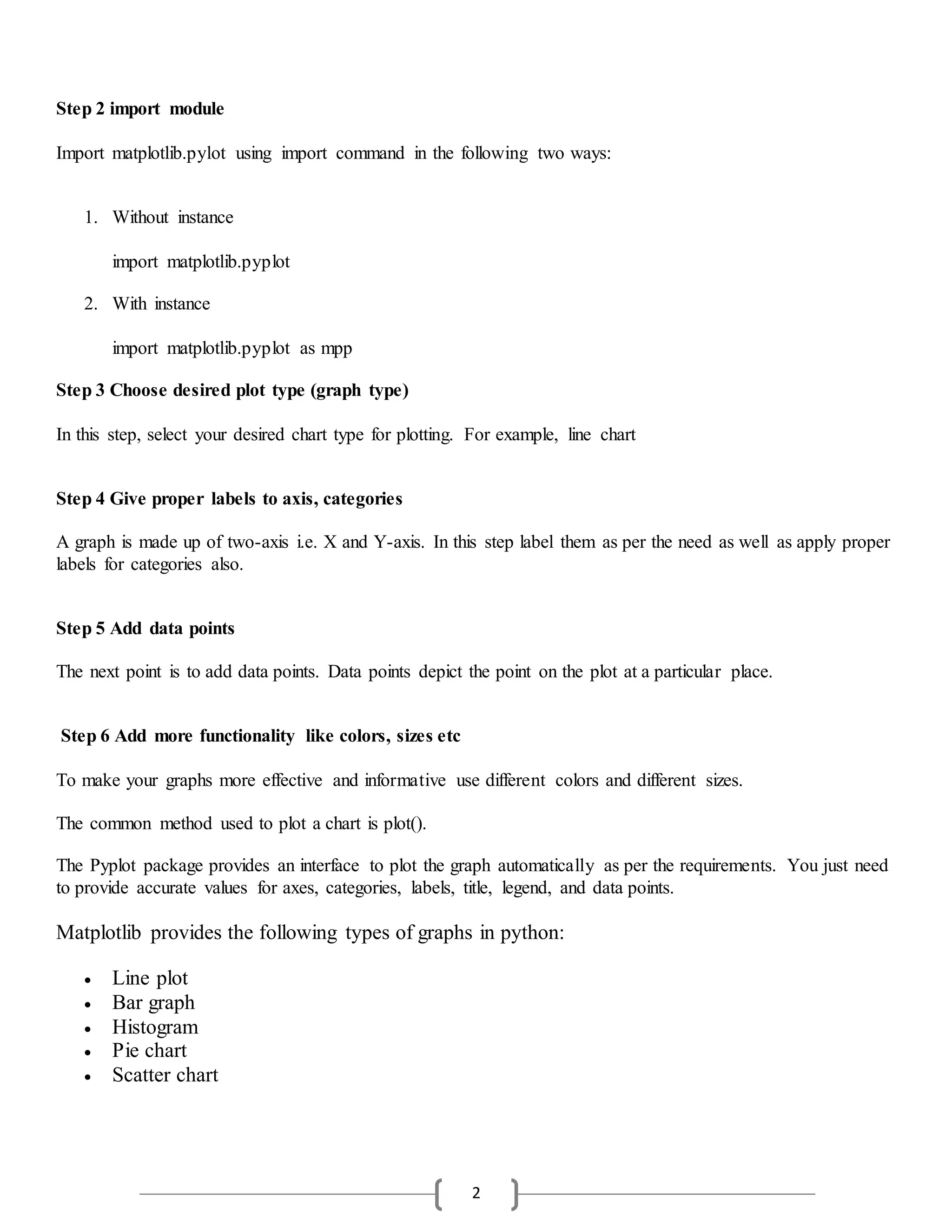
Matplotlib provides the following types of graphs in python:
 Line plot
 Bar graph
 Histogram
 Pie chart
 Scatter chart
3
Creating a Line chart or Plotting lines
To create a line chart following functions are used:
 plot(x,y,color,others): Draw lines as per specified lines
 xlabel("label"): For label to x-axis
 ylabel("label"): For label to y-axis
 title("Title"): For title of the axes
 legend(): For displaying legends
 show() : Display the graph
Now observe the following code:
import matplotlib.pyplot as mpp
mpp.plot(['English','Maths','Hindi'],[88,90,94],'Red')
mpp.xlabel('Subjects')
mpp.ylabel('Marks')
mpp.title('Progress Report Chart')
mpp.show()
Output:
Line plot in Python 3.8.3
4
In the above code, 3 subject marks are plotted on the figure. The navigation toolbar helps to navigate through
the graph. Now observe the following code for plotting multiple lines on the graph.
import matplotlib.pyplot as mpp
o=[5,10,15,20]
r_india=[30,80,120,200]
mpp.plot(o,r_india,'Red')
r_aust=[25,85,100,186]
mpp.plot(o,r_aust,'Yellow')
mpp.xlabel('Runs')
mpp.ylabel('Overs')
mpp.title('Match Summary')
mpp.show()
Output:
Multiline chart using Python 3.8.3
So now you understand how to plot lines on the figure. You can change the color using abbreviations and line
style by using linestyle parameter also. Just do the following changes in above-given code and see the output:
mpp.plot(o,r_india,'m',linestyle=':')
mpp.plot(o,r_aust,'y',linestyle='-.')
5
Bar Graph
The bar graph represents data in horizontal or vertical bars. The bar() function is used to create bar graph. It is
most commonly used for 2D data representation. Just have a look at the following code:
import matplotlib.pyplot as mpp
overs=[5,10,15,20]
runs=[30,80,120,200]
mpp.bar(runs,overs,width=30, label='Runs',color='r')
mpp.xlabel('Runs')
mpp.ylabel('Overs')
mpp.title('Match Summary')
mpp.legend()
mpp.show()
Output:
Bar Graph in python 3.8.3

Data visualization using py plot part i

  • 1.
    1 Data Visualization usingPyPlot Read the following quotes: “Visualization gives you answers to questions you didn’t know you had.” - Ben Schneiderman “An editorial approach to visualization design requires us to take responsibility to filter out the noise from the signals, identifying the most valuable, most striking or most relevant dimensions of the subject matter in question.” - Andy Kirk “Data visualization doesn’t live in an ethereal dimension, separated from the data. When there’s a large number of pie-charts in a report or a presentation, there is something wrong in the organization, and it’s not the pie. A pie chart is a potential symptom of lack of data analysis skills that have to be resolved.” – Jorge Camoes Quotes Source Pictures playing an important role in representing data. As we all are aware that pictures giving a more and more clear understanding of any kind of data or complex problems. Some of the images help to understand the structure or patterns of data flow and execution. Before going ahead, If you missed the notes on data frames check out our main page of Informatics Practices class XII portion. In this post, we will discuss the following topics: Basic components of Graph A graph has the following basic components: 1. Figure or chart area: The entire area covered by the graph is known as a figure. It can be also considered as a canvas or chart area also. 2. Axis: These are the number of lines generated on the plot. Basically, there are two axis X and Y-axis. 3. Artist: The components like text objects, Line 2D objects, collection objects, etc. 4. Titles: There are few titles involved with your charts such as Chart Title, Axis title, etc. 5. Legends: Legends are the information that represents data with lines or dots. Matplolib Python supports a variety of packages to handle data. Matplotlib is also one of the most important packages out of them. It is a low-level library integrated with Matlab like interface offers few lines of code and draw graphs or charts. It has modules such as pyplot to draw and create graphs. Steps how to use Matplotlib Step 1 Installation of matplotlib Install matplotlib by following these simple steps: Step 1: Open cmd from the start menu Step 2: Type pip install matplotlib
  • 2.
    2 Step 2 importmodule Import matplotlib.pylot using import command in the following two ways: 1. Without instance import matplotlib.pyplot 2. With instance import matplotlib.pyplot as mpp Step 3 Choose desired plot type (graph type) In this step, select your desired chart type for plotting. For example, line chart Step 4 Give proper labels to axis, categories A graph is made up of two-axis i.e. X and Y-axis. In this step label them as per the need as well as apply proper labels for categories also. Step 5 Add data points The next point is to add data points. Data points depict the point on the plot at a particular place. Step 6 Add more functionality like colors, sizes etc To make your graphs more effective and informative use different colors and different sizes. The common method used to plot a chart is plot(). The Pyplot package provides an interface to plot the graph automatically as per the requirements. You just need to provide accurate values for axes, categories, labels, title, legend, and data points. Matplotlib provides the following types of graphs in python:  Line plot  Bar graph  Histogram  Pie chart  Scatter chart
  • 3.
    3 Creating a Linechart or Plotting lines To create a line chart following functions are used:  plot(x,y,color,others): Draw lines as per specified lines  xlabel("label"): For label to x-axis  ylabel("label"): For label to y-axis  title("Title"): For title of the axes  legend(): For displaying legends  show() : Display the graph Now observe the following code: import matplotlib.pyplot as mpp mpp.plot(['English','Maths','Hindi'],[88,90,94],'Red') mpp.xlabel('Subjects') mpp.ylabel('Marks') mpp.title('Progress Report Chart') mpp.show() Output: Line plot in Python 3.8.3
  • 4.
    4 In the abovecode, 3 subject marks are plotted on the figure. The navigation toolbar helps to navigate through the graph. Now observe the following code for plotting multiple lines on the graph. import matplotlib.pyplot as mpp o=[5,10,15,20] r_india=[30,80,120,200] mpp.plot(o,r_india,'Red') r_aust=[25,85,100,186] mpp.plot(o,r_aust,'Yellow') mpp.xlabel('Runs') mpp.ylabel('Overs') mpp.title('Match Summary') mpp.show() Output: Multiline chart using Python 3.8.3 So now you understand how to plot lines on the figure. You can change the color using abbreviations and line style by using linestyle parameter also. Just do the following changes in above-given code and see the output: mpp.plot(o,r_india,'m',linestyle=':') mpp.plot(o,r_aust,'y',linestyle='-.')
  • 5.
    5 Bar Graph The bargraph represents data in horizontal or vertical bars. The bar() function is used to create bar graph. It is most commonly used for 2D data representation. Just have a look at the following code: import matplotlib.pyplot as mpp overs=[5,10,15,20] runs=[30,80,120,200] mpp.bar(runs,overs,width=30, label='Runs',color='r') mpp.xlabel('Runs') mpp.ylabel('Overs') mpp.title('Match Summary') mpp.legend() mpp.show() Output: Bar Graph in python 3.8.3