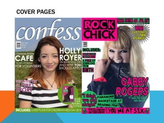
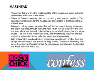
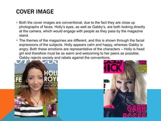
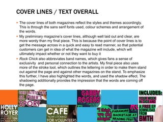
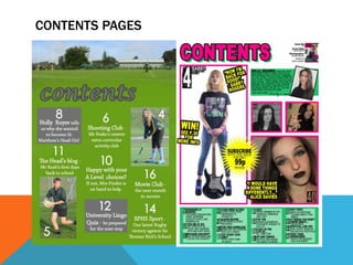
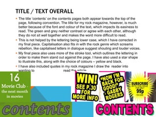
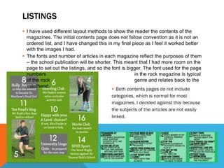
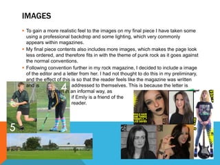
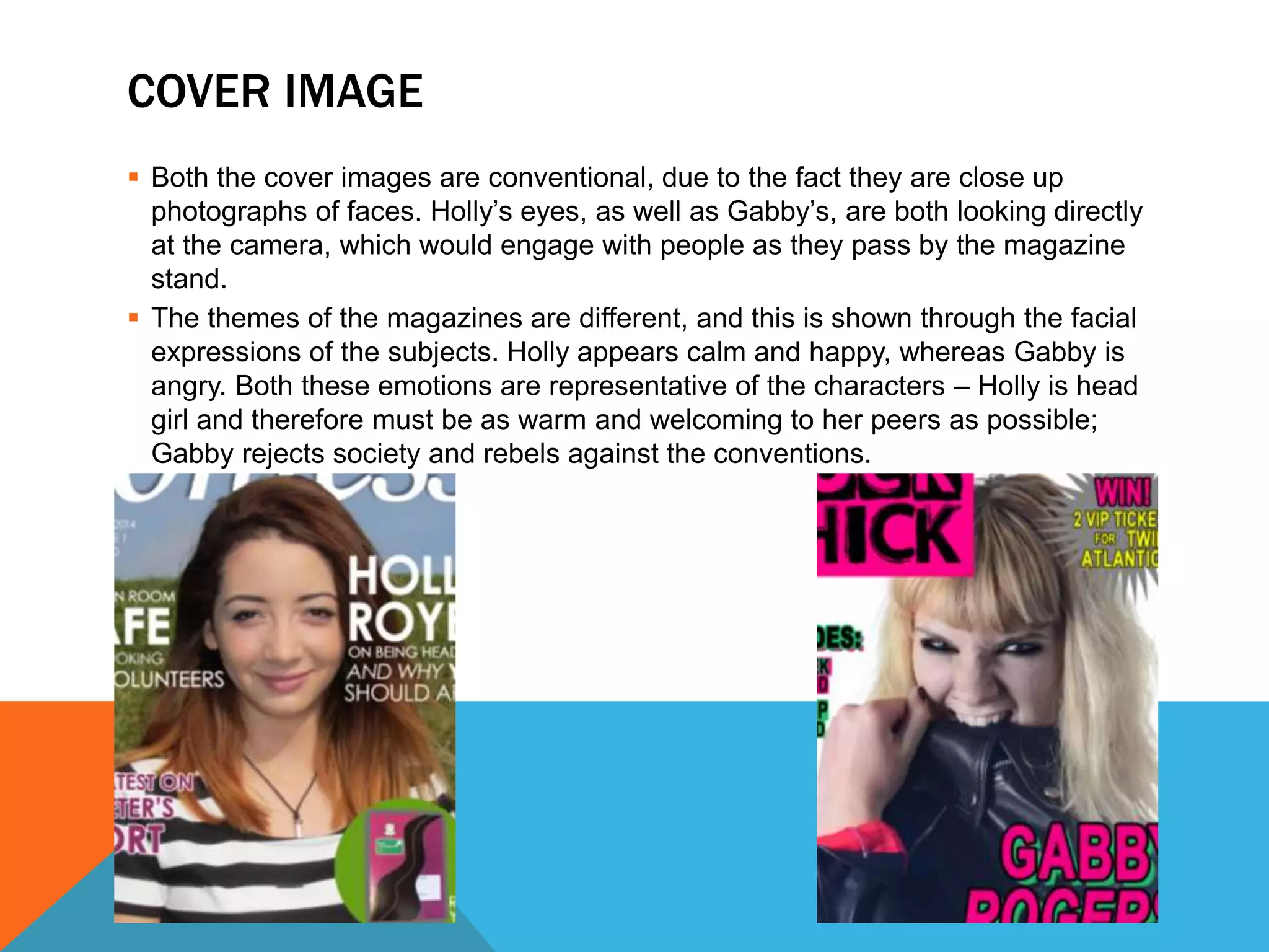
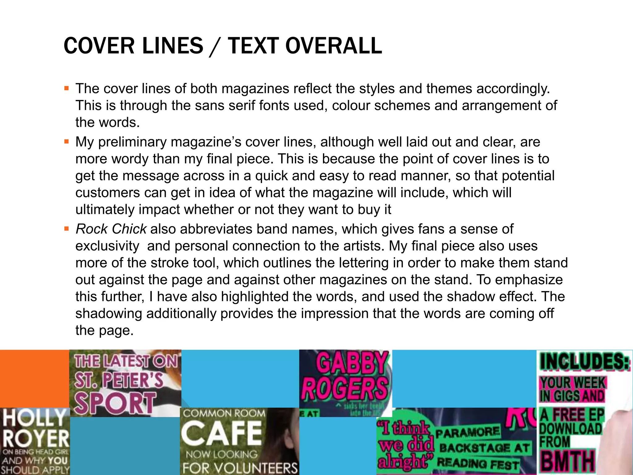
The document summarizes and compares the key differences between the preliminary and final covers and contents pages designed by the author for two magazines - a school publication called "Confess" and a music magazine targeted at young women called "Rock Chick". For the final covers, the author improved the masthead layout and used cover images that better represented the magazine themes. Font, color, and graphic design choices for the cover text and contents pages were also updated for the final pieces to make the information easier to read and more aligned with each magazine's style and audience. Additional images and a letter from the editor were included in the final "Rock Chick" contents to further engage readers.


![Presentation2[1] (1)](https://cdn.slidesharecdn.com/ss_thumbnails/presentation211-130314080752-phpapp02-thumbnail.jpg?width=600ounds&width=560&fit=bounds)


